Architecture Design Core I Portfolio

Ignacio BurgosProf. Mauricio Barreto
Section 3 - Fall 2023

Arch.113.03

Assignment 1 - Sections Cuts
Assignment 1: Documenting an Object

Having to accurately and precisely understand an object through sections cuts was a difficult undertaking. In the above image, there is a clear series of cuts throughout the shears, illustrating that this is not a simplistic, symmetrical object, but is created for the movement of a hand with the blades bent at a specific angle,. The object is shaded to further illustrate its depth and shape.
Arch.113.03
Ignacio Burgos

Assignment 1Early Observation Sketches
Assignment 1 - Movement Diagram
The illustrations above demonstrate the intended movement of the blades, and the extent to which they move at different profiles. The drawing contains no shading, allowing for these movements to be more effectively seen. The constructions lines allow for the viewer to see the blades’ location in comparison to the main body, showing where its movements extend to.
Assignment 1: Abstraction and Experimentation

Assignment 1 - Abstract Charcoal
This abstraction of the shears depicts an intensification of the shears’ curvatures. The swirls and swooped strokes of the object are almost a comic of the original object’s more straight, piercing angles. The colors of the background contrast with the object’s color, a contrast that muddies the more colorful background of of hues.
Attempting to depict the shape and functionality was something quite unique. The image demonstrates erratic movement of sharp shapes, representing the blades’ intensity. Contrasting with this image of severity are these softer, cloud-like shapes, recalling the the original purpose of the sheep shears. This image reflects this intent in a surreal conceptualization, not immediately being recognizable as shears.
Arch.113.03
Ignacio Burgos

Assignment 1 - Abstract Watercolor

Assignment 2: Experimenting with Dimension, Lighting, and Scale
The assignment of creating a series of spaces with strong consideration of light and orientation all within a scale of 24’ x 24’ with human scale was a new challenge. Understanding the human body and its constrictions with light and space was something that challenged me to better understand the natural world surrounding architecture and forced me to strongly consider just how to orient a space.
The assignment of creating a series of spaces with strong consideration of light and orientation all within a scale of 24’ x 24’ with human scale was a new challenge. Understanding the human body and its constrictions with light and space was something that challenged me to better understand the natural world surrounding architecture and forced me to strongly consider just how to orient a space.
Understanding how lighting affects a space was something I personally found challenging. I decides to orient the cube’s orientation towards the sun diagonally so the lighting coming through the cube’s openings would not remain too intense.
Without a concept of materiality for the structure, it was important to understand how to maintain a sense of shelter and passage throughout the cube.

Assignment 2: Considering Elevations and Creating a Model


2 - Physical Model ½” =
Arch.113.03
Ignacio Burgos
The first time creating a model was something originally daunting, but having a simplistic set of dimensions for a scaled model in the most simple of shapes made its creation easier. Throughout the model, much of the cube’s original shape is maintained while still allowing some apertures for light. On other faces of the cube, much of it is carved away, allowing for movement along the sides of the structure. This combinations of flat surfaces and carved faces allow for an interesting series of elevations along the cube.

This elevations of this model allowed me to more accurately understand the scale of my model through human usage. Utilizing human figures taught me what spaces within my cube were to large or small, too covered or unsheltered. Using these figures allowed me to further analyze what might appear impractical in my model. It dawned on me how without using figures,it can be very easy to create a structure that does not function efficiently and understand the human body in relation to architecture.


Arch.113.03
Ignacio Burgos

Assignment 3: Experiments in Creating Physical Models
Certainly one of the messier and less forgiving of materials, utilizing concrete as a method of modelling was incredibly difficult. Creating the model required a lot of planning and a time-consuming reductive process. The model also requires a larger consideration of lighting, as there is little room for error in creating apertures. The model itself contains few apertures yet allows some quantifiable amount of space within the cubic space. Thus, any lighting coming into the model is much more significant.

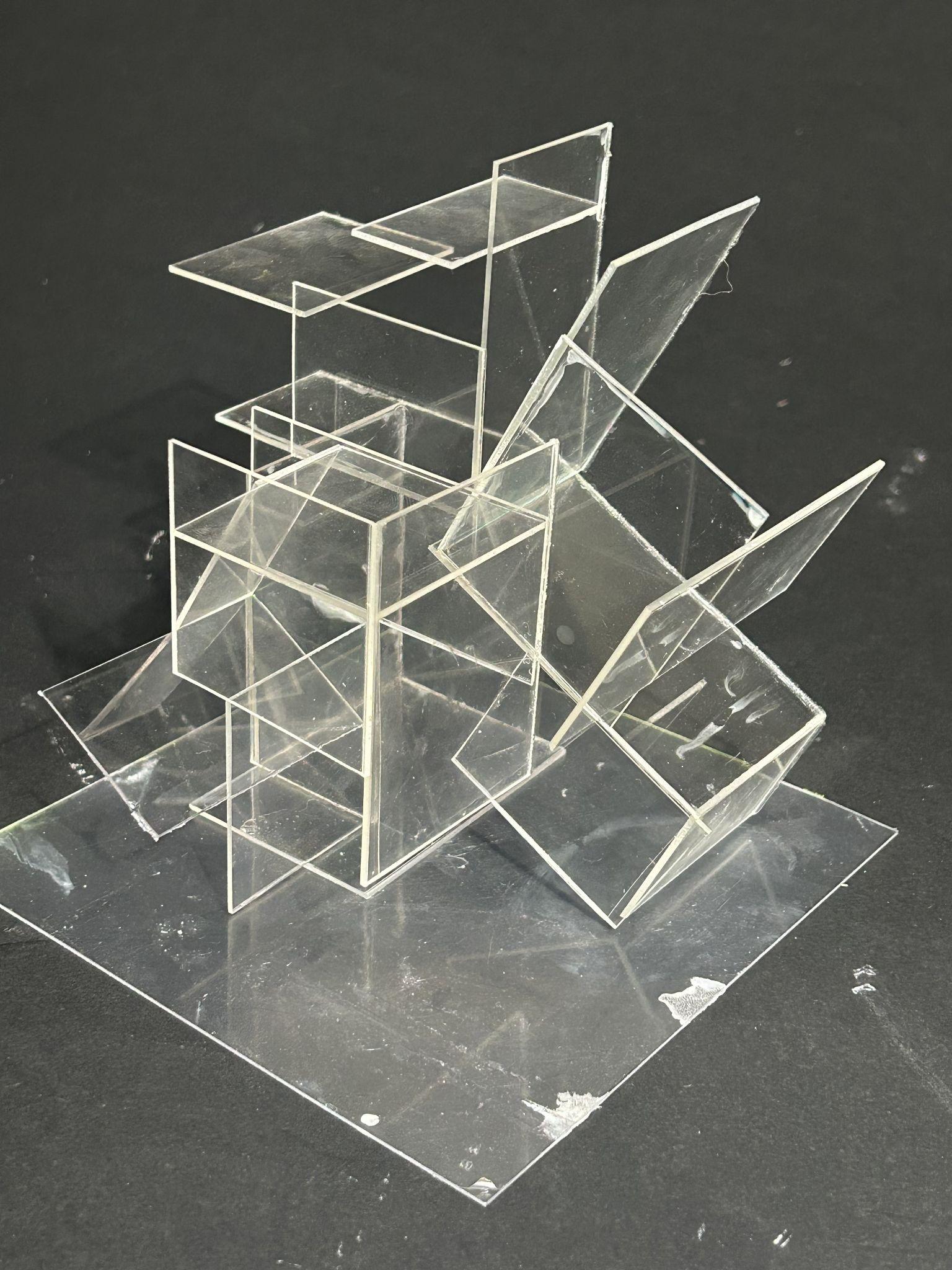

Although constructing the model itself was arguably complex, I found creating actual spaces to be more difficult. Creating this particular model, I prioritized creating spaces without forcing a rectangular space. The model is meant to allude to space with the least amount of intersecting planes. I also experimented with involving diagonal elements that still maintained a dynamic geometric quality with these intersections. The entire model creates something similar to a wire-frame effect similar to that of an axonometric conveyed physically.
Assignment 4: Creating a Model with Site and Structure


Arch.113.03
Ignacio Burgos

Creating a model in scale was something both intriguing and complex given the few constraints within the project. Wishing to create a place of contemplation, I sought to create a space that felt large and upscale, reminding visitors of how small we are in the world. The folly as a whole was meant to reflect the fluidity of water, with the roof referencing a crashing wave. The assignment also required the utilization of a modular system, in which I chose to utilize a series of curved rectangular shapes that varied in dimension. Combining both of these elements, I created a structure that contained a contrast of linear and organic lines. I situated the model itself to be embedded within the sloped ground, to which the physical model of the structure could actually be removed to convey the depth of the space within an excavated site. At a scale with human figures, the model is relatively large, but the folly does not require a sense of practical functionality with the sense of scale.
Assignment 4: Conveying Perspective and Materiality

Assignment 4 - Perspective Drawings, Outside perspective
Arch.113.03
Ignacio Burgos
(Left 2 Perspectives) Setting the environment for my designs visually was something never done for my structures and designs. With this, I experimented through small visuals of how I wished for a user to view my proposal, allowing the viewer to prospectively understand the approach and be set to scale in a way that architectural drawings and physical models cannot produce.

Assignment 4 - Colored Perspective, Interior

(Above) I decided to take a new undertaking in incorporating color into my perspectives, and thus conveying a sense of depth and materiality in my model. As the physical model itself naturally did not do justice to how I wish for my model to appear, I found the use of perspective and color as useful tools in generating how I want my project to be viewed. The color also allows my to demonstrate how I wish for the lighting to appear in a real-world structure, and sets the mood for this specific space in the model.
Assignment 4: Replicating the Model at Scale


Assignment 4 - Elevations ¼” = 1’
Generating a series of plans and sections for the model was incredibly frustrating. Although much of the dimensions of the project were very linear and straight-forward, generating a sense of depth the understand the curvatures of the model without muddying the the drawing was complicated. I decided to use thin lines to convey the curvature of the lower portion of the model ,thus generating a 3-dimensional quality for ground views.

Assignment 4 - Site Plan ⅛” = 1’
Creating the site plan allowed me to further understand how I wished to orient my structure not just for its own sense of direction but also in its relationship to site and landscape. The drawing allows for a better understanding for the intended approach to the folly, and better allows the viewer to understand the structure’s scale through a plan view.
Juliana Erb First Semester Studio Portfolio

This was the first drawing I made in the semester. The goal is to get used to using the parallel, triangle, ruler, and french curve tools. I also tried to achieve different line weights to help communicate depth.


These drawings were based on Frank Loyd Wright’s Martin House, built in 1904. Frank Lloyd Wright was the architect of this project. His legacy was being able to create forms of architecture that were one with the landscape. He achieved this by connecting the design of the natural world to his architecture.
The Martin house was a series of houses woven together to make one big house for Martin’s family. The project housed a main dwelling, a secondary house, and a garden cottage. Connecting all of the spaces were pergolas. These open-air covered walkways bring the garden to the sheltered. The house also included a conservatory. This was an indoor glass garden filled with rare tropical plants. The variety of gardens and themes of nature throughout the house and land brought the inside and the outside world together.
These drawings gave me a first insight into the design world and got me to challenge my way of thinking about a building when it can to plan and section. It also gave me an introduction to how to properly draft a drawing.


Plan, Section, and Elevation
Drafting this whisk was a challenge. I had to make three plans of the whisk to help me pinpoint the width of each whisk rod to its opposite rod to figure out how the curves change within an elevational drawing. To the right, you will see my first draft of drawing this whisk and how I had to pull down each point to try to get an accurate reading on how to draw the curves. For once I had the points I was able to use the french curve to connect the dots.


This drawing to the left helps communicate how the object moves through space. This more abstract drawing, below, also communicates the same thing however it shows the marks it leaves behind when interacting with a liquid. For this drawing, I used the whisk as my drawing tool to help show the marks the whisk can leave behind. These marks help communicate the adjectives associated with a which; spinning, mixing, and spattering.

Graphite
Drawing
Unlike the last drawing on the previous page which captured the chaotic motion of the whisk, this drawing communicates a moment of stillness a whisk can make when in use. It shows how a thicker material becomes trapped in the whisk. The markers made in the negative space of this drawing help indicate the very chaotic motions and marks that a whisk can hold. In this moment of stillness, there is still a connection to the way the whisk operates. This abstract take on this drawing, reveals the ghosts of the marks that the whisk once made.

This drawing communicates the strike the whisk makes when it comes in contact with a bowl. As it spins and rotates around the bowl, mixing the substance it strikes the side of the bowl as the user uses more force to quickly mix the substance in the bowl.

This project intended to create a space by carving out a very solid mass. For the carving, this project created a center where everything expanded and rotated. The central space is a place for gathering and is the largest place for people to gather throughout the whole project. A system found in this project is that every other space created has expanded from this central core. All of the expanding paths intersect and circle the space creating many pathways and secondary spaces for people to inhabit. This structure does not hold a specific starting or ending point for the motion of this project is continuous.


Model Photographs


Rockite and Wire Hybrid Astracted Models
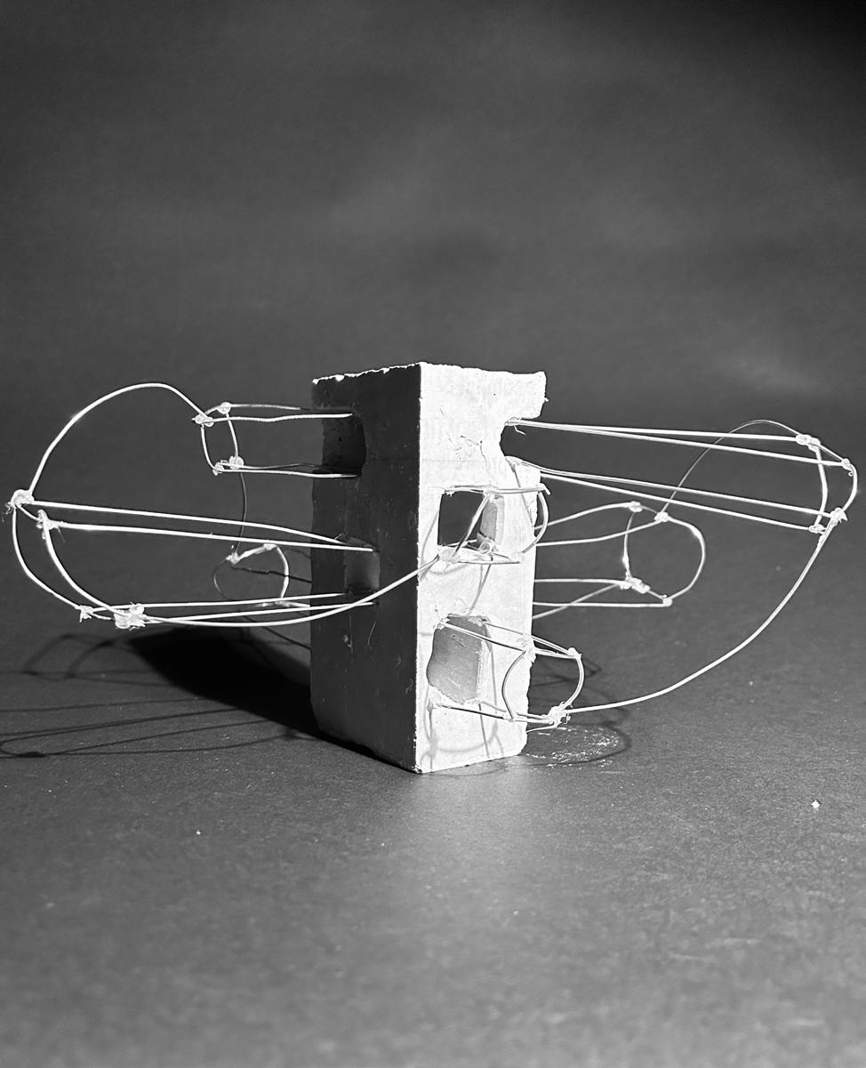
The intention for this project was to create abstract models based on my system and ideas from the previous project. I created abstracts that communicated expanding from a central core, intersecting and creating a circular motion.
This astact modle has a cement core which creates a more dominant presence in the model making a clear hierarchy of importance. Intersecting paths in the core broke up the mass and expanded into more delicate wired spaces. These spaces defined by the framing of the wire were connected by one continuous wire to help communicate the circulation of the project. This also pulls the expanding motion back to the center for they do not just expand forever. They are all attached and connected to the care and each other.



Wood and Acrylic Hybrid
This triangular wooden structure was inspired by the triangular steps in the previous project that connected one path to the next. The triangles rotate around the core increasing in elevation.

Wood and Acrylic Hybrid


Astracted Models
Mesh Fabric
In this model organic shapes expand from the central core. The shapes concierge with each other creating a continuous space. The stitching on the material evokes a connection and intersection found in the previous cube project. The stitching creates triangles signifying a sense of hierarchy as they move toward the center core. This is a similar interpretation to the triangular shapes made in the previous model. The triangle steps in the cube project connected the expanding hall where the triangular stitching is physically connecting the model.


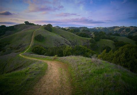
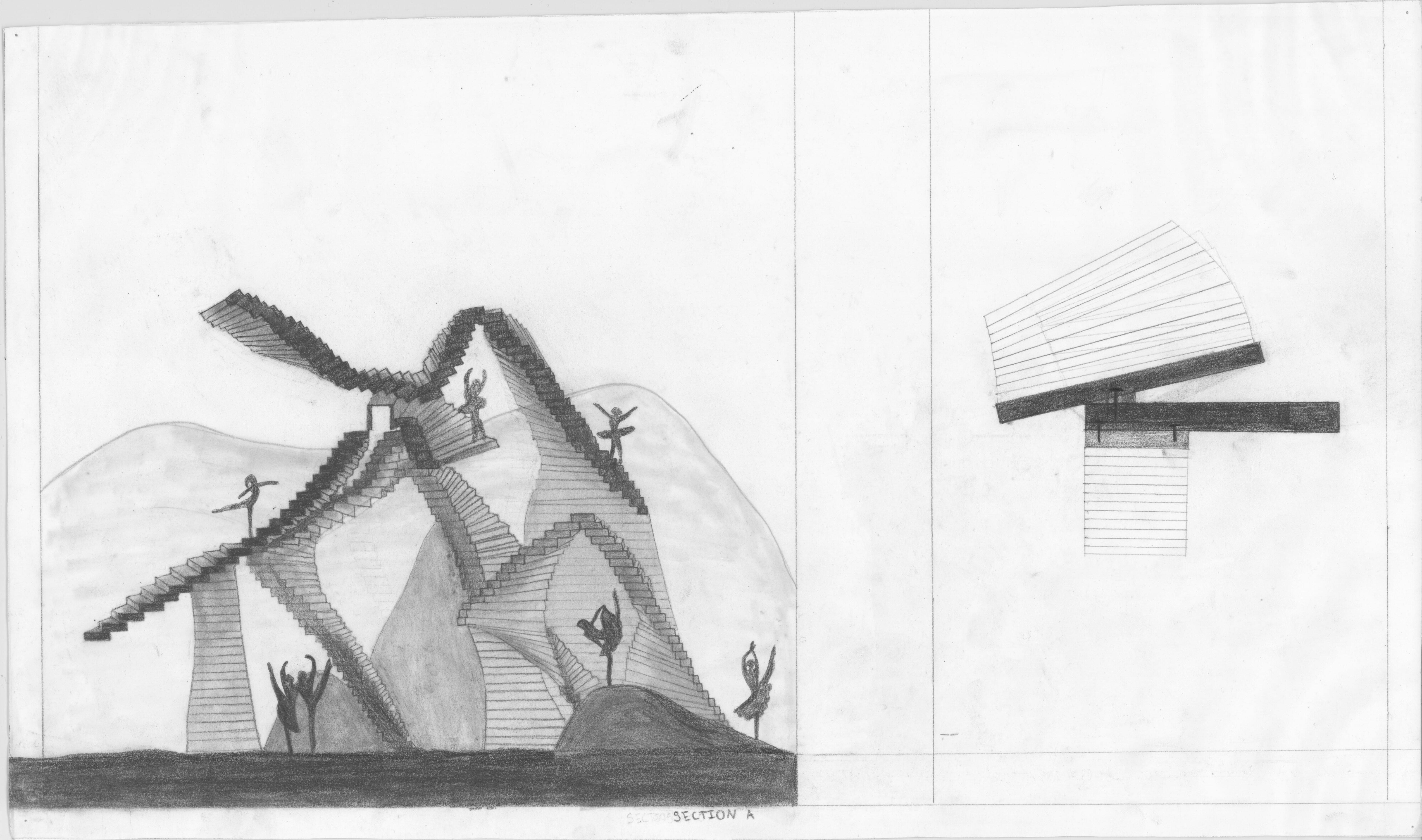
This project creates a playful rejuvenating community center. Rolling grass hills envelop this sculptural project. The way it bends and moves creates this choreography and purpose for the way people inhabit all of the different spaces created. This project was based on a stair module. Keeping the steps the same length the module then expands up and around. This one-defined motion creates a starting point and end point. Between those two points, there are points of rest and many pivotal points to create this fluid motion. Smaller versions of this motion were created underneath to help create smaller, secondary, and more intimate spaces. I imagine people would use this space to run, climb, relax, and gather. They could climb up the large structure and see the surrounding hills. They could gather in the larger space below to host a yoga class. A couple of people could find some quiet in the smaller places the curvature creates to have a picnic.

A Work in progress...
This evolution so carelessly labeled life Never-ending chapters of ethereal yesteryears Pave the road of existance for yet another day. Dreams, vistions and experiences...
Architectural designs of some cosmic happenings, Decades in the making, Builds an apex of truths.
As though peering through a kaleidoscope While drafting these blueprints, Struture shapes and re-shapes itself
As if molded from paper mache. Oddly enouh, the heart is molded of glass.

Model Photographs


A1: Documenting an Object
A1: Elevations, Plans, Sections
The purpose of this assignment was to gain an understanding in creating the various types of architectural drawings. This was done through the observation of an object, in this case a hand riveter. Elevations became apparent through looking at and measuring the surface of the object. Plans and sections however required a further understanding of the interior. Disassembling the object revealed the design of its mechanism and enabled its full documentation.


A1: Action/Movement Analysis
This part of the assignment required documentation of the moving parts of the object and movement of the object in action. It was necessary to first consider how to effectively represent movement through sketch. Action and movement are shown simultaneously.
Concepts which were observsed within the object while completing earlier parts of the assignment were to be represented through abstract drawings. The hand riveter’s surfaces and their relationships to each other were observed. Also, the action of the object introduces tension and strain in the mechanism as the handle is compressed. These concepts were used to create the abstractions, and show the beginnings of spatial ideas.


A2: Space


For this assignment, the relationships of space and void were explored, as well as light and shadow. This was done by designing void as a solid with sketch models. Concepts that were found in the solid models were combined and translated into void by carving into a foam cube.
A2: Representing space
While creating the foam model, the effects of light and shadow within the cube’s voids were studied. This was done by examining and photographing the model under various lighting conditions. Drawings of the space became informative of these conditions, and consideration of human occupation was required. Combined, these concepts enabled the design of a space at a human scale with a spatial hierarchy.


The idea was to have a primary space at the center of the solid and to create a different threshold on each plane of the cube. This created a closed off chamber which reached outward toward the bounds of the solid. Entry of light was limited and specific, and intersected within the primary space.
A2: Representing space
The beginnings of materiality were a part of the assignment. The solid was to be understood as constructed, so an approporiate material choice had to be considered. For the exterior, metallic diamonds complimented the idea of reaching out from a center to a point. The interior’s geometry made rectilinear concrete surfaces sensible.


A3: Modeling Space
The purpose of this assignment was to explore the techniques and qualities of a variety of model making materials. The design of the models was to be based upon A2, but quickly transformed as the characteristics of the materials were learned.
Rockite was cast and worked well to represent mass and structure. Brass wire was soldered and its scaled seemed to work well for secondary and intricate elements. A design was made which expanded these ideas and combined both materials.
A3: Modeling Space
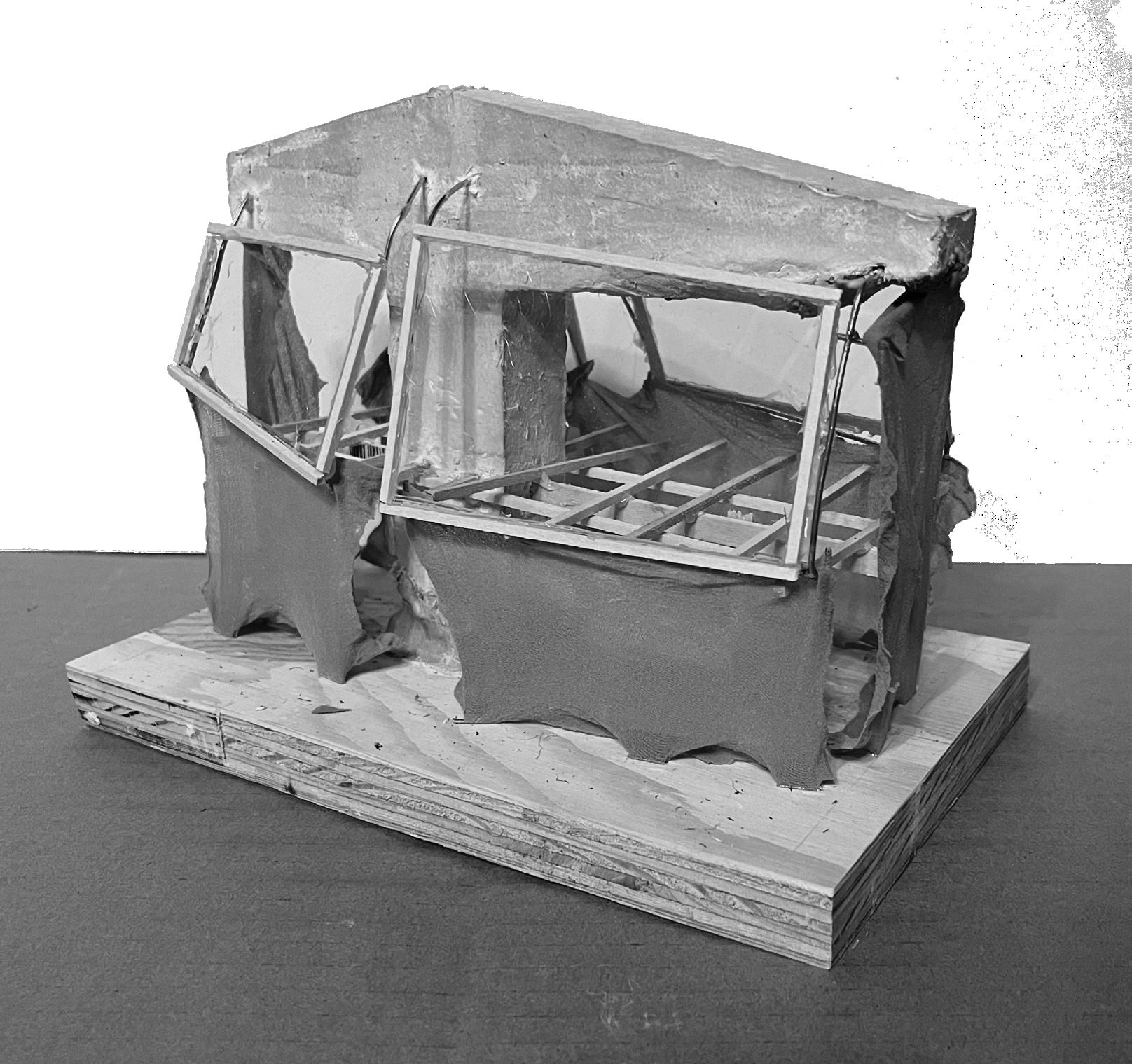
Fabric was cut and pinned to create surfaces with potential for highly intricate curves. It worked well to cover a frame. The transparency of acrylic naturally makes it fit to represent glass. The fabric and acrylic has an appearance of lightness.
The qualitites of each material were considered, with the goal of creating a model that incorporated every one.





A4: A Folly of Light and Shadow
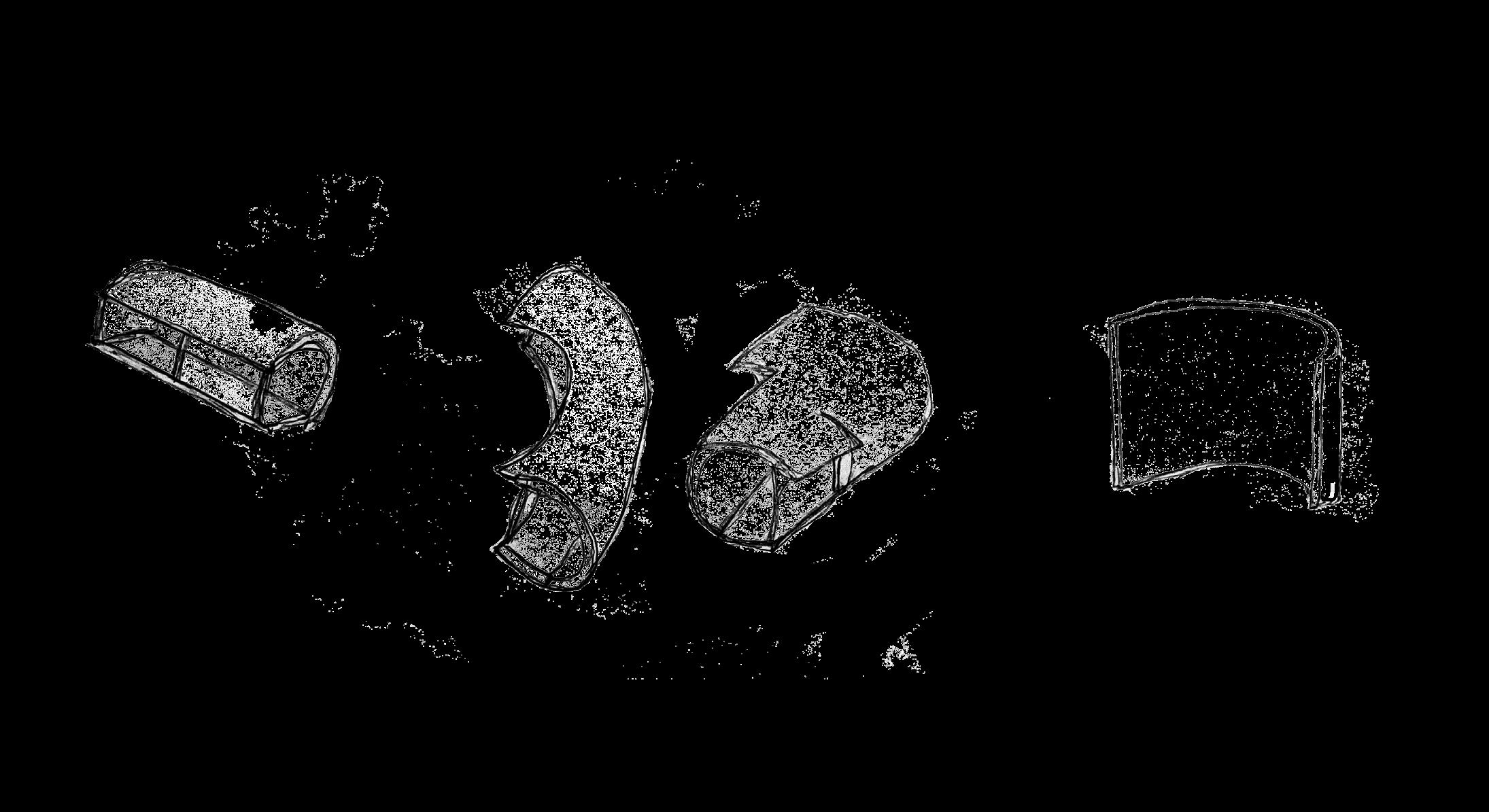
This project’s objective was to design an architectural folly, starting with a completely new design. The approach to achieving this was to first develop a “language” with which to begin generating a design. The word “bending” was chosen, represented as a piece of paper curved over itself to create enclosure.
When trying to develop this language further, it seemed too limited to design the bends in section. Designing instead in plan created potential for generating the folly. A recurring observation in the design process was the gradual way a curved surface becomes some other thing. In this way, a curved element can simultaneously be another element.
A4: A Folly of Light and
Shadow
An exploration in simultaneity generated much of the design. A primary element became the curved bands of wall, which would transform along their lengths to include program such as seating, tables, and stairs. Layering the walls allowed control over the heights of the stacks and created staged seating. Space was created as these walls curved around, and the roof structure became a continuation of a higher wall element. With these choices, the folly became well suited to the program of an amphitheater.


A4: A Folly of Light and Shadow
The folly was finalized by considering the site. The sketch plans resembled the elevation contours on a topographic drawing, which became central to the final design. The topograpy of the site and the shape of the plan were to become closely related. The structure was imbedded into the terrain. The overlapping walls became retention walls and the heights of the roof change with the ground.
A4: A Folly of Light and Shadow
The plans show the relationship between the structure and the site. The the roof structure follows the topography lines. The approach is defined by flat terrain at the entrance. The stairs allow access to the terrace roof. Structural members run to the ground along perimeters and centers of curves. A spatial hierarchy can be seen from the size and placement of roofs.


The relationship between the ground and the wall elements can be seen in section and elevation. The walls overlap when they encounter terrain but stack in shorter heights when freely standing. Walls articulate to create thresholds and apertures.
A4: A Folly of Light and Shadow
The choice of metal as a wall material came from the need to construct lengths of curved wall. It reflects lighting across the surfaces and creates a sharp range of light and shadow. These concepts were explored in experiential/perspectival drawing and photographing the model.


A4: A Folly of Light and Shadow
The staged seating serves as a place for the audience at the ampitheater. The ground of the folly is made of stones with a gradient in size. This choice alludes to the idea of ground and terrain. The performance area and other significant areas are indicated with larger stones, which organizes the space. Beyond the folly is a significant view as part of the assignment’s site conditions. It is made visible from the staged seating and serves as a backdrop for the performance.
