ARCH 515 GRADUATE ARCHITECTURAL DESIGN
STUDIO
FALL 2023
Preserves / Libraries
Rubén Alcolea, Associate Professor of Architecture

Preserves / Libraries
Rubén Alcolea, Associate Professor of Architecture
Fall 2023 | Arch.515.01 Grad Arch Design Studio | Preserves, Libraries
Instructor Rubén Alcolea
Cummings School of Architecture
Roger Williams University
Audrey Barnhart
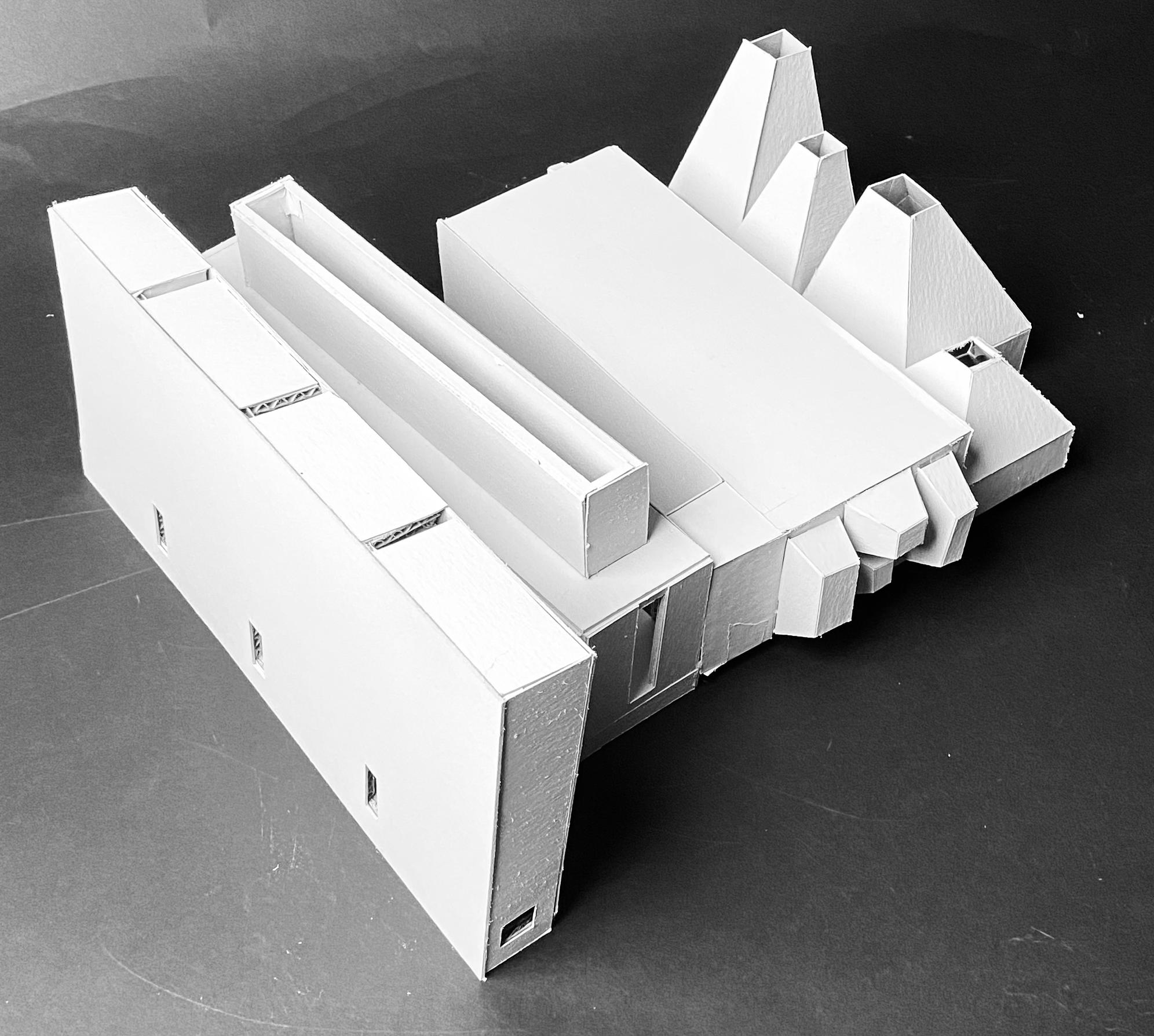
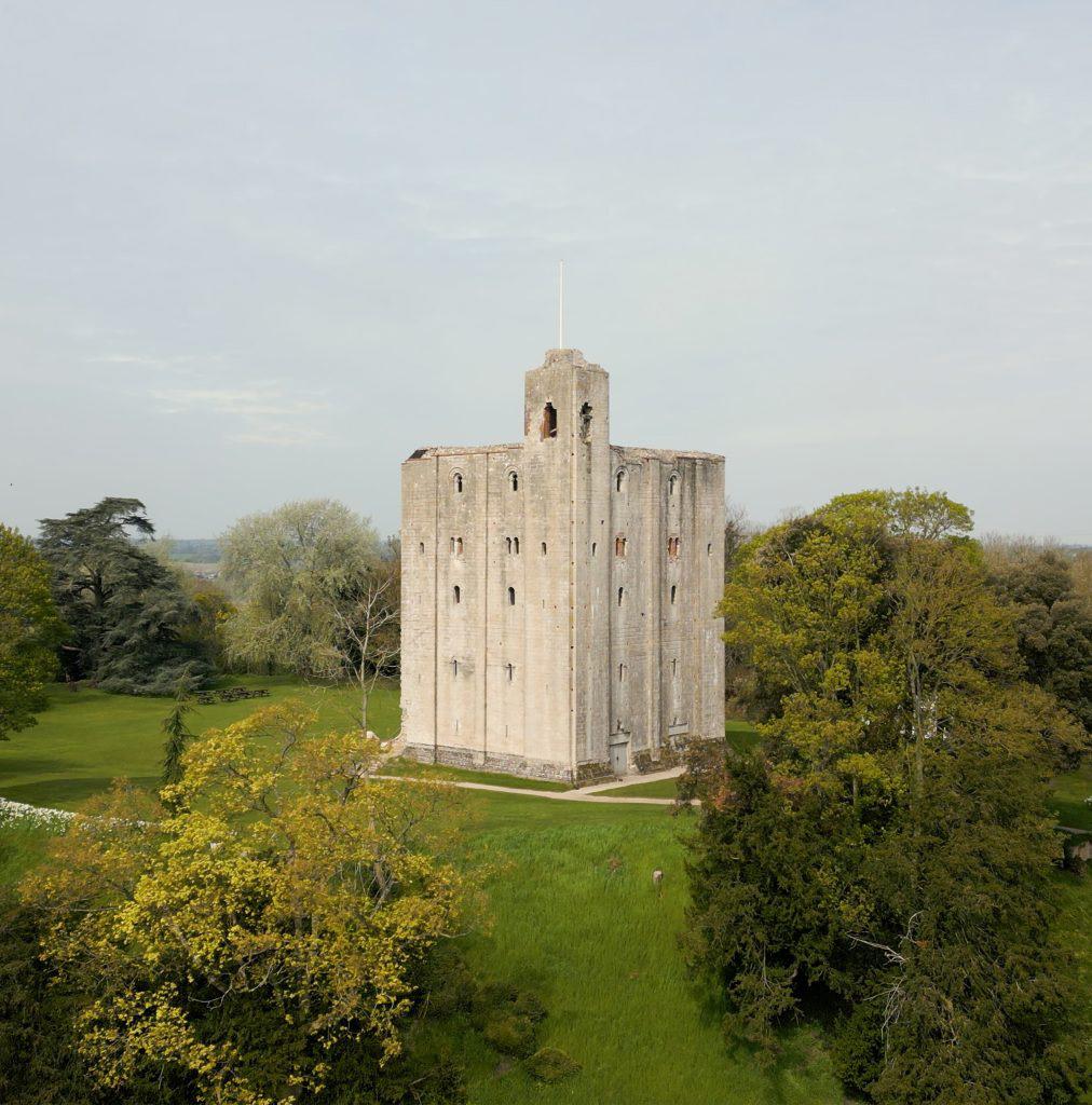
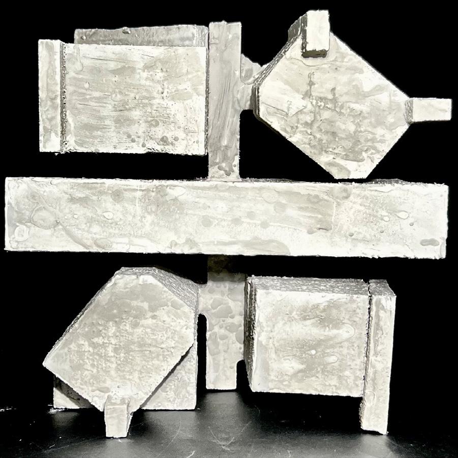
Headingham Castle is located in Essex, England and is a 12th century dfensive castle. The castle appears to be a simple cube on the exterior but has instricate spaces carved out on the interior. The telescoping openings and the abstract geometries make their way into the final iteration.
The messing drawings attempt to emulate the rough texture at the top of the castle. many of the interations had a back and forth weaving pattern that inspired the massing moving forward.

Audrey Barnhart
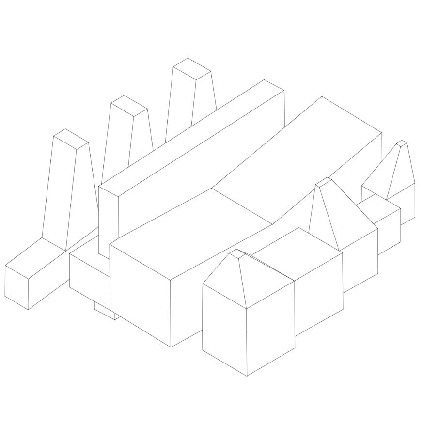
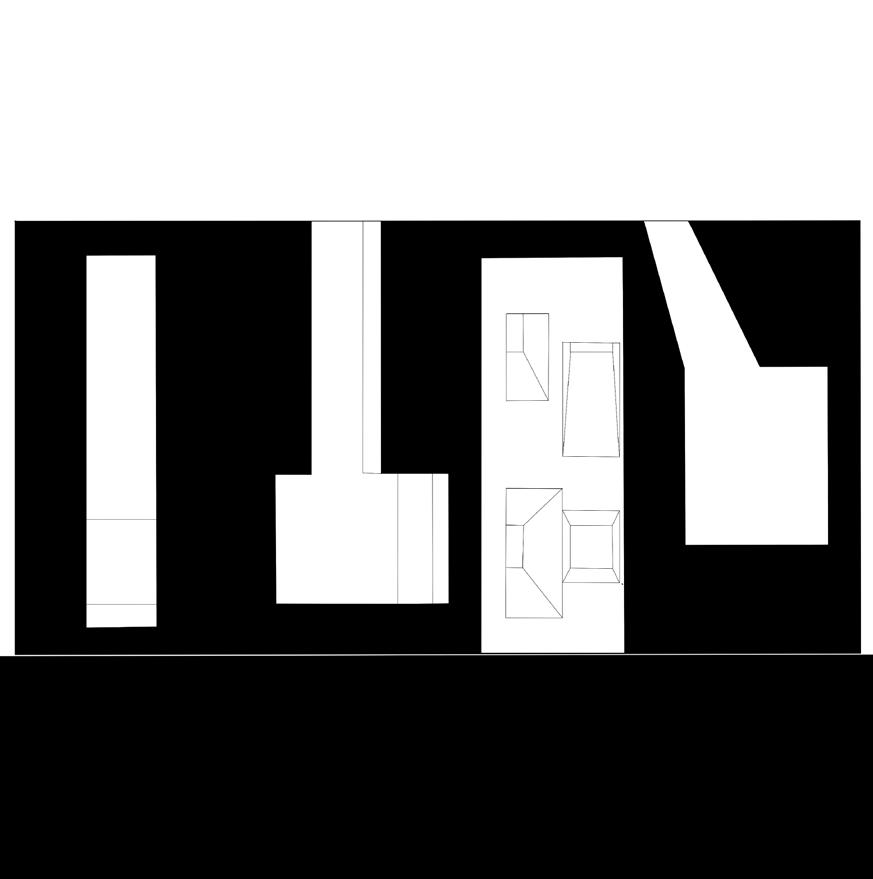
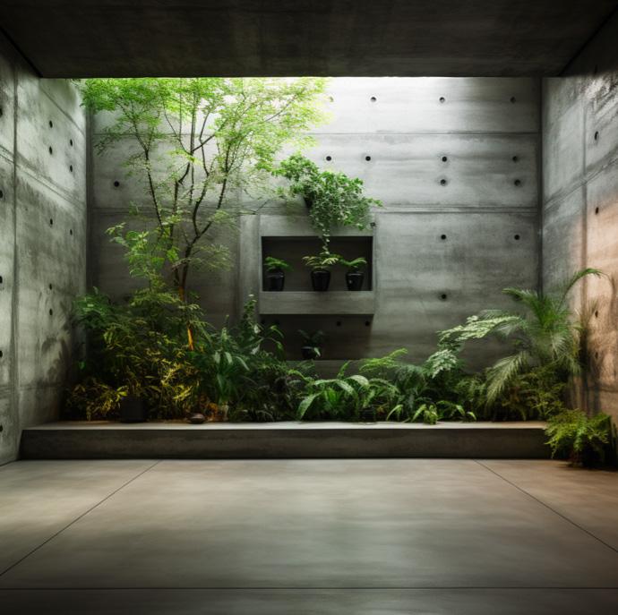
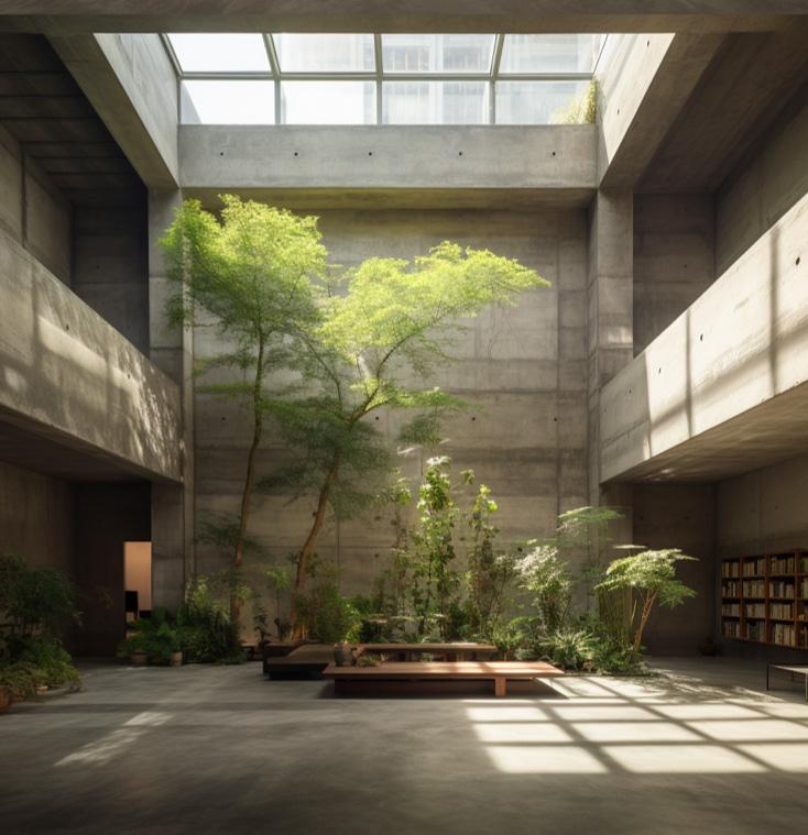
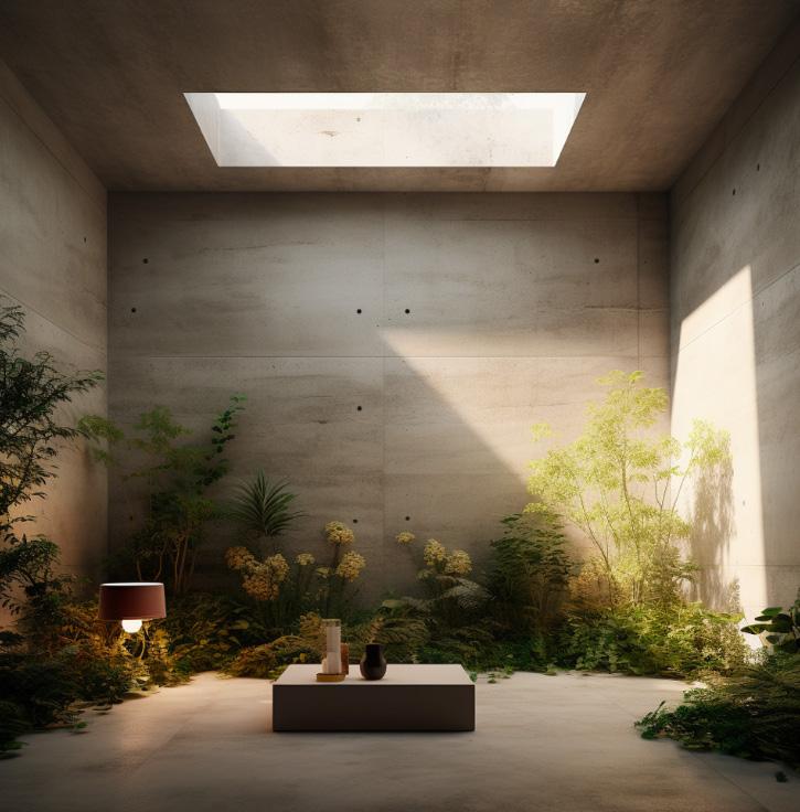
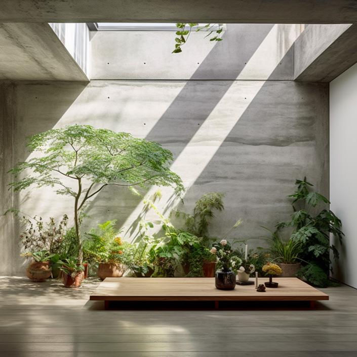
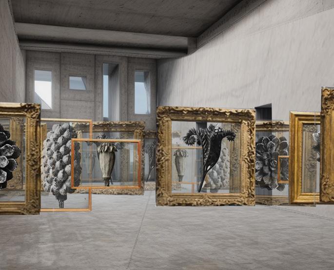
The insporation for the AI and massing were “interior of a concrete building, plant archival, dramatic lighting, designed by Carlo Scarpa, Louis Kahn, Alvar Aalto”. These images helped to visualize what a space to collect, display, and archvive plants would look like from the interior. The overall
massing of the building was inspired by the messing drawings from the castle, drawing insporation from the back and forth pattern seen in many of the messing drawings.

Audrey Barnhart
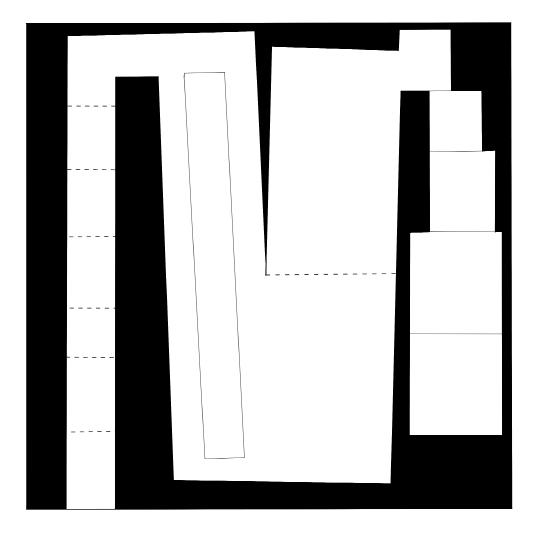
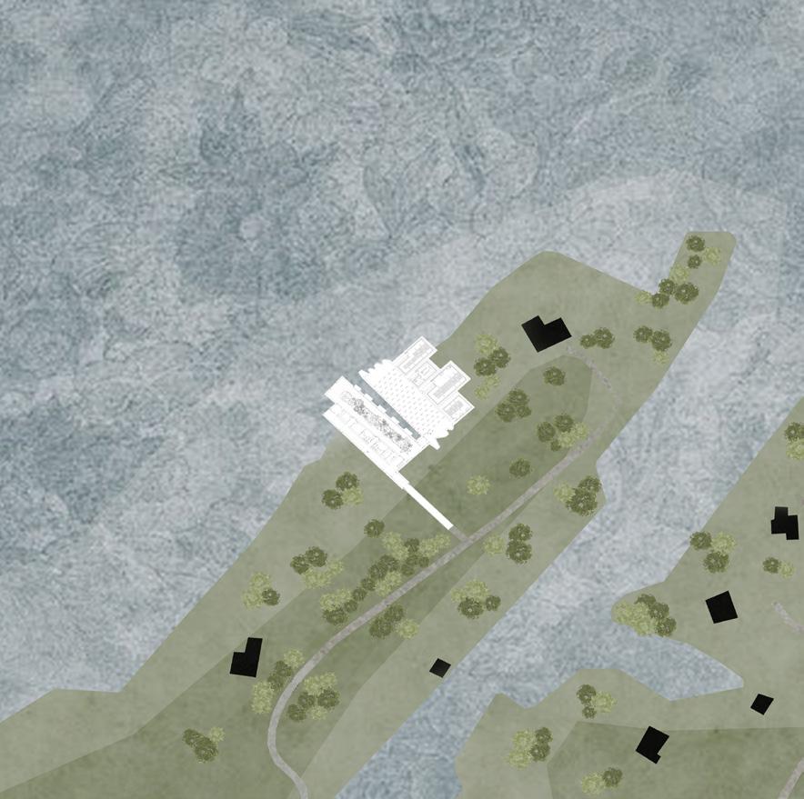
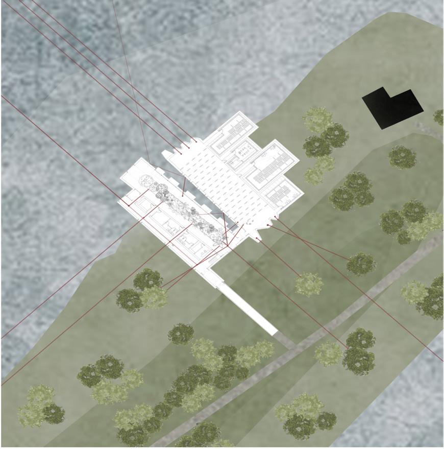
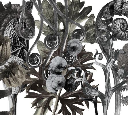
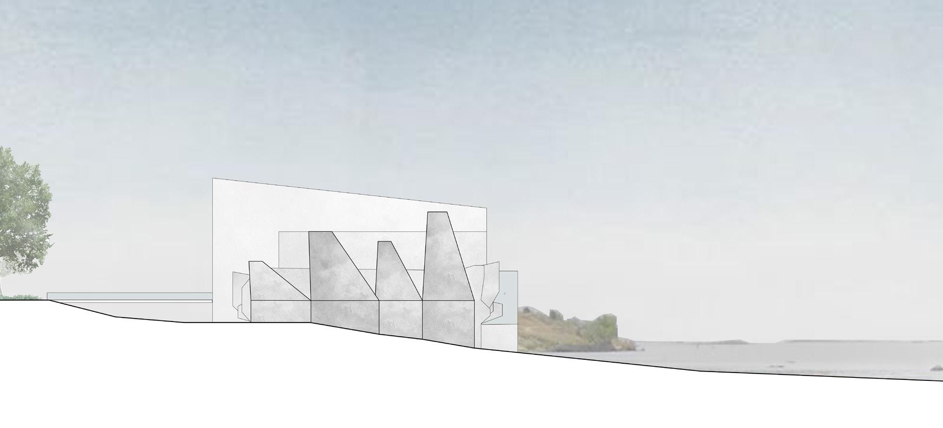
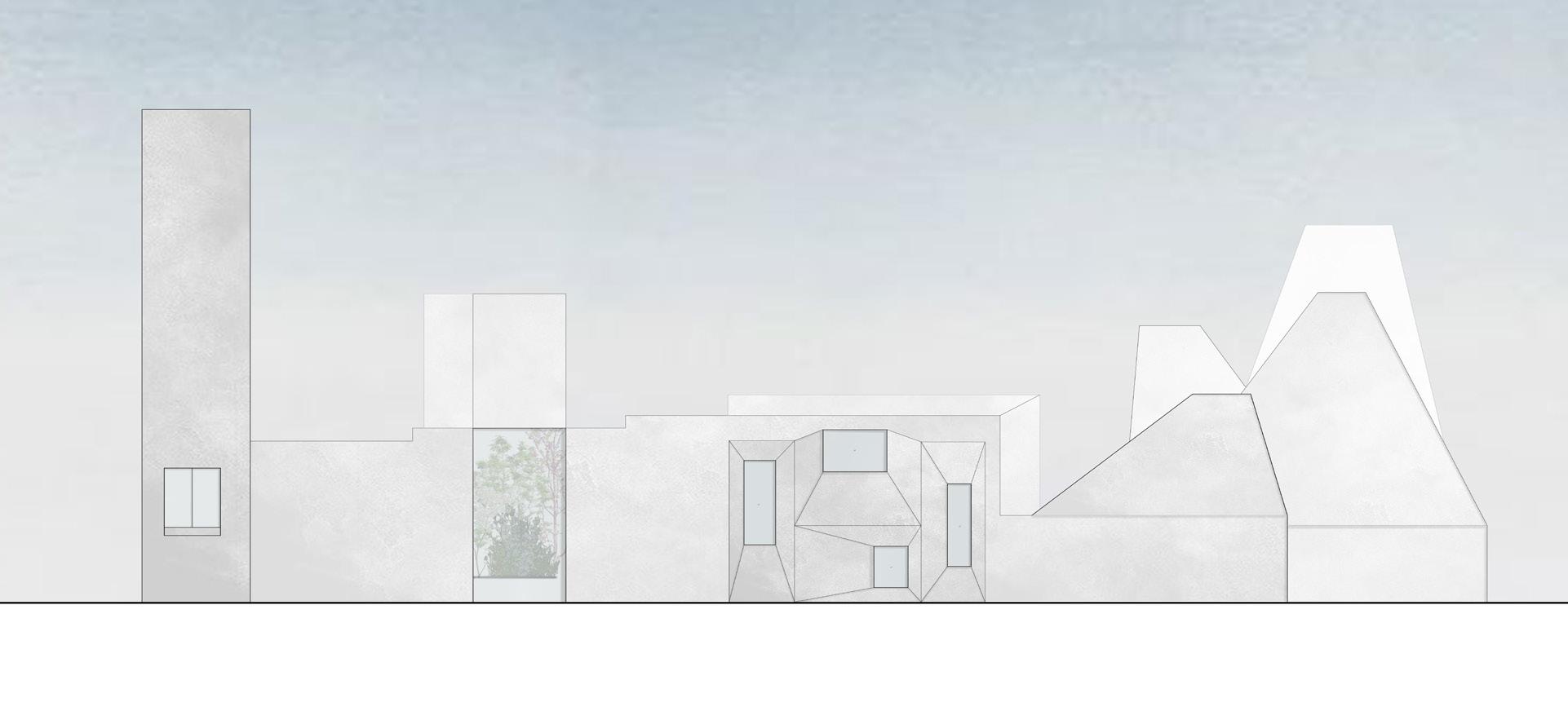
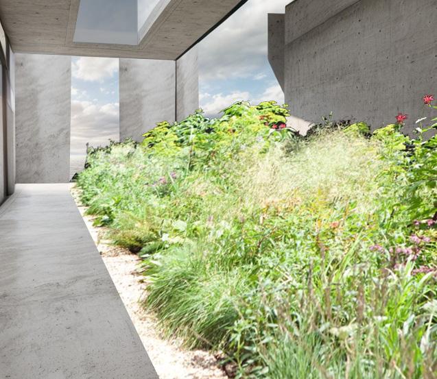
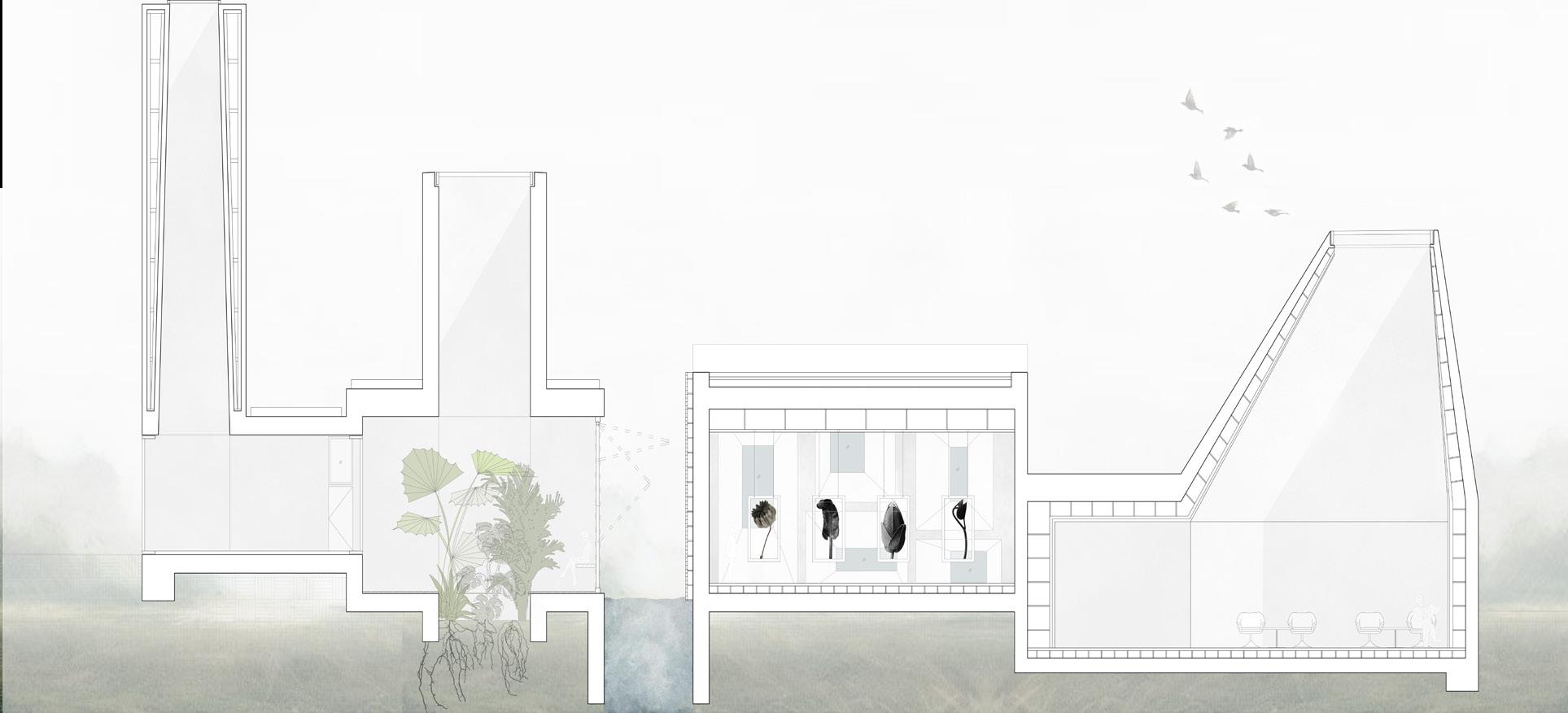
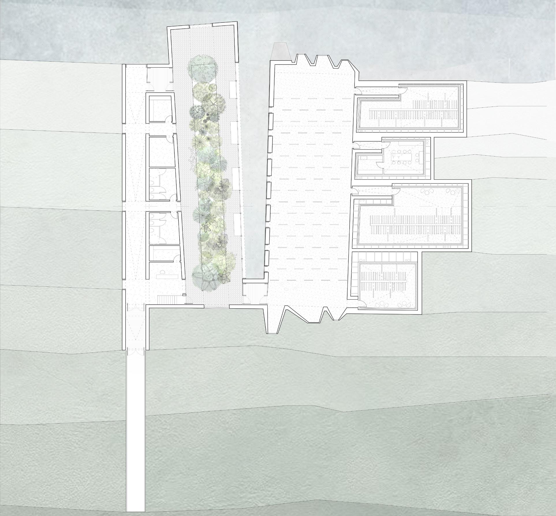
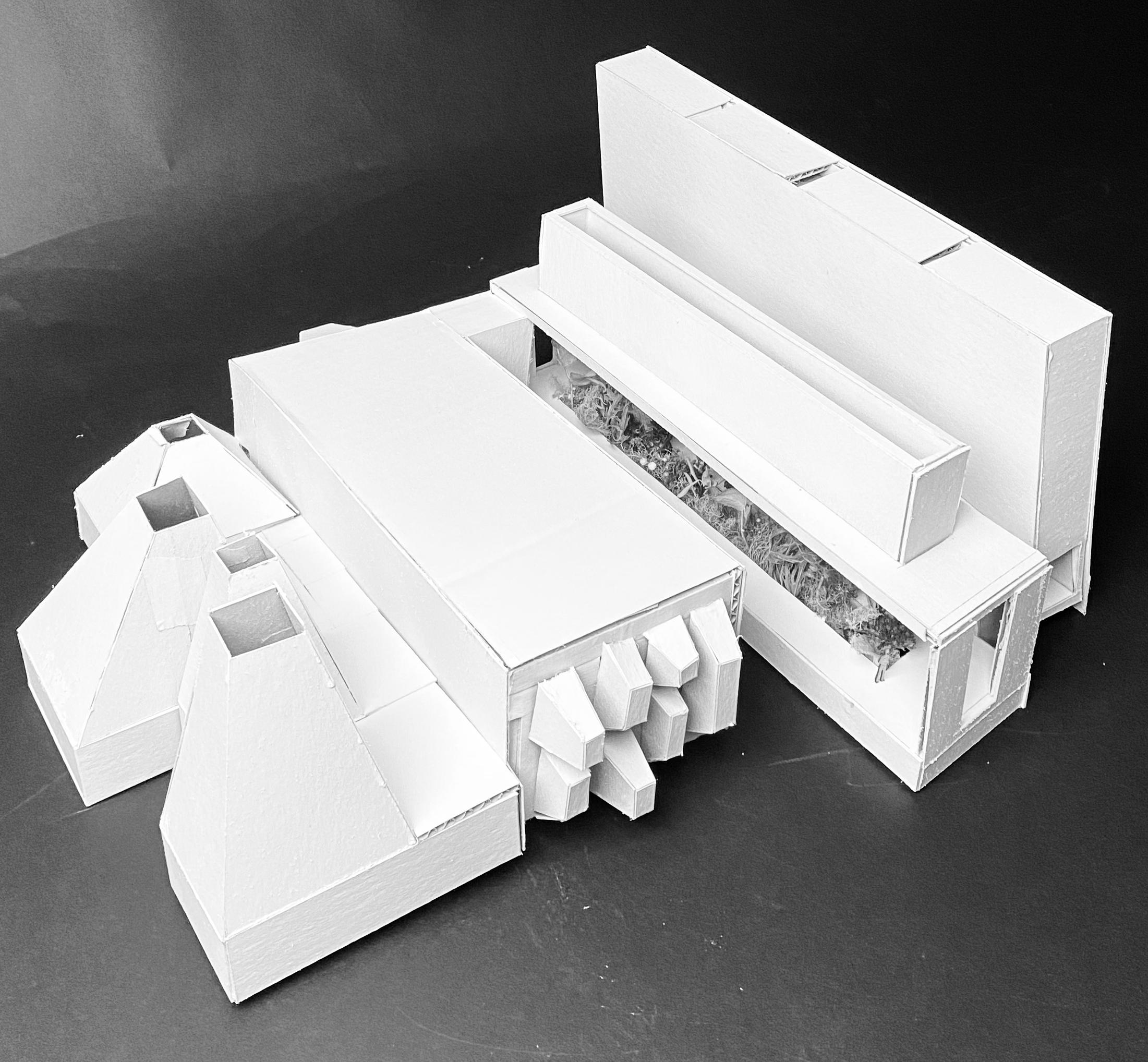
The final iteration draws insporation from the castle and begins the incorporate the photographs from Karl Blossfedlt. Moving through the building the interior of the building goes from organic to abstract, as one moves through the garden space into the exhibition hall where Blossfeldt’s prints are on display. the garden space displays the natural state of the plants he photographed. Specific views are framed throughout the project. In the entrance hall as each platform is reaching, the building opens up to the sky, the water, nature, and the garden space, bringing
the viewer back to nature as they begin to move through the building. The walls within the garden space reflect the dimensions of the garden itself. The telescoping apperatures in the exhibition space, frame specific views outside of the building, to bring the viewer back to nature. The fourth space that houses the photogrophy development space and storage for the prints, opens to the sky allowing for intereacting moments of light.

Fall 2023 | Arch.515.01 Grad Arch Design Studio | Preserves, Libraries
Instructor Rubén Alcolea
Noah Ellingwood
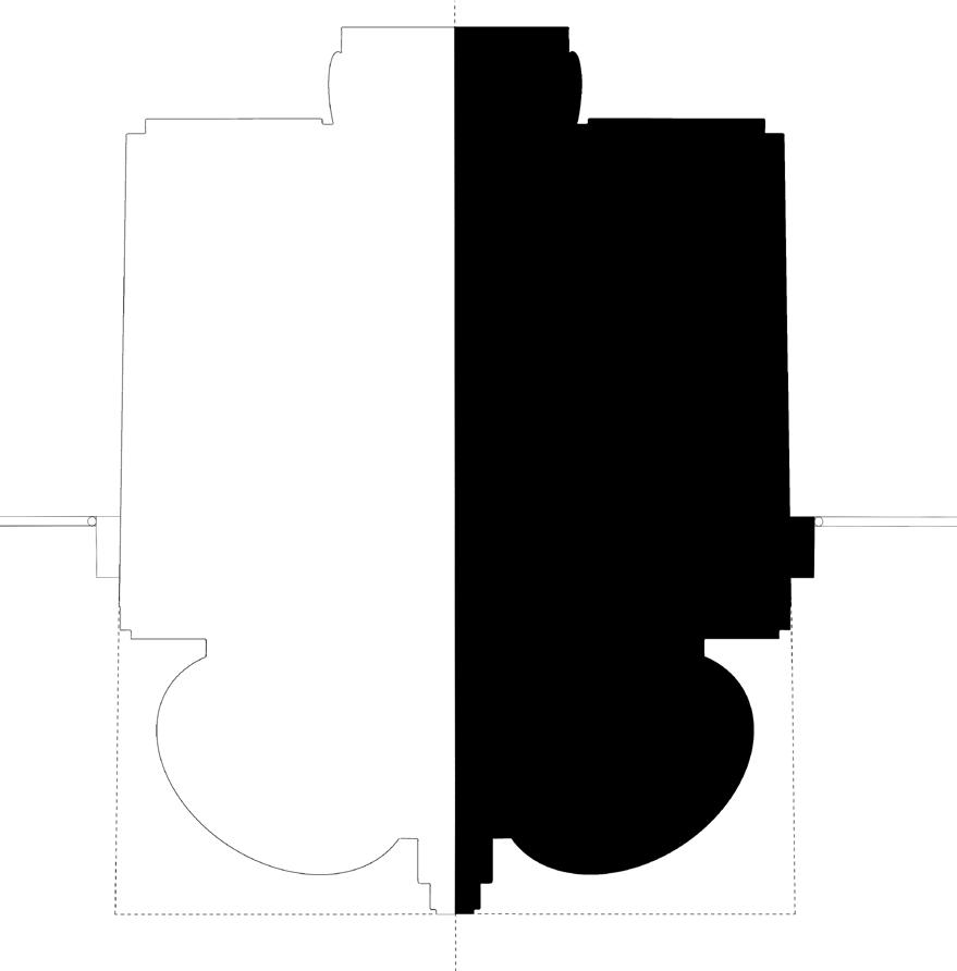
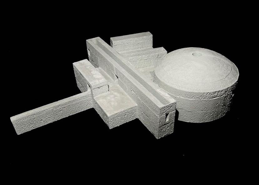
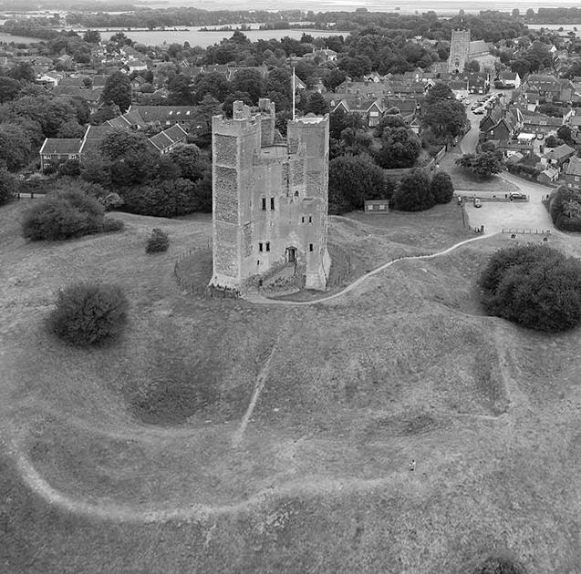
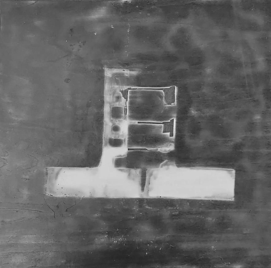
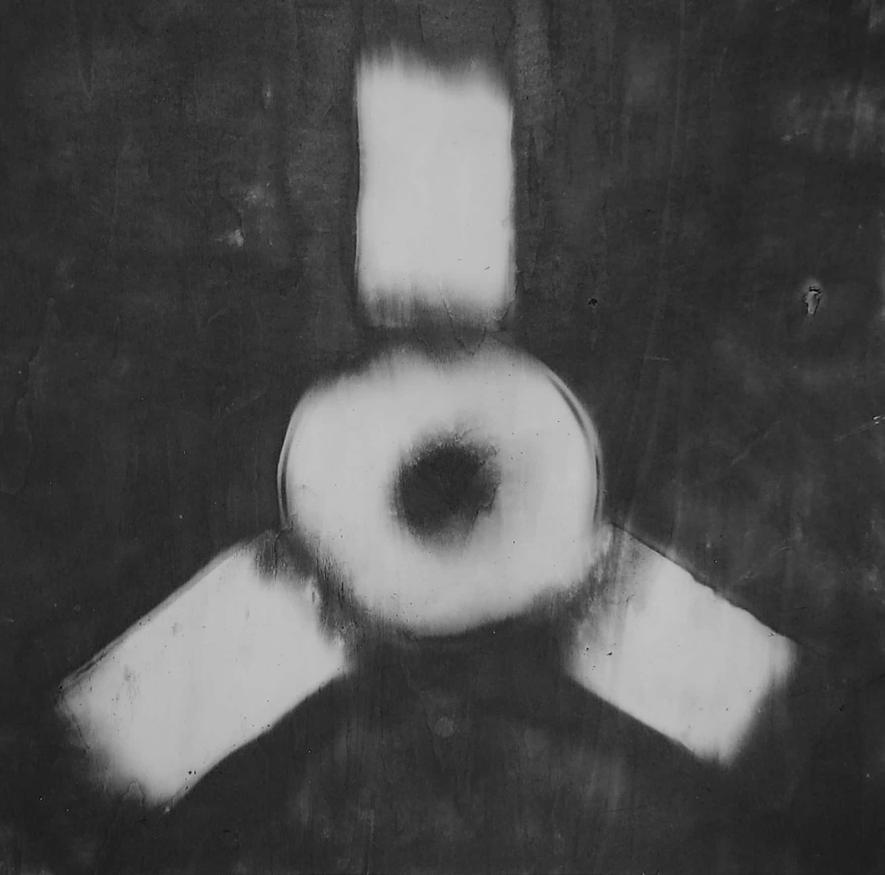
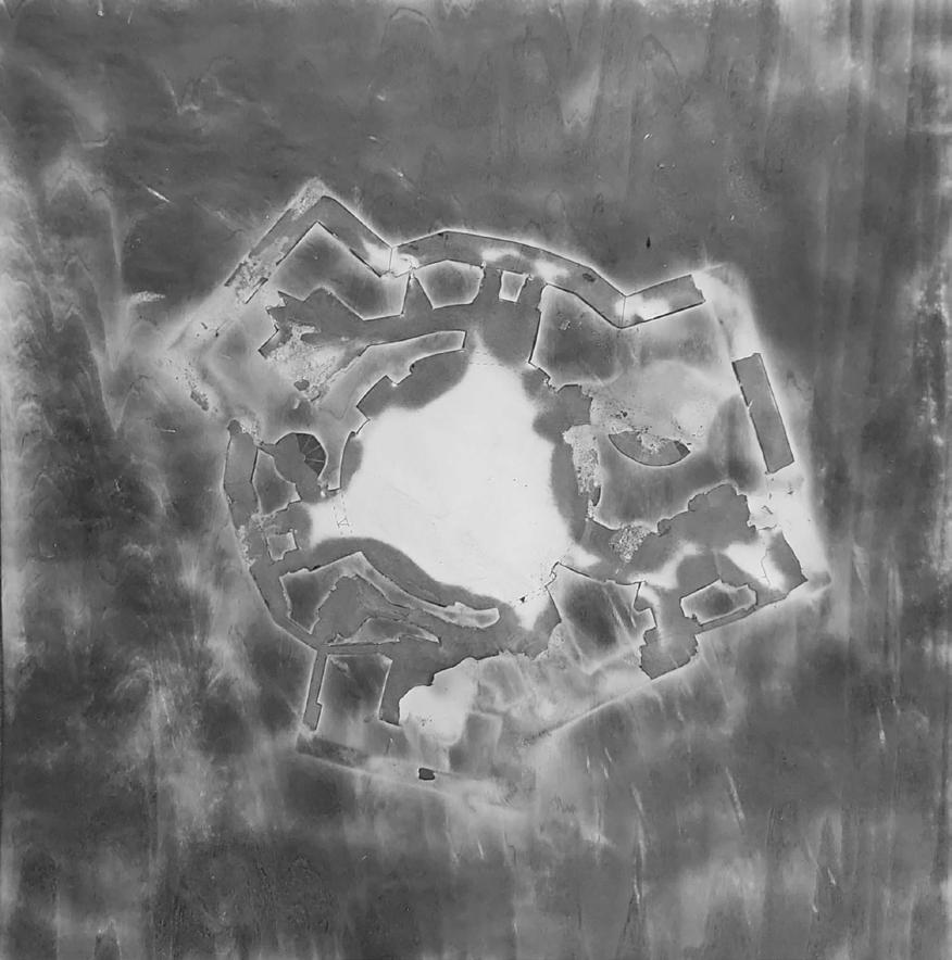
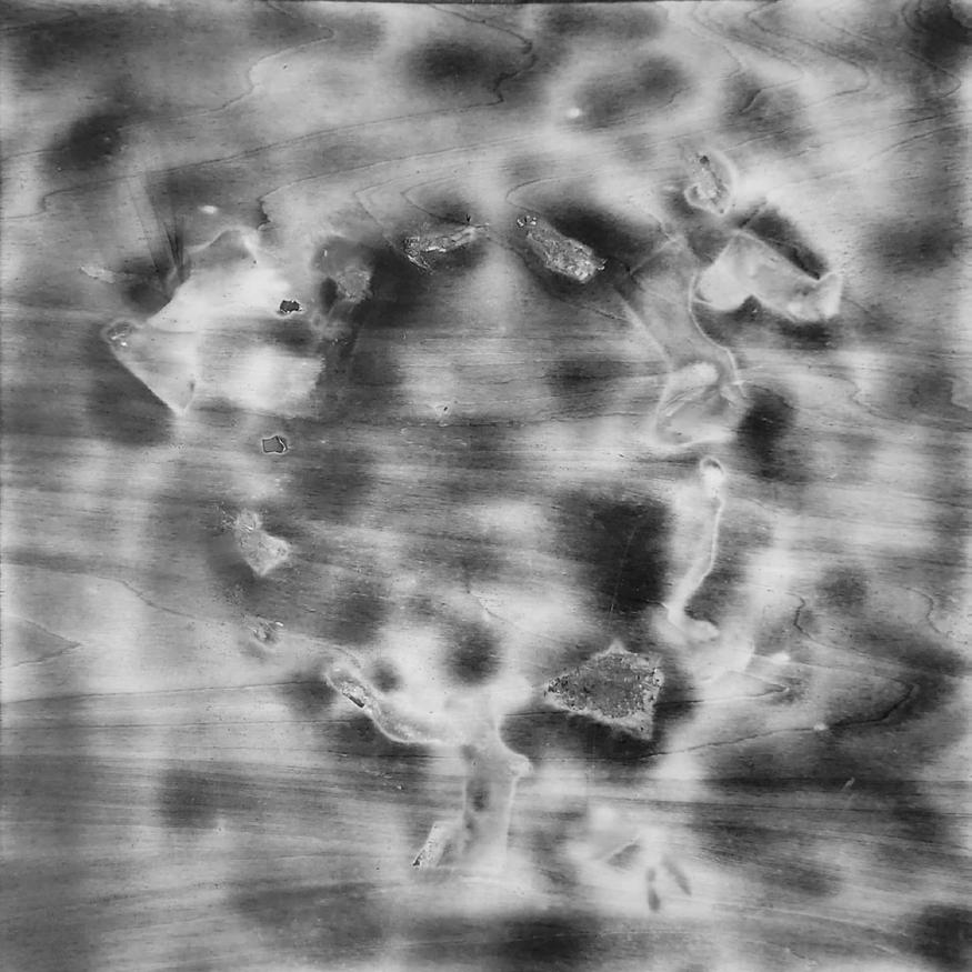
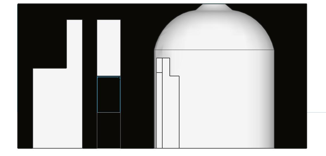
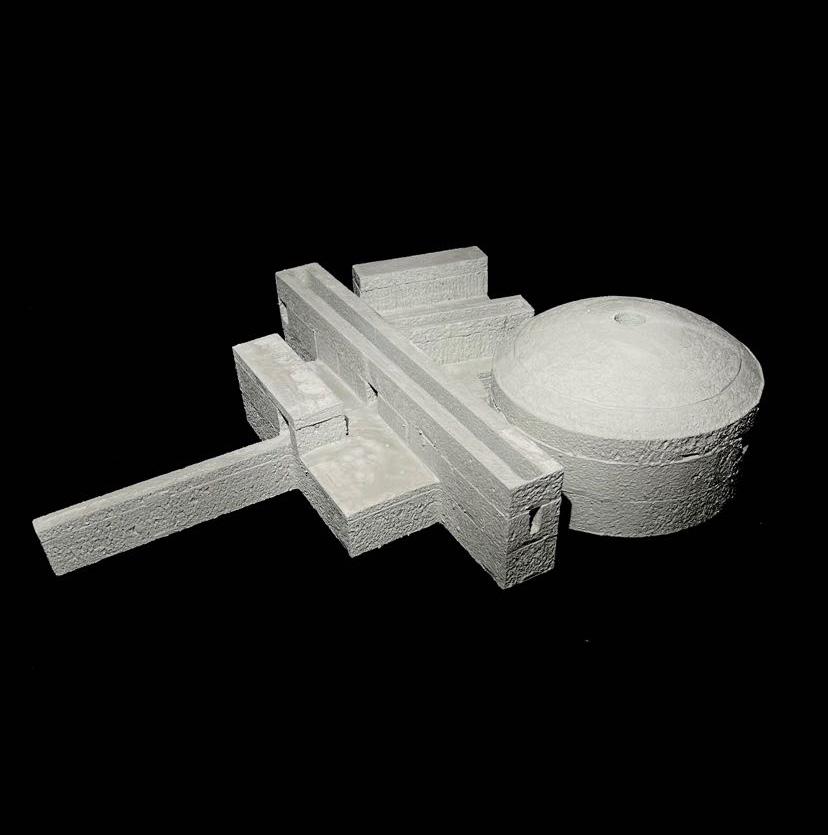
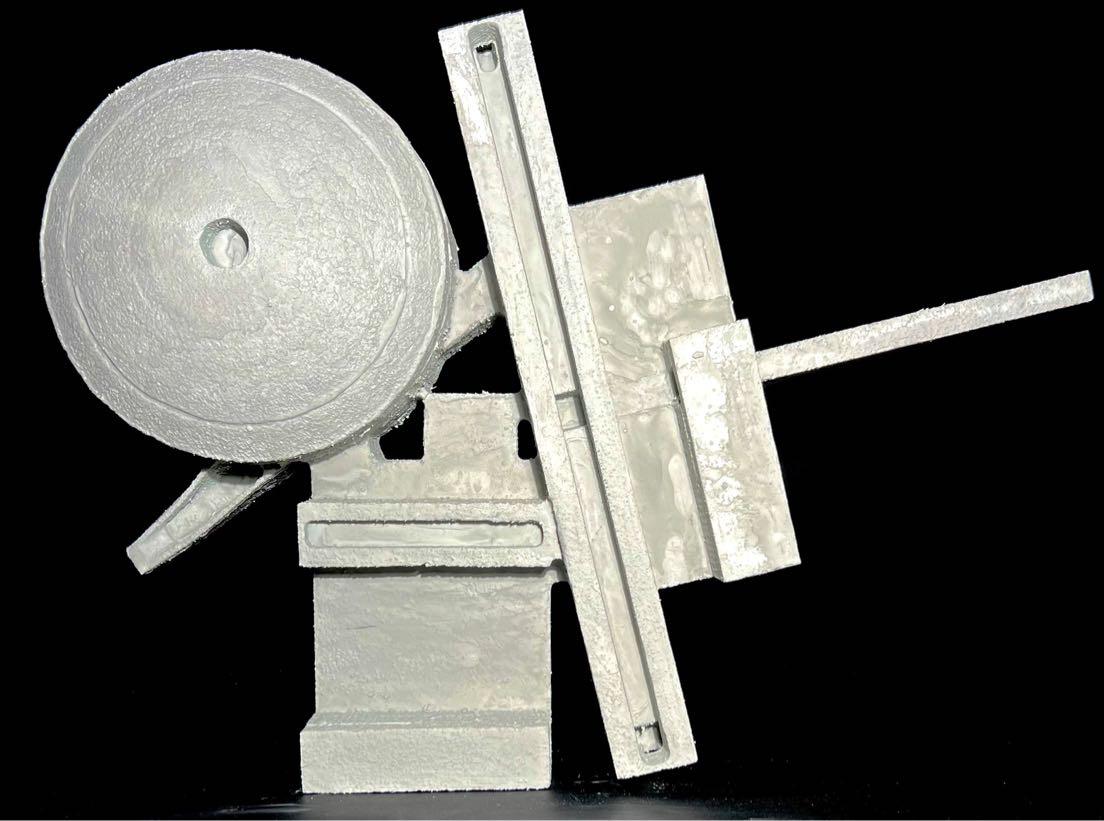
Orford Castle, commissioned by King Henry II in 1173, was designed in the Byzantine style. The castle is heavily built with a labyrinth of interconnected rooms. The large circle in the center proposes the rest of the massing, marking it as important. This also corresponds with the idea that the exterior does not show nor hint to what is happening inside.
The goal at looking at the castles is to learn about the ideas of preservation, protection and massing. We used the information gathered to inform our understanding of what it means to preserve. We used these ideas to inform the first iterations of our libraries.
Noah Ellingwood
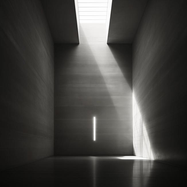
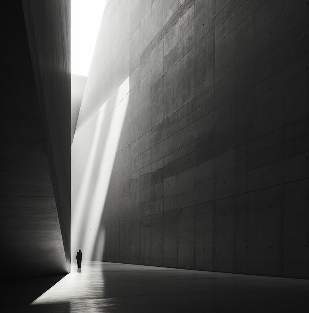
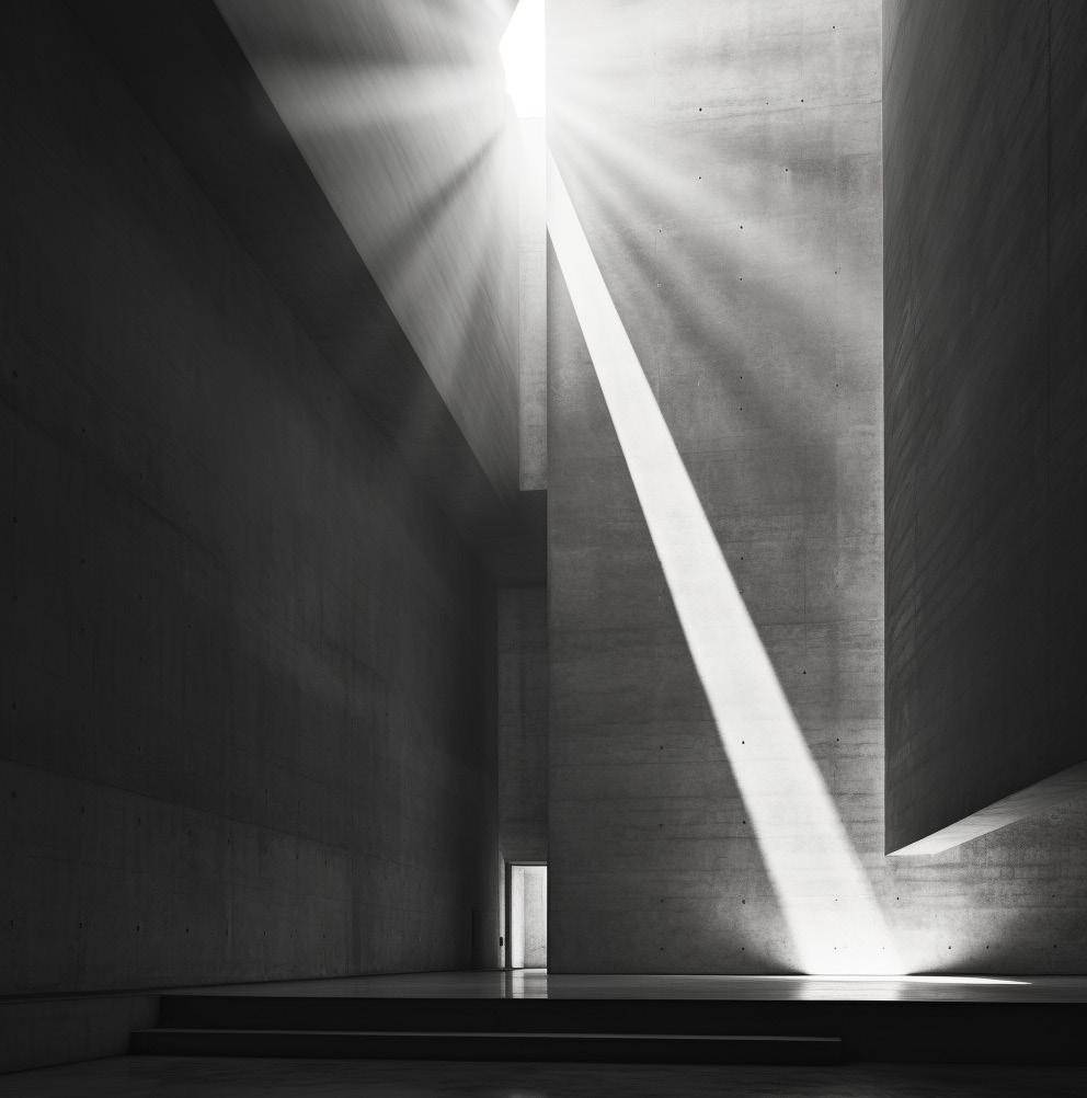
From the beginning, I wanted to convey the ideas of heavy monolithic architecture through the use of heavy massing of thick walls and ceilings. I wanted users to have unique and dramatic encounters with light. The goal of my AI images was to elicit the feelings of intrigue relating to the
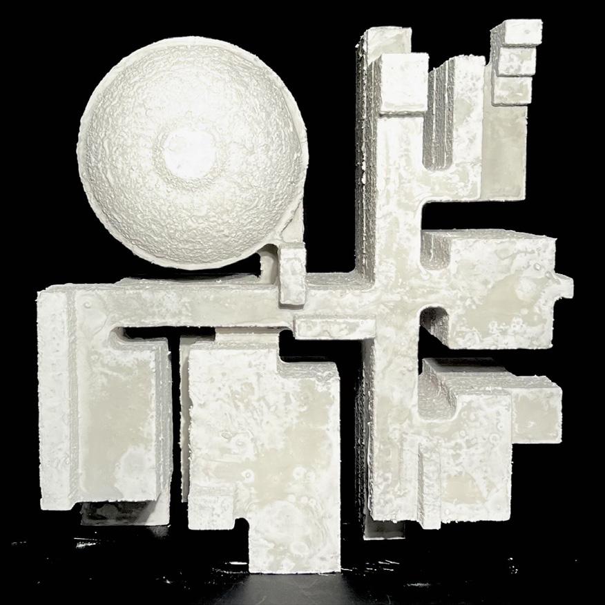
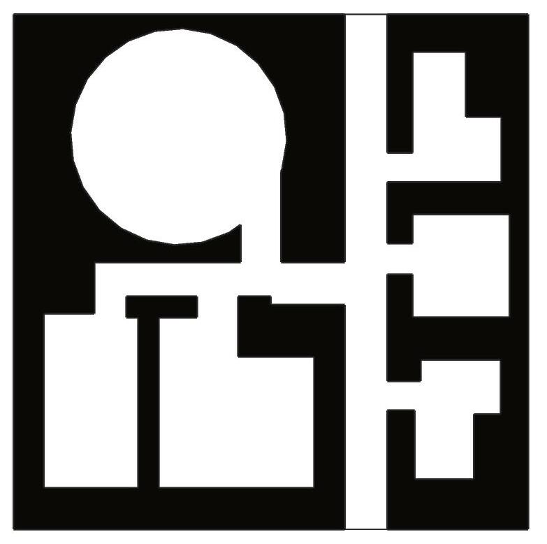
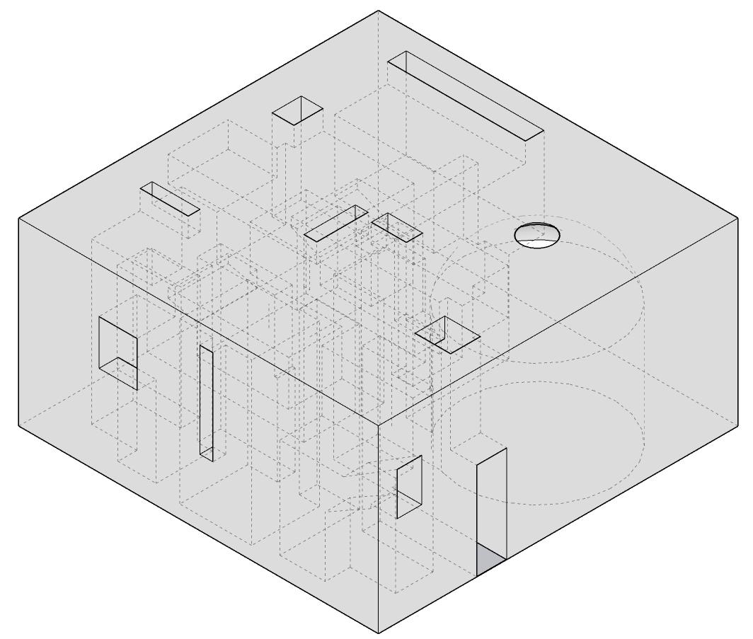
idea of having to enter and explore the space in order to understand it. From these AI images and abstract model we applied these ideas to a site of our choosing within Alexandria, NY, to create our interpretation of a library.
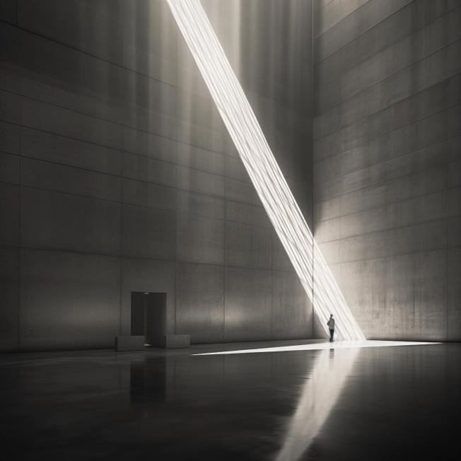
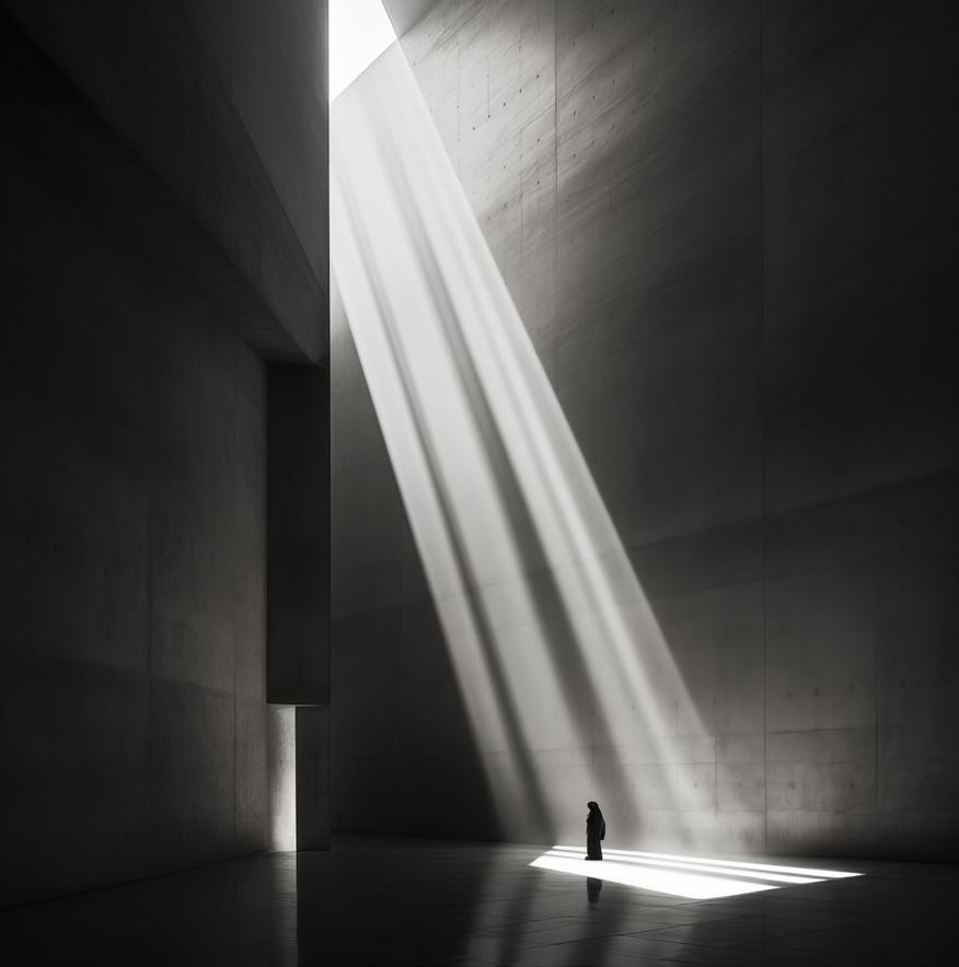
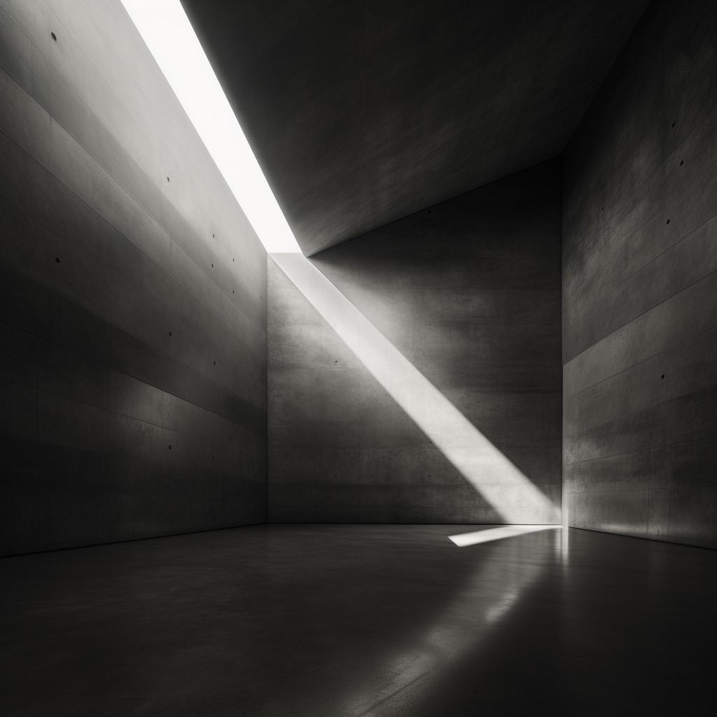
Noah Ellingwood
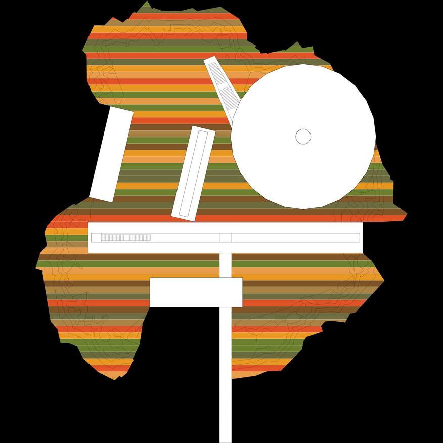
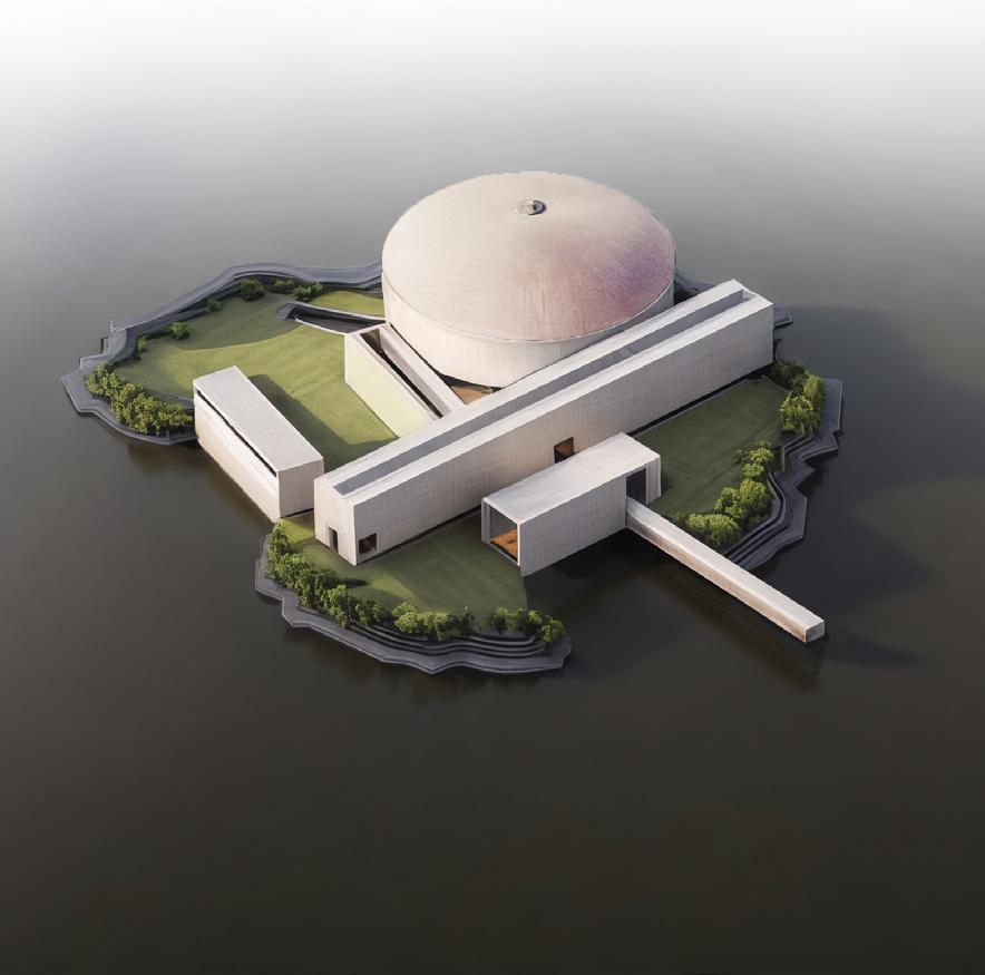
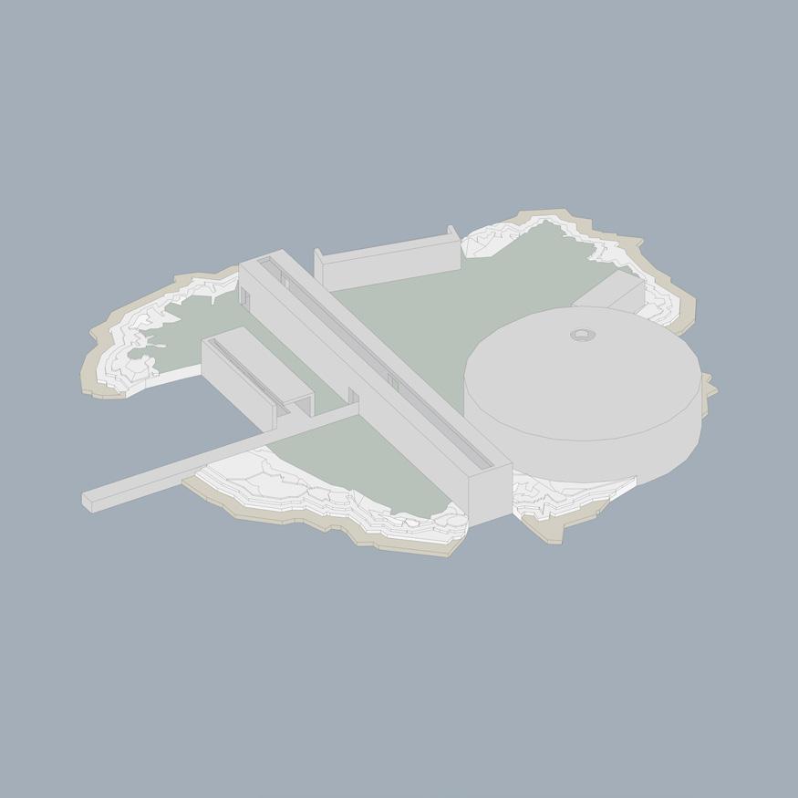
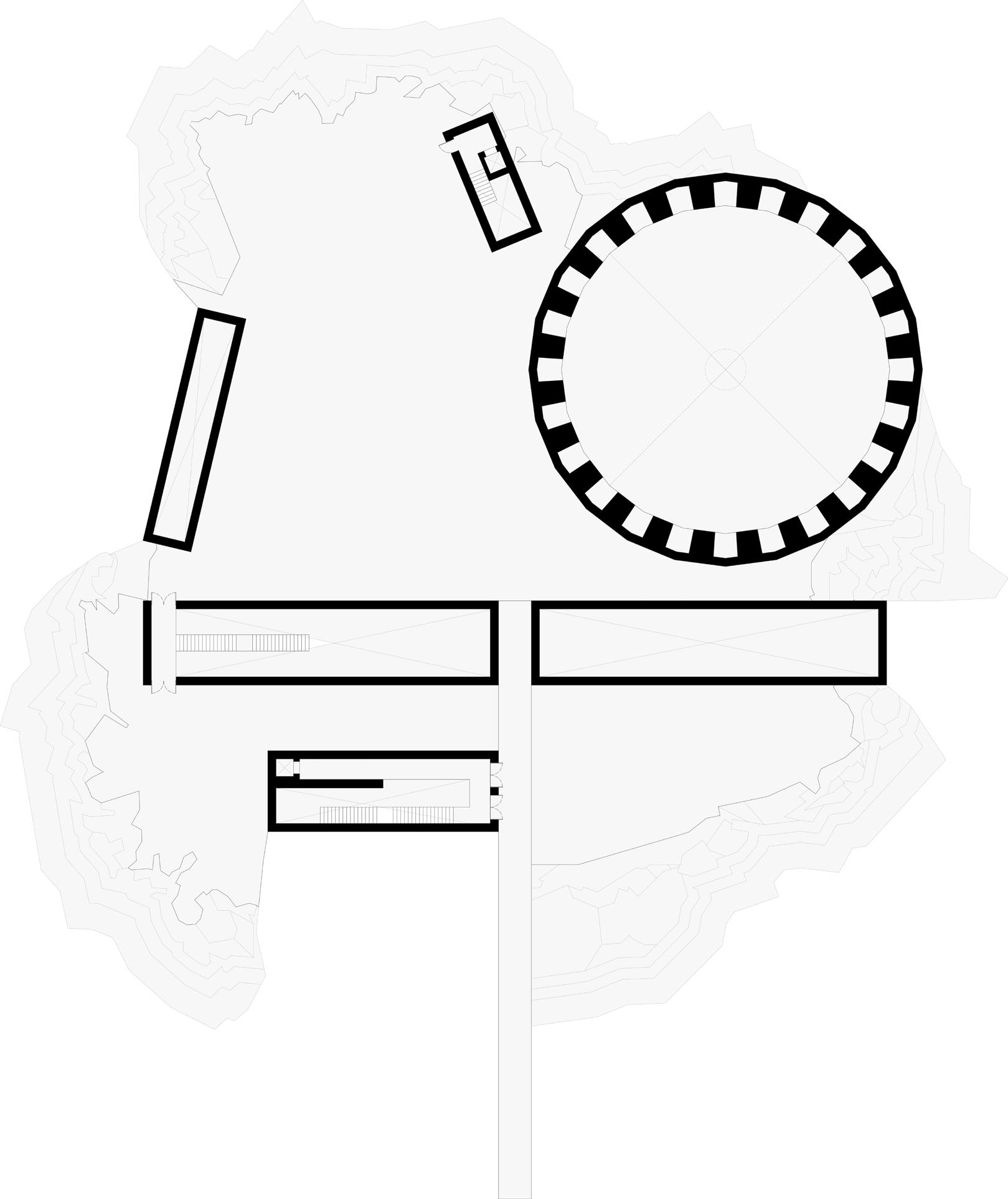
Whiskey Island, is a small remote island within Alexandria, NY. It is the location of my library.
Alexandria, NY was selected to create an intentional reference to the great ancient Library of Alexandria, Egypt. This insinuation demands that our libraries are just as great. This original locational play on words is what further inspired me to go a level deeper and reach for yet another play on words. Thus, Whiskey Island was created for the library of whiskey and spirits.
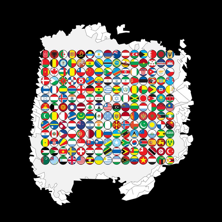
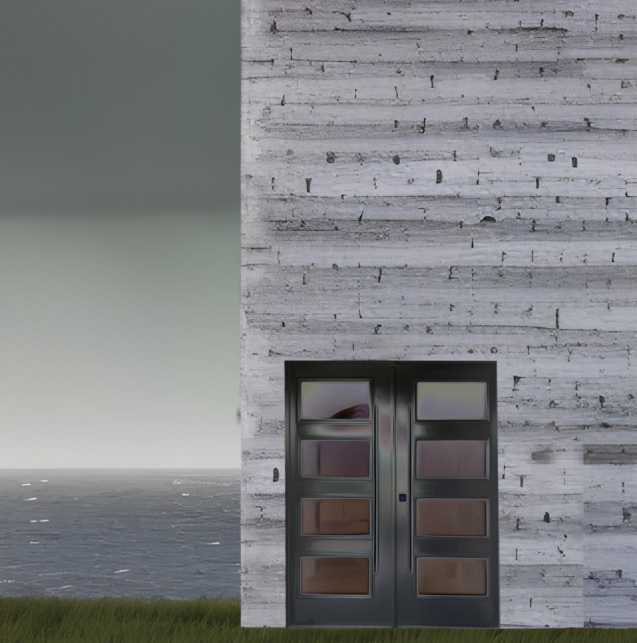
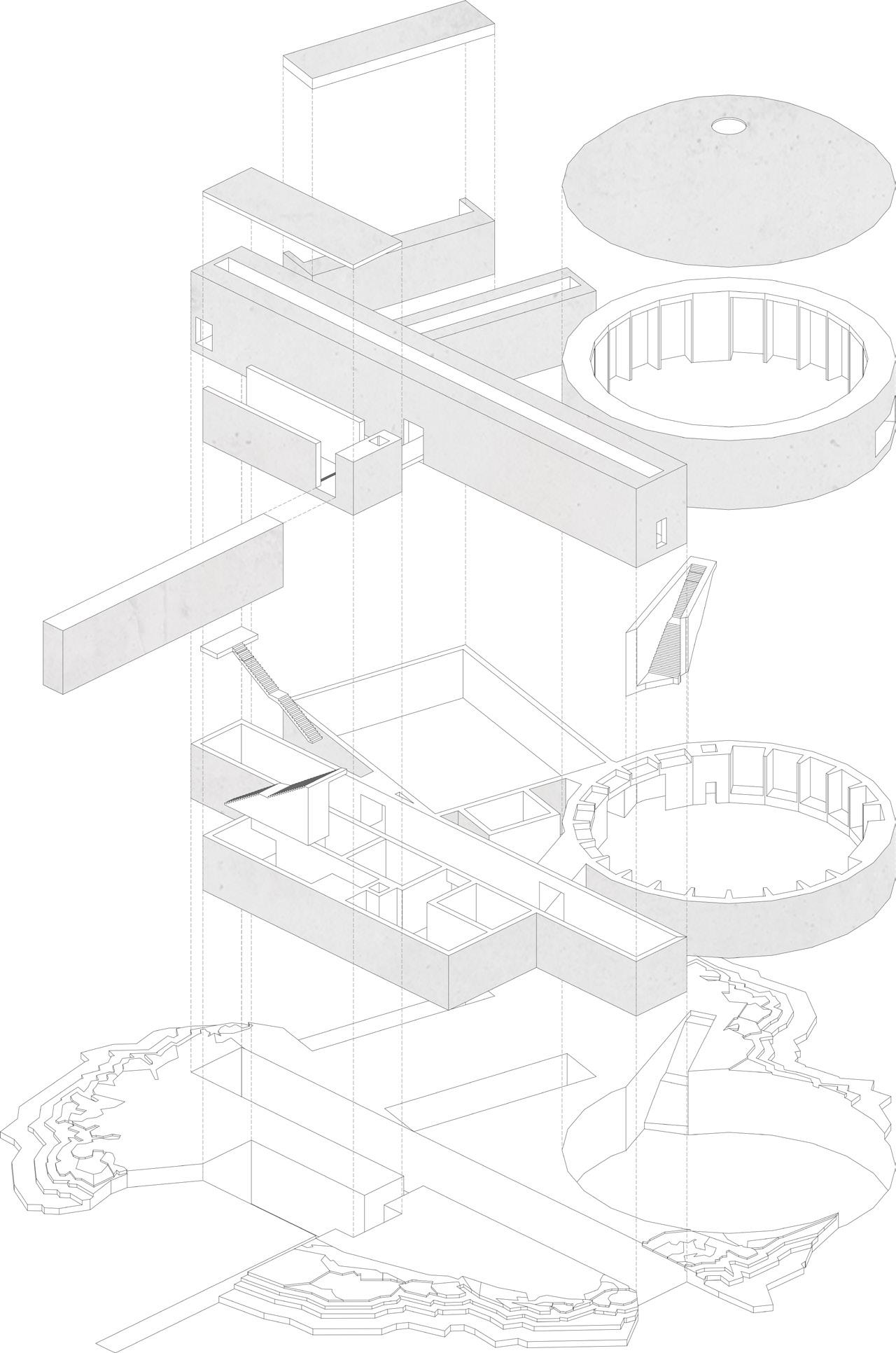
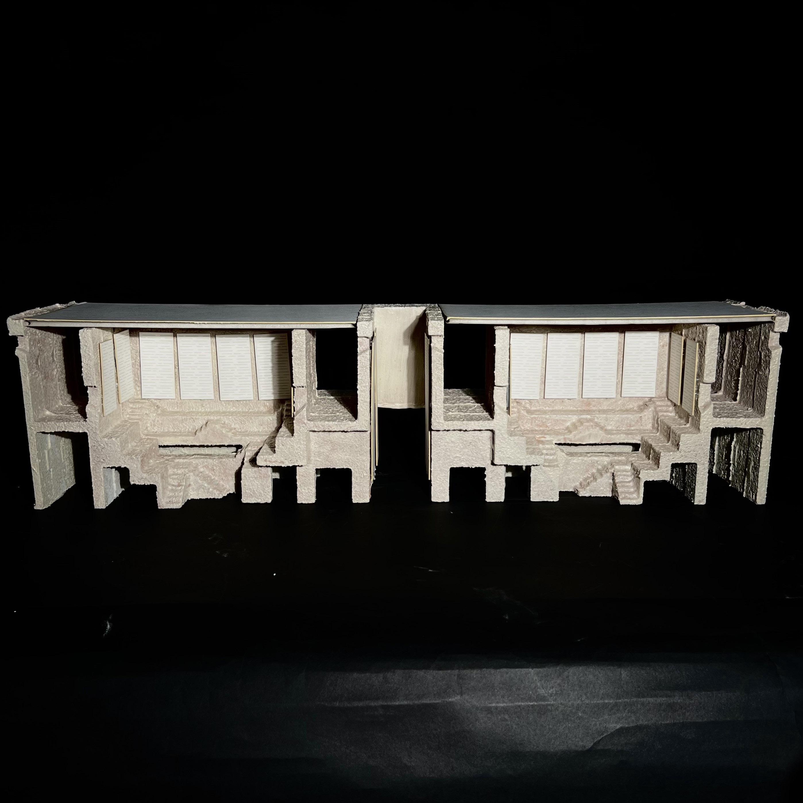
The title of the library project is “Spirits of the World”. It is a gathering place for people to experience different cultures and heritage as the library is a collection of each countries most prized spirits. All are prominently displayed within the rotunda.
Within the building there is also a typical library for the storage of books containing the history and recipes of alcohols. The history goes back ten thousand years or more. There is also a kitchen as frequently when individuals have a drink they often have a meal and this affords that full experience. This also creates moments of connection to each cultures ethnic cuisine.
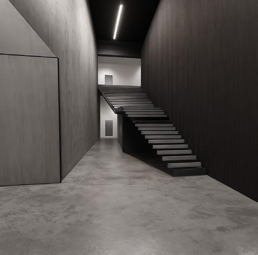
The building itself is monolithic in nature retaining the idea of heavy construction. There is myriad of intentional dramatic light encounters that patrons will experience. The rooms are all interconnected. The idea that the interior is not discernible by looking from the exterior is carefully planned, so as the experience of the space requires the user to explore inward.




Fall 2023 | Arch.515.01 Grad Arch Design Studio | Preserves, Libraries
Instructor Rubén Alcolea
Cummings School of Architecture
Mauricio Hector Escalante Valencia
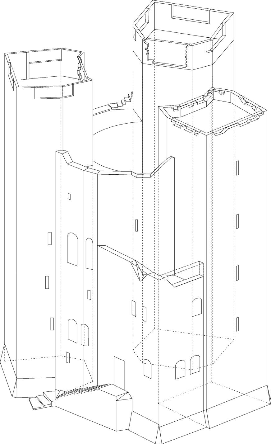
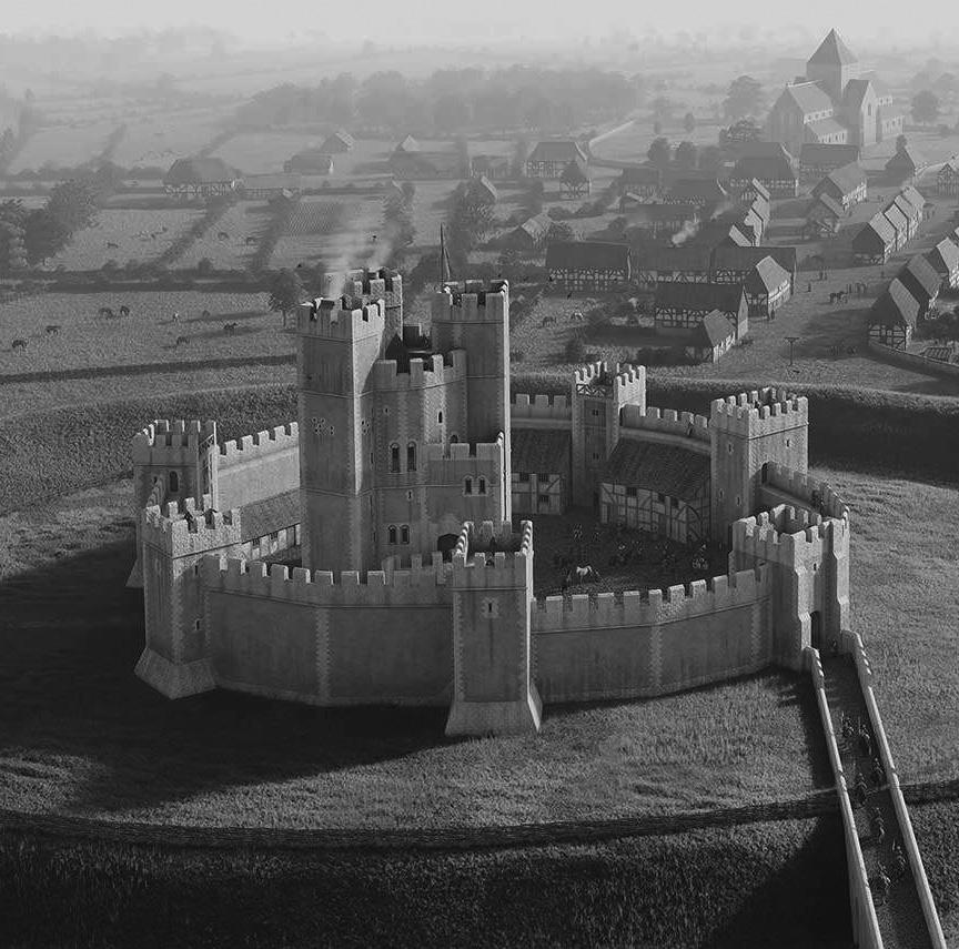
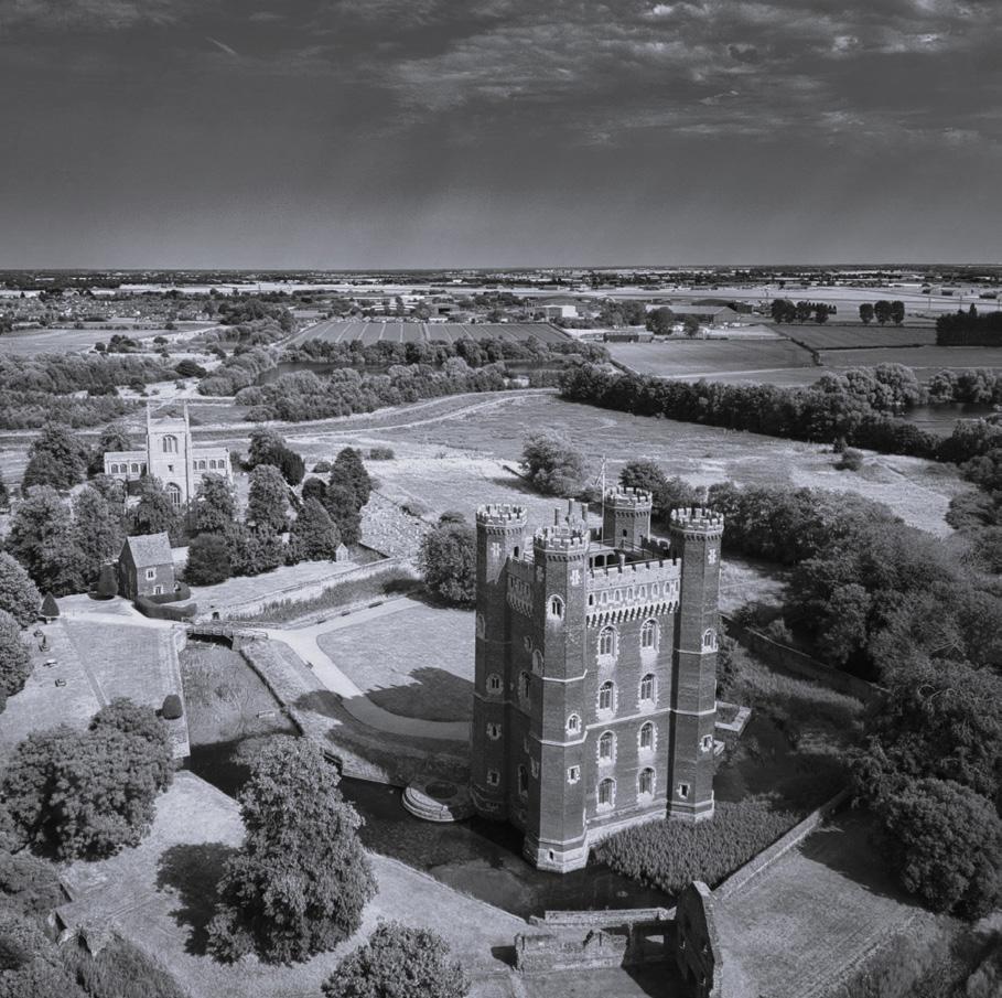
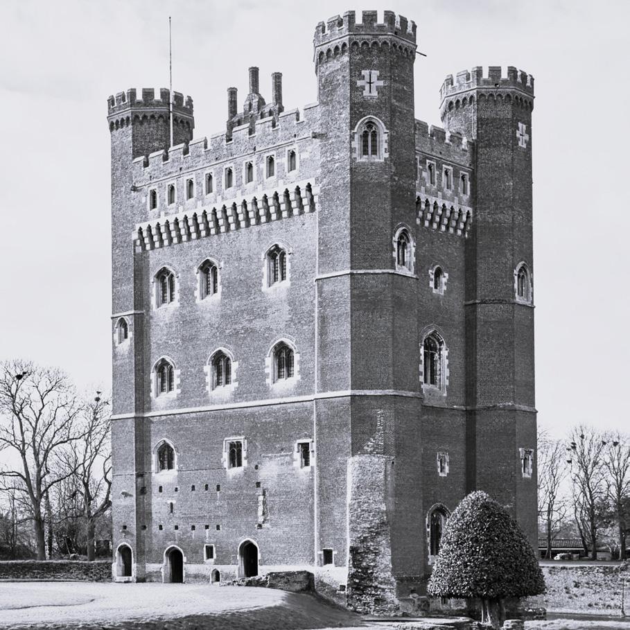
Tattershall Castle, commissioned by Robert Tattershall for King Henry III in 1231, stands as an enduring testament to medieval architecture, seamlessly intertwining history and grandeur. The crenelated manor house, a masterful creation of its time, proudly displayed its stone façade, housing a great hall, kitchens, gatehouse, and a chapel within its walls. This architectural symphony is fortified by a curtain wall and a moat, creating a picturesque embodiment of medieval splendor.
The great tower, a later addition by Lord Ralph Cromwell, serves as a distinctive emblem of wealth and power. Noteworthy for its departure from convention, the tower is predominantly constructed with an abundance of brick, defying the prevalent use of stone during that era. Beyond its material uniqueness, the tower becomes a tangible manifestation of Cromwell’s architectural vision, contributing to the castle’s enduring legacy.
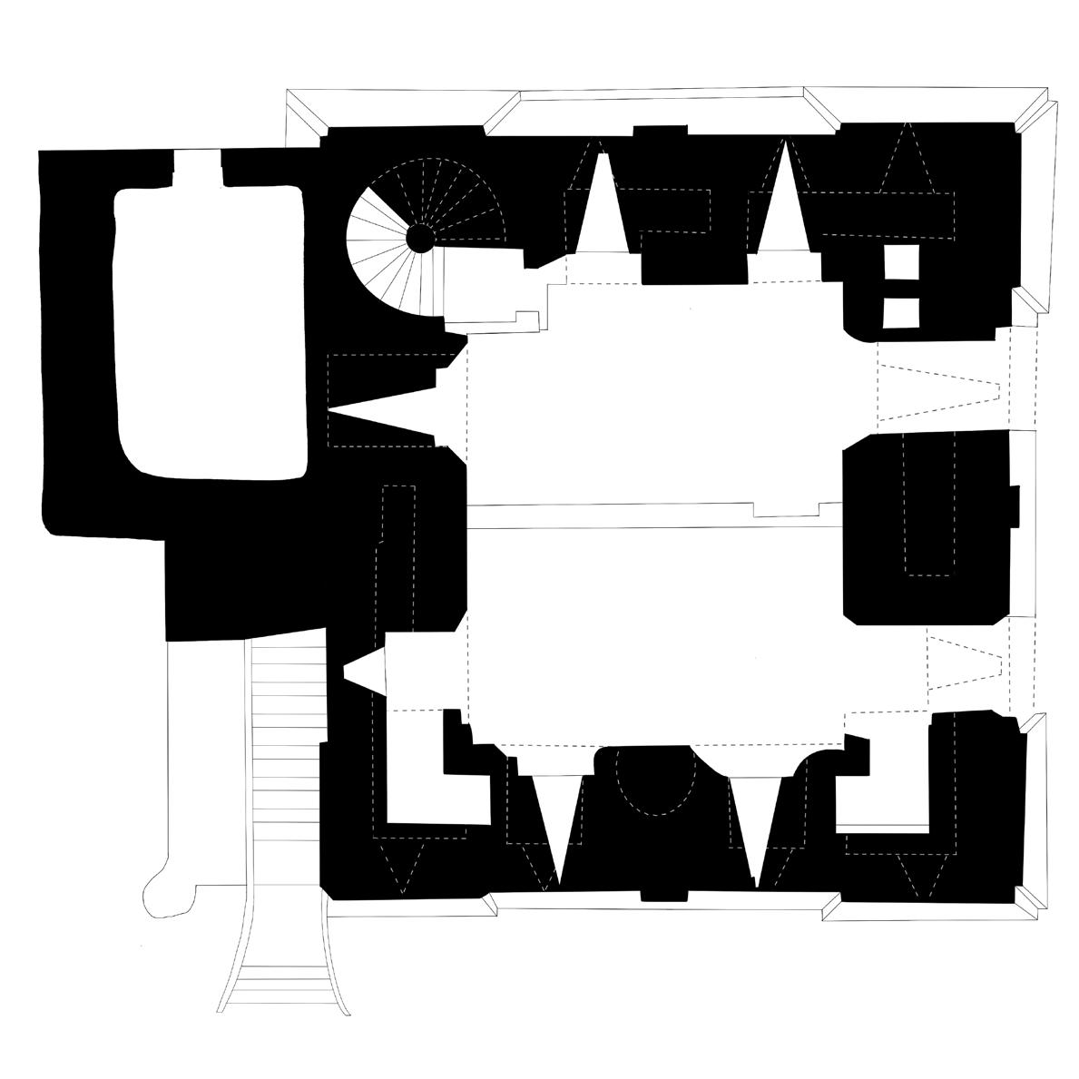
Approaching Tattershall Castle as a precedent study reveals a multifaceted fortress, a bastion seemingly impervious to external threats. The dual moats, strategically encircling the castle, enhance its defensive capabilities while providing a sense of isolation within the natural landscape. Delving into the architectural intricacies, the fortress showcases a harmonious synthesis of traditional stone masonry and innovative brick construction. The meticulously designed curtain wall reinforces the fortress’s defensive strategy.
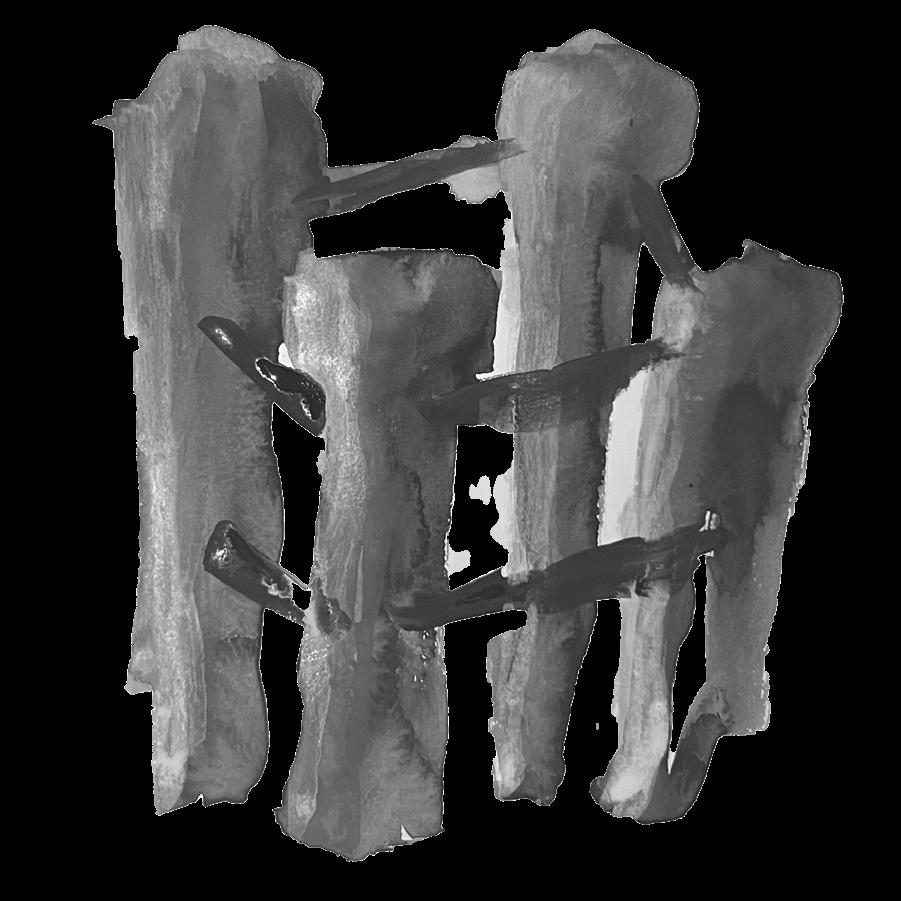
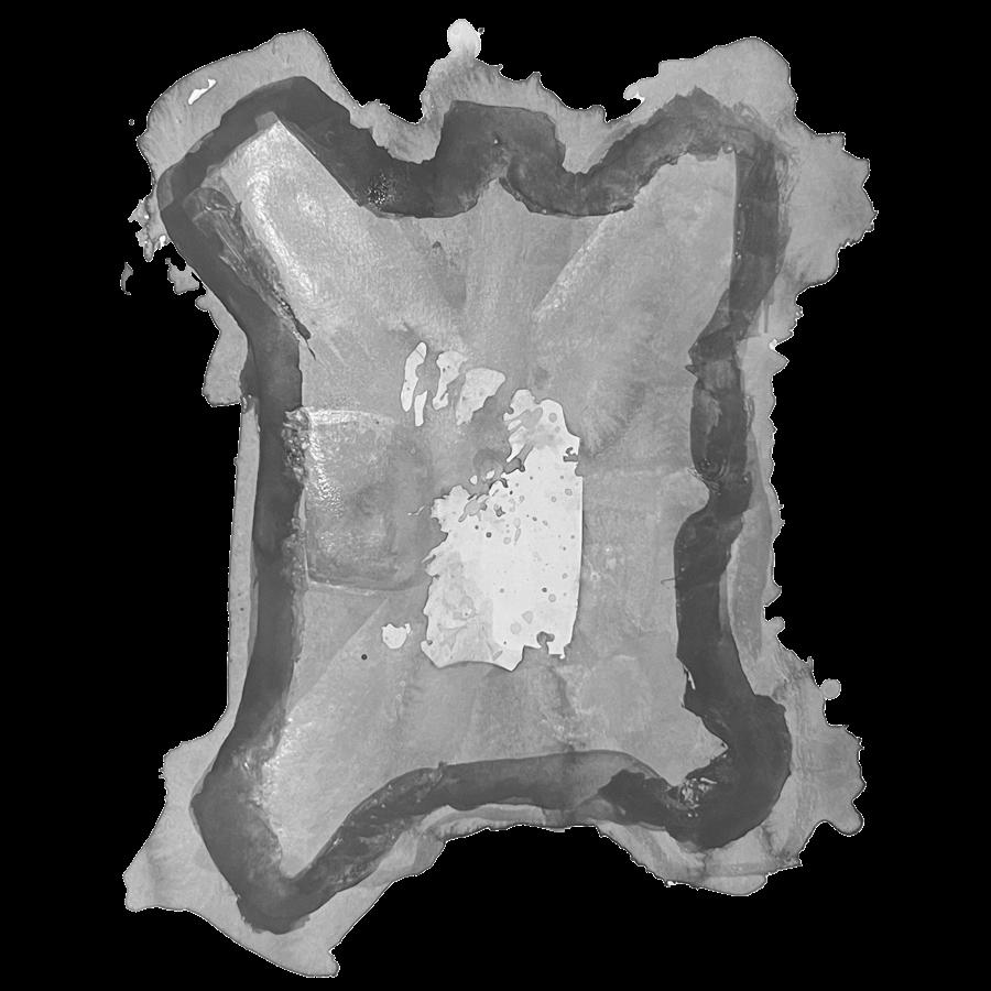
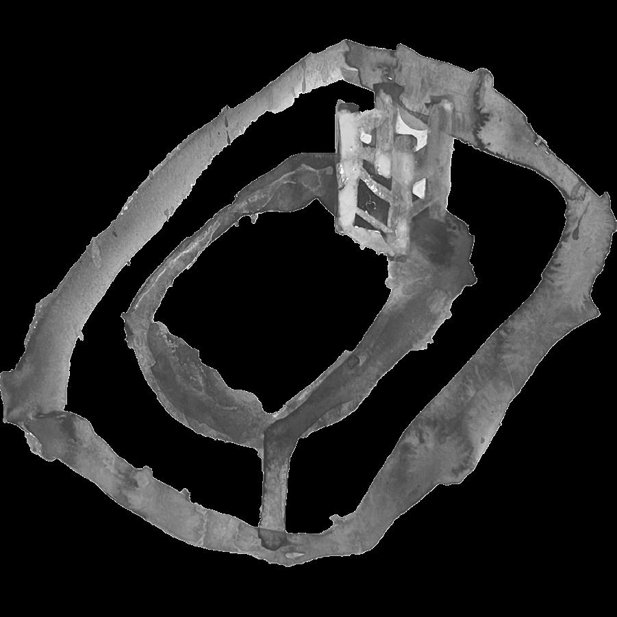
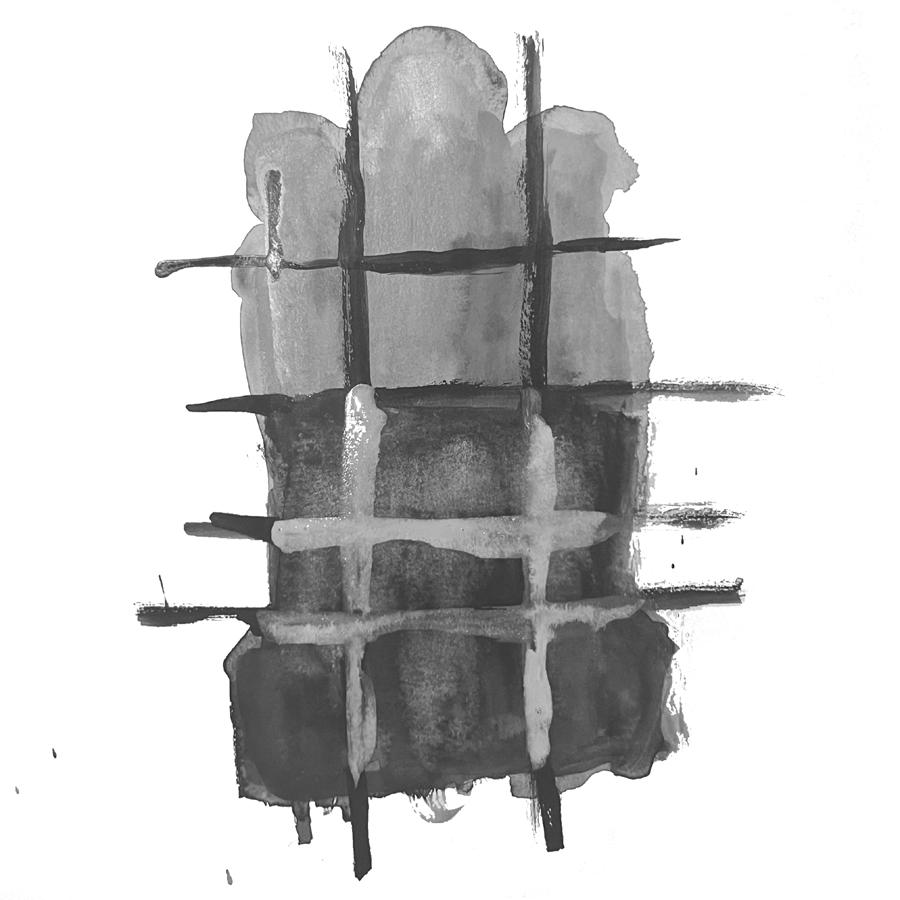
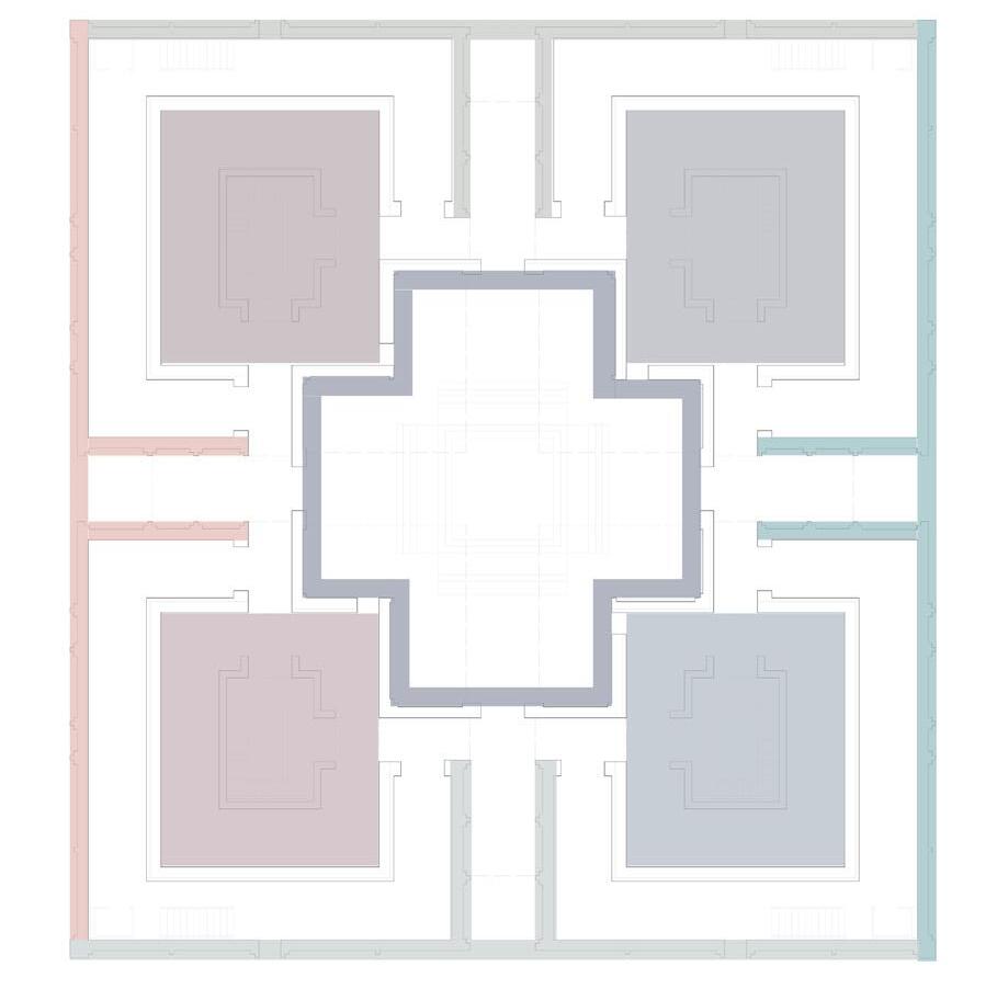
In plan you are able to appreciate the duality of the symmetrical programattic qualities and the juxstaposed openings that allow for both direct and indirect lighting. Everything about this castle highlights the idea of building off of a central core. The four towers feed off of and come back to the central atrium space as places to further enhance the fortification.These were the main components that were derived from this castle throughout the rest of the semester.
Mauricio Hector Escalante Valencia
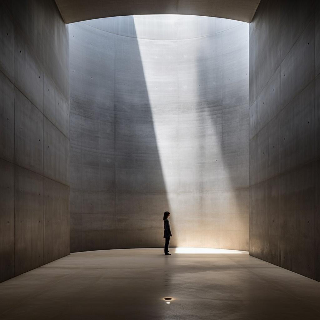
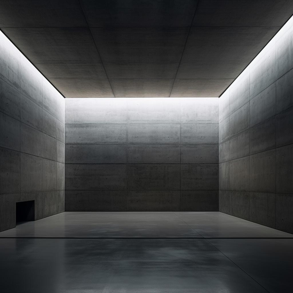
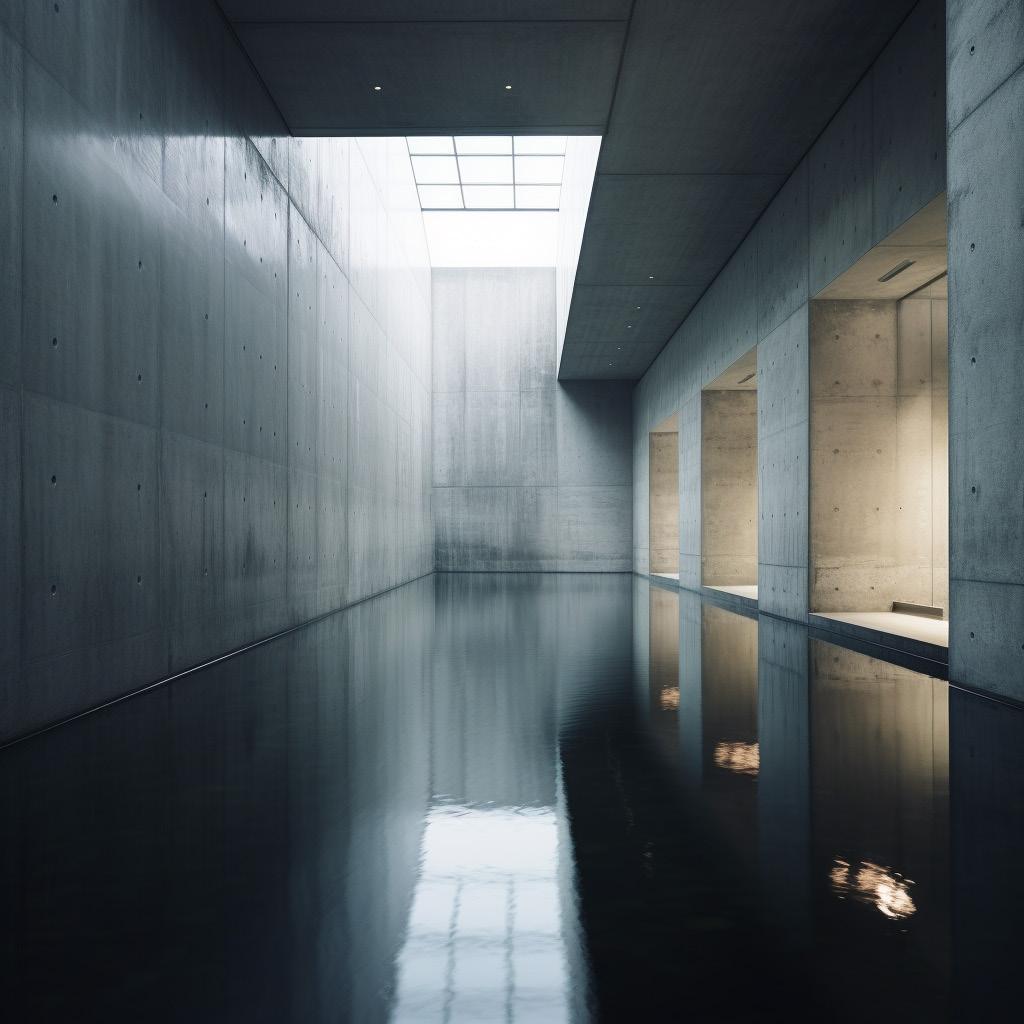
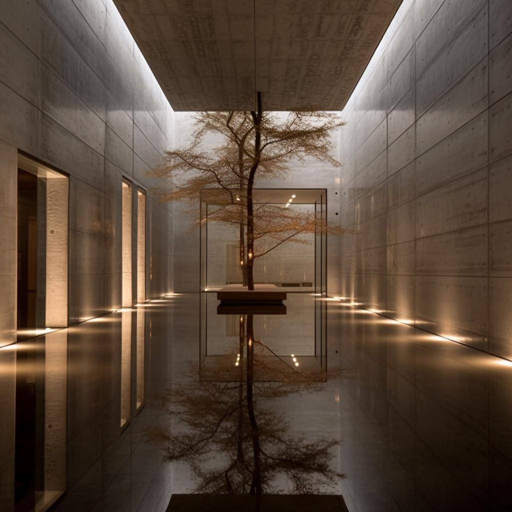
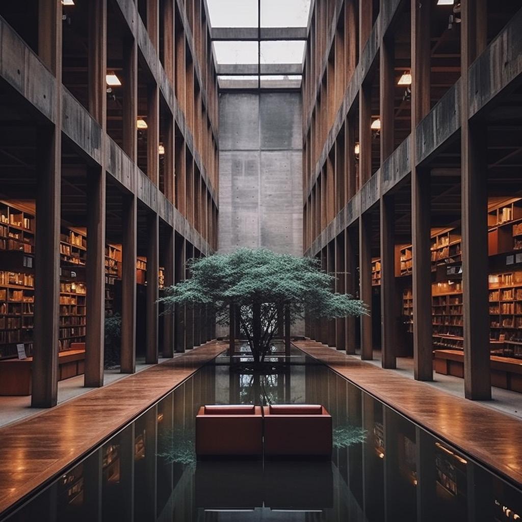
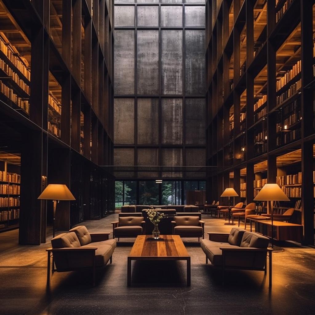
After analyzing Tattershall Castle I was left with the idea of symmetry, of having four programmstic spaces surrouding a central core, and the idea of bringing in natural light in both direct and indirect ways. In order to further the project through the use of Ai, focus was given to how to bring in natural light. Names like Tadao Ando and Daniel Libeskind were plugged in, along with words like “tiny openings”, “subtle passive lighting”, “Timeless” and “Magical”. Once images were being generated that were more crucial, there was more of an emphasis on materiality, the idea of having a cold, dark, stone interior that would be designed by Louis Kahn, as well as a common photography style by Aurelien Chen. A mixture of these prompts
helped to guide what was to come.
These Ai images helped to guide a project that served what was initially intended. Four distinct corner all feeding off of a central core, filled with what would be varying programmatic conditions. A main core that would get an abundance of natural light, and then unique ways of bringing in natural light into the four corners. At this point the light that was coming in was baed around the four seasons, and each corner had an orientation that would give it more or less natural light depending on what season would be held there.
Mauricio Hector Escalante Valencia
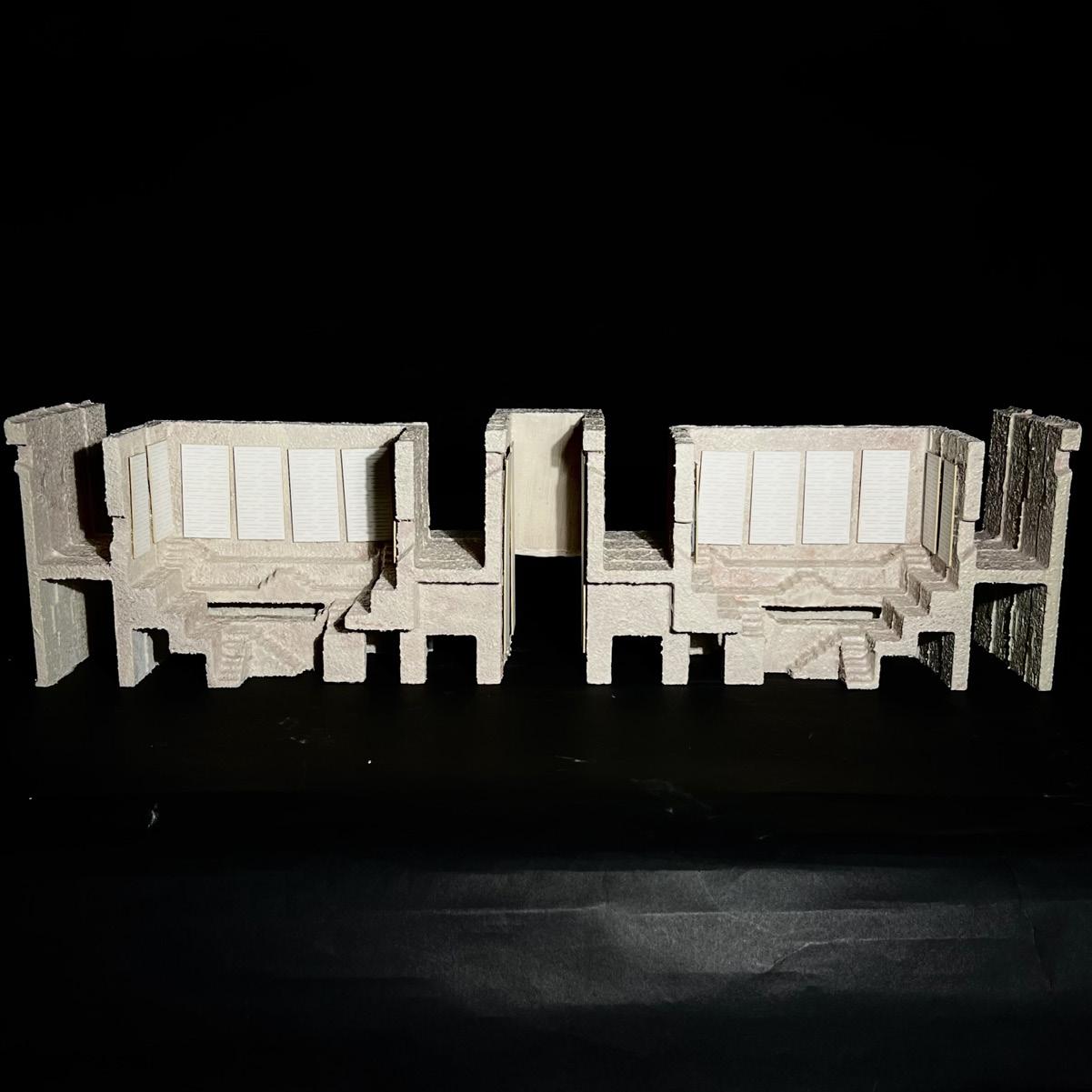
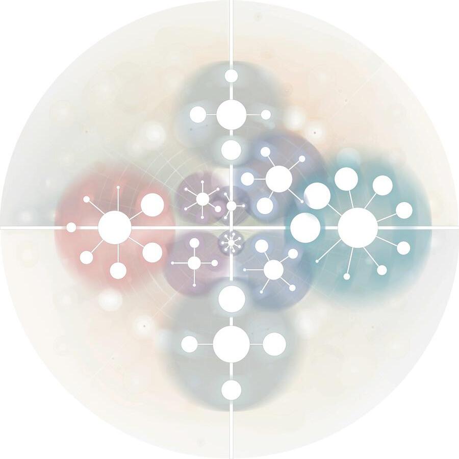
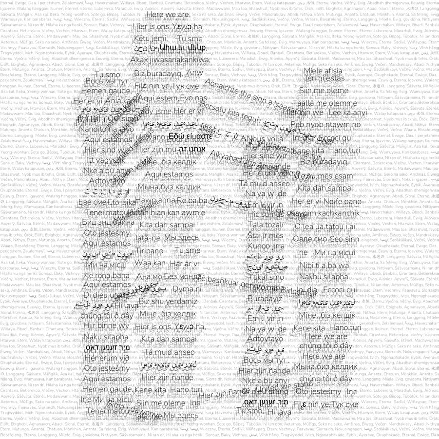
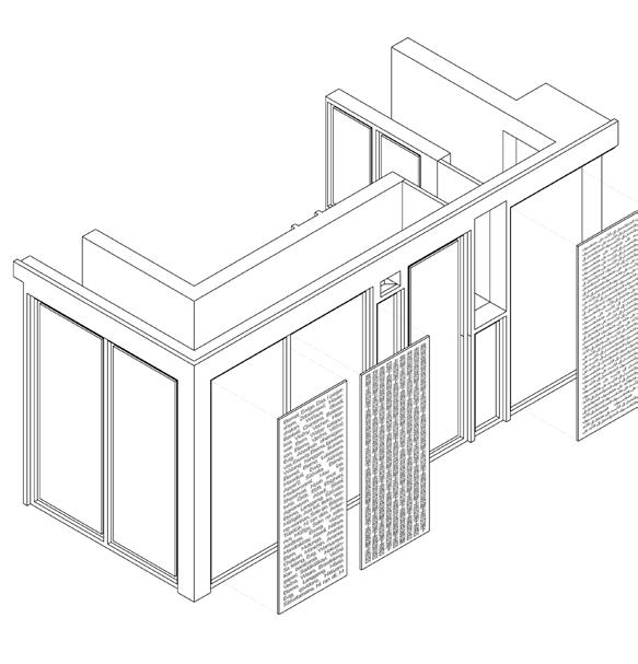
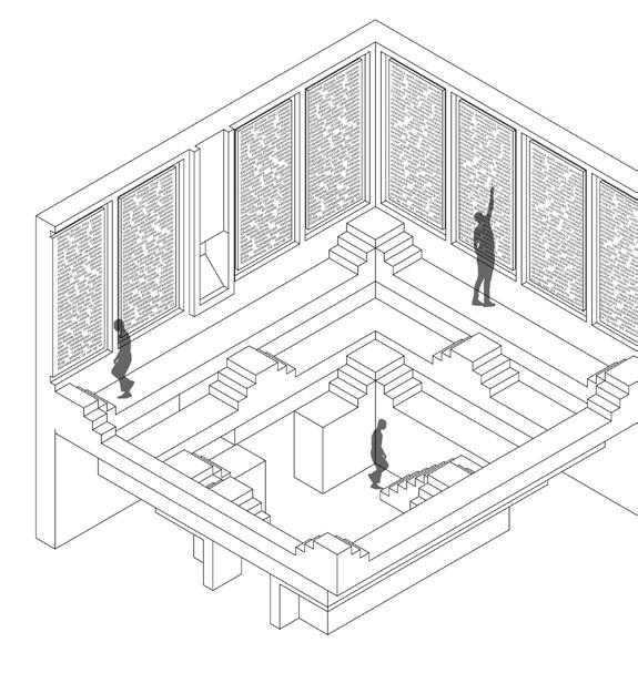
A Library of Languages, a way to preserve languages, conserve languages, immortalize languages; That wast the focus of this project. Coming from the Castle and the Ai images, the biggest take away was the idea of solitude. As well as the idea of building off from a central core, different ways to bring in natural light, and what a density of text can look like when applied as a text carving into the building interior and exterior.
In order to fully understand languages, there must be an understanding that they are shared and preserved through various different ways. A difficulty with this project came from the vast plethora of just how many languages there are in the world. In order to be able to capture as many languages as possible, focus was given to the top ten language families that make up the majority of the worlds spoken languages. These family groupings were taken and the subgroupings within them were analyzed, and were placed around the building in a way that the more prominent languages would get more surface area
on the building envelope.
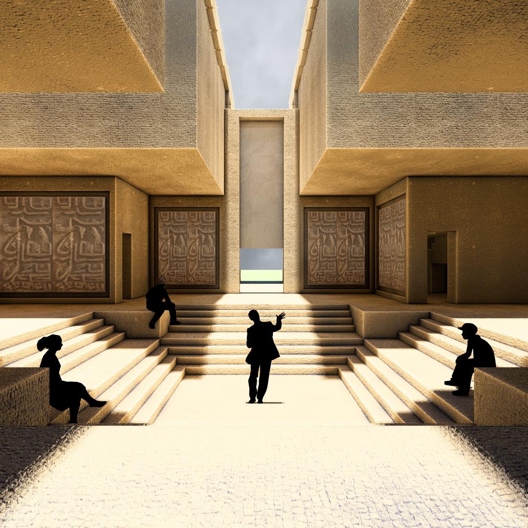
This designed focused on how you build and create using words as a foundation building block. The narrative that was pushed was the idea of being able to preserve languages in several ways. As you go through the building, constantly weaving between the inside and outside world, you are constantly being surprised by the wonders of the programmatic spaces. There are moments where you can see, feel, experience the languages, moments where you can read and further understand the languages, moments where you can see and hear the languages, and finally moments where you can practice the languages that you would be learning about.
The idea of language as a texture played a pivotal role in this project, as well as the level of symmetry that was showcased in the Castle plans. This project is a timeless labyrinth that is meant to be experienced by those who seek to preserve our dying languages.


Fall 2023 | Arch.515.01 Grad Arch Design Studio | Preserves, Libraries
Instructor Rubén Alcolea
Cummings School of Architecture
Helena Mott
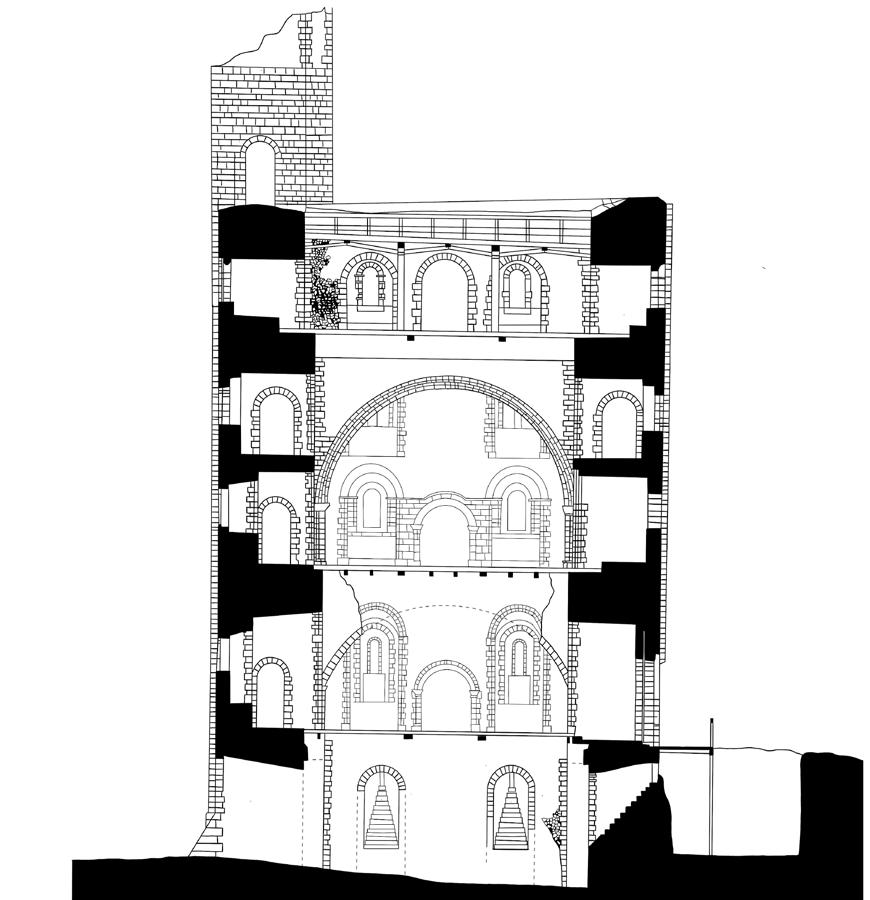
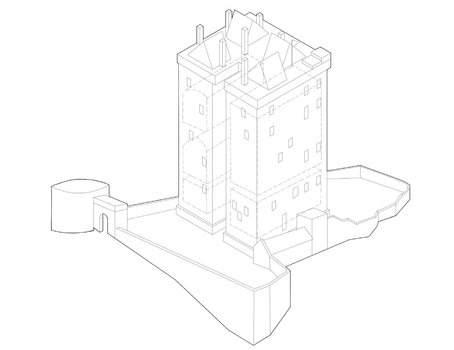
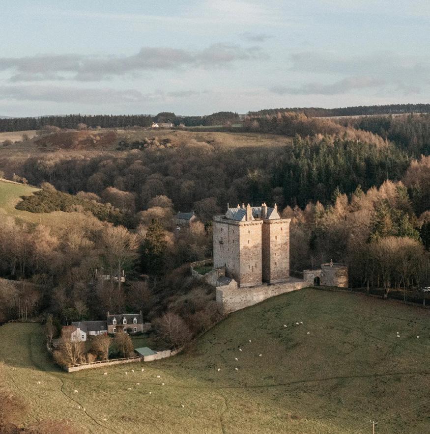
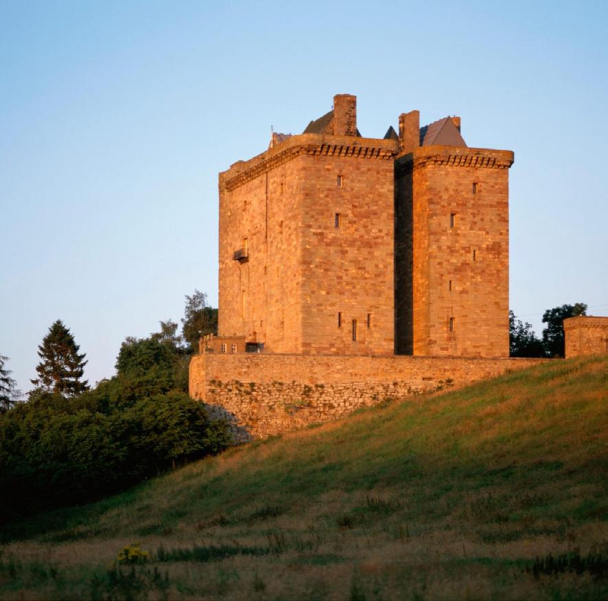
Borthwick Castle, located in Scotland and built in 1430 has many important characteristics. Seemingly simple from the exterior, the castle has an intense system of circulation that runs along the inside of the building. With spiral staircases, long narrow windows, and arched ceilings, the castle embodies beauty and chaos.
Through drawing plans and sections, details and axons, we discovered underlying qualities that the castles had.
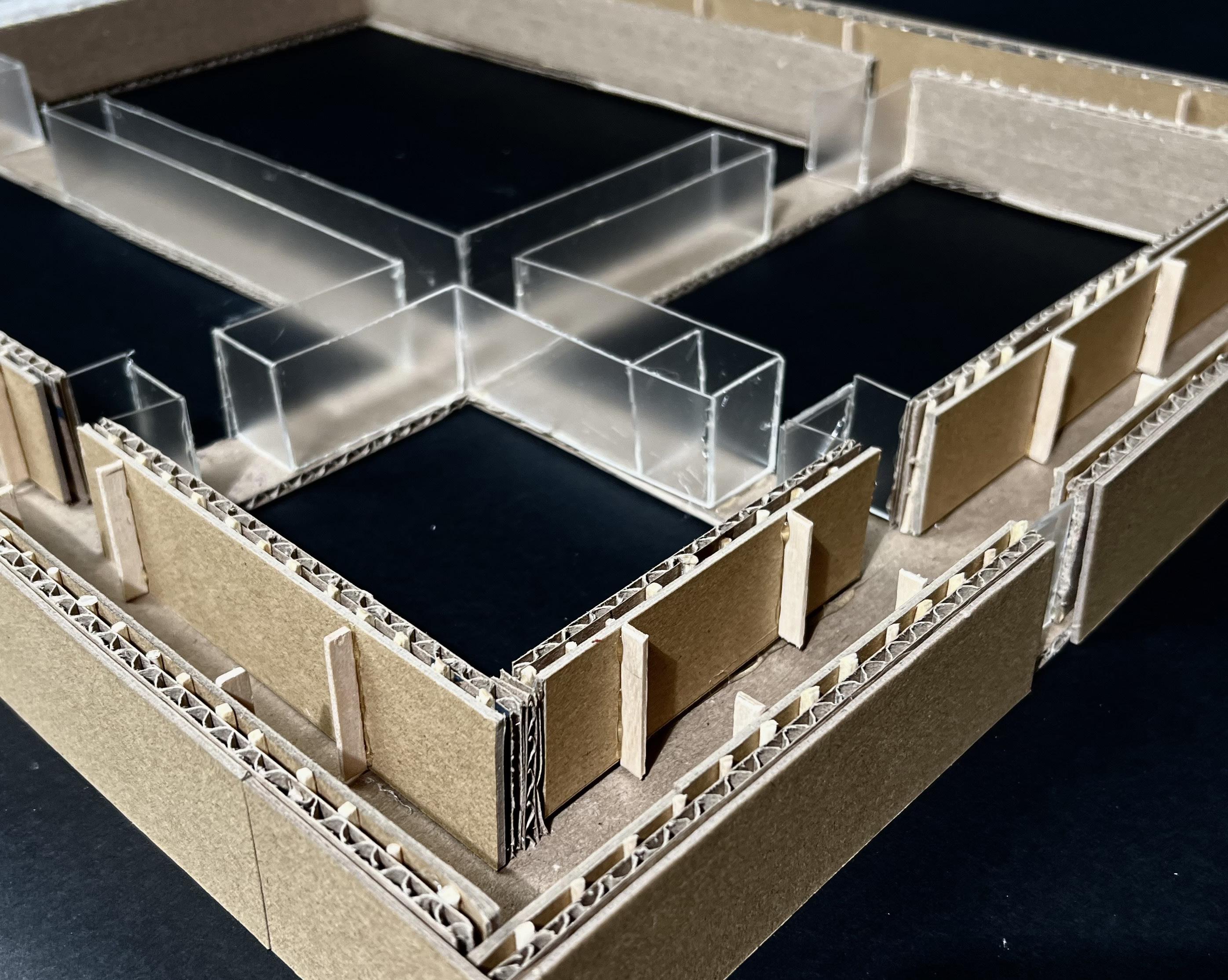
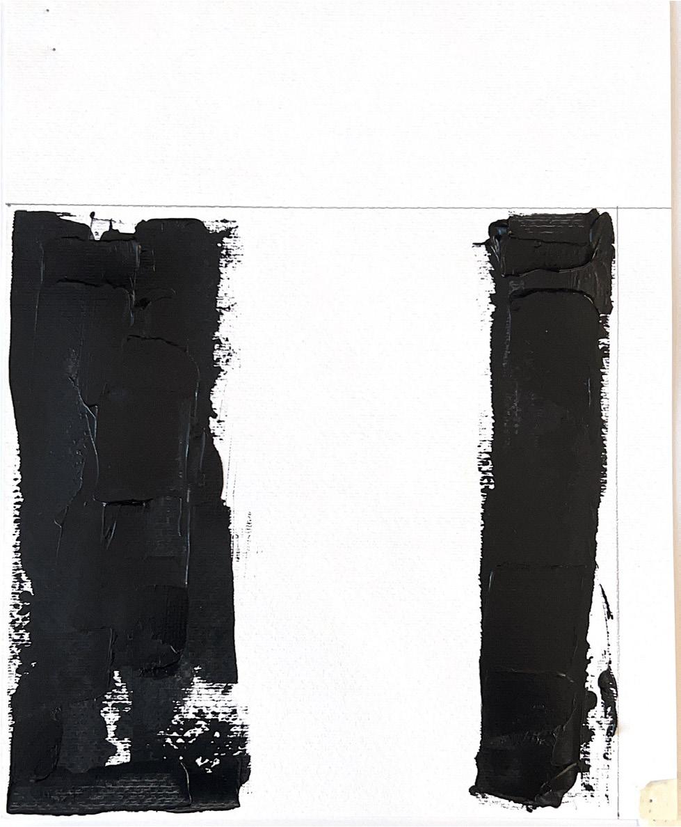
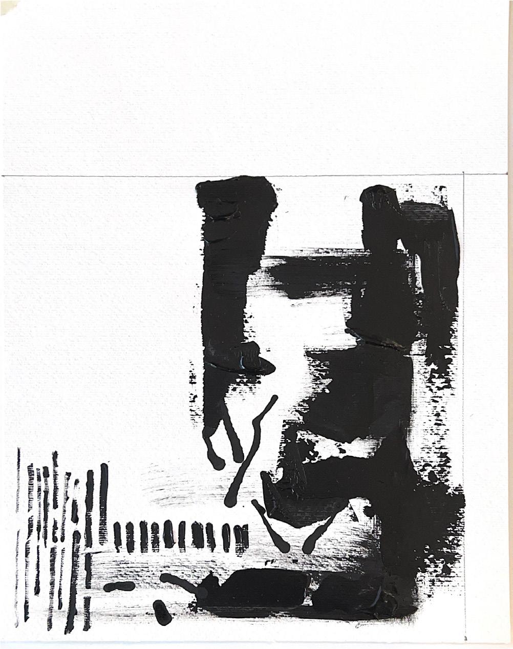
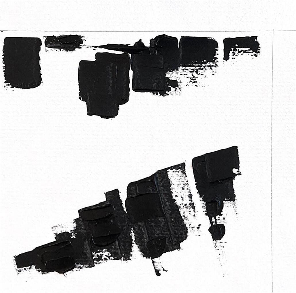
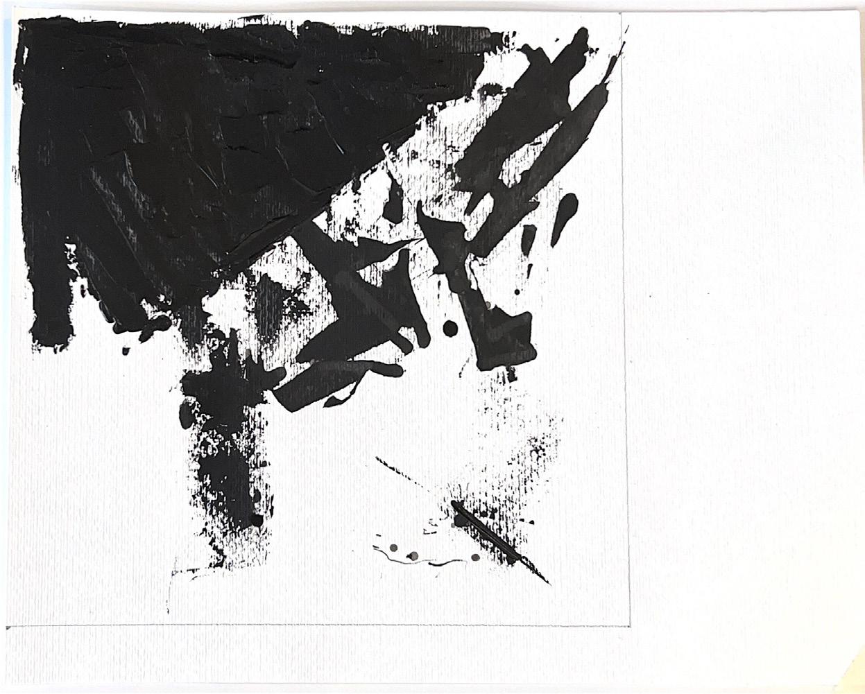
This castle seemed to circulate around smaller main spaces. These three rectangles make up the series of voids, while supporting spaces travel around the perimeter.
The geometric line drawing demonstrates these forms with
the use of spacing and lineweight. More lines are added to the perimeter while leaving the center empty.
The indent along the West facade also plays a role in establishing this diagonal line in the geometric drawing. Where the line meets the top right corner is the only spot in the whole drawing where two members meet.
The interesting aspects of the castle that were carried throughout the rest of the project were including a series of void spaces that create a framework for the development of the perimeter functions.
Helena Mott
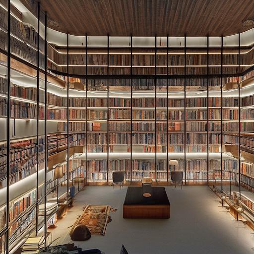
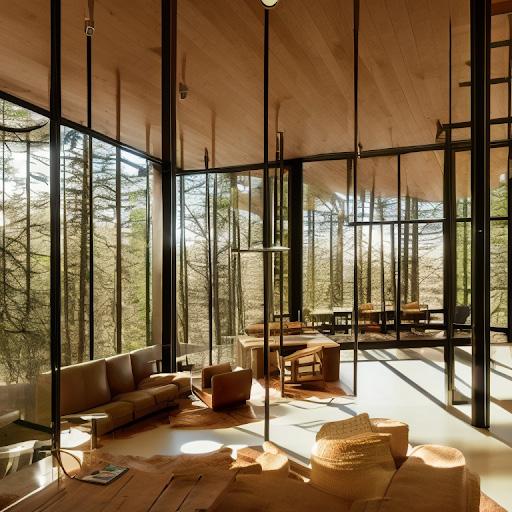
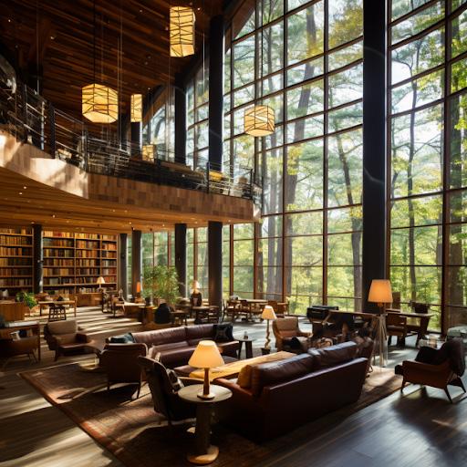
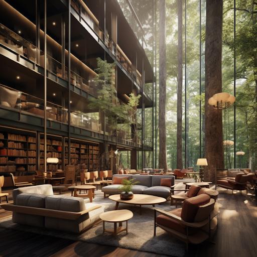
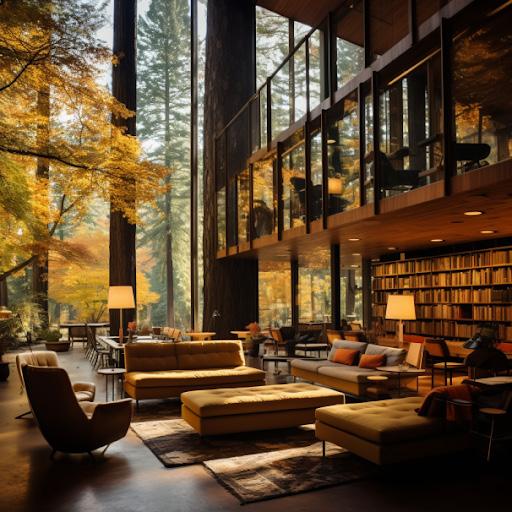
Generating AI images involved a long process of entering prompts into multiple programs.
The prompts featured key words, artists, photographers, and architects, to create a variety of images to inspire our own 3D massing.
The most important words used were tall spaces, open courtyards, indirect lighting, surrounded by trees, inviting, nature, and views to outside.
Photographers like Helene Binet and architects like Frank Lloyd Wright were referenced throughout the process.
These photos helped create the main spaces for the massing. Emphasizing moments of thin solid and heavy void, perimeter circulation, and angled openings to the outside.
Helena Mott
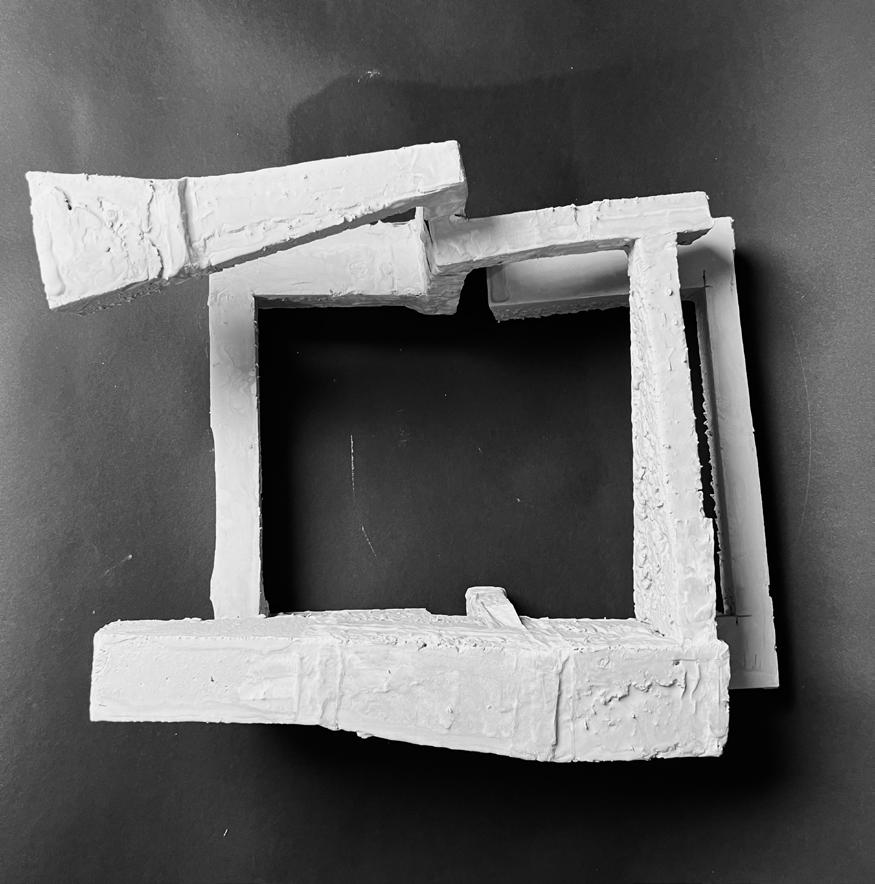
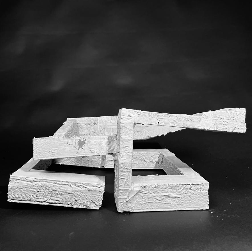
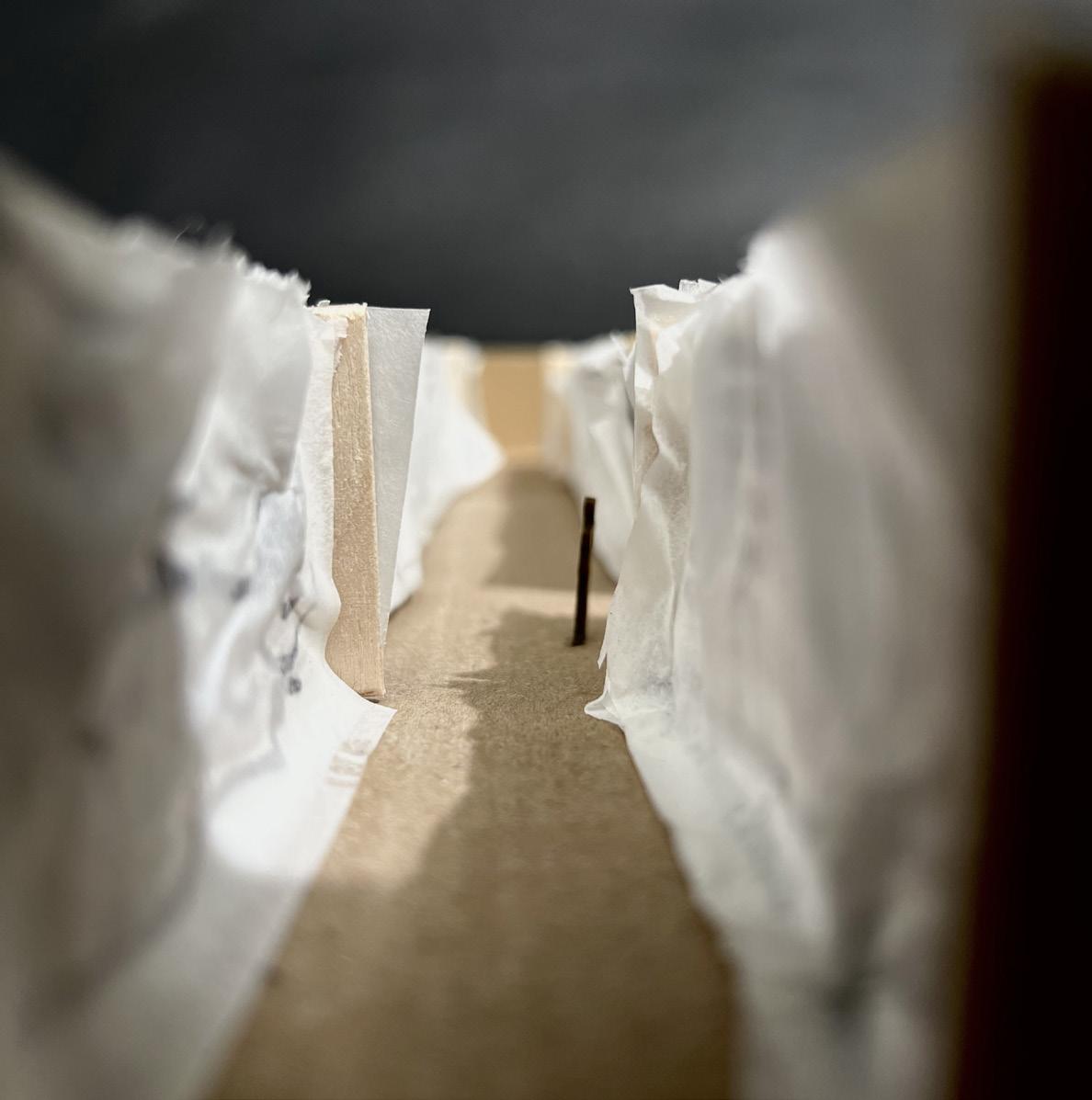
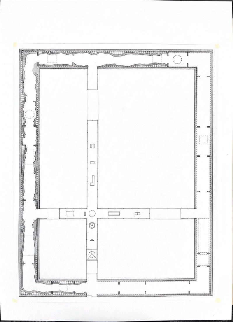
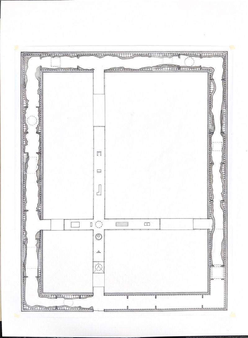
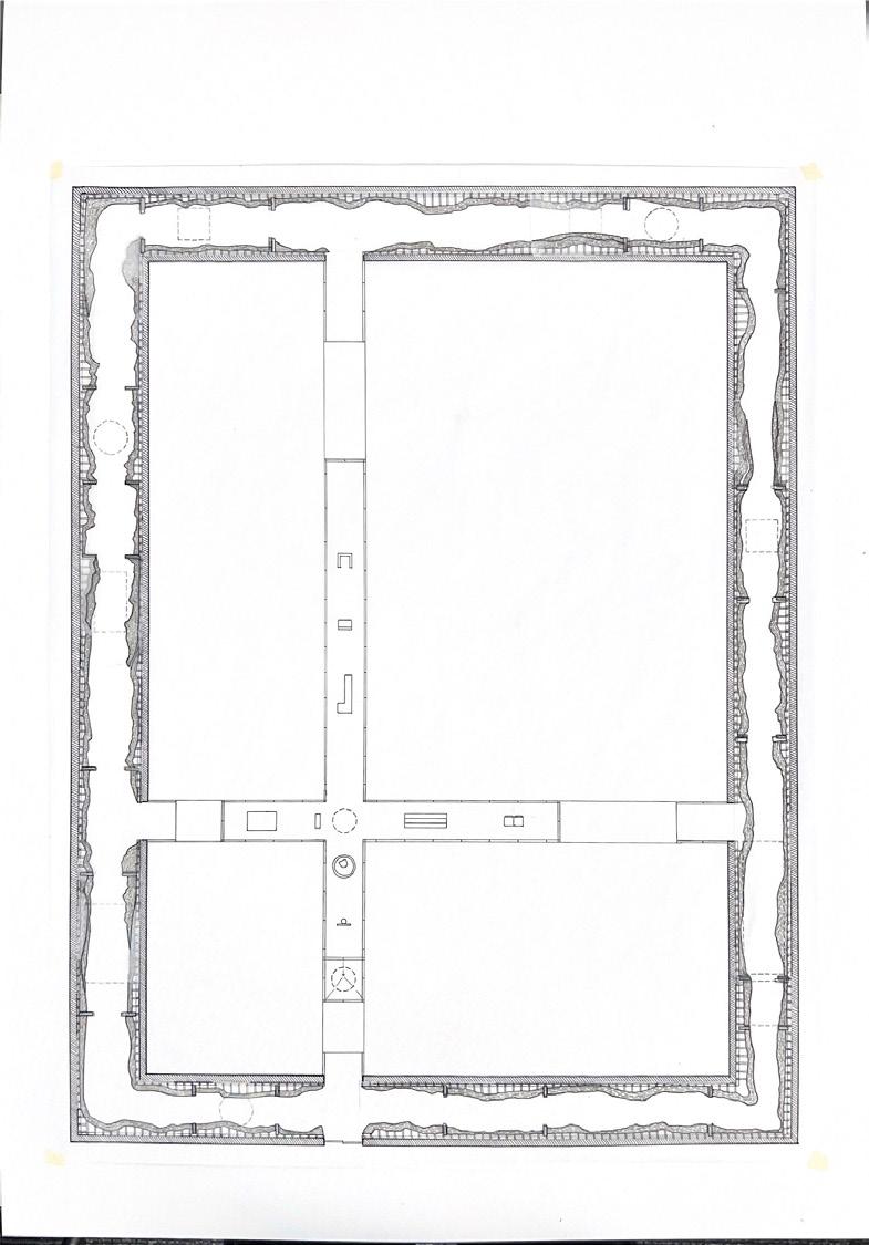
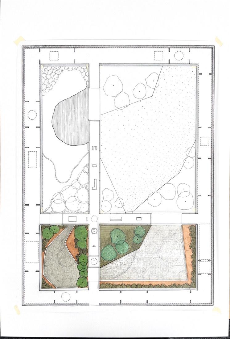
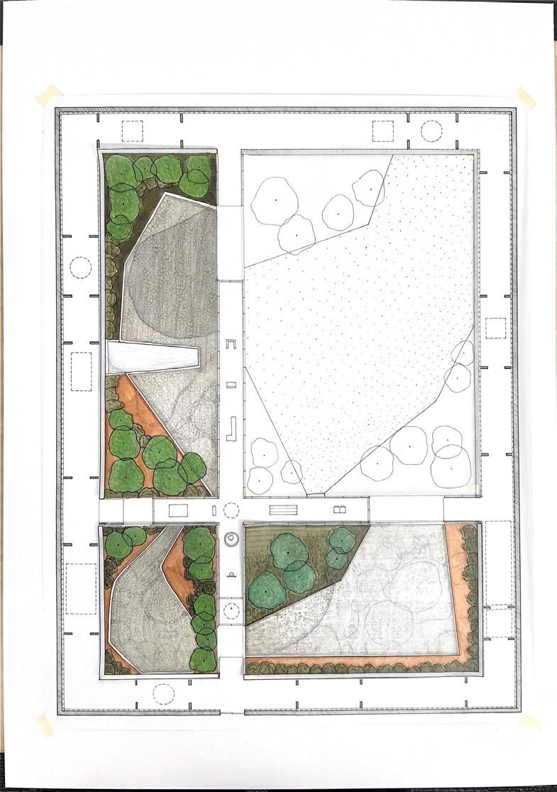
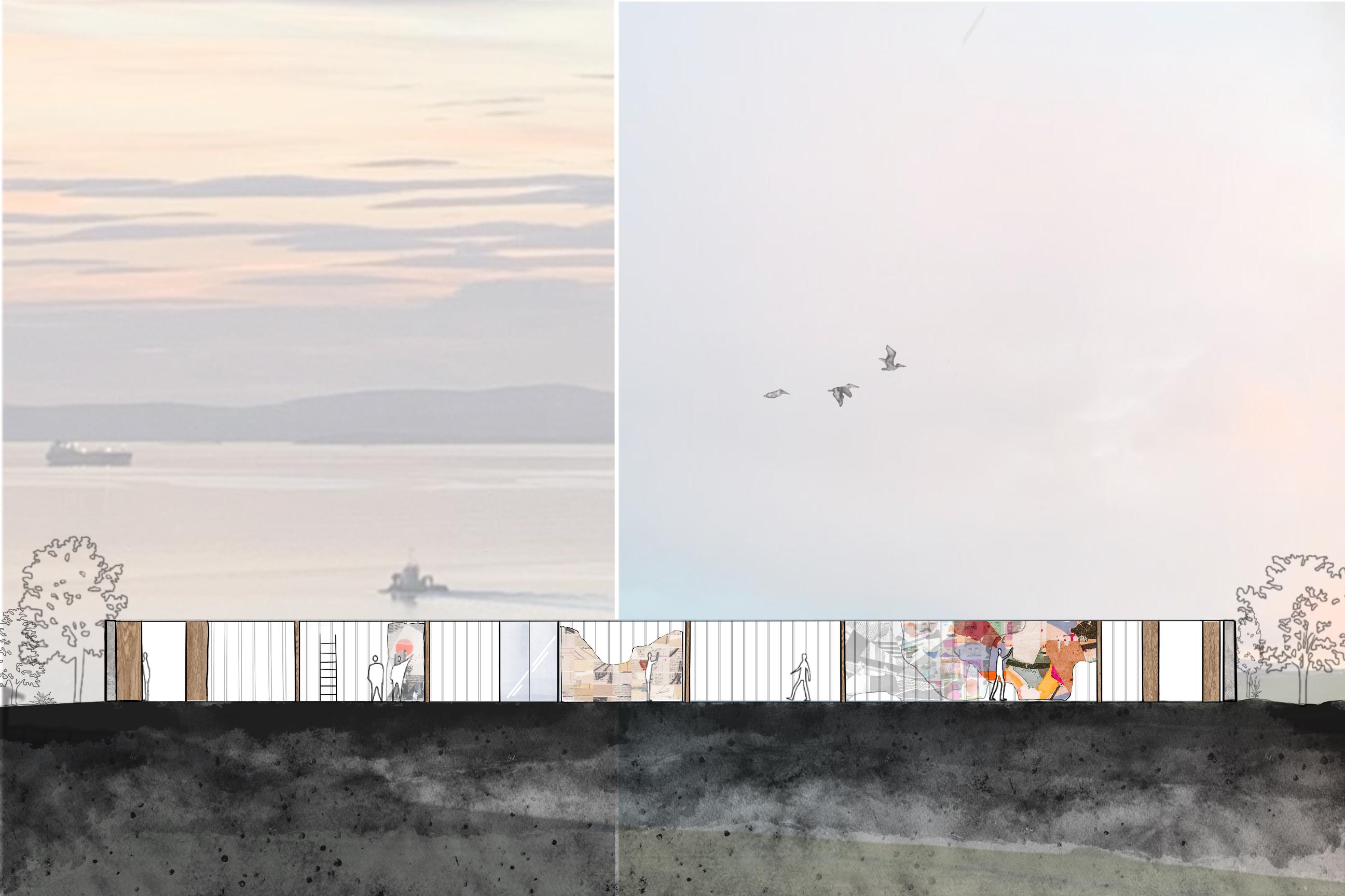
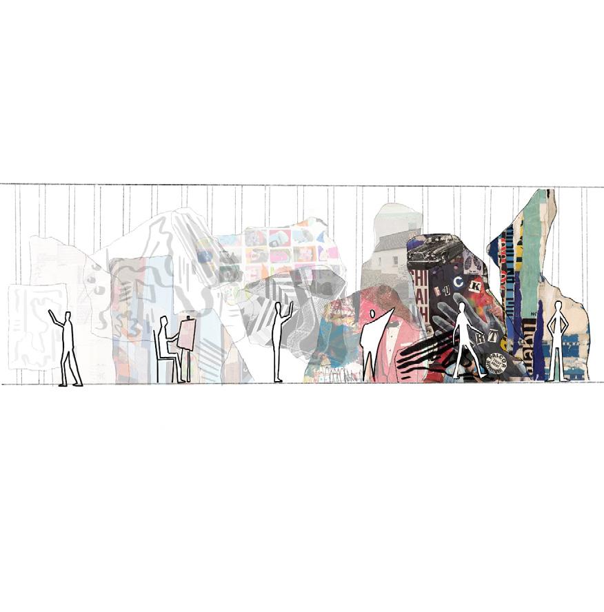
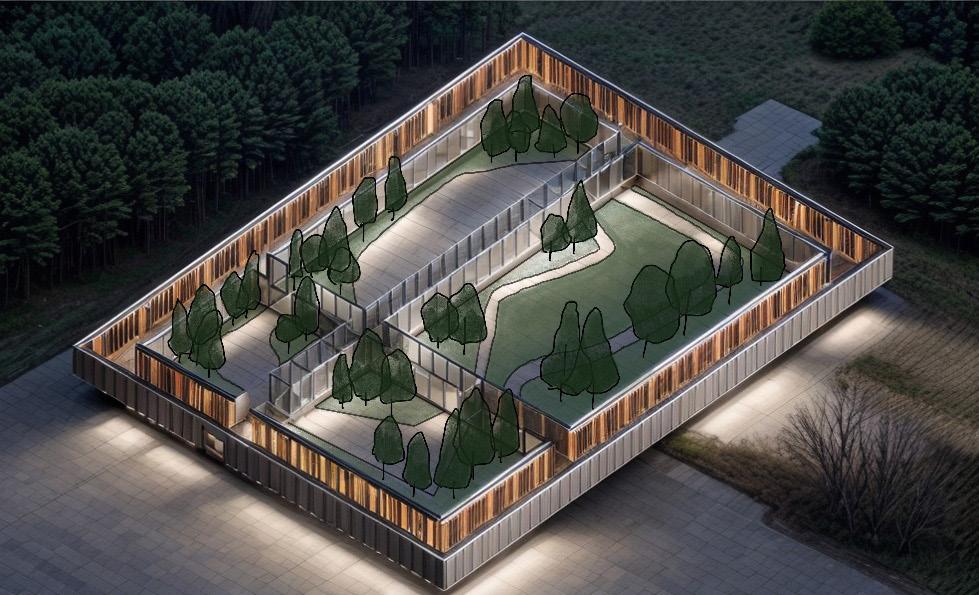
The Library is a building that grows over time, a live palimpsest of people and art who came before one another.
It’s ability to adapt is through the user. Artists will come to stay for two months at a time. During their stay they will produce work and apply it to the walls.
As the months and years go by, more and more paper will be added to the structure, causing it to grow in size.
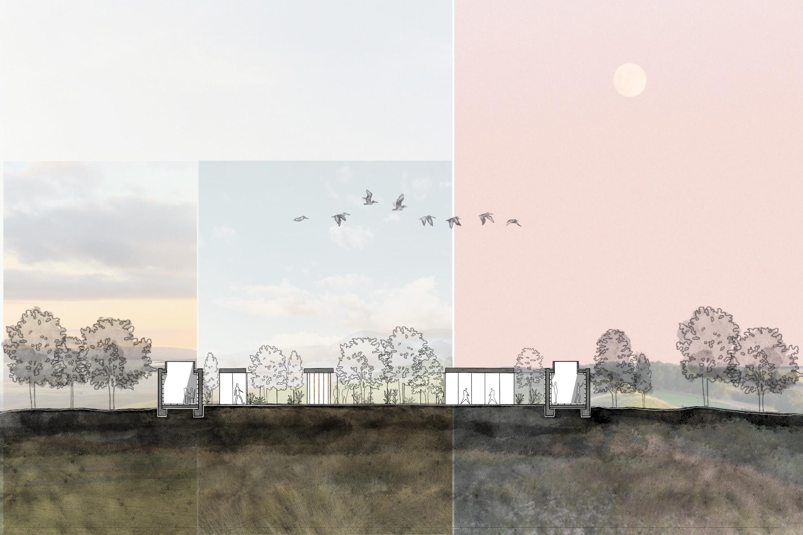
This collection of art and expression is seen through the immense amount of layers of paper. Not only does the building have a life of it’s own, but it creates its own world through it’s connection to nature as well.
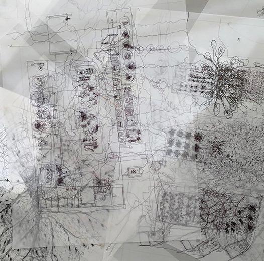
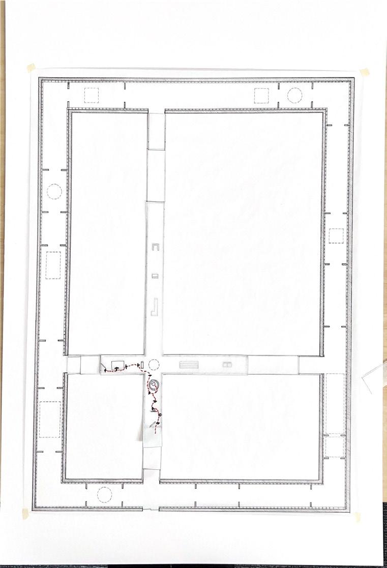
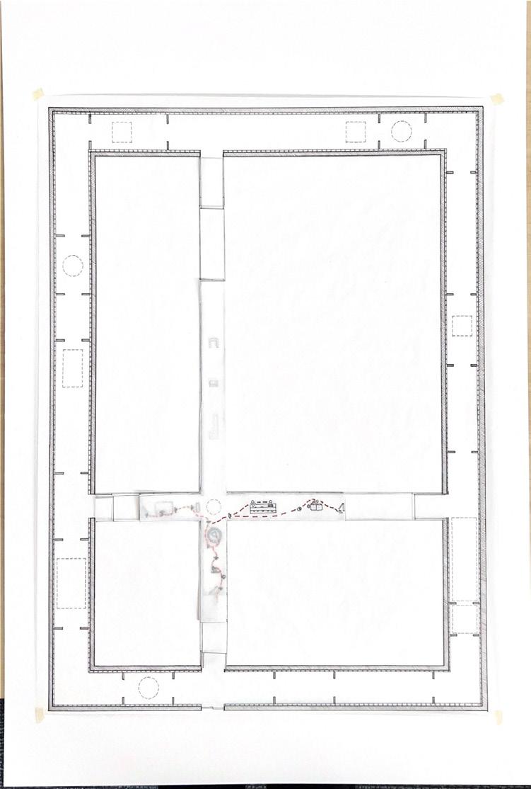
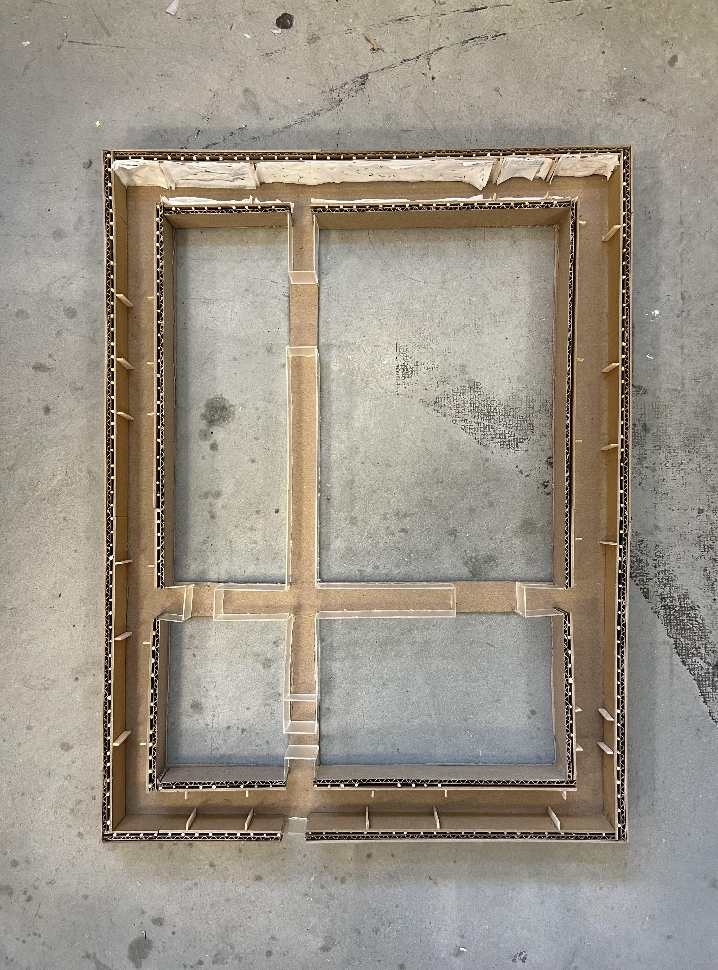
By developing a series of hand drawn plans on trace paper, I emersed myself in this process of layering and collecting ideas through drawing.
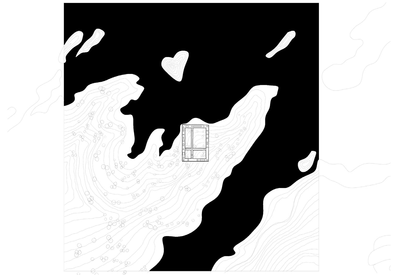
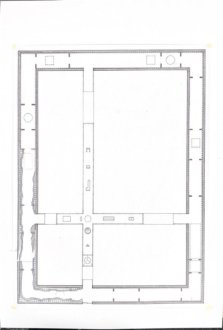
As the perimeter houses the art and work produced by the residents, the cross acts as the living area. Surrounded by four courtyards that change in size and purpose, the building forms a world of it’s own, open to interpretation, and ever changing.
Fall 2023 | Arch.515.01 Grad Arch Design Studio | Preserves, Libraries
Instructor
Rubén Alcolea
Cummings School of Architecture
Part One: Preliminary Research
Nathan Cormie
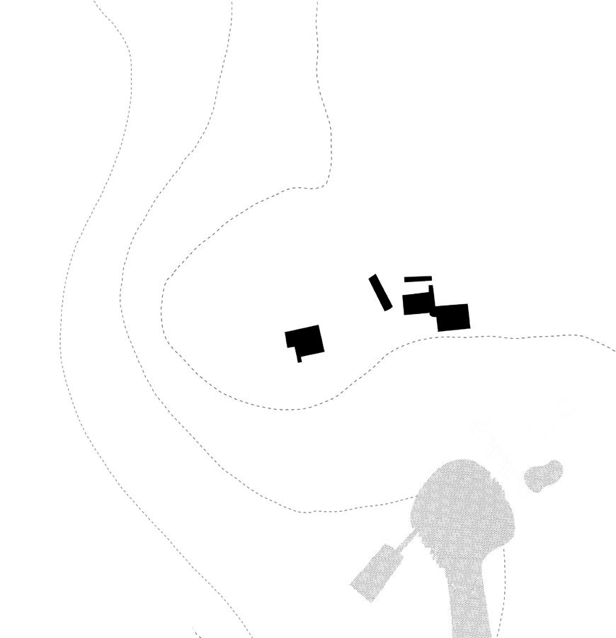
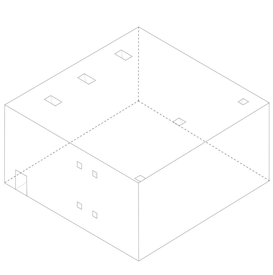
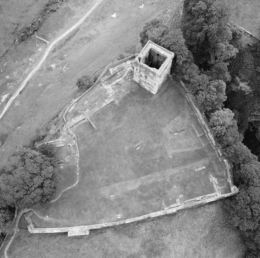
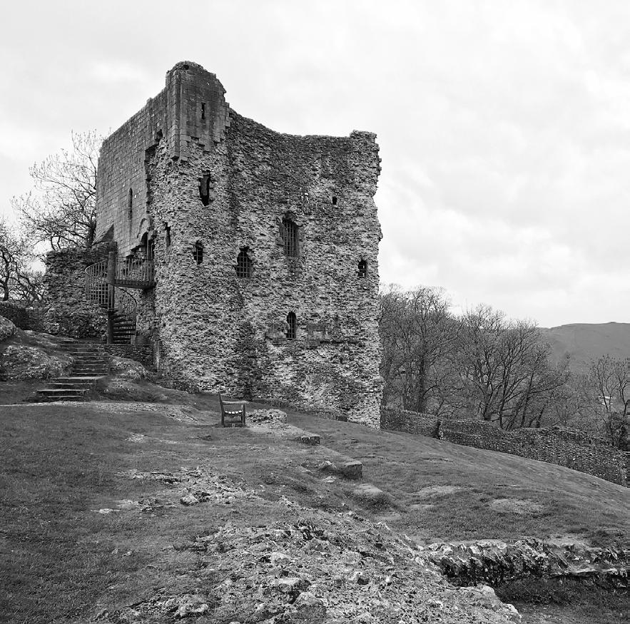
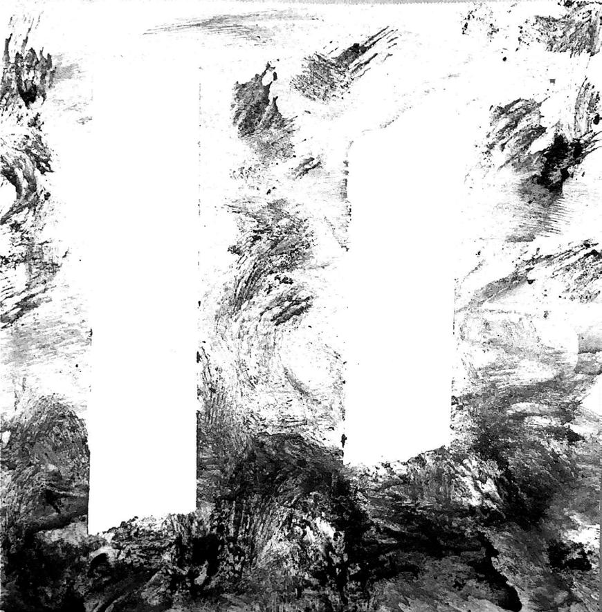
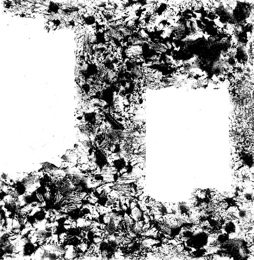
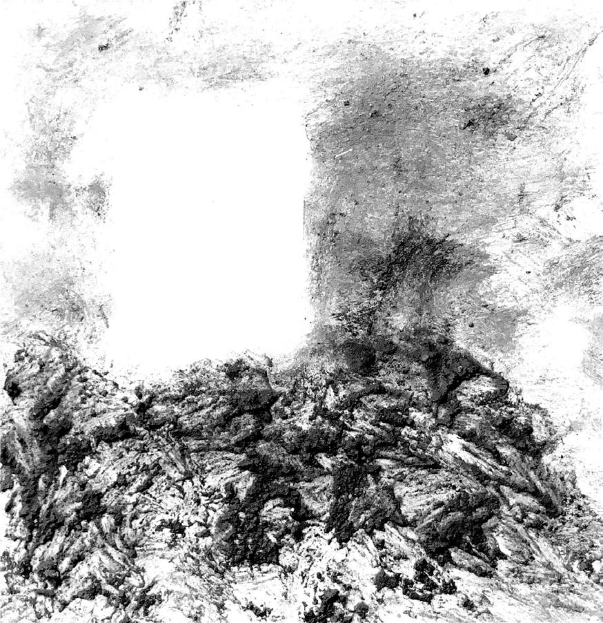
Peak Castle is located in Durbyshire, England, at the top of a steep valley. The main town is located nearby and is overlooked by Peak castle providing a sense of protection The castle uses its site to its advantage by locating the square keep in the far corner. The plan portrays a sense of pure geometry within its dense, heavy walls. Small openings in the facade conceal the vast interior void that is found at the center of
the castle. Secondary elements surround the central void and serve as support spaces and elements of circulation.
Part Two: AI
Nathan Cormier
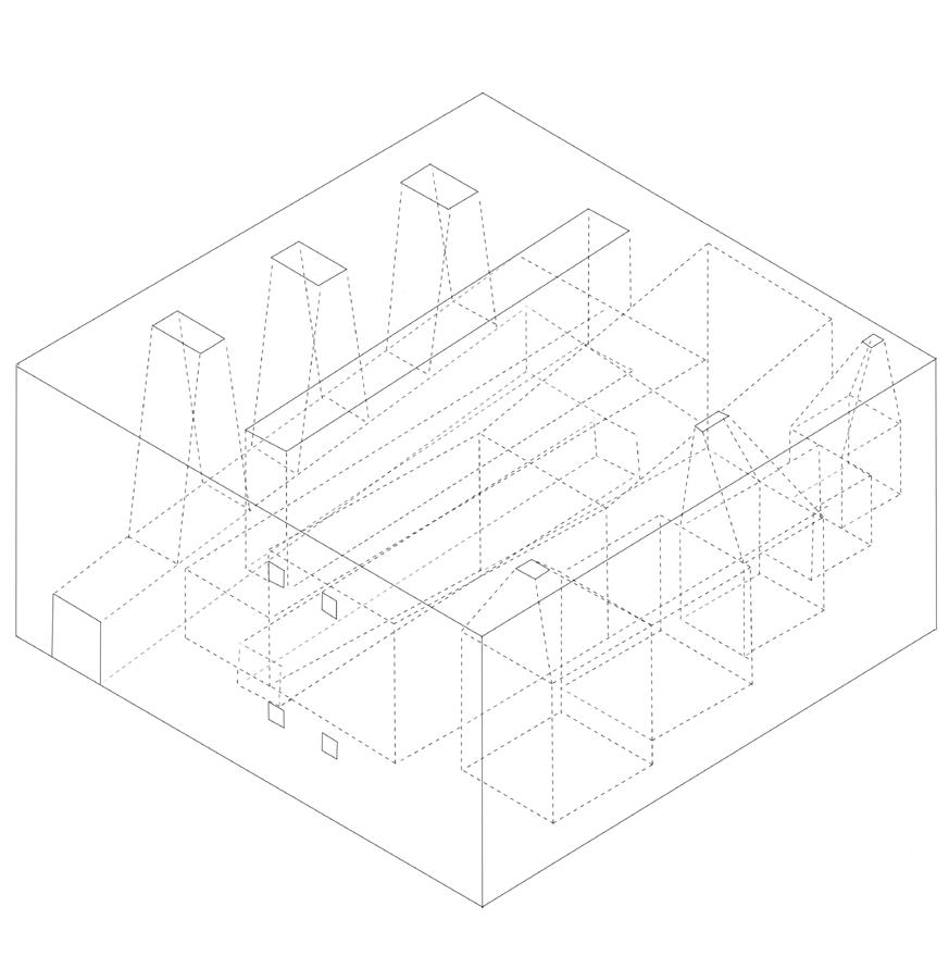
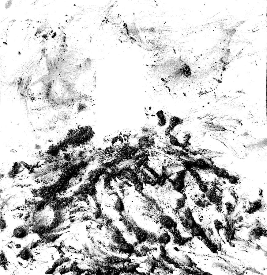
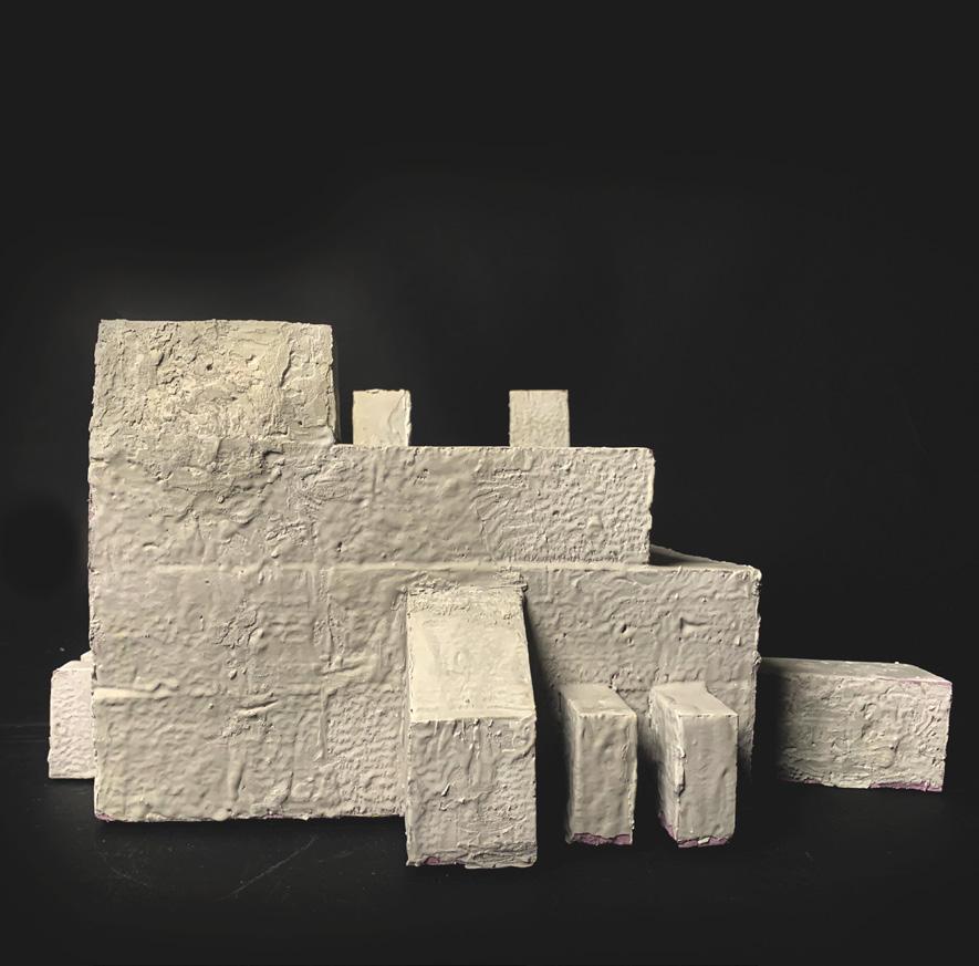
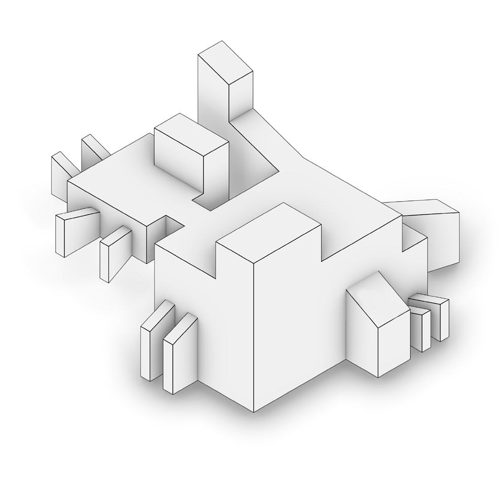
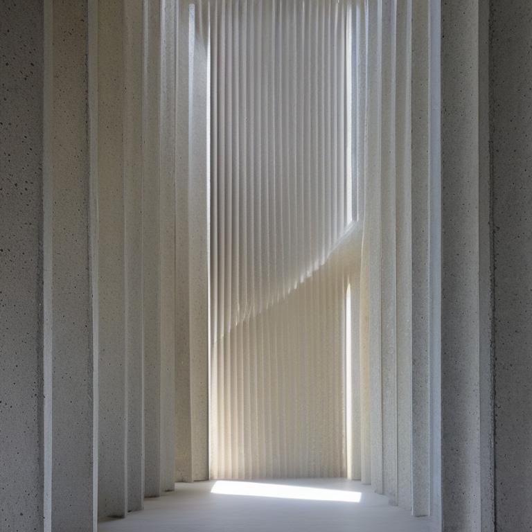
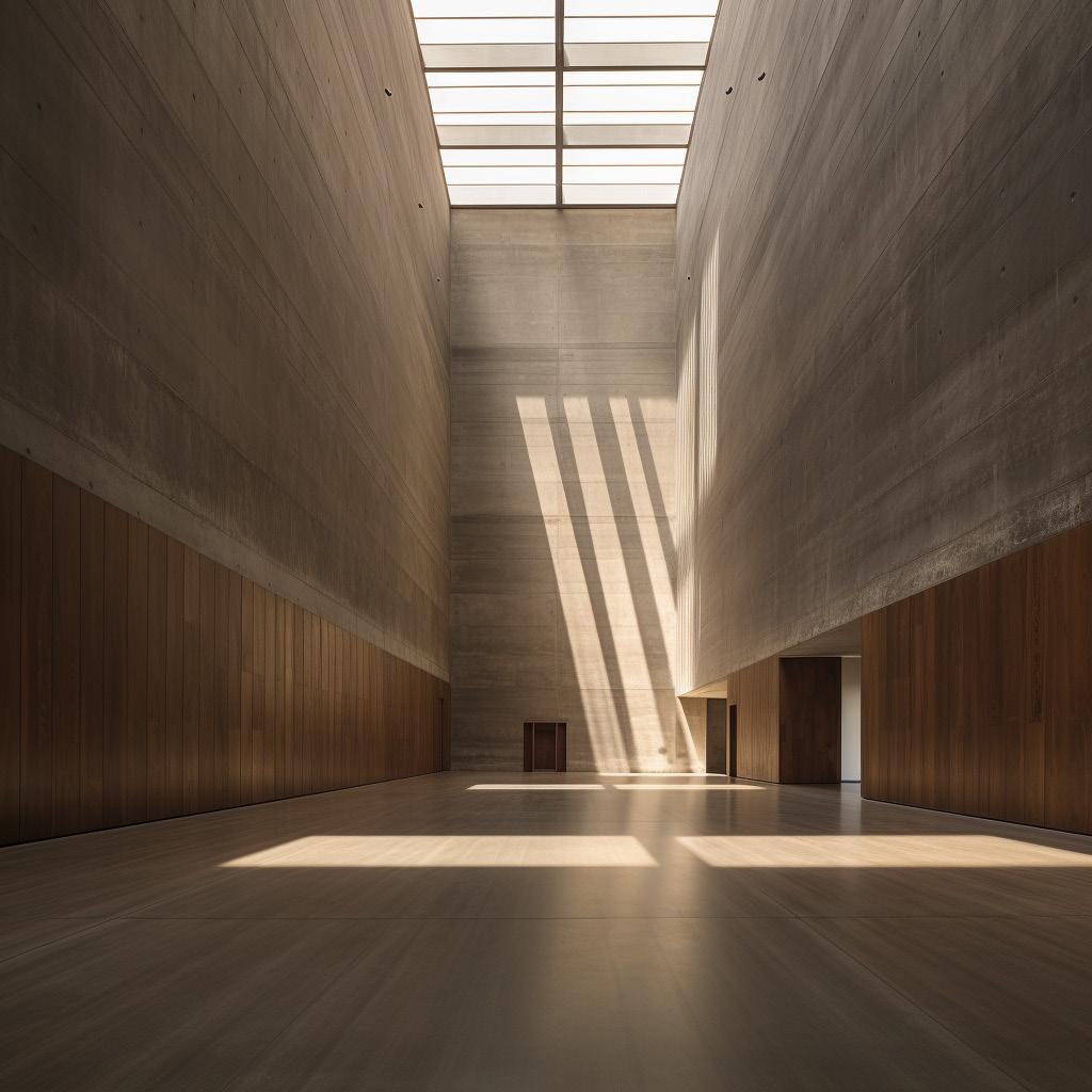
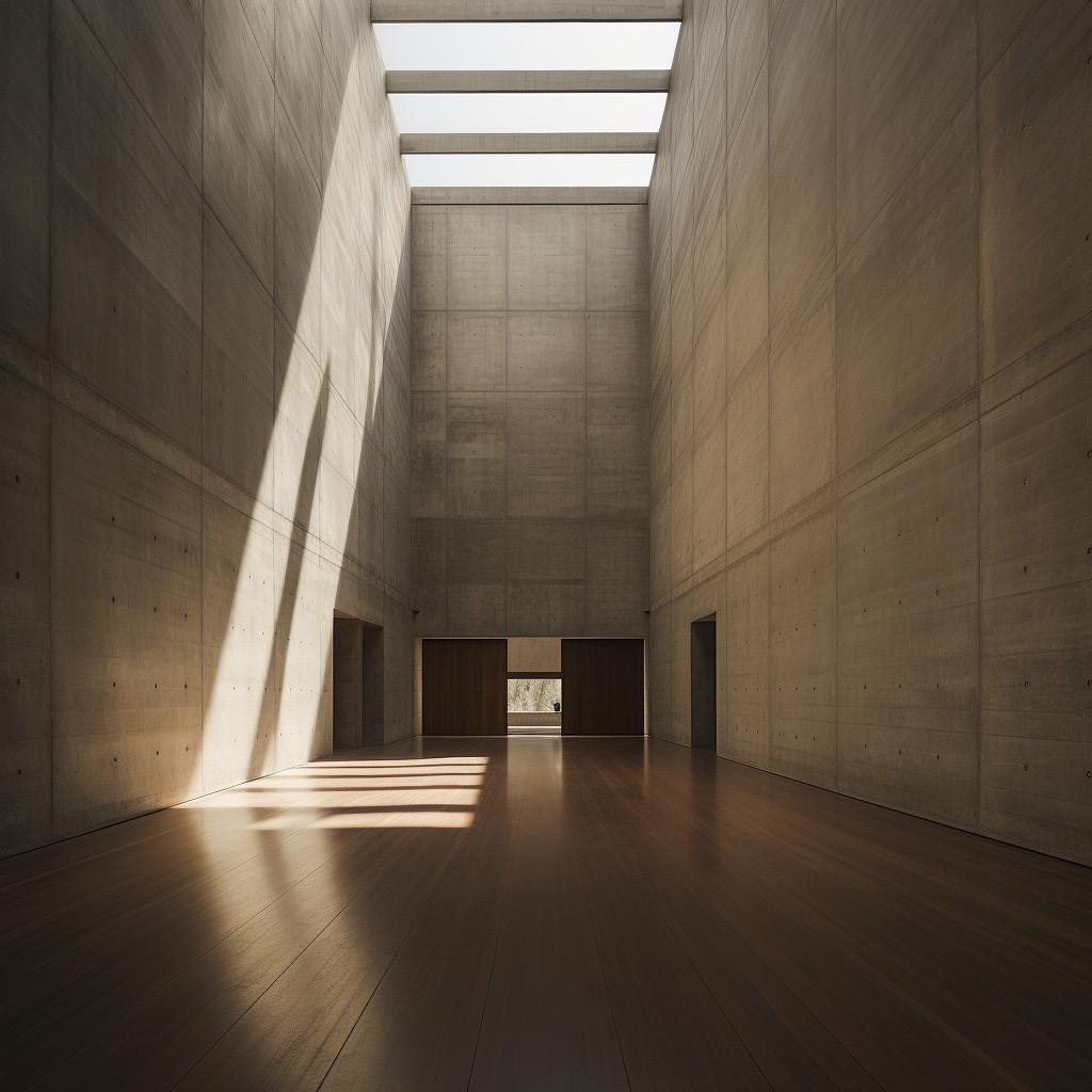
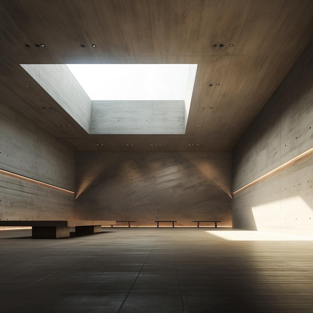
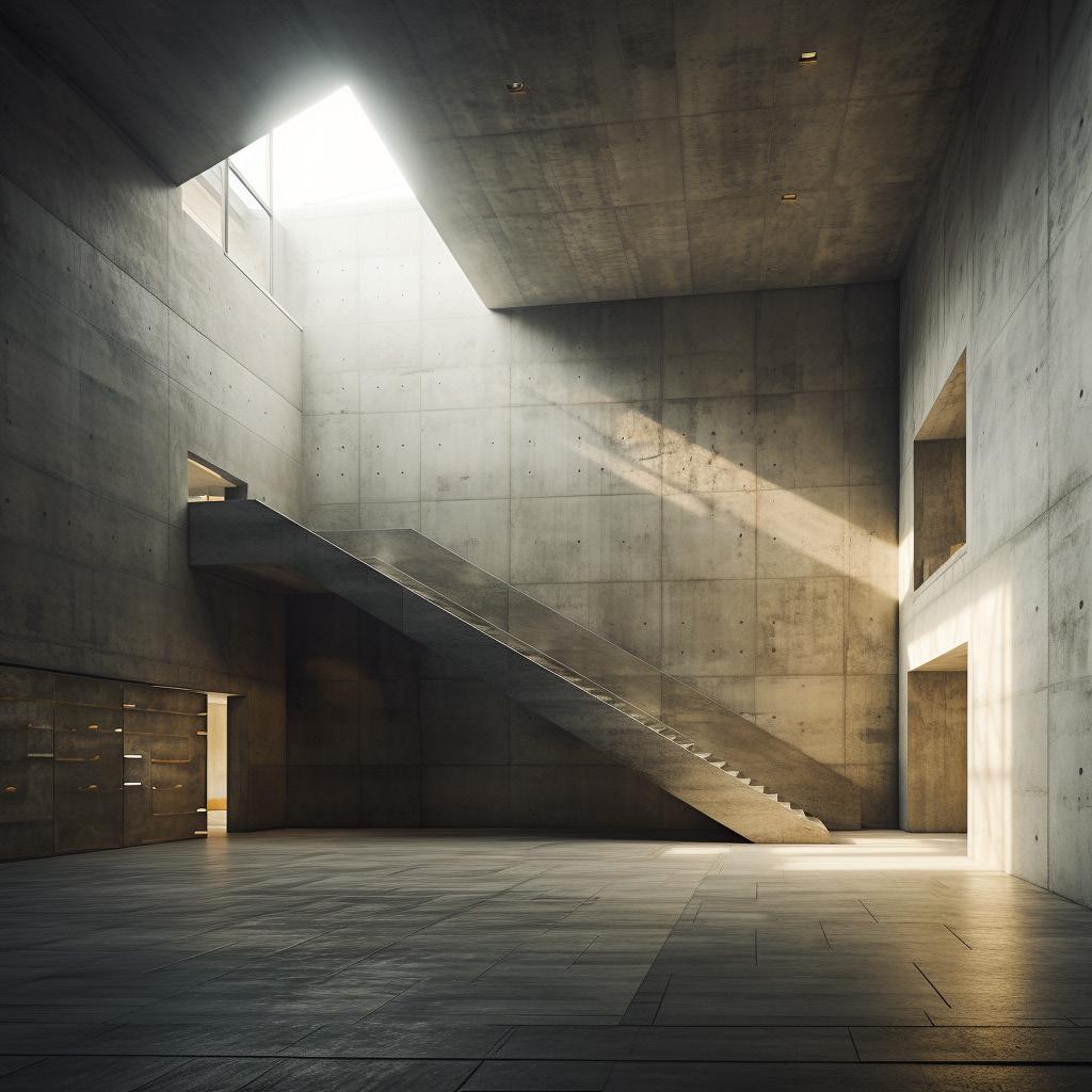
Ai generated images were produced using various tools and promps to achive spaces that would later be applied to a given void of 120’ x 120’. Promps including key terms such as “monolithic” & “dramatic lighting” were used to render the ideal spaces being described. Materials were also entered into the Ai generator, including concrete & wood primarily. Voids that represented the scale and essence of the images
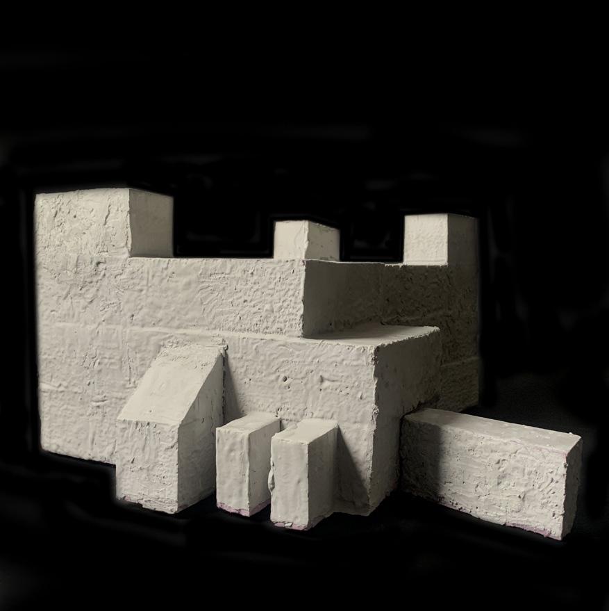
were carved from a solid mass and extracted to form the inital massing for the project. Skylights played a major role in the orientation and configuration of the spaces within the massing

Part Three: Preserves / Libraries
Nathan Cormier
Describe the project, intentionality, etc, etc...
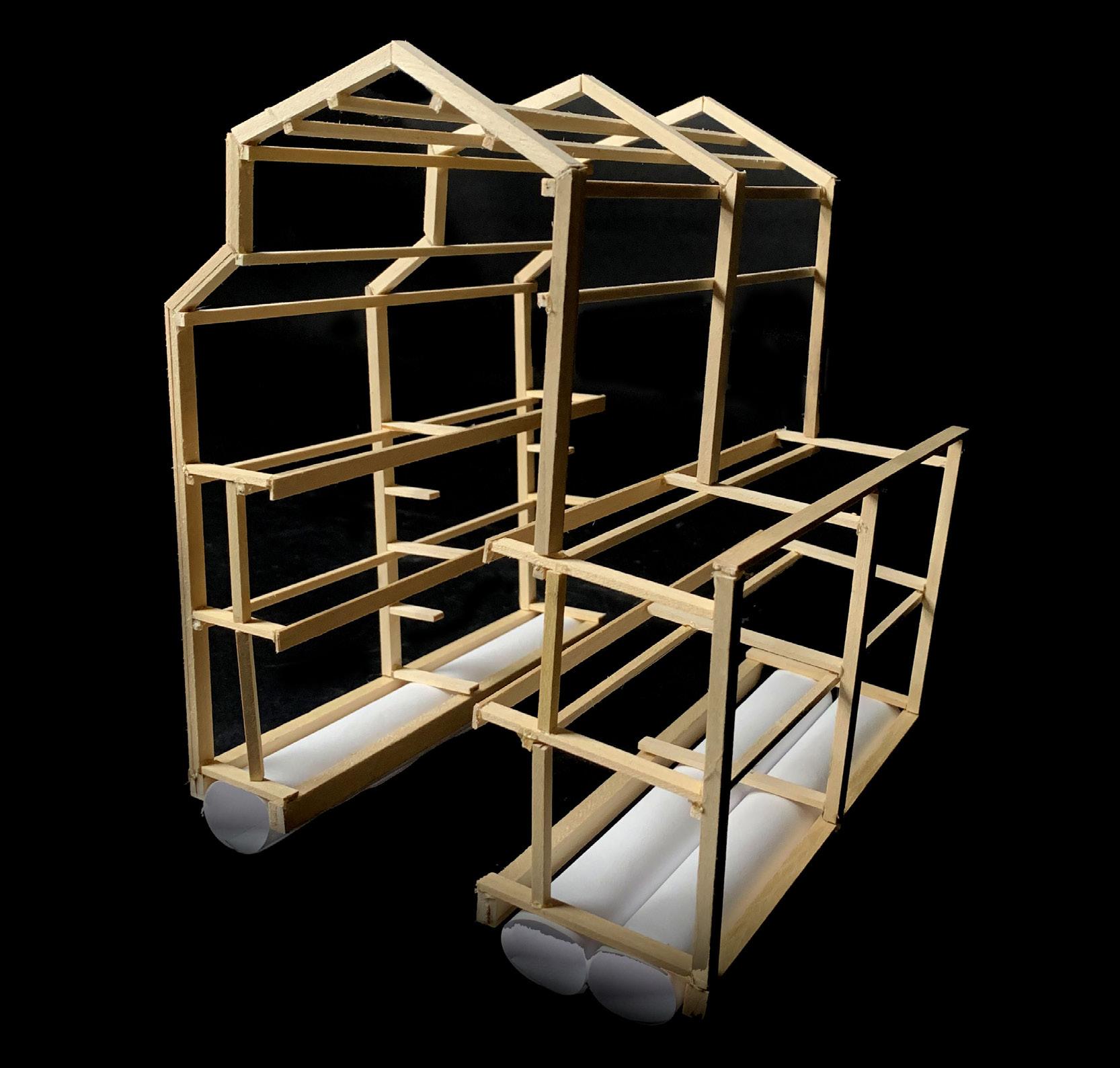
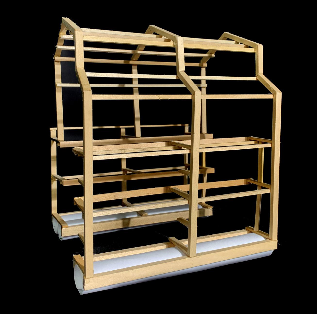
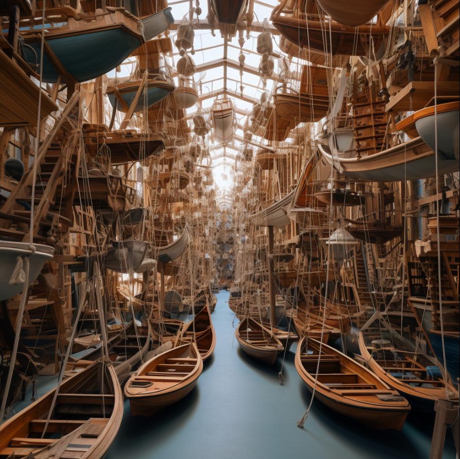
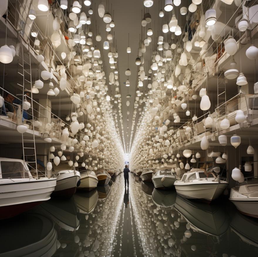
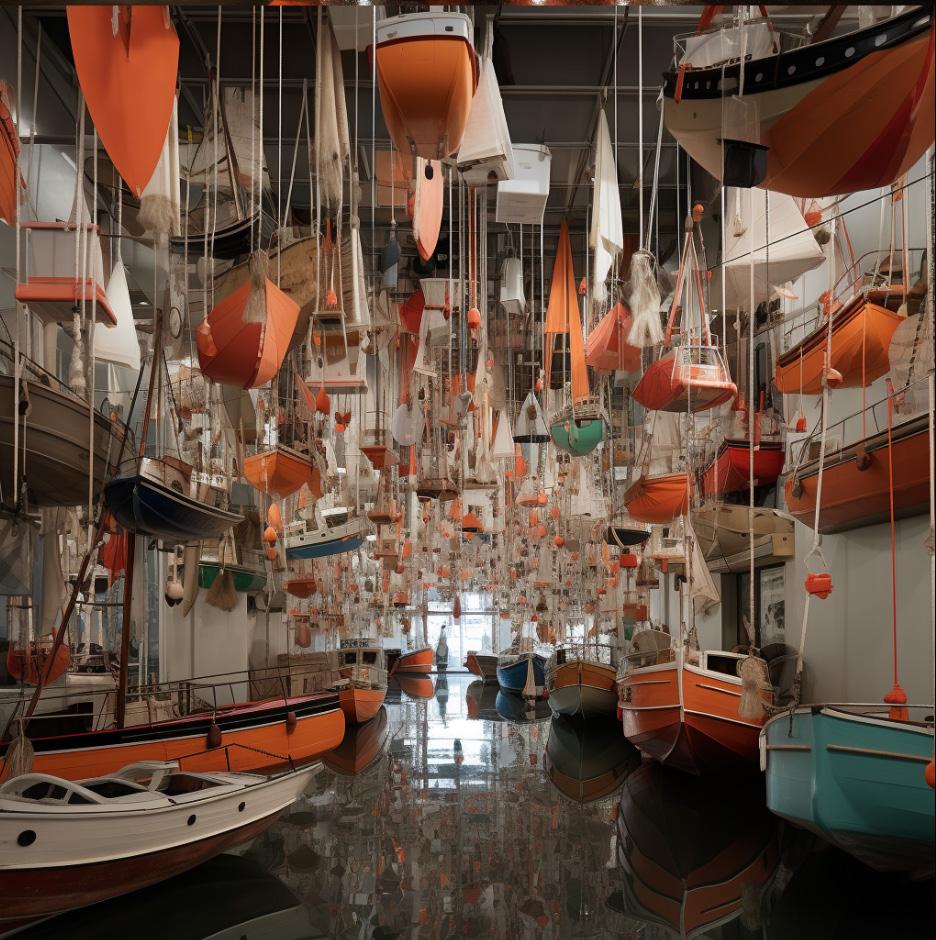
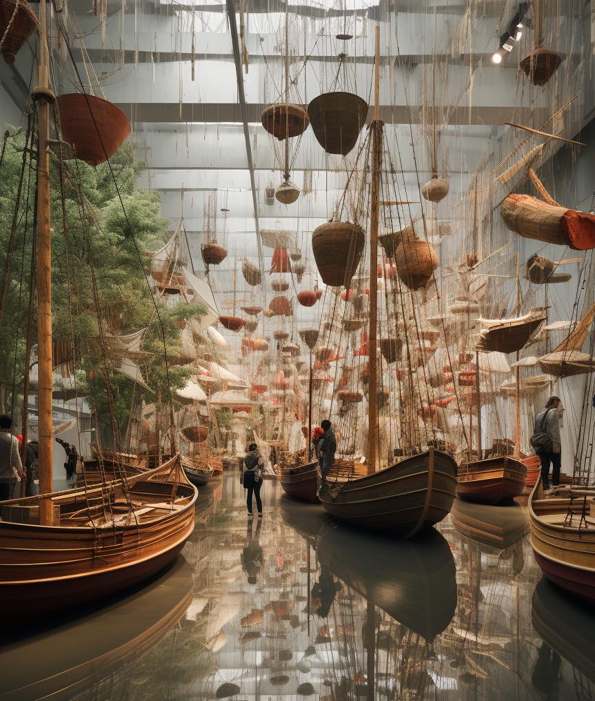
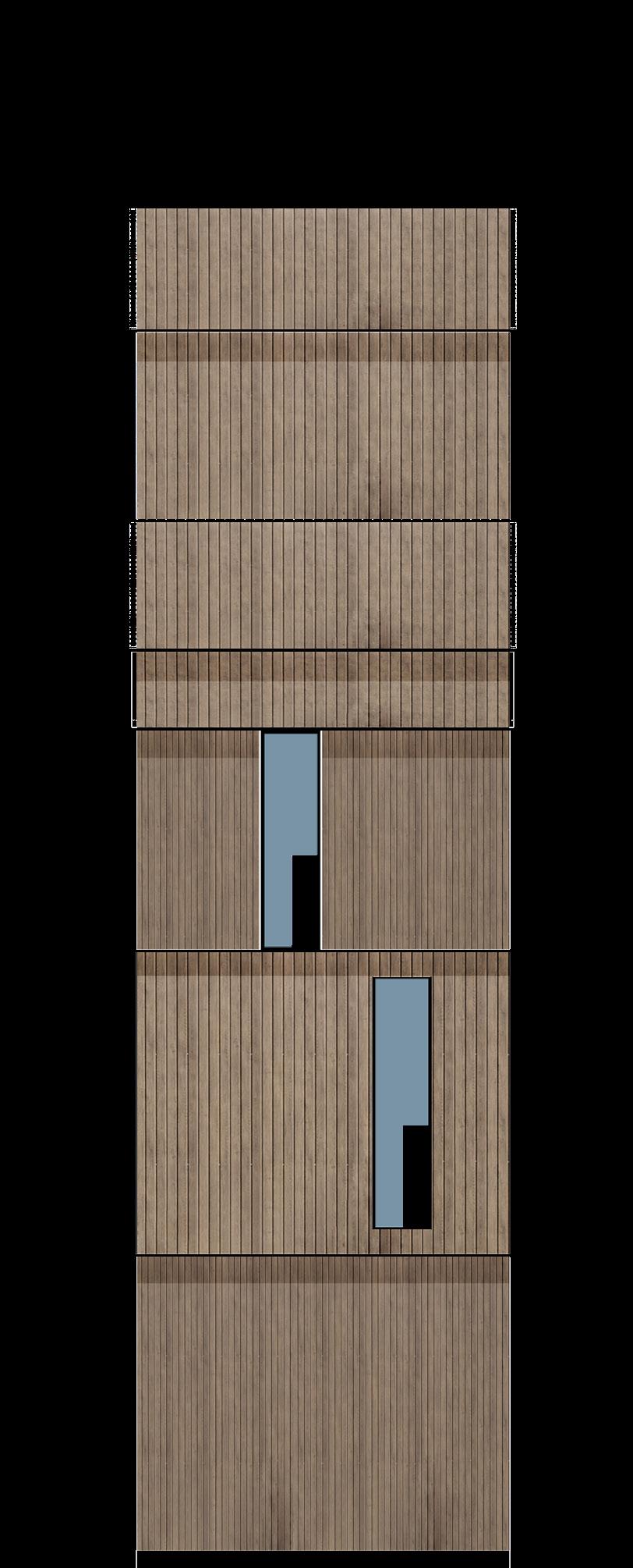
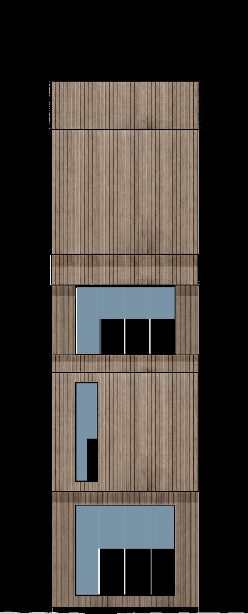
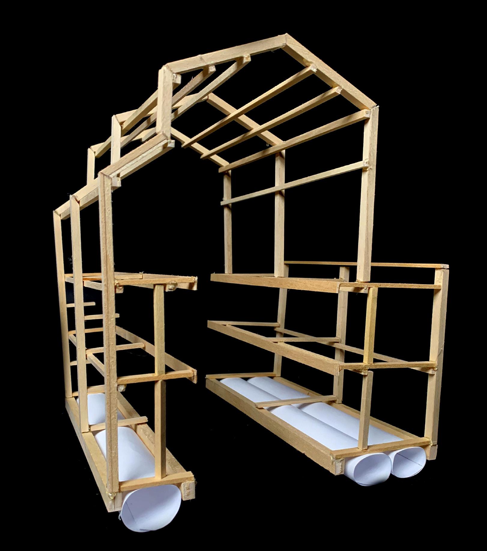
The Boat Library is located in the Alexandria Bay, New York. The structure is non-site specific due to its floating nature. It serves as a large boat which travels throughout the bay distributing & collecting small boats. Occupants are able to access the library by land or water, where users can rent boats or kayaks from. The central space is a large, water filled void which houses suspended boats that can be dropped down into the canal-like space and driven out into the bay. Additionally, the structure provides space for reviewing
nautical records & historic information on Alexandria Bay. A roof top viewing deck allows occupants to capture views while aboard. These spaces are accessed by a series of draw bridges, allowing taller sailboats to migrate through the central space.


Fall 2023 | Arch.515.01 Grad Arch Design Studio | Preserves, Libraries
Instructor Rubén Alcolea
Cummings School of Architecture
Roger Williams University
Part One: Preliminary Research
Ethan Izzo
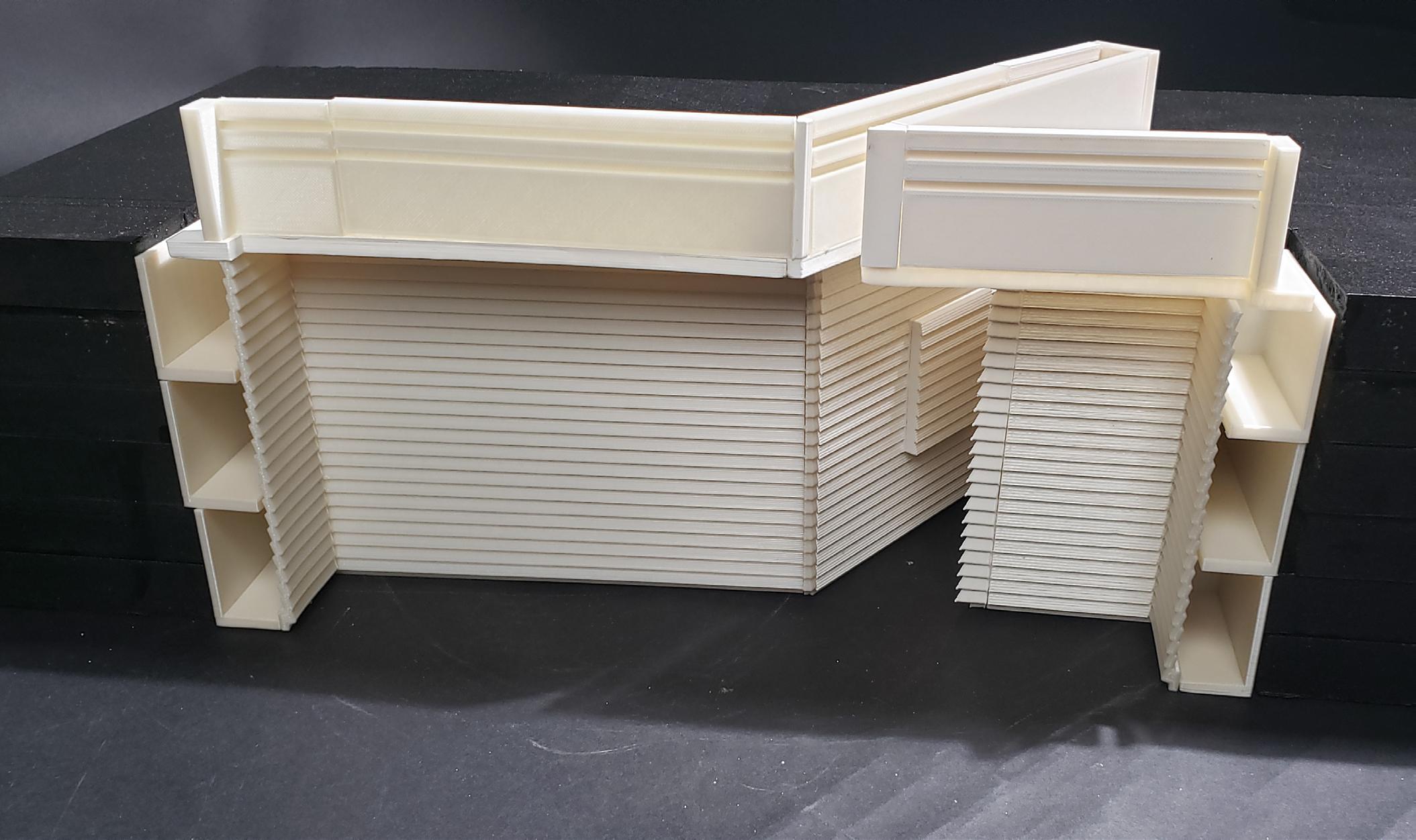
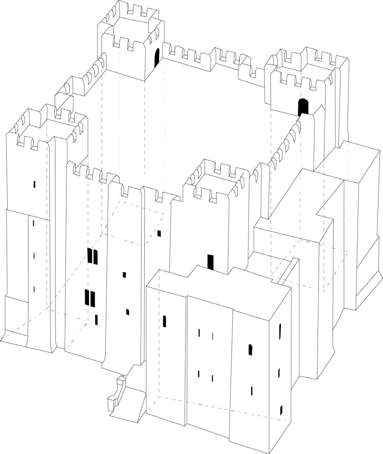
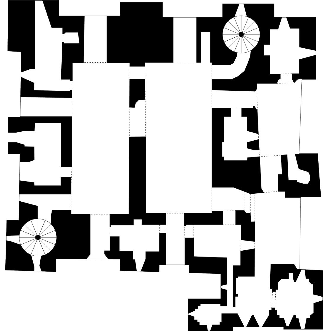
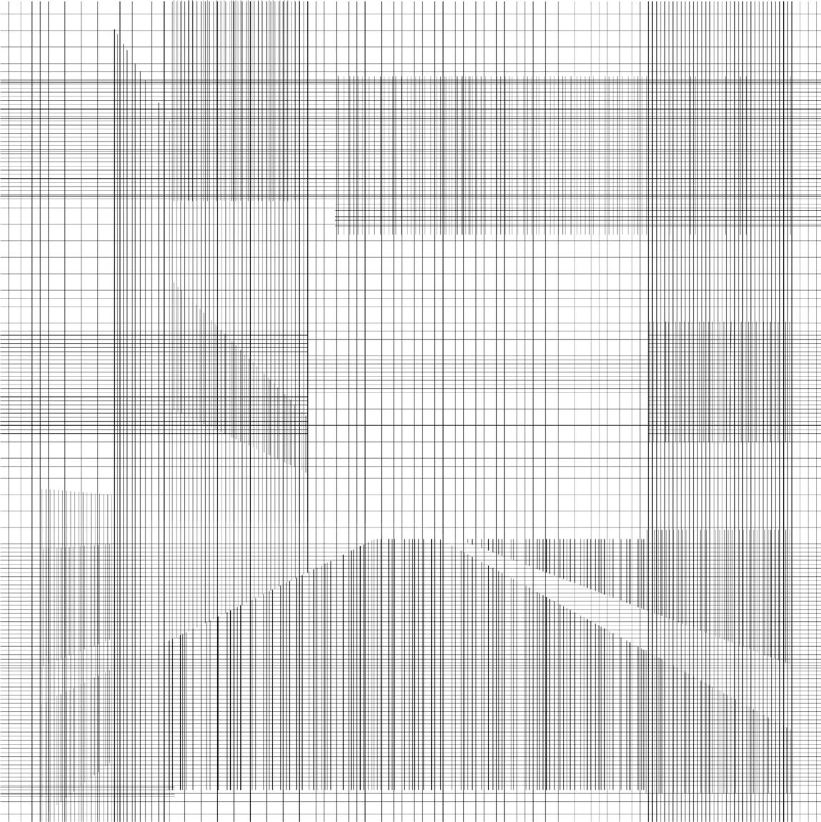
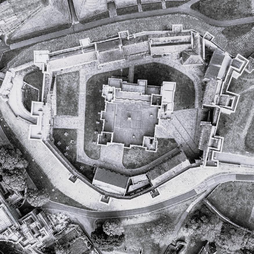
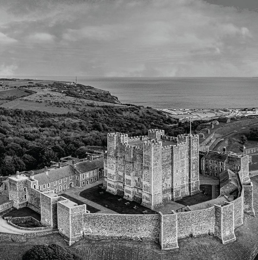
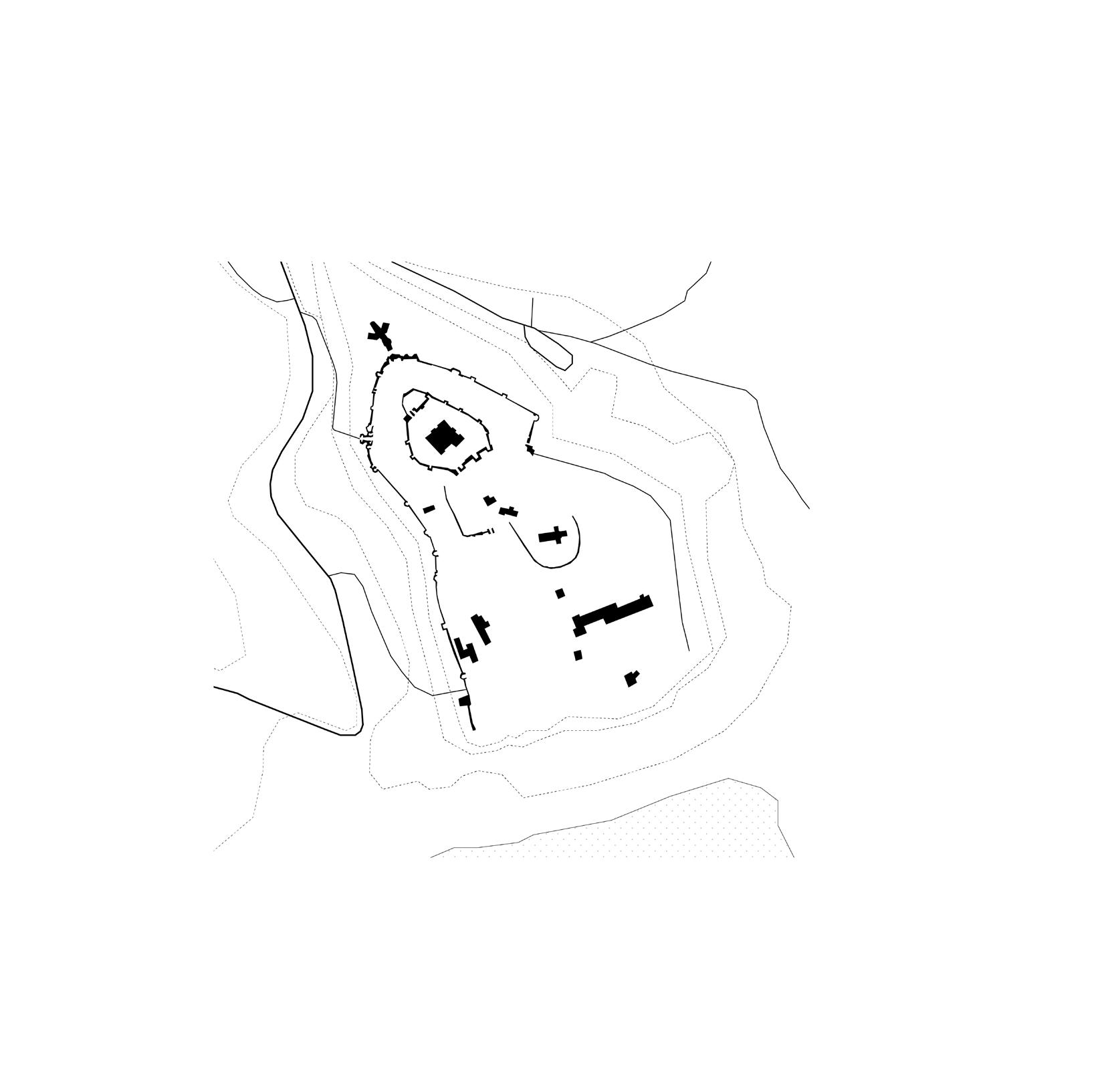
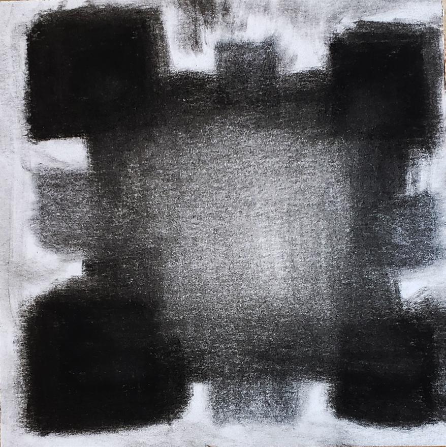
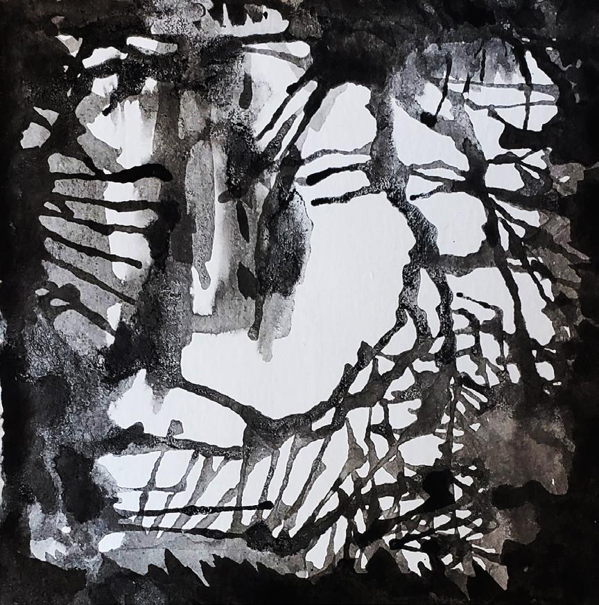
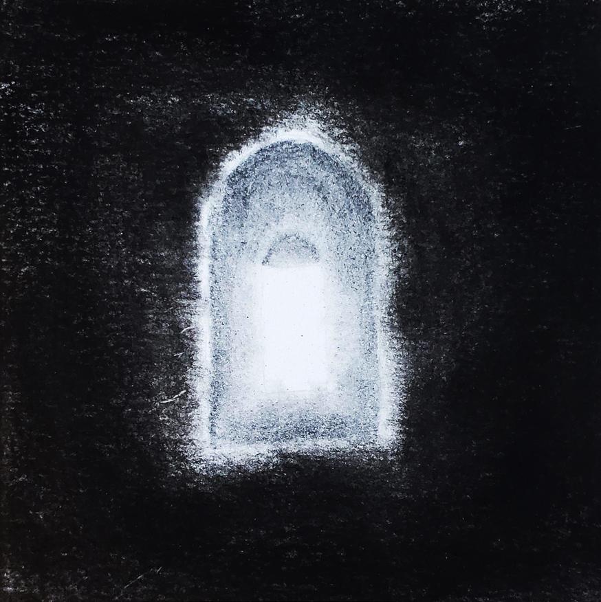
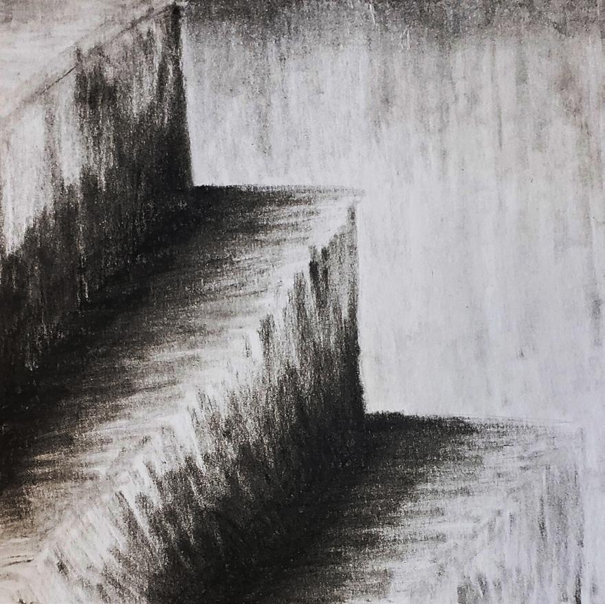
At the beginning of this project I chose to analyze the Dover Castle in Dover england. The biggest takeaways I got from this precedent were the heavy exterior walls that contrasted greatly with the openness of the building in plan. I also drew inspiration from the section of Dover castle which consists of a large opening in the center with minimal spaces along the perimeter, being mostly circulation spaces; A concept that became a central idea to my project.

Part Two: AI
Ethan Izzo
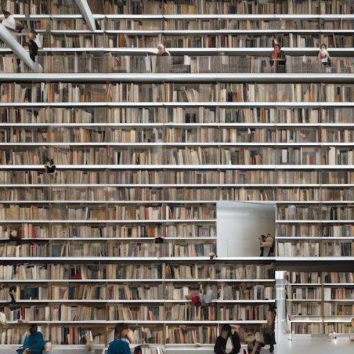
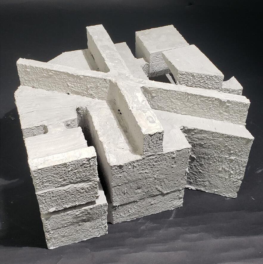
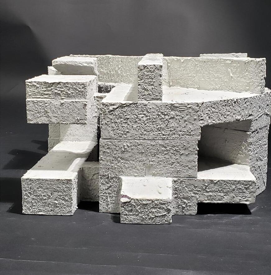
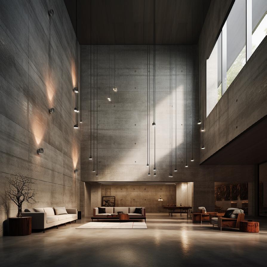
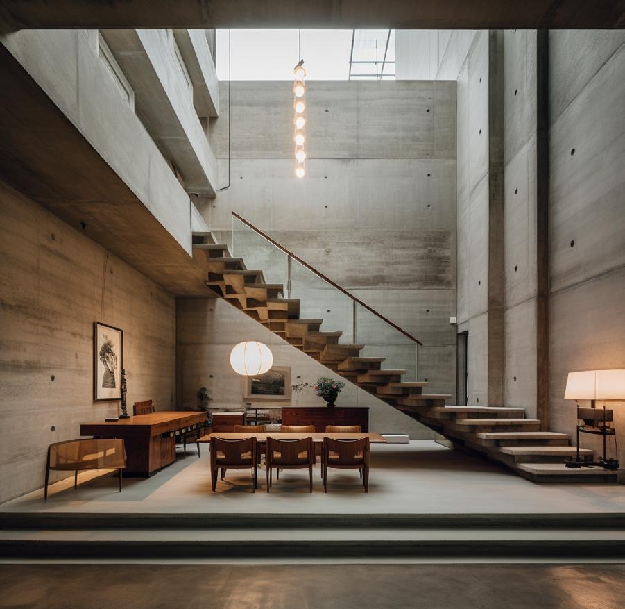
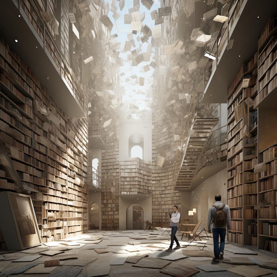
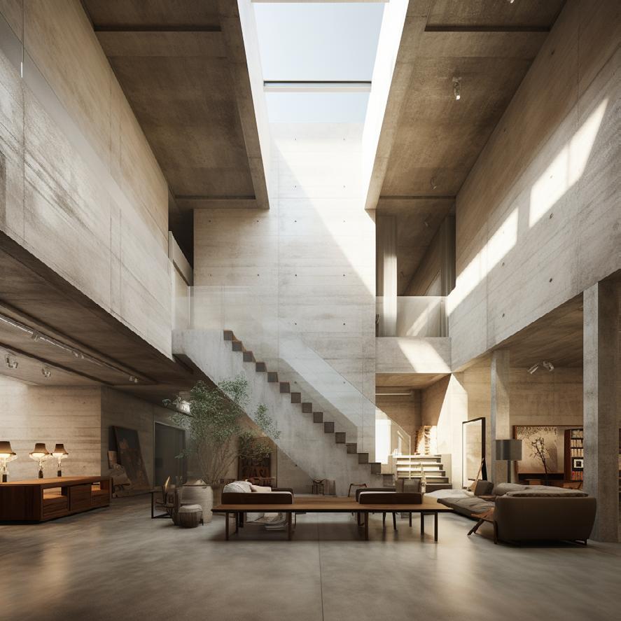
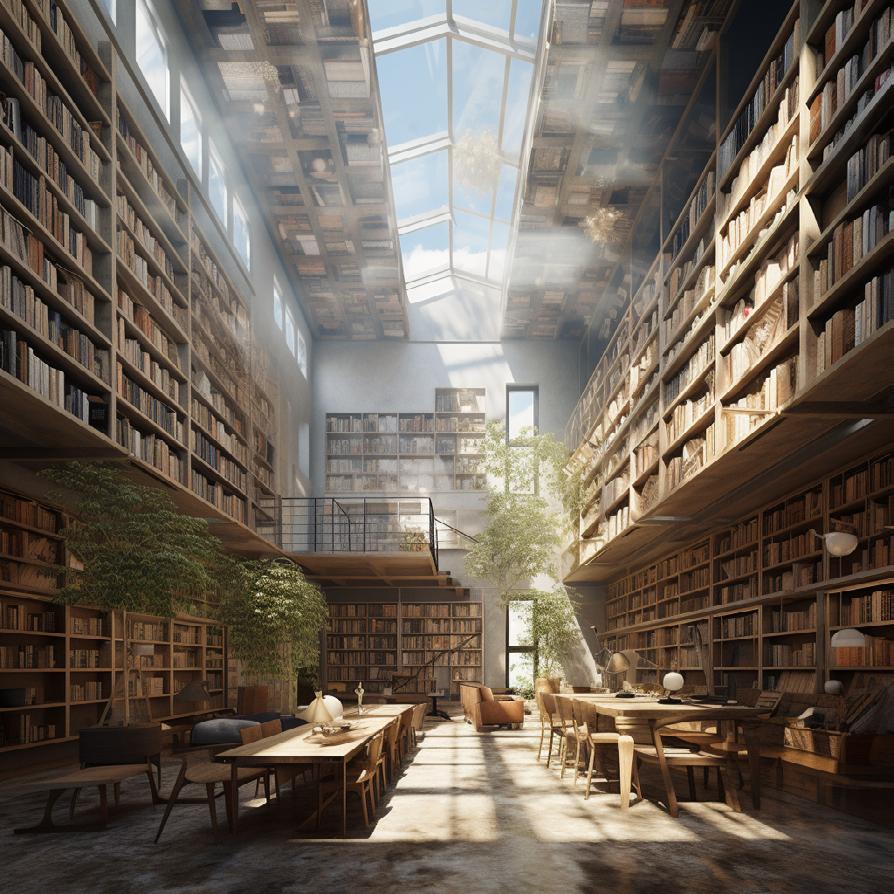
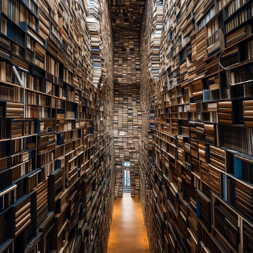
When first moving into AI images I initially fed the machine props that included key words such as “dramatic indirict lighting, monolithic space, and concrete. As my project and concept continued to grow I began to adapt the AI image prompts to match my new intents for the project, including phrasing such as walls made of books, and narrow central skylight. This allowed me to get a visual of how my project may look, while also potentially inspiring new ideas for my design.
Part Three: Preserves / Libraries
Ethan Izzo
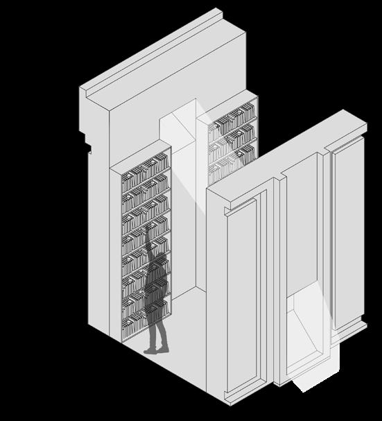
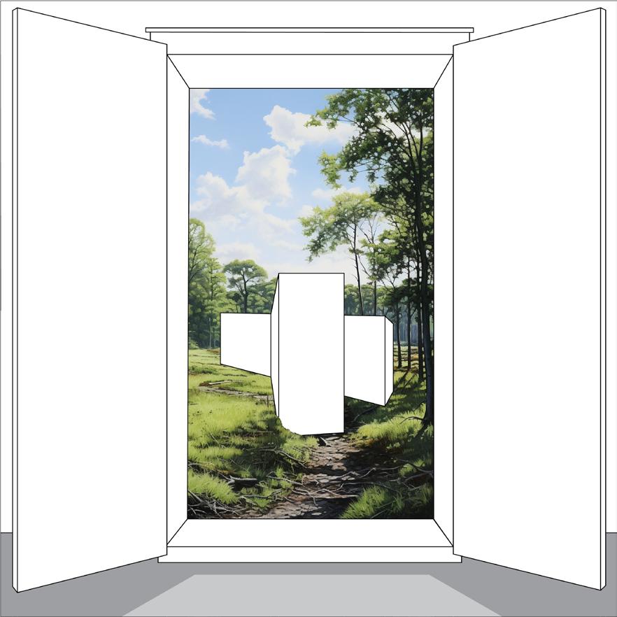
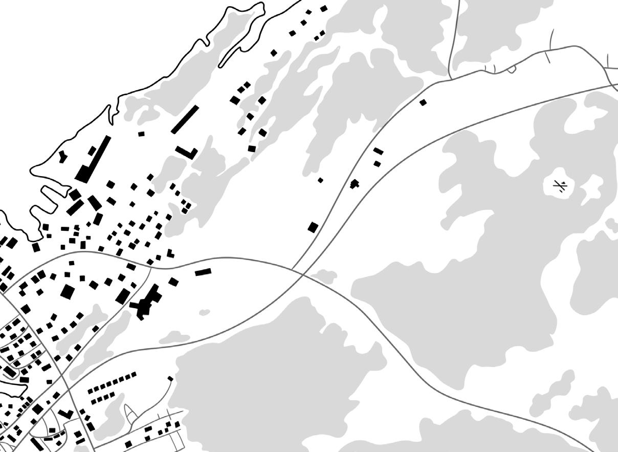
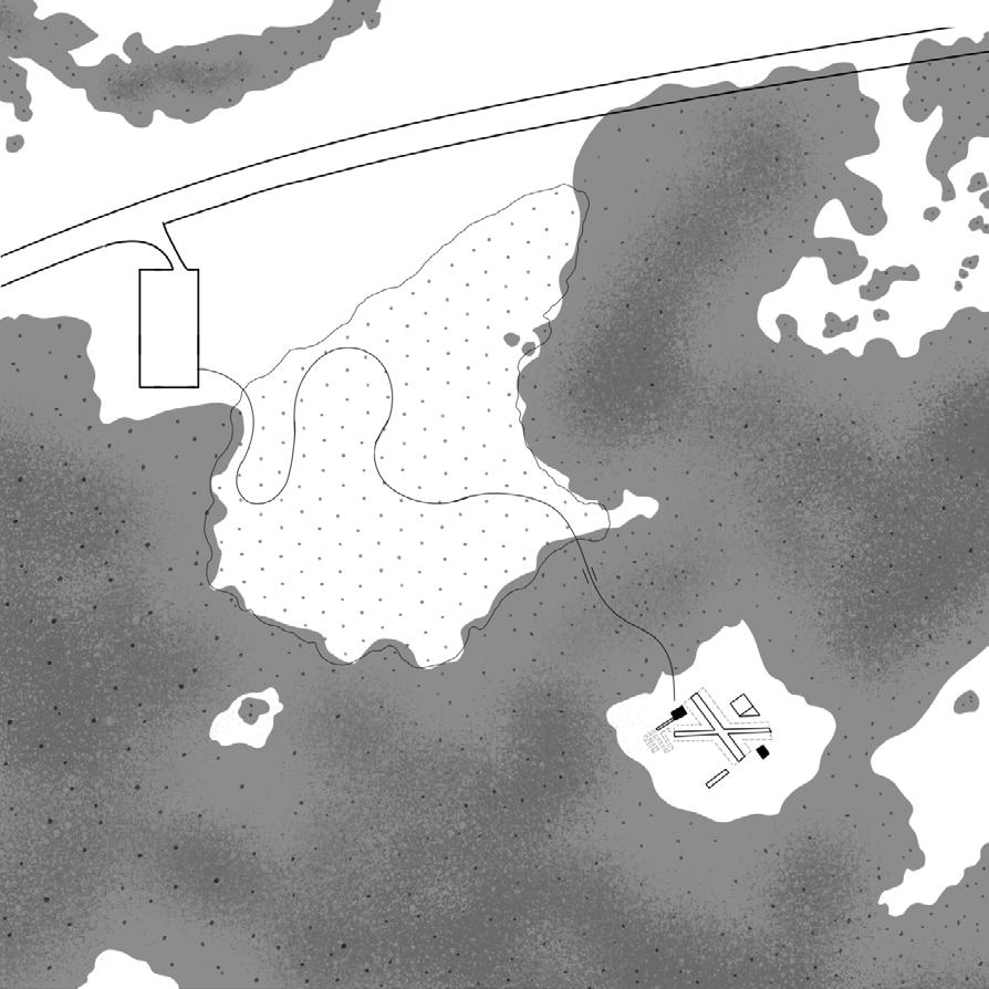
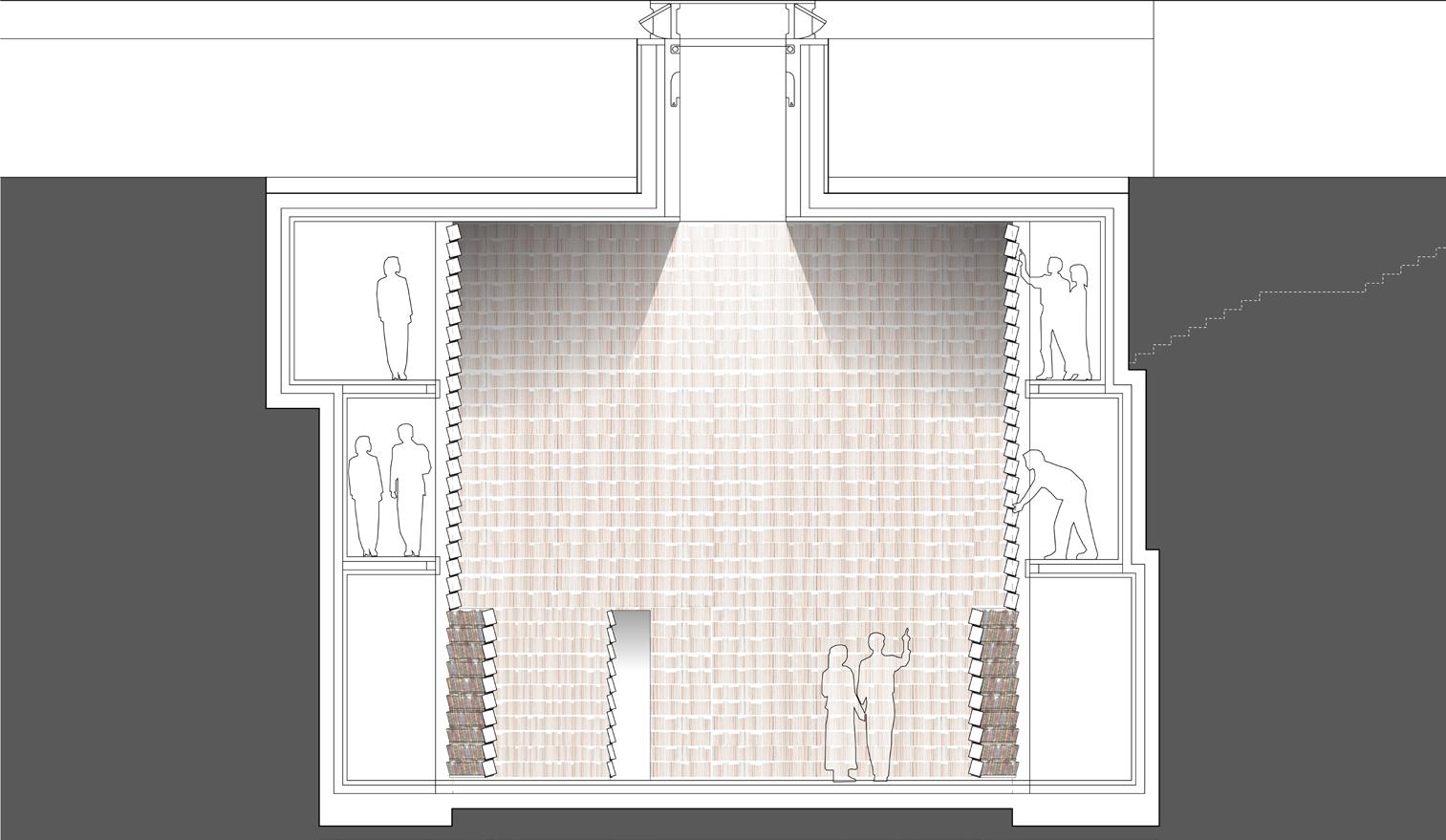
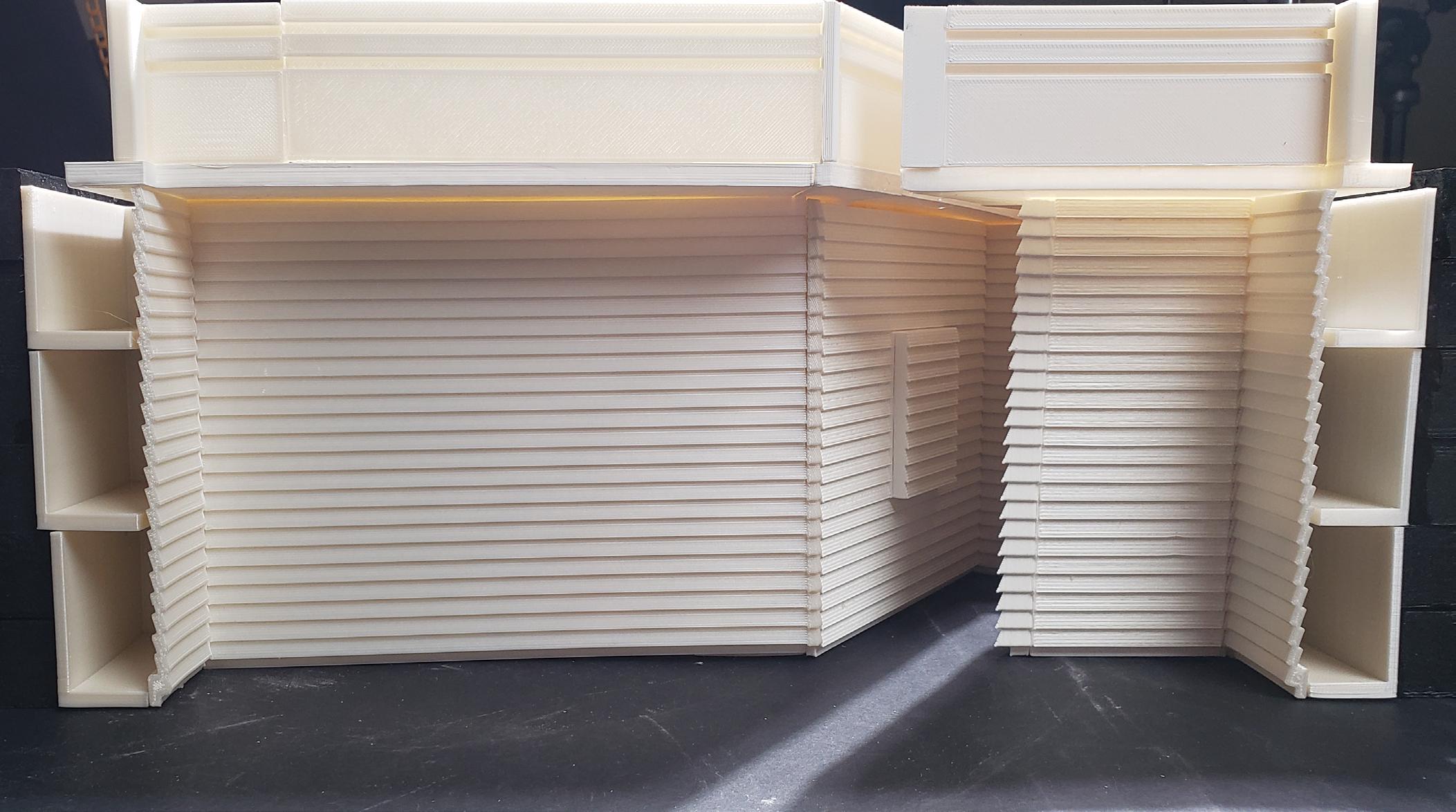
For my project I chose to create a library of adventures. The library itself would contain a vast number of high-fantasy novels, I chose to collect these novels as they serve as an escape from the monotony of modern life, much as the library itself is intended to serve as an escape. The adventure of the library begins at its placement in a clearing in the woods far from the center of town, making you embark on a journey, leaving behind the things you see everyday, upon reaching the parking lot you must leave your car behind and continue on foot through the meandering path that will lead you to the library, granting you the first moment of discovery, as you see a large X shape protruding from the ground with no way to know what it is or whats beneath. As you work your way down through the building you find yourself in an undulating path that grows narrow in certain locations, with an interior wall made entirely of books that you are able to take out, doing so will give you a glimpse of the large central space beyond. As you work your way through the building one will find areas where the concrete floor changes to a more welcoming wooden material that denotes an area where you can stop, read, and rest. These spaces are either small individual reading nooks carved into the exterior wall, or larger spaces that can be occuped by several readers. In addition there are some places where the interior wall of books pushes out into the central space, creating a narrow view port from which one can get a glimpse of the central space. Upon reaching the lowest level, one will discover bookshelves that are designed to pivot, allowing them to push open the walls themselves to enter the central space. Once within the space, visitors will see sheer walls of books with no visible structure that rise all the way to the top of the building, seemingly supporting the roof which has a narrow X shaped skylight that runs through the length of both of the buildings axis, providing the building with indirect lighting, the narrow organization of the skylight helps to shroud the roof in darkness, making it harder to determine where the walls of books end.





Fall 2023 | Arch.515.01 Grad Arch Design Studio | Preserves, Libraries
Instructor Rubén Alcolea
Cummings School of Architecture
Roger Williams University
Grace Salisbury
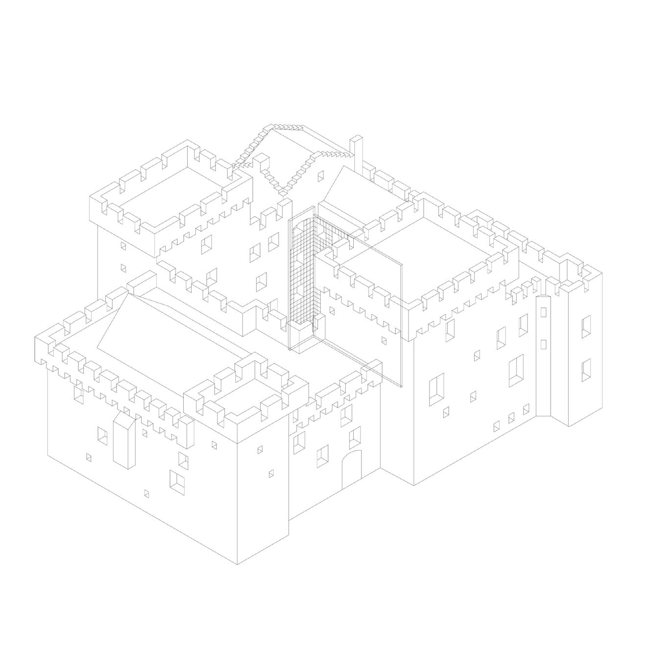
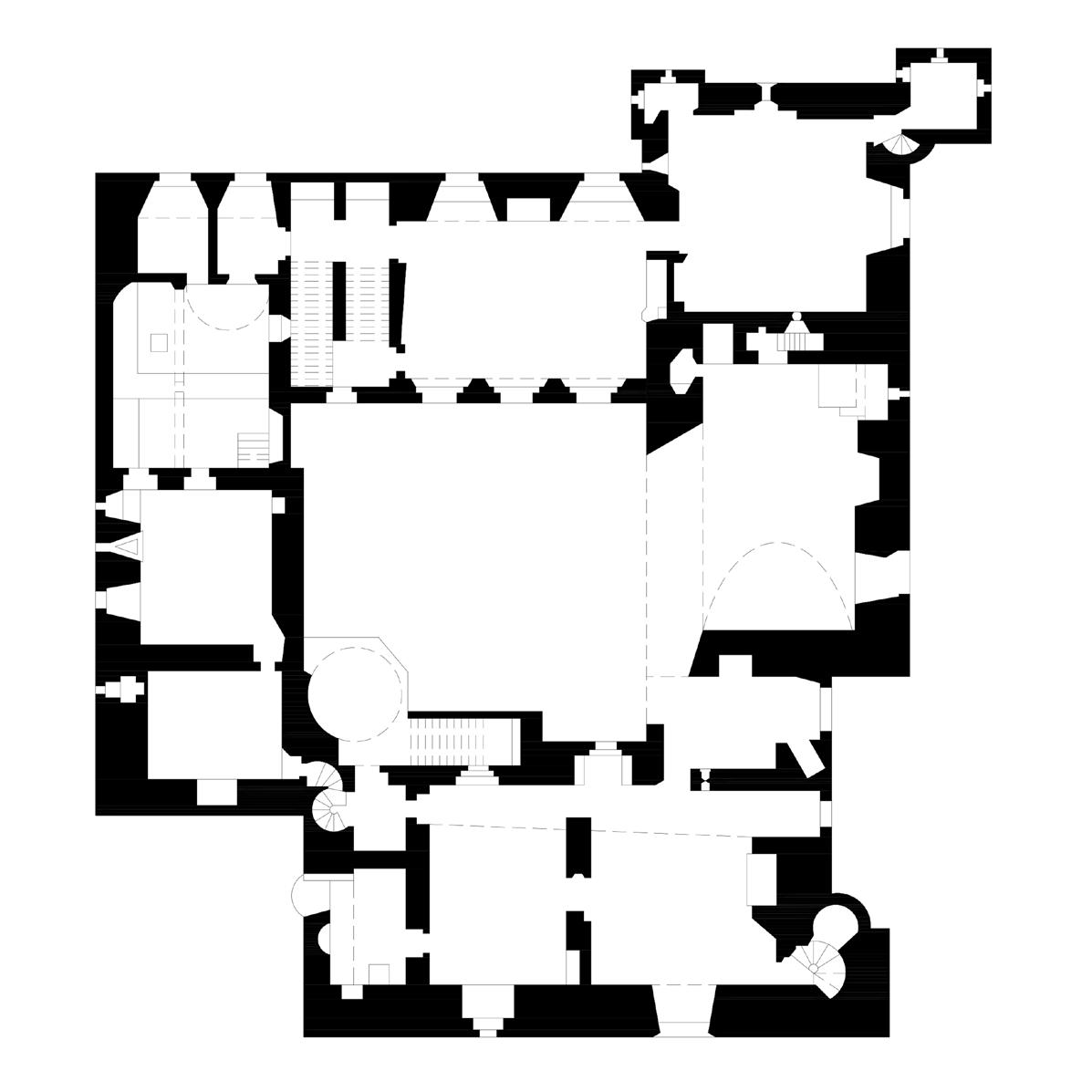
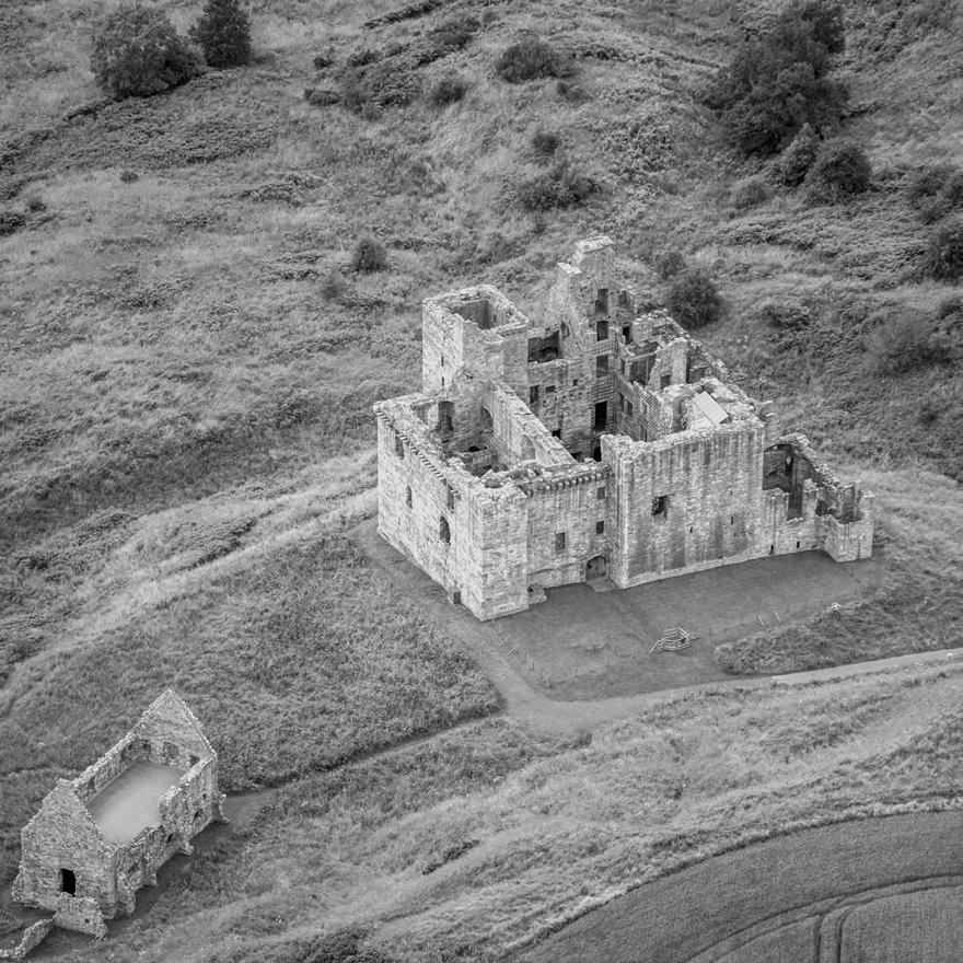
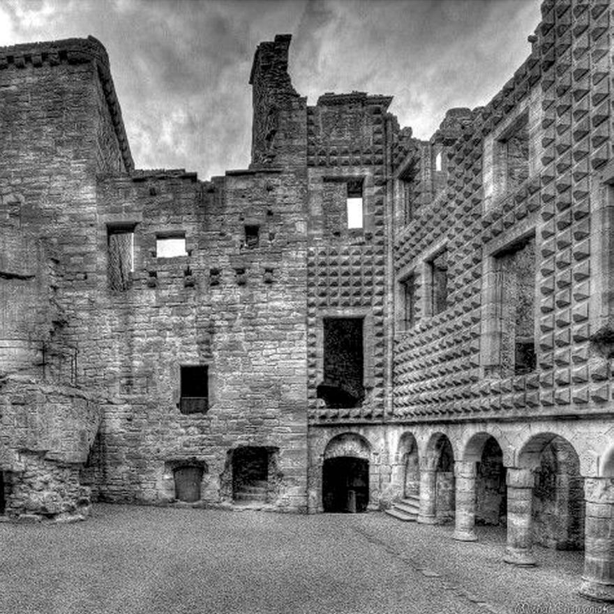
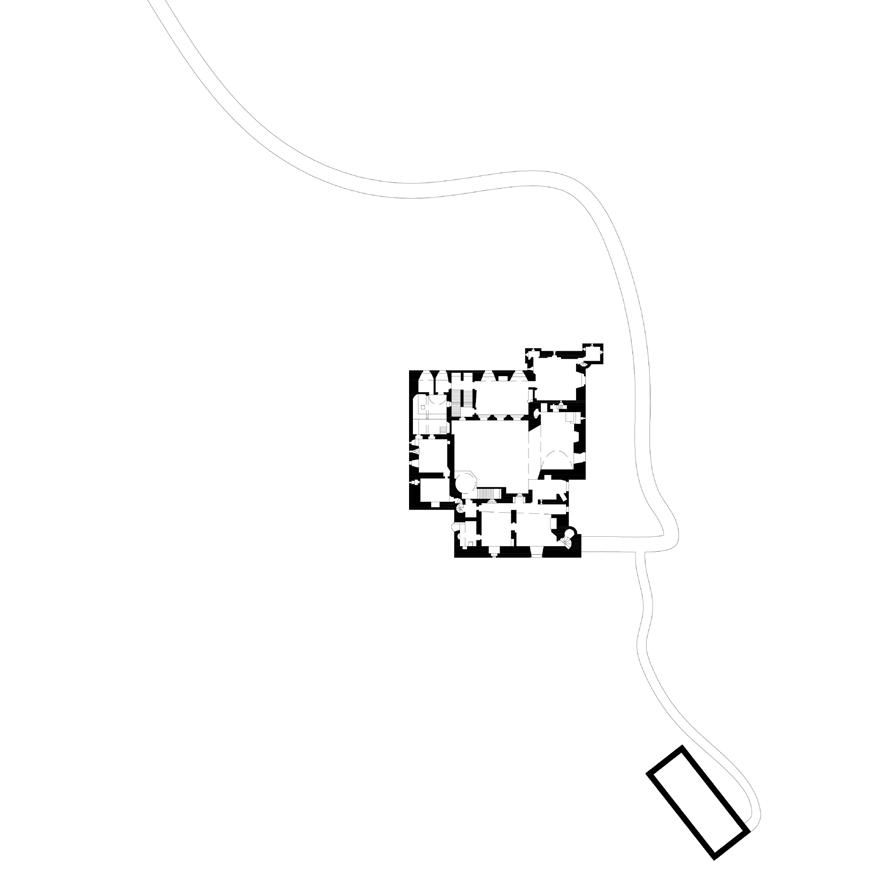
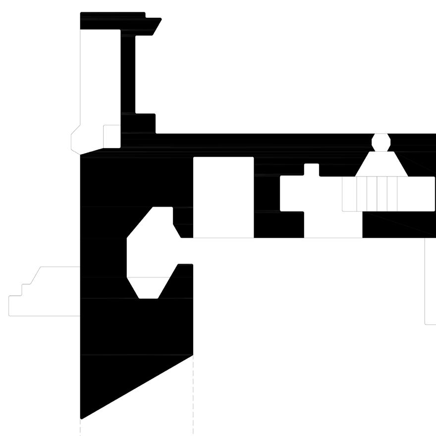
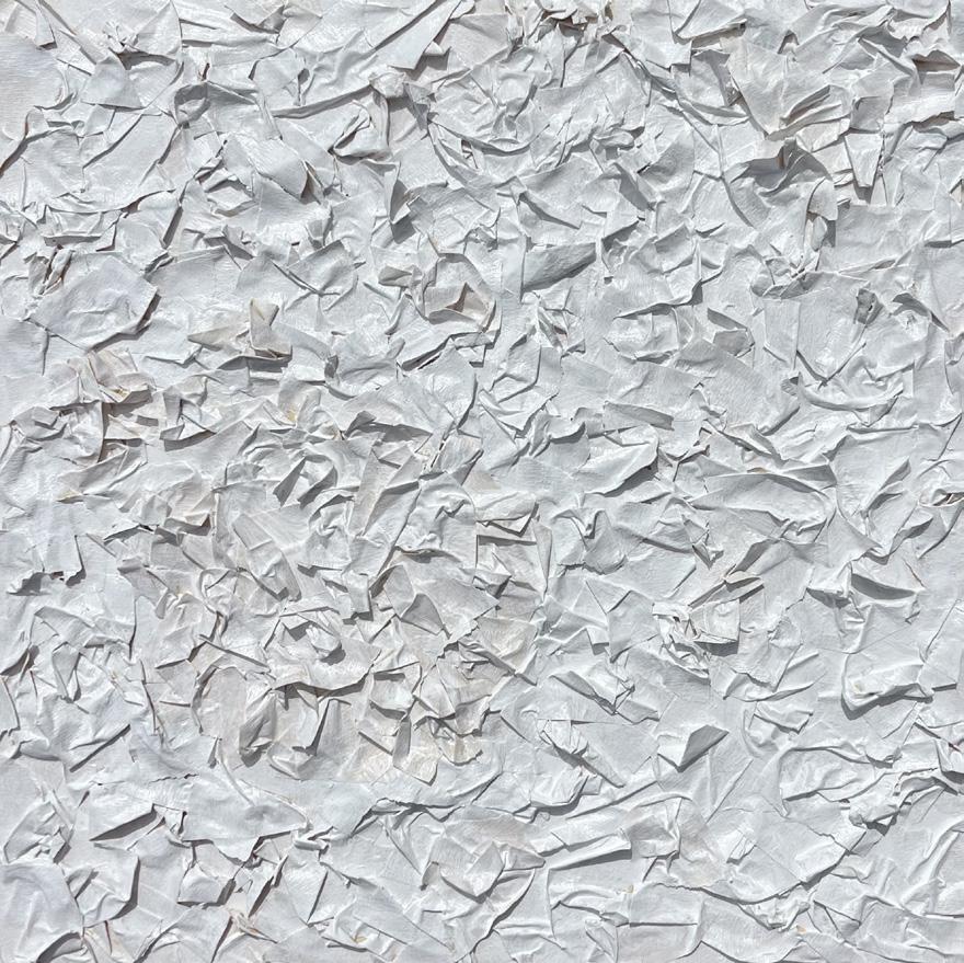
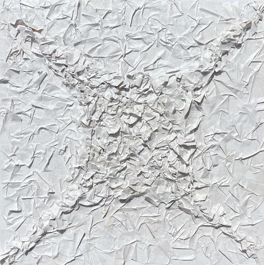
The Crichton Castle highlighted certain characteristics I decided to explore more upon in my final project of a library. It was one of the first tower houses and was built in 1390 by the Crichtons. Located in Midlothian, Scotland, the castle was added to over many centuries by different leaders. In the design, I referenced the castle’s thick wall structure, orthogonal layout, large window openings, and use of repetition in forms and ideas. The different hierarchies that controlled the castle over time changed the design and
added their own mark there, such as the diamond-faced facade built by the Earls of Bothwell in the 16th century on the wall that overlooked the central courtyard. The roads and ways of travel also changed during the many centuries that this castle endured. This was the beginning of my interest in exploring travel and finding a collection of maps to display and hold in my library design. The initial forms and ideas from this precedent shaped my design in many ways.

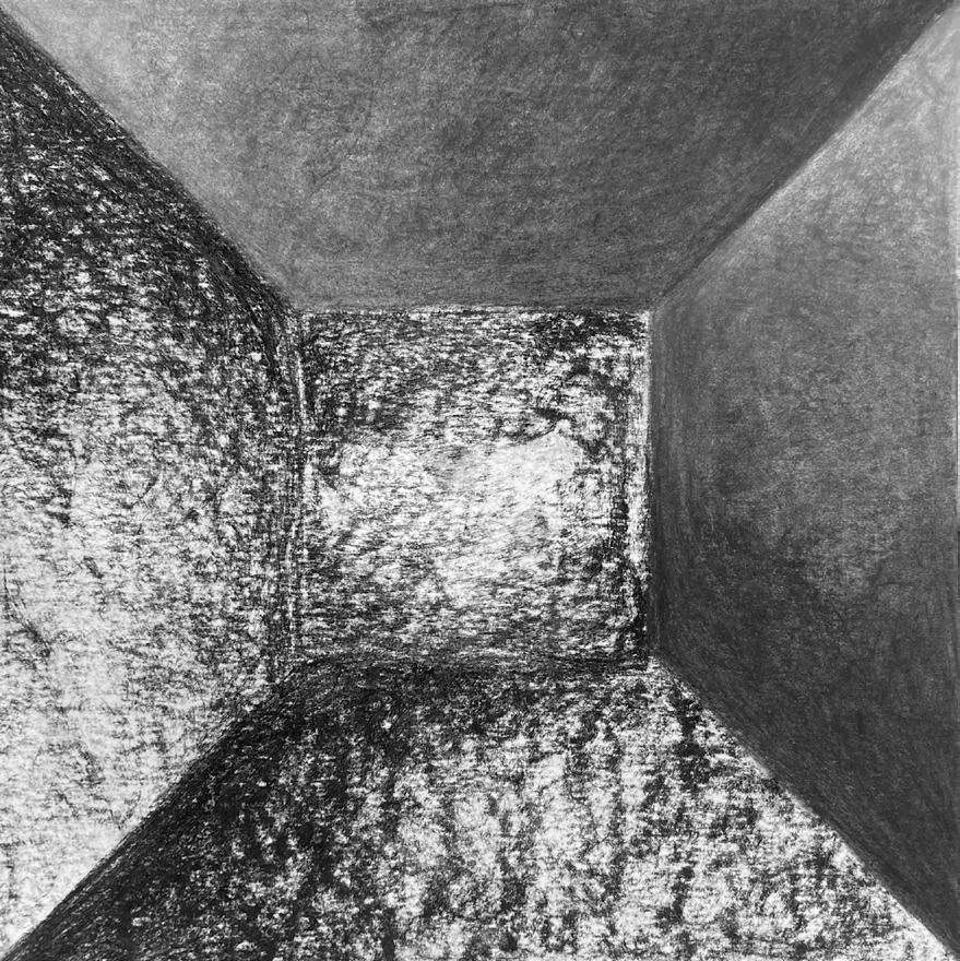
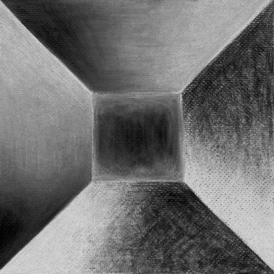
Grace Salisbury
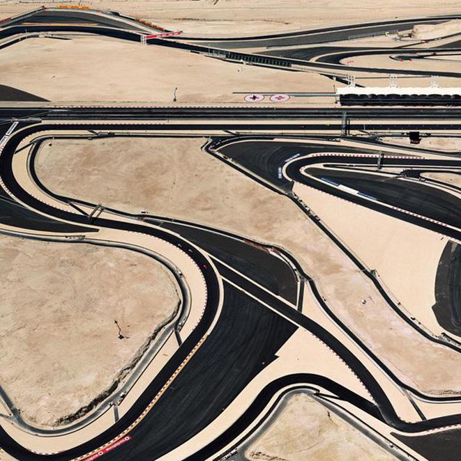
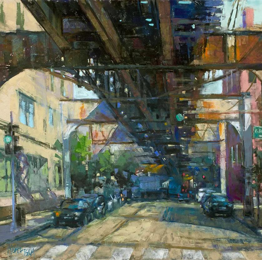
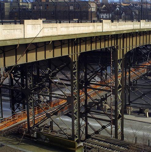
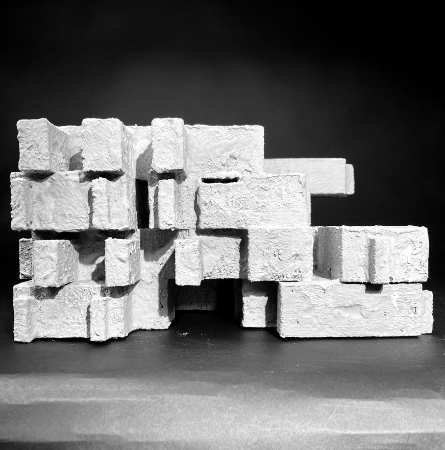
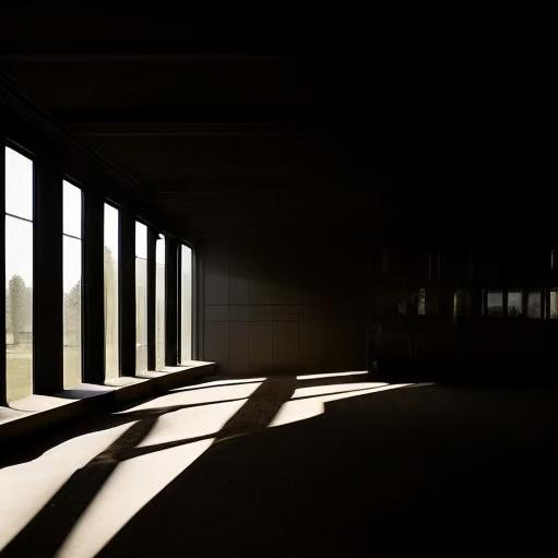
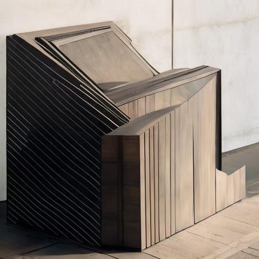
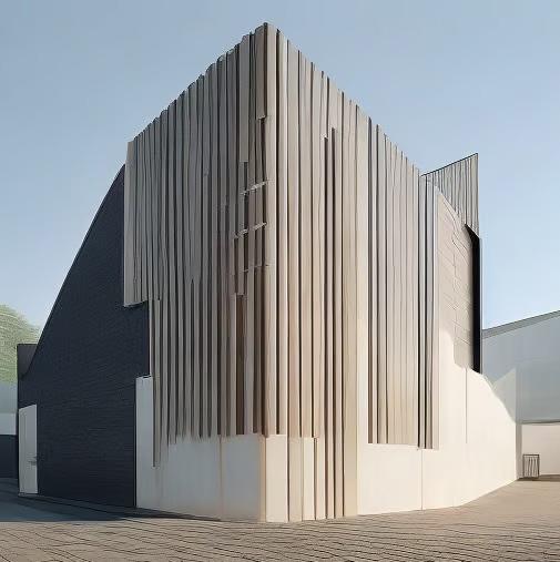
To generate the first AI images, I used words that would bring forward the ideas and forms I liked in the Crichton Castle precedent study, that I wanted to continue in the design for my project. Using these ideas for the prompts, the AI programs generated many images that I used to help form a SketchUp model. I replicated certain views or exteriors to extrude and retract in the model to create a 120’ x 120’ building. There were four levels, which were used to plan the layout of the negative and positive spaces in the library. Some of the AI images also helped define the
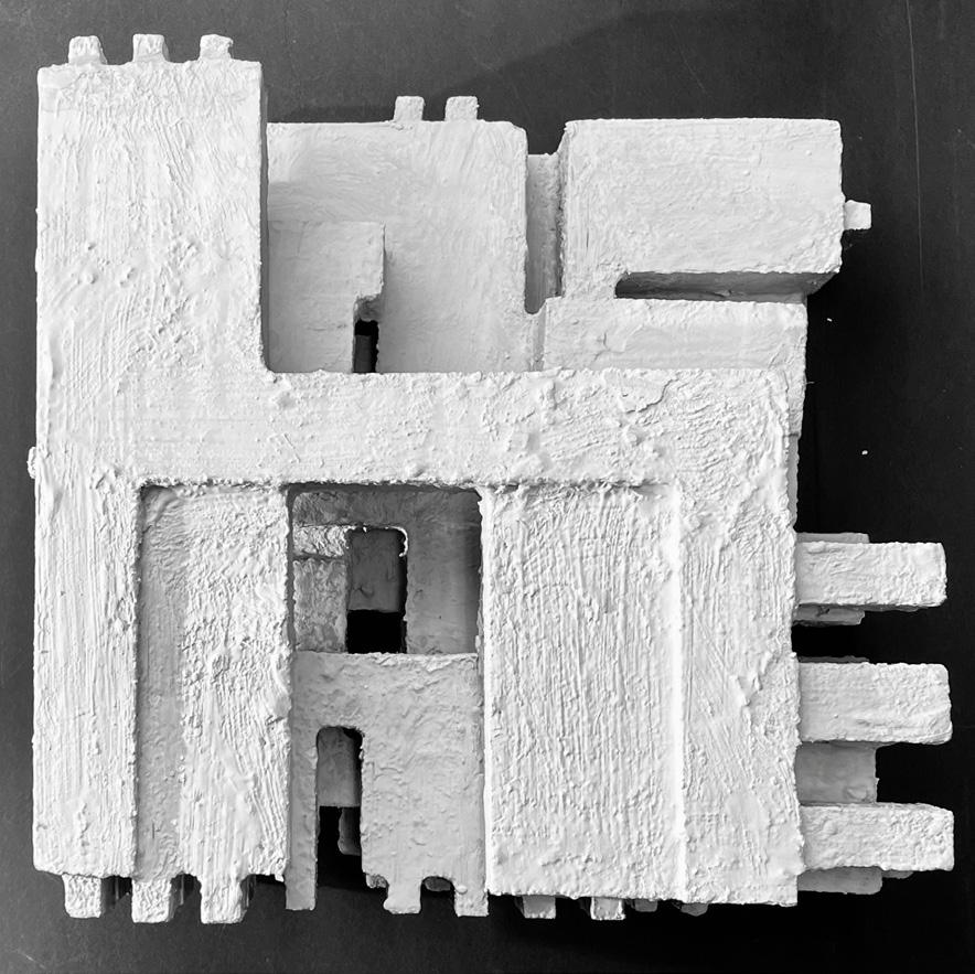
collection of the library and where it would be located in Alexandria, NY. For the prompts, I referenced Enric Mestre sculptures and Nicholas Alan Cope photography. I also used different combinations of the following words/phrases: connection of roads, traveling on roads and bridges, pattern of texture, repetition, large openings, shadows, monolithic walls forming space, staggering effect, large daylight openings, thick perimeter walls, concrete, wood texture, comparison of negative and positive space.
Part Three: Preserves / Libraries
Grace Salisbury
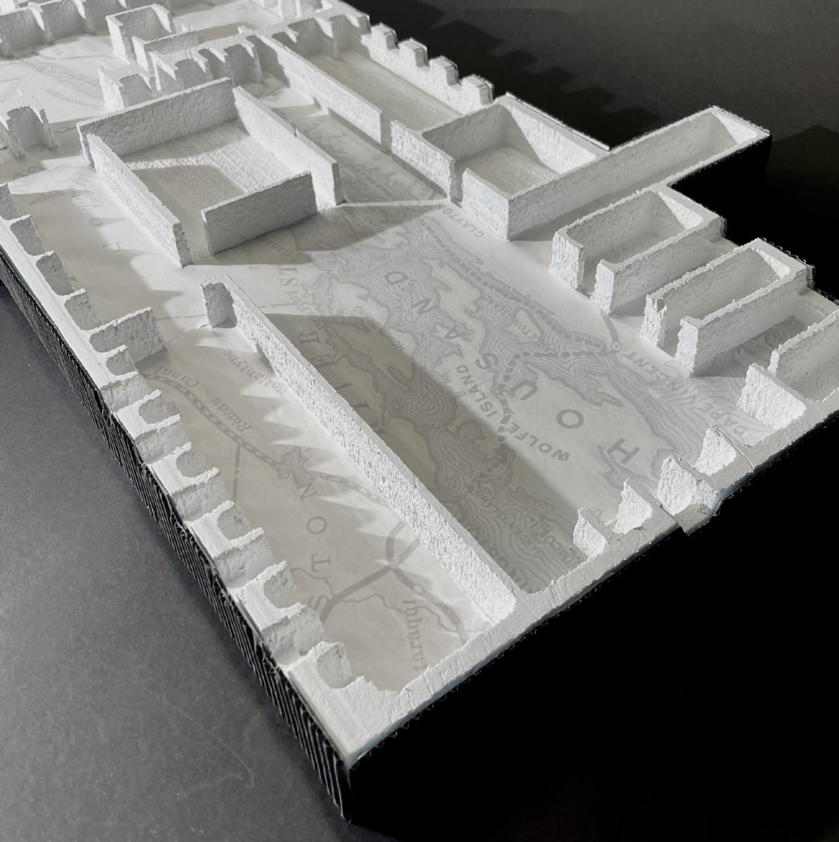
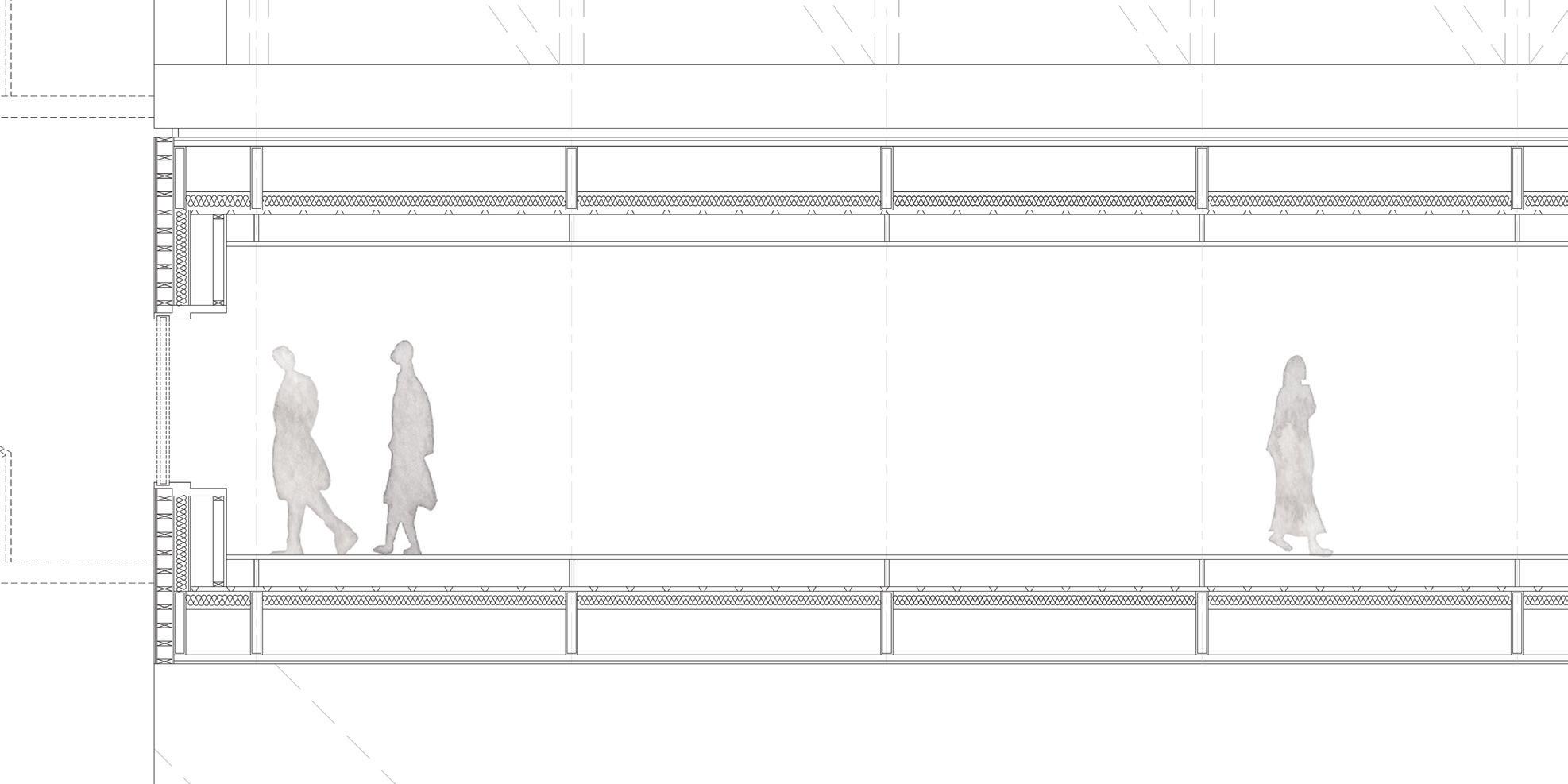
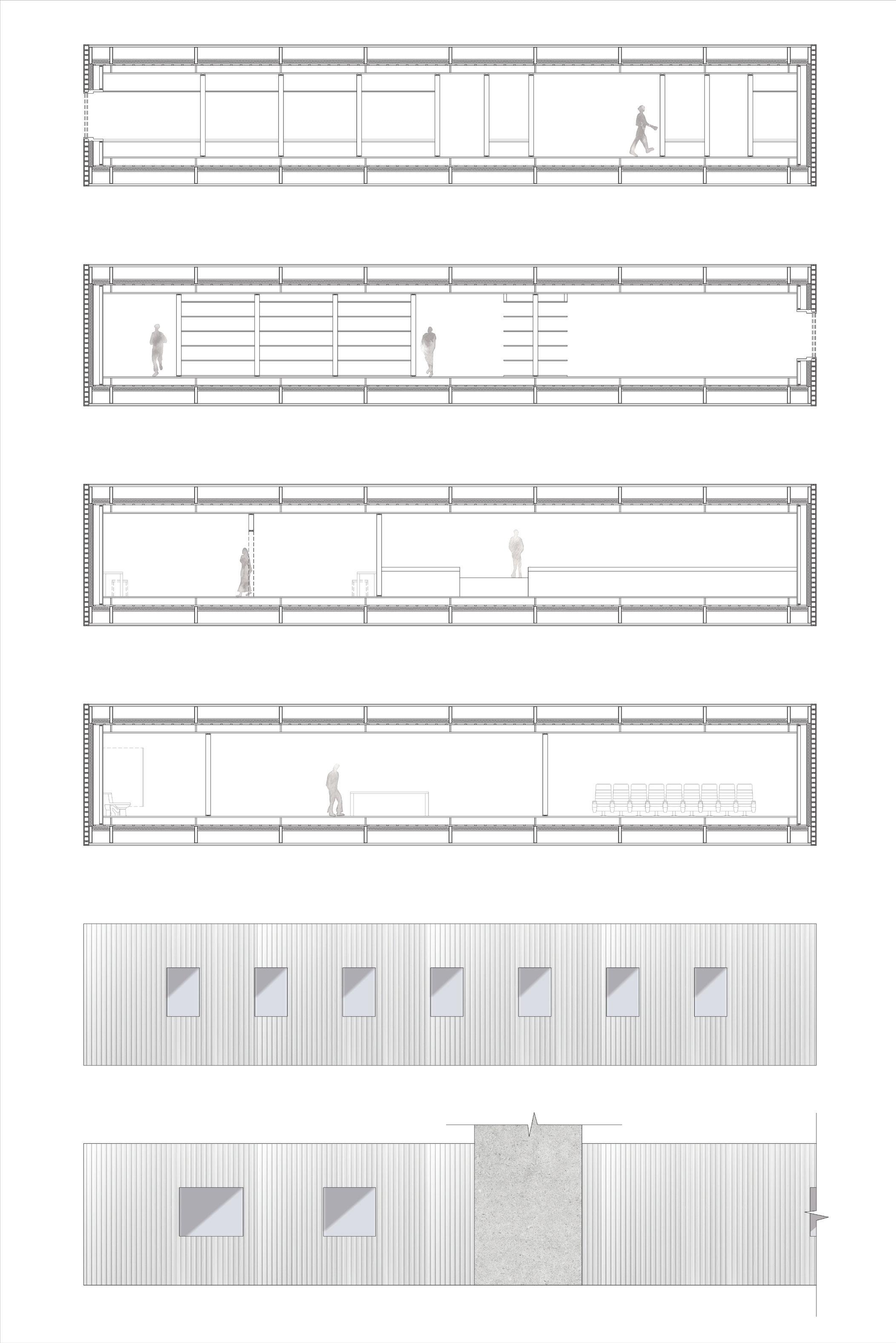
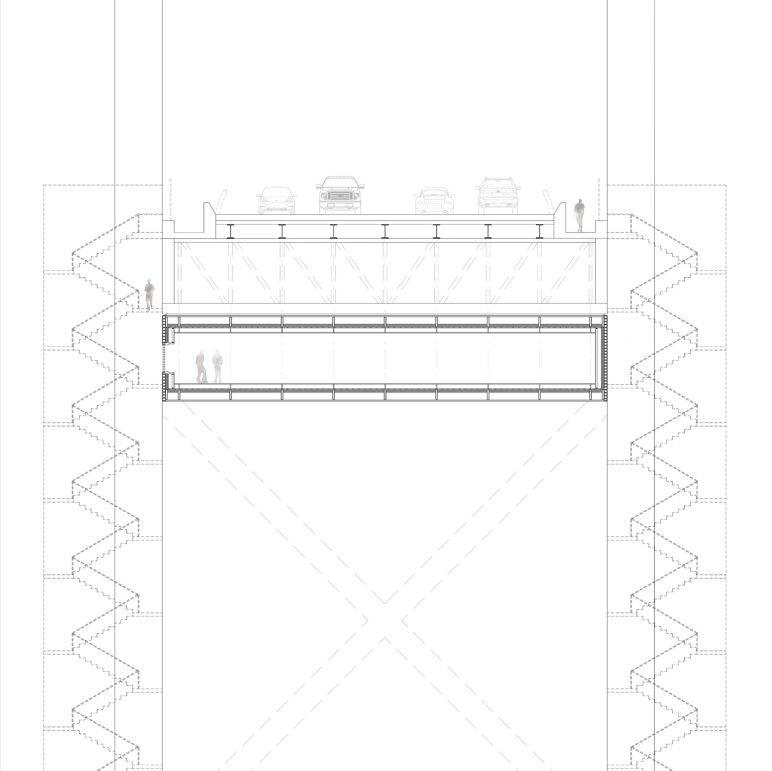
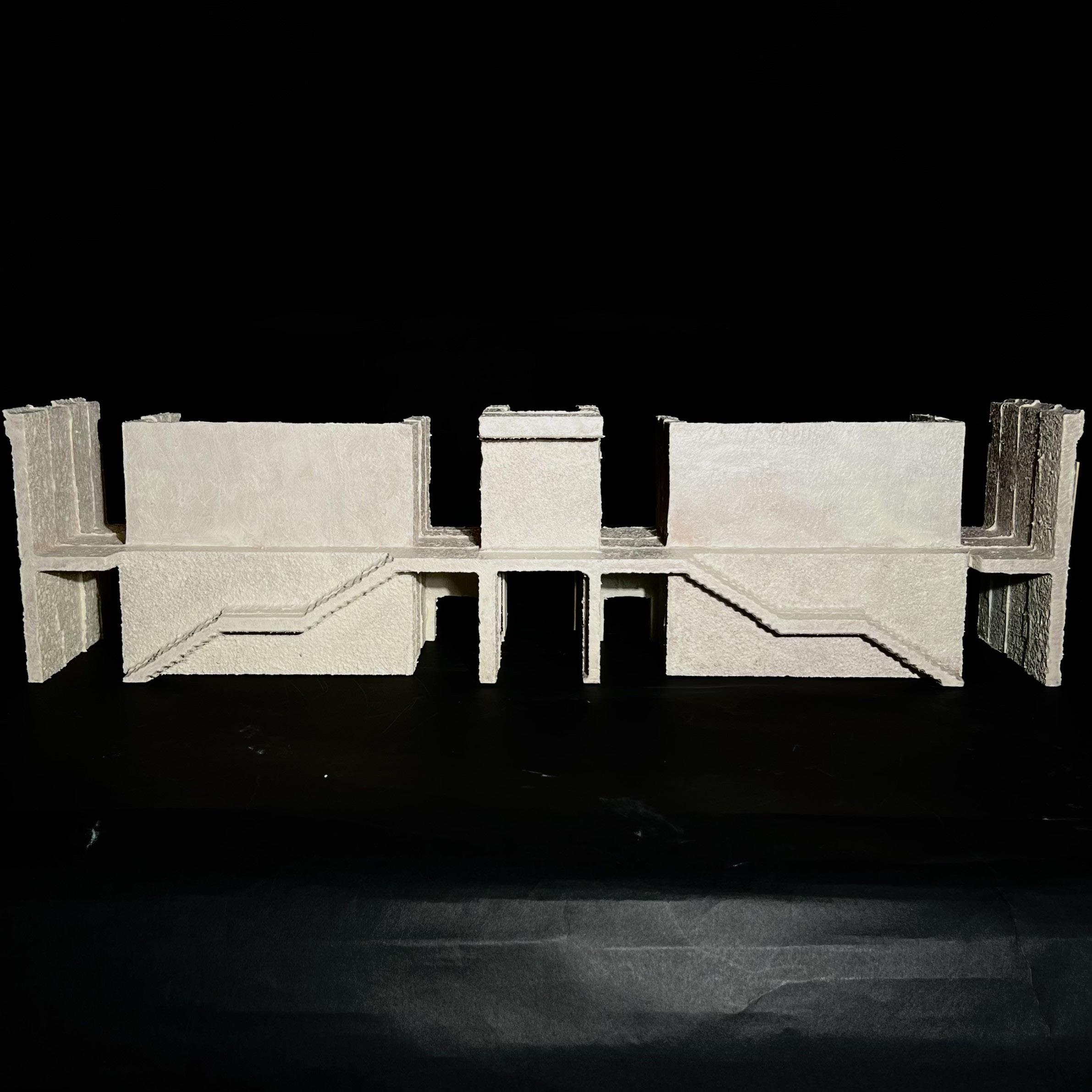
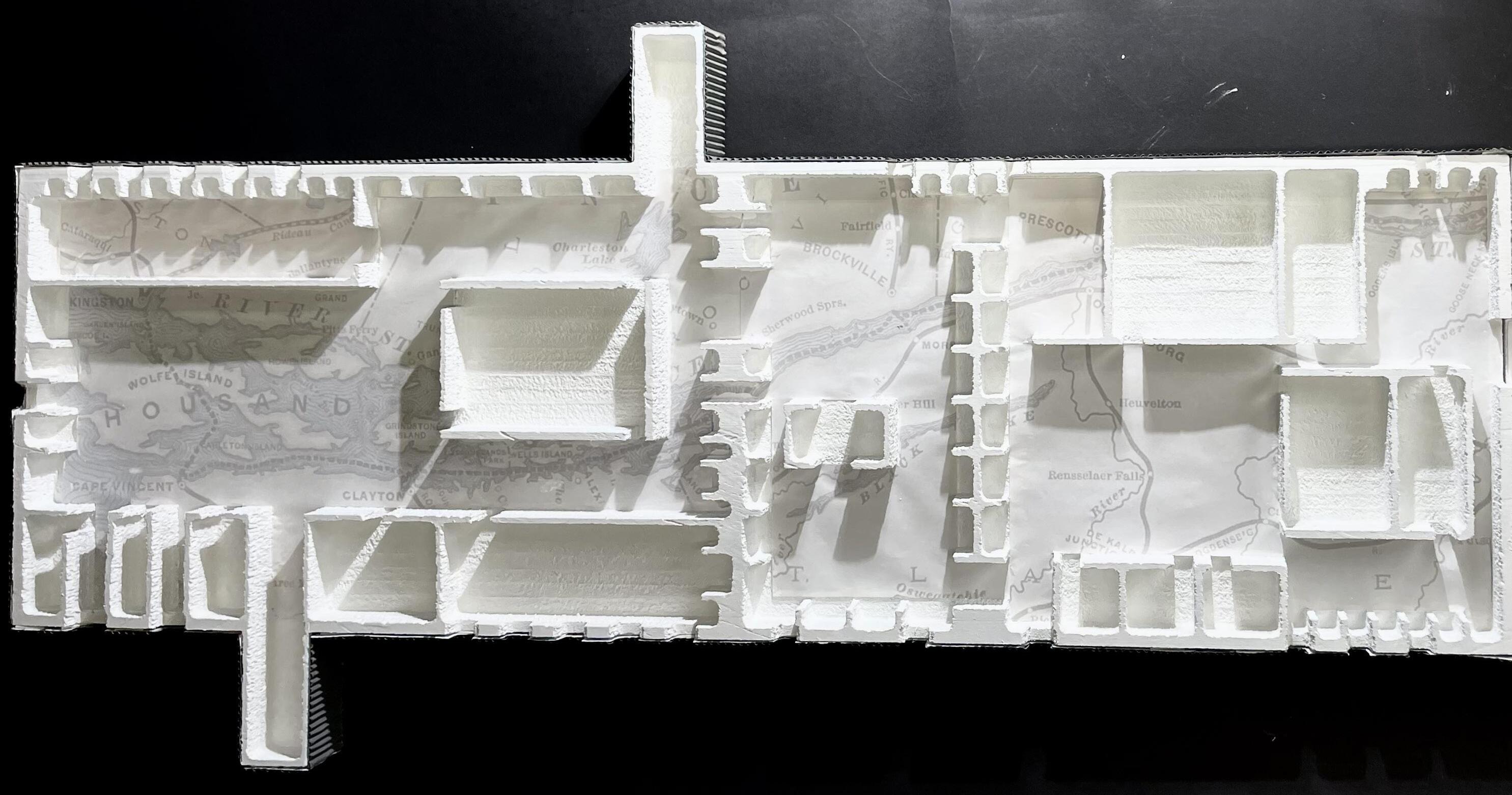
The final design is a library of world maps. The building hangs below from the Thousand Islands Bridge over the St. Lawrence River in Alexandria Bay, NY. It is one singular level that has combined my original idea of four floor plans into one long building of four modules. Each module would be a different type of map collection, such as globes and three-dimensional maps, atlases, large maps, and maps of unknown areas. The total dimensions are 480’ long and the width is about 90’, the same as the bridge width. The main material will be steel and sheet metal for lightweight construction. There are four towers that hold the stairs and elevators that reach the ground below where the parking lot exists. There are two more sets of stairs at the opposite end of the building that only go up to meet the pedestrian walkway at the same level of the highway on
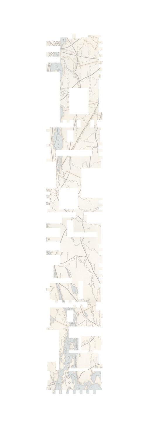
the bridge. Within the structure, there would be collections of world maps of all sizes, era, time period, etc. There are large tables and walls to hang or drape the maps over for viewing. There is a map engraved on the floor showing the topography, streets, landforms, islands, and river below the building of the Thousand Island region and surrounding areas. This map shows the positive space of the building for the main path of circulation and use of the public will occur. The underside of the building references Lewis Carroll’s “Ocean Chart” or “Snark Map”, but with a mirror instead of a blank drawing. Boaters below the bridge will see a reflection of themselves and the water when looking above them. For the future of this design, more modules could be added to have the building stretch across the entirety of the suspension bridge.
