SPRING 2024
Juliana Erb
Spring 2024 | Arch.114.01 First Year Design Core Studio
Instructor Rubén Alcolea


Cummings School of Architecture
The Analytical Body
Juliana Erb
The project’s objective was to observe the human body in great detail. We started by focusing on one part of the body and then moved on to the whole body, thinking about proportions and how the body interacts with space. I started by observing the hand and wrist and then expanding to the whole body. When recording the human body I thought about how the body bent and lifted through space and the negative space the human form creates as it moves through space. As a dancer, I chose to have my drawings of people dancing. Different mediums help communicate the flow, sharpness, precision, and lightness of a person and dancer.


Body Apparatus
Juliana Erb
In a team of two, we have to design and build an extension of the body that would be able to create a mark on a page.
My team’s concept was to create a small motion from our hand that would then activate a large gesture through another part of our body. Two paddles swung back and forth creating a similar rhythm to the pattern of walking. These paddles extended from just below our knees and were braced onto our legs. The drawing utensils expanded from the paddles. The drawing tool has the most range of motion creating more organic marks from the very structured apparatus.




Nature
Juliana Erb
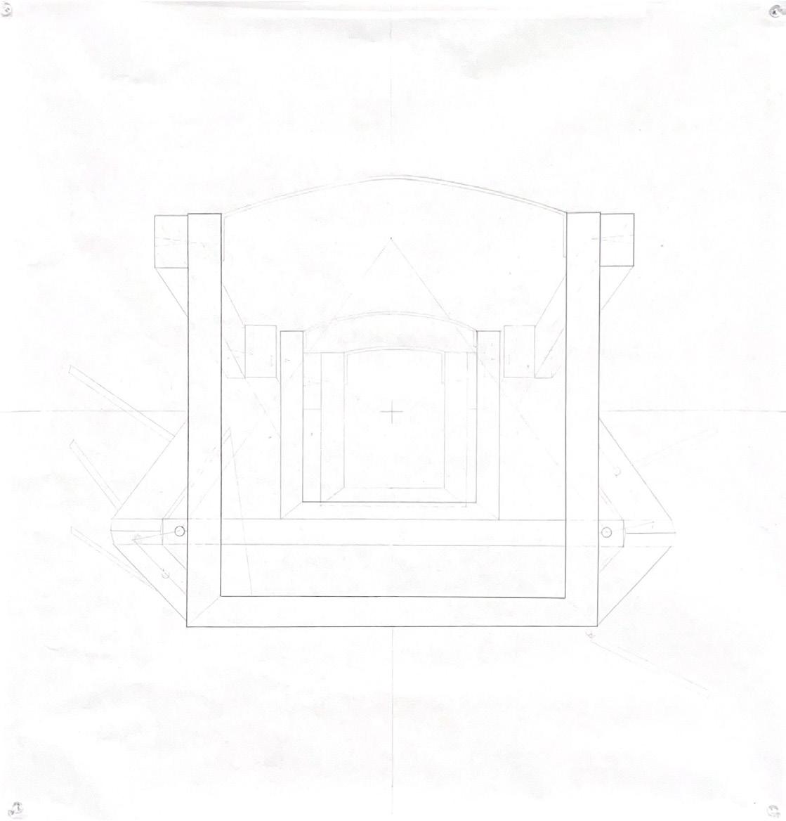
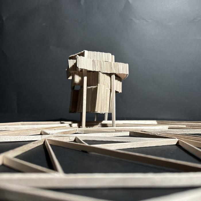
For this project we were asked to design a sauna for one, and a pool that slopes down into at least a four-foot deep space that can inhabit three people. The sauna was to be located on the shore of the Roger Williams Campus. Taking inspiration from the site I was drawn to the reeds. They were very linear elements that from the side elevation appeared to be very dense, but, in reality, they created a lot of negative space in between them.
For my project, I wanted to mimic the texture of the reeds by creating a structure that suggests verticality. However, the project is also cut horizontally to suggest fluidity and movement. The bottom layer’s shape is crafted


to lead the person through the building in one continuous motion. The upper layers react to the bottom layer to create an opening door for a small amount of light to pour in. The smoke created by the fire inside the sauna exits through the roof. The roof is double-paned to allow the smoke to exit up and out of the sides of the structure. This creates a cloud of smoke around the building and further defines the idea of negative space.
The pool’s shape takes inspiration from the building and is slowly treated down through alternating ramps that slowly lower to the center of the pool.




Place of Senses
Juliana Erb
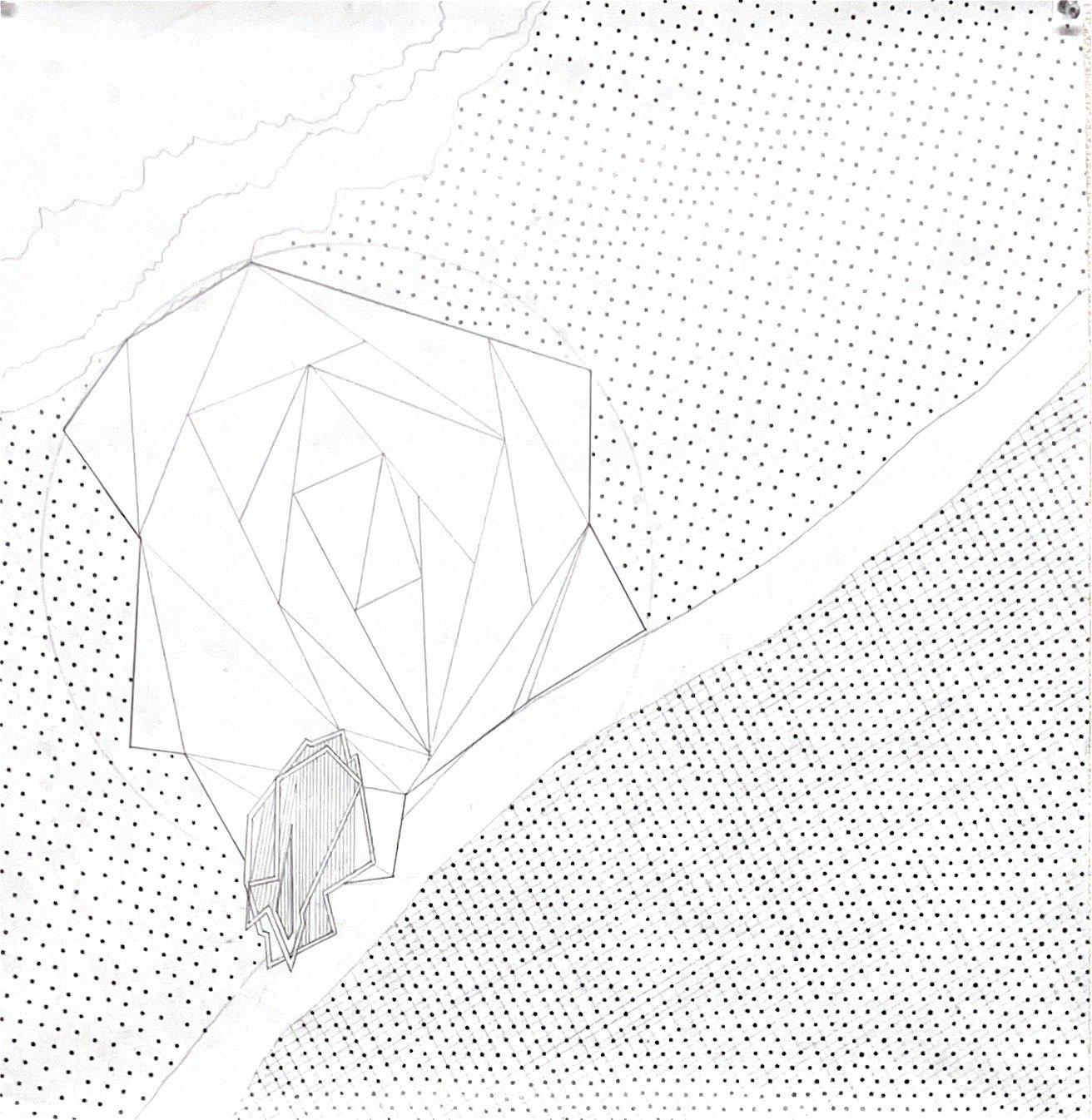
The prompt for this project was to create a resort for eight people to stay. At this resort, guests must have a place to sleep, eat, and wash themselves. There must also be a small pool if they wish to swim. The project must also address three attributes- a given island, a painting, and a sense. I was given an Island called “Side Slice”, a painting by Roy Lichtenstein titled “Landscape 1 from ten Landscapes”, and the sense of smell.
Inspired by the landscaping painting, I decided to have the whole project pierce through the island. The inhabitable space cuts away at the large mass. The whole project branches off of the natural slit on the island. The geometric rooms reinforce the idea of breaking up the


pattern and language of the rest of the island. I defined smell as the differentiable change in air qualities and texture and how the body reacts with the density of the air. Having the project in a narrow slit allows for a direct path for the sea air to enter the project. Elements of the project dilute or increase the air texture and volume as it blows through the project. The enclosed bedrooms create a very still atmosphere, where the open dining room allows for the sea to come crashing into the space, and the top pavilion’s shape is designed to create wind tunnels for the breeze to weave through, varying the texture of the breeze as one walks through.




Ashley Beck
Spring 2024 | Arch.114.01 First Year Design Core Studio
Instructor Rubén Alcolea


Cummings School of Architecture
The Analytical Body
Ashley Beck
For this project we were assigned the task of understanding and documenting the human body in terms of its scale and space that it inhabits. This included studying our daily motions in dynamic qualities featuring the use of multiple mediums to create both precise and exploratory characteristics. Within the first part we studied one portion of the body and how it moves in space. I chose to look at the arm and wrist movement as I felt this is where we interact the most with a space. I focused on being very precise in some pieces and others more dynamic in how a hand and arm would naturally move through a space. For the second portion of this assignment, we were asked to study the body as a whole. I looked at more specific qualities of structure, texture, density, and dynamism. This helped me in understanding how certain portions of the body have a heavier presence than others. Lastly, we documented the body and a space itself. In one of my drawings, I explored the motion of someone moving down a flight of stairs which gave me a sense of how the dimensions of the spaces around us are so critical to our movement and comfort. I also looked at the movement of people in my kitchen at home which reinforced this concept of designing spaces in terms of dynamic qualities to enhance experience.


Body Apparatus
Ashley Beck
For the second project of the semester, we were assigned to work in pairs in creating a body apparatus that explored similar concepts of how the body interacts with space, through a constructed device. My partner and I chose to take a deeper look into replicating the extensions of our arms as we do everyday tasks. Instead of replicating the motion in front of our bodies though, as we would normally do, we wanted to do so upon our backs. How we envisioned the tool being used is as you are sitting in a chair moving your arms around in front of you, the tool upon your back would then extend in many directions and paint as it did so. On each of the joints of the tool are then either a brush or a sponge, creating different levels of brushstrokes across a painting. The paintings done by the tool that are pictured, were either done while typing on a computer in front of us or while clapping. This again brings us back to the concept of how we inhabit a space and really allowed me to wrap my head around the space we take up in moving our arms around ourselves.


Nature
Ashley Beck
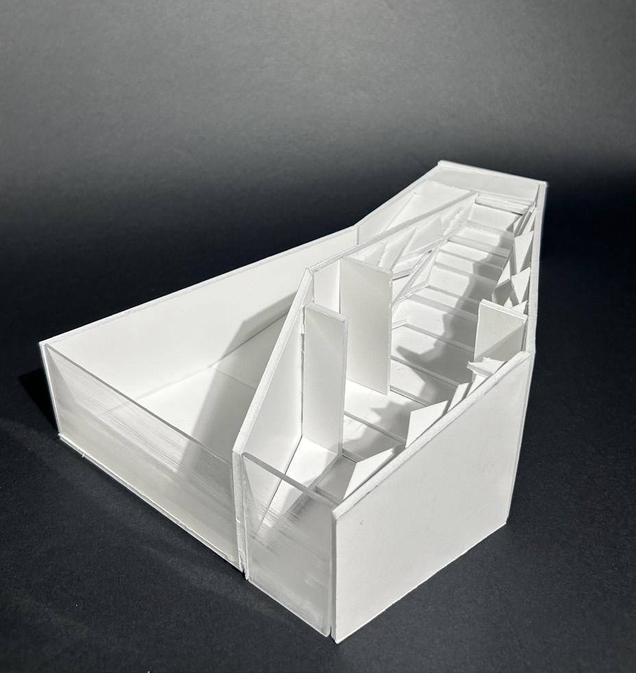
Our third project revolved around the concepts of site and how that can play such a large role in the defining of the design concepts behind a project. In this assignment we were given the task of creating a sauna and a pool that would be placed on a site in our campus, a shell path right along our campus’s bay, that experiences multiple levels of changing tides throughout the day. When first visiting this site the characteristics that really grabbed my attention were within the tide and this layering that it created on the surrounding land, rock, and just topography in general. This then resulted in me placing the intervention right upon the coastline where the tide would surround the sauna and pool at different parts of the day.
As you enter the sauna section of the intervention you are led down a series of differently spaced stairs. This is done so to ensure that every stair aligns with the corresponding topography of the surrounding area, again reinforcing this concept of layering. In this area there is also a textured wall in which each layer of the wall protrudes out to a point that aligns with a certain topography line as well. As one proceeds to enter the sauna, these stairs and textured wall are continued, and you are led to a large glass wall that is inserted within the ocean. As the tide changes throughout the day, water level lines as well as different discolorations are left on the glass which again brings you back to this concept of layering. A similar concept is brought to the pool as well, within its large glass wall that once again reveals these changing sea levels.



Place of Senses
Ashley Beck
For the final project of the semester we were asked to create a resort upon an island in the Galapagos that could accommodate a small group of people for an extended period of time. We were each given a series of three cards to help direct us in the designs of the project. For my cards I received the island “the lake”, the sense of touch, and the painting Les Fenetres by Robert Delaunay. Starting with the island I was assigned, the lake, I choose to focus on these linear elements within the biggest changes in topography. I interpreted these linear elements as mountain with canyons in between each of them that extend into the lake. With the painting I was assigned I chose to focus upon these very linear divisions between color that reminded me of the canyons, as well as focus on the triangular ombre shape that is seen within a larger rectangle. Lastly, with my sense of touch, I knew that I wanted to create two very contradicting experiences, one being these very rough carved rooms in to the mountains, and another being a main glass structure that would be very smooth and precise.
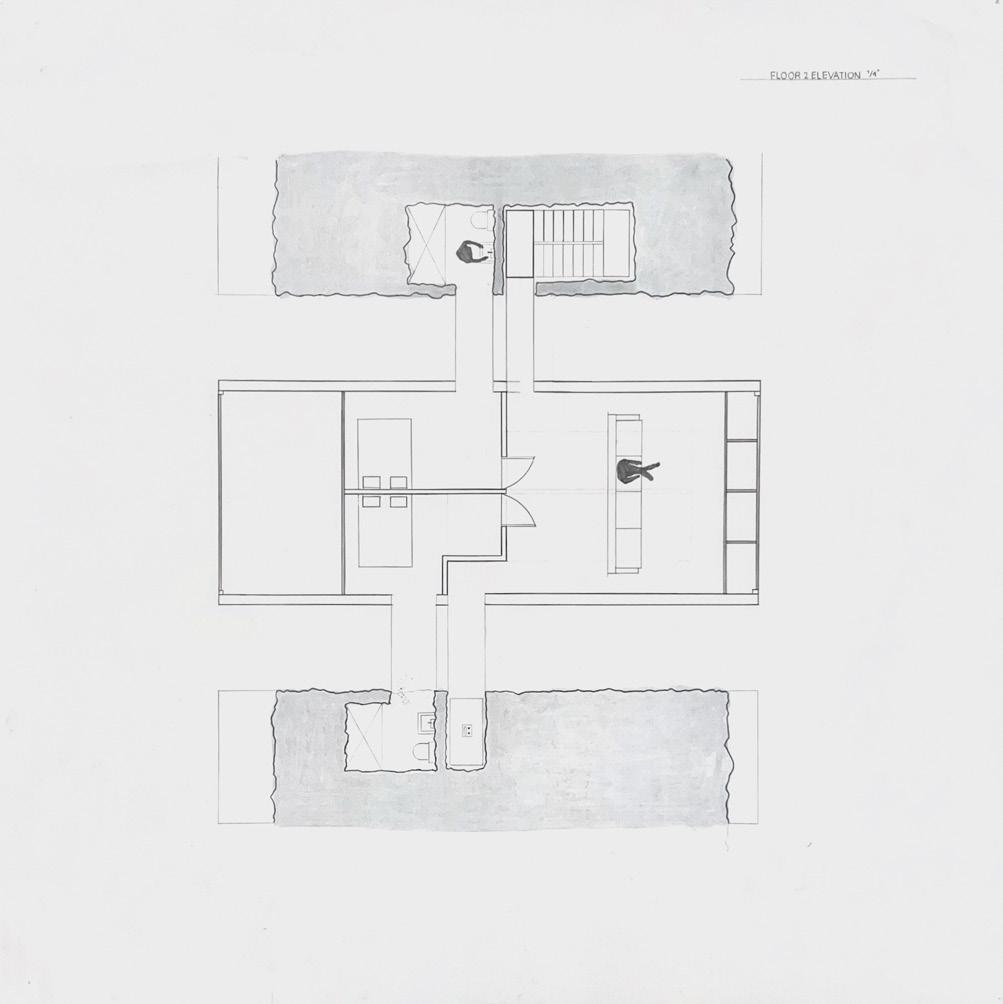
For the actual intervention itself I chose to remove one of the mountains in this area of the site and place my main structure between two neighboring ones. I then had bridges extending from this main structure into carved rooms within the neighboring mountains. These bridges would be glass and allow people to look down upon this canyon filled with water below them as they enter these carved spaces. The form of the main structure is also inspired by the concept of having a triangle inset in a rectangle from the painting and the sides of this structure have a cutout glass section that directly aligns to the shape of the surrounding mountains. Walking through the plan of the resort as you enter the first floor you are brought to the kitchen where there are then bridges on either side to enter into the carved pool area and grotto meeting space. There are also bridges that lead to a carved staircase and elevator areas. This then leads you to the next three floors which include bedrooms with bridges leading to carved bathrooms as well as a common space on the top floor. As you can see there is this constant interaction with the site as you must move across these bridges to get from one space to the next




Evan Shankar
Spring 2024 | Arch.114.01 First Year Design Core Studio
Instructor Rubén Alcolea


Cummings School of Architecture
Roger Williams University
The Analytical Body
Evan Shankar
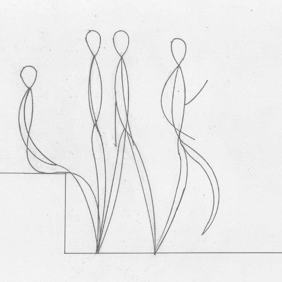
This assignment dealt with drawing the human body, with an emphasis on proportion, scale, and the depiction of movement. Abstraction and technical drawings were required to capture qualites of “structure, texture, density, and dynamism.” Focus began on individual body parts, which I analyzed first by hand-drawing then going over with drafting tools to better understand bodily mechanics. Similarly I explored depicting the movement of the full human body with the use of drafted geometry to be dimensionally accurate.


The assignment also included depicting the body as it occupies and interacts with a small space of our choice. I selected my studio desk to capture the variety of movement and interaction with objects made by the body when working there.




Body Apparatus
Evan Shankar
The task for this assignment, done in groups of two, was to design and construct a device that could be worn and which was capable of marking a surface. For our “apparatus,” we decided to focus on the movement of the leg and foot and chose ink as a medium for its bold marking quality. The apparatus is essentially a shell which encases the leg and foot. Suspended from the shell is a bag of ink with a hose that runs around the foot. A fin on the upper joint of the shell compresses the bag when the leg is contracted, pushing ink through nozzles at the bottom of the hose.
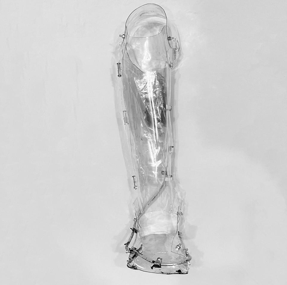

The shell is made of PET plastic which allowed it to be constructed by hand thermoforming. The transparency of the plastic shell, hose, and bag draw the eye toward the blackness of the ink which is applied to a large white page.


Evan Shankar
The assignment was to design a sauna and pool which could be occupied by one and up to three people respectively. The site was located on the university campus at a waterfront path. Upon visting the site, the most significant qualities which occurred to me were the vegetation, the large rock which stood in the water, and the use of the bay by sailing students. The location of the rock and signficant trees around the site became a source


of geometry and orientation for the project. The exterior timber material of the project creates a dense, raw surface which suits the site and is contrasted by the finished plank interior. Flooring made of a woven woody material helps keep traction while descending the sloped floor. Program is incorporated into the thickness of walls to take advantage of the geometry of the plan. The protruding edges of the roof compliment the jutting sides of the plan.


Place of Senses
Evan Shankar
The goal of this assignment was to design an island retreat accessible by boat that can be occupied by up to 8 people for a few weeks, focusing on the importance of a site. To generate a design, we were randomly assigned a site and a painting to interpret, as well as a physical sense. Joan Mitchell’s “Mooring” appeared to show a large, central mass and a small pack of figures approaching it. While concepts like texture are most immediately relevant to the sense of touch, I wanted to explore touching the history of the site. The geometry of the “Lake” site suggests an artificiality, which I determined to be the remains of a quarry. Therefore,
the past, present, and potential features of the site became central to the project. The building is to be constructed from recovered stone which was originally extracted from the quarry, thereby being reintroduced to the site. Following on the impression of “Mooring,” the form of the building becomes monolithic, and is placed where it can dialogue with the remains of the island. The height of the building seeks to restore the original height of the island before it had been depleted. Spaces are meant to be occupied in groups, who may huddle in minimally furnished interiors to reflect on the history of the wrought stone which surrounds them.


Arch.113.03
Architecture Design Core II Portfolio
Ignacio Burgos - Professor Melissa HutchinsonSection 5 - Spring 2024
Assignment 1 - Movement of the Body

Arch.113.03
Ignacio Burgos

I found it interesting to consider the body as a piece of architecture. Seeing body as working as a moving structure made for some interesting drawings in terms of movement and centrality.
Assignment 1 - The Body In Space

Arch.113.03
Ignacio Burgos

Inserting the body as an element of design certainly changed my perspective and forced me to constantly integrate the movement and structure of the human form into elements of functional architecture. The body doesn’t merely inhabit but functions in conjunction with its architectural surroundings
Assignment 2 - The Body as a Tool


Arch.113.03
(Top Left) Right Arm Brace
(Lower Left) Right Leg Brace
For a team project, I was certainly expecting it to be difficult to collaborate on such a complex piece. Yet, the actual construction of the project was quite successful, functioned easily, and was easy to convey in drawing form.
Assignment 3 - Abstracting the Site


Arch.113.03
I was most focused on the variety of textures and the constantly changing colors that are evident along the coastlines of the school. The stark contrast in seasons most interested my along with the variety of different surfaces along the landscape.
Assignment 3 - Modeling the Structure


Arch.113.03
It is often difficult for me to understand my own project without being able to fully see and comprehend the project in a 3-dimensional view. The model shows the specific dimensions with general accuracy in relation to the drawings. The model is scaled ¼”=1’
Assignment 3 - Observing the Site

Arch.113.03
Ignacio Burgos

Site plans were something new for me to consider, forcing me to think about how the landscape will chane with whatever intervation I choose to place. Utilizing texture and lineweights to convey different natural objects was often quite a challenge
Assignment 4 - The Site and Intervention


The large amount of sections needed for this project allowed me to better understand the surrounding area of my intervention. It was much easier to understand the relationships of other areas of the island in relation to where to place the intervention as well as creating a program that works in conjunction with the surrounding landscape.
Assignment 4 - Visualizing the Intervention


Arch.113.03
As my assigned sense was sight, instead of doing an axonometric drawings of the structure’s qualities I found it better to illustrate what I hoped for user to view from several different areas, all referenced in the letters on the site diagram.
