
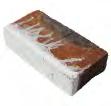








Custom Bricks showcases 47 projects that use bricks with special formats, colours or glazes. We hope they will inspire you.
03 Introduction
21 Public institutions
22 Maitland Riverlink, New South Wales, Australia
26 Kannikegården, parish hall, Ribe Cathedral, Denmark
30 Goel Center for Theater and Dance, Massachusetts, USA
34 After-school club, Allenmoos, Switzerland
38 Gothenburg City Library, extension, Sweden
42 City Circle Line (M3), Copenhagen, Denmark
46 Andlinger Center for Energy and the Environment, Princeton University, New Jersey, USA
50 Christian IV’s Brewhouse, Copenhagen, Denmark (R)
53 Commercial
54 Konvert, headquarters, Kortrijk, Belgium
58 1A Page Street, Victoria, London, England
62 Astoria House, Stockholm, Sweden
66 Turnmill offic building, Clerkenwell, London, England
74 Tivoli Corner, Tivoli Gardens, Copenhagen, Denmark
78 Kville Saluhall, Gothenburg, Sweden
80 Design studio, Rancate, Switzerland
84 Petrol station, Skovshoved, Denmark (R)
90 Arcade building, Nordre Toldbod, Copenhagen, Denmark (R)
93 Culture
94 Kunstmuseum Basel, new extension, Basel, Switzerland
98 Z33, House for Contemporary Art, Hasselt, Belgium
104 Tobias Mayer Museum, Marbach am Neckar, Germany
108 CLAY Museum of Ceramic Art, Middelfart, Denmark
112 Museum of the Bible, Washington DC, USA
116 European Hansemuseum, Lübeck, Germany
122 LAM Lisser Art Museum, Lisse, The Netherlands
126 Museum de Lakenhal, Leiden, The Netherlands
134 Brooklyn Botanic Garden ticket pavilion, New York, USA
138 The main entrance to Tivoli Gardens, Copenhagen, Denmark (R)
144 The Round Tower, Copenhagen, Denmark (R)
149 Housing
150 Villa Platan, Aarhus, Denmark
154 Private home in Groenekan, The Netherlands
158 Private home in Utrecht, The Netherlands
162 Cabin in Hvaler, Norway
166 Holiday home in Tisvilde, Denmark
170 Private home, Prinsen Bolwerk, Haarlem, The Netherlands
174 Houttuinen townhouse, Dordrecht, The Netherlands
178 Paper Island, housing project on Christiansholm, Copenhagen, Denmark
182 Residential block on Jagtvej 2/Ågade 110, Copenhagen, Denmark (R)
187 Churches
188 Don Bosco Church, Maribor, Slovenia
190 Ordrup Church, Ordrup, Denmark (R)
192 Grundtvig’s Church, Copenhagen, Denmark (R)
194 Underground chapel, Grundtvig’s Church, Copenhagen, Denmark
198 St Paul’s Church, Copenhagen, Denmark (R)
203 Art
204 Bibliotheca – Archaeological Library, Kivik, Sweden
208 Yu‘un, private gallery, Tokyo, Japan
212 Trekroner Church, Roskilde, Denmark
216 ‘Interspecies Campus’, artwork at Roskilde University, Roskilde, Denmark
220 Traffi Tower East, Copenhagen, Denmark
224 Index by technique
(R) = Restoration Projects





Contents Introduction Public institutions Art Commercial Culture Housing Churches

2
Introduction

3
Photo: Anders Sune Berg

4
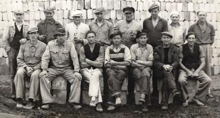
Petersen Tegl employees in 1951.
Photo: Broagerlands Lokalarkiv
In 1791, King Christian Vll granted permission to the founder of the family-owned company, the smallholder Peter Andresen, to open the brickworks. The officia document is in the possession of the Petersen family.
Timeless craft, endless possibilities
Brick has a great many qualities. Made from the purest elements imaginable – clay, water and fie – it has an almost infinit lifespan and requires no maintenance. Bricks laid in lime mortar can be taken down and reused. Or they can be crushed, and the grains used to make new bricks or to build roads, squares and other facilities.
As a building material, brick also has another almost unique quality. It can be produced in exactly the shape you need. All it takes is a brickworks capable of making them by hand. Like Petersen Tegl.
When the company was founded at the present address at Nybølnor in Broager in 1791, handmade bricks were the norm. The Industrial Revolution changed all that, and by the early 20th century, the entire Western world was using machines to produce bricks. They looked mass-produced – uniform, smooth, very few colours.
But not at Petersen Tegl. It was one of the few brickworks to return to its roots.

5
Petersen Tegl employees in 2022 – with the owner Christian A. Petersen in the centre.
Photo: Annette Petersen
66
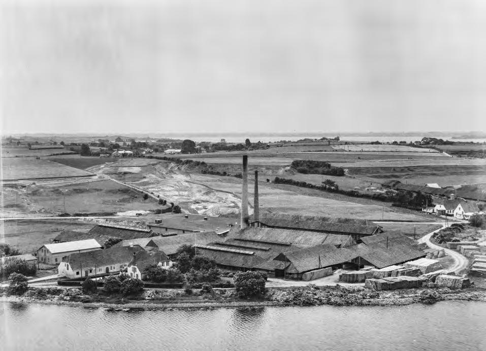
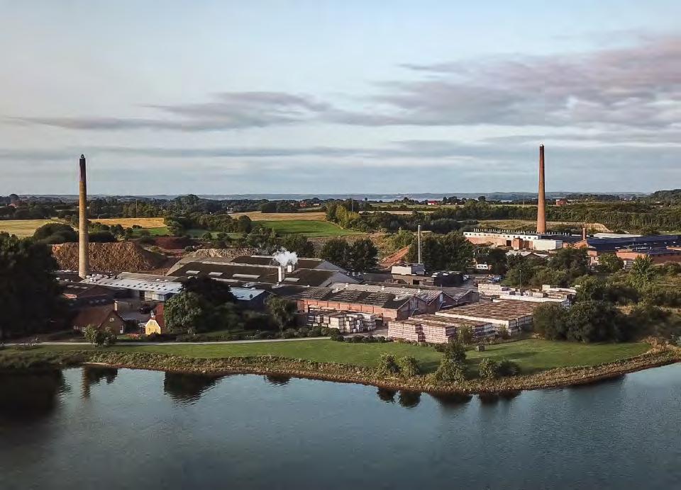
Petersen Tegl in Nybølnor, 1957. Photo: Sylvest Jensen, www.kb.dk/danmarksetfraluften (Denmark seen from the air)

7
Petersen Tegl in Nybølnor, 2021. Photo: Erhorn Hummerston
In the early 1980s, Petersen invented and built machines designed to imitate manual processes, endow the water-brushed bricks with their original, uniformly uneven look and provide four equally presentable surfaces. Ever since then, those same machines have accounted for a significan proportion of the company’s production.
Tivoli in Copenhagen, the second oldest amusement park in the world, celebrated its centenary in 1990. To mark the occasion, it commissioned Petersen Tegl to produce new terracotta ornamentation for the original main entrance. Christian A. Petersen immediately threw himself into the project, and the Custom Brick Department was born.

In the late 1990s, when the architect Peter Zumthor won a competition to design the Kolumba Museum in Cologne, he asked Petersen Tegl to develop a special brick for the project. The Custom Brick Department had the requisite expertise, and the museum was built in the new, handmade Kolumba brick and inaugurated in 2007. Handmade standard bricks have been a hallmark of Petersen Tegl ever since.

8
Petersen Tegl recreated the ornamented terracotta elements for the main entrance to Tivoli Gardens in 1991. Photo: Anders Sune Berg
Architect Peter Zumthor developed the Kolumba brick for the Kolumba Museum in Cologne, which was inaugurated in 2007. Photo: Anders Sune Berg
A large part of the company’s production now consists of the standard bricks Kolumba and Cover. They are produced 100% by hand in wooden moulds. However, custom bricks for special projects also account for an ever-increasing proportion of turnover.


9
Architects Min2 developed Petersen Cover in 2009 for their home in Bergen aan Zee in the Netherlands. Photo: Paul Kozlowski
Architects Lundgaard & Tranberg refine Kolumba for The Royal Playhouse in Copenhagen, which opened in 2008. Photo: Anders Sune Berg
Special formats
The fact that so much of Petersen’s standard production is by hand makes it easy to comply with requests for special formats. The processes and equipment are all there. The customer and brickworks discuss the specificaions for orders. Then a wooden mould is made. An order can range from a single brick for a restoration project to large-scale new construction.
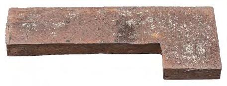

Demand for special formats has been increasing in recent years. It gives an obvious freedom to architects and designers during the creative process that brick can be custom made.
In some cases, special formats are used for ornamentation and complicated detailing. In others, they make the brickwork look as harmonious as possible, for example by using angled bricks on corners. Or bricks can be produced in exactly the lengths needed in order to fi the planned length of the row in the most elegant way.

10
Bricks with customised angles are used to form seamless, harmonious brickwork corners.


11
Preparation of clay
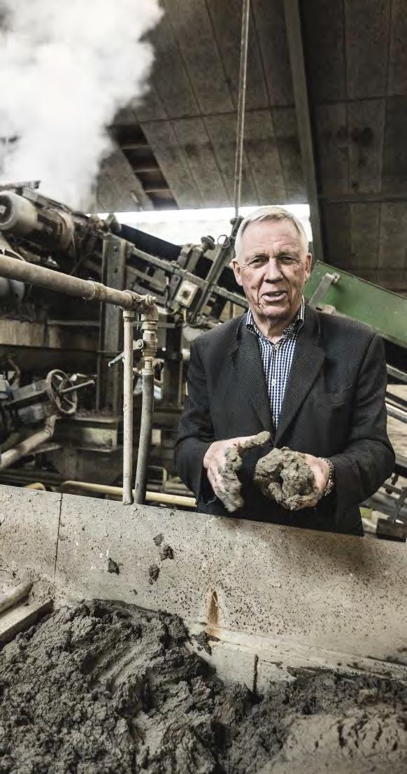
Petersen Tegl adapts the production methods according to the actual type of brick. At Petersen Tegl, the clay is pugged, formed and pressed by means of techniques imitating the procedures used when also this part of the work was done by hand. The method gives the clay its optimum texture with capillars and air pores allowing the water to expand when it freezes to ice without spoiling the brick. The fact that the brick may absorb water does not entail risks of frost damage, and Petersen Tegl’s bricks are 100% frost resistant.
12
The owner of the brickworks, Christian A. Petersen, at the machine that processes the clay.
Photo: Anders Sune Berg
Methods of formatting
Three methods of formatting are used to produce the special formats, wooden moulds, templates or plaster moulds.

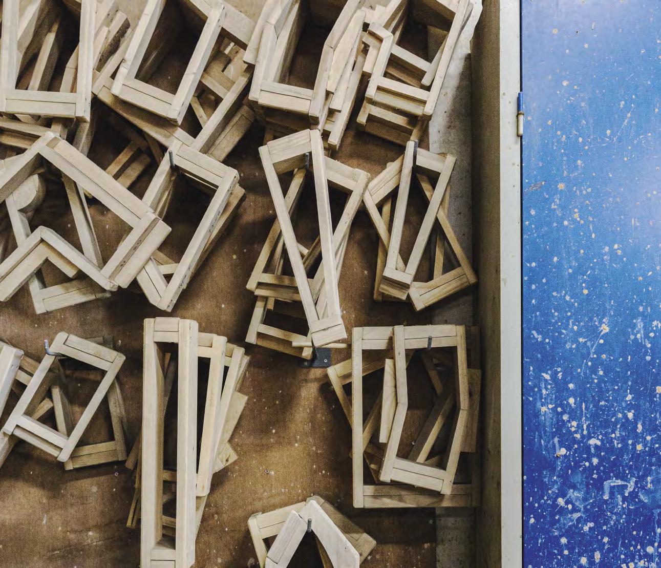
Wooden moulds: Bricks have been produced in wooden moulds for thousands of years. They are hand struck by pressing a lump of clay into a wet form. The clay is then compressed and any surplus material struck off. Water or slurry is used as a lubricant to slide the lump out of the mould and onto a plate to dry. It is then fied in a kiln.


Photos: Anders Sune Berg

13
Wooden mould and finishe brick.
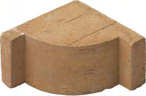
Templates: A lump of clay bigger than the fina product is pressed into a wooden mould and left to dry for a few days. It is then clamped between two pieces of indented wood and cut with a wire. The excess clay is removed, and the brick is rubbed down. After the wooden template is removed, the clay is dried and fied.


14
Photo: Martin Schubert
Examples of bricks produced using templates.
Plaster moulds:


Mainly used in restoration projects to recreate the original bricks. Based on a 3D drawing, a plastic or wooden model is produced, 8-10% larger than the original. This is then used to make a plaster mould. High-quality clay is pressed carefully into the mould to avoid air pockets forming. Once the mould has been filed, a cavity is carved out to ensure that the clay dries evenly. The plaster draws water out of the clay for a few hours, and then the mould is removed. The brick is left to dry before firing Photo:

15
Martin Schubert
Examples of bricks produced using plaster moulds.


16
Highly detailed terracotta elements made in a plaster mould for a restoration project on a church spire.
Photo: Anders Sune Berg
The artist Vibeke Fonnesbech designed the portrait reliefs in tile that are built into the façades of a housing block.
Photo: Anders Sune Berg
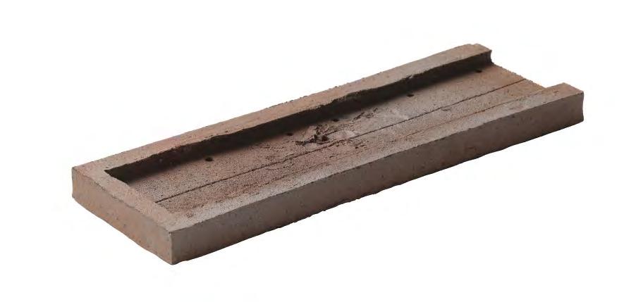
Custom bricks made in wooden moulds create the illusion that the façade is made of pine logs.

Semi-circular bricks positioned in a pattern were recreated to replace existing ones when the wall around a 19th-century property was restored.


17
Photo: Martin Schubert
Photo: Anders Sune Berg
Special colours
To meet the rising demand for custom shades and tones, the brickworks has its own dedicated colour department, which constantly conducts experiments. As a result, several specially coloured bricks originally developed for specifi projects have later been added to Petersen’s standard range.
Two factors determine a brick’s colour –the type of clay and the firin process. Petersen uses Danish, German and English clay, either in pure or mixed form. When clients request particularly unusual hues, small amounts of natural clay minerals are added to the mixture.

The bricks are fied at 1,000-1,150°C. Different temperatures influenc the fina colours and appearance. The firin process can also be adjusted by adding to or reducing the amount of oxygen in the kilns. These processes – known as ‘reducing’ and ‘oxidising’ – provide extra colour options.
The variations in clay type and firin processes can be combined in various ways to produce an almost infinit array of colours in the fina product.
For Petersen Tegl, the colouring process can be part of fulfiling a major order for bricks that all have the same tone and play of colour. However, and just as often, it can also be for a project that calls for a batch of bricks all of which have different colour variations.

18
The colours in tile are produced by combining different types of clay and using different firin processes.
Photos: Anders Sune Berg
Kim Reinecker, head of the Department for Colour and Product Development.
Special glazes
Glazed brick has been around for millennia. For example, remains have been unearthed in Mesopotamia of buildings with glazed brick façades built hundreds of years BCE.

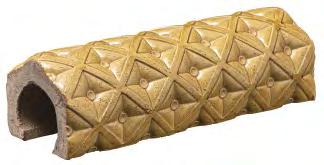

Architects have loved the glazed look ever since. It catches and reflect light and can be used to emphasise certain details, sections or colours on the façade.
Petersen Tegl has a special glazing department, which – like the colour department – is constantly experimenting to meet clients’ requirements.
Glazed bricks are produced by applying a liquid glaze after the firs firing The bricks are then fied in electric or gas kilns at varying temperatures so that the glaze melts without affecting the character of the brick. Sometimes, an underglaze is necessary, in which case the brick needs to be fied several times.

19
Bricks can be glazed in an endless variation of nuances.
Public institutions

21
Photo: Julie Vöge Hansen
Maitland Riverlink, New South Wales, Australia
Client: Maitland City Council
Architect: CHROFI Architects
Brick: D71 DNF + 1,180 bricks in custom formats in the same clay
Completed: 2018
Photos: Justin Alexander
Sharp looking soft corners
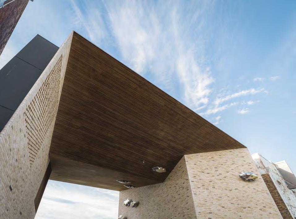
Custom bricks with sharp corners create a precise profile in a multi-purpose house along a river in New South Wales.
CHROFI knew early on that Riverlink would be brick-built, and that very special materials would be required to achieve the desired effect.
“When you get close to the building and touch it, it conveys a clear sense of something human and recognisable,” explains Joshua Zoeller, architect and senior associate partner at CHROFI.
The surrounding old houses’ brick façades alternate between soft yellow and cream, with some fin sandstone buildings in between.
“Petersen D71 proved to be the perfect match in every respect. It has just the right powdery tone, and there’s even something sandstone-like about it,” Zoeller says.
The Riverlink building is characterised by its sharp, tapered wall corners, which required custom solutions.
“At two of the corners, the walls meet at angles of 18 and 22 degrees, respectively,” says Zoeller. “We had to specially commission a number of bricks from Petersen, including some with rounded corners. While the corners look razor-sharp from a distance, up close, you see they are rounded. This changes the look in a quite unique way.”

22 A2 B2 A1 60° 60° 60° 54° 18° 40° 118° 60° 60° 60° 22° 118° 108° 108° C1. C2. C3. C4. C5. C6. C7. C8. C9. C12. C13. C11. C15. C10. C14. 10040mm 9960mm 8710mm - 8710mm 3570mm 3570mm 2740mm 2730mm 2730mm 2730mm 840mm - 850mm 2785mm 2755mm 9100mm 9040mm 8725mm - 8730mm 2625mm 2625mm 2630mm - 2625mm 2715mm - 2635mm 5090mm 6255mm 9070mm - 9030mm 156 Bricks tall 136 Bricks tall 56 Bricks tall 43 Bricks tall 43 Bricks tall 13 Bricks tall 44 Bricks tall 142 Bricks tall 137 Bricks tall 41 Bricks tall 41 Bricks tall 43 Bricks tall 98 Bricks tall 142 Bricks tall 2730mm - 2730mm 43 Bricks tall A B B1 108°
205 108 186 81 98 203 83 155 228 R25 R25 120° 40° 140° 40º SPECIAL 60º SPECIAL 60°
Ground floo
186 25 154 70 81 200 108 217 49 260 188 25 161 68 175 108 55 81 44 205 108 212 254 215 R40 R25 R 40 R40 R25 133° 18° 119° 118° 90° 152° 129° 54° 126° 108° 54º SPECIAL 22º SPECIAL 118º SPECIAL 108º SPECIAL 18º SPECIAL 22° 119° Drawings of the various special format bricks for the project.


24
About Maitland Riverlink

The town of Maitland in New South Wales, on the banks of the Hunter River, has been a thriving trading town for centuries. About 80 years ago, the river began to overflo its banks, and between 1949 and 1955, Maitland repeatedly endured heavy and devastating floods The town stagnated, and the new houses built on the High Street were positioned facing away from the river.
The flooing has since abated, and a project to revitalise the city was launched around 12 years ago. This resulted in the construction of Riverlink, an architectural landmark that re-establishes physical and visual contact between Maitland’s city centre and the Hunter River.
The building is designed as an open gateway between the High Street and the river, and its café and restaurant quickly made it a focal point for the townspeople. Maitland Riverlink also houses office for citizen services and functions as an attractive covered urban space that hosts various outdoor events.
25
Kannikegården, parish hall, Ribe Cathedral, Denmark
Client: Ribe Domsogns Menighedsråd
Architect: Lundgaard & Tranberg Arkitekter
Archaeology: South-west Jutland Museums
Funding for landscape project: Realdania
Completed: 2016
Brick: C48 customised by Lundgaard & Tranberg, 630 x 350 x 50 mm
Photos: Anders Sune Berg
Medieval associations
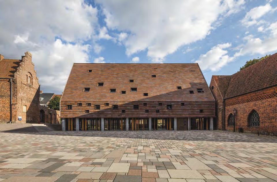
A special edition of Cover fosters kinship between a new parish hall and the surrounding 12th-century architecture.
It was crucial that the materials used in Kannikegården harmonised with the cathedral and surrounding buildings on the main square, all of which are brick with tiled roofs. At the same time, the parish hall needed its own distinct identity.

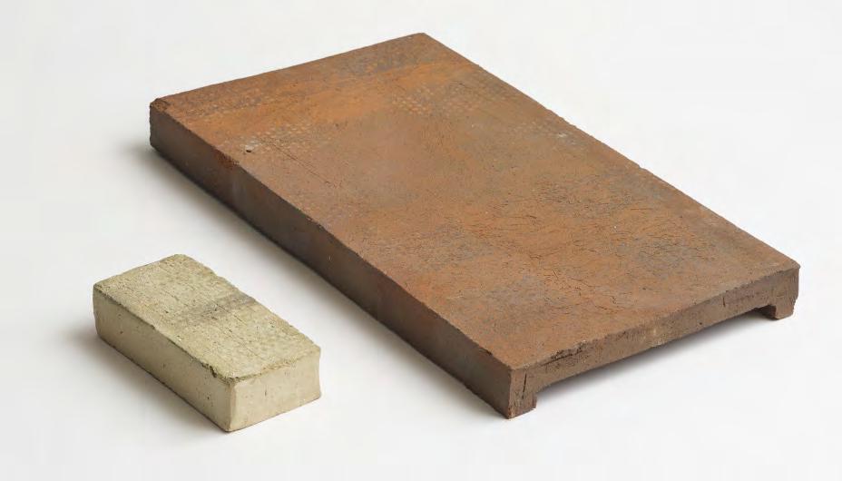
The architects and Petersen Tegl developed a special edition of Cover, which was firs used at the Sorø Art Museum in 2011. The custom Cover measures 350 x 630 mm and weighs over 15 kg. From a distance, the clinker-clad surface appears light

compared to the surrounding brick buildings. Up close, the irregularities of the granular brick become obvious, echoing the crooked medieval buildings, for which tolerances were measured in inches.
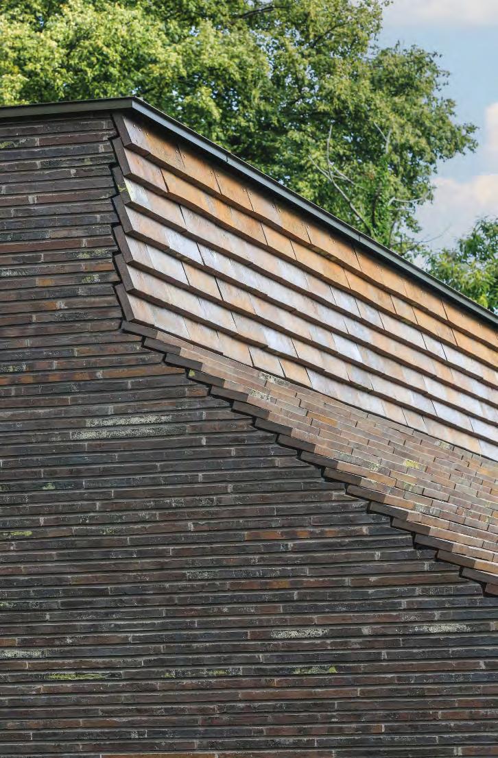
Its proximity to the buildings to the south dictated that the hall had to be tapered slightly towards the west, leaving a diagonal incision in the roof. The crooked look is common in Ribe, where many buildings have had to adapt to their neighbours over time. This determined the size of the new Cover, as the bricks had to be relatively large to ‘sew’ them together in an elegant manner along the roof edge.


27
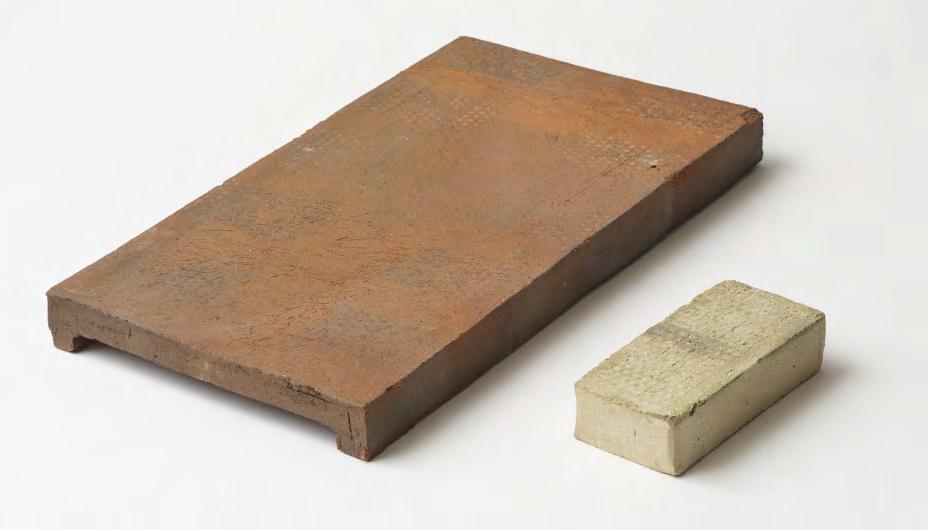
The 630 x 350 x 50 mm C48 custom brick is shown next to a 228 x 108 x 54 mm Danish standard brick to indicate the measurements.
Carsten Jørgensen of Petersen Tegl, moulding the special format Cover brick by hand.
About Kannikegården
Kannikegården in Ribe is a long building on the south of the square, opposite the cathedral. It houses facilities for the parish council and cathedral staff, as well as a 100-seat lecture theatre. In the course of the project, an exhibition space was also added, as the excavation work on the site in 2012 uncovered archaeological remains of the cloisters built in 1100 – possibly the earliest brick building in Denmark. Believed to have been part of the refectory wall, the ruins of the old monastery were immediately subjected to a preservation order. They were integrated into the new building and are now on display to the public. An open glass façade stretches the entire length of the ground floo, while the rest of the façades, gables and roofs are covered with brick shells.
Kannikegården was one of fiv finaists in the Mies van der Rohe Award 2017 due to its “exceptional interaction with both the cathedral and the wider urban space. At the same time, it is also a genuine architectural expression of today, providing a functional space and, in particular, underscoring and contextualising the cultural, historical significanc of its setting.”
“Firing bricks is a kind of alchemy. Using mock-ups, the brickworkers were able to make decisions about colour on the site. Tiny adjustments to the oxygen supply in the ovens eventually resulted in just the right mix of rustic red hues to enable the new building to blend in with its surroundings.”
 Erik Frandsen, architect, partner, Lundgaard & Tranberg
28

29
Architects and partners Erik Frandsen and Lene Tranberg, Lundgaard & Tranberg Arkitekter.
Goel Center for Theater and Dance, Massachusetts, USA
Client: Phillips Exeter Academy
Architect: Tod Williams Billie Tsien Architects

Completed: 2019
Brick: K92 + five ifferent formats of handmade, glazed bricks

Photos: Michael Moran, Tom Eckerle
30
Erich Mick, head of the Custom Brick Department.
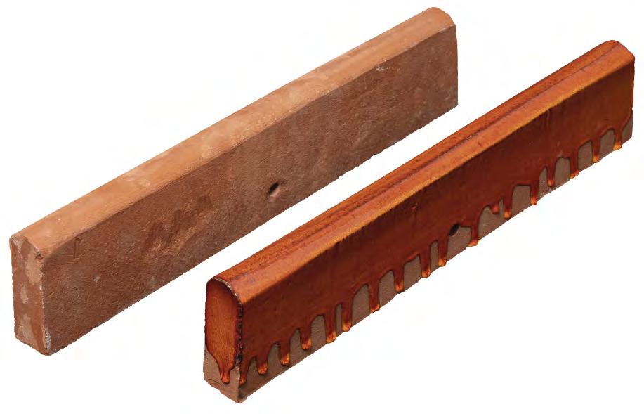
Bricks in special formats were glazed in three different shades of red and yellow.
Theatre curtain in fiery bric
A flaming ed and orange curtain in glazed, moulded brick welcomes visitors when arriving to a theatre building.
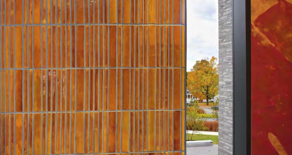
Tod Williams Billie Tsien Architects and their client wanted the Goel Center for Theater and Dance to have a distinctive entrance area, the texture and colour of which would provide a stark contrast to the rustic, grey façades. The vision was for an undulating surface in strong, red hues, resembling a theatre curtain that is pulled aside to let the performance begin. A glass entrance is drawn back from the façade, alluding to the large space behind it.
The vision was realised by the brickworks in Broager, which produced fiv different curved and rectangular bricks, the largest measuring 489 x 511 mm.
The bricks were glazed at the brickworks in red, orange and light brown. To achieve exactly the right shade, the thickness of the glaze had to be precisely measured. Careful consideration was also given to the bricks’ rounded and angular forms in order to achieve the illusion of folds in a hanging curtain. The fact that the brick is made by hand and therefore has a rustic surface means that the colour pigments are distributed somewhat unevenly, which gives the beautiful surface a flame-ike appearance.
31


32
About the Goel Center for Theater and Dance
The square 5,200-m2 building includes an auditorium housing the main stage, a blackbox studio, several rehearsal rooms and dance studios, as well as a whole range of ancillary services. The building has almost no internal symmetries. Instead, it consists of a network of corridors, stairways, and rooms connected in an irregular but extremely functional manner within a square floo plan.
The architectural concept was inspired by a geode – a stone with a rough, uneven outside but a glittering inside. The client wanted the theatre building to contrast a natural, rustic exterior and a radiant and active interior.


Irregular, hard-fied bricks would add precisely the raw simplicity that architects and clients sought. They alighted on a handmade Kolumba, the diverse, greyish hues of which are at once muted and distinctive.

After-school club, Allenmoos, Switzerland
Client: Stadt Zürich
Architect: Boltshauser Architekten AG
Completed: 2013
Brick: K43, custom format 20 x 110 x 530 mm

Photos: Paul Kozlowski
Clinker façades with brick quality
Custom-made, hard-fied clinkers add warmth and rusticity to an after-school club in a Swiss suburb.
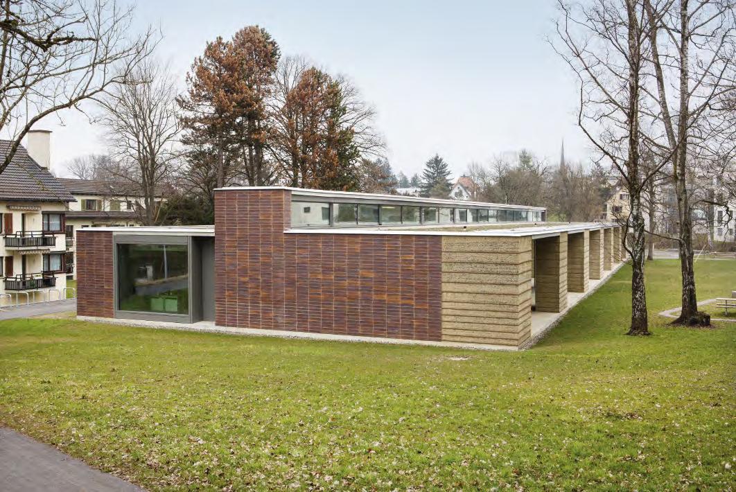
When commissioned to transform a school pavilion into an after-school facility in Allenmoos, Boltshauser Architekten originally wanted a brick façade in Kolumba, similar to the facing wall in their own Zurich studio. However, the authorities placed strict limits on the amount of energy used to produce the materials for the pavilion, which precluded using a 37-mm thick brick – the standard Kolumba measurement.

Instead Boltshauser asked Petersen Tegl to produce a custom clinker that was only 20 mm thick, 110 mm wide and 530 mm long. It is directly attached to the underlying 250-mm insulation and pointed with a cement mortar compressed to a couple of millimetres. To ensure the façade was durable, the studio built a 1:1 mock-up that coped admirably with all kinds of weather conditions.
The expansion joints are carefully positioned in all of the outward- and inward-facing corners but deliberately avoided in the middle of the long, north-facing façade. The handmade Kolumba clinker is not completely flat which endows the façade with a welcoming, textured character, avoiding the clinical, bathroom-like feel of many façades clad with tiles or facing bricks. The clinkers’ horizontal format emphasises the building’s resting form, while the vertical joints dispel any association with a massive wall.
A special format of Kolumba was mounted directly onto the façades.


35
36
About the after-school club in Allenmoos
Boltshauser Architekten were commissioned to extend a 1958 school pavilion and convert it into an after-school club for children aged 4-13. The basement and a few concrete walls from the original pavilion turned out to be reusable and have been integrated into the new building. The resulting structure greatly resembles the aesthetic of the original modernist pavilion but has a warmer, more empathetic feel.


The same plot that previously housed six south-facing rooms now hosts five with a connecting corridor along the back. The fla roof is fited with skylight boxes running the length of the building like a backbone.
To the north-west, the building has stairs running down to the basement, toilets and a kitchen with the same proportions and window placement as the
fiv rooms. In the west gable, the main offices large window directly echoes the front door – the only opening presenting itself in the east-facing gable.
One new element is the loggia, which connects the building to the park. From the inside, the loggia feels protective. From the outside, it conveys permeability and transparency.
37
Gothenburg City Library, extension, Sweden

Client: Higab
Architect: Erséus Arkitekter
Completed: 2016
Brick: D32 + customised bricks in three formats
Photos: Ulf Celander
Conic-shaped tile columns
Narrow columns made from custom bricks frame the glass façade of Gothenburg City Library’s extension, elegantly preserving the brick motif on the original building.
Gothenburg City Library has a new three-sided glass extension. It was important to make it blend in with the surrounding cultural institutions, all of which are in yellow brick. The solution was to suspend slender pillars in grey-yellow brick in front of the glass façades.
Viewed head-on, the library looks open and transparent, but from more oblique angles, the exterior is gradually transformed and the brick becomes more prominent. The effect is achieved by the relatively close spacing of the pillars, each of which is two brick lengths deep.
Erséus Arkitekter designed three different moulded bricks, including a conical one that endows the pillars with their tapered shape. The 37-mm-high moulded bricks are made of the same Danish blue clay as D32. The yellow brick has a partially whitish surface, derived from the white, slurried clay used as a lubricant when the lump of clay is pressed out of the mould.
 The massive columns in the façade are made of yellow cone-shaped custom bricks.
Drawings of the special format bricks for the project. Below, detail, horizontal section.

39


40
The initial Gothenburg City Library, inaugurated 1967, designed by Lund & Valentin Architects.
About Gothenburg City Library


Gothenburg City Library is on Götapladsen in Sweden’s second-largest city and is surrounded by several large, historic cultural institutions, all in yellow brick. In order to adapt to its monumental neighbours, the library has its own yellow-brick façades, albeit in a form and idiom reflecing its era.

The building is the third structure to house the city library. The firs was constructed in 1897, and the current one was designed by Lund & Valentin Arkitekter and opened by the author Astrid Lindgren in 1967.
Erséus Architects refurbished and extended the library in 2012-14. The largest section of the extension is north-facing and houses conference facilities, a large café, a new main entrance and a foyer. To increase the library’s footprint and retain the link with the nearby park, the architects wrapped an extension around the existing building on three sides.


41
Floorplan, 2nd floo. Extension marked.
City Circle Line (M3), Copenhagen, Denmark
Client: Metroselskabet (Copenhagen Metro)

Architect and engineer: COWI, Arup Systra JV
Main contractor: Copenhagen MetroTeam CMT, a Salini Impregilo Group Company
Completed: 2019
Brick: Custom format Kolumba in various colours
Brick suspension system: Fischer
Photos: Anders Sune Berg
“We asked Petersen to produce the bricks because we know they welcome challenges and are happy to develop new products. And we weren’t disappointed. It was an eye-opener to meet artisans willing to experiment tirelessly throughout the development process, with minor variations during the firing process, until the bricks had exactly the look we wanted.”
Nille Juul-Sørensen, architect and associate, Arup
Underground textures
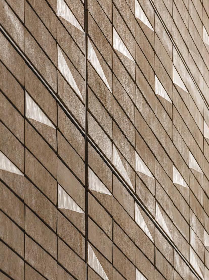
Each of the 17 new stations on the recently completed City Circle Line has its distinct look. Four have wall panels made of handmade brick.

Aksel Møllers Have Station
Located in Frederiksberg, home to many fine ornate buildings. Many of the local façades are decorated with glazed brick, which inspired the decision to glaze the station bricks diagonally, creating a beautiful play of light. Brick: K21 with glaze.
Nørrebros Runddel Station
Located right by Assistens Cemetery, where the surrounding buildings are made of brick. Using a single type of light-coloured brick and a single overhead light source underscores the sense of a sacred place. The golden hue also references the yellow-washed walls around the cemetery. Brick: K71.
Nuuks Plads Station
Three bricks in three different shades of grey reference a neighbouring building from 1964, clad in black slate – the National Archives’ storage facility, designed by architect Nils Koppel. A powerful, natural material was needed to complement this iconic Copenhagen building, and a greyish hue was an obvious choice. Brick: K91, K51, K50.
Enghave Plads Station
The neighbourhood around the station is dominated by heavy, dark, brick buildings that stretch all the way back to Copenhagen Central Station. The combination of three types of red bricks creates a surface that evokes most of the red nuances that meet the eye above ground. Brick: K23, K33, K36.
Aksel Møllers Have Station
43
About the City Circle Line
The City Circle Line has a consistent design language both above and below ground. At street level, the stations are easily identifiabl by their glass lift towers and daylight-channelling prisms.

The stations are hugely important structures and have to stand out in the urban space – many Copenhageners have an emotional attachment to the station nearest their home. Each station has a distinct look due to its wall cladding, which varies in the different parts of the city.


For example, the wall panels in the Marmorkirken (Marble Church) station are clad in Gotland limestone, referencing the architecture of the Frederiksstaden area, which is characterised by natural stone.
Brick was chosen for the four stations as a recognisable, very Danish and particularly tactile material. The wall panels – a modifie version of Kolumba – are mounted on a lightweight steel construction supplied by Fischer, behind which is a space for cables. As Kolumba is handmade, it has a certain amount of tolerance in terms of measurements.
All the bricks were calibrated to within a few millimetres on the short side to achieve a precise measurement, allowing them almost to touch. The largest surface of the bricks faces outwards, creating a uniform but distinctly rustic idiom.
44
Nuuks Plads Station



45
Nørrebros Runddel Station
Enghave Plads Station
Andlinger Center for Energy and the Environment, Princeton University, New Jersey, USA
Client: Princeton University
Architect: Tod Williams & Billie Tsien Architects

Associated architect: Ballinger

Completed: 2016
Brick: K92 + 18 different custom format bricks in the same clay
Photos: ©Michael Moran/OTTO
Idiom humanised by brick
The brickwork in a recently built Princeton building blend in with the surrounding brick architecture and expresses at the same time the look of natural stone.
Most of the buildings at Princeton University are built in grey stone and red brick. For the Andlinger Center for Energy and the Environment, architects Tod Williams & Billie Tsien and their client chose the light-coloured K92. The wild bond gives the building a handmade structure and texture but with shades reminiscent of light-coloured natural stone.
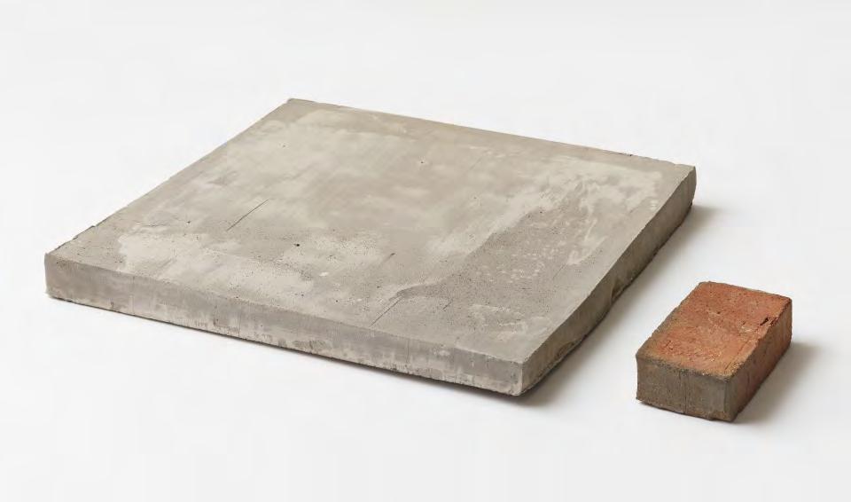
The Andlinger Center is composed of precise and minimal shapes and completely smooth façades, with recessed windows and doors. The architects insisted that every edge and corner in the building should merge seamlessly and without dissonance. To achieve the harmonious façades, they used 18 customised bricks made of K92 clay, which blends into the brickwork without making a fuss. One of the custom products is a brick measuring 483 x 483 mm, which gives a beautiful finis on the walls around the large multi-level terraces.
“Engineering is a bridge discipline, no longer a pure study of chemistry, mathematics or biology. There is now much greater recognition of the need for engineering and the humanities to work side-by-side. The desire to convey this coming together of the two disciplines determined the choice of material for the Andlinger Center, and the use of Petersen brick humanised the overall expression.”
Billie Tsien, architect
Export manager Stig Sørensen, architects Billie Tsien and Tod Williams, brickworks owner Christian A. Petersen.
47
Various custom bricks were designed for the project. A brick, 483 x 483 mm, height sloping from 57 to 37 mm, finishe the walls around the large terraces. The custom brick is shown next to a 228 x 108 x 54 mm Danish standard brick to indicate the measurements.
About Andlinger Center for Energy and the Environment
Princeton University was founded in the New Jersey town of the same name in 1746 and is the fourth-oldest institution of higher education in the United States. An Ivy League university alongside Harvard and Yale, Princeton consists of more than 200 buildings, including Nassau Hall from 1756, which served as the original United States Capitol building.

Tod Williams & Billie Tsien Architects were commissioned to design one of the most recent additions to the Princeton campus. Called the Andlinger Center for Energy and the Environment, the facility is devoted to research into sustainable energy production.
Some of the labs in the Center conduct research into materials at the atomic level, which requires an ultra-low-vibration environment. To achieve that level of stability, the labs had to be built directly on bedrock – i.e. below ground level. The 12,000-m2 building is divided into three pavilions – two containing laboratories and one a lecture theatre. The sunken gardens allow plenty of daylight to reach the subterranean rooms.

48
In terms of colour, the masonry in Andlinger Hall matches the greyish, sedimentary stone called argillite used, for example, in Princeton University’s Blair Hall, built in 1897.

49
Christian IV’s Brewhouse, Copenhagen, Denmark

Builder: King Christian IV
Completed: 1608-1762
Repairs to the brickwork on the façade, 1996
Brick: Medieval format bricks, 285 x 140 x 85 mm made in custom colours of red and blue clay
Architect: Bornebusch
Photos: Anders Sune Berg
New bricks with 17th-century patina
As part of the façade repair, new bricks replaced ones that were 400 years old – and the difference is imperceptible.
The façades on the Brewhouse, parts of which are almost 415 years old, occasionally need an overhaul. The last time bricks were replaced was about 25 years ago. Bornebusch have been associated with Christian IV’s Brewhouse for many years.
In 1996, following a survey of the state of the building and options for the interior, Bornebusch undertook repairs to the façades. At that time, the brickwork looked mottled, with an age difference of up to 200 years between the oldest bricks, dating from 1608, and the sections rebuilt after two major fies.
Brickwork is well suited to repairs, as individual bricks can easily be replaced. The challenge is to fin bricks that are a good fi for the existing look. For the restoration of the façades of Christian IV’s Brewhouse, Bornebusch and Petersen Tegl developed a custom brick measuring 285 x 140 x 85 mm. With their rich play of reddish, greenish and yellowish shades, the new bricks blend in beautifully with the surrounding medieval ones.

50
About Christian IV’s Brewhouse
With its enormous roof surfaces and huge, flame-ed medieval brick façades, Christian IV’s Brewhouse is one of Copenhagen’s most spectacular historic buildings. Built by King Christian IV more than 400 years ago, it was designed as a strong bastion and formed part of Copenhagen’s defences. To this day, the aloof, enigmatic, approximately 8,000-m2 building overlooks the waterfront and Frederiksholms Canal.

After the construction of the fortress town of Christianshavn, the bastion lost its military importance, and in 1618 it was converted into a brewery for the military. After fies in 1632 and 1767, the brewery was moved to a new address in the town. It was rebuilt in its current form and spent two centuries as a warehouse for the Royal Arsenal Museum, among others.
With its angled floo plan, up to 2.5-metre-thick exterior walls, and numerous cross vaults and cylinder vaults, the building’s sturdy, brick-built ground floo clearly resembles a military fortificaion. The ground floo consists of one vast room called ‘The Brick Ceiling’. It is built in a style reminiscent of older warehouses, with a timber roof structure that rises to a height of six storeys.

51

Commercial

53
Photo: Anders Sune Berg
Konvert, headquarters, Kortrijk, Belgium

Client: Konvert NV
Architect: Bureau Goddeeris Architecten
Completed: 2019
Brick: Kolumba in custom colour, F261, F264, F287 various formats bricks in the same types of clay

Photos: Luuk Kramer
Blue brick echoes branding
The addition of minerals to the clay conjures up blue tones in the finished brick hat match the company’s logo.
The client and architect wanted Konvert’s new headquarters to look architecturally straightforward, which made materials of the highest quality an obvious prerequisite. They also wanted the building to be as flexibl as possible.
Load-bearing concrete columns are incorporated into the façades, which makes some storeys column-free and affords the maximum interior flexibiity. The façades are rhythmic and minimal, with rectangular window sections without parapets, pulled back from the façade. Closed sections around the service cores enclose two of the gables. The brick borders that frame the window sections are cut at oblique angles, which makes the surfaces visible from all directions and creates a fascinating depth effect.
Kolumba was chosen for the façade to emphasise the building’s horizontal lines. Konvert wanted a distinctive look that would echo the company’s visual identity. Along with Petersen brickworks, they designed three custom bricks that use minerals to create the same delicate blue shades as Konvert’s logo.
To achieve brickwork that perfectly and silently wraps around the building, the architects designed a total of 43,500 custom bricks. These are deployed around the windows, doors, corners, crowning walls and on the undersides of lintels.
At firs glance, you might not notice the custom bricks. But that is the point – the impression is of a beautifully tailored wall surface that does not instantly give up the secret of how it was achieved.
Kolumba in three custom colours.


55 90 20 doorsnede aanzicht 15.5 15 25 grondplan 25 12 15.2 25 99.75 21x4.75=99.75 98.7 98.7 60.7 60.7 60.7 45 45 64 64 18 33 14 33 18 aanzicht 60.7 25 15.2 98.7 45 45 64 25 15.2 45 45 64 33 18 25 15.2 98.7 45 45 64 B' B' C D D B' A E' E F B B C D B A C G G B' B B B B B B B' B' B' B' B' B' B' A A A A A A A A A A A B B B B B B B' B' B' B' B' B' A A A A A A A A A A A E E' B' A E B E' B' A E B B' A E B E' B' A E B E' E' E' E E E E E E H H H E' A E B E' B' A E B E' B' A E B E' B' A E B E' B' A E B 630 18 18 18 18 laag 1 laag 2 E' B' A E B laag 1 laag 2 laag 1 laag 2 B B' B' B B' B' B B B laag 1 laag 2 grondplan grondplan grondplan 361 D E F B A B' C E' dorpel lateien 7 56 25 56 25 56 25 56 25 10.8 107° 107° 11.75 10.8 22.2 47.75 10.8 10.8 4.58 17.81 52.8 30.75 12.75 12.75 30.75 36.5 3.7 56.25 61.44 66.76 67.81 5 107° 11.75 90° 163° 66.76 71.15 163° 107° 10.8 10.8 10.8 10.8 10.8 53.3 7.2 10.8 5.5 4.51.2 66.76 0.4 steenstrips 10.8 17 56 17 17 56 17 17 56 17 17 56 17 10.8 10.8 11.75 12.75 12.75 30.75 4.58 53.71 163° 9.91 60.8 90 20 doorsnede aanzicht 15.5 15 25 grondplan 25 12 15.2 25 99.75 21x4.75=99.75 98.7 98.7 60.7 60.7 60.7 45 45 64 64 18 33 14 33 18 aanzicht 60.7 25 15.2 98.7 45 45 64 25 15.2 45 45 64 33 18 25 15.2 98.7 45 45 64 B' B' C D D B' A E' E F B B C D B A C G G B' B B B B B B B' B' B' B' B' B' B' A A A A A A A A A A A B B B B B B B' B' B' B' B' B' A A A A A A A A A A A E E' B' A E B E' B' A E B E' B' A E B E' B' A E B E' E' E' E E E E E E H H H E' A E B E' A E B E' B' A E B E' B' A E B E' B' A E B 630 18 18 18 18 laag 1 laag 2 E' B' A E B laag 1 laag 2 laag 1 laag 2 B B' B' B B' B' B B B laag 1 laag 2 grondplan grondplan grondplan 361 D E F B A B' C E' dorpel lateien 7 56 25 56 25 56 25 56 25 47.75 10.8 107° 107° 11.75 10.8 22.2 0 10.8 10.8 4.58 17.81 30.75 12.75 12.75 30.75 36.5 3.7 56.25 61.44 66.76 67.81 5 107° 11.75 90° 163° 66.76 71.15 163° 107° 10.8 10.8 10.8 10.8 10.8 53.3 7.2 10.8 5.5 4.51.2 66.76 0.4 steenstrips 10.8 17 56 17 17 56 17 17 56 17 17 56 17 10.8 10.8 11.75 12.75 12.75 30.75 4.58 163° 10.8 9.91 60.8 90 20 doorsnede aanzicht 15.5 15 25 grondplan 25 12 15.2 25 99.75 21x4.75=99.75 98.7 98.7 60.7 60.7 60.7 45 45 64 64 18 33 14 33 18 aanzicht 60.7 25 15.2 98.7 45 45 64 25 15.2 45 45 64 33 18 25 15.2 98.7 45 45 64 B' B' C D D B' A E' E F B B C D B A C G G B' B B B B B B B' B' B' B' B' B' B' A A A A A A A A A A A B B B B B B B' B' B' B' B' B' A A A A A A A A A A A E E' B' A E B E' B' A E B E' B' A E B E' B' A E B E' E' E' E E E E E E H H H E' A E B E' A E B E' B' A E B E' B' A E B E' B' A E B 630 18 18 18 18 laag 1 laag 2 E' B' A E B laag 1 laag 2 laag 1 laag 2 B B' B' B B' B' B B B laag 1 laag 2 grondplan grondplan grondplan 361 D E F B A B' C E' dorpel lateien 7 56 25 56 25 56 25 56 25 47.75 10.8 107° 107° 11.75 10.8 22.2 0 10.8 10.8 4.58 17.81 30.75 12.75 12.75 30.75 36.5 3.7 56.25 61.44 66.76 67.81 5 107° 11.75 90° 163° 66.76 71.15 163° 107° 10.8 10.8 10.8 10.8 10.8 53.3 7.2 10.8 5.5 4.51.2 66.76 0.4 steenstrips 10.8 17 56 17 17 56 17 17 56 17 17 56 17 10.8 10.8 11.75 12.75 12.75 30.75 4.58 163° 10.8 9.91 60.8 Elevation, window section Horizontal section Drawings of various special format bricks produced for the project.

56
About Konvert HQ
Konvert is a company based in West Flanders. Its portfolio spans a wide range of industries and includes service companies, employment agencies, offic administration, waste management and security services. In Kortrijk alone, Konvert employs 2,275 people.
In 2019, the company inaugurated a new headquarters in Kortrijk covering a total of approximately 6,000 m2 spread over six floors A figue that includes a partially subterranean ground floo and an underground car park the size of the whole building.

The new building is in a prominent spot on Kennedylaan, a broad avenue that runs through central Kortrijk. The building is designed as a wing located parallel to the avenue, with two smaller buildings on each side, forming a double L-shape. The side wing facing away from the avenue incorporates a large terrace overlooking surrounding green areas.
The various floor inside the building are designed as large, flexibl work areas, with service cores located at the front of the two wings. At the top of the building is a large terrace where staff gather for informal meetings and to enjoy unobstructed scenic views.

57
1A Page Street, Victoria, London, England
Client: Derwent London
Architect: PLP Architecture
Completed: 2014
Brick: D45 DNF custom colour + three bricks in custom format in the same clay
Photos: Philip Vile
“The people at the brickworks are just as passionate as we are. They don’t rest until the right brick is found for each building – and everything is possible in terms of colours and custom formats.” Simon Silver, director, retired, Derwent London
Glass converted to brick
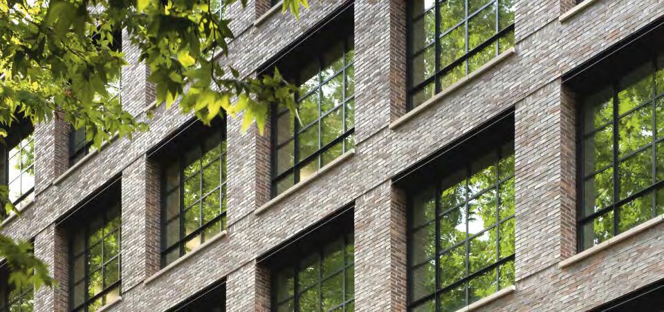
Custom formats made it possible to clad the building in brick and to match the heritage building across the street.
The beautifully proportioned façades of 1 Page Street, in London’s prestigious Victoria district, give little indication of the enormous amounts of planning involved. The previous glass and steel cladding dated from 1999 and looked out of place in the area. As part of a complete renovation a decade ago, PLP Architecture proposed new brick façades.
“Normally, a building’s size is based on the dimensions of the bricks. In this case, the façade would have to be adapted to fi the existing concrete construction behind it. We had three extra formats specially made, and each brick was laid vertically to make the bond work. The John Islip Street corner is not a right angle, which is reflecte in the architecture, so Petersen produced a custom brick with an angle of 115°. Since the ceiling height varies throughout the building, we also had to intervene on the vertical plane – not that it’s visible in the finishe façade – to get the bonds to work,” explains Ron Bakker, architect and partner at PLP.


59
Architect, director, Amy Holtz Mathy and architect, founding partner, Ron Bakker.
Elevation, window section.
The position of the special format bricks in the façade.

60
About 1A Page Street
After purchasing 1A Page Street, Victoria, owner and operator Derwent London decided to restore the approximately 16,000-m2 building so it more closely reflecte its upscale neighbour, Horseferry House in Dean Ryle Street, also owned by Derwent. Architecturally, brick and sandstone façades were the obvious choice for Page Street. Burberry, which leases both buildings, also expressed a desire for a more coherent look.

“Finding the right brick was crucial. We knew from working with Petersen Tegl in the past that they are just as passionate as we are,” says Simon Silver, former Derwent director.


“The tolerance of the bricks is also hugely important. All Petersen bricks are slightly different sizes, which results in an irregular and rich façade. The coal firin also gives each brick a crystalline surface that reflect light and enhances the
effect,” adds architect Amy Holtz, CEO of PLP Architecture.
“At first we intended to use a mixture of bricks,” Bakker continues, “but during a visit to Broager, we spotted a brick that was not only red but also had the hints of purple and blue present in Horseferry House. It had been discontinued a decade ago, but Petersen was, of course, willing to resume production specificaly for our project.”
61
The building was previously covered with glass and steel. The extensive renovation included new brick façades.
Horseferry House across the road, rightmost, inspired the look of 1A Page Street.
Astoria House, Stockholm, Sweden

Client: Humlegården
Architect: 3XN
Completed: 2020
Brick: F154, custom format
Photos: Rasmus Hjortshøj, Ulf Celander
Unifying tiles
Innovative use of brick on the roof and façade adds a unique and modern twist to a new building complex.


To unify the whole complex, the big new roof covering both the restored Astoria House and the newly built adjacent offic building was to be clad in one material.
“It was only natural to go in the direction of brick, which is used in older buildings in the area,” says architect Audun Opdal of 3XN. “It was crucial for us that the new building would look weathered right from the very beginning as if it had been there for years and years, and at the same time it should be contemporary. We felt that bricks from Petersen could be the element that tied the two buildings together, particularly if we bypassed traditional, joint-based masonry and instead developed a new way to lay the bricks.”
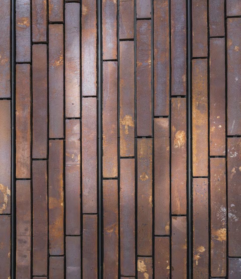
The brickworks and the architects experimented to fin the right brick and a suitable mounting technique. The result was a special edition of Kolumba, 800 mm long, in a deep, rusty red. To get the most out of the hand-moulded bricks’ rich play of colours and uneven texture, the architects decided to mount them on the façade vertically, with the broad, more rustic underside facing outwards. This resulted in a completely new brickwork effect.
62
The cinema in Nybrogatan opened in 1928 and closed in 2007.

64
About Astoria House
Before it closed in 2007, the Astoria on Nybrogatan, Östermalm, Stockholm, was one of the Swedish capital’s oldest and best-known cinemas. The property that housed the cinema was known as Astoria House. Originally home to luxury apartments, the upper storeys were later converted into offices
An extensive and very successful restoration of the property was combined with the construction of a new 6,000-m2 offic building next door, replacing a former outbuilding. The preserved part of the complex, including the façade and the entrance to the former cinema on Nybrogatan, has been superbly and sensitively returned to its original residential use.
The overall project, handled by 3XN, has re-established the address as a contemporary landmark in Östermalm.

The complex’s roof is its most striking feature. The unique, two-storey construction starts as a pitched roof atop the preserved Astoria House and from here rises in a twisting movement over the new building volume, ending in a right angle - as a greeting to the neighbouring fie walls. In the process, the two storeys inside the pitched roof are transformed into more conventional offic space.

65
Turnmill office builing, Clerkenwell, London, England


Client: Derwent London
Architect: Piercy&Company
Executive architect: Veretec
Completed: 2015
Brick: Three custom colours in Kolumba, F56, F58, F59. 27 custom format bricks made of the same clay
Photos: Allan Crow, Philip Vile
Adapting 18th-century colours
85,890 handmade bricks in 27 formats and three special colours make an office block in Clerkenwel simultaneously stand out and fit in
Brick was always going to be used to clad the building. It is the classic Clerkenwell material – unlike the City of London to the east, which is all about glass and steel. Machine-made bricks were also out of the question. At first the architects Piercy&Company and client Derwent London envisaged dark shades to reflec the building’s kinship with the nearby railway buildings. Along the way, however, they looked to the listed Session House across the road, which was built as a courthouse in 1780 using sandstone in various shades of warm grey.
The architects and client chose the handmade, 528-mm-long Kolumba due to the vertical profil of the building. However, the colours they wanted were not in the standard Kolumba range, which was either too grey or too golden compared to the sandstone of Session House. Instead, they developed three subtle, special colours at the brickworks in Broager. One complicating factor that emerged from the development work was that the light in London differs from that in Denmark.
The architects could not make fina decisions about shades until the bricks were mocked-up in situ with the right mortar. The three colours were mixed so that bricks of the same tone do not appear beside each other.
As well as producing three special colours, Piercy&Company designed 27 different custom bricks to accommodate a range of architectural details.
The colours for the new version of Kolumba were inspired by the sandstone façades on the 18th-century Session House next door.

67


 Architects Henry Humpfreys and Stuart Piercy, Piercy&Company and Simon Silver, Derwent London, in the lobby at Turnmill.
Architects, client and the brickworks experimented for months with colours for the new Kolumba bricks.
The three new Turnmill colours which are now to be found in the standard range of Kolumba.


69
Standard Brick
Brick Special Type F
Brick Special Type A
Brick Special Type Ch
Brick Special Type B
Brick Special Type Dh
Brick Special Type C
Brick Special Type Eh
Brick Special Type D
Brick Special Type Fh
Brick Special Type E
Brick Special Type G1
Brick Special Type F
Brick Special Type G2
Brick Special Type Ch
Brick Special Type G2h
Brick Special Type Dh
Brick Special Type H1
Brick Special Type Eh
Brick Special Type H2
Brick Special Type Fh
Brick Special Type H2h
Brick Special Type G1
Brick Special Type I
Brick Special Type G2
Brick Special Type G2h
Brick Special Type H1
Brick Special Type H2
Brick Special Type H2h
Brick Special Type I
70
Drawings of some the many custom bricks designed by the architects.
71 03 04 02 Brick Special Type FH
Dogleg Brick Special Type E Cill Brick Special Type B Reconstituted
Perforated
03 04 02 Brick Special Type FH
Dogleg Brick Special Type E Cill Brick Special Type B
Perforated
Extent
of
brick-faced precast lintels dashed red
Stone Coping
Masonry Parapet
Extent of brick-faced precast lintels dashed red
Reconstituted Stone Coping
Masonry Parapet
Elevation, façade section. Plan, horizontal section.
About Turnmill
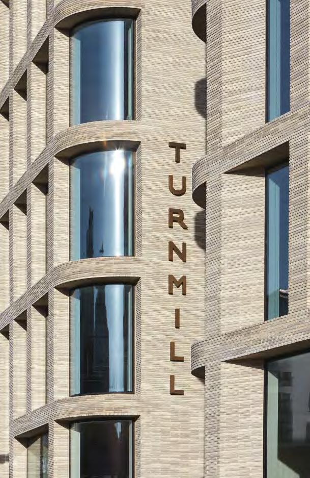
The delicate, light and shimmering colours and the bricks’ handmade structure give the façade of the six-storey offic building the appearance of a refined woven piece of cloth, while the edifices volume and solidity invoke associations with the centuries-old warehouses that have played a key role in the local area’s colourful history.
The Great Northern Railway Company constructed the original building in 1886 as a multi-storey stable for the horses that used to pull the carriages on the underground. The local authority was very keen to preserve the building, even though all the original interior details had disappeared over the years.
Piercy&Company analysed all the options for the building but ultimately decided that it would not be suitable for either housing or offices In consultation with the London Borough of Islington, a decision was finaly made to demolish and rebuild, on condition that the new building would make a more positive contribution than the old building in both architectural and material terms –and it does.
72
Lukas Thomsen, part of the 9th generation of the Petersen family, designing the street number for Turnmill.


73
Tivoli Corner, Tivoli Gardens, Copenhagen, Denmark
Client: Tivoli
Architect: Pei Cobb Freed & Partners
Completed: 2017
Brick: Custom colours and formats of Petersen Cover developed by Pei Cobb Freed & Partners in cooperation with Tivoli
Photos: Anders Sune Berg
Inspired by local heritage


Handmade bricks forge a connection between Tivoli’s most recent addition and the 180-year-old amusement park.
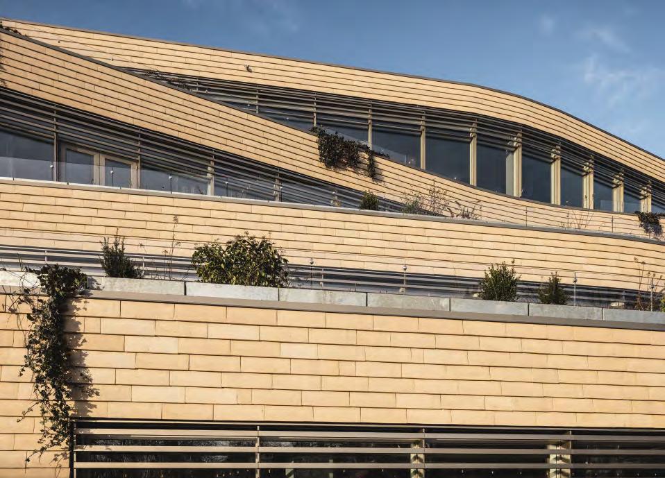
The rear façade of Tivoli Corner, facing the gardens, comprises undulating terraces with green outdoor spaces. Although the surfaces are sub-divided and spread over different levels, the building has a unifie feel – not least thanks to the brick cladding chosen by Tivoli and Pei Cobb Freed & Partners, which has a natural look that complements the greenery of the Gardens. Denmark’s wonderful brick heritage, including the Church of the Holy Trinity, was a source of great inspiration for the architects so using natural Danish materials to pay homage to the history of Tivoli was an obvious choice.

The new building stands between the ceramic-tiled main entrance to Tivoli Gardens from 1890, and Hotel Nimb, with its Moorish-inspired façade in Venetian marble. As they wanted to establish a dialogue with the two older buildings, the architects commissioned Petersen Tegl to develop a special edition of Cover for the new brick façade. The result is a Danish blue-clay brick made in wooden moulds, using a greyish-white slurry as lubricant. Its white and yellow shades reflec the colours of the neighbouring buildings.
As well as the unique colour, the architects and client chose a special format that results in slightly less relief in the clinker-built construction. Another custom format is used on the façade facing Bernstorffsgade, where the bricks are flus with the façade.
According to the architects, the history of Copenhagen is reflecte in the layers of materials used on its façades over the centuries, for example, this wall in Fiolstræde in the old city centre. These materials served as a source of inspiration for the work on the façades at Tivoli Corner.
Cover samples in various colours and with various level of slurry were inspected at the brickworks.
The architects wanted façades with a limited profil and shadow effects, a look achieved by using this L-shaped custom version of Cover.

About Tivoli Corner
Tivoli Corner is the name of the latest attraction built as part of Tivoli’s mission to connect with the surrounding city. The 8,500m2, four-storey building on the corner of Bernstorffsgade and Vesterbrogade was designed by the American architects Pei Cobb Freed & Partners. Architect and partner Ian Bader has been the designer on the project since its initial conception 15 years ago. Accessible from both the Gardens and the street, Tivoli Corner houses restaurants, cafes, shops and a modern food hall with takeaway outlets and sit-in dining, all under one roof.
Facing the street, the exterior is decidedly urban, comprising two dynamic, undulating glass bands with vertically integrated rotating slats that provide shade and alter the view between the interior and the street. The two floor behind the glass house a restaurant and 21 new rooms of the five-sta Nimb Hotel. By day, the glass façade reflect the surrounding buildings and absorbs the colours of the city. By night, it sparkles and twinkles, enticing visitors to experience the fairy-tale adventures within.


76


77
A flat custom version of Cover, used as a smooth cladding on the façades facing out to the city.
Kville Saluhall, Gothenburg, Sweden
Client: Älvstranden Utveckling
Architect: Gustav Appell Arkitektkontor

Completed: 2016
Brick: D71 FF + custom brick in the same clay with clear glaze

Photos: Ulf Celander
Shimmering brick

Glazing selected bricks reveals a surprising, illuminated pattern in a certain light.
Architect Gustav Appell’s vision for Kville Saluhall was for an architecturally simple structure, which required a brick with a strong idiom.
“The brick had to be handmade to bring the façade to life,” he explains. “We chose a yellow one that derives its light tones and unusual play of colours from the white porcelain clay used to ease the lump of clay out of the mould after the firin process. In the end, we decided on Flensburg Format, which is very elegant and works well with the other building components.”
Seeking a distinctive aesthetic for the façades, the architects decided that selected bricks would glisten when they caught the sunlight at certain angles. So they asked Petersen Tegl to glaze a number of bricks before firing
“The effect was just as refine and understated as we had hoped,” says Appell. “Once the building work was completed, we had the pleasure of the client and partners telling us that the brick had been worth the money and that they were glad we had insisted upon it. In 2014, the hall was named the best building project in Gothenburg – the fines accolade we could wish for because it didn’t come from architects!”
6,000 bricks were glazed in order to create a shimmering effect in the façade.
About Kville Saluhall
Southern European-style market halls have gained a foothold in Scandinavia in recent years and are now found at several locations around Sweden. The aim of the saluhaller (as they are called in Swedish) is to support small traders and producers in a consumer-friendly way.

Located in the Gothenburg suburb of Kvillebäcken, Kville Saluhall looks like a three-storey building that tapers off into a lantern-like structure at the top. This tapering of the main body allows the afternoon sun to reach the small, neighbouring square.
On the ground floo, one enters a double-height hall with shops side by side, creating a bustling, intimate atmosphere. A firs floo balcony has various restaurants that open onto a large terrace. Large windows provide plenty of light and open up the market hall to its surroundings.
The design called for materials that would correspond to the functional and architectural robustness of the hall, which made hardwearing, timeless and maintenance-free brick the obvious choice.

79
Design studio, Rancate, Switzerland

Client: Stocker Lee Architetti
Architect: Stocker Lee Architetti
Completed: 2019
Brick: C48, K49 + C48 custom format

Photos: Paul Kozlowski
Seamless integration of Kolumba and Cover
An architectural office in Switzerland uses a special version of Cover allowing for simple, elegant corners.
A few years ago, Stocker Lee Architetti designed and consummately executed a building that houses a design studio for their own use. The building is a sharply define brick volume with no overhanging eaves. Recessed glass façades at ground level make the upper storeys look as if they are floaing in the air. The studio feels straightforward in its appearance and entirely convincing in its hierarchy – a testament to both Stocker Lee’s natural incorporation of nature into the design, and the building’s striking precision and veneration for detail.
The upper gables are clad in Kolumba with a wild bond, while the roof and façades on the long sides of the building are clad in Cover fied in the same way and with the same colours. Two-thirds of the way up, the roof breaks sharply to make room for fla skylights.
The meeting of Kolumba on the gables and Cover on the long façades required a custom solution designed by Stocker Lee. Every Cover brick at the corners of the building has a side section that borders the gable end, giving the bricks a closed look. The Kolumba bricks, which also go all the way out to the corners, are cut to
The architects developed a U-shaped version of Cover to merge the roof seamlessly with the Kolumba façade.
81
About Stocker Lee design studio

The building in Rancate is on an elongated plot measuring 12.70 x 22.60 m and facing the imposing mountain Monte Generoso, between Lake Lugano and Lake Como. The shape of the plot is due to the shape of the old village, which is surrounded by vineyards, forests, small-scale industry and housing. Close to the forest, the design studio is semi-submerged to take up less space and leave more room for nature.
The floo plan measures 6.6 x 17.6 m, and the compact structure is based on 29 tightly packed load-bearing wooden
beams rooted in the in-situ-cast concrete walls surrounding the partially submerged ground floo. Above this are the windows on the lower façade, which is slightly retracted from the deep reddish-brown solid Cover brick monolith of the upper volume. Cover was chosen as a nod to cottage architecture and blends in naturally with the colours of the landscape. Equally, the bricks emphasise the shape of the building without dominating the surroundings.
Architects and partners Dong Joon Lee and Melanie Stocker, Stocker Lee Architetti.


83
Petrol station, Skovshoved, Denmark
Builder: Texaco
Architect: Arne Jacobsen
Completed: 1938
Restoration project: 2001-2003
Client: Gentofte Kommune
Architect: Dissing+Weitling
Brick: Various custom format glazed ceramic tiles
Photos: Anders Sune Berg
Recreating iconic ceramics
Following a successful restoration almost two decades ago, a world-famous petrol station looks just as it did when completed in 1938.
Arne Jacobsen’s petrol station was restored in 2002 and 2003 to mark the centenary of the architect’s birth. The project was subject to close scrutiny by the conservation authorities and involved recasting the elliptical roof and resurfacing and cleaning up the site. The service building’s ceramic tile cladding – a key element in the overall aesthetic – was in poor condition and needed to be replaced.

According to Teit Weylandt, former partner at Dissing+Weitling and the architect who oversaw the restoration project, the texture, colour, finis and format of the replacement tiles were crucial.

“We didn’t manage to track down the original manufacturer, which we think may have been in Bohemia. We approached several others, only to fin tiles with smooth, uniform and lifeless surfaces with a bathroom-like feel. Luckily, Petersen Tegl offered what we were looking for.”
The original standard tile measures 150 x 300 mm, but the project also used 130 custom formats, including curved and double-curved tiles, which required specially produced plaster moulds. After shaping and drying the tiles, they were glazed.
“The brickworks came up with special methods to produce a rustic, raw, vibrant glaze and surface, with a slight variation in colouring as close to the original as possible,” Weylandt explains. The successful result on Kystvejen has been admired for the last two decades.
The original standard tile measuring 150 x 300 mm was recreated by hand for large sections of the façade. In addition, 130 custom formats, including curved and double-curved tiles, were produced with plaster moulds.


85
“The brickworks came up with special methods to land on a rustic, raw, vibrant glaze and surface, with a slight variation in colouring as close as possible to the original.”
Teit Weylandt, architect


86


87
The tiles around the windows and doors were recreated 1:1 like the originals, including the rounding of the edges.
“The seemingly simple tiles present myriad variants, corners and edges that manufacturers today aren’t equipped to accommodate to this degree of individual fiting. We were thrilled by Petersen Tegl’s commitment to our collaboration and achieving the desired result.”
 Teit Weylandt, architect
About Arne Jacobsen’s petrol station
Located on Kystvejen in Skovshoved, north of Copenhagen, Arne Jacobsen’s famous petrol station was part of his modernist plan for the area around Bellevue: ‘The White City on the Sound’. In 1938, Texaco commissioned him to design a new type of petrol and service station. The result was a light and elegant construction that went on to be world famous and is today a listed building. Architecturally, Jacobsen had an experimental approach to materials and structures.
A distinctive roof construction provides shelter and acts like a giant lamp – the ellipse is illuminated from below by specially designed fixtues that reflec off the shiny underside. The roof’s distinctive contour is echoed in Jacobsen’s furniture design – most clearly in the classic Ant Chair from 1952.
The building measures just 9 x 15 m and consists of a car wash, office storage room, boiler room and two toilets. It is cast in reinforced concrete and clad in white ceramic tiles, reflecing Jacobsen’s preference for pure, minimalist design.

The petrol station is a fin example of free form and reflect Jacobsen’s openness to influence from peers in other countries such as Gunnar Asplund, Alvar Aalto, Mies van der Rohe and Le Corbusier.
The restoration of the petrol station was awarded the prestigious Europa Nostra Prize 2006.
Architectural drawings and Arne Jacobsen’s original watercolour for the petrol station from 1936.


Copyright: Arne Jacobsen
® Design, Photo: Danish National Art Library
89
Arcade building, Nordre Toldbod, Copenhagen, Denmark
Architect: Gustav Friedrich Hetsch
Completed: 1850
Client: A.P. Møller Mærsk
Restoration project: 2010
Architect: Fogh & Følner Arkitekter
Brick: custom format and custom colour brick in Danish blue clay
Photos: Anders Sune Berg
Golden bricks on historic port buildings
Restored a decade ago, the brickwork on the listed arcade buildings in this historic Copenhagen district looks as harmonious as ever.
From the mid-1850s, access to Nordre Toldbodplads in the Port of Copenhagen was via a lattice gate, on the pillars of which sat two lions who still guard the spot to this day. Inside the gate, visitors pass two low arcade buildings, built in 1856 by the architect Gustav Friedrich Hetsch. The listed and partially preserved arcades bear witness to a historic era and are today owned by the shipping company A.P. Møller and the development company By & Havn. A decade ago, as part of a renovation project, the Fogh & Følner studio was commissioned to restore the brickwork in the southern arcade’s pillars.


Petersen Tegl supplied golden-hued bricks to replace the damaged ones. These custom bricks are fied from Danish blue clay and laid with an extruded joint that allows them to blend in with the 165-yearold brickwork.
About the Arcade building
Københavns Toldbod (Copenhagen’s Customs House) was the name given to a large area in the north-east of inner Copenhagen in 1630. From here, customs officer controlled the seaward approach to the city, and the name stuck for centuries. Heads of state and other dignitaries would disembark there when they landed in the capital, including the world-renowned Danish sculptor Bertel Thorvaldsen when he arrived back from Rome in 1838.
As trade grew in the 18th and 19th centuries, the Customs Service erected a number of buildings in the area, several of which were later demolished. The abandoned warehouses came down in the mid-1970s when changes in the law meant that goods no longer had to be stored for physical inspection. Two arcade buildings from 1856 have been preserved and listed.
Part of the oil painting Toldbodvejen by Peter Ølsted (1860), featuring the lions and arcades. From the book: Hundrede år under Dannebrog (100 Years under the Danish Flag), Bo Bramsen, 1983.


91

Culture

93
Photo: Anders Sune Berg
Kunstmuseum Basel, new extension, Basel, Switzerland
Owner: City of Basel, Immobilien Basel-Stadt
Client: Construction and Transport Department of the Canton of Basel-Stadt, Städtebau & Architektur, Hochbauamt
User: Department of Presidential Affairs of the Canton of Basel-Stadt, Kunstmuseum Basel
Architect: Christ & Gantenbein

Completed: 2016
Brick: D91 and D11 in custom formats

Photos: Anders Sune Berg
Concealed lighting effect
Integration of light frieze into the façade of a Swiss art museum.
Two-thirds of the way up the front of the Kunstmuseum Basel is a broad band that serves not only as a decorative frieze but also as a communicative element.
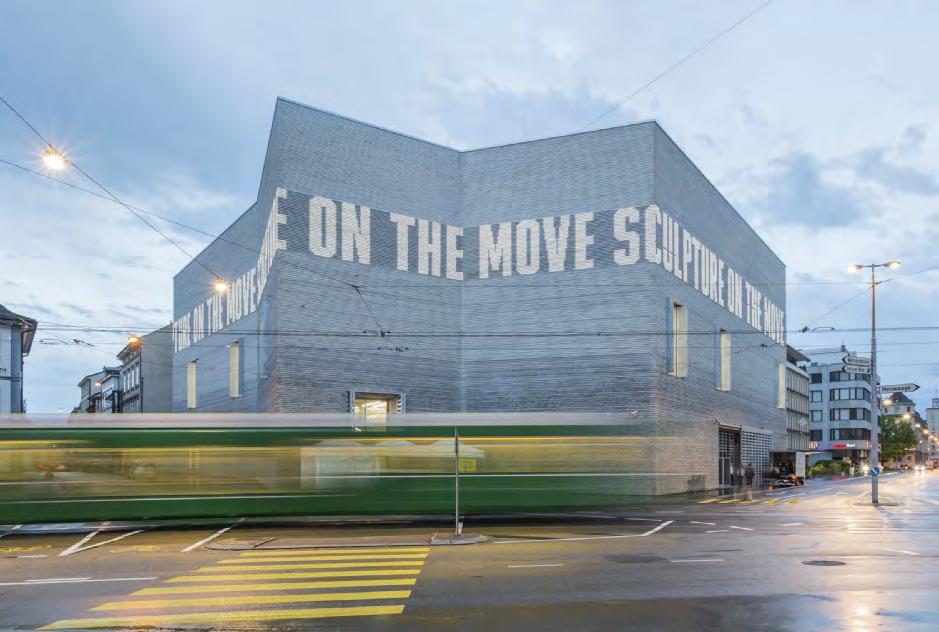
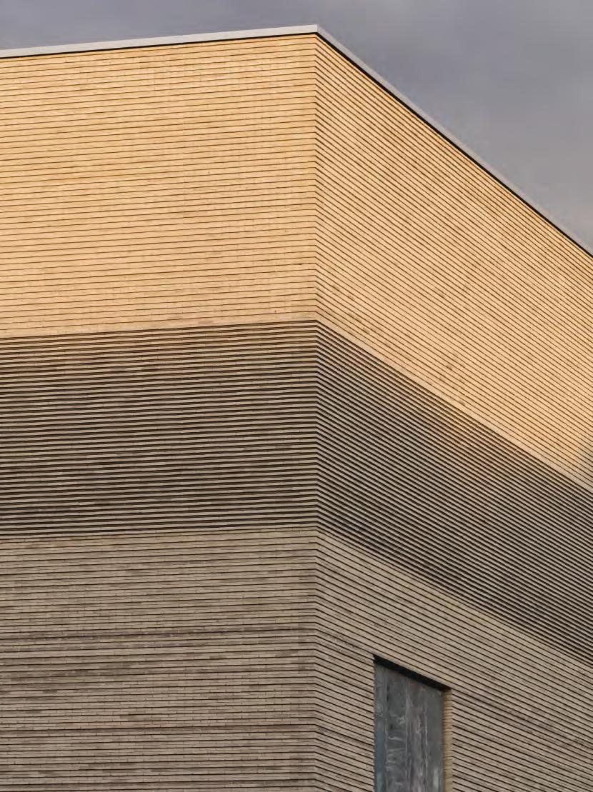
Architects Christ & Gantenbein worked with Petersen Tegl to produce custom, concave-moulded bricks that form a horizontal band in which LED lights have been mounted. The lighting is adjusted to make parts of the frieze appear flus with the rest of the façade. When selected lights are turned on, letters appear on the façade, seemingly formed by protruding bricks. However, they are, in fact, created by the contrast between illuminated and non-illuminated areas.
The lighting is digitally controlled so the text can be modifie to advertise special exhibitions, etc. The custom bricks are handmade from the same type of clay as the facing brick (K11).
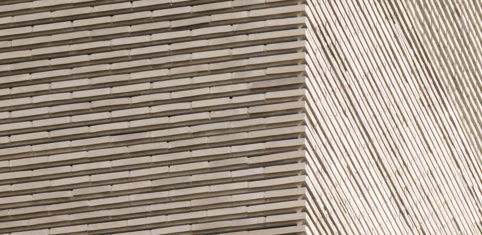
The customized concave-moulded bricks form an underlying horizontal band in which LED lights are mounted in order to achieve flexibl lighting effects.

96
About Kunstmuseum Basel
Kunstmuseum Basel, on the boulevard St. Alban-Graben, houses the world’s oldest city council-owned art collection, which includes several Renaissance masterpieces. The original museum was built in 1936 and clad with decorative limestone bands. Christ & Gantenbein won the competition to design the extension, which was inaugurated in 2016.
The new building spans fiv storeys, two of which are underground where a passage connects the new and old parts of the museum. The three storeys above ground correspond to the height of the older main building.
The extension comprises a large volume divided into horizontal strata as if formed by geological deposits over millennia. The brick façade has no expansion joints, creating the appearance of one continuous surface. Every other brick course protrudes, producing a subtle relief effect.

The hand-made bricks of the façade vary in shades ranging from dark to light grey. This smooth shading effect is broken near the roof, where large letters appear to have been carved out of the façade in a band encircling the building. The darkest bricks are at the bottom and appears to provide a solid base supporting the lighter layers toward the top.

“The beauty is that you can’t see the LEDs – just the light on the bricks. In traditional architecture, a frieze was usually decorated with sculptures, and sculpture is, of course, all about how light and shadow fall on three-dimensional objects. Here, we explore these principles in a highly technological and adaptable way. It is a pragmatic, modern building that reflect contemporary textual modes of communication.”
Architect Christoph Gantenbein, Christ & Gantenbein

Z33, House for Contemporary Art, Hasselt, Belgium
Client: Provincie Limburg, Z33
Architect: Francesca Torzo

Completed: 2019
Brick: Custom format tiles for facades, made of German and Danish clay
Photos: Gion von Albertini

Allusion to damask linen
The custom colour in façade tile was achieved by mixing red wine, water and milk
Architect Francesca Torzo started developing a brick for the façades on Z33 by devising a colour palette for each of the remaining Beguine buildings on the site. The aim was to explore ways the new building could harmonise with its historic surroundings.
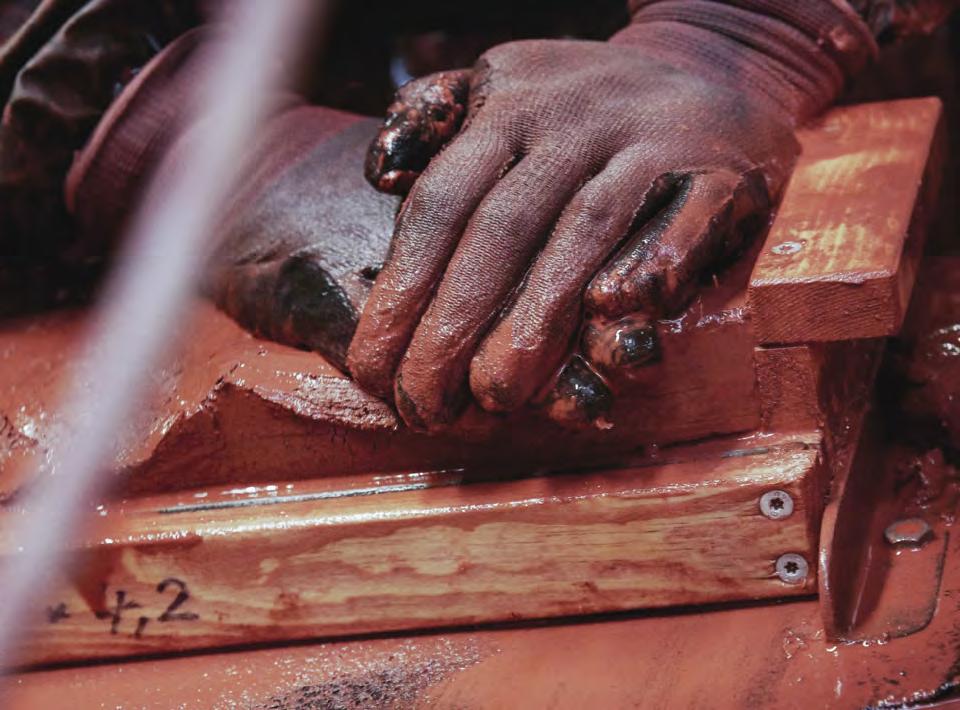
The result was a purplish-reddish hue, which Torzo recreated at Petersen Tegl by mixing red wine, water and milk. Using this colour as a reference, the brickworks combined German and Danish clay to produce a custom brick. The new façade’s bricks are rhombus-shaped, 370 mm high, 130 mm wide and 37 mm thick.
The cladding on the street-facing wall, which is solid, was carried out so that expansion joints were unnecessary. Coloured mortar creates a coherent look – almost like a damask pattern, monochrome, but with a hint of zigzag due to the rhombus-shaped bricks.
 Architect Francesca Torzo mixing wine, water and milk to arrive at the exact purple-red hue she wanted.
Three formats of tiles were produced in order to create the façade exactly as the architect had envisioned it.


99
100


101
About Z33
Z33 is in the heart of Hasselt, on a triangular plot of land surrounded by streets on all sides. In the 18th century, a semi-monastic lay order called the Beguines established a community here, and most of the buildings still survive today. Their closed external façades line the edge of the plot, while the more open façades, heavily punctuated with windows, face the large garden. Later, a gin distillery was built on part of the site and has since been turned into a gin museum. In 1958, the art museum Vleugel ’58 was built at Zuivelmarkt 33, the address from which the new gallery derives its name.
The extension to Z33, designed by Francesca Torzo, is built in brick and follows the same principle as the Beguine buildings: closed toward the street, open toward the garden. A 60-metre-long, 12-metre-high wall almost surrounds the site. The wall is interrupted only by a ridge in the middle and two openings, one of which leads into a small courtyard and continues into Z33.


The new building has two floor of exhibition space, between which is a floo housing offices It also has classrooms, a space for handling museum objects and an apartment for artists in residence.
Z33, House for Contemporary Art has been nominated for the Mies van der Rohe Award 2022
102
“Minor variations in the handmade bricks create a shimmering effect, and the façade will age well with few, fine wrinkles –which I love because absolutely nothing is perfect in life.”

 Francesca Torzo, architect
103
Tobias Mayer Museum, Marbach am Neckar, Germany

Client: Hermann and Erika Püttmer, Tobias Mayer Association
Architect: Webler + Geissler Architekten BDA (planning and supervision)
Knappe Innenarchitekten (competition winners)
Completed: 2018
Brick: K11 + nine custom format bricks made of K11 clay


Photos: Lukas Roth
Seamless corners

Meticulously planned custom brickwork endows the unusual pentagonal building with the appearance of a precisely constructed block.
The museum extension is reminiscent of both the fortress towers that fascinated Tobias Mayer and the observatories in which the scientist and astronomer spent so much of his life. The extension’s irregular pentagonal footprint closely follows the construction site’s outer boundary. Due to the varied profile it was an obvious choice to use specially moulded, handmade bricks with exactly the angles required to achieve the building’s distinctive shape. Webler + Geissler Architekten designed nine different custom bricks and drew up the façade brickwork at 1:1 scale.
It was crucial that the new façade’s cladding should harmonise with the surrounding, centuries-old buildings, all of which boast the kind of beautiful patina only possible with hand-built construction. At the same time, the extension had to exist in its own right, and neither architecturally nor materially imitate the nearby plastered façades.
This careful approach is evident in the immaculately constructed brickwork that subtly wraps the corners.
104
Examples of the angled corner bricks designed by the architects.
Nine custom formats were produced so that the brickwork could be woven harmoniously around the many different angles in the building.


105
Ground floo.
About Tobias Mayer Museum
Born in 1723, the scientist Tobias Mayer made many groundbreaking discoveries before his death, aged just 39. He was the firs to measure lunar movements and the topography of the Moon’s surface accurately, observe fixe stars and calculate the cycle of solar and lunar eclipses. Until 1981, the museum dedicated to his life and research was housed in Mayer’s birthplace, a half-timbered house from 1711. In 2018, an extension was inaugurated, increasing the exhibition area to 220 m2
The extension’s façades both relate clearly to and respect the half-timbered structure of the original museum. The ceiling above the recessed entranceway follows the upper edge of the original 18th-century stone wall. Similarly, the extension’s horizontal window is flus with and continues the baseline of the frontispiece.


“Before we decided on the bricks for the façade, we knew that Petersen makes handmade bricks. We approached the Backstein Office in Cologne and had a construcive dialogue with them about the possibilities. We designed the bricks, and Backstein subsequently communicated with the brickyard and contractor. The custom bricks arrived at the building site on time, along with the standard ones. The process was simple and uncomplicated throughout.”
Martin Webler, Webler + Geissler Architekten


107
CLAY Museum of Ceramic Art, Middelfart, Denmark
Client: Grimmerhus Bygningsfond
Architect: Kjaer & Richter A/S
Development, delivery and mounting of the slats: CO<
Completed: 2015
Brick: K48 + custom-format slats in K48 clay
Photos: Anders Sune Berg
A lump of baked clay
Brick slats in three formats form the flexibl cladding on a museum extension.


The extension to the CLAY Museum of Ceramic Art Denmark is sunk into the grass lawn and emerges from the earth in the form of a pavilion. Baked clay was an obvious choice for the façades on a museum of ceramics, but the architects also wanted to transform the heavy brick into a lightweight material that would convey a pavilion-like air.
They devised the idea of shaping and firin the clay for slats that open or close depending on how the exhibition space behind the wall is used.
The façade consists of three standard modules mounted on vertical steel frames designed by the architects, which form columns from the ground to the roof. Each column comprises fiv sets of brick slats, each made up of a random selection of 2-5 bricks. Developed in partnership with Petersen Tegl, the slats are made of red English clay, 37 mm thick, 805 mm long and produced in three widths: 56, 123 and 190 mm. At each end of the slats are grooves into which pin bolts are inserted. The slats are arranged in eight sections on each side of the building. All can be opened and closed independently, controlled by an electronic panel inside the museum.
The suspension system was designed by Kjaer & Richter and produced by CO<.


109
The slats were produced in three widths, 56, 123 and 190 mm, and are 37 mm thick and 805 mm high.
About CLAY Museum of Ceramic Art
Since CLAY was founded in Middelfart, Funen, the museum has amassed a major collection of ceramic art from Denmark and abroad – the largest of its kind in the Nordic Region.

The museum is in Grimmerhus, a historic ochre-red building from 1857, built as a dower house for Hindsgavl Castle. The client did not want a traditional extension to the main building, so the new exhibition space is tucked away underground, with a pavilion as the only visible element.

From a distance, the pavilion resembles a precision-built treasure chest – but the nearer you are, the more uneven and handmade the rust-red brick surface seems. The rust-red hue glows more fiecely as you approach the building. Up close, on a sunny day, the wall is like a sea of flames
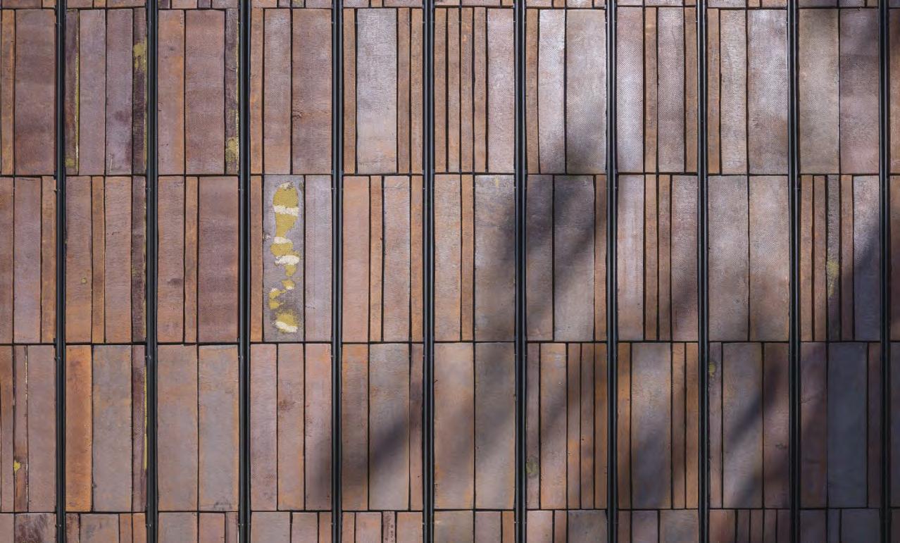

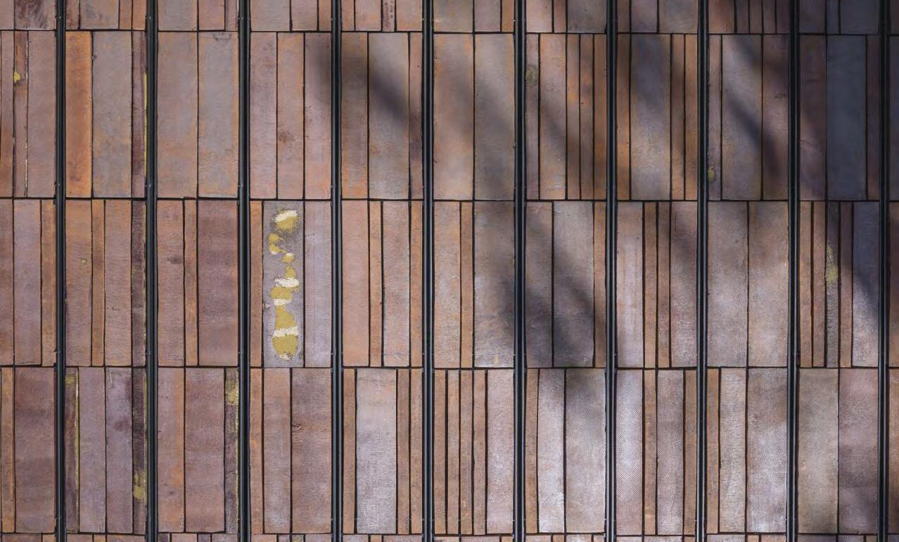
110
“Something special happens when you fie clay. It is a process that has fascinated brickmakers and ceramists for millennia – a magical transformation from sodden grey gunge to glowing gold to solid stone, finaly blossoming into a dark rush of colour. At any rate, that’s how it must have seemed in Nybølnor when the tiles for the CLAY Museum of Ceramic Art made their entrance into the world.”
Thomas Bo Jensen, professor, cand.arch., PhD


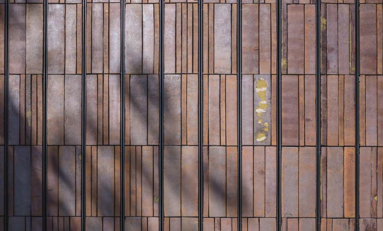
111
Museum of the Bible, Washington DC, USA
Client: Museum of the Bible
Architect: SmithGroupJJR
Opened: 2017
Brick: Mix of K36, K46, K4, K43 (9, 18, 64, 10%) and K36 in various customised widths
Photos: Tom Eckerle
Biblical motifs in brick
Echoing the museum’s purpose, the architects used special bricks to deploy subtle biblical images in the façade.


The Museum of the Bible involved not only the conversion and renovation of existing structures but also the construction of a brand new connecting building. The architects managed to make use of biblical references throughout.
The connecting building’s two façades utilise a mixture of four different versions of Kolumba in a muted, red-grey hue that harmonises with the brickwork on the adjacent industrial façades.
On the south façade, the long, narrow brick is laid in rectangular field in both transverse and vertical formats, while the last fiel is purely vertical. This not only endows the large surface with life and character but serves as an elegant paraphrase of the Wailing Wall in Jerusalem.
The two large bay windows on either side of the new building are clad in a bright red K36 in various lengths, laid in an uneven, ridged pattern. The architects wanted a subtle reference to the bulging and frayed edges of the pages on which the ancient Holy Scriptures were written.
According to the museum’s architect, David Greenbaum, brick was the natural material of choice: “Brick represents thousands of years of history and tradition. Brickmaking is an ancient craft, kept alive by Petersen, especially in Kolumba – the format, texture and handmade prints of which are infused with history.”
“The handmade nature and varied colour and texture of the brick express the same qualities as the priceless ancient manuscripts inside.”

 David Greenbaum, architect, SmithGroupJJR
113
A mix of Kolumba in various reddish shades was produced in varying widths to achieve an uneven, fluted patern on the façade – a reference to the uneven and frayed edges of the handmade paper on which the ancient Holy Scriptures are written.
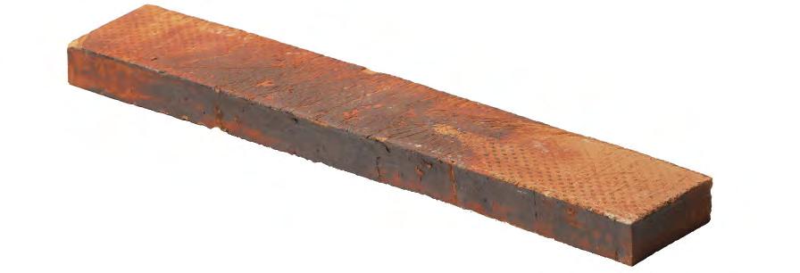


“Instead of resorting to dogmatic and literal biblical symbolism, we sought to convey religious and historical references by means of a subtle and sensuous architectural idiom. The idea was for the Museum of the Bible to be a palimpsest – a three-dimensional equivalent of the earliest handwritten Holy Scriptures, which bear traces of multiple revisions, additions and deletions over time.”
David Greenbaum, architect
114
About Museum of the Bible

The Museum of the Bible in downtown Washington DC brings to life and conveys the history, content and significanc of one of the world’s oldest and most important texts. At the same time, the modern, forward-looking approach to architecture and museums allows the museum to make its own mark on history.
The museum is housed in a red brick building from 1922, originally a refrigerated warehouse. A neighbouring building was later added to the triangular site, and then a third was built to connect the two.
The architects SmithGroupJJR were commissioned for the complex task of transforming the old industrial unit while keeping the main volume. The client wanted the site’s history and previous functions to echo in the finishe museum and for the museum’s content and non-dogmatic approach to be encoded in the architecture and design.
As well as the old warehouse, the museum complex includes a new, spectacular addition and a connecting building in red brick. The former is crowned by an asymmetrical, curved glass roof that provides a contemporary counterpoint to the old red-brick façades.


115
European Hansemuseum, Lübeck, Germany
Client: European Hansemuseum Lübeck gemeinnützige GmbH
Architect: Studio Andreas Heller GmbH Architects & Designers
Completed: 2015
Brick: Custom format, 305 x 105 x 65 mm, English clay. Three versions with different concentrations (30, 60 and 90%) of clay slurry on the surfaces
+ Varius custom format bricks, including roof tiles in a range of sizes for specifi solutions
Photos: Anders Sune Berg
History recreated
A key part of the project was fining a brick with textures and hues that would harmonise with the highly varied, centuries-old brickwork in Lübeck.

Studio Andreas Heller worked with Petersen Tegl to develop a unique brick for the European Hansemuseum in Lübeck. After many tests, they chose an English red clay fied at very high temperatures, with a format (305 x 105 x 65 mm) close to that used in medieval monasteries.
The architects also designed 40 moulded bricks in custom formats, including a version on the gable walls, laid in a quatrefoil pattern – a classic motif in Gothic architecture. All 120,000 bricks were made by hand in wooden moulds. The light clay slurry used as a lubricant remains in place, leaving a semi-transparent surface after firing The result is a unique brick with
its own distinctive character, but that also reflect the play of colours and heterogeneous structures of Lübeck’s historic brick façades.
The custom-designed bricks for the museum were produced in three versions, the surfaces of which have different concentrations of clay slurry: 30, 60 and 90%. They were laid with the darkest at the top and the lightest at the bottom, resulting in a smooth gradation.
The architects also wanted variations to be incorporated into the new brickwork, similar to those found on old buildings that have been in use for centuries. To this end, some of the joints are fla or retracted, creating strong shadow effects. The retracted bricks are a nod to the permanent indentations in medieval façades following the removal of wooden scaffolding.
 Drawings of a selection of the many custom format bricks designed for the museum.
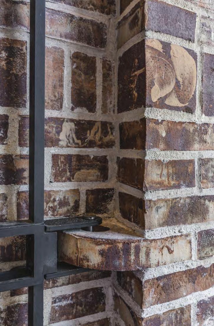
117


119
Placed together, the custom bricks create a four-leaf clover, a classic motif in Gothic architecture.
It is a Petersen hallmark that no pallet departs the brickyard until the bricks have been thoroughly mixed, which helps prevent stains and scaffolding marks. For the European Hansemuseum, Andreas Heller Architects wanted dark, irregular areas on the façades that suggest associations with modifictions and repairs to old brickwork. This makes the European Hansemuseum in Lübeck the firs project involving Petersen Tegl, for which the architect deliberately wanted the façade to look as if the bricks had not been mixed properly.


About the European Hansemuseum

The Hansemuseum in Lübeck tells the story of the famous network of traders that operated during the Middle Ages. Starting as a loose alliance in the 13th century, the Hanseatic League evolved into a powerful group of merchants and retained its power and influenc until the mid-17th century. The League consisted of 70 ports – mainly in Germany, but also London, Bruges, Bergen and Novgorod. Lübeck, which had accumulated vast wealth from the trade in silver and salt and had a strategically strong position as a shipping port for Hamburg and the Baltic Sea, was the League’s informal but undisputed centre of power.
The Hanseatic Museum is located by the River Trave at the foot of Castle Hill, the highest point of which is around 11 metres above the river. The Museum has been hewn directly into Castle Hill, where the deepest room measures 26 m. The main wing follows the river and the slight bend of the road.
The 95-metre long, 15-metre-tall monolithic edific is modulated in powerful, simple shapes reminiscent of the fortificaions that once stood here. But its modern lines and features make it very clear that this is something unmistakably new.
120
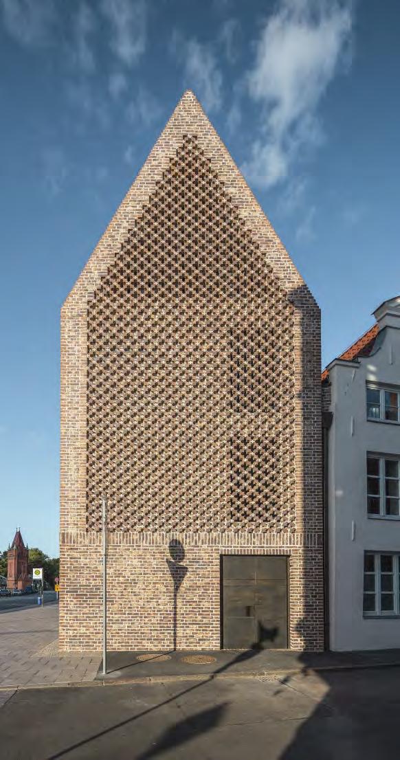


121
The bricks used for the facades were also used as paving. The amount of clay slurry in the bricks on the different sections is increased incrementally from 30 to 60 and 90%.
LAM Lisser Art Museum, Lisse, The Netherlands
Client: VandenBroek Foundation
Architect: KVDK Architecten

Completed: 2018
Brick: Custom colour K F146 (70%) and K F145 (30%) + one custom format brick
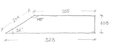
Photos: Paul Kozlowski
Floating on air
Three different customised Kolumba colours mimic shades of the surrounding park.
KVDK Architecten opted for Kolumba for LAM’s façades to reflec the horizontal nature of the museum but could not fin the colours they wanted in the standard range. Petersen Tegl is always happy to develop custom colours and formats, and the architects and client visited the brickworks several times until they arrived at just the right hues.
The surrounding Keukenhof park is notable for its trees and abundant plant life. Over several seasons, the architects collected plants and other natural objects from the park and took them to the brickworks. The staff in Broager succeeded in recreating the shades of the plants and wood cuttings and used them to develop three new bricks in nature’s own palette.
The architects also played with the opportunities that Kolumba offers in terms of designing custom formats. To the south, a path slices through the hillock. The building follows this line and is cut off at a diagonal. The pointed shape called for a custom brick, which Petersen produced. At this end, the highly tapered bricks form a sharp and precise contour, forming a wedge embedded in the hillock.

A
Site plan
The architects designed a single type of moulded brick for the pointed westernmost corner of the building.
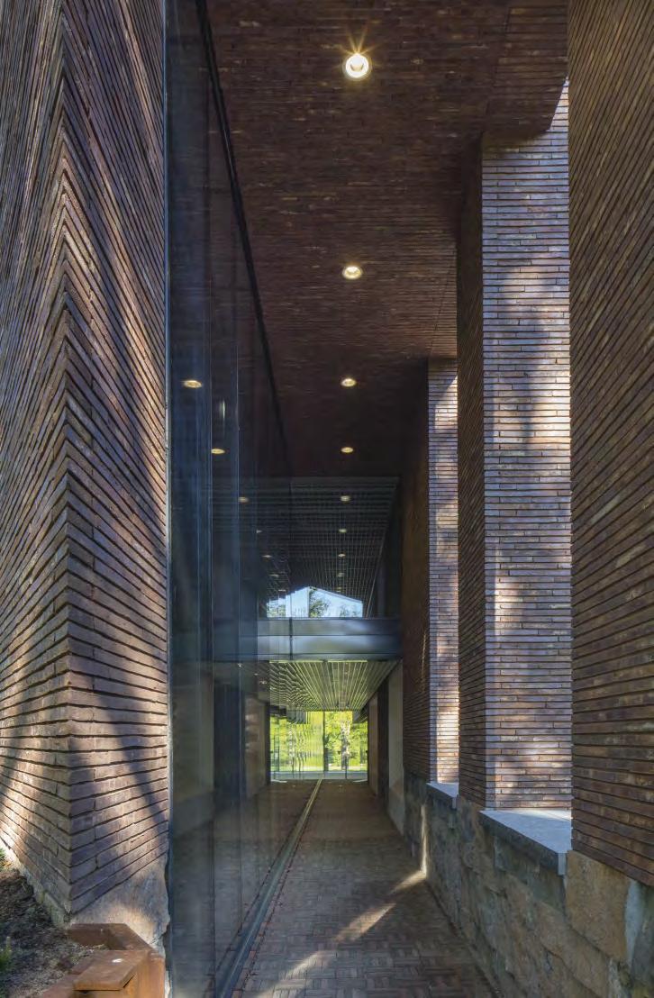
123

124
About LAM
LAM is in Keukenhof, a large park surrounding a castle, about 40 km southwest of Amsterdam. It belongs to the VandenBroek Foundation, founded by the Jan van den Broek family, owners of a big Dutch supermarket chain. The nature of their business inspired the museum’s collections: all the works refer to food and consumption, in a variety of playful, investigative and surprising ways, via media such as painting, sculpture and video art.

The area is dominated by a large, ridgeshaped hillock from the 17th century, which played a significan role in the design of the new building. From a distance, the museum seems to floa above the ground, but on closer inspection, two parallel volumes are built into and on top of the small hill, with a narrow passageway between them. Solid natural stone walls support the opening in the hillock and lead visitors into the museum through a curtain wall of glass and between the high, bark-covered pillars on which the exhibition halls rest.

Everywhere in the museum, the interior and exterior are linked. Daylight is drawn in through the windows, which provide exceptional views of the grassy hillock, the trees and the old castle. Like the Guggenheim Museum in New York, tours of the museum start at the top and then continue down through the exhibition halls, albeit with the option to crisscross the rooms.

125
The red brick of the nearby Keukenhof Castle, built in the 18th century, inspired the decision to use red Kolumba in LAM.
Museum de Lakenhal, Leiden, The Netherlands
Client: City of Leiden Council
Architect: Happel Cornelisse Verhoeven

Restoration architect: Julian Harrap Architects
Completed: 2019
Brick: D190 DNF + 13 custom bricks made of the same clay

Photos: Karin Borghouts, Paul Kozlowski
Custom bricks weave old and new together
Patterns in brickwork evoke the fine texiles exported from 17th century buildings.
The extension to Museum de Lakenhal is nestled carefully between the original brick buildings. The architects, Happel Cornelisse Verhoeven, chose brick for the new buildings, too.
“D190 is blue-tempered. It’s twice-fied, with the second firin in a low-oxygen atmosphere. This imbues the brick with a greyish-yellow hue that was not available in the 17th century, but which nonetheless establishes a link to the older buildings’ grey Bentheimer sandstone detailing,” Ninke Happel explains.
A moulded brick at a 30-degree angle creates the sawtooth pattern on the façade.

127
“We wanted to create a building without ornamentation, but which is ornamental in its materialisation. We chose to create a sawtooth pattern of moulded brick, angled at 30°, each brick with almost the same shape as a small house. This is a north façade, which gets morning and evening sun, so the 30° angle lets the façade catch the light.”
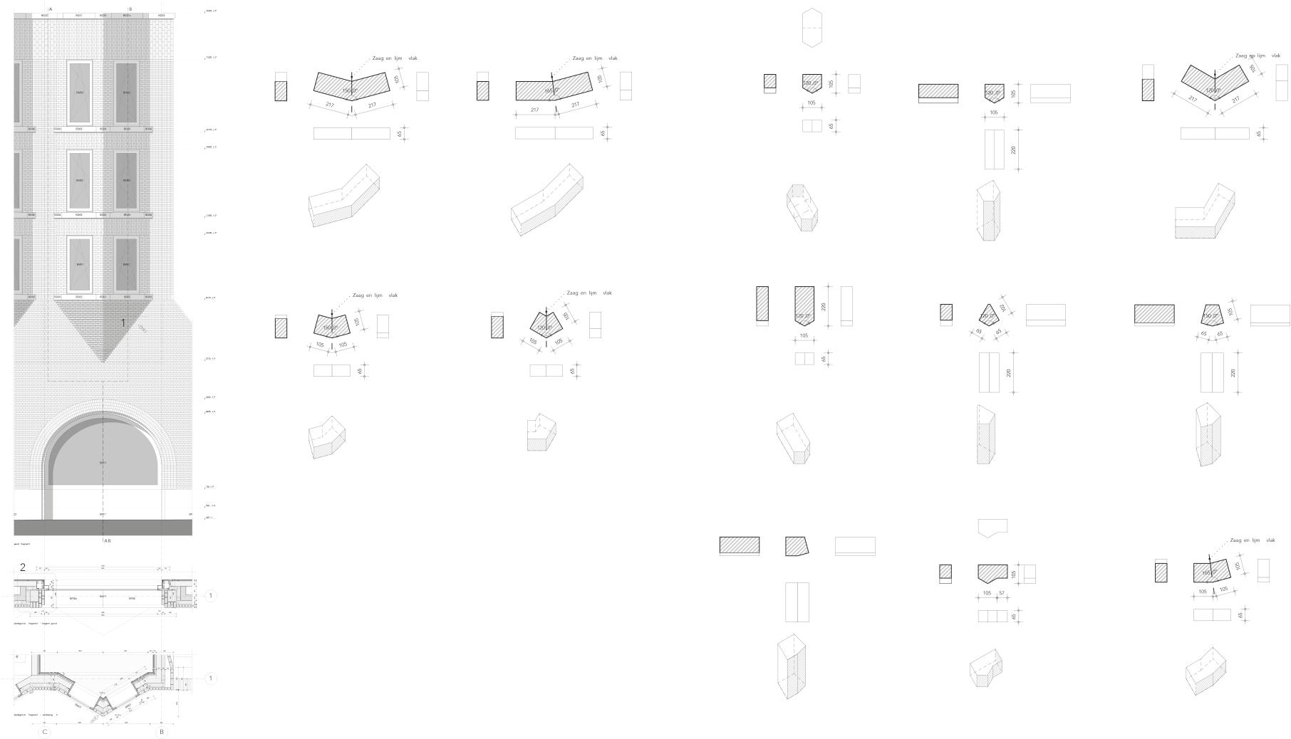 Architect Ninke Happel, Happel Cornelisse Verhoeven
Drawings of the various custom bricks developed by the architects.

129
The architects wanted to create buildings without explicit ornamentation, but which were ornamental in their material application – echoing the patterns woven into the exquisite old textiles once traded there. With these criteria in mind, Happel Cornelisse Verhoeven designed a series of custom bricks laid in varied patterns. The four-storey Van Steijn building facing Lammermarkt Square has a wide base and a narrower superstructure with four tapered bay windows, each with a profil resembling a small house, and features a sawtooth pattern of moulded bricks laid at 30°.

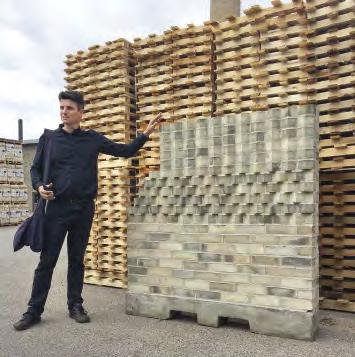
The north-facing façade means the angled bricks catch both the morning and evening light. The façade overlooking the Oude Singel canal features perforated moulded bricks, pulled back from the façade, alternating with custom rectangular bricks, with a runner bond laid at every second course.

130
Architect Paul Verhoeven at the brickworks inspecting the mock-up for the museum.
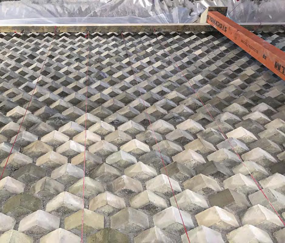


131

132
About Museum de Lakenhal
Museum de Lakenhal is the city museum in Leiden. It opened in 1874 and houses a rich collection of art and crafts in a series of historical buildings built in different epochs. The oldest part of the museum is Laecken-Halle, which was built in 1641 for the purpose of inspecting the famous woollen cloth that Leiden exported around the world for centuries.
A major restoration and extension project was completed in 2019. The new Van Steijn building houses two large exhibition halls, offic facilities and a library.

The museum sought to preserve its historic buildings, which had fallen into disrepair and were marred by random alterations and extensions, offer new functions to visitors, improve accessibility and safety, make the museum as a whole more logistically coherent and offer visitors something new.
With simple, powerful effects and a feel for history’s many layers, the architects have managed to weave four centuries of architecture into the new building. The new façades’ greyish-yellow bricks and their fin textile-inspired patterns are carefully attuned to the hues and textures of the existing buildings.

133
Brooklyn Botanic Garden ticket pavilion, New York, USA
Client: Brooklyn Botanic Garden


Architect: ARO, Architecture Research Offic


Completed: 2015


Brick: K4, six custom bricks in the same clay
Photos: Elizabeth Felicella, Tom Eckerle
Dematerialising brickwork
Contemporary, patterned brickwork forms a counterpoint to Brooklyn Botanic Garden’s historic and beautiful archway.

For the studio Architecture Research Offic (ARO), red brick was an obvious choice for the new ticket pavilion in Brooklyn Botanic Garden. It creates a link to the exquisite, neoclassical arch nearby. “We visited Petersen Tegl and found what we were looking for in the form of the handmade K4, which has precisely the right shades of red and a distinguished Georgian look,” explains architect Stephen Cassell.
The new pavilion has a large, sloping, one-sided roof, while the rear façade, which faces Empire Boulevard, is a plain brick surface. Toward the garden, the architects have created a perforated wall that forms a screen in front of the entrance to the toilets. The idea is that the wall appears to be slowly dematerialising before stopping completely.
Large, green glass sections behind the perforated wall create a luminous signal effect. “This is a load-bearing wall with both structural and decorative functions. A big advantage of working with Petersen is the alacrity with which they produce custom bricks. We needed six different types to create the pattern we wanted as a counterpoint to the finel decorated arch,” explains Cassell.
Toward Empire Boulevard, the façade has delicately modulated corners due to the slightly serrated nature of the joints. This makes the wall an experience in itself, as it entices visitors to continue around the corner and into the garden.
13’ 4” 11’ - 3” 3’ 4”
Section of the new building and elevation of the historic archway.


 Using Kolumba in three different widths provided the desired relief on the wall with the gaps in it.
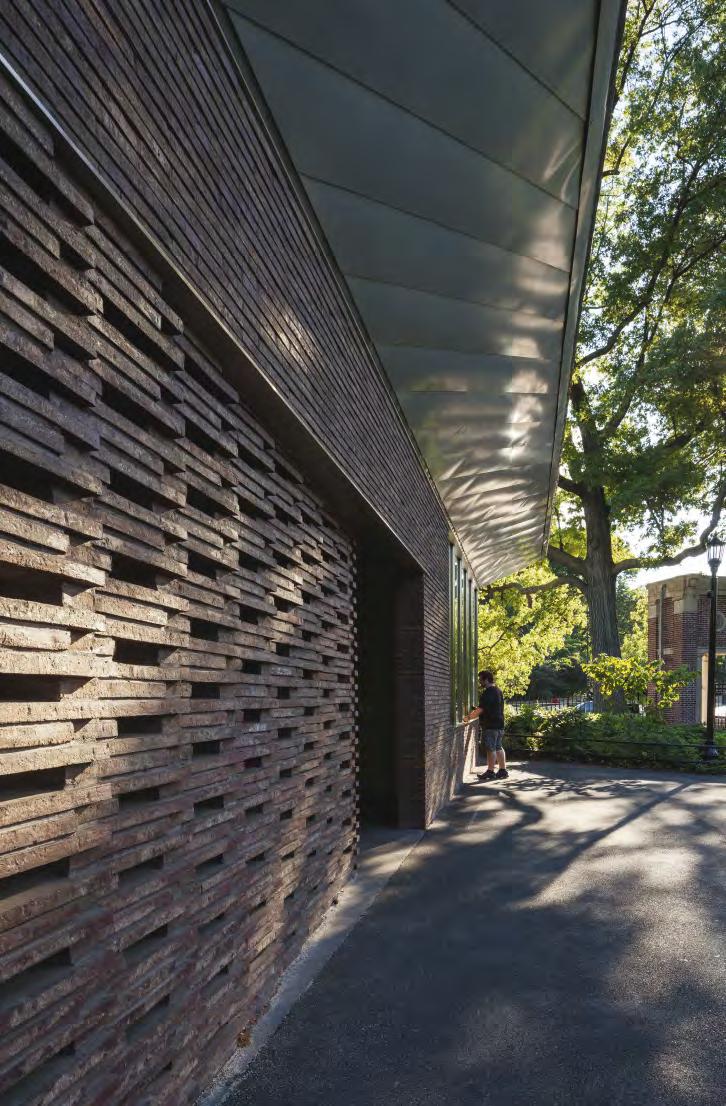
136
About the ticket pavilion in Brooklyn Botanic Garden


Following a recent major restoration project, the famous Brooklyn Botanic Garden in New York City is now more beautiful than ever. A graceful, neoclassical arch designed in 1915 by the acclaimed New York architects McKim, Mead and White stands in the south-west corner of the garden. Facing the busy Empire Boulevard, the brick-clad arch is adorned with marble and Doric columns and was originally used as an entranceway. Over the years, its function has been reduced to a rarely used back door.
Part of the project of modernising the garden involved returning the old archway to its original prominence with the help of a ticket pavilion and toilet facilities. It was also important that the pavilion looked inviting so that people would avail themselves of its facilities, but without it overshadowing the historic archway.
The result is a square, 90-m2 building designed by Manhattan-based studio Architecture Research Offic (ARO). The elegant, modern design idiom and natural materials make the pavilion a fiting and respectful counterpart to the historic icon.
137
The main entrance to Tivoli Gardens, Copenhagen, Denmark

Built: 1890
Architect: Richard Bergmann and Emil Blichfeldt
Restoration project: 1990
Client: Tivoli A/S
Recreating approximately 2000 terracotta elements made of German clay for the main entrance

Photos: Anders Sune Berg
Former glory restored
Recreating the terracotta elements for the entrance to the Tivoli Gardens in Copenhagen was the catalyst for Petersen Tegl setting up its Custom Brick Department in 1990.
The Tivoli Portal, the main entrance to Tivoli Gardens on Vesterbrogade, is an archway flanked by two smaller gates, flanked, in turn, by two paviions. Every façade and surface on the iconic entranceway, which has served the same role since 1890, is clad in richly ornate terracotta.
Having lasted almost 100 years, sections of the terracotta cladding slowly crumbled, and Tivoli decided to restore the entrance in the run-up to the Garden’s centenary in 1990.
The owners approached Petersen Tegl, which did not produce custom-moulded bricks at the time. Characteristically, Christian A. Petersen accepted the commission right away – and figued out how to do it afterwards.
Petersen and the staff at Broager resurrected traditional methods used at the brickworks when it was founded in 1791. Using plaster moulds, they recreated the intricate and richly ornate bricks by hand. The Custom Brick Department was born – and supplied some 2,000 bricks in time for the Tivoli centenary.
 The recreated ornamental terracotta elements from 1890 on the Tivoli entrance.


139


140
From left to right: an original, crumbled terracotta brick, a wooden mould, a plaster mould and an early prototype of the recreated brick.


141
About the main entrance to Tivoli Gardens
Georg Carstensen was inspired by parks he had seen abroad before he was granted a royal charter to open Tivoli Gardens. His amusement park was the firs of its kind anywhere in the world when it opened its gates on 15 August 1843. The famous writer Hans Christian Andersen was an early visitor.
The original entrance was a wooden gate flanke by two ticket booths – Tivoli has always charged for admission and the price of the ticket was 1 Mark. Season tickets were introduced in 1845 to encourage customer loyalty. The options were ‘gentleman’, ‘gentleman and lady’ or ‘gentleman accompanied by two ladies’.
The current main entrance and façade buildings on Vesterbrogade were completed in 1890. Both are clad in terracotta and designed by the architects Richard Bergmann and Emil Blichfeldt. The façade buildings used to be bigger and housed the Apollo Theatre and Restaurant Wivel, later known as Wivex, on either side of the main entrance. Wivex –which could seat up to 1,500 diners while big band concerts were broadcast from it – was a legendary Copenhagen venue. It closed in 1964, and the building was demolished. The portal, which still serves as the main entrance to Tivoli, was all that was left.

142
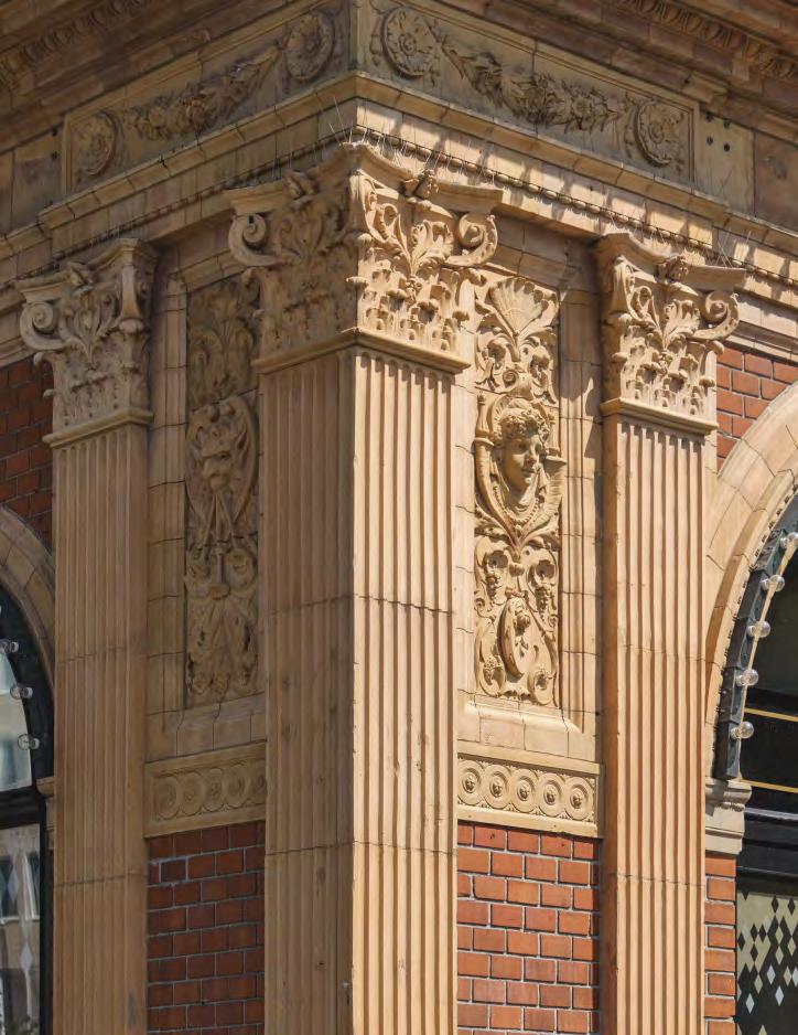
143
The Round Tower, Copenhagen, Denmark

Builder: King Christian IV
Architect: Hans van Steenwinckel (II)
Built 1637-1642
Client: Rundetaarn
Brick: Clinker made of Danish blue clay
Photos: Anders Sune Berg
Still going strong after four centuries
For the last three decades, custom clinkers have been used to replace the 17th-century originals on this famous Copenhagen landmark.
To reach the top of the Round Tower, visitors walk up an approximately 210-metre-long, step-free passage that winds around the inside of the tower 7½ times. The brick walls in the snail shelllike passage are clad in a limestone layer that varies in thickness from 300 mm to one metre. On top of this, yellow bricks were laid as clinkers with lime mortar, and many of the originals have survived.

Attached to the tower is the Church of the Holy Trinity, which houses an exhibition space on a mezzanine floo below the loft. Unfortunately, vibrations from the electric carts used to transport exhibition materials between floor for more than three decades were causing the mortar to crack. As a result, bricks were starting to protrude from the limestone and suffering damage.
Since 1990, Petersen Tegl has been supplying custom-made clinkers in Danish blue clay to repair the damage. They are laid in the same kind of hydraulic mortar used in the 17th century, which provides good adhesion and elasticity, and enables the covering to move with the rest of the building.
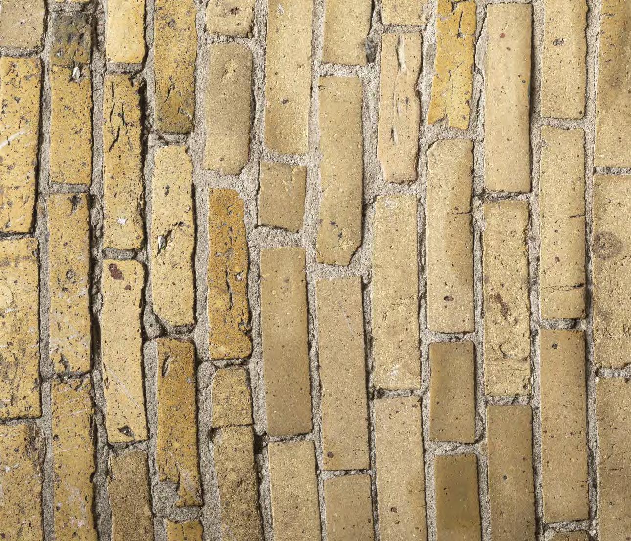

145
About the Round Tower


Built by King Christian IV in the heart of Copenhagen, the Round Tower is one of the city’s best-loved buildings and most visited tourist attractions. It is part of a complex that originally combined three very different functions: an astronomical observatory, the Church of the Holy Trinity and a university library on the mezzanine floor between he church and loft. However, due to increasing problems with light pollution from the city, the observatory moved out in 1861, as did the library.
Work on the tower began in 1637 and was completed five years later. The church was consecrated in 1656.
The Round Tower has a long and colourful history. On one occasion, the visiting Russian Tsar Peter I rode up the winding passage on horseback. His wife, Catherine I, followed in a two-wheeled carriage pulled by one horse.
The Round Tower, which was built to provide access to the observatory and a viewing platform, is a 34.8-metre-high cylindrical structure, broken up by lesenes, with courses alternating between yellow stretchers and red headers in cross bond.
146

147
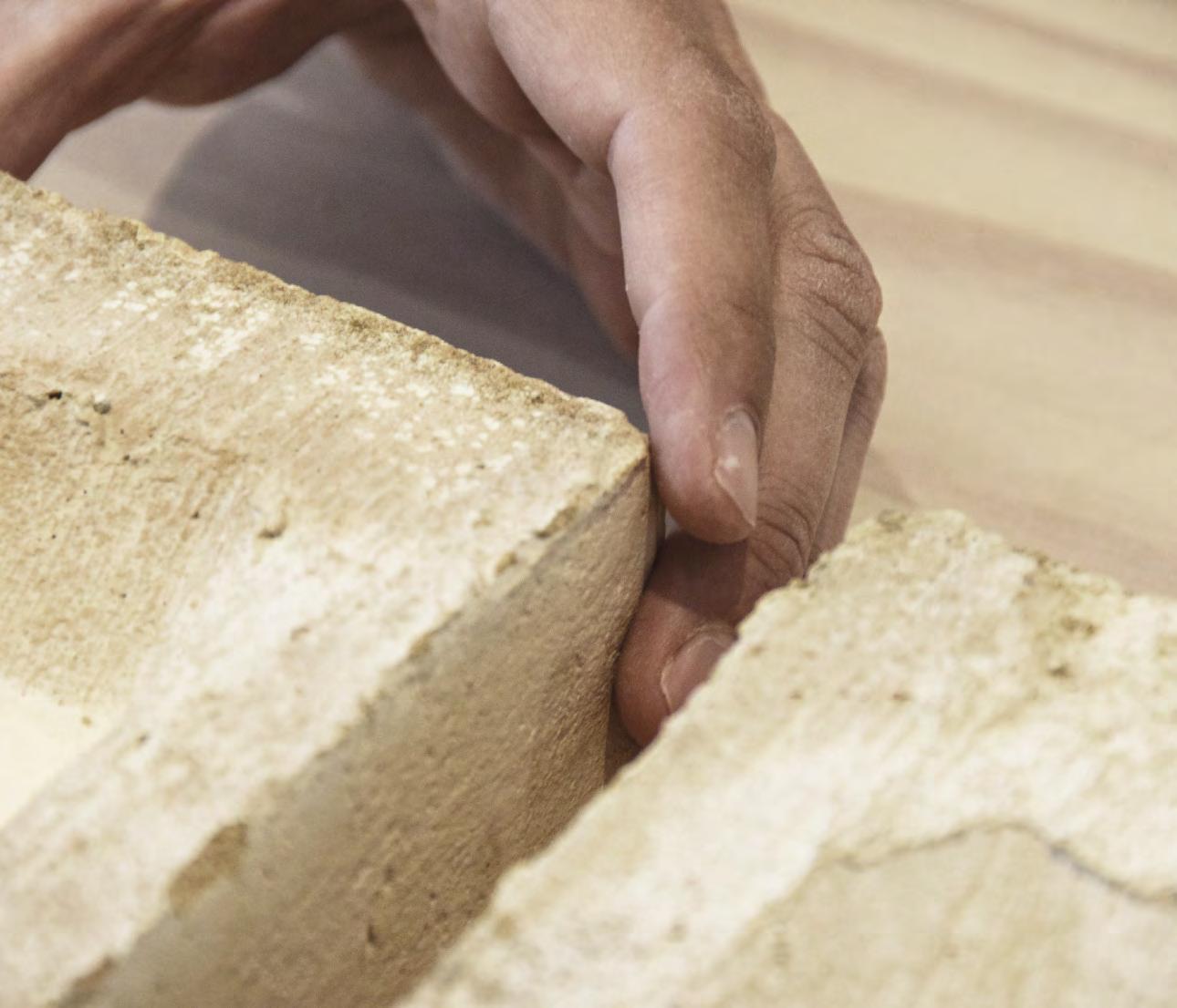
Housing

149
Photo: Anders Sune Berg
Villa Platan, Aarhus, Denmark
Client: Private
Architect: ADEPT
Completed: 2015
Brick: K91 + two custom format bricks in the same clay
Photos: Anders Sune Berg, Jakob Lerche
Multi-purpose brickwork

Just two customised bricks were enough to produce precisely the curved forms the architect wanted.

The house comprises just four rooms, each with its own function. Each room is almost an entirely separate structure, carefully positioned to protect privacy, preserve existing trees, frame the view and provide shelter from the wind. The four structures merge at their corners, and short passages create transitions between the rooms without the need for doors. The curved walls, made with customised bricks, mean that the passages are easily traversed.

“Since all the bricks in the façades are handmade, it was a simple matter to supplement them with the curved customised bricks we needed, which are, of course, also made by hand. The design of the façade means that all the curves have the same radius, so we only needed two types of custom brick –one that is curved on all sides and one that has both curved and straight edges. They merge naturally into the brickwork’s wild bond by alternating the two, resulting in a beautiful, harmonious surface. In addition, the long lines of the house are emphasised by the joints – the horizontal ones are retracted, while the vertical ones align with the façade,” explains the architect, Anders Lonka of Adept.
 Just two moulded bricks with different radii made it possible for the architect to create all the soft shapes he wanted on the façade.


151
Drawings of the two custom bricks designed for the house by the architect.
About Villa Platan
Lonka adopted the mantra ‘As little as possible, as well as possible’ when designing a new home for his retired parents.

“It means that we use fewer resources, which lets us design more flexibl buildings and, not least, leaves time to add subtlety and refinemen to the architectural elements,” Lonka explains.
Both the clients and the architect knew from the outset that the house would have brick façades that require minimal maintenance. Kolumba was the obvious choice because of the building’s horizontal profile and several brick variants were considered. Lonka and his parents took several types of grey Kolumba to the beach before opting for K91, the greywhite shades of which best capture the colours of the sand and the rocks.
“The house is only feet from the beach. Given the area’s unforgiving conditions, it’s surprising that many of the houses along the coast have plaster facades,” Lonka adds.
Villa Platan was nominated for the Wienerberger Brick Award in 2018.


152

153
Private home in Groenekan, The Netherlands
Client: Private
Architect: Zecc Architecten
Completed: 2013
Brick, façade: Kolumba K60 + custom format bricks for corners, window niches, sills and lintels
Brick, roof: Custom Cover format in German clay
Photos: Paul Kozlowski
Livable monolith
Well-designed brickwork and exemplary craftsmanship give the desired monolithic air.
The desire for a house with a monolithic look drove the project and led the architect and clients to Petersen Tegl, who they knew could produce the custom bricks that would deliver the all-important, seamless aesthetic.
For the roof, the architects chose a custom-made fla version of Cover with holes to make it easy to mount. Zecc Architecten also designed several custom bricks for the corners, window niches, sills and lintels – all made from the same clay as the standard K60 used on the rest of the façade. Every detail on the new home, including the brickwork, was designed at 1:1 scale, and the craftsmanship is exemplary.
In addition to the 11,040 standard K60 bricks, Petersen Tegl produced 1,070 roof tiles and 1,271 custom bricks. Every brick is handmade and hard-fied in reddish-brown colours, with sand and light slurry on the surface.


Zecc Architecten designed a brick in K60 clay, 528 x 330 x 37 mm, for the roof. They also designed a series of different moulded bricks to allow the roof and façades on the sharply define construction to meet in perfect harmony.


155
The architects designed a special solution for the gutter integrated in the roof.


156
About the private home in Groenekan
The house is on the outskirts of a village, close to a rural area. Most of the surrounding buildings have a simple design, with tiled roofs, plaster façades and partial wood cladding. It made sense for the new building to adopt the same look but with a contemporary feel.
The house consists of two angular, interlocking blocks covered in dark brick and with sharp edges. Both main blocks have roofs of different heights – the lower forming the transition to the adjacent rural area, where the maximum permitted construction height is one storey.
The bricks flo seamlessly around all corners, spreading over the surfaces in the window recesses, up over the roof and outwards to form the paving on the two terraces. A chimney on the roof of each block acts as an anchor point for the vertical grooves that run down through the brickwork on the sides, inlaid with bands of Kolumba that act as expansion joints. At the top, the chimneys dissolve into fiigree patterns that allow you to look through them, softening the transition to the sky.
The concealed gutters are built into the eaves, and no downpipes spoil the exterior – instead, internal pipes drain off the water. The flashing along the roof edges are in brownish lead and perfectly match the homogeneous brickwork.

157
Vertical section gutter
Roof tiles, plan
Private home in Utrecht, The Netherlands
Client: Private
Architects: Hilberink Bosch Architecten

Completed: 2014
Brick: K44, K47 + K49 in custom lengths

Photos: Paul Kozlowski
Forest shades
The woodland setting inspired varied lengths of Kolumba in a private home in the Netherlands.
The client wanted a seamless transition between the building and the landscape, a house in dialogue with its surroundings. Accordingly, the architects opted for colours and materials that would create a sense of connection between place and building. The requirement was for a modern home, but not an arrangement of white boxes. The house is in a forest, so the architect chose natural materials, with sand-coloured concrete and bricks that reflec the bark on the pine trees.
In order to give the walls a natural-stone look, three different lengths of brick were used. The longest measured 1 m – the maximum Kolumba length. The deep joints emphasise the horizontal lines, and the use of dark mortar makes the bricks appear to have been loosely stacked rather than precisely placed by a bricklayer.
Overall, a simple and precise dynamic of horizontal and vertical lines has been created architecturally. The sand-coloured concrete deck was cast in situ and has a matte surface, offering a calm contrast with the bricks’ rich play of colour.
 The one-metre long Kolumba is shown next to a 228 x 108 x 54 mm Danish standard brick to indicate the measurements.
“The concrete is the colour of the sand dunes. The bricks are from the Petersen Kolumba range, in shades from black to green and orange. We wanted a minimal look, so went with concrete, brick, glass and cedar, in rustic and toned-down finishes.

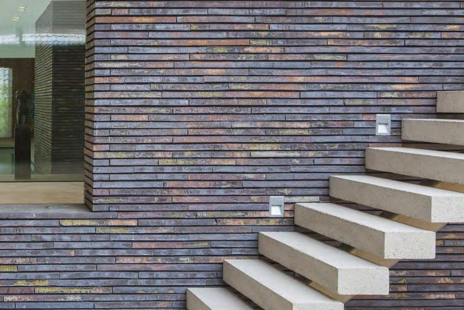
Hilberink Bosch Architecten

159
About the private home in Utrecht
Major changes of level in the terrain are rare in the Netherlands, but north of Utrecht is a ridge of sand formed in the Ice Age and covered by forest. This special location, with a vertical drop of six metres, inspired the design of the new home. It stands on the northern and eastern edges of a square site, with the house along the northern and eastern perimeter and a long horizontal wall extending from the garage to the south.

Visitors arrive via a double-height hall, in which the owner exhibits some of his art collection. Most of the living spaces are on the firs floo, connecting the building to the dune and optimising the view of the lush garden. The large windows and sliding doors make the transition between interior and exterior as flui as possible. Interaction with nature is a constant, and it is easy to follow the passing of the seasons.
Brick has been used inside and out, including for the big fieplaces, which infuse the home with warmth and cosiness as the days grow shorter and colder. The strong textural effect of the bricks emphasises the homely feeling and results in an unpretentious aesthetic.

160
Making a one-metre long Kolumba by hand.
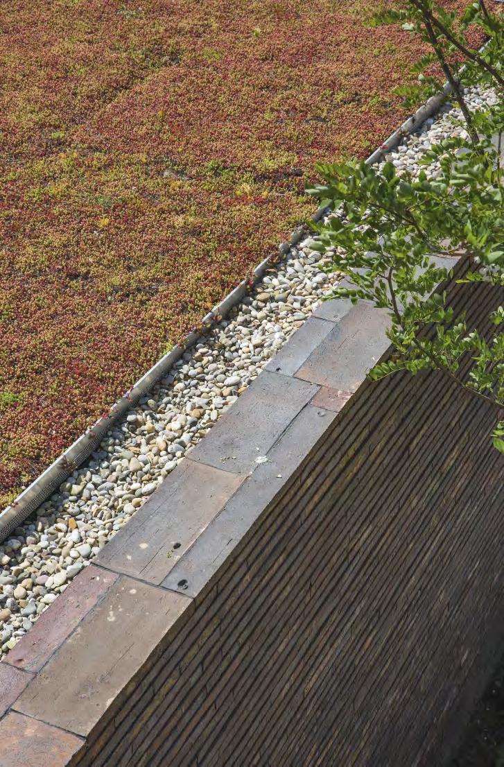
161
Cabin in Hvaler, Norway
Client: Private
Architect: PUSHAK
Completed: 2020
Brick, façade: C56, 170 mm
Brick, roof: C56, 240 mm custom made
Photos: Ivan Brodey
Custom format makes roof steeper
Cover roof tiles designed in L-format rather than C allow for a steeper incline.

The roof and façades of this cabin in Hvaler are clad in Petersen Cover. Its shimmering, grey-brown shades echo the surrounding boulders, pine trunks, heather and other vegetation.

In their detailing, the architects used both Cover formats – 170 mm wide on the façades, 240 mm on the roof. Although broader, the roof tiles look the same size when seen from the ground.
“It is also an advantage that Cover is made by hand, which means it is easy to modify,” says architect Gyda Drage Kleiva of PUSHAK. “The roof tiles are in a specially moulded L-format, rather than C. This allows for a steeper incline, which was both a visual and practical advantage for this project.”
C56 in a special L-shaped edition, which allows for a steeper incline and has both visual and practical advantages.
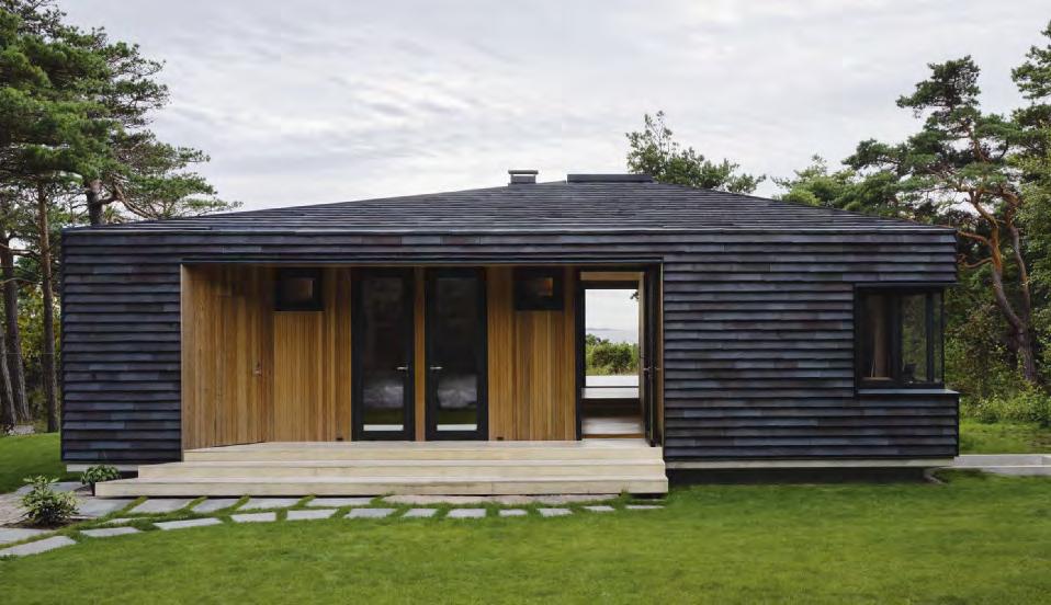
163 Roof plan
Detail, vertical section, the special solution for the gutter integrated in the roof.
About the cabin in Hvaler
The cabin lies on an island in Hvaler, on the edge of a forest, with views of the sea and the uniquely beautiful Ytre Hvaler National Park. The previous cabin on the site was built in 1962 but had fallen into disrepair and had an impractical floo plan, so the owner decided to rebuild.

It was crucial for the architect and client that the site remained as intact as possible. The cabin was designed and positioned with the greatest possible respect for the surrounding landscape and vegetation.
Local building regulations allowed a maximum façade length of 12 metres on the side facing the sea, which is why the building is so compact – almost square. It does not spread out but is a simple, well-define volume that clings to the site on the hill overlooking the water.
The cabin has an asymmetrical, hipped roof that allows water to drain off in four directions. This distinctive roof shape also means it was possible to pull the cornices down toward the ground at each corner. All external doors, including the front one, are in recesses sheltered by the large roof. The recessed façade sections are clad with untreated cedar, which will turn silky grey over time.
164
“It is also an advantage that Cover is made by hand, which means it is easy to modify,” says architect Gyda Drage Kleiva of PUSHAK. “The roof tiles are in a specially moulded L-format, rather than C. This allows for a steeper incline, which was both a visual and practical advantage for this project.”
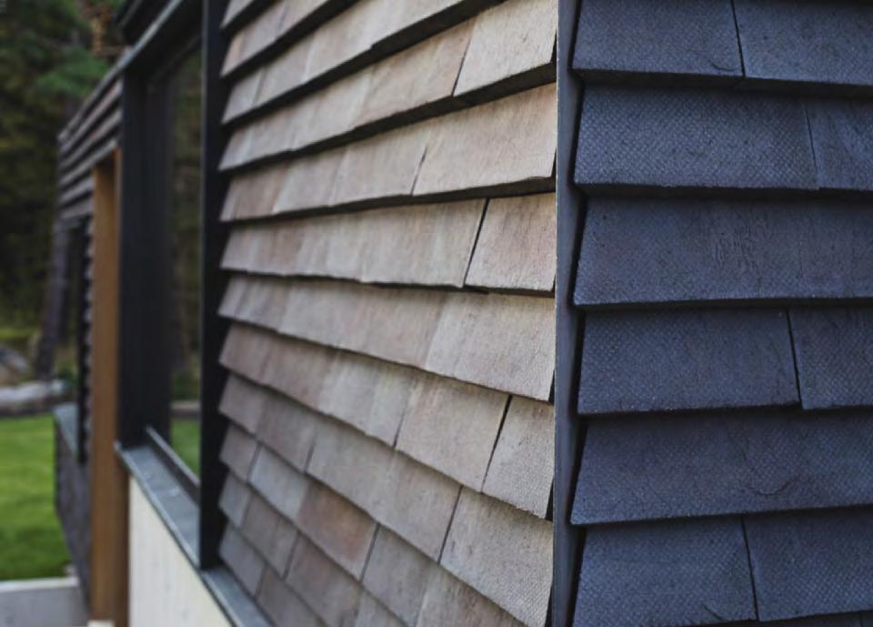
165
Architect Gyda Drage Kleiva, PUSHAK
Holiday home in Tisvilde, Denmark

Client: Steen F Lindbergh
Architect: Tage Lyneborg
Brickwork: Sculptor Bjørn Nørgaard
Completed: 2010
Brick: D48, D54 and D72 DNF + custom format bricks in the same clay


Photos: Anders Sune Berg
Draped in brick
An architect and a sculptor worked together to build this holiday home with undulating brick façades in earthy hues.
The overall idea was that the body of the building should form a softly rounded monolith that merges gently into the landscape. The roof has no gutters, so its curves are uninterrupted. The central concept is also reflecte in the big wall section, the rounded corners which extend around the two façades.
The rounded edges are formed by a number of customised bricks produced by Petersen Tegl, using the same clay as the standard ones used on the project. This gives the brickwork the appearance of plastic sheeting draped around the house. Also the chimney has round corners.
The wall section combines D48, D54 and D72 in a variety of different bonds, and each elevation has its own pattern. Close up, the bricks have an enchanting texture and rich colour. From a distance, what stands out are the refine patterns and the perforated, three-dimensional effect created by offsetting the bricks. They are offset in a consistent pattern – all of the grey bricks are flus with each other, while the red and yellow ones either protrude or are recessed by 16 mm.
Rounded custom bricks were used to create soft shapes of the walls and facades.

167
About the holiday home in Tisvilde


Art and architecture work best together when the borders between the two are fluid In the Tisvilde holiday home, jointly designed a few years ago by sculptor Bjørn Nørgaard and architect Tage Lyneborg, the two art forms achieve a complementary synthesis. The architecture has been artistically processed, while the ornamentation has architectural merit.
The home is on a north-facing hillside in the beautiful, protected Tisvilde countryside. It stands on a plateau that evens out the height difference across the site.
The house is anchored by its key feature – the large wall section that comprises the west façade. It encompasses the fieplace, chimney and west wall of the house but extends beyond the main structure and around the north-west corner to provide protection against wind, weather and prying eyes. The wall makes the house stand out as something unique in the landscape but also embeds it in its location through the use of natural materials – including handmade bricks – and harmonious, earthy colours.
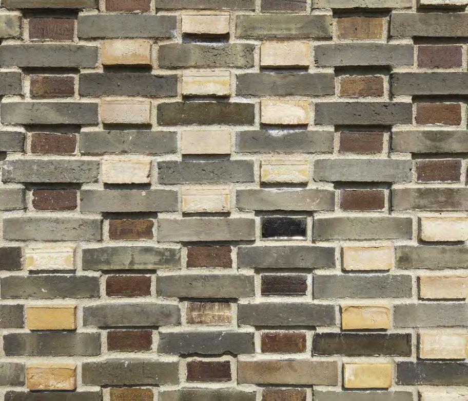
168
Nørgaard, to the left, envisioned brick, Lyneborg envisaged using glass.


169
The two visions in sketches. The fina result was a brick house.
Private home, Prinsen Bolwerk, Haarlem, The Netherlands
Client: Private
Architect: MOPET Architecten

Completed: 2016
Brick: C71 + custom version of C71 with gaps
Photos: Paul Kozlowski
Decorative gaps

Perforated Cover protects privacy and creates a decorative pattern.

According to Joep Mollink from MOPET Architecten, Petersen Cover’s sculptural shape made an obvious choice for cladding the façade of this new home. Not only did it turn out to be a practical and technically straightforward solution for the wooden construction, C71 subtly complements the white and yellow shades of the older houses in the neighbourhood. The brick’s almost luminous surface is a result of the slurry used as a lubricant when the clay is removed from the mould. The same hues found in C71 were also used in the building’s concrete plinth.
A large, unconventionally shaped roof turns the first floor into wide-open and intriguing space. As the path through the park goes right past the house, Mollink opted to use custom Cover to screen off several rooms on both floors. Horizontal gaps in selected bricks form a decorative pattern and let light into the rooms while breaking up the line of sight.
C71 in a special edition with a gap as a decorative element.

171

172
About the private home in Prinsen Bolwerk
The new home designed by J.D. Zocher was built on a 500-m2 plot in De Bolwerken Park, where Haarlem’s defensive fortifictions once stood. Before World War II, a school – now demolished – was built on the site. To avoid damaging the remainder of the fortificaions below ground, the new home had to be built within the foundations of the old school, which are still there.
Several generations in Haarlem have fond memories of attending the school. Mollink’s desire to acknowledge the site’s history and keep the new construction within the old footprint resulted in an unconventional design idiom.
The neighbouring buildings consist of grand homes from the late 19th century, so the architects were keen that the new 350-m2 building should have a solid, monumental look.


173
Houttuinen townhouse with two flats, Dordrecht, The Netherlands
Client: Private
Architect: Lugten Malschaert Architecten
Completed: 2017
Brick: K91 + K91 in custom format with a radius of 3,000 mm
Photos: Paul Kozlowski
Reviving forgotten history
A townhouse in Dordrecht features a custom-brick rotunda and echoes a nearby medieval fortificaion.
Architect Andries Lugten had long had a clear architectural vision for a site in Dordrecht’s historic harbour area. When the site was put up for sale in 2015, Lugten submitted his proposal to the council building committee, which approved the plan and published the details in the local newspaper. This attracted the interest of two clients, who have lived in the Houttuinen development’s two flat since its completion.
It was crucial for Lugten that the townhouse referenced and paid homage to Dordrecht’s past. The building includes a ro-


To establish a visual affinit with its medieval neighbour, Lugten opted to clad the façades of the new building in handmade Kolumba. The brick is made from a clay mixture that, after firing resembles the patinated sandstone and slate of the 600-year-old tower. Petersen Tegl also supplied custom bricks with a radius of 3,000 mm to give the tower a regular curved shape.
 tunda erected on the foundations of a watchtower demolished along with the city wall in the 14th century. Further along the quayside, about a kilometre from the new building, one solitary element of the original fortificaions still stands – Rondeel Engelenborch, dating from 1429.
Engraving of Dordrecht from 1649, featuring the city wall and watchtowers along the waterfront. Credit: Regionaal Archief Dordrecht, Hof van Nederland
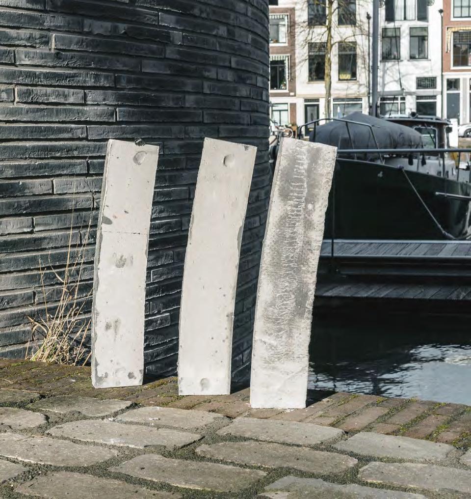
175
Special bricks with a radius of 3,000 mm gave the tower a perfect shape.


176
Architect Andries Lugten.
Map of Dordrecht in the mid-16th century by Jacob van Deventer. The map is from an atlas featuring drawings van Deventer made of all of the Dutch cities.
About Houttuinen townhouse
Throughout his career, the architect Andries Lugten has been passionate about the fascinating, historic city of Dordrecht and has played a part in several restoration projects to preserve its cultural heritage. He designed Houttuinen (The Lumber Yard) along with his partner Theo Malschaert, with whom he has shared a studio for almost 40 years.
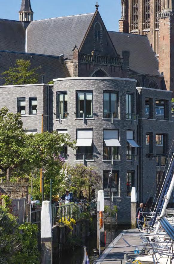
Houttuinen is a three-storey, L-shaped building linked by the rotunda. One wing runs along the riverside, the other along an alley perpendicular to the waterfront. The entrance to the two flat is via the spacious foyer of a listed, single-storey factory building from 1840. At the ground-floo level, the building houses an office which is connected to the lower of the two flat and has parking space for six cars.
With a scale that matches its neighbours, its articulated shape that marks the three volumes – with the rotunda in the middle as a hinge, a simple façade and the subdued grey shades – the new building is a modern and positive addition to the city, not least because it recalls the site’s forgotten history without descending into pastiche.
177
Paper Island, housing project on Christiansholm, Copenhagen, Denmark

Client: Udviklingsselskabet Christiansholms Ø P/S, consisting of Danica Ejendomme, UNIONKUL and Nordkranen
Architect: COBE
Completion: 2023-2024
Brick: Custom format and colour, Danish clay developed in collaboration with COBE
Photos: Anders Sune Berg
New brick with a sense of history
Structure and textuality give new brick a look that harmonises with the surrounding centuries-old warehouses.
Early in the project, Dan Stubbergaard, architect and owner of Cobe, contacted Petersen Tegl to develop a custom brick for the residential project on Christiansholm. They wanted a brick that had an inherent patina and special textuality that would establish a kinship with the harbour’s old brick warehouses.
The new brick is made at the brickworks in Broager on machines designed to replicate centuries-old, handcrafted techniques.
“We named it the Christiansholm brick, and it has exactly the look we wanted,” says Stubbergaard. “The water-brushed brick is made from Danish blue clay and is coal-fied to achieve its totally unique play of colours. We designed the brick with a four-sided, obliquely chamfered recess, which drains rainwater no matter which way it faces. The recess gives the façades a relief effect that makes playful use of shadow.”
The brick is placed with the mortar side outward. Cobe used a technique developed at Petersen Tegl that adds an additional layer of whitish clay to the side of the brick, giving it a slightly lime-like look after firing The façades are prefabricated, with a light mortar that closely matches the golden hues in the 500,000 bricks used in the project.
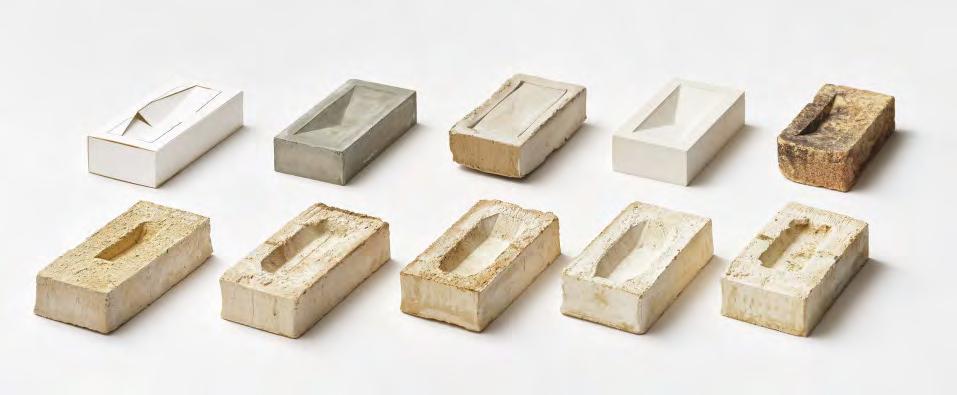


179
The development process of the Paper Island brick involved carboard models and firin the prototype clay models at various temperatures.
About Paper Island
For well over 300 years, the artificia island of Christiansholm in the Port of Copenhagen housed a number of important functions for the city, including a naval hospital, shipyard and storage facilities for cannons and coal. In recent times, most locals remember it best for storing materials for Danish newspaper production, which earned Christiansholm its current nickname: Paper Island. Right now, the island is undergoing a metamorphosis. Soon, it will be a new urban district that, in addition to housing, will be home to an aquatic centre, a hotel and a new food market which was the latest major activity on the island.
Cobe drew up the master plan for Christiansholm and is also the studio behind the new homes. In total, Paper Island will accommodate approximately 250 homes. It was a precondition that the residences would be highly diverse in terms of both type and size. One third will be affordable housing, the rest private. To promote a sense of community between the buildings, the ground floor have high-ceilinged halls that can accommodate various activities.
The design of the buildings takes inspiration from the old warehouses on Holmen and Christianshavn, as well as the former industrial buildings on Paper Island. They vary in height and create a varied skyline on the harbour front. The firs homes are expected to be ready in 2023, the last in 2024.

180
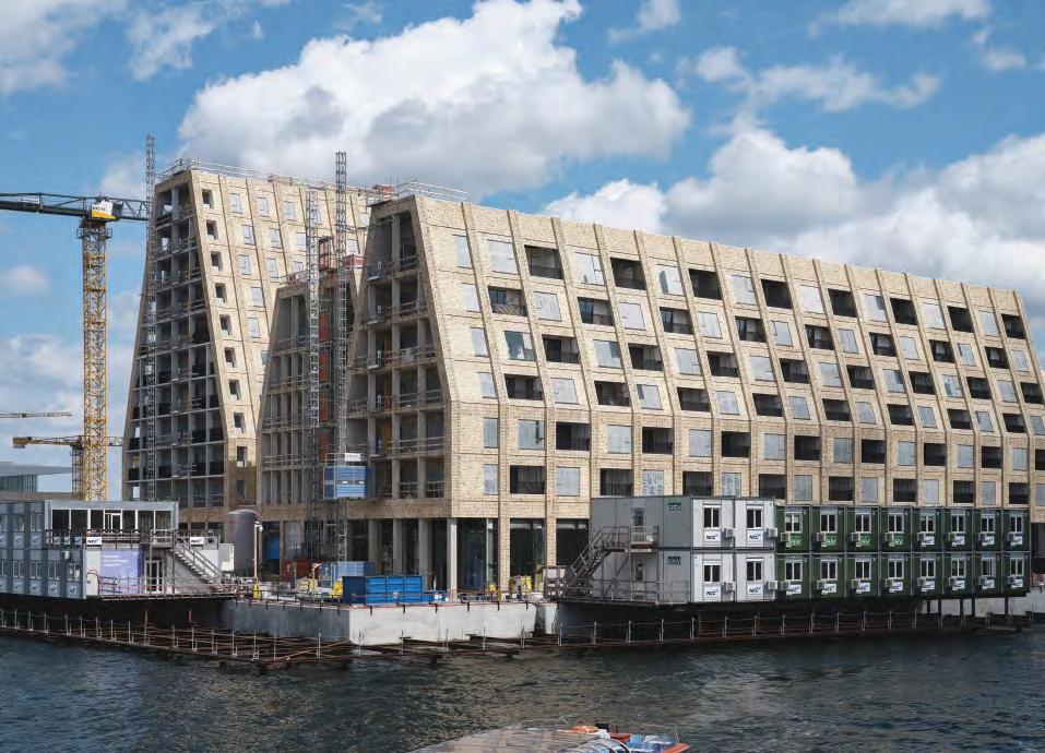
181
Residential block on Jagtvej 2/Ågade 110, Copenhagen, Denmark
Architect: O. Nærum
Built: Late 19th century
Restoration project: 2012
Client: Andelsboligforeningen A/B Åhjørnet
Architect: Michael K. Andersen
Engineer: A/S Ishøy & Madsen
Brick: 3,000 bricks in 36 different formats, the main part glazed
Photos: Anders Sune Berg
Recreating refinement
3,000 handmade, glazed, moulded bricks were produced for a 19th-century building in the heart of Copenhagen.


When Petersen Tegl was commissioned to recreate thousands of moulded bricks for a corner building in Nørrebro, the firs step was to make a comprehensive photographic record. Petersen supplied 3,000 bricks for the project, divided into 36 different types. A copy of each type had to be sent to the brickworks before work could commence.
“All of the bricks were hand-cut by knife, but fiv of the types were so complicated that the mould had to be cast in plaster and then imitated by hand. The bricks were glazed in fiv different colours, one green, one white, one a translucent, greenish colour and two different shades of brown. Copying the colours of an existing glaze is no mean feat. Even the most experienced brick-makers have to experiment extensively until they get it right,” explains Erich Mick, head of Petersen’s Custom Brick Department.
The experiments were a success, and it is virtually impossible to tell the difference between the new bricks and the original moulded ones from 1889.
182
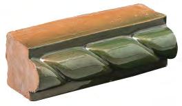

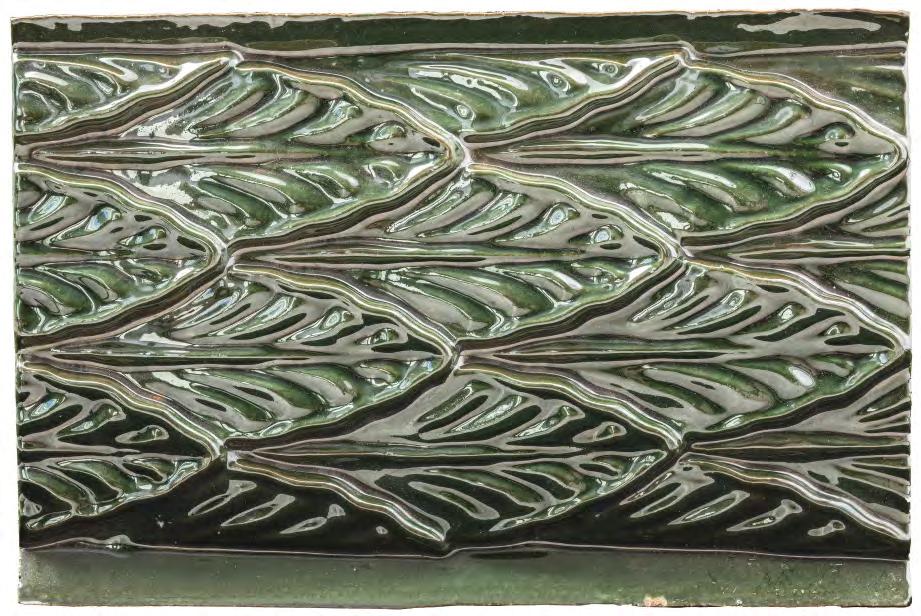
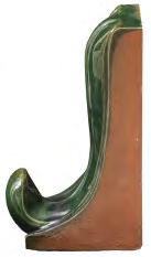


183
Examples of the various glazed bricks handmade for the Jagtvej property.
About Jagtvej 2/ Ågade 110


At the corner of Jagtvej and Ågade stands this five-stoey, yellow-brick apartment block of the type found throughout the densely populated inner-city areas in Copenhagen. However, this building is a little bit more sophisticated than most, with glazed bands of terracotta on the ground and firs floors The street doors and windows on the second floo are also framed in glazed, yellow and brown terracotta, and the cornice under the eaves and bands on the third floo also feature terracotta ornamentation.
About a decade ago, architect Michael K. Andersen and engineering company Ishøy & Madsen were commissioned to renovate the dilapidated block and restore its original look. The architects dealt with the descriptions and drawings while the engineers handled building management and supervision – and both contributed to the historical research. In addition to recreating the glazed moulded bricks, the project specificaions included new attics and windows, restoring the tower and spire and replacing the brickwork.


 The almost 133-year-old building was in a poor state before the renovation project. To recreate the exact sizes and glaze, copies of each type to be replaced were sent to the brickworks.
From the top left, Aenne Thomsen, part of the ninth generation of the family to work at Petersen. On the right, Erich Mick, head of the Custom Brick Department. Below, employee Børge Andersen.


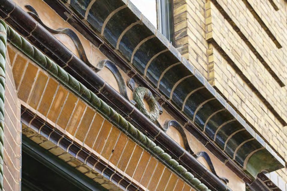
185

Churches

187
Photo: Anders Sune Berg
Don Bosco Church, Maribor, Slovenia
Client: The Salesians of Don Bosco in Slovenia
Architect: Dans Arhitekti
Completed: 2015
Brick: D72 + custom brick in the same clay with white glaze
Photos: Miran Kambič
“We wanted the architecture to look modern while at the same time expressing something religious, historical, social and traditional. Brick helps because it is an eternally modern yet traditional building material.”
Dans Arhitekti
White-glazed brick laid in an ornamental pattern on a circular façade pays homage to historical building customs.

The architects wanted Don Bosco Church to look contemporary while architecturally expressing something religious, historical and traditional. “Brick helps because it is an eternally modern yet traditional building material,” say Dans Arhitekti.
The studio also drew inspiration from local building traditions: “Brick is common in Slovenia. For example, the haylofts in
Local tradition interpreted About Don Bosco Church
Dedicated to the Salesian Order, Don Bosco Church is located near the river Drava in Maribor in north-eastern Slovenia, the country’s second-largest city.
The project was the result of a competition won by Dans Arhitekti in 2007.
Surrounded by a small park, the complex consists of a rectangular, closed building on one level, with an inner courtyard inspired by organic forms. On entering the courtyard, with its beautiful old lime tree, the church itself suddenly becomes visible on the other side of the colonnade. Its rounded shape rises above the low

the north-west of the country traditionally have picturesque, patterned brickwork. The gaps serve both aesthetic and practical functions, as they provide natural ventilation that helps preserve the hay.”
For Don Bosco Church, the architects reinterpreted historical tradition by using white-glazed bricks instead of holes to form a regular pattern on the rounded façade. A cross made of glazed bricks signals the building’s function from a distance.
part of the complex, offering a clear view of the coal-fied, golden brick façade.
As the church is a place for spiritual contemplation, the interior is designed in such a way that the only exterior view is up toward the sky. According to the architects, the dramatic use of light is an essential feature of a church, and they employed varied effects to accentuate the curved nave.
Around the upper part of the rounded façade, an even pattern of white glazed brick with seven white crosses produces an ornamental effect.
188


189
White glazed bricks are used to create a decorative pattern on the church façade.
Ordrup Church, Ordrup, Denmark

Architect: Hans J. Holm
Completed: 1876, consecrated 1878

Client: Ordrup Sogns Menighedsråd
Architect: Sven Felding
Brick: Ongoing replacement of terracotta elements at the main entrance
Old pillars, new base
150-year-old terracotta elements are being replaced as they start to crumble.
Bricks last a long time, but exposed ones – like the ones on the pillars and their bases flankin the entrance to Ordrup Church – may slowly deteriorate after 140–150 years.
The Custom Brick Department at Petersen Tegl is involved in a range of newbuild and renovation projects, often producing bricks in complicated shapes, like the ones on the bases of the two pillars in Ordrup.
Whenever it is commissioned to replace a richly ornamental old brick, Petersen Tegl removes the original and takes a 3D scan of it. Based on the resulting image, it produces a plastic or wooden model 8–10% bigger than the original. This model is used to cast a plaster mould, after which work with the clay begins.
High-quality clay is pressed slowly and carefully into the mould to avoid air pockets forming. Once the entire mould has been filed, a cavity is carved in it to ensure that the clay dries evenly.
The plaster takes a few hours to draw water out of the clay, which then loosens, and the mould is removed. For large objects as big as the ones on the bases of the Ordrup Church pillars, the total drying time can be four to six weeks.
Shrinkage of about 8–10% is the norm during the drying process, so the brick ends up roughly the same size as the original. The high quality of the clay means that it only shrinks by 1–2% during firin – that is also factored into the process.

About Ordrup Church
Ordrup Church, about 8 km north of Copenhagen, was designed by Hans J. Holm, a leading national romantic architect, and consecrated in 1878.
Historicism, also known as eclecticism, is an umbrella term for a current in European architecture that sought to recreate and imitate older styles. It flourishe in Europe in the period 1820–1900, in Denmark mainly 1850–1910, and churches were built in the style until 1940. With its two monumental, west-facing towers, Ordrup Church is a prime example of a historicist interpretation of the Romantic style.
It is made of red brick with relatively simple patterned brickwork under the eaves and around the windows. The pillars in moulded terracotta brick flan the windows and main door.

A few years ago, water began leaking through the corroded slate slabs used along with copper to clad the roof of the two towers. A major restoration project completed in 2020 restored the towers to the original 1878 look. The church’s ceramic tiles are also replaced on an ad hoc basis.


191
Erich Mick, head of the Custom Brick Department.
The new column bases are made using plaster moulds.
Grundtvig’s Church, Copenhagen, Denmark
Architect: P.V. Jensen-Klint, Kaare Klint
Completed: 1940, building initiated: 1913
Repairs to the façade, including the replacement of bricks in buttresses
Client: Bispebjerg Sogns Menighedsråd
Architect: Bertelsen & Scheving, since 2022 Over Byen Arkitekter
Brick: Handmade custom bricks in blue German clay
Photos: Anders Sune Berg
Matching bricks on iconic façades
The unique landmark Grundtvig’s Church, built in 1940, requires occasional repairs for which Petersen Tegl regularly supplies custom bricks made of German clay.

Bertelsen & Scheving Arkitekter have been replacing damaged bricks on the façades of Grundtvig’s Church for many years. In 2018, they replaced covering bricks on the north façade’s buttresses. Following technical analyses of the bricks, the architects asked Petersen Tegl to experiment with clay types and firing. They opted for a German clay, which the firing pocess imbues with shades of gold, green and red, just like the original bricks on the church. The bricks were then handmade in wooden moulds and lightly weathered with black oxide and ochre to match the patinated church.

192
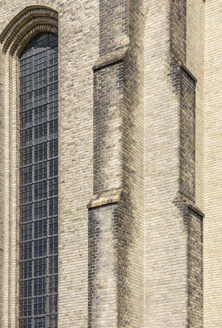


193
Architect Rikke-Julie Schaumburg-Müller of Bertelsen & Scheving and Erich Mick study the brickwork of the church.
Architects Bertelsen & Scheving worked closely with Petersen Tegl to fin the right clay and firin temperature to match the original bricks.
Underground chapel, Grundtvig’s Church, Copenhagen, Denmark
Architect: Toyberg-Frandzen
Completed: 2005
Brick: Handmade bricks in blue German clay used for walls and floo
Photos: Anders Sune Berg
Tone retained
New bricks identical in colour to the original ones were developed for an underground addition to Grundtvig’s Church


In 2005, an underground chapel and service room designed by the architects ToybergFrandzen was added to the north side of Grundtvig’s Church.
The almost square chapel has a tiled floo and walls and a white plastered ceiling. The tiles were custom-made in the same German clay used for the bricks on the façades and measure 120 x 240 mm. A small basin made of German travertine has been installed in one corner of the room. It is in a niche with fronts in patterned brickwork made of the same tiles as the floo.

194
The new custom clinker made of German clay measures 120 x 240 mm and is used for the walls and floors


195
About Grundtvig’s Church
Looking out over Copenhagen from the top of Bispebjerg Bakke, Grundtvig’s Church still exudes the same presence and dignity as it did upon completion in 1940. Architects from all over the world make pilgrimages to this unique and deeply impressive edifice Designed by P.V. Jensen-Klint, the church was built as a memorial to the renowned minister, poet and educator Nikolaj Frederik Severin Grundtvig.
Its design was inspired by the crenelated roofs of medieval Danish village churches, combined with Gothic columns and pointed arches. With an interior length of 76 metres, 22-metre-high vaulted ceilings and a 49-metre-high spire, this strictly geometric church has the cavernous feel of a cathedral.
The choice of materials matches its architectural stringency. Around six million light-yellow, hand-moulded bricks were used on the façades and the interior, including the columns and floors Inside, the bricks are sanded down to create a homogeneous, silky surface that softly reflect the light. The massive brickwork is laid in a Flemish bond, stopping pattern effects from forming on the wall.

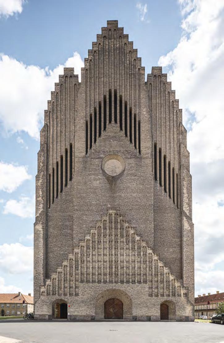
197
St Paul’s Church, Copenhagen, Denmark

Completed: 1877
Restoration project: 2017
Client: Sankt Pauls Sogn Menighedsråd
Architect: Toyberg-Frandzen
Contractor and master builder: Guldmann Dam – Pre/nor
Brick: Custom format bricks, including custom-glazing, developed in collaboration with the architects
Photos: Anders Sune Berg
The art of unsuccessful glazing
Petersen Tegl imitated historical glazing methods to endow new tiles with an authentically aged look.
During the major restoration of the spire of St Paul’s Church, completed a few years ago, Petersen Tegl hand-produced 6,300 curved bricks. Of these, 4,900 were delivered untreated, and the remaining 1,400 had to match the original, glazed bricks that still clad two-thirds of the spire.
“It would have been easy enough to make a green glaze in various shades, but then we would never have been able to recreate the look of the original, which shimmers between shades of green and brown because of the imprecise way people worked in those days. They used to dip the bricks in a copper oxide mixture but didn’t constantly stir it, so particles fell to the bottom. In addition, the non-uniform dosage of the pigment meant that, after firing some bricks had an almost transparent glaze that let the red brick shine through, resulting in a brownish effect.
To produce something similar, we copied the old method using different concentrations of copper oxide. To create further variation, we stacked the bricks in the oven differently each time,” explains Erich Mick, Head of the Custom Brick Department at Petersen Tegl.

The bricklayers used what is, in effect, an oversized pair of drawing compasses to position the rows precisely.
Long-term problems with damp meant the top rows of brick on the 140-year-old spire were ripe for replacement.


199
Part of the restored spire, with both glazed and unglazed bricks.
About St Paul’s Church
St Paul’s Church in Copenhagen was designed by architect J.E. Gnutzmann and built in 1872–77 in the North Italian/Romanesque red-brick style. The church spire had been in a state of disrepair for several years, and the brickwork had started to crumble. Restoration work, including the production of new bricks, commenced in 2015.
Analysis of the spire – the only brick one in the city – revealed that the interior was extremely damp. Previous restoration work had involved inserting a thick layer of ‘sacrificia plaster’ to absorb the damp, but the lack of natural ventilation meant that moisture was trapped inside the spire and the brickwork was disintegrating. A total of 53 rows of bricks, over six metres in height, were carefully removed until the team reached the undamaged part of the spire.
The spire’s brick cladding consists of curved tiles laid in a scalloped pattern, comprising seven rows of unglazed brick and fiv glazed. The bricklaying itself proved challenging and required the use of an oversized pair of compasses to position the rows precisely so that the new spire is the same height as the old one. In addition, to provide adequate ventilation, seven granite pipes were bricked into the top rows.
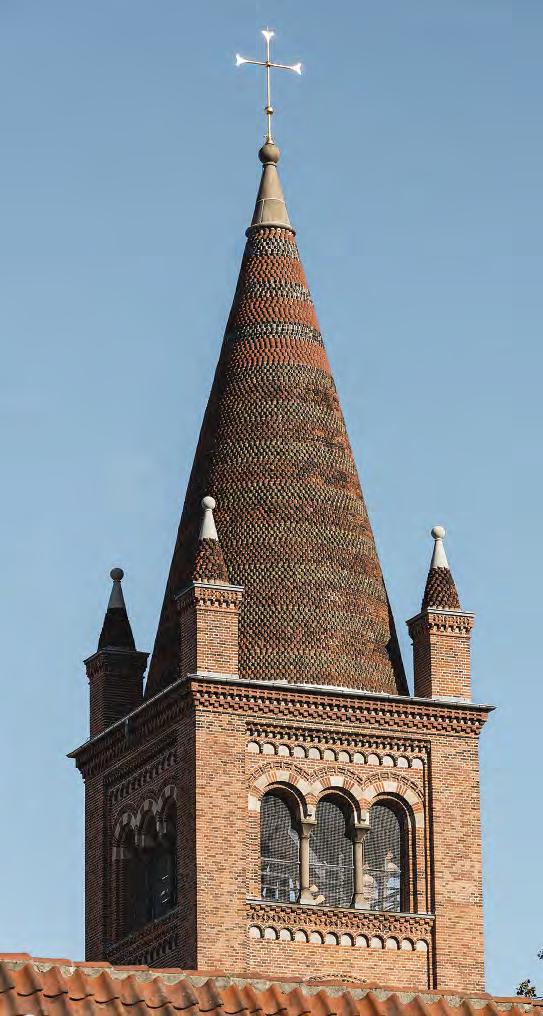


201
Erick Mick, head of the Custom Brick Department.
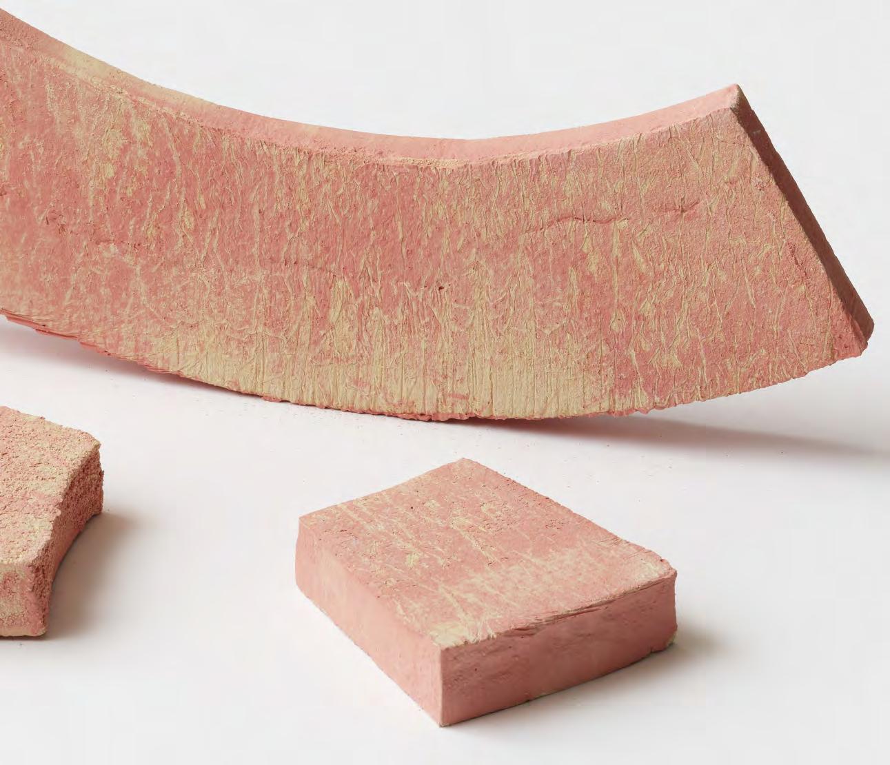
Art

203
Photo: Anders Sune Berg
Bibliotheca – Archaeological Library, Kivik, Sweden
Client: Kivik Art Centre
Artist: Ulla Viotti
Completed: 2019
Brick, exterior: K55 DNF, interior columns in custom D55. Custom bricks, books made in custom clay, 2000 pcs.
Photos: Mads Frederik
Brick novels
This work by sculptor Ulla Viotti is a beautiful synthesis of two of her passions – books and fied clay.
Bibliotheca – Archaeological Library is a work by the Swedish sculptor Ulla Viotti at the Kivik Art Centre in Scania. As the title suggests, the work explores the idea of the library as a repository of memory but also references sacred sites such as the columbarium or mausoleum. It is one of a series of brick monuments by Viotti based on architectural archetypes such as towers, pyramids, cones, sarcophagi, walls and gates.
Located on a sloping glade in a wooded area, Bibliotheca forms a circular wall that rises out of the tall grass. The exterior is made of hard-fied, tempered D55, which shimmers from whitish-grey to black. Courses of headers divide the exterior into horizontal layers and underline its cylindrical shape, while a trim of moulded bricks at the top of the wall creates a soft finish

Inside, rhythmically spaced pillars of rounded, custom-made D55 frame stacks of ‘books’ in a lighter shade of grey.
The spines of some of the books are engraved with either the names of Nordic writers associated with Scania or short quotes, such as the following from Cicero: “If you have a garden and a library, you have everything you need.”

204
“No other building material undergoes such a scale-dependent metamorphosis – from monolith (at a distance) through deeply textured volume (closer) to the ceramic qualities of individual bricks (up close).”
 Professor Thomas Bo Jensen, architect
205
A total of approximately 2,000 handmade, blue-tempered brick books were produced for the art installation. Some of the book spines are engraved with the names of Nordic writers associated with the Scania region.
About Kivik Art Centre
Set in the beautiful surroundings of Österlen, Scania, Kivik Art Centre explores the interface between sculpture, architecture and nature.

The centre was founded in 2006–2007 as an open-air exhibition space and meeting place for creatives. It was inaugurated with a series of minimalist concrete spaces by the Norwegian architects Snøhetta and has since expanded to include significan works by David Chipperfield Antony Gormley, Matti Suuronen, Gert Wingårdh, Sol LeWitt and, most recently, Ulla Viotti, whose work is the firs to use brick at the centre.
In line with its founding ideas, Kivik Art Centre offers exciting and visionary interactions between the landscape and the works within it.

206
Artist Ulla Viotti


207
Yu‘un, private gallery, Tokyo, Japan
Client: Takeo Obayashi
Architect: Tadao Ando
Courtyards, decoration: Olafur Eliasson
Completed: 2008
Brick: Quasi bricks, platinum glazed, developed by artist Olafur Eliasson in collaboration with architect and artist Einar Thorsteinn
Photos: Tomoki Imai
Shimmering platinum glaze

Handmade, glazed bricks transform a contemporary gallery’s atrium walls into a work of art.
The builder and owner of Yu’un, a private modern art gallery in Tokyo, along with architect Tadao Ando, commissioned artist Olafur Eliasson to transform the atrium of the building into a work of art.

Eliasson opted to clad the walls with a rhombus-shaped, 12-sided Quasi brick that can be rotated into six different positions. Its ability to form complex but random patterns gives Quasi an unpredictable and intricate quality. This unusual brick was originally developed in collaboration with architect and artist Einar Thorsteinn.
Eliasson wanted the bricks in Yu’un to be clad in platinum. Petersen Tegl rose to the challenge, glazing thousands of handmade bricks. The deeply enthralling result comprises shimmering, reflecive surfaces that seem to change with the light constantly.
The 12-sided brick is challenging in terms of form and production technigue. For example, several types of firin are necessary before coating the brick with platinum and firin it one last time.


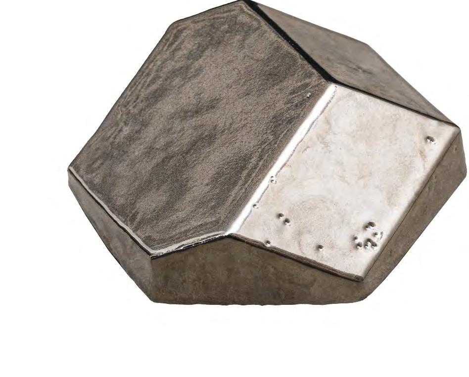
209

210
About Yu’un
The Japanese word ‘Yu’un’, meaning ‘heavenly sanctuary’, was the name bestowed upon this new building in a quiet neighbourhood of Tokyo. The client – builder and art collector Takeo Obayashi – wanted to combine his art collection, a guest house and a tea ceremony room under one roof, and commissioned architect Tadao Ando for the project. Off-green opal glass façades endow the building with a delicate and unassuming presence. Inside, visitors are naturally guided through alternating sequences of rooms, which provide an optimal backdrop to the artworks.

211
Trekroner Church, Roskilde, Denmark
Client: Himmelev Parish Council
Architect: Rørbæk and Møller
Floor: Henrik Plenge Jakobsen
Completed: 2018
Brick: Handmade, pentagonal clinker, 50 mm thick, made of German clay
Photos: Anders Sune Berg
Ground-breaking geometry
The artist behind the floor design in he modern church derived his inspiration from the discovery by three mathematicians of a new type of pentagon.

When artist Henrik Plenge Jakobsen was commissioned to design a floo for the new Trekroner Church, he knew right away that he wanted to use a natural material, preferably Danish, and that concrete was out of the question. He had previously worked with Petersen Tegl on the floo in the Traffi Tower in Copenhagen. It made sense to work with the brickworks in Broager again, and the company was happy to oblige.

The inspiration for the floo design came when Jacobsen read about a new type of pentagon that can be joined up to form surfaces. The discovery was made by three mathematicians – Casey Mann, Jennifer McLoud and David Von Derau – at Washington University, Seattle.
Jacobsen turned their concept into a reality. The pentagonal clinkers are made of German blue clay, imbued with a paleyellow hue by the firin process. The surface pattern was achieved by producing the pentagonal clinkers in two variants – one the mirror image of the other. They are 50 mm thick and laid in 15 mm wet mortar joints.
Jakobsen is satisfie with the result. “In functional terms, a clinker floo is a huge advantage for the indoor environment, and the visual impact fully lived up to my expectations. Apart from the cross, we avoided Christian iconography in the church. The idea is for churchgoers to lose themselves in the ornamentation, for example on the floo, in a meditative state. Laying a tile floo in a modern church is a beautiful and fiting continuation of a tradition that has endured for millennia.”


213
Artist Henrik Plenge Jakobsen.
The pentagonal, 50 mm thick clinker is made of German blue clay, imbued with a pale-yellow hue by the firin process.
About Trekroner Church
The previous church was simply too small to cope with population growth in the area. A bigger one was needed, and it was designed by the architects Rørbæk and Møller and completed in 2018.

Trekroner Church has an organic shape and is made of concrete cast in situ in over 200 moulds. The large amount of skylight plays an important role in the church, which has almost no windows. Daylight spreads seamlessly and gradually through the nave, helping to generate a special, intimate atmosphere.
The architects and client agreed right from the outset to integrate art into the project, as has been the tradition in church buildings throughout history.
The artist Henrik Plenge Jakobsen, who also acted as project manager and consultant, designed the main door, windows made of thin-cut agate and the alter cross coated in palladium. He was also responsible for the handmade Petersen Tegl floo tiles. The other artists involved were Lea Porsager, who designed and made the baptismal font in South African sodalite, and Alexander Tovborg, who was responsible for the oak altar.
214


215
‘Interspecies Campus’, artwork at Roskilde University, Denmark
Artist: SUPERFLEX in close collaboration with KWY.studio
Client: The Danish Building and Property Agency for Roskilde University
Completed: 2022
Brick: Hand-moulded brick in six different geometrical shapes, German clay
Photos: Anders Sune Berg
Purposeful art inspired by coral
Pink sculptures in handmade brick put climate change centre stage.


The Superfle group of artists chose Petersen Tegl to develop a special brick for a work of art commissioned by Roskilde University Campus (RUC). It comprises a series of circular structures called ‘Interspecies Campus’. The custom product is called ‘Superbricks’.
German clay was used, resulting in a bright yellow shade when the bricks were fied. A total of 12 different handmade variations were produced with six different geometric shapes and two different surfaces. The surfaces are either with or without sand on the sides, endowing the bricks with a distinct rough look and feel.
The bricks are made by pressing the clay down and into a wooden mould, all in a single movement. Just before this, pink slurry is spread over the brick by hand. No two pairs of hands work quite the same, so the manual process leaves different yellow spots on every brick wherever the slurry has not quite covered them completely.
The bricks are fied and oxidised in a gas kiln. The air used during this part of the process results in the yellow hue. When they are removed from the moulds, the bricks are left to dry for four days and then fied for five
Examples of the special formats of brick designed by Superflex
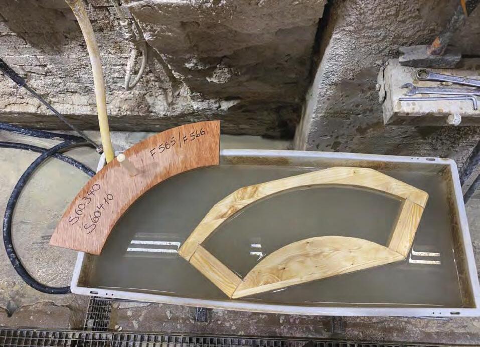

217
Bjørnstjerne Christiansen, Artist and co-Founder, Superflex
Photo: Jacob Bloch
About ’Interspecies Campus’
Created by the artist group Superflex ‘Interspecies Campus’ is the name of a work of art inaugurated at Roskilde University in May 2022. ‘Interspecies Campus’ consists of eight sculptures dotted around RUC. They are created of ‘superbricks’ developed for the project by the artists in cooperation with Petersen Tegl.
Like much of Superflexs work, the piece directs attention to the global climate crisis, Bjørnstjerne Christiansen, one of the artists and founders of Superfle explains:
“The sculptures symbolise a future in which sea levels are rising. They are designed to be fish-frienly and attractive for algae. Working with marine biologists, we know that pink attracts the coral polyps that are essential for reefs to thrive, hence the choice of colour.
The pink structures extend throughout the campus, creating new paths for us to walk on and new directions for our thinking. We were inspired by the infrastructure provided by marine coral reefs. We wanted people to be able to weave their way through the individual elements of the sculptures, which sprout from a sandstone ground reminiscent of the seabed.”
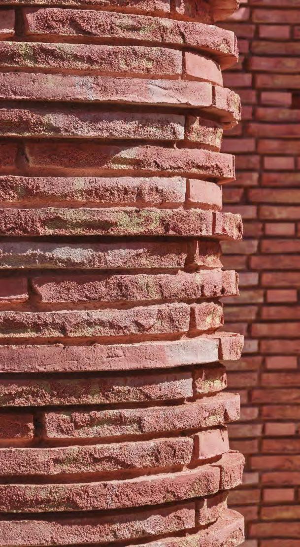

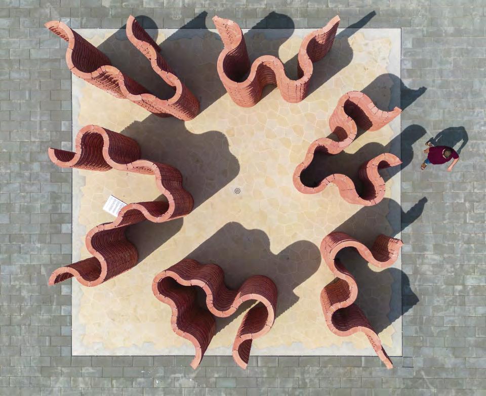
219
Traffic ower East, Copenhagen, Denmark
Client: Banedanmark
Architects: Tranberg Arkitekter

Art: Henrik Plenge Jakobsen
Completed: 2015
Brick, façades: D48
Floor: Handmade, triangular clinkers created in German blue and red clay
Photos: Anders Sune Berg
Tiles evoke Africa associations

The artwork ‘Africa Control’ consists of handmade floor iles serving as a human element and at the same time providing a good indoor climate.
The artist Henrik Plenge Jakobsen designed Traffi Tower East’s decorative elements, seamlessly integrating them into the architecture. The entire ground floo is covered with handmade, triangular red and yellow tiles arranged in a beautiful pattern. The rustic idiom contributes to the warm atmosphere, which is a far cry from a conventional offic building. His artistic input includes a Foucault’s pendulum, which hangs from the roof and continually circles a slightly raised plinth, also paved in beautiful, handmade tiles. Jakobsen explains:
“A traffi tower symbolises the journey as a phenomenon. This is where Africa comes into the picture, as both a remote destination and a wellspring of inspiration for patterns like the ones I have created. Right now, Africa is experiencing massive economic growth – it is the continent of tomorrow. Hence the title Africa Control.“
220
The bronce coconut oscillates over handmade clinkers made of red and blue clay.

“Brick is a basic material”, Plenge Jakobsen continues. “I have a great veneration for fied clay, and it is far too rarely deployed. It seemed only natural to continue using brick on the inside of the building. The tower’s shape and the materials used on the exterior both have associations with the Middle Ages, especially the beautifully patterned tiled floor of medieval churches and banqueting halls, which have survived hundreds of years of wear and tear.”
The Foucault’s pendulum in the atrium, which takes 26 hours to draw its circle, also symbolises a journey. It’s a good example of an installation that adds to –rather than detracts from – its beautiful surroundings. The pendulum, a bronze coconut, is another African feature.


222
Artist Henrik Plenge Jakobsen and architect Christian Tranberg.
About Traffic ower East
As of 2021, all rail and road traffi in Denmark is monitored from Traffi Tower East in Copenhagen and Traffi Tower West in Fredericia – both designed by Tranberg Architects and built in dark-red, hardfied D48. In Copenhagen, the bricks’ myriad hues are reflecte in the rusty pylons, railway tracks and surrounding brick buildings.
The architects’ choice of façade materials refers to the classic Danish red brick railway stations, which often have patterned brickwork. The towers also had to express robustness and solidity, something that brick does very well.
“It was important that the brickwork didn’t resemble an extra outer shell but looked as if it had emerged from the soil. This required a hard-fied brick like D48. Equally, it was important to let the brick surface determine the whole architectural idiom.

The façade consists of patterned brickwork with recessed headers, as well as sections with perforated, interlaced brickwork that shield the windows behind it from sunlight,” explains Christian Tranberg.

223
Index by technique
224 • • • • • • • • • • • • • • • • • • • • • • • • • • • • • • • • • • • • • • • • • • • • • • • • • • • • • • • • • • • • • • • • • • • • • • • • • • • • • • • • • • • •
Public institutions Maitland Riverlink, New South Wales, Australia 22 Kannikegården, parish hall, Ribe Cathedral, Denmark 26 Goel Center for Theater and Dance, Massachusetts, USA 30 After-school club, Allenmoos, Switzerland 34 Gothenburg City Library, extension, Sweden 38 City Circle Line (M3), Copenhagen, Denmark 42 Andlinger Center for Energy and the Environment, Princeton University, New Jersey, USA 46 Christian IV’s Brewhouse, Copenhagen, Denmark (R) 50 Commercial Konvert, headquarters, Kortrijk, Belgium 54 1A Page Street, Victoria, London, England 58 Astoria House, Stockholm, Sweden 62 Turnmill offic building, Clerkenwell, London, England 66 Tivoli Corner, Tivoli Gardens, Copenhagen, Denmark 74 Kville Saluhall, Gothenburg, Sweden 78 Design studio, Rancate, Switzerland 80 Petrol station, Skovshoved, Denmark (R) 84 Arcade building, Nordre Toldbod, Copenhagen, Denmark (R) 90 Culture Kunstmuseum Basel, new extension, Basel, Switzerland 94 Z33, House for Contemporary Art, Hasselt, Belgium 98 Tobias Mayer Museum, Marbach am Neckar, Germany 104 CLAY Museum of Ceramic Art, Middelfart, Denmark 108 Museum of the Bible, Washington DC, USA 112 European Hansemuseum, Lübeck, Germany 116 LAM Lisser Art Museum, Lisse, The Netherlands 122 Museum de Lakenhal, Leiden, The Netherlands 126 Brooklyn Botanic Garden, ticket pavilion, New York, USA 134 The main entrance to Tivoli Gardens, Copenhagen, Denmark (R) 138 The Round Tower, Copenhagen, Denmark (R) 144 Bricks in custom formats Bricks in custom colours Glazed bricks
225 • • • • • • • • • • • • • • • • • • • • • • • • • • • • • • • • • • • • • • • • • • • • • • • • • • • • • • • • • Housing Villa Platan, Aarhus, Denmark 150 Private home in Groenekan, The Netherlands 154 Private home in Utrecht, The Netherlands 158 Cabin in Hvaler, Norway 162 Holiday home in Tisvilde, Denmark 166 Private home, Prinsen Bolwerk, Haarlem, The Netherlands 170 Houttuinen townhouse, Dordrecht, The Netherlands 174 Paper Island, housing project on Christiansholm, Copenhagen, Denmark 178 Residential block on Jagtvej 2/Ågade 110, Copenhagen, Denmark (R) 182 Churches Don Bosco Church, Maribor, Slovenia 188 Ordrup Church, Ordrup, Denmark (R) 190 Grundtvig’s Church, Copenhagen, Denmark (R) 192 Underground chapel, Grundtvig’s Church, Copenhagen, Denmark 194 St Paul’s Church, Copenhagen, Denmark (R) 198 Art Bibliotheca – Archaeological Library, Kivik, Sweden 204 Yu‘un, private gallery, Tokyo, Japan 208 Trekroner Church, Roskilde, Denmark 212 ‘Interspecies Campus’, artwork at Roskilde University, Roskilde, Denmark 216 Traffi Tower East, Copenhagen, Denmark 220
(R) = Restoration Projects
Bricks in custom formats
Bricks in custom colours
Glazed bricks
Copyright © 2022 Petersen Tegl A/S
Publisher: Petersen Tegl A/S
Editors: Ida Præstegaard, MA in architecture
Annette Petersen, MA in architecture
Text: Ida Præstegaard, MA in architecture
Translation: Citadel Translations Ltd.
Design: Zangenberg Design - ZD1432
Print: Strandbygaard
Repro: Ehrhorn Hummerston
Print run: 5,000
ISBN 978-87-971240-1-7
Petersen Tegl A/S
Nybølnorvej 14
DK-6310 Broager
P: +45 7444 1236
E: Info@Petersen-Tegl.dk
www.petersen-Tegl.dk
 Painting of the Petersen Tegl brickworks from the 1940s. Artist unknown.


ISBN 978-87-971240-1-7


 Erik Frandsen, architect, partner, Lundgaard & Tranberg


 The massive columns in the façade are made of yellow cone-shaped custom bricks.


 Architects Henry Humpfreys and Stuart Piercy, Piercy&Company and Simon Silver, Derwent London, in the lobby at Turnmill.
Architects, client and the brickworks experimented for months with colours for the new Kolumba bricks.
The three new Turnmill colours which are now to be found in the standard range of Kolumba.


 Teit Weylandt, architect


 Architect Francesca Torzo mixing wine, water and milk to arrive at the exact purple-red hue she wanted.


 Francesca Torzo, architect


 David Greenbaum, architect, SmithGroupJJR


 Drawings of a selection of the many custom format bricks designed for the museum.


 Architect Ninke Happel, Happel Cornelisse Verhoeven
Drawings of the various custom bricks developed by the architects.


 Using Kolumba in three different widths provided the desired relief on the wall with the gaps in it.


 The recreated ornamental terracotta elements from 1890 on the Tivoli entrance.


 Just two moulded bricks with different radii made it possible for the architect to create all the soft shapes he wanted on the façade.


 The one-metre long Kolumba is shown next to a 228 x 108 x 54 mm Danish standard brick to indicate the measurements.


 tunda erected on the foundations of a watchtower demolished along with the city wall in the 14th century. Further along the quayside, about a kilometre from the new building, one solitary element of the original fortificaions still stands – Rondeel Engelenborch, dating from 1429.
Engraving of Dordrecht from 1649, featuring the city wall and watchtowers along the waterfront. Credit: Regionaal Archief Dordrecht, Hof van Nederland


 The almost 133-year-old building was in a poor state before the renovation project. To recreate the exact sizes and glaze, copies of each type to be replaced were sent to the brickworks.
From the top left, Aenne Thomsen, part of the ninth generation of the family to work at Petersen. On the right, Erich Mick, head of the Custom Brick Department. Below, employee Børge Andersen.


 Professor Thomas Bo Jensen, architect


 Painting of the Petersen Tegl brickworks from the 1940s. Artist unknown.