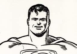
Wayne Boring & The Early “Superman” Artists Who Followed Joe Shuster
PART I
by Eddy Zeno (with the Aid of Mel Heggins)
Original Graphic Design by Jeff Weigel
INSTANT OVERVIEW: The Early Superman Artists
Joe Shuster (1914-1992)
Frank Shuster (1918-1996)
Paul Cassidy (1910-2005)
Wayne Boring (1905-1987)
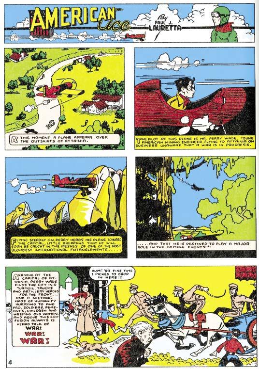
Paul J. Lauretta (1917-2000)
Dennis Neville (1919?-1982?)
Leo E. O’Mealia (1884-1960)
Fred Guardineer (1913-2002)
Jack Burnley [Hardin J. Burnley] (1911-2006)
Fred Ray (1920-2001)
Israel “Ira” Schnapp (1894?-1969). Letterer. Documents vary, but 1894 is the most likely birth year as determined by comics letterer Todd Klein
Leo Nowak (1907-2001)
John Sikela (1906-1998) per his son Jim; born 1907, say some sources
Hi Mankin (1926-1978)
Ira Yarbrough (1910-1983) per son Ira, Jr. Ed Dobrotka (1917-1977) according to Superman: The Action Comics Archives, Vol. 5 [corrected from Vol. 4]
Pete Riss (1914-1961)
Sam Citron (?-?)
Don Komisarow (1914-2000) according to Lambiek Comiclopedia
Stan Kaye (1916-1967)
George Roussos (1915-2000)
Paul Fung (1897-1944)
Jon Small (?-1966)
Charles Paris (1911-1994)
Dupree “Ray” Burnley (?-1964). The older brother of Jack Burnley; he retired from comicbook inking in 1959
Marvin Stein (1925-2010)
Al Wenzel (1924-1995)
James Winslow “Win” Mortimer (1919-1998)
And thanks to writer/co-creator Jerry Siegel (1914-1996), an artist in his own “write.” His ideas allowed Joe Shuster and others to create magic!
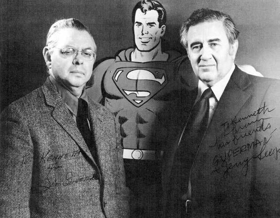
Joe Shuster & Jerry Siegel
(Above, left to right). The guys who started it all: writer Siegel and artist Shuster, in a publicity photo autographed to “Kenneth” at the Super DC Con in 1976. Auctioned on Hake’s in 2017.
For this writer, the artists most admired upon my first encountering their work were Michelangelo Buonarroti, Johannes Vermeer, Camille Pissarro, Frank Frazetta, and Curt Swan. Reading about them gave historical context to their lives. With my mind opened, additional Renaissance painters, Baroque masters, Impressionists, and practitioners of other forms of art filled the continuum. It was an onslaught of discovery destined to include many comicbook and comic strip delineators. Hergé, Alex Raymond, V.T. Hamlin… even those not considered leaders in the medium usually contributed something of value. For example, when a memorable “Legion of Super- Heroes” story in Adventure Comics #310 (July 1963) was read with difficulty due to my young age at the time, illustrator John Forte drew his Legionnaires so stiffly they might have all been named Stone Boy (or Girl) after one of the “Substitute Heroes” introduced a few issues earlier. Appearing unbendingly upright, they resembled a brilliant box of crayons in their multi-colored costumes. What could be more appealing to a seven-year-old?
The Inheritors
John Forte began delineating the Legion’s futuristic exploits in 1962. With time-traveling Superboy as the group’s premier member, the artist had already drawn imperfect duplicates of the Superman Family for a year in “Tales of the Bizarro World!” John inherited the Legionnaires when they replaced the Bizarros in Adventure Comics. Asked to serve as one of Curt Swan’s temporary inkers when embellisher Stan Kaye left the field, Forte himself was both penciler and inker on a few stories featuring cub reporter Jimmy Olsen, senior correspondent Lois Lane, and the Man of Steel himself.
There were others.
Former “Batman” artist Jim Mooney gathered “Supergirl” as a backup feature when his 6½-year stint on “Tommy Tomorrow” ended in Action Comics. He added “Superman & Batman” team-ups for a time in World’s Finest Comics
In 1941 comicbook artist George Papp co-created a hero (with Mort Weisinger) who thrives to this day: Green Arrow. As the Emerald Archer shifted from More Fun Comics to other titles, George in 1958 received “Superboy” assignments in Adventure Comics and in the main Superboy title.
Four years after Fawcett ceased publishing comicbooks, Kurt Schaffenberger, who’d drawn “Captain Marvel,” became the
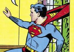
“You Will Find Me A Grave Man…”
(From
…
definitive artist on Superman’s Girlfriend Lois Lane, beginning with the inaugural issue (March-April 1958). Kurt had a long second act on nearly all the “Superman” titles. Another former “Captain Marvel” artist, Pete Costanza (who often served as artist C.C. Beck’s embellisher), inherited mainly the Superman’s Pal Jimmy Olsen title, starting with the 91st issue (March 1966).
The author’s two previous biographies dealt with the super-careers of Al Plastino and Curt Swan; the purpose of this volume is to shore things up before their arrival—to celebrate the guys who were there before Joe Shuster was fated to leave his co-creation in the latter 1940s.
top right:)
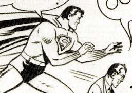
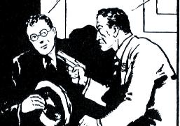
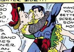
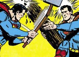
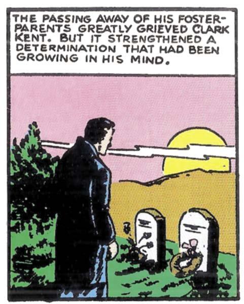
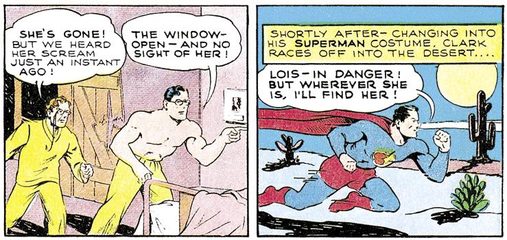
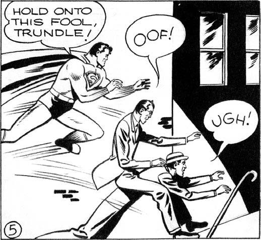
Clark Kent at his parents’ graves, by writer Jerry Siegel & artist Joe Shuster, from Superman #1 (1939), as per Superman Archives, Vol. 1
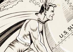
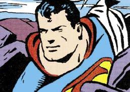
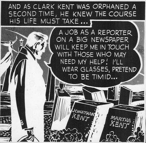
The Wayne Boring-penciled version of this scene, a negative from Three Dimension Adventures Superman (1953), from an artist proof preserved by DC production manager Jack Adler; inker uncertain; script by Bill Finger…
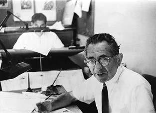
Bob Rozakis’ “Answer Man” alias came from a recurring column in DC Comics that addressed readers’ questions about the firm’s heroes. Earlier, he drove a company vehicle called the Comicmobile. Rozakis’ more conventional jobs at DC included production director and comicbook writer. Bob co-created ‘Mazing Man and Hero Hotline with artist Stephen DeStefano. Other assignments included writing the Superman Sunday Special syndicated comic strip and the Superman: The Secret Years (Feb.-May 1985) miniseries.
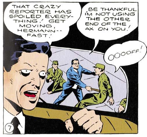
Ido not pretend to be an expert on the art of Joe Shuster and the “ghosts” he employed in his studio. Certainly, Shuster is responsible for the look of Superman, Lois, Clark, and the other regulars in the stories. He did his best to move the story along, albeit with characters who more resembled posed mannequins than real people. But he paid minimal attention to background details, which came and went panel-by-panel.
Consider, for example, pages 2 and 3 of the “Superman” story that appears in Action Comics #7. The scene takes place inside a trailer; and over the space of a half dozen panels, furniture, things hanging on the walls, and even the windows seem to be moving all around. A towel hanging on a hook, drawn in four of the panels, is in a different spot relative to other objects each time. Shuster also used the shortcut of panels with no background at all, just a single character and a word balloon.
In Superman: The Action Comics Archives, Vol. 2, DC attributes the art to Shuster and “the Superman Studio.” Perhaps the most noticeable thing about these stories is that the background art becomes more complex. One can only imagine that these assistants, trying to demonstrate their abilities, drew as much as they could in the panels to jazz them up. DC notes in some of the Archives volumes that Shuster would often draw the heads of Supes and other characters while his studio artists did the rest.
In late 1940 DC bypassed Shuster and his Studio completely,
Faster Than A Speeding Bullet Train
giving some “Superman” scripts to Jack Burnley. Burnley had almost a decade of experience by then as a professional, and it shows in his art. The characters are more realistic-looking and the action more fluid. Interesting to note that the stories done by the Studio that follow Burnley’s appear to be imitating his style and attention to detail. There is still evidence of panels that Shuster laid out, but others that can probably be attributed to the assistants because of their un-Shusterish style.
After the anonymous attribution to the Studio in Vol. 2, in Superman: The Action Comics Archives, Vol. 3 DC starts to identify individual artists. Among them are Leo Nowak, John Sikela, Paul Cassidy, Ira Yarbrough, and Ed Dobrotka.
Cassidy’s art in Action #37 is the most like Shuster’s in terms of layout, though with a bit more background detail.
Nowak’s art is a bit more fluid in #38 & 39, though it seems the only way he can consistently draw Superman or Clark is a three-quarters head shot. It’s evident with other characters as well, but most obvious when you realize that Supes/Clark is looking either to the right or the left in virtually every shot.
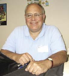
Bob Rozakis at a Big Apple Con in New York City in 2011.
helped put the feature over, to come to Cleveland and work upon polishing the appearance of all the Superman art and in addition turning out one or possibly two more releases of Superman per month.”17
The first-ever talk of legal action concerning Shuster and Siegel occurred several years before Superman’s co-creators sued DC to regain ownership of their character. Paul Lauretta sought to have his name added to the credits; a cousin who was an attorney advised him to bring suit. Lauretta was fired immediately.
Antoinette Lombardi (Paul called her Ann) stated that her
brother’s name became infamous because of his threatened lawsuit.16 American Ace’s exploits were briefly reprinted and advanced in Marvel Mystery Comics before becoming “Lieutenant Lank” (and moving from Timely to Centaur Publications). Other than that, Paul tried for more than a year to get back into cartooning without success. He’d been blackballed.16
Other Avenues For His Art
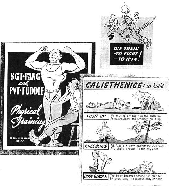
Lauretta entered the Army Air Forces during World War II to serve in public relations. His duties included drawing for military magazines and producing brochures on subjects ranging from physical training to how to stay safe during air raids. To gently convey each message, Paul’s art was mainly in the bigfoot vein. His less exaggerated comicbook style re-emerged, however, when asked to portray the goings-on in each department on base. Personnel were encompassed in panels without borders, numbered sequentially and connected by Lauretta’s trademark arrows to drive the eye from one vignette to the next.
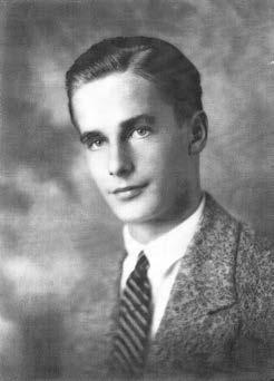
Paul never went overseas. Stationed in a luxury hotel in Atlantic City, he was living the life of Riley.16 Paul J. Lauretta had black hair, was 5’10”, attractive, and of average build. In 1943 he married Viola A. Zappala; the couple had three children. After the war he went from company to company as a commercial illustrator. Eyesight affected Paul’s work toward the end of his career, and he eventually became legally blind.16 Mel Higgins interviewed a younger cousin, also named Paul Lauretta, who said the artist was
mirthful. His sister described him as dry; his comedic barbs would suddenly appear, and a grin would attach to his face. Though the blacklisting from comics took something out of him, Lauretta in his autobiography looked back fondly on his career as an illustrator: “One day, during my grade school years, a spring bubbled forth, an embryonic coordination of eye and hand. This phenomenon enabled me to draw lines on paper of a configuration that gave a semblance of what I saw or imagined.” He remembered with gratitude several years later when “my sister Ann… would find me in the family dining room, busy at my drawing board.” In his epilog, Lauretta discussed segueing into commercial art, when “many hundreds more [illustrations] flowed from my pen and brush until the tide ebbed; and I retired in 1984. In retrospect, I realize I derived great pleasure and satisfaction from this labor. I feel I was very lucky to have been able to do this work.”
V . Inside The Shuster Shop: Paul Cassidy & Wayne Boring
Wayne Boring and Paul Cassidy were talented young artists when they arrived on the comics scene. One stayed long enough that his name will forever be associated with the Man of Steel. The other left quickly to make his mark elsewhere.
Born in 1910, Paul Cassidy’s family moved from Cherry Valley to Rockford, Illinois, when the lad turned seven. After graduating from high school in 1928, he attended the University of WisconsinMadison. Paul cartooned for the school newspaper18 while earning a bachelor’s degree in Fine Arts. Later, he returned to UW-M to add a master’s degree in Art Education.19 Paul’s wife Inez also obtained her master’s degree from same.20
For his master’s thesis, Paul Henry Cassidy was one of the
first to choose the subject of comics. Dated 1942, it was titled, “An Approach to the Profession of Comic Strip Cartooning Based upon an Analytical Survey of Current Trends and Personal Experiences.”20 In the treatise Paul confessed to having drawn Clark Kent and his alter ego for comicbooks commencing in December 1938, and for newspaper strips beginning in late winter/ early spring 1939. Though he wasn’t explicit, these dates are likely when Paul first received the assignments, a few months before the work was actually published. To speculate, Cassidy may have begun drawing the Kryptonian’s adventures while Wayne Boring remained a little longer with Siegel and Shuster’s less famous heroes before he was given “Superman” stories of his own.
A focus of the thesis involved polling famous cartoonists of the day, including Carl Anderson (Henry), C.C. Beck (Captain Marvel), Milton Caniff (Terry and the Pirates), Al Capp (Li’l Abner), V.T. Hamlin (Alley Oop), Bob Kane (Batman), his boss Joe Shuster (Superman), Frank Willard (Moon Mullins), and many more. One survey question, dear to Paul’s heart, asked if they used uncredited assistants. Over half of the respondents answered yes.
Back To The Beginning: A Superlative Chat
In the book Superman: The Dailies, 1939 to 1942, James Vance’s introduction refers to a 1994 conversation with Mr. Cassidy.21 The former “Superman” artist acknowledged that he traveled to Cleveland for an interview with Jerry Siegel and Joe Shuster in June 1938. A graphic arts instructor at the Milwaukee Vocational School, at first Paul assisted Joe through the mail. In January 1940 he moved to their city to draw for the Studio full-time. Cassidy found that Wayne Boring had answered the same 1938 help-wanted ad in Writer’s Digest and was also sending art through the post initially. Boring likewise settled in Cleveland, preceding Paul by a couple of weeks.
Before anyone knew how successful “Superman” would become, Paul and Wayne were helping Joe with features like “Slam
Paul Cassidy & Friend
(Above:) 1927 high school photo; courtesy of sons Larry and Dick Cassidy.
Action Comics - 80 Years of Superman: The Deluxe Edition (DC Comics, 2018). It came in the form of an unpublished “Superman” story, whose delicate art included long lean characters with looseygoosey arms, Fred Ray’s borrowed “S” emblem on the Man of Steel’s chest, and the distinctive eye traits attributed to Pete Riss. The original art was rescued from DC’s incinerator long ago by a young man touring the DC offices with other comicbook fans. He was given some of the pages and traded for the remainder of the story on that eventful 1960s day. That youngster grew to become professional editor and comicbook writer Marv Wolfman. In his accompanying essay, Marv noted that there was a 1947 published version of the story redrawn by Wayne Boring, shortened to 10 pages from the original 12-page art job. Riss’ rendition dates to 1945. Wolfman shared how he has treasured and preserved the art. To see it reach the public after 73 years honors a little-known “Superman” artist who was quite prolific in the final years of Joe Shuster’s reign.
There is one more interesting fact about the written-off story. Marv uncovered that Shuster was the paid illustrator, indicating that Riss, at least for a time, worked as one of his assistants.
the Model tale (for Timely, later called Marvel Comics), Riss’ elbow pictorials bent within the two-dimensional plane of the page. Noses were barely there in straight-on views. Even more than Joe Shuster, Pete’s characters had squinty eyes but, as mentioned before, when they were open, they bulged. No man or woman had fully outlined orbs. A single horizontal line under each eye gave them a wet look. Pupils were pinpoints, making Pete’s villains appear more maniacal.
Riss drew the smallest chest insignia on Superman, with the emblem’s inner “S” shaped like Fred Ray’s. A battened-down head of hair, narrower chin, and lower, less defined abdominal muscles also help to identify Pete’s hero. During the mid-1940s his panel layouts were the most conservative, his figures the thinnestlined of anyone regularly penciling the Man of Steel’s adventures.
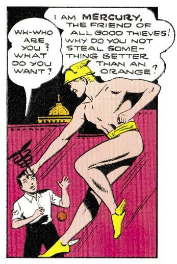
One quirkily attractive story (“The Quicksilver Kid!” in Superman #26, Jan.-Feb. 1944) featured a long-limbed, near-naked Mercury flying on winged clogs to highlight the two-dimensionality in Riss’ work. His Earth was flat. The overall effect: a more graceful, ornamental style than was seen in the art of his peers.
A Golden Age history lesson was unearthed in the book,
Sam Citron drew comicbook stories for several companies. When he was allowed recognition, he sometimes used the anagram “Marc Ricton.”33 About the rest of his life little is known, although he may also have been a Golden Encyclopedia artist and medical illustrator.
Uncredited, Sam began illustrating Kal-El’s adventures around the same time as Pete Riss, starting in 1943. His run lasted for three-plus years. Never a Shuster Shop artist, it was DC Comics’ editorial director Whitney Ellsworth who moved him from “Robotman” to “Superman.” This was noted in a letter dated November 19, 1942, from Ellsworth to Jerry Siegel. Further, Whit wrote that Citron was often paired with Don Komisarow on the Man of Steel. According to historian Bob Hughes: “Sam… later went on to draw Mr. District Attorney and other crime comics for DC and later drew horror/mystery stories for the American Comics Group.”3
Citron designed his pages so that panels possessed a more vertical dimension. Because of that, and the fact that he might crowd in more characters, the action seemed further away. The Man of Steel had lumpier muscles and appeared especially squatty on story splash pages. His Lois Lane was skinnier. There were lots of poses from the waist up. However, when characters were on full view while tussling, they didn’t just fall—they flopped—legs akimbo! During flight Superman flexed one hip almost into the abdomen, akin to how Jack Burnley drew him. Sam must have admired the chief cover artist at that time, because he borrowed other flying poses from Burnley, too. Finally, Citron’s Kal-El was sometimes known to side-bend his trunk while soaring.
Sam was not as adept at drawing pure make-believe as the later-arriving Ira Yarbrough; yet, in the first tale in Superman #22 (May-June 1943) he was asked to give it a go. From the opening caption: “This is a fantasy, but don’t get the wrong impression. The story deals with modern-day realities, with a war industry… with a foul Nazi plot… with a crusading, all-powerful Superman! Want to know more? Then, turn the page, read on, and… ‘Meet the Squiffles!’” The writer was Jerry Siegel. Citron provided both
pencils and inks. His green-colored Squiffles were a cross between gnomes and demons, surrounded by more realistic rendering. Using page designs just a shade less conservative than those of Pete Riss, Sam presented the one-shot hobgoblin, Ixnayalpay, “Ruler of the Squiffles.”
Ixnayalpay, in Pig-Latin name and otherworldliness, was a sort-of tryout for Mr. Mxyztplk. Unlike Mxy, however, there was not enough broad-brushing in terms of the script. Further, greater background detail in the art would have enhanced the story. And, finally, had the hairless lead Squiffle been gifted with extravagant tresses, there might have been encores. That’s because, as previously mentioned, Sam Citron (especially when paired with Don Komisarow) concocted the most fanciful hairstyles.
Coiffeurs Of The Comics
Some of penciler Citron and inker Komisarow’s curlyheaded male guest stars favored Charles Bickford (a well-known supporting actor in Hollywood whose film appearances included The Song of Bernadette and The Big Country). The artist duo liked to illustrate bushy eyebrows, as on the roguish Toyman, whose own locks were glorious. Judging from other masculine characters they
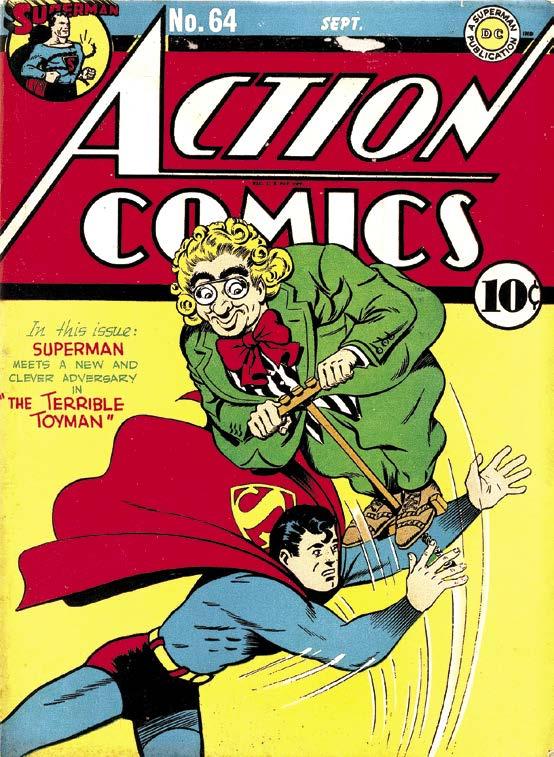
Was The Toyman Really So “Terrible”?
Unfortunately, Sam Citron is another of the Shuster Shop artists of whom we’ve been unable to score a photo—but his cover for Action Comics
(Sept. 1943), as inked by Don Komisarow, shows how his pencils gained new life with a new embellisher. They illustrated The Toyman’s debut inside, too. [TM
borders. Question marks were squigglier. Known as a stylized scroll option, first letters of captions were colored red and shaded in the upper left corner to provide the illusion of depth. At each fable’s conclusion, “The End” transformed from block writing to cursive. Working months ahead of the printed publication date, it can be reasonably surmised that Frank Shuster was gone by this time. Jean Peavy told Mel Higgins that Frank entered the Army on November 1, 1942; he exited the service circa September 1945. She added that her brother never returned to the craft of lettering because the folks at DC by then controlled the hiring on “Superman.”11
After the war, Frank moved into the lovely apartment in Forest Hills, Queens Borough, New York City that Joe rented for his family. (Joe resided in Manhattan, in a fancy apartment building with a doorman; he knew many of the celebrities living there, too.) Frank wrote humor skits and jokes for his sister Jean’s nightclub act. The wannabe actor combined singing and comedy into her one-woman show.
Frank himself was once an aspiring thespian. Determined to perform on Broadway, at sixteen years of age he left Glenville High School (where Joe had graduated) and jumped a train headed for NYC. Working as a busboy, he lasted six months before returning to Cleveland to graduate from a different institution than his brother. John Hay High School provided Frank with the opportunity to do Shakespeare and comedy. He was also editor of the school newspaper and contributed a satirical humor column called “Stiletto.”11
The Shuster clan obviously enjoyed entertaining others. Certainly, big brother Joe enthralled millions due to his part in creating and sustaining the adventures of Superman, but a cousin, also named Frank, was part of the once-famous Canadian comedy team of Wayne and Shuster. The “other” Frank Shuster and Johnny Wayne performed together as professionals from the 1940s through the 1980s. They made 66 appearances on TV’s The Ed Sullivan Show alone.
Joe’s brother Frank was enamored with sociology. Foreshadowing the Beat Generation, he traveled with hobos to study their culture. In addition, while he was penning gags for Jean’s show Frank was writing about human nature. He could be serious and insightful. Even during the war, after taking a personality test, the Army made Frank an assistant chaplain because he was interested in advising and guiding others. Later he clerked for a general at the Pentagon. Frank made it a point to observe 5-Star general and future President Dwight D. Eisenhower while walking the halls.11
Big brother Joe ran out of money after he was fired from “Superman.” Long before he and Jerry were each granted an annual stipend from DC Comics (commencing at the end of 1975), the then-destitute older sibling left his fancy digs and moved into the family apartment. Frank became the main provider. Initially working as a draftsman38 for very little money, he eventually found a job with the Nielsen Company. From the early 1950s until 1992 Frank
compiled television show ratings charts for the marketing research organization. Responsible and reliable, he never missed a day at Nielsen.11
Showcard Letterer Of The Comics
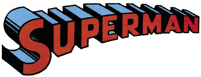
Ira Schnapp came to Superman after Frank Shuster. His earliest known contribution to the Metropolis Marvel was to redesign the Superman comicbook logo. Beginning with the title’s sixth issue (cover-dated Sept.-Oct. 1940), Ira’s masthead, clean and ahead of its time, would endure for more than four decades without alteration. While it deserves its trademark status, credit must go to Joe Shuster for the initial concept. He had the right idea but remained undecided on the best, fixed look to his stubbier title lettering, redrawing the logo a few times between issues one through five. Longtime comics letterer Todd Klein, who started working at DC in 1977, wrote: “Ira took elements from all the Shuster versions, standardized the width and shapes of the letters, made the telescoping consistent, and used true three-point perspective, which Shuster’s work only guessed at.”
Schnapp brought to comics more than two decades of prior experience as a showcard letterer, where he learned to use greatly varied calligraphy on title, narrative, and dialog placards for silent moving pictures, movie theatre lobby cards, storefront posters, and other forms of print advertising. Immigrating to this country as a boy from Sassow, Austria, the roots of his vocation came even earlier. Between the ages of 14 and 18, Ira was tasked with enlarging
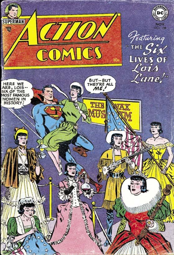
Ira Schnapp in the DC Comics bullpen—juxtaposed with Wayne Boring’s cover for Action Comics #198 (Nov. 1954), with Stan Kaye inks—and (except for the logo) the distinctive fancy lettering of Ira Schnapp.
and perfecting an architectural firm’s lettering so stonecutters could inscribe what still appears on the James A. Farley Post Office in New York City: “Neither snow nor rain nor heat nor gloom of night stays these couriers from the swift completion of their appointed rounds.” Construction on the Post Office occurred between 1908 and 1912, an era when Schnapp may have enlarged letters for other landmark buildings as well, including the main New York Public Library (completed in 1911) and Grand Central Station (opened in 1913).
The Art Deco movement originated in the 1920s and grew stronger in the ’30s and ’40s. Deco’s design style influenced Ira’s work for the rest of his career.
As early as 1934 Schnapp was lettering covers and creating logos for Harry Donenfeld’s spicy/girlie pulp magazines at Trojan Publishing.24 Ira was related by marriage to Jack Liebowitz who, at the time, was Harry’s accountant and point man, prior to the two men entering the comicbook industry.
In 1940, the same year he revised Shuster’s logo for “Superman,” Ira illustrated and probably wrote copy for a weekly newspaper panel titled “The Art of the Ages.” Schnapp’s goal for each installment was to discuss and reproduce one well-known painting or sculpture. Applying nuanced shading to pen and ink in an attempt to add realism to newsprint, the feature appeared in exactly one tabloid, the Toledo Blade. “The Art of the Ages” survived for a mere 24 installments.
In a few years Ira was providing ancillary cover blurbs as well as inside story lettering for DC Comics. By the latter 1940s, he’d moved from working freelance to taking a position with the company. Gaspar Saladino was a younger calligrapher when he joined the staff at the end of 1949; he recalled that Schnapp was already at his desk in the production room (on the 9th floor at 480 Lexington Avenue) by the time he arrived.
With full-time status, Ira was specifically tagged to produce more and more of the blurbs appearing on comicbook covers, revealing the guest stars or hinting at mysteries about to unfold. He would establish new logos that symbolized the individual themes behind different titles. Eventually, Schnapp became perhaps best-known for the DC house ads known as “Coming
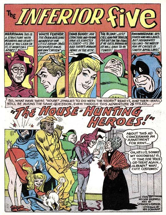
Interior—But Not Inferior!
Super-Attractions!” Combining small cover images (or just the title logos) with hand lettering of varying fonts and styles, the ads began appearing earlier but exploded all over the line during the early to mid-1960s. Meanwhile, Ira continued to transpose dialog for hundreds of inside stories on the line’s super-hero and humor comicbooks when he could find the time.
Look! Up At The Top Of The Cover!
Todd Klein on his blog described traits consistent to the letterer. Schnapp’s cursive script for covers, splashes, and ads was distinctly attractive, taking on bright colors with ease. In story panels, when a writer used excessive dialog, Ira liked to overlap his word
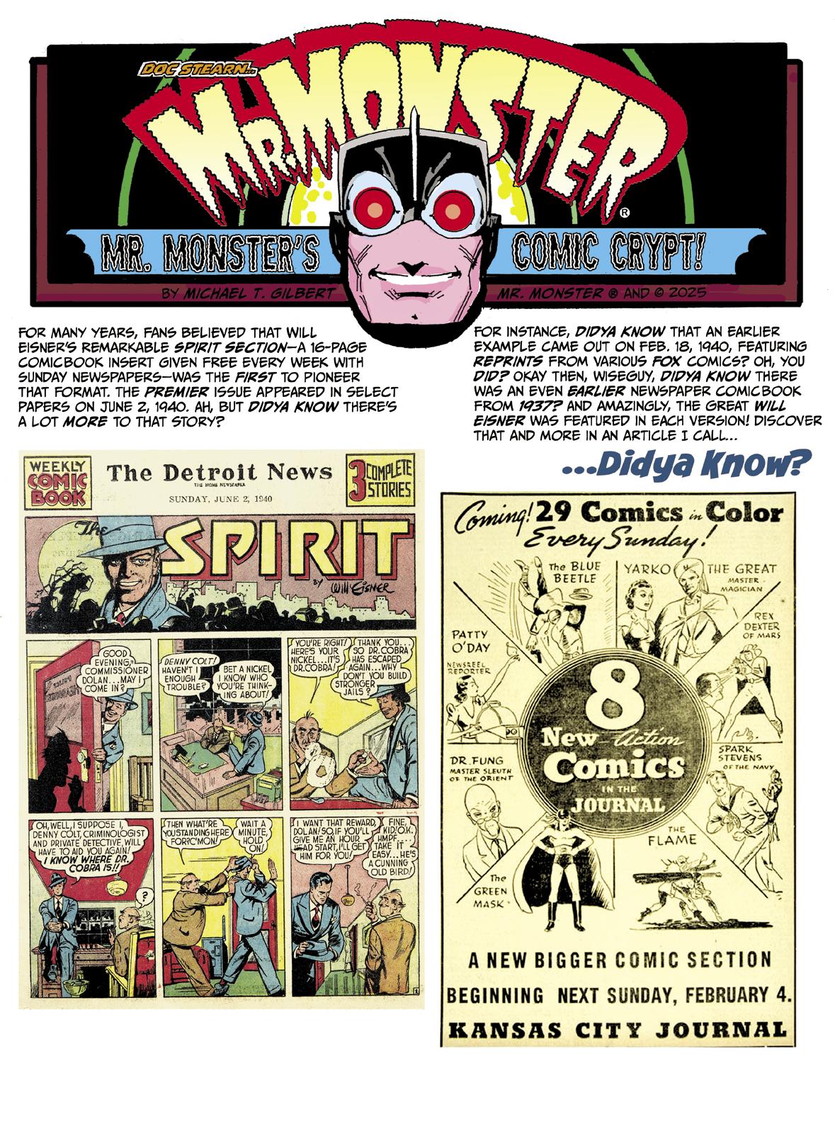
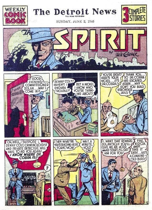
For decades, common knowledge had it that Will Eisner (working with publisher Everett “Busy” Arnold) pretty much invented the weekly newspaper comicbook section (syndicated by the Register and Tribune Syndicate). Most fans long believed the format was introduced with Eisner’s first Spirit Section in June 2, 1940. Eisner wrote and drew the lead for that 16-page comicbook, inserted in Sunday newspapers. A free comicbook each Sunday was a great bonus for the kiddies (and their comic-friendly parents).
The section originally consisted of a lead 8-page story featuring Eisner’s crime-fighting hero, Denny Colt, alias The Spirit. Eisner reportedly also scripted the first episodes of both four-page backup features, “Lady Luck” and “Mr. Mystic.” Chuck Mazoujian (under the “Ford Davis” pseudonym), illustrated “Lady Luck,” while the great Bob Powell (as “W. Morgan Thomas,” the same pseudonym used by one and all on every “Sheena, Queen of the Jungle” story at Fiction House) did the honors for “Mr. Mystic.” Powell would soon take over the writing as well, making the strip his own.
Foxy Victor!
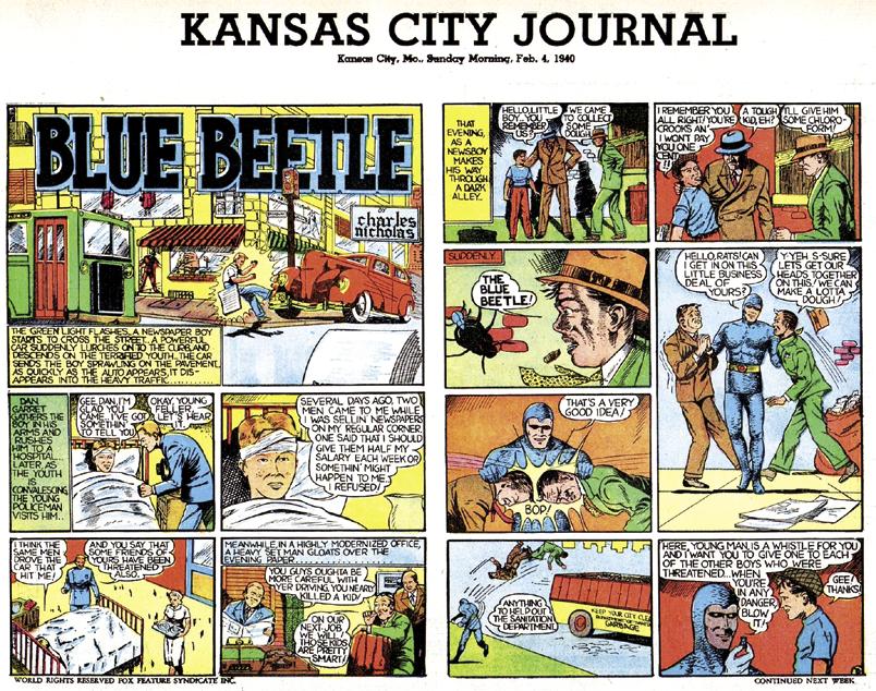
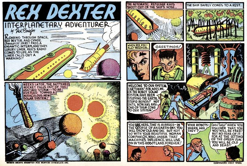
Some years back I discovered that publisher Victor Fox also produced a comic supplement for newspapers, in a similar format. Fox, who ran Fox Publications, Inc., was a notoriously sleazy publisher. That being the case, I naturally assumed that Fox stole the idea from Arnold and Eisner.
Imagine my surprise to discover that Fox actually published his comic four months before Eisner’s Spirit Section! The books weren’t exactly the same, of course. While Eisner’s section featured all-new material (and all new characters), Fox’s comicbook reprinted stories from his comics, laid out four to a page. Not a bad deal for cartoon fans, but not nearly as ambitious. This way Fox was able to do it on the cheap, his “standard operating procedure.”
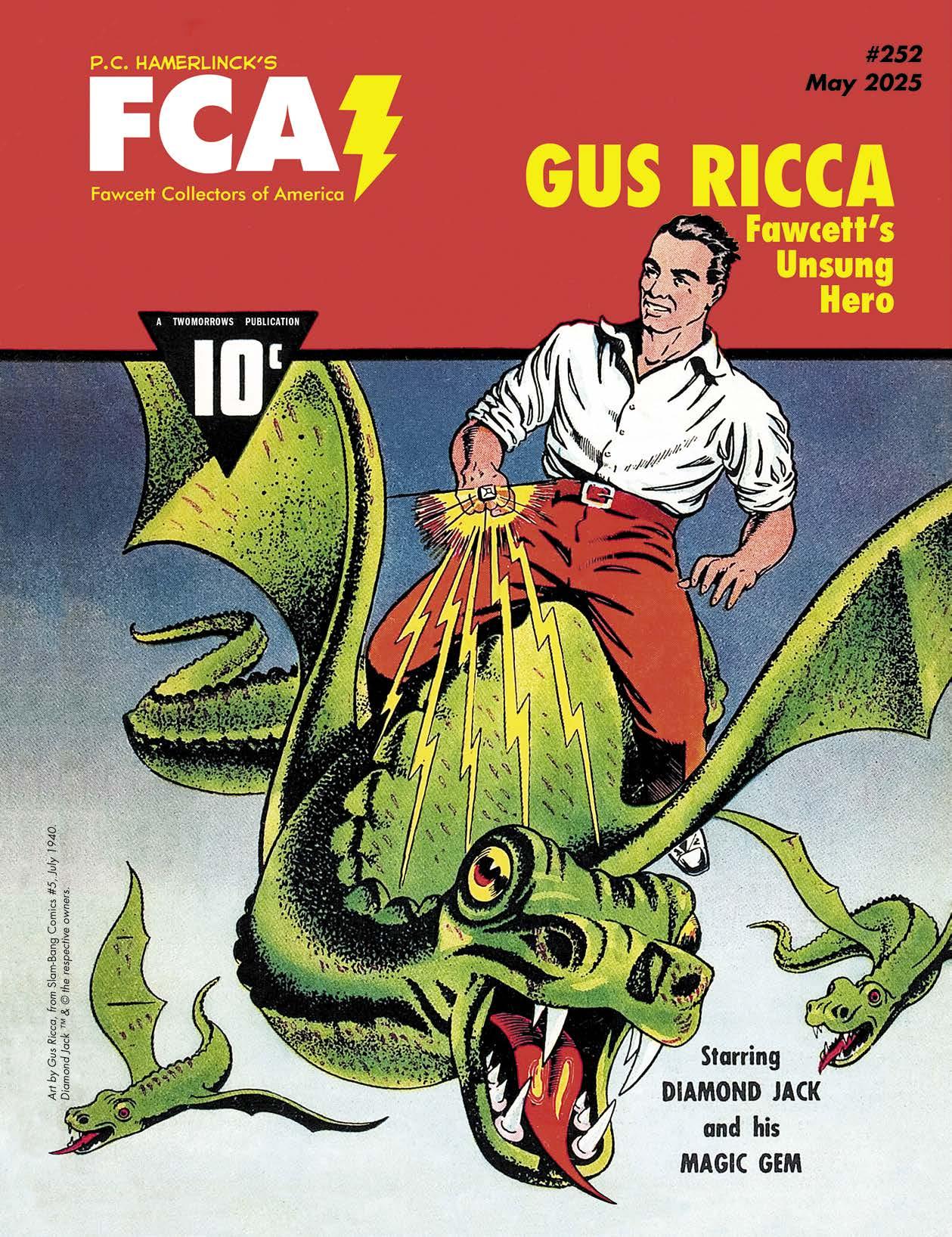
In the hierarchy of artists who produced work for Fawcett Publications during the Golden Age of Comics, certain names shine brightly: C.C. Beck, Mac Raboy, and Kurt Schaffenberger, to name just a few. Yet, for every high performer, there are numerous talented artists whose contributions have been unfairly lost to the passage of time. One such artist is Gaspano “Gus” Ricca, a versatile illustrator whose work for Fawcett in the 1940s helped shape the visual language of an entire era of comicbook art.
Born on February 22, 1906, in Brooklyn, New York, Ricca’s journey to becoming a comics artist was anything but conventional. The son of Italian immigrant Ignazio Ricca and New Yorker Julia Brown, Gus grew up an only child in a household where art was not just a hobby, but a way of life. His father, a classically trained artist (with his own studio in Brooklyn), undoubtedly played a significant role in nurturing his son’s talents.
Gus Ricca’s formal education ended after the eighth grade in 1919, but his real education was just beginning. He dived headfirst into the world of commercial art, starting in newspaper advertising illustration. This hands-on experience in the practical aspects of the industry would serve him well throughout his career, giving him a keen understanding of how art and business work together— knowledge that would prove crucial to his later work in the comicbook industry.
Long before Ricca began producing comics artwork for Fawcett through the Chesler Studio, and later as a freelancer, he had already established himself as a versatile commercial artist. Throughout the 1930s his work had graced the pages of prestigious publications like Collier’s, Esquire, Time, Liberty, and The New Yorker. This diverse background would prove invaluable when he’d eventually take on the exciting art form of sequential storytelling.
In October of 1934 he married Beatrice Goldberg, an associate editor at Radio Revue Magazine and a radio news commentator. The couple lived in Manhattan and had one child together, a daughter, Roberta, born in 1939. (Their marriage ended in 1952, and the teenage daughter went to live with her mother.)
Ricca joined forces with Billie Gould and Dorothy Haubert in 1939 to form the Gould, Ricca and Haubert Advertising Agency. Gould, a former newspaper sports cartoonist, went on to create the King Features syndicated detective comic strip, Red Barry. The business was later transformed into a public relations firm, Billie Gould, Inc., where Ricca served as its vice-president.
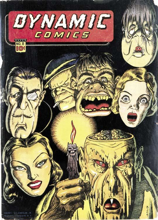
Late 1939 was when Ricca entered the world of comics, when he agreed to be part of the stable of artists at the Harry “A” Chesler studio (shop) that packaged comicbook contents for various publishers, primarily Street & Smith, Timely (Martin Goodman), and Fawcett. (In four fast years, Ricca was promoted to art director of Chesler’s Dynamic Comics, and also produced many extraordinary covers for Chesler’s line of comics.)
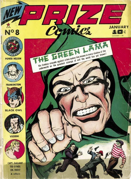
Compared to Mac Raboy’s later, more super-heroic version for Ken Crossen’s Spark Publications, Gus Ricca gave us a very different and menacing Green Lama (in the style of the original pulp-magazine character) on the cover of Feature’s Prize Comics #8 (Jan. 1941).
Ricca’s cover for Dynamic Comics #8 (March 1944). He became the art director of the title and the premier cover artist for Harry “A” Chesler’s line of comics during the 1940s.
At the time Ricca produced his early Fawcett work, that publisher found itself in the midst of a comicbook revolution. Fawcett was riding high on the success of its flagship character, Captain Marvel. But it wasn’t just the World’s Mightiest Mortal that was capturing readers’ imaginations. Fawcett was busy building a diverse group of engaging characters, each with their own unique appeal. It was in this creatively charged environment that Ricca would make his most significant contributions to the comics medium.
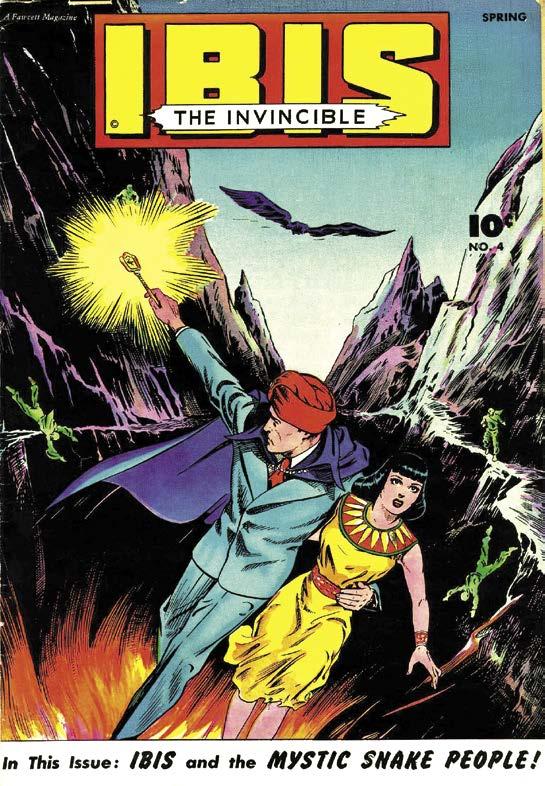
“Ibis The Invincible”: Ricca’s Mystical Masterwork
Of all the characters Ricca illustrated for Fawcett, perhaps none showcased his talents better than Ibis the Invincible. Created by Bill Parker and C.C. Beck, Ibis first appeared in Whiz Comics #2 (actually the first issue) in 1940. The character was an ancient Egyptian prince, reawakened in the modern world, who wielded
The Invincible Man
TwoMorrows needs your help!
DIAMOND COMIC DISTRIBUTORS FILED FOR BANKRUPTCY IN JANUARY without paying for our December and January magazines and books, leaving us with enormous losses— and we still have to pay the expenses on those items, and keep producing new ones. Until payments from our new distributors begin in the Fall, we’re staying afloat with WEBSTORE SALES
Every new order (print or digital) and subscription will help TwoMorrows get through this, and emerge even stronger for 2026. Please download our NEW 74-PAGE 2025 CATALOG and order something if you can: https://shorturl.at/gA9Fv
Also, ask your local comics shop to change their orders from Diamond to LUNAR DISTRIBUTION, our new distributor. We’ve had to adjust our release dates for the remainder of 2025 while we wait for orders from our new distributor, so you may see some products ship earlier or later than originally scheduled. We should be back to normal by end of Fall 2025; thanks for your patience!
the magical Ibistick, a talisman of immense occult power that he used to battle evil in his eternal war against the forces of darkness.
Ricca’s work on “Ibis the Invincible” allowed him to combine his classical art training with the dynamic needs of comicbook storytelling, a technique he called “The Ricca Method.”
As a freelancer making $16 per completed page from Fawcett, Ricca’s rendition of Ibis was a thing of terrible beauty—regal yet fierce, ancient yet full of life. It was a study in contrasts—the character’s royal bearing and ancient Egyptian aesthetics set against the backdrop of modern-day America. Ricca’s attention to detail in depicting Ibis’ attire, with its distinctive headdress and flowing cape, helped cement the character’s visual identity.
Ricca’s Ibis was a primal scream of creativity. His pages pulsed with raw energy, each panel a window into a world where magic crackled
IF YOU ENJOYED THIS PREVIEW, CLICK THE LINK TO ORDER THIS ISSUE IN
ALTER EGO #193
An abridgment of EDDY ZENO’s “Drawn to Greatness” book, showcasing Superman artists who followed JOE SHUSTER: WAYNE BORING, PAUL CASSIDY, FRED RAY, JACK BURNLEY, WIN MORTIMER, and others. With appreciations by ORDWAY, KUPPERBERG, ISABELLA, JURGENS, WAID, MACCHIO, NEARY, NOWLAN, EURY, THOMAS,