It’s a stunning, stop-on-a-dime image Sexy, scantily clad B-movie siren Allison Hayes is a giantess—fifty feet of female pulchritude, and she’s not in the mood to go clubbing. She’s very, very angry, straddling a highway overpass as she prepares to drop a car and its terrified occupants to the ground below. It’s not a photo and it’s not on film. It’s the poster created by Reynold Brown for Attack of the 50 Ft. Woman (1958) Brown’s unforgettable, iconic painting doesn’t even depict an actual scene from the film, but that doesn’t matter Movie posters were intended to lure patrons into theaters, and no artist could match the sheer immediacy of Brown’s work His art transcended all genres, but monsters became his metier Film historians and academicians link Brown’s posters to the angst and repression that pervaded America in the 1950s, but Brown dispelled that notion. He always viewed himself as a storyteller, and the posters he created for the horror genre wordlessly tell tales of terror that seduced and captivated monster mavens of all ages
William Reynold Brown was born on October 18, 1907 in San Gabriel, California. He and his two sisters were raised to appreciate art and culture, taught to play music and to paint and draw. From infancy, Brown took to drawing, scribbling illustrations with a pencil his mother tied to his hand. In elementary school, he filled notebooks with sketches of soldiers, aircraft, and weaponry. While in high school, he assisted Norman Rockwell with a cover painting for The Saturday Evening Post, an experience that profoundly influenced Brown’s artistic style and career path. In 1928, he began working with Hal Forrest, drawing and inking the popular Tailspin
Underpaid and overwhelmed, Brown left Forrest to create technical drawings for North American Aviation, where he devised three-dimensional cutaways (known as “phantom drawings”), which detailed both the inner and outer workings of the airplanes manufactured by North American. It was a brilliant concept, resulting in some of Brown’s most impressive early work.
Noirish Dread
In 1946, Brown and his wife Mary Louise left California to move to New York, where his career as a commercial illustrator truly began. He became a prolific and tireless cover artist for a panoply of popular periodicals, including The Saturday Evening Post, Popular Mechanics, and Life. His chiaroscuro-flavored interior drawings for magazines like Argosy were steeped in noirish dread. His covers boldly staged horrendous, nearly impossible catastrophes (his cover for the March 1948 issue of Popular Science shows a car and its petrified passengers careening off the top of a building).
Brown’s watershed moment as a poster artist occurred in 1951, when he met Universal Pictures’ art director Maurice Kallis (father of celebrated poster creator Albert Kallis). Impressed with Brown’s work for the Art Center College of Design, where Brown taught, Kallis commissioned him to design a poster for Universal’s 1952 production The World in His Arms. “He was very unsure about the whole thing,” recalled Mary Louise, “but they absolutely loved the painting and used it on the poster and that was the beginning of Reynold’s career as a movie poster artist.” The studio marveled at Brown’s facility for accurately replicating the faces and physiognomies of actors, but his most important stylistic contribution was his ability to depict furious, forward-moving action. His creative process involved examining a film’s script for action scenes, then using either still photos or his own imagination to conjure up the image of a monster or set piece. Pencil sketches would segue into India ink drawings which were then layered with watercolors until the desired nightmarish effect was achieved.
An Exploited Talent
Universal may have loved Brown’s work, but the studio exploited his talent with dirt-cheap checks that barely paid the rent (when Norman Rockwell rejected a $10,000 offer to create a poster for Universal’s 1955 film To Hell and Back, Brown took the assignment for a paltry $300). “Reynold
MARTIANS, MONSTERS and MAYHEM The Strange Saga of Mars Attacks!
by Steve Kronenberg
The tag line on a movie poster? The hype for some eagerly awaited TV show? Not even close. That titillating text appeared on the packaging for a pop culture phenomenon. In 1962, Topps Chewing Gum, Inc. made a bold move. After years of dominating the baseball trading card trade, the company hitched its wagon to an interplanetary invasion by releasing its gloriously gory Mars Attacks! card series. What Topps created became a legend: droves of kids eagerly traded their nickels for packages of these superbly drawn, garishly colored cards depicting malevolent Martians descending on and destroying planet Earth. Topps knew its audience— preadolescents with an affinity for horror films and outsized monsters. The goal of every Monster Boomer was to collect a complete set of all 55 cards, a daunting but worthy task. The front of each card displayed an unearthly, painted
scenario from the story, continuing sequentially with every consecutive card until the literally explosive conclusion. The back of each card revealed a textual description of the illustrated scene, gradually unfolding the narrative and urging fans to stick with the story and purchase the next card in the series. The painted cards were delightfully lurid: the Martians were hideous, bulbous-headed brainiacs; Earthlings were seen disintegrating from ray gun blasts; the invaders turned ordinary insects into gigantic carnivorous monsters with an appetite for humans. Blood and guts flowed freely from the start of the sanguinary saga to its furious and fearful finale on the planet Mars.
Mars Attacks! was the brain(iac)child of Topps creative directors Woody Gelman and Len Brown. They modeled the concept after H.G. Wells’ The War of the Worlds. What they came up with was more like The War of the Worlds on
steroids. The series was test-marketed as Attack From Space and sold for a penny a pack, but when sales took off, Gelman and Brown substituted the more exclamatory Mars Attacks!, upped the ante to a nickel a pack, and watched the cards fly off store shelves. The Martians’ general appearance was adapted from legendary artist Wally Wood’s cover art for EC Comics’ Weird Science #16 (November 1952), depicting a group of intergalactic invaders emerging from a spaceship after landing on Earth. Gelman and Brown copped the Martians’ exposed and bulging brains from the Metaluna Mutant in Universal Pictures’ 1955 science fiction epic This Island Earth. “Those big-brained aliens were the perfect inspiration for the Martians in our trading card series,” wrote Brown in his intro to the celebratory book Mars Attacks! (Abrams: 2012), released to commemorate the cards’ 50th anniversary. Gelman and Brown initially approached Wood to illustrate the cards (some of Wally’s roughs are shown above), but his artwork proved too subdued. “We required more drama and excitement to be sure to catch our young audience’s attention,” Brown wrote. “Each Mars Attacks card needed to achieve the impact of a paperback cover with a dramatic story clearly detailed at first glance.” Bob Powell, who penciled Topps’ 1961 Civil War card series, was tapped to conceptualize each Mars Attacks! card with tight 5x7 pencil sketches on illustration board. Powell’s work was then forwarded to renowned pulp artist Norman Saunders to paint over his pencils with gouache. Saunders’ work was breathtaking. “We were very lucky to have Norm working with us on Mars Attacks!,” recalled Brown. “I loved watching him paint over the Powell pencils. He created beautiful, colorful masterpieces working with a fine paint brush under a magnifying glass, filling each card with more and more dramatic detail.” Saunders’ patience was unshakeable: the original paintings for each card were smaller than the cards themselves, requiring a painstakingly deft and delicate hand. “I was able to do one-and-a-half cards a day,” said Saunders. Topps president Joel Shorin objected to the violence and scantily clad women featured on
While amusing, Pete von Sholly’s enlightening “Mars a Task,” from his book If Not Now, When? [below], reveals just how complex pre-production can be in the making of a film±certainly before CGI took a hold of the special effects in the industry. To bring Mars Attacks to the big screen was a step into the unknown, as evidenced in his sketch for one of these Martian
invaders. The original concept looked nothing like the Martians from the Topps’ Mars Attacks cards, who unbeknownst to Pete were poised to make their return, going on to reap a similar trail of large-scale havoc and destruction in Tim Burton’s 1996 film. Pete admits he was only playing with the ideas at this time, describing his doodles as nothing more than “a joke.”
Tim had been given a free rein with his proposals for what was going to be an amusing homage to the B-movies of yesteryear; so at that stage in 1995, there was already a plethora of ideas being thrown into the melting pot. If anyone understood the fundamentals of a B-movie, it was Burton, coming off the back of his tribute to the cult B-movie impresario Ed Wood in 1994—a fitting celebration of the man and his enthusiasm for these outrageous films, which in his hands became even more outrageous, as we shall see in a future issue of Cryptology
Maligned from the outset, Topps’ Mars Attacks cards didn’t last too long at the neighborhood store. The lucky ones were certainly picking them up as fast as they possibly could, but the controversy surrounding their graphic content resulted in this mind-blowing series being unceremoniously pulled from the shelves, so few kids away from the big cities ever got to see them. The upshot for those frothing at the mouth for more, was not a single toy manufacturer in their right mind was going to go anywhere near them. They were trouble, serious trouble. Much to their relief, the toy shop owners weren’t besieged by these Martian invaders and their deadly saucer machines. Nor was there to be any dodging of the ray guns and the giant insects they engineered, and as for the killer robots, there was no chance of them going on the rampage. The entire concept was dead in the water long before these searing works of art ever got the chance to ransack our towns and cities. For the few
who were lucky to lay their hands on these cards back in ’62, there was nothing, but nothing to follow by way of collectibles. Alas for the modern day vintage toy collector, Mars Attacks has drawn an absolute blank.
Those self-righteous propagandists, whose outcry precipitated the purge of these gruesome cards, soon forgot about them, but Mars Attacks never quite went away. The cards were reprinted in Britain between 1964 and 1965, although they were slightly smaller. They then returned briefly States-side with a re-issue in 1984, a decade prior to a further release, that was to add 22, and then in a subsequent release that same year, 23 more cards to a series now entitled Mars Attacks Archives. Finally in 1996 came the release of Tim Burton’s cinematic tribute to the genius of Woody Gelman, Len Brown, Bob Powell, and Norman Saunders. While Burton’s film divided fans of these spectacular cards, it was to spawn a wave of must-have memorabilia for a new generation of enthusiasts.
It’s arguably the most famous event in radio history. On October 30th, 1938, New York’s Mercury Theater broadcast live to air their interpretation of H. G. Wells’ The War of the Worlds, and what happened next is the stuff of legend.
There’s no doubt the broadcast caused concern and chaos among many listeners. Created to sound like a live documentation of a Martian invasion, with news flashes and updates, listeners who’d missed the beginning of the program had little to tell them this was a radio-play and not real events. Across the eastern seaboard some listeners panicked, with armed men heading out to hunt Martians, while families packed essentials so they could go into hiding.
The smirking devil behind the broadcast was Orson Welles, who faced an angry press the following day, claiming to have been unaware of the panic he’d caused. We now know the Mercury Theater had deliberately constructed the show to hit important beats at specific intervals, for example having urgent bulletins appear at the very moment other radio stations went to an ad. They knew listeners would likely be channel surfing for something else during this interval and would catch their disturbing broadcast. We also know Mercury’s producers were aware beforehand the potential public reaction they’d invoke, as everything they tried had been done before.
“COULD
ONLY HAPPEN IN AMERICA”
Newspapers across the world, such as the Melbourne Herald, reported on the event with a somewhat superior chuckle, claiming such a thing could only happen in the USA and never happen there. Well,
it turns out memories are short and some of those countries laughing should’ve looked into their own broadcast histories.
The first radio scare occurred on January 16, 1926. A BBC music broadcast from London’s Savoy Hotel was interrupted by a well-known public figure, Father Ronald Knox. In “Broadcasting From the Barricades,” Knox reported a crowd of unemployed men were rioting in London, having already destroyed Big Ben, stolen art from the National Gallery and captured the government minister for transport (the fictitious Mr. Wutherspoon), then hung him. There were realistic screams and gunfire in the background, making listeners grow so concerned they rang the police, offering help or demanding the Royal Navy send warships up the Thames to deal with this Bolshevik revolution.
The broadcast only aired for ten minutes and was clearly satirical. Many of the names used were fake, for example: “Mr. Popplebury, secretary of the National Association for the Abolition of Theater Queues.” It looks like people just missed the joke, and to make matters worse, it snowed heavily the next day, making it impossible for some newspapers to get their daily editions out. For many this was evidence the paper had been one of the places destroyed in the riots.
Just one year later, Australian audiences in Adelaide heard a disturbing report, and what happened next headlined the nation’s newspapers.
“Serious alarm was created on Thursday evening by a playlet broadcast by 5CL. Hundreds of people believed that it described the progress of an actual air raid, and telephoned to the newspaper offices, the police, harbors, and telephone departments, and the fire brigades for confirmation of the statement… The alarm was
so serious that many women fainted, and children became hysterical, until information was given out that it was all a hoax. The play caused the Port Adelaide police considerable trouble. It was taken as a news item by listeners-in, and they kept the officer in charge at the Port Adelaide police station busy answering inquiries as to what the sensation was” (The South Eastern Times, 5 July 1927).
Just like the Mercury production, both earlier broadcasts began with live music from a local theater, that was suddenly interrupted by the urgent news of enemy forces invading the region. What’s rarely mentioned was 5CL tried the same thing a week later. This time they broadcast a science fiction story about a Professor Graviotti, an Italian scientist who’d created a special flying car, which he drove to Mars. “At an advertised time… Listeners were then told to watch the sky above the city of Adelaide for the departure of the machine. Many saw the large rocket sent up… to heighten the allusion” (Port Pirie Recorder, 8 July).
Never in New York
A decade before Orson Welles, and using many of the same techniques, an Australian radio station had panicked the local population with a tale of military invasion, then followed it up with a visit to Mars. Significantly, all of this was well documented in the New York Times (July 2, 1927).
“AIR INVASION BY RADIO SCARES
AUSTRALIANS”
“… so realistic was the play broadcast from 5-CL radio station here representing an imaginary aerial invasion that many women and children became hysterical and even men were alarmed… Numerous protests have since been made that the announcements regarding the stunt were not sufficiently definite, but those responsible for the broadcasting maintain that due warning was given of a dramatic surprise which would be introduced in consequence of complaints received from listeners against the sameness of the programs. This is the second time within eighteen months that British broadcasters have nearly caused a panic by the realism of mimic catastrophes broadcast to credulous listeners-in.”
Embarrassingly, the paper earlier had boasted in “we are safe from such jesting” (Jan. 19, 1926) a similar scare could never happen there, as they had many more radio stations than these commonwealth nations.
More evidence the Mercury knew what they were doing appeared on July 7, 1967, when the BBC reporter Leonard Miall interviewed the Mercury’s true creator.
“…John Houseman, who is now the Director of the Juilliard Drama School at the Lincoln Center for the Performing Arts… In 1938 he was the partner of Orson Welles in the Mercury Theater. Houseman, as a boy, had been in school in England and had remembered a production he had heard on April 16, 1926…
…Father Ronald Knox’s famous broadcast… was so vivid that it caused a major alarm all over the country. Houseman was therefore well aware of the kind of panic
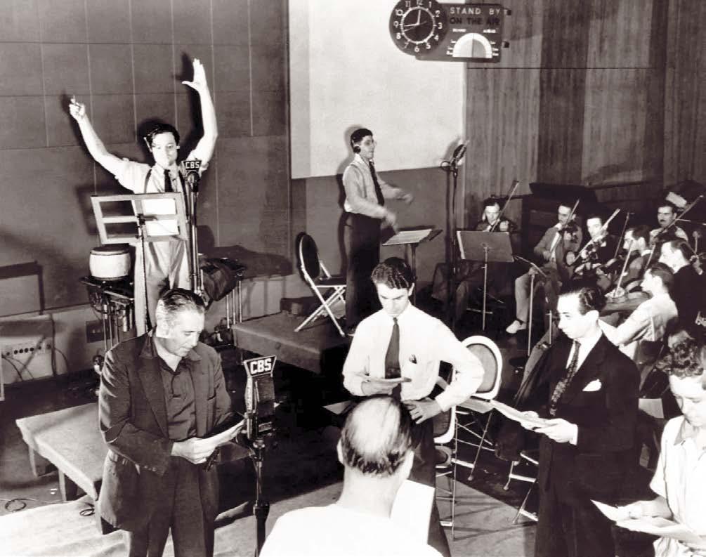
WAR OF THE WORLDS BROADCAST
The stage was set for Orson Welles’ War of the Worlds broadcast from New York’s Mercury Theater. Copyright of the respective owner.
THE OTHERWORLDLY ART OF HENRIQUE ALVIM CORRÊA A Martian Portfolio
by Peter Normanton
It is impossible to underestimate the role played by H. G. Wells’ earth-shattering The War of the Worlds in the shaping of Mars Attacks. During the course of his narrative, Wells made clever use of the contemporary fascination with science and technology, the curiosity for which had slowly evolved over the best part of half a century. In the same way, Mars Attacks picked up on the technology of its day, astounding those who saw these cards with rocket ships lifting men into space, while horrifying with deathly weapons of mass destruction. These advancements were paramount to the design of this series.
In their clearly impossible conflict with the highly developed Martians, Mars Attacks drew much influence from Wells’ novel, which if it wasn’t the first, was certainly one of the earliest encounters with the war-like denizens of Mars. War of the Worlds, however, was the first of its kind to make the terrifying events it detailed appear as if they were actually happening, a ruse that would pave the way for others, as we have just seen. It would also stir
considerable thought and creativity in others of a similarly imaginative persuasion.
Following its serialization in Pearson’s Magazine and Cosmopolitan in the United States in 1897, an expanded and revised edition of The War of the Worlds was published in 1898 by William Heinemann, bringing its content to a far larger readership. Just a couple of years later, it was translated for an expectant French audience by the respected Henri-Durante Davray. Among those who succumbed to the resonance in Wells’ words was a young artist by the name of Henrique Alvim Corrêa, an aspirant whose legacy would excite writers, artists, and filmmakers alike for generations to come.
Born in Rio de Janeiro, Henrique had moved to Paris with his family after spending a short period in Lisbon. While in Paris, he studied art, his military-styled paintings gaining recognition in the gatherings of the Paris Salons between 1896 and 1897. Those around him anticipated a distinguished career ahead, but none of
Flash back to the early 1950s, when horror comics permeated newsstands and eager kids were willing to give up a dime for cheap chills. No one delivered the goods better than Bill Gaines, whose EC Comics bundled a triptych of terror: Tales from the Crypt, The Vault of Horror, and The Haunt of Fear. What kept EC at the head of the pack was its imaginative stories and its bullpen of brilliant artists. Case in point: “The Basket,” an especially grisly entry in Haunt of Fear #7 (May–June 1951), written by Gaines’ collaborator Al Feldstein and illustrated by the multi-talented Jack Davis. It’s a gloomy tale focusing on a character named Vincent Cabez. He resides in a small village, and he’s the talk of the town because he’s never seen without a basket perched over his right shoulder. Locals wonder what’s inside of it, especially when Cabez’s physical appearance begins to deteriorate, and
his usually sunny demeanor becomes hateful and violent. The blame lies within the basket: what it’s hiding is a second, malevolent head that grows out of Cabez’s shoulder and is slowly taking over his body and persona. The story ends with the tortured freak committing suicide with a shotgun blast.
Comic book buyers loved “The Basket;” bluenosed parents and politicians were shocked by its downbeat plot and violent graphics. What’s even more shocking is why it took so long to adapt Feldstein’s idea into a horror film. That finally happened with The Manster (1959, released in the US in 1962), a JapaneseAmerican production co-directed by George Breakston and Kenneth G. Crane. The psychotronics are set from the get-go with a pre-credit sequence depicting a shaggy, ape-like creature attacking a group of geishas and leaving a bloody streak across the screen. Veteran British actor Peter Dyneley plays Larry
a REQUIEM for CHARLTON HORROR a REQUIEM for CHARLTON HORROR
By Will Murray
CPart 1
harlton Comics was the last survivor of the off-brand newsstand comic book companies that had managed to keep on going until the 1960s, with some lasting into the ’70s, after the industry-wide shakeout of the 1950s had left less than a dozen publishers still actively producing. A bottom-of-thebarrel publisher, the outfit specialized in generic-specific anthology titles, with one of their mainstays being horror comics. Their strengths were their weaknesses and their weaknesses proved to be strengths. They were survivors for all the wrong reasons, until finally their business practices caught up with them.
Charlton entered the new decade of the 1970s in an expansive mode after the 1966-68 “Action Heroes” debacle, which saw the collapse of the fan-favorite line and the loss of new editor-in-chief Dick Giordano to DC Comics early in 1968. During the “Action Heroes” period, Giordano seemed content with Charlton’s two fantasy-supernatural titles, Ghostly Tales from the Haunted House and The Many Ghosts of Dr. Graves. Both titles focused exclusively on manifestations of the supernatural. Other than the differences observed in the personalities of each title’s hostnarrators, Mr. L. Dedd and Dr. M. T. Graves, the stories were largely indistinguishable.
Coincident with Giordano’s departure, Ghostly Tales went monthly, and Charlton added their third title, Ghost Manor, which debuted with a July 1968 cover date and a cover by veteran Charlton artist Rocco Mastroserio. Compared to the other supernatural titles, Ghost Manor was a lackluster package. While it was probably conceptualized by Giordano, his replacement, Sal Gentile, edited it from its debut.
Ghosts, Demons and Apparitions
These three titles continued steadily as the 1960s shaded into the 1970s. Readers were fed a diet of ghosts, demons, and similar apparitions, invariably colored green when they were presented on the covers, a comic convention going back to the defunct American Comics Group, if not before. Most of it was competent, but little was memorable.
Occasional scripter Paul Kupperberg lamented of his own Charlton work. “There’s not a single thing in any of the stories you haven’t read before,” he confessed. “They’re all straight O. Henry twist endings that anyone paying half a mind could see coming from a mile away. A lot like many of the other tales in the Charlton books, but it’s the type of stuff you write when you’re either young and inexperienced or they’re not paying you enough to think beyond cliches and retreads.”
This was the state of creativity at Charlton during most of its tenuous existence. For many years, one inhouse scripter penned over 90% of their comics, his tales crossing a variety of genres: veteran Joe Gill. “At Charlton,” said Gill, “[publisher] John Santangelo was underpaying artists and writers, and practically anything that artists and writers did was acceptable. There was very little criticism. The idea was to get the books out, and nobody at Charlton seemed to give a damn how good they were!”
Shoddiest Comics
During this period, Charlton and Martin Goodman’s nameless pre-Marvel company vied for the dubious distinction of producing the shoddiest-looking comic books in a faltering industry, drawn by artists the more mainstream companies would not hire.
“They bought the cheapest ink, they had used presses that printed badly,” insisted Joe Gill. “They had the worst distributors. Charlton had Capital Distribution, and they didn’t have any roadmen at all. So we could be publishing the best comic books in the field, and we still wouldn’t be selling because they offered no inducements.”
A huge change took place at the top of 1971. The Comics Code was revised to permit previously taboo creatures, such as vampires, werewolves and sundry others—although zombies were still explicitly prohibited. Suddenly, Satan under his many aliases popped up in horror titles as a character or plot device, rapidly becoming a cliched crutch for lazy writers.
This opening triggered a resurgence in classic horror comics. Charlton jumped in with both feet. With issue #20, September 1971, the limping Ghost Manor was retitled Ghostly Haunts. Simultaneously, Charlton launched Haunted and a month later a new incarnation of Ghost Manor was released, starting all over with #1.
Midnight Tales appeared at the end of 1972. A gothic hybrid called Haunted Love followed
For collectors and researchers of old films, many have remained elusive, frustrating the efforts of those attempting to uncover their whereabouts. Celluloid collectors and scholars alike have gone to great lengths to locate the censored half of Erich von Stronheim’s Greed, its first cut said to run to 10 hours; the pornographic short with Disney characters that was shown at a studio party as an inside joke (Uncle Walt promptly fired the two men responsible); a large part of the filmography of Theda Bara, the first great femme fatale of silent cinema; and a long etcetera of cinematographic material, largely from the silent era. Some searches have been successful: in Cuba, a copy of the 1931 Hispanic version of Dracula finally came to light, then not so long since scenes cut from Fritz Lang’s Metropolis were discovered in Argentina.
However, there are still so many films that are ostensibly lost to posterity.
Among the missing, London After Midnight, directed by Tod Browning and starring Lon Chaney, has become one of the Holy Grails of lost cinema.
At the box office, it was one of the most successful collaborations of its day, an accomplishment which has since aroused the interest of those intent on tracking down this enigmatic silent. As we shall later see, as profitable as it may have been, the critics of the day were far from being universally appreciative in their reception. Browning and Chaney may have cut fine figures in the Hollywood of the Roaring Twenties, but this wasn’t about to save them from the wrath of these newspaper columnists.
CINEMATIC PUPPET TERROR
by Peter Normanton
Just a word of warning—even the most ardent horror fan can be creeped out by these wooden dolls; their overly exaggerated features exacerbated by the strange glint in their eyes imparting the impression of a human grotesque. In the next few pages you will discover these creations have minds of their own, their intent anything but wholesome. Be they puppets, dolls, marionettes or ventriloquist dummies, their unsettling demeanor drags us back to that part of childhood we had hoped to forget.
For almost 60 years the dolls that inveigled their way onto the cinema screen were waged in a bizarre conflict with their
masters, a succession of puppeteers and ventriloquists worn down by their psychological trauma. On each occasion, these surreal struggles would leave the audience guessing as to which of them held the upper hand. This rationale took precedence until 1988, when Tom Holland introduced his malevolent creation Chucky to the world, in his landmark film Child’s Play. Tom wanted nothing more than to make a horror movie, but he inadvertently spawned an entire franchise, with his evil progeny serving as the curtain-raiser for the modern day killer-doll. From thereon, puppets and ventriloquist’s dolls alike would become susceptible to possession by forces beyond
our mortal ken, conferring them the means of inflicting horrors of the foulest kind on those who crossed them. However, Child’s Play wasn’t the first of these films to flirt with the malfeasance of possession, or the violence in these creations, but with Tom pulling the strings, it was escalated to a whole new level.
Many years before Chucky stole onto the scene, The Great Gabbo, played by Erich von Stroheim, who also co-directed this film alongside James Cruze, first exposed the cinemagoers to a doll with seeming lifelike qualities. It was way back in 1929 when this ventriloquist’s fall guy, Otto, was stirred into life as his self-serving master lost his grasp on reality. While neither von Stroheim nor Cruze had set out to make a horror film, the mocking visage of Otto would become the stuff of darkest nightmare for many of those in the auditorium.
As a director, von Stroheim was perceived as a man of vision, but his
unwillingness to compromise was a bone of contention with the studio heads. In spite of this, his contribution to cinema is beyond reproach, a legacy little Otto would be hard pushed to deny.
The Dread Fitch
Otto’s performance would prove the inspiration for the most influential of these unnerving dolls, Hugo Fitch, the devious dummy from the anthology terror Dead of Night, released by Ealing Studios in 1945. The audience had to wait until the final part of this feature, directed by Alberto Calvalcanti, before they made the acquaintance with this rueful little chap, although many of them would wish they never had. Up until this point the film had certainly chilled, but no one could have counted on the machinations of Hugo Fitch and the consequent demise of Maxwell Frere, played by Michael Redgrave. The audience was left to ponder whether Maxwell really was stricken by a split personality, or was there something much more sinister about the grinning Hugo? While locked away in the confines of their prison cell, Hugo began to adopt an uncanny veneer of life; there really was something altogether too realistic about him.
There were some stellar performances throughout, but it was the caustic figure of Hugo Fitch that was to endure. For all this, Dead of Night wasn’t a success; its failure quashing any plans Ealing Studios had for a return to horror. Yet, Dead of Night’s anthology format provided the model for the memorable Amicus horror portmanteaux of the late ’60s and early ’70s.
The B-movies of the 1950s should have been the perfect vehicle for these deathly dolls, but it wasn’t to be. Hugo Fitch’s ghastly performance looked to have put the
Amore shocking title you weren’t likely to see during the pre-Code craze for horror comics, one that willfully incited these deranged puppets, marionettes, dolls and dummies to revel in their bloodthirsty intent. Strangely, this incendiary appellation was the brainchild of a company never entirely at ease with the excess of these years, the American Comics Group, published as early as the second issue of their pioneering terror Adventures into the Unknown, dated December 1948–January 1949. The lunatic puppet master observed in Frank Belknap Long’s “Kill, Puppets, Kill!” displayed the traits evident in the maniac toymaker from Stuart Gordon’s film Dolls, released in 1987. As you can see here, the dramatic splash page for this nasty little offering didn’t
spearhead for the murderous spree upon which these vicious dolls were about to embark, beginning with the strangulation of the woman who had spurned their master’s advances, as a prelude to their returning through the years to continue in their relentless slaughter. As with so many of these comic book puppet terrors, Long’s creations had more in common with the violent farce of a seaside Punch and Judy show than the mental deterioration observed in Ealing’s Dead of Night; it was the devilish spectacles of this ilk that would have the kiddies demanding even more.
The boom in horror comics may have been a little way over the horizon, but with only its second appearance, Adventures into the Unknown had shown just how extreme this new breed of comic book could be. These macabre manifestations of puppetry gone astray had already been evidenced in the pulps, most notably on Paul Wesso’s cover for William
DIAMOND COMIC DISTRIBUTORS FILED FOR BANKRUPTCY IN JANUARY without paying for our December and January magazines and books, leaving us with enormous losses— and we still have to pay the expenses on those items, and keep producing new ones. Until payments from our new distributors begin in the Fall, we’re staying afloat with WEBSTORE SALES
Every new order (print or digital) and subscription will help TwoMorrows get through this, and emerge even stronger for 2026. Please download our NEW 74-PAGE 2025 CATALOG and order something if you can: https://shorturl.at/gA9Fv
Also, ask your local comics shop to change their orders from Diamond to LUNAR DISTRIBUTION, our new distributor. We’ve had to adjust our release dates for the remainder of 2025 while we wait for orders from our new distributor, so you may see some products ship earlier or later than originally scheduled. We should be back to normal by end of Fall 2025; thanks for your patience!
Clayton’s March 1932 edition of Strange Tales. Wesso, who had jumped ship in New Orleans after becoming disillusioned with his life as a merchant seaman, was to become one of the leading pulp artists of his day. His spine-tingling imagining was later used by LB Cole in his arresting cover for Continental’s Suspense Comics #7, dated December 1944, then by Paul Gattuso for his depiction of a diabolical puppet master on his cover for Dynamic Comics #19 in July 1946.
IF YOU ENJOYED THIS PREVIEW, CLICK THE LINK TO ORDER THIS ISSUE IN
Such perturbing puppet play was a rare event in the comic books of the Golden Age; this would change following the advent of the horror comic. “Kill, Puppets, Kill!” didn’t quite set the ball rolling for these odious puppets, but that would soon change.
An Innocent Doll
CRYPTOLOGY #3
When they put together their ideas for Prize’s horror title Black Magic, Joe Simon and Jack Kirby were determined to explore the more psychological aspects of horror, following in the footsteps of Dead of Night. They also introduced a disturbing doll in the debut of their new title, cover-dated October-November 1950. “My Dolly is the Devil,” rendered by Leonard Starr, adhered to this psychological approach, carefully escalating the tension in the wake of a series of accidents sequent to the arrival of an innocent little doll. The finale, which replicated the horror on Jack Kirby’s cover, may not have resorted to the grisly overkill of its contemporaries, but the reader was left in no doubt as to the horror at hand.