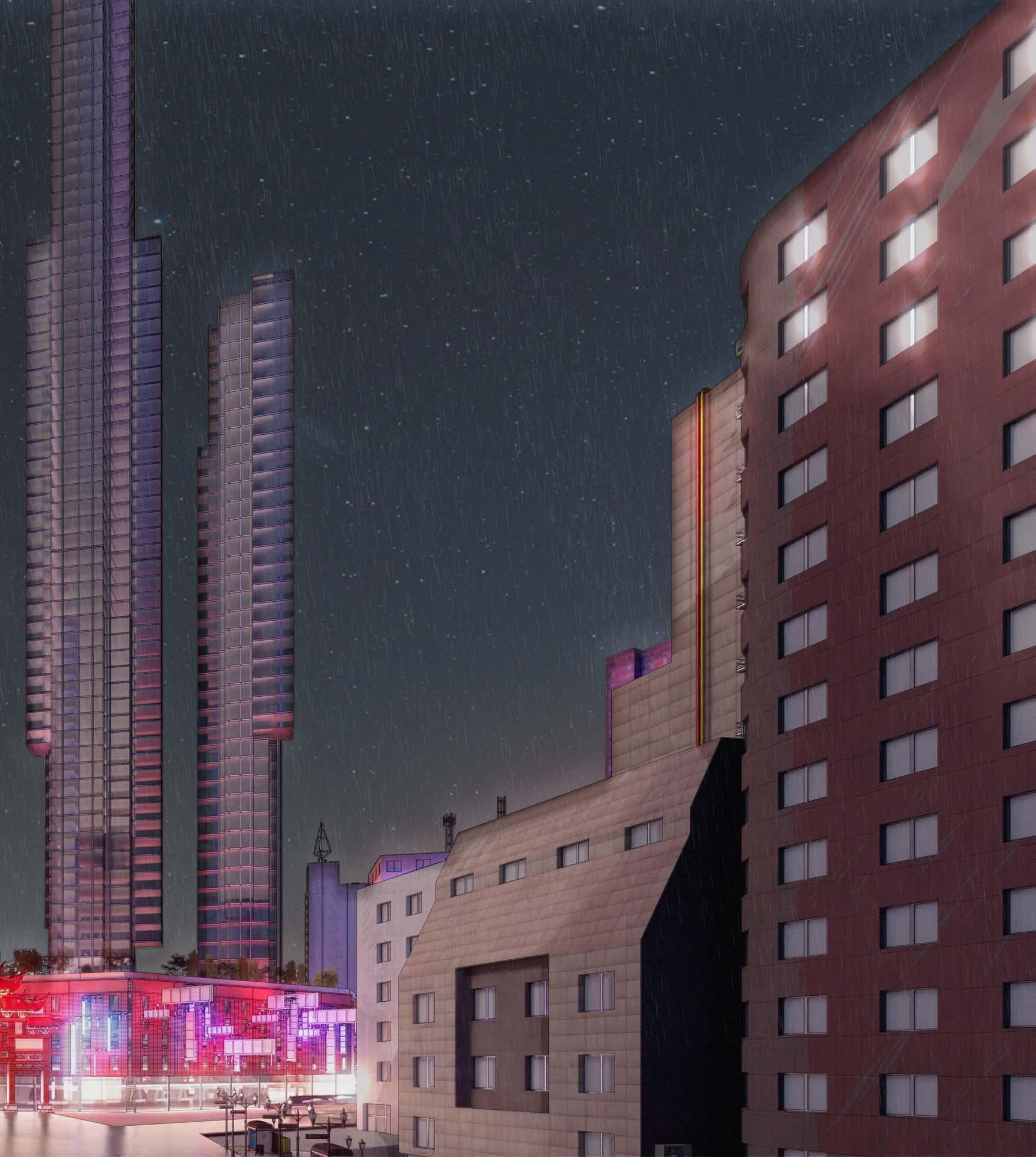
RE-IMAGINING CHINATOWN -

ANSON HAU -
UNIT Y5 AH
YEAR 5 @unit14_ucl
All work produced by Unit 14
-
www.bartlett.ucl.ac.uk/architecture
Copyright 2021
The Bartlett School of Architecture, UCL All rights reserved.

No part of this publication may be reproduced or transmitted in any form or by any means, electronic or mechanical, including photocopy, recording or any information storage and retrieval system without permission in writing from the publisher.

@unit14_ucl
 Cover design by Charlie Harris
ansonhau27@gmail.com @anson.rsrch


RE-IMAGINING CHINATOWN
A MULTICULTURAL HUB
MANHATTAN CHINA TOWN, NEW YORK, U.S.A.
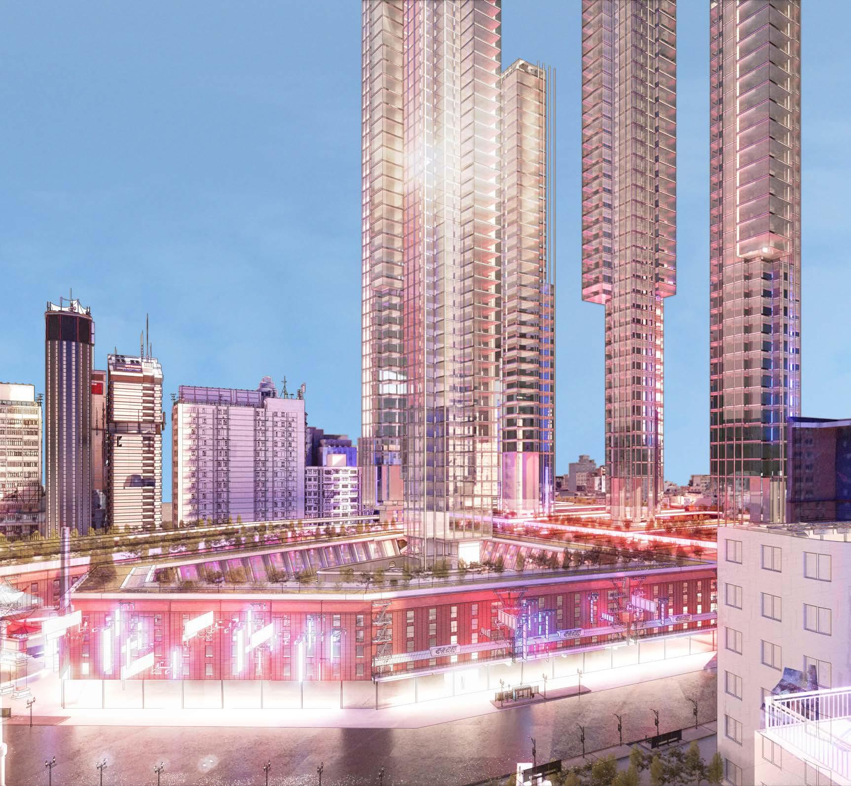
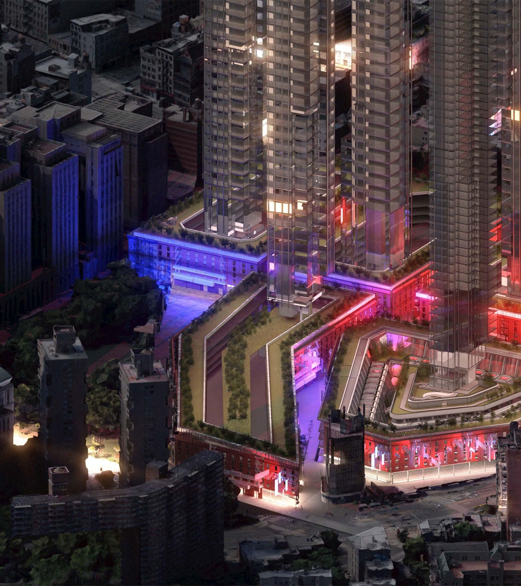
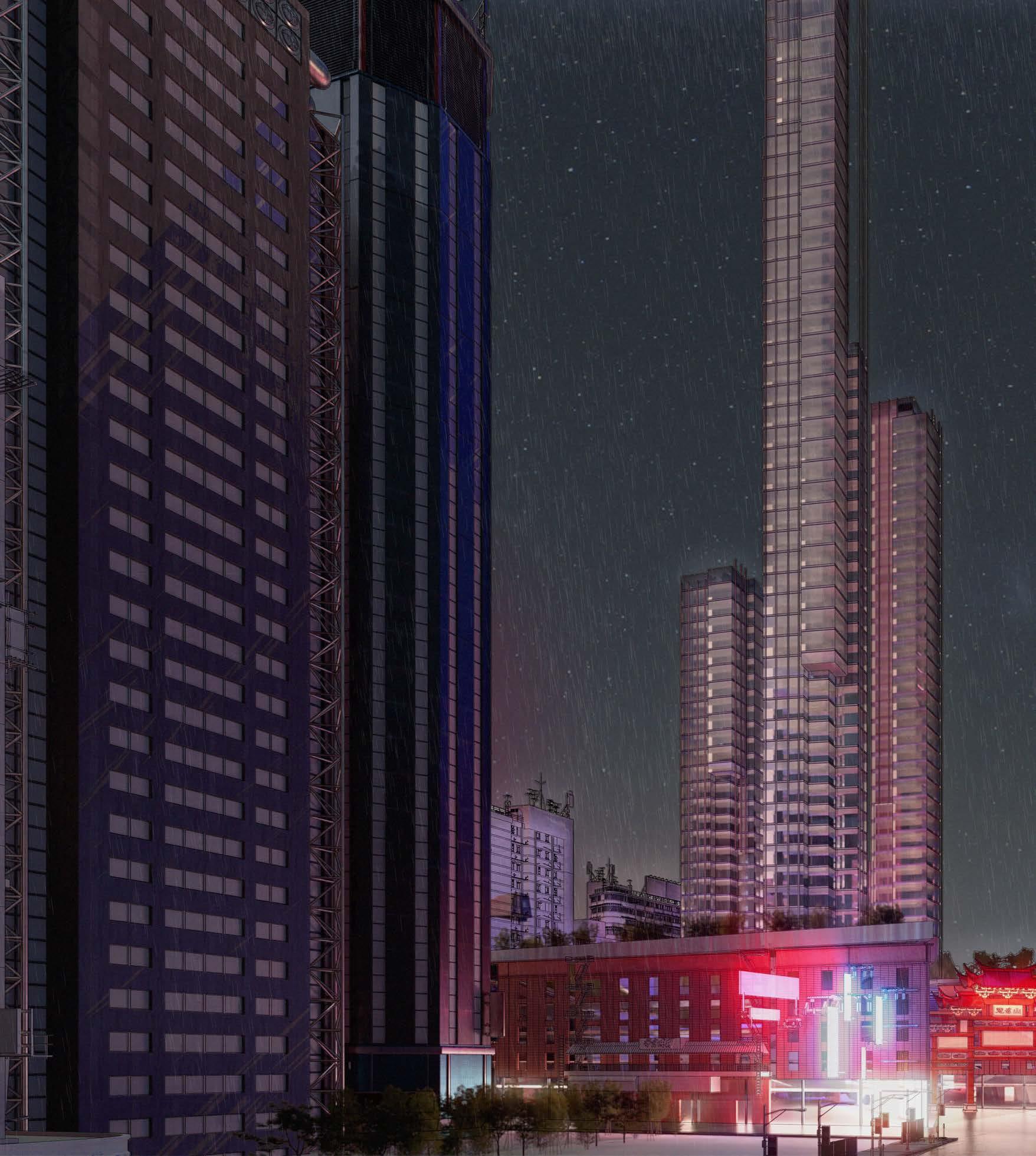
The project speculates that Chinatown New York returns to the ownership of the Chinese Party, in a mutual territory trade between the US and CN. This applies a new set of planning and building rules within downtown Manhattan. This exchange between two nations would provide development for an underdeveloped area within New York City, while also providing cultural and economic values to local communities.
The negative portrayal of colonialism is questioned along with notions of territorial dynamics and borders. Colonies have resulted in many collisions of culture, resulting in interesting new topologies ranging from pop culture to architecture. Using examples such as Hong Kong and New York as thriving and successful cities due to the result of it being colonies. Interestingly, colonial methods also present a set of new rules set and borders which directly informs design and planning of a space. As China Town is returned to the Chinese Party, its borders have now become a constraint, yet capacity must increase for the influx of citizens
and workers. A key design objective is to increase capacity of Chinatown within its existing borders. By comparing vertical envelopes of NYC and CN a proposal will be formulated. The principles in will follow notions discovered from initial Artefact research while applying Chinese planning and building rules bringing a new architectural topology to the proposed site of China Town.
ANSON HAU YEAR 5
Y5 AH

01 Research Topic and Artefact Research
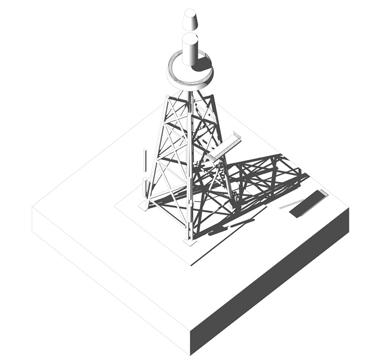
Artefact Research - 1.0

Offshore Oil Rig Artefact

Conclusion :
The offshore oil rig study brought forward the notions of structural purity and integrated infrastructure. The artefact itself does not provide opportunities for architectural and spatial development.



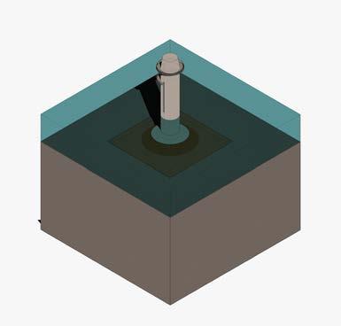
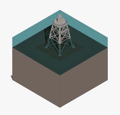
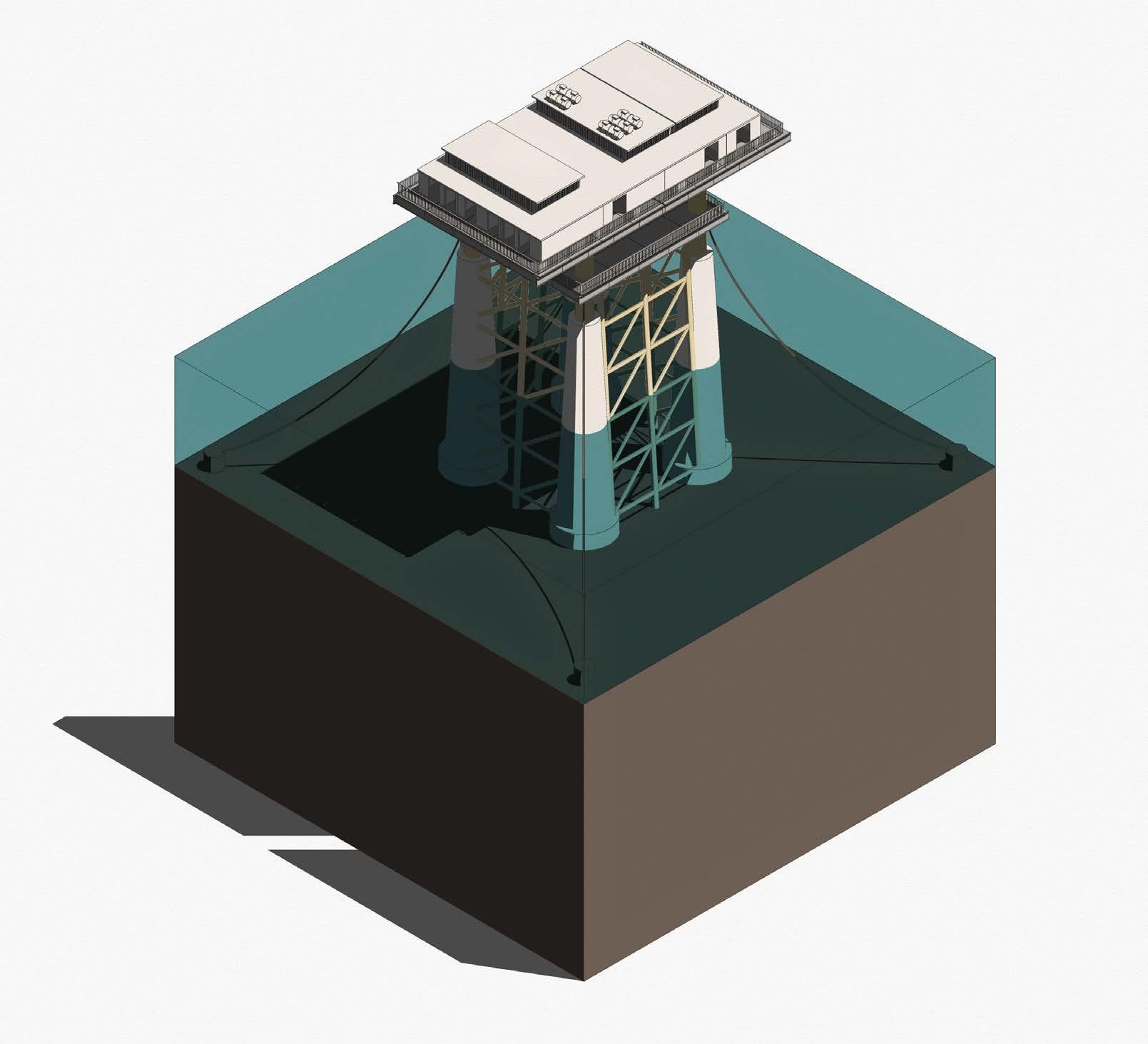
1 Tower 2 Work platform 3 Transition 4 Scour Protection 5 Mono pile 1 Tower 2 Work platform 3 Externa J Tube 4 Pile Sleeve 5 Mud Mat 1 2 4 3 5 1 2 4 3 5 1 Tower 3 Shaft 4 Scour Protection 5 Skirt 6 Concrete Layer 1 2 4 3 5 6 1 Tower 2 Work platform 3 Shaft 4 Scour Protection 5 Suction Bucket 1 2 4 3 5 2 Work platform
Conclusion :
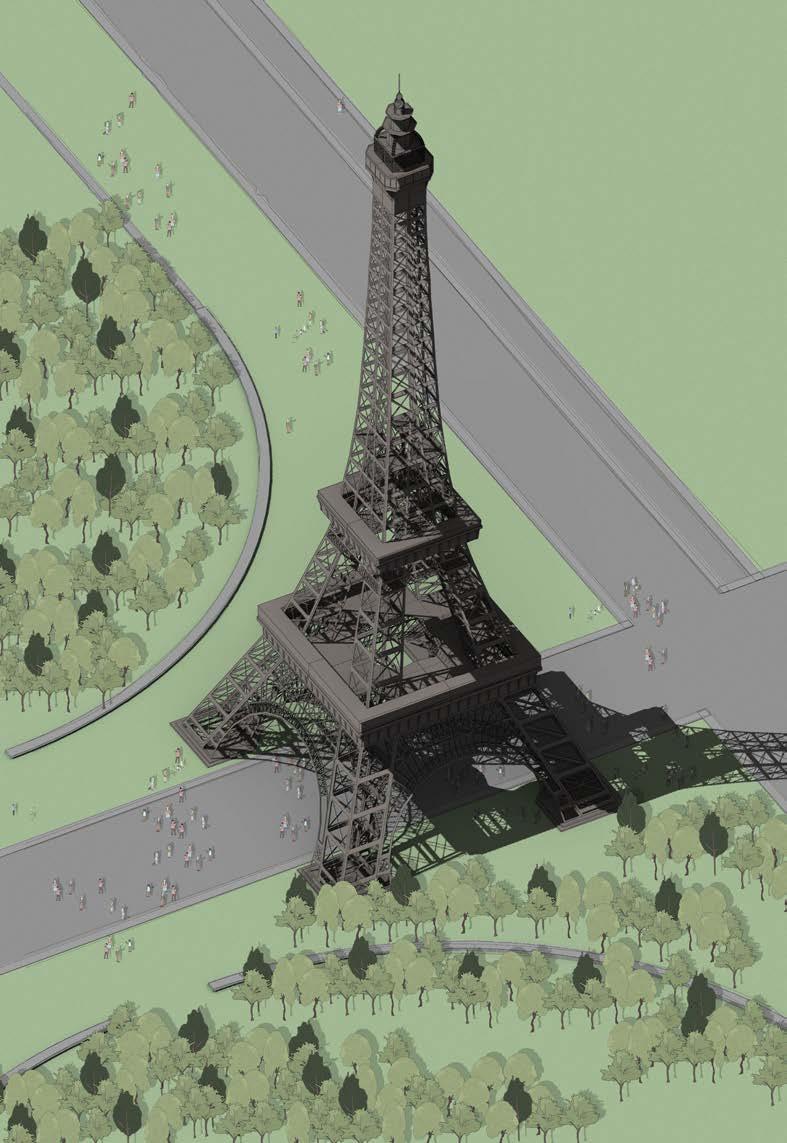
The Eiffel tower was explored as a the second artefact as it presented architectural ambition and opportunity, while also displaying structural purity and clarity, similar to what the oil rig presented.
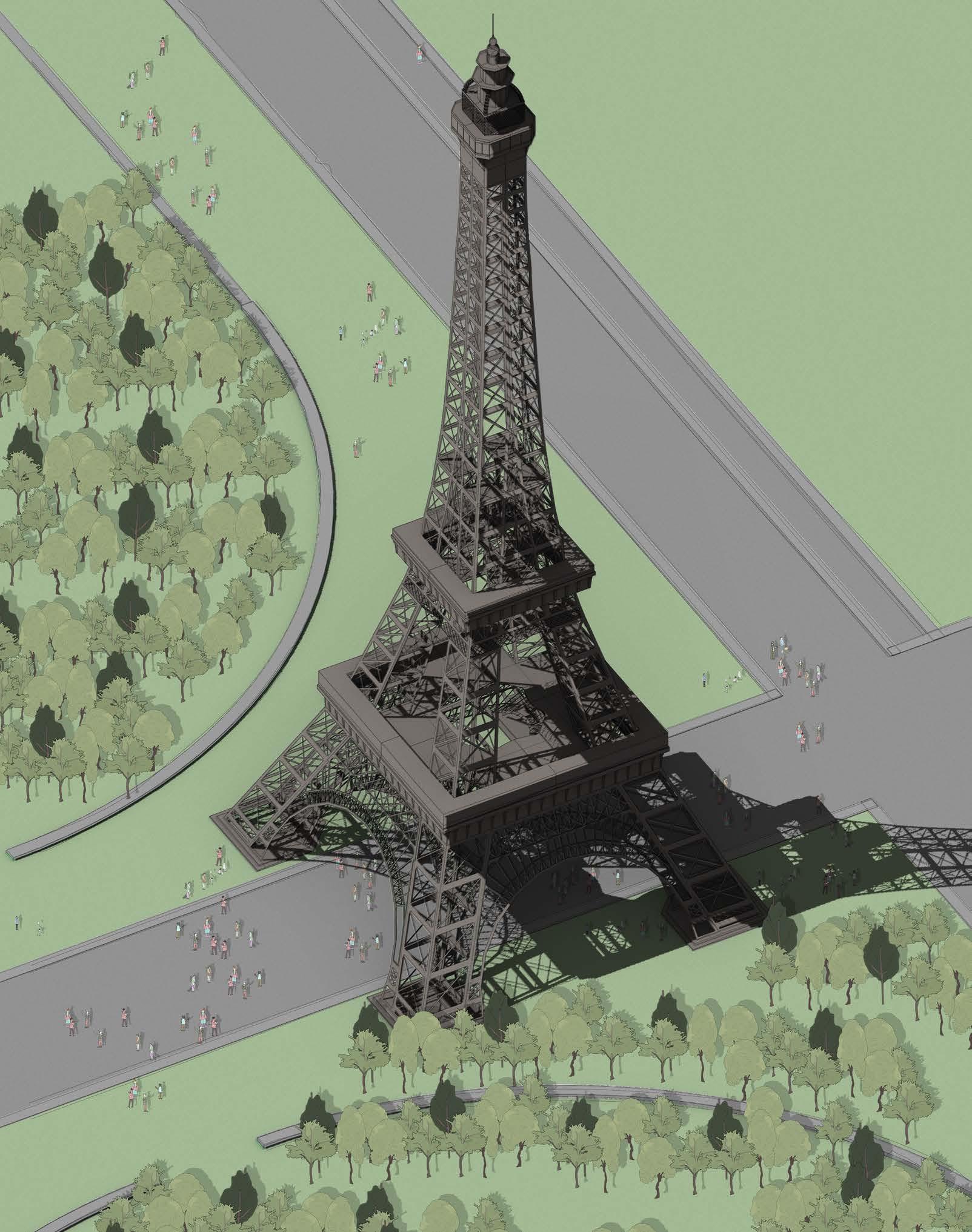 Civic Structures as Cultural Icons
Eiffel Tower Artefact
Artefact Eiffel Tower
Artefact Research - 1.1
Conclusion : Another aspect which came with the architectural opportunity that the Eiffel tower presented was its cultural impact. The notion of cultural and historic impact will be further explored in parallel with structural purity and clarity.
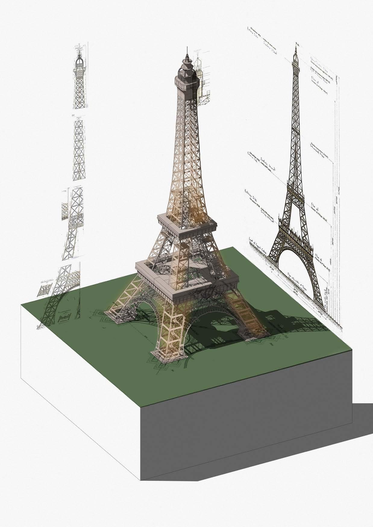
To understand how pure structural elements became artefacts with such heavy impact on local culture, the axonometric displays how spatial conditions are generated through the structural design, how these rigid spaces are occupied
Foundation Spatial Axonometric
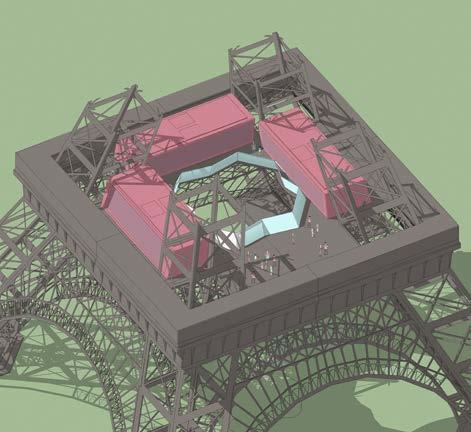
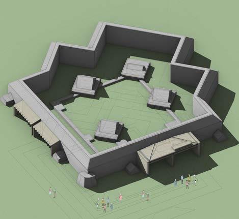
Eiffel Tower - Detail Axonometric
1 2 1
2 First Floor Spatial Axonometric
Research - 1.1 Eiffel Tower Artefact Analysis
Artefact
Artefact Research - 1.2
Galerie des Machines Artefact
Conclusion :
The gallery of machines displays qualities from notions discovered thus far. (Structural purity, Culturally important, Architectural opportunities and civic ambition.
Artefact Galerie des Machines
Conclusion :
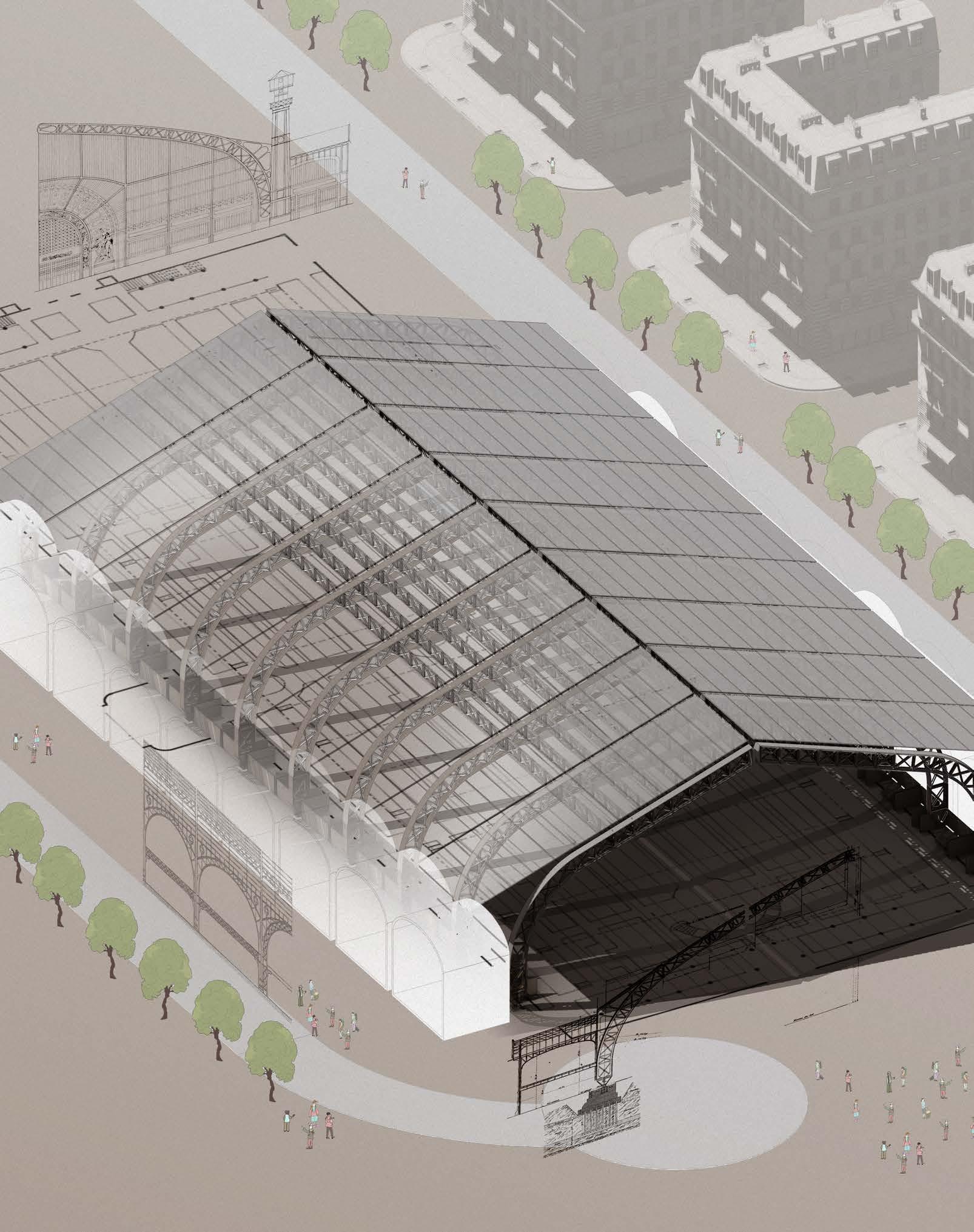
The Gallery of machines revealed the notion of integration of technology at a infrastructural level while also showing architectural ambition. A key notion discovered within this artefact study is the interface which structure provides for architectural programme .
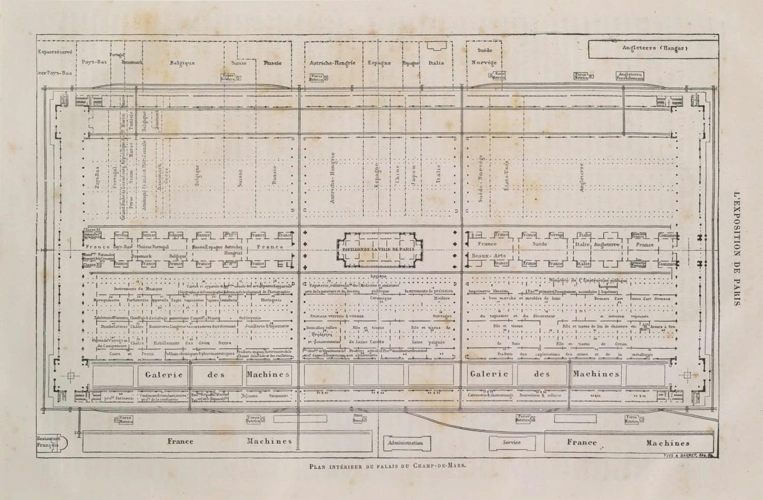
Spacing between primary structural members is show to have dictated spatial layout during general usage of the building. Structural grid has directly affected the general arrangement of the interior space. Bringing forth notions of structure and programme interface
Spaces between each structural member is utilized as exhibition zones. These bays are echoed throughout the entire plan.
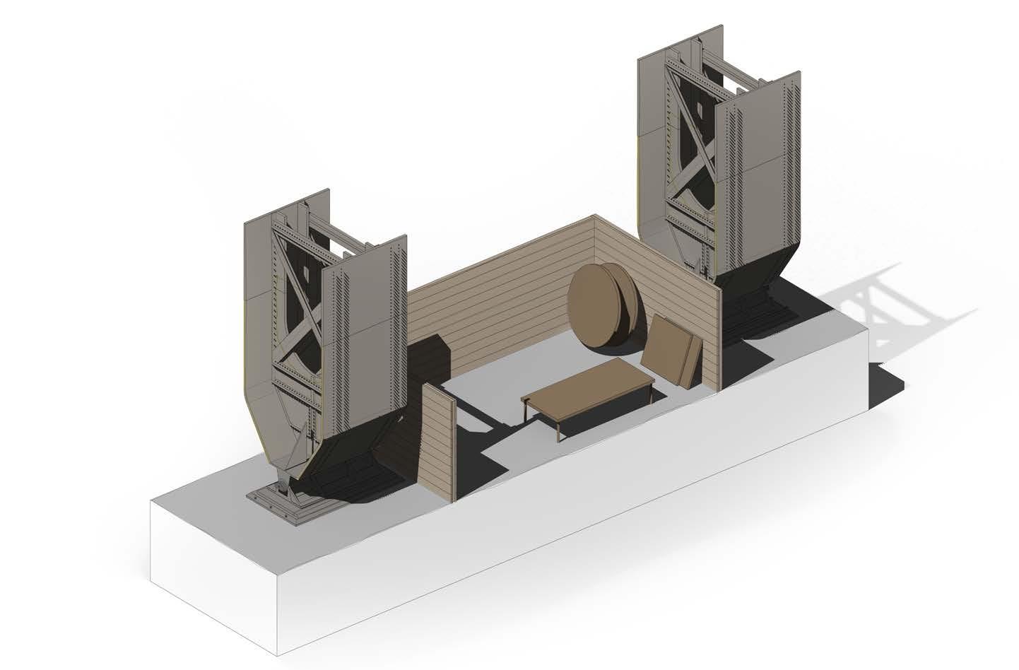
Artefact Research - 1.2 Galerie des Machines Analysis
Artefact of Gallery of Machines - Displaying its structural clarity and architectural ambition. The central structure provides a interface for programming such as display stalls. The diagram displays all of the revealed notions within one fragment.
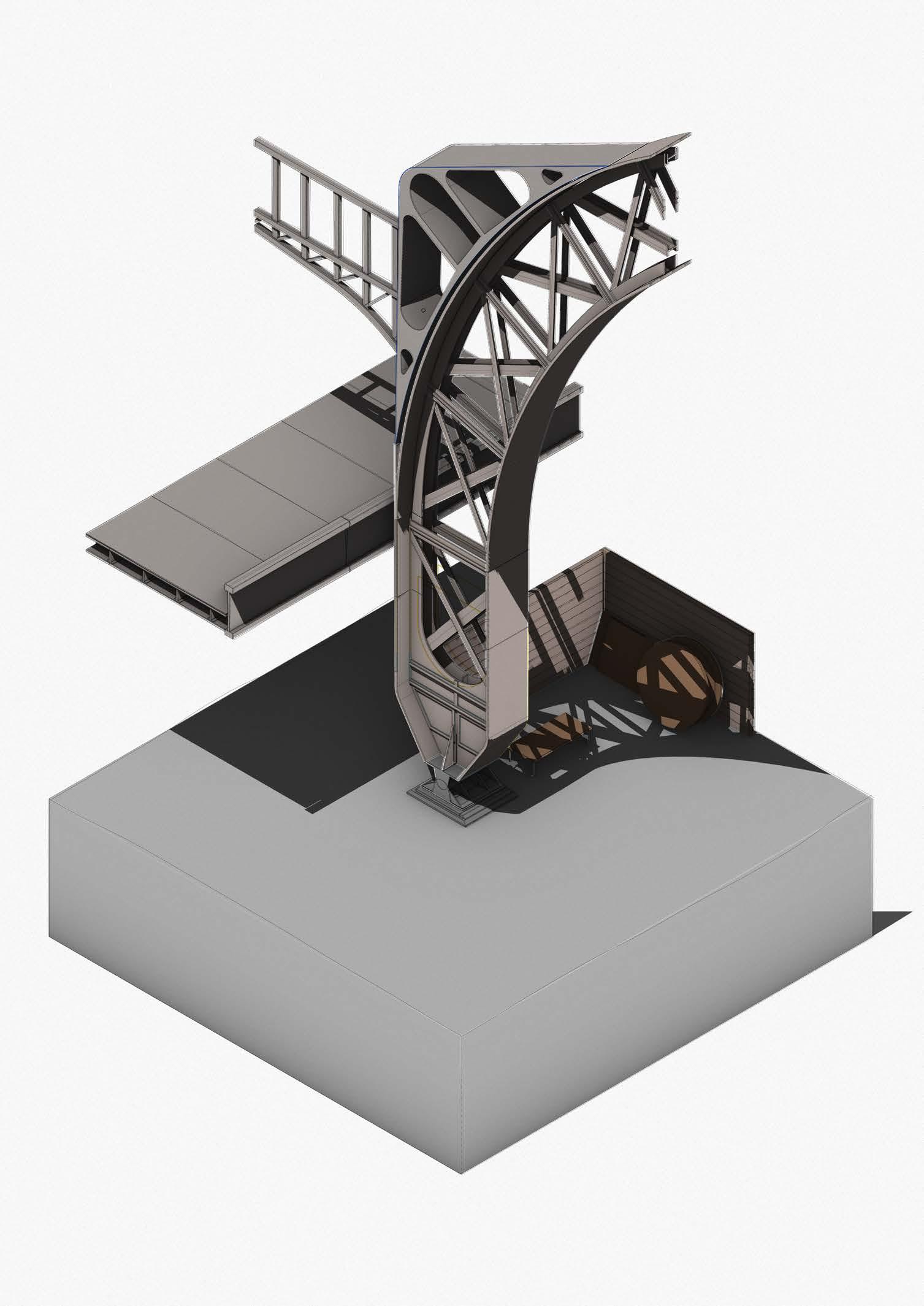
Artefact Research - 1.2 Galerie des Machines Analysis
Conclusion of Artefact Research
Notions discovered: (1)Structural Clarity and Purity, (2)Architecture with Civic Ambition, (3) Technological Integration, (4) Structural and Programme Interface
Large scale infrastructure is designed often catering to its specific time period, with no foresight into the future of its lifespan, the example artefacts has made it evident. An example being 20th infrastructure designed catering to cars and buses, yet in the 21st century many of these are being converted into bike lanes, parks and pedestrian walkways.
What would the future of infrastructure and large scale monuments look like? To keep the notions discovered from the artefacts while also synthesising urban and technological dimensions of modern day design values. In the next section we will look towards New York City and the development of its Piers.

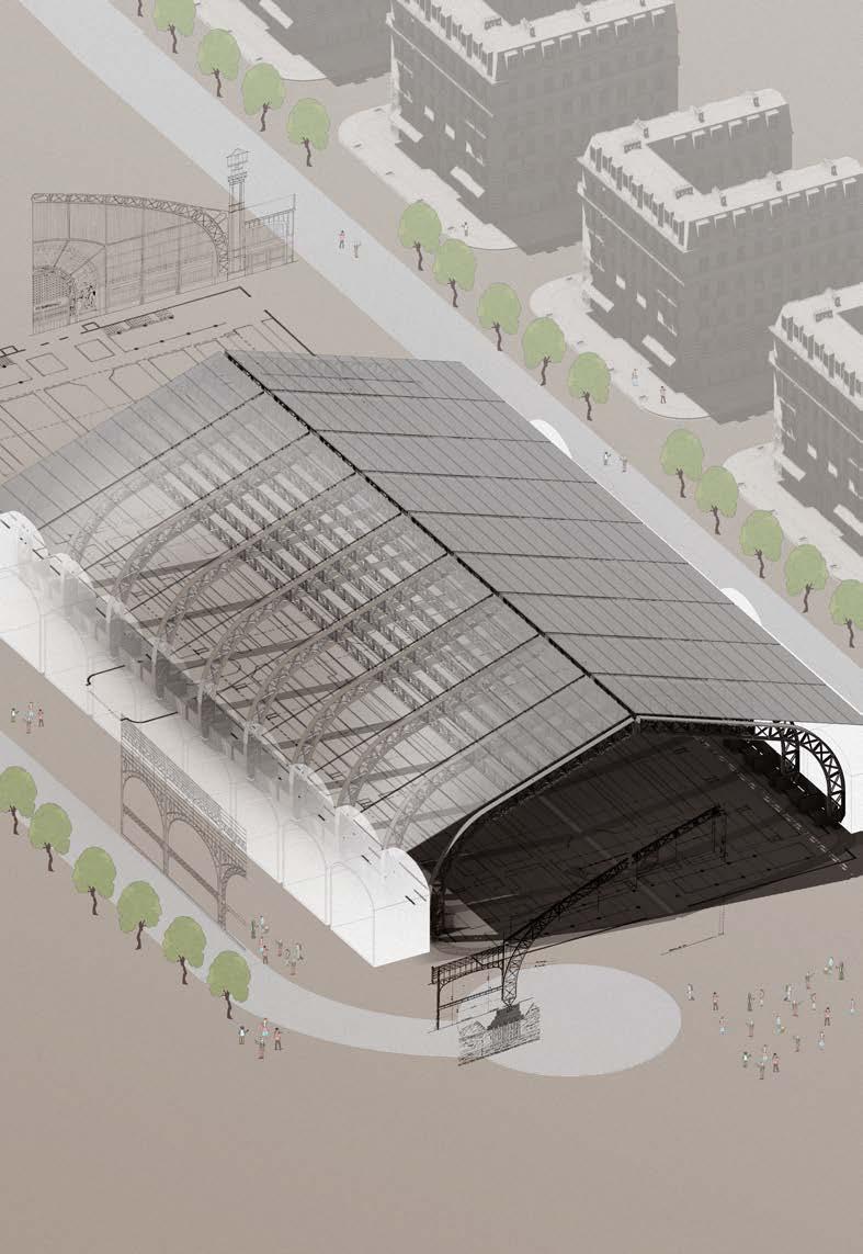
Artefact Research - 1.3 Artefact Research Summary

02_Contextual Research
Fragment Exploration - 2.1
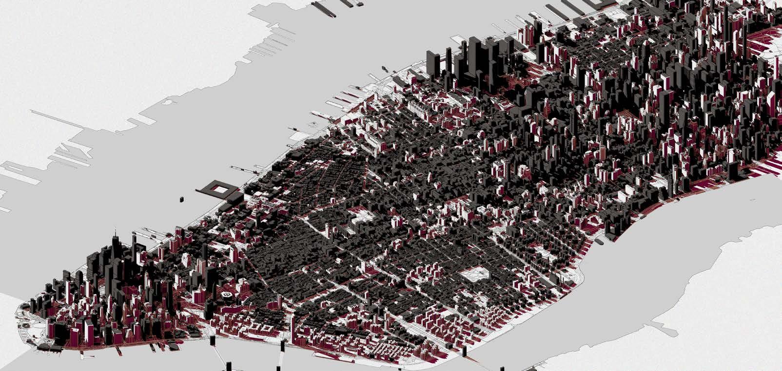
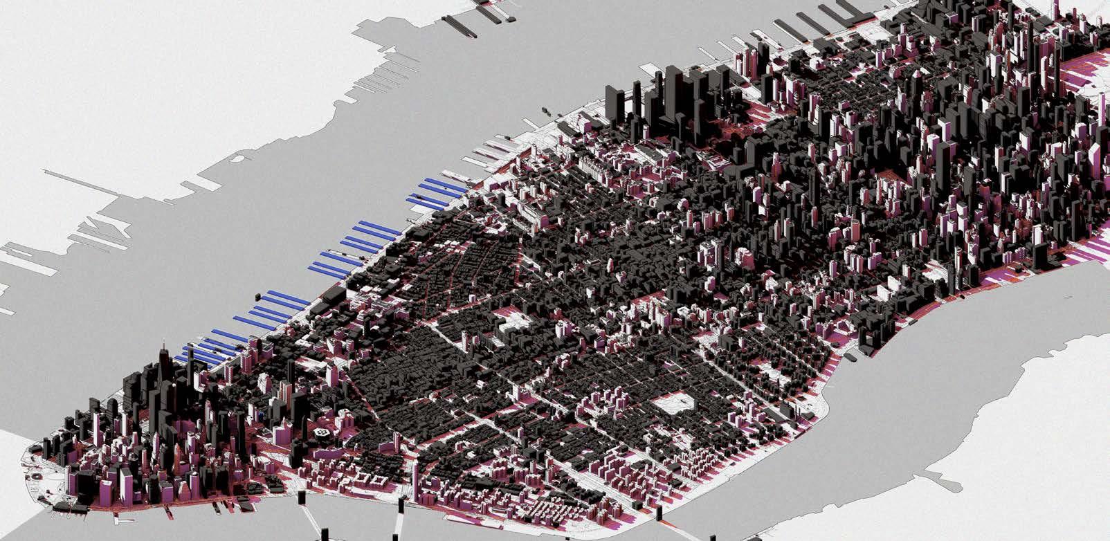
NYC Bridge Pier History
Conclusion :
As cities and communities develop, so does its requirements and necessities, During the early 20th century NYC focused on Piers for imports and travellers to the city, but overtime , this is no longer required. Piers are now being converted to public spaces, bike lanes and pedestrian walkways.

Fragment Exploration - 2.2
Conclusion :
The pier as a artefact reveals interesting structural principles which will be used to inform the first fragment design. Elements such as the concrete diaphragm, structural reinforcement systems and overall composition of piers are used as a source of inspiration.
Precedent study: Connection Detail for Prefabricated Bridge Pier Elements

Components Connected Precast Concrete Pier Column
Forces connection designed to transmit Shear Moment Compression
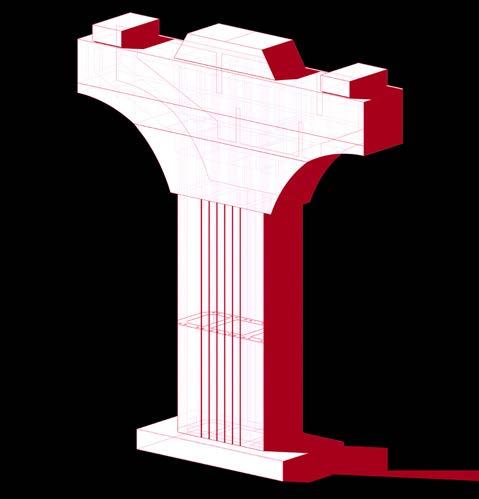
TOP OF PIER HEADER TOP OF PIER COLUMN LEVEL LEVEL PRECAST CONCRETE PIER COLUMN C L CONCRETE DIAPHRAGM PRECAST POST TENSION PIER EQ EPOXY JOINT EPOXY JOINT EPOXY JOINT TOP OF FOOTING DUCT FOR POST-TENSIONED BAR STRIATED FACE C L C L COLUMN CAP
Fragment
Typical Bridge Pier
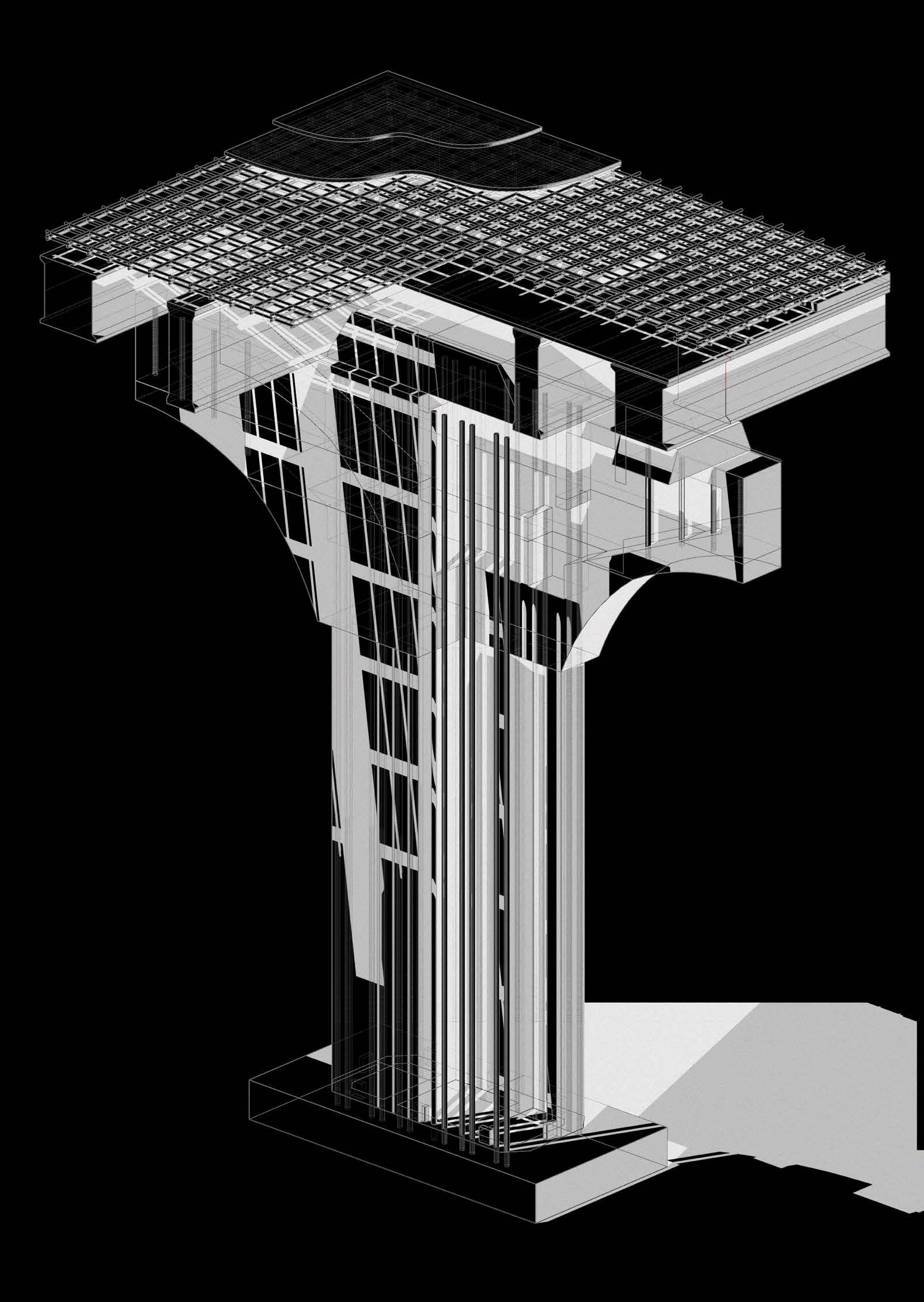
Fragment Exploration - 2.3 Bridge Pier Initial Fragment
Bridge Pier Fragment
Form development from the typical bridge pier structure resulted in monolithic concrete fragments.
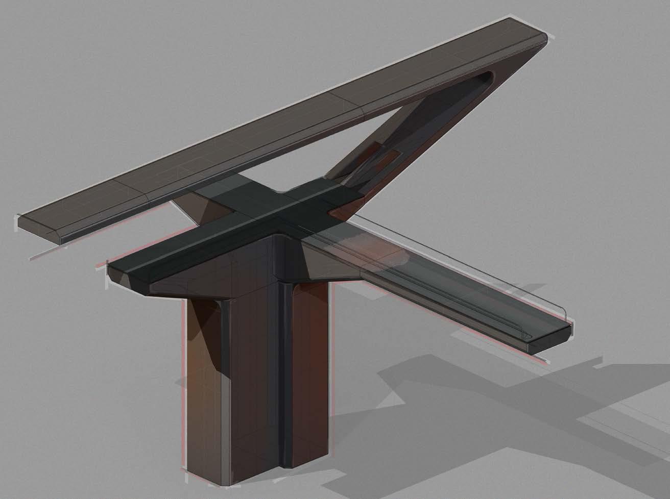
Conclusion : Inspired by the structural purity of the bridge pier, forms are developed and explored through manipulating forms resulting in monolithic concrete fragments. The next stage of development would be to integrate and test such structures in the context of spatial quality.
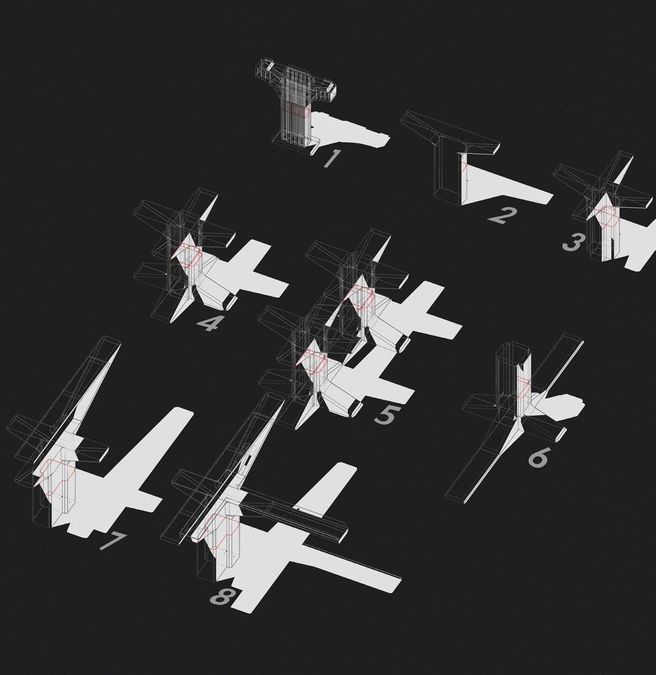 Fragment developed through form iteration of the bridge pier structure.
Fragment Exploration - 2.4 Bridge Pier Fragment Development

Fragment_01 Fragment Exploration - 2.4 Fragment Development
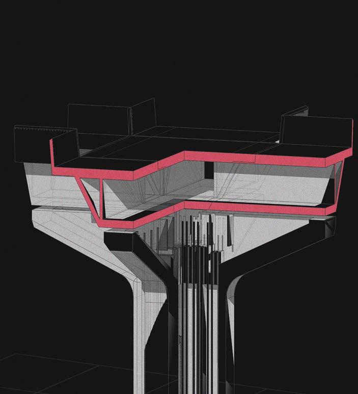
Spatial qualities generated through the inversion of the concrete diaphragm, inspired by the structural principles of the bridge pier.
Fragment 02
Spatial exploration in context of the human scale
Further exploration of form is conducted by taking individual monolithic fragments and experimenting with it at different scales. This resulted in spatial qualities being uncovered

Fragment Exploration - 2.4 Fragment Development
The concrete diaphragm of the bridge pier is informed by its structural properties, allowing for a more efficient use of material. When inverted, this creating positive spaces within the fragment. Allowing for spaces to reflect structural properties, while also acting as decorative elements. (Ref. The idea of celebrating modern techniques and technology. )
Conclusion : Inspired by the structural principles of the concrete diaphragm and its clarity, the following experiment attempts to generate spatial qualities through inversion of material and forms. By doing so, the fragment is placed into the context of the human scale.


z x
Fragment Exploration - 2.5 Fragment Testing
Manipulation of concrete diaphragm profile
Fragment is tested within a urban context - the relationship between integration of architecture with civic ambition and existing city fabric.
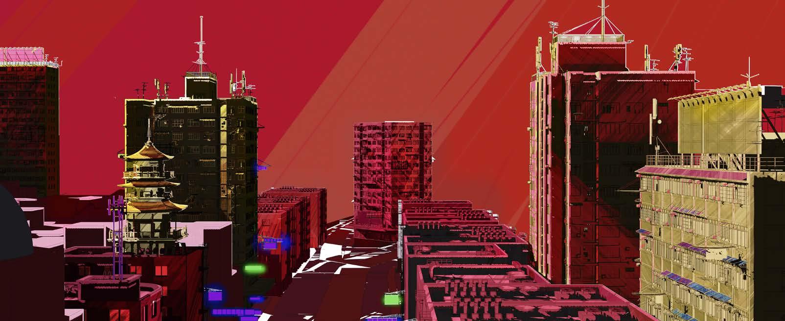
Spatial conditions generated from this is specific to certain context, in this example; the traditional Hong Kong vendor stalls are used to occupy spaces, weaving programme and interesting moments into a existing city context without damaging its fabric continuity.

z x
Fragment Exploration - 2.5 Fragment Testing
The Fragment above further explores circulation conditions created by adjusting and experimenting at different scales. This experiment focuses on creating a sense of verticality through connecting different fragments thus resulting in a modular and expandable system. Fragment_01 specifically reveals that each module has the potential of being connected in four different directions.
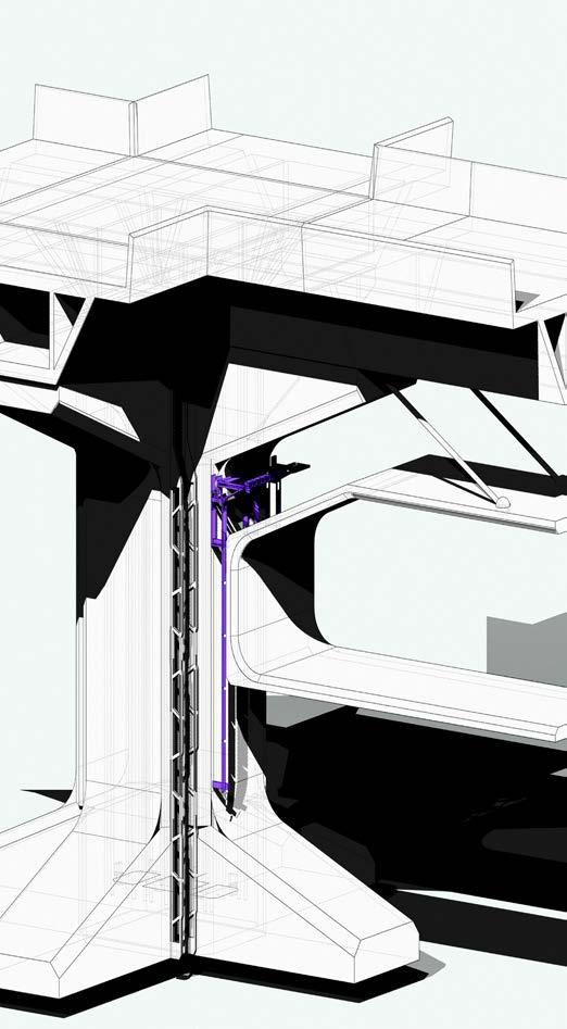
This fragment explores a cultural icon of billboard signage within the context of Hong Kong and New York.
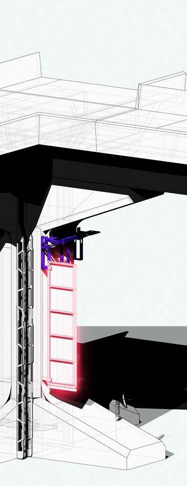
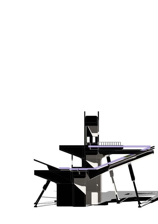
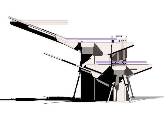
With form purity in mind, signage structure is adjusted and reinterpreted into structure systems for suspended spaces to the existing fragment. This creates a additional layer to the modular system.
Spatial hierarchy between the topside and suspended space also provides a new dimension for spatial organization.
Conclusion :
The experiment of applying signage onto the fragment revealed notions of fragment as a interface. This interface which the fragment presents can be utilized to merge cultures, creating new topologies. This notion will be a key driver for the projects context and brief.
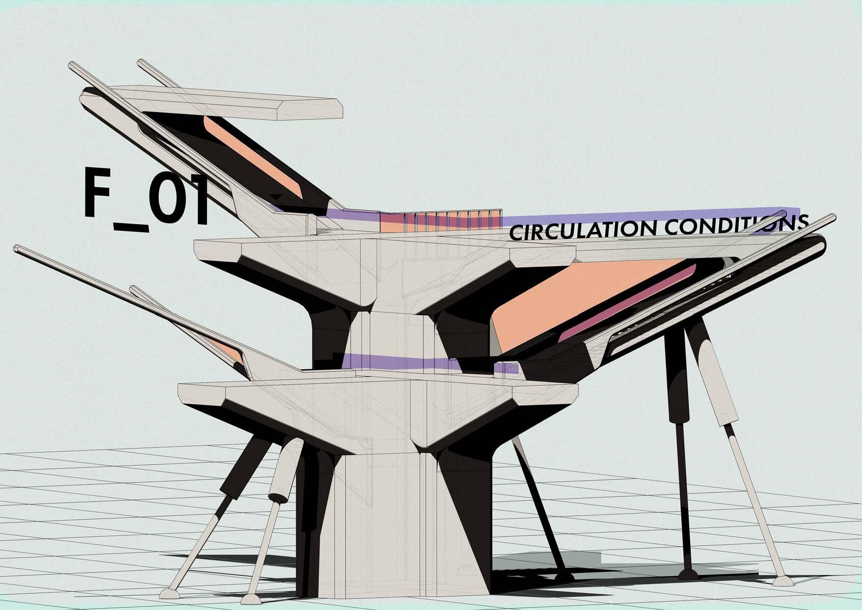
A A B B A B 01 02 04 03 01 02 03 04
Fragment Exploration - 2.5 Fragment Testing
03_Context and Brief
Contextual Research:
Throughout the contextual research, the notions of cultural importance were a recurring theme. Leading the narrative to New York, China town. As a cultural hub within a foreign setting it brings forth the notions of colonialism and borders.
Research Topic:
The negative portrayal of colonialism is questioned along with notions of territorial dynamics and borders. Colonies have resulted in a many collisions of culture, resulting in interesting new topologies ranging from pop culture to architecture. Using examples such as Hong Kong and New York as thriving and successful cities due to the result of it being colonies. Interestingly, colonial methods also presents a set of new rule set and borders which directly informs design and planning of a space.
Project Narrative:
The project speculates that Chinatown New York returns to the ownership of the Chinese Party, in a mutual territory trade between the US and CN. This applies a new set of planning and building rules within downtown Manhattan. This exchange between two nations will boast political stability and urban development for a underdeveloped area within New York City.
Design Objectives
As china town is returned to the Chinese Party, its borders have now become a constraint, yet capacity must increase for the influx of citizens and workers. A key design objective is to increase capacity of Chinatown within it’s existing borders. By comparing vertical envelopes of NYC and CN a proposal will be formulated.
The principles in will follow notions discovered from initial Artefact research while applying Chinese planning and building rules bringing a new architectural topology to the proposed site of China Town.
Context and Brief - 3.0 Project Brief
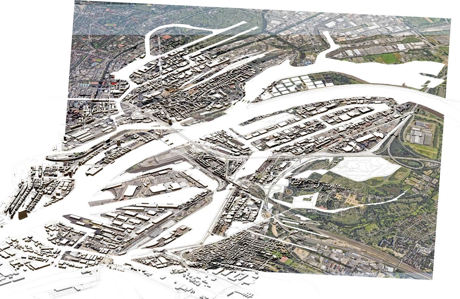
Precedent of territory trading between nations
Czechoslovakia’s (Gateway to the World)
The Moldauhafen port provided great economic significance not only for Czechoslovak commerce but also for the city of Hamburg as well
China’s (Gateway to the World)
enforce mutual
interdependence

A Microcosmic platform for Chinese forms of society and their confrontation with western ideas, influences and conflicts

Conclusion :
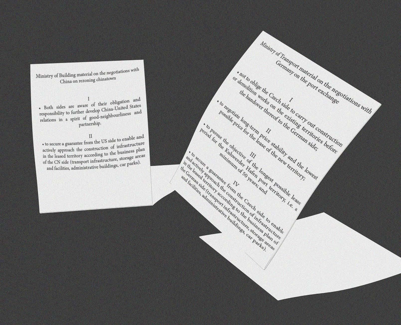
As Chinatown is speculated to be returned as a Chinese Colony, this study follows a precedent of mutual territory trade between Czech and Germany, forming free ports which mutually benefit both nations. This acts as a form of benchmark for the proposed brief.
 The establishment of a zone for the Chinese party must
benefits, creating
between the US and CN.
Contextual
Study
Context and Brief - 3.1
Precedent
Conditions of territory trade
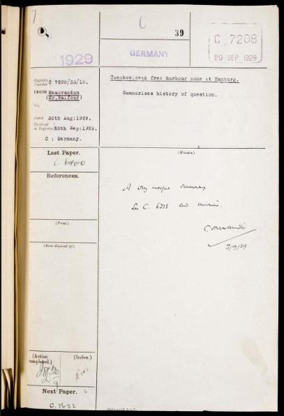
Czech-German Lease Agreement
Reimgaining Colonies
A trade of territory between CN and US is initiated to stabilize relationships. The Chinese party would like to migrate into NYC China town as their first colony. Through the trade of territory and establishment of colonies in both nations, China will gain stability for their relationship between the US. The US will gain rapid development and urbanization of the China Town area.
 Chinese offshore police station - Example of negative colonial method/ strategy
Contextual Precedent Study
Context and Brief - 3.1
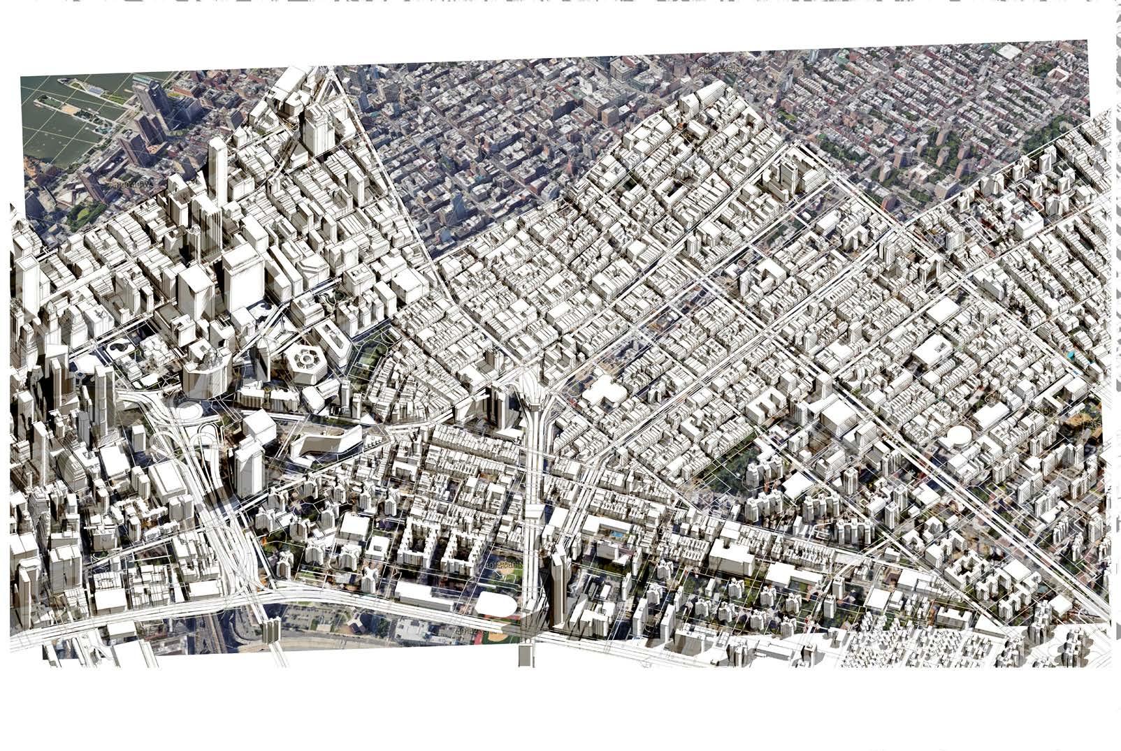
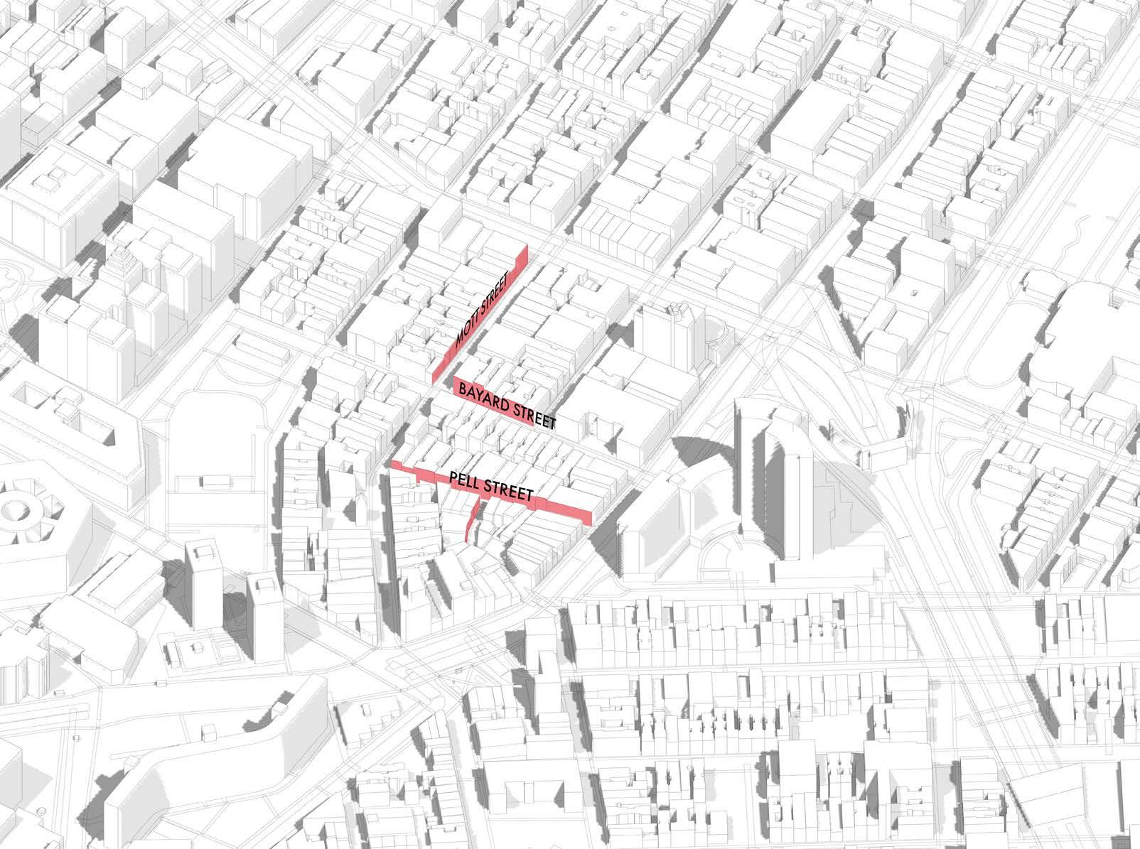
A B C D E F G H I J K L M N O P Q R S T U V W X Y 123456789 10 11 12 13 14 15 16 1718 19 20 22 21 22 24 23 200m 200m 200m 200m 200m 200m 200m 200m 200m 200m 200m 200m 200m 200m 200m 200m 200m 200m 200m 200m 200m 200m 200m 200m 200m 200m SEA LEVEL ±0.000 N 3350mm SIde walk 3000mm Parking Width 1500mm Bike Lane 3350mm Drive Lane 5694 1615 12 1: 203 2: 495 3: 361 3 121,059/mi² 107,659/mi² 1218,326/mi² Density A B C D E A B C D E F G H K M N 123456789 10 11 12 13 14 15 16 1718 19 20 200m 200m 200m 200m 200m 200m 200m 200m 200m 200m 200m 200m 200m 200m 200m 200m 200m 200m 200m 200m Context and Brief - 3.2 Site Map
Context and Brief - 3.3
FAR Ratio 6.0
What is Floor Area Ratio (FAR)
Floor Area Ratio is the measurement system used to regulate density of buildings, commonly as apart of the zoning regulation.

In New York City, FAR is calculated relative to the lot area. In this case the lot ratio to height is 1:6
FAR = Gross Floor Area Area of the Plot
FAR Ratio 10.0
This example above applies a block extracted from NYC China Town. The FAR of 1.0 is applied to show how building height is affected while maintaining the same density.

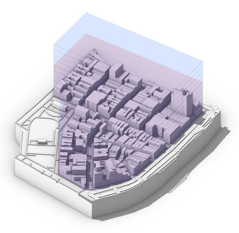
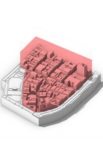
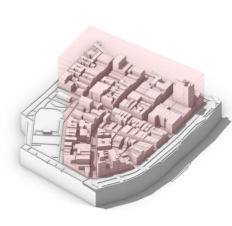
Taking the same block from the site, Red zoning shows the existing permitable ratio of FAR 6.0 based on NYC regulations.
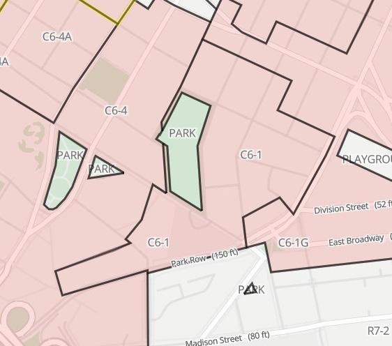
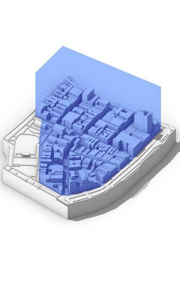
Blue zoning shows FAR 10.0 zoning based on Hong Kong regulations. Through this expansion, density and capacity of blocks will increase by 66%
Conclusion :
The comparison of existing zoning reveals that following Chinese zoning rules may increase the capacity of China Town up to 66%.
New York Zoning Rule Chinese Zoning Rule Site Analysis - Existing Constraints

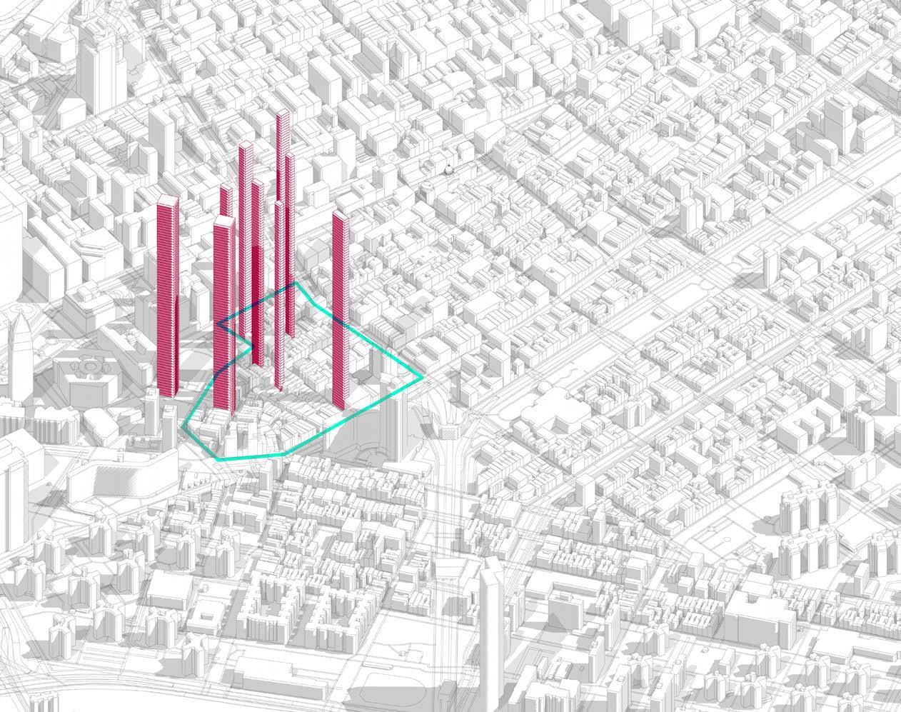
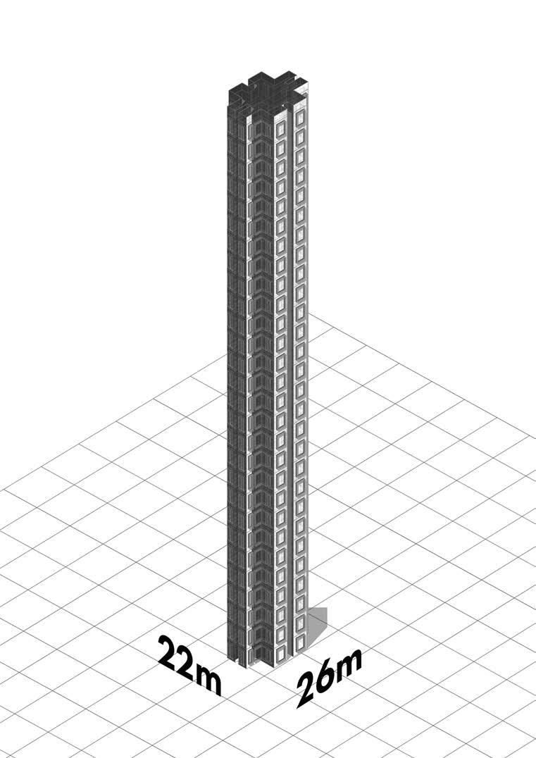

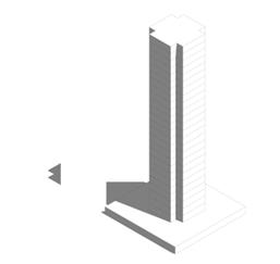

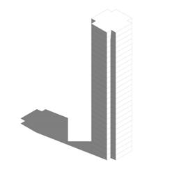
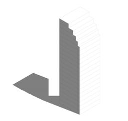
1 2 1960 1970 1980 1990 2010 Vertical Zoning Development Hong Kong Vertical Zoning Integration New York Chinatown Current Zoning 4 storey 10 storey 25 storey 25 storey Podium 75 storey Podium 1960 4 storey 1970 10 storey NYC HK Conclusion : Vertical envelope following Chinese zoning regulations is integrated into existing site and voids to understand its relationship to the urban fabric. Context and Brief - 3.3 Site Analysis - Resolving Constraints
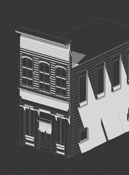
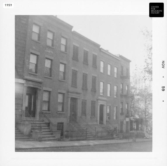
Faux Façades in New York 58 Joralemon Street is a town house facade disguising an emergency exit for MTA and a subway Ventilator
The preservation of cultural façades within Chinatown must not only provide cultural value but also provide additional functions.
Conclusion : Cultural Value as a key notion must be preserved within the existing site, Inspired by western faux facade, identified culturally important façades of Chinatown will be retained as a false front
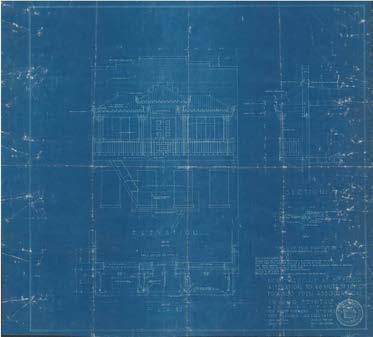
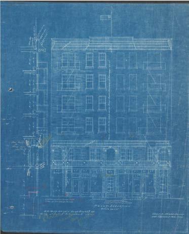
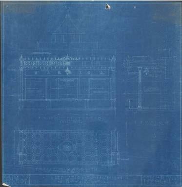
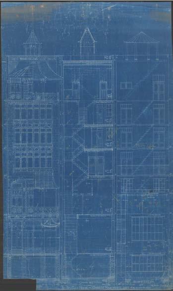

49 Mott Street, New York, NY 10013 Lin Sing Association Building
A
A
Context and Brief - 3.4 Site Analysis - Historical Study
Faux Façades in western cultural were often used to project an image of stability and success to passer bys.

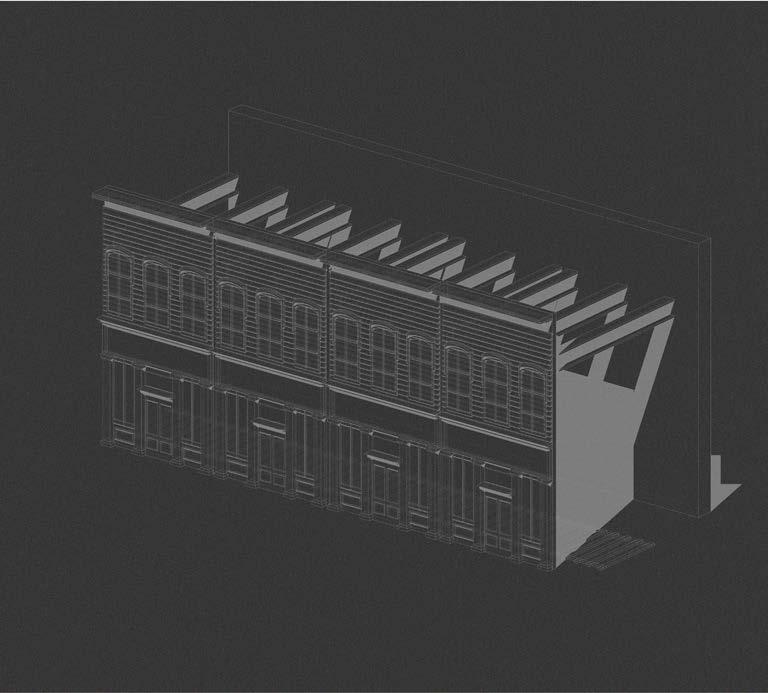

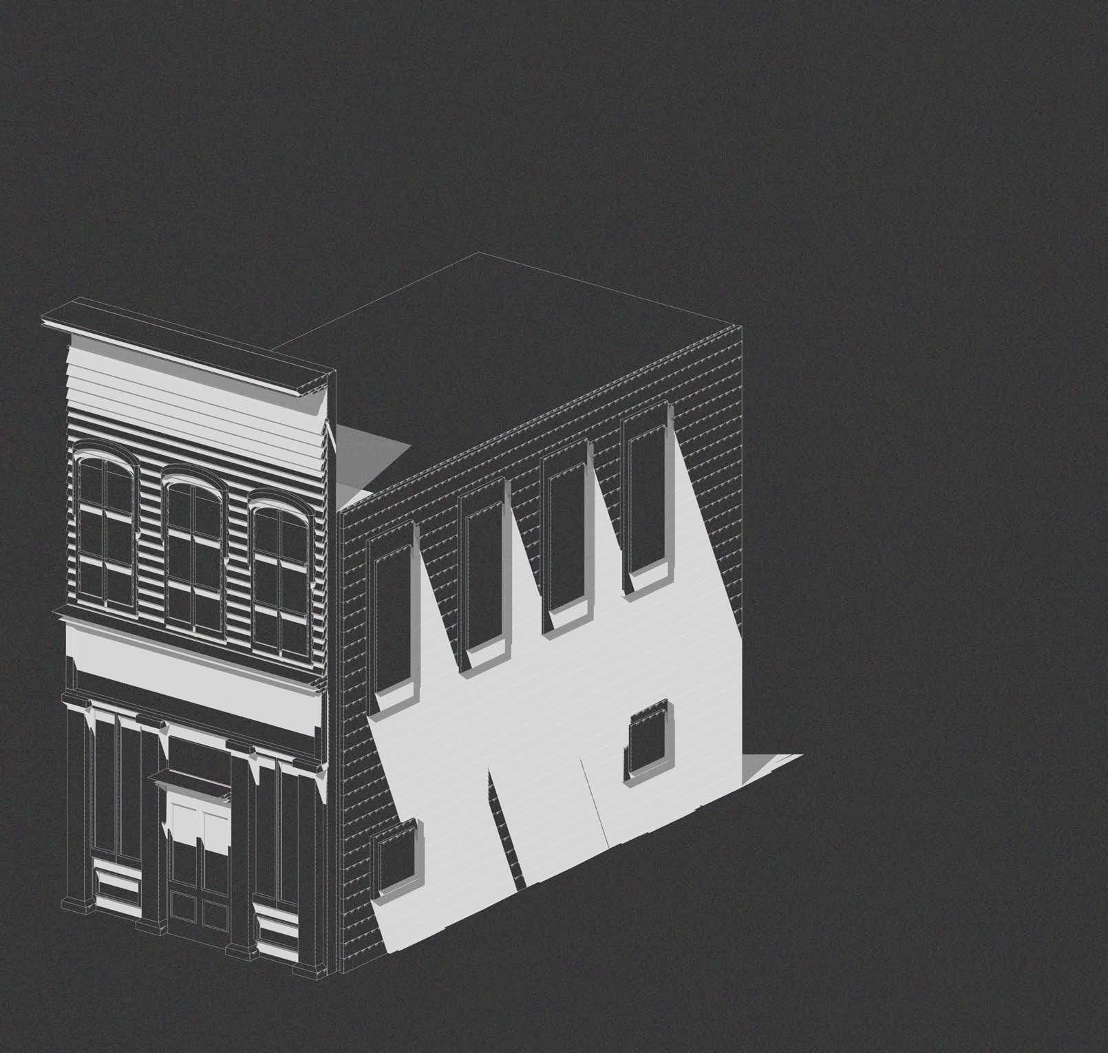
This was particularly prominent during the early 20th centuries when new towns were established and towns would want to attract investors.
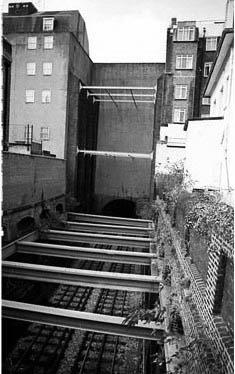
Modern day integration of faux façades are mainly used to hide infrastructure such as subway emergency exits and ventilation points, as seen in New York.
 1
2
1
2
1 2
Faux Facade Railway Context and Brief - 3.4 Historical Analysis and Cultural Values
1 2
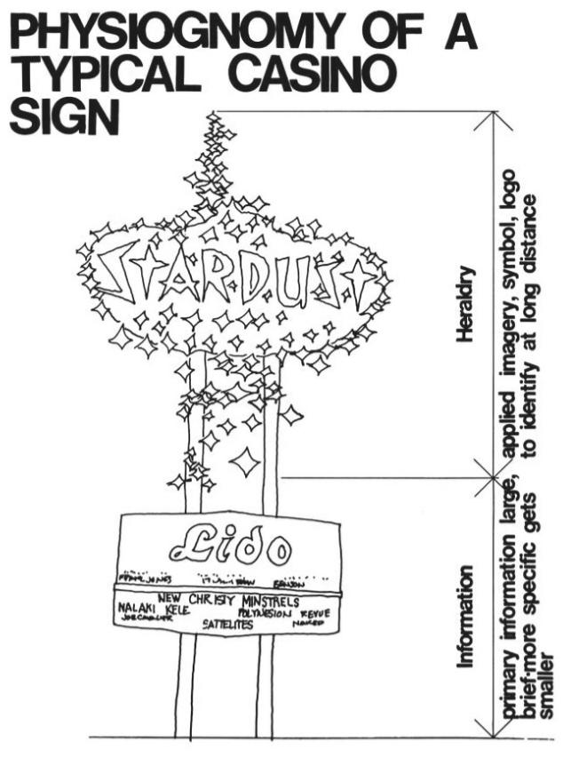
Within Learning from Las Vegas, Robert Venturi and Denise Scott Brown highlights the value of symbolism over form. Following a similar approach in analysing the façades of Chinatown New York, the project aims to highlight the values of cultural icons through preserving the iconic façades of Chinatown, while expanding its current limited capacity.

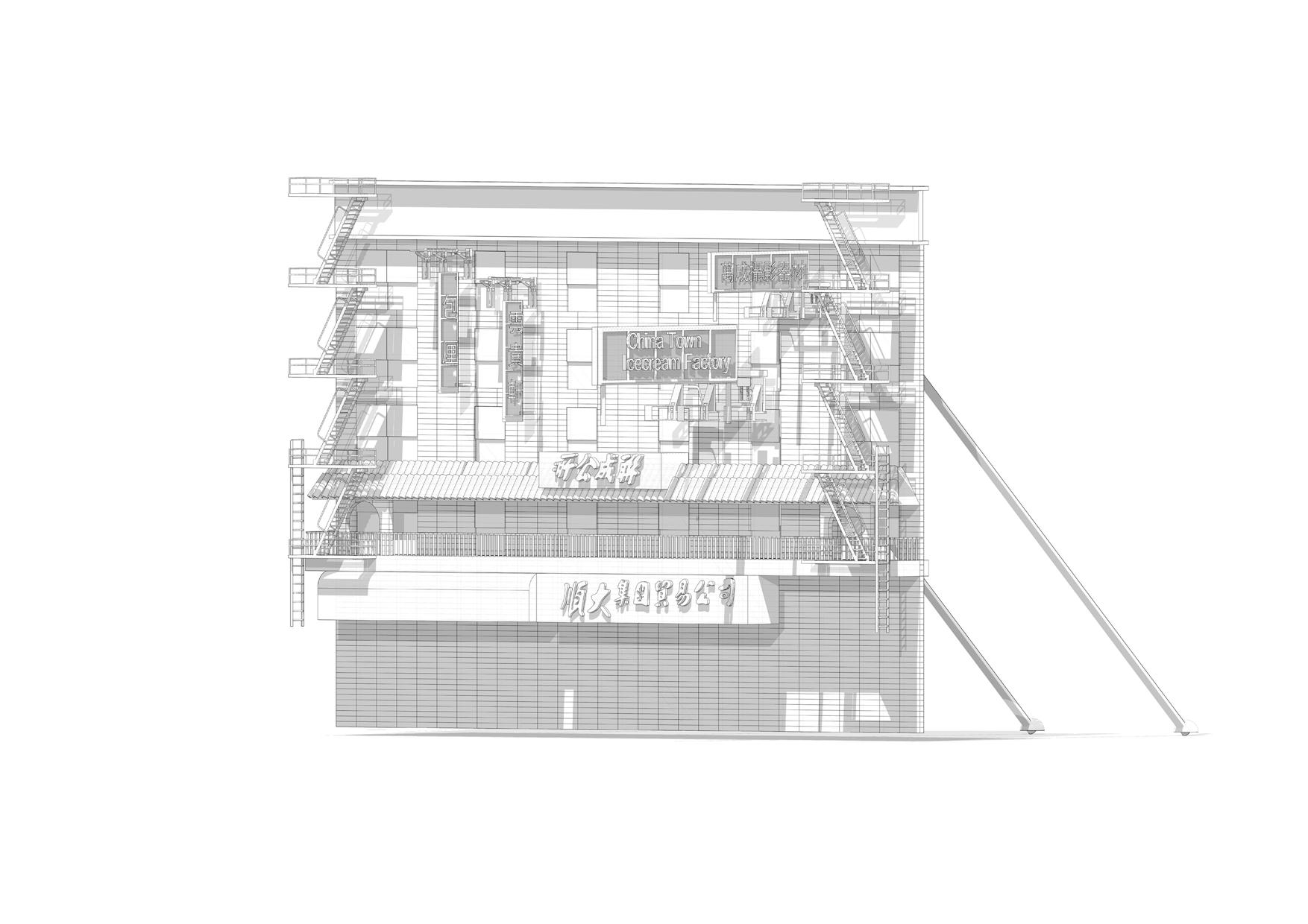
ProgrammeExapson of existing china town.
Conclusion :
Cultural Value as a key notion must be preserved within the existing site, Inspired by western faux facade, identified culturally important façades of Chinatown will be retained as a false front
A sketch for a Casino Sign _© Learning from Las Vegas
Duck and Decorated Shed _© Learning from Las Vegas
Context and Brief - 3.4 Preserving Cultural Values
04_Design Development - Pencil Towers
Design Development - Pencil Towers - 4.1
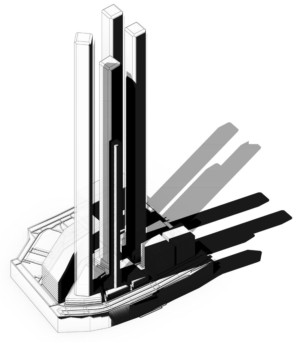
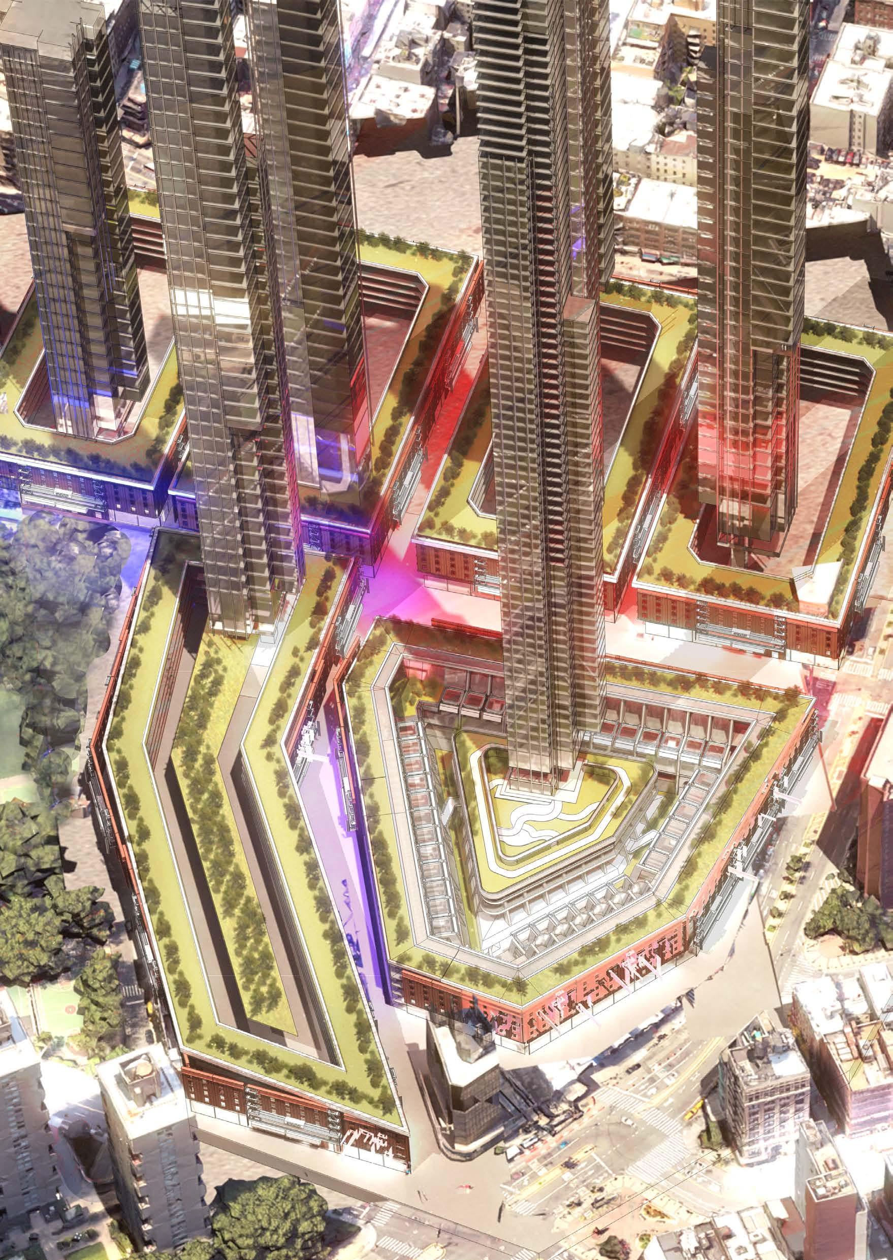
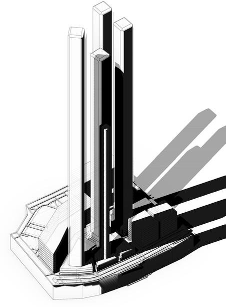
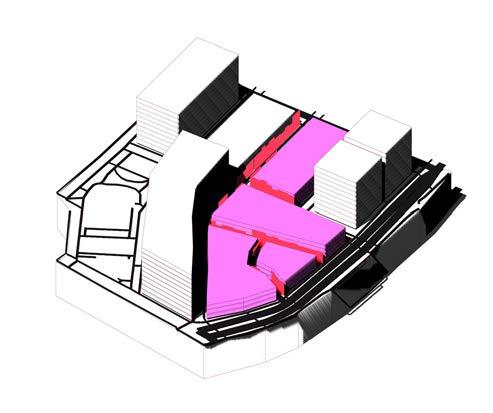
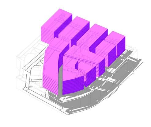
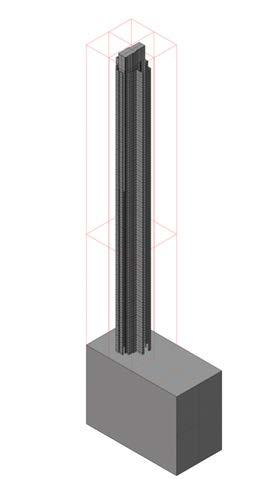
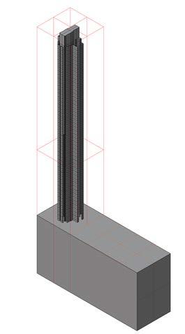
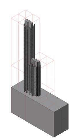
Identified historical and cultural façades will be retained. Masses which are directly connected to these façades will incorporate a podium, which would take up 30% of available space. The remaining GFA will be achieved through towers with a FAR of 13.0

NYC Envelope
Chinese Envelope
Extracting available mass after podium is allocated
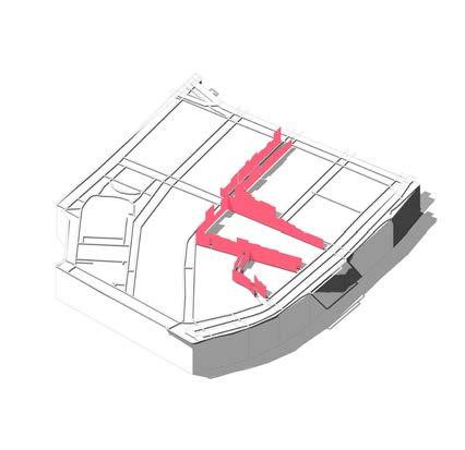 Diagram above shows podium massing of lots connected to historical and cultural façades
Floor Area Ratio 13.0 Masses
Increasing Heigh of towers while retaining density
Integrating towers to podium
Solution for increasing existing capacity
Arrangements of towers within Chinatown and sun light analysis is carried out presenting a understanding of sunlight exposure and its affect on the site. Buildings must not be too tall while retaining the same amount of expanded volume.
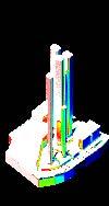
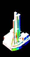
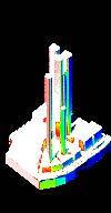

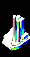


Design Development - Pencil Towers - 4.2 Tower Configuration - Solar Analysis
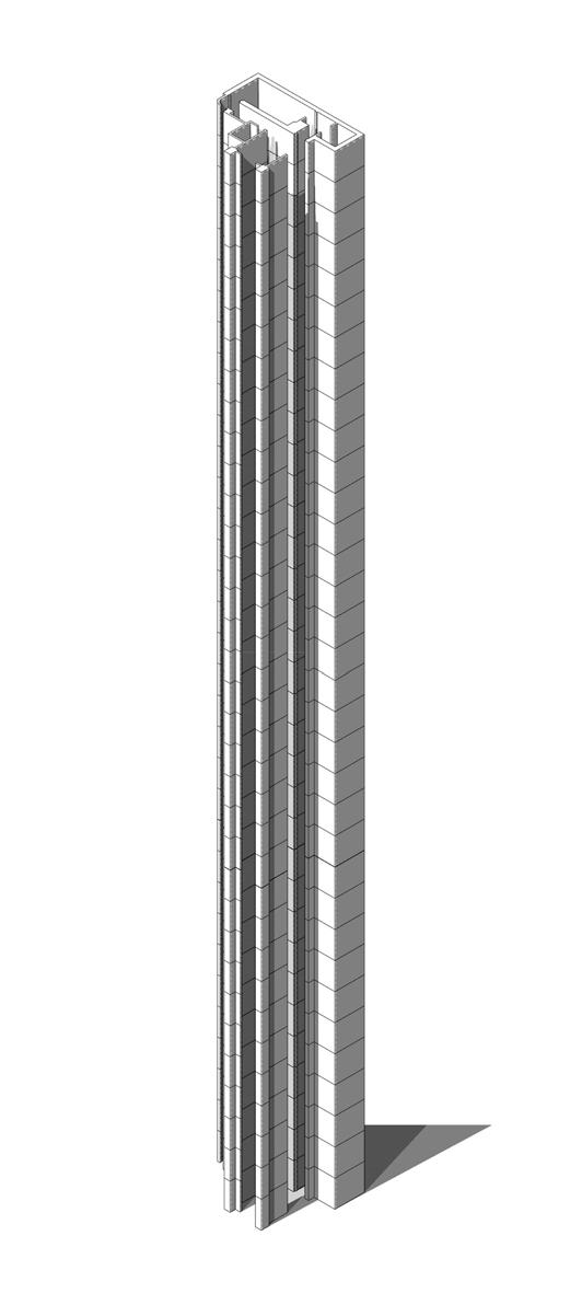
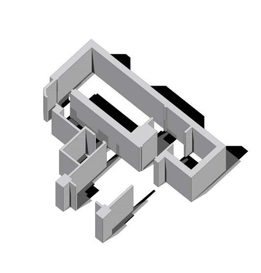


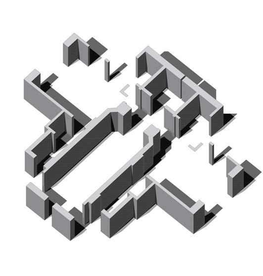
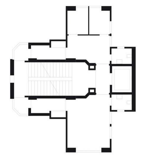
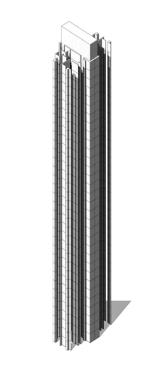
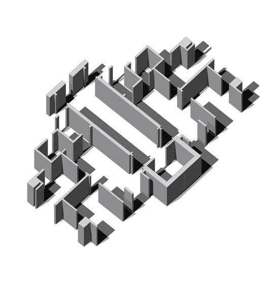
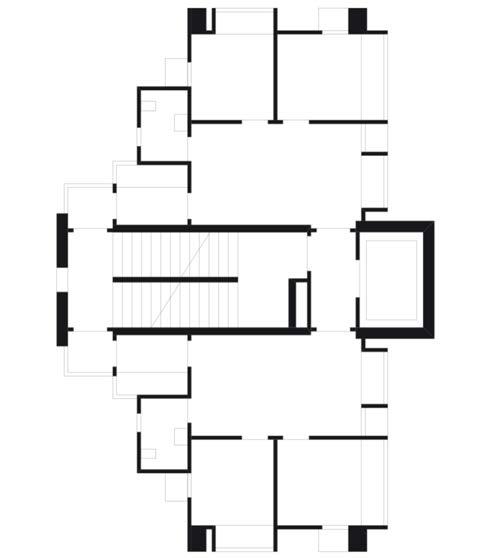
Hong Kong Pencil Tower Study
Design Development - Pencil Towers - 4.3
Fullic Court Hong Kong Sun Ho Court Hong Kong Swan Hill Mansion Hong Kong
Design Development - Pencil Towers - 4.4

Conclusion :
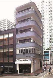
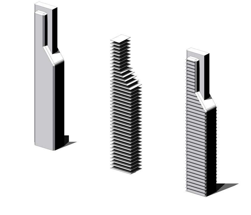
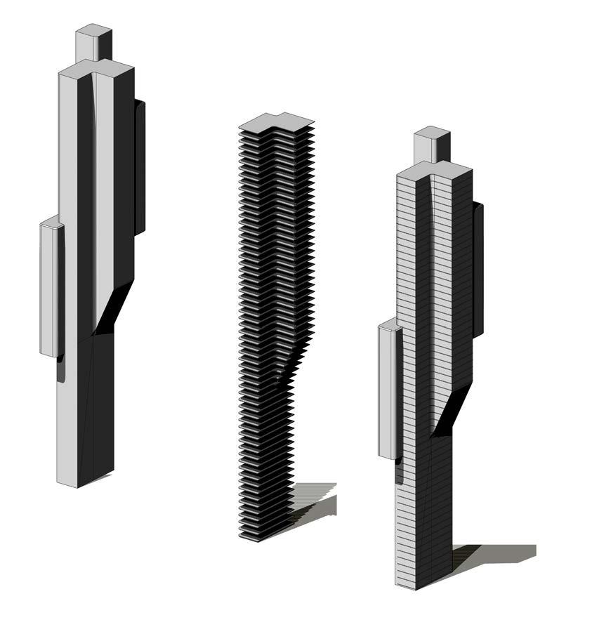
Traditional Hong Kong Pencil towers often had small footprint and highly limited internal space. A bundling strategy is adopted which would allow the lower levels to keep its small footprint while upper levels would expand and receive more internal space for residential units. The bundling profiles is inspired by the profiles of pencil towers in Hong Kong
Core Residential Communial Area Court Yards Communial Area Court Yards Communial Area Tribeca Central Park Little Italy East River Tribeca Central Park East River Core Residential Court Yards Communial Area Residential Residential Communial Area
Design Strategy - Bundling
Tower Volume and Allowed Volume Expansion
Bundling Strategy High Level
Strategy Low Level
Design Development - Pencil Towers - 4.4
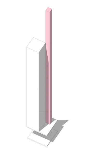
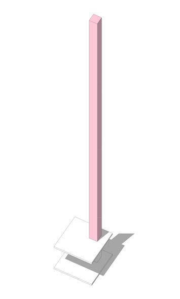

Hong Kong Pencil Tower Study
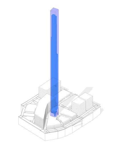
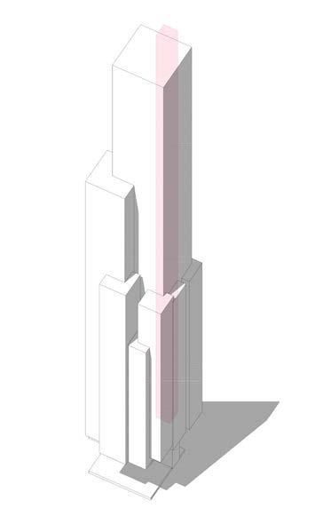
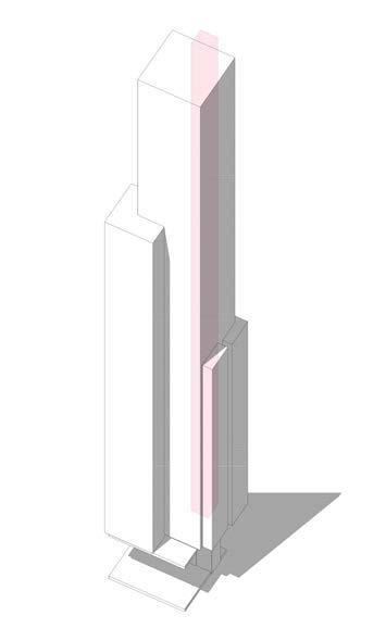


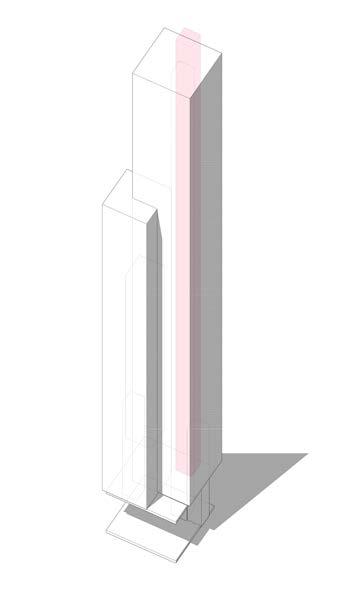
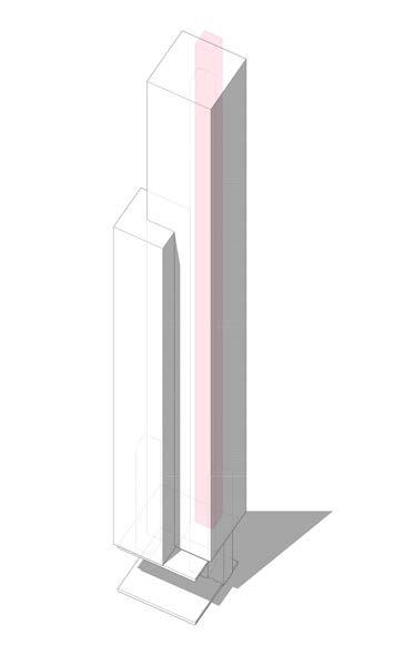
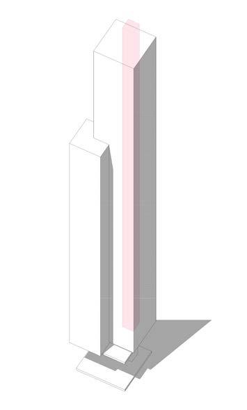

Bundling Process
Current New York Zoning
New York Zoning Allowable Capacity
Chinese Zoning Rule
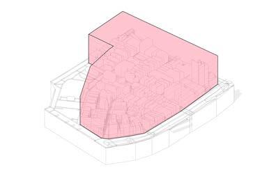
Developing from the findings of research into Hong Kong Pencil Towers, a bundling strategy is adopted, this will allow for the visual ratio of iconic towers to be retained while also increasing usable space to improve efficiency, answering to one of the main downfalls of the traditional tower.
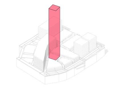 Bundling Process - Plan View
05_Design
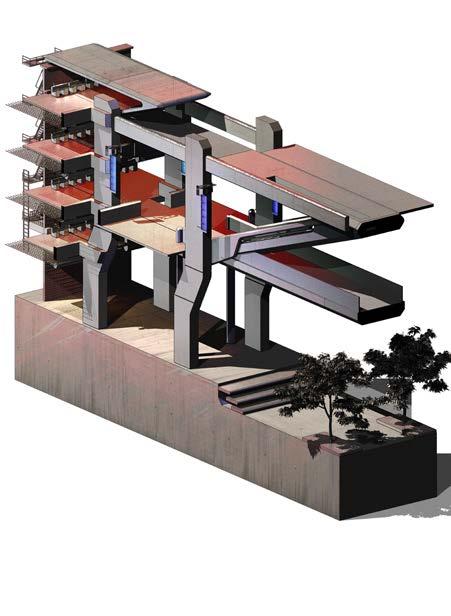
Development - Initial Fragment Design
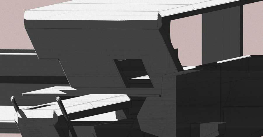
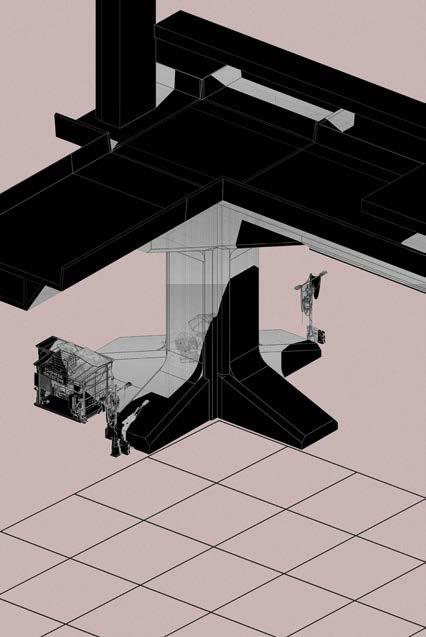
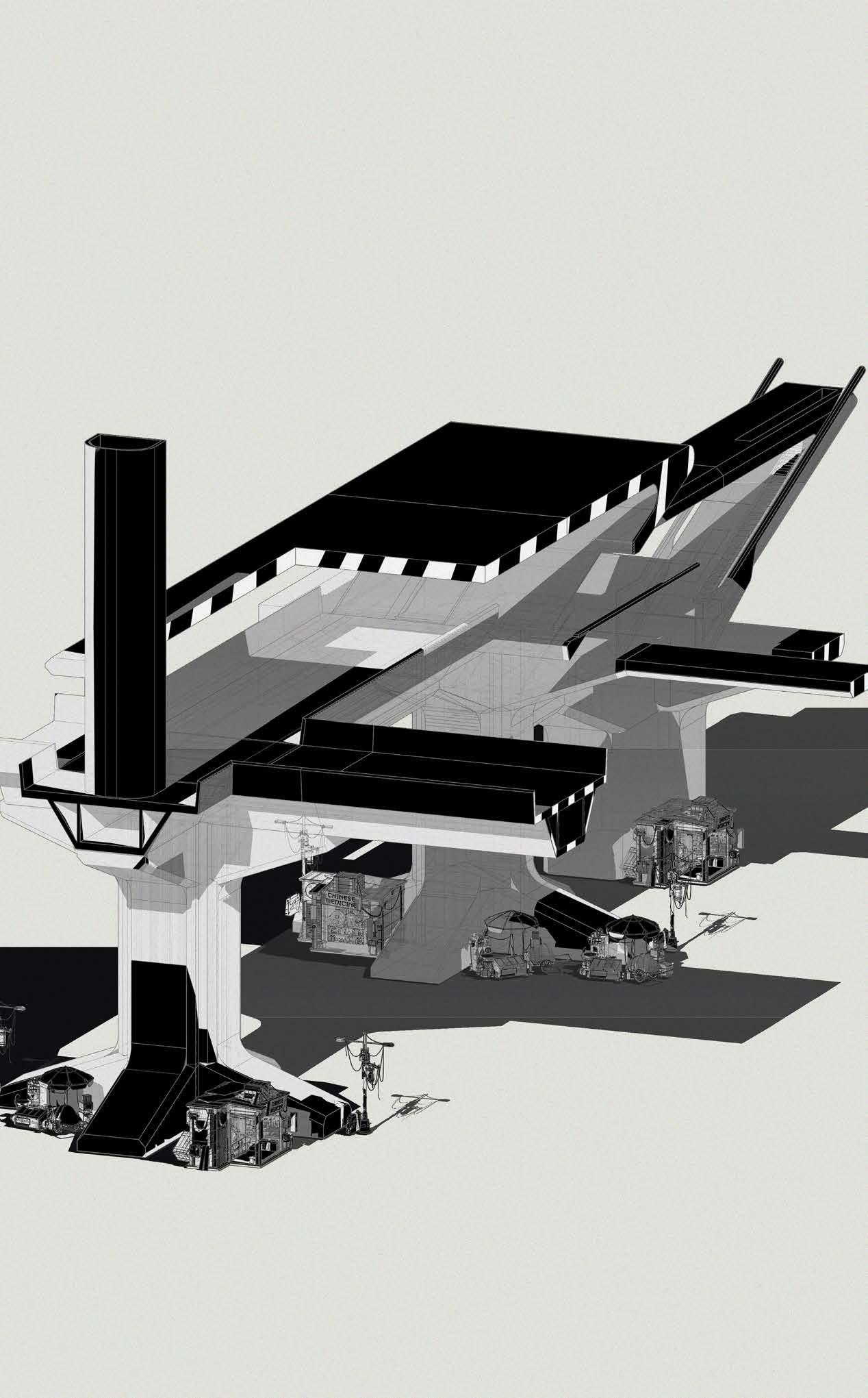
The concept of territory dynamics and borders is explored through this fragment. The design confines itself to context specific conditions. In this case, following Hong Kong urban requirements, the following experiment explores sight lines. 6.2.33 resulted in a linear spaces due to the requirement for direct sight-line, while 6.2.32 resulted in a open podium space due to the requirement for visible squares.
6.2.32 6.2.33
Design
- Initial
- 5.1 Fragment Development
Development
Fragment Design
Design Development - Initial Fragment Design - 5.1 Fragment Development
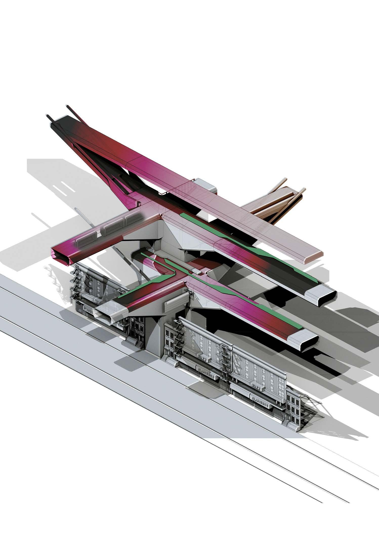
The fragment explores a potential interface utilizing voids between existing façades to connect new to old.
Design Development - Initial Fragment Design - 5.1 Fragment Development
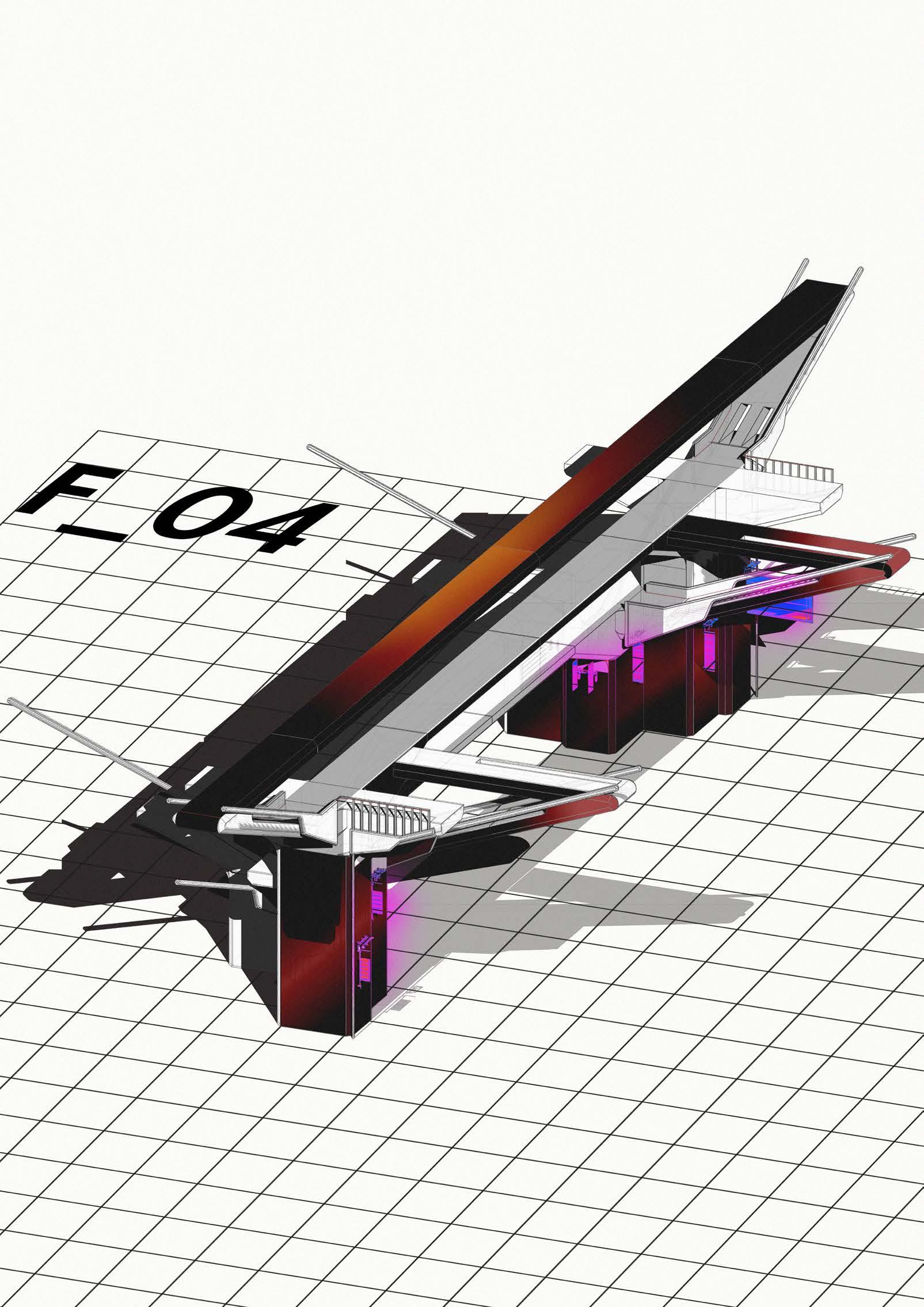
The Fragment explores the contrasting visual impact of differentiating rules. Contrasting what New York rules allow for signage and what could potentially be the new street scape when following Chinese rules regarding signage.

Below Floor Plate 12 3 2.8m² Total Area 3800mm 5800mm 1 2 3 1m From Kerb 3.5m Min 4.2m Projection
Design Development - Initial Fragment Design - 5.1
Fragment Development
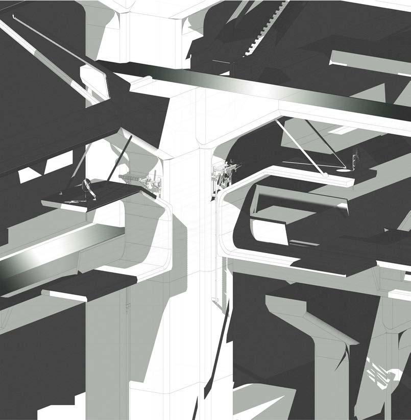
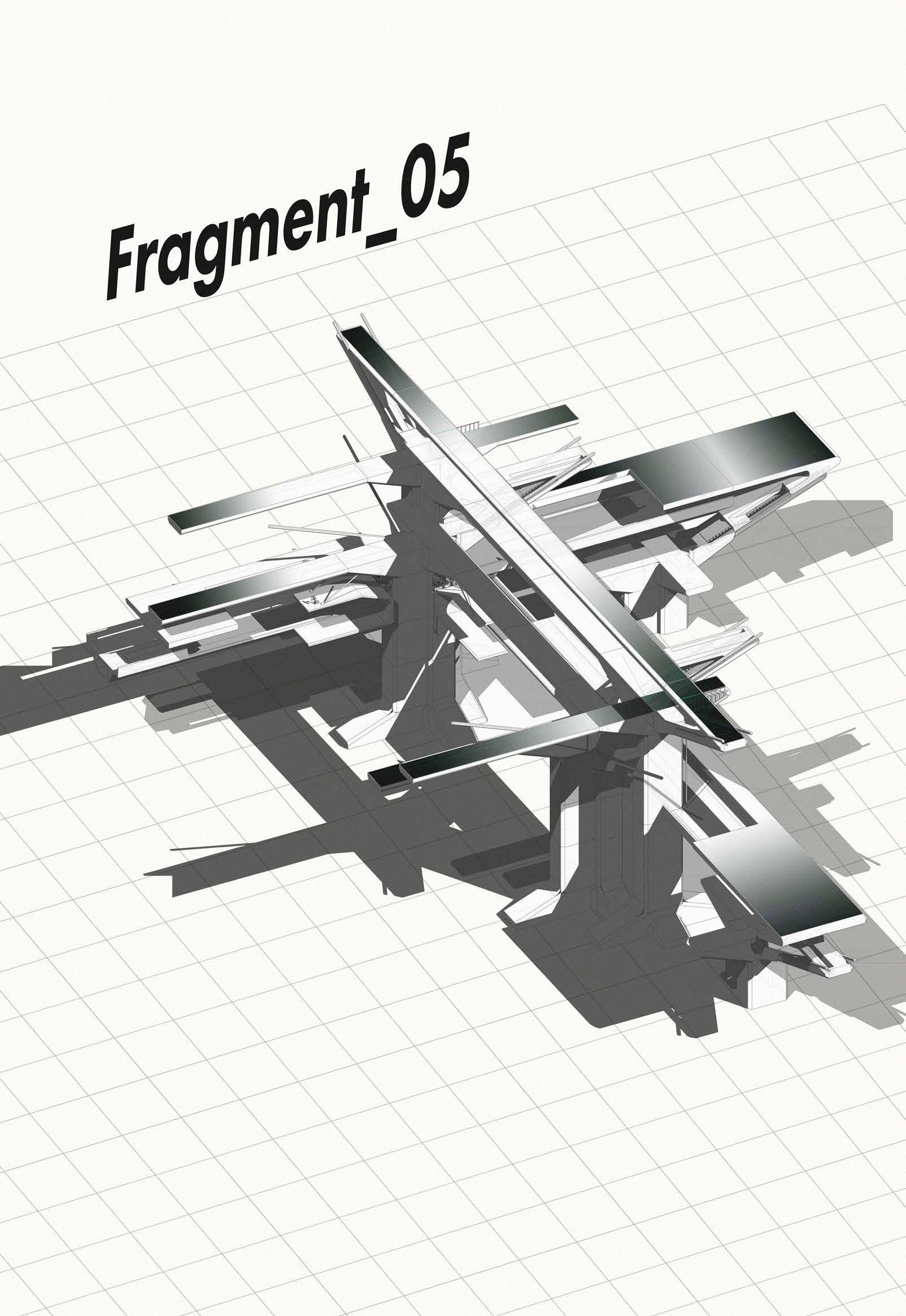
The Fragment explores the notions of structural interface. Utilizing spaces not usually occupied in a structure, habitable spaces are presented within this fragment as an experiment to understand how we can formalize space with a proposed structural element.

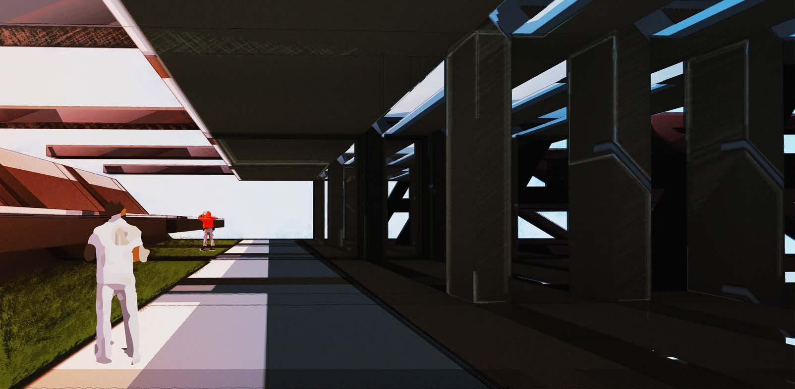
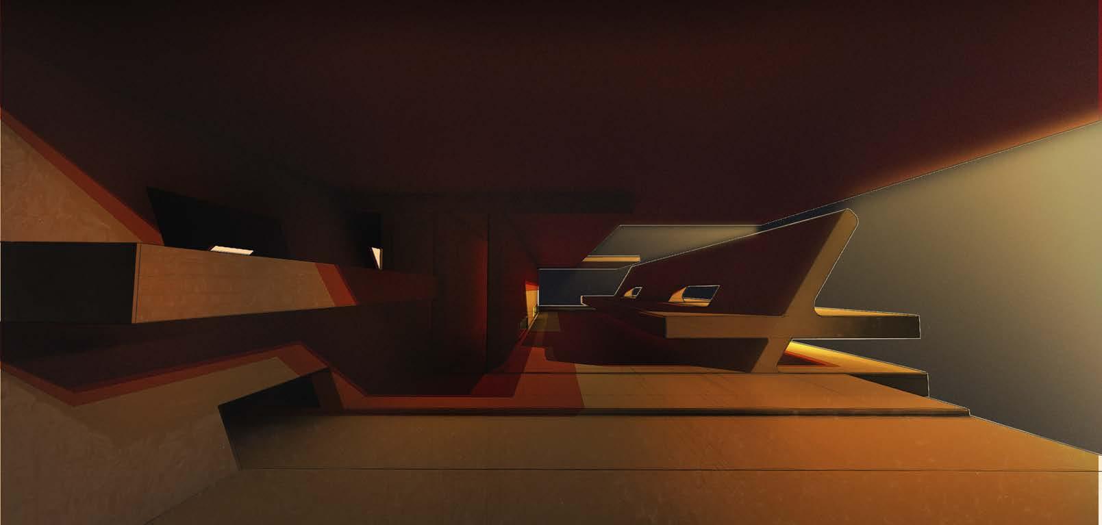
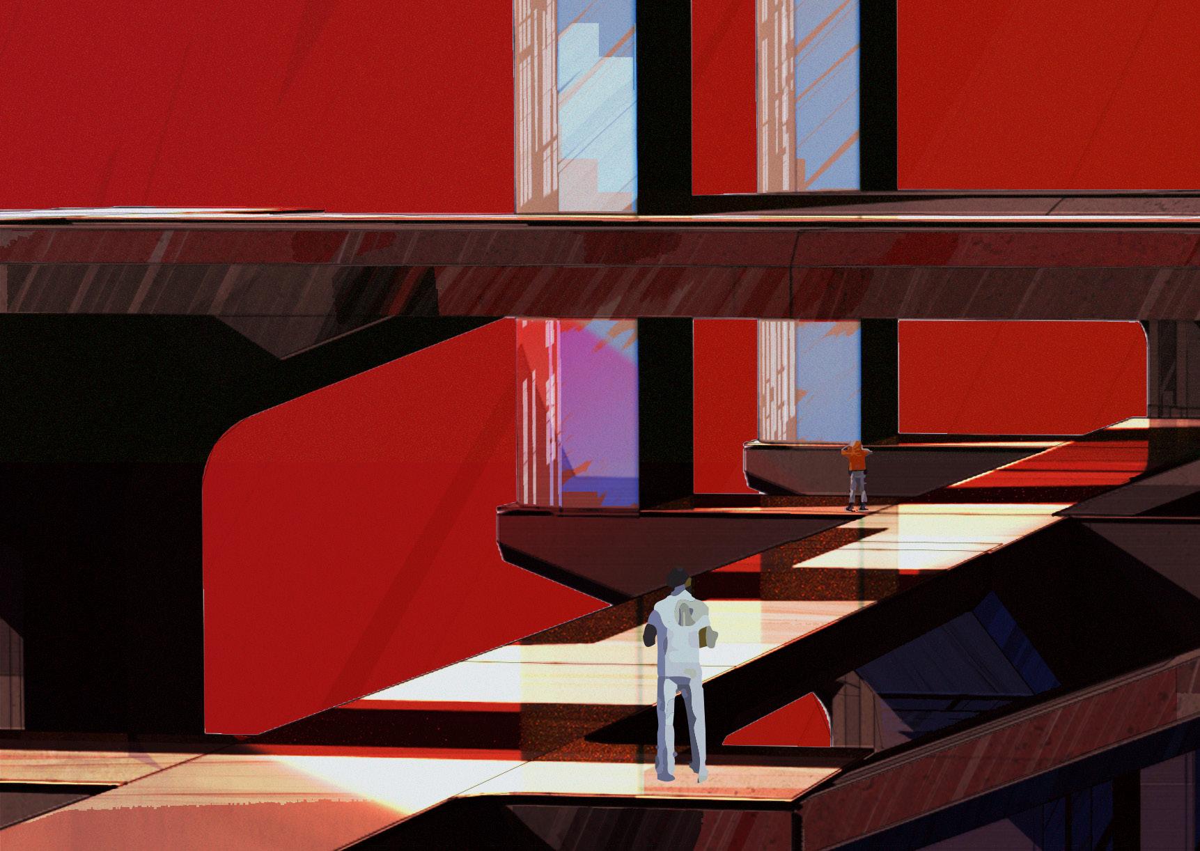

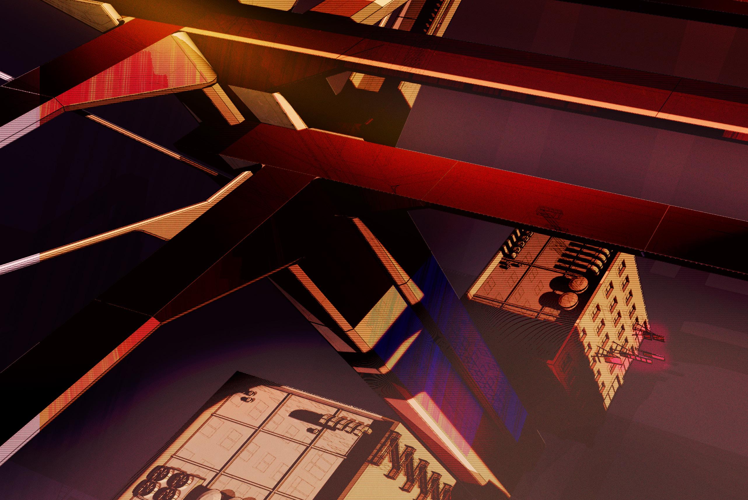

Design Development - Initial Fragment Design - 5.3
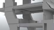
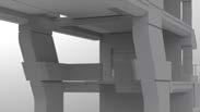
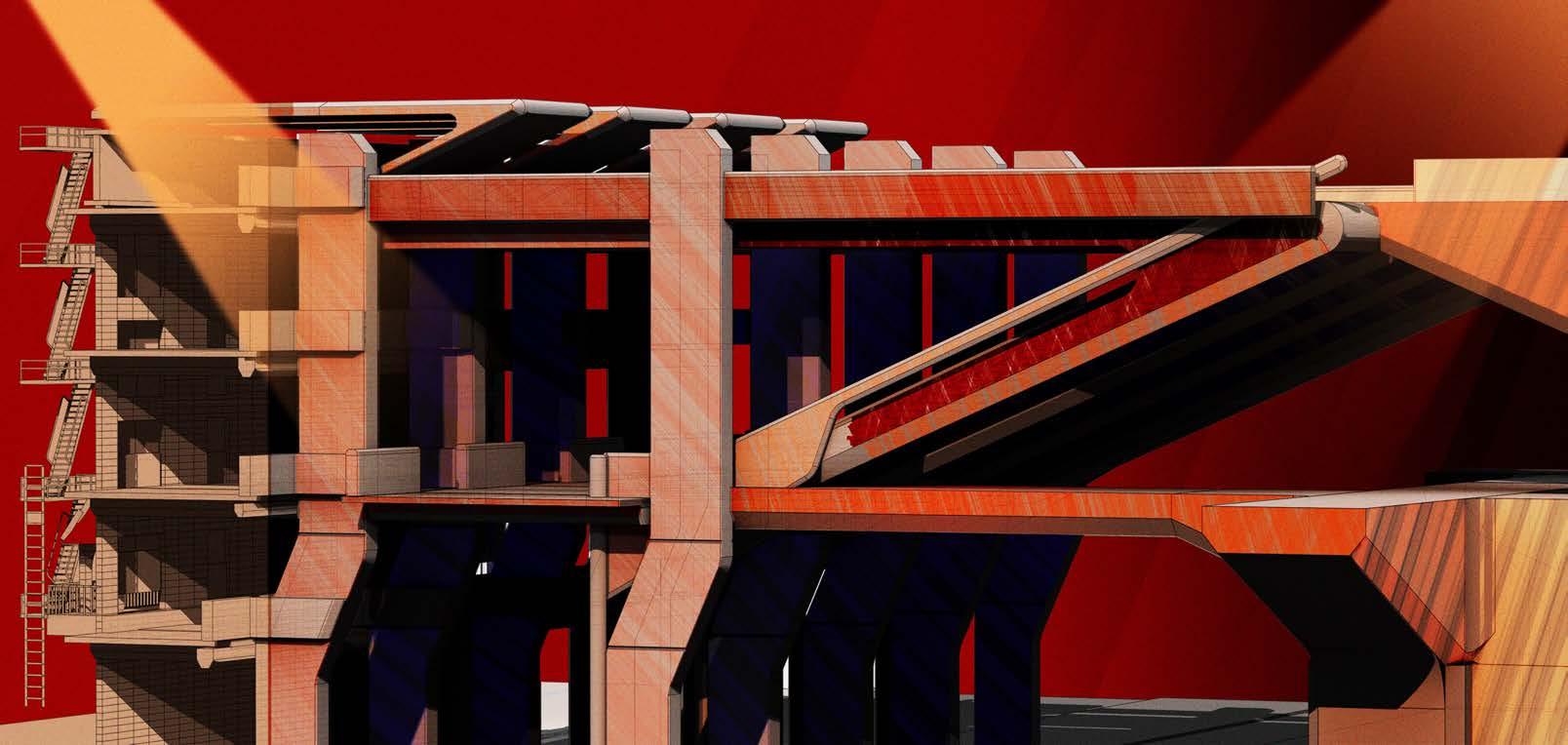
Inspired by the pier research, structural form is introduced which retain the existing Chinatown facade while also providing additional space for programmes, expanding the capacity of the urban fabric.

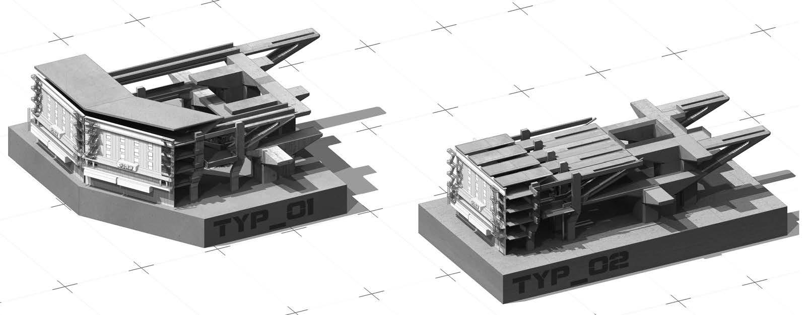
Developing from initial fragments inspired by mega structures with civic ambition,and in context with the projects brief, the following fragment is a initial response to show how architecture could interact with the existing façades of Chinatown, while providing a interface for activities and programmes.
Conclusion - Findings and Development :
Although the fragments showed topologies for different spaces which the design aims to achieve, many circulation bridges remain unresolved. The heavy architecture also left undesirable spaces underneath. Optimized circulation paths with programme and solar gain would be considered in the next design versions
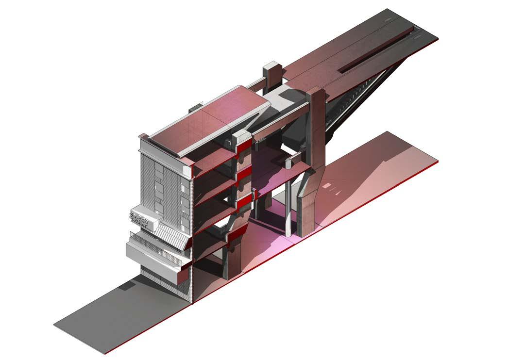
GROUND LEVEL F G H Existing Cultural Facade Retaining Cultural Elements Main Square Vertical Access Integration of Tertiary and Main Structural Systems Structural Column
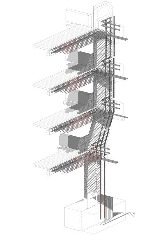
A_01 Detail Axonometric _ 01 Inspired from the peir research from the early stages of the project, key concrete columns will follow similar strategies in bridge peir construction. Concrete Structure_Slab to Wall Connection System Axonometric
Fragment Development
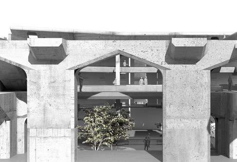
Developing from the initial fragment, this exercise attempts in formalizing space, defining the different spatial topologies which the design should reflect, these include (1) multilevel retail space, (2) courtyards, (3) Atrium and circulation zones such as bridges.
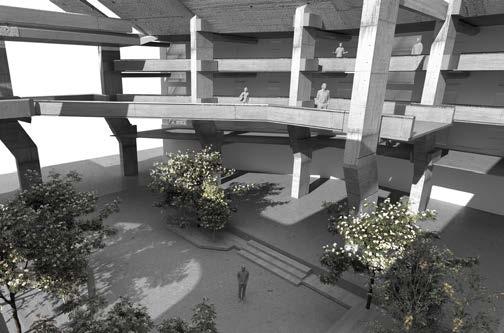
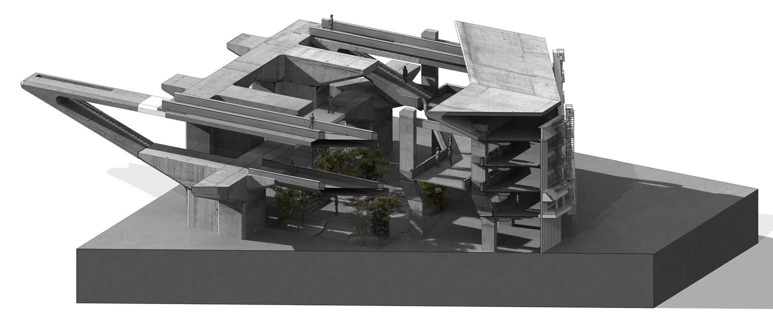
The fragments above utilizes heavy architectural elements to form courtyards, and multilevel zones for programmes. Circulation bridges are also introduced which are continuous from the facade towards the inner spaces of the fragment.
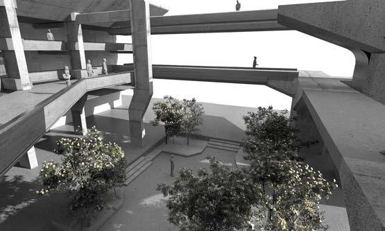
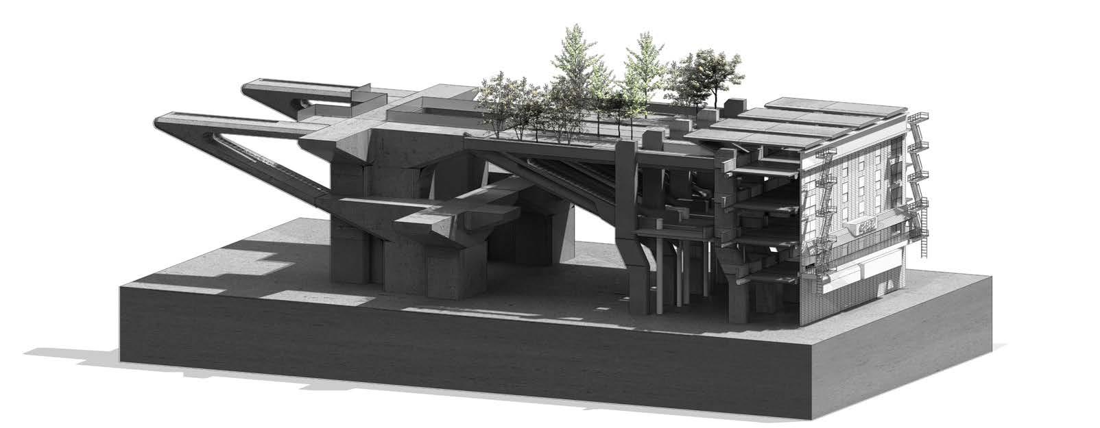
Conclusion - Findings and Development :
This exercise with the fragment designs explored how different topologies can be combined and interface with each other. This resulted in interesting relationship of spaces which could inform programming in the next stage of design, but also presented issues in regards to spatial quality and building logic. The next stage will focus on presenting a clear programming strategy as well as formulate inital hierarchies.
Initial
5.3 Fragment Development
Design Development -
Fragment Design -
Introducing New Topologies
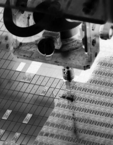
Electronics Market
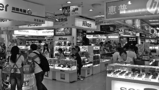
Shop Houses
Between cultures topologies take different and contrasting forms and approaches to its design. To emphasize the benefits produced from the proposed strategy in this projects context, architectural programming will negotiate between these norms, merging the conventional to propose new topologies.
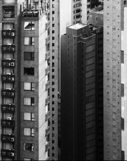
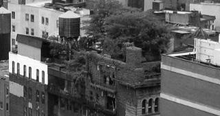
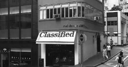
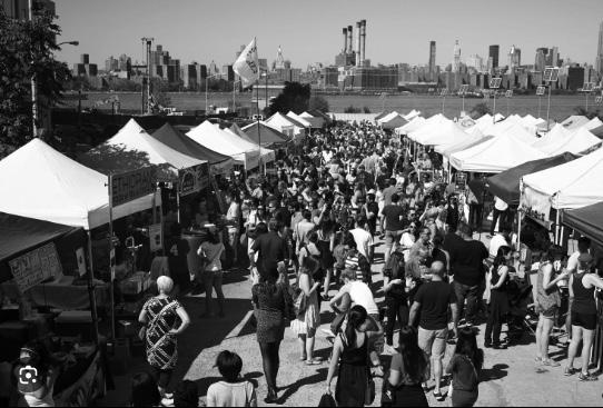
Pop culture was the result of East meeting West, resulting in iconic films, social spaces and activities such as martial arts schools will be a key proposal to the schemes programming, followed by a electronics market with shophouse residential for store owners and the intergeneration of pencil towers.



Design
- Initial Fragment Design - 5.4 Fragment Development - Programme Definition
Development
Culture Development Electronics Expansion in Capacity
Chinese Gardens Pop
Electronics Market F&B Large Footprint Retail Small Footprint Retail Public Retail Spaces Shophouse Residential Semi Public Social Spaces Public Garden Roof Garden Residential Units Social Spaces Public Amenities Mix Used Activities Semi Private Social Spaces Pencil Tower Residential Sky Lobby Private Chinese Courtyards Residetial Units Private Spaces Public Spaces Semi Public Spaces Street Access
Design Development - Initial Fragment Design - 5.5 Fragment Development
The circulation strategy of the proposal allows for general retail spaces to be formed along the existing façades, keeping their original intent while also becoming the new urban filter as users walk into the site.
Design Prototype
Towards the centre of the proposal, programmes become more dense.
Circulation is connected through walkways inspired by sky bridges in Hong Kong.
Large open areas towards the rear are areas which have most shade due to the towers. These zones will be used for delivery and loading zones of the commercial aspect.
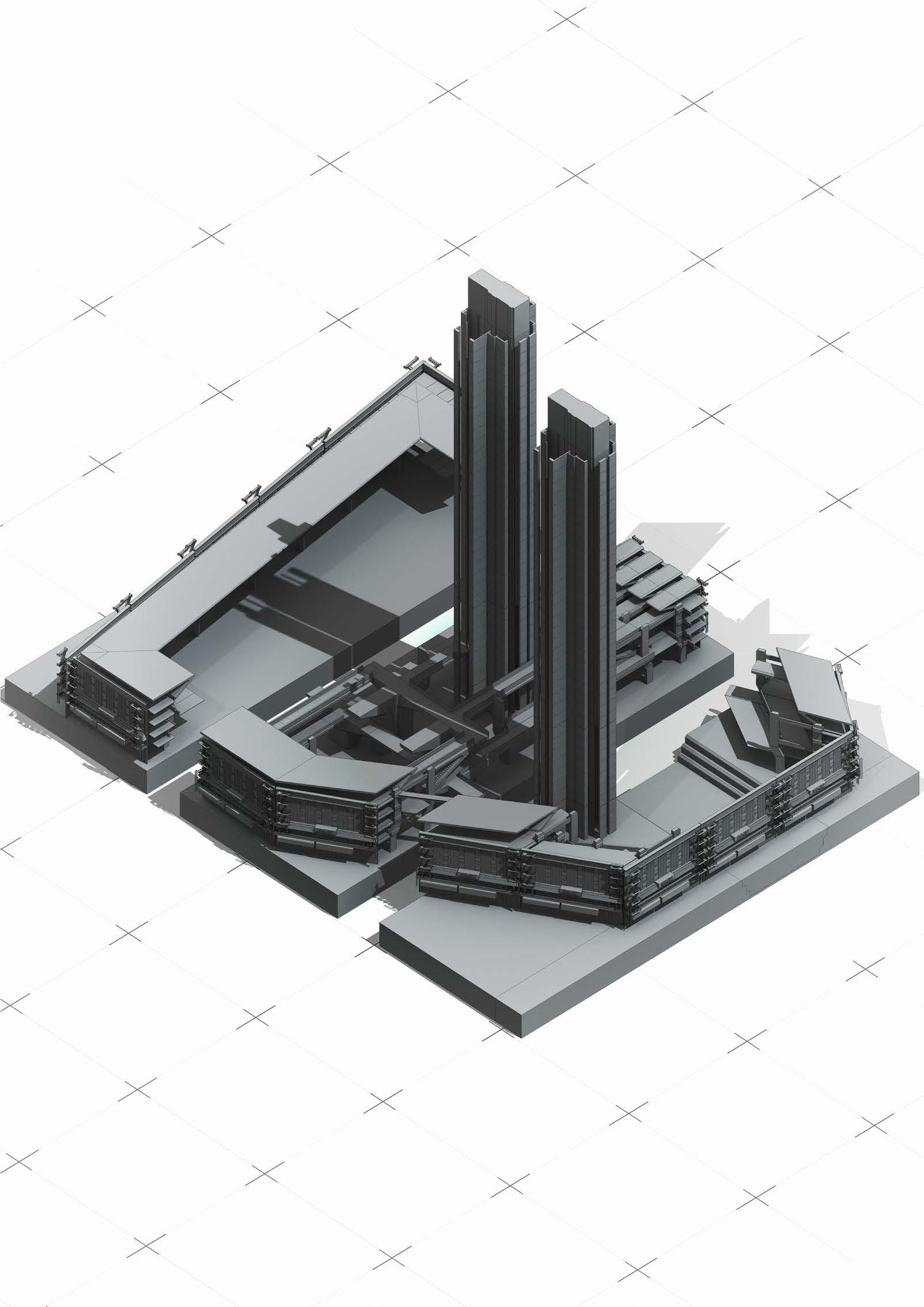
Connecting all these zones and programmes, there will be court yards inspired by traditional Chinese gardens,
Creating moments of urban and nature as one progress throughout the proposal
Upon reaching the residential towers, we go through the courtyards below and as we look back out, There is a gentle reminder that we are in New York.
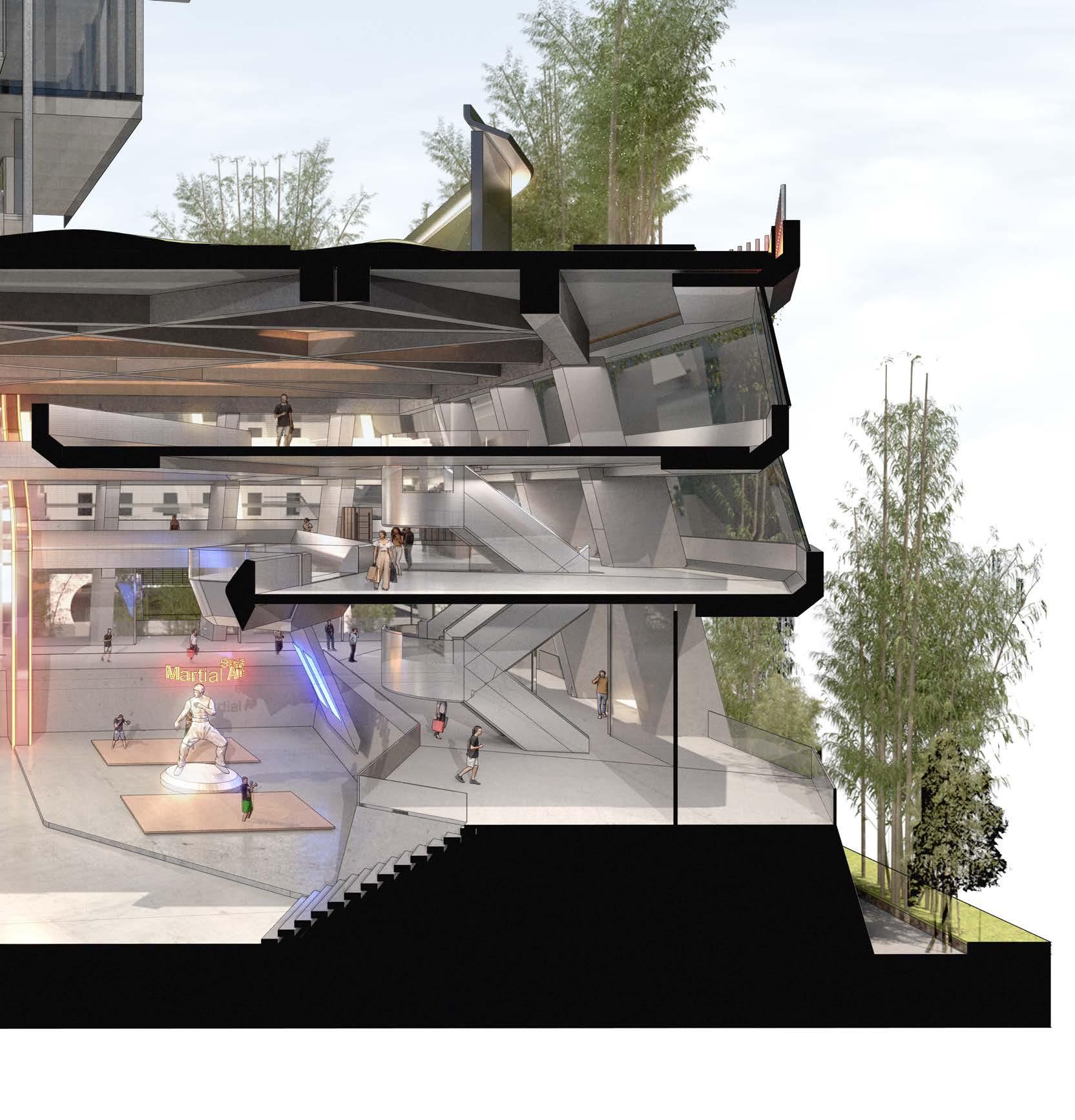
The south facing section will become a martial arts zone. With the open space being set into the ground, creating new sight lines from all around the proposal. The environment is lively and constantly moving
Conclusion - Findings and Development : After applying programme and zoning logic to this initial prototype, the strategy still lacked hierarchy and clarity, leaving the design with undesirable spaces. This will be addressed in the next chapter and following fragments. With a focus on clear programming and relationship between interfaces as well as visual hierarchy in the context of privacy levels.
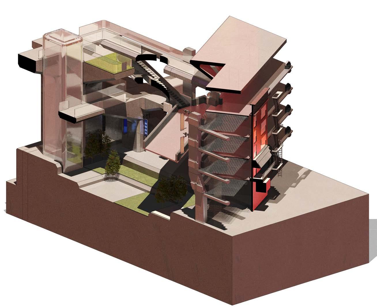
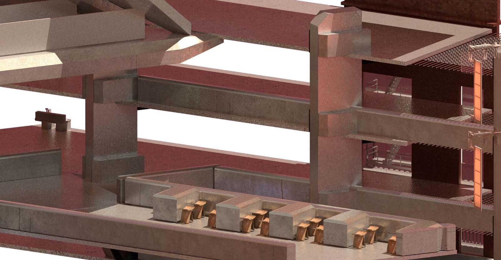
Retail Space / Circulation Axonometric_02 01. Existing Retained Facade 02. Restaurant 03. Garden 04. Elevator 05. Landing 06. Landing B_02 01 04 06 05 03 02
Design Development - Initial Fragment Design - 5.6 Fragment Development - Spatial Testing A_01
The fragment above attempts to show interaction between levels of retail and the retained facade. This version has opened up central spaces for more solar gain, resulting in a sunken courtyard.
Design Development - Initial Fragment Design - 5.6
This version of the bridge fragment integrates a sunken courtyard in relation to the architecture and retained facade. The multilevel spaces for retail programme is also expanded.
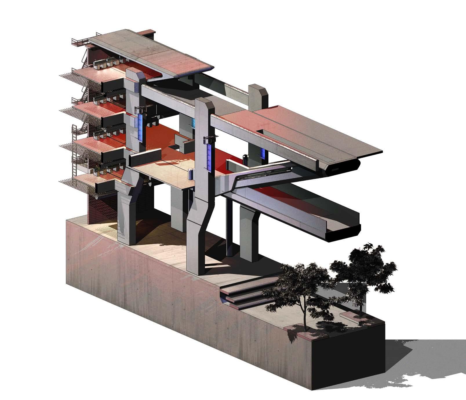
Retail Space / Circulation Axonometric_01 Single Volume Retail Space Section_01 01 02 03 04 07 05 06 01. One Meter Counters (Retail) 02. Primary Concrete Roof System 03. Floor Slab Structure Primary 04. Ceiling Finish 05. Banister 06. Primary Concrete Structure 07. Floor Slab Structure Tertiary Retail Spaces Double Volume Retail Space Section_02 01. One Meter Counters (Retail) 02. Primary Concrete Roof System 03. Floor Slab Structure Primary 04. Ceiling Finish 05. Banister 06. Primary Concrete Structure 07. Floor Slab Structure Tertiary 08. Signage 01 02 03 04 06 07 05 08 Double Volume Space Retail Spaces Retail Spaces
Fragment
Development
The following fragment explores the tower integration of the scheme. Located at the centre the tower can act as a focal point, where density is at its peak.

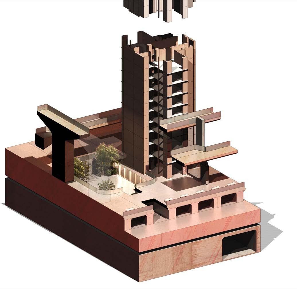
This version of the fragment proposes the tower to be surrounded by sunken plazas, forming a pedestal which the tower sits upon.
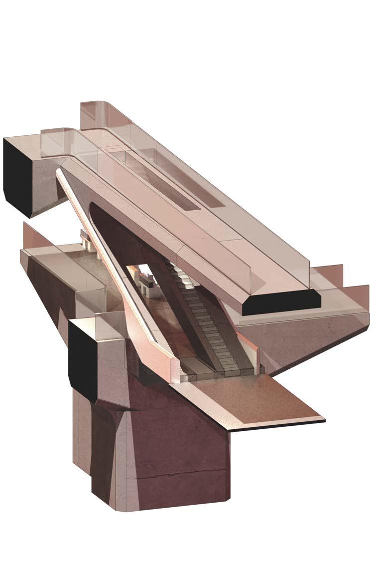
Conclusion:
The fragment reveals design cues of sunken plazas and green spaces. This will be further explored in the next stages to formalize green spaces of varying privacy level.
Residential_Courtyard_Axonometric_01 D_01 Residential Courtyard Connection_01 01 02 03 04 07 05 06 Courtyard Residential Lobby 08 09 01. Flush Drain Grate 50mm 02. Aluminium Cladding 03. Bottom Mount Front Rail 04. 5mm Frame-less Glass 05. Aluminium Fin 06. Concrete End Block 07. Bottom Mount Glass Banister 08. Aluminium Cladding 09. Residential Unit 01. Potential Retail Spaces - Under-bridge space to be eliminated. 02. Vertical Circulation 03. Horizontal Circulation 04. Landing 05. Retail Space Integration 02 04 03 01 05
Design Development - Initial Fragment Design - 5.7 Fragment Development - Programme Testing
Design Development - Initial Fragment Design - 5.8
Findings and Development - Conclusion
As a initial fragment design, we have defined spatial requirements and topologies which the final design would want to achieve. This version lacks hierarchy and planning in relation to spatial usage and programme, which will be the key focus in the next revision.
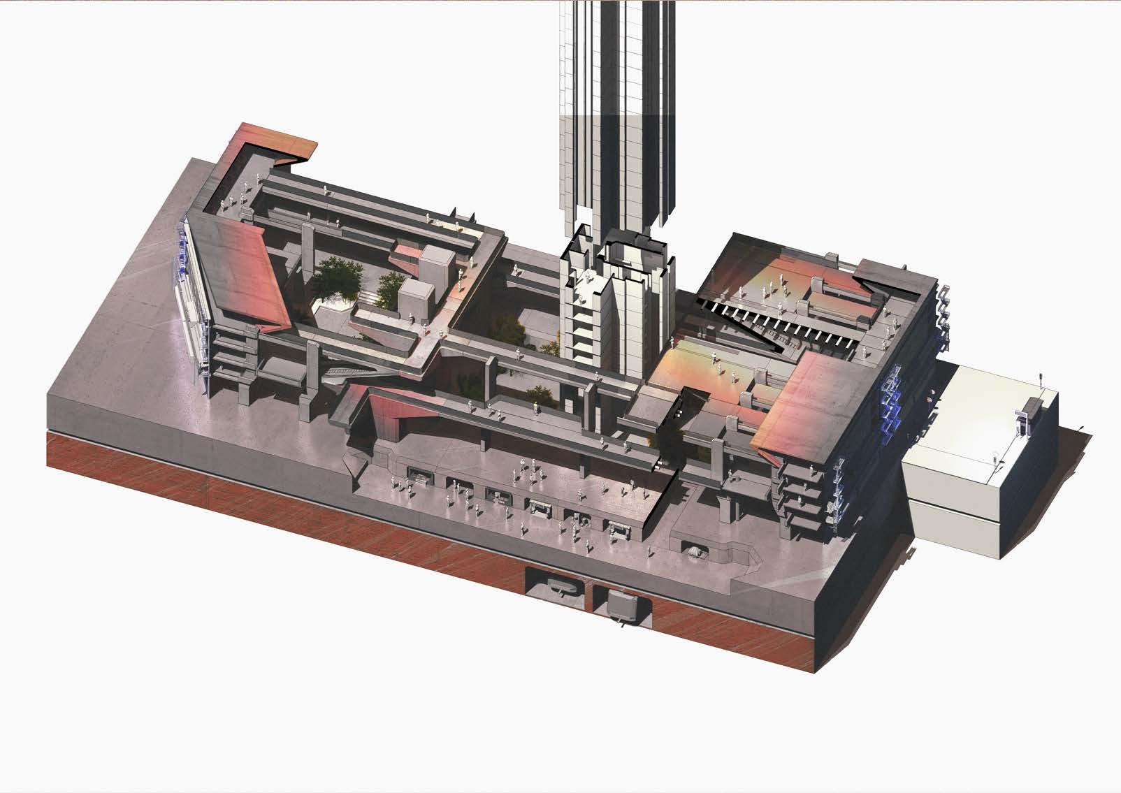
01 02 03 04 05 06 07 08 09 10 11 12 13 14 15 16 17 18 01. Retained Facade - Existing China Town Cultural Element 02. Single Volume Spaces (Retail/Circulation) 03. Double Volume Space (Social/Circulation) 04. One Meter Counters (Retail) 05. Courtyard 01 06. Lift Lobby 01- Provides access between GL and Sky bridges 07. Courtyard 02 08. Sky bridge - Circulation connecting both sides of retail zones with Tower 09. Sky bridge - Circulation connecting retail zones 10. Street Market. F&B 11. Main Square 12. Tunnel access - Circulation towards Courtyard 03 13. Courtyard 03 14. Podium - Key Access to Tower 15. One Meter Counter Retail Space 16. Single Volume Space 17. Residential Unit. 1B/1B TYP.01 Pencil Tower Configuration 18. Pencil Tower 17. Retained Existing China Town Facade 18. Bowery St. RSC_01 RC_01
Initial Fragment Design 01 Summary
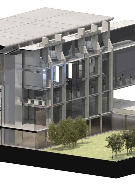
06_Design Development - Initial Fragment Design 2.0
Design Development - Initial Fragment Design - 6.1
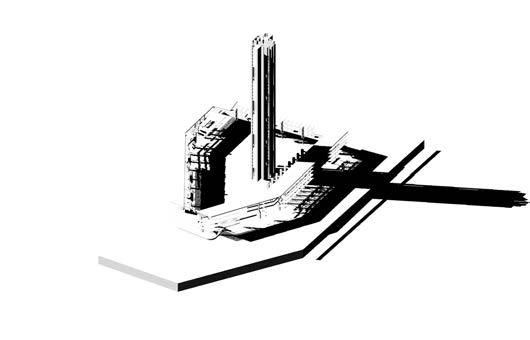
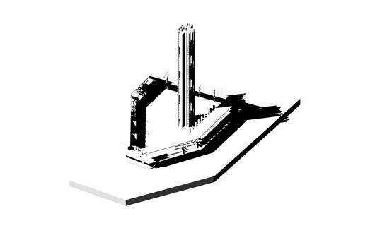
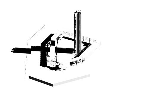
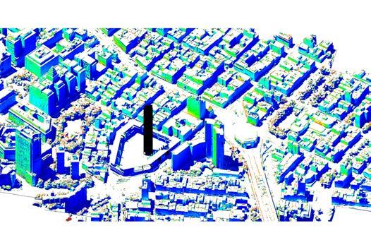
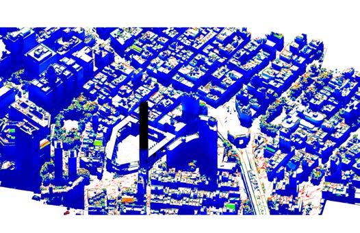
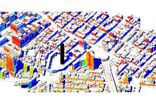
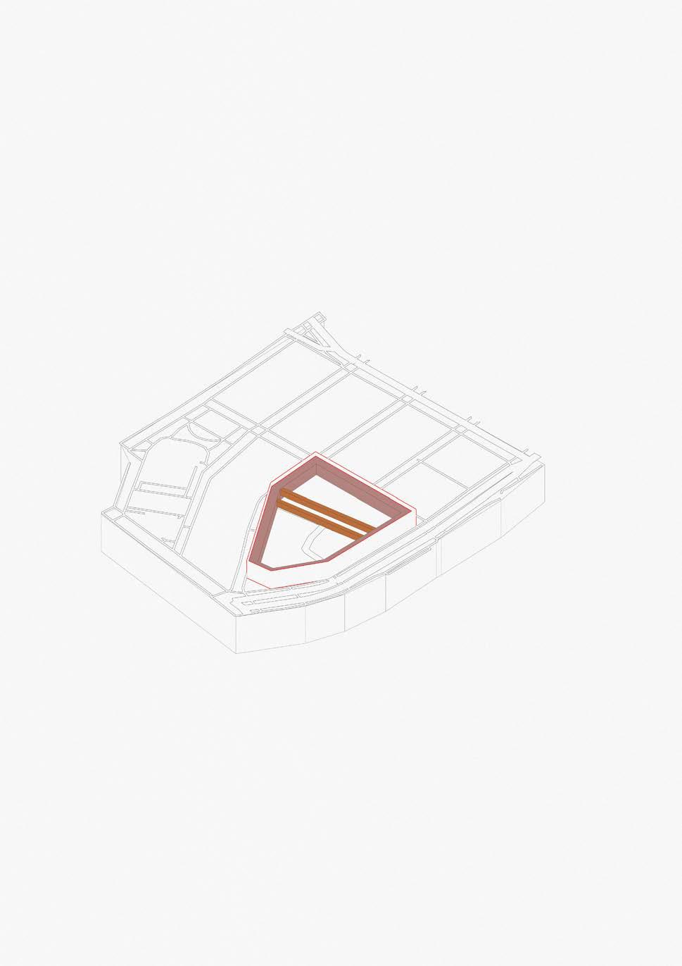
Fragment Development - Solar Analysis
Previous experiments and solutions are integrated with a fragment in the context of the scheme and site providing insight on how retail spaces can be integrated into walkways and bridges utilizing ‘‘under bridge spaces’’.

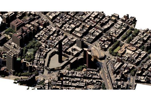

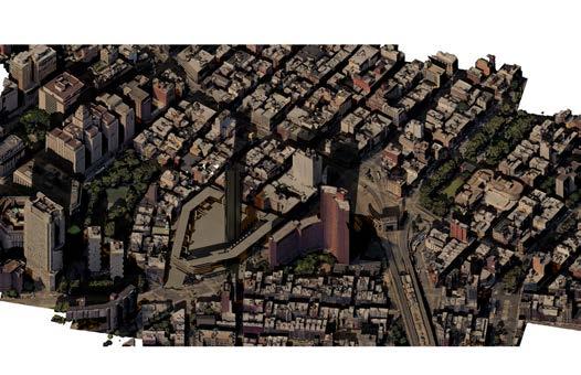
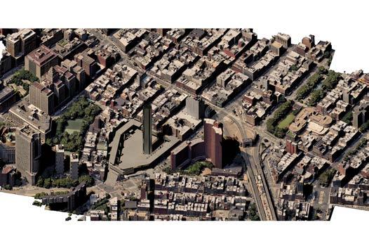
Conclusion:
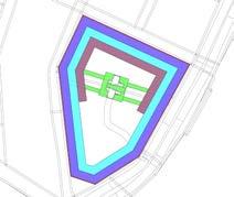
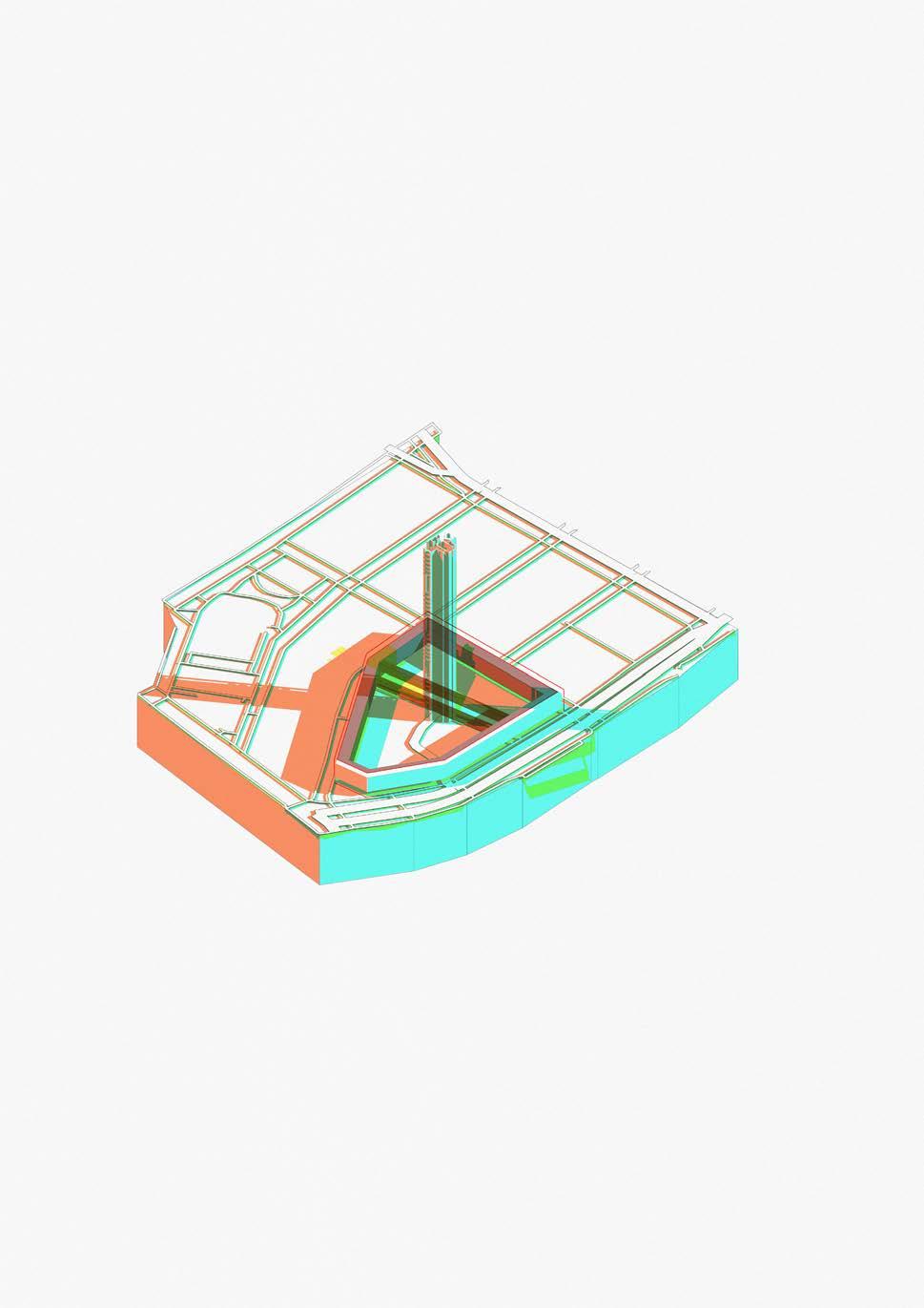
By conducting this study of solar analysis, shadow casted by the pencil towers are revealed, highlighting zones and the amount of daylight they would receive. This study will be further developed for more shading information to be used for informing programme of the scheme.
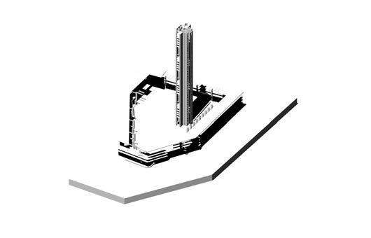
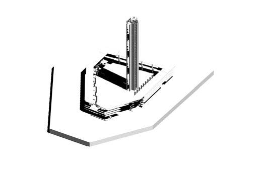
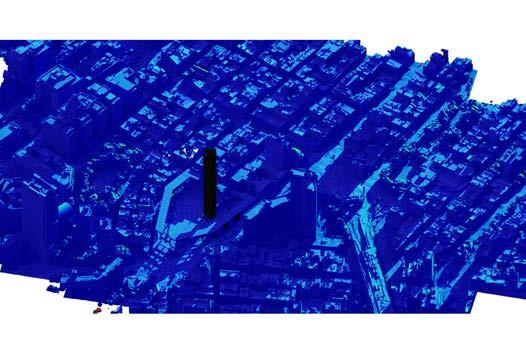

7 am 10 am 12 pm 3 pm 6 pm
Retained Facade
Public Spaces
Semi Public Spaces

Transition
Private Spaces

Conclusion:
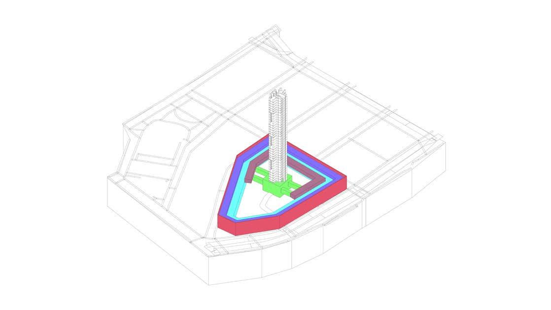
Using the solar analysis data, cast shadows of the tower is extracted and analysed. This study has highlighted the initial programming of spaces, which will inform the next stage of design. Knowing the varying hierarchies and programmes from this initial study, a sectional development will be carried out in the next section.

- Initial
- 6.1 Fragment Development - Shading Analysis
Design Development
Fragment Design
Section_01
Retail spaces, Tea rooms, Research labs and Residential Lobby
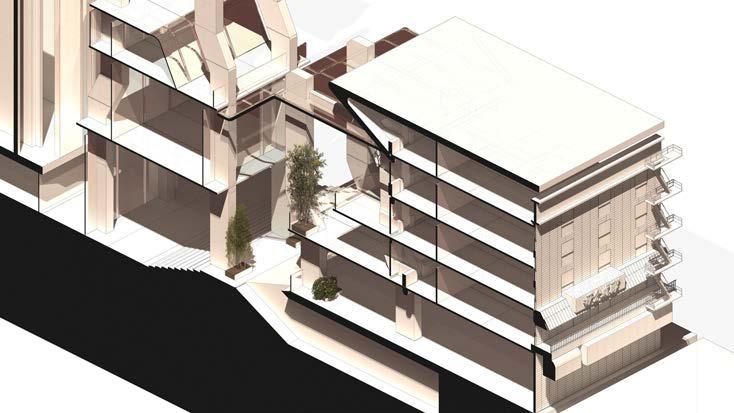
Stepped floor plates for both sides of retail spaces are optimized to receive maximum sunlight, informed by solar exposure analysis.
Resulting in a asymmetrical form for the outer retail ring.

Section_02
Circulation connections
Sky bridges informed by historical site context provides circulation and linkage between two sides of the retail space, while also linking other major programmes such as the main residential space.
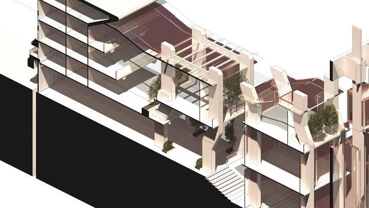 Stepped retail spaces and atrium topology
Retail space and tea room street scape
Public Private Public Semi-Private Semi-Private
Development Section - Hierarchies
Design Development - Initial Fragment Design - 6.2 Fragment Development - Sectional Development
Carrying on from the shadow study, public spaces are placed on the outer edges of the scheme. As we move towards the centre, the scheme becomes private residential. This axonometric aims to highlight circulation methods and connections which bridge private and public, through the use of lift cores.
Lift cores connects public to private zones, through the use of private lobbies. Within public areas, public lifts are available.
Conclusion and Findings
A sectional exercise is has allowed for the formalization of space to be defined more clearly. The design utilizes a stepped layout, allowing for more space to be assigned to retail zone (Public space). As we reach the centre of the scheme we arrive at private residential zones, showing the hierarchy of spaces but also privacy and programme.

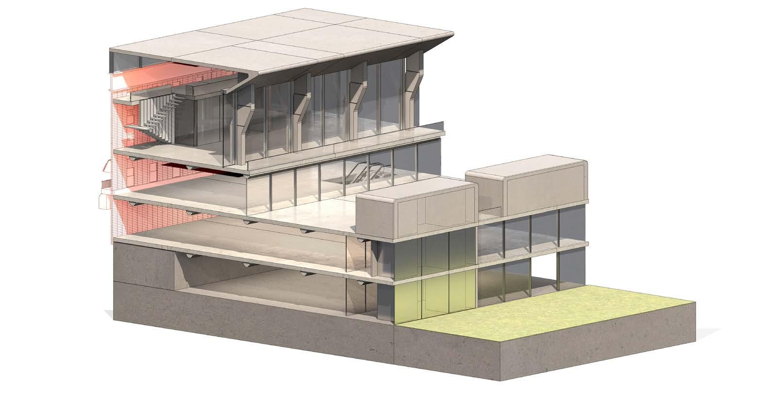 Section Axonometric
Section Axonometric
Section Axonometric
Retail Zone A01 Retail Zone A02 Market Zone A02 Retail Zone A01 Retail Zone A02 Market Zone A01 Market Zone A02 Lobby C_01 Low Zone PT_01 High Zone PT_01 Garden D_01 Garden D_02 Market Zone A01 Amenities_A01 Amenities_A01 Terrace_T01 Tea House Residential Terrace_T02 +5m Circulation plane +0m Section Plane 140.50
Design Development - Initial Fragment Design - 6.3 Fragment Development - Sectional Development and Building Profile Inital Development Section - Hierarchies
Design Development - Initial Fragment Design - 6.4
Section Axonometric
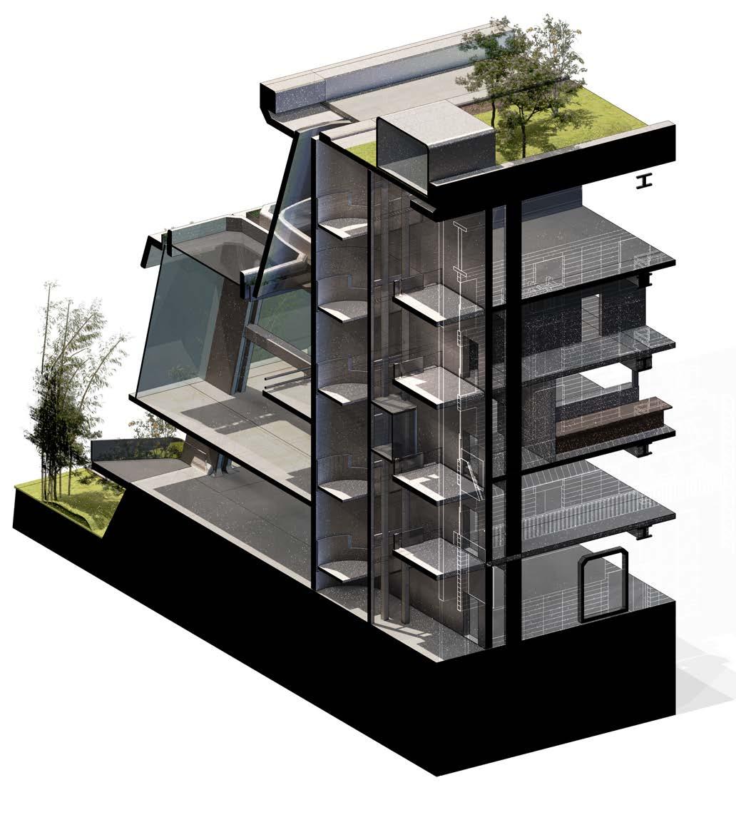
This series of Axonometric aim to test circulation and connections between public and private spaces of the scheme. Elevator lobbies are located in both the outdoor market and indoor retail areas for residents to access private areas.
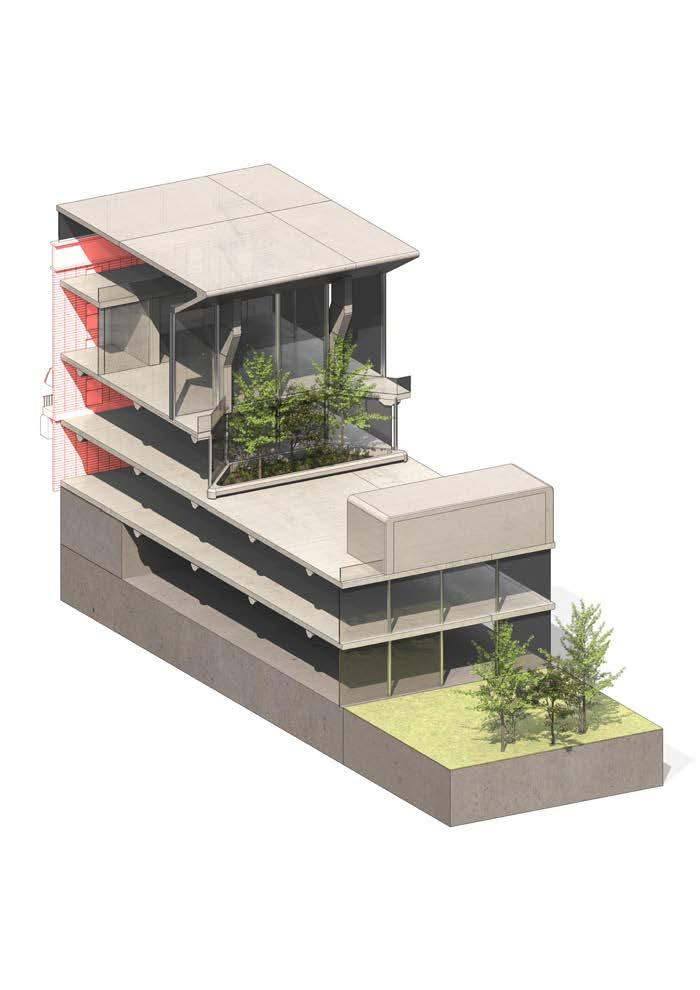
Section Axonometric
Outdoor market widen at certain sections, allowing for temporary activities.
Section Axonometric
Typical section of the outdoor market
Section Axonometric
Planters and vegetation is scattered along the outdoor market providing shading in different areas
Section Axonometric
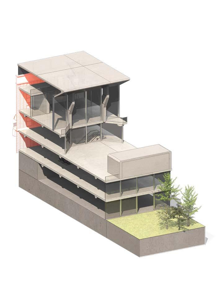

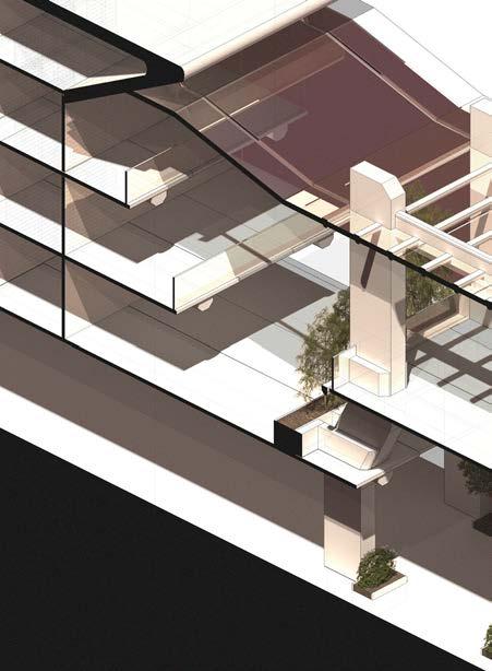
Vertical circulation connects the outdoor market to upper retail floors. Stair structure also acts as sky light bringing natural lighting into lower retail levels.

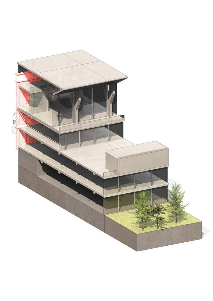
Fragment Development - Sectional Development
Design Development - Initial Fragment Design - 6.5
Lab block is positioned offset to the floor plates of the retail zone. This strategy allows day light to pass into retail zones while also providing privacy for the labs and working area.
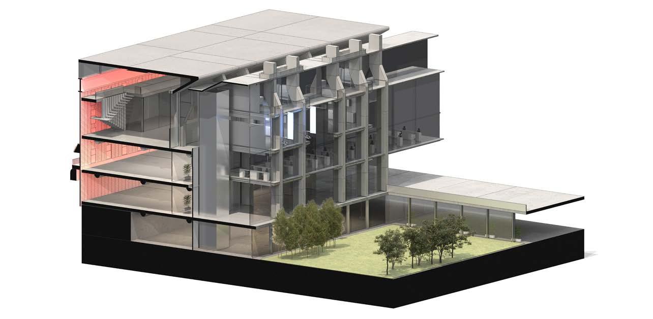
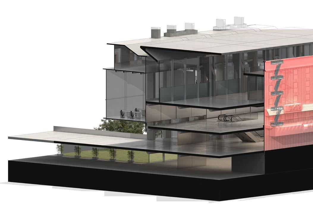
Buffer zone between the labs and retail block acts as a corridor, providing horizontal circulation across all labs.
Conclusion and Findings
Although a basic hierarchical order is achieved in this exercise of Fragment version 4, the section still requires refinement and further spatial planning. This will inform a series of sectional development which will form our final proposal.
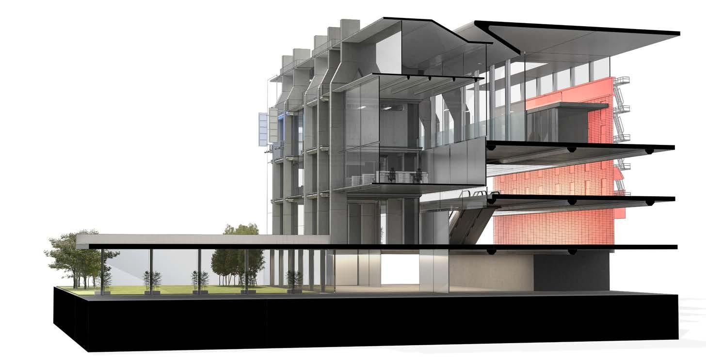 Lift lobbies are located in every floor. Connecting all zones - retail , labs and residential
Fragment Development - Sectional Development and Programme Integration
07_Design Development - Sectional Development
Tower Integration Profile Option 3 Building Profile Retained Façades Ground Profile Ground Profile Development Large Footprint Retail Zone Small Footprint Retail Zone Private Zone, Residential Small Footprint Retail Zone Circulation Residential Tower Atrium Profile Option 1 Atrium Profile Option 2 Retail Profile Option 1 Retail Profile Option 2 Tower Integration Profile Option 1 Tower Integration Profile Option 2 Atrium Profile Option 3 Retail Profile Option 3 Sectional Development Sectional Development 02 Sectional Development 03 Design Development - Sectional Development - 7.1 Sectional Development Full Utilization Atrium Intergration High Atrium Intergration High Atrium Intergration and Light Optimization Atrium Intergration and Light Optimization Atrium Intergration and Light Optimization with Offset Floorplates High Atrium Intergration and Light Optimization with Offset Floorplates High Atrium Intergration, Light Optimization with intergration to tower Atrium Intergration, Light Optimization with intergration to tower Atrium Intergration, Light Optimization with intergration to tower
Ground Profile Sectional Development Design Development - Sectional Development - 7.1 Sectional Development
Design Development - Sectional Development - 7.2
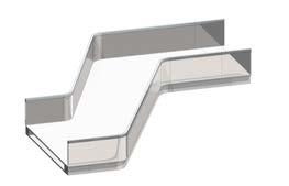
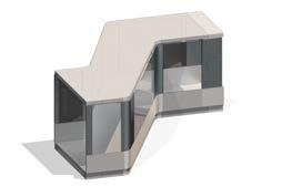
Circulation and Programming
Strategy Option 1
Circulation blocks separate each retail section. Providing vertical circulation to connect all levels.
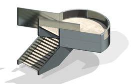
Strategy Option 2
Shophouse residential only accessible to store owners. Circulation access located within ground floor retail spaces
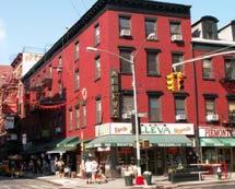
Circulation Strategy
Zoning Strategy
Circulation Strategy
Main points of circulation consists of bridges connecting the outer ring and inner atrium. Vertical circulation is accessible through a series of stair cores which links retail areas of the electronics market and F&B zones. Private zones including shop house residential areas are accessible through existing facade entrances or through private cores highlighted in green.

Small Footprint Social Spaces Walkway Walkway Public Residential Amenities and Activities Private Podium Residential Garden Small Footprint Social Spaces Walkway Walkway Walkway Walkway Large Footprint Retail Zone Retail Spaces Large Footprint Retail Zone F&B Ground Level Retail Zone Market Canyon Garden Residential Topology A Private Residential Retained Facade Walkway Walkway Large Footprint Retail Zone Retail Spaces Large Footprint Retail Zone F&B Residential Topology A Private Residential Retained Facade Ground Level Retail Zone Market Residental Central Atrium Private Lobby Public Residential Amenities and Activities Small Footprint Electronics Market Small Footprint Electronics Market ±0.00 ±4000 ±8000 ±12000 ±16000 ±20000 ±24500 ±28500 ±32500 ±36500 ±40500 ±44500 ±48500 33000 120000 8500 8500 10000 24150 10000 24150 Canyon Canyon Residential Residential F&B Retail F&B Retail RetailRetail Retail Retail Retail BOH Private GardenPrivate LobbyPrivate Lobby Private LobbyPrivate Lobby Central AtriumCentral Atrium Retail Retail Retail BOH Private Garden Residential Residential F&B Retail Retail F&B Retail Retail Dynamic Activity Residential Canyon Canyon Residential Residential F&B Retail F&B Retail Retail Retail Retail Retail Retail BOH Private Garden Private Lobby Private Lobby Private Lobby Private Lobby Central Atrium Central Atrium Retail Retail Retail BOH Private Garden Residential Residential F&B Retail Retail F&B Retail Retail Dynamic Activity Residential Canyon Canyon Residential Residential F&B Retail F&B Retail Retail Retail Retail Retail Retail BOH Private Garden Retail Retail Retail BOH Private Garden Residential Residential F&B Retail Retail F&B Retail Retail Dynamic Activity Residential Residential Residential F&B Retail Retail F&B Retail Retail
Public Stairs Public Bridges Private Stair Cores Private Lift Public Lift
08_Design Development - Proposal

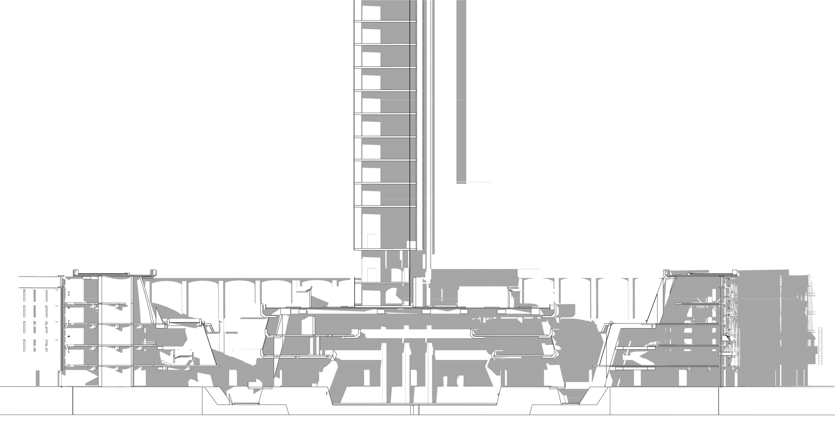
01 02 03 04 05 13 12 06 07 08 09 10 11 01 GL Retail Zone. Entry Halls 02 L1 Mix Use Retail Zone. HK Mall Topology 03 L2 Public F&B Zone 04 Shophouse Residential Units 05 Residents Sky Garden. New York Roof Garden Topology 06 Private Sky Lobby - Garden 07 Activity Spaces. Martial Arts Gym 08 L1 Mix Used Cultural Spaces. Public Activities 09 GL Mix Used Cultural Spaces. Public Activities 10 Sunken Plaza. Mix Use Space. 11 Lift Core 12 Sky Lobby - Reception 13 Tea Rooms 14 Public Garden. Canyon Topology 15 GL Retail Zone. Entry Halls 16 L1 Mix Use Retail Zone. HK Mall Topology 17 L2 Public F&B Zone 18 Shophouse Residential Units 19 Retained Cultural Façades Design Development - Proposal - 8.1 Key Section

15 16 17 18 14 19 N
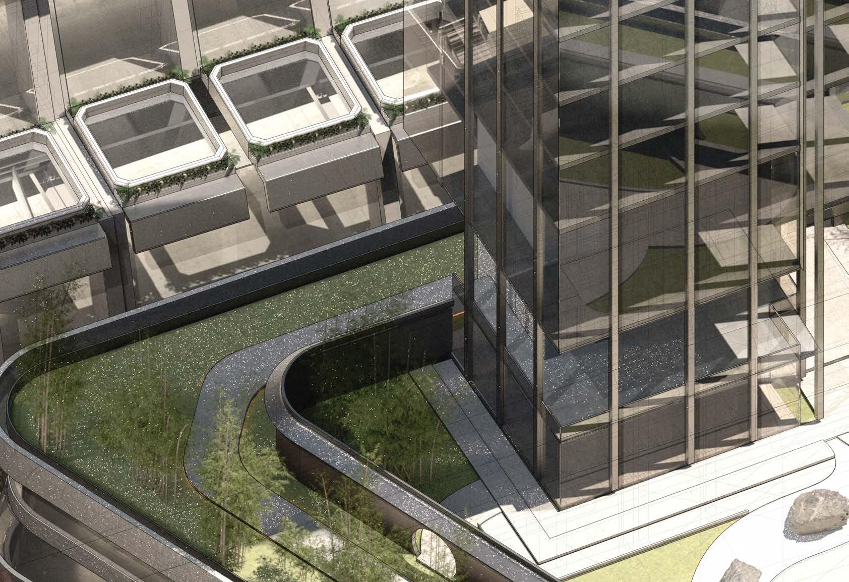
Comer Condition. The axonometric above shows a resolution towards comer conditions of the scheme. Instead of skylights and openings, a sky garden is introduced. Acting as privacy screens for residential of the shophouses.
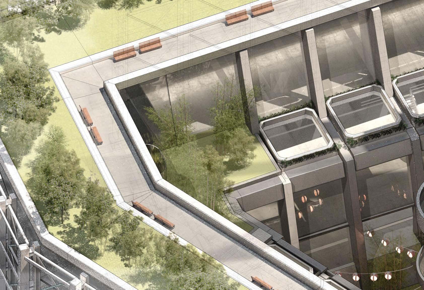
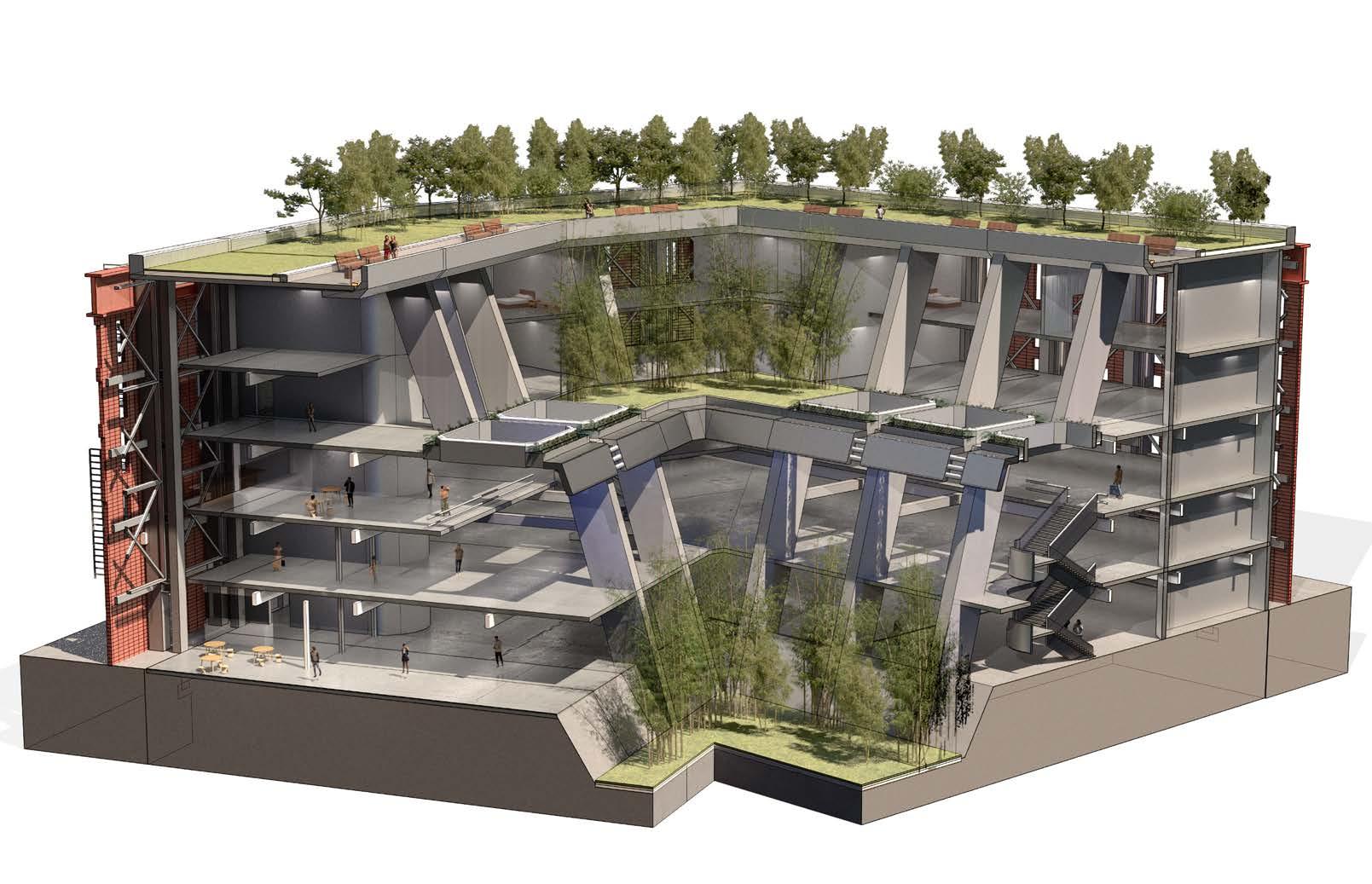
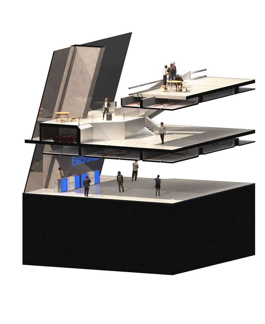
Public Electronics Retail Zone 1 2 3 4 5 6 1 Ground Level, Public Retail Zone 2 Level 1 Mixed Retail Zone 3 Level 2 F&B 4 Shophouse Residential Unit 5 Private Sky Garden 6 Sky Garden 7 Public Sky Garden 7
Design Fragment - Corner Condition
Design Development - Proposal - 8.2
Large Footprint Retail Zone
Small Footprint Retail Zone / F&B
Social Spaces (Semi Private)
Social Spaces (Public)
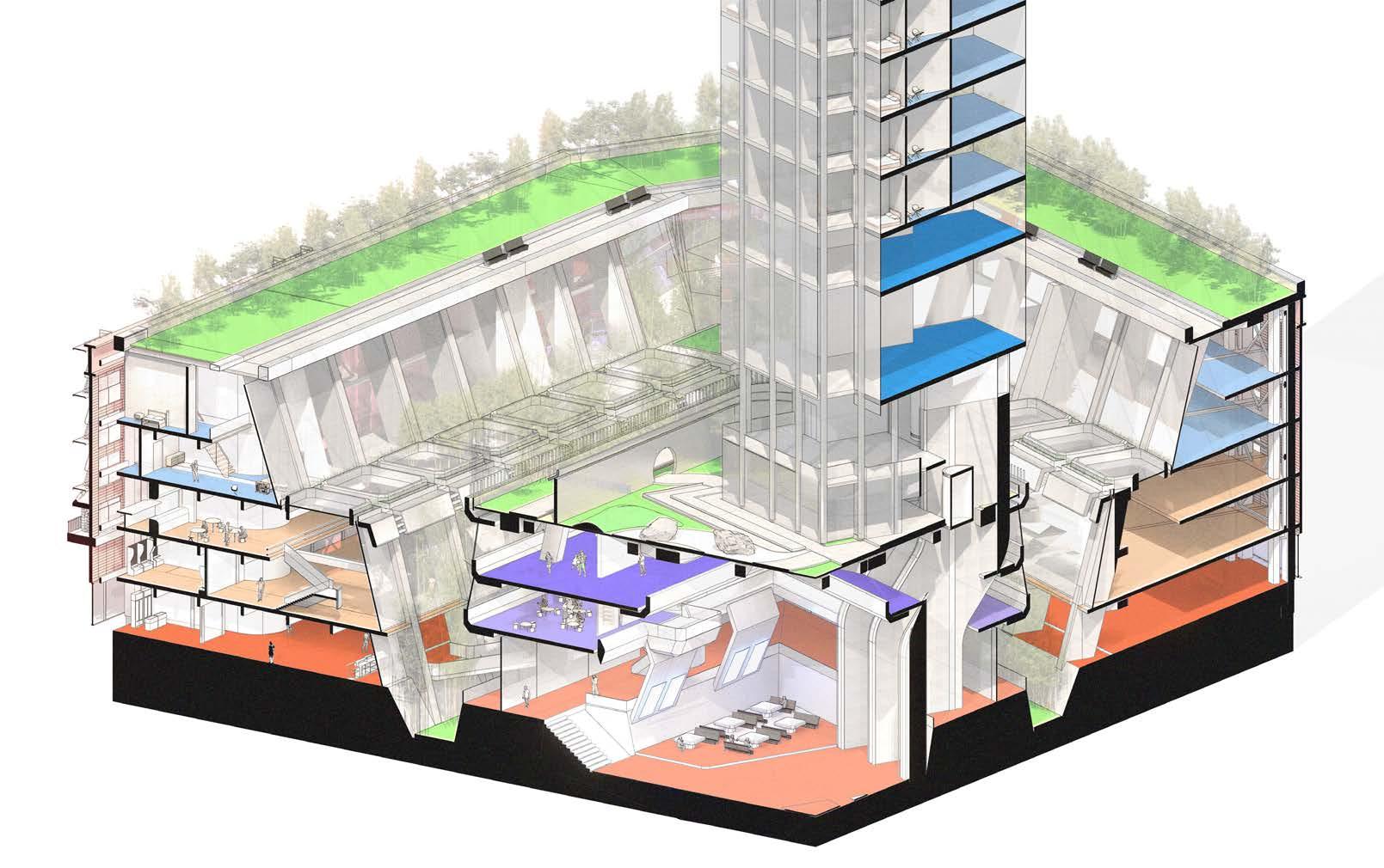
Amenities
Shophouse Residential
Pencil Tower Residential Gardens
-
- 8.2 Design Fragment - Programming
Design Development
Proposal
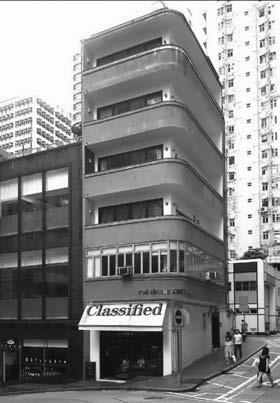
Located in Hong Kong are constrained by small footprint of the architecture. The new proposed topology aims to combine the integrative approach of Hong Kong shophouses and efficient planning of typical New York Lofts
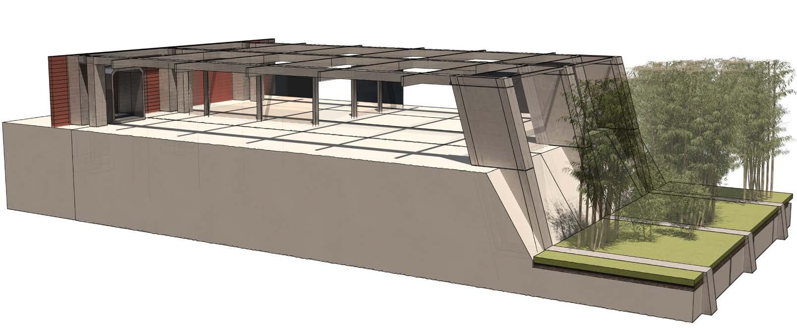
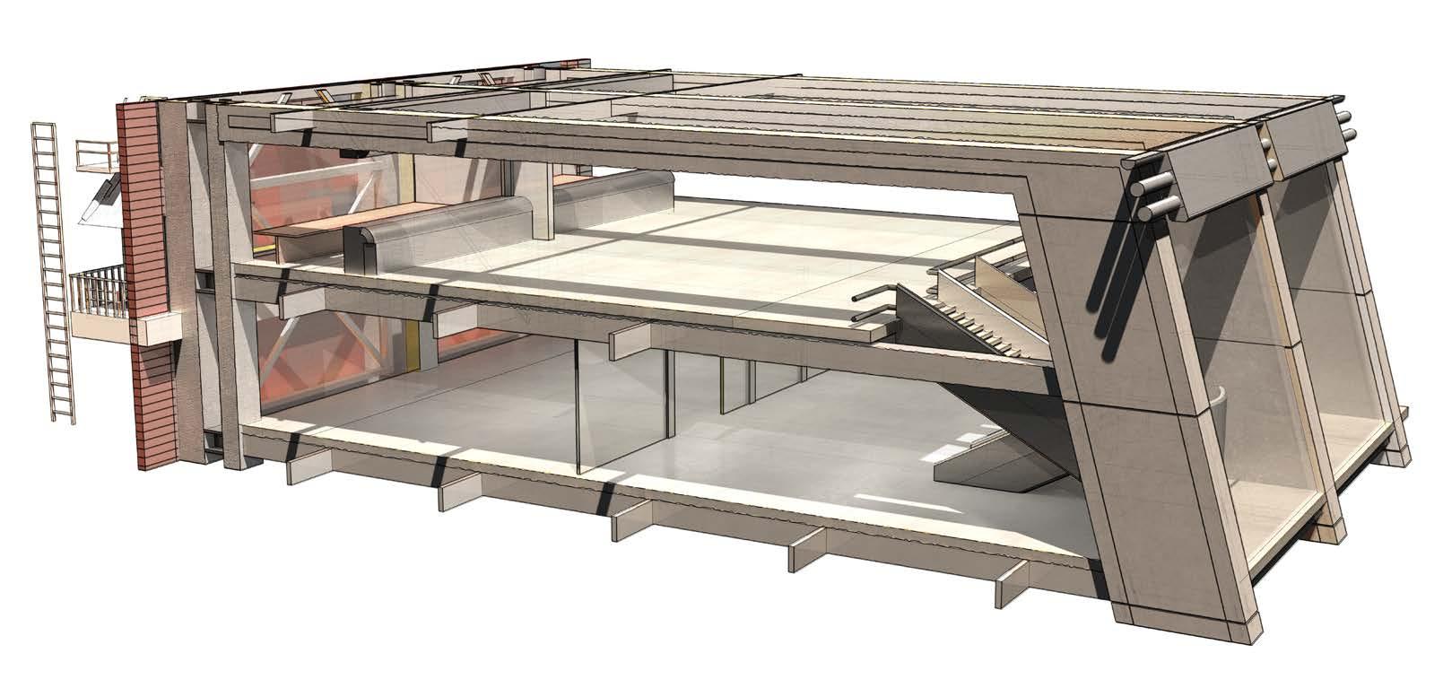
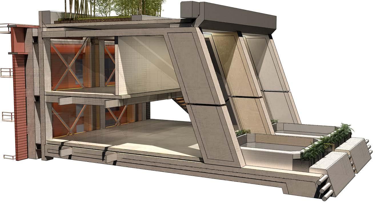
Shophouse Residential Unit Fragment Public Retail Zone and F&B Fragment GL Retail Zone and Public Garden Fragment
4th generation shophouses
01 02 03 01 Living Space 02 Bedrooms 03 Roof Garden 01 Vertical Circulation 02 Retail Circulation 03 Retail Spaces 04 F&B 01 03 04 02 01 Mix-Use Spaces (Market) 02 GF Store fronts/Retail 03 Public Garden 04 Street Access 01 02 03 04 A01 Design Development - Proposal - 8.3 Design Fragment - Fragment Component
Structure Components - Pier Topology
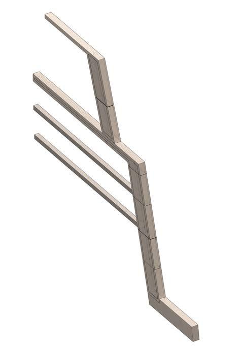
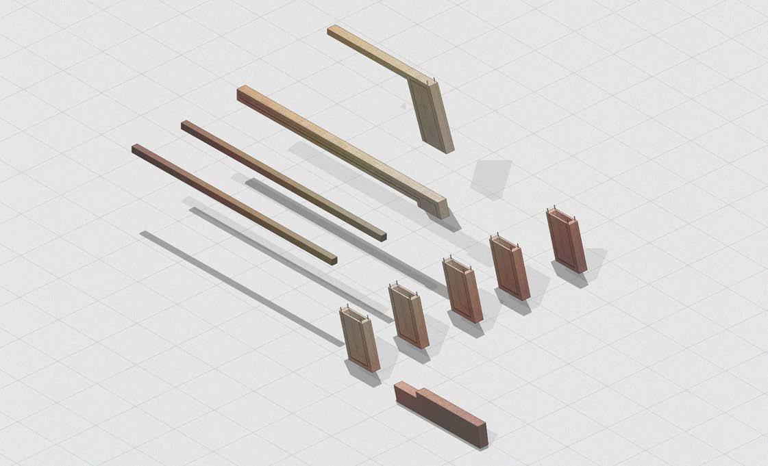
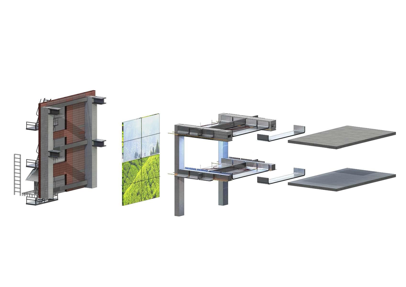
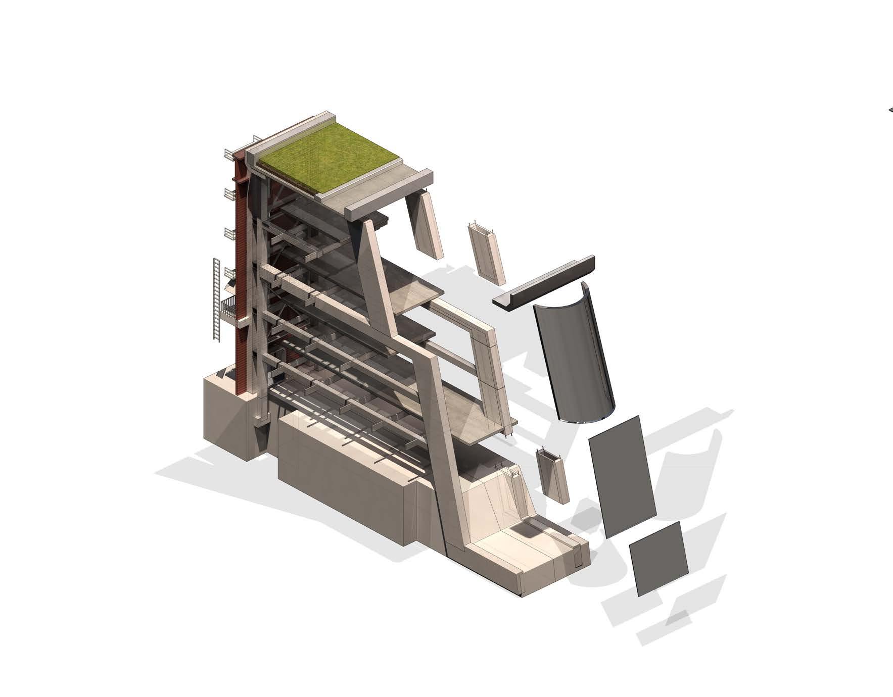 Exploded Structure Axonometric Outer Ring
A01 Design Development - Proposal - 8.3 Design Fragment - Fragment Composition
Section - Structure and floor plate relationship
Traditionally, facade retentions systems composes of light weight steel frames.

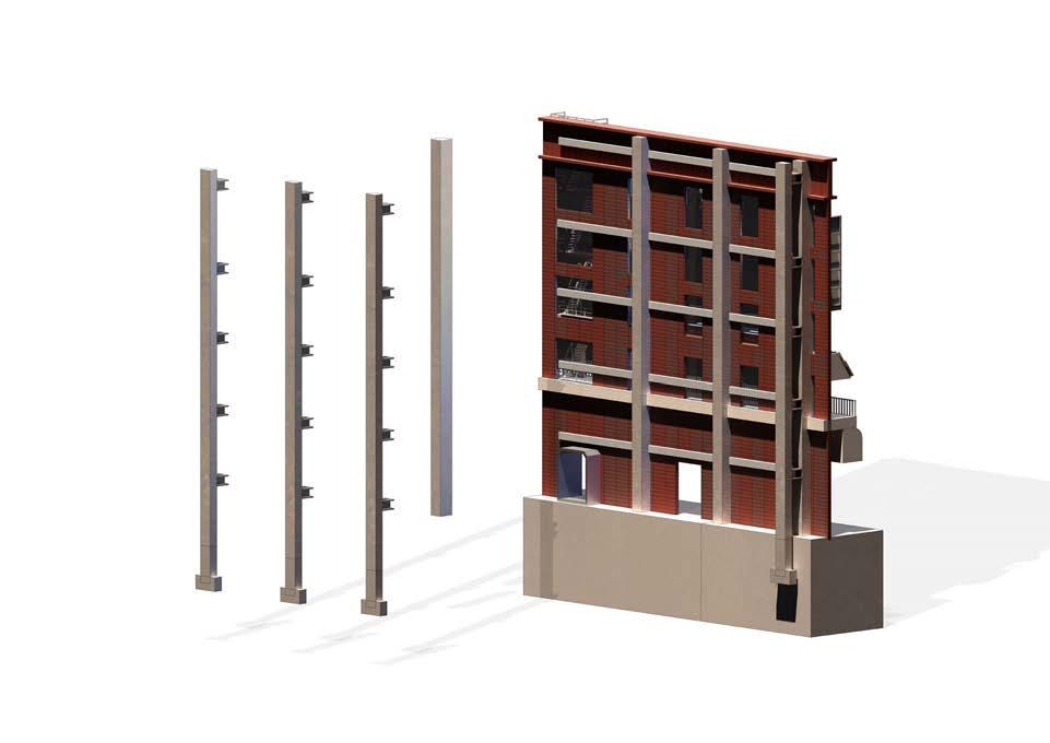
Due to the addition of floor plates and expansion of programme behind the retained facade, a new concrete structure must be added to support new floor plates.
The proposed system composes of a tertiary retaining structure made of steel and a primary concrete structure to support additional load of floor plates.
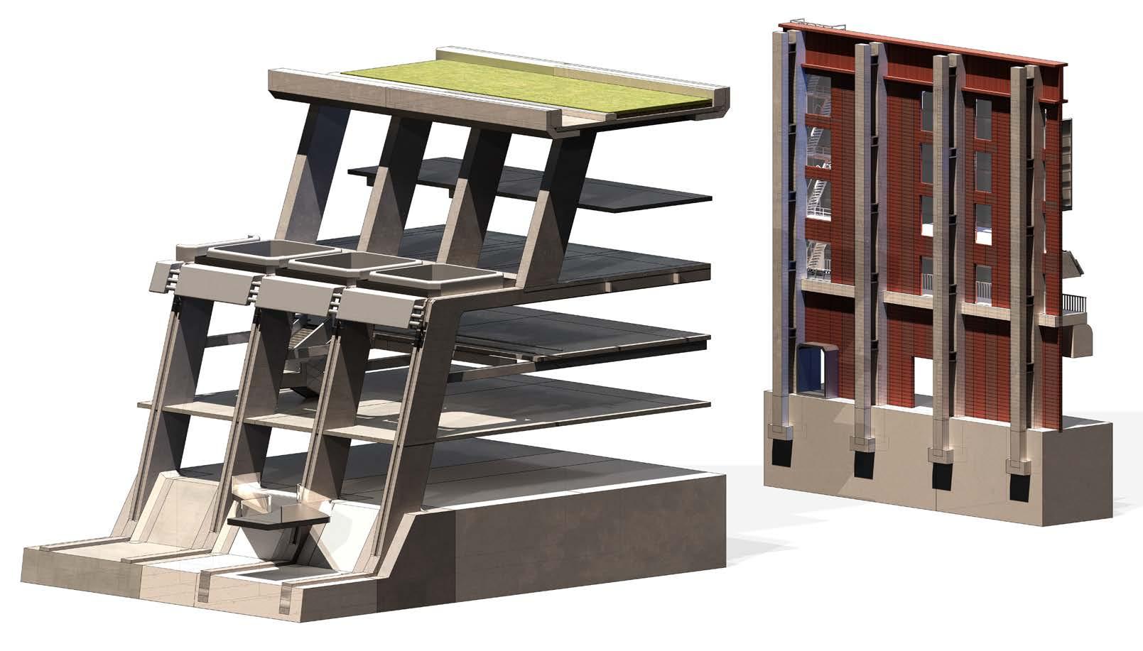
Retaining wall section
Pirmary Facade Retention Frame New Concrete Structure Columns Teitary Steel Structure Structural Concrete Connectors to Floor Plates
Typical Steel Facade Retaining
Structures
Structural Systems Axonometric Design Development - Proposal - 8.4 Design Fragment - Retaining Facade System
Facade Retaining Structural System
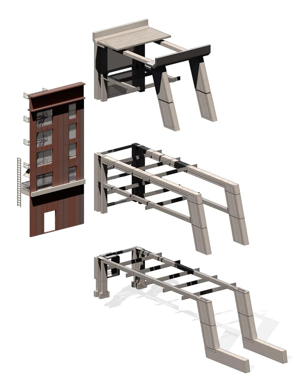
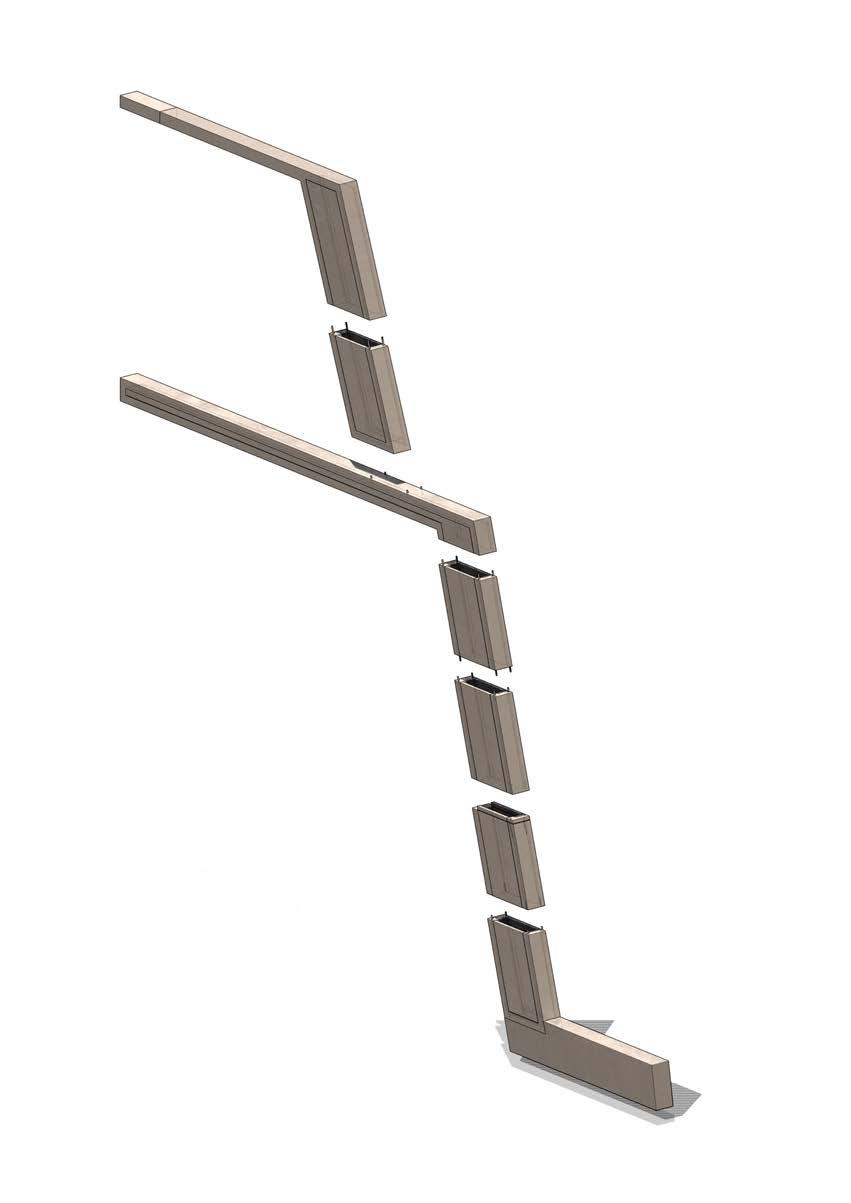
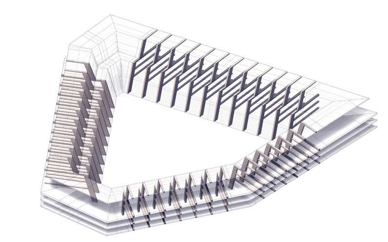
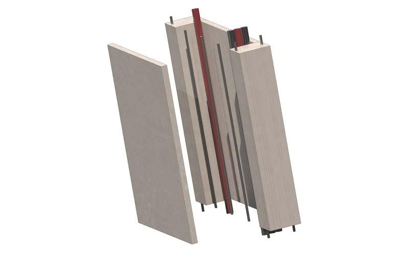
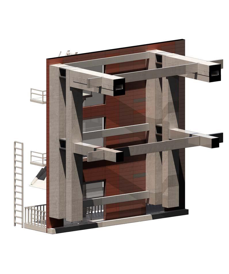
A_01 Retained Facade 01 Pier Deck 02 Retaining Steel Form work 03 Floor Beam 04 Pier Section - Primary Structure 05 Concrete Primary Structure 06 Foundation 07 Foundation A_01 01 03 04 01 07 06 05 02 Outer Ring Structure
Structural system axonometric Design Development - Proposal - 8.4 Design Fragment - Building Structure
Exploded Concrete Column
Traditionally, facade retentions systems composes of light weight steel frames.

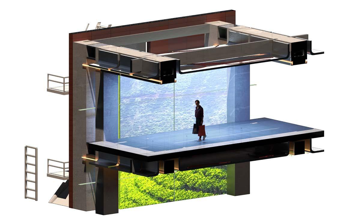

Due to the addition of floor plates and expansion of programme behind the retained facade, a new concrete structure must be added to support new floor plates.
The proposed system composes of a tertiary retaining structure made of steel and a primary concrete structure to support additional load of floor plates.
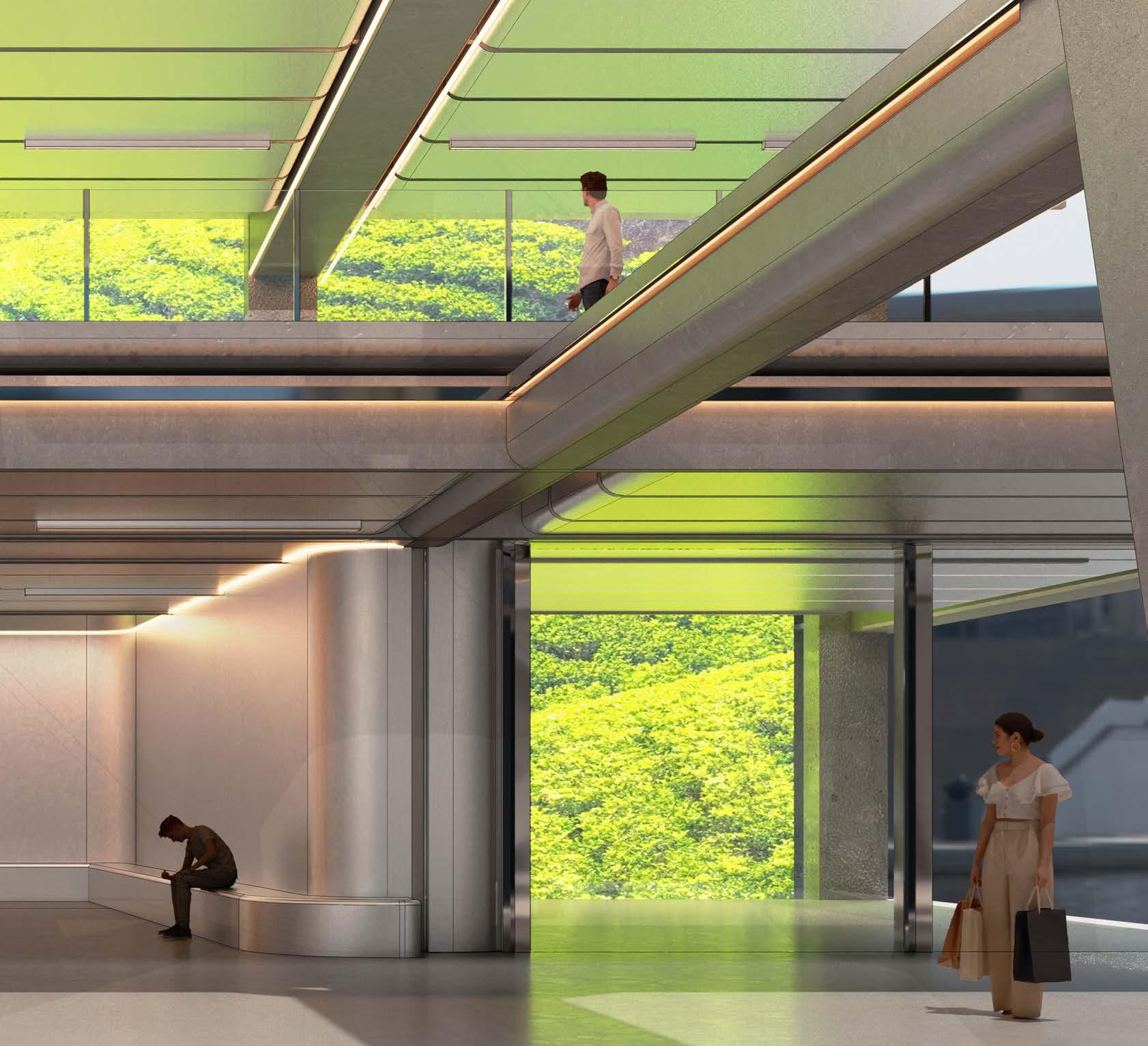
Design Development - Proposal - 8.4 Design Fragment - Retail Zone - Screen System
Design Development - Proposal - 8.4 Design Fragment - Retail Zone - Screen System
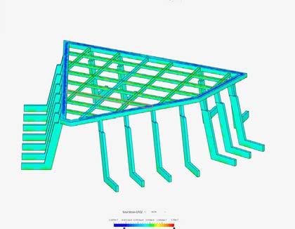
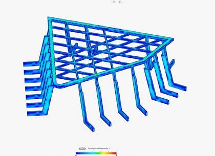
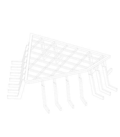
Version 01
This initial version follows the existing grid of the site and connects each column of the atrium to form the roof structure.
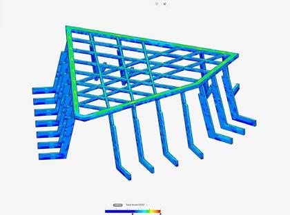

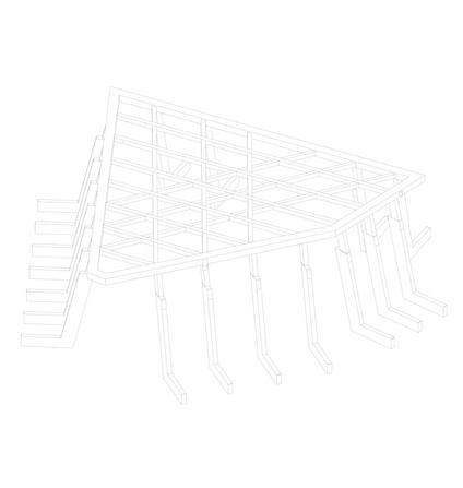
Version 02
This variation follows the grid of the atrium and connects each column of the atrium at a angle, forming a hatched patten for the roof structure.

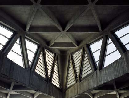
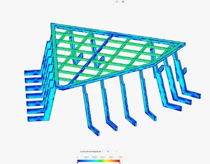

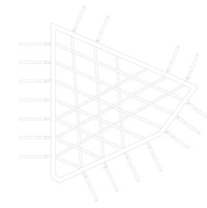

Inspired by the George Washington bridge bus station. This result is visually more interesting compared to the traditional grid like approach.

Design Development - Proposal - 8.5 Design Fragment - Atrium Structural Analysis
George Washington Bridge Bus Station
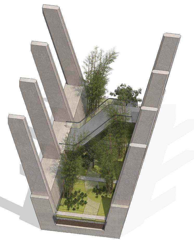
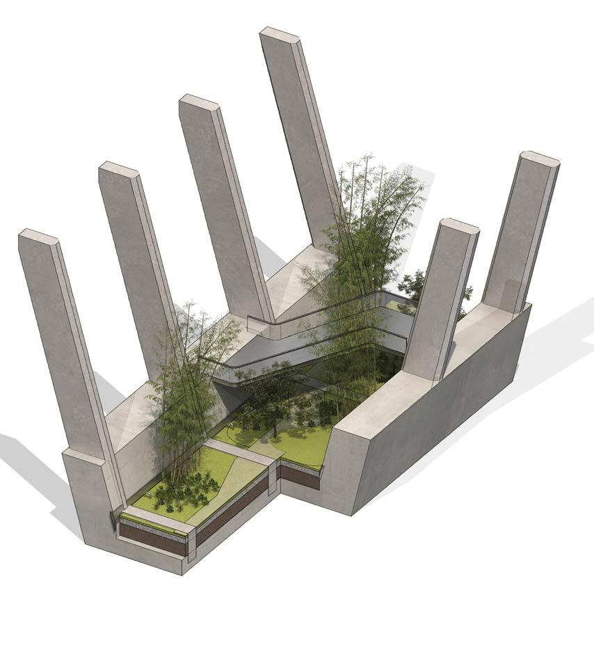


01 Continuous Concrete Primary Structure 02 Concrete Screed 03 Gravel 04 Top Soil/ Growing Medium 05 Soil 06 400mm Up stand 07 Pedestrian Sky Bridge 01 02 03 04 07 05 06 Design Development - Proposal - 8.5 Design Fragment - Structural Interface and Public Gardens
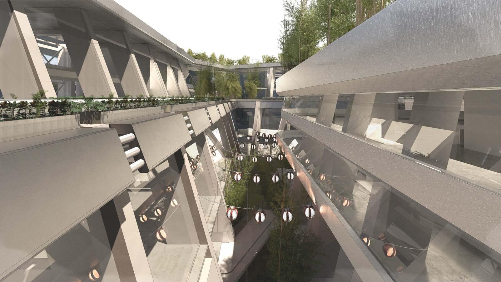
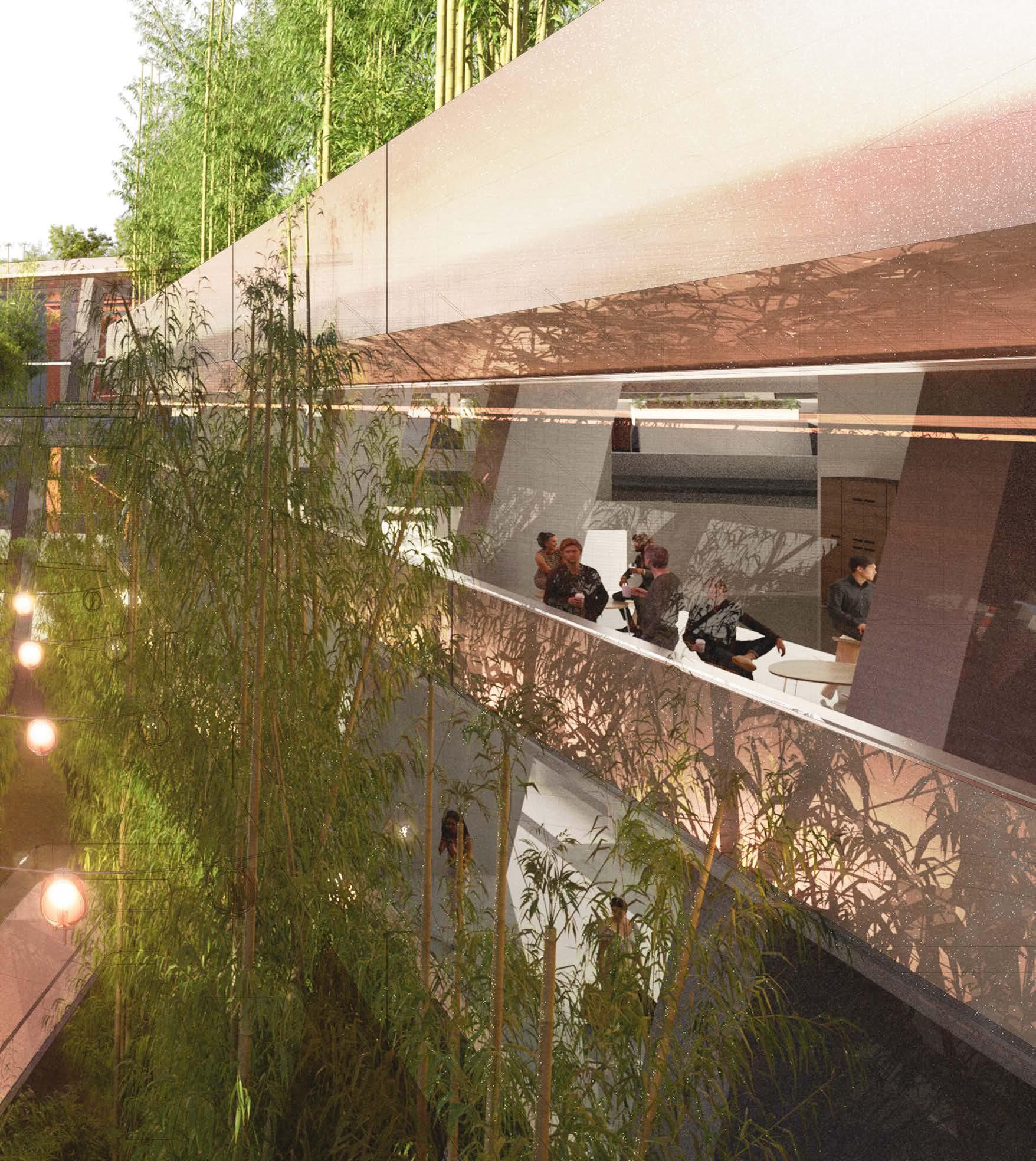
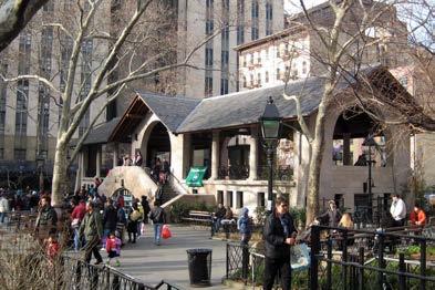
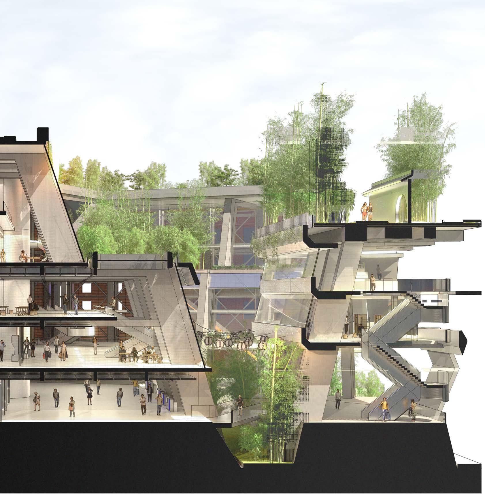
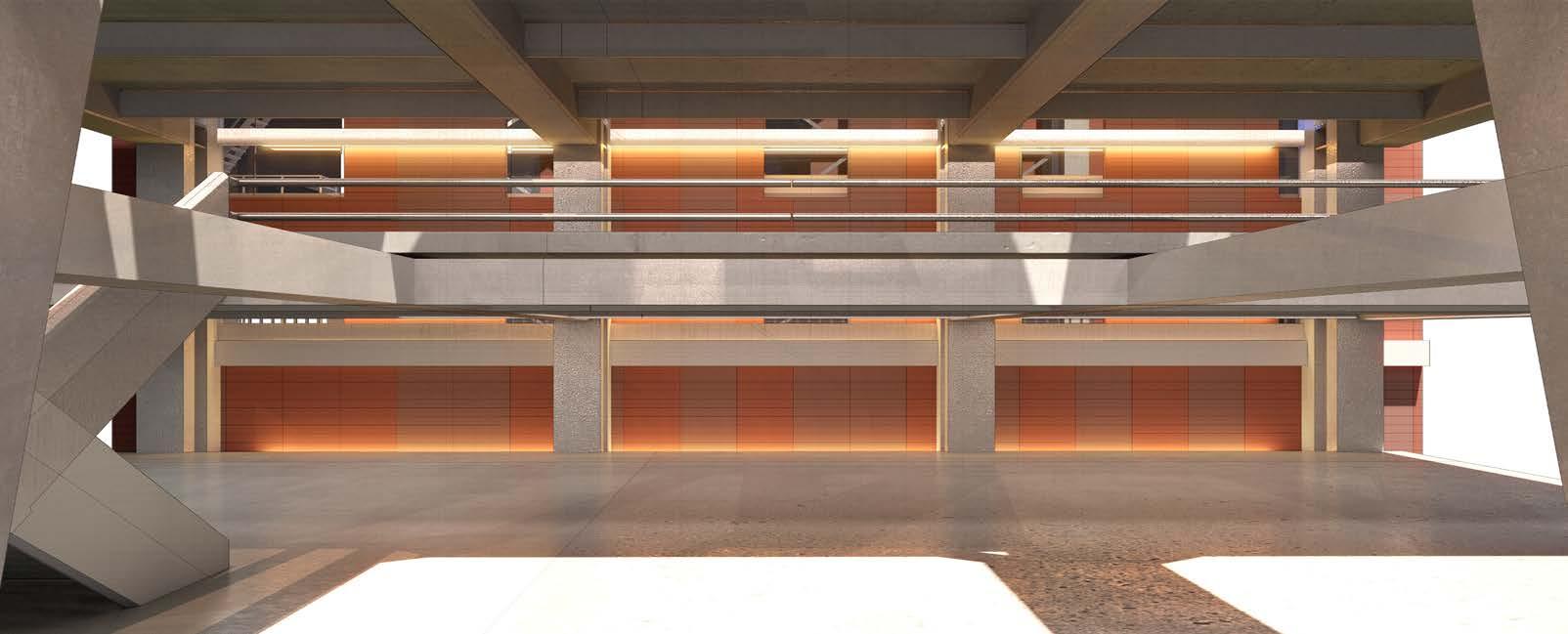
The central atrium aims to recreate conditions seen in Columbus park New York. The park is a common space for the local Chinese community to host cultural events as well as daily activities, showing how central spaces can be integral to the local communities daily lives. The atrium space proposed is a mix used space presenting a interface for social, public, private and necessary activities. Ranging from space for Chinese chess to martial arts gym and social spaces.
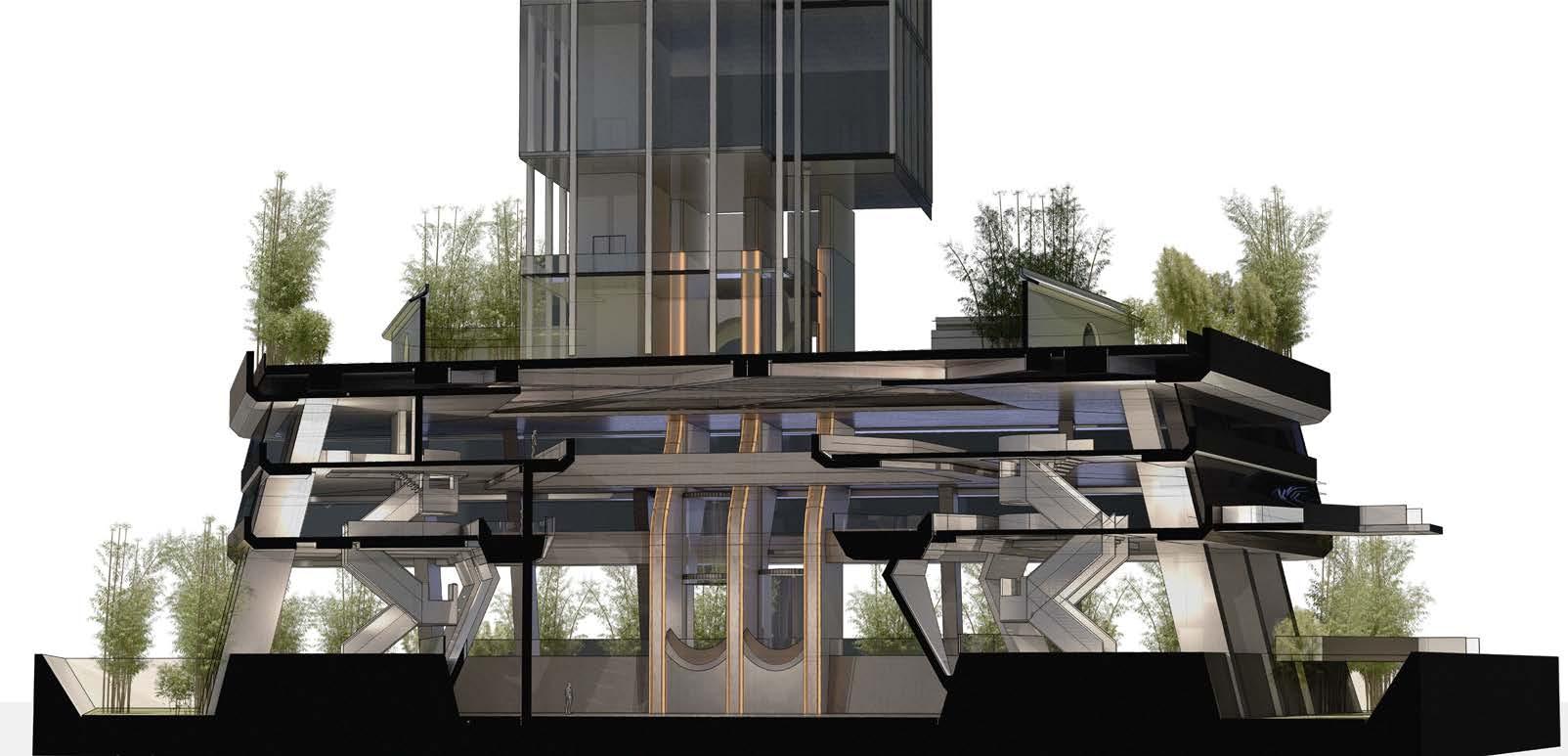

The central atrium presents a space which provides interfaces for cultural activities that local residents of Chinatown consider apart of daily lives. Sunken plaza at the central space is a mix used space, inspired by similar topologies in parks located around New York city. The space would also be used for activities such as martial arts. At the second level, resting and social spaces are presented while top floor acts as a martial arts gym.
 Atrium Fragment 01
Atrium Fragment 02
Design Development - Proposal - 8.6 Design Fragment - Atrium
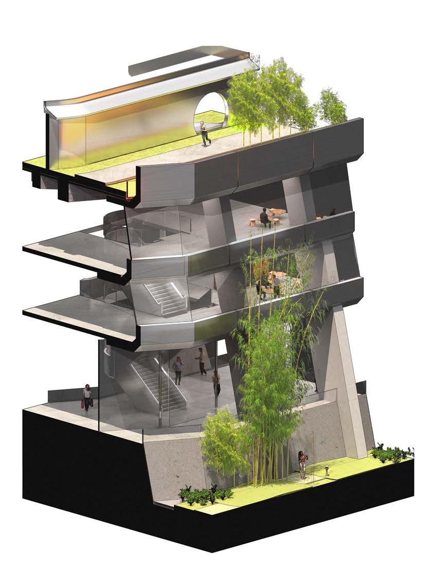
This fragment of the atrium shows circulation points, stair cores and elevators provide vertical circulation surrounding the sunken plaza. Central elevator is reserved only for private residents of the tower above.
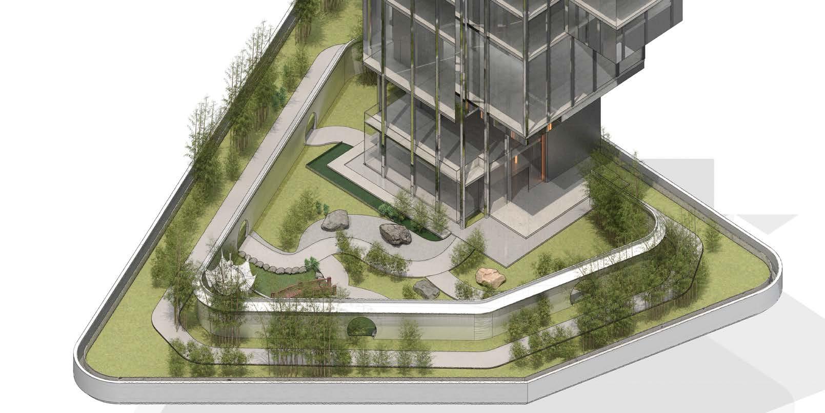
The sky lobby is a private space only accessible by residents of the pencil towers, inspired by Chinese gardens and the hierarchical layout of Chinese planning, a inner court and a outer court is created. Inner court consists of water features and lush vegetation as well as a pavilion, while the outer court acts as a walk way overseeing the green canyon of the scheme


01 Atrium Hatch Structure 02 Private Lifts to Residential Tower 03 Private Sky Lobby/ Inner Garden 04 Outer Garden 05 Private Tea Rooms 01 02 05 03 04 Sky Lobby - Residential Podium Sky Lobby Fragment
of Green Canyon
Design Fragment - Sky Lobby
View
Design Development - Proposal - 8.7

Design Development - Proposal - 8.7 Canyon View


(Outer Ring) Retail Space and Shophouse Fragment
retail
combine topologies
the electronics mall
China
in New York. Void Design Development -
- 8.8 Design Fragment - Atrium Social Spaces 02 03 04 05 07 06 01 01 Roof Garden 02 Shophouse Residential 03 Small Footprint Retail (F&B) 04 Small Footprint Retail 05 Large Footprint Retail (Market) 06 Bridge Connection (Atrium) 07 Public Garden 01 Roof Garden 02 Shophouse Residential 03 Residential Access 04 Residential Private Circulation 05 Street Access (Private) 06 Sky Light 07 Small Footprint Retail 08 Large Footprint Retail (Market) 09 Public Garden 01 03 02 04 05 08 07 06 09 02 02 04 03 03 (Outer Ring) Retail
and Shophouse Fragment
The retail section located in the outer ring is a space of transition. The main
space aims to
of
from
and markets found
Proposal
Space


Design Development - Proposal - 8.8 Design Fragment - Retail Space 01 02 03 04 05 06 01 Sky Garden (Private) 02 Amenities 03 Social Spaces (Semi-Private) 04 Social Space (Public) 05 Exterior Walk Way 06 Public Garden 01 Small Footprint Retail (F&B) 02 Small Footprint Retail (Electronics Store) 03 Social Spaces / Viewing Platform 04 Large Footprint Retail (Market) 01 03 02 04
Enclosed Retail Spaces


Shophouse Residential

Large
Open Electronics Stalls

Footprint Retail Public Canyon
Continuous Primary Structure
Outer Ring - Retail Space and Shophouses
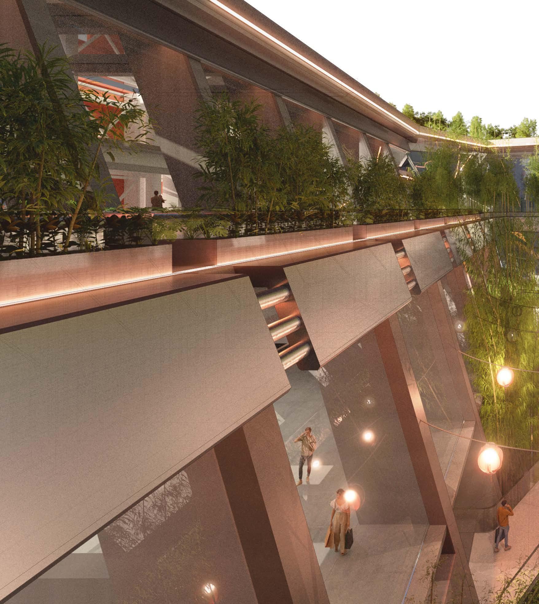
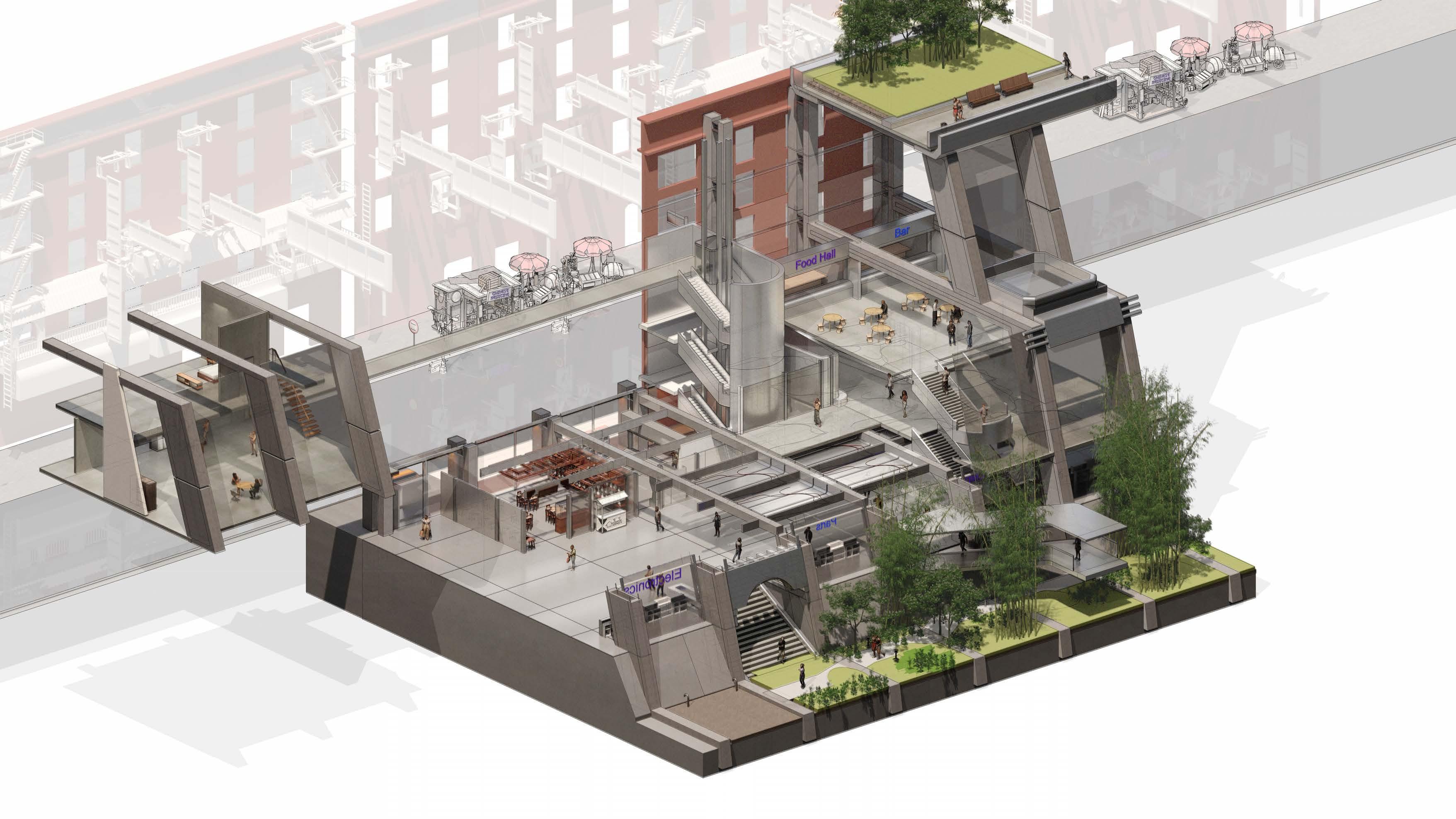
The outer retail ring aims to integrate several cultural topologies, revealing Inspired by the high density planning spaces of Chinese technology ring has two levels of retail at the lower levels, with large footprint at ground reduce traffic as we move upwards, following the privacy hierarchy at spaces.
Located at the top floors, only accessible through private circulation cores shop owners of the scheme at ground level, hence only being accessible
Design Development - Proposal - 8.9 Design Fragment - Retail and Shophouse Axonometric
revealing new spatial qualities when we combine two different Approaches. malls and efficient living spaces of present in new York city. The outer retail ground floor and small footprint retail shops at first floor, this strategy aims to at the highest level. At the third floor, we have the food hall and resting social
cores behind shops are the shophouse residential lofts. Each loft belongs to accessible through the back of a shop or off the existing streets of Chinatown.
Roof Garden
Skylight
±8000
±4000
±00
Food Hall Canyon Garden Shophouse Residential -4000

Small Footprint Retail Bridge to Atrium
Central Atrium and Private Residential


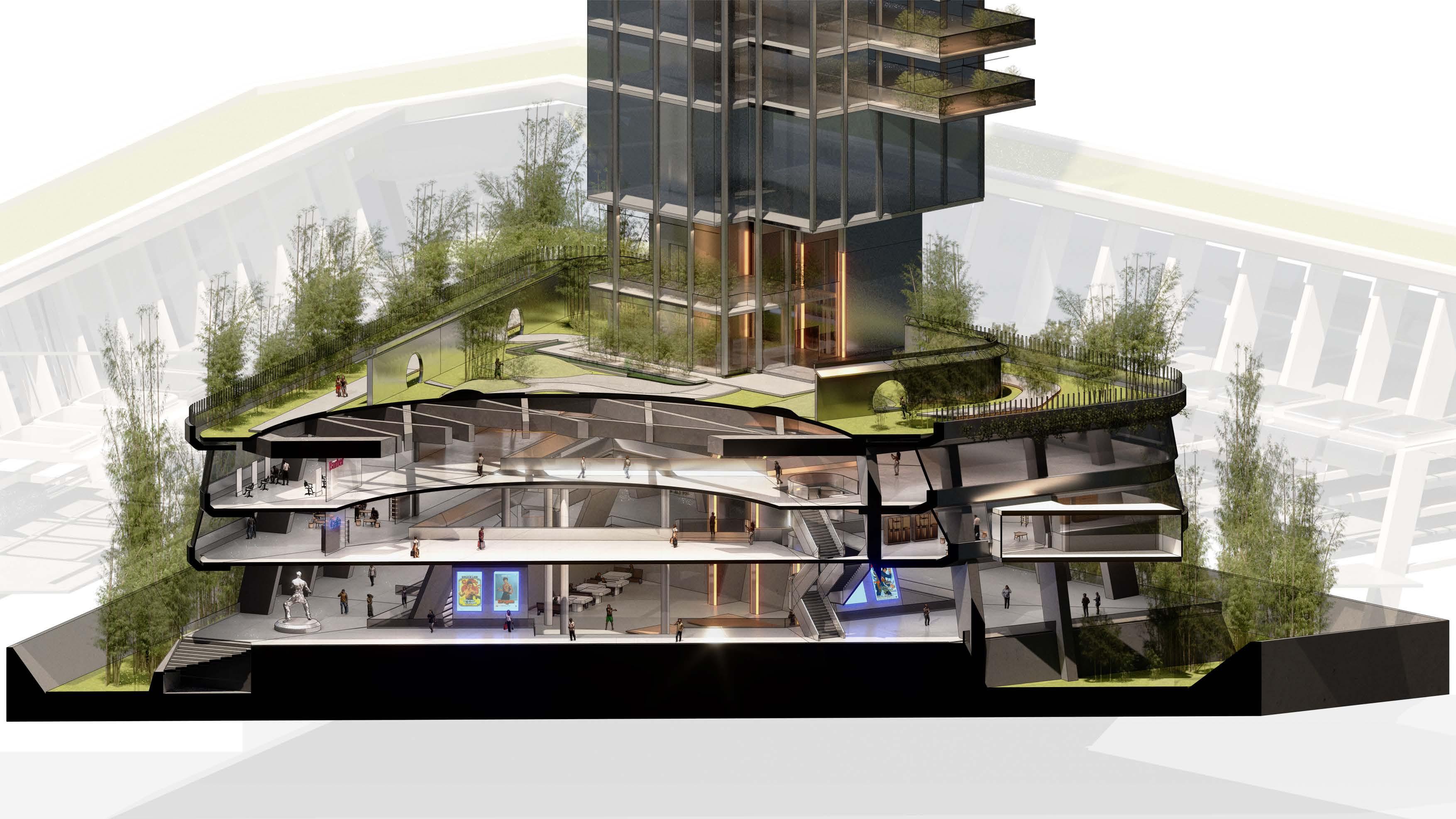
The Central Atrium utilizes the structure presented to create interfaces which supports the Chinese way of living. in typical Chinese podium mall topology, such as barber shops, cafés and gyms. Adding on this, the local showed that social spaces for chess and other activities are also a large part of the local community, thus public parks surrounding the Atrium.

Design Development - Proposal - 8.9 Design Fragment - Atrium and Pencil Tower Axonometric
Main Atrium
Social
Amenities Public Garden Continuous Primary Structure
Circulation / Viewing Platform
Spaces
Enclosed Amenities Spaces Enclosed Social Spaces
Private Residential Lobby
living. Bringing many amenities presented local Columbus Park of New York also the integration of social spaces and

±00 ±6500 ± 10000 ± 15000
Bridge to Retail Zone
Private Sky Garden

Design Development - Proposal - 8.9 Design Fragment - Sectional Axonometric

Key Perspective Section 01
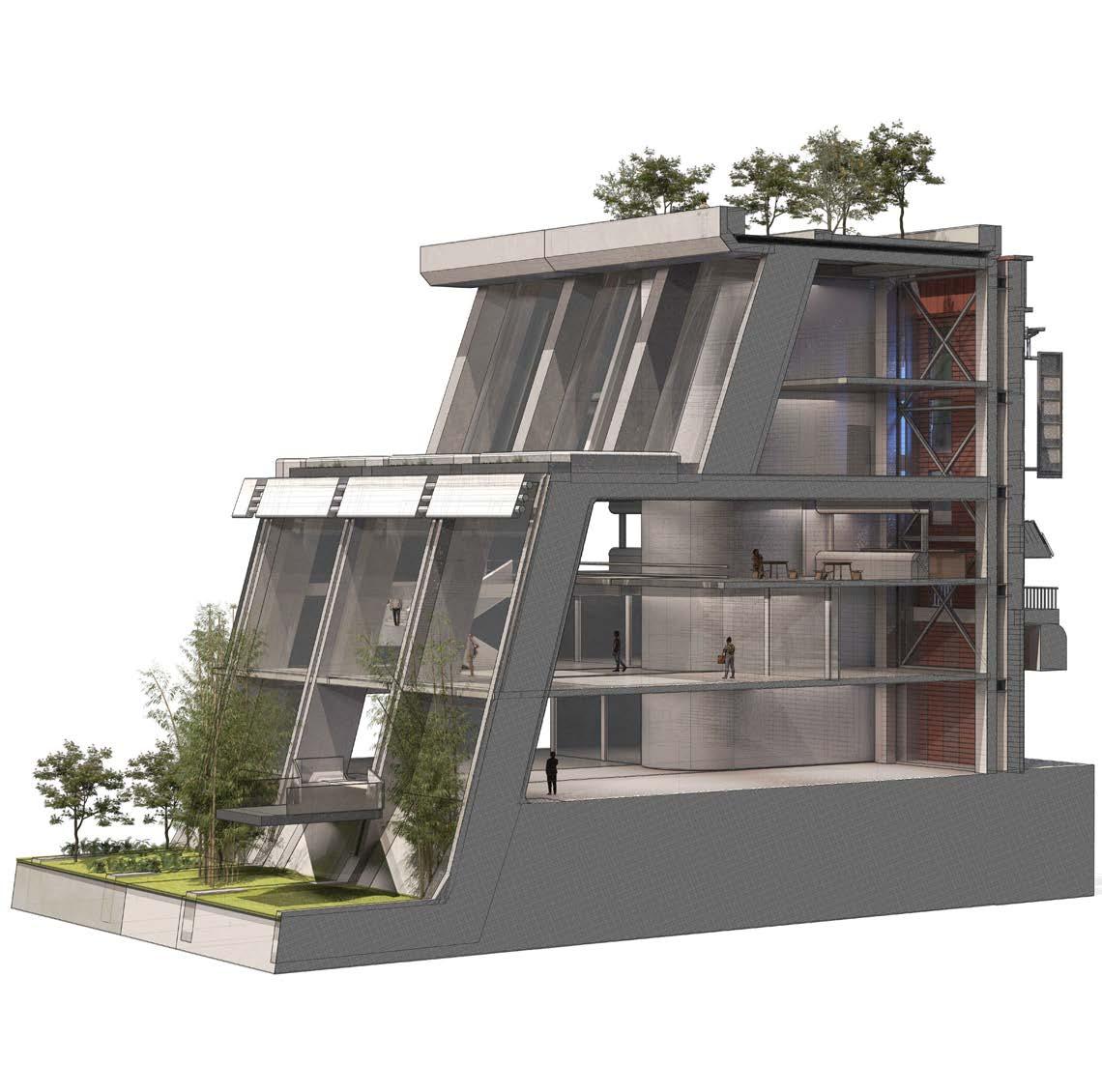
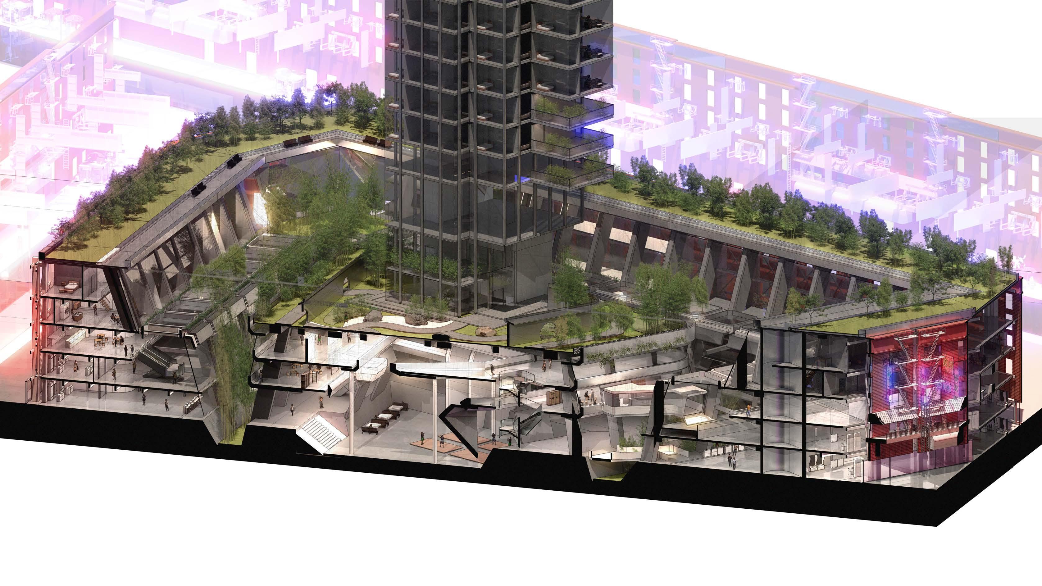
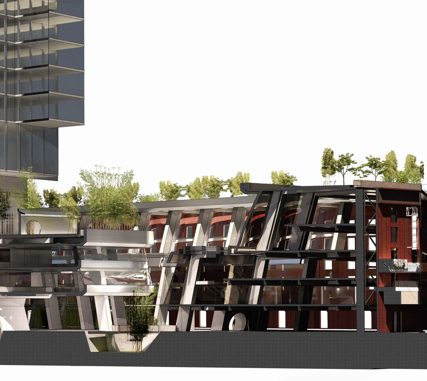
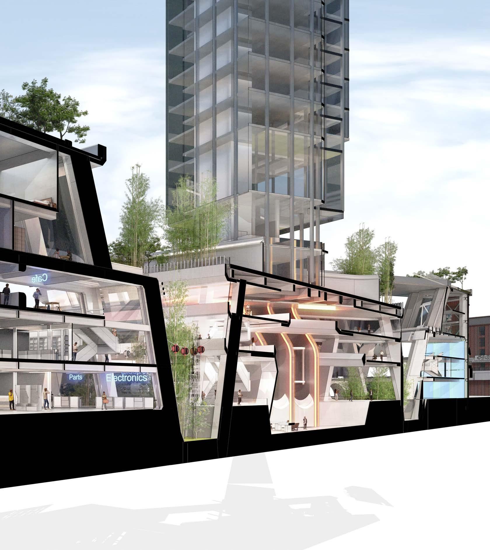
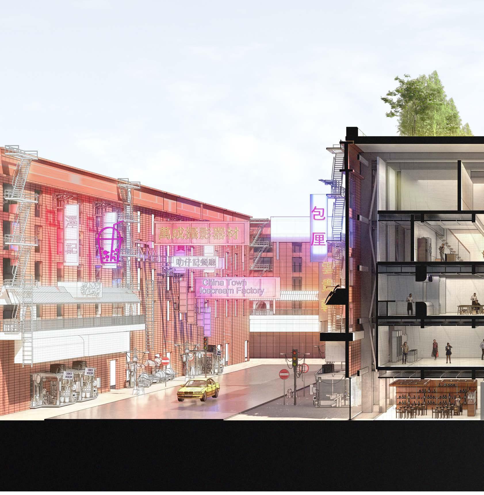
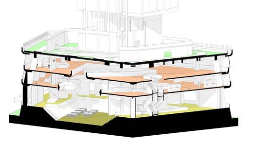
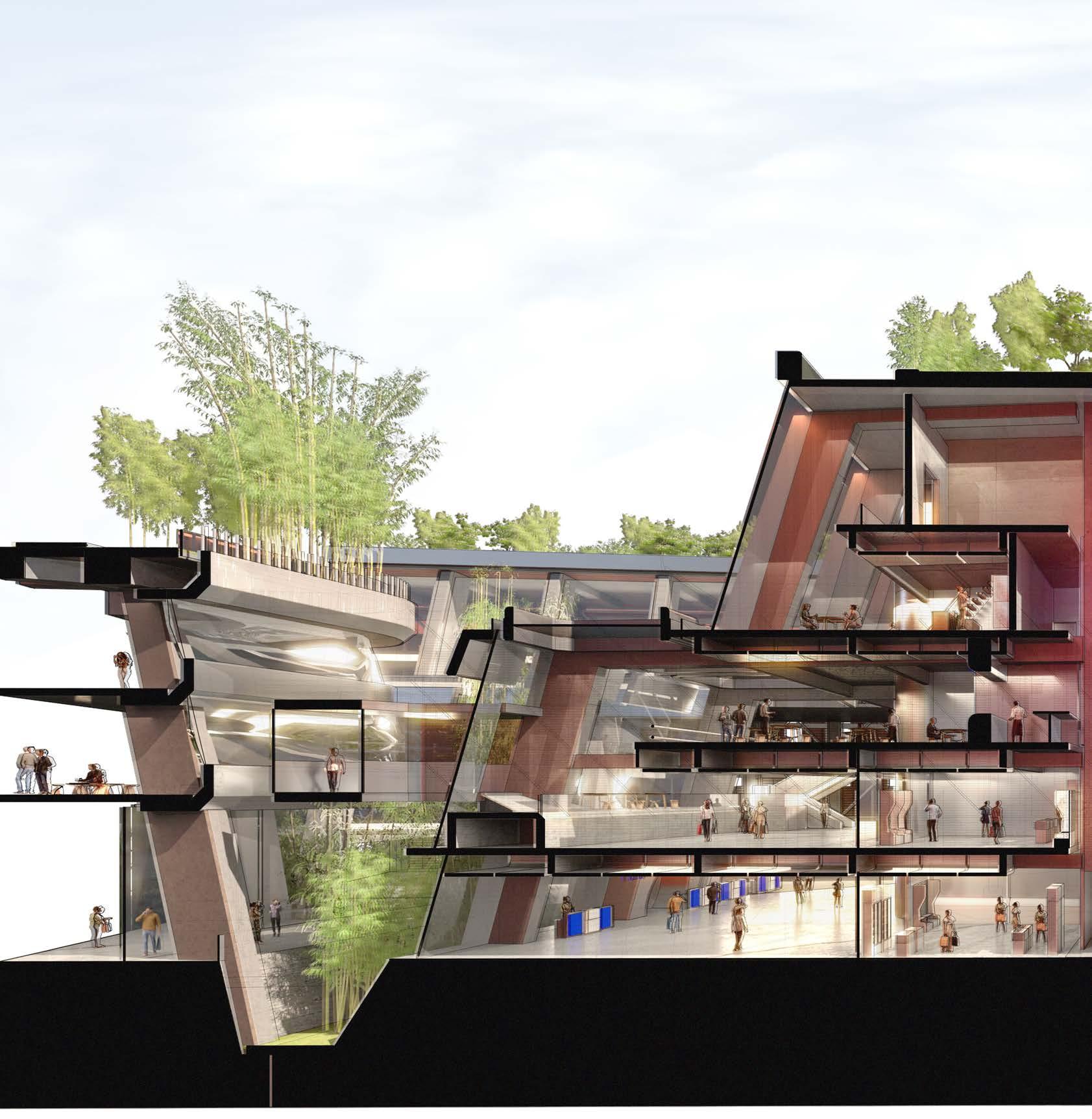
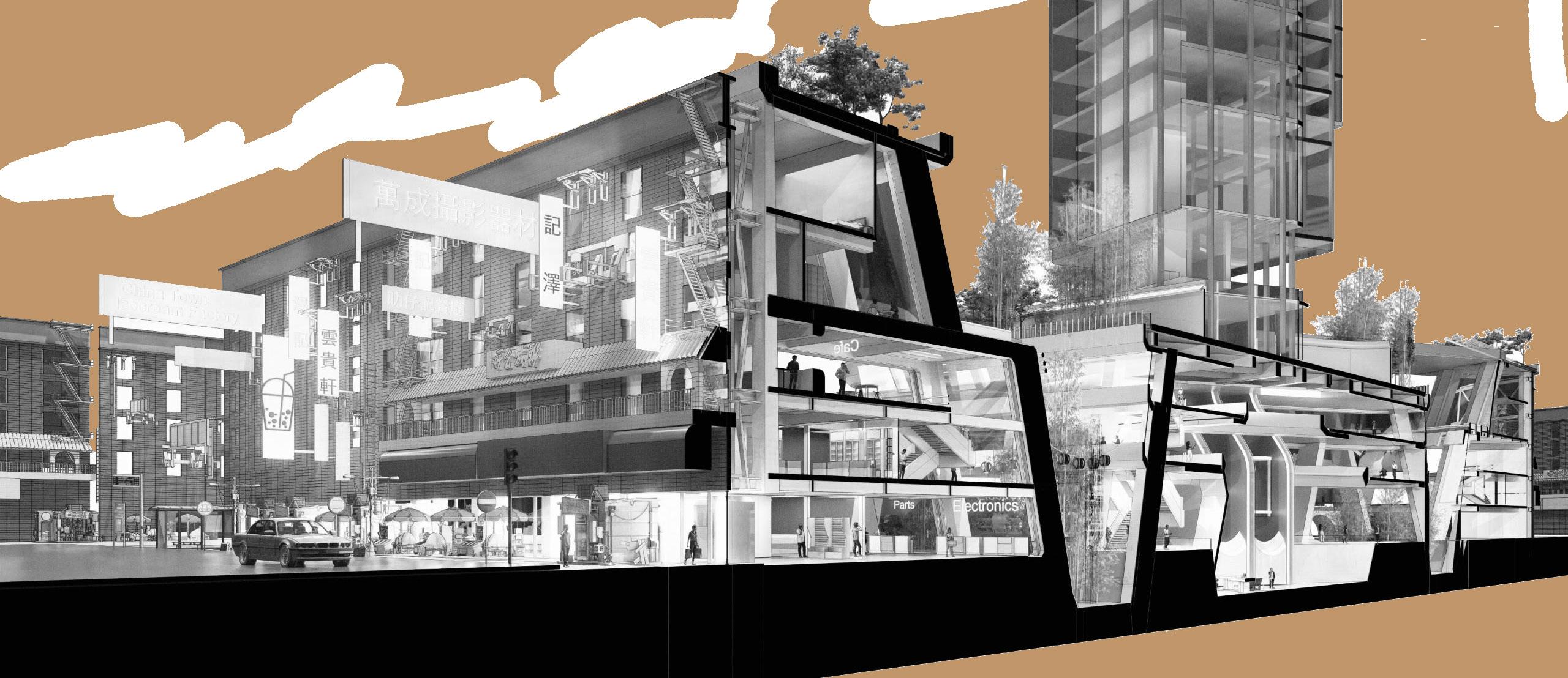
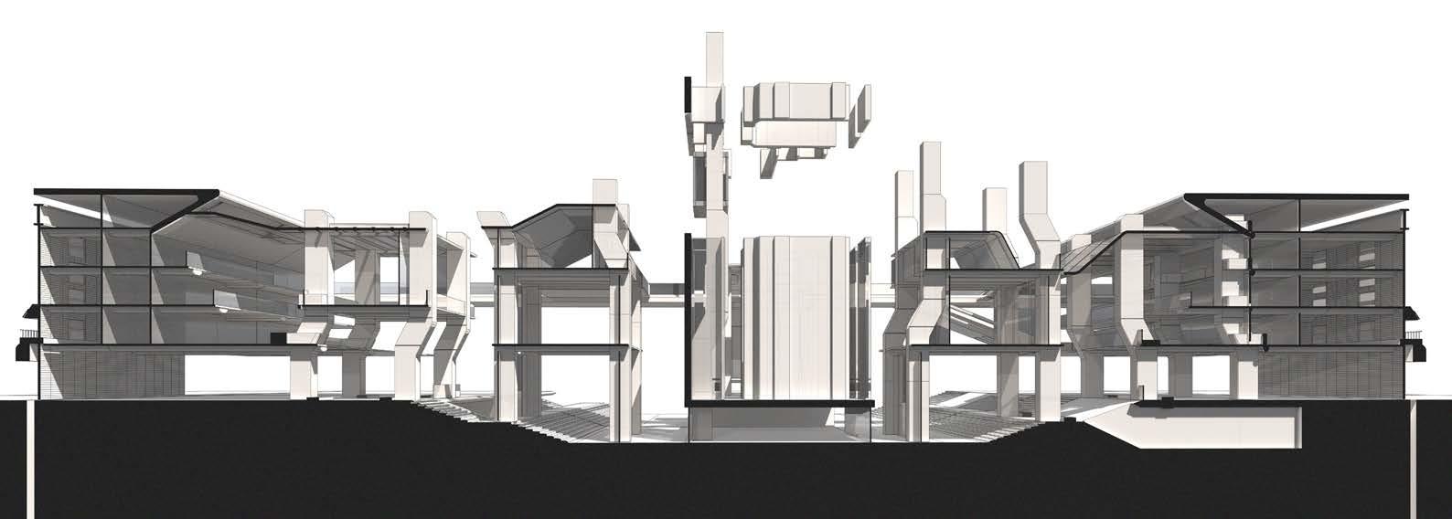
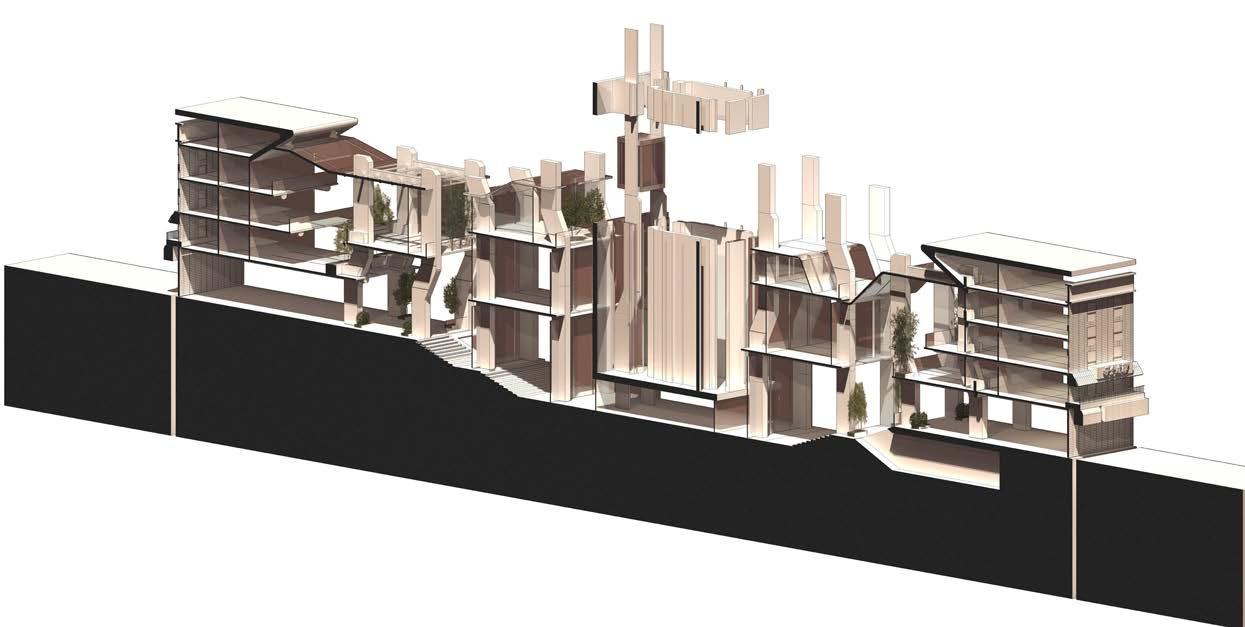
The section below shows the overall proposal, highlighting the continuous structure which connects the existing facade to the central atrium. The project aims to use structure with civic ambition inspired by New York piers as a interface for Chinese cultural programmes.

01 GL Retail Zone. Entry Halls 02 L1 Mix Use Retail Zone. HK Mall Topology 03 L2 Public F&B Zone 04 Shophouse Residential Units 05 Residents Sky Garden. New York Roof Garden Topology 06 Private Sky Lobby - Garden 07 Activity Spaces. Martial Arts Gym 08 L1 Mix Used Cultural Spaces. Public Activities 09 GL Mix Used Cultural Spaces. Public Activities 10 Sunken Plaza. Mix Use Space. 11 Lift Core 12 Sky Lobby - Reception 13 Tea Rooms 01 02 03 04 05 06 07 08 09 10 11 12 13
8.9 Design Fragment - Sectional Axonometric
Design Development - Proposal -

N
Key Perspective Section 02

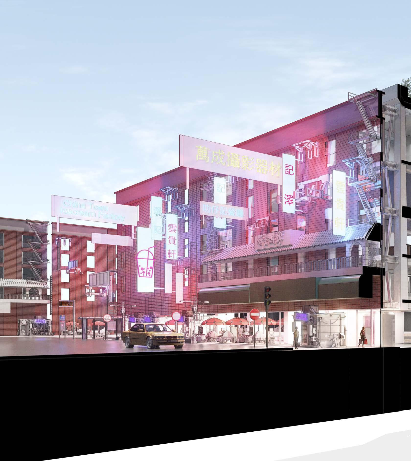
Design Fragment - Street Relationship Axonometric
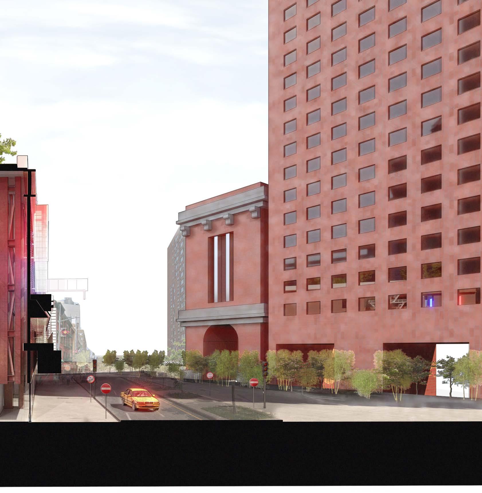
The section below shows the overall proposal, highlighting the continuous structure which connects the existing facade to the central atrium. The project aims to use structure with civic ambition inspired by New York piers as a interface for Chinese cultural programmes.
Design Development - Proposal - 8.10

N
Green Spaces Amenities
Social Space
Small Footprint Retail Space


Large Footprint Retail Space
Shophouse Residential
-
- 8.10 Design Fragment - Retail and Shophouse Section - West
Key Perspective Section West Design Development
Proposal

Green Spaces
Amenities
Social Space
Main Atrium, Mixed Use Activities


Perspective Section Central Design
- Proposal - 8.10 Design Fragment - Atrium Section
Key
Development

Design
Development
Social Space
Small Footprint Retail Space

Large Footprint Retail Space
Shophouse Residential

-
- 8.10 Design
Key Perspective Section East Retail and Shophouse Section - East
Proposal
Fragment -
Green Spaces Amenities


All work produced by Unit 14
Unit book design by Charlie Harriswww.bartlett.ucl.ac.uk/architecture
Copyright 2021
The Bartlett School of Architecture, UCL All rights reserved.

No part of this publication may be reproduced or transmited in any form or by any means, electronic or mechanical, including photocopy, recording or any information storage and retreival system without permission in writing from the publisher.

-

@unit14_ucl UNIT
CONSTRUCTED FUTURES 2023

At the center of Unit 14’s academic exploration lies Buckminster Fuller’s ideal of the ‘The Comprehensive Designer’, a master-builder that follows Renaissance principles and a holistic approach. Fuller referred to this ideal of the designer as somebody who is capable of comprehending the ‘integrateable significance’ of specialised findings and is able to realise and coordinate the commonwealth potentials of these discoveries while not disappearing into a career of expertise. Like Fuller, we are opportunists in search of new ideas and their benefits via architectural synthesis.
As such Unit 14 is a test bed for exploration and innovation, examining the role of the architect in an environment of continuous change. We are in search of the new, leveraging technologies, workflows and modes of production seen in disciplines outside our own. We test ideas systematically by means of digital as well as physical drawings, models and prototypes. Our work evolves around technological speculation with a research-driven core, generating momentum through astute synthesis. Our propositions are ultimately made through the design of buildings and through the in-depth consideration of structural formation and tectonic. This, coupled with a strong research ethos, will generate new and unprecedented, one day viable and spectacular proposals. They will be beautiful because of their intelligence - extraordinary findings and the artful integration of those into architecture.
The focus of this year’s work evolves around the concept of ‘Constructed Futures’. The term aims to describe architecture and as such fundamentally human future as the result of the architect’s highest degree of synthesis of underlying principles. Constructional logic, spatial innovation, typological organisation, environmental and structural performance are all negotiated in a highly iterative process driven by intense architectural investigation. Inspiration for inherent principles of organisational intelligence can be observed in both biotic and abiotic systems, in all spatial arrangements where it is critical for the overall performance of the developed order. Through the deep understanding of constructional principles, we will generate highly developed architectural systems of unencountered intensity where spatial organisation arises as a result of sets of mutual interactions. Observation as well as re-examination of civilisatory developments will enable us to project near future scenarios and position ourselves as avant-garde in the process of designing a comprehensive vision for the forthcoming. The projects will take shape as research based imaginative tales, architectural visions driven by speculation.
Thanks to: ALA, DaeWha Kang Design, Foster + Partners, Heatherwick Studio, Populous, RSH+P, Seth Stein Architects, ZHA, Expedition Engineering


UNIT 14 @unit14_ucl All work produced by Unit 14 Unit book design by Charlie Harriswww.bartlett.ucl.ac.uk/architecture Copyright 2021 The Bartlett School of Architecture, UCL All rights reserved.No part of this publication may be reproduced or transmitted in any form or by any means, electronic or mechanical, including photocopy, recording or any information storage and retreival system without permission in writing from the publisher.


 Cover design by Charlie Harris


 Civic Structures as Cultural Icons


 Fragment developed through form iteration of the bridge pier structure.


 The establishment of a zone for the Chinese party must
benefits, creating
between the US and CN.


 Chinese offshore police station - Example of negative colonial method/ strategy


 1
2
1
2


 Diagram above shows podium massing of lots connected to historical and cultural façades
Floor Area Ratio 13.0 Masses
Increasing Heigh of towers while retaining density
Integrating towers to podium


 Bundling Process - Plan View


 Stepped retail spaces and atrium topology
Retail space and tea room street scape

 Section Axonometric
Section Axonometric
Section Axonometric


 Lift lobbies are located in every floor. Connecting all zones - retail , labs and residential


 Exploded Structure Axonometric Outer Ring


 Atrium Fragment 01
Atrium Fragment 02
