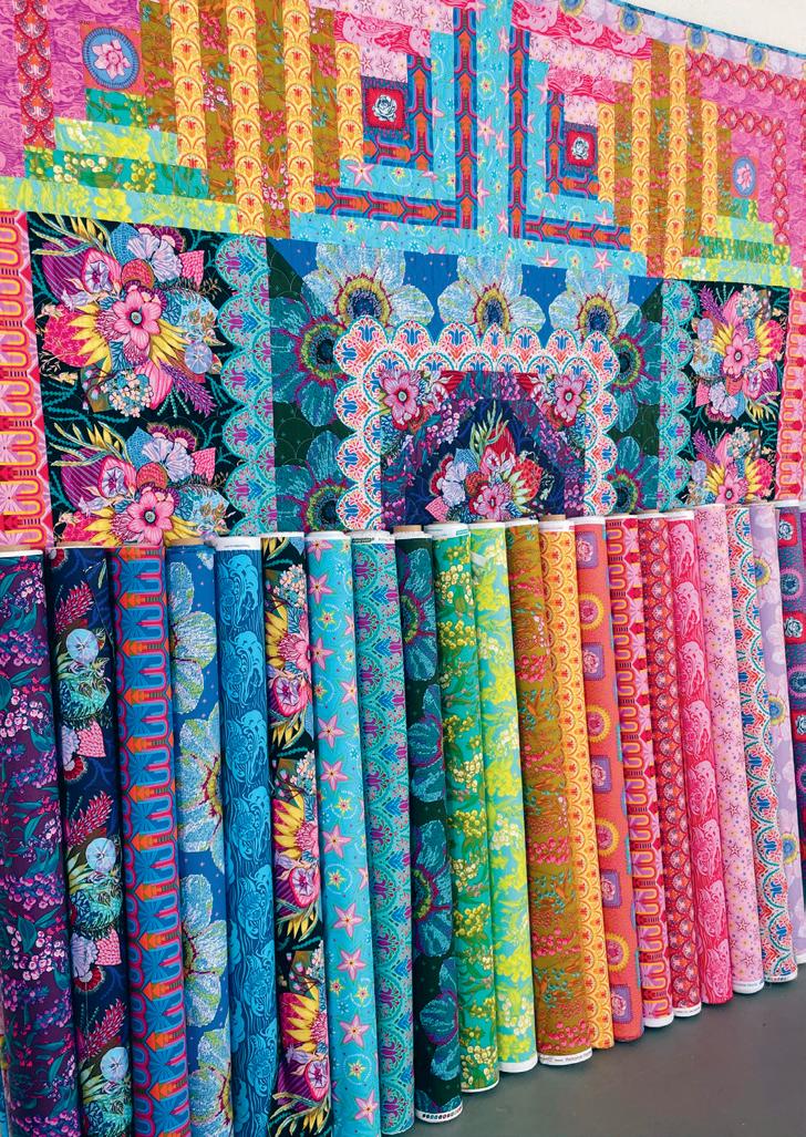
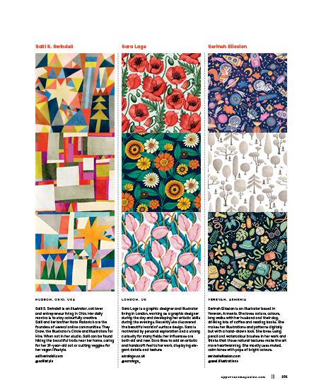
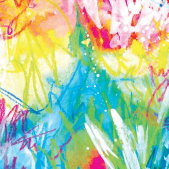
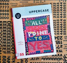
abundant patterns 57 for the CREATIVE and CURIOUS
DESIGN GUIDE
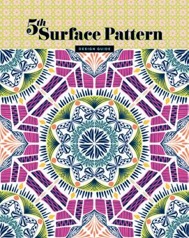
Surface Pattern
ENCYCLOPEDIA Volume N The UPPERCASE Encyclopedia of Inspiration encyclopediaofinspiration.com
FROM THE EDITOR’S DESK
Dear Reader,
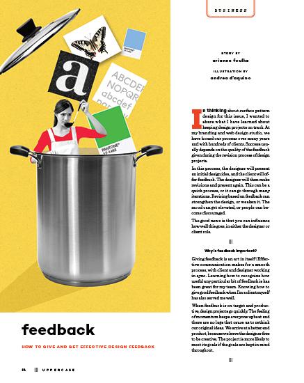
Patterns, patterns and more patterns! Welcome to the fifth edition of the UPPERCASE Surface Pattern Design Guide.
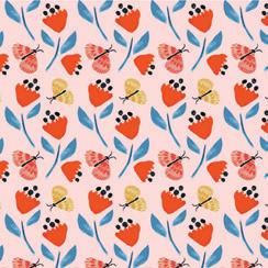
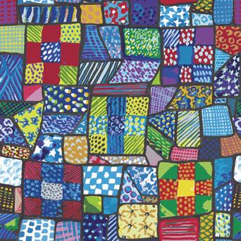
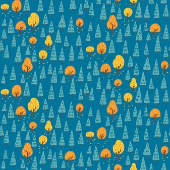
When designing a surface pattern, your choice of media, technology, theme, motif, colour palette and scale are only some of the starting technical variables. You also have to choose the method of the repeat: block (motifs arranged in a grid, also called “full drop”), half drop (staggered mid-way), arrangement by brick, nestled tiled shapes (diamond, hexagon or ogee) or simply randomly tossed (scattered) motifs.
In pattern making, the fusion of geometry, colour and creativity offers infinite possibilities. Having skill is certainly important—whether gained through deliberate practice or serendipitous talent—but when it comes to creating a design that is attractive and memorable, it is the artist’s individuality that has the most influence. Personality (with all of its idiosyncrasies!), a knack for storytelling and an eye for colour. Those are the intangible qualities of a successful surface pattern designer.
May this issue be a joyful celebration of pattern and personality!
 Janine Vangool
 PUBLISHER, EDITOR, DESIGNER
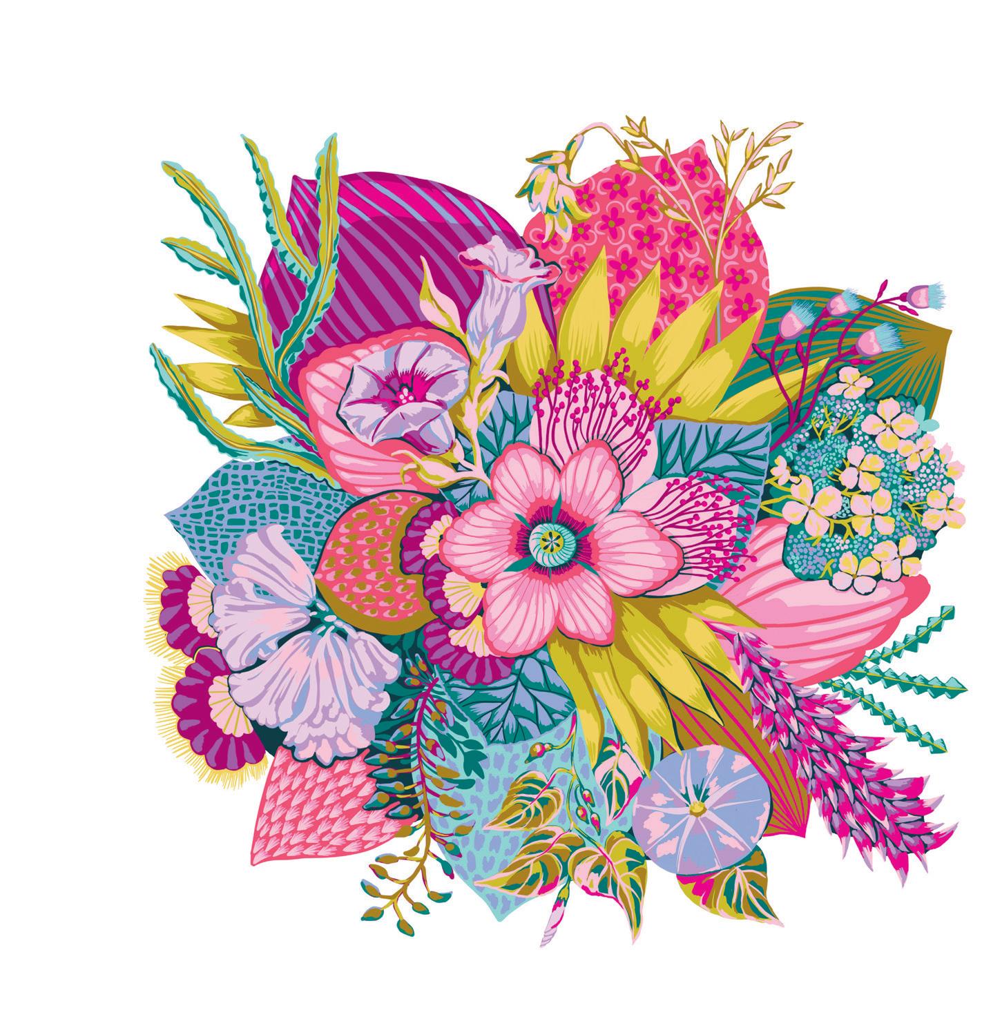
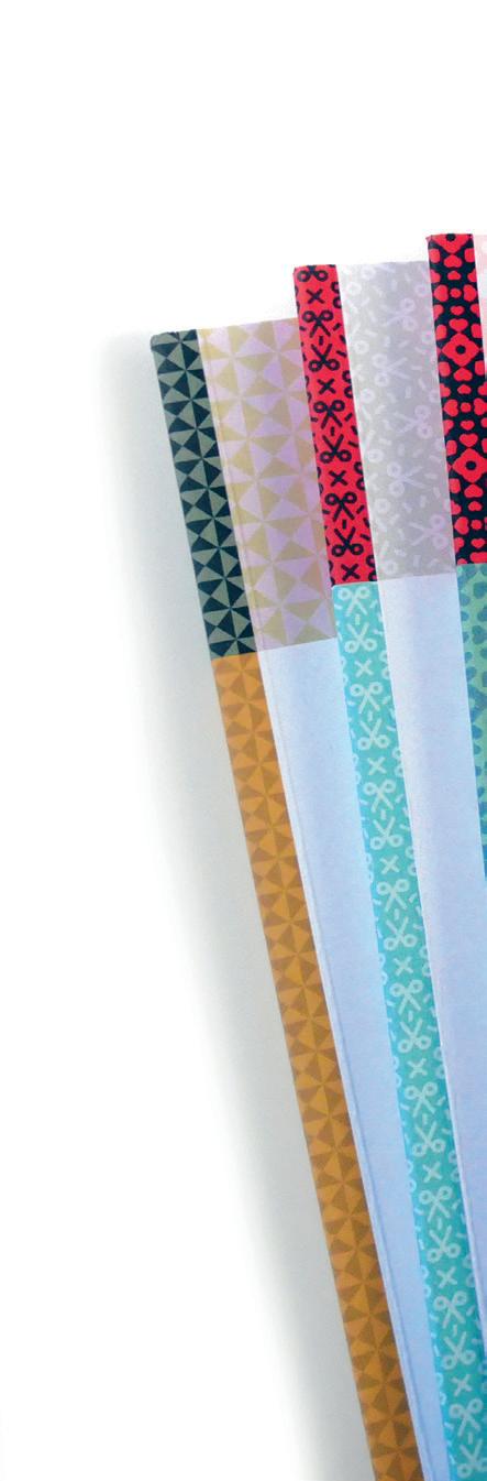
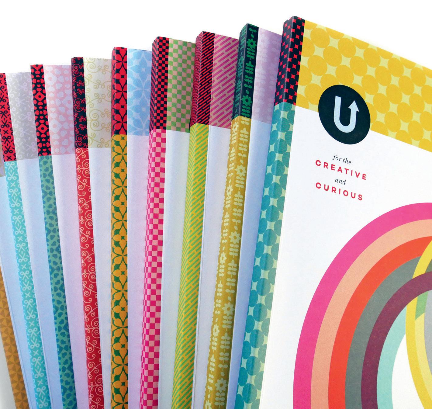
With each UPPERCASE issue, I design a companion pattern to adorn the masthead and spine. Here’s a full-colour variation, demonstrating how scale and colour can change the look!

uppercasemagazine.com ||| 3
Sign up for my newsletter for free content and an introductory subscription offer: uppercasemagazine.com/free
Contents
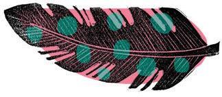
Funky Feathers
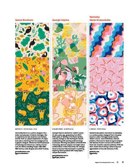
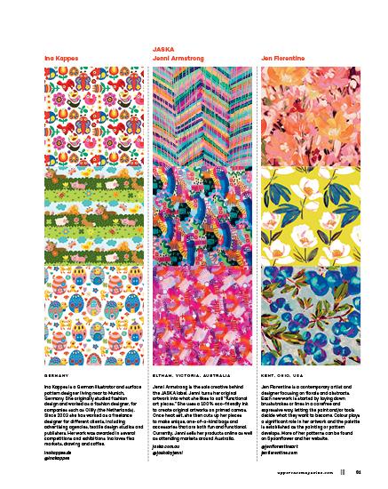
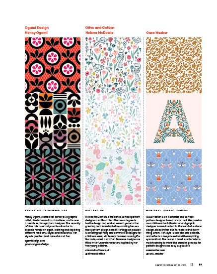
Sumana Ghosh-Witherspoon
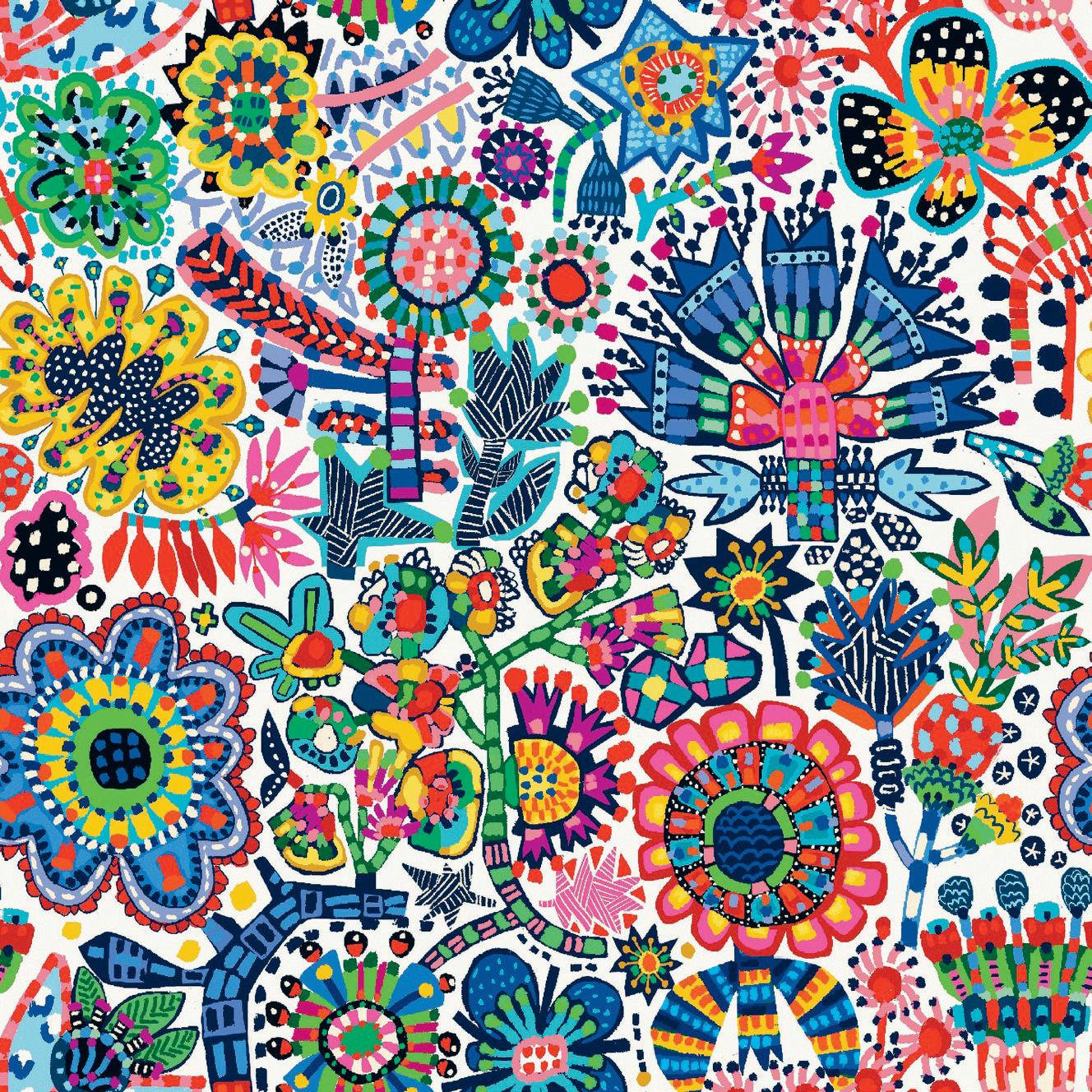
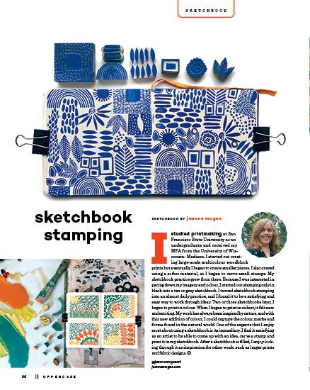
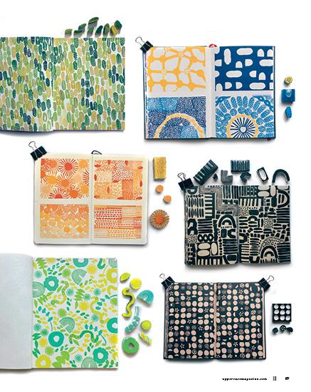
Sumana Ghosh-Witherspoon is a fine artist and surface designer who has a passion for patterns, collage and textile design. Her work often reflects the sun-drenched memories of her adolescent years spent in India, where the colours, textures and folk arts continue to fascinate her. She uses block printing methods and mixed media to create her images. “I love Instagram challenges because you never know where the inspiration will take you!” she says of the feather design that graces the back cover of this issue. “This piece was in response to a prompt (‘feathers’) from Salli Swindell @theydrawandgarden for their #theydrawtober challenge. I created rubber stamps and block-printed the feathers. The finer lines of the feathers were then contrasted with some broader, more graphic pops of colour, which I added digitally. The result is a motif that is kind of retro and modern all at once.” Find more of Sumana’s work with PBS Fabrics and on Spoonflower and Society6.
@shoemona shoemona.myportfolio.com
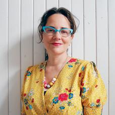
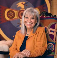
Fine Print
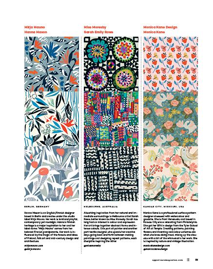
Miss Moresby
Sarah Emily Rowe
Welcome Editor’s Letter . . . . . . . . . . 3 Subscriptions . . . . . . . . . . 6 Snippets . . . . . . . . . . . . 8 BEING 10 Emotional Palettes by Meera Lee Patel FRESH . . . . . . . . . . . . . 12 Sara Torabi, Kea Peters, Sarah Hirst NOTED 14 Terrific Tiles WORTHWHILE 15 The Pattern Paper by Amelia Woodbridge
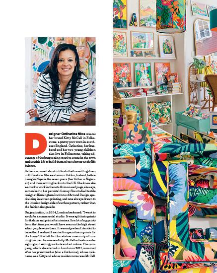
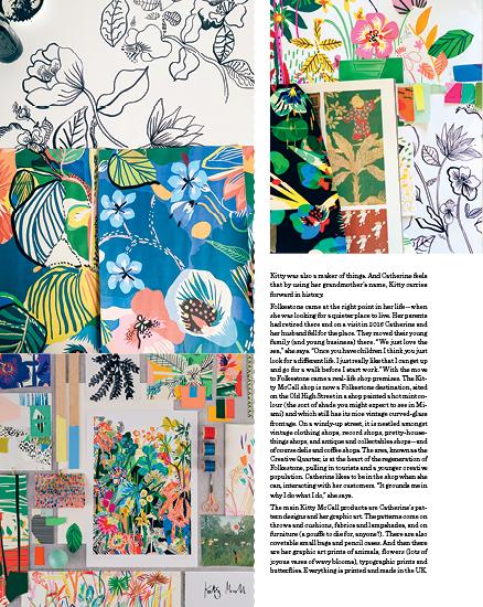
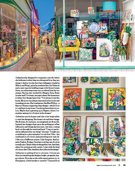
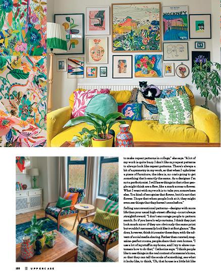
LIBRARY 16 Recommended Reading BUSINESS 18 Feedback by Arianne Foulks illustration by Andrea D’Aquino ABECEDARY 20 Tiles by Lydie Raschka Art & Design COVER ARTIST 22 Anna Maria Horner by Leigh Metcalf TEA WITH T 30 Graphic Artist Anna Russell Jones by Tamisha Anthony VINTAGE 34 Vintage Sheets by Kerrie More BEGINNINGS 42 The Visual Language of e bond by Joy Vanides Deneen FIELD TRIP 50 Azulejos de Portugal by Shelley Davies SKETCHBOOK . . . . . . . . 56 Sketchbook Stamping by Jeanne McGee Misc. STUDIO 112 Mirth Studio by Liz Logan SPACES 118 Kitty McCall by Jane Audas HOBBY 124 Off the Scale by Brendan Harrison Subscriber Studios . . . . . . 126 Maggie Ramirez Burns Erica Catherine Nichols Looking Forward . . . . . . . 128 Shares . . . . . . . . . . . . . 129 COVET 130 Little Stabs by Andrea Jenkins uppercasemagazine.com ||| 5
JUNE 2023
APRIL, MAY,
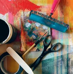
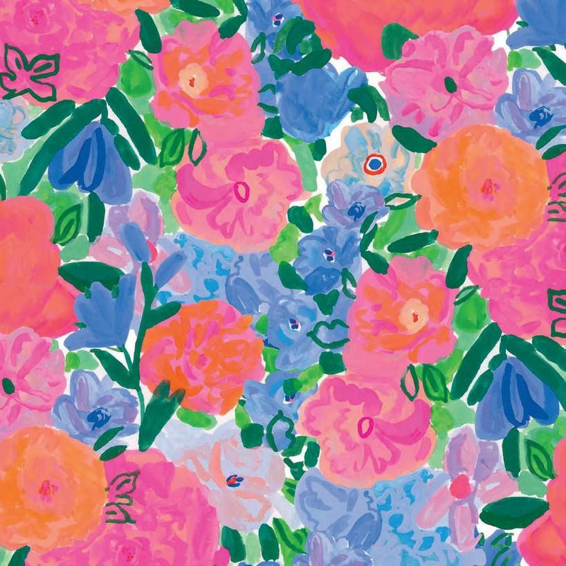
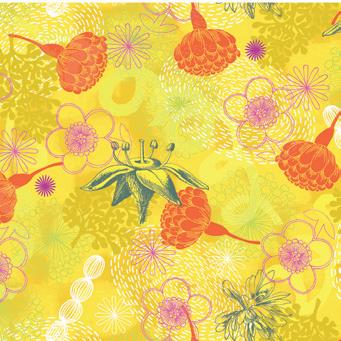
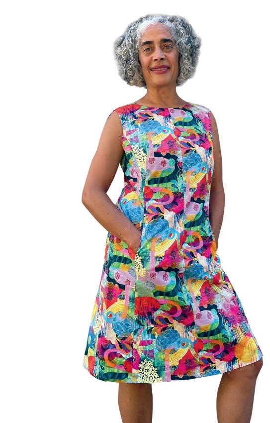
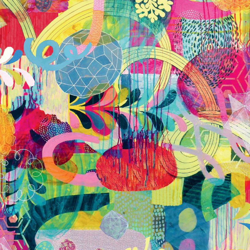
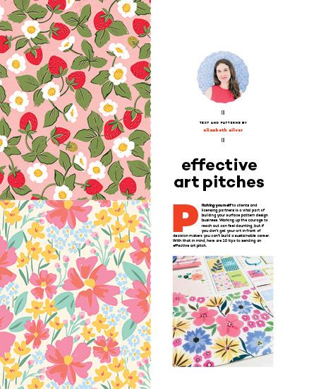
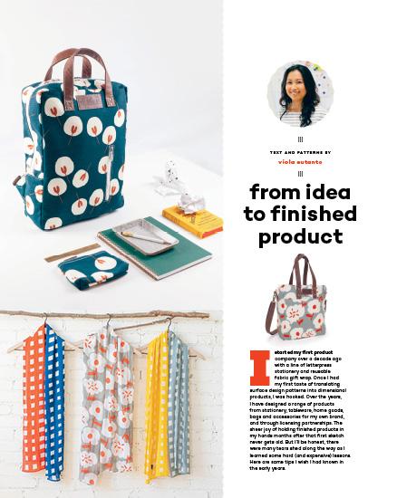
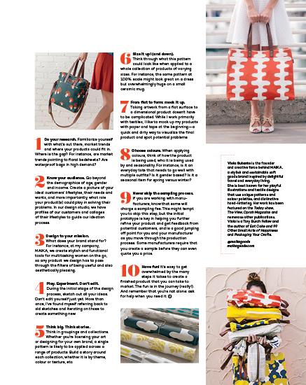
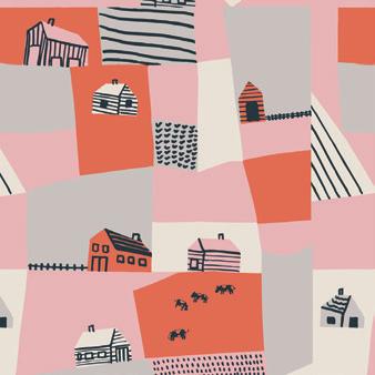
SURFACE PATTERN DESIGN GUIDE 58 Windham Fabrics Winner 60 Partner Picks 62 Portfolios 64 Tips and Spotlights Pitches by Elizabeth Silver . . . . . . . 68 Flat Fat Stacks by PBS Fabrics 72 From Idea to Finished Product by Viola Sutanto 78 Inspired by Wovens by Daniela Venezia 84 Knitted Blankets by Betsy Leighton 90 Preparing for Success by Bonnie Christine . . . . . . 96 Not Really Just About Plaids by Lilla Rogers 102 Knitup . . . . . . . . . . . . 109 GUIDE COVER BY VANESSA CLARKE YOUNG
@missmoresby
BACK COVER
PHOTO BY LISA GUILLARD
PHOTO BY LISA GUILLARD
UPPERCASE
201B – 908, 17th Avenue SW Calgary, Alberta, Canada T2T 0A3
Janine Vangool
PUBLISHER, EDITOR, DESIGNER janine@uppercasemagazine.com
CUSTOMER SERVICE shop@uppercasemagazine.com
Correy Baldwin COPYEDITOR
Core Contributors
Tamisha Anthony
Jane Audas
Correy Baldwin
Andrea D’Aquino
Arianne Foulks
Joy Vanides Deneen
Brendan Harrison
Andrea Jenkins
Andrea Marván
Kerrie More
Emily Orpin
Meera Lee Patel
Lydie Raschka
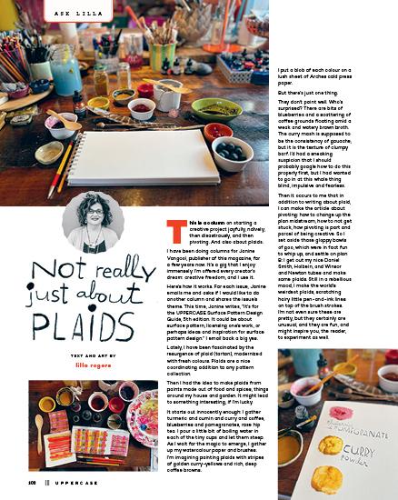
Lilla Rogers
Cedric Victor
PRINTED IN CANADA BY THE PROLIFIC GROUP.
Interior pages are printed on 100% post-consumer recycled Rolland Enviro 100.
Give this magazine a long life! The content is evergreen, so we hope you’ll revisit it over and over again. If you’re done with it, please pass it on to a friend or colleague who might enjoy our content, or cut up the pages and create some art.
We plant a tree with every subscription.
SUBSCRIBE
SUBSCRIPTIONS
This quarterly magazine is released in January, April, July and October.
CANADA
CAD $ 96
UNITED STATES
USD $ 80
INTERNATIONAL
CAD $ 144
Our shop will do the currency conversion for you.
RENEWALS
You will receive a notice by email when it is time to renew. Renew online anytime to add issues to your current subscription.
GIFTS
Simply enter the recipient’s name and address in the shipping information and your name, email and billing address during check out.
BACK ISSUES
Get them while you can! Once they’re gone, they’re gone. Back issues will not be reprinted.
uppercasemagazine.com
STOCKISTS
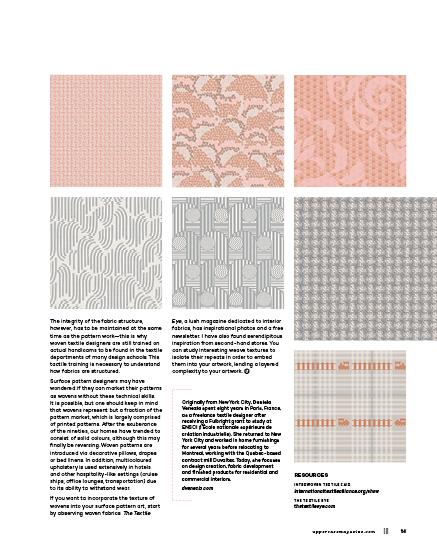
To view our list of stockists or to carry UPPERCASE in your shop: uppercasemagazine.com/ stockists
QUESTIONS?
Have a question about your subscription or a change of address? Email us: shop@uppercasemagazine.com
Thank you to all of the talented writers, illustrators, creative collaborators and loyal readers who contributed their talents to this issue of UPPERCASE.
Thank you to everyone who submitted to the open calls for this issue. Even if you weren’t featured within these printed pages, your effort was noticed and appreciated!
SUBMISSIONS
UPPERCASE welcomes everyone and all identities, ages, talents and abilities. We share an inclusive, positive and community-minded point of view. Everyone is welcome to explore our creative challenges and submit to the magazine—you don’t have to be a professional artist or writer.
Please visit the Submissions page of our website for current open calls for submissions. The Fresh, Sketchbook, Creative Careers and Subscriber Studio columns are always open and submissions will be considered for print and for inclusion in All About YOU: the weekend UPPERCASE newsletter featuring creativity from readers around the world.
In the spirit of reconciliation, we acknowledge that we live, work and play on the traditional territories of the Blackfoot Confederacy (Siksika, Kainai, Piikani), the Tsuut’ina, the Îyâxe Nakoda Nations, the Métis Nation (Region 3) and all people who make their homes in the Treaty 7 region of Southern Alberta.
NEWSLETTER
Sign up for the newsletter to receive free content and behind-the-scenes peeks at the making of the magazine—plus a welcome discount on your subscription!
uppercasemagazine.com/free
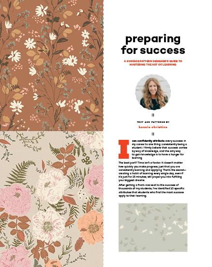
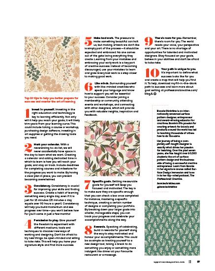
You can also pitch your own work, propose an article about someone else or suggest a topic that you would like to research through the Open Pitch submisison form.
Please make sure that your submission is suitable for UPPERCASE magazine. Be familiar with the magazine and its writing and visual style. uppercasemagazine.com/ participate
This independent magazine thrives because of you— its loyal subscribers!
uppercasemagazine.com
6 ||| UPPERCASE
PUBLISHED INDEPENDENTLY SINCE 2009 for the CREATIVE and CURIOUS ™ ™
Subscribe!
Snippets
SYMBOLIC
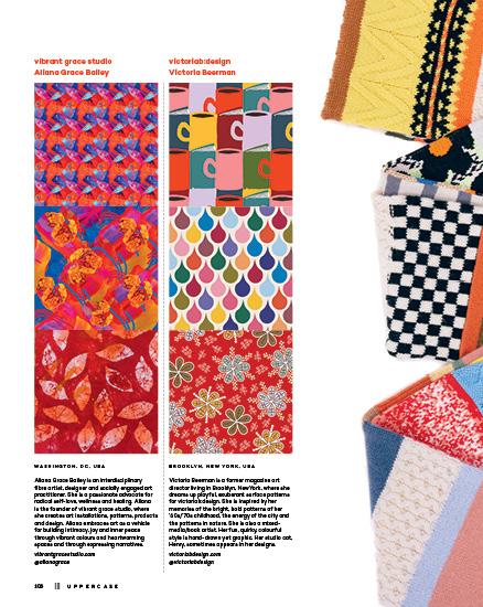
Mahota Textiles
Founded by Margaret Roach Wheeler, Mahota Textiles creates textiles informed and inspired by Southeastern tribal history, symbols, and traditional stories. Mahota is the first tribally owned textile company in the United States, drawing inspiration from the Southeastern heritage of the Chickasaw Nation and other tribes to create elevated and meaningful textiles designed in Oklahoma by Native American Artisans. “We are makers of art, of story, the threads that connect the inspiration of our ancestors to all of us in a modern world,” says Margaret.
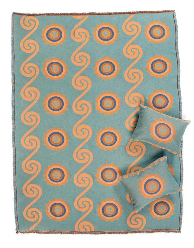
The woven Okcha (Life) Blanket offers comfort and meaning: “Water and the sun have always been significant aspects of life for tribal people. Rivers provided necessities like river cane and also served as a means of transportation for travel and trade. Just as the river brings necessities to sustain life, so does the sun. The sun represents the Creator who has gifted us light to warm our days and bring forth food.”
mahotatextiles.com
QUIRKY
Miho Unexpected Things is an Italian brand with a 60-year heritage. Michele Pianezza, the third generation of the family company, took over the vision with product designs that are fun, eclectic and sometimes strange takes on household décor such as rugs, trays, candle holders and more.
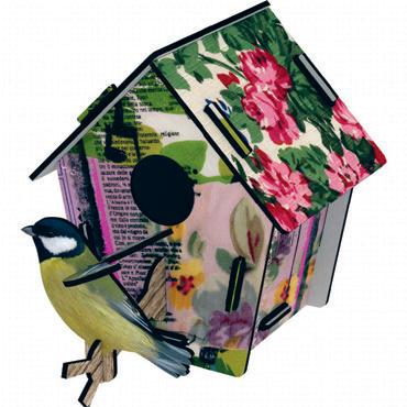
mihounexpectedshop.com
8 ||| UPPERCASE
Abstract prints from original photos
Sarah Dunbar is a British pattern designer who makes colourfully faceted abstract designs from photographs. “I studied design for exhibitions and museums at university before pursuing a professional career, project managing exhibitions and events for over a decade. I have always harboured a desire to create my own line of handmade products, and in 2018 I set myself a new challenge and left my permanent job to establish my own design business. I’m focused on creating vibrant designs to transform into handcrafted, gorgeous accessories for everyday use.” Her products include digitally printed faux leather pouches, tea towels and pillows.
@sarahdunbardesign sarahdunbardesign.co.uk
Society of Wanderers
This Australian company offers pattern and comfort with its 100% French flax bed linen in pretty patterns, bold stripes and gorgeous ginghams. societyofwanderers.com
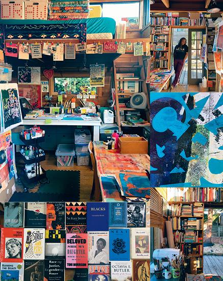
Knit it yourself
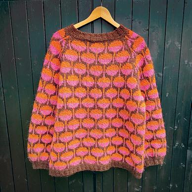
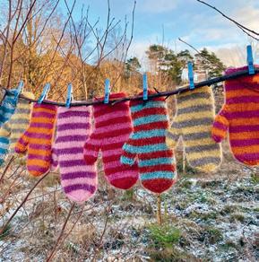
Swedish knitwear designer Marita Miettunen Clementz creates patterns for these eyecatching and cozy sweaters (plus adorable striped mittens), available on Ravelry. ravelry.com/designers/marita-clementz @maritaclementz
uppercasemagazine.com ||| 9
ABSTRACTED
DREAMY
COZY
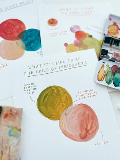
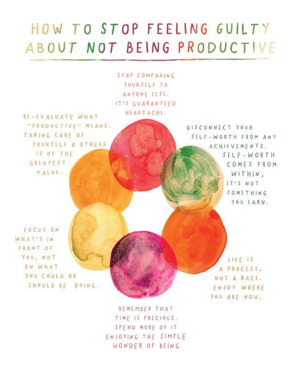
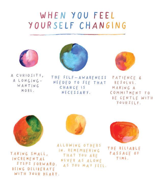
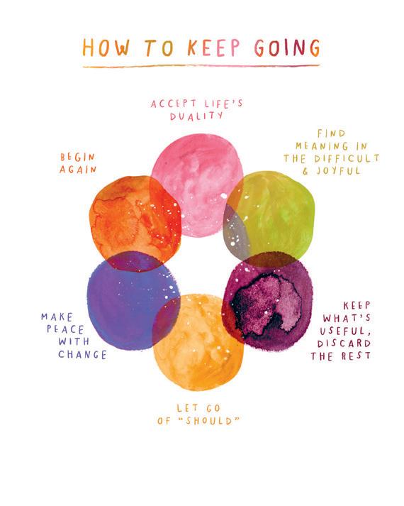
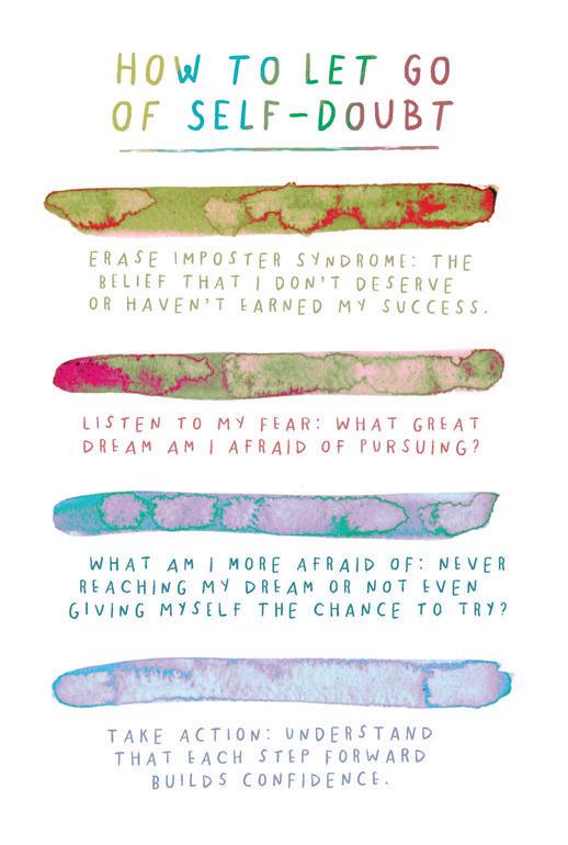
emotional palettes
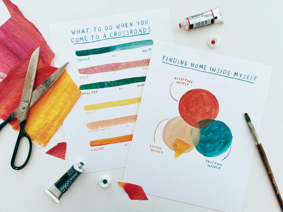
As an artist, I tend to think and feel in colour. Assigning colours to my emotions allows me to identify each one, helping me understand what I’m feeling, when I’m feeling it. After some time has passed, I find it easier to extract meaning from each experience. Understanding how you best process your experiences is foundational not only to your self-exploration practice, but into your creative practice. Without a strong self-understanding, it’s impossible to imbue your work with honesty, clarity and meaning. I encourage you to journal, exercise or meditate—to engage in the practices that bring you clarity.
The colour palettes in the book How it Feels to Find Yourself distil fundamental life transitions and explore the processes of moving through them with presence. The short essays that accompany them are a collection of memories, emotional snapshots and reflective exercises that have encouraged growth, critical thought and significant shifts within me.
The palettes and stories I share in these pages aren’t full of simple answers. They may not always point you in one direction. Rather, I hope they encourage you to see your own life as a beautiful, complex rainbow, full of meaning in moments of joy and satisfaction—but also within the painful experiences of change, loss and growth. This book asks you to be responsible for yourself and your choices. It asks you to do the challenging work of examining yourself. When you know yourself well, it’s easier to locate the significance in every small moment. Your capacity to retain peace during difficult transitions increases. You understand that most situations have more than one correct answer. You feel freer.
The most important relationship we can spend our lives nurturing is the relationship we have with ourselves. The lens through which we view ourselves determines our connection to the world. If that lens is cracked or cloudy, each of our relationships begins to suffer. Building a strong internal compass that skillfully guides you through life’s uncertainties is possible only by developing an intimate, healthy relationship with yourself. Through this process of continued self-exploration, I began to learn who I am, what my purpose is and how to intentionally shape my life into one I recognize with joy. Living well means adapting to life’s constant transition; evolving with purpose and clarity is a skill I now practise regularly. This is how I found myself—for the first time, and then again, every time after that.
meeralee.com
How it Feels to Find Yourself is a book that came from a period of deep transition. I wrote it during the first two years of Covid, while pregnant with my first child. I rewrote it over the first year of my daughter’s life, while navigating new motherhood and re-examining who I was becoming as a parent, person and artist.
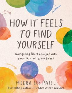
Through illustrated palettes, honest essays and insightful questions for deeper reflection, this book encourages you to sharpen your internal compass—so you can discover your purpose, let go of what you’ve outgrown and navigate challenging relationships with greater confidence.
@meeraleepatel @tarcherperigee
EXCERPTED FROM HOW IT FEELS TO FIND YOURSELF: NAVIGATING LIFE'S CHANGES WITH PURPOSE, CLARITY, AND HEART WITH PERMISSION OF TARCHERPERIGEE, AN IMPRINT OF PENGUIN PUBLISHING GROUP, A DIVISION OF PENGUIN RANDOM HOUSE LLC. COPYRIGHT © MEERA LEE PATEL, 2023. PENGUINRANDOMHOUSE.COM 10 ||| UPPERCASE ||| ARTICLE AND ILLUSTRATION BY meera lee patel |||
BEING
EXCERPTED FROM HOW IT FEELS TO FIND YOURSELF: NAVIGATING LIFE'S CHANGES WITH PURPOSE, CLARITY, AND HEART WITH PERMISSION OF TARCHERPERIGEE, AN IMPRINT OF PENGUIN PUBLISHING GROUP, A DIVISION OF PENGUIN RANDOM HOUSE LLC. COPYRIGHT © MEERA LEE PATEL, 2023. PENGUINRANDOMHOUSE.COM
uppercasemagazine.com ||| 11
fresh talent
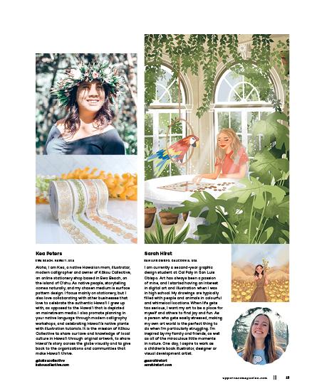
Sara Torabi
EDMUNDSTON, NEW BRUNSWICK, CANADA
I’m a new surface pattern designer and calligrapher based in New Brunswick, Canada. My creative purpose is to create art that brings happiness and joy to lives all around the world. I get inspired by everything and anything in the beautiful nature of New Brunswick. Sometimes I just walk quietly outside and see a beautiful, delicate weed grass, and it gives me a lot of inspiration for my next pattern. Sometimes I read a storybook for my three-year-old son, and I get inspired to draw animals in my next pattern. I am passionate about creating seamless patterns specifically for fabrics and wallpaper, and my hope is that my work lights up people’s homes and hearts with warm colours and playful design. Being in the surface design world has helped me to look at my surroundings more deeply, to pay attention to little details and appreciate the beauty around me even more.
@papillonpatterns

WHETHER YOU’RE A FRESH GRADUATE OR MATURE ARTIST, IT IS OFTEN A DREAM TO BE PUBLISHED FOR THE FIRST TIME!
You’re welcome to submit your work for consideration.
uppercasemagazine.com/ participate
FRESH
THIS IS A LOW RES PREVIEW OF A HIGH QUALITY
QUARTERLY PRINT MAGAZINE
PLEASE SUBSCRIBE
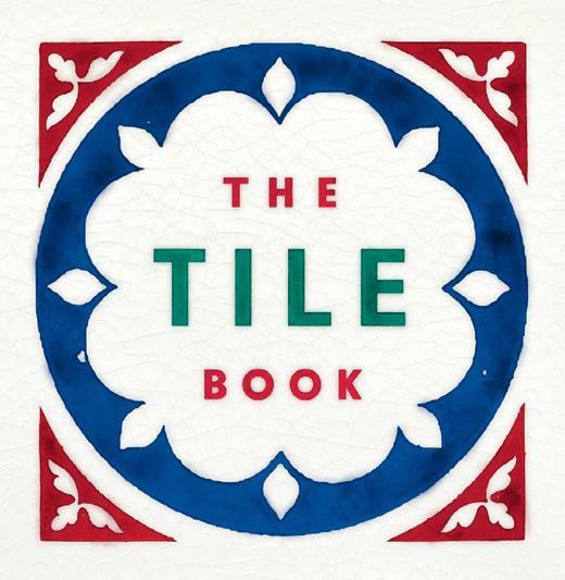
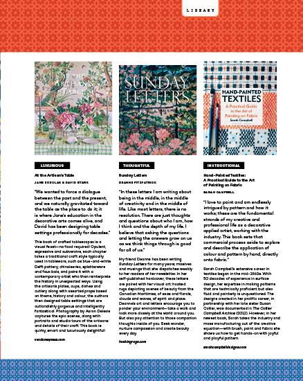
The Tile Book is beautifully designed by Here Design to highlight the diverse graphic quality of tiles from around the world. thamesandhudsonusa.com
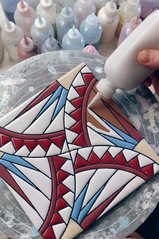
218K followers of @kibak_ tile love to watch Kibak tile artisans squeeze glaze onto tiles as if it they were icing on a fancy cookie. kibaktile.com
terrific tiles
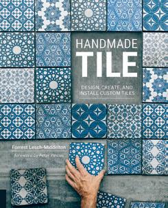
Handmade Tile: Design, Create, and Install Custom Tiles by Forrest LeschMiddelton teaches you how to make and install your own ceramic tiles. quartoknows.com
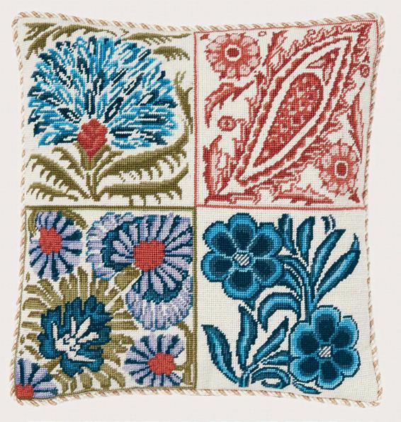
The Regent Tile Tapestry Cushion Kit is based on drawings for tiles in the collection of the Victoria and Albert Museum. ehrmantapestry.com
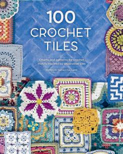
100 Crochet Tiles is a clever look at granny squares and more complex crocheted squares inspired by decorative tiles and interpreted by various crochet pattern designers. davidandcharles.com
Andalusian ceramic tiles shipped from Spain. CeramicFromSpain. etsy.com
14 ||| UPPERCASE NOTED
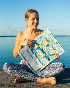
the pattern paper
TEXT BY AMELIA WOODBRIDGE
Mélanie Johnsson is a freelance graphic designer, illustrator and letterer living in the English seaside town of Margate. A designer and collaborator with brands in the luxury, travel, art and fashion industries, among others, Mélanie is the creative behind The Pattern Paper, a quarterly newspaper showcasing original patterns created by illustrators from around the world.
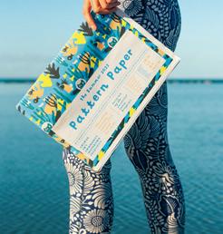
The Pattern Paper is curated from submissions to #thepatternchallengebymel, a biannual Instagram challenge started by Mélanie. She launched the paper as a vehicle to share artwork from the challenge and, through a nonprofit, support charitable causes chosen by the artists from sales of the paper. Support to date has benefited the British Red Cross, Surfers Against Sewage and Arthouse Unlimited, raising £600 (C$975) with the first two issues.
With three issues of the paper released so far, and nearly 17,000 submissions, Mélanie says the paper gives artists visibility and strengthens their community. “It’s a proud moment for a lot of illustrators to see their work in The Pattern Paper—some of them seeing their work published for the first time. It boosts their confidence and shows them the power of sharing their work and trying new things.”
Mélanie curates each issue with sustainability in mind, with subscription only through pre-orders, avoiding overprinting and waste. She also encourages subscribers to repurpose The Pattern Paper in their own art or craft. “It’s beautiful to collect, but the paper can be great source material for new art, too!” says Mélanie.
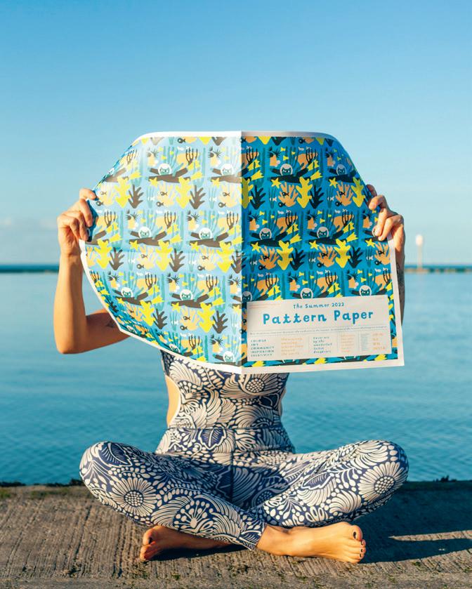
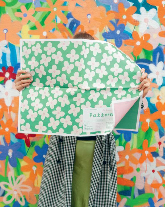
melaniejohnsson.com
uppercasemagazine.com ||| 15
WORTHWHILE
Using our creativity for good is one of the best ways we can make a difference. Through design, art and craft—and with our hands and hearts—we can effect change. However small it may seem at first, each incremental effort is still significant.
PLEASE SUBSCRIBE
THIS IS A LOW RES PREVIEW OF A HIGH QUALITY QUARTERLY PRINT MAGAZINE
THIS IS A LOW RES PREVIEW OF A HIGH QUALITY QUARTERLY PRINT MAGAZINE
PLEASE SUBSCRIBE
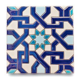
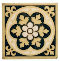
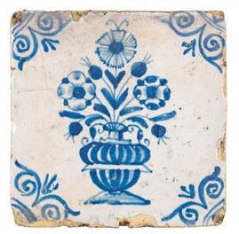
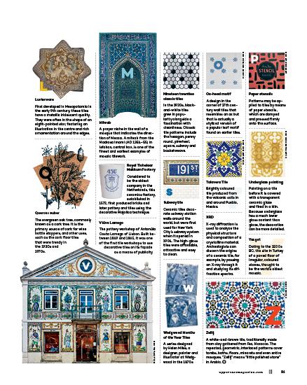
tiles from around the world and through time
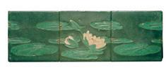 COMPILED BY lydie raschka
A set of square and rectangular multicoloured blocks used to concretely represent algebraic principles.
An English medieval monastery, now a beautiful ruin, noteworthy in part for its geometrically designed green and yellow floor tiles.
A technique used to create coloured ceramic tiles, introduced in Islamic Spain in the 10th century. Cuerda seca (Spanish for “dry cord”) involves thin bands of wax, called resists, used to prevent coloured glazes from running together, allowing for intricate designs.
Girih
Delftware
A general term for Dutch tinglazed earthenware. The city of Delft was the major centre of production at its height, from 1640 to 1740. Mostly blue and white, Delftware was made from clay and coated with a white tin glaze after it was fired, to resemble porcelain.
While most ceramic tiles are coloured by using glazes on the tile surface, encaustic tiles contain different colours of clay within the body of the ceramic tile itself, creating embedded patterns and illustrations.
A tin-glazed and enamelled earthenware with an opaque, milky white colour resulting from the addition of tin oxide to the glaze. It became popular beginning in the late 16th century.
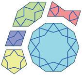
A form of Islamic architectural decoration since 1200 AD, this ingenious set of five interlocking tiles are each patterned with strapwork, or girih: geometric lines suggesting interwoven straps of leather.
An arrangement of rectangular shapes that resemble the bone structure of the herring fish skeleton. Early examples can be found in Ancient Egyptian jewellery and early Roman brick road construction.
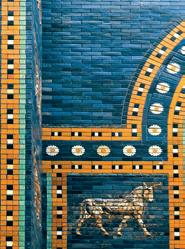
The eighth gate to the inner city of Babylon, constructed circa 575 BC. The front is adorned with alternating rows of dragons and bulls, surrounded by blue tiles.
The American artist’s 1979 installation “An Interior Decorated” featured a mosaic of 1,000 star-and-hexagon-shaped ceramic floor tiles, surrounded by ceramic decoration, hanging silk-screened fabrics and lithograph prints. She calls it her “personal anthology of the decorative arts.”
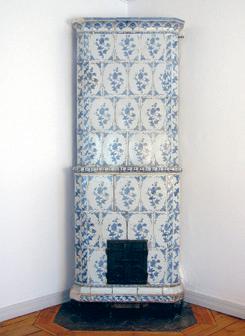
Kakelugn
Also called “cocklestoves” (tile stoves), a device for warming a room through radiant heating. The Swedish version, designed by the 18th-century polymath Carl Johan Cronstedt, was incredibly efficient: one small wood fire could keep a room warm for 12 hours, ultimately helping reduce deforestation.
20 ||| UPPERCASE
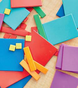
Algebra tiles
ABECEDARY
Byland Abbey
Cuerda seca
JOYCEKOZLOFF.NET
METMUSEUM.ORG
Encaustic tiles
French faience tile
tiles
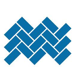
Herringbone pattern
Ishtar Gate
Joyce Kozloff
METMUSEUM.ORG
THIS IS A LOW RES PREVIEW OF A HIGH QUALITY QUARTERLY PRINT MAGAZINE
PLEASE SUBSCRIBE
was happening in our lives when we look at one piece or another. In that way, I think what we make tells our story back to us, chapter by chapter.”
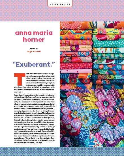
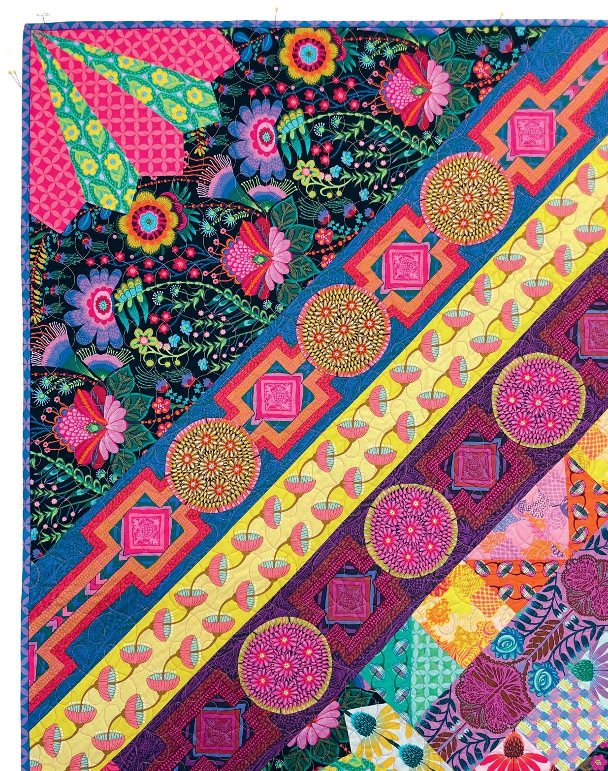
Like her eloquent use of colour and scale in her art and textile designs, her multifaceted product offerings have expanded and scaled over time. After attending university, Anna Maria started a clothing line of her designs named Handmaiden, and since then, as her business evolved, she has grown her various product offerings, adding quilt patterns and templates, sewing patterns, books, needlework, and supplies and kits. “I think that diversifying what I share has increased the interest in my work to include crafters who maybe never considered doing needlepoint, for example, until their favourite quilt fabric designer created kits,” she says. “If I love making something, I want to share that love [and the products and education related to it] professionally with others.”
Anna Maria’s business growth has been organic, and like a garden that needs tending in order to flourish, she says her business and its growth are something she has to keep tabs on. “These days, I want my work to fit my life more than my life to fit my work,” she explains. One example of this is how she approached designing clothing sewing patterns in the early days of her career: “In 2009 [designing sewing patterns] was a natural progression of making clothing my whole life, but as I added other patterns for quilting, needlework and accessories, and began teaching workshops, I realized I couldn’t do it all, at least I couldn’t do it all as well as I thought it should be done.” Making sewing patterns, she says, means “also providing a lot of customer support and expertise to allow everyone a quality experience,” for various levels of experience. That level of customer experience was one she “never seemed to have enough time for.” Rather, it made more sense for her to create very basic, beginner clothing patterns with her Simple Start collection, which she describes as patterns that are “classic in their silhouette and are very achievable for first-time sewers.”
Another big decision for Anna Maria in 2022 was to transition her brick-and-mortar shop, Craft South, to an online shop exclusively. “With world changes that were out of my control, the business grew in sales but at the same time completely changed its ratio [to more online sales than in-store sales],” she explains. The move to online only, she says, “really tugged at me emotionally because I love the community we have built at Craft South.” But the shift in sales from in-person to online “made me question whether we needed to open the front door to just 25% of our customers when operational time and costs of doing so could have been better spent making other parts of our work smoother,” she adds.
26 ||| UPPERCASE
THIS IS A LOW RES PREVIEW OF A HIGH QUALITY
QUARTERLY PRINT MAGAZINE PLEASE SUBSCRIBE
circumstance, this would have been amazing. It was a good opportunity for a woman of colour in the 1920s. But calmly and respectfully, Anna said no. All the men in the meeting with Anna were baffled. I mean, did she not understand? She was just offered stability. And let’s be honest, the businessmen told her that it was complicated to be prosperous in what she wanted to do, even for a man. How would she make it? But Anna said it didn’t bother her and that God would take care of her. And on she went. Basically Anna threw out a polite “Watch me!”
Oops! Did I just add a second spoon of sugar to my tea or was that my fourth? How can I focus on anything else when listening to Anna’s story? It is shocking. Even more shocking is how humble she is. I don’t think I would have had the gumption in my early twenties to sit in a room with four or five men offering me a good job to start my life, and say no. But she did. She became a freelancer, selling her carpet and wallpaper designs to various companies. And she was not discouraged by that well-meant meeting she had with the gentlemen. In fact, she wrote them a letter thanking them for giving her knowledge about the industry. They explained the difficulties she would encounter and she was grateful that she knew in advance what to expect before taking that leap of faith.

This was not Anna’s first experience facing others’ doubts. And it didn’t only come from white people. As a girl and young woman, Anna was discouraged by other Black people from pursuing the arts. Again, it was not a lack of belief in her talent or even a lack of respect for an artistic gift, but rather the discouragement stemmed from fear. It was the 1920s—how was a Black woman going to make an earning from drawing or painting? It was unheard of.
I have felt this discouragement and doubt in my past, too. People saw that I excelled in a traditional school setting and wanted to see me pursue something more practical than art. And honestly, their fear ignited my own fears. For a while, I pursued psychology in college. But not too far into my freshman year, I added a second degree in visual arts and eventually found myself running to New York City to become an artist. I could not quiet the inner urge of artistic expression that lived in me. I imagine this is how Anna felt. She said that when people expressed doubt and discouraged her artistic direction, she would just keep to herself. And she would continue to create. She listened to her own inner voice and to her truth. And from learning about her life, she never steered away from that.
I sip my tea and sit in awe, enamoured by Anna and her die-hard freelancer life. When I say that, I mean she lived her life seeking and grabbing opportunities
when they came. And when they didn’t come, she created them. Bottom line, you gotta pay the bills and you want to accomplish that by doing something you love. She said, “my fingers can do anything,” and they did. In 1937 when the Great Depression was weighing heavily on most, Anna used her art to reflect the political climate. She focused on questions and concerns about the lives of Black Americans. While at the Works Progress Administration (WPA), she served as an assistant supervisor on African American projects, but it didn’t take her long to build her own African American educational poster and lecture project, called Teacher’s Art Service. This helped build and produce a network of schools, libraries and educators in Philadelphia, Baltimore and Washington, DC.
What I find so brilliant about Anna was her willingness and courage to adjust to her ever-shifting artistic career. I don’t know about you, but I find comfort and stability in having a focused identification or label. For example, I am a “children’s book illustrator and writer.” Ideally, I would continue to write and draw until my ideas and/or my fingers dry up. I am in love with what I am doing right now. But Anna seemed to focus on being an artist, period. She wanted to share her artistic expression. She was not hindered by communicating art in a particular or limited way. I’m sure she had a preference in what she wanted to do. And it is okay to have a preference. But she did not allow one ideal job or a vision of her freelance career to pigeonhole her. She always found ways to busy her fingers and contribute to the world around her. She went on to join the Women’s Army Auxiliary Corps, excelling in the arts, to work for the government as a graphic designer and tech draftsman, and to study medical illustration at Howard University.
“Anything you want is in your possession to get, but you have to pay a price for it,” Anna once said. “And you know within your heart the price you have to pay.”
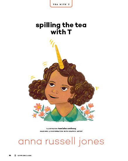
Anna knew exactly what she wanted to do and pursued it with quiet confidence. She loved to create and she found many avenues in which to share her artistic voice. I think that is what happens when your inner being, your core personality, is a creator. She could not help but seek, find and create ways to make art. So, to my fellow freelancers, I hope we will have the audacity to follow our artistic paths just as courageously and open-mindedly as Miss Anna Russell Jones. Here’s to being a unicorn! tamishaanthony.com
32 ||| UPPERCASE
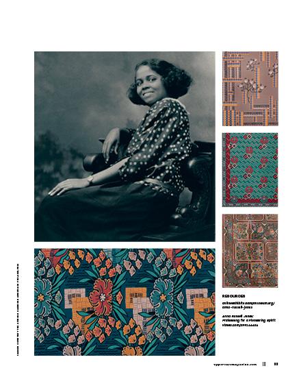
IMAGES COURTESY THE AFRICAN AMERICAN MUSEUM IN PHILADELPHIA
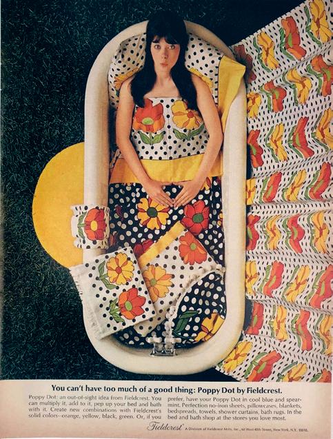
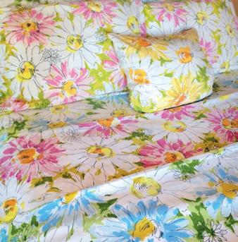
vintage sheets
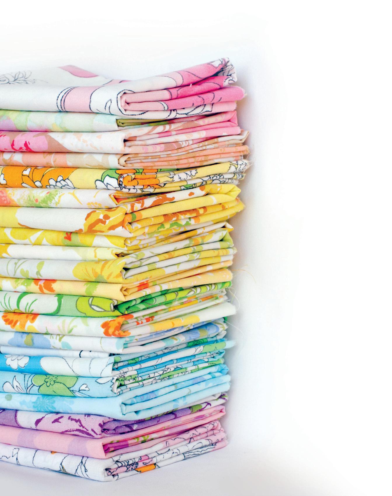
Is there anything more luxurious, or relaxing, than slipping between a pair of really, really nice sheets? When it comes to making your bed, modern sheets, with their 1,000 thread counts, truly are the stuff that dreams are made of (pun intended). That said, many would argue that the finest era for sheets and bedding has come and gone, for many of us can’t help but feel nostalgic for those iconic designs of the sixties, seventies and eighties, with their bold stripes, wild florals and funky patterns. From gigantic poppies and cheerful butterflies to psychedelic waves and geometric shapes—whatever your personality, there was bedding to match! Like most trends, these unique patterns eventually fell out of fashion, and over time were shoved to the bottom of a drawer or the back of a closet. But artists, collectors and vintage lovers are giving these oldies-but-goodies a new life—rediscovering, refreshing and repurposing them for a new audience. Vintage sheets transport us to specific times and places—a grandparent’s house, a childhood bedroom, a first apartment— which is why we love them so much and celebrate them and all their soft, vintage goodness.
BY kerrie more
VINTAGE
|||
STORY
THIS IS A LOW RES PREVIEW OF A HIGH QUALITY QUARTERLY PRINT MAGAZINE PLEASE SUBSCRIBE
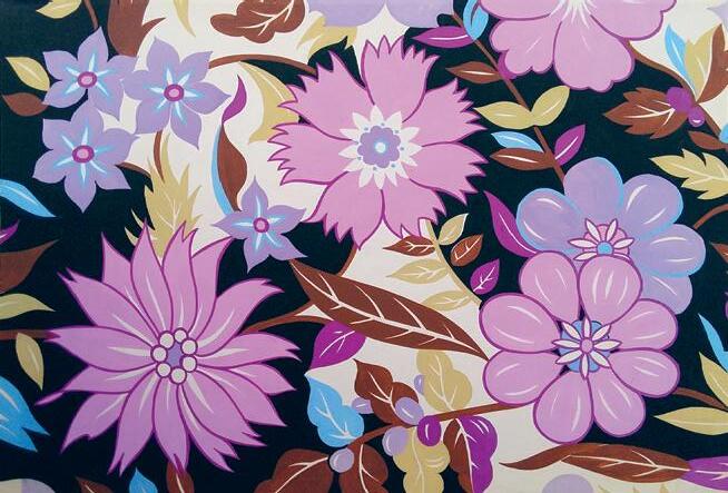
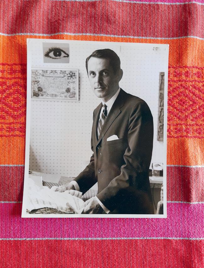
Bill Stark
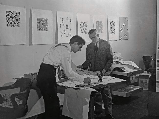
It is easy to forget that the designs we love and adore— the ones that we choose for our homes and live with day in and day out—were all imagined, created and brought into the world by a talented artist. Bill Stark is one of the many artists who ushered in the bold, playful, colourful imagery that dominated the home textile market in the sixties and seventies. He graduated from the School of Professional Arts in 1944 and Cooper Union in 1952, among other prestigious programs. In addition to freelance work, Bill spent time at Morgan Jones, Bates Mill and Fieldcrest. Over the course of his career, he worked with a number of licensed designers, including Marimekko, Yves Saint Laurent and Pierre Cardin, and also collaborated with Bjørn Winblad and Missoni to introduce their iconic, bold designs to the US bed and bath division. Always trying to predict the next trends for spring and fall, he created patterns for the upcoming season the old-fashioned way, with gouache and tempera on paper. At Fieldcrest, his sketches would be passed along to the creative team, who would see them into production—including vintage sheet designs such as Lazy Daisy, Poppy Dot and Pow Flower. These popular designs ultimately became household favourites, still coveted today by a growing number of vintage sheet collectors—an enduring legacy for a groundbreaking artist!
Dawn Thompson
As a collector, stager and vintage lover, it is not unusual for Dawn Thompson to visit nine or ten estate sales every Saturday. It was while searching for her first love, vintage Pyrex dishes, that she stumbled upon the allure of vintage textiles. “The sheets from this era are memory makers!” she says. “I had a great childhood, so I’m nostalgic for all of those fantastic, bold colours. I’ll see something and remember my grandma having it, or it will take me back to my friend Stacy’s slumber party from 1980.” Years ago, after a successful day of treasure hunting, Dawn laid out all of the items she had purchased and noticed that the linens and the dishes, with their bright colours and bold designs, made a compelling vignette. “Everything just went together,” she realized. Things just evolved from there and her Instagram account has become a colourful show-and-tell of her vintage eye candy, including the one-ofa-kind bedscapes she started creating as her sheet collection grew… and grew… and grew. “I’m a little over the top,” she says, “and when I make my bed with these vintage linens, it’s not a chore, but an artistic expression.” Even if the sheets she finds are stained or torn, she combines them with other damaged linens and repurposes them into decorative swags. “These patterns are too good to toss. You can’t find this kind of art any more, and once they’re gone, they’re gone.”
@houseonfawn.vintage
38 ||| UPPERCASE
“Every time I make a fresh bedscape, those designs become my new favourites.”
–DAWN THOMPSON
“I love making vintage sheet quilts with all the colours of the rainbow. Purple designs are the unicorns of vintage sheets—they are so hard to find! But it’s my favourite colour, so I’m always on the hunt.”
–JENI BAKER
Jeni Baker
A handmade quilt is just the thing to make a room more cozy and welcoming. So, when Jeni Baker moved into her first apartment, she decided to learn how to make one herself. However, when she finished that first one, she immediately started another, and she hasn’t stopped since! With an eye for beautiful fabric, and an affinity for thrifting, it’s not surprising that she fell in love with vintage sheets. “I remember the first one I bought for ten cents at a flea market,” she says. “It’s such a good one, I still haven’t cut it up!”
According to Jeni, making a quilt from vintage sheets involves combining a lot of intense colours and patterns into one project, in what is definitely a “more is more” aesthetic. When people see her quilts they often say, “There’s so much to look at!” Jeni loves working with these reclaimed materials, and turning them into something beautiful. “Vintage sheets have been washed hundreds of times. They’re buttery and wonderful, and you can’t rush that!” In fact, her sheet quilts end up feeling so personal that she has never given one away. “I remember where I was, and who I was with, when I found many of the sheets in my quilts. They are like a little scrapbook of my life.” Incolororder.com
@jenib320
THIS IS A LOW RES PREVIEW OF A HIGH QUALITY QUARTERLY PRINT MAGAZINE
PLEASE SUBSCRIBE
BEGINNINGS
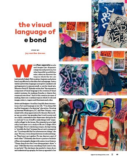
love of research, reading and relationality. “I just want to know more, like why did they do that? Or what was happening in the world when this was happening?”
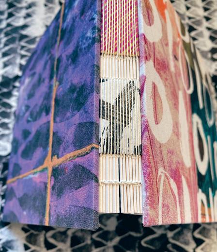
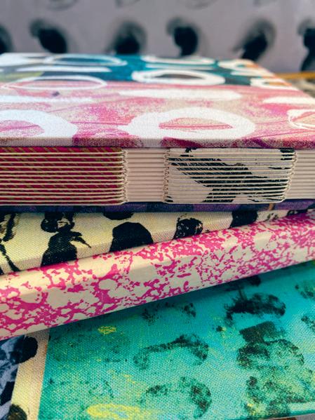
When e discovered book art after her undergrad, it felt like the world opened up. “Here was this place [where] words and images had to go together.” While working her day job as a graphic designer, she would go home and make book forms, drawn to the idea of creating beautiful utilitarian objects for everyday use. In 2003, e started her business roughdrAftbooks, creating handmade books that “merge and blur the boundaries of art, craft, design and poetry.” She also relocated from the East Coast to Northern California for graduate school at Mills College, which offered an interdisciplinary program, and where she received her MFA in book art and poetry. For two decades, she has built a hybrid creative life: making books, creating art and teaching, alongside her career as a graphic designer for companies like Anthropologie, Gap and Athleta.
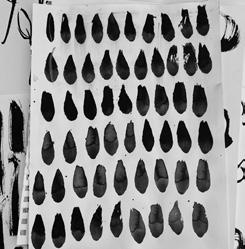
Making books, she says, is a process full of fun, with zero pressure. “It’s the thing that is always there, to go back to. There’s always a stack that’s ready to be folded or ready to be sewn. It feels like it’s just like a comfort, too.” She likens her muscle memory of folding and sewing paper to that of a knitter, one who can knit and watch television at the same time. Her body knows these movements intimately, allowing her hands to fold and sew while her brain focuses elsewhere. “It’s not even a thought anymore. It’s almost like my body just sews them. If my hands are moving, I can think something else out.”
And for e, being able to work on different projects in parallel is essential. “I don’t know how to work in any other way. I can’t just make the design, or I can’t just teach, or I can’t just make the art. To me, they have to be together in some way, and they have to feed each other. And I’ve got to have more than one thing going on so that [projects] can speak to each other.”
One significant project amidst the pandemic was called 100 Questions Worth Asking, for which she explored the idea of how to ask better questions over 100 days on Instagram. This project led to numerous conversations, including one with her cousin Sarah Bond, who is a quilter. Sarah mentioned that other quilters were eager to know if e made or would ever consider making fabric with her designs. She was indeed interested but wasn’t sure how to enter that realm. Thanks to quilter Victoria Findlay Wolfe, e was able to connect with FreeSpirit Fabrics, a wholesale supplier of diverse designer fabric collections.
When e met with the team at FreeSpirit, she immediately knew that they would get along. The team was attracted to her abstract work, pointing to drawings, she says, that “had no rhyme or reason on the surface” but
44 ||| UPPERCASE

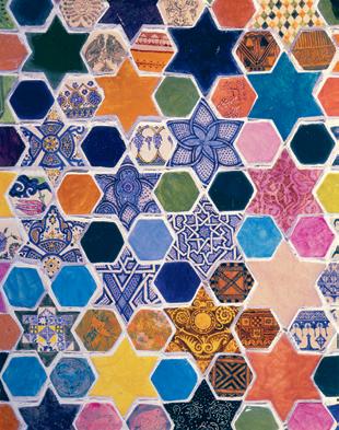
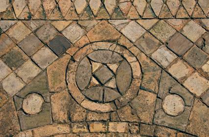
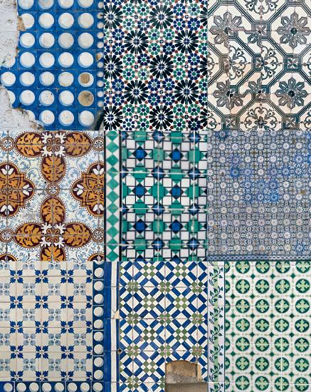
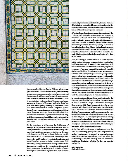
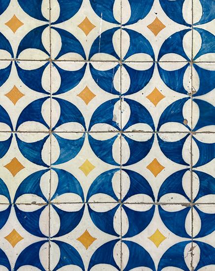
azulejos de portugal
FIELD TRIP
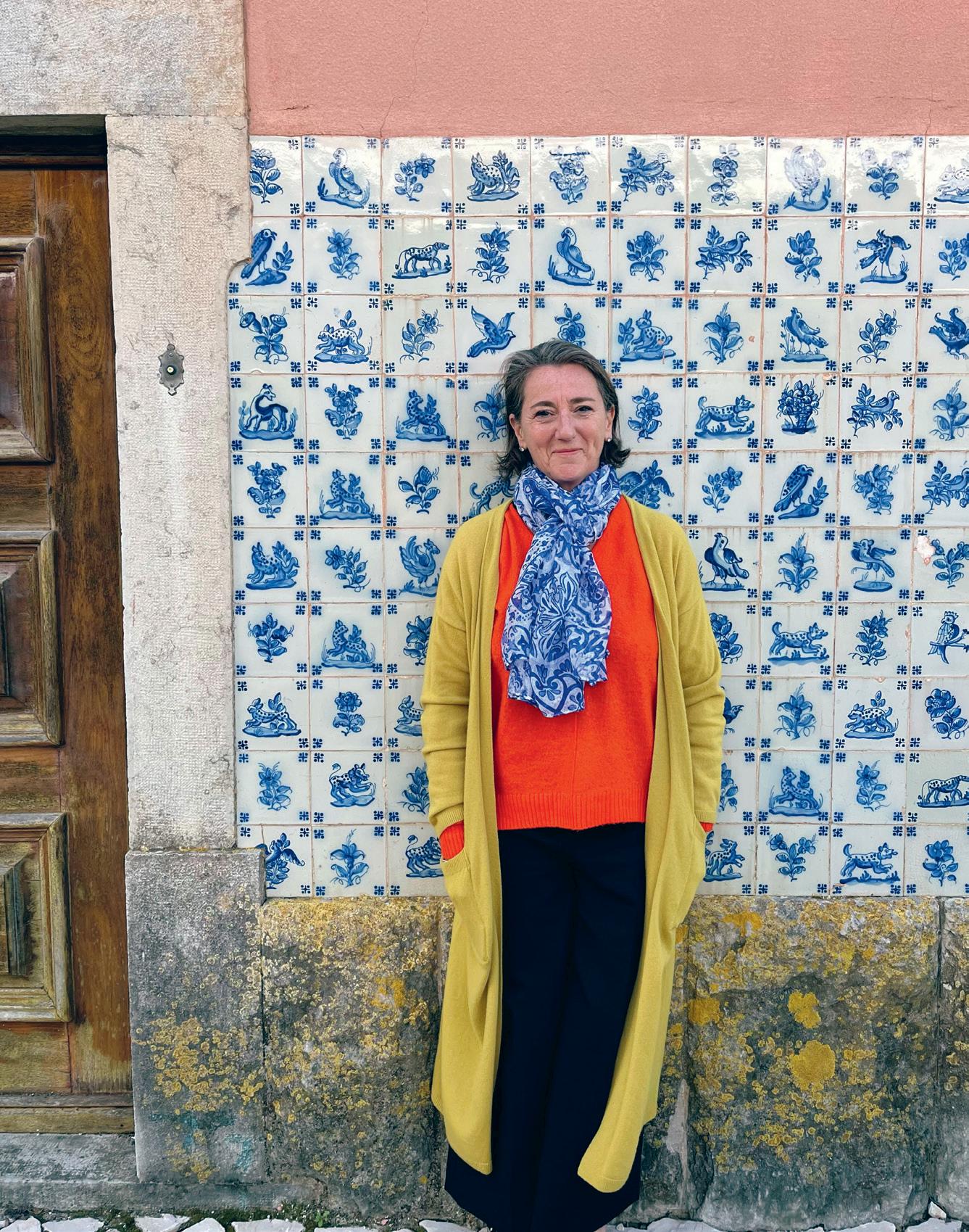
STORY AND PHOTOS BY shelley davies
Azulejo, from the Arabic al-zillīj ( الزليج ), roughly translates to “small polished stones,” evolved into “azulejos,” both the Spanish (ah-soo-le-haws) and Portuguese (ah-zoo-le-zhoosh) word for ceramic tiles.
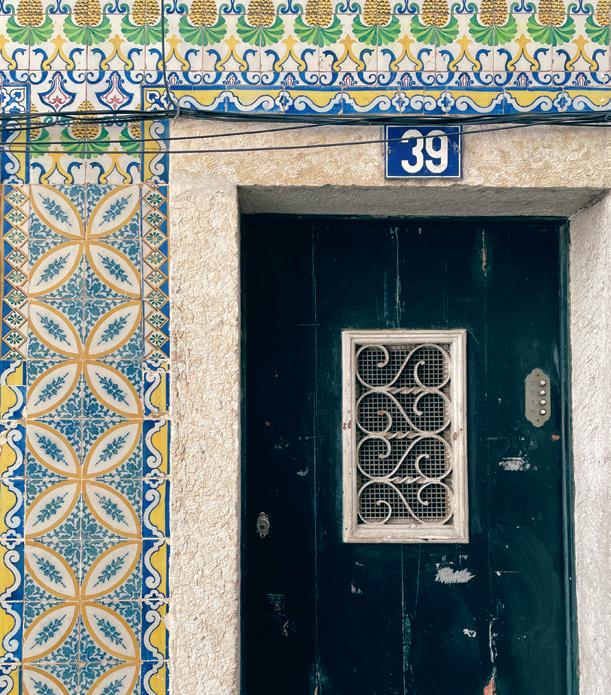
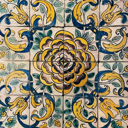
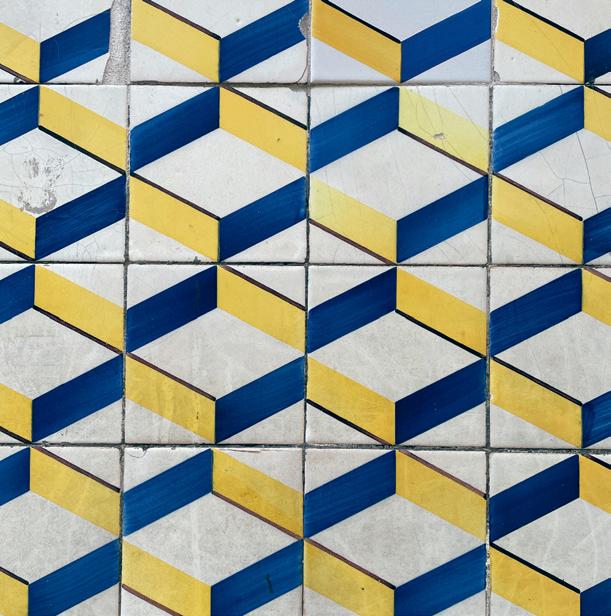
One of the most beautiful threads that wends its way through the bright and ancient land of Portugal is the ubiquitous ceramic tile, which enlivens every inhabited corner of this vibrant country. From the magnificent examples decorating religious edifices such as churches, monasteries and convents, to those decorating bars and restaurants, schools and libraries, town squares, fountains, waiting rooms and laundromats, not to mention most homes, tiles are an integral part of this country’s vernacular, which runs the gamut from venerable narrative storytelling to modern-day decorative invention. Much of Portugal’s signage is also incorporated into ceramic tiles, blending functionality with decoration in a most delightful, handmade and very Portuguese way.
I spent this past spring in Lisbon, soaking up the gritty patchwork that is this ancient metropolis, and found tiles on every street corner, from broken fragments peeking out from a multitude of renovations to beautifully restored murals, all butting up against each other in a haphazard and very collaged way, one century plonked beside another to charming effect. I particularly loved getting unexpected glimpses of spectacular tiles as private doors opened and closed, while wandering through the winding, cobbled streets. And in the tonier parts of town, bold black-and-white stone mosaic designs make up the sidewalks and plazas, adding yet more aesthetic delight to the city.
uppercasemagazine.com ||| 51
|||
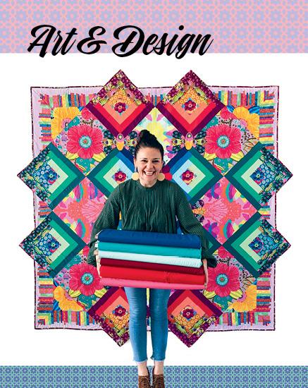
Surface Pattern
DESIGN GUIDE
guide cover artist welcome
Iwas very new to the world of surface design when I curated the very first UPPERCASE Surface Pattern Design Guide (issue #21). In fact, that issue began as my way of getting to know this industry. It was an introduction, both for myself and for my readers, to the many creative opportunities that are part of surface design and art licensing.
The connections that began with that first guide have flourished ever since. Windham Fabrics has been an encouraging and supportive presence through all of the guides, collaborating on collections with many artists featured in the inaugural and subsequent guides. I have also been fortunate to have released four collections with Windham Fabrics in the past decade. For many of us, me included, that original introduction to surface design has become an educational and fulfilling creative experience and an enduring pursuit!
With this fifth edition of the guide, 994 aspiring and seasoned artists submitted work. There is only room to select 100 artists for publication, but I want to acknowledge all the talented and enthusiastic artists whose work contributed to this guide. Whether you were published or not, your work was appreciated!
On behalf of my partners at Windham Fabrics, Bonnie Christine, Halfpenny Postage, Chronicle Books, Lilla Rogers’ Make Art That Sells, Sarah Watts, Elizabeth Silver, Surface Design News and Patternbank, we thank you for the privilege of viewing your work.
UPPERCASE Surface Pattern Design Guides are used by industry professionals to find new talent. They are a valuable and inspiring reference for aspiring surface designers. For all designers, they are an excellent snapshot of the colours, motifs and styles of the two-year period that each guide reflects. I hope that the UPPERCASE Surface Pattern Design Guide will also be a stepping stone for you and your creative career.
There’s always room for more patterns and more beauty in the world— and it’s up to us to make it!
Janine Vangool PUBLISHER, EDITOR, DESIGNER
For insights on the selection process, videos about surface design, an archive of helpful videos and a newsletter dedicated to surface design, please visit the UPPERCASE website.
uppercasemagazine.com/spdg5

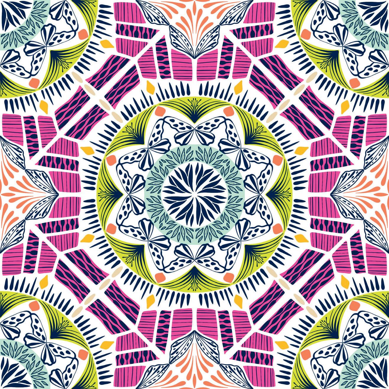
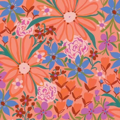
SURFACE PATTERN DESIGN GUIDE COVER ART BY
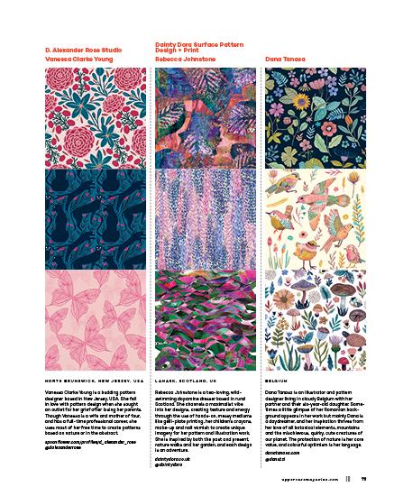
Vanessa Clarke Young
Vanessa Clarke Young is a lawyer, mother of four and surface pattern designer who sells her work on Spoonflower. “I’m so honoured that my artwork was selected to be on the cover,” she says in response to the good news of being selected for the UPPERCASE Surface Pattern Design Guide.
Vanessa drew the design, entitled Spring Fun, on her iPad. “Born in March, I am naturally drawn to spring and nature-inspired motifs (I love butterflies!). I fell in love with a colour palette from a design challenge and wanted to draw a fun and bright pattern.”
I love how her design incorporates a butterfly— a recurring trend motif I observed in many submissions—but in a subtle way. Her colour palette and the central radiating flower are a lovely and serendipitous graphic echo of Anna Maria Horner’s front cover art.
spoonflower.com/profiles/ _d_alexander_rose
@dalexanderrose
uppercasemagazine.com ||| 59
tara lilly
Thousands of patterns were submitted to the Guide, so the team at Windham Fabrics had their work cut out for them!
“It is a treat to go through hundreds of submissions in the UPPERCASE Surface Design Pattern Guide competition; to sift through colour, pattern, originality and lots of talent from all over the world,” says Sophia Santander Rudloff, chief creative officer at Windham Fabrics.
“This year our team was drawn to the exuberant florals from Tara Lilly Studio. Tara’s thoughtful use of colour—ranging from pastels to fluorescents—in her bright and cheerful designs, set her submission apart from the rest. While we look for creativity and a designer’s artistic vision, the practical application of the design onto fabric is just as important. Tara’s florals will certainly quilt up beautifully and offer the home sewing enthusiast opportunities to explore their own creativity. We look forward to diving into our collaboration with Tara Lilly and preparing her debut fabric collection with Windham Fabrics!”
windhamfabrics.com
@windhamfabrics
winning work
For Tara Lilly, the creative process starts with inspiration: “Something as simple as a fresh colour palette can inspire a new floral.” Walking in nature, exploring vintage markets and thumbing through books can provide that spark. “I am also a collector and have many mini collections of things that inspire me. My artwork is created using a mostly non-digital approach. Mediums of choice include gouache, acrylic, watercolour and most recently oil pastels. I rarely sketch anything before creating, but if I do sketch I find a watercolour pencil ideal. The final process of making new patterns involves scanning my paintings into Photoshop where I can make corrections and create implied repeats.”
Tara was thrilled to hear that Windham selected her for a collaboration. “I have dreamt of working with a bolt fabric company for a while now!” Her work has previously been licensed for bedding, children’s clothing, lingerie, lunch bags and picnic blankets. “It seems so suiting to have a fabric collection for folks to sew their own fabric goods at home. It will be amazing to see what people will create with this new collection.”
taralillystudio.com
@taralillystudio
60 ||| UPPERCASE
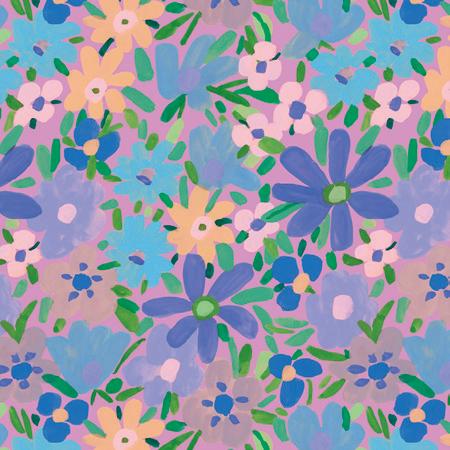
In 2021, Sharon Virtue was selected as Windham Fabrics’ winner of a fabric collection licensing deal in the 4th edition of the UPPERCASE Surface Pattern Design Guide, published in issue #49 (April-May-June 2021). A few years later, this collaboration is on its way to fabric retailers.
“I was so pleasantly surprised (and encouraged) that my collection of artworks was picked for the Windham award, because none of my artworks were actually in repeat,” says Sharon. Her work is painterly and expressive—and oh so colourful! “I recall listening to a podcast through Pattern Observer a long time ago which suggested that not everything you make needs to be in a repeat. Sometimes a potential client is looking for a fresh style or use of colour that stands out, and they will put things into repeat with a technical team.”
Windham’s in-house designers helped Sharon prepare her ideas for fabric production. “Windham has a fantastic staff of designers who have much more experience in creating patterns,” explains Sharon. “For my painterly style, it makes sense to work in Photoshop in order to keep the details and textures of the brushstrokes. Fortunately, I have read a few great books on pattern design with Photoshop—one great easy starter book is called Print, Make, Wear by Melanie Bowles. I was able to make the first rough ideas, and then the team would clean things up and change things around. We went through a few iterations and design choices. I was particularly fussy about the colour because I think the use and choice of colour is part of a person’s signature style.” The process required some compromises to suit Windham’s customer tastes. “Some of my choices might be considered a little outrageous!” Sharon admits, but the resulting collection is still full of personality.
sharon virtue’s bright world
The 22-print collection is entitled Bright World and will be available in quilt shops as of April 2023. “The abstract painting that inspired the collection is made up of spirals and geometric forms, overlaid with organic shapes and painterly splashes of bright pink, sky blues with aqua, yellows and darkest violet,” says Sharon. “I wanted this collection to have a cosmic feeling—as if you were dancing inside a Matisse painting.”
“The joy comes in seeing the fabrics in real life!” says Sharon. “I worked with a fantastic local seamstress to make clothing from Simplicity patterns. This was another big learning experience: how to mix and apply patterns in real life for an item of clothing or bag is very different from working with swatches on paper!” Sharon is looking forward to bringing this new experience to her second fabric collection.
@shabanackle virtuevision.org
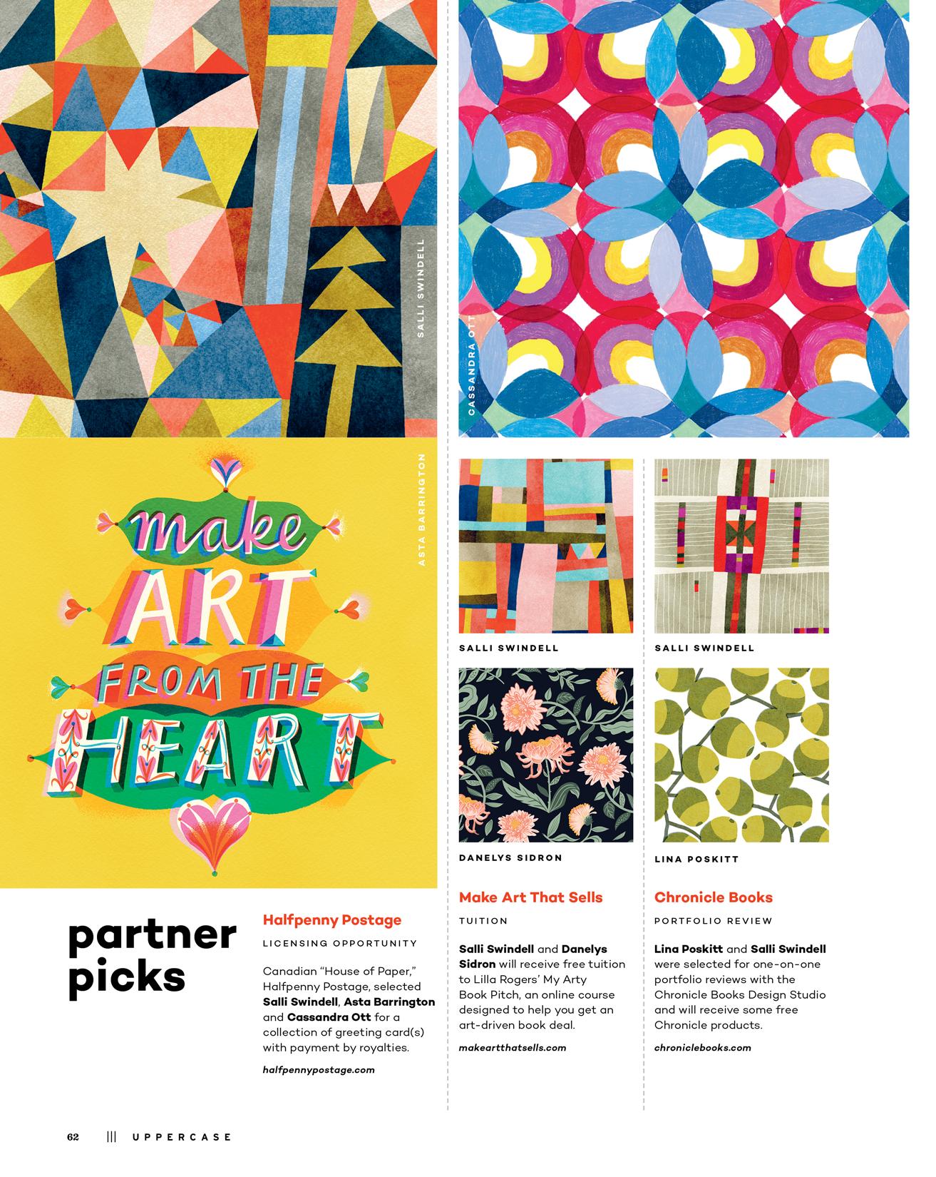
Surface Design Immersion
FREE TUITION + ACCESS
Bonnie Christine selected Monica Kane as her recipient for free tuition to the Surface Design Immersion course plus one free year of Flourish. bonniechristine.com
From Paint to Pattern
FREE TUITION
Sarah Watts selected Sumana Ghosh-Witherspoon as her recipient of free tuition to From Paint to Pattern: In-Depth Photoshop Training for Pattern and Illustration. wattsalot.com
Start Your Surface Pattern Business
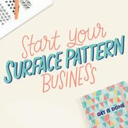

FREE TUITION
Elizabeth Silver selected Hina Mirza for a full scholarship to Start Your Surface Pattern Business, a course that helps designers find focus and pitch their portfolio. courses.elizabethsilver.com
Surface Design News

FREE SUBSCRIPTION
Stacie Dale selected Kasey Rainbow for a year’s subscription to Surface Design News and their company directories. surfacedesignnews.com

THANK YOU TO THESE EXCELLENT OPPORTUNITY PARTNERS FOR THEIR TIME, EXPERTISE AND GENEROSITY
Patternbank
PORTFOLIO REVIEW
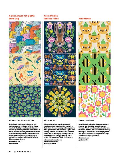
Neil Elliott selected Rebecca Harris for a portfolio review and new designer advice from Patternbank, the global marketplace for textile design. patternbank.com
uppercasemagazine.com ||| 63
MONICA KANE
SUMANA GHOSH-WITHERSPOON
REBECCA HARRIS
KASEY RAINBOW
HINA MIRZA
Ewing Klipspringer
Fresh Cut Prints Erin Niehenke
Geetanjali Behera
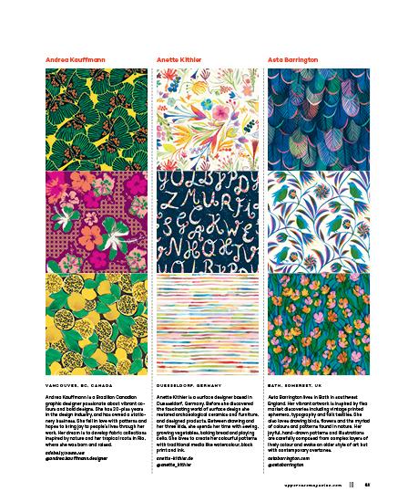
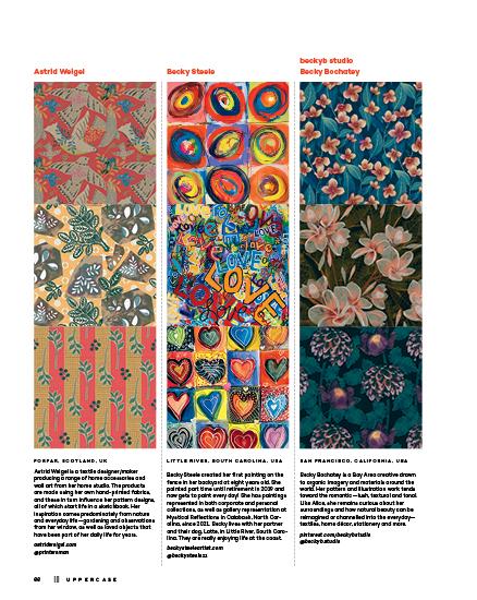
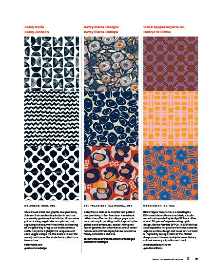
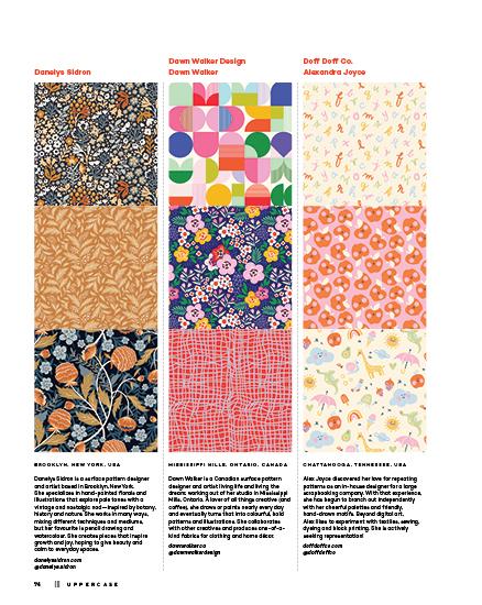
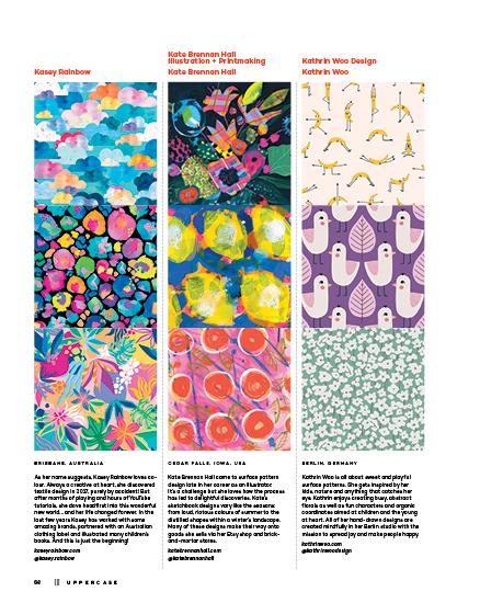
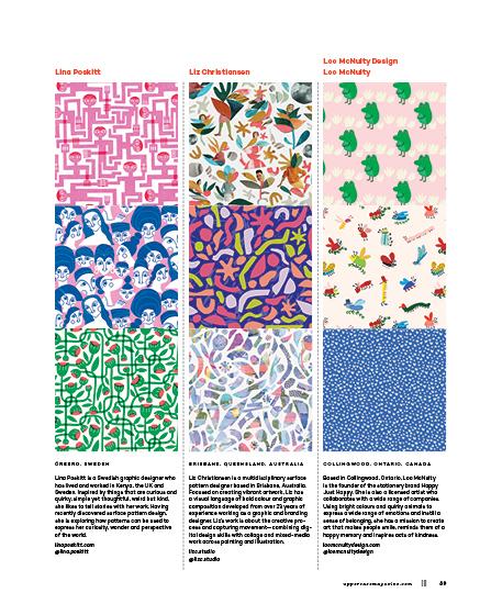
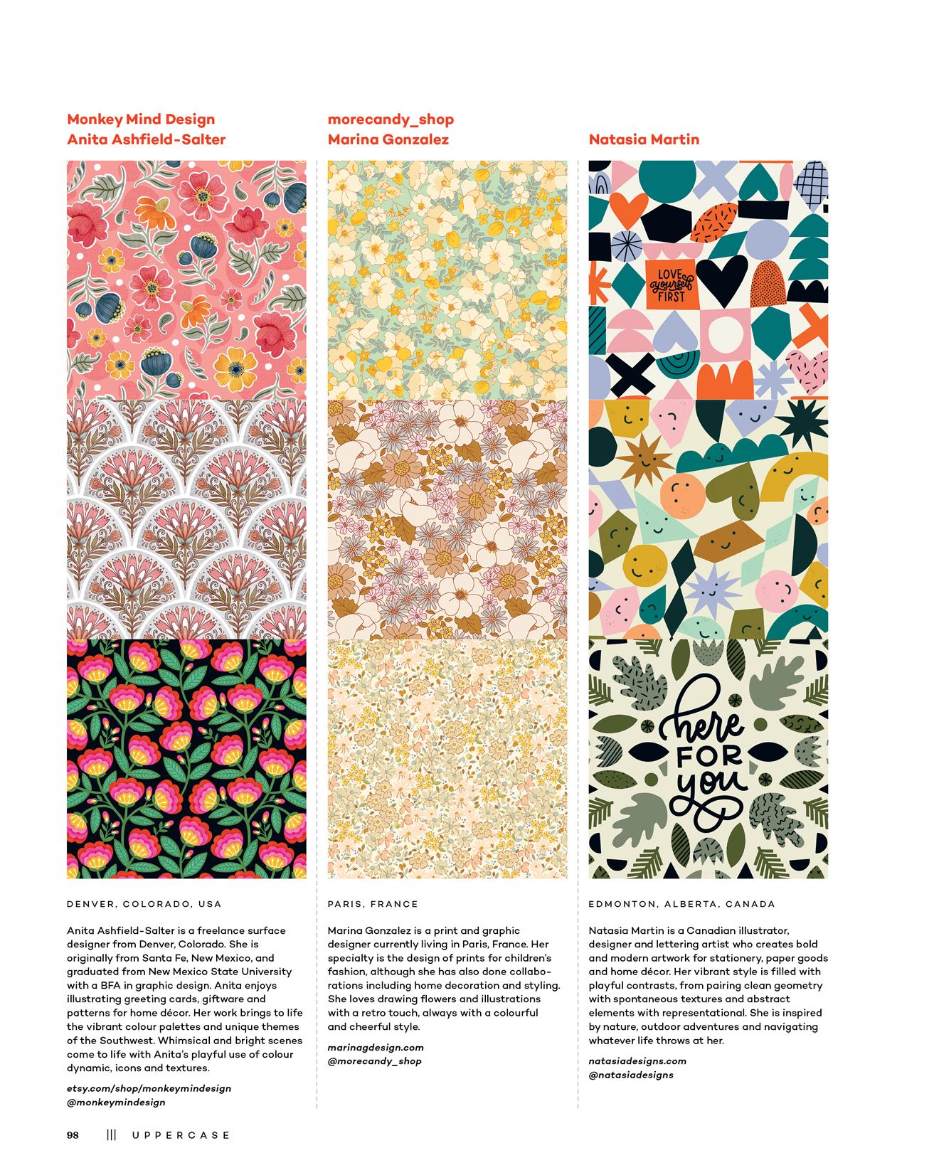
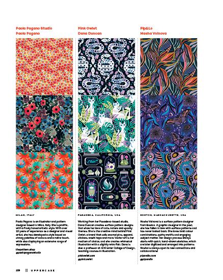
MIDLOTHIAN, VIRGINIA, USA
Ewing Klipspringer did not like geometry when he took it in junior high school, and yet, decades later, here he is designing geometric patterns—still without having learned the names of those theorems and proofs. His next project—intricate patterns based on trigonometry and physics—has been more difficult to bring to market, as currently it is only discernible through X-rays in the 11th dimension.
linktr.ee/EwingKlipspringer
@eklipspringer
GIBSONIA, PENNSYLVANIA, USA
Erin Niehenke is dedicated to creating bright and beautiful designs. Art and typography have been a passion of Erin’s since childhood. Although she earned her degree and worked for several years in mechanical engineering, the search for a creative outlet never ceased. She returned to her artistic roots after her children, Clara and Virginia, were born. Erin aims to brighten the lives of others through her illustrations and designs.
erinniehenke.com
@erinniehenke
GOA, INDIA
Geetanjali Behera is an illustrator, surface pattern designer and thangka painter based in Goa, India. Her designs are intricate, colourful and full of details. Over the past 10 years, she has worked as a freelance illustrator with a wide variety of amazing clients that span different markets including fashion illustrations, technical drawings and wall art. She loves to learn and grow her art with new skills and life experiences.
geetanjalibehera.com
@geetanjali.b
76 ||| UPPERCASE
SYDNEY, NSW, AUSTRALIA
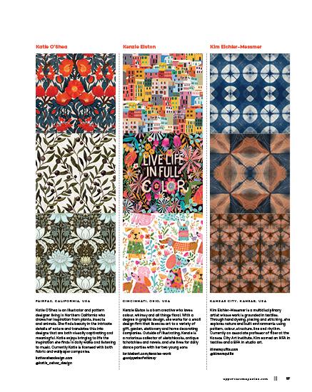
Kirsten Katz is an Australian artist and surface designer who creates art and designs prints that celebrate the beauty and diversity found in nature. Kirsten’s art decorates textiles, home décor, cards, wallpaper, apparel and gifts. She is known for creating modern botanical artwork with vibrant colours. Kirsten’s number one goal is to create art that adds beauty and colour to designer products.
kirstenkatz.com.au
@kirstenkatzart
NUNDAH, QUEENSLAND, AUSTRALIA
Kristina Forrest is an artist and surface pattern designer from Australia. She loves to combine her obsession with colour and patterns to create playful, vibrant designs. She is inspired as much by urban environments as she is by nature, and this is evident in her work, which features anything from blooming blossoms to edgy, abstract geo subject matter. These ideas are then filtered through her unique creative lens into bold, joyful patterns.
kristinaforrest.com
@kristinaforrestcreative
Let Me Repeat Myself
Rachel Poulin
LOS ANGELES, CALIFORNIA, USA
Rachel Poulin is a Los Angeles–based artist and designer. She creates high-contrast lettering and line patterns under the name Let Me Repeat Myself. With a strong sense of negative space and balance, and extensive graphic design experience, she likes to explore the idea that letters and messages can be their own unique textures. She also loves painting, home décor and lettering reality TV quotes.
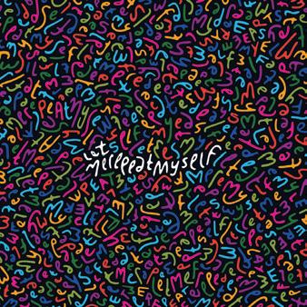
letmerepeatmyself.com
@letmerepeatmyself
88 ||| UPPERCASE
Kristina Forrest
Kirsten Katz
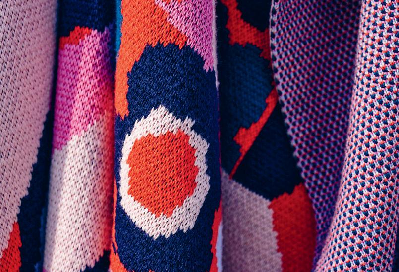
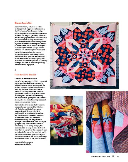
knitted blankets
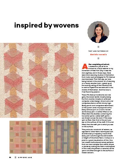
A QUILT CONCEPT BECOMES KNITTED
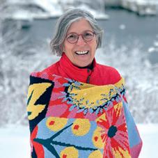
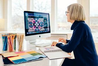
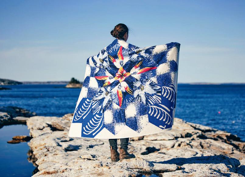
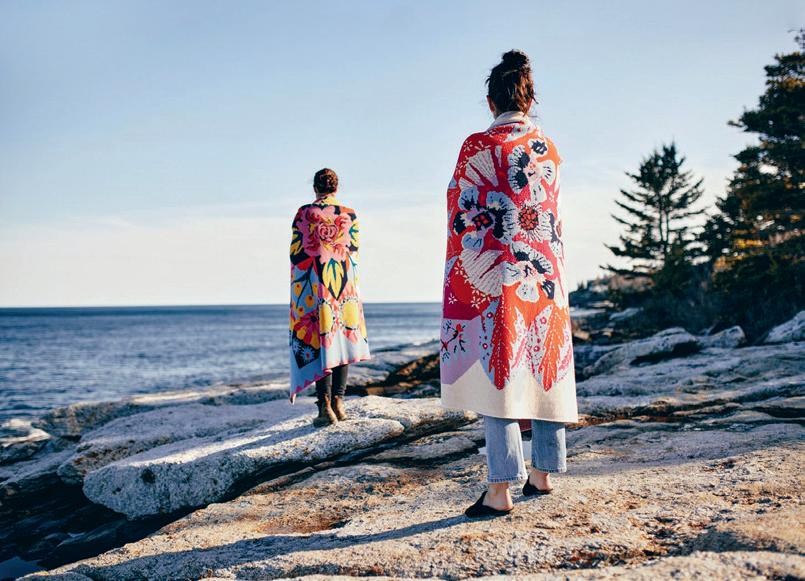
Ihave been a maker all my life and have experimented with many mediums before zeroing in on fibre arts. My formal training includes two years at Philadelphia College of Art, where I became certified to teach art (this after completing a BA at a liberal arts college and realizing that I wanted to become an art teacher). During my early years of teaching art, I pursued a master’s of art education at Maryland Institute College of Art. This afforded me the opportunity to explore a wide range of materials and processes. I enjoyed several summer creative residencies, including a weaving course at Penland School of Craft in North Carolina and a pieced fabric class at Haystack Mountain School of Crafts in Deer Isle, Maine.
|||
|||
TEXT AND PATTERNS BY betsy leighton
THIS IS A LOW RES PREVIEW OF A HIGH QUALITY QUARTERLY PRINT MAGAZINE
PLEASE SUBSCRIBE
Lost in a Loop
Karin van Rijckevorsel
Majestik Magnolia
Alexandria Hamm
Margaret Rankin
ARNHEM, THE NETHERLANDS
Karin van Rijckevorsel is a print designer who discovered surface pattern design not so long ago. One day she turned one of her prints into a repeating pattern and she has been crazy about making patterns ever since. She likes the flat look of vector illustrations and prefers bright colours. Under the name Lost in a Loop she creates, explores and enjoys patterns. Animals are a favourite subject in her designs. lostinaloop.com


@lostinaloop_
WESTMINSTER, COLORADO, USA
Alex Hamm is a disabled artist and aspiring surface designer in Denver, Colorado. Her mission is to inspire people to celebrate themselves and each other, and to #MagnifyTheMajestik in every day. Alex’s designs boast unique, off-beat motifs and colour pairings, and each artwork is an exploration of colour. Alex has a passion for stationery and owns the paper goods company Majestik Magnolia. majestikmagnolia.com
@majestikmagnolia
TORONTO, ONTARIO, CANADA
Margaret Rankin is a Canadian printmaker based in Toronto. Her background in landscape architecture and her Asian travels inspire her style. She uses linoleum, cardboard, leaves and textured wallpapers to create her hand-printed blocks. Margaret’s prints reinterpret her world in simple graphic shapes. Her style is bold and geometric with vivid colours and an ordered sensibility. Her prints are on book covers, wallpaper and packaging.
margaretrankin.com
@magprintprints
92 ||| UPPERCASE
NORTHERN CALIFORNIA, USA
Tara Lilly is a Northern California–based artist, designer and mother of two. She enjoys time in her home studio painting whimsical florals, folkloric characters and nature-inspired motifs. Tara’s licensed artworks can be found on apparel, home and garden décor, children’s toys and a variety of paper goods. Her artwork is represented by Lilla Rogers Studio.
taralillystudio.com
@taralillystudio
The
HARBOUR GRACE, NEWFOUNDLAND AND LABRADOR, CANADA
Ralph Jarvis has been an educator, natural history curator, designer and illustrator in Newfoundland and Labrador. He has contributed paintings, illustrations and graphic design to museum exhibits, publications and gallery exhibitions in Canada and abroad. The Quilted Stash, a quilt studio collaboration with Corey Follett, puts their Newfoundland roots at the centre of fabric designs, featuring uber-regional motifs.
thequiltedstash.com
@thequiltedstash
WINTER PARK, FLORIDA, USA
Tim Eggert is a designer/illustrator who loves to draw bright and colourful patterns. Tim began surface design to make his illustrations come alive on patterns and loves seeing them on wallpaper and clothing. Illustrating with a nod to vintage design and Art Deco style, he is always looking for new subjects to breath life into.
timeggert.com
@timeggert
106 ||| UPPERCASE
Tara Lilly
Quilted Stash
Ralph Jarvis
Tim Eggert
MOUNT VERNON, WASHINGTON, USA
Tori King is the artist/owner behind Tori Tornado, a one-woman operation based in the beautifully damp Pacific Northwest. After working as a graphic designer for 10 years, she shifted her focus to a more handmade approach of art and design. She mainly works in water-based, mixed-media painting. She believes life is an abundance of colourful messiness that should be celebrated through art and design.
toritornado.com
@toritornadocreative
BRIGHTON, EAST SUSSEX, UK
Ulrika Jarl is a Swedish-born illustrator and surface pattern designer living and practising in Brighton, UK. Her work celebrates the beauty in the natural environment and embraces the unusual in the usual. Taking inspiration from nature’s infinite richness, she strives to capture movement and flow with her detailed style. Her prints are versatile with a modern aesthetic, suitable for fabric and wallpaper. Many are also perfect for stationery and paper goods.
ulrikajarl.com
@ulrikajarldesign
DUBLIN, IRELAND
Verity Lowry is a Dublin-based print and pattern designer. Her minimal hand-drawn illustrations have an instinctive, naïve quality that is inspired by nature, a love of minimalist design and a child-like sensibility. Verity has worked as a graphic designer for years, but since motherhood and through a desire to create unique art, she has discovered her love of pattern making, and now creates playful, nostalgic illustrations for a range of products. veritylowry.com
@veritylowry
uppercasemagazine.com ||| 107
Tori Tornado Tori King
Ulrika Jarl Verity Lowry
Wisbey Design
Sarah Wisbey
yancey towne
Yueming Li
ROCHESTER, NEW YORK, USA
Sarah Wisbey is an artist from Rochester, New York, where she lives with her family and three cats. She is a constant doodler and loves the textures created by never quite colouring inside the lines. Sarah has had a successful graphic design career since graduating from the Rhode Island School of Design. She has recently shifted focus to pursue her dream of surface pattern design for the children’s market.
wisbeydesign.com
@sarahwisbeydesign
PORTLAND, OREGON, USA
yancey towne is an artist and art director based in Portland, Oregon. She thrives by working on a variety of projects at a time because the learning she gains in one series affects and influences the direction of her other pieces. While creating she pays attention to both the art making and the inner conversations that arise—it’s the inner conversations that hold the key to experimenting and growth.
yanceytowne.com
@yanceytowne
BALTIMORE, MARYLAND, USA
Yueming Li is an illustrator and designer from Beijing, China. She has worked as a concept designer since graduating from the School of Visual Arts and is currently pursuing her last year of the MFA program at Maryland Institute College of Art. She loves making patterns that involve nature and animals. She is interested in using colour, shape and lighting to convey emotions and feelings.
yuemingliart.com
@yuemingli_art
110 ||| UPPERCASE
Zatetic Studios
HARTLAND, WISCONSIN, USA
Megan Spindler explores materials and mediums from architectural space to digital design to painting. She holds Wisconsin architect and elementary educator licenses and is often gathering, collecting, curating and processing information. Mixing handmade elements with technology, she finds beauty in colour, texture and layering. Her work examines connections of relationships and their tangible representations.
zateticstudios.com
@smilesbymeganstudios
Ziva Otta is inspired by nature and its seasons, and her work is rich in colour and texture. She combines ink and watercolours with cut-out and digital techniques. Her pattern designs start from a fragment of a memory or mood, and evolve into an imaginary landscape with a hint of a narrative. She has an MA in communication design, and has worked in graphic and digital design before rekindling her deep-rooted love for illustration and pattern.
zivaotta.art
@ziva.otta
If you dream of seeing yourself in the pages of the next guide, keep making patterns. Auditions for the next edition of the UPPERCASE Surface Pattern Design Guide will open in late 2024.
For design insights and inspirations plus links to learning opportunities, please sign up for the UPPERCASE Surface Design newsletter. Happy creating!
uppercasemagazine.com/spdg5
youtube.com/@uppercasemag
uppercasemagazine.com ||| 111
Megan Spindler
Ziva Otta
Ziva Moskric
LJUBLJANA, SLOVENIA
I hope you are inspired and excited by the possibilities of surface pattern design!
MORE
112 ||| UPPERCASE
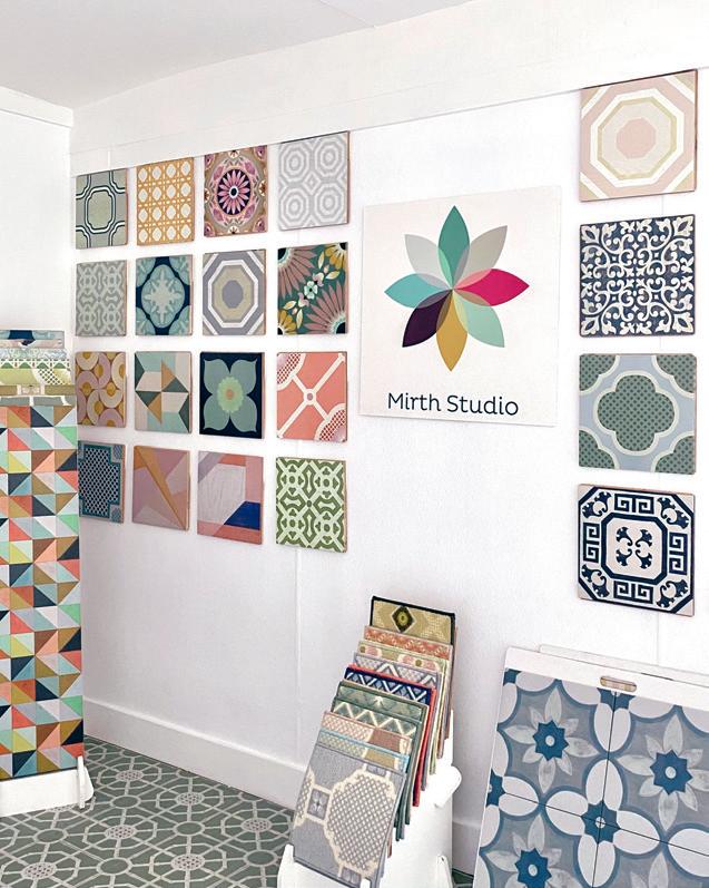
mirth studio
decorative surfaces for joyful spaces
STORY BY liz logan
Beginnings
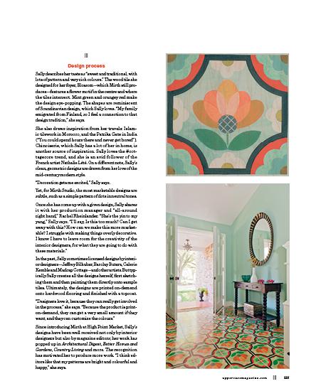
Iaccidentally invented this process, printing designs on wood flooring,” says Sally Bennett, artist and founder of Mirth Studio.
The idea originated in Sally’s home in Charleston, South Carolina, during a renovation project in 2013. She wanted an intricate, vibrantly coloured tile floor for her foyer—similar to the ones she made when she worked as a decorative painter in New York City. But she was worried that ceramic tile wouldn’t be kid friendly (the youngest of her three children was a toddler at the time, and she was worried about him stumbling and hitting his head). Yet, she wasn’t willing to paint on the wood floor herself; decorative painting had been too hard on her body.
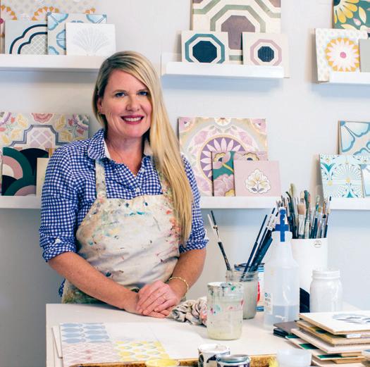
Sally started researching hardwood tile and found that no one was making hardwood tiles that could be printed on decoratively in the way she had in mind. Suddenly she had an idea for a new design product.
Sally’s background prepared her well for designing products with commercial appeal. After graduating from Maryland Institute College of Art with a degree in painting, she licensed paintings to big retailers such as Target, Bed Bath and Beyond, and World Market.
Since that moment of inspiration, Sally has worked hard to build a business that is profitable and environmentally sound while still reflecting her unique, decorative aesthetic.
Technical production
Coming up with a way to manufacture wood tiles with patterns printed on them, on-demand, took years of research, including talking to many manufacturers and folks in the wood business—and running into many dead ends. The young company experienced its fair share of challenges.
uppercasemagazine.com ||| 113
|||
|||
STUDIO
|||
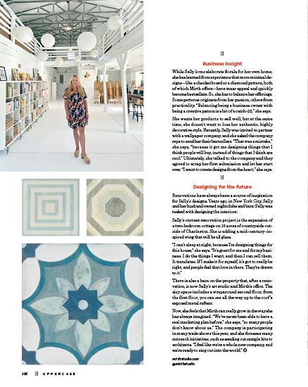
In 2015, once Sally had her first manufacturer, she introduced the tile flooring at High Point Market, one of the largest home furnishings trade shows in the world.
“I learned you really shouldn’t introduce a product to market until you have solid manufacturing,” Sally says. After debuting Mirth Studio at High Point, the head of the manufacturing company went to jail. “Luckily, he left his son in charge of the company, so we were able to fulfill the orders,” Sally recalls. “Nonetheless, I wasn’t left with much confidence in them.” She began searching for another manufacturer.
“I went to every wood show in the world, and begged for contacts and introductions wherever I could,” she says.
While she was trying to work out the kinks with the wood tile manufacturing, Sally began offering her designs on products that were easier to manufacture: wallpaper, porcelain tile, wool carpet and rugs.
She nearly gave up on wood flooring. In her research, she learned that making a perfectly square tile is one of the most difficult things in the wood industry. Ultimately, manufacturers told her that her designs could be most effectively printed on planks, with tongueand-groove construction making installation easy. The planks are 48 inches by 12 inches, digitally printed with four foot-long repeats, to achieve the overall effect of a tiled, hand-painted wood floor. The planks have a thin layer of recycled hardwood on the top.
With the first few manufacturers, the process was remarkably complicated: wood planks had to be made in a factory, shipped to another company for printing and then shipped back to the factory, where they would receive a durable topcoat. In late 2022, Sally found a manufacturer—her fifth—that could make the planks and do the digital printing and the finishing all under one roof. This one-stop-shop manufacturer was a game changer.
Sustainability
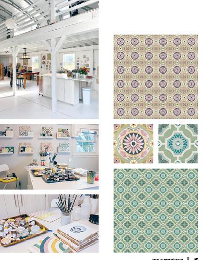
In addition to their signature printed-wood flooring, Mirth offers Sally’s patterns on other products: porcelain tile, New Zealand wool rugs and carpet, traditional wallpaper, reusable peel-and-stick wallpaper and vinyl decals for stair risers, walls and floors. Cork tile is coming soon.
Sally has always kept an eye on sustainability. The wool rugs, for instance, are a natural material and the sheep are not harmed in the shearing. The vinyl wall decals are the one product Sally has misgivings about. “The backing can only be recycled in Denmark,” she says. “So, I collect them when I can and use them as paint palettes. I would like to be 100% sustainable.”
114 ||| UPPERCASE
|||
THIS IS A LOW RES PREVIEW OF A HIGH QUALITY
QUARTERLY PRINT MAGAZINE
PLEASE SUBSCRIBE
THIS IS A LOW RES PREVIEW OF A HIGH QUALITY QUARTERLY PRINT MAGAZINE
PLEASE SUBSCRIBE
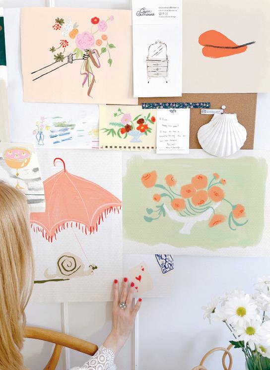
 Maggie Ramirez Burns
SEATTLE, WASHINGTON, USA

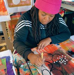
I am an artist and a small business owner. My husband and I own two shoe boutiques in Seattle. After years of making myself a corner in my basement’s laundry room, it was time to use that counter for what it was intentionally made for: folding clothes. For a milestone birthday, my husband asked what I would like to mark the occasion. I didn’t have to think twice, I wanted a backyard shed to be my studio. It has great natural light, it’s small and every corner of space is used. It is usually a mess. While I work on my art, I listen to music, podcasts, audiobooks and reruns of shows or movies, depending on my mood. The best part of having the studio in the backyard is that it’s only a few steps away from my kitchen door. My studio has been integral to my practice and growth not only as an artist but as a human. It is my sanctuary, my refuge and the one place I can be completely alone with my thoughts. It was the best investment I have ever made for myself, and that seems to be the greatest gift of all.
@maggieramirezburns
126 ||| UPPERCASE
Want to be featured? Submit your studio story! uppercasemagazine.com/participate STUDIO
maggierburns.com subscriber studios
Erica Catherine Nichols
OTTAWA, ONTARIO, CANADA
I’m an illustrator, decorator and surface pattern designer from Ottawa, Canada. I live with my husband and two kids. I enjoy making playful, narrative designs using painterly textures and warm colours. I hand draw each piece, playing with line, form and space to strike a chord between pretty and peculiar. I love decorating my studio as much as I love creating the art within it. In art and design, I believe one must combine elements from the past, the future and the living to enjoy stunning visuals. I’m inspired by retro, deco and boho influences—old Hollywood movies and interior design, mid-century modular furniture, ornate line and scroll work, nature, the sea and anything seemingly not of this world. I find much inspiration from design books and magazines, such as UPPERCASE! I’ve recently released a Skillshare class to help other creatives develop their style and feel comfortable styling their art to increase its value.
@ericacatherinedesign
ericacatherine.ca
looking forward
Be sure to sign up for my weekly newsletter for behind-the-scenes updates and the latest on open calls for submissions.
uppercasemagazine.com/free
Circle
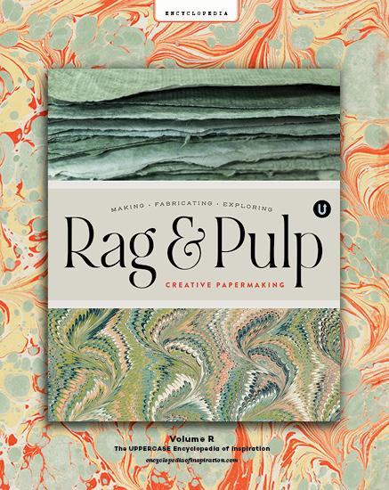
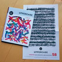
Volume R: Rag & Pulp UPPERCASE Encyclopedia of Inspiration
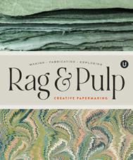
The eleventh volume in this ongoing series is about creative papers and papermaking.
Planned for release in June 2023.
uppercasemagazine.com/volumeR
Make connections, nurture your creative spirit and grow your business!
Volume N: Notions

UPPERCASE Encyclopedia of Inspiration
Planned for release in November 2023.
uppercasemagazine.com/volumeN
UPPERCASE magazine
#58 July-August-September 2023
#59 October-November-December 2023
#60 January-February-March 2024
#61 April-May-June 2024
Pitch your article ideas and theme suggestions anytime!
uppercasemagazine.com/participate
The UPPERCASE Circle is a vibrant community hub, one that is a valuable source of motivation, inspiration and encouragement for like-minded and kind-hearted creative people from around the world. Although the community is initially brought together by its support for and appreciation of UPPERCASE magazine, the Circle will enhance your experience of all things UPPERCASE while providing additional value to your creative life through conversation and the sharing of knowledge.
• Connect with members of the UPPERCASE community— both near and far—who share your interests.

• Share your work with your peers, mentors and potential customers.
• Find inspiration, motivation and new perspectives.
• Move your creative business forward with tips, tools and support from peers and guest experts.
• Live video conferences and video chats.
Access to this community is FREE when you subscribe to UPPERCASE magazine!
uppercasecircle.com
128 ||| UPPERCASE CIRCLE
Please share your pictures and stories of my books, magazines and fabric on Instagram @uppercasemag #uppercaselove with your friends, family and colleagues. It means a lot to me!
@shelly_marlott @_theworkroom @lelamckeefriel @cami_boyett_studio @books_and_abe @katehendersonquilts @home.made.by.me @mondegreen_studio @ngturner22 @secondchance_studio SHARES
STORY AND PHOTO BY andrea jenkins
little stabs
When I feel stuck, I stitch. When the words won’t come, when the good ideas seem lodged in some impossible place or the anxiety is humming, I pick up a favourite old pair of jeans, find a spot that needs mending and get to work. I’m not very good at it, even after years of practice. I’m told my great-grandmother was a master quilter, and memories of my paternal grandmother expertly working the black iron pedals of an old sewing machine with one foot while her hands fed swaths of fabric into the Singer’s mouth are still crisp and clear in my mind. My own mother made our clothes when we were young, mostly by hand—matching outfits in sturdy, neutral cottons and stiff denims, often worn for yearly family portraits. But this beloved talent, however deeply embedded in the family genes, seemed to skip me altogether. I nearly failed high school home ec the semester we covered sewing, and for years my mother tried to teach me how to sew by hand, but I had already decided I was no good at it, had already given up. Eventually, she did too. So when I fell in love with the art of visible mending, a practice I took up nine years ago, no one was more surprised, or delighted, than I was.
Visible mending, known also as sashiko, is a Japanese folk art that has been practised for hundreds of years. Sashiko (which literally means “little stabs”) refers to a traditional style of hand stitching used to repair everyday textiles during a time when resources were scant and creativity was crucial. Best described as a simple running stitch repeated to produce interlocking patterns, early Japanese creators of the technique not only found this way of mending most durable, but visually striking as well. And this practice, initially born out of necessity so many years ago, has evolved into what is now a cherished decorative art, rich in heritage—
a technique that does not hide its repairs but instead uses visible stitches to emphasize them. Nothing celebrates the history of a well-worn piece of clothing more thoughtfully or creatively than sashiko.
My own visible mending beginnings were rooted in practicality—looking for easy, no-sew ways to salvage a favourite old pair of jeans ripped beyond repair, I turned to the Internet. One link led to another, and down the sashiko rabbit hole I fell, only to emerge hours later, images of intricate patterns and deep indigo blues dancing in my head (admittedly the very opposite of a no-sew option). But my sewing-impaired self would not be deterred, and the mending of that first hole was a revelation—not because it was anything special to look at but because I found focus in one stitch, one little stab at a time, until I had completely transformed the hole into what felt like a small piece of art. And then I stitched up another hole, and another and another until every last spot was repaired. I slipped the jeans on and marvelled at my own handiwork, a chorus of stitches, crooked and wonky as they were. But perhaps what most struck me then was the calm I felt. And what I know now, nine years later, is that when I stitch, my mind clears. My mind, so often a tangled mess, seems to quiet itself as my hands drop into a sort of rhythm. As I stitch, a constellation of ideas, the threads of which normally fly loose in every direction, settle into place and find connection. An hour spent mending is as good as a brisk walk outside, or a long hot shower. Better, even. I resurface, mind clear but mossy, calm but alive with ideas. Every time I look at the pieces I’ve mended, each time I run my hands over imperfectly sewn patterns, I’m reminded: the stitches, a meditation—keep going, they say. Just keep going. And I do.
@hulaseventy
130 ||| UPPERCASE COVET
$24 CAD/USD PRINTED IN CANADA APRIL-MAY-JUNE 2023 uppercasemagazine.com FRONT COVER anna maria horner BACK COVER sumana ghosh-witherspoon 72527486315057 72527486315057
