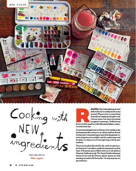
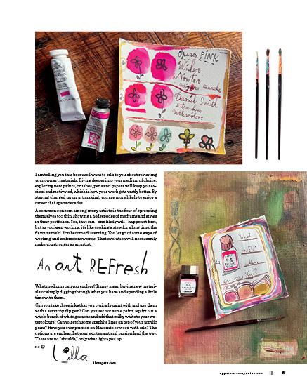
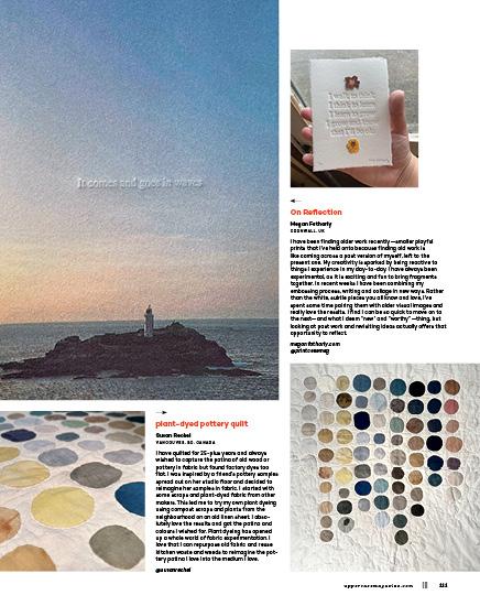
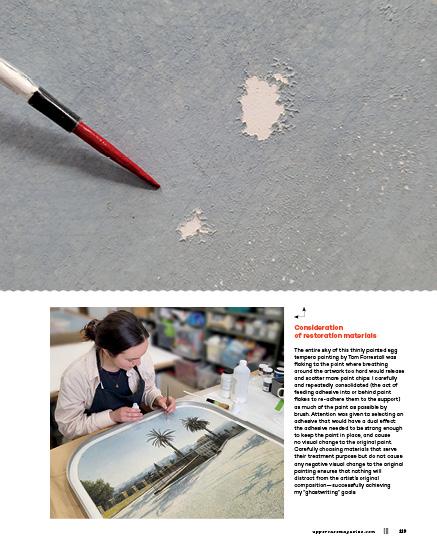
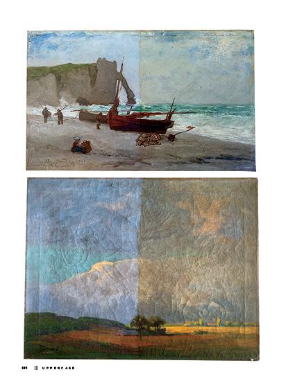
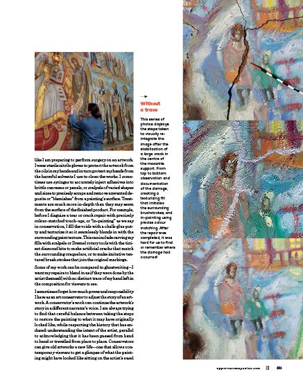
for the CREATIVE and CURIOUS

common ground
61
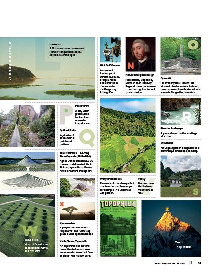
ENCYCLOPEDIA Volume N The UPPERCASE Encyclopedia of Inspiration encyclopediaofinspiration.com
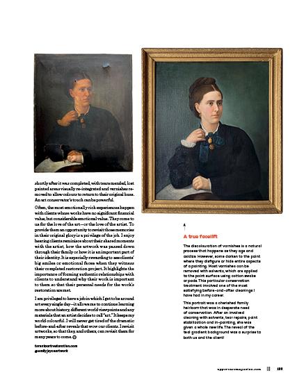
FROM THE EDITOR’S DESK
Dear Reader,
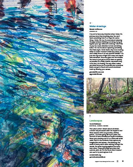
To make art, you need two driving forces: inspiration and impulse.
Inspiration is typically sparked by outside sources—something we’ve seen, experienced or read—but it can also come from revisiting our own past work with a fresh perspective. Our archives of imaginative experiments offer a renewable resource of creative ideas.
Inspiration is fleeting, though, if we don’t do something with it. Follow that inner impulse and make something!
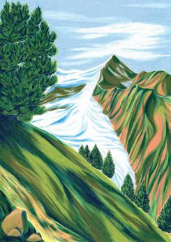
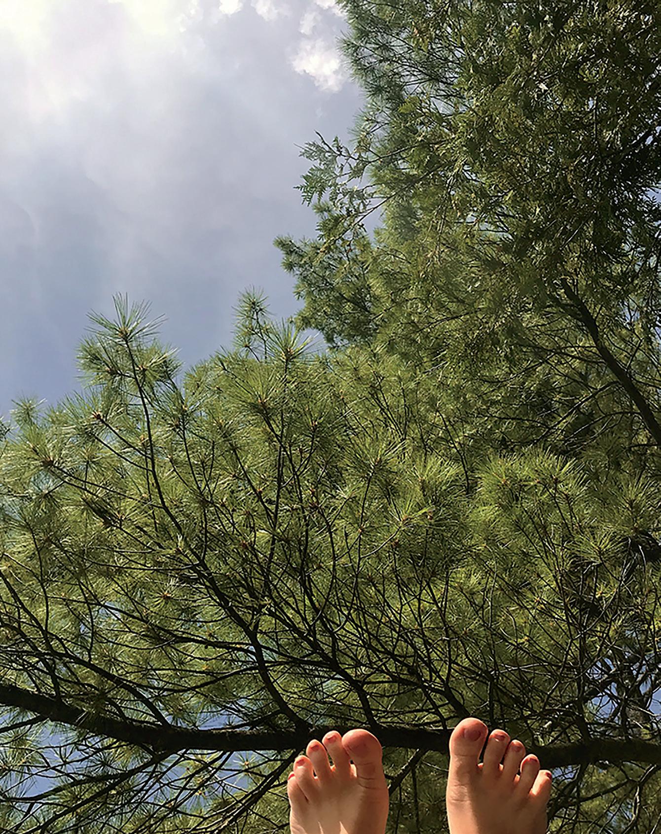
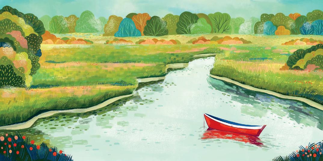
When it comes to “outside” sources of inspiration, the landscape has always been a classic muse in the world of art. It’s a good subject matter: the landscape provides constancy across years and yet has an alluring changing temperament brought on by weather, seasons and endless moods of light, shadow and atmosphere.
We grow emotionally attached to “our” landscapes—these lands and bodies of water become part of our identity. Looking out over a beautiful vista puts us in our place, illustrating just how small we really are. Landscapes remind us to look outside of our selves.
 Janine Vangool PUBLISHER, EDITOR, DESIGNER
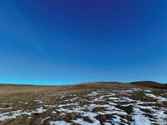
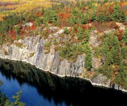
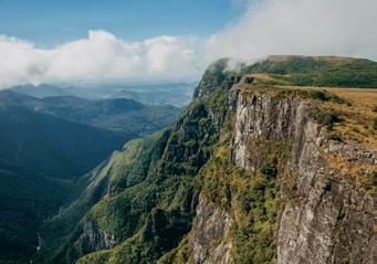
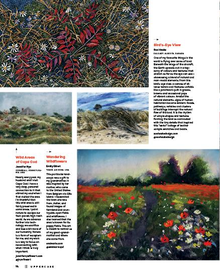
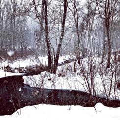
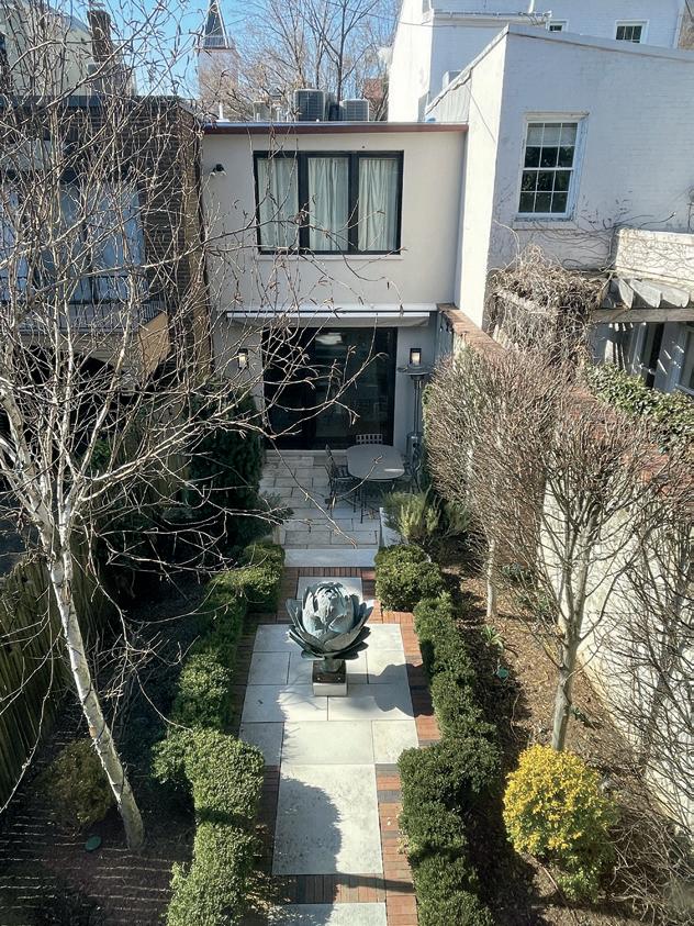
Landscapes in and around Calgary, Alberta, Canada.
Sign up for my newsletter for free content and an introductory subscription offer: uppercasemagazine.com/free
ENCYCLOPEDIA uppercasemagazine.com ||| 3
APRIL MAY JUNE 2024 4 ||| UPPERCASE
Contents
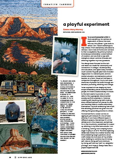
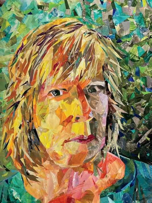
FEATURED CONTRIBUTOR
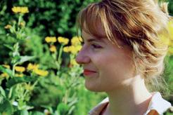
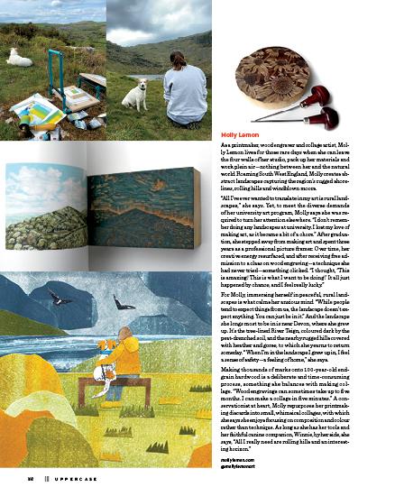
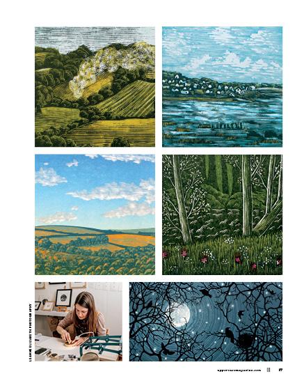
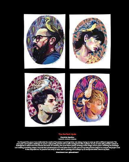
Emily
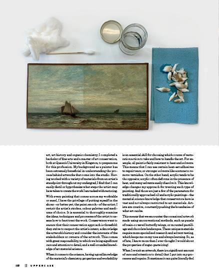
a painter and paintings conservator who explores her interests in art history through the juxtaposition between traditional and digital art mediums. She received a bachelor of fine art from Queen’s University in 2018, and a master’s of painting conservation, also from Queen’s University, in 2021. Emily works as a conservator at Toronto Art Restoration, and as an art instructor at the Toronto School of Art. emilyjoyce21.wixsite.com/ emilyjoyceartwork @emilyjoyceartwork
Perfect Is Now
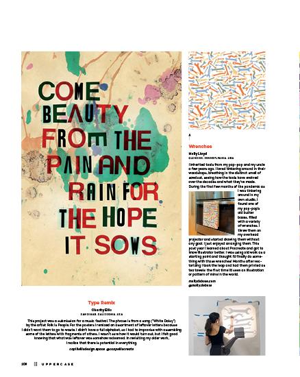
Charity Ellis
SAN DIMAS, CALIFORNIA, USA
My projects that were recently “remixed” and “revised” were created by letting go of embarrassment and preciousness so I could make something new. The first revision was a misspelling that was printed first and discovered after the fact. Embarrassed by this typo, I hid them away. The second remixes were screen-printed misprints for a design assignment. I didn’t have the heart to part with the expensive paper I’d printed on, so they sat rolled up in the garage. I realized that I had other projects that were also waiting for something, so I challenged myself to let go of the excuses and use what I had. For the screen-printed sheets, I cut them up and printed on them. For the misspelled word, it became part of the design. In revisiting older work, I discovered how often I waited for the “perfect” time. I have learned that “perfect” is now!
capiliellisdesign.space @ccapelliscreate
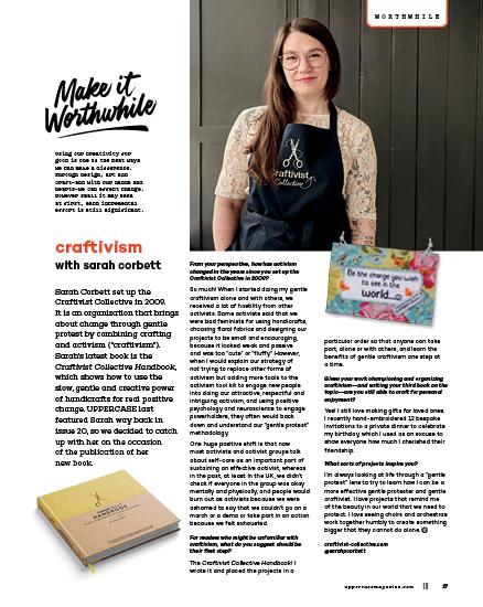
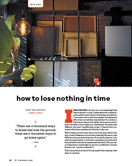
Welcome Editor’s Letter 3 Subscriptions 6 Snippets 8 BEING . . . . . . . . . . . . . 10 The First Work I Make Is the Last Work I Make by Meera Lee Patel FRESH 12 Cornelia Cannier, Darlene Marwitz, Alexandra Tinsley Fine Print LIBRARY 14 Recommended Reading CREATIVE CAREERS 16 Emma Mary Murray WORTHWHILE 17 Craftivism with Sarah Corbett BUSINESS . . . . . . . . . . . 18 It’s Never Done! Why and When to Review and Revise Your Online Presence by Arianne Foulks illustration by Andrea D’Aquino ECO . . . . . . . . . . . . . . . 20 A Sustainable Supply Chain: A Practical Guide for Creatives by Marnie Hawson MUSING . . . . . . . . . . . . 22 How to Lose Nothing in Time by Cedric Victor
& Design COVER ARTIST 24 Victoria Rose Richards’ Aerial Artworks by Joy Vanides Deneen ORIGIN 34 Held by the Land: Co-Creating with the Landscape by Correy Baldwin images by Jamie Ashforth ABECEDARY 40 Scenery by Lydie Raschka CREATIVE BRIEF 42 They Draw The Great Outdoors ASK LILLA 46 Cooking with New Ingredients by Lilla Rogers SKETCHBOOK 48 A Sketchbook in Ode to Trees by Linda Zacks PERSPECTIVES 54 The Sense of Place by Kerrie More featuring Molly Lemon, Adrienne Lee, Patrick Hunter, Luiza Niechoda, Anne Gibson, René Shoemaker, Elaine Luther GALLERY 66 Depictions of Landscape by UPPERCASE Readers PHOTOGRAPHY 90 Thomas Jackson by Andrea Jenkins TEA WITH T . . . . . . . . . . 92 Folk Artist Clementine Hunter by Tamisha Anthony PROCESS 96 Revisit / Review / Remix / Revise by UPPERCASE Readers CRAFT 116 Art Conservation: Revisit, Repair, Revive by Emily Joyce Misc. HOBBY 124 Mining My Past by Brendan Harrison STUDIO . . . . . . . . . . . 126 Jennifer Wilkin Penick, Jessica Loughrey, Julie M. Gratien SHARES . . . . . . . . . . 129 COVET 130 Nothing Is Wasted by Andrea Jenkins uppercasemagazine.com ||| 5
Art
is
Joyce
MASTHEAD
UPPERCASE
1052 Memorial Dr NW Calgary, Alberta, Canada T2N 3E2
Janine Vangool
PUBLISHER, EDITOR, DESIGNER janine@uppercasemagazine.com
CUSTOMER SERVICE shop@uppercasemagazine.com
Correy Baldwin
COPYEDITOR
Core Contributors
Tamisha Anthony
Jane Audas
Correy Baldwin
Andrea D’Aquino
Arianne Foulks
Joy Vanides Deneen
Brendan Harrison
Marnie Hawson
Andrea Jenkins
Andrea Marván
Kerrie More
Meera Lee Patel
Leigh Metcalf
Lydie Raschka
Lilla Rogers Cedric Victor
PRINTED IN CANADA BY THE PROLIFIC GROUP.
Interior pages are printed on 100% post-consumer recycled Rolland Enviro 100.

Sustainability Initiatives
Through the Wren Trailblazer fund, UPPERCASE removes two tons of carbon each month with an additional two tons of carbon offset monthly. Please join fellow readers in the Wren Impact forest. wren.co/groups/uppercase
In the spirit of reconciliation, we acknowledge that we live, work and play on the traditional territories of the Blackfoot Confederacy (Siksika, Kainai, Piikani), the Tsuut’ina, the Îyâxe Nakoda Nations, the Métis Nation (Region 3) and all people who make their homes in the Treaty 7 region of Southern Alberta.
™
6 ||| UPPERCASE
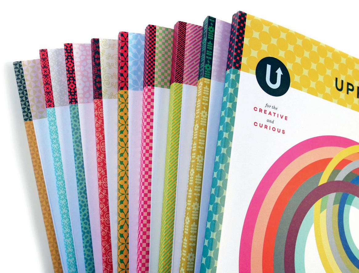
for the CREATIVE and CURIOUS ™ Celebrating 15 years!
Subscribe!
uppercasemagazine.com
SUBSCRIPTIONS
This quarterly magazine is released in January, April, July and October.
CANADA
CAD $ 96
UNITED STATES
USD $ 80
INTERNATIONAL
CAD $ 144
Our shop will do the currency conversion for you.
RENEWALS
You will receive a notice by email when it is time to renew. Renew online anytime to add issues to your current subscription.
GIFTS
Simply enter the recipient’s name and address in the shipping information and your name, email and billing address during checkout.
STOCKISTS
To view our list of stockists or to carry UPPERCASE in your shop:
uppercasemagazine.com/ stockists
Thank you to all of the talented writers, illustrators, creative collaborators and loyal readers who contributed their talents to this issue of UPPERCASE.
Thank you to everyone who submitted to the open calls for this issue. Even if you weren’t featured within these printed pages, your effort was noticed and appreciated!
QUESTIONS?
Have a question about your subscription or a change of address? Email us:
shop@uppercasemagazine.com
NEWSLETTER
Sign up for the UPPERCASE newsletter to receive free content and behind-the-scenes peeks at the making of the magazine— plus a welcome discount on your subscription!
uppercasemagazine.com/free
SUBMISSIONS
UPPERCASE welcomes everyone and all identities, ages, talents and abilities. We share an inclusive, positive and community-minded point of view. Everyone is welcome to explore our creative challenges and submit to the magazine. Pitch your own work, propose an article or suggest a topic through the Open Pitch submisison form. Be familiar with the magazine and its writing and visual style.
uppercasemagazine.com/ participate
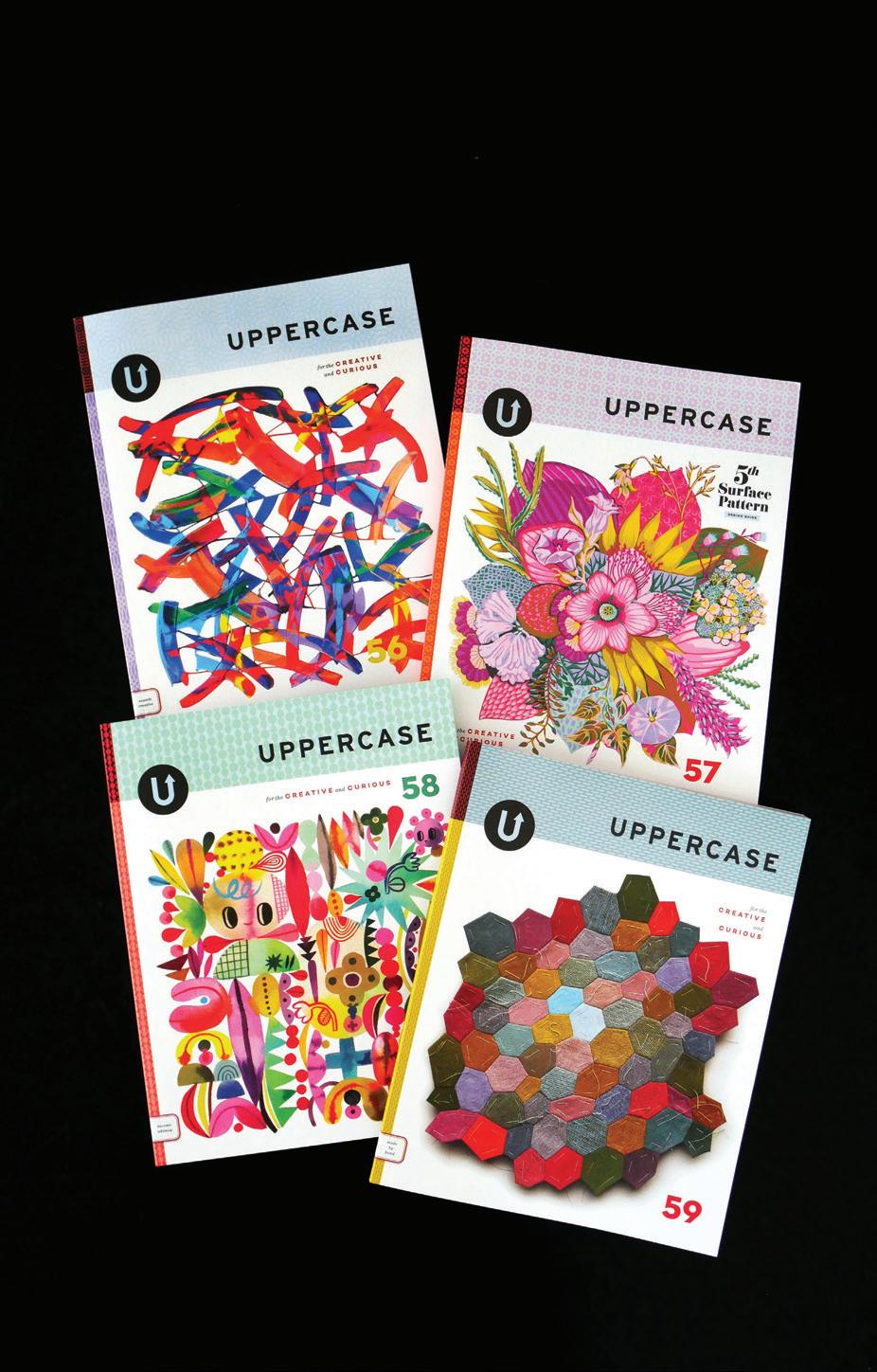
BACK ISSUES
Get them while you can! Once they’re gone, they’re gone.
Back issues will not be reprinted.
This independent magazine thrives because of you—its loyal subscribers!
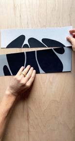
Snippets
NEEDLEWORK
The landscape in needlepoint
by Rebecca Van Kollenburg
Artist Rebecca Van Kollenburg (known as Becca Van K) makes abstracted needlepoint landscapes based off of photographs to depict her reverence for the natural world. “By reducing elements of the photographs to basic shapes in humorous ways, I aim to create a more contemporary version of the needlepoint landscape and create abstract forms that bring a fresh visual language to an older medium. Each work is inspired by an outdoor experience, mainly long hikes. This series has also evolved to become a form of advocacy for nonprofits that focus on environmental conservation and Indigenous rights. I donate a portion of my sales to various conservation and First Nations–focused nonprofits and use my social media platform to express my passion for preservation and support for those whose homes have been here for millennia.”
beccavank.com
@beccavank
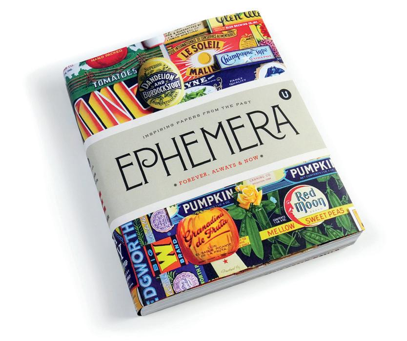
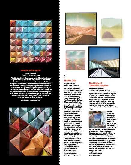
Our favourite book has been reprinted!
Volume E: Ephemera uppercasemagazine.com/ephemera
8 ||| UPPERCASE
INSPIRATION
UPCYCLE
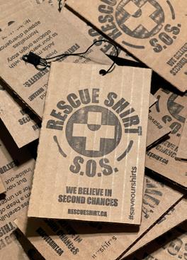
Rescue Shirt
Calgary artist and graphic designer Jimi Scherer and writer Jennifer Allford are revisiting the humble T-shirt.
“You know the one: the never-worn tee at the bottom of the drawer that eventually finds itself a charity shop or local landfill, or in a bale headed to Africa.” Rescuing these tees, they turn them inside out and revise them with bold graphics. “We hope to inspire people to think about the plight of the modest tee, celebrate its rebirth or just laugh. After all, no one said waste diversion has to be a drag.” The handstamped hangtags come from repurposed cardboard boxes. Because, as the tag says: “We believe in second chances.” rescueshirt.ca @rescueshirt
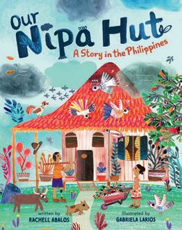
CHILDREN’S BOOK
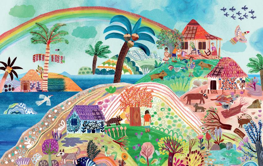
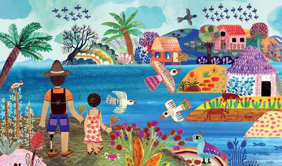
Before and after the storm
These landscapes by Gabriela Larios were created for the picture book Our Nipa Hut, written by Rachell Abalos (Barefoot Books). “It’s a story set in the Philippines. These scenes depict the beauty and the calm before and after a huge storm,” describes Gabriela. “These landscapes mean a lot to me, as I had to go through my own storm when I lost my father to COVID-19, just before starting this project, and therefore working on these landscapes was an experience that brought me comfort, hope and peace as I grieved his loss.” Though she is now based in London, Gabriela grew up in El Salvador and found a kinship with tropical Philippines that helped her “envision the exuberant landscape of the story.” The story follows Yelena and Papa in their traditional Filipino dwelling, a nipa hut, while they work together as a family to withstand a tropical storm. “I hope these art pieces shed light on the importance of living a harmonious existence with nature,” says Gabriela. gabrielalarios.com
@gabrielalarios1
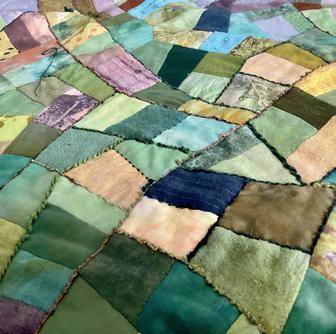
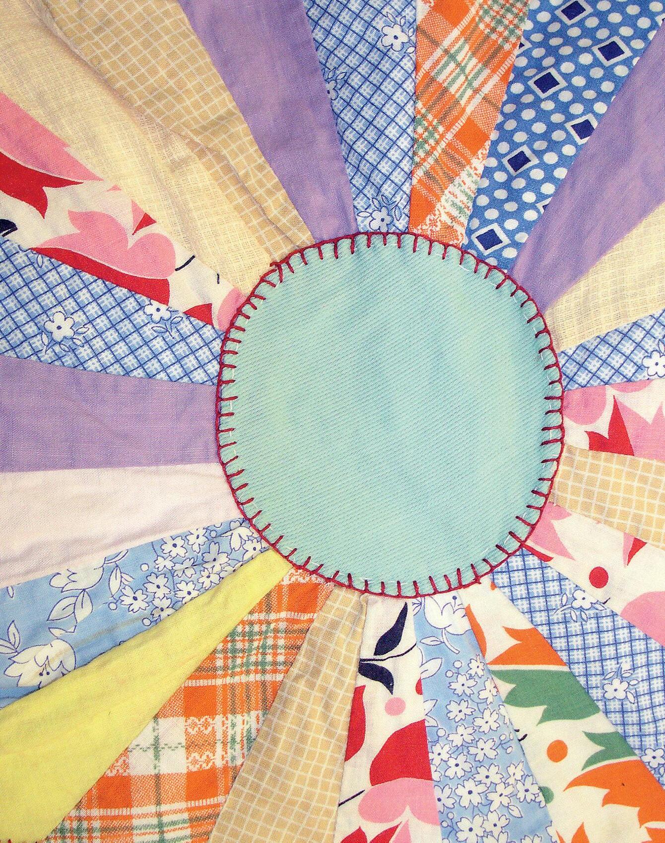
STITCHING
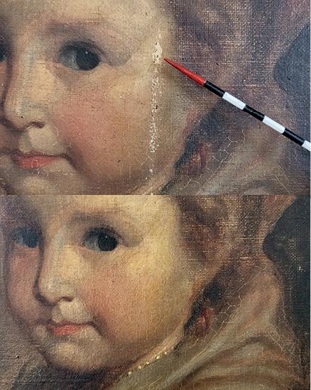
A Stitching Life by Karen Turner
Based in East Yorkshire in the United Kingdom, Karen Turner is a textile and mixed-media artist who is inspired by landscapes. She teaches intuitive stitching and also hosts a course about stitching little landscapes by layering fabric scraps with embroidery.
Her excellent blog is profusely illustrated with process images of her many projects, like this patchworked piece, above, that she is embellishing with silk bouclé and textured yarns to depict hedgerows between the fields.
stitchinglife.uk
@k.j.turner
uppercasemagazine.com ||| 9
uppercasemagazine.com ||| 11
Whether you’re a fresh graduate or mature artist,
it is
often a dream to be published for the first time!
You’re welcome to submit your art for consideration.
uppercasemagazine.com/ participate
fresh talent
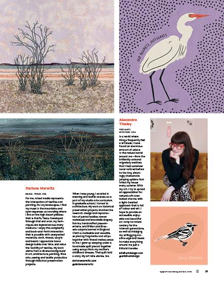
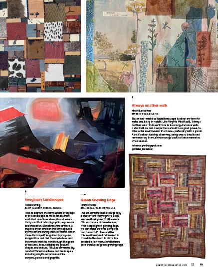
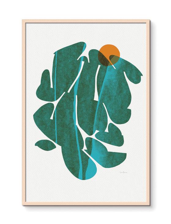
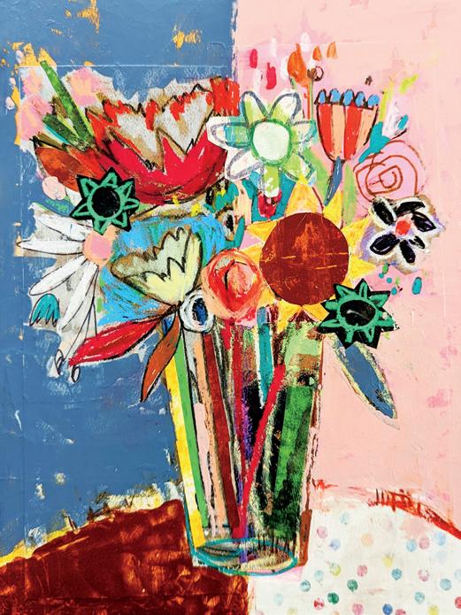
Cornelia Cannier
GRENOBLE, FRANCE
I worked as an architect for three years after graduating. I loved studying architecture at school; however, working in a company was really different. The pandemic was my salvation—I gradually started drawing again (I stopped completely during six years of architecture school). I worked as an architect during the day; drawing at night was my remedy to stressful Parisian life. It’s been a year now since I started working as a professional illustrator. I moved to Grenoble, a city in the French Alps where living conditions are much better.
I grew up in the countryside, running in the fields and climbing cherry trees. My grandparents were farmers and produced pears and apples. My grandfather had a horticulture degree and he and my grandmother were lovers of flowers, trees and fruits. I now live in the mountains, and my work is largely inspired by the flowers and memories of my childhood, but also by my numerous hikes and the landscapes that I see through my daily life. I hope to transmit the beauty of everything around us and encourage people to protect their environment. My long-term goal is to be able to find a balance between illustration and architecture in work. It’s a new challenge but I know I will succeed.
corneliacannier.com
@cornelia.cannier
12 ||| UPPERCASE
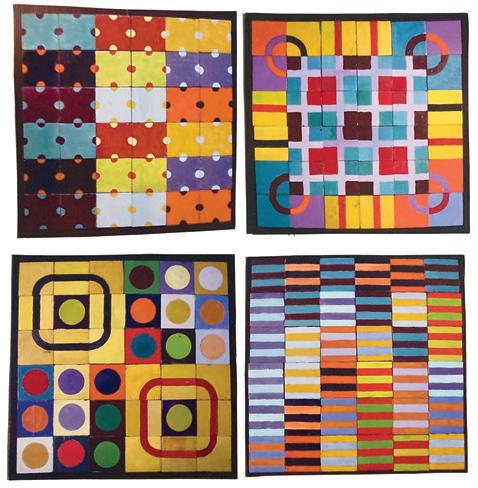
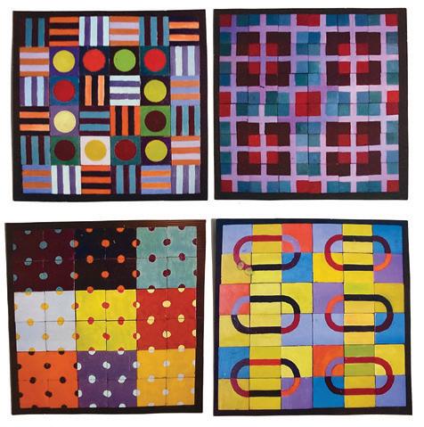
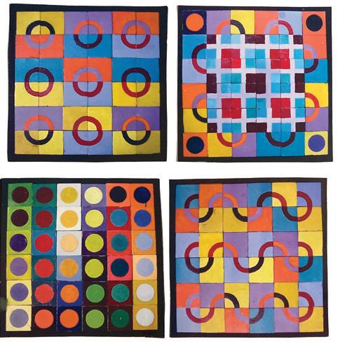
FRESH
QUARTERLY
PLEASE SUBSCRIBE
THIS IS A LOW RES PREVIEW OF A HIGH QUALITY
PRINT MAGAZINE
naturally inspired reading
RECOMMENDED
READING BY
janine vangool AND finley dresser
14 ||| UPPERCASE
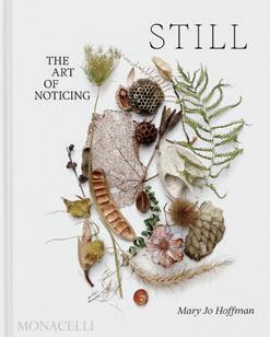
STILL:
The Art of Noticing
MARY JO HOFFMAN
“Because I was a scientist by training and inclination, the natural world drew me in not just as an aesthetic proposition but equally as an expression of mathematics, physics, and evolution.”
Mary Jo Hoffman has been photographing objects from nature against a white backdrop, every day, for over a decade. Without missing a day, she has over 4,000 images in her archive. The endeavour is both a study of nature—its beauty arranged and preserved in still images—and a daily creative project, with its compounding effect. 275 images have been selected for publication in STILL: The Art of Noticing (Monacelli, May 2024).
The project began before her children were grown; they grew to participate in the daily practice of gathering in nature. In the foreword, her husband, Steve, writes eloquently about the shared familial experience of STILL. “I have begun to wonder if dailiness will not in the end be the body of work that will be my legacy,” contemplates Mary Jo. “That whenever I am done, for whatever reason, I will have left behind thousands of small eyeblinks, each a record of noticing the world on a particular day, and one enormous accomplishment that will be their collected, cumulative weight.”
stillblog.net
@maryjohoffman
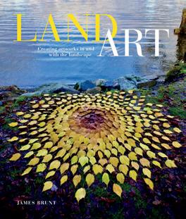
Land Art: Creating Artworks in and with the Landscape
JAMES BRUNT
“Works I embark on are generally a simple process, processes that allow me to arrange, collect, sort and place in an almost instinctive manner, allowing the mind to empty and the nuances of the environment not to pass me by.”
Neat spirals of leaves sit alongside crooked tree roots. Twigs and stones are arranged in geometric patterns amongst the weeds. James Brunt heads out on a walk in nature to appreciate and create. He may spend hours making his ephemeral work by organizing natural materials, careful not to disrupt the environment around it. Whether at a beach or sitting at the base of a tree, the composition is in tune with its surroundings and the finished creations are beautiful and mesmerizing. In his book, Brunt describes how he makes land art—the physical aspects of gathering and arranging but also his mental process—appreciating and being inspired by nature. The result is something beautiful and fleeting, but the calm, meditative effects are long-lasting.
schifferbooks.com
jamesbruntartist.co.uk
REVIEWED BY FINLEY DRESSER
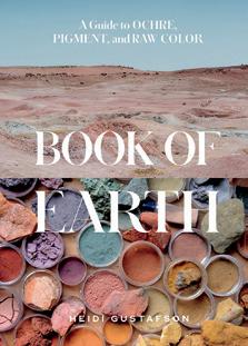
Book of Earth:
A Guide to Ochre, Pigment, and Raw Color
HEIDI GUSTAFSON
“If I look closely within my little stardust body, I find that I am full of microscopic, ochre-rich mineral deposits. Magnetic black ore gathers in my brain. White earth dust in my bones. Iron shepherds oxygen through my veins via blood…”
Throughout this issue, we explore how the landscape inspires our art. With Heidi Gustafson’s Book of Earth, we learn how to create art from the landscape—from Earth itself. Ochres and iron oxides are minerals that can be ground up to create pigments; they’ve been used for human expression since our earliest beginnings. With an archive of samples from around the world, Heidi delves into ochre’s anthropological history and culture in ways that are both personal and spiritual. Heidi’s work centres around gathering—research, knowledge and pigment samples. Her education is suited to this unique niche; she studied sculpture and forensic science and also holds a master’s in philosophy and religion. Illuminated with beautiful photography throughout, we see both the vastness and intimacy of pigmented colour. From geologic striations in the landscape to portraits of powdered pigment, flaked rock and specks of colour, Heidi contrasts the ubiquitous and the precious.
Her book is an elegy, a poem—and a kind of family album of our shared geology.
earlyfutures.com
@heidilynnheidilynn
uppercasemagazine.com ||| 15 LIBRARY
IS A LOW RES PREVIEW OF A HIGH QUALITY QUARTERLY PRINT MAGAZINE PLEASE SUBSCRIBE
THIS
a sustainable supply chain
a practical guide for creatives
TEXT BY marnie hawson
In today’s world, sustainability is no longer just a buzzword—it’s a necessity. For creative businesses, ensuring a sustainable supply chain is essential not only for the environment and community, but also for building a reputable brand. This article delves into some key considerations for creatives aiming to make more ethical choices within their supply chain.
One of the first things to do is conduct an audit of who you are spending your money with. Your supply chain does not just include materials and physical items—it’s also the software you subscribe to, your phone and Internet provider, the consultants you employ, your car insurance. The easiest way to do an audit is to download your last year’s worth of expenses and then do a thorough review. You can do this in a spreadsheet: make a column for each product or service, another column for your existing supplier and then a new column for alternatives.
Then ask yourself, where are you spending your money? Are you spending with intention? Are you supporting small, local businesses, female or diverse/minority-owned businesses, or companies that have baked a sense of purpose into their business model? I just love this quote from Béa Johnson, author of Zero Waste Home: “Every time we make a decision, we have the power to support a practice that is sustainable or one that is not.”
The next step is to try and replace your not-so-ethical or sustainable suppliers with better options. Here are some things to consider.
Certifications matter
One of the first steps in building a sustainable supply chain is to look for recognized certifications that validate a supplier’s commitment to sustainability. Certifications like B Corp and Fair Trade act as beacons, signifying a commitment to ethical and sustainable practices. B Corp certification demonstrates a business’s dedication to balancing profit with a positive social and environmental impact. Fair Trade certification guarantees that the raw materials in your supply chain are sourced ethically, promoting fair wages and the ethical treatment of workers.
20 ||| UPPERCASE ECO
|||
THIS IS A LOW RES PREVIEW OF A HIGH QUALITY QUARTERLY PRINT MAGAZINE PLEASE SUBSCRIBE
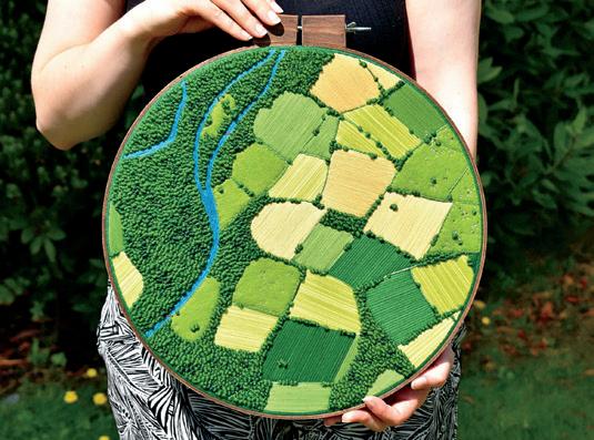
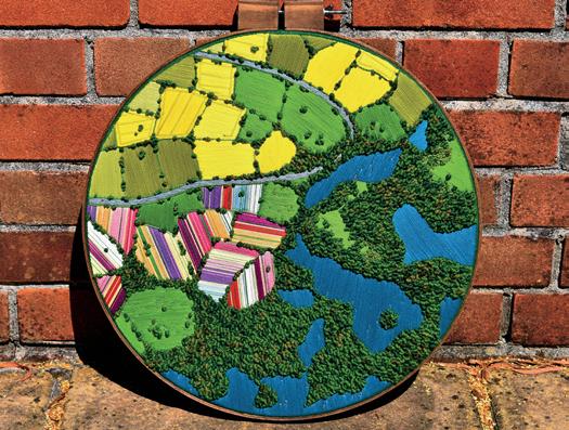
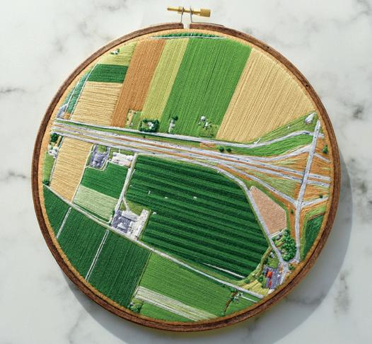
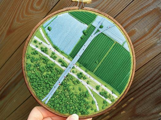
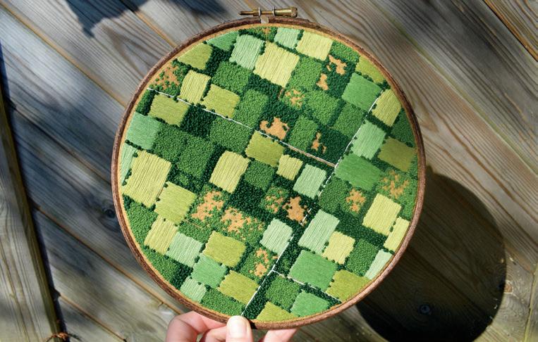
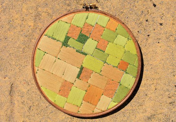
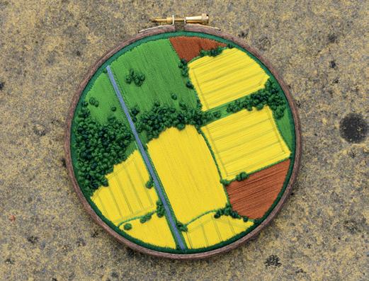
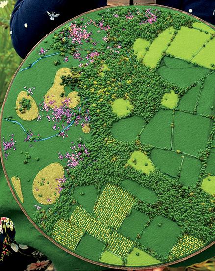
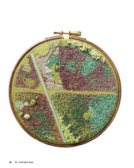
Art & Design
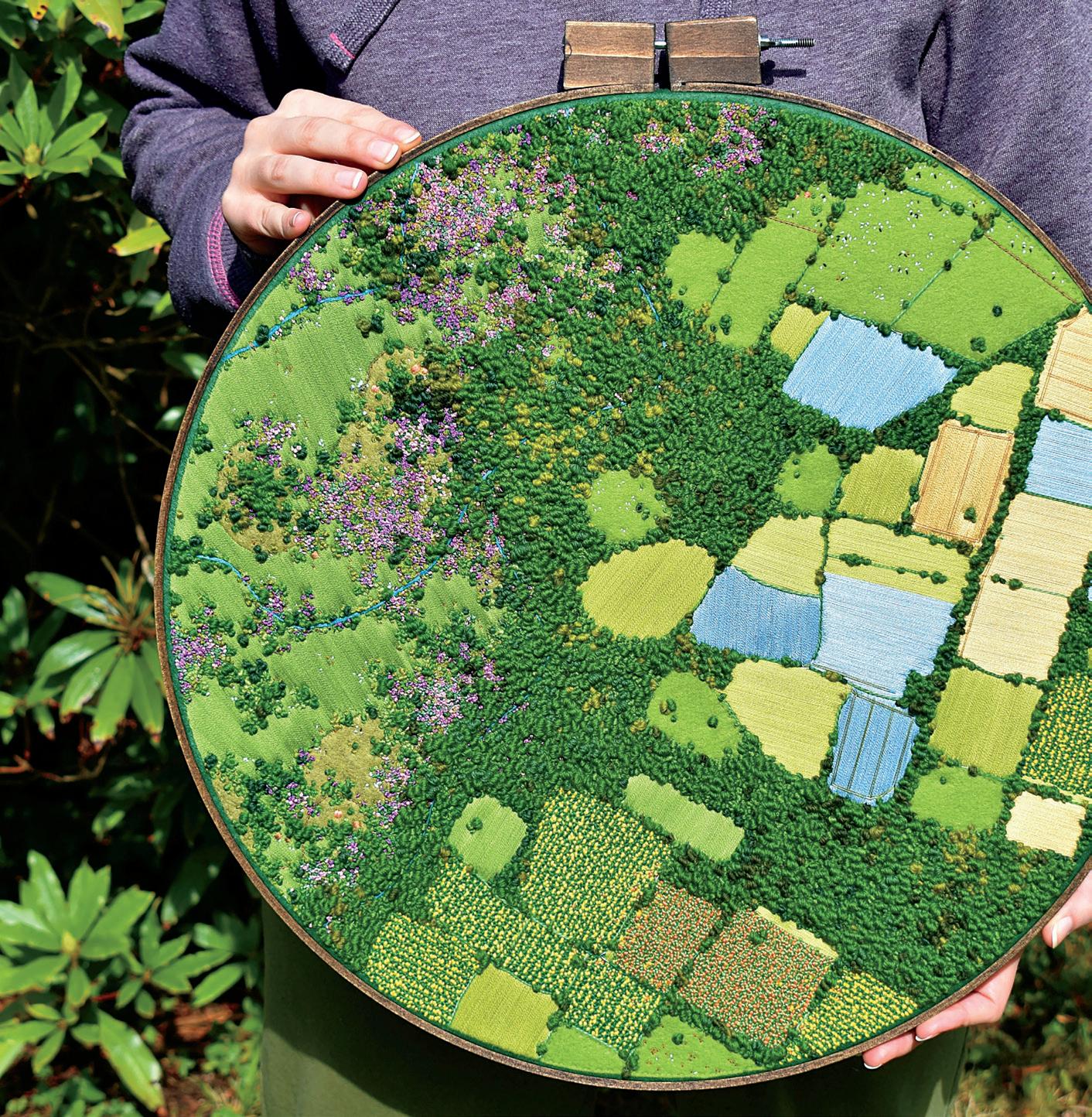
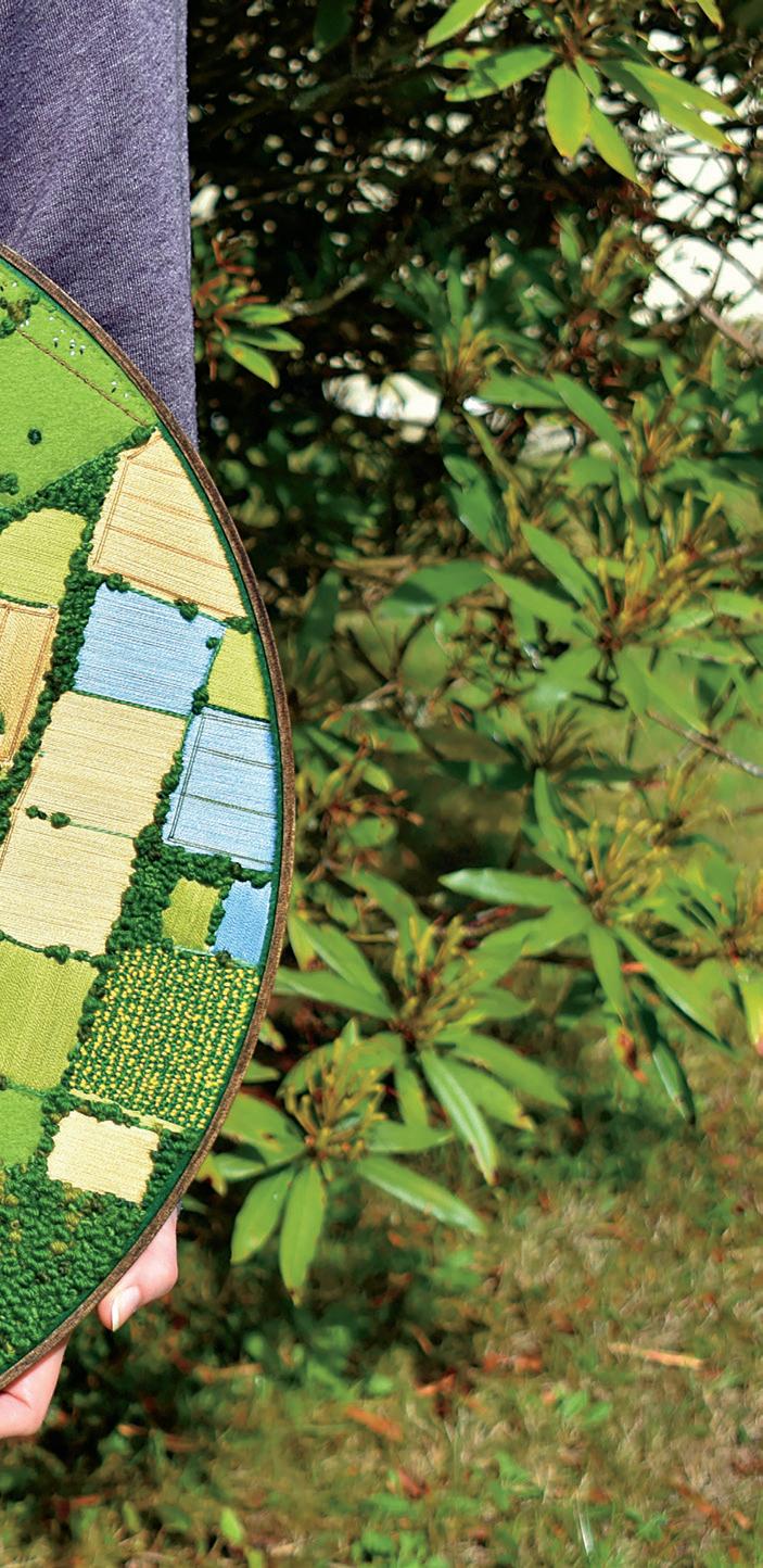
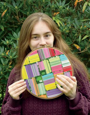
aerial artworks
victoria rose richards
STORY BY joy vanides deneen
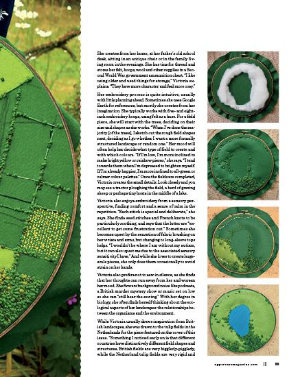
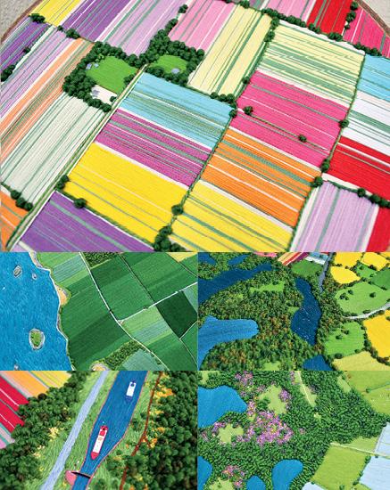
Through her intricate and vibrant embroidery, Victoria Rose Richards creates bird’s-eye views of the land, stitch by stitch. She juxtaposes ordered agricultural fields against the organic forms of the wilderness, methodically rendering the world with needle, thread and felt. Framed with wooden embroidery hoops, her small-scale landscapes give macro aerial views that are also rich in warm details. For Victoria, her art is intertwined with her autism. “I think of things others don’t, or see things others miss,” she says. “I’m more driven to go my own way and not follow others. And my art is a direct reflection of how I see the world—everything is too strong and bright. I’m often told my art is very strongly coloured and bold. But that’s just the world to me.”
Since childhood, Victoria has lived in the British countryside, surrounded by the “endless fields and meadows, lush forests, winding rivers and reaching moorland” of South West Devon. Her parents are bookbinders and encouraged her creative pursuits from a young age. She has fond early memories of experimenting with paints, sewing toys and building wood models, even carving a small-scale replica of the Titanic out of a block of balsa wood. While she excelled academically, she went through “a phase of selfhate. I thought I was fighting my autism to be where I was and that my achievements were in spite of it.”
uppercasemagazine.com ||| 25 COVER ARTIST
|||
When she moved to university to study biology, she went through a very difficult period. “I’d had mood issues for years already, but then a school friend of mine died and it tipped over into real depression. I felt lost in my free time, feeling I couldn’t be as creative as I wanted since I couldn’t paint or do models [in her university housing], and eventually I started looking for something else.” One day, she stumbled upon pictures of embroidered landscapes online and was inspired to pull out her grandmother’s old sewing tin and threads. “I got some greens and blues out… and just kept sewing!”
As months passed, her embroidery skills greatly improved but she discovered that she wasn’t interested in the sky aspect of landscapes—she wanted to focus on the land itself. She was in the middle of a series, creating landscapes in each colour of the colour wheel, when she shifted perspective and created her first aerial embroidery. It was a “small, all-green field,” and Victoria enjoyed making it so much, she challenged herself to create a larger one. “And then I just kept doing them,” she says. “I felt something click that I hadn’t felt before when using any other art medium or style, and realized I’d found my ‘thing’ that I wanted to keep going at.” During this time in university, Victoria also came to the powerful realization that “I haven’t achieved what I have in spite of my autism, I achieved it because I’m autistic. I simply wouldn’t have had the focus, creativity and determination in my studies and art if I wasn’t. I know myself better than anyone else and I know it’s true.”
Since completing her biology degree and publishing her first scientific paper, Victoria’s aerial embroidery has evolved into a full-time profession. She particularly enjoys rendering the fields, with their patchwork quality: “I love the shapes [the fields] naturally form and are made to form by agriculture, seemingly perfectly fitted together yet forced. How many people have fond memories of visiting the countryside as a child? In these idealized scenes, I try to express a nostalgia that is both comforting and bittersweet, bringing back rose-tinted memories of simpler days past.”
Within her embroidery hoops, we can travel meandering rural roads and gaze over fields of linseed, wheat, corn and flowers, and follow the rivers that snake through the land. We see the countryside throughout the seasons, from orderly rows of bursting sunflowers and wild purple heather of the moorlands to autumn leaves and frozen, snowy ponds. Sometimes Victoria plays with three-dimensional techniques, such as using felted wool to create wispy clouds floating over the landscape. Her pieces have titles that are evocative and lyrical, such as “My heart beats [in fields of gold],” “It will grow back, eventually (and it always will)” and “I wish I could just sit here and lose myself.”
26 ||| UPPERCASE

uppercasemagazine.com ||| 27
THIS IS A LOW RES PREVIEW OF A HIGH QUALITY QUARTERLY PRINT MAGAZINE PLEASE SUBSCRIBE
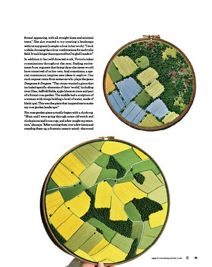
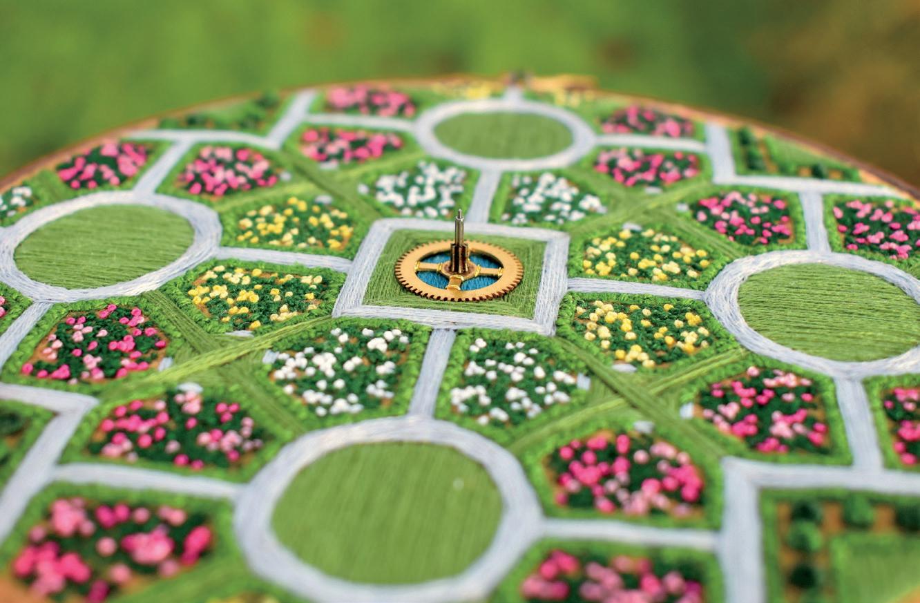
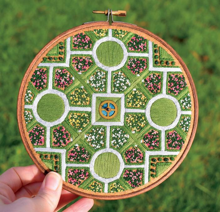
metal base, the central part where the water would come out and the gaps around the edges for the water to show through. I kept [the pieces] aside for ages—over a year I think—waiting for some proper inspiration on what landscape to use them with.” After creating the Dungeons & Dragons piece, Victoria knew she “wanted to do a whole rose garden with geometric shapes and different colour roses, but I wanted something special for the centre. I remembered the cogs I’d kept aside—a fountain would be perfect! I tried them all out and settled on the medium one. I’m very proud of how that piece came out. The intricate details, geometric build and 3D aspect combined perfectly for me.” Thinking of the old buildings and fountains around Devon, she titled the piece, “Throw a penny in and make a wish.”
Looking ahead, Victoria is still as excited as ever to continue exploring the world of aerial embroidery. She looks forward to moving into her own home and spreading out in a full-size work space. “I’ve slowly been unmasking, and I’m finding my place in the world as an autistic artist, not an artist who happens to also have autism,” she says.
victoriaroserichards.co.uk @victoriaroserichards
32 ||| UPPERCASE
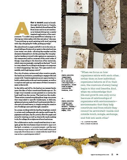
co-creating with the landscape
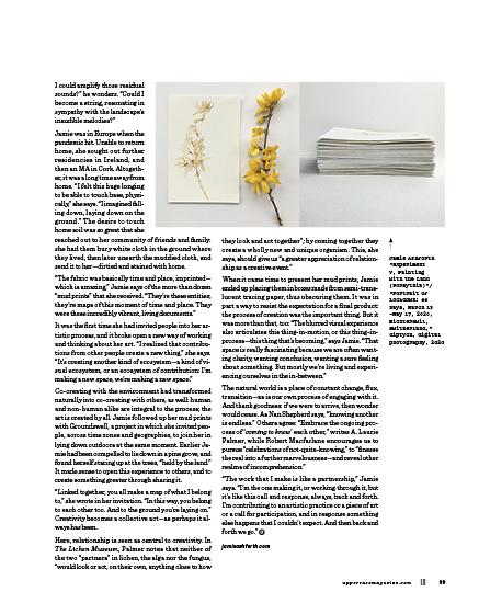
STORY BY correy baldwin
held by the land
ORIGIN
IMAGES BY jamie ashforth

THIS IS A LOW RES PREVIEW OF A HIGH QUALITY QUARTERLY PRINT MAGAZINE PLEASE SUBSCRIBE
“I have discarded the noun form of place as meaningless. The verb, to place, as an activity in itself is a condition of being present.”
Jamie Ashforth
“Excavation:
August 23, 2021 –Toronto, Rachel,” photographic image—unwrapped, 18x27cm, 2021
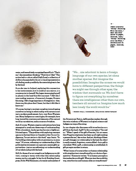
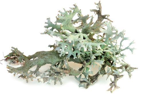
—RONI HORN, ARTIST
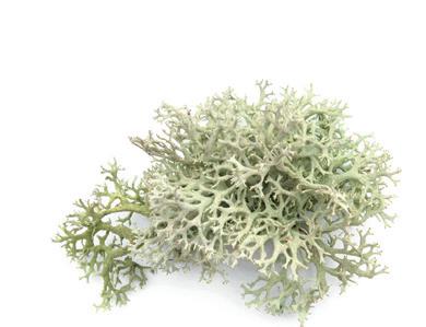
In her Lichen Museum project, artist and writer A. Laurie Palmer turns to lichen—a symbiotic organism comprising an alga and a fungus—to reimagine how we might exist in the world, and to consider what it means to live in relationship, both with nature and with each other.
Palmer describes the problem of relationship this way: “A mess of problems could be seen as undermining this project from the start, not least being the fact that lichens don’t even have eyes to look back at me. And of course they don’t speak in any language I can recognize. How can I argue for any kind of meaningful relation with, or the ability to learn from, beings that occupy worlds that are so different in every way from my human world?” The endeavour, she says, is fraught with “the absurdities of attempting to reach across incommensurable difference, and of projecting my own, very human, concerns onto what can’t be known in human terms.”
Her conclusion is decidedly less analytical: Just step outside, she says, and “allow yourself to be captured by a relationship.” When she encounters lichen in the wild, the hand wringing dissipates, and she is left simply exclaiming: “Hello, hello, hello, hello!” The desire to connect is what’s important, no matter how impossible it may be. “Impossible, perhaps,” Palmer writes, “but crucial, necessary, to try.”
Why necessary? Because the things we can learn from nature are too valuable, and because any attempt to imagine the “incommensurable difference” of nature opens the door to new possibilities for ourselves as well. To imagine the life of a symbiotic organism like lichen, for example, is to imagine a world based fundamentally on relationship. For we were never simply individuals, closed off from each other and from the world: “Interdependent relations among many and diverse worlds is what makes any of us what we are,” as Palmer writes.
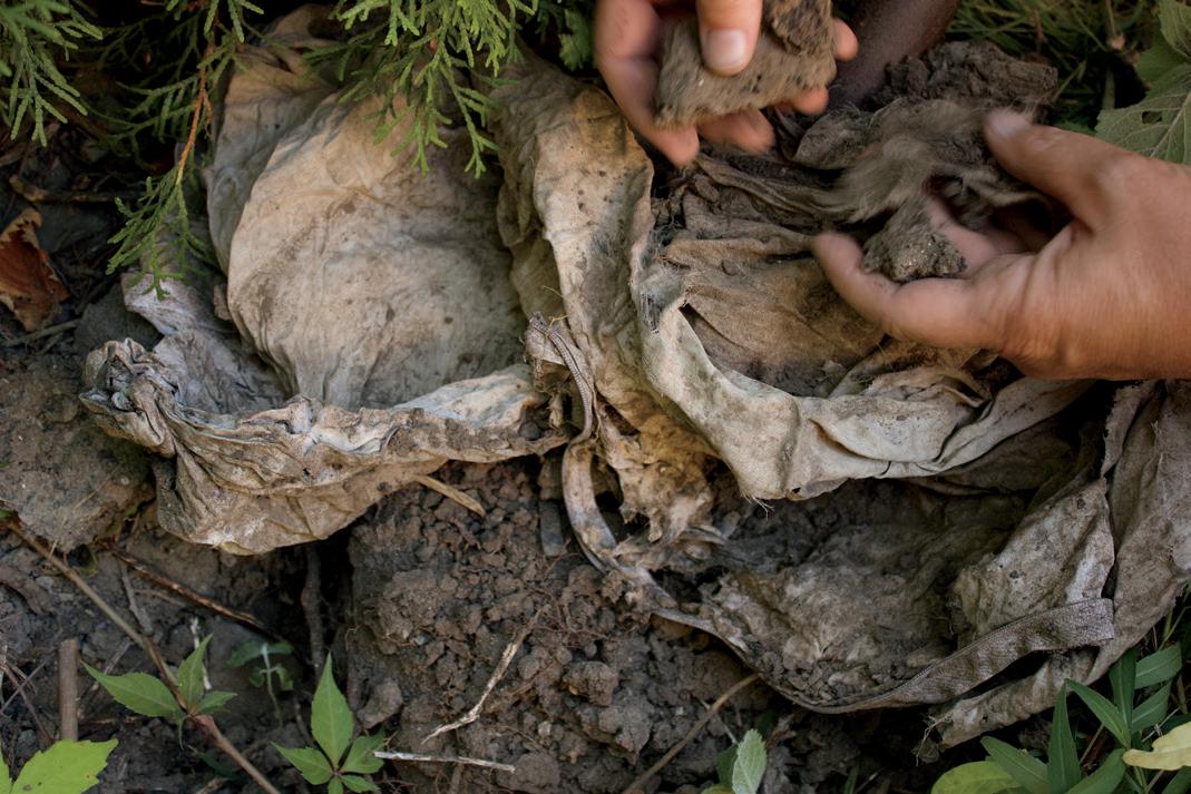
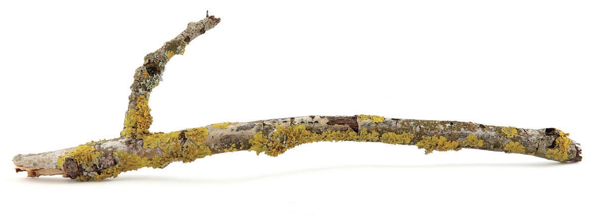
Years after art school, Jamie was living in Toronto but not feeling rooted. While walking the shore of Lake Ontario, she saw a piece of driftwood rolling around in the
36
“In the mid-sixties I sort of metaphorically walked out of my studio. I had a sort of intuition that the natural world was far more dynamic and interesting, and had far more possibilities, it had far more potential and even pleasure for my work. So I began to work in fields or in woods, on riverbanks, using just the material of the place. And that opened a whole new territory for making art. I could use time and distance to make a work of art. And it also gave me an amazing freedom, because I realized I could make my work in the world just by walking. And also the walks gave me opportunities to make sculptures along the way.”
—RICHARD LONG, LAND ARTIST
Interacting with the land may be less about understanding what the environment is experiencing, and more about, as Jamie says, “registering for ourselves— via our body, thoughts, memories—how the interaction is impacting us. We are always registering ‘relationship’ by our own individual experience.”
And just as our own individual experiences vary, so a relationship with the natural world can take many forms. Some will best understand nature in human terms, while for others, nature is simply too mysterious. The writer Nan Shepherd, for example, whose book The Living Mountain describes her lifetime spent walking in Scotland’s Cairngorms mountains, “was thrilled by evidence of the earth’s vast indifference to human consciousness,” according to writer Robert Macfarlane.
But for Shepherd, the incomprehensible landscape is the very thing that allows for transformation. One’s sense of self dissipates, allowing for new perspectives on what it means to exist: “One walks the flesh transparent,” she writes. “But no metaphor, transparent, or light as air, is adequate. The body is not made negligible, but paramount. Flesh is not annihilated but fulfilled. … I have walked out of the body and into the mountain.”
The musician and writer Richard Skelton immersed himself in a different landscape. Suffering an immense personal grief, Skelton returned to his birthplace and began wandering the moors. He carried with him various stringed instruments, creating music on, and with, the land.
In his book Landings, Skelton writes of his attempts to “sound the landscape,” as well as his attempts to physically meld sounds and land: “[I] grasp handfuls of balsam leaves and thread them into the sound hole of my mandola. Rub their greenness onto its dull brown strings.” He explores the sound of “soft soil sprinkled on resonant wooden bodies. Grasses and leaves intertwined around neck and fretboard. Bone and wood plectra. … A collusion of place and instrument.”
Skelton also returned to certain sites to play recordings of this music back to the places where it was created, “returning the music back to its birthing chambers.” Here, as “the wood listens to itself,” he witnesses the music “losing shape and form,” its echoes and reverberations diminishing, “commingling with the residual undersong” of the moor. “What would it be like if
Arcadia
A mythic idyllic, pastoral landscape.
moulds and hippos.
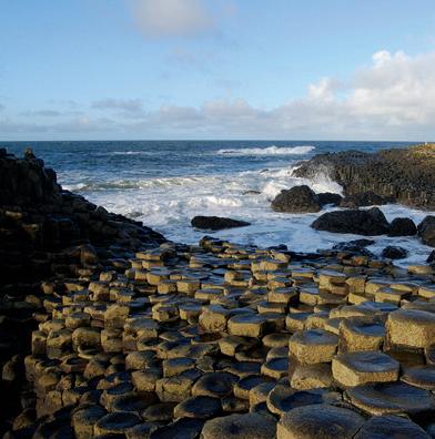
Giant’s Causeway (Northern Ireland)
Either the giant Finn McCool was building a bridge to Scotland to fight his rival Benandonner, or the hexagonal columns marching out to sea are the result of ancient cooling volcanic rock.
scenery
COMPILED BY lydie raschka
Boundary Waters
A landscape of lakes on the border of Ontario and Minnesota.
Escarpment
A steep cliff or slope.
Folly
A whimsical, impractical structure found in a park or garden.
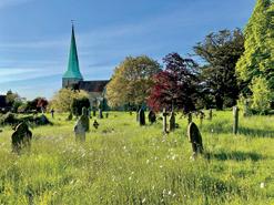
Cemetery
An ideal landscape for the living as well, in certain 19th-century settings.

A book that stresses the importance of working with, not against, nature.
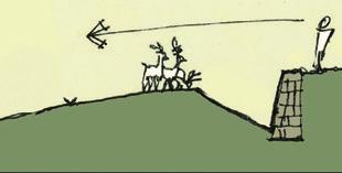
Ha-ha
An 18th-century trick—a sunken wall that keeps animals in check yet maintains an uninterrupted landscape view.
Joan Miró’s landscape paintings (1893–1983)
Brightly coloured natural and abstract shapes float in vibrant landscapes.
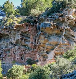
Karst
A landscape of caves and sinkholes, created by water slowly eating through soft rock, like limestone.
40 ||| UPPERCASE ABECEDARY
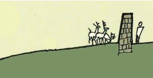
Desire Path
The easiest route from here to there made by people, slime
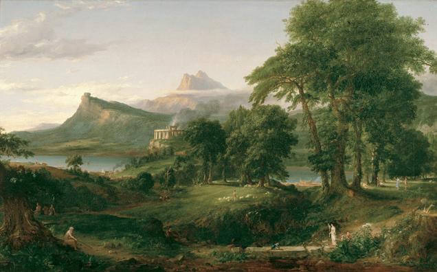
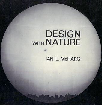
Ian McHarg’s Design with Nature (1969)
THOMAS COLE, 1834

The Great Outdoors
The theme of this challenge was: The Great Outdoors. What natural landscape would you pick to express your creative personality? What are the textures and palettes of these natural places?
Are you drawn to wide-open prairie spaces full of grasses and wildflowers or vast blue oceans of undulating waves?
Do you love a horizon of jagged snow-topped mountain peaks, or do you prefer lush green tropical rainforests? Let your mind wander as you ponder the landscape that feels most like you!
THEY DRAW is a creative community dedicated to showcasing the work of artists and illustrators from around the world through food, travel and garden illustrations. THEY DRAW and UPPERCASE are collaborating to bring you engaging prompts that will be featured in an online gallery and in print. Sign up to our newsletters for all the details! they-draw.com uppercasemagazine.com/free
42 ||| UPPERCASE
CREATIVE BRIEF
SALPI BOULGHOURJIAN
SIMITIAN
@SALPIBSIMITIAN
YIOTA
EFTHIMIOU @BOUBOU_LOVES_DRAWINGS
RAE PROCYSHYN @RAEDRAWSBADLY
44 ||| UPPERCASE
LOGAN @BETHLOGANSART
O’KEEFE @KELLIOKEEFE.ART
BETH
KELLI
@ALEESHA_NASH
ALEESHA
NASH
@SARASANCHEZ.ILUSTRACION
SARA SÁNCHEZ
uppercasemagazine.com ||| 45
NATHALIE BEAUVOIS @TANEBEAUVOIS_ILLUSTRATIONS
RAHATUL ERBE @STICKERBUN
ANN BIELIK @ANNBIELIK.ART
FARIDA ZAMAN @FZAMANART
50 ||| UPPERCASE
uppercasemagazine.com ||| 51


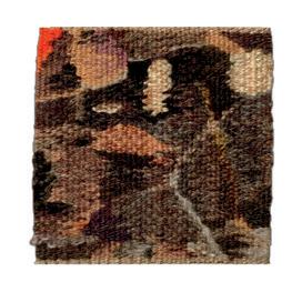
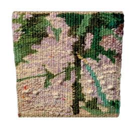
Gatineau Hills
Elizabeth Rutledge
CHELSEA, QUEBEC, CANADA
The Gatineau Hills are spectacularly beautiful! The pure pigment of pastel seems to allow for a vibrant expression of this land.
Haiku
Andrea Butler
ROTHESAY, NEW BRUNSWICK, CANADA
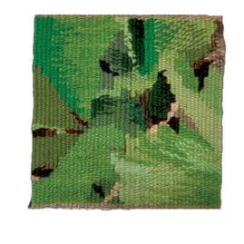
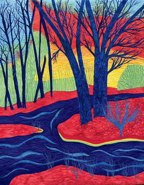
I am a hiker. I hike hundreds of kilometres a year. I take in the shapes, colours and sounds around me and document my treks with snapshots.
I am working on a weaving project called Haiku, transforming a landscape photo from each season into a series of 12 small-format tapestries. My intention is to take landscape images out of context just enough that they are not realistic portrayals. I wish for the viewer to sense the magic and mystery of nature through imagination—to be taken into the moment, to feel what it is like to be surrounded by the landscape, to relive memories of being in nature. I want people’s minds to be filled with the imagery and sounds of nature, not unlike what happens when one reads traditional haiku poetry.
andreabutlerdesigns.ca
@andreabutlerdesigns

THIS IS A LOW RES PREVIEW OF A HIGH QUALITY QUARTERLY PRINT MAGAZINE PLEASE SUBSCRIBE
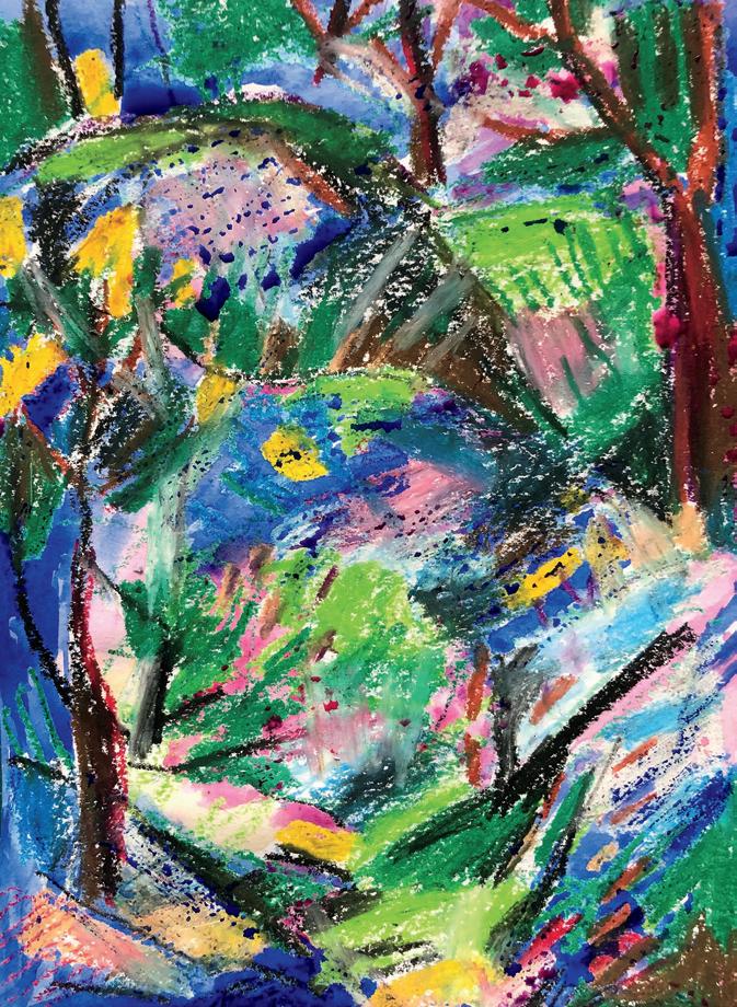
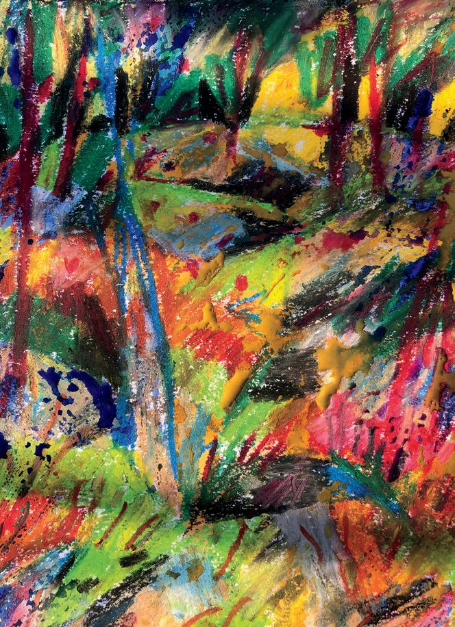
Each day the forest tells a different story
Lisbeth Nordin
ÅRSTA, SWEDEN
My goal for body and soul is a walk a day in the forest. I bring a sketch pad, a box of oil crayons and some old newspapers in my tote bag. When I find a place that speaks to me, I sit down on my newspaper cushion, smell the forest, investigate the colours and start to draw, quickly without thinking, making my hand do the work. Back home I paint watercolour all over my drawing. Day after day, this forest-diary habit makes me happy and
finally turns out to become quite a body of work.
pappeterian.com
@pixelprinsessan
Nature Dreams in Colour
Laurie Russman
LOUISVILLE,
KENTUCKY, USA
As I walked my dog on a bitterly cold, grey day, I took a photo of the wetlands that surround our neighbourhood; the image might as well have been taken in blackand-white. I altered the photo with my favourite neon filter and was struck by the vivid contrasts… and how they hinted at the colours that would follow in real life come April, no matter how dead these trees looked that day.
neonkittyquilts.com @neonkittyquilts
88 ||| UPPERCASE
 jackson
thomas jackson
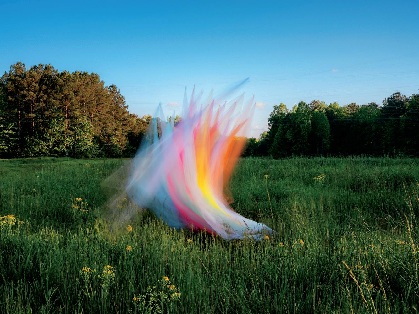 TEXT BY andrea jenkins
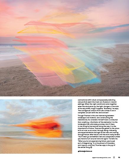
Thomas Jackson has a love/hate relationship with nylon tulle. Thomas, a photographer best known for his fantastical sculptural installations set amidst natural environments, has, over the years, worked with a slew of everyday materials—plastic cups, paper plates, packaged lollipops, neon glow necklaces, aluminum roasting pans and, of course, the aforementioned tulle. In collaboration with surrounding natural elements, he seems to magically catch these objects mid-air, as if in the process of explosion, tumbling and floating through varied landscapes as living, breathing things. “It’s about the transformational qualities of materials,” he tells me. “And finding ways to take an inert object, something really familiar, and make it into something completely different.”
Love/hate relationship aside, I can’t help but notice how he lights up when he talks about working with nylon tulle, particularly when in partnership with the wind. “Tulle,” he says, “is not very interesting when it’s still, but when it moves, it completely transforms and takes on so many different shapes and personalities that it just continues to surprise me.” When asked if there is a significance in the colours he chooses to work with, he tells me it is more about finding unexpected
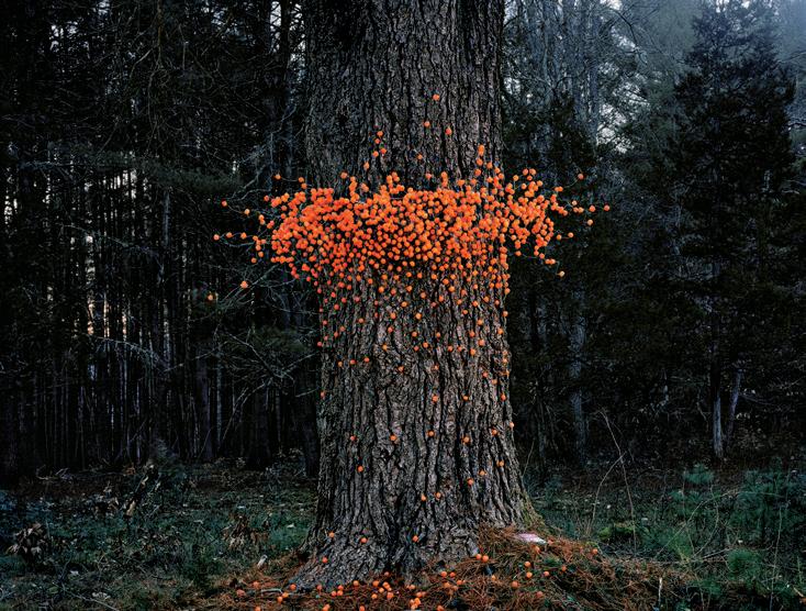
90 ||| UPPERCASE
PHOTOS BY thomas
PHOTOGRAPHY
THIS IS A LOW RES PREVIEW OF A HIGH QUALITY QUARTERLY PRINT MAGAZINE PLEASE SUBSCRIBE
spilling the tea with T
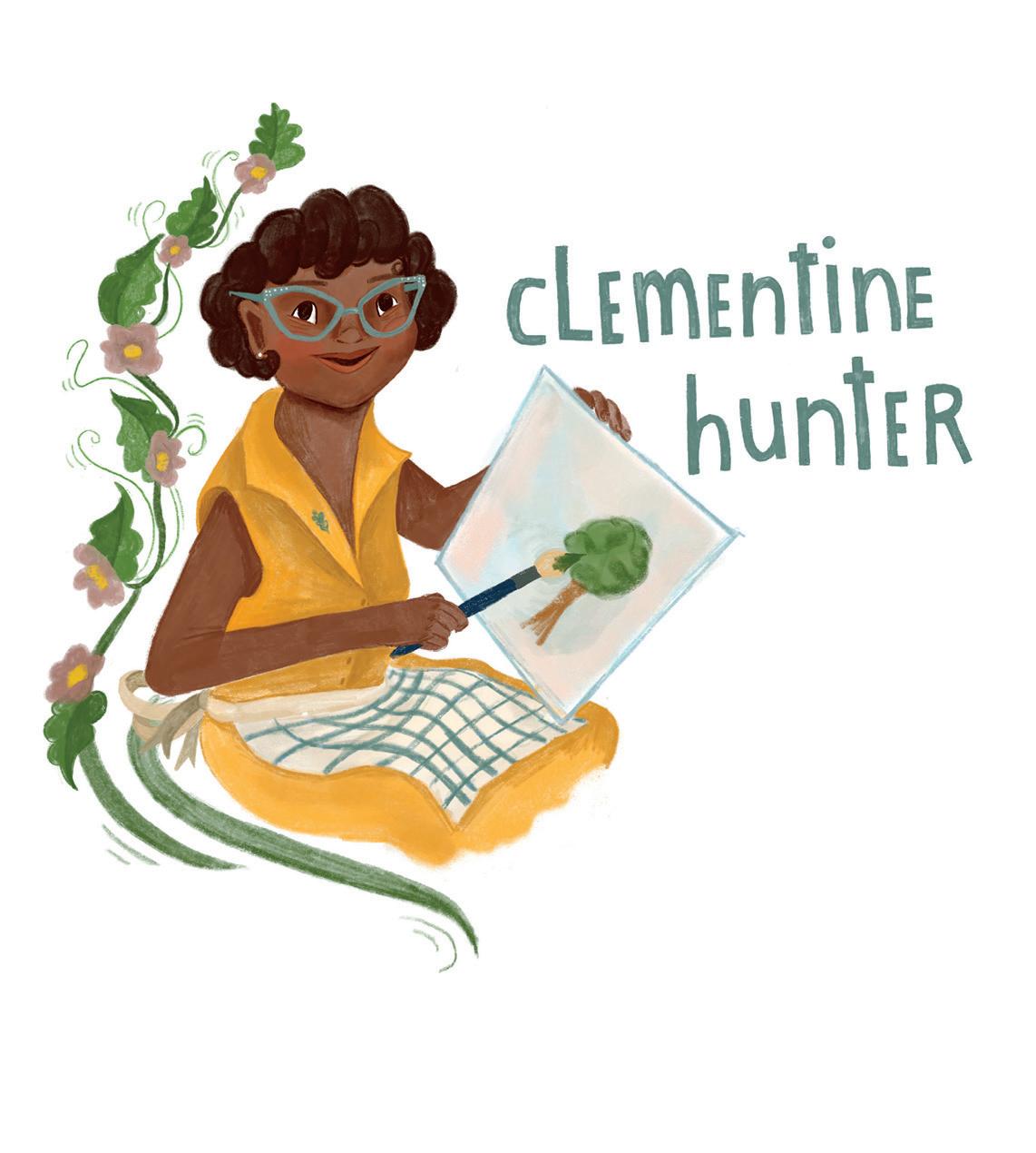 ILLUSTRATOR tamisha anthony IMAGINES A CONVERSATION WITH FOLK ARTIST CLEMENTINE HUNTER
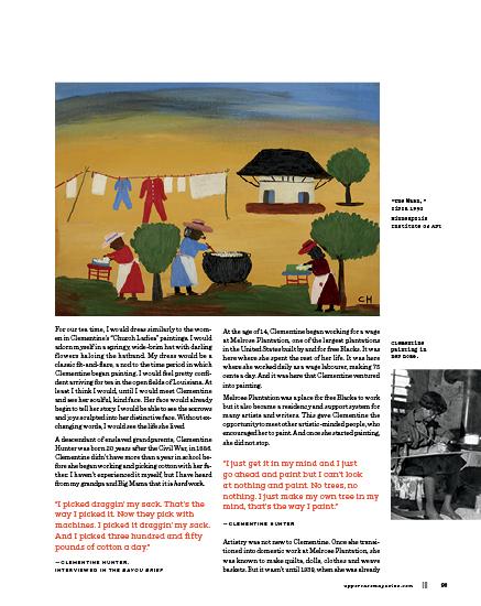
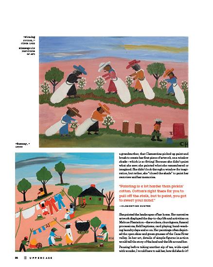
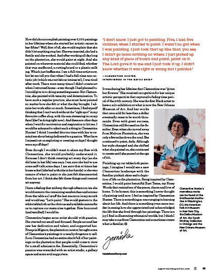
As a child, I lived in good ol’ East Texas, known as the Piney Woods. No matter if my family was driving from the store “in town” or on a longer road trip, little Tamisha knew she was almost home when she saw the rows of towering pine trees that brushed the clouds above. It was always at this moment that I stared out the car window and watched the rows of trees ripple by in a cadence—a countdown to home. I am a little nostalgic. I grew up with nature encapsulating me, giving me a feeling of safety, belonging and love. Although I live in a city now, surrounded by apartment buildings, restaurants and concrete, I still have pictures in my mind of those tall, lean pine trees, and whenever I want to, I can still see my landscape of home. So, when talking about familiar landscapes and the imagery of memories, who better to “spill the tea” and share afternoon tea with than with the wonderful self-taught folk artist, Clementine Hunter (1886 to 1988).
First of all, Clementine was from Louisiana, and guess who is living in Louisiana right now? Yes, we were meant to meet for tea. Because she was raised in Louisiana and she painted the landscapes around her, I think it makes sense to meet Clementine near the place she called home in Natchitoches Parish, near Cane River.
92 ||| UPPERCASE
TEA WITH T
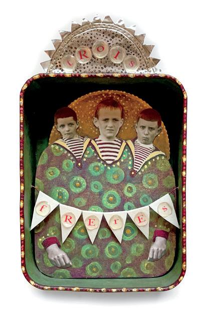
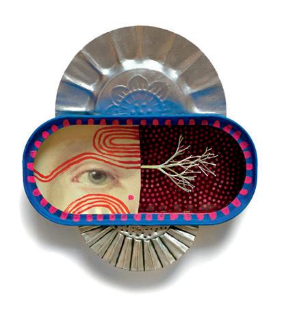
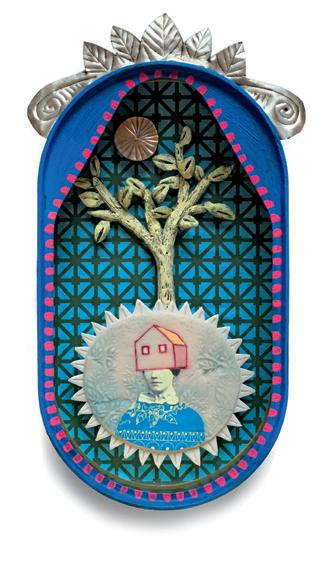
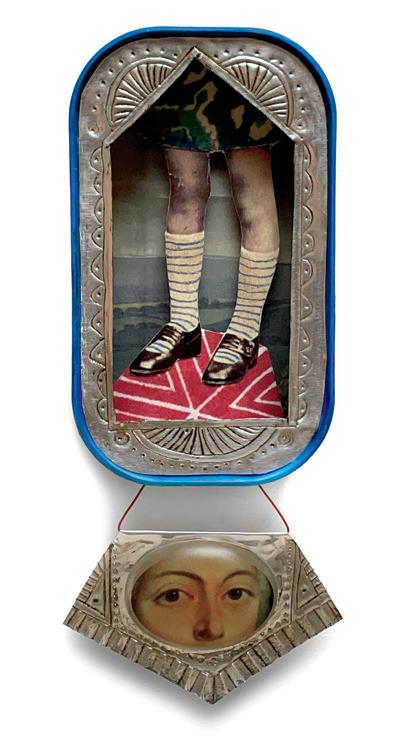
Sardine Saints
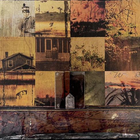
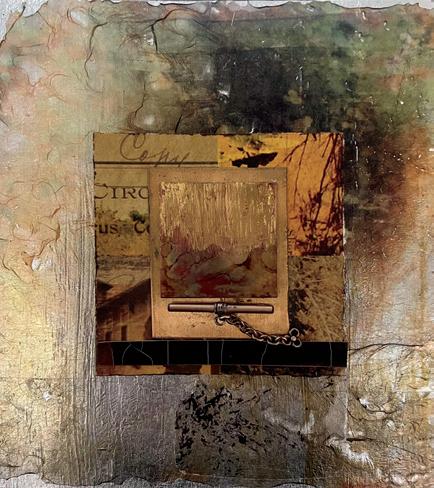
Julie Liger-Belair TORONTO, ONTARIO, CANADA
One of my favourite and the most satisfying things for me to do in my art practice is to recycle, remake and revisit older pieces and ideas. If a piece hangs around my studio for more than a year, then I consider it fair game for recycling.
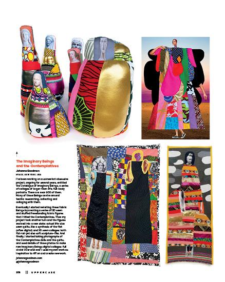
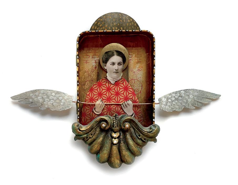
In this case, I’m revisiting some old ideas that I had worked into several series of works over 15 years ago. In the older series (the dark red pieces), I was exploring the world of religious iconography and mythology, and inventing saints and gods with everyday objects. I called them “sardine saints and dustpan gods.” It seems that my delight with containers and boxes has never disappeared and it has been so much fun to play with this format again but with a new visual language and new experiments such as resin and polymer clay objects. julieligerbelair.net @julie.liger.belair
106 ||| UPPERCASE
Quilt Revisions
Anne Ramsey FRANKLIN, TENNESSEE, USA
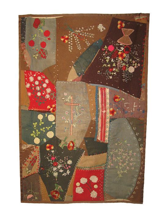
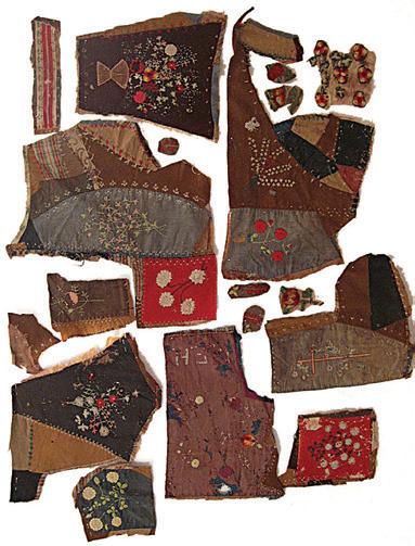
My creative work begins with quilt projects made by others. They come to me with holes and tears, incomplete and in fragments. Damage from a washing machine, a nibbling mouse or a rowdy dog can be remedied with some creative rescues. Fragments saved by a granny can be assembled into a useful keepsake. More importantly these quilt projects come holding memories and stories. The owner’s intentions guide the choices I make as to how I repair, restore or repurpose the project. The materials, patterns and construction also inform what may be possible, and when I can, I research the maker’s life to honour them and add to the story of the project. I then patch, repair, restore or assemble everything that brings the revised quilt back to life. A quilt’s owner comes to me with the hope that the story of their heirloom can continue to be told. NashvilleQuiltRepair.com @anniecreated
Transitions
Dorothy Simpson Krause
FORT LAUDERDALE, FLORIDA, USA
These eight-by-eight-inch collages use bits and pieces remaining from “River of Grass,” an homage to Marjory Stoneman Douglas’ efforts to protect the Everglades. They are part of an ongoing series, Transitions, that uses remaining ephemera to produce new work.
DotKrause.com
If things had been different
Diane
Britt BIRMINGHAM, OHIO, USA
I made this artist’s book from a drawing and painting that I had stashed out of sight and dragged from one place to another for 25 years. I was finally trying to sort through the pile of these largely rotted, dirty objects. Always on the lookout for materials to make artist’s books, especially paper and card for pop-ups, I developed an idea for a book. The history held in this work made me think again about what my life might have been had certain things happened—or not. I thought about a parallel story for the drawing, too, the whole experience deepening my ability to see objects and materials for making art in fresh, new, more flexible ways.
@diane11413
uppercasemagazine.com ||| 107
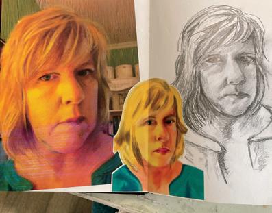
Revisit Self-Portrait
Judy Ormshaw TRENTON, ONTARIO, CANADA
This self-portrait started as a photo taken in 2012. The yellow highlights intrigued me. Years later I was learning about digital art using Photoshop and a drawing tablet, and the photo came to mind as subject matter mostly due to that yellow. I’ve also sketched this image in pencil and marker, and I’ve run it through an app called Percolator, but I haven’t been satisfied with any of these renderings.
In January 2023, I had been painting with acrylics and had been saving the peel-off sheets of palette paper mostly because I still thought they were pretty. It occurred to me that I could use the splotched sheets to do paper mosaic and this photo came to mind. I am very satisfied with my finished work. It’s one of my favourite pieces. This project, once started, consumed me. I was in the flow state and I think it shows.
@judyjujubeart
Looking In
Leila Simon Hayes BOSTON, MASSACHUSETTS, USA
I keep a basket in my studio where I throw castoff ideas, wonky paintings, drawings that didn’t work out, collages that never clicked. It’s labelled “for later.” Whenever I’m stuck, I like to take everything out and spread it over my desk to see if anything asks for a new life. For this piece I unearthed some simple cut-paper collages, sliced them up and reconfigured them to make new shapes. Paired with painted texture from the same bin, it clicked. The process of remixing old pieces that haven’t worked yet into a piece that breathes new life reminds me that nothing is ever final, everything is an iteration.
leilasimonhayes.com
@leilasimonhayes
uppercasemagazine.com ||| 109
112 ||| UPPERCASE
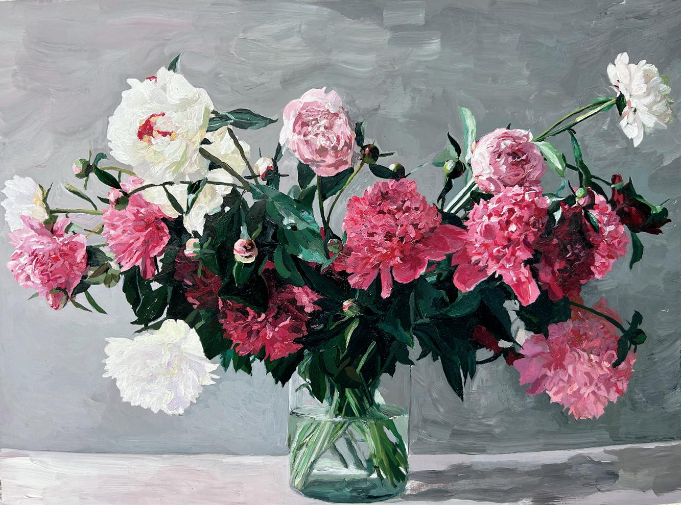
Peony Painted Photograph
Alexandra Steele
MANHATTAN BEACH, CALIFORNIA, USA
Peonies grew by the hundreds in my neighbour’s yard in Prairie Village, Kansas, which she generously shared when they burst forth in late spring. In June 2019 I harvested and photographed these flowers, shortly after which I moved from Kansas to Los Angeles. I printed the photo and hung it in my kitchen. After a few years, I retired the print (but didn’t trash it). Fortuitously, while cleaning out some art supplies, I stumbled upon a 2D Design homework assignment from college in which I had taken a paint-by-numbers approach to recreating Matisse’s “Woman with a Hat,” using, instead of paint, cut Color-aid paper collaged onto particle board. The old assignment inspired me to revisit my peony print with the same paint-by-numbers approach, this time mixing acrylic paint to colour-match each shade in the original photo print—a delightful challenge, and quite a thrill to see a tired piece revitalized. alexphotographs.co
Tracing Nostalgia
Kelly Frederick Mizer
WAUWATOSA, WISCONSIN, USA
Lately I have been creating monoprints on copy paper and then printing old drawings on top of them by running them through a laser printer. Sometimes they stand alone. Sometimes I remix them further in Photoshop. Sometimes I run them through the printer again, this time using old photographs. I have always had a love of cut-paper collage and mixed-media work, but printing on monoprints has changed the game for me because it is so unpredictable. The ink smears, the printer jams. It’s a game and I love the conversations that take place between me and the work. This collection stems from the imagery I see in meditation and the acceptance of change.
kellyfrederickmizer.com
@kellyfrederickmizer
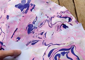
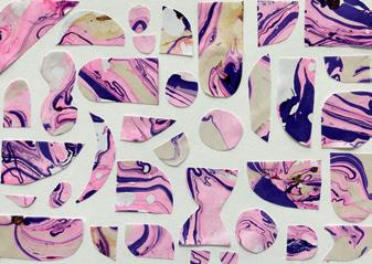
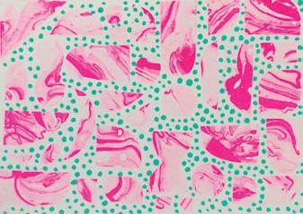
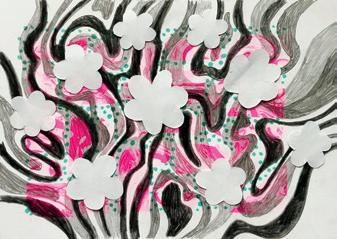
From marbled paper to repeat pattern
Natalia Zlateva FRANKFURT, GERMANY
A marbled paper I designed some time ago was the starting point for a collage I printed on a Riso printer. The result was a print with interesting colour effects, but it looked flat to me and I wasn’t very enthusiastic about it. So, months later, using the flowing lines of the marbled paper as a guide, I drew some loose shapes over the print with black pencils. Then I added some abstract floral shapes cut out of paper over the drawing. Finally, I created a repeat pattern on my iPad from this mixed-media image. I liked the bright colours, the loose geometric shapes and the green dots in the background of the drawing, so I used these elements in my pattern to add depth and interest.
nataliaoro.com @nataliaoro_studio
uppercasemagazine.com ||| 113
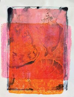
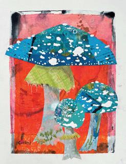
Repurpose Those Mediocre Paintings
Lynne Redmond
GREENSBORO, NORTH CAROLINA, USA
I like to take chances in my art practice and sometimes a painting is disappointing. Not one to waste good watercolour paper, I often crop the image and make artist trading cards or bookmarks. For a new twist, I overprinted two lacklustre seashell paintings with a gel plate. After several layers, the results masked the original images. I created mushroom collages with hand-printed papers and applied them to the recycled new backgrounds. I love the intricate patterns and interplay between the collage elements and the remixed paintings.
LynneRedmond.com
@lynneredmondart
Therapeutic pattern blocks
Stephanie Dendle SWANSEA, WALES, UK
I’m an artist and designer. My practice has been about exploring pattern. In 2015 I suffered a serious brain haemorrhage resulting in loss of memories, balance, logic and spatial awareness. I was disoriented and recovery was a slow process. I revisited my pattern-making skills to rebuild my brain using repetitive cognitive activities and researched neuroplasticity: the brain’s ability to grow and reorganize neural networks that store and retrieve information.
Pattern is about repetition. I have utilized pattern making to aid my recovery and developed an ongoing exploration of what constitutes pattern by creating interchangeable designs on wooden blocks based on geometric, naturalistic and architectural themes. Change, choice and complex interactions can be achieved by turning and rearranging the blocks to create multiple images. This initially appears as a simple concept but was very complex to design. It potentially has numerous applications in health rehabilitation, mindfulness and educational settings. asanctuaryplanted.co.uk @livingsfrances
114 ||| UPPERCASE

Half & Half Flower Experiment
Dori Patrick CEDAR RAPIDS, IOWA, USA
These pieces sprouted from an experiment. I drew a flower bouquet using oil pastels in my sketchbook. I drew the bouquet several more times using other mediums. There was something just too precious about the drawings, so in a moment of frustration, and a desire to mix things up, I tore one of them in half. I ended up laying a piece of the drawing on top of another, and viola! Inspiration! I ended up creating a series of paintings in which I tore up all of my work and pieced it back together. It was such a fun way to remix my work, and exercise a new creative muscle in my brain. To this day, when I feel stuck in my work, sometimes I remember to just tear it up and mix it up!
doripatrick.com @patrickdori
uppercasemagazine.com ||| 115
THIS IS A LOW RES PREVIEW OF A HIGH QUALITY
QUARTERLY PRINT MAGAZINE
PLEASE SUBSCRIBE
subscriber studios
Want to be featured?
Submit your studio story! uppercasemagazine.com/ participate
my carriage house studio
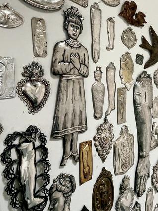
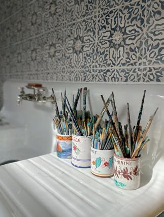
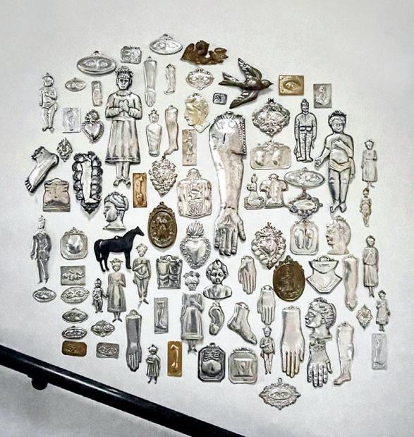
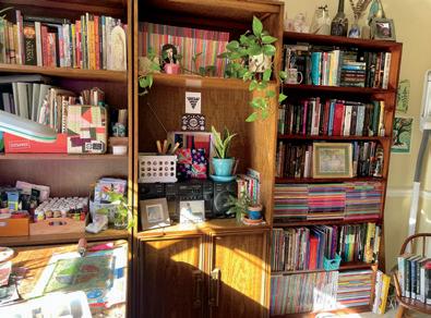
Jennifer Wilkin Penick
WASHINGTON, DC, USA
I feel incredibly fortunate to have my own studio space. It is located upstairs in our 18th-century brick carriage house, which according to historical maps used to be on the grounds of Alexander Graham Bell’s home up the street. Since my studio is removed from the main house, it is quiet and peaceful, and no one minds if I leave it messy. I don’t have much room for displaying art, but I love having open shelves on which to prop books, magazines and art that inspires me.
I lived in Italy for many years and collected small silver votive plaques (called ex-votos) and I love that I can now have them all hanging on the wall at my studio entry, whereas before they lived in a big ceramic bowl.
jenniferwilkinpenick.com
@jenniferwilkinpenick
UPPERCASE
STUDIO
My Studio Space
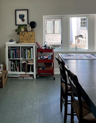
Jessica Loughrey
CROFTON, MARYLAND, USA
My husband decided to do some rearranging to give me a room all to myself! The room is right off of the kitchen. It was originally the formal dining room, then my son’s bedroom, then a shared space for myself and my husband. Now it is all mine. I have two desks—one for computer and not-messy work and one for messy work, usually gelli printing, and multiple shelving units for art supplies, books and plants, and a closet for overflow. The room has amazing natural light, great to work by and for the many houseplants that I share the space with. With my husband’s help I have created a cozy, inspiring space, right in the heart of the house, allowing me to pop in and out throughout the day and still be available to my family.
@jessica__loughrey
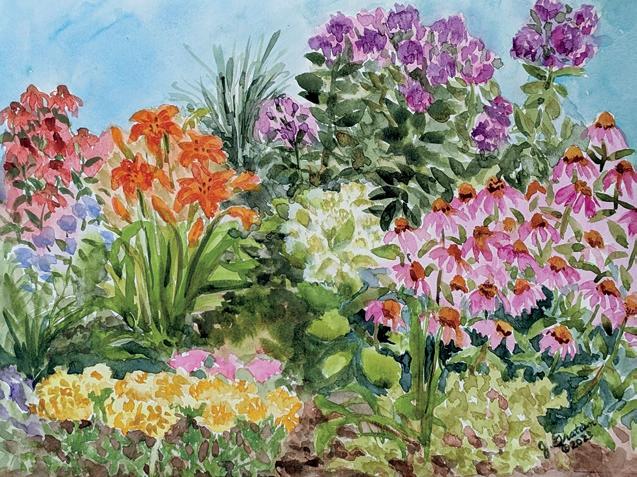
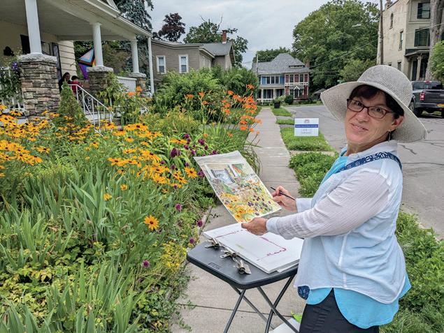
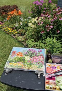
Flower Gardens Are My Studio
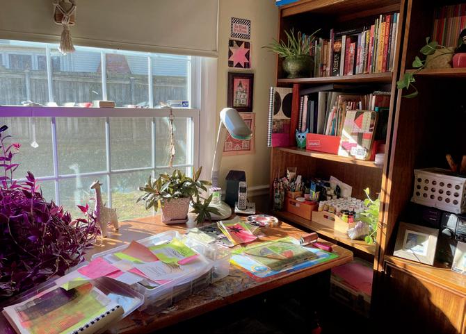
Julie M. Gratien
EAST SYRACUSE, NEW YORK, USA
As a self-proclaimed floral fanatic, my favourite studio spaces are flower gardens. On any given summer day, you will often find me setting up my portable table near vibrant blooms, wearing a big smile on my face. The beauty of the outdoor studio is that it is constantly changing, filling up with a wide array of vibrant colours. Painting en plein air allows me to have a truly immersive and multisensory experience. I favour the warmth of the gentle breeze on my skin, the delightful sounds of the birds and the fragrant scent of the blossoms. While some of my watercolour paintings are intended for wall art, they often evolve into seamless patterns for my surface designs. gratienart.com @gratienartdesigns
uppercasemagazine.com ||| 127
looking forward
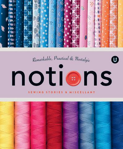
Volume N: Notions
Notions celebrates the remarkable, practical and nostalgic tools and accessories of sewing. With sewing stories and miscellany from textile artists, fabric designers, quilt pattern makers, quilt shop owners, haberdashers, inventors and entrepreneurs, Volume N in the UPPERCASE Encyclopedia of Inspiration will be an entertaining and illuminating A to Z of sewing miscellany.
uppercasemagazine.com/volumeN
Volume G: Glue
This volume will be all about collage, assemblage and other sticky creative pursuits! Auditions to be profiled in the book will be announced in the UPPERCASE newsletter and on the website.
uppercasemagazine.com/volumeG
Sign up for my weekly newsletter for behind-thescenes updates and the latest on open calls for submissions for UPPERCASE books and magazines.
uppercasemagazine.com/free
UPPERCASE magazine
#62 July-August-September 2024
#63 October-November-December 2024
#64 January-February-March 2025
#65 April-May-June 2025
Pitch your article ideas and suggestions anytime! uppercasemagazine.com/participate
Circle
Make
connections, nurture your creative spirit and grow your business!
The UPPERCASE Circle is a vibrant community hub, one that is a valuable source of motivation, inspiration and encouragement for like-minded and kind-hearted creative people from around the world. Although the community is initially brought together by its support for and appreciation of UPPERCASE magazine, the Circle will enhance your experience of all things UPPERCASE while providing additional value to your creative life through conversation and the sharing of knowledge.
• Connect with members of the UPPERCASE community— both near and far—who share your interests.
• Share your work with your peers, mentors and potential customers.
• Find inspiration, motivation and new perspectives.
• Move your creative business forward with tips, tools and support from peers and guest experts.
• Live video conferences and video chats.
Access to this community is FREE when you subscribe to UPPERCASE magazine!
uppercasecircle.com

128 ||| UPPERCASE CIRCLE
Have you made something with the subscribers’ kraft envelope or reused the magazine or postcards in an interesting way?
Please share your pictures and stories of my books, magazines and fabric on Instagram: @uppercasemag #uppercaselove

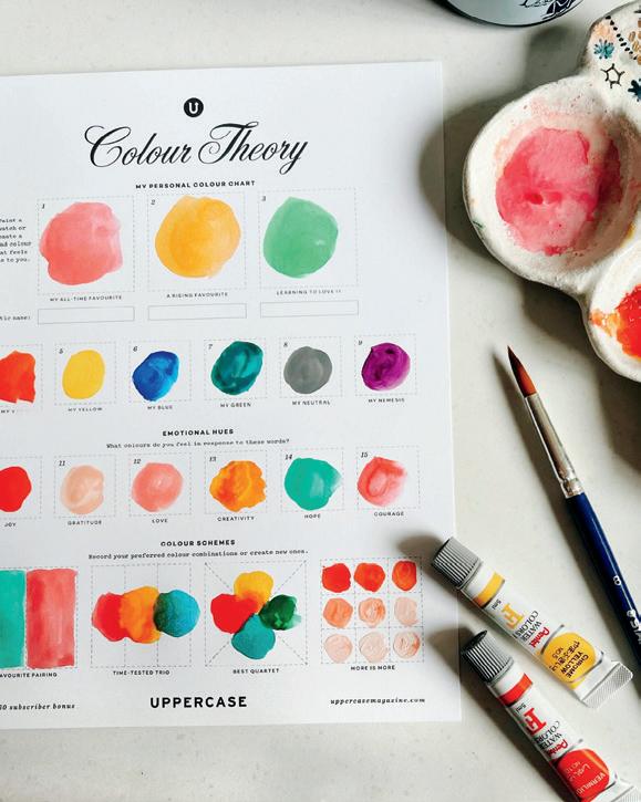
Suki McMaster
I had so much fun doing this colour theory exercise from @uppercasemag! I noticed I have so much red and pink in my chart. One interesting colour is for “hope” I wasn’t expecting myself to choose green but now I think about it, I do feel hopeful when I am in the park, looking at trees and garden so it kind of make sense. What colour do you choose for hope?
@sukimcmaster
Vanessa KiKi Johanning
Reuse and make something beautiful and useful! I love to make my own journals to write and dream in! The @uppercasemag mailers are a perfect size!
@vanessakikijohanning
SHARES
@articulations_to
@rosaliehaizlett
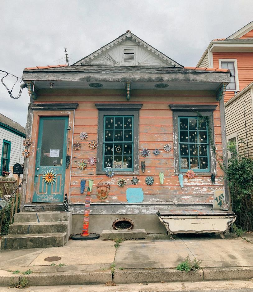
nothing is wasted
STORY AND PHOTO BY andrea jenkins
In the spring of 2022, I met up with a few old friends in New Orleans. As we rode rented bikes down narrow streets, they told me about a local artist they loved named Mo and insisted we meet. When we rolled up to her house in the Bywater a few hours later, I understood why. The crumbling, coral exterior of her home was decked with pieces she had made from found materials—sunburst flowers and hand-painted signs, an old traffic cone encrusted with shiny metal bits. Mo, a tiny wisp of a person, sat on the front steps in her bare feet and wore an old santa hat, the white trim dingy with sweat. Introductions were made as we parked the bikes, and in a matter of minutes, I felt her link her arm through mine and pull me inside. As she led me through a series of long, skinny rooms, my eyes struggled to adjust, as if to accommodate bright light. Inside, art covered the walls. Mo took my hands in hers, and with an urgency bordering on uncomfortable said, “Old materials are just waiting to be made into new things. But you have to be willing to dig, you have to be willing to get your hands dirty. And you have to learn how to look, to see the possibility.”
This moment came back to me recently while considering old work. What I know now, after a lifetime of making art, after decades of trying to find my way, is that in this long arc of a process, you will leave a bevy of work in your creative wake— finished and unfinished projects, some with real substance and shine, some without. But everything you make, every aspect of the process, contributes to who you are. In this way, nothing is wasted. To look at my own older work through Mo’s lens, to take her words, spoken with such urgency that day, in that shotgun home filled with art and light, is to look at old projects and ideas not as static or immutable things (or even as successes or failures) but instead as organic matter, edgeless and malleable, old materials just waiting to be made new.
With this idea in mind, I revisited a writing project from 2018 in which I made a list every day for one year. Out of all my creative processes, writing is the one that feels the most like stumbling around in the dark in the middle of the night. In an attempt to transcend this stumbling, I took the humble, wholly accessible list and turned it into a personal creative practice. But as the year rolled on, the stumbling only continued and the project took on a particular heft. By the time I wrote the last list, the ending felt more like the beginning of something else. A few years later, when a poet friend told me my lists sometimes read more like prose and gently suggested that maybe what I was really doing was writing poetry, I laughed. But now, after even more time and space from the project, after reading through nearly 300 lists, I can see it—the soft edges of something completely different, maybe even what the work was meant to be in the first place. Old made new. That is, if I’m willing to dig, to get my hands dirty again, to let go of what once was and lean deep into reimagination. And to see what was there all along—the glint of possibility.
130 ||| UPPERCASE COVET
andreacorronajenkins.com @hulaseventy
ENCYCLOPEDIA
FRONT COVER ART BY victoria rose richards
BACK COVER ART BY jennifer wilkin penick
uppercasemagazine.com
$24 CAD/USD PRINTED IN CANADA
2024
APRIL-MAY-JUNE
