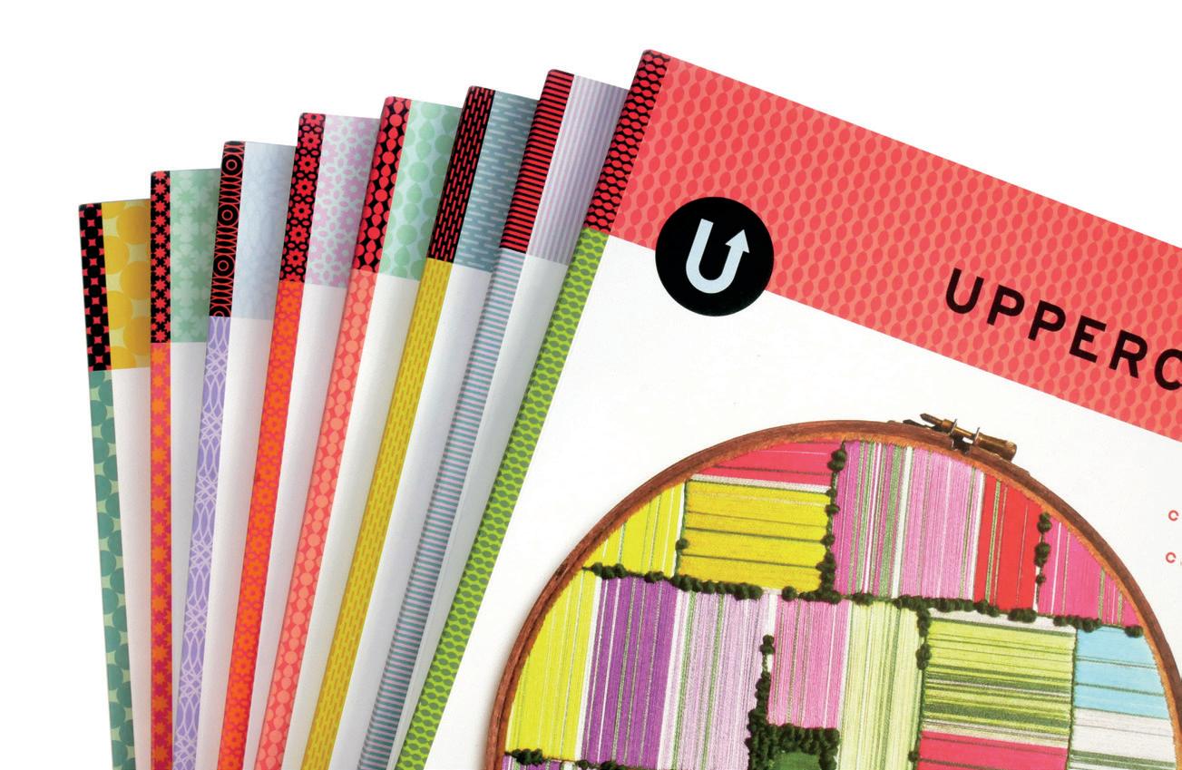
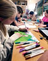
for the CREATIVE and CURIOUS
domestic arts
62
ENCYCLOPEDIA encyclopediaofinspiration.com
Dear Reader,
Make yourself at home! Settle in to enjoy this edition of UPPERCASE magazine, inspired by the domestic arts. Our interpretation of the term is purposely loose and playful; we embrace it, reinterpret it, rebel against it and express ourselves in new, unexpected and traditional ways.
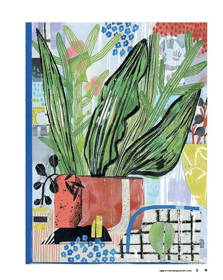
We also have a wonderful gallery of still lifes influenced by our homes and gardens. These compositions act as a proxy self-portrait; what we surround ourselves with reflects who we are.
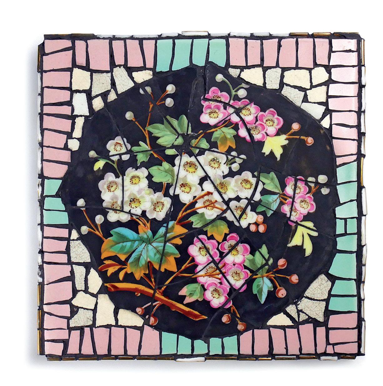
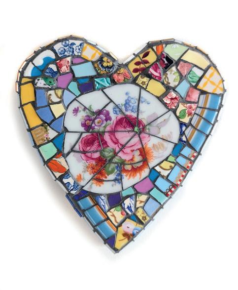
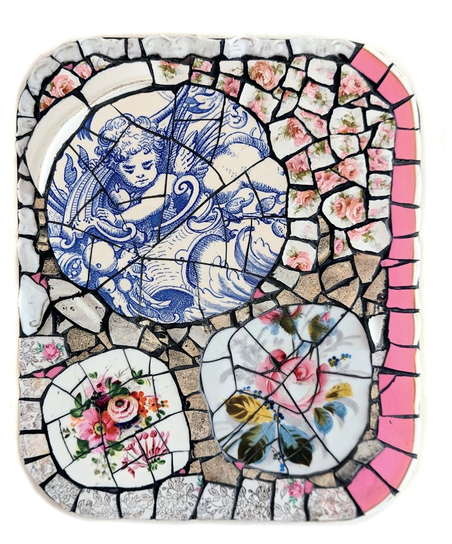
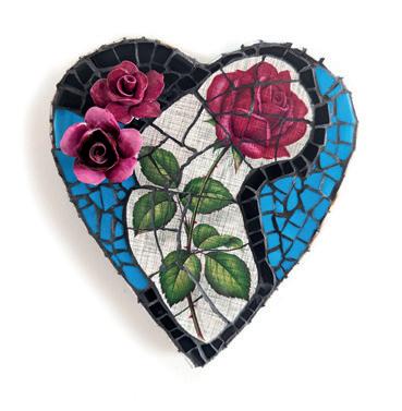
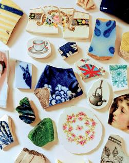
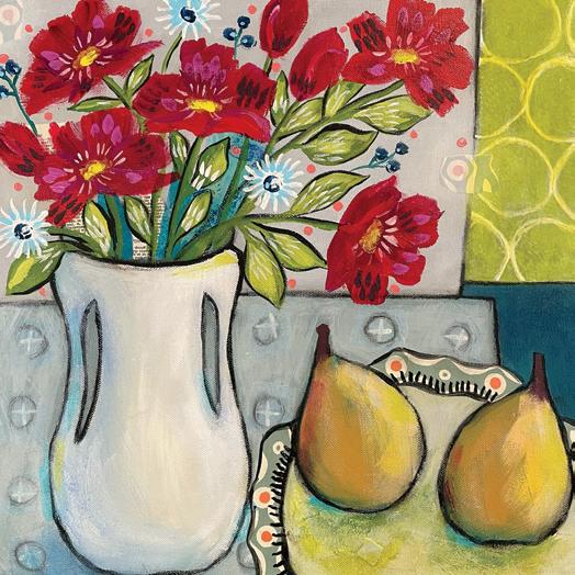
From the front cover mosaic by artist Helen Swanton to the back, a paper plate painted by Elizabeth Hamilton, you’ll notice a theme of plates, saucers and dinnerware throughout these pages. Coincidentally, while creating this issue, I found eight plates discarded in alleyways and parks near my home! I’m encouraged to reuse them creatively—as paint palettes, under garden pots and even a mosaic.
Smash the plates! I’m not going to make dinner, I’m going to make art instead!
 Vangool PUBLISHER, EDITOR, DESIGNER
Sign up for my weekly newsletter to get a special discount code to use in our shop! uppercasemagazine.com/free
ENCYCLOPEDIA uppercasemagazine.com ||| 3
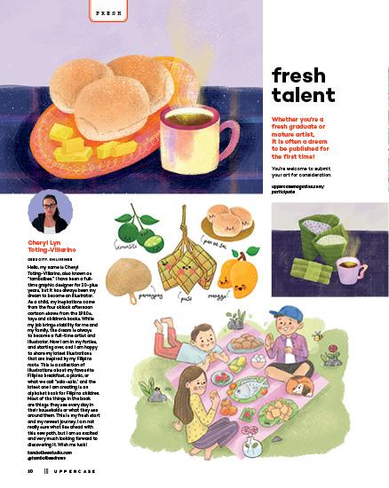
Janine
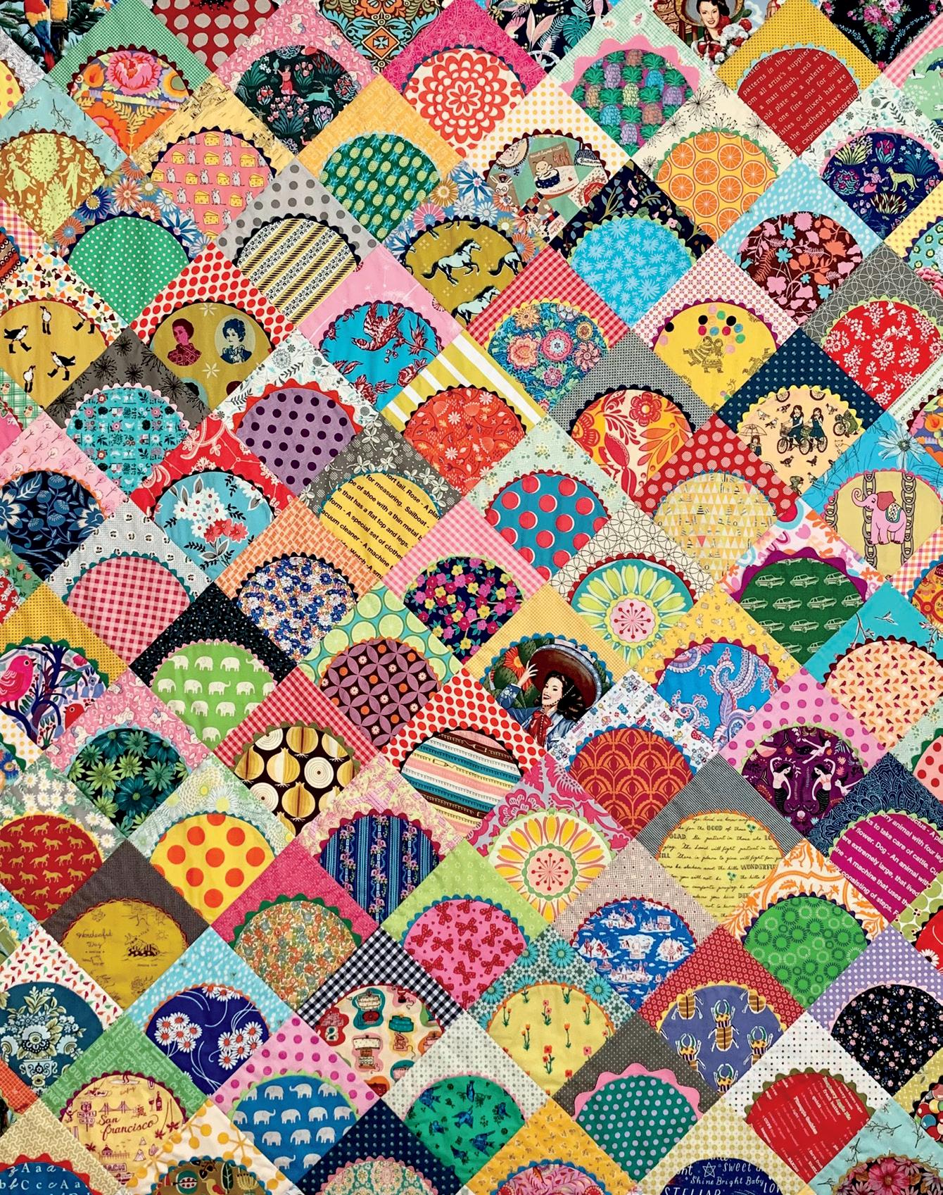
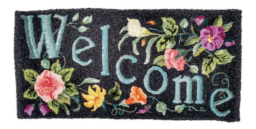
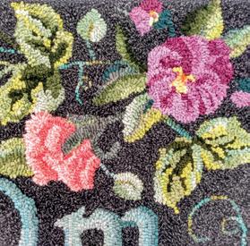
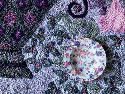
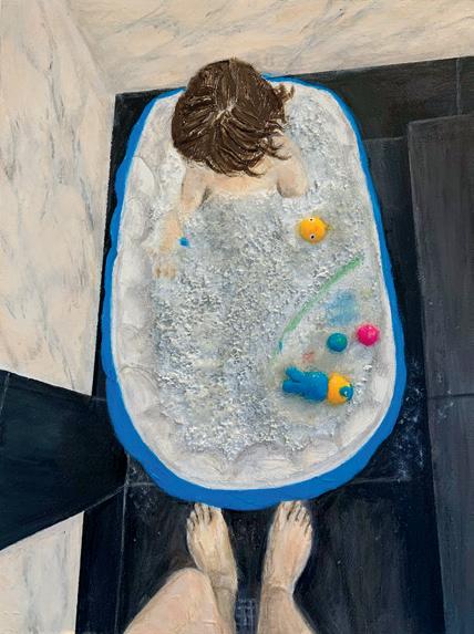
QUILT BY RACHAELDAISY.COM RUG BY Laura Smith PAGE 5
JULY AUGUST SEPTEMBER 2024 4 ||| UPPERCASE
Contents
Design
Cheryl Lyn Toting-Villarino, Jane Hodgkiss, Angela Windin
Welcome
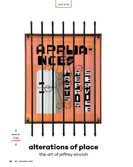
of Place:
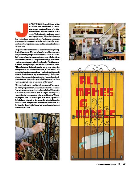
Art of Jeffrey Sincich by Leigh Metcalf
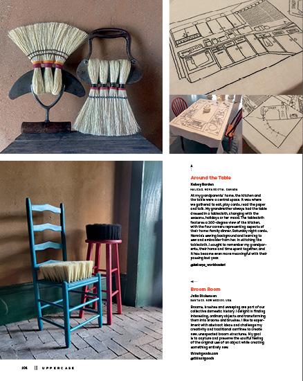
Needlework became a vital creative outlet easily contained from little hands during the early years of motherhood. With time, mesmerized by an exhibit of Grenfell hooked rugs, rug hooking became my artistic endeavour of choice. Awed by their utilitarian beauty, it was their creation amongst the demands of daily household life that both inspired me and resonated deeply. This rug resulted from the inheritance of a stash of vintage patterns and value-dyed wool cloth swatches, a collaboration between the past and the present. While I have primarily hooked from prepared kits or designs, I’m motivated by how they become a springboard to individual creativity. @laurapaonesmith
Welcome Editor’s Letter 3 Subscriptions 6 Snippets 8 FRESH . . . . . . . . . . . . 10
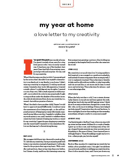
BEING 12 My Year at Home by
Lee Patel TREND 15 Lampshades by Megan Carter Fine Print LIBRARY 16 Recommended Reading CREATIVE CAREERS 18
BUSINESS . . . . . . . . . 20 How
Worth by
illustration by Andrea D’Aquino ECO . . . . . . . . . . . . . 22 Using
illustration
EPHEMERA 24 The
Life
by
Roller ORIGIN 28 Pasta Shapes by
Baldwin illustration by
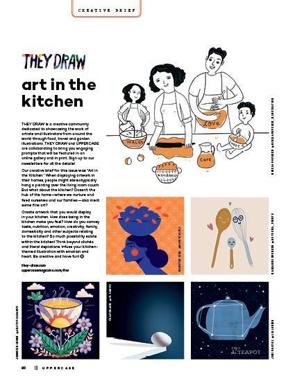
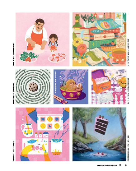
ART 32 Doing the Dishes Helen Swanton, Cover Artist 32 Elizabeth Hamilton . . . . . . 36 Gabriella Buckingham 39 Gésine Hackenberg 44 Zoey Frank . . . . . . . . . . . . 46 Kari Ceramics 50 International Museum of Dinnerware Design Story by Liz Logan . . . . . . . 53 ABECEDARY 54 Art and Design Around the House by Lydie Raschka PROCESS 56 Mindfulness and Memory Story by Danielle Ridolfi illustrations by Krupali Patel CREATIVE BRIEF 60 They Draw Art in the Kitchen COLLECTION 62 The Life
A
Story
TEA WITH T 70 Margaret Burroughs by
GALLERY . . . . . . . . . . . 74 Still Life Self-Portraits by UPPERCASE Readers SCRAPBOOK 90 Memorable Teas by
uppercasemagazine.com ||| 5 Lois Reynolds Mead SEE PAGES 75 AND 109 HELEN SWANTON
Meera
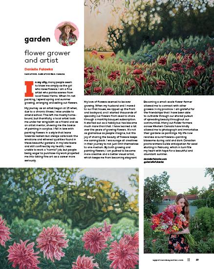
Elyse Whittaker-Paek Danielle Fulawka
to Charge What You’re
Arianne Foulks
Your Money Responsibly by Marnie Hawson
by Andrea D’Aquino
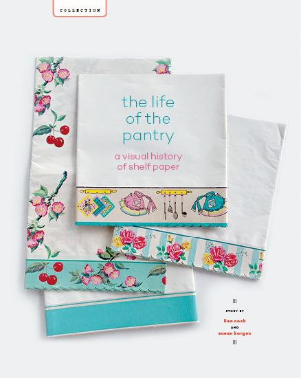
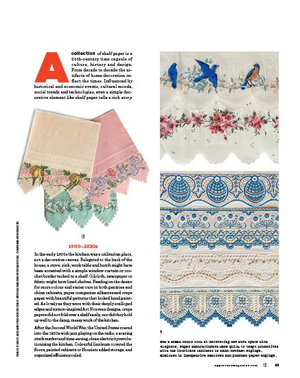
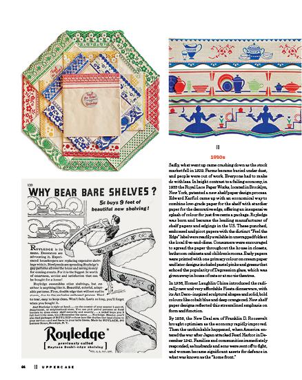
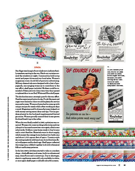
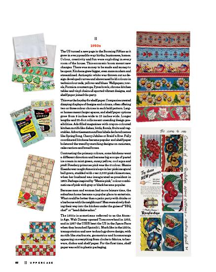
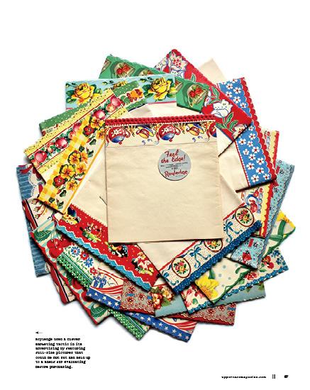
Shelf
of JELL-O
Mark E. Sackett & Melanie
Correy
Valerie Hamill Art &
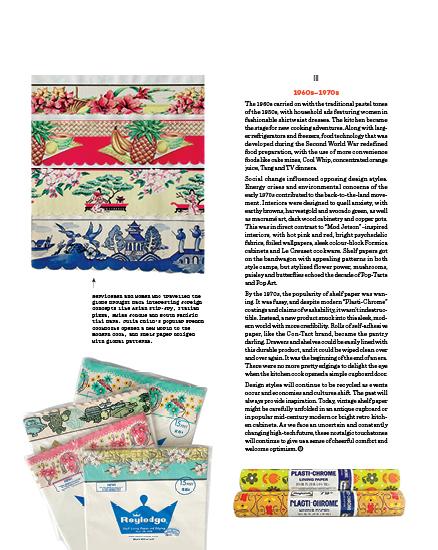
of the Pantry
Visual History of Shelf Paper
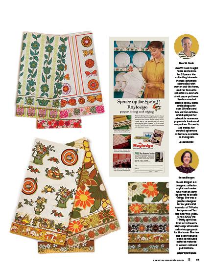
by Lisa Cook and Susan Borgen
Tamisha Anthony
Mandy Ross
Rug
NANTON, ALBERTA, CANADA
Laura Smith
in Illustration Story by Jamie Runnells PERSPECTIVES 96 Domestic Arts by UPPERCASE Readers STITCH 116 Alterations
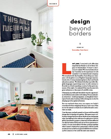
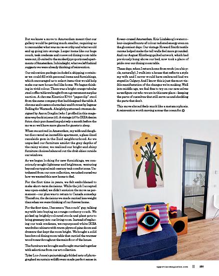
Misc. HOBBY . . . . . . . . . . . . 124 Design Beyond Borders by Brendan Harrison STUDIO 126 Maria Esther Sund, Liita Forsyth and Abbey Sy SHARES 129 COVET 130 Let There Be Lamps by Andrea Jenkins Lois Reynolds Mead SEE PAGES 75 AND 109 HELEN SWANTON
The
UPPERCASE
1052 Memorial Dr NW
Calgary, Alberta, Canada T2N 3E2
Janine Vangool
PUBLISHER, EDITOR, DESIGNER janine@uppercasemagazine.com
CUSTOMER SERVICE shop@uppercasemagazine.com
Correy Baldwin COPYEDITOR
Core Contributors
Tamisha Anthony
Jane Audas
Correy Baldwin
Andrea D’Aquino
Arianne Foulks
Joy Vanides Deneen
Brendan Harrison
Marnie Hawson
Andrea Jenkins
Andrea Marván
Kerrie More
Meera Lee Patel
Leigh Metcalf
Lydie Raschka
Lilla Rogers
Cedric Victor
PRINTED IN CANADA BY THE PROLIFIC GROUP.
Interior pages are printed on 100% post-consumer recycled Rolland Enviro 100.

Sustainability Initiatives
Through the Wren Trailblazer fund, UPPERCASE removes two tons of carbon each month with an additional two tons of carbon offset monthly. Please join fellow readers in the Wren Impact forest.
wren.co/groups/uppercase
In the spirit of reconciliation, we acknowledge that we live, work and play on the traditional territories of the Blackfoot Confederacy (Siksika, Kainai, Piikani), the Tsuut’ina, the Îyâxe Nakoda Nations, the Métis Nation (Region 3) and all people who make their homes in the Treaty 7 region of Southern Alberta.
MASTHEAD 6 ||| UPPERCASE
for the CREATIVE and CURIOUS ™ ™
Celebrating 15 years!
Subscribe!
Thank you to all of the talented writers, illustrators, creative collaborators and loyal readers who contributed their talents to this issue of UPPERCASE.
SUBSCRIPTIONS
This quarterly magazine is released in January, April, July and October.
$ 96
$ 80 INTERNATIONAL
CAD $ 144
Our shop will do the currency conversion for you.
RENEWALS
You will receive a notice by email when it is time to renew. Renew online anytime to add issues to your current subscription.
GIFTS
Simply enter the recipient’s name and address in the shipping information and your name, email and billing address during checkout.
STOCKISTS
To view our list of stockists or to carry UPPERCASE in your shop:
uppercasemagazine.com/ stockists
QUESTIONS?
Have a question about your subscription or a change of address? Email us: shop@uppercasemagazine.com
NEWSLETTER
Sign up for the UPPERCASE newsletter to receive free content and behind-the-scenes peeks at the making of the magazine— plus a welcome discount on your subscription!
uppercasemagazine.com/free
Thank you to everyone who submitted to the open calls for this issue. Even if you weren’t featured within these printed pages, your effort was noticed and appreciated!
SUBMISSIONS
UPPERCASE welcomes everyone and all identities, ages, talents and abilities. We share an inclusive, positive and community-minded point of view. Everyone is welcome to explore our creative challenges and submit to the magazine. Pitch your own work, propose an article or suggest a topic through the Open Pitch submisison form. Be familiar with the magazine and its writing and visual style. uppercasemagazine.com/ participate
Get our back issues while you can! Back issues will not be reprinted.
This
loyal subscribers! uppercasemagazine.com
independent magazine thrives because of you—its
CANADA
UNITED STATES
CAD
USD
Snippets
OVERGLAZE
Post-Porcelain
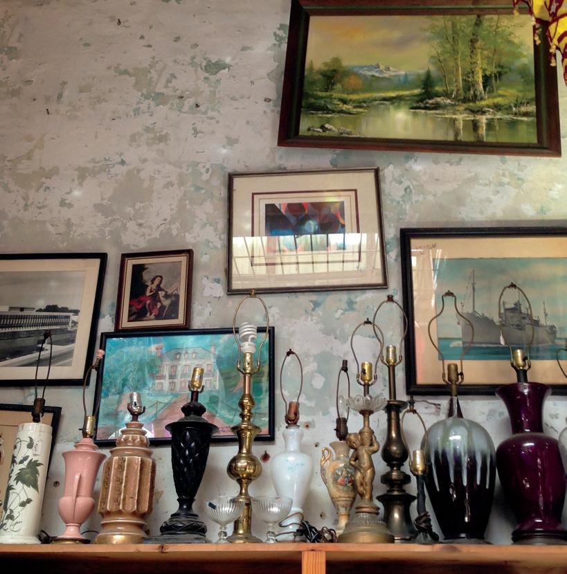
Dutch designer Simone Post participated in a three-month artist residency in Japan. “Arita is a town with a long history in porcelain, also known as Imari porcelain. I collaborated with Kinemon Kiln. I wrapped his deadstock pieces with a new layer of overglaze.” Cleverly naming the collection Post-Porcelain, Simone’s transparent graphics overlay existing motifs. “By giving it new layers I can give the pieces from different series a new coherence and therefore can create new families.” simonepost.nl
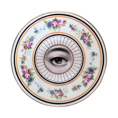
Lover’s Eye
A single eye gazes from the centre of repurposed plates and saucers in Susannah Carson’s Lover’s Eye oil-painted series. @susannah.carson
8 ||| UPPERCASE
OVERT GAZE
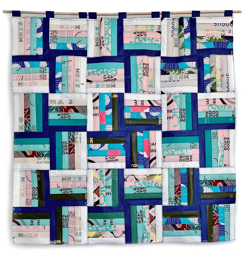
Coffee Culture
Coffee Culture is Jennifer Coghill’s ongoing body of work “rooted in the re-imagining and transformation of waste.”
The project began with a site-specific window installation at Hamers Coffee in Toronto as part of the 2023 DesignTO Festival in which she repurposed coffee packaging.
“Since then, I have been creating machine-pieced wall hangings made with these same materials, referencing the traditional domestic art form of quilting. These pieces suggest the warmth and comfort of home, but by using waste materials, the resulting contrast between what they once were and what they have become challenges conventional notions of beauty and value.
Coffee Culture aims to start a conversation, asking viewers to reflect on and reimagine their own rituals of consumption and waste.
jennifercoghill.com
@jennifercoghill_ textileart
HOOKED ON FOOD
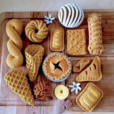
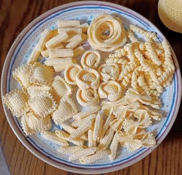
Copacetic Crocheter
Normalynn Ablao, aka the Copacetic Crocheter, makes pastries, pastas and junk food through the marvel of crochet. She sells her “recipes” on Etsy. “One of the beauties of crochet is texture, forged at our free will and defined by character. It’s so beautiful what we can do with a crochet hook and yarn! Our hands are meticulous as we weave each stitch to stitch to stich, instantly manifesting a physical creation directly from our intention.”
CopaceticCrocheter.etsy.com
uppercasemagazine.com ||| 9
FOOD WASTE
Jane Hodgkiss
WEST SUSSEX, UK
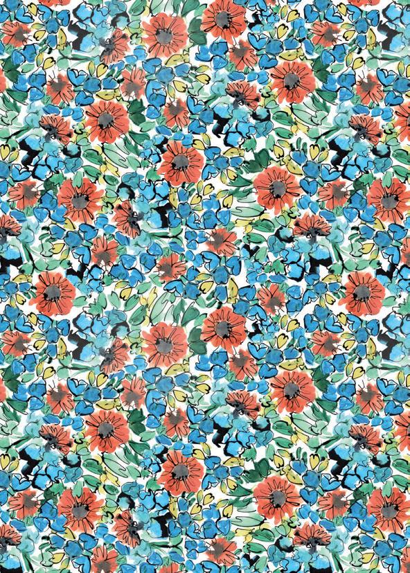
I’m an ex-drama teacher of 20 years turned artist and surface pattern designer. Leaving the education sector has been incredibly rewarding, allowing me the time and space to create art, find my style and develop my passion for turning my vibrant and joyous watercolour and ink paintings of (mostly) flowers into loose, expressive and joyful surface patterns. The process from beginning to end brings me the most incredible amount of joy, something I hope is reflected in my art and patterns! I want to provide a one-stop shop for joyful art and patterns for your home, clothes, wallpaper—everything! I’m right at the start of my journey, but I’m so excited for the road I’m travelling on.
janehodgkiss.com
@jane_hodgkiss_art
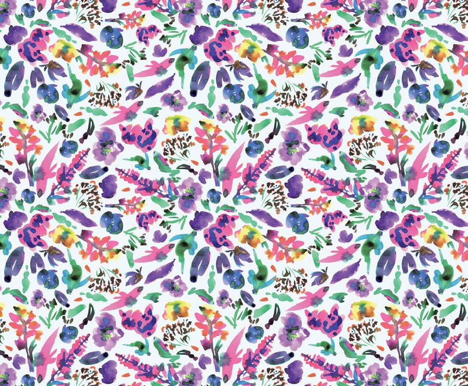
Angela Windin
SAN FRANCISCO, CALIFORNIA, USA
Since childhood, I have obsessively loved animals, explosive colour and the soothing— almost hypnotic—effect of pattern. I still have the illustrated animal encyclopedia I would lovingly thumb through for hours on end. As I grew older, I slowly began to forget what brought me joy. Around, let’s say, middle age, I picked up a paintbrush. Painting became an outlet for remembering and helping others to remember that joy is always there—we simply need to look for it.
A couple of years ago, my friend decided to “reboot” her career and asked if I would share a booth with her at a local street fair. My first reaction was, “I don’t have anything to sell!” But then I thought, “Why the heck not?” I made several items, but the strongest reaction was to my paintings. From there, my art practice took off. I work in acrylic paint because it feels accessible, but I fantasize about experimenting with all kinds of mediums: alcohol inks, oil, pastels… oh, the things I will try!
angelawindin.com @koiperdesigns

uppercasemagazine.com ||| 11
THIS IS A LOW RES PREVIEW OF A HIGH QUALITY QUARTERLY PRINT MAGAZINE
PLEASE SUBSCRIBE
first one. But none of that really matters because the entire time I was drawing, I was full of joy. Real joy. The kind I can’t believe is real—that the feeling I am always chasing is here, right now, swimming inside me.
OCTOBER 2023
I bake a cake for my older child’s third birthday. I spend a week thinking about how to make it into a collaborative surprise for her: how can I create a cake that is for her and also a reflection of her. In the end, I bake and decorate a cake inspired by one of her paintings. I am inspired by her relentless ability to listen to herself: she keeps the line that connects her heart to her mind clean, clear from self-doubt, fear of failure or what anyone else thinks.
NOVEMBER 2023
I read online about a friend’s daily poetry practice and ask to join. The friend responds with joy and enthusiasm, welcoming me with open arms. Now, I write a poem each day. Here I am: a person who writes poetry. Like me, my poems are not good or bad; they just are. I am. A person. A poet.
DECEMBER 2023
After the baby goes for her nap, I sit down to respond to emails. Each email is an invisible thread that connects me to someone else—often, a person on the other side of the world. The fact that something I wrote put me in dialogue with a person I’d otherwise never have met: this is a great victory, a sign that yes, vulnerability and dedicated craft can carry you to another place.
JANUARY 2024
I’ve created only a few paintings in the past six months, and the ones I am most proud of are of myself and my children. I feel inspired by them and by myself, a feeling I have not held before. My creativity is beginning to well up inside me, a balloon carrying me to places I have never known. The more I blur the lines between my work and my life, the easier it is to make more.
FEBRUARY 2024
My oldest wakes up sick and I know any plans of productivity are out the window. This resignation sets me up for success. I find myself present through the tears, the laundry, the crackers and the soup. Although I don’t
have anything tactile to show for it, I used my creativity to practise something notoriously difficult for me: letting go.
MARCH 2024
I’ve spent plenty of time griping about being our family’s cook, but now that my oldest is becoming less picky and my youngest is eating solids, I vow to make it fun again. I find a new recipe for walnut meatballs, and let my intrigue call the shots. I follow the recipe loosely and rely instead on my creativity and common sense. Years of making art have made me more comfortable with failure—it will either work or it won’t; life will go on. The recipe comes out perfectly, which it almost never does, and I enjoy it more because of that.
APRIL 2024
I write an essay about friendship. In the last few months, I have written mostly for myself—to capture moments of my fleeting days to feel more grounded, less swept away by feelings of immediacy, of urgency. These days, my creative energy is finite, a realization I used to mourn. Now, I feel grateful that I am forced to choose how I spend it, forced to find the meaning in each project—and forced to walk away if it simply isn’t there.
My year at home is nearly over. In a few weeks, my youngest will begin daycare a few hours a week, and in the fall, she will attend full time. The biggest lesson I have learned over the past year is that dividing myself is just that: dividing myself. The biggest mistake I made was assuming that less time for my work meant less time to nurture my creativity. When I stopped drawing a line between myself as mother and artist, I stopped feeling so internally conflicted—and the more adventurous my art became.
Over the last 12 months, creativity stopped living in my studio and made itself at home in my kitchen, in the living room, inside the picnic lunches I arranged for my children. When I consider the past year, I am proud of all I’ve managed to accomplish—but I am primarily grateful for how I feel: steadfast, confident, in pursuit of the work I love and that moves me. While I know my creativity will ebb and flow, like all natural waves of the human spirit do, I trust that once again, I will know where to find it.
meeralee.com
14 ||| UPPERCASE
|||
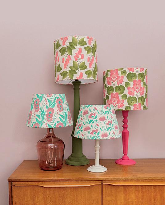
lampshades
Stencil Print Joy
British surface pattern designer Megan Carter licences her designs commercially to the wallpaper and textile industry as well as to stationery clients.
Recently, she has been experimenting with creating bespoke patterns using stencil printing onto fabric. “I’ve been keen to do this as sustainably as possible using eco friendly printing inks printed onto organic cotton,” she says.
Megan’s particular interest is in bold, colourful floral prints. “I’m particularly influenced by different historical design movements, favourites including the Arts and Crafts Movement, Art Nouveau and Art Deco.”
“The joy of working away from a screen and back to a hands-on, slow creative process has been life giving! I am now working with a local upholsterer and seamstress to make the prints into homeware products to sell locally.”
megancarterpatterns.co.uk @megemlew
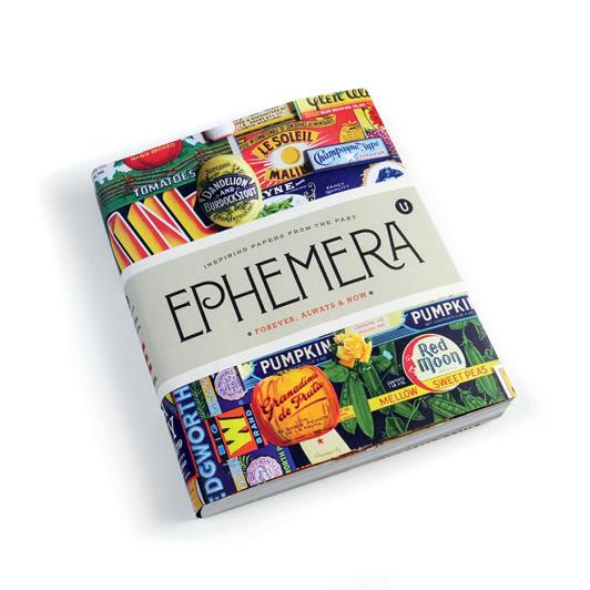
book Ephemera is recently reprinted. And look for our newest title, Notions uppercasemagazine.com
STOCKISTS
Support a local stockist! uppercasemagazine.com/stockists
Issues Magazine Shop
Issues Magazine Shop is a magazine retailer in Toronto, Canada. We carry hard to find, independent magazines from around the world. Despite shrinking magazine stands and the ascendency of digital everything, Issues is here to prove that reports of print’s death are greatly exaggerated. Pop in to peruse your favourites among industry types. Linger to chat and discover new titles.
issuesmagshop.com @issuesmagshop
uppercasemagazine.com ||| 15
TREND
domestic bliss
THIS IS A LOW RES PREVIEW OF A HIGH QUALITY QUARTERLY PRINT MAGAZINE PLEASE SUBSCRIBE
how to charge
STORY BY arianne foulks
ILLUSTRATION BY andrea d’aquino
It can be hard to set pricing for your work and charge what you are worth, whether you provide a service or sell products. You want to charge what seems “fair,” and you want to position yourself correctly among your competitors. You want customers to continue to purchase from you, and of course, you want to earn a living.
Many small creative business owners, especially women, are undervaluing their work. If you, like me, are your own boss, you may be in an enviable position in which you can decide how much money you make. Why are we so hesitant to charge what we are worth?
Your ability to charge more increases when you have been in the same line of work for a while. You need to provide a high-quality product or service, and it helps if you have a steady stream of customers. You will find that you may have a hard time growing your business if you are undercharging from the start.
If you sell products that can be bought elsewhere, you need to be careful not to overcharge, or people will find a cheaper price online. If you sell products you design and have manufactured yourself, you have more ability to experiment with pricing. |||
The benefits of charging what you’re worth
Let’s explore why charging what you are worth is crucial for the health of you, your business and your industry:
Perceived value: Charging more generally increases your perceived value. Customers associate higher prices with better quality, allowing you to position your brand as a premium choice. Of course, you have to back this up in reality.
Adding value to your industry: When many businesses in your industry undercharge,
20 ||| UPPERCASE BUSINESS
what you’re worth
THIS IS A LOW RES PREVIEW OF A HIGH QUALITY QUARTERLY PRINT MAGAZINE
SUBSCRIBE
PLEASE
using your money responsibly
STORY BY marnie hawson
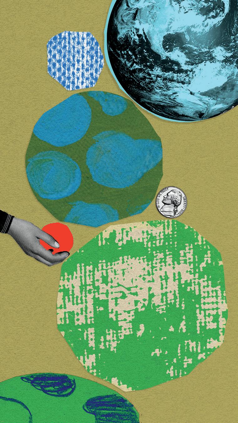
We all use money in business and in our personal lives. What we do with our money, whatever the amount, can make a powerful statement. How we use money can generally be divided into five main areas: income, banking, super, spending and giving. We covered spending (i.e., our supply chain) in the last issue, so let’s explore other ways we can make an impact with money.
Income
It is important to consider a fundamental question: where is our money truly coming from? The answer can vary significantly depending on our industry. For those of us in business-to-business sectors, we often have the freedom to choose our clients, which allows us to align with those who are committed to bettering the world. However, if you operate in an industry that caters to consumers, this control might not be as direct. In either scenario, it is crucial to reflect on who is ultimately financing our operations. Are these entities contributing positively to our planet, or are they harming it?
For those in a position to choose their clients, implementing screening questions for potential clients can be an effective strategy. Although categorizing prospects is not always straightforward, establishing clear criteria for collaboration can help steer our decisions towards more ethical and sustainable practices.
A tangible step towards this goal is the commitment to refuse to work with fossil fuel enterprises. Numerous organizations worldwide have pledged to this cause, notably among creative, communication and advertising agencies. These pledges often
22 ||| UPPERCASE ECO
|||
ILLUSTRATION BY andrea d’aquino
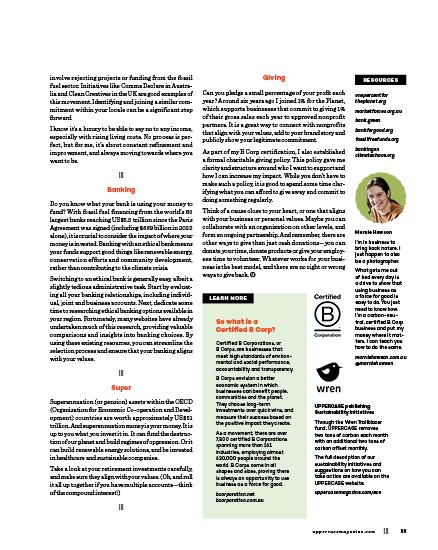
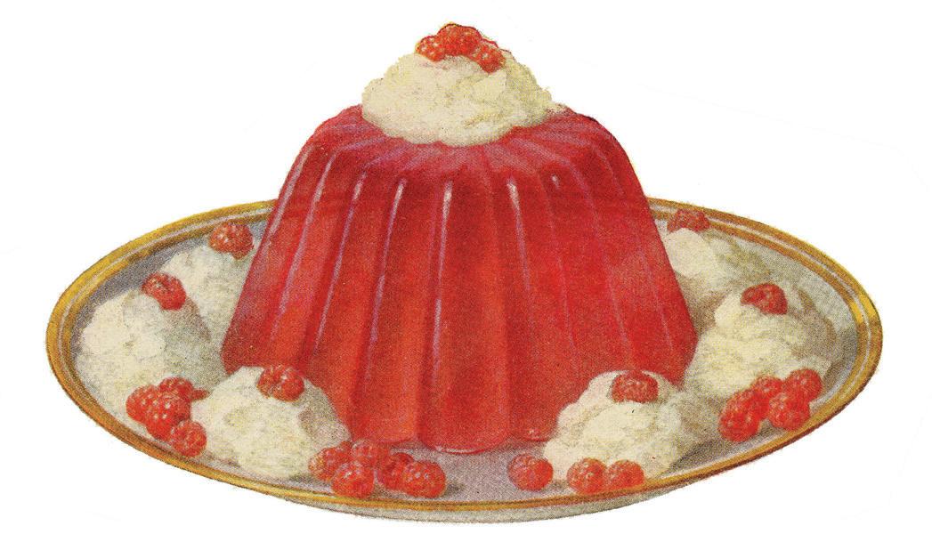
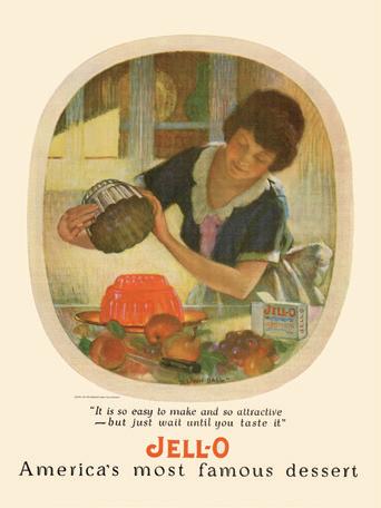
the shelf life of JELL-O
COLLECTION OF mark e. sackett
24 ||| UPPERCASE EPHEMERA
|||
The last 150 years have produced many products and brands that we still use every day and see every time we go into a store, and brand recognition plays a large part in how we choose and view products on the shelf. Every day, we are bombarded with advertisements which inundate us with brand associations, from the shape and look of a package to a particular ad campaign.
One easily recognized product that has grown and evolved over the last century is the shiny, wobbly concoction now known as Jell-O.
Before it was branded as Jell-O, this product consisted of plain gelatin and started out on the tables of the wealthy and royalty. Gelatin is produced from collagen found in boiled animal products, and large amounts of expensive meat by-products are necessary to produce it. Grandiose displays of coloured gelatin, moulded into wondrous shapes, were served less as an edible meal than an impressive exhibit of wealth.
Things changed in 1897 when a carpenter named Pearle Wait experimented with various ingredients, attempting to create a cough suppressant and tea laxative. After adding sugared fruit syrup to granulated gelatin, Wait created a bright, flavourful and much more palatable concoction that he named Jell-O.
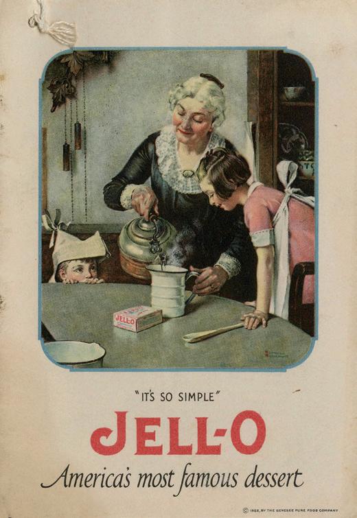
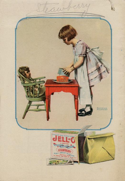
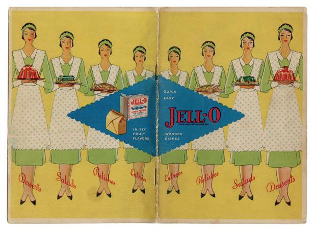
From these beginnings, the company selling Jell-O sought to promote a family-friendly image, with particular emphasis on household togetherness. This idea of idyllic domestic unity factored heavily into early advertising, further cemented by illustrations made by famous 20th-century artists such as Norman Rockwell. Part of the success and popularity of Jell-O was due to small recipe folders that were placed inside boxes with instructions for Jell-O preparation. These folders preceded recipe-booklet premiums, which contained colourful product images, tricks, tips and new creations. These booklets emphasized the variety of impressive-looking, easy and affordable dishes families could make, regardless of their geographic location or socio-economic situation.
uppercasemagazine.com ||| 25
26 ||| UPPERCASE
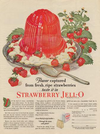
According to an early ad campaign, Jell-O was at home on any table anywhere.
As the brand grew and times changed, so did the advertising approach. During the late 1920s and early 1930s, Jell-O advertising embraced the clean, sophisticated lines of the Art Deco period and sought to market to a new, modern consumer. Booklets and advertising of the time emphasized how perfectly Jell-O fit into the lives of a fashionable set. The shining jelly appears on luncheon and dinner tables as salads and vegetable aspic, always surrounded by young, beautiful people— dancing or hosting stylish gatherings. During this time, the original four flavours of lemon, orange, strawberry and raspberry were expanded, with the addition of the shockingly green flavour of lime, a flavour that highlighted the ability to consume out-of-season fruit during the fall or winter.
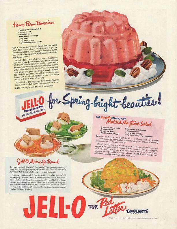
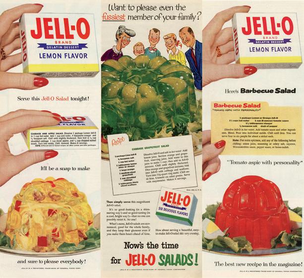
This period was closely followed by a shift to thrift and resourcefulness, while the buying public dealt with an economic depression and the following world war. Jell-O had an advantage over other foods, as it was cheap to produce, making it ideal for budget-strapped customers and wartime rationing. Some women, now spending the majority of their day working outside the house in jobs vacated by men, could come home from their busy day and quickly and economically feed their families. Working families could also preserve rationed fruits and vegetables longer when adding them to gelatin meals.
After the war, the thrifty housewife still turned to Jell-O for meals and entertaining. Advertising now focused on the convenience of Jell-O products in a world inundated with new inventions, claiming to make the work and life of a housewife easier. Impressive and attractive dishes could be whipped up quickly for dinners, church socials and picnics, which was emphasized through the bright photo advertisements of the 1950s and 1960s.
As decades passed, Jell-O continued to grow and adapt to the times through the introduction of new products and attempts to appeal to diet-conscious consumers of the late 20th century. Through the long history of the product, the Jell-O package has remained primarily the same. The small white box with large, red block letters—varying only slightly in typographical style—is both instantly recognizable and a source of nostalgia for generations of consumers. As an ad campaign from the 1940s stated, “Always look for the big red letters on the box!”
theboxsf.com
uppercasemagazine.com ||| 27
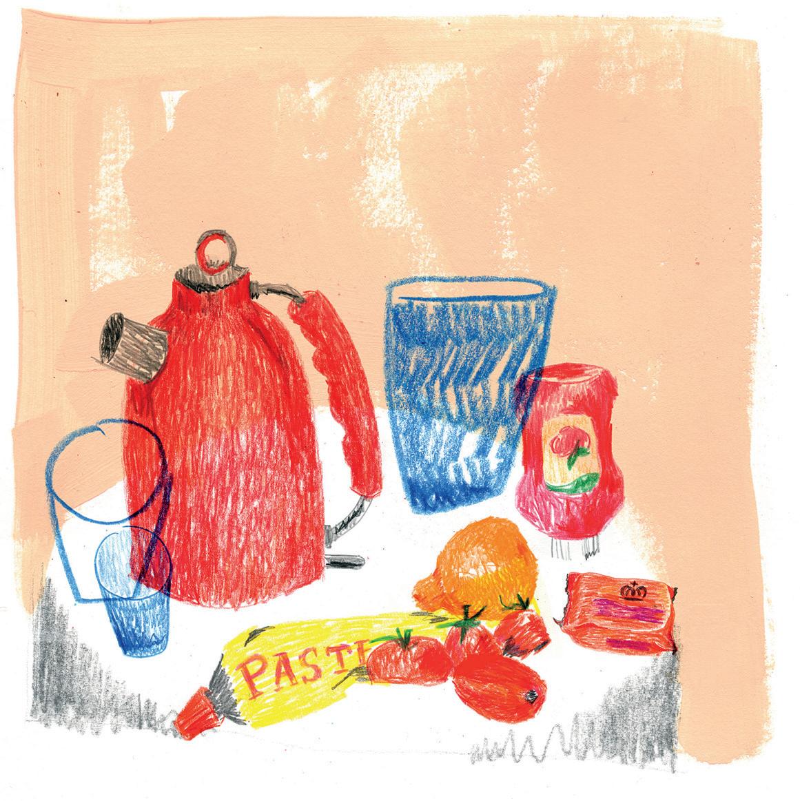
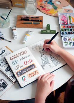
“Pasta, a small word for a universe of shapes.”
—RACHEL RODDY, A–Z OF PASTA
pasta
28 ||| UPPERCASE ORIGIN
sha p es
THIS IS A LOW RES PREVIEW OF A HIGH QUALITY QUARTERLY PRINT MAGAZINE
PLEASE SUBSCRIBE
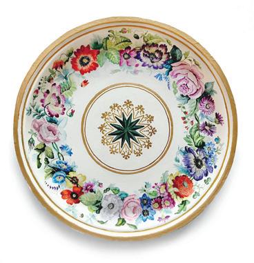
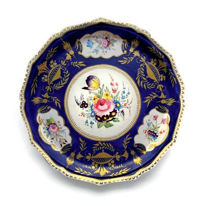
Art & Design
doing the dishes
artists who are inspired by dinnerplates
32 ||| UPPERCASE
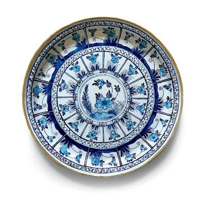
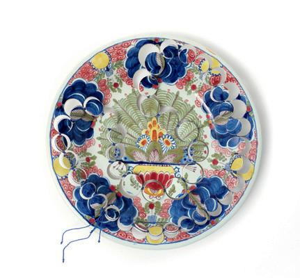
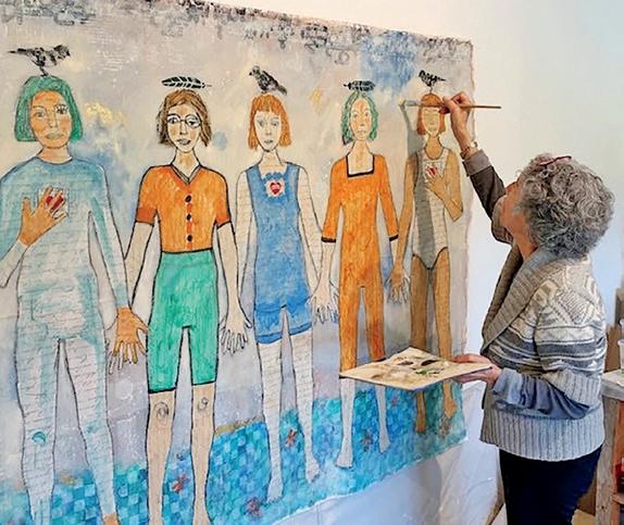
helen swanton
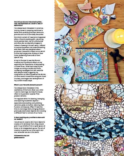
Please tell us a bit about yourself.
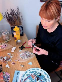
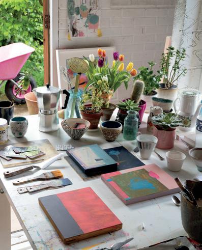
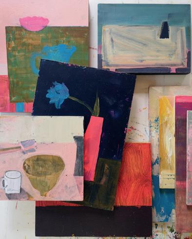
I’m a mosaic artist based in London, and for me, my art is all about colour and creating stories. I’m lucky to work in a studio that’s part of a creative collective in Wimbledon. There’s a great atmosphere amongst the artists. We encourage and inspire each other, sharing ideas, materials and techniques.
My studio benefits from a lot of natural light and is a mass of colour. On a sunny day, light pours in, illuminating a kaleidoscope of colours against the bright white walls.
Born into a creative family, I’ve always loved making. A career in recycling and sustainability increased my awareness of the waste of resources in society. This drove a passion to explore how previously used materials can be transformed in a sympathetic and sustainable way to become uplifting, unique mosaic art.
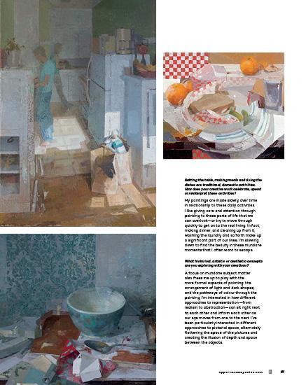
Setting the table, making meals and doing the dishes are traditional, domestic activities. How does your creative work celebrate, upend or reinterpret these activities?
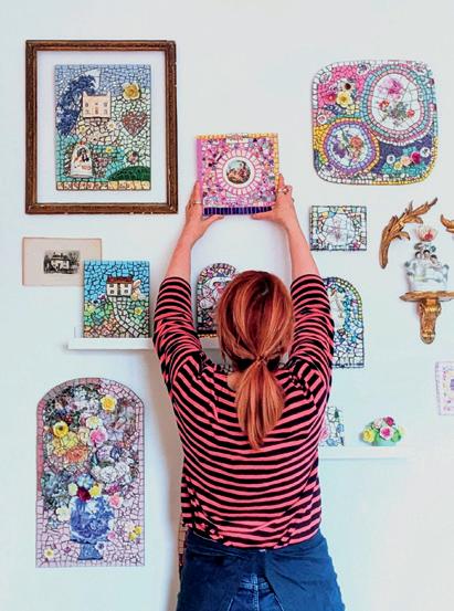
The preparation and sharing of food is tangibly linked to happy memories, often of close friends and family. A cracked plate or cup can be so easily discarded, a seemingly insignificant loss that severs this thread to these precious experiences, losing these memories forever.
My art seeks to mend these fragmented memories. I always consider the initial purpose of the item, how it might have been used and by whom. From there I move to consider colour, shape and texture before designing a finished piece which celebrates the original find and preserves the memories. The final piece can now continue to bring joy to a new home in a purely artistic form.
uppercasemagazine.com ||| 33 COVER ARTIST
What historical, artistic or aesthetic concepts are you exploring with your creations?
At the centre of everything I create is a belief that the old and broken pottery I source has not reached the end of its life, but can continue as an object purely to be enjoyed for its artistic aspect. Some of my pieces give a historical nod to Victorian and Georgian times, perhaps with a hint of the Baroque, often reflecting sentiments as accurately as they did then.
I’m always aware that each piece of crockery has a history serving previous generations. I like to think that my art reflects the cheerful yet careful values of their previous owners. I hope that by creating new mosaics I’m preserving some of the happy experiences whilst remaining true to the less abundant times in which they lived.
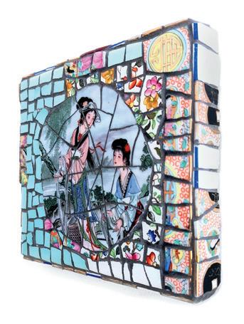
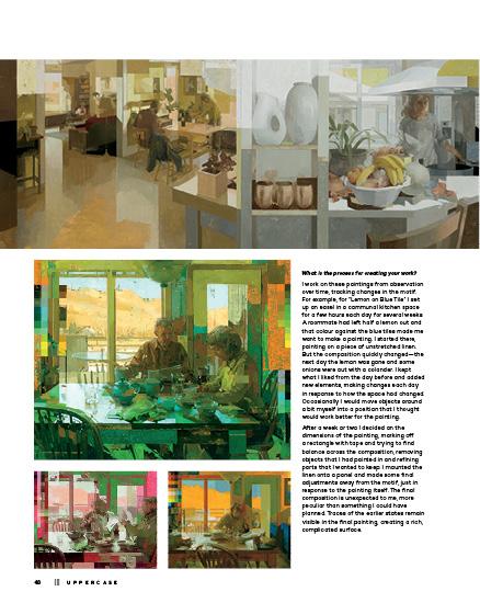
What is the process for creating your work?
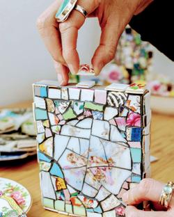
“Every piece tells its story” is my belief. Pretty much every piece of work I create is inspired by an initial piece of ceramic that I find or purchase. I’ve collected ceramics for my work over many years and always hope to see plates, dishes and cups reused where possible. Friends donate items and I regularly find a small collection left outside my studio door from fellow artists and potters.
My pieces can form around a central image or be of an abstract design. Then I consider whether it should have a playful, calming or upbeat theme. Making my pieces colourful and uplifting is always important to me.
The ceramic pieces are then positioned on a recycled wooden base and always contain a few quirks to reflect life’s unexpected events. Often I incorporate small found objects to create a more three-dimensional image to enhance the story. I avoid symmetry and uniformity, as I don’t believe it accurately reflects life’s path.
I use carefully selected pigment colour for the inlay material to heighten the design, message and emotion. The final polishing process then enhances colour, depth, detail and texture, and breathes vibrancy into the piece, revealing its full story and restoring its value in the home.
34 ||| UPPERCASE
A LOW RES PREVIEW OF A HIGH QUALITY QUARTERLY PRINT MAGAZINE
THIS IS
PLEASE SUBSCRIBE
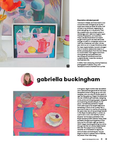
elizabeth hamilton
Please tell us a bit about yourself.
I am originally from outside Boston and relocated to Philadelphia to attend the Pennsylvania Academy of the Fine Arts. There I received my MFA, and since graduating I have shown at museums and galleries throughout the United States. My work centres on personal narratives that focus on grief, domestic life and relationships. All my pieces are shaped by the concepts that inspire them, so I don’t define myself as a sculptor or collage artist. Instead, I feel open to using whatever material holds the most meaning in relation to the topic I’m exploring. Sometimes that might be found objects or it may be a collage drawing.
The thing that had the most intense impact on my practice was becoming a mother. It drastically changed everything, from my perspective on life to how I work and even the kinds of materials I use.
I’m lucky enough to have a studio in my home, but since my children are young, I often find myself working at temporary art stations around my house. Becoming a mother was something I desperately wanted and I’m grateful beyond expression to have my two children. But there’s a brutality to motherhood that I couldn’t grasp until I started living it. Everything is more intense yet precious. So many everyday decisions seem both more and less important and I’m grateful I have my art practice to help me process the experience.
Setting the table, making meals and doing the dishes are traditional, domestic activities. How does your creative work celebrate, upend or reinterpret these activities?
Domestic life has been threaded into my work for years. My grandmother was the centre of my world growing up and our home seemed like her kingdom. Much of my work about her relates to how she spent her days; it involves the domestic
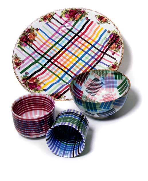
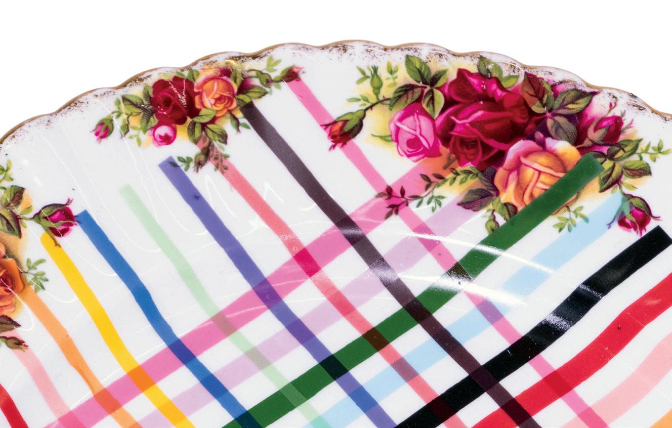
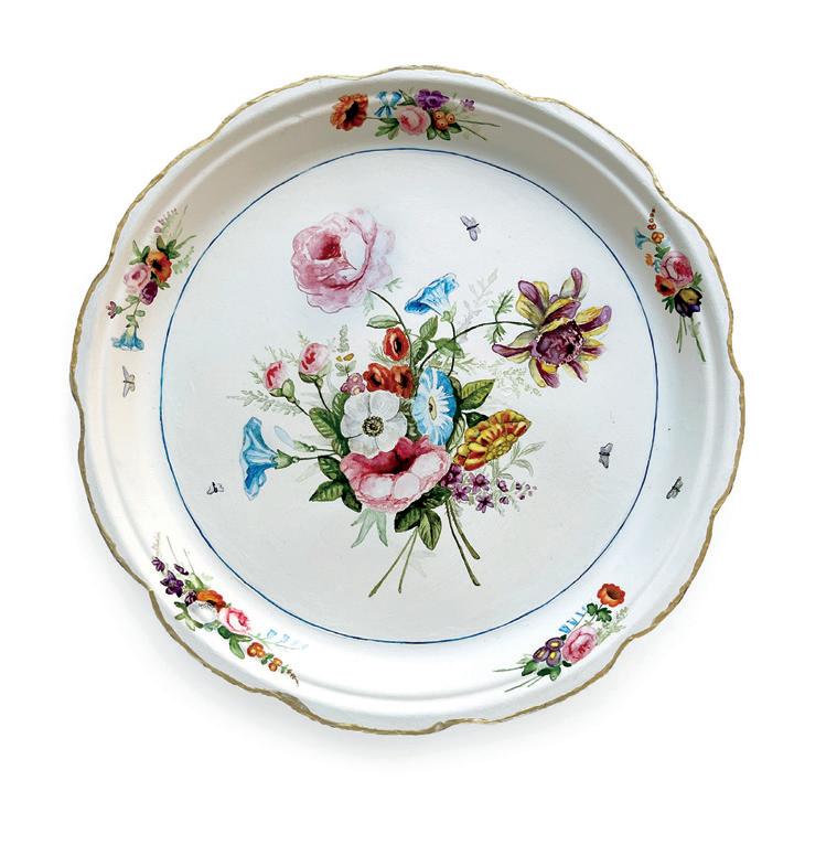
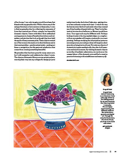
Because the paper plates are limited to standard sizes, I have to make an adjustment for each plate to scale the existing designs up or down. I spend some time studying the design then do my best to draw it as accurately as possible before I start with colour. Painting in general, and watercolours in particular, wasn’t part of my art practice before this project. There was a decent learning curve in the first several pieces, so much so that I redid a few of them, because after I built up some techniques, those early ones just looked too terrible.
Watercolours continue to be a challenge for me, but this series fits perfectly into my current studio needs. I can work on them in spurts, and unlike with some projects, 10 minutes here and there can really show some progress. Working full time and having two young children means I just don’t have long stretches of hours in the studio, but Private Collection makes art making possible even during those seasons when I’m squeezed for time.
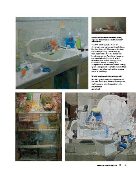
How did you become interested in plates, cups and dinnerware as a motif or area of exploration?
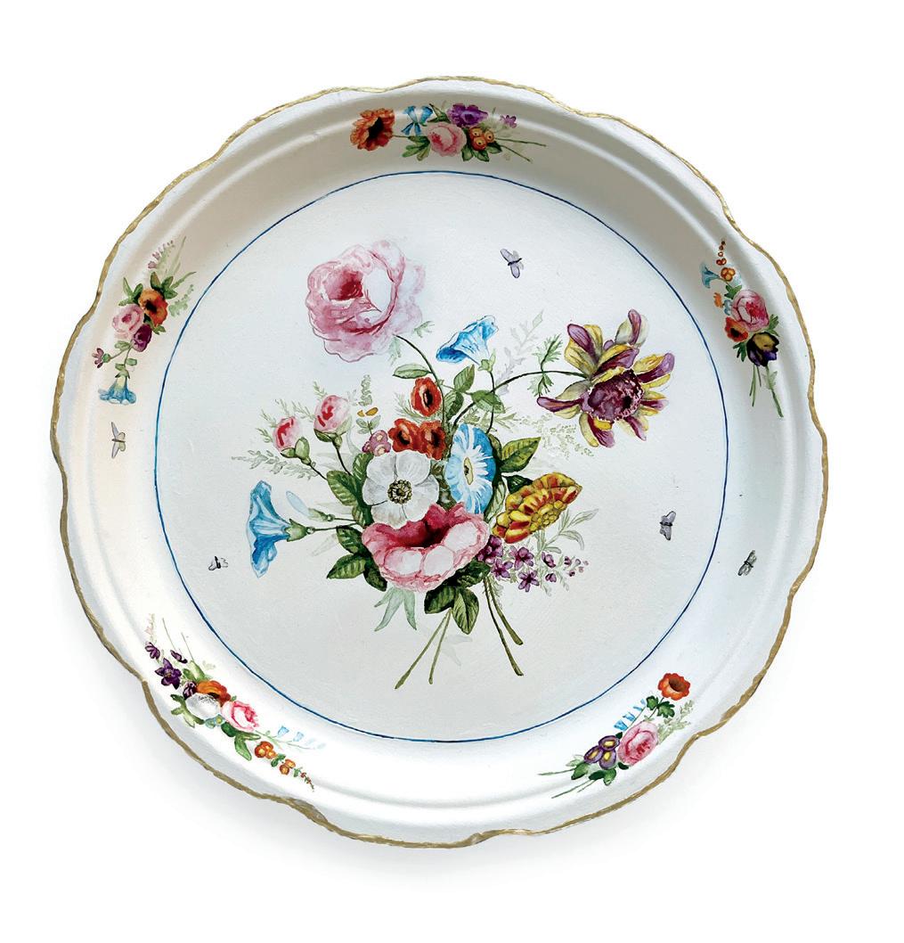
I used to work in conservation at the Philadelphia Museum of Art and would clean their large collection of European decorative arts. I became fixated on the plates—so many stunning, floral pieces of dinnerware that had the most intricate bouquets. Partly why I was drawn to them was that my grandmother, who inherited nothing from her parents, had bought herself a small collection of six mismatched floral teacups. The Private Collection series started as a way to question the value of those museum pieces and also to reinvent the story of my grandmother, in which she had a large collection of beautiful, mismatched English and French dinnerware that had been passed down to her.
What is your favourite domestic pursuit?
If “domestic pursuit” relates to housekeeping, I don’t have a favourite chore; I kind of hate all of them—maybe because I do them all in perpetuity and yet the piles never decrease. What I have tried to do lately is reframe how I see stains, damage and the mess. I’m so grateful to have a safe home, to have a place where a childhood is being formed. So I tell myself that the evidence of childhood, like spills, clutter and tiny socks littered throughout the house, is temporary and precious.
elizabethmhamilton.com @elizabethmhamiltonart
38 ||| UPPERCASE
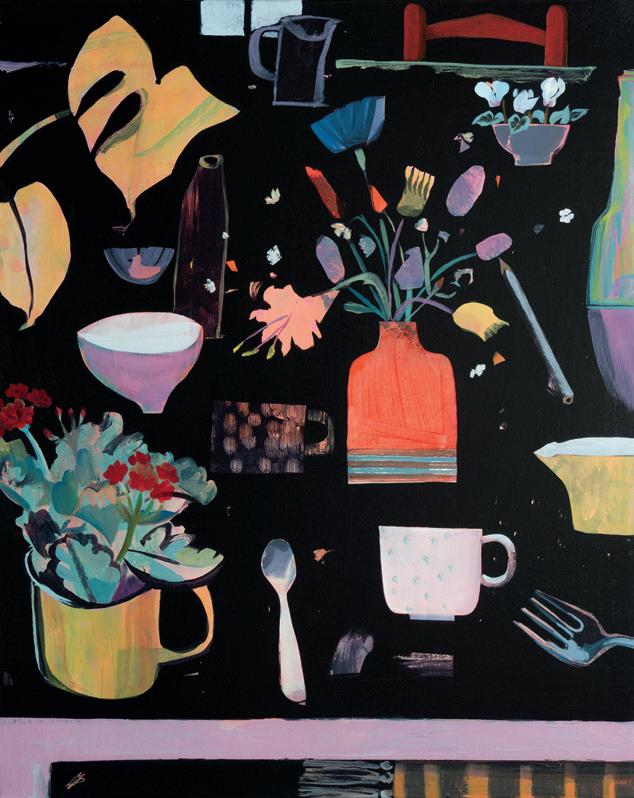
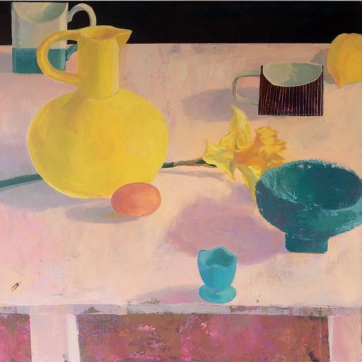
40 ||| UPPERCASE 2 3 4 6 5
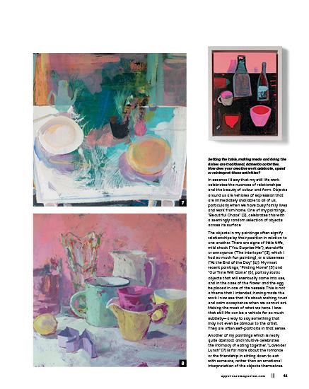
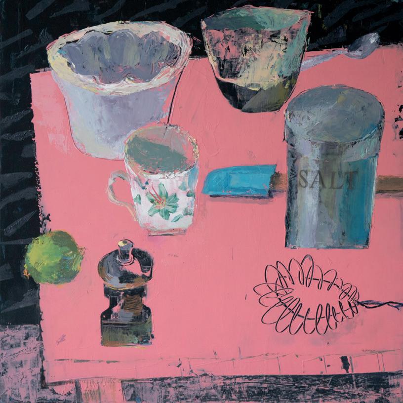
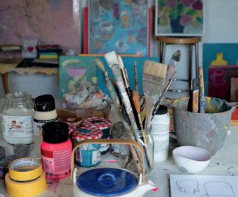
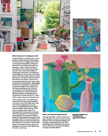
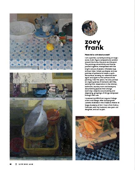
Cooking utensils have such contrasting shapes and the modern ones have fun colours, too. I could go so much further with them in the future. They lend themselves to boldness and yet some are challengingly delicate. A couple of years ago, while on camera for my experimental still life course, I had to move quickly to draw a whisk through thick, pink paint into a black background [9]. Fortunately it worked!
Many of my paintings are quite straightforward and are painted for simple reasons. For example, “Cookie Cutter” [8] was created as an exploration of colour for ESL, so I chose objects from around my home which I loved, first for their colour and secondly for their shape. There was no deep meaning in their placement or their relationship. I also wanted to explore painting predominantly with palette knives for this work.
What historical, artistic or aesthetic concepts are you exploring with your creations?
The older I am and the more aware I am of art from years gone by alongside contemporary art, the more my own view—that we can paint what we like, how we like—stands. I view all my work as experimental. Perhaps I may explore an aspect of the still life genre historically and play with an idea that it sparks, but I don’t feel that’s necessary. My own processes, and becoming more clear and investigating my own ideas, will, I think, keep me busy for the rest of my life. I don’t feel the need to be overly intellectual and referential. What I do feel is very rewarding is writing about and considering my own work. I don’t do this enough.
I paint intuitively and observationally, often combining the two approaches. This, coupled with all the options there are in the paint application itself, is a lifelong adventure.
42 ||| UPPERCASE
9
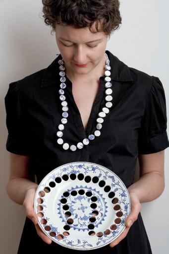
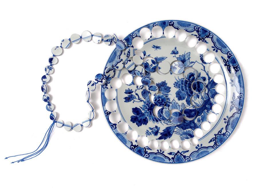
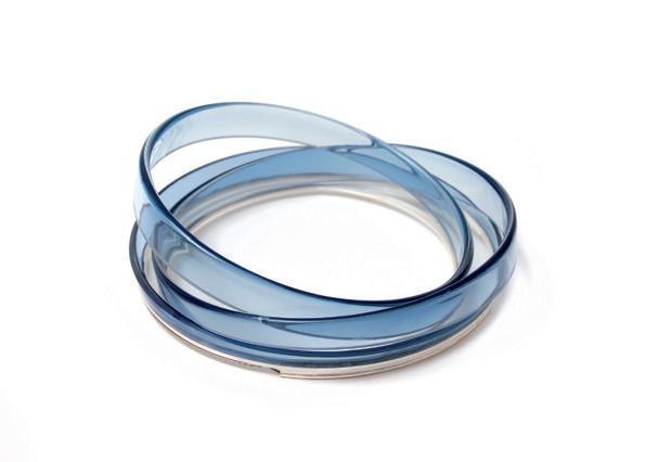
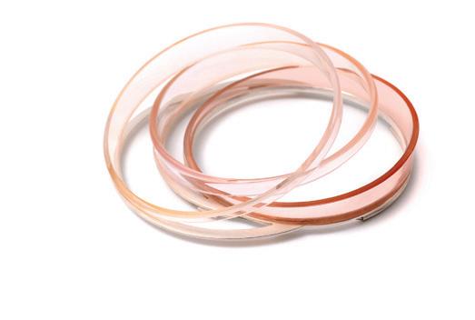
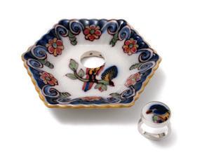
gésine hackenberg
Please tell us a bit about yourself.
I’m a jewellery artist based in Amsterdam, originally from Germany. Along with my solo practice, I teach metalsmithing classes and conceptual jewellery making. And I also have my family.
In my artistic work, I like to explore the boundaries of traditional jewellery. It is an ongoing investigation of how jewellery relates to everyday life and domesticity. In a way, my practice became a means of connecting to what touches me in life, like a kind of glasses for looking around me—a lens with which to express my passions and fascinations. Because my work interacts with different disciplines and concepts, I use a wide range of techniques and materials that tell their own stories of preciousness.
Setting the table, making meals and doing the dishes are traditional, domestic activities. How does your creative work celebrate, upend or reinterpret these activities?
I believe that the essence of jewellery is rooted in very basic human needs and concerns. Domestic and food culture speak about identity, values and how we handle daily life. During my career, I’ve developed various bodies of work related to tableware, preparing, eating and celebrating life in different ways.
My first collection, Spoons, Spoons, Spoons, celebrated this commodity as a tool and companion for life, to nurture physically and mentally. My Ceramic Jewellery collection, with necklaces, rings and earrings cut out of crockery and antique ceramic ware, plays with the sentimental value of ceramic items. The piece of jewellery takes along a familiar aura from the original object to be worn on the body, whereas the perforated object serves as a natural home for the jewellery.
In my Still Lifes series, I cut designer and vintage glasses and rearranged them into compositions for the body. Similar to paintings from the Dutch Golden Age, my still lifes depict collectibles of personal value and pride. The body acts as the display, just like a canvas did before.
In the Daily Delicious series, I translated fruits and vegetables into jewellery, conjuring images from the classical decorative arts as well as from our everyday contact with these natural products. The sensual pleasures entailed in our everyday interactions with them— like shopping, peeling, preparation and eating—invite us to celebrate the little things in life, play with fruit and vegetables, and adorn ourselves with their splendour.
In other collections, my jewellery tends to act more as a metaphor for mental states. Objects or domestic materials and techniques become a means to express and reflect on emotions. For example, Falter Not Fall projected my feelings onto balancing and tumbling glassware during a period of severe illness. My last collections, Slowdown and Of Birds and Clouds, emerge from the pandemic period as a time of radical retreat into the private. They speak about life that slowed down fundamentally, expressed in the technique of embroidery. Observations of my immediate domestic and urban surroundings found their way into my pieces.
44 ||| UPPERCASE
What historical, artistic or aesthetic concepts are you exploring with your creations?
My artistic practice is driven by a certain curiosity about how jewellery and everyday life intertwine. Objects of daily use often become loved and indispensable to people. What one owns and saves often has a sentimental meaning apart from its practical function or value. Possessions, especially personal treasures, define and represent their owner.
Jewellery is an outward sign of values that are deeply rooted in the wearer, of what people cherish, what they believe or what they desire. Wearing jewellery becomes, in this sense, the most intimate and direct form of expressing a specific relationship to an object and its inherent meanings. All kinds of domestic objects can speak about aspects beyond.
Historical details about objects, as well as classical topics of art and jewellery history, serve as a chief source of inspiration for me. But at the same time, it is important to me that those topics relate to my own contemporary context and experiences. The private intermingles with the universal and is recognizable. It allows for identification for a wearer and viewer.
What is the process for creating your work?
My works are based on traditional craft techniques combined with a range of materials such as (precious) metal, existing tableware and ceramic clay, glassware, textiles and in the past Japanese urushi lacquer. My materials of choice come from the domestic sphere and tell their own stories about preciousness and adornment. Materials and processes to me are always loaded with their context. Sometimes I also use existing objects as raw material—you can call it reuse or recycling. I also transform their message by referring to inherent associations.
A new body of work usually starts with a fascination with a certain material, item or craft technique, on the one hand. On the other hand, there is an interest in a certain topic or datum. With these two elements, I try to build up a visual playground for myself that allows me to explore different facets. In the end, my aim is usually to develop a new collection with several jewellery pieces, rarely a single autonomous piece of art.
How did you become interested in plates, cups and dinnerware as a motif or area of exploration?
My love for tableware in ceramics or glass originally stems from my grandmother, who owned several service sets for different occasions and a collection of Delft Blue show pieces. Her motto was to use these treasures in daily life. My father took on her love, and like that, I was simply brought up with it. My family was the first seed for constantly looking out for nice or special pieces of dinnerware, first for personal use, but later also as material for my work (as a justification for my collecting mania). Since living in the Netherlands, I also use hunting in antique and thrift stores or on the Internet to explore Dutch material history. I always research the styles, dates, décors, designers and companies of the objects I purchase. It teaches me a lot about my country of choice and its habits.
What is your favourite domestic pursuit?
One of my main goals is to make my home a pleasant and safe haven, a resting point for my family and myself. Living in a city can be pretty challenging. I like to surround myself with special things full of stories and made with love and care that are meaningful, thoughtful, curious, sustainable and beautiful. (I hate plastics.) It is also important to me not to surround myself with too much stuff so that I can breathe in my own space. I would like to apply similar characteristics to my jewellery pieces. They should matter to the wearer and still stimulate and beguile the senses.
I like that my practice speaks to women’s experiences by addressing domesticity and everyday life. I love exploring the aesthetics and possibilities of everyday materials and, along with that, the territory between ornamentation, functionality and values. I truly hope that I never stop learning about new aspects.
gesinehackenberg.com @gesinehackenberg

uppercasemagazine.com ||| 45
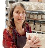
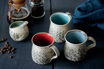
kari ceramics
Please tell us a bit about yourself.
My name is Kari Ytterdal. I am 59 years young and I enjoy life together with my beautiful family. I grew up with nature around me, on a small island in the south of Norway. In 1993 I studied art and sculpture at Avni Institute of Art in Tel Aviv, then travelled a lot and “landed” in Amsterdam. Though Amsterdam is now where I live and have my studio, we still travel quite often to stay in touch with family and nature.
Around 2016 I decided to go online with my pottery and things changed for the studio. I grew slowly yet successfully, and now my 200-metre-squared studio is always bursting with activity and I have four assistants working with me, as well as my partner and two children, who also are involved part time. The customers and the restaurants I work with are located all over the world, and the fact that I can provide joy for so many people with my pottery makes me very humble and grateful.
Setting the table, making meals and doing the dishes are traditional, domestic activities. How does your creative work celebrate, upend or reinterpret these activities?
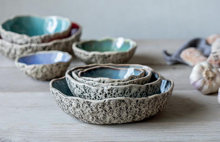
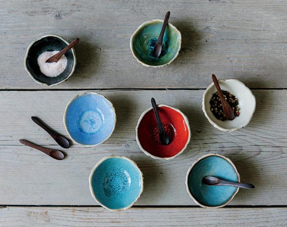
I would definitely say my work both celebrates and reinterprets these activities. What I create is unique. In my ceramics, especially in my collection Organic Stone, which is very organic and inviting to touch, you will find the grounding feeling of nature, as well as an aesthetic and a tactile appeal. All senses are involved; it elevates the celebrations, and reinterprets the “ordinary” moments. In other words, doing the dishes becomes an entirely different story when you are drying off a piece of art. Setting a table with a handpicked selection of handmade pottery will almost feel like a curation rather than a daily task. What I receive most compliments about is how these pieces of functional art change the experience of food, of plating, of eating, of enjoying a meal.
50 ||| UPPERCASE

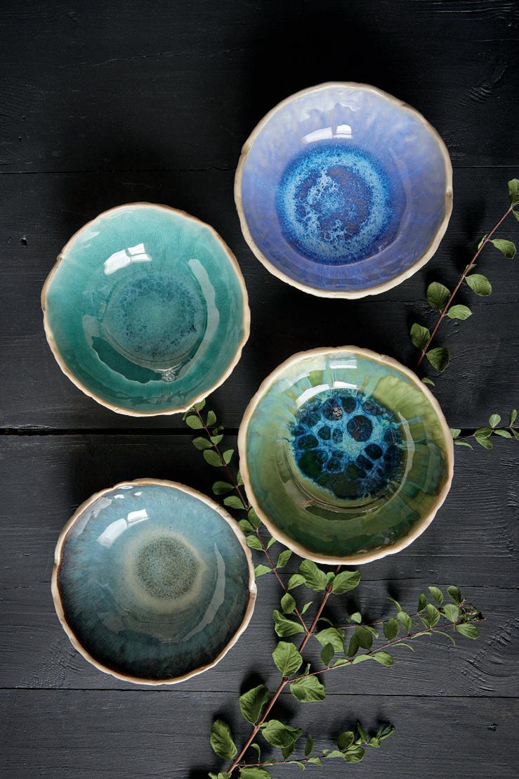
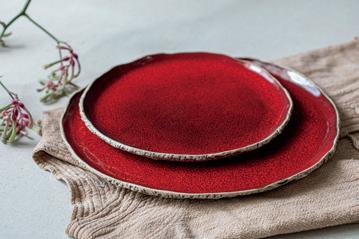
What historical, artistic or aesthetic concepts are you exploring with your creations?
The first thing that comes to mind is Scandinavian design. Though traditional Scandinavian design is more minimalist, due to my heritage I am intrinsically linked with and inspired by the concept of natural materials, durability and quality. From there I start exploring with the clay: Where do art and functionality meet? How could the organic forms be brought into everyday life? I think in a historical perspective; now more than ever people are easily disconnected from nature, you might even say from their true nature. When we surround ourselves with natural objects it helps us ground ourselves and find that connection again. I create my pottery with the intention to be part of that reconnection.
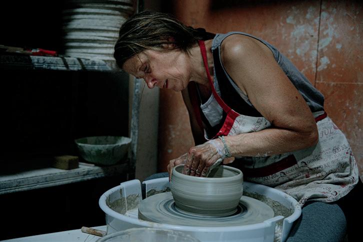
What is the process for creating your work?
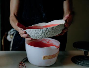
Most of the pieces I make are for my collection Organic Stone. The starting point is raw clay. The next step would be shaping, and for this I have different methods, depending on the piece I am working on. Each piece is made either on the potter’s wheel or hand shaped using clay slabs on moulds. While the clay is still soft, I apply very detailed work by hand to create the organic, stone-like effect on the exterior. Pieces will thereafter stand to dry before going to the first fire in the oven. The next stage is decoration and glazing. I apply several layers of food-safe ceramic glazes to create the designated colour. In some cases this is a calming and matte colour, yet for others it is a special combination that will result in eyecatching bursts of colour. Before the final fire, I sign each piece with my signature. As I now have very talented and dedicated assistants working with me in the studio, this also is a confirmation that I had the final touch on each piece.
After glazing it will be fired again in the oven around 122°C/223°F to ensure superior quality and strength. The duration of the fire is decided by the exact colours that are being made. Each glaze has different needs when it comes to temperature, placing in the oven and fire program. The total time of this last fire—including cooling down—will take two full days. Now only the final check and sanding the bottom is left before we send the pieces to their happy new owners.
uppercasemagazine.com ||| 51

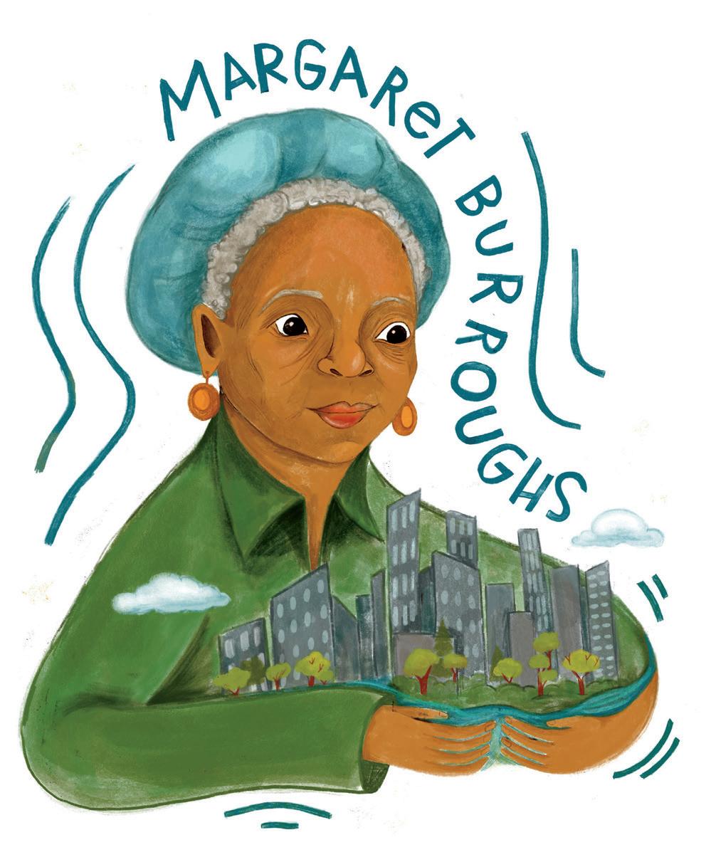
spilling the tea with T
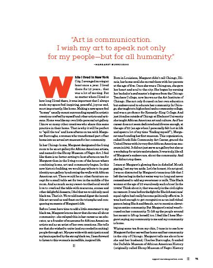
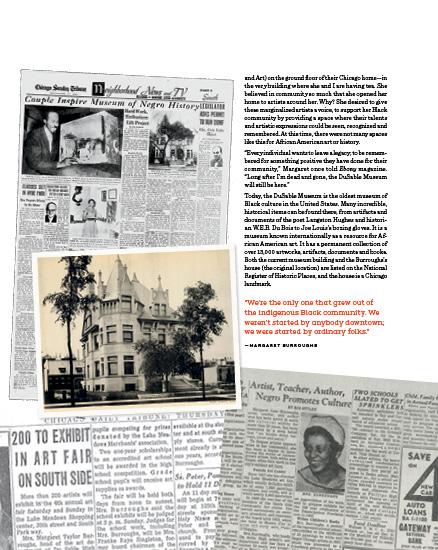
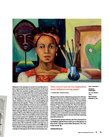
an imagined conversation with visual artist, poet and arts organizer margaret burroughs
70 ||| UPPERCASE
||| STORY AND ILLUSTRATION BY tamisha anthony
TEA WITH T
|||
Saratoga Brunch
Cheryl Chalmers
ITHACA, NEW YORK, USA
On a brilliant summer day I visited the local farmers’ market to pick a variety of flowers and fruit for inspiration. Near our backyard pond, I quickly set up my still life in direct sunlight. I am fascinated with sun on glass, so I placed a beautiful blue Saratoga water bottle into my scene. I wanted the viewer to share the intensity of colour and light, to feel the heat of summer and the joy of a picnic. Growing up in California, I am drawn and moved by dramatic sunlight and shadows.
CherylChalmers.com
@cherylchalmersart
Plant 22
Greta Songe CORALVILLE, IOWA, USA
Green leaves permeate all of our spaces. Layers of pattern and colour, elements added and taken away and a hodgepodge of unrelated parts come together harmoniously. This is definitely reflective of my creative process and how I try to move through the world. I love finding unexpected connections, matching up unrelated or disparate components and creating worlds where big, small, messy, neat, disarrayed and organized can all coexist. gretasonge.com @gretasongedesigns
River Notes
Carrie Tasman TANGENT, OREGON, USA
There is a story here. It is about a place I love in the Pacific Northwest. The flowers are native wildflowers: shooting stars, balsamroot, blanket flower and orange lilies. The fruits and berries grow in the Willamette Valley where I live (best strawberries ever!), and a view out the window where I walk my dog, and where the red-winged blackbirds hang out and the Willamette River curves away with a view to the Cascades.
carrietasman.com
@ctasman
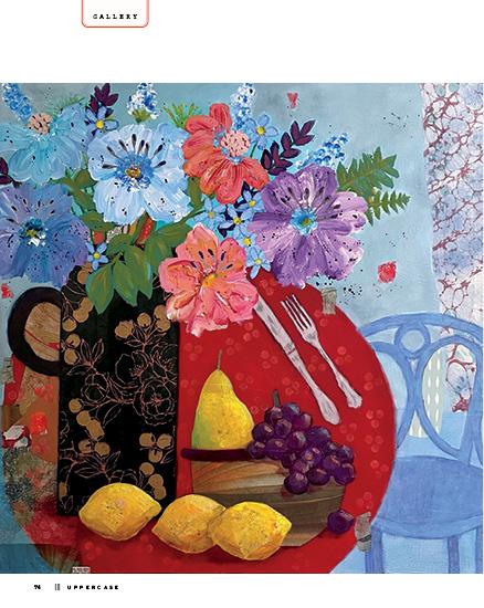
76 ||| UPPERCASE
THIS IS A LOW RES PREVIEW OF A HIGH QUALITY QUARTERLY PRINT MAGAZINE PLEASE SUBSCRIBE
88 ||| UPPERCASE Like a vase Bhargavi Rudraraju HYDERABAD, TELANGANA, INDIA The items captured in the illustration are part of my everyday life. They show what I do and what I see. Like a vase, I am in a place, doing my bit for a while every day; the rest of the time, I am just seeing things happen. bhargavirudraraju.com @bhargavirudraraju
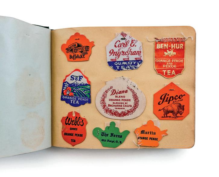

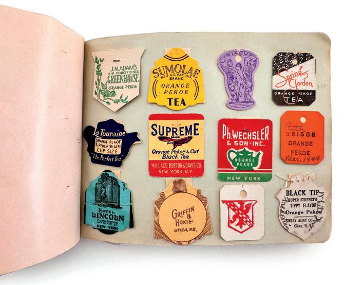
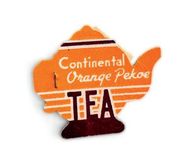
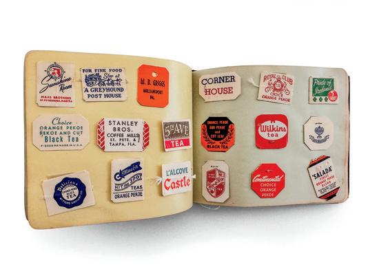
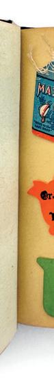
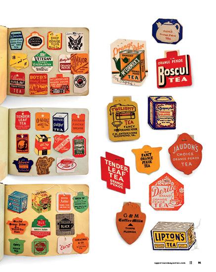
memorable teas a tea tag album
STORY BY mandy ross
This small album, created by an unidentified tea enthusiast, holds a collection of 362 tea tags gathered between 1937 and 1958. Arranged chronologically, the tags illustrate the evolving designs and styles of tea tags over the years. Most of the tags are attached using a stamp hinge, allowing them to be lifted for viewing details on each side. The album contains few handwritten notes, but some tags are labelled with city names and dates, with places in Southern California and New York appearing most often. Based on the selection of tags, the person’s tea of choice was orange pekoe. This book not only serves as a time capsule of design trends but also celebrates the joy found in a good cup of tea.

SCRAPBOOK
THIS IS A LOW RES PREVIEW OF A HIGH QUALITY QUARTERLY PRINT MAGAZINE
PLEASE SUBSCRIBE
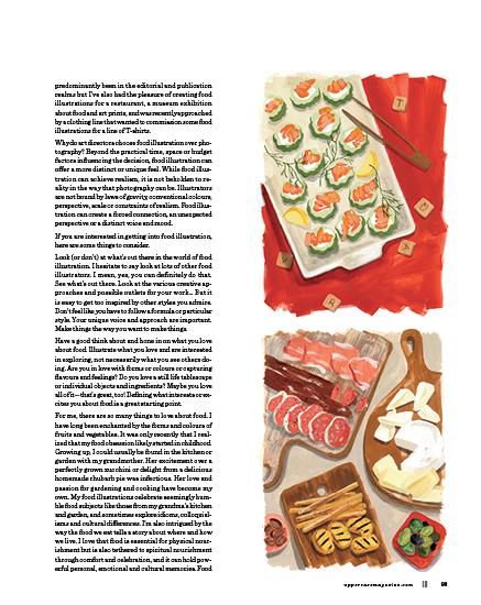
food! a delicious direction in illustration
Food illustration is surprisingly ubiquitous in today’s visual landscape—you probably stumble across it in your kitchen on a tea towel or serveware, at the grocery store on virtually every product or in a magazine as part of a recipe or feature article. From depicting individual ingredients to complete dishes, stages of recipes and complete meal or food scenes, food illustration also commonly appears in branding, in books and on home and paper goods. Illustrators focusing on this niche may also create food-related images for advertising, motion designs, websites, apps, exhibition designs, greeting cards, clothing, murals, art prints and more. My own experiences have
92 ||| UPPERCASE ILLUSTRATION
|||
|||
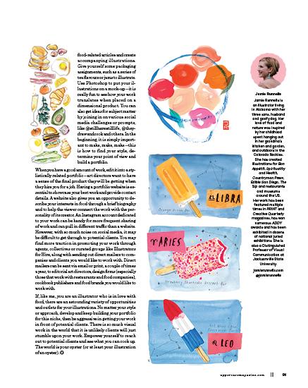
STORY AND ILLUSTRATIONS BY jamie runnells
106 ||| UPPERCASE
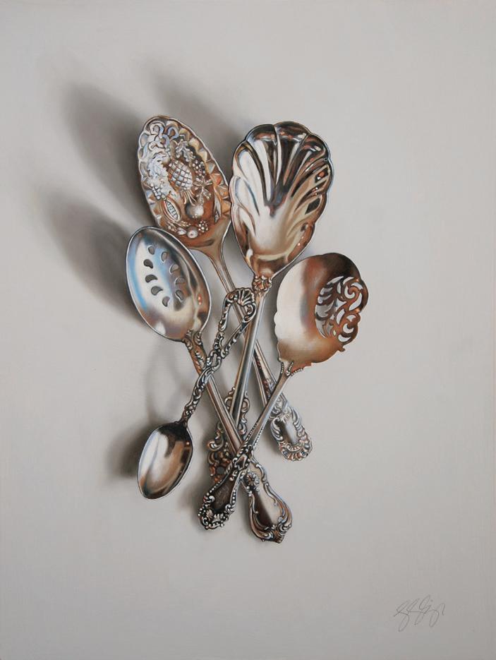
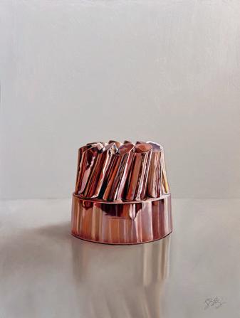
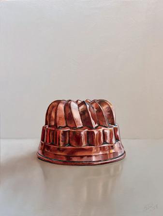
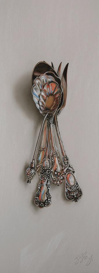
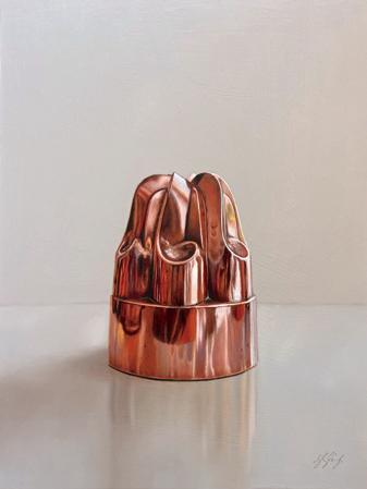
Objects of My Reflection
Leslie Lewis Sigler SOQUEL, CALIFORNIA, USA
My paintings of silver and copper heirlooms explore family objects as families of objects. Each object has its own unique story to tell, moments of polish and moments of tarnish. A series of portraits thus emerges whose enduring power and beauty reflect the depths of human character and the profound connectedness of shared history. Domestic objects made of precious metals—flatware, vessels, moulds, cutlery—have a kind of eternal life. They may age beyond recognition, but polishing them will soon recapture their original luster. The paintings stand as invitations to see life reflected as part of an evolving lineage that crosses generations and geography, connecting us all through time and space.
leslielewissigler.com
@leslielewissigler_artist
Home Portraits
Kerri Liu ELGIN, ILLINOIS, USA
Sculptural Knitting
Barbara Murak
GETZVILLE, NEW YORK, USA
Rags to Rugs to Art! The Journey of the Hooked Rug
Lisanne Mattioli Miller WELLS, MAINE, USA
The hooked rug had humble domestic beginnings: a utilitarian craft made from leftover rags and burlap. Images were crudely drawn, inspired by patterned plates, daily life and gardens—elementary at best. The 1960s brought a richness of flowers and pictorials full of detail, displayed on rugs, pillows, chair pads and wall hangings. Today, the domestic textile craft is an art form, from watercolour painting to tapestry—even 3D art, using dyed wools, yarns and tapestry threads. The plate becomes the inspiration!
wcushing.com
@lisannemiller1
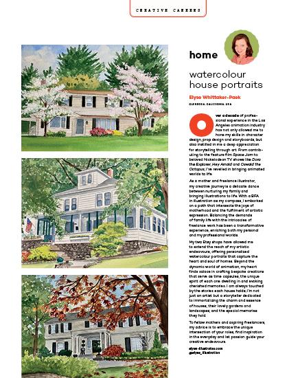
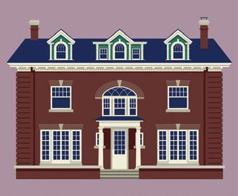
I’ve always felt very connected to the spaces I’ve lived in—whether it is an apartment, dorm room or house, I get a deep sense that existing there, for however long, I’m becoming a part of its history, and it a part of mine. When I moved to my town, I fell in love with the old homes, some dating back to the 1800s. I work out of my home as an illustrator, so it felt natural to start illustrating portraits of the historical homes in my neighbourhood. It was my way to soak in their beauty and also create something special for the people who lived their lives in them. A home sometimes feels like a beloved member of the family, so creating portraits feels like a way to honour that connection.
thegin.city @thegincity
Nanny, my grandmother, taught me to knit when I was 10; I’m now 76. At first it was the usual: mittens, scarves, then knitting for our kids—a christening outfit, sweaters, etc. I wanted to do something abstract and sculptural with my knitting. I turned once again to those tiny metal knitting needles from my grandmother—then an interesting new yarn and dozens of knitted sculptures over several years later. Whenever I knit, I feel her arms around my back, helping me hold the much-worn-off painted needles—the places where her own fingers held them.
uppercasemagazine.com ||| 107
The domestic arts: Wallpaper
Thérèse Cilia
LONG SAULT, ONTARIO, CANADA
The way we decorate our homes reveals so much about ourselves, but wallpaper in particular tells a more intimate story about how we want to feel in our private spaces—what’s important to us and what we’re inspired by. This is my current obsession.
To hone my skills, my project is to make as many patterns as I can in as many different ways. I’ve started with painted motifs and a working colour palette.
The theme is the backyard—take a small square section in the garden and observe all the activity. Take that lens and pause. Stop time and notice the intricacies of your natural surroundings. There is beauty in these structures of wildflowers, weeds, birds and insects. strawberrysnail.com @strawberrysnail
The enduring quality of furniture
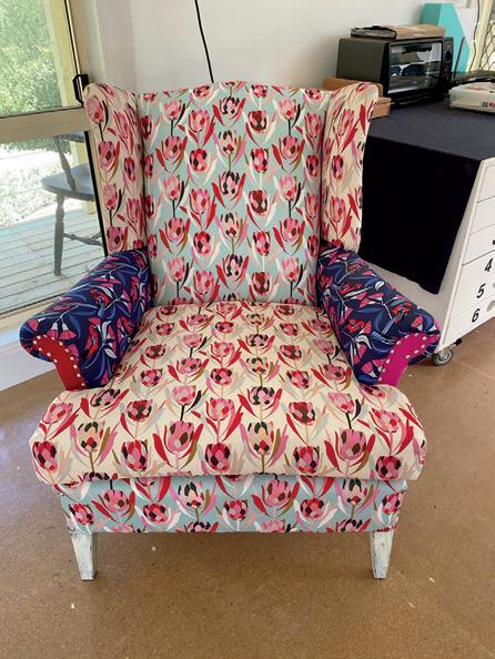
Lesley Walker PORTLAND, VICTORIA, AUSTRALIA
This old wingback chair was inherited from my husband’s parents when we were newly married and setting up our own home. I re-upholstered it in blue velvet when the kids were little. Now, they have moved away and it was time to breathe new life into a favourite. Jocelyn Proust’s protea prints seemed perfect to bring much colour and cheer to my happy working space. This chair holds stories of family life:
On the Table
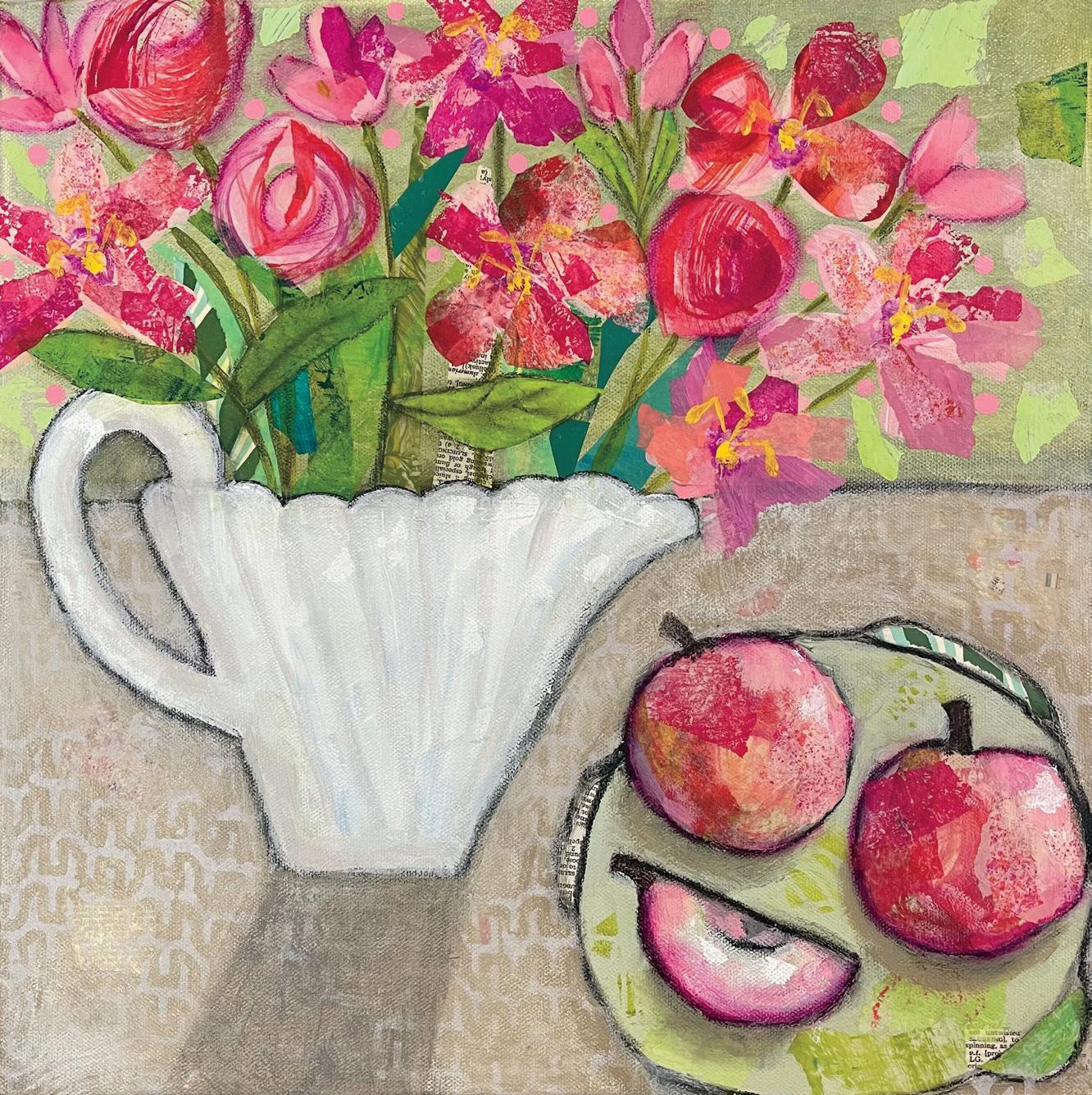
Lois Reynolds Mead
ORINDA, CALIFORNIA, USA
I started my art journey as a potter making functional work for tabletops. I was fascinated with form and function as well as texture and colour. After the pandemic hit, I was isolated from those in my family. I used the increased time at home to concentrate on painting and made huge strides and gained confidence in my techniques. However, the longing for family gatherings was intense, and Zoom holiday celebrations, although fun, did not fill the void. My collages began to focus on still life themes on tabletops. Treasured items began to appear: flowers my daughter sent me, a McCoy vase my mother left me, a Bauer pitcher from my prized collection, family silverware and mementos of my marriage. Memories of food, family and friends were collected on a two-dimensional plane. loisreynoldsmead.com @loisreynoldsmead
uppercasemagazine.com ||| 109
My Aunt Martha’s Sewing Box, Iron & Apron
Michelle Shain
PORT WASHINGTON, NEW YORK, USA
I remember my Aunt Martha sitting on her rocking chair, re-sewing a button onto Uncle Harry’s shirt. Or hemming his pants. Always by hand, never with a machine. Her stitches were even and fine. Then she would iron. Then bake. She always looked elegant doing it—hair and nails done, lipstick on. I miss her.
m44art.com
@m44art
Can You Find Joy in a Tea Towel?
Vanessa Lamarche
TIMMINS, ONTARIO, CANADA
I think so… just add bread, wine or a box of chocolates!
I create kitchen textiles, hand-dyed naturally with organic indigo. I envision my textiles taking part in family meals, from the preparation of the meal, the enjoyment and even the clean up!
borealblues.ca
@boreal.blues
Kitchen Table
Tarsha M. Gary HOUSTON, TEXAS, USA
I am a chef and urban farmer. In my professional capacities, I encourage people in urban environments to grow something they can eat. I recently started painting as a self-prescribed therapy and coping strategy to reignite my creativity after the passing of my mother. Little by little I’m rediscovering my artistic value and the beauty in the things I create, like growing, cooking, eating and now painting food. I’m turning in this submission as a way of saying, “I’m here and I’m going to be fine!”
ecotoneworld.com
@cheftarsha
Annette’s Mum
Mieke Daraei
GELDROP, NOORD BRABANT, THE NETHERLANDS
When my friend Annette emigrated from the Netherlands to Spain, she gifted me some tablecloths that her mother embroidered. I used one to make this apron. So her mother’s work can still be used and seen, like it was supposed to be.
112 ||| UPPERCASE
Artist-Mother Series
Carla E. Reyes
ASTORIA, NEW YORK, USA
The Artist-Mother Series explores the complexities and contradictions of motherhood and daily domestic life. The chosen scenes encapsulate the humour, bittersweetness, absurdity, irony, hidden longing and loss of self often unexpressed by many mothers due to social pressures and expectations surrounding motherhood. Physically, the mixed-media paintings incorporate relief texture and a strong emphasis on surfaces, as well as an interest in pattern and materials often associated with domesticity, craft, the “feminine” and children, such as textiles/fabrics, brightly coloured plastics and bubbly, fuzzy and plush objects.
carlaereyes.com
@carlacrafts
uppercasemagazine.com ||| 113
It’s in My DNA
Uma Sanghvi AUSTIN, TEXAS,
USA
This series is inspired by a love of textiles and colour—both of which I have my Indian heritage to thank for. India’s textiles date back at least 6,000 years and are still a huge part of our culture.
Even though I was born in the US, I grew up seeing my mom and grandmother wear brightly coloured saris and other traditional clothing. Our home was filled with vibrant Indian linens, rugs, tablecloths, wall hangings and textile art.
I love the three dimensionality of textiles—especially quilts and rugs. Even though they’re flat, they aren’t flat at all! And then there’s the sense of history. These pieces are made to last and are passed down through families. For all these reasons, texture is an integral part of my paintings.
Colour + pattern + texture = joy. umasanghviart.com @uma.sanghvi.art
moments
Amy ZuZu
KOHLER, WISCONSIN, USA
In my mixed-media art, I try to capture the love, the chaos and the peace of the domestic experience. Sometimes mundane and ordinary, sometimes electric, but always beautiful in the love expressed in the exhaustion, the juggling and the quiet moments—moments that ultimately lead to the complicated puzzle of who we truly are. @amyzuzuart
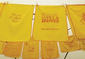
Domestic Dusters
Vanessa Marr
BEXHILL-ON-SEA, EAST SUSSEX, UK
My collaborative arts project, Domestic Dusters, invites women to embroider a yellow dusting cloth with their gendered experiences of domesticity. Established in 2014, the 700-plus collection is exhibited regularly in arts and community spaces. Dusters were selected as a metaphor for domesticity because as invisible cleaning cloths they share the status of so-called women’s work. The project uses craft to give women a voice where they are silenced, unheard or ignored, capturing experiences of caregiving, the mental load, gendered divisions of housework, displacement and other domestic responsibilities or hardships through words and images with humour and wit, sadness, frustration and joy. domesticdusters.wordpress.com @domesticdusters
Vicki Allwardt
MELISSA, TEXAS, USA
I love to paint functional items. Silver that no one wants to polish anymore is not hard to find. I prefer ones that are clean inside and useable. The pieces do not have to match, as the paint takes care of that detail. folkhearts.com @folkhearts
uppercasemagazine.com ||| 115
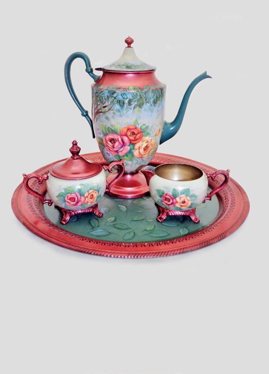
Woodland Roses Tea Set

THIS IS A LOW RES PREVIEW OF A HIGH QUALITY QUARTERLY PRINT MAGAZINE PLEASE SUBSCRIBE
subscriber studios
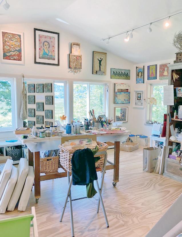
 Maria Esther Sund
OTIS, OREGON, USA
I am very lucky to have a wonderful studio with a view of the Salmon River at Cascade Head. Here is where I create my work while looking at the tide changes, rainbows and wildlife. I work with collage/ mixed media, incorporating old and new elements, using acrylics at the beginning, which allows for multiple layers of paint, glaze and other medias.
My studio is separate from the house, letting me leave my work until I come back to continue working again. I spend many hours creating and having fun working with three or more pieces at the same time. I like the exploratory process and try to work with new ideas. I leave the door open for a personal interpretation from the viewer. For me, the creative process is more fun and important than the finished result.
mariaesthersund.com
@mariaesthersund
Want to be featured?
Submit your studio story!
uppercasemagazine.com/ participate
STUDIO
Liita Forsyth
In 2010 I opened The Little Bits Workshop as a makerspace for kids. We started with four kids a week and now we serve 125 a week through after school art and craft workshops. I also have used this space as my personal studio when kids were not taking classes. However, it’s hard to always have to put everything away. So this summer, I converted one of our three garages out back into my own personal studio. Somehow kids have expanded into it, too, and I’m still cleaning up all the time to make room for them! But this time, this space is mine first. We are a busy workshop and growing constantly. I am also an art teacher so I use my workshop constantly to develop projects for my 225 students.
thelittlebits workshop.com
@morningmoonam
Abbey Sy
Hello! I’m Abbey Sy, an artist based in Berlin. I love to document my life and travels in the pages of my sketchbooks and journals. Over the years, I’ve worn many hats, as a designer, author of seven books, public speaker and stationery shop owner. Currently, I have a lovely community online on Patreon, share my ideas and inspiration on the Internet and host workshops on creative and travel journaling. When I’m not at work, I’m usually exploring a new city or hanging out by the local park with
a book and a coffee. I designed my workspace to take up half of my bedroom, by the window, as I love natural light when it comes to working. It’s a space where I allow myself to make art, explore and brew ideas. By the shelf are housed books and magazines that inspire me, as well as my collection of completed journals. On my main desk I edit videos, design graphics and write up essays, usually carried over from a trip or when I’ve been in transit. It may not be big and spacious, but it’s perfect for the type of work I do, and it’s a beautiful extension of my creative personality.
abbeysy.com
@abbeysy
uppercasemagazine.com ||| 127
BERLIN, GERMANY
RIVER FOREST, ILLINOIS, USA
looking forward
Volume N: Notions
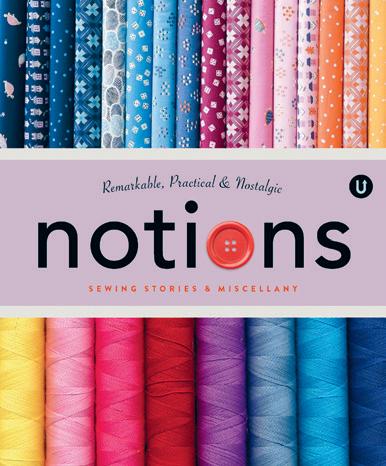
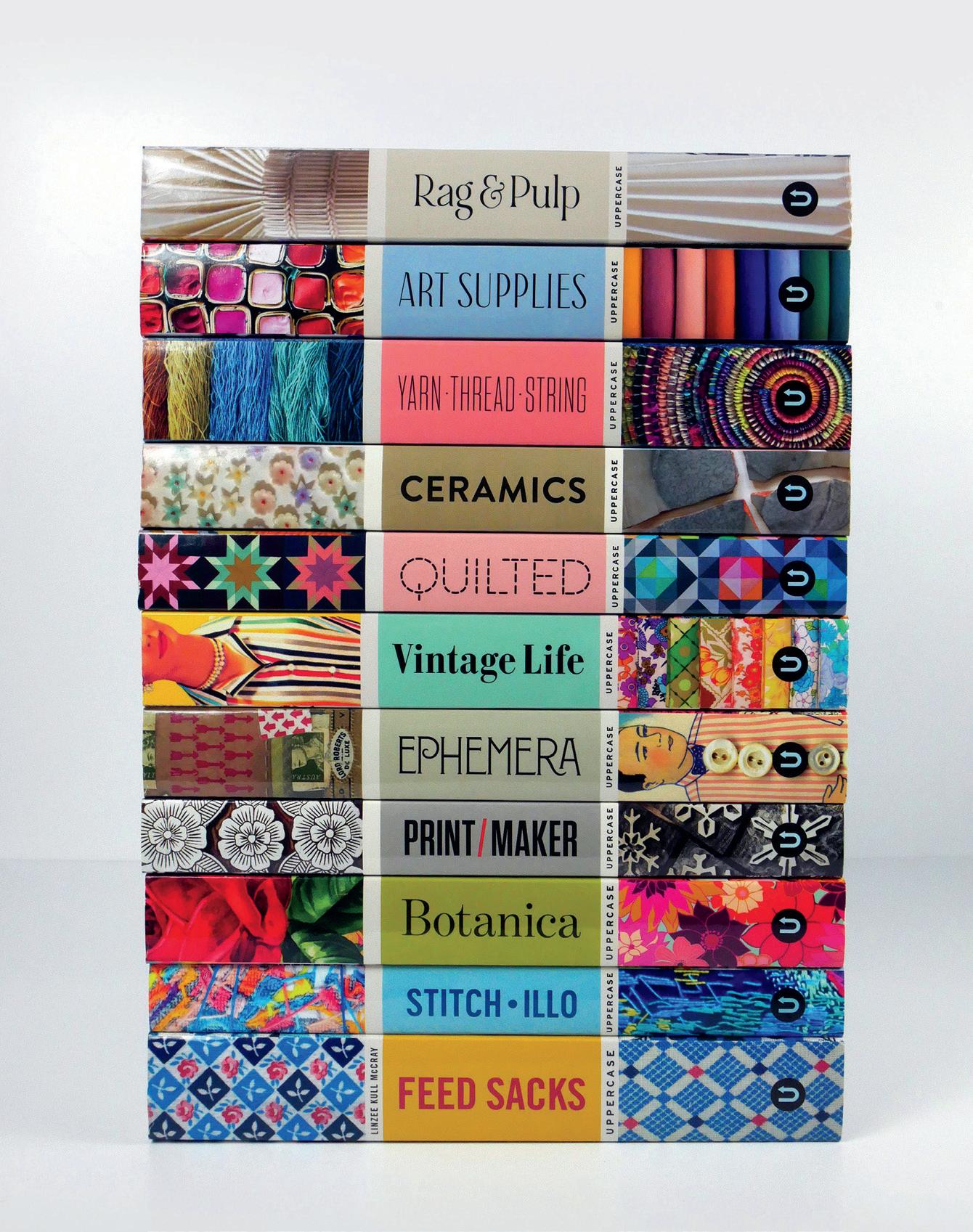
Notions celebrates the remarkable, practical and nostalgic tools and accessories of sewing. With sewing stories and miscellany from textile artists, fabric designers, quilt pattern makers, quilt shop owners, haberdashers, inventors and entrepreneurs, Volume N in the UPPERCASE Encyclopedia of Inspiration is an entertaining and illuminating A to Z of sewing miscellany.
uppercasemagazine.com/volumeN
Volume G: Glue
This volume will be all about collage, assemblage and other sticky creative pursuits! Auditions to be profiled in the book will be announced in the UPPERCASE newsletter and on the UPPERCASE website.
uppercasemagazine.com/volumeG
Sign up for my weekly newsletter for behind-thescenes updates and the latest on open calls for submissions for UPPERCASE books and magazines.
uppercasemagazine.com/free
UPPERCASE magazine
#63 October-November-December 2024
#64 January-February-March 2025
#65 April-May-June 2025
#66 July-August-September 2025
Pitch your article ideas and suggestions anytime!
uppercasemagazine.com/participate
Circle
Make connections, nurture your creative spirit and grow your business!
The UPPERCASE Circle is a vibrant community hub, one that is a valuable source of motivation, inspiration and encouragement for like-minded and kind-hearted creative people from around the world. Although the community is initially brought together by its support for and appreciation of UPPERCASE magazine, the Circle will enhance your experience of all things UPPERCASE while providing additional value to your creative life through conversation and the sharing of knowledge.
• Connect with members of the UPPERCASE community— both near and far—who share your interests.
• Share your work with your peers, mentors and potential customers.
• Find inspiration, motivation and new perspectives.
• Move your creative business forward with tips, tools and support from peers and guest experts.
• Videos, behind the scenes and more!
Access to this community is FREE when you subscribe to UPPERCASE magazine!
uppercasecircle.com

128 ||| UPPERCASE CIRCLE
Have you made something with the subscribers’ kraft envelope or reused the magazine or postcards in an interesting way?
Please share your pictures and stories of my books, magazines and fabric on Instagram: @uppercasemag #uppercaselove

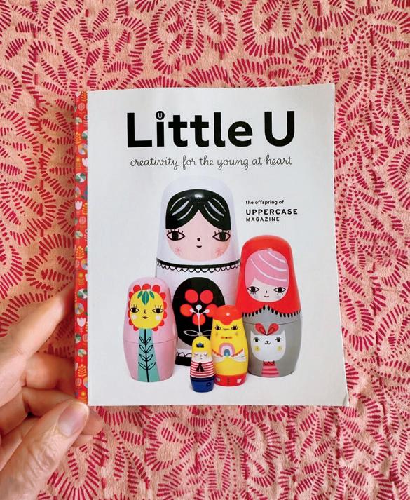
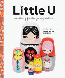
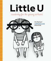
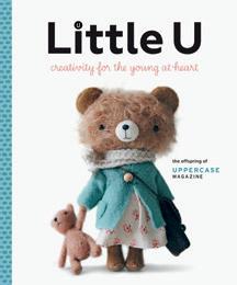
Little U raises money for UNICEF
Little U, the offspring of UPPERCASE magazine, is a magazine/ book for the young at heart. (Think of it as a smaller and cuter version of UPPERCASE!)
Since 2018, Little U has raised over $38,000 for UNICEF. This year, 100% of sales are donated to UNICEF’s humanitarian aid in Gaza, with $14,000 donated so far. littleumag.com

@hatcreekquilts
SHARES
@judithmariaart @thethriftymushroom @bookbindingwithcass
@artbarblog
STORY AND PHOTO
andrea jenkins
BY
let there be lamps
Idon’t know when it happened exactly, the moment I went from casual lamp enthusiast to diehard lamp evangelist. Maybe it wasn’t so much a moment as an evolution. I have always had a thing for lamps, even as a kid, but somewhere between childhood and middle age, I doubled down. Last week, I walked into a local coffee shop, took one look at the bleak overhead lighting and walked right back out. I did not hesitate, not even for a second. Huh, I thought. So this is who I am now. Which, frankly, should have come as no surprise, as I have been yammering about the crimes of the overhead light for years, forever lamenting its ghoulish effect, the way it flattens everything in sight and sucks the life out of the room. The very first thing I do when we move into a new home is remove all bulbs from the ceiling fixtures, thus eliminating the chance an unsuspecting visitor might reach for a switch and subject us
all to even a few seconds of what my children have affectionately dubbed “the devil’s light.” A few years ago, in an attempt to meet overhead lighting halfway, I invested in a beautiful bentwood pendant to hang in our dining room. But even the most exquisite fixture could not bring me around, could not make the overhead light feel like anything less than punishment. I removed the bulb from that fixture too, and as a result, what now hangs over the dining room table is merely a sculpture.
In my defence, I am not alone in my devotion. This is not a new or controversial take. Recently, the Internet exploded over this very subject, and while there were two camps, disdain for the overhead light (or as the Internet deemed it, the Big Light) was overwhelmingly dominant, with defenders of the overhead clearly in the minority. Personal preferences aside, recent research also lands in favour of the lamp: overhead lighting has been shown to trigger headaches and mess with circadian rhythms. I can’t say that I’m surprised. And maybe now it won’t seem so strange when I tell you I have taken to travelling with a small portable lamp, which I swaddle in pyjamas and tuck deep inside my suitcase. At the end of the day, wherever I am, I want to reach for a lamp, feel the crisp click of the knob and let the warm glow of quiet light wash over the room. Truth be told, I want the whole world to know the joy of the quiet light, too. I am one step away from handing out lamps to strangers. There are a good many things to be outraged about in the year 2024, and I will admit, the enduring existence of harsh overhead lighting is not one of them. Still, I believe in fighting for the small things, even if they seem a little silly. The light we choose is not going to change the world, but it does shape the way we feel while we live in it. And that is no small thing after all.
andreacorronajenkins.com @hulaseventy
130 ||| UPPERCASE COVET
ENCYCLOPEDIA
uppercasemagazine.com $24 CAD/USD PRINTED IN CANADA FRONT COVER ART BY helen swanton BACK COVER ART BY elizabeth hamilton JULY-AUGUST-SEPTEMBER 2024 72527486315062 72527486315062
