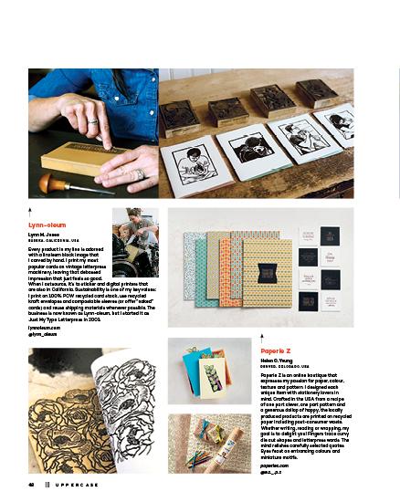
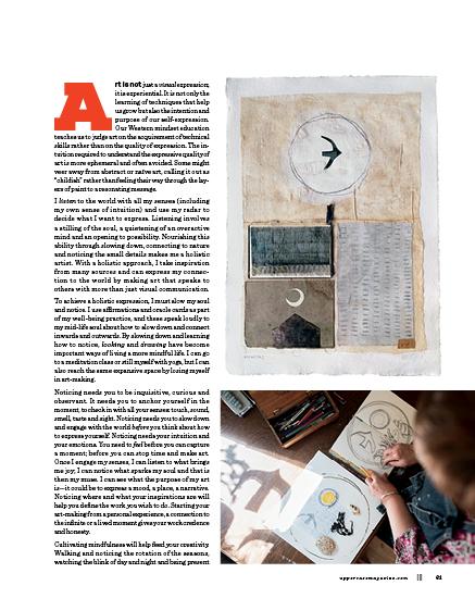
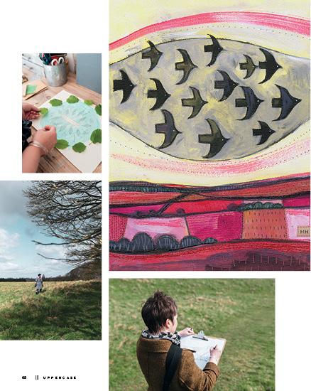
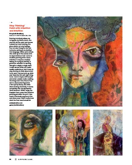
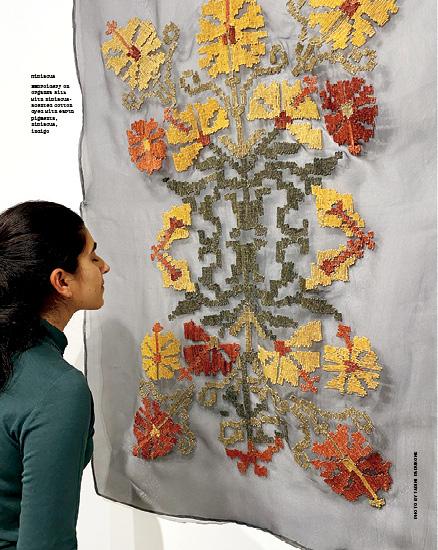
Being sensitive is intrinsic to what makes us creative. By looking closely, we notice the things that others might overlook. By listening, whether to the noise or the silence, we connect to ourselves and our place in the world. Through fragrance and our sense of smell, memories are both created and released. Our taste preferences can manifest literally when we prepare our food, but also metaphorically through art-making and curation. Touch leads us to the tactile pleasure of making things with our hands and the appreciation of texture.
The creative senses are many—and go beyond the physical five. Inspiration, wonder, faith, vision and love—what if we defined these as senses as well? These feelings all inform our intuition, a sense that is perhaps the strongest as it guides us to create from deep within ourselves, from our heart and mind, and from the soul.
Janine Vangool PUBLISHER, EDITOR, DESIGNER
Sign up for my weekly newsletter for behind the scenes, special offers and open calls for submissions. uppercasemagazine.com/free
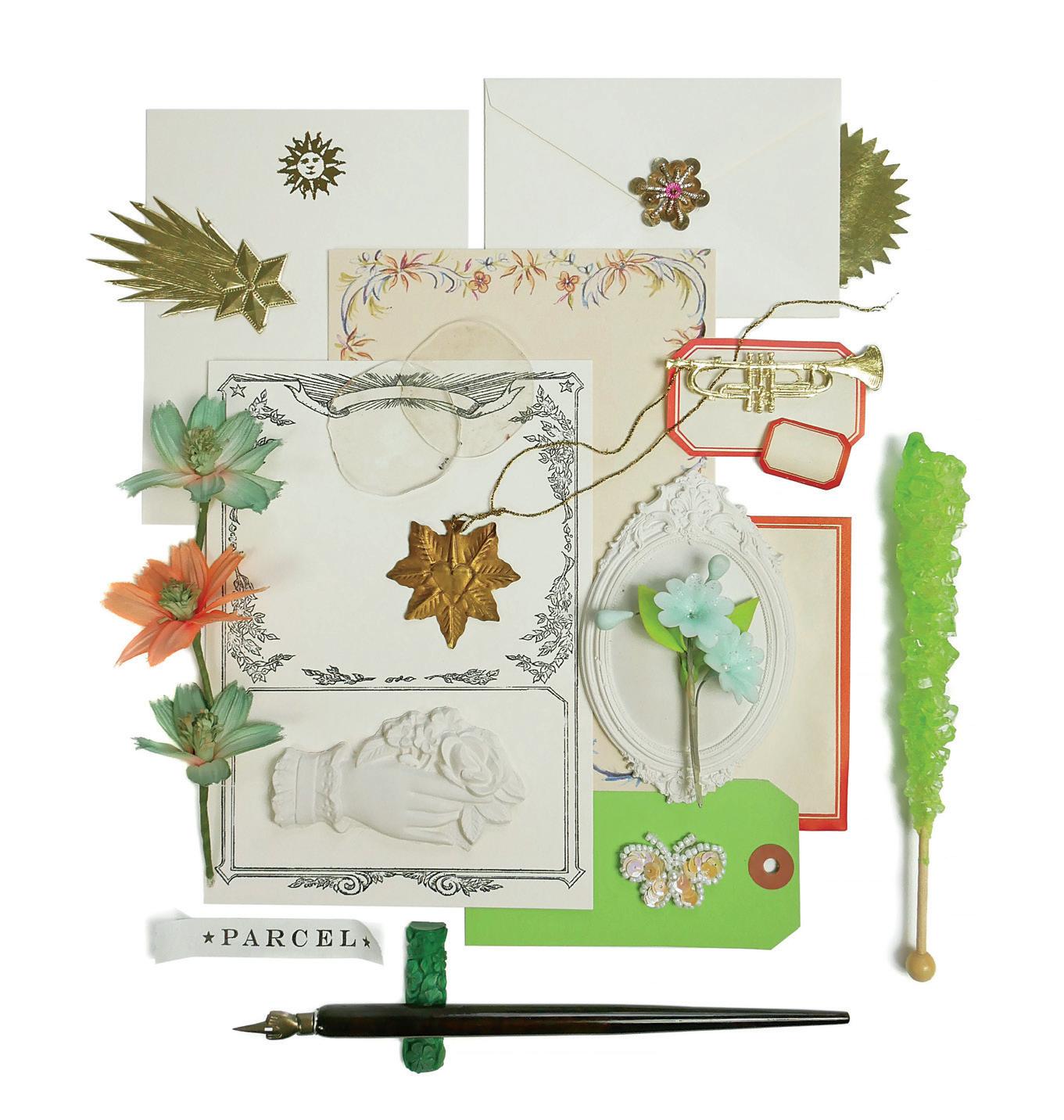
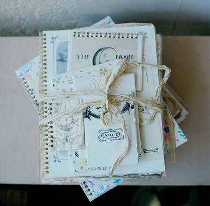
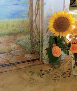
Arranging treasures from Parcel for this issue’s cover photo!
UPPERCASE
1052 Memorial Dr NW Calgary, Alberta, Canada T2N 3E2
Interior pages are printed on 100% post-consumer recycled Rolland Enviro 100.
Sustainability Initiatives
Through the Wren Trailblazer fund, UPPERCASE removes two tons of carbon each month with an additional two tons of carbon offset monthly. Please join fellow readers in the Wren Impact forest. wren.co/groups/uppercase
In the spirit of reconciliation, we acknowledge that we live, work and play on the traditional territories of the Blackfoot Confederacy (Siksika, Kainai, Piikani), the Tsuut’ina, the Îyâxe Nakoda Nations, the Métis Nation (Region 3) and all people who make their homes in the Treaty 7 region of Southern Alberta.
Subscribe!
Thank you to all of the talented writers, illustrators, creative collaborators and loyal readers who contributed their talents to this issue of UPPERCASE.
SUBSCRIPTIONS
This quarterly magazine is released in January, April, July and October.
$ 96
$ 80 INTERNATIONAL
CAD $ 144
Our shop will do the currency conversion for you.
RENEWALS
You will receive a notice by email when it is time to renew. Renew online anytime to add issues to your current subscription.
GIFTS
Simply enter the recipient’s name and address in the shipping information and your name, email and billing address during checkout.
STOCKISTS
To view our list of stockists or to carry UPPERCASE in your shop:
uppercasemagazine.com/ stockists
QUESTIONS?
Have a question about your subscription or a change of address? Email us: shop@uppercasemagazine.com
NEWSLETTER
Sign up for the UPPERCASE newsletter to receive free content and behind-the-scenes peeks at the making of the magazine— plus a welcome discount on your subscription!
uppercasemagazine.com/free
Thank you to everyone who submitted to the open calls for this issue. Even if you weren’t featured within these printed pages, your effort was noticed and appreciated!
SUBMISSIONS
UPPERCASE welcomes everyone and all identities, ages, talents and abilities. We share an inclusive, positive and community-minded point of view. Everyone is welcome to explore our creative challenges and submit to the magazine. Pitch your own work, propose an article or suggest a topic through the Open Pitch submisison form. Be familiar with the magazine and its writing and visual style. uppercasemagazine.com/ participate
Get our back issues while you can! Back issues will not be reprinted.
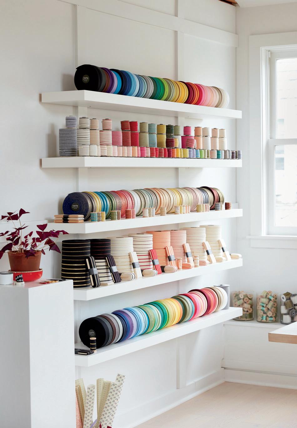
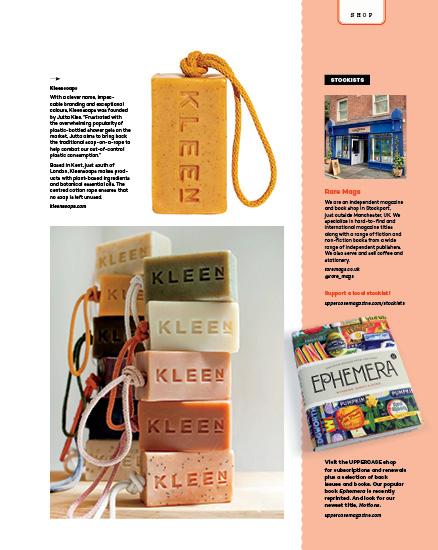
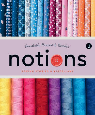
The Ribbon Studio by Angela Liguori, Studio Carta ABRAMS BOOKS
Born in Rome, Angela Liguori’s connection to Italian manufacturers and her eye for colour and quality has led her family business, Studio Carta, to be an inspiring source of Italian ribbons and curated craft supplies for over two decades, from her shop in Chestnut Hill, Massachusetts.
Her first book, The Ribbon Studio, is being released by Abrams in November 2024: “Silke Stoddard and Laura Murphy, both longtime Martha Stewart Living collaborators, have designed more than a dozen ribbon confections, including bows, present toppers, and little accessories. From simple DIYs to more elaborate embellishments, each project is an affordable luxury, as is the book itself: a perfect gift filled with wrapping secrets to make all of your gifts perfect, too.”
In addition to the craft projects, readers can read about the Studio Carta story, Angela’s colour inspirations, and her recommendations and resources.
studiocartashop.com abramsbooks.com
EYE CANDY
CONNECTIONS EAR ADORNMENTS
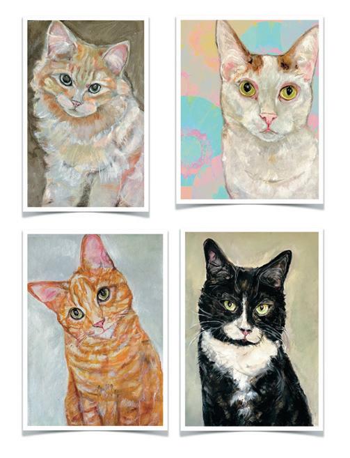
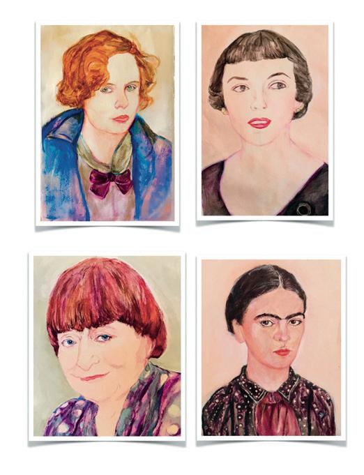
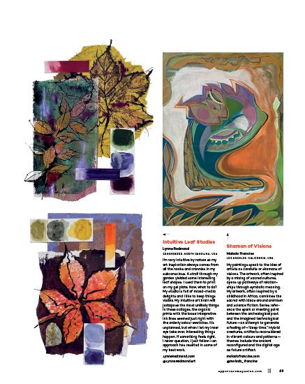
Affinity, Feminists, Cats & Kittens
Jenny Belin BROOKLYN, NEW YORK, USA
My painting studio is papered wall to wall with sketches of cats and kittens. Also, there are postcards from Le Palais de Tokyo, road trip matches, and labels from my grandmother’s perfume. These fragments are affinities pinned on the walls with other ephemera I’ve collected. Nostalgic artifacts inspire me both consciously and subconsciously. When things are going well, my creative process is in a zone as I work without a road map.
I am writing and illustrating two books.
NYC Cats: each page is a character study that offers a rare glimpse into the longings, psychology and philosophical musings of native New York felines. Letters to Dead Feminists: a collection of epistolary prose in which I ask my greatest muses to counsel me and share perspectives on art, feminism, fashion and identity. When I look at these works side by side, I start to see a road map emerge. This connection between the projects is a product of the intuitive thread in my creative process. jennybelin.com @jennybelin
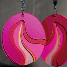
Paper Earrings
Having worked in the printing trade for over four decades, Rebecca Alexander has access to all kinds of interesting paper. “My love of paper led me to create paper jewellery. My first pieces were made in the 1980s from paper sample books.” beccasblend.etsy.com
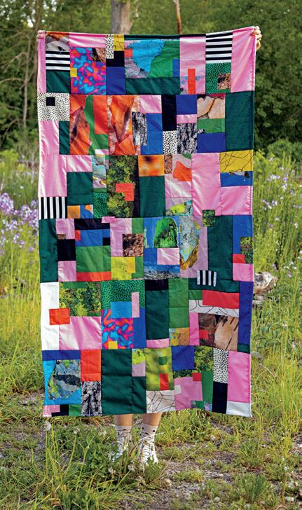
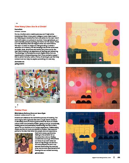
INTUITIVE QUILTING
Learning through Making
Nicole Beno typically works in digital media and collage, but she recently taught herself to sew. “Since sewing is such a physical medium, it felt really good working with my hands, making mistakes, and learning through the process of making. It was like improvising on the spot, and making decisions intuitively.” Incorporating art and textures printed digitally, the final artwork becomes an “interesting marriage of the hand with the machine—the digital with the tactile.” nicolebeno.com @nicole_beno
Stephanie Bucholz
PHOENIX, ARIZONA, USA
I work mostly on canvas and wood, combining media in a way that is (as far as I know) unique. I do landscapes, cityscapes and recreations of ads using acrylic paint, markers, collage and modelling paste to build layers. When working on wood, I also carve into the layers using linoleum-cutting tools. I use newspapers local to the subject city (mixed with the New York Times). The ads paintings make up my more “artist statement” work, meant to call attention to strangenesses in our consumer culture, and this comment also blends into the scape paintings through the collage. I’m also working on a graphic novel on wood.
I’ve been selling work at Art One in Scottsdale, Arizona. It’s a gallery for emerging artists, to help give new artists a start. My transition to another gallery is in the works for this year. I work full-time in the marketing department of a software company and generally paint on the weekends. I hope to make painting my full-time job, and my transition to the new gallery is part of that plan.
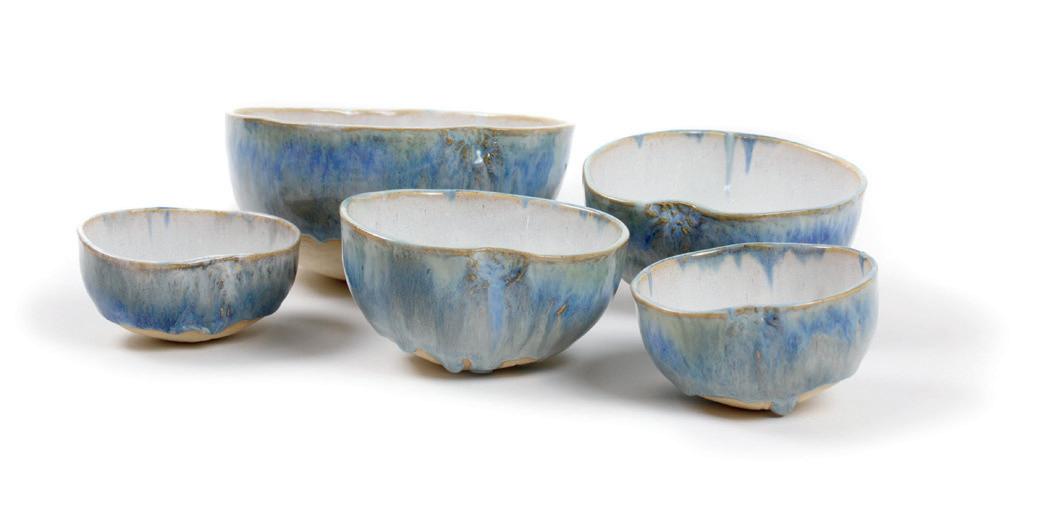
I was formally introduced to ceramic arts through the esteemed Pakistani potter Sheherezade Alam, whom I met in 1986 while my family lived in Lahore. Fast-forward a decade. Upon learning that Alam had moved to Toronto, I leaped at the opportunity to study with the renowned artist and attended several of her workshops at Toronto’s Arcadia Co-Op in 1997.
After a 20+ year hiatus, I returned to pottery in 2019 and started taking classes at Inspirations Studio—a ceramic-based program for women and non-binary people who have experienced firsthand the impacts of poverty, marginalization, mental health and/or homelessness. A social enterprise, Inspirations Studio offers workshops to the public to generate funds for core programming.
With the onset of the pandemic, the studio shuttered its doors temporarily, putting an end to community classes. For my 50th birthday in December 2020, which was celebrated over Zoom, my closest friends gifted me a pottery wheel and I have continued my practice from my “studio” in my apartment (a.k.a. my laundry room).
This collection of ceramic “bowlies” is formed in calabash (a bottle gourd) from St. Vincent and the Grenadines—one of my favourite places on earth. The blue glazes evoke memories of the country’s glorious waters. What makes this fresh? My ability to take an object and transform it into a unique representation of itself. (I have yet to come across another potter using gourds as forms.)
@_pottery_and_prose_
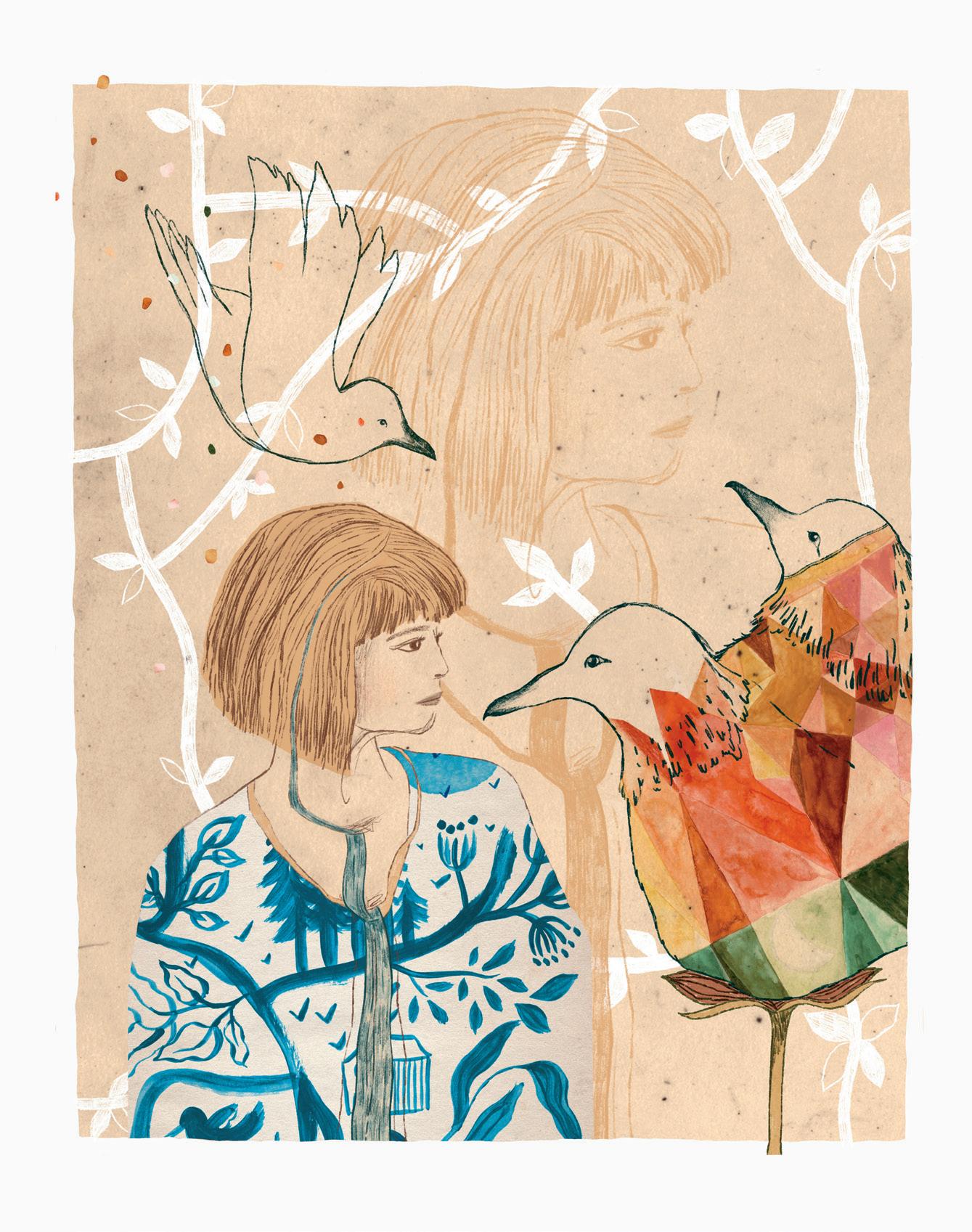
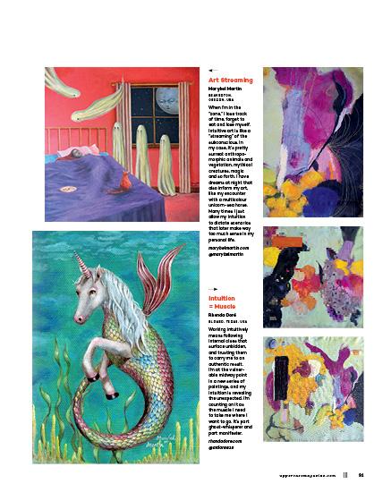
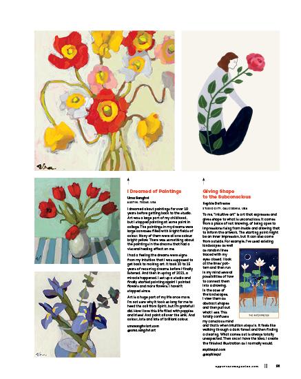
Meera Lee Patel is a self-taught artist, writer and internationally recognized bestselling author who writes books that help people connect with themselves, each other and the world around them. Her work advocates for greater mental health awareness in children and the grown-ups who care for them.
meeralee.com
criteria necessary for making creative work that is meaningful, ripe with the only truth you can draw from: yours. In an interview with Mosaic Magazine, writer and poet Lucille Clifton stressed the importance of writing for oneself rather than an audience. “Somebody asked me why is it that I want to heal the world,” she said. “I want to heal Lucille Clifton! And fortunately, I am very human just like all the other ones, all the other humans.” Writing primarily for herself gave Clifton the chance to unearth her own mind and heart, to sift through the many voices within her before distilling them into the written voice we recognize in her poetry. Her self-awareness grew each time she conversed with herself, making it easier to discern her own voice from the sea of others. Most importantly, prioritizing the connection she had with herself helped her ground her self-worth internally. “We often want somebody else to decide our validity,” she said. “And I talk as one who’s been validated. I try to walk the path I’ve seen in front of me, not the one I’m supposed to get on, not the one I was told I should be on.”
In the past, I’ve been perplexed by artists who work intuitively—artists who say they simply knew to use a certain colour or to make a specific mark. A fear of failure, compounded by a mountain of self-doubt, led me to believe these artists possessed an innate talent I didn’t have. For years, I attempted to use logic and reason to convince myself of this self-sabotaging belief because it relieved me of the responsibility of accepting the truth: that intuition in craft develops through years
of regular practice. In Art & Fear: Observations on the Perils (and Rewards) of Artmaking , authors David Bayles and Ted Orland address this very idea: “For every artist who has developed a mature vision with grace and speed, countless others have laboriously nurtured their art through fertile periods and dry spells, through false starts and breakaway bursts, through successive and significant changes of direction, medium, and subject matter. Talent may get someone off the starting blocks faster, but without a sense of direction or a goal to strive for, it won’t count for much.” Creative confidence comes from building skill and practising your craft. This creates muscle memory—the very memories your intuition will recall during decision-making. When you develop your craft, you build a sturdier home for your intuition. The more work you create and the more comfortable you are with failure, the more your skills and resilience evolve. Your intuition safely speaks, knowing it won’t be ignored.
In the same Mosaic Magazine interview, Clifton asked readers: “Can’t you feel in yourself when something’s real and something’s not and feel the authenticity? Trust that you can do that.” Through the many years I stumbled around in my art-making, I believed that my artist’s voice was housed inside a specific visual style—a creative fingerprint that clearly stamped anything I drew as my own. I wanted to make paintings as distinct as Dylan’s voice, work that pulled me cleanly from the crowd—paintings that could only belong to me. I was so fixated on what my creative voice looked like that I didn’t focus enough on what it said. My focus was misguided; I was unable to feel when something was real—and because of this, creating anything felt like a consequence—one where I was guaranteed to experience confusion and discouragement.
Luckily enough, I decided to try again. I shut out external voices and began rooting out my deeply embedded desire for external validation. I kept my eyes on my own path. Slowly, I found my sense of self, and my intuition deepened as I listened to it. I made work—awful work, certainly—but work that was freeing to make. I built my artist’s voice little by little, not by searching or wishing, but by doing the work itself. My voice has yet to clearly surface, but I see its shape beneath the water. The work I’ve made in recent months is more valuable than anything I’ve made before—not because it’s objectively better, but because it emerges from a deeper place inside myself. This work is intuitively guided; it maintains integrity from a hard-won trust in myself.
Meera Lee Patel
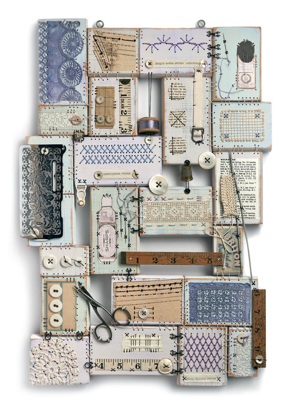
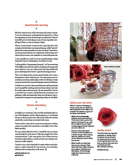
aliferguson.co.uk @thepurplethreadshed
Artist Ali Ferguson and her wooden patchworks are profiled in Notions.
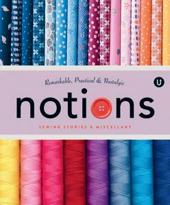
Notions celebrates the remarkable, practical and nostalgic tools and accessories of sewing. With sewing stories and profiles of textile artists, pattern makers, quilt shop owners, haberdashers, inventors and entrepreneurs plus an exploration of the history and invention of our beloved notions and tools, Volume N in the UPPERCASE Encyclopedia of Inspiration is an entertaining and illuminating A to Z of sewing miscellany. uppercasemagazine.com encylopediaofinspiration.com
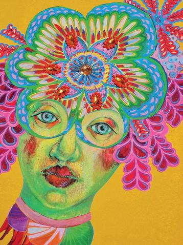
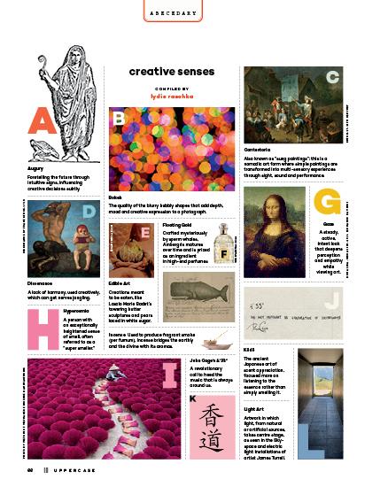
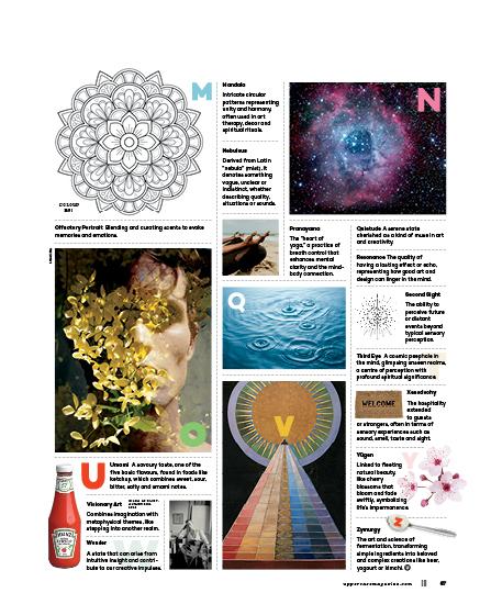
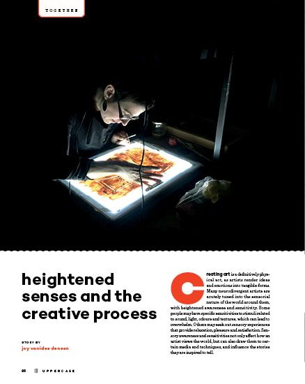
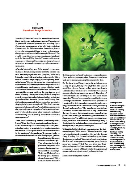
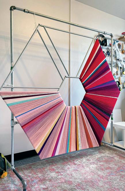
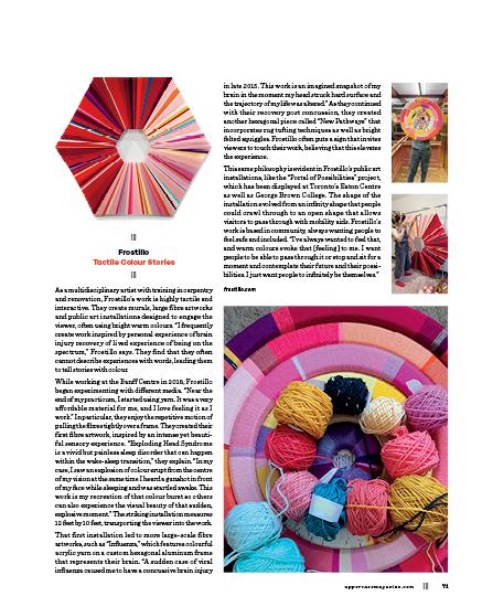
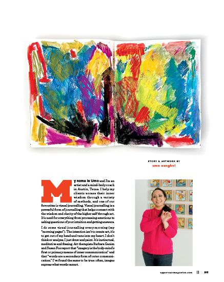
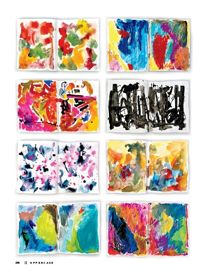
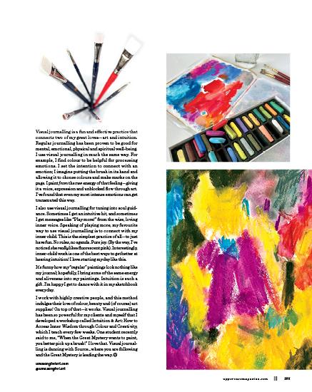
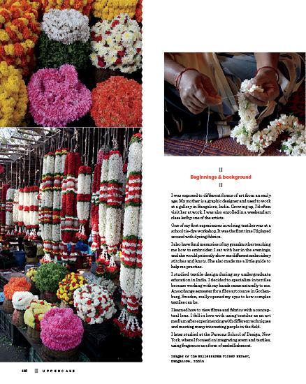
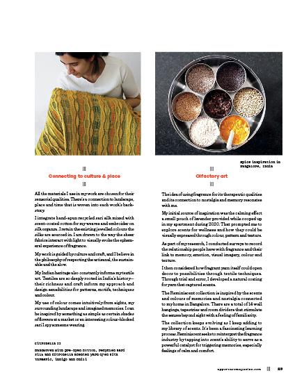
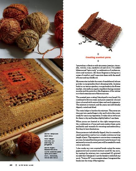
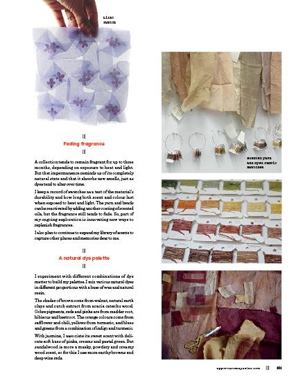
heightened senses
RECOMMENDED READING BY janine
vangool
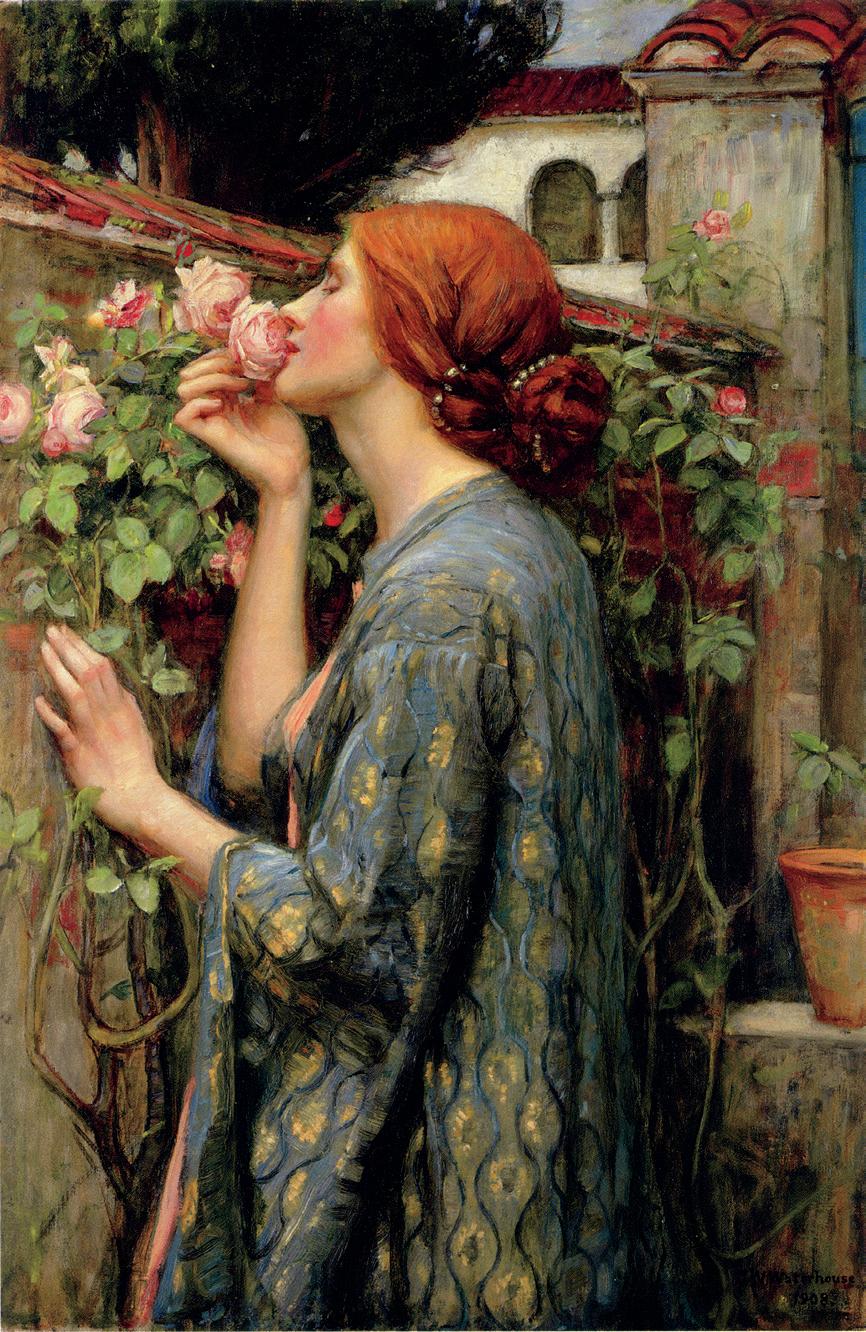
The Other Side
A Story of Women in Art and the Spirit World
JENNIFER HIGGIE
“There can be comfort in not knowing: while certain things are beyond our comprehension, they are not beyond the limits of our empathy or curiosity.”
What can we make of our senses beyond the physical five? Intuition, clairvoyance, faith or life after death… Jennifer Higgie’s book The Other Side explores women’s art history with a unique lens to the spirit world. “Listening to your unconscious can reveal something unprecedented, both about yourself and where you live,” she writes. “At best, magical thinking is fluid; it can expand the ways we perceive our bodies, our societies, nature; it’s about possibilities—about looking forward.”
The artists profiled were spiritualists in touch with otherworldly guides who directed their hand at art, women visionaries unfettered by convention and tradition, charlatans who stretched the boundaries of ethics and surrealists whose imagery is unsettling still. Through the book, Jennifer incorporates her own story, which acts as a tether to intangible topics and a point of perspective of how society—and women in it—has transformed, yet psychic connection and theories of the unknown remain in the fringe. “Perhaps what we really crave is to become magical ourselves; transcendent creatures not ground down by bills, work, family; the stress and strains of the physical realm.” It is an engrossing read that is sure to take you to places you’ve never been.
jenniferhiggie.com
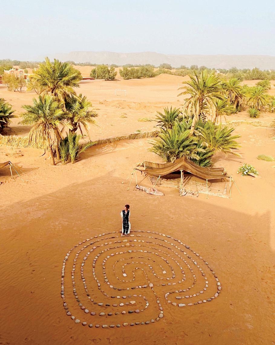
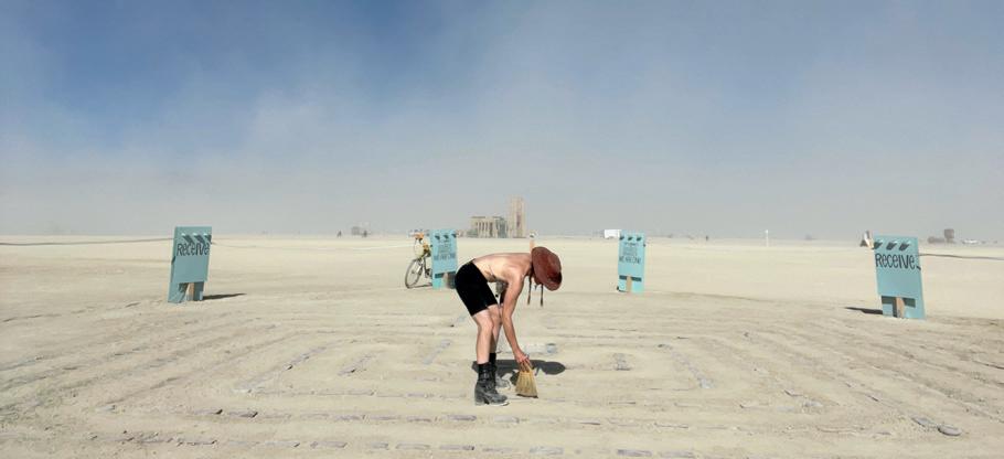
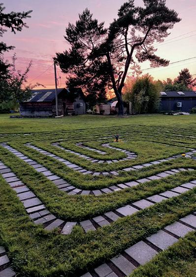
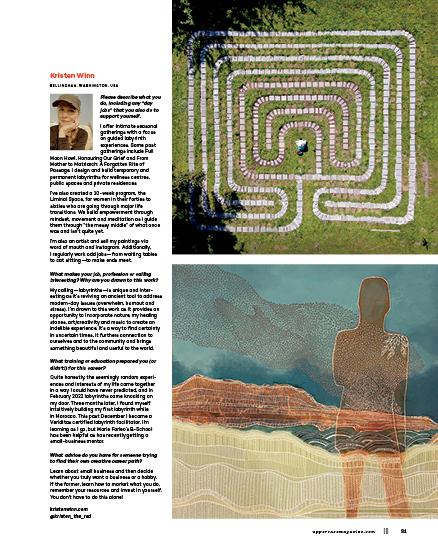
labyrinths
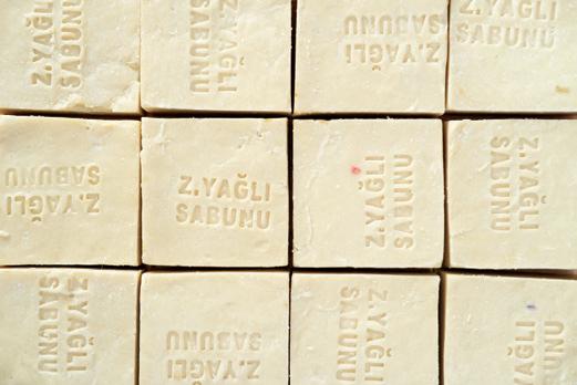
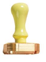
soap typography
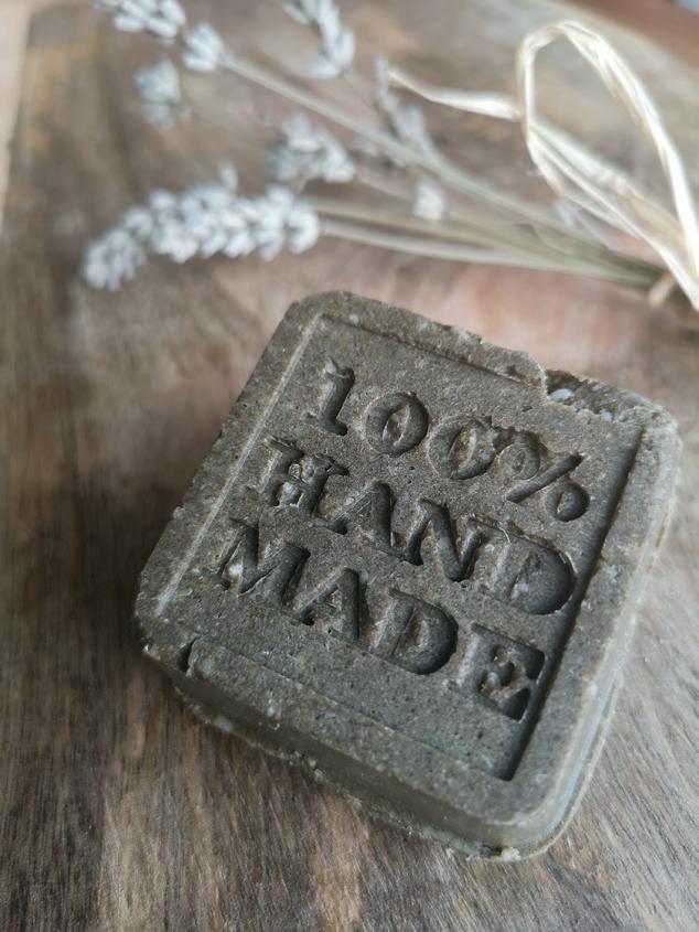
SOAPS WITH SOMETHING TO SAY
Soap makers can use moulds or stamps to impress their mark into handmade soap. AbdelhakStore offers a variety of options for you to customize your own soap stamp (or use it for marking pottery, too.)
AbdelhakStore.etsy.com
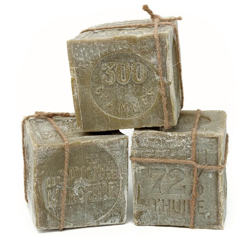
Soaps on TV
The Still Standing series from Business Insider on YouTube presents in-depth profiles of traditional manufacturing. Check out “How Lebanon’s Oldest Soap Factory Makes 30,000 Olive Oil Bars” to see artisans from Masbanat Awaida in Tripoli, Lebanon, make soaps in a centuries-old tradition by pouring the soap on the floor, levelling and stamping it.
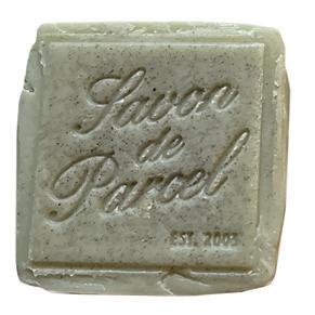
Olive Oil Soap Cubes
Fibre Craft recommends this olive oil soap cube for wet felting: “It opens up the wool fibres ensuring quick and thorough wetting, reduces felting time and therefore there is less design shifting during the process.”
fibrecraft.ca
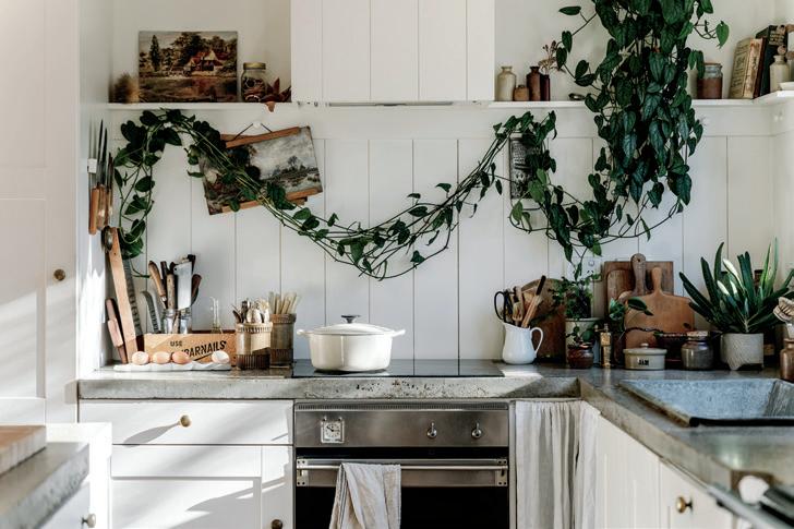
electrifying your home
A SENSORY JOURNEY INTO SUSTAINABLE LIVING
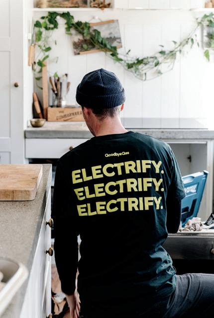
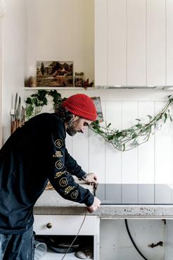
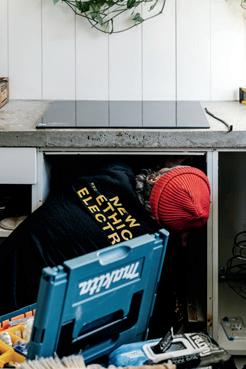
Electrifying your home is more than just a choice that’s good for the planet— it’s a transformation that engages all your senses. It’s about seeing the beauty in clean energy, hearing the silence of efficient systems, breathing fresher air in a gas-free kitchen and feeling the comfort of renewable heat. I just electrified our old 1890s cottage with the help of a local business called Goodbye Gas. We don’t have solar panels yet but we use green electricity. I love cooking on induction, and whilst I’ll miss the heat of our fireplace—I definitely won’t miss the double handling of firewood, the ash and the poor indoor air quality.
Home energy use accounts for over 40% of domestic emissions and is a major expense. Electrifying your home can significantly reduce your energy bills, and you should also check if you’re eligible for any electrification rebates from your local government. If you’re still connected to the grid, make sure to choose a green electricity option to avoid relying on fossil fuels.
Imagine a home where your energy is clean, renewable and perfectly responsive to your needs. This is the future of sustainable living and it begins with the essentials: cooking, heating, cooling and hot water. |||
Sight: seeing sustainability
The sight of a sleek, modern induction cooktop can be a testament to innovation and efficiency. Unlike traditional gas stoves, induction cooktops use electromagnetic energy to heat pots and pans directly. This means no open flames, no wasted heat and a kitchen that stays cooler. The smooth surface of an induction cooktop is not only easy on the eyes but also easy to clean, making your cooking space look pristine and clutter free.
STORY AND PHOTOS BY
marnie hawson
Sound: the quiet revolution
The hum of an induction cooktop is barely audible compared to the roar of a gas flame. Similarly, electric heating systems operate almost silently, unlike the clanking and whirring of older, less efficient systems.
Smell: clean air, healthier home
Induction cooking doesn’t emit harmful gases like gas stoves do. This keeps the air in your home cleaner and healthier. Gas stoves are linked to around 12% of all childhood asthma cases. With induction, there are no lingering gas smells or carbon monoxide risks. Your home becomes a place where you only smell delicious home-cooked meals.
Taste: precision and health
Induction cooktops offer precise temperature control, giving you the ability to cook food perfectly every time. The rapid response to temperature adjustments means you can sear, simmer and sauté with ease. To compare their efficiency and speed: one experiment took under two and a half minutes to bring a litre of water to a boil on an induction stovetop, while a gas cooktop took over four minutes (this will depend on the gas cooktop and the cookware you’re using of course).
Touch: the warmth of renewable heat
Electric heating systems, such as heat pumps, extract heat from the air or ground and convert it to your home. This method is highly efficient and the warmth you feel comes from a system that is both sustainable and environmentally friendly. It is also one of the cheapest ways to heat your home. Additionally, hot water heat pumps, which use electricity to extract heat from the air or ground to heat water, are incredibly efficient and can significantly reduce your water heating costs. Heat pumps can also cool your home, so the one appliance is all you need year round.
The big picture
Electrifying your home with renewable energy reduces your carbon footprint, protects the environment and decreases reliance on fossil fuels. This choice fosters responsibility and harmony with nature. By embracing a sustainable lifestyle through options like induction cooking and electric heating, you make your home more efficient and healthier. These changes enhance your life and contribute to a cleaner and greener planet.
I’m in business to bring back nature. I just happen to also be a photographer. What gets me out of bed every day is a drive to show that using business as a force for good is easy to do. You just need to know how. I’m a carbon-neutral, certified B Corp business and put my money where it matters. I can teach you how to do the same. marniehawson.com.au @marniehawson
UPPERCASE Sustainability Initiatives
Through the Wren Trailblazer fund, UPPERCASE removes two tons of carbon each month with an additional two tons of carbon offset monthly. The full description of our sustainability initiatives and suggestions on how you can take action are available on the UPPERCASE website. uppercasemagazine. com/eco
Marnie Hawson
sensory marketing of yesteryear
COLLECTION
OF mark e. sackett
ARTICLE BY melanie roller
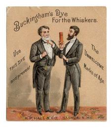
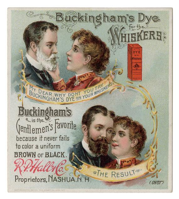
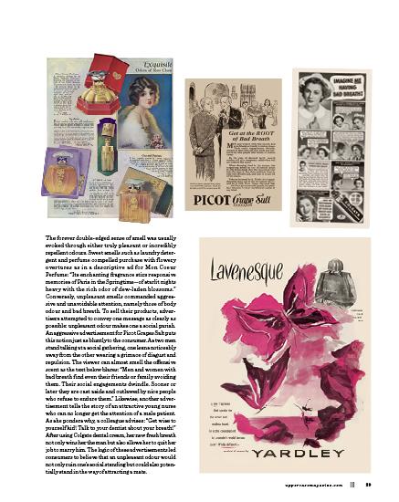
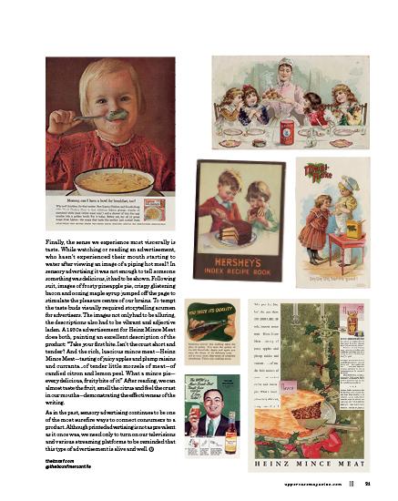
Whenever we taste the rich buttery flavour of a chocolate cake while scanning an advertisement or feel the soft silkiness of a baby’s youthful skin while watching a commercial, our senses have been activated to vicariously immerse us in a product’s story. The term for this is “sensory marketing,” a potently effective advertising strategy designed to target one or more of a consumer’s five senses. From the earliest days of the modern advertising industry, this tool has been employed again and again to elicit a visceral reaction from a potential buyer. By tapping into the visual and descriptive qualities associated with sight, sound, smell, touch and taste, even primitive printed advertisements could captivate audiences and stimulate their sensory desires.
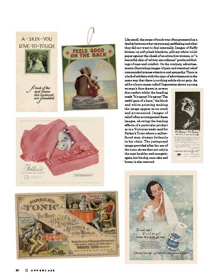
As the old platitude goes, “a picture equals a thousand words,” and the most obvious way our senses have been historically appealed to is through sight. The most straightforward way to demonstrate the value of a product is by showing its effectiveness, such as the results of a particular cleaning liquid or implement. As one television advertising booklet put it: “Seeing is believing and they buy what they believe in.” However, sight-based advertising could also be more complex, falling into two broad categories: how we are perceived and what we perceive.
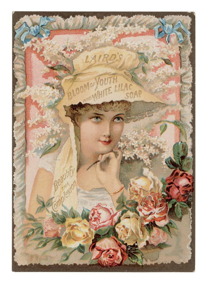
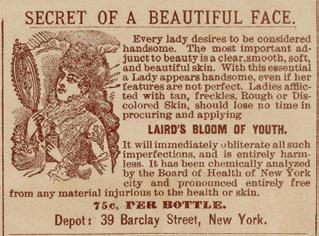
The modern advertising age directly contributed to the almost universal need for self-improvement and beautification. Advertisements proliferated using visual stimuli to sell a more attractive aspirational version of oneself. Even before the modern use of cosmetics and expensive skin care routines, ads pushed an alluring complexion as the prerequisite for beauty. A late 19th-century trade card for Laird’s Bloom of Youth soap demonstrates this with an illustration of an attractive young woman with clear skin and bright eyes, wreathed by a spray of pink roses and white lilac— the image of Victorian perfection. The reverse side of this card then makes a pitch for the soap brand, while drawing attention to the reader’s assumed imperfections: “With this essential a Lady appears handsome, even if her features are not perfect. Ladies afflicted with tan, freckles, rough or discolored skin, should lose no time in procuring and applying” the product. It then promises to “obliterate such imperfections” implying that the user will become as attractive as the idealized lady on the front of the card.
Endless examples of societal pressure abound throughout the decades and extend to both women and men. Amplified by targeted printed advertising, the pressure to present youth, beauty and an attractive figure became undeniably present, leading even the most indifferent to turn a critical eye on themselves.
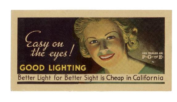
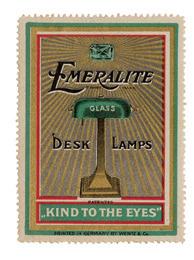
Meanwhile what and how consumers saw became just as compelling to advertisers. Technology and the rise of new inventions invited the general public to witness exciting visual wonders such as electricity. For the first time, families could see clearly indoors, not just by hazy gas or candlelight, but by bright, illuminating electric bulbs, thus saving their eyes from unneeded strain. Advertisers were quick to capitalize on the mass appeal of this useful new product as evidenced in a beaming gold poster stamp for Emeralite desk lamps describing their product as “kind to the eyes” while an advertisement for PG&E, featuring a wide-eyed young woman, insists: “Better light for better sight is cheap in California.”
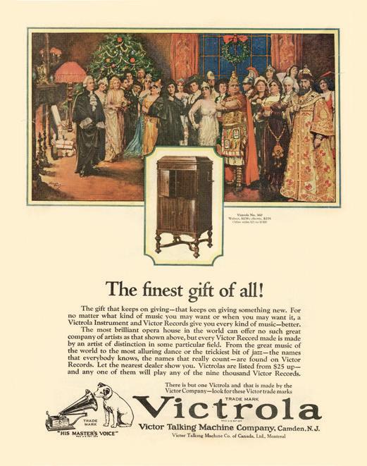
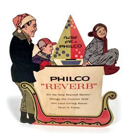
As with sight, our sense of hearing was targeted by this new wave of technological advertising. Radios and various other music players could now bring the pleasure of great music into the household, eliminating the previous barriers of price and privilege. Families could enjoy at home the pleasures and variety of the worldclass music they had only read about. Illustrating this point, a vivid Victrola ad from the 1920s shows a large, elaborately costumed group of performers crowded in a warm, comfortable living room.
The sentiment below reads: “The most brilliant opera house in the world can offer no such great company of artists as that shown above, but every Victor Record made is made by an artist of distinction in some particular field.” A later advertisement for Philco radios put this even more succinctly: “Brings the concert hall into your living room.”
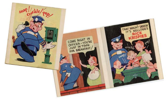
Another unusual way advertisers targeted our sense of hearing was through a unique kind of synesthesia: using a set of printed sounds to create brand recognition. This is most notable in the ad campaign launched by Kellogg’s for Rice Krispies cereal with its signature “Snap! Crackle! Pop!” Not only did the onomatopoeic phrase become eternally linked to the brand, it also gave consumers a sense of the sound, texture and what they could expect when eating the cereal.
STORY BY kate farrall
PORTRAITS BY dea burlew
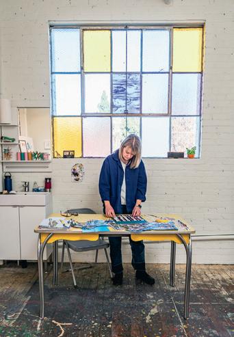
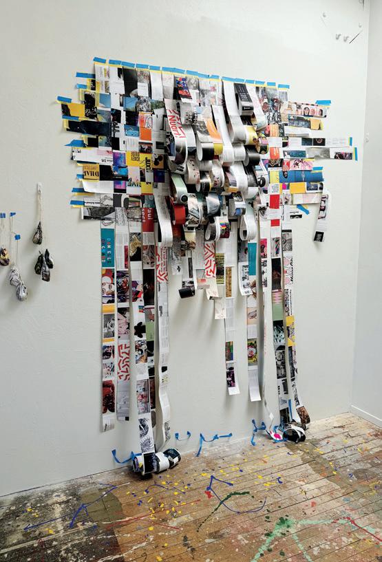
peripheral senses
Iwas having trouble making decisions about the artwork I made. I felt like I was missing that creative spark after years of working, parenting, caregiving and focusing on everything but my art practice.
While continuing to make art, it was disjointed. My main medium of cameraless photography started to feel stale. It was harder and harder to make the work I wanted when I needed antiquated machines that existed in expensive darkrooms 100 miles away.
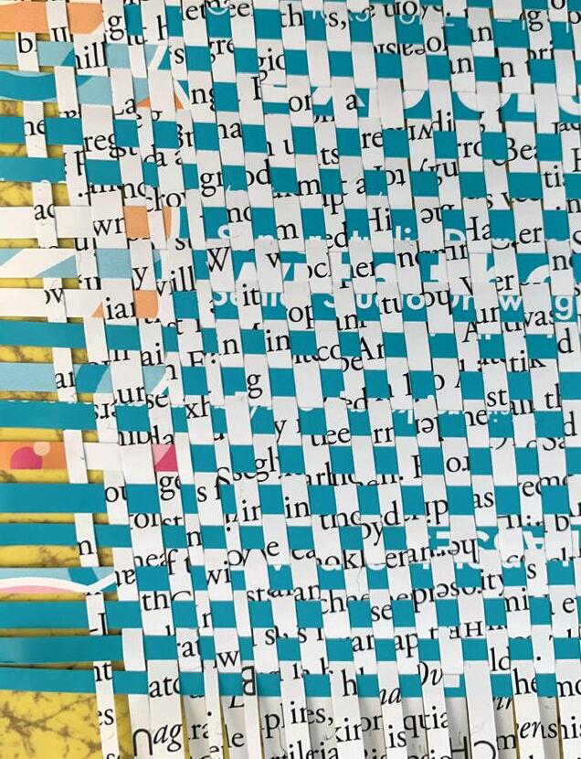
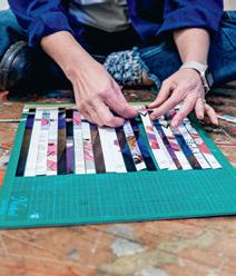
My friend Maris Kaplan (foundandmade.org) invited me to participate in a collaborative, quilt-blockinspired Paper Piecing Zine . I partnered with an anonymous artist to make two pieces. Each artist in the duo started a piece, traded it and completed the piece the other artist had begun. For the project, I decided to weave paper, sew it and treat it like fabric to reference the traditional quilting process. I didn’t expect to but I loved the results of this secondary project that was outside of the other things I was “officially” working on. It felt honest and approachable. I noticed that even my scrap pieces looked good to me. It created a spark for me in my art practice. And, it wound up fueling my more recent work.
Like with this project, I’ve noticed that creative breakthroughs come when I’m not directly looking for them. They happen when I notice and work with what I call my “peripheral vision.” That information I’m taking in but not directly. Now that I’ve harnessed my peripheral vision and senses, I can more easily identify and know the things I like most about what I’m making versus overthinking, decision fatigue and not being sure about where to take my work next.
I started noticing that when I’m making a collage or painting, exciting things were happening to the side of the main piece, in my peripheral vision. The offcuts of my paper collages looked amazing with how they landed on my table. There were neat colour and mark combinations on the papers where I cleaned excess paint off my brushes. As I did a collage demo, I loved how the paper looked when I tore the edges to demonstrate my concept. So, sometimes I started to work on these art pieces that were accidentally evolving from my “peripheral vision.”
|||
On PBS, I saw “Your Brain: Perception Deception” where they showed how the brain absorbs a huge amount of information that’s in its blind spot. It was amazing to see a person who exemplified this. They correctly answered questions about what they had seen that was only in their blind spot. It was validation that I can trust my gut because it’s operating with actual information that’s been subconsciously gathered by my peripheral vision.
When I notice things in my peripheral vision, not where my main focus is, I’m harnessing this special human ability. My definition of working with my peripheral vision is wider than the medical definition of it. That’s because I am using the concept more broadly when I shift my attention to my blind spots to notice things that catch my eye, no matter which sense I use to absorb it.
What this looks like for me is having a woven paper sculpture in progress on the wall and then seeing a vintage sweater with a yarn-loop design, which inspired me to decide how I’d move forward with the wall sculpture. Things that are outside of my main focus are informing the things that are my main projects. And, it’s so much fun to see it this way.
Harnessing my peripheral senses like this has helped me to now develop a body of art that feels truly like a reflection of me. I noticed that I really loved working with paper, treating it like fabric and working with it sculpturally, which is a new and exciting vocabulary for me. My art has started to look like a body of work again. It all fits together when I see it in the studio, and doesn’t feel like a hodgepodge. I now have a collection of pieces that have meaning and feel good to make. They stand out because they’re unique.
Utilizing my peripheral vision like this creates a spark of excitement! It’s fun. Which is what being creative is all about for me. I’m proud to share my art during my monthly open studio events and to talk about it with others. I don’t feel like I need to “defend” it or overexplain it. Nor do I need outside validation for it. I’m now submitting to calls for art, getting accepted and winning awards. It’s fun to see that others are getting my vision and that it’s resonating with them. Maybe something I make will inspire someone from their peripheral vision.
and
for
She creates abstract, painted paper collages, paper weavings and paintings while also helping creatives set up systems to earn monthly income.
katefarrall.com
@katefarrall
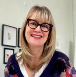
Kate Farrall
Kate Farrall is a fine artist
a business coach
creatives.
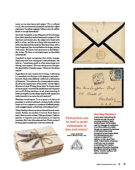
fountains of fancy the etiquette of letter-writing handbooks
|||
STORY BY correy baldwin |||
“There is no greater opportunity to show good taste—or bad— than in the tone, design and type of note paper we use. It is as effective an index to one’s individuality as are the clothes we wear.”
—LILLIAN EICHLER, BOOK OF ETIQUETTE, 1921
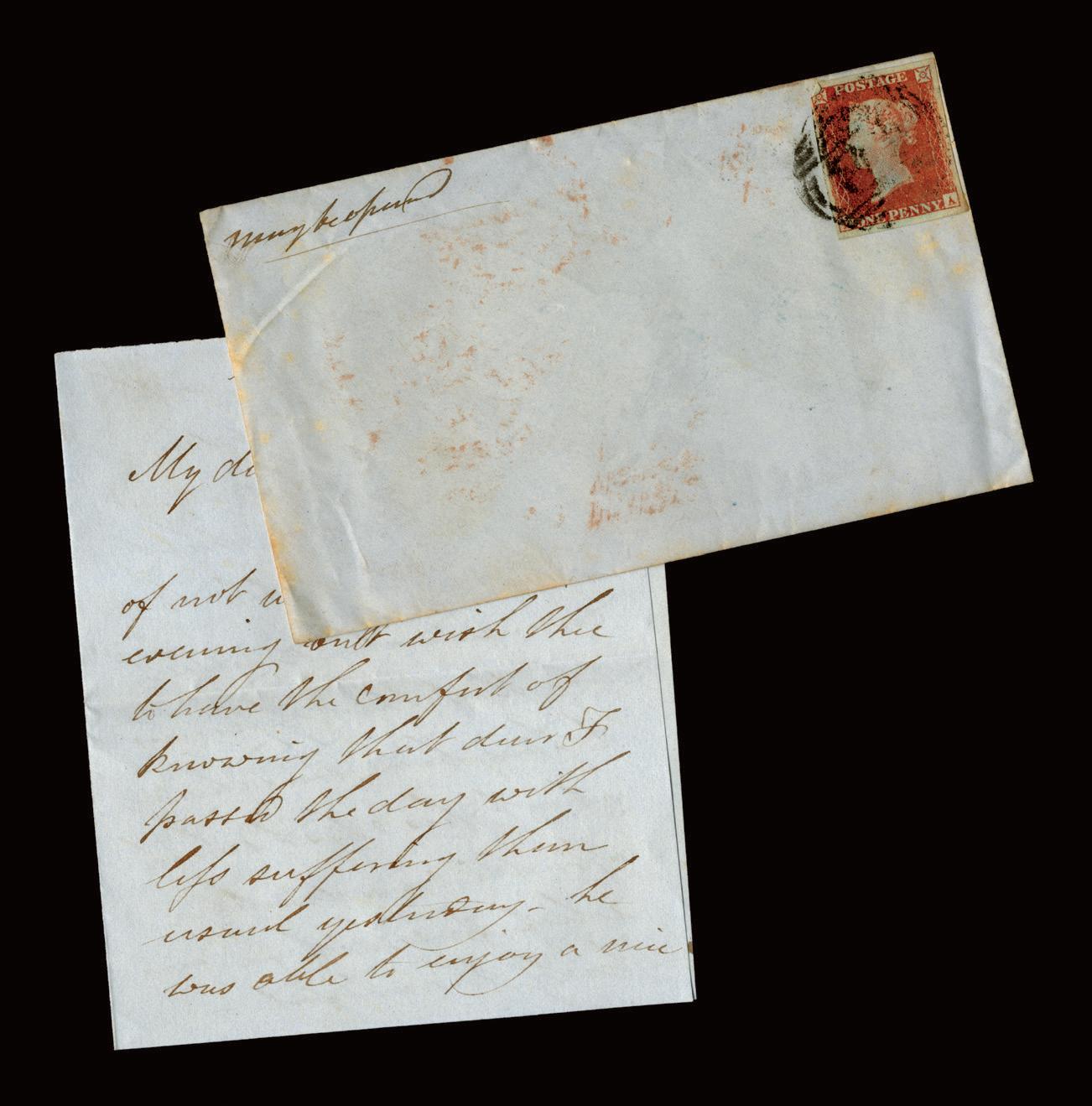
As letter writing took hold in the Victorian era, a host of handbooks like Eichler’s, Eaton’s and Westlake’s were published to help guide those who were putting pen to paper—and often ensuring they were doing so properly. They helped encourage good writing habits while letter writing was at its height, and later they encouraged the continuation of these habits during fears of its decline.
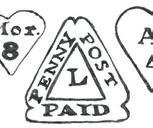
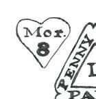
Affordable postage—the “Penny Post”—was introduced in the United Kingdom in 1840, ushering in an explosion of correspondence. This led to a proliferation of stationery, as well as rules about how to use it. Although much of this Victorian etiquette has fallen away, its legacy can be found in what is considered standard and custom today: the position of a stamp on an envelope, the colour of our ink, the size of our paper, anachronisms like “yours truly.”
These etiquette handbooks provide a glimpse of this early standardization by way of rules enforcement—along with the social expectations surrounding them—as well as hints of the variety, experimentation and creativity of Victorian stationery, even as this expression was being suppressed and restrained.
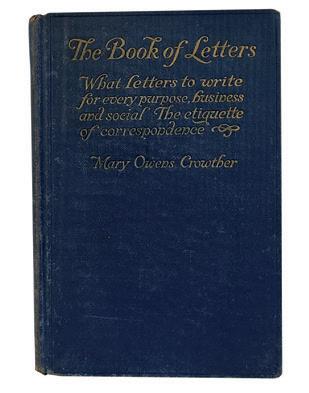
“In the matter of perfumed stationery, if perfume is used at all, it must be very delicate,” writes Mary Crowther in How to Write Letters, from 1922. Reading this, we learn that perfumed paper existed, and was being used. How fantastic!
“The styles of fine papeterie at a modern stationer’s are as capricious and variable as the figures of a kaleidoscope,” writes Westlake, not entirely enthusiastically (papers regarded as standard, on the other hand, he writes, are “those that are always in fashion among sensible people”). Eichler, similarly, cautions against using “such startling color combinations as deep purple paper inscribed with white ink,” and instead urges letter writers to “avoid all fads in size and color of social stationery.” Both Eichler and Eaton lament that violet, blue and purple inks were recently in fashion, and Eaton is adamant: “colored inks are never correct.” Although white-on-purple may indeed have been an eyesore, I remain impressed by such enthusiasm. Eichler would disagree: “to be conspicuous is to be ill-bred,” she writes.
What else did these etiquette handbooks advise? First, selecting the proper paper was paramount. Correspondence was often divided into the “friendly letter,” the “business letter” and the “social letter,” which encompassed invitations and announcements. (The social letter, Eichler tells us, “is always written in the third person, and always requires an answer.”)
Each category of letter required a different size and type of paper, and straying from these standards was in poor judgement: “Noticeably large or very small stationery is not good form, the one looks clumsy, the other mean,” writes Eaton. “Lined papers must never be used for social correspondence; they are extremely bad form,” he writes elsewhere. “Never write a private letter on foolscap paper,” writes Westlake, with emphasis: “to do so is awkward, clumsy, and generally inexcusable.”
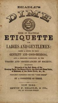
Sending a note on a scrap of paper was unthinkable. According to the Beadle’s Dime Book of Practical Etiquette for Ladies and Gentlemen, from 1860, “it is ill-bred to write on a half-sheet; the shortest letter requires a whole one.” And for Westlake, “to use part of a sheet looks mean and stingy, and is disrespectful to the receiver.”
And of course, there were different expectations for men and women: “The size of stationery for men’s social correspondence varies, but it is usually a trifle larger than a woman’s note paper,” writes Eichler. “A man never uses small sheets of paper.” Heaven forbid. In general, the advice was toward the reserved and plain. “Letter paper (other than for business) with designs of any kind is in questionable taste, as are seals ornamented with flowers and figures,” according to the Beadle’s Dime Book—“Perfectly plain paper should be preferred.” Eaton tells us that “flourishes and elaborate capitals are always in very bad taste.”
Although coloured paper was apparently available and abundant, none were recommended but white: “No color is more elegant and tasteful than white, for any kind of letter, and gentlemen should use no other,” writes Westlake. “Ladies may use delicately tinted and perfumed paper if they choose, but for a man to use it is, to say the least, in very bad taste.” Eaton allows for “either white or cream-tinted” paper: “Strict good form does not recognize the use of colored papers. Nor are papers with a fancy finish of any sort allowable.” Morton concurs, recommending “pure white, a cream, or a bluish tint,” although she allows that “some concession is made to the instinctive ‘love of color.’” Still, one should be cautious: “the use of bright tints expresses the caprice of young people.”
For Eichler, it is “bad taste to use paper of vivid red, yellow or green—so glaring in color that it is conspicuous. Colored borders on stationery are in poor
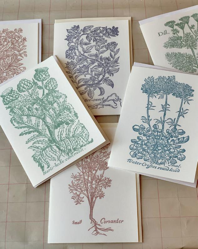
“Sensuous: of or relating to the senses or sensible objects”
Materials as Inspiration
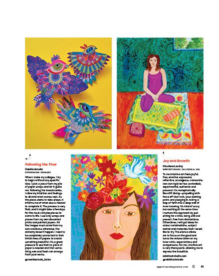
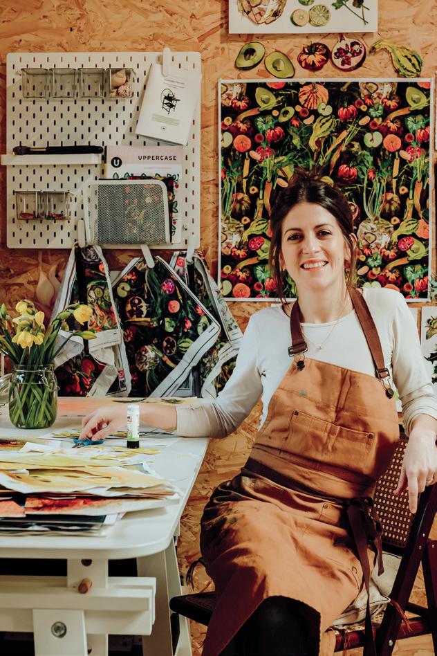
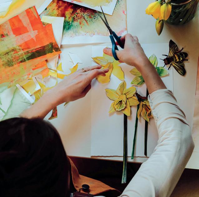
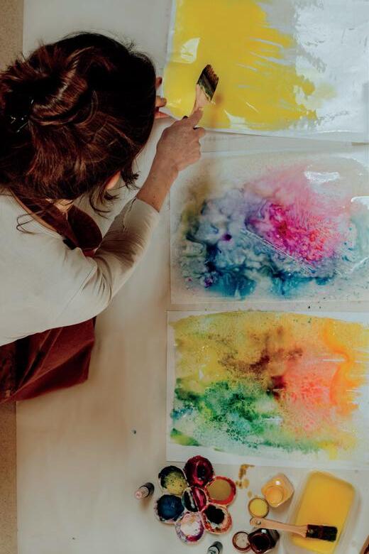
Camila Arruda
COPENHAGEN, DENMARK
Paint, brushes, paper, glue, beads, embroidery threads, scissors—these tools and materials inspire and guide me in creating my cards and collages. The process is very hands-on, activating all my senses. The texture of the paper, fluidity of the paint and even the sound of embroidering sparks my imagination. I aim for others to be touched by the materiality of my pieces. For my cards and collages, I use shapes and motifs cut from leftover prints, ensuring nothing is wasted in my studio. Everything undergoes a creative transformative process, gaining new life.
@camilaarruda_ baiao
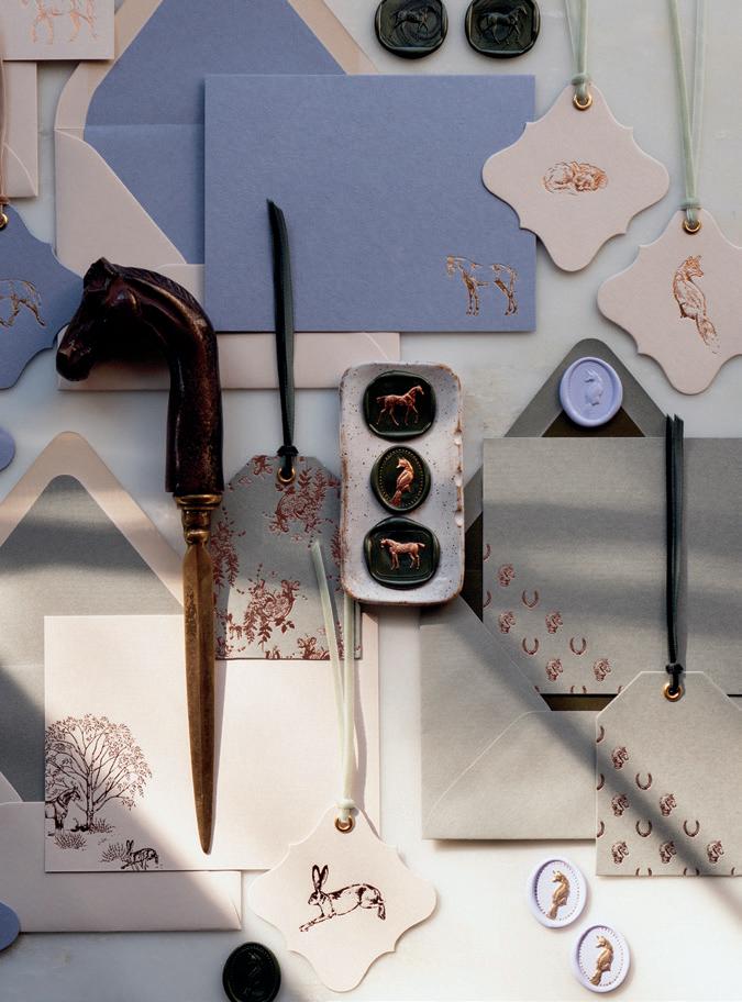
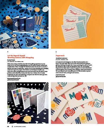
Luxury Small Batch Foil-Pressed Stationery
Danielle Demers
YORK, MAINE, USA
The ancient art of handwriting letters in the modern day should feel like an elegant occasion. At Danielle Demers Studio all stationery motifs— from correspondence cards, to gift tags to intaglio-style wax seals—start as pencil drawings that are later refined and transformed into beautiful copper printing plates. Stationery is foil stamped by hand in small batches by Danielle in her studio and is offered in a curated range of metallic foils on 111 lb card stock. All foil stamping is done on a lovely tabletop hot foil stamping machine crafted in England by Metallic Elephant.
danielledemers.com
@danielle.demers
Love Lettering
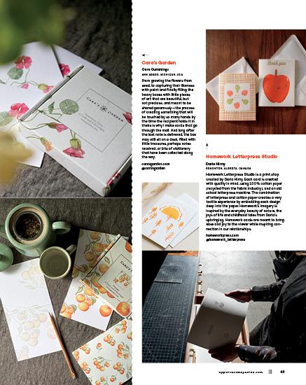
Doris Wai TORONTO, ONTARIO, CANADA
Growing up, I was fascinated with letters—the 26 in the alphabet AND writing them to pen pals and family. Stationery was a way to send love and stay in touch. As an illustration grad, letters were what I loved to draw most. Love Lettering was created in 2014, a small studio focused on the art of calligraphy, lettering and illustrations. I design stationery that ignites sensory in multiple ways. Letterpress fulfills the touch details such as colour palette, foil brings life to the visual design and the lettering/ calligraphy with the right wording can really bring sunshine to any mailbox.
lovelettering.ca
@lovelettering_doriswai
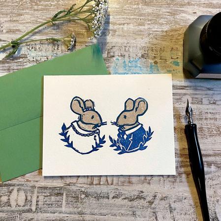
The Dreamy Linocuts of Loaded Hips Press
Shannon Buck
PORTLAND, OREGON, USA
Loaded Hips Press cards are printed on a letterpress in the haunted downstairs of a waterfront warehouse. There, the fairy-tale drawings of illustrator and printer Shannon Buck come to life as they become carved linocuts. Linoleum is a buttery smooth surface to carve, and reveals the texture of the paper it is printed on. Inks are repurposed from other old school print shops, yet because they are high quality, they remain luscious and vibrant. The sound of the rollers as they move over the linocuts and onto the ink plate make a spongy sound, and the clang of the ink plate rhythmically cranks. loadedhipspress.com @loaded_hips
Marbled Letterpress
Erin Pieronek
MANHATTAN BEACH, CALIFORNIA, USA
I am a letterpress and marbling artist. By combining my two passions, I create tactile work inspiring optimism and joy. Most of my letterpress is on cotton paper, which is soft and leaves beautiful impressions. I love how the simplicity of letterpress contrasts with the surprise of the colourful marbling inside. My over-marbled letterpress prints also highlight the dimensions of both. Everything I make is unique, as each is marbled individually. I ensure that nothing goes to waste; with scraps, I create bookmarks, collages and pieces for others to use in their own art.
ExudeJoywithErin.etsy.com @epieronek
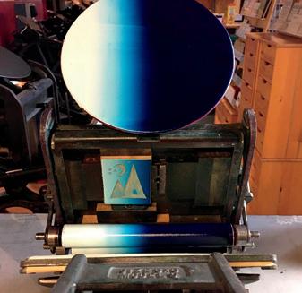
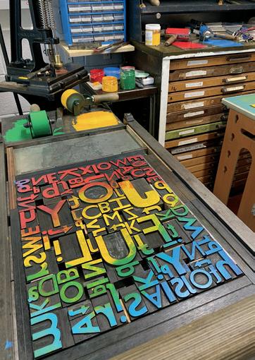
Princetown Press
Emma Hogbin
PRINCETOWN, DEVON, ENGLAND
There are three distinct sounds in our studio. The sticky whisper of ink as it is rolled from a puddle to a thin sheet of velvet. The bobsled of the proofing press as the cylinder is rolled back and forth like an old credit card machine. And the bell note as the ink disk rotates on the treadle press. For a newcomer, the studio smells exactly like a book should. A little ink with a base note of machine oil. Not as overpowering as visiting a car repair shop, but just enough to know the cast iron press in the corner is still used regularly.
princetownpress.co.uk
@princetownpress
Georgia Breeze
Georgia Frost
BUDE, CORNWALL, UK
Rediscover the joy of handwritten notes with our vibrant, houseplantthemed stationery collection. Designed with mindfulness, each piece—from positivity postcards to planners—features hand-drawn illustrations that evoke tranquility and fun. Perfect for jotting lists or sending heartfelt messages, our stationery adds charm and creativity to your daily routine. Experience intentional, positive communication with our whimsical designs. Ideal for your magazine’s feature on delightful stationery, it’s sure to inspire positivity, happiness and creativity. georgiabreeze.co.uk @georgiabreezedesigns
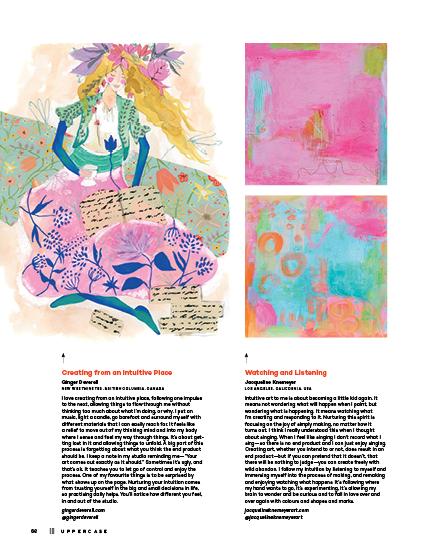
Licensed Beauty
Ginger Deverell
NEW WESTMINSTER, BRITISH COLUMBIA, CANADA
My lifelong love of papergoods led me to create artwork for cards, notebooks, gift wrap, bookmarks and more. Companies license my designs and create elegant paper products. My stationery designs are full of delicate wildness, infusing sensuous flora and fauna with soft ethereal colour palettes. They carry you away from the everyday and into places of whimsy and beauty—where you can hear birdsongs, see winged creatures fluttering amidst wildflowers, smell the perfumed air and feel nature’s gentle breeze dance against your cheek. gingerdeverell.com @gingerdeverell
Hand-Carved Art in a Style That Echos the Past
Carolyn Howse
MAYNE ISLAND, BRITISH COLUMBIA, CANADA
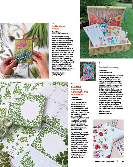
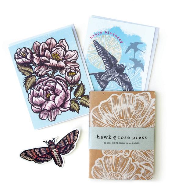
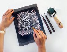
Ebullient nature-based art created by Canadian printmaker Carolyn Howse using the time-honoured tradition of linocutting. The hand-drawn compositions are methodically carved and printed by hand using a manually operated press. “A deep love of nature inspires my work. I employ saturated inks to convey an imagined sensory richness that my creatures experience when they grab a ripe berry or perch next to a flower.” The vintage style of artwork evokes feelings of joy and nostalgia for a less complex world. Printed carbonneutral in Canada on 100% recycled FSC-certified paper. hawkandrose.ca @hawkandrosepress
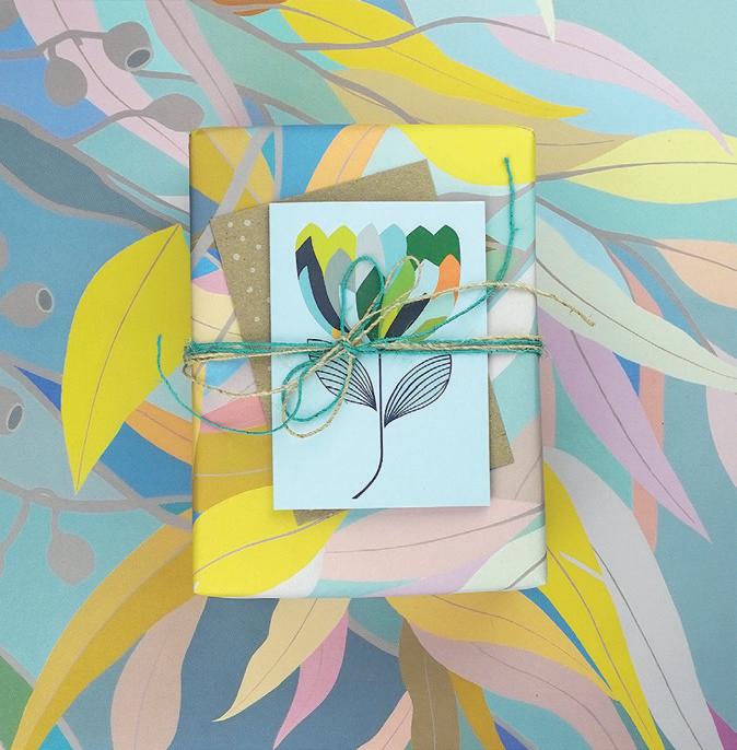
Earth Greetings x Claire Ishino
Heide Hackworth
ADELAIDE, AUSTRALIA
Earth Greetings are Australia’s original earth-friendly greeting card and stationery brand. Our Claire Ishino collaboration showcases Claire’s vibrant, hand-painted artworks of magical Australian florals on uncoated 100% post-consumer recycled cards, gift wrap and stationery. Claire’s joyful artworks have a dream-like quality, inspired by her love of Australian native botanicals, colours, music and morning walks. Our collaboration results in beautiful nature-inspired stationery to inspire everyday expression, and vibrant greeting cards to celebrate milestones.
earthgreetings.com.au
@earthgreetings
Carpe Diem Papers
Mindy Carpenter
ASHLAND, OREGON, USA
Carpe Diem Papers is a stationery company based on Mindy Carpenter’s original paintings. The aesthetic is nostalgic art meets vintage style, where everywhere beauty is captured in her unique colour palette and extensive collection of flea market finds. Whether it’s a beloved Staffordshire dog, farmer’s market bouquet in a tea tin or fanciful parlour, the stationery reflects heartfelt memories and classic iconic places and imagery we love.
Carpe Diem Papers is printed domestically on high-quality card stock and sold in specialty boutiques across the United States and Canada.
carpediempapers.com @mindy_k_carpenter
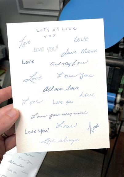
Lots of Love
Natalia Brown MINDEN, ONTARIO, CANADA
I have always been drawn to the intentional, slow-paced nature of non-digital writing tools, so my journey into letterpress printing seemed inevitable. This Mother’s Day, I wanted to expand my design process to have a more personal touch. I searched through decades of greeting cards for those written by the women on my mom’s side of our family. Words and phrases from my mom, grandmother, sister, aunts and me were scanned and digitally traced. After being meticulously arranged and printed in two colours with extraordinary love, we now have a token to keep them close for years to come.
naebr.com
@naebr.design
Niki Neems
IOWA CITY, IOWA, USA
Response: The convergence of poetry, handwriting and epistolary correspondence, is a collaborative literary art project, offered as a reaction to the slow disappearance of the handwritten mark, posted letters and books.
Originating with a fascination for the way life becomes art, Niki Neems, owner of r.s.v.p., a stationery shop in Iowa City, has instigated a series of letterpress notecards featuring handwritten work by poets and writers. Single cards are sold at r.s.v.p.
Complete signed sets are placed in handmade paper boxes with hope of consideration by special collection libraries.
responsehandwritingproject.com @rsvpicia
Notions celebrates the remarkable, practical and nostalgic tools and accessories of sewing. With sewing stories and profiles of textile artists, pattern makers, quilt shop owners, haberdashers, inventors and entrepreneurs plus an exploration of the history and invention of our beloved notions and tools, Volume N in the UPPERCASE Encyclopedia of Inspiration is an entertaining and illuminating A to Z of sewing miscellany. uppercasemagazine.com encylopediaofinspiration.com
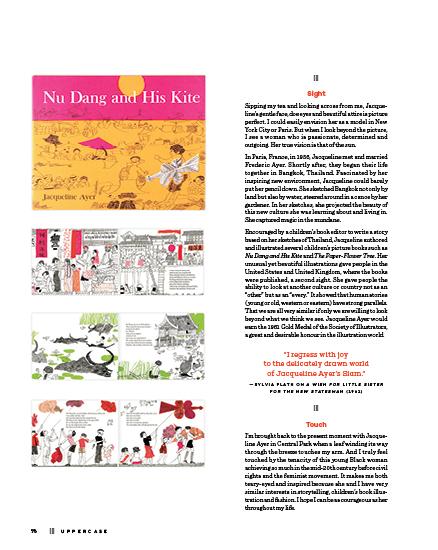
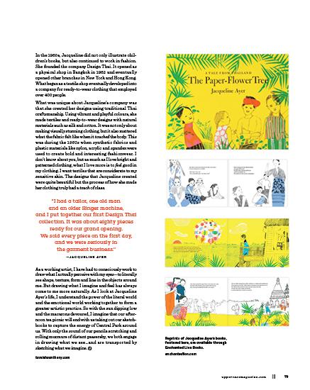
spilling the tea with T
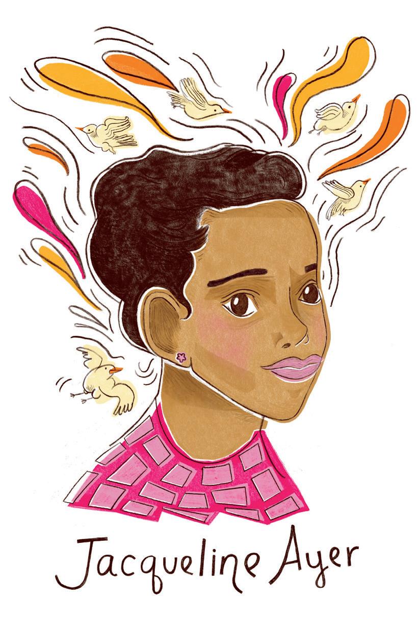
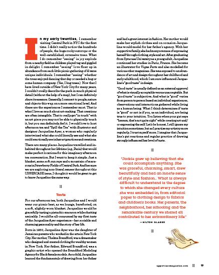
an imagined conversation with fashion designer, illustrator and writer jacqueline ayer
||| STORY AND ILLUSTRATION BY tamisha anthony
|||
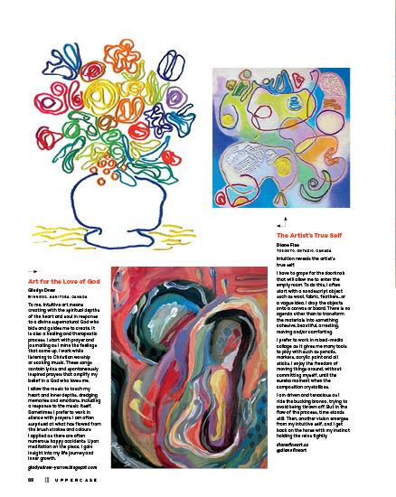
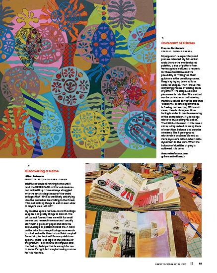
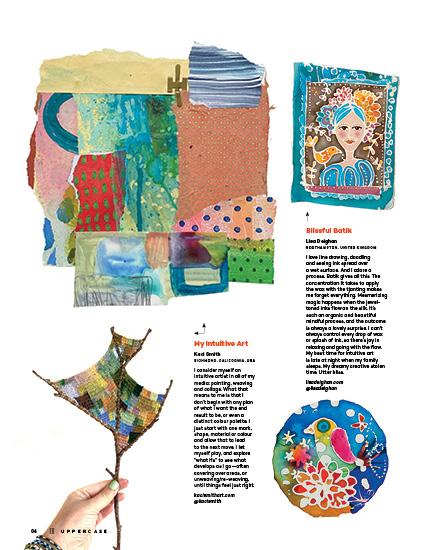
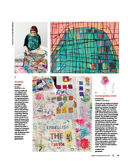
What does the term “intuitive art” mean to you?
intuitive art
How do you nurture this approach? How do you follow your intuition in art, design or craft?
Trust Your Intuition
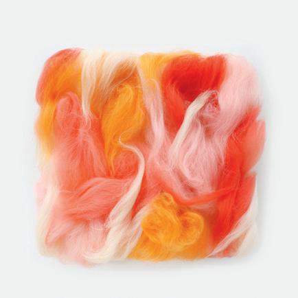
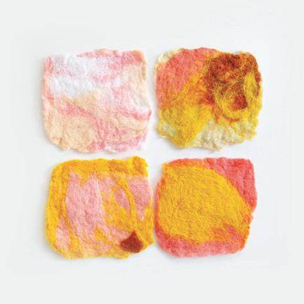
Lili Holland
TENAFLY, NEW JERSEY, USA
When I think about “intuitive art,” I think about trust. As a fibre artist focusing on wool and wet felting, working by intuition is integral. It’s deliberate and thoughtful, with a heavy reliance on trust and instinct. Trusting myself, my knowledge and experience, allows me to explore freely. I create without knowing the outcome but knowing the experience will enrich me. Inspiration comes from anywhere: nature, colours, a sound, a gesture. The urge to explore is fundamental to why I’m an artist. Embracing intuition has led to transformative discoveries and is central to my creative process. It can yield results that are magical. When I’m immersed in the work, I feel most connected and in tune to both my materials and my own humanity. Wool is magic. bayleafstudio.com @bayleafstudio
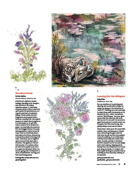
The Art of Listening to the Things That Call You
Kim Koehler
LOS ANGELES, CALIFORNIA, USA
Every morning, as I descend the stairs into my neighbourhood, I pause to see which path calls to me. Sometimes, the sun’s warmth pulls me toward the shadier route; other days, I seek the calm of quieter roads. I know the times of year that my favourite flowers bloom—the camellias in February and the jacaranda trees in May. I recognize their patterns, each with an inner compass attuned to the changing seasons. Taking my morning walks is like drawing a card from a tarot deck. I let whatever strikes me inspire my art for the week. It always motivates me to pick up my sketchbook. When my time is limited, I use a mini sketchbook. On lazy Sunday mornings, I pull out an oversized one. It’s a place where I experiment when no one is watching. It’s a whisper of something that spoke to me and I listened. Sometimes, a bit of magic happens and a new piece comes together without much thought. They are the seeds of ideas that I use for my final art pieces. kimko-design.com @kim_ko_design
An Indispensable Tool
Megan Lui DETROIT, MICHIGAN, USA
My intuition is the most valuable tool at my disposal for making my art. It guides the beginning of my practice for every painting. As I prep my canvas with modelling paste, I make impressions into the paste using palette knives, different stamps and found objects. Whatever “feels right.” I let my hands go and lay down my marks. This creates zones within my painting where the figurative work dissolves into texture, as if in a dream where you do not see the whole picture. From there, I build up the layers while being deliberate about letting go of control.
These unexpected compositions wouldn’t have been possible without me following my intuition in the early stages of making a painting. Making art while relying on your intuition can feel freeing and bring spontaneity to your work. The challenge can be trusting that it will all come together. That moment when the painting starts to become something out of the chaos—the feeling is indescribable.
meganlui.art
@meganlui.art
Intuitively Easy
Nicole Roberts OREGON, USA
The practice of intuitive art came to me after years of struggle to find my “style.” Having been a commercial artist for many years, I was fighting to find my own voice. Finally someone told me that my style boiled down to my choices… do I want this to be blue or black? Do I like circles or squares? For some reason that simplified the process for me and I was able to look at my process differently. Instead of forcing my art to fit into a box, I began to approach it with curiosity. Now the question I ask is, what if I do this…? I’m amazed at how much easier, more enjoyable and more nurturing my art practice has become.
nicolerobertsdesign.com
@nicolerobertsdesign
PLEASE SUBSCRIBE
Painting from the Soul: How Intuition Drives My Art
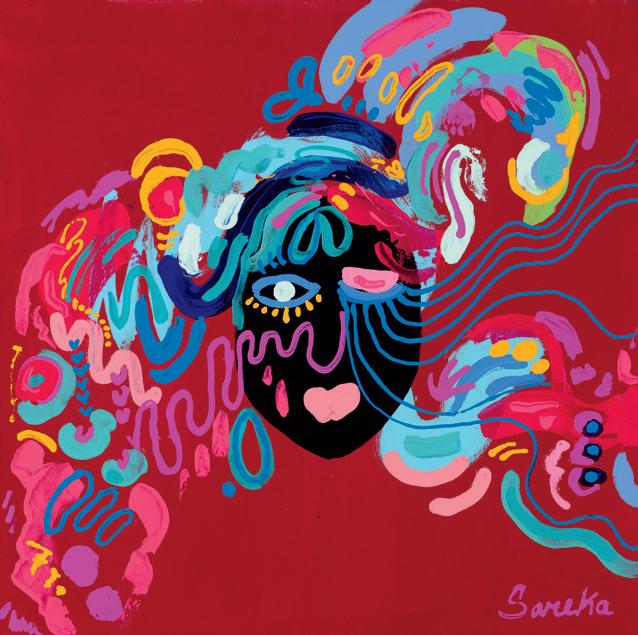
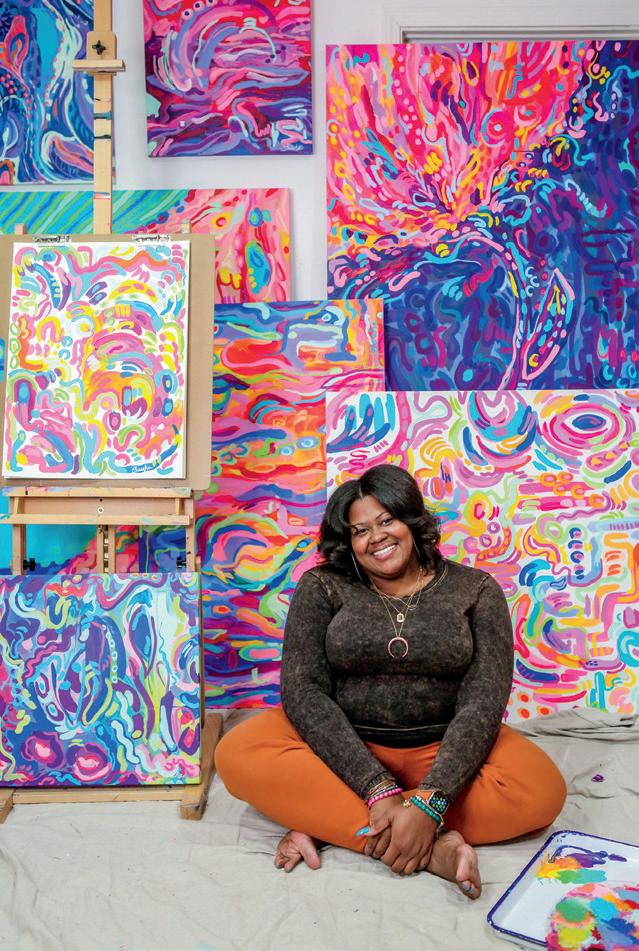
Sareka Unique Smith
MICHIGAN, USA
YPSILANTI,
I love bringing joy to people through my art. I am very emotional and driven by my feelings (it’s my Cancer sign). I’ve learned to balance logic and emotion but still allow those feelings to drive my abstract expressionism. Intuition leads me through life’s challenges, and I rely on it completely when I create. My background in graphic design and illustration has ingrained design principles in me, so when I approach a canvas, my intuitive flow naturally aligns with those principles. The best advice I can give for tapping into intuitive painting is to fill your cup with experiences and knowledge that will pour out when you create.
sarekaunique.com @sarekaunique
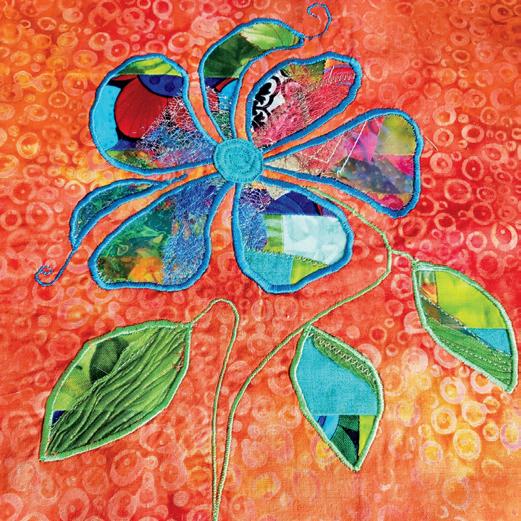
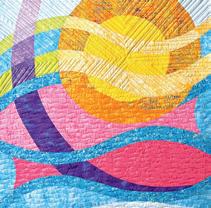
Controlled Chaos
Teresa Stoller FLAGLER BEACH, FLORIDA, USA
Intuitive art is my happy place—a colourful dance with colours, textures and patterns in a symphony of (what I call) controlled chaos scrap stitching that turns quilting into pure joy. It’s all about diving into my stash, letting my hands grab whatever they find and trusting the process. I may start with a rough sketch or drawn pattern, but the real magic happens when I pull fabric scraps from my drawer. Need ocean blues? I grab a handful from the blues drawer, no fussing, just stitching them together into a beachy, bold and playful quilted art piece. Bright colours, carefree vibes and a touch of whimsy—that’s my kind of creativity.
beachdreamsquilting.com @beachdreams_quilting
intuition and art
how to access inner wisdom through colour and creativity
You want your creative work to be amazing, highly regarded, maybe referred to as “genius.” You want to make a living with it, maybe even garner a multi-six-figure income.
STORY & LETTERING BY lilla rogers
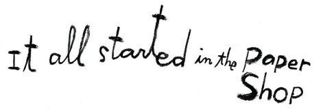
It all started at the paper shop, where you drooled over the art on the covers of the journals. You bought a few, just to own, to cuddle, knowing you won’t actually write in them. They are too pretty. You placed them around your apartment just so you can look at them. You secretly wanted to get that gig, to get commissioned to make art for journal covers. Or children’s books, or to write and illustrate your own non-fiction book or make a line of cups for Anthropologie.
You picture it: your work is on the Anthropologie site, it sells like crazy, and you are hot, hot, hot. Your podcast is blowing up! Your book is selling! You’re definitely a success, it’s indisputable! It was easy, and all worth it! Your work flowed from beginning to end!
Hyped up, you get your coffee, power up your iPad Pro, gather your real-life drawing materials or open up your laptop to start writing your book or the outline for your podcast.
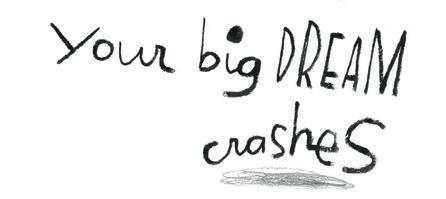
And then it happens. You write your first sentences or make your first lines of the drawing. It’s not fabulous, it’s not amazing. Actually, you can’t stand what you’ve done. Your drawing bores you, your text is flat. A dud. You’re sure of it. And then it all stops, crashes into the side of the road. You don’t have what it takes, you just know it. This bad work is proof. Your big dream crashes. Game over. Creative block.
Please, please, let me tell you that every single creative person understands this. Even the most successful people experience this from time to time, particularly when they branch out in a new way. A successful writer takes a stab at a podcast. An illustrator takes a chance on writing and illustrating their own picture book. Even my top artists who crank out brilliant images for a living, feel shy or timid when they send me their very first manuscript for a picture book, like they are starting at the beginning, and in a way they are. Every time you start a new medium or new creative venture, you are a beginner once again and the dreams ride alongside the fears and the pressure of high expectations.
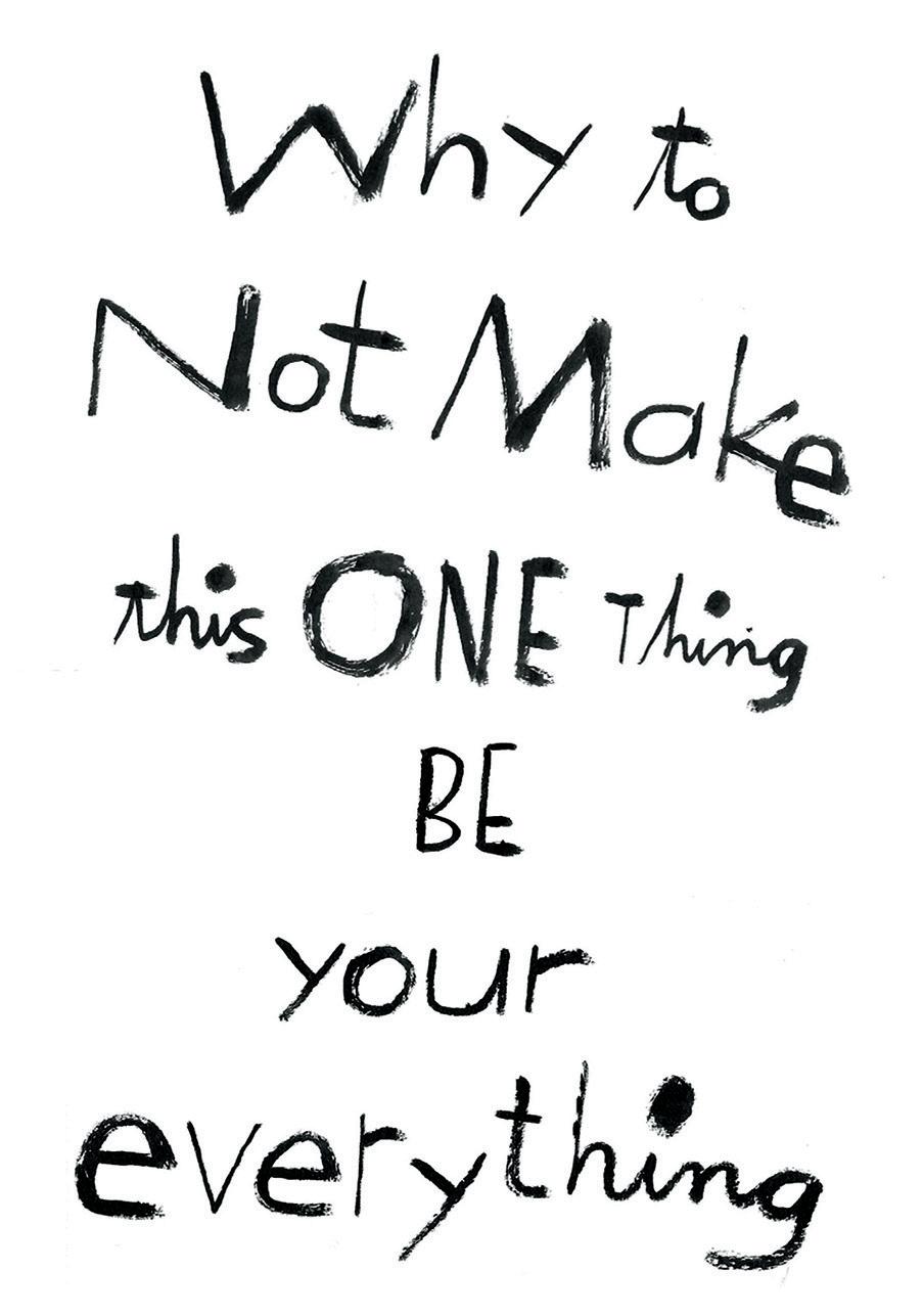
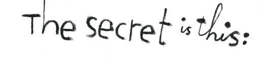
The secret is this: start where you are, right now, and just know that you will get better if you keep on making stuff. You absolutely will get stronger with each book, or each podcast, or each illustration, or each painting. It’s automatic. You don’t even need to fret about it. For me, when I feel that bad stuff I now am able to ignore it, because I know if I just keep working I’ll figure out the path. I’ll try this and I’ll try that, all with an open mind. I’m ok to pivot, to stay chill and to see what emerges. This is just one project you’re doing. It is not your everything! Once you know that your current project is just one of many stops on your creative highway, you are free. This latest project doesn’t have to be brilliant. It’s not an assessment of your worth nor your entire identity. If you keep at it, eventually it will be wonderful.
For the past few years, I’ve been writing this column for Janine. I enjoy it immensely because she emails me with the general theme of the upcoming issue, and she gives me total creative freedom, because she’s a star. She trusts her writers. Anyway, a few months ago I was looking at my first few columns and I’m like, wow. I actually have improved. It’s now more fun to make them, my confidence and comfort have expanded. My writing has improved. It made me think that I might like to write another book because the columns are such fun. And so it goes.
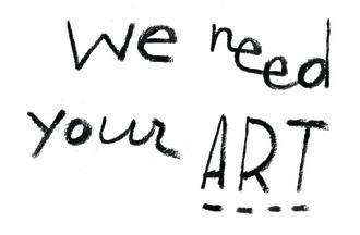
Most importantly, it’s critical that you relieve yourself of the fear of creating. That you learn how to work past blocks. Because your voice matters. Your art matters. You may feel this: who needs another book, story, picture? I will tell you. Think of all the creative items from others that uplift you: the aforementioned journal, the joy you get in curling up with a book and falling in love with the main character, the gorgeous fabric for sewing your new dress or that mural you gaze at while sipping a latte at your favourite café. Art is a spiritual gift you give to the world. It is peace and harmony. We need your art. Remember that.
lillarogers.com
@lillarogers
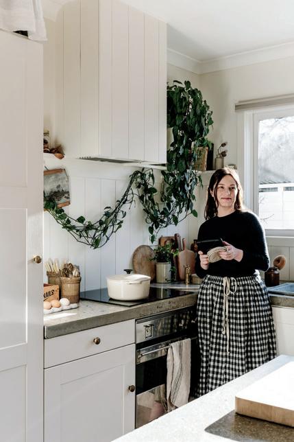
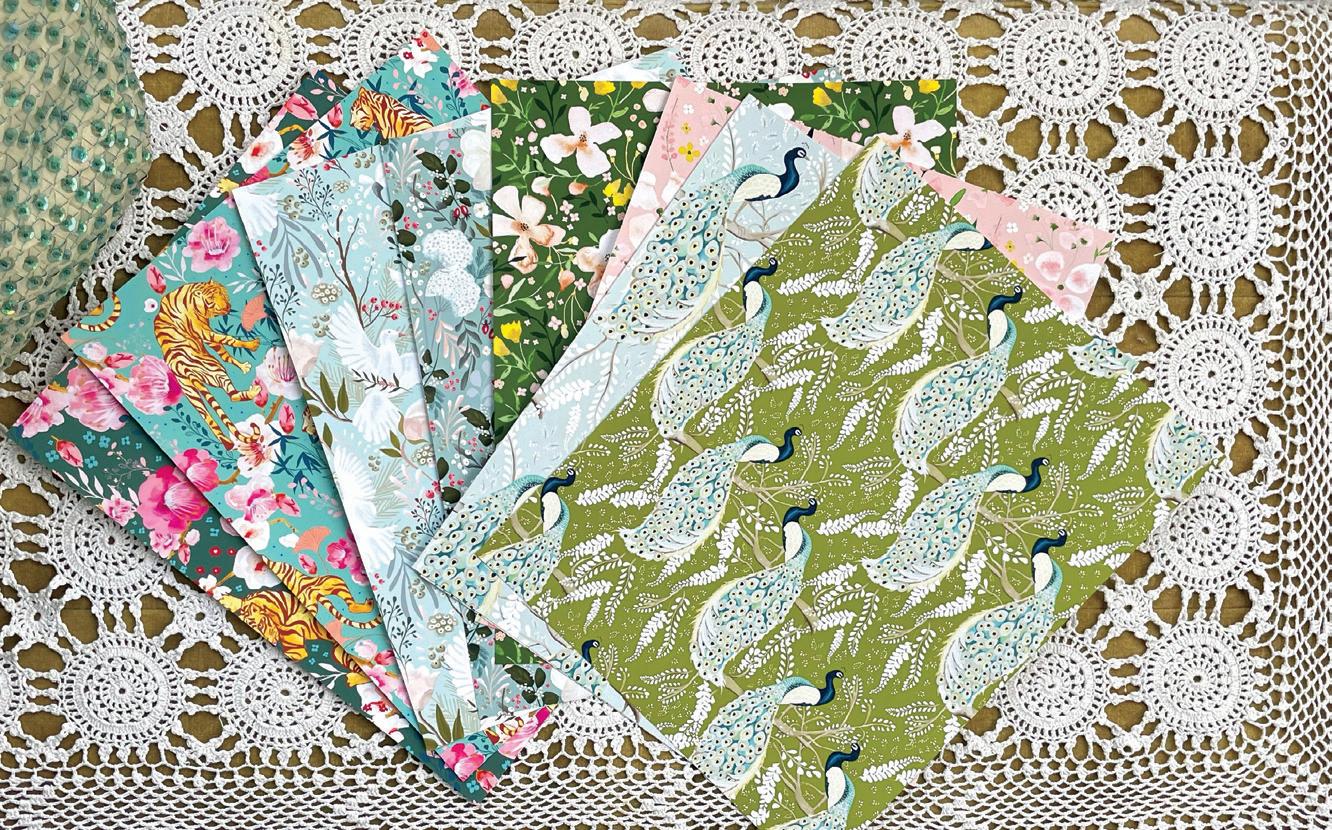
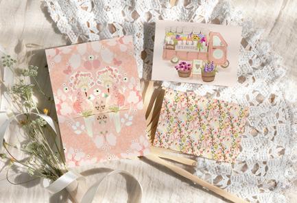
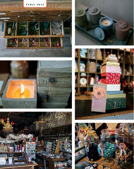
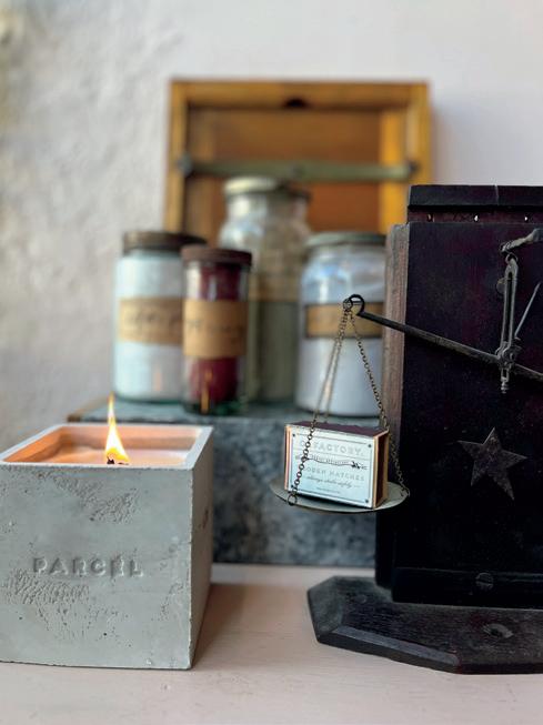
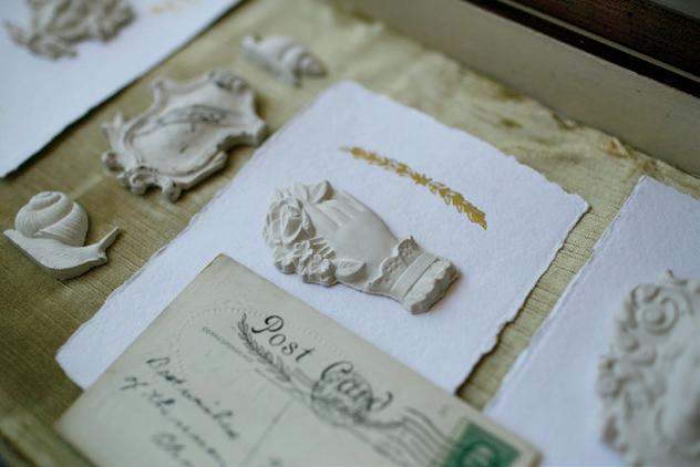
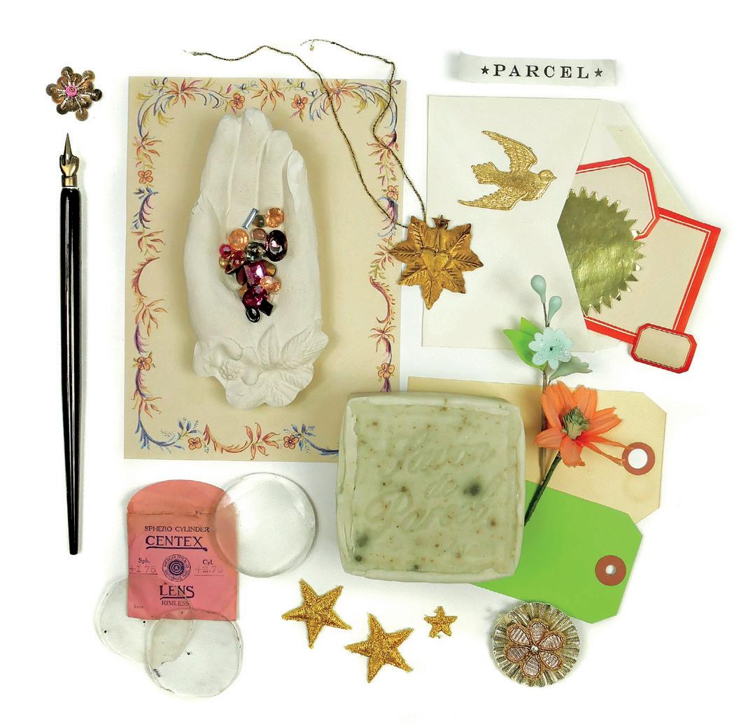
vintage treasures & sensory delights
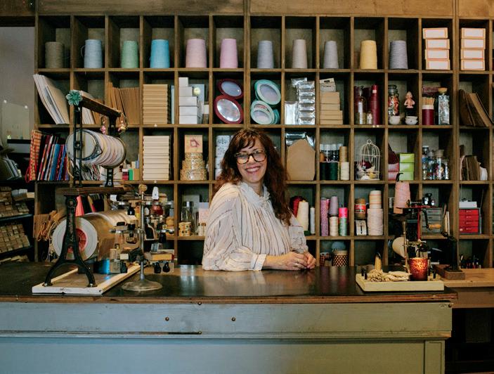
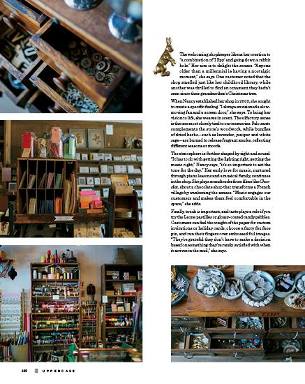
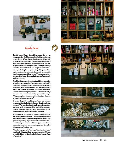
Nancy Laboz, the founder of Parcel, was a quirky kid with imaginary friends and a vibrant inner world. “As a child, I had my own businesses and I always had an office,” she recalls. “I always had a bank. I collected little papers, and had little filing cabinets, and made little things and created little worlds.”
As she grew older, her childhood passion took shape in a new way. Around 2001, she began cleaning out a defunct stationery store from the 1930s, making repeated trips to collect ledgers, labels, old greeting cards and other paper products. Her plan was simple: if she could fill a trunk with these finds, she would have enough to open a real shop.
Today, you can visit Parcel in Montclair, New Jersey, and immerse yourself in a tactile and visual trove of papergoods and vintage curiosities. Take your time— it’s an experience meant to be savoured.
Twinkling string lights and hanging basket fixtures cast a soft amber glow, reflecting off mirrors and sparkly tinsel trim. The shop is a sensory feast: dozens of drawers, cubbies and compartments beckon you to discover their treasures. Classic Bingo cards and waxy Wonder Bread wrap evoke nostalgia, while Mexican offer healing and protection. Accordion melodies and playful waltzes from the dreamlike fill the air, mingling with the sweet scent of aromatic wood. Each detail invites you to touch, explore and linger.
The Pouring Lab
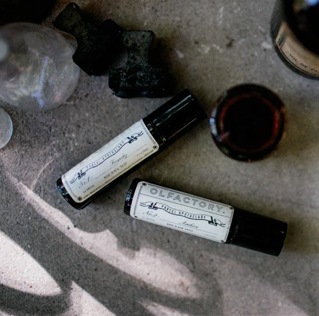
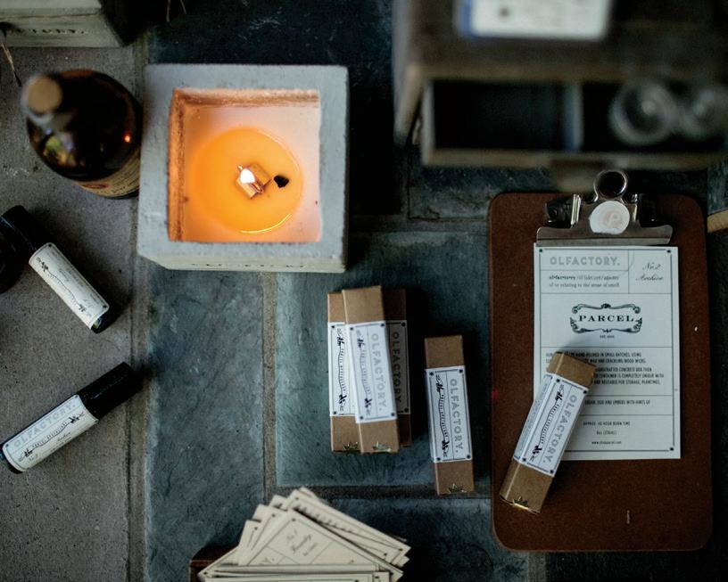
Nancy and her family live in a mid-century home that was once owned by a doctor and his wife. The medical practice operated from the basement. Adam, a sitar and guitar player, uses the doctor’s office for his DJ show and other musical projects. Recently, Nancy converted examination room #3 into a pouring lab, where she creates Olfactory, her line of apothecary products.
After some trial and error, she developed a signature scent by sourcing ingredients from fragrance labs. In her workspace, she crafts silky-smooth concrete candle holders, pours shea butter and apricot oil into hand salves for her hard-working customers and makes goat’s milk soap and lip balm. She also uses antique pieces to create moulds for decorative plaster objects. The name "Olfactory" was chosen to reflect the traditional and handcrafted ethos of the business. This commitment is evident in the use of old-fashioned techniques and small-scale production. “Everything is very, very small batch,” she notes, emphasizing her focus on maintaining a personal touch and steering clear of mass production.
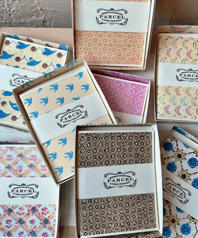
Paper and Packages
While Parcel has a wide range of inventory, the heart of the shop is stationery. Visitors are invited to relax on an antique French loveseat while selecting custom invitations, stationery or holiday cards. The foil-pressed notecards use heat and pressure to imprint shiny metallic designs onto paper, utilizing vintage or handdrawn plates. Staff draw images from a library of worn science books, recipes, fairy tales, piano music and catalogues. Red monogrammed notecards are adapted from a 1930s Spanish dictionary. Greeting card designs include good luck symbols, moons and stars, nautical themes, laurels and a lady dancing on a teapot.
Stationery may be central to Parcel’s offerings, but their standout service is gift wrapping. “People come from far and wide for our gift-wrapping service,” Nancy says. She has wrapped rings for proposals and nested boxes that reveal jewelry or a token in the tiniest box. “You can bring something that you haven’t purchased from the shop, and we’ll very elaborately, or very simply wrap it.”
Parcel’s wrapping paper features images of fairies, bugs, harlequins, and Pennsylvania Dutch Fraktur, an ornate folk-art style of calligraphy and decorative design dating to the 18th century. Packages are adorned with ribbon pinwheel rosettes, tassels, ribbon or whatever staff or customers imagine.
Gift wrapping “brings in a customer that wouldn’t otherwise find us,” she says. “I also offer my handwriting services. I’m not a calligrapher but I love the handwritten note.”
Memorial Magic
The shop has become a touchpoint in the community serving not only weddings, birthdays and anniversaries, but also moments of loss. The small staff has created physical memorial shrines and handmade memorial books for funerals, providing comfort through creativity.
One of the most unusual assignments was crafting a three-dimensional fairy-tale scene for a woman who knew her end was near. Nancy describes her as having “a very magical sense about her” and a lifelong love of fairies. The woman wished to be surrounded by fairies at her memorial. Funerals require creativity on the spot, with little time to prepare. For this project, Nancy fashioned winged characters with retro faux flowers and sparkly bits from the shop. She is honoured to create meaningful designs that help people mark significant moments.
The passing of her own father last year deepened her appreciation of his influence on her business. “My dad was a nuclear physicist, and he was like a mad scientist; but he was also a maker of furniture and a tinkerer. He taught me a lot of methods, and how to look at tools and use tools. I never was very good at it, but I used to always be around it.”
Reflecting on her long tenure on Bloomfield Avenue, Nancy expresses gratitude for her father’s role in shaping her resourceful DIY approach. “Enlisting help in my team is really important, but outsourcing is not really my thing. We always try to figure it out ourselves.”
Beyond its charm and sensory experiences, Parcel highlights the impact of creativity and personal touch in a retail world often dominated by the mundane. It’s more than just a shop; it’s a place of nostalgia and inspiration, showcasing the beauty in the small things you can see, smell, touch, hear and taste.
shopparcel.com @shopparcel
THIS IS A LOW RES PREVIEW OF A HIGH QUALITY QUARTERLY PRINT MAGAZINE
PLEASE SUBSCRIBE
subscriber studios
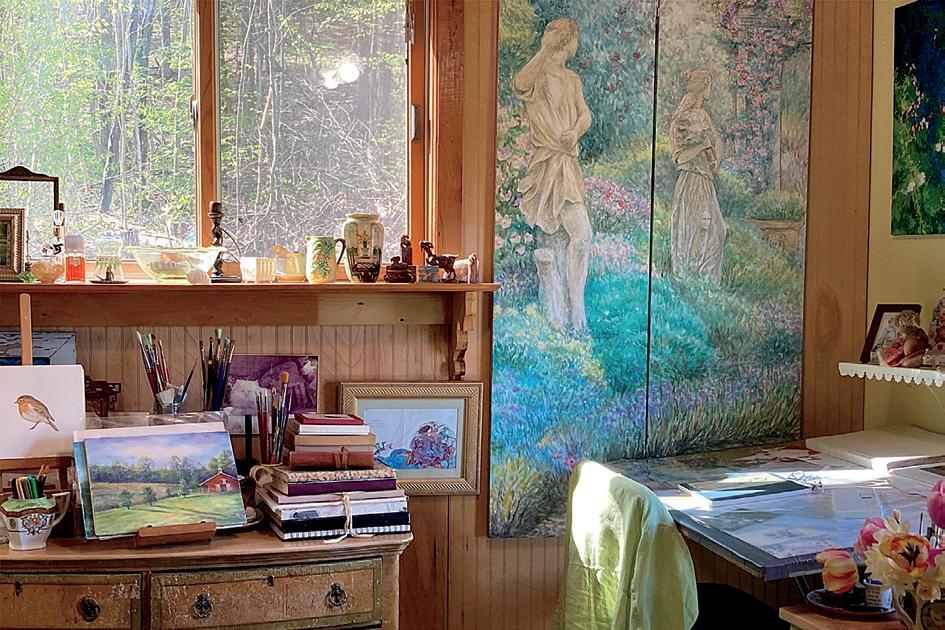
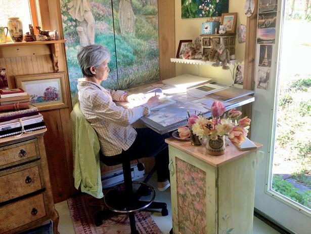
Fiona McTaggart
POOLE, DORSET, UNITED KINGDOM
I am a passionate artist and surface pattern designer whose creative journey is deeply intertwined with the beauty and therapeutic qualities of nature. Based in Dorset, and as a mother of two wonderful children, family experience is very much embedded within my practice. Having left teaching art to reengage with my own art practice and to be more available for my children, I now spend my weekdays in my lovely little studio at the bottom of my garden.
fionamctaggart.co.uk
@fmctaggart
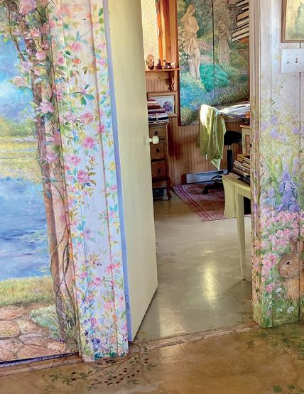
I’m a professional artist who has done everything from murals to children’s books. My art is inspired by the beauty of my surroundings. Nature, in all its glory, fuels my paintings and projects. I have a house in the country, in the rolling hills, and my studio overlooks the vista. From the painted floor to the hand-painted china, “Painted Cottage” is my artist statement. judithchengart.com @judithchengart
Want to be featured? Submit your studio story! uppercasemagazine.com/ participate Judith Cheng
looking forward
Volume N: Notions
Notions celebrates the remarkable, practical and nostalgic tools and accessories of sewing. With sewing stories and profiles of textile artists, pattern makers, quilt shop owners, haberdashers, inventors and entrepreneurs plus an exploration of the history and invention of our beloved notions and tools, Volume N in the UPPERCASE Encyclopedia of Inspiration is an entertaining and illuminating A to Z of sewing miscellany.
uppercasemagazine.com/volumeN
Volume G: Glue
This volume will be all about collage, assemblage and other sticky creative pursuits! Auditions to be profiled in the book will be announced in the UPPERCASE newsletter and on the UPPERCASE website.
uppercasemagazine.com/volumeG
Sign up for my weekly newsletter for behind-thescenes updates and the latest on open calls for submissions for UPPERCASE books and magazines.
uppercasemagazine.com/free
UPPERCASE magazine
#64 January-February-March 2025
#65 April-May-June 2025
#66 July-August-September 2025
#67 October-November-December 2025
Pitch your article ideas and suggestions anytime!
uppercasemagazine.com/participate
Make connections, nurture your creative spirit and grow your business!
The UPPERCASE Circle is a vibrant community hub, one that is a valuable source of motivation, inspiration and encouragement for like-minded and kind-hearted creative people from around the world. Although the community is initially brought together by its support for and appreciation of UPPERCASE magazine, the Circle will enhance your experience of all things UPPERCASE while providing additional value to your creative life through conversation and the sharing of knowledge.
• Connect with members of the UPPERCASE community— both near and far—who share your interests.
• Share your work with your peers, mentors and potential customers.
• Find inspiration, motivation and new perspectives.
• Move your creative business forward with tips, tools and support from peers and guest experts.
• Videos, behind the scenes and more!
Access to this community is FREE when you subscribe to UPPERCASE magazine!
uppercasecircle.com
Have you made something with the subscribers’ kraft envelope or reused the magazine or postcards in an interesting way?
Please share your pictures and stories of my books, magazines and fabric on Instagram:
@uppercasemag #uppercaselove
Julieanne Steedman
ONTARIO, CANADA
Meera Lee Patel’s words from the latest issue of UPPERCASE magazine really hit home and were the perfect thing to paint.
julieannesteedman. substack.com @heirloomisland
Colouring over the UPPERCASE postcards
Marion Herlet
GALIANO ISLAND, BRITISH COLUMBIA, CANADA
I chose to use the patterned inserted postcards from UPPERCASE. I always feel encouraged to re-use the magazine in a crafty way and thought this could be a fun exercise. The UPPERCASE prints serve as a digital collage, filling parts of the motifs and inspiring the backdrop. I also drew and sketched on top of them to create additional texture.
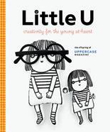
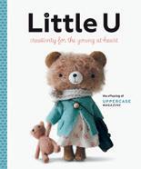
Small but mighty! 100% of Little U sales go to UNICEF!
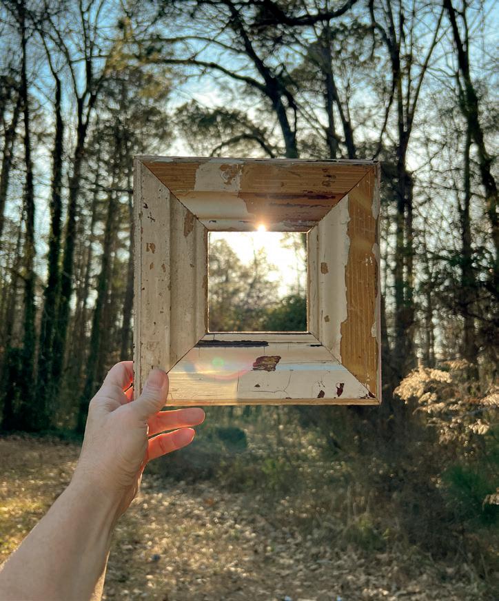
the art of seeing
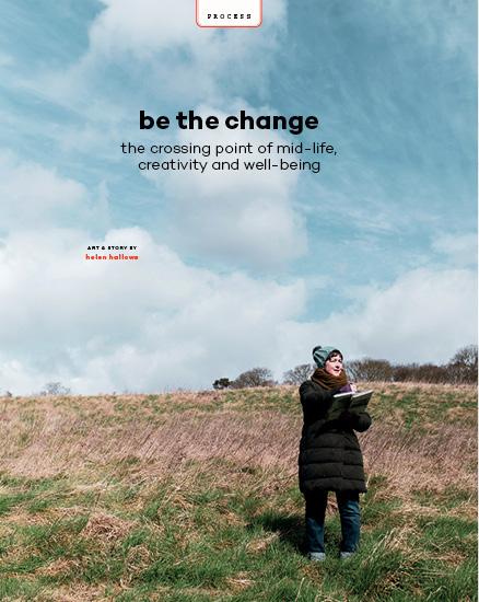
Late afternoon light blanketed the wooded path as I walked to find the right tree. I settled on an ancient oak consumed with ivy, found a comfortable place to sit and set the timer on my phone for 15 minutes.
An hour earlier, I’d stood in an old church library before a small group of participants who had signed up for a workshop I was leading on the art of seeing. I assigned a handful of exercises designed to deepen the way they “see” (one of which was to observe a tree for 15 minutes) and sent them out to wander the lush sprawling wooded acres that surrounded the old library. Pay attention to what you pay attention to, I told them. But even as the words left my mouth, I wondered how often I really did that myself.
Looking is one thing, seeing is another. When we look, the act is physical—we direct our vision towards something and let our eyes pass over it, but seeing
is something else altogether. To see is to notice, to commit to what our eyes land on and to connect with it—to not only take in the details of a particular object, being or scene, but to also understand how these details make up the whole. To really see is to identify context, to perhaps even decide how we feel about it and to embrace the idea that sometimes this transcends sight. Sometimes, to really see something means to lean into sound, scent, taste or touch. In other words, seeing is more than just about sight. It takes time. It requires both attention and intention. For me, it’s a decision I make every day, whether I’m aware of it or not. In fact, the very idea for the workshop was born from a realization that, for all my good intentions, I sometimes go days without really seeing anything. I resolved to carve out a more dedicated practice and offer a shared learning experience for those who felt pulled to do the same.
Observing a single tree for 15 whole minutes isn’t as easy as you might think. As soon as I sent the class into the woods to explore, I set out too, which is how I ended up in front of the old oak. I’d been experimenting with observational exercises so the experience wasn’t exactly new to me, but still I was struck by just how hard it is to sit for 15 minutes to study anything. But this time, I really paid attention to what I paid attention to. In the first five minutes, I swatted at bugs both real and imagined, shifted positions a dozen times and checked the timer on my phone what seemed like a hundred times. As fidgeting gave way to stillness, what I noticed first were the sounds. What I initially perceived as silence was not silence at all, but instead a cacophony of wind, leaves, birds and insects. I became acutely aware of all movement—the bend of a branch, the sudden shudder of a cluster of leaves or the arrival and departure of all sorts of winged things. The tree’s details began to melt into shapes, and the shapes gave way to something more abstract. Just before my timer sounded, the tree had begun to look like something from a different planet, as if the tree were a word I’d repeated over and over until it was no longer recognizable. A real sense of wonder set in then and I felt, for a moment, wholly alive. “Attention is vitality,” Susan Sontag once said to a roomful of young graduates. “It connects you with others. It makes you eager. Stay eager.” And while Sontag was referring to the creative process, it’s not a bad way to move through the world either: eyes wide open, fully awake.