a magazine for the CREATIVE and CURIOUS since 2009 th Surface
Pattern
FROM THE EDITOR’S DESK
Dear Reader,
On a neighbourhood walk, you may observe a variegated leaf, fallen petals strewn on the sidewalk, a spotted cat, the plumage of a bird and the sun casting late-day shadows of tree branches across the lawn. Stepping through a puddle, your damp shoes leave prints of their soles, tracking your return home.
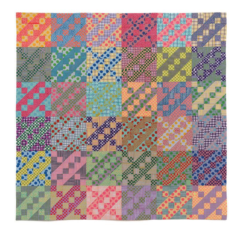
Inside, you remove your shoes on the lattice-embossed floor mat and hang your plaid jacket in the closet. You smooth your gingham shirt and place your backpack on a chair, noticing that its pattern clashes pleasingly with the padded cushion. The living room welcomes you with a woven carpet, pretty wallpaper and a couch upholstered in soft texture. Sitting down to read, you pause to appreciate the endpapers of your book. Putting your feet up on the ottoman covered in vintage fabric, you wiggle your toes, admiring the stripes of your socks. You drape a throw blanket over your lap; it’s a patchwork quilt. You are enveloped in a kaleidoscope of pattern and colour.
Patterns are applied to the surfaces of our daily lives. From fabrics, clothing, papergoods, wallpaper and our furniture, there are many dimensions of surface pattern design. It’s a form of creative expression and personal style, and, as shown in this sixth edition of the UPPERCASE Surface Pattern Design Guide, it can become an encompassing career.
If you may permit me the pun, patterns are all over!
Janine Vangool
PUBLISHER, EDITOR, DESIGNER
Receive my weekly musings, delivered to your inbox!
uppercasemagazine.com/free
BEHIND THE SCENES
Making decisions
Although challenging to narrow it down to just 100 portfolios, it was an absolute pleasure to review the thousands of patterns submitted for this issue. Your work is beautiful and inspiring!
Sarah
Surface Pattern
Joke
Laura
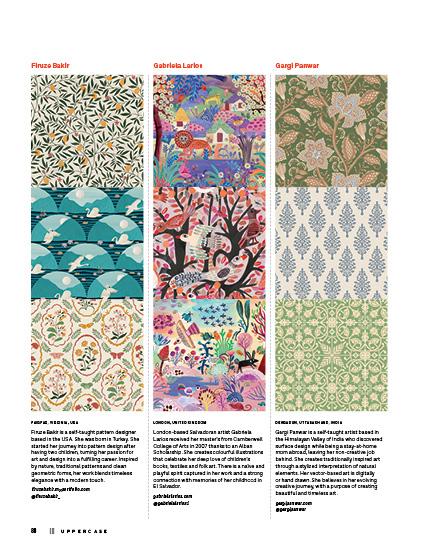
Gargi Panwar 64
Halfpenny Postage
Bravery Co.
Surface Design Immersion
Make Art That Sells
From Paint to Pattern
Sketch Design Repeat 65
PAPERS
Renée Stramel
Gisela Gilbert
Kristina Forrest
Leanna Baxter
Sophie Dufresne
Rachel Kroh
Ouss Mezher
Janine Vangool 66
100 artists’ portfolios selected from 790 entrants
TOP TEN TIPS FROM PATTERN EXPERTS
Long-Term Success in Surface Design by Bonnie Christine 70
Collaborative Marketing with The Creative Source Collective 76
Creating a Business Around Surface Pattern Design by Erin Flett 84
Generating New Ideas by Jackie Tahara 90
Hands-On Pattern Making by Justine Munro 96
Getting Started in Surface Design by Shannon McNab 102
Business Basics by Tracy Krauter 108
UPPERCASE
1052 Memorial Dr NW Calgary, Alberta, Canada T2N 3E2
Interior pages are printed on 100% post-consumer recycled Rolland Enviro 100.
Sustainability Initiatives
Through the Wren Trailblazer fund, UPPERCASE removes two tons of carbon each month with an additional two tons of carbon offset monthly. Please join fellow readers in the Wren Impact forest.
In the spirit of reconciliation, we acknowledge that we live, work and play on the traditional territories of the Blackfoot Confederacy (Siksika, Kainai, Piikani), the Tsuut’ina, the Îyâxe Nakoda Nations, the Métis Nation (Region 3) and all people who make their homes in the Treaty 7 region of Southern Alberta.
SUBSCRIBE
This independent magazine thrives because of you— its loyal subscribers!
uppercasemagazine.com
SUBSCRIPTIONS
This quarterly magazine is released in January, April, July and October.
$96
USD $80
INTERNATIONAL
CAD $144
Our shop will do the currency conversion for you.
RENEWALS
You will receive a notice by email when it is time to renew. Renew online anytime to add issues to your current subscription.
GIFTS
Simply enter the recipient’s name and address in the shipping information and your name, email and billing address during checkout.
STOCKISTS
To view our list of stockists or to carry UPPERCASE in your shop:
uppercasemagazine.com/ stockists
Thank you to all of the talented writers, illustrators, creative collaborators and loyal readers who contributed their talents to this issue of UPPERCASE.
QUESTIONS?
Have a question about your subscription or a change of address? Email us: shop@uppercasemagazine.com
NEWSLETTER
Sign up for the UPPERCASE newsletter to receive free content and behind-the-scenes peeks at the making of the magazine— plus a welcome discount on your subscription!
uppercasemagazine.com/free
Thank you to everyone who submitted to the open calls for this issue. Even if you weren’t featured within these printed pages, your effort was noticed and appreciated!
SUBMISSIONS
UPPERCASE welcomes everyone and all identities, ages, talents and abilities. We share an inclusive, positive and community-minded point of view. Everyone is welcome to explore our creative challenges and submit to the magazine. Pitch your own work, propose an article or suggest a topic through the Open Pitch submission form. Be familiar with the magazine and its writing and visual style. uppercasemagazine.com/participate
Magazine issues are not reprinted— get our back issues while you can!
SNIPPETS
ON DISPLAY
London-based embroidery artist Jessie Chorley is celebrating her first major solo exhibition, hosted at the Ruthin Craft Centre in North Wales from April 5 to June 29, 2025.
The work for the show is quite different to her more commercial embroidery work, and the work that she does as a tutor. This new work has been made over the last three to four years.
“This upcoming exhibition is a celebration of the rhythm of my life as an embroidery artist, my working processes with needle, fabric and thread, and my routines as a collector and maker,” describes Jessie. “This exhibition will feature a large collection of new, embroidered illustrations, panels and objects, as well as experimental works, made in my South London studio between 2021 and 2025. Several works will be on display in an unfinished and evolving state. Alongside this new body of work, there will be older items from my personal archive, including my studio doodle cloths and sketchbooks.”
Nearly all of the work in Find, Play, Placed, Embroidered will have been made with found and pre-used fabric.
jessiechorley.com @jessiechorley
JESSIE
CHORLEY
FIND, PLAY, PLACED, EMBROIDERED
GROOVE
Quilt artist and designer Emily Van Hoff has an exciting first collection with Moda Fabrics, available in May 2025.
“This collection is the delightful fusion of my work as a quilt artist who exclusively uses solids, and my background as a graphic designer passionate about pattern design,” she says. “It brings to life a vibrant world of patterns that this solidsloving enthusiast is thrilled to sew with! The extra-large scale of each print gives the impression of a quilt pieced from solids, while the curvy, interwoven designs bring unexpected movement and complexity. They work beautifully as whole-cloth quilts, and when cut to smaller sizes, they reveal a variety of perfect, curvy, colour-blocked pieces.”
modafabrics.com @emilyvanhoff
STOCKIST
ISSUE 51
Art Quilts
We featured Emily’s art quilt in issue #51 (OctNov-Dec 2021). Discover more from old issues in the UPPERCASE Archive and re:issue. uppercasecircle.com
KELOWNA, BRITISH COLUMBIA, CANADA
Heirloom Bohemia is a slow-living textile studio and store in beautiful Kelowna, British Columbia, Canada. Founded by local textile artist Sharilyn Kuehnel in 2022, the studio quickly became a hub for local sewists. Heirloom Bohemia specializes in high-quality fibres like linen and organic cottons, haberdashery and artisanal goods for the home. It is like the sewing room where everyone is welcome!
heirloombohemia.com @heirloom_bohemia
NEW FABRIC
Heirloom Bohemia
the wedding sari
ARTICLE AND ILLUSTRATION BY MEERA LEE PATEL
The sari I wore on my wedding day was red and white, with broad gold borders that shone, shone, shone. The large pleats that draped my upper body were a brilliant red, with giant gold paisleys that dotted my torso.
Bright green, pink and gold flowers adorned the white pleats of the sari’s body, which fell past my waist and legs, gently swishing when I walked. The blouse I wore under it was a shock of pink pressed with gold paisleys, with turquoise borders along the arm bands. This was my panetar , the wedding sari that Gujarati women wear on the day they enter their marriage. I was the third person in my family to wear it: it was the same sari my mother was married in, and it belonged to her older sister, my aunt, who wore it on her own wedding day.
Saris, like marriages, are complicated. For me, wearing a traditional wedding sari was a celebration of love, but it also felt like a cultural achievement—an overdue milestone I had finally reached. When I got married, I wanted to wear my mother’s wedding sari because it linked me to a culture and tradition that, as a first-generation American, I felt I was becoming more and more disconnected from. It also, quite simply, made me feel closer to her.
I researched panetar saris to learn more about the history and meaning behind the piece of cloth that meant so much to me. In Linda Lynton’s The Sari , I learned that the panetar sari is a Gujarati Hindu wedding sari of gajji (satin weave) silk that boasts two contrasting colours. The Gujarati term pana refers to a small piece of red cloth; likewise, a traditional panetar sari has a white body with rich, red borders and centrally placed medallions. The white body usually— but not always—features red spots spaced evenly throughout. Lynton notes that the panetar belongs to the bandhani class of saris—bandhani referring to a tie-dyeing technique that, in India, can be traced as far back as the late 5th century. It typically consists of small resist-dyed spots that come together to produce an elaborate pattern. After the sari is dyed, artisans
embellish the sari using hand techniques such as embroidery, mirror work and beadwork to create fascinating patterns and designs along the ornate border of the sari’s pallu
Panetar saris were predominantly worn by brides in the Patidar and Patel communities in the Indian state of Gujarat. The panetar itself was traditionally a gift for the bride from her maternal uncle, and its very design and construction—whether the delicate embroidery along its borders was adorned with sequins, or mirrors—was seen as a sign of wealth and status. The more intricate and ornate a panetar is, the more status the bride’s family was believed to have. The panetar symbolizes marital bliss and prosperity; historically, it also promises fertility—a blessing seen not only for the bride herself, but for the family she is marrying into.
At the time, it felt romantic to wear a garment previously worn by two people I loved, on their wedding days, on my own. As much as it connected me to my mother and her sister, my aunt, it also connected me to a longer tradition of compromise and, hopefully, continued compassion between me, my chosen partner and the family we formed. Now, years later, my wedding panetar means something different to me. It doesn’t resemble prosperity or fertility or wealth, but choice. I consider what marriage meant for my mother and my aunt—and, because of their choices, compromises and triumphs, what it is now allowed to mean for me. Like any piece of art, each sari is created, painstakingly, by a specific set of hands, guided by certain techniques and traditions, for a specific purpose. However, its story and meaning are created by the person who wears it.
I don’t have my wedding panetar—it doesn’t sit in my closet, cleanly pressed and folded—and likely, I will never see it again. It resides with my aunt, and one day it will be passed down to her daughter-in-law, whose own daughter may one day wear it. It exists only in photographs, in memories and in my heart—and that is enough.
Meera Lee Patel
Meera Lee Patel is a self-taught artist, writer and internationally recognized bestselling author who writes books that help people connect with themselves, each other and the world around them. Her work advocates for greater mental health awareness in children and the grown-ups who care for them.
meeralee.com
@meeraleepatel
Whether you’re a fresh graduate or mature artist, it is often a dream to be published for the first time! You are welcome to submit your art for consideration. uppercasemagazine. com/participate
fresh
Rose Feely AUSTRALIA
I work as a professional horticulturist and my handdrawn digital patterns reflect the magical experiences I have in outback Australia propagating plants and regenerating landscapes. My illustrations bring the smallest details from the biggest places and invite people to adorn their lives with these beautiful intricacies.
My evolution from a fine arts undergrad to an Australian native plant specialist and surface pattern designer reflects my devotion to merging my creative talents with my love for the natural world. I hope by featuring native plants in our interior spaces we will be more inclined to protect them and form a closer bond with the remnant ecosystems that remain.
I think the “fresh” quality I contribute to the world is being a multifaceted person, propagating plants through the day with dirt on my hands, outside in the freezing cold or steaming hot, surrounded by birds and bugs, roots and leaves, and then spending my free time drawing and adjusting and digitizing and repeating and sharing. I live a very creative lifestyle and help others do the same, while always grounding myself in big nature walks and adventures. I bring a layer of science to wallpapers and a flare of creativity to horticulture.
Australians are known for their adventurous spirit, and my illustrations are a way of wrestling our mountains into our living rooms and our forest pathways to our tabletops, and nestling our wild, beautiful selves into the comfort of our homes. I love that I have found surface pattern design as a way to share this with the world.
eucalyptroses.com.au
biomimicry
A BLUEPRINT FOR SUSTAINABILITY
STORY AND
BY MARNIE HAWSON
Nature has been designing for 3.8 billion years, creating patterns that are as efficient as they are beautiful. Think honeycombs with their structural strength, or the intricate veins of leaves optimizing water flow. In the face of climate change and resource scarcity, designers are turning to these natural designs not just for aesthetics but as a tool for sustainability. Biomimicry— the practice of emulating nature’s strategies—is transforming surface design to create materials, products and structures that minimize environmental impacts.
Nature’s genius in everyday patterns
In nature, every pattern serves a purpose. Honeycombs use minimal material for maximum strength, tree bark textures protect against environmental stress, and leaf venation optimizes resource distribution. These natural designs offer clues for human applications, blending function with beauty.
Biomimicry in surface design goes beyond aesthetics. It is about applying nature’s principles to solve real-world problems—such as reducing waste, minimizing energy use and creating regenerative materials. Surfaces that mimic the microscopic textures of shark skin, for example, naturally resist bacterial growth, eliminating the need for chemical disinfectants—an innovation now used in hospitals and public spaces.
PHOTOS
Transforming materials through biomimicry
One of the most exciting applications of biomimicry is in the development of sustainable materials. Designers are looking to nature’s patterns to create resource-efficient alternatives to traditional, highimpact materials.
Take fungi-based materials, such as mycelium—they mimic root systems and leaf venation to create lightweight yet durable surfaces. Mycelium’s natural textures lend themselves to sustainable alternatives for leather, plastics, eco-packaging and even construction materials like building panels, tiles and insulation.
Researchers are also drawing inspiration from the microscopic structure of mollusk shells to investigate how to create stronger, more sustainable building materials. The nacre (mother-of-pearl) pattern, with its brick-and-mortar arrangement at the microscopic level, is being replicated in new composite materials that are both lightweight and extraordinarily strong. These biomimetic materials could one day replace energy-intensive traditional construction materials like steel and concrete.
Nature-inspired structures in architecture and design
Architecture has long taken cues from nature’s structural intelligence. Surface design plays a crucial role in making buildings more sustainable, drawing on nature’s principles to enhance both form and function.
A striking example is the Eastgate Centre in Harare, Zimbabwe, a building modelled after termite mounds. By using a passive cooling system inspired by the mounds’ intricate ventilation structures, it requires no air conditioning, dramatically reducing energy consumption. Similarly, façades inspired by tree bark and coral patterns help buildings manage airflow and temperature in a natural way. These textured surfaces reduce wind resistance, improve insulation and contribute to energy efficiency.
Beyond aesthetics: Biomimicry as a sustainability tool
One of the key advantages to biomimicry is its whole-lifecycle approach to design. Unlike traditional methods, which often prioritize short-term function
or appearance, biomimicry considers sustainability at every stage—from material sourcing to end-of-life disposal.
The lotus leaf, for instance, has a micro-textured surface that repels water and self-cleans with remarkable efficiency. Companies like Sto Corp. have developed exterior coatings inspired by this “lotus effect,” reducing the need for chemical cleaners and prolonging material lifespans—an innovation directly drawn from nature’s efficiency.
Traditional tile patterns are also giving way to designs inspired by snake scales and plant cells, creating interlocking systems that are more resistant to damage and easier to repair. These biomimetic patterns not only enhance durability but also reduce waste by allowing for selective replacement of damaged sections rather than entire surfaces.
The future of biomimicry in design
As we face environmental challenges, biomimicry offers a way forward. The solutions we seek often already exist in nature—we just need to learn from them. For surface designers, this means going beyond nature as a visual reference and embracing its deeper principles of efficiency, adaptability and regeneration.
The future of sustainable surface design lies not in fighting against nature, but in learning from it. As architect Michael Pawlyn once noted, “You could look at nature as being like a catalog of products, and all of those have benefited from a 3.8 billion year research and development period.” Perhaps it’s time we paid more attention to that catalogue.
I’m in business to bring back nature. I just happen to also be a photographer. What gets me out of bed every day is a drive to show that using business as a force for good is easy to do. You just need to know how.
I’m a carbon-neutral, certified B Corp business and put my money where it matters. I can teach you how to do the same.
marniehawson.com.au
@marniehawson
Marnie Hawson
FINE PRINT
using illustration
STORY BY ARIANNE FOULKS
ILLUSTRATION BY ANDREA D’AQUINO
Early in my career, I partnered with my favourite illustrators to bring lovely and memorable touches to the websites I designed. Twenty years later, our designers still illustrate frequently. I have a special place in my heart for the online shops we build for artists, especially when they imbue the site with their personal charm and style through illustration.
I absolutely love using illustrations to market and promote a small business. Drawings enhance products, packaging, websites and marketing materials. Illustrated details add personality and demonstrate how much care— and, dare I say, love?—is put into a brand.
ILLUSTRATION TYPES
There are many ways to categorize illustration types. I use the following groupings to think about what drawings to plan for business and marketing purposes.
Characters or mascots
A character is a person or creature with a developed personality who serves as a business mascot. Although this is not the most common use of illustration for a brand, it can be a fun addition to marketing assets.
Characters usually pair well with playful brands, such as an illustrated doll for a toy brand. I’m sure you can think of some fast food chain or household product mascots that immediately call a brand to mind. Muddy’s Bake Shop in Memphis has an adorable gnome mascot that inspires playful illustrated scenes on their marketing materials.
designer mentors
Creative Studio Collective
SALT LAKE SPRINGS, UTAH, USA
Hi! We are Fleur Crawford of Hufton Studio and Ryann Scrafford of Charlie Rowan Designs. We’re business partners, but the truth is we are more than that—dare we say we’re even more than creative besties! We found our way into each other’s lives through Instagram and the incredible surface design community, with a simple DM.
Fleur mustered the courage to reach out to Ryann with questions she feared might be too trivial. That simple act of vulnerability sparked a connection—we found ourselves in endless conversation, discovering not just answers, but a shared vision.
We co-founded Creative Studio Collective, a collaborative space for artists and designers, born out of a need for learning, collective sharing of knowledge and growth. This creative venture was born out of necessity. We both felt isolated in our independent work. We had countless questions and ideas but were unsure where to start. Hesitant to ask what seemed like silly questions, we faced technical hurdles and struggled to define our artistic voice.
Being a creative entrepreneur can be a lonely road—but we don’t think it should be. We believe deeply in the power of connection and community. It’s been a cornerstone of our journey, transforming many of our challenges into opportunities for growth and discovery. This belief inspired us to create the very thing we needed: a space to connect, learn and thrive together. We support the surface pattern design community and provide them with tools, insights and resources that we, as working artists, need or have needed in our own creative businesses.
Our advice to anyone seeking their own creative career path is to prioritize collaboration over competition. Our journey began with the courage to reach out to a fellow creative and find connection.
There is power in community, and as artists, we believe it’s our responsibility to elevate the industry together!
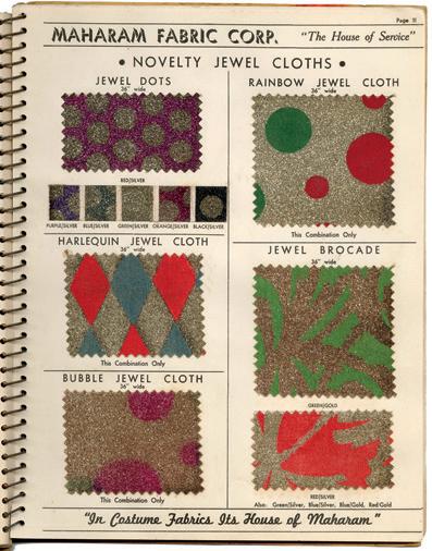
Early Twentieth-Century Commercial Swatch & Sample Books
When we wake up and wander over to our crammed dressers and closets to pick out our clothes for the upcoming day, we consciously choose the image we want to present to the world.
Whether we opt for a classic floral motif on a blouse, a lighthearted print adorned on a dress or a practical stripe on a pair of trousers, the fabrics and styles we pick daily tell a story about the wearer. These days, as ready-to-wear clothing is easily accessible and the level of variety and customization we have come to expect only continues to grow, we have the luxury of presenting the exact image we wish others to see. But, although we make these aesthetic and personal choices day after day, it is a rare occasion that someone can pick and choose fabric samples for a garment made specifically for them. Unlike a century ago, if we run across a sample book filled with textiles, it is often only when visiting a furniture store for draperies, upholstery or carpeting. Although once prevalent and heavily relied upon, fabric swatch books containing an abundance of printed fabrics and colours specific to each season are virtually unknown to the modern consumer.
Before the proliferation of department stores and fast fashion, clothing for the average person was practical and utilitarian. A female family member would generally make the clothing, which would then be handed down in succession from one family member to another. Simply put, there was little choice or variety in what was available, and what you wore greatly depended on what was on hand or what could be obtained cheaply. If they did keep up with the popular styles of the day, fashion-forward women and men would simply alter or restyle garments they already owned. For most of history, only the wealthy could afford the luxury of having clothing designed or tailored to their specifications.
If one was lucky enough to have the money to purchase a custom suit of clothes, they could have them made by a professional dressmaker or tailor. Upon arriving at the craftsperson’s storefront or workshop, the salesperson would show wealthy and upper-middle-class patrons a swatch book containing available fabric options and style choices. These sample books were visual and tactile marketing tools produced by textile manufacturers, promoting what was popular and new from season to season. Traditionally, they would consist of a collection of swatches or small fabric cuttings. These samples would be pasted directly into the book and accompanied by fashion illustrations or photographs promoting the newest available styles. The customer would then select the style of garment and type of fabric they wanted it made out of, and the tailor or dressmaker would set to work customizing the ensemble to their specific measurements.
Even 100 years ago, the concept of a swatch book was nothing new, as books of tipped-on fabric cuttings
had already been around for centuries, used for personal, historical and commercial purposes. In the 18th and 19th centuries, as loom technology improved and fabric production increased, so too did the concept of the modern textile sample book. Cuttings were often collected in account books bound in animal skin, with linen threads holding the pages together. Perhaps the most famous example of these swatch books is the 1782 “Gazette des atours” or “wardrobe book” held by the National Archives in Paris. The book, kept by Marie Antoinette’s Mistress of the Robes, Geneviève de Gramont, contains small patterned samples of fabric used in creating the queen’s royal wardrobe. On the other end of the economic spectrum, it was also common for everyday women to keep personal project books or sewing diaries, memorializing the fabrics and notions used to complete a needlework project.
Moving into the modern period, with the rise of industrial mechanization and the rapid proliferation of commercially available materials, it became more common for textile producers to distribute printed sample books to tailors and dressmakers, along with fabric offerings. As Janet Lee (2020) describes in her paper on restoring these sample books: “With industrialization in the nineteenth and twentieth centuries, textile manufacturers took advantage of promotional sample books to cultivate relationships with their clients. Unlike an eighteenth-century sales book, which was usually a unique volume that traveled with a salesman to reach clients, manufacturers could send fleets of printed promotional sample books to their entire client list” (14). Due to printing advancements, the fabric swatches within these books also became increasingly diverse in content and the variety of prints they displayed.
Until the 20th century, the process of printing on fabric was accomplished by either block printing or roller printing. The block printing method was laborious and slow, requiring hand-carved wooden blocks covered in ink or dye to be pressed onto the fabric’s surface. By contrast, roller printing was faster and yielded a higher volume of product. Cloth fed into the machine would be rolled over by an engraved copper cylinder, imitating the printing technology of the day. It was not until 1907 that Englishman Samuel Simon patented the screen-printing process, which allowed for fabric production in bulk. This process was cheaper and less labour intensive, allowing for quicker fabric production. Barty Phillips, in their book Fabrics and Wallpaper (1991), describes the screen-printing process: “Based on the same principle as stenciling, it is done on a frame over which a screen of silk muslin is stretched. There is one screen for each colour of the design. The design is transferred to the screen, and the areas not to print are masked with wax, cord or paper. Colour paste is then pushed through the unmasked parts of the screen onto the cloth underneath” (72).
Sample books and the fabric industry greatly benefited from this new technology, allowing them to quickly and more economically adapt to rapid changes in fashion
Gingham was brought to Europe by the Dutch, who encountered the fabric in Southeast Asia during their colonial exploits. In the 17th century, the Dutch wanted to control trade in the region, and began, via the Dutch East India Company, to muscle their way into territory held by colonial Portugal. In 1641 they captured the port city of Malacca (in modern-day Malaysia) with the assistance of the Malay sultanates, and set up their own trading centre.
It was in Malacca that the Dutch encountered a local textile called genggang, or ginggang, which in Malay meant “striped”—and indeed, the original cloth, even when the Dutch began manufacturing it themselves, was striped rather than checked. Back in Europe, around the mid-18th century, the British encountered the cloth that the Dutch were then calling “gingang” and began manufacturing it themselves, in the newly industrialized textile mills around Manchester.
In a new country with a new language, the name altered once again, from “gingang” to “gingham.” The name was not the only thing to change: it was also at this point that a preference took hold for gingham checks over gingham stripes, and soon the British textile mills were producing the checked fabric as we know it today.
That is the simple version. In truth, the plain weave and checked pattern that we recognize as gingham exists in similar forms throughout the world, from Malaysia to Japan to India; from 11th century Vikings to the Maasai in East Africa. Even within Europe the cloth can trace itself back to multiple origins. Those who are familiar with gingham, for example, will also know it by another name: Vichy check, a cloth from France that is virtually indistinguishable from gingham, and is today considered synonymous.
In the 1860s, Napoleon III, the emperor of France (and nephew to the more famous Bonaparte), took to vacationing in the thermal spa town of Vichy. On one of these trips, he travelled to the nearby town of Cusset to tour the Grivats textile mill, which had been producing textiles for nearly 40 years—in particular a striped, durable cloth known as “grivat,” for which the mill was
named. As a supporter of industrial development, Napoleon III often visited factories and other projects throughout the country, and on this occasion he was duly impressed.
Whether through Napoleon III’s enthusiasm or that of his wife, Empress Eugénie, the cloth made its way back to the imperial court, and from there into Parisian high society fashion. “Grivat” was now being referred to as “Vichy” cloth, and it became just as common to spot grivat workwear as a “Vichy dress” featuring lilac and white stripes, or pink and daffodil.
Like with gingham, grivat/Vichy cloth was manufactured as a cloth that could withstand a reasonable amount of wear. It was ideal for utilitarian use, and was initially manufactured for this purpose. Both gingham and Vichy were used primarily for clothing worn by labourers, and for aprons in particular, which were not just ubiquitous in kitchens and bakeries, but also used extensively by a host of shopkeepers, artisans and factory workers.
However, the adoption of Vichy by the aristocracy secured it a foothold in the fashion world as well. And when the fashion world took notice of working-class clothing in the 19th and 20th centuries, it discovered gingham once again, in a new form. Curiously, unlike many fabrics, gingham has featured simultaneously in both working-class and high-end clothing, and could be found in both men’s and women’s fashion, as well as clothing for children. The combination of the practical and the fashionable could perhaps best be seen in its common use as a toile—a fabric used by dressmakers to test a pattern or design, before using a more expensive cloth for the final article.
Interior decoration and design followed suit. Gingham made its way onto upholstery, drapery and table covers. American colonists took an interest, first importing it for use in their stately homes, then manufacturing it in their own cotton textile mills, where it accompanied American settlers in their march west.
But as fashionable as gingham has and continues to be, its utilitarian qualities have proven to be its most enduring, and its history as a working fabric remains the primary influence on how it is regarded today.
Throughout the 18th and 19th centuries, gingham could be found, yes, on dresses and bowties, but just as
often on tablecloths, curtains, aprons and bed linens. It was a practical cloth: relatively durable, relatively inexpensive, easily manufactured and easily laundered. It thus became, largely, a domestic cloth—a cloth of the home, a cloth of the kitchen. And as an affordable cloth, it also became a cloth of the working-class home, which in the 19th century was often as not a rural home. Gingham could withstand both factory work and farm work, but it could also look pretty while doing so. The farmhouse became gingham’s home turf, and as such the cloth became associated with all that pastoral country living was assumed to represent: wholesome, honest and simple; innocent, unpretentious, friendly and charming. It might still be found on the high streets of Paris, but during the 20th century, gingham was more likely to conjure pure-hearted farm girls in peasant dresses and family picnics along country lanes.
And then it was modernized once again, thanks to the film industry—worn famously by Judy Garland in The Wizard of Oz (1939), and then in the 1940s and 1950s by such glamorous actors as Katherine Hepburn, Lauren Bacall, Ingrid Bergman, Brigitte Bardot and Marilyn Monroe. Gingham was fashionable once again, and remains so today, riding the ebbs and flows of fashion and style—stylish, but always endowed with a hint of the wholesome.
FEED SACKS
By the time the Great Depression of the 1930s hit, companies that sold animal feed and other dry goods such as flour, sugar and rice had begun packaging their products in cotton bags printed in colourful patterns. These were known as feed sacks, a response to a growing trend of rural women repurposing dry goods bags for material to make clothing. These patterned feed sacks came in an array of florals, plaids and ginghams.
And this is why you may feel compelled to hang blueand-white checked curtains in your kitchen, to lend the room a certain “rustic charm,” or why a red-andwhite checked picnic blanket might seem particularly picture perfect. It is why a gingham dress just seems to carry a simple, innocent feeling to summer. Gingham has come to be defined by the historical and cultural contexts through which it has found its uses—it is a working cloth, a beautiful, uncomplicated cloth; a cloth worn by rural, working folk who we tend to look back at with a warm nostalgia. For gingham, these associations have proven impossible to shake, perhaps because they have been so well earned.
Perhaps the earliest patent for “bags of dress print fabrics” was filed in 1924 by the George P. Plant Milling Company, from Missouri, which began printing a red-andwhite gingham pattern on cotton bags for the Gingham Girl flour company. It was a brilliant marketing tactic, enticing consumers to purchase their flour for the fabric in which it was contained. Meanwhile, affordable gingham, and soon other patterns, found its way into rural homes across the United States and Canada. Feed sack clothing was widespread throughout the 1940s and 1950s.
Learn more about Gingham Girl and other brands of feed sacks in Feed Sacks: The Colourful History of a Frugal Fabric, written by Linzee Kull McCray and designed/published by UPPERCASE. uppercasemagazine.com/feedsacks
ART & DESIGN
pieces sold out immediately, thanks to a small but loyal online following. “The way I see it is that our stories are really very similar; [they are] just packaged in different ways. And showing my face was what connected me to these women. Hence, they wanted to support me.”
I want from life?” She began to write, to clear her mind and process her thoughts. “When I started my blog, I didn’t show my face,” she says. “It was just my silhouette because I was ashamed of my story. I didn’t have the confidence to show my face.”
With just 50 pounds, she designed her first tote bag, learning Photoshop from YouTube videos. She began to design necklaces and tees as well, stepping in front of the camera to model her designs. Readers began to ask her questions about the clothes she was wearing, which were often vintage or secondhand pieces from Nigeria. She remembers thinking, “For God’s sake, I’m trying to sell a T-shirt to you. Why are you asking me about my skirt?” But she came to realize that there was a reason for these questions. She invested more money and began sketching ideas. “The only fabric that I understood was the wax fabric,” she says, so that fabric was her choice for her first collection of skirts. The
When it came time to name her brand, Yvonne wanted something that “resonated with me personally and something unique, easy to remember, and imbued with significance. I delved into the roots of my given names [Modupe Oluwakemi Sunpo Ogunbe] and found my inspiration in ‘Oluwakemi,’ which means ‘God cherishes me.’ From this beautiful expression, I extracted ‘Kemi’—a short, sweet and memorable name. To honour my journey and the life I’ve built, I combined it with my marital name, Telford, creating a fusion that speaks to my heritage and present.”
Kemi Telford is a brand that doesn’t “do ordinary.” Yvonne designs versatile pieces for “women who want to be seen: bold prints, striking shapes and vibrant colours. Our pieces speak before you do. They’re designed to empower you and turn heads wherever you go.” Her clothes can be worn in the day as well as for formal occasions. Kemi Telford is also known for voluminous silhouettes and a fusion of aesthetics. “I like to merge Nigerian heritage with Western influences when I use wax fabrics,” Yvonne says. “The shapes are
often vintage inspired or drawn from Japanese street style. This approach makes the pieces accessible to women from all backgrounds. Everyone can wear them and feel connected.”
This global connection is evident through her network of manufacturers and artisans in the United Kingdom, China and India. Yvonne also wanted to support a Nigerian woman, and friends introduced her to a seamstress in Lagos named Helen. As Helen was not accustomed to working with patterns, Yvonne sent her to receive training on making clothing in bulk. In addition to sewing garments, Helen scours the fabric markets, sending pictures of options to Yvonne via WhatsApp. Selecting fabrics is an intuitive process for Yvonne. “When I see the right pattern, I know it because it moves me.” In addition to her instincts, she asks herself if she would wear the print and if her clients would buy it. Her next step is to consider what kind of garment can be made from the fabric. For example, she knows that some patterns need to be used for skirts rather than dresses, “otherwise the print will wear the woman.”
Yvonne also is mindful of selecting prints that can be worn by women of any background, with a focus on empowering prints and motifs. She says that, by bringing African wax fabrics to the West and creating
garments with non-traditional silhouettes, she is giving her clients the go-ahead. “Most of my customers don’t even look like me. I’m giving them permission that it’s okay to wear these things.” For example, she selected a classic Jumping Horse print, as it reminded her of the Igbo women who wore a similar print when going to their tribal meetings after church. Many of these women had moved to her city of Kano from other towns and villages, and these meetings were a time to come together, support each other and share a meal, while wearing a traditional outfit that reminded them of home. Yvonne decided to use the classic rearing horse print to make “something Igbo women would never think of creating”—a Scandinavian-style shirt and skirt that any woman could wear to make a statement.
Yvonne has also designed garments using production remnants, something not usually done in Nigeria. She had all of her manufacturers gather the remnant fabric pieces that they had been storing and send them to Helen, who cut them into squares. Grouped by colour, the squares were painstakingly stitched together to make a limited collection of one-of-a-kind dresses. Each patchwork dress took almost a week to make and while each dress is unique, they all share the voluminous silhouette that is signature to Kemi Telford.
Symbolic Birds
Among the Igbo people of Nigeria, the Speed Bird print, known as “Eneke,” is inspired by a proverb about a bird that has learned to fly without perching, symbolizing adaptability, resilience and the ability to navigate challenges with agility. It represents a spirit of perseverance and the drive to keep moving forward despite obstacles.
The Birdcage print carries a powerful message of freedom, resilience and selfdiscovery.
In many African cultures, the image of birds escaping from cages symbolizes breaking free from limitations, embracing independence and pursuing new opportunities. It speaks to the balance between comfort and the courage to enter the unknown.
A collaboration with Anthropologie in honour of International Women’s Day was an opportunity for Yvonne to design prints for home goods. She thought back to the coral necklaces her mother wore, inspired by the shape of the beads and the sounds they made. She transformed these memories into a striking print made of semi-circles and lines. She also created a pattern based on the only type of flower she saw growing up in Nigeria: the hibiscus. Her aim was to “convey a message of love, beauty and fabulousness,” and pay homage to her upbringing. Her hand-drawn sketches and watercolours were transformed into fabrics for lamp shades, throws and pillows.
Kemi Telford was also invited to create an exclusive collection for Tate, a British cultural institution and family of art galleries. Yvonne delved into their archives, pulling from the lives and work of Sonia Delaunay, Sophie Taeuber-Arp and Anni Albers. She designed vibrant prints that told the story of womanhood, starting at birth. She chose the shape of a box as a prominent motif. “From the very beginning, [girls] are put into a box of what society expects from us,” she says. She also incorporated zigzags, to represent obstacles and prejudices. She wove circles into the geometric pattern, to represent “waking up every day and feeling okay but unsatisfied; juggling different plates and trying not to make one drop.” Kemi Telford’s Tate collection is unapologetic as it addresses womanhood in all of its challenges and complexities. “We get to a place in our lives where we’re thinking, What do I want from life?” Yvonne says. “I don’t want to just be a mother. I don’t want to just be a wife. I don’t want to just be a woman. I want to be who I’ve been created to be.”
For women who want to explore wearing more prints, bright colours or new silhouettes, Yvonne recommends taking baby steps. “Start with a bold print skirt. Wear a T-shirt with it. Stay in your house, and see how you feel about it. You could wear a black top with a bold print skirt, and [that] would make a statement.” She also has encouraging words for women who feel small and unseen. “I’ve been where you are. I’ve felt invisible. I’ve been told to fit into a box and fade quietly into the background. But I’ve learned that the world needs unapologetic, vibrant and alive women like us. Your voice matters. Your presence matters. Stop apologizing for taking up space. Stop trying to blend in. Stand tall and let the world see you for who you truly are. The journey to being seen starts with you. Surround yourself with people who visit your worth. You are not ‘too much.’ You are exactly enough. And the world needs every bit of you.”
kemitelford.com
@kemitelford
Pattern Motifs
COMPILED BY LYDIE RASCHKA
Arabesque
Flowing vines and geometric forms from Islamic art, inspired by Roman wall paintings.
Ditsy
Patterns with tiny, scattered flowers, cherries, hearts, dots or other doodles.
Honeybees rely on this strong, efficient shape to store honey.
Bandana
From Hindi bandhna, “to tie”; traditionally a redand-white square with a paisley or floral design.
Eyebright
A sweet 1883 William Morris design of white eyebright flowers and buttercups.
Threads are tied and dyed before weaving to create a blurred effect.
Fleur-de-lis
A lily-shaped symbol, once linked to toads and ancient Nineveh gods, now a symbol of French elegance.
A 17th-century design with twisting vines, oversized flowers and animal motifs, drawing inspiration from English crewelwork and Indian botanical artistry.
Coin dot pattern
Supersized polka dots!
Gingham
Checks or squares, usually bright colours on white, popular for aprons and tablecloths.
Repeating symmetrical shapes and colours like those seen through a kaleidoscope.
Hexagonal
Ikat
Jacobean
Kaleidoscope
STORY AND LETTERING BY LILLA ROGERS
We are creative people. We have active imaginations and are able to swiftly spiral to a dark place, especially at a time like this. We hurt for those who are hurting. We spiral downward.
Can we use our powerful imaginations to envision a beautiful world that is about kindness, care, love, peace and prosperity for all, if just for a moment? It takes courage, I know. Yes, donate if you can, take action, join a progressive group. That matters. But make self-care a piece of your life. Stay strong for yourself and others. One way is to create.
Creating something is a very high-vibrational form of self-care. Can you make a little art every day, such as drawing a little flower on the bottom of your to-do list or finding a leaf to trace or a face on the subway to sketch (surreptitiously)?
IMPRESSIONS
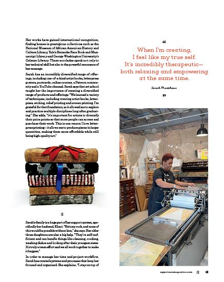
Sarah Matthews
PRINTMAKER & BOOK ARTIST
STORY BY LEIGH METCALF
Sarah Matthews is a printmaker and book artist whose work explores race, equality and gender, boldly shining a light on social injustice. Through her layered art prints and original artist books, she challenges stereotypes and captures the struggles of breaking societal barriers. By reframing narratives that often represent African Americans as inferior, her work inspires audiences to embrace the beauty, intelligence and value of all people, regardless of race.
Just as surface pattern design is multi-faceted and multi-dimensional, so too did Sarah’s evolution to becoming a printmaker and bookbinder have many aspects to it. These various facets are reflected in her journey to becoming a full-time, internationally known artist and art educator.
deadlines by preparing as much as possible in advance. For example, I pack and label my prints ahead of time, and all my artwork for exhibitions is framed, wrapped and stored in one place.” She also has a spreadsheet with titles, dimensions and prices of her work, along with a database of images, so that she is ready when opportunities arise. She also stays centred by following daily routines such as using specific days for specific roles and tasks, such as Mondays for administrative work and Thursdays for teaching artist book classes. Sarah also prays every day. “It’s my faith that keeps me focused and grounded.”
Some of her favourite tools to help with her productivity are Grammarly, for writing and editing, and Calendly, for scheduling meetings and interviews. “Calendly is a game changer. It streamlines the entire process of finding a time that works to meet with people,” she says. Sarah brings her organization prowess to her students as well. She is revamping how she teaches to better equip her students to sell their work. “This includes teaching them how to photograph their pieces, write artist statements and create colophons.”
Along with a supportive network and systems for organizing workflow, Sarah also believes it is important to have a stable source of income to support your art. She teaches classes and works part time at a nonprofit, which helps fund the supplies she needs to create the work she is passionate about. Applying for grants is another helpful way to support one’s art career. “It takes time to find your rhythm, but with persistence and planning, you’ll get there,” she says.
When it comes to advising anyone who wants to make art their career but is not sure how to begin, Sarah’s advice is simple: “just start.” She adds, “the journey of a thousand miles begins with a single step, so take that first step and give yourself grace along the way.” She also finds it important that artists not rush their work. “It’s easy to get frustrated or produce lower quality work when you rush. Instead, break your project into small, manageable tasks. Before you know it, you’ll have something finished that you can be proud of.”
iamsarahmatthews.com @iamsarahmatthews
long-term success in surface design
TIPS AND PATTERNS BY BONNIE CHRISTINE
Fifteen years ago, I decided to leave my 9-to-5 job to pursue a big, audacious dream of becoming a surface pattern designer. I decided to trade in a steady paycheque and walk into the unknown. The journey has been full of twists and turns; it has also been the most rewarding decision of my life. Deciding to do what you love for a living truly has to be one of the greatest gifts.
Since then, I have seen many people come and go in the field. What I have noticed are a few key patterns (see what I did there?) that create longevity, and that is exactly what I am excited to share with you in this article. I hope these tips help you build a career that you love for years to come!
1
Master the tools of the trade.
Consistently mastering the tools of the trade is one of the most important keys to longterm success. This means staying up to date with the latest software updates and regularly practising and exploring the fundamentals that keep your skills sharp and your designs fresh.
2
Focus on timeless trends.
Trends come and go, which is precisely what we want to avoid when it comes to our brand. In order to withstand the test of time, lean into what makes you uniquely you.
3
Tell your story.
In a world that feels like a high-tech whirlwind, your story has never been more important. People are connecting to humanity more than ever. Be sure to share the “why” behind what you create, your process and your experiences. While someone might be able to copy your designs, they can’t copy you. Your story is your greatest differentiator!
4 5
Network with purpose.
No one makes it to the top alone. Along the way, network to create connections and build a support system of peers who lift each other up. Make it a priority to build relationships with industry peers, clients and fellow designers. These connections will provide both meaningful friendships and invaluable opportunities.
Diversify your revenue streams.
The more revenue streams you can build from your artwork, the better. This ensures that when one stream ebbs, another can flow. I think if long-term success had a motto, it would be “pivot.” This flexibility will help your business continue to grow and flourish for years to come.
CMYKaren Karen Kurycki
Karen Kurycki, also known as CMYKaren, brings a vibrant and playful energy to her work as an illustrator and designer. Her bold use of colour and dynamic compositions reflect a unique perspective shaped by her love of humour and the small, often overlooked moments in everyday life. Her patterns are a delightful blend of whimsy and sophistication, bringing a sense of joy to those who encounter them.
cmykaren.com
@cmykaren
Copley Creates
LaRae Copley
Based in Ohio, LaRae Copley creates art that moulds everyday observations into playful, colourful designs. Inspired by the vibrant world around her, she invites viewers to see life through a curious and bold lens. When not in her studio, LaRae enjoys knitting, spending time with her sweetheart and dogs, and practicing medicine—a balance that fuels her creativity.
@copleycreates
Designer of Surfaces
Vicky Graham
Vicky Graham is an all around creative person based in the North East of England, working as a senior print technician and small business owner of hose. tights and Designer of Surfaces. She loves nothing more than finding daily inspiration and in turn inspiring others to find and feed their own creativity, which does not have to be process specific. Mark making, pattern design and screen printing bring her the most joy.
@designerofsurfaces
SUNDERLAND, TYNE AND WEAR, ENGLAND
AMLIN, OHIO, USA
JACKSONVILLE, FLORIDA, USA
collaborative marketing
COMPILED ON BEHALF OF THE CREATIVE SOURCE COLLECTIVE FAYE BELL & KATE GOLDING
1 Establish a mission statement. Making decisions as a group can be complicated. And with creatives, there is never a shortage of ideas. A simple and agreed-upon mission statement will help maintain unity when evaluating opportunities.
Ours, as an example: Creative Source is a not-for-profit resource helping the interior design community discover and explore the work of independent lines.
2 Grow your community organically. Our collective was born out of genuine friendships that formed over time. Because of this, our work together is informed by mutual admiration and respect. If you are looking for collaborators, it’s important to consistently create space in your work life for relationship building.
HANNAH LEARNER
JACKIE TAHARA
generating new ideas
STRATEGIES FOR KEEPING THINGS FRESH AND AVOIDING DESIGNERS’ BLOCK
1 .
Do your research. An obvious starting point (note I said starting point) is all the visual inspiration you can find online: social media posts, design blogs, colour and trend resources, brand websites, newsletters, etc. You can discover what’s trending, find new favourite designers, get inspired by all things vintage… But of course, get off your devices, too: check out print resources (subscribe to your favourite magazines, take out books from your local library) and bookmark pages, go outside, wander about, take lots of photos, peruse the shops, travel if you are able—all with eyes and mind wide open. Pair this tip with #10.
2 .
Be self-reflective. Ask yourself: Why do I like this? Why did this pattern design catch my attention? Why does this pattern make me want to buy that product? What is it about the designs of my favourite designers or brands that make them my favourite? Is it the style, colours, subject matter? Is it because they are quirky or sumptuous or unlike anything else out there? Let these answers guide you.
3
.
Scribble your heart out. Take all that visual research you have absorbed and squeeze it out onto a blank page. Draw from memory. Take bits from your photos. Recall all your favourites (but never copy, of course). I like to quickly jot down descriptive words around a theme on a page in my big 14-by-17-inch sketchbook. Then I just start freehand scribbling ideas for each word. For example, if I am trying to create some new floral motifs, my descriptive words might be: line drawn, silhouettes, cartoony, with faces, pointy, tulips, passion flowers, geometric, curvy shapes… Experiment, experiment, experiment.
4
.
Participate in pattern design challenges and enter design competitions. Keep an eye out for challenges on social media or offered by art agents. Try a 100-day challenge or a seasonal one; they are a great way to grow your portfolio. Consider entering design competitions from publications or companies looking for new art. Tip: Always take a moment to consider the terms and conditions of any competition before you enter.
5
. Give yourself personal pattern design challenges. As designers, we strive to create our own look and develop how we like to work. But when I get too comfortable or start feeling like I’m being repetitive, I like to set myself little design challenges that are specific and digestible, like building flower motifs using only geometric shapes, or designing with a limited colour palette of two or three colours. Try it; it can be very freeing!
TIPS & PATTERNS BY
getting started in surface design
Being a surface designer can be incredibly rewarding, but with an infinite number of possibilities and a neverending to-do list, it can also feel overwhelming. My aim as a mentor in this community is always to be encouraging, yet honest, and I hope these tips will help you better navigate this industry.
1 Don’t quit your day job… yet!
You might be tempted to let go of other income sources to focus solely on your art. However, it takes a minimum of three years for surface designers to generate significant income from their art—a statistic from the 2024 Surface Design Industry Survey, a yearly survey I started in 2020 to provide information about pricing and income.
Instead, set aside time to focus on your art alongside your regular job. Your art career may grow more slowly, but this will alleviate the pressure to make money from your art right away.
2
Start with a single focus
There are many income streams available to you as a surface designer, such as licensing, selling products or print on demand, but the most effective way to earn an income from your art is by starting with just one income stream, especially if your time is limited. This way you can devote all your energy to becoming great at one thing instead of spreading yourself thin trying to grow a bunch of different income streams.
3
There is more than one way to do things
You may be given advice that there is a specific way to do something, such as having to use Adobe Illustrator or that you should only design in large collections. But that is not true—there are multiple ways to do just about everything in surface design.
Do you prefer painting in watercolour? That’s great! Do you like using Illustrator? Go for it! Do you want to sell single patterns to fabric companies? Yes, it is possible (I’ve done it myself). Don’t get stuck doing something just because someone told you to do it.
4
Choose the best markets for your art
You may already know about specific markets that you want to work in, like home décor, bolt fabric or stationery. But just because you want to see your art on wallpaper or journals, it doesn’t mean that it’s suitable for those products. Instead of making your art fit a market, decide which markets to pursue based on your art, as that will give your designs a better chance of being picked up.
4 .
Don’t be afraid to pivot and evolve. I made baby clothes and taught art when my kids were little. Then I remodelled houses. Then I started Splash Fabric. Early on in the pandemic, we pivoted to masks, creating jobs for our community and donating 70 thousand of them. Now, my sewing product business is becoming a fabric design company and a sewing education company.
5 .
Keep your eye on the prize. Determine your number one reason for your business. My “why” has always been to play with colour. It is simple and might feel selfish, but it’s not. We artists are at the forefront of culture. We mirror the beauty, joy and love in the world. We need you and your art, too! Pro tip: Don’t compare yourself to others. There is room for us all. A rising tide lifts all boats.
6.
Trust your gut. People often ask how I choose what fabrics to make. I believe that my fabrics find me. I get an idea of what the world needs to see on fabric, then I design lots of options. I print out the possibilities on paper and walk by them over days or months. I pick the ones that catch my eye over and over. I’ve got to feel it in my gut.
7.
Marketing is hands on. Get your product in front of people, then watch and learn. Early on, I sold my kids’ clothing line at street fairs. I learned what people were drawn to by watching them at my booth. They would come in for the crazy, colourful piece, but often bought something else. I learned who they were, how they thought, what they would spend money on. Learn to listen to your customers.
8 .
Find your niche. There are a dizzying array of options for everything out there. Figure out what you can be memorable for. You can’t be all things to all people, nor should you try. Study others and then innovate. We are a fabric company that doesn’t sell quilting cotton, like most of the others. We make laminated cotton, with a focus on tabletop and home décor. That’s my niche. It works.
9.
Build your email list. Wherever you go, whoever you interact with, ask for their email and build that list. Of all the marketing efforts you do, that list is your gold. You don’t own any of the social media apps, but you do own the website and the email list you build.
10.
You are not too old, too young, too poor, too rich or too short! There is room for you, as there was for me. I started Splash Fabric at age 54, still a little over five feet tall. Ten years in, I am going strong and doing the best work of my life.
splashfabric.com
@splashfabric
CRAFT
CHARLOTTE FLORY & MICHELLE FREEDMAN
The Reprintery is a collaboration between Michelle Freedman and Charlotte Flory that combines the artistry of traditional printmaking with the sustainability of upcycled textiles. Drawing from their diverse backgrounds in design and art, the project explores the intersection of craftsmanship, history and innovation. By reimagining discarded fabrics through print, The Reprintery not only gives new life to vintage materials but also brings a fresh perspective to the art of textile design.
|||
The Spark of Collaboration
Finding a true collaborator is a rare and wonderful thing—when everything just clicks. “That’s exactly what happens when we team up for a project; it feels like a seamless flow—our strengths complement each other without effort,” says Charlotte. “We spoke the same design language right from the start, something that’s not always easy to come by in collaborative work. That effortless connection was the spark that ignited our ongoing partnership, and we both knew it was something worth pursuing beyond just the first project.”
Charlotte’s background in printmaking and textile design gave her a strong foundation in pattern creation, but it was not until working alongside Michelle that the full connection between quilt patterns and textile prints clicked. The shared repetitive structure between the two became clear, and that is when things started to fall into place.
Charlotte explains, “I learned so much from Michelle about quilt pattern making. I’ve always loved quilts but never realized that each block is also a unit of repeat, much like a textile print, and the two combined can connect directly in the same way a repeat can, together from the inside out. It’s like repeats to the second power!”
waxing and waning
ANKARA: DUTCH WAX BLOCK FABRIC
In January, a dense fog descended upon Amsterdam and lingered for the better part of a week. While I had become accustomed to the dull gloom that characterized winter in a seaside city, this particular fog carried an almost spectral quality that I found alluring. Typically, I had to force myself to go outside on dreary winter days, but this mist mesmerized me, drawing me out to explore familiar streets transformed into dreamlike passages. I found myself prolonging my commute past gothic 17th-century buildings and volunteering to do household errands so that I could be transported into the ethereal landscape.
As the grey week gave way to a grey weekend, my family and I headed for a walk to explore the shrouded city. Our meandering led us to the Oosterpark in the city’s east end, where we were delighted to see the bright green plumage of the park’s resident parrots peeking through the misty morning fog. From there, we wandered to the Dapper Market. In this bustling multicultural street market, vendors selling used clothing and electronics jostle with florists and fishmongers for the attention of passers-by. I was on a mission to find fresh stroopwafels (traditional Dutch waffle cookies filled with caramel), which I consider Dutch cuisine’s finest achievement.
My search for snacks was interrupted when a stand laden with brightly patterned fabrics quite literally stopped me in my tracks. The kaleidoscopic cacophony of colour hit me like fireworks against the desaturated streetscape. After months of grey skies and a week of fog, the vibrant market stall felt like a life raft in a dismal sea. Within moments, I found myself asking the stall owner a barrage of questions, compelled to understand more about the eye-catching fabrics.
In halting English, the proprietor explained that the textiles were double-sided, wax-printed cotton fabrics popular with the local Ghanaian community. When I expressed surprise that there was a market for African fabric in Amsterdam, he corrected me. Although many
STORY BY BRENDAN HARRISON
THIS IS A LOW RES PREVIEW OF A HIGH QUALITY QUARTERLY PRINT MAGAZINE
PLEASE SUBSCRIBE
Jackie’s Atelier
Jackie Brewer
SNOWFLAKE, ARIZONA, USA
Off the dinning room in my 1920 Craftsman home is a lightfilled space I’ve made into my atelier. Most of the time, one side is dedicated to machine embroidery and one side is for real estate work. But over the holidays and birthday season, when I’m hand-making gifts, both sides usually hold a sewing machine. I surround myself with things that inspire me. I am a maximalist and pattern enthusiast! I do a lot of mixed-media projects, a lot of book collecting and cataloguing, and a lot of sewing. My favourite thing about the space is the two vintage desks anchoring each side.
@books_and_abe
Inspired
Stripes
Laura Shabazz
BERNARDSVILLE, NEW JERSEY, USA
This is where I create my collages from upcycled magazines and books. I painted a dreary woodpanel wall in bright, cheerful colours that inspire me and make me happy. The spaces between the panels were too narrow to paint, so I glued glittery gold pipe cleaners in there to catch the light. I love being in here!
LauraShabazz.com @laurashabazz
Want to be featured?
Submit your studio story!
uppercasemagazine.com/ participate
Something old (and completely new) from your favourite magazine!
The Archive is a growing resource of out-of-print UPPERCASE magazine back issues presented as digital flip-through editions. With over 50 out-of-print issues, there’s an incredible abundance of inspiration awaiting in this digital UPPERCASE library.
Re:issue curates content from past issues, bringing a fresh eye to 16 years of inspiring UPPERCASE content. Stories and topics are presented in a new way, based on themes—and a bit of serendipity—with each month bringing a new re:issue.
uppercasearchive.com
Your
Make connections, nurture your creative spirit and grow your business!
Have you made something with the kraft envelope, upcycled the magazine or reused the postcards in an interesting way?
Please share your pictures and stories of my books, magazines and fabric on Instagram: @uppercasemag #uppercaselove
An excellent benefit to your UPPERCASE print subscription.
The UPPERCASE Circle is our online home for print subscribers. Connect with kindred spirits— both near and far—who share your interests.
Access to the community is always FREE when you have an active subscription to UPPERCASE magazine!
This year, look for a reimagined Circle that will include paid options to access content such as the UPPERCASE Archive, plus more opportunities to enhance your creative business: courses, guest speakers, online events and more.
uppercasecircle.com uppercasearchive.com
Share your work with your peers and potential customers.
Get personal posts from Janine, plus links to what’s currently inspiring, interesting and informative.
Explore video archives of past learning events.
Organize swaps, trades and other group projects.
Attend monthly show-and-tell gettogethers.
Return to the archive of Creative Prompts for when you need to get unstuck.
66 Jul-Aug-Sept 2025
67 Oct-Nov-Dec 2025
68 Jan-Feb-Mar 2026
69 April-May-June 2026
Calls for Submissions
Sign up for my weekly newsletter for behind-the-scenes updates and the latest on open calls for submissions for UPPERCASE books and magazines.
uppercasemagazine.com/free
Pitch your article ideas and suggestions! uppercasemagazine.com/participate
Volume G: Glue
This volume will be all about collage, assemblage and other sticky creative pursuits! This book is in progress, check the website and our newsletter for updates on its release date.
uppercasemagazine.com/volumeG
Volume F: Feed Sacks
We’re reprinting Volume F, the first volume of the UPPERCASE Encyclopedia of Inspiration. uppercasemagazine.com/feedsacks
ROSEMARY L.
time travel
When I was around 10 or 11, I remember wondering if it was possible to hold onto ordinary moments. Surely the more remarkable ones would stick, but I wondered if I could will myself to remember the more mundane. If I closed my eyes and memorized everything about them, if I painted the scenes in great detail in my mind, was it possible? The idea that over time, they would all just eventually disappear troubled me and I thought maybe if I tried hard enough, I could beat the system. Create my own small form of time travel, so to speak. To me, it was simply a matter of will. And I did manage to hold onto a few—most notably, the way the skin on the back of my legs stuck to the vinyl seats of the family station wagon while my mom fiddled with radio dials in the front, or the moment I held a spoonful of peanut butter in one hand and a Judy Blume book in the other while the sun burned my shoulders. Though mostly, I failed in my attempts. What I know now is that the brain can only hold so much. Most memories, no matter how hard we try, cannot be magically or even methodically conjured. They don’t materialize as crystalline scenes but instead, tend to move in and out of focus. Coaxing them back into some sort of view generally requires a little help. Stories we tell or are told, old photos we revisit again and again, the sound of a specific song, the hit of a particular scent—all are conduits that help give shape to memory when ours inevitably fails.
A few months ago, I was at the thrift store when I spotted the edge of an old plate. I recognized the everyday china pattern from my childhood and was instantly flooded with memories of weeknight dinners with my family, said plates heaped with spaghetti, my dad pleading with us to share favourite parts of our day while my brothers groaned in protest. It struck me then—pattern is yet another conduit, capable of real evocative power. And what is more ubiquitous than surface pattern? From dishes, wallpaper and floor tiles to linens, décor and clothing, patterns are endlessly threaded throughout our everyday lives, the amount we encounter over the course of a lifetime, immeasurable. It stands to reason that some memories might just be hiding in plain sight. One look at a photo I made years ago of a jumble of old patterned sheets, and faint memories of sleepovers, camping trips and picnics on the beach fade back into focus. The boomerang pattern that covered a grey Formica table in my grandmother’s tiny kitchen is one I would trace again and again, as Sunday nights at my Sicilian German grandparents’ house was a fairly regular thing. Tracing those shapes will always remind me of the adult conversations and plumes of cigarette smoke that swirled around me as fish fried in cast iron skillets and thick slabs of bread were cut for dinner. They are forever forged in my memory, not because I willed them into being, but because as I traced that pattern over and over again, my brain was also processing the sights, sounds and smells of a recurring scene, profoundly connecting the detail of a specific surface pattern to the story of a collective moment. I wish we still had that old table and those Sunday night dinners, but of course, we don’t. All that remains now is the ghost of a muscle memory, the recollection of small fingers tracing boomerang-shaped lines. The rest of the scene usually falls back into place for me. Time travel, sort of, hazy at best—not exactly the way my 11-yearold self imagined it but still, time travel all the same.