3 minute read
Contrast and saturation


Using curves and blend modes to improve colour saturation and contrast in your digital photos
When you take a digital photo of a scene, you are relying on your camera to be able to capture all the colours and tones that you see. Unfortunately most digital cameras simply aren’t capable of recording the full range of colours and shades that the human eye can see, so your photo of what was a bright and colourful scene may prove to be a bit of a disappointment when you see it on your monitor. Fortunately there are many different ways to improve both contrast and colour saturation, which might help to restore some of the sparkle to your photos. Let’s take a look at some of the alternatives.
Advertisement
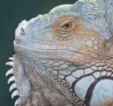
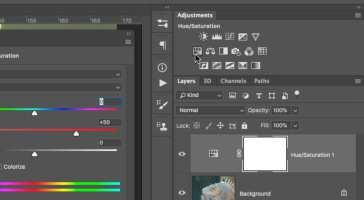
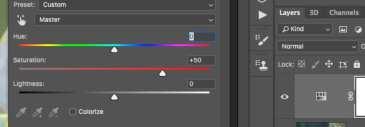
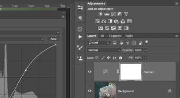
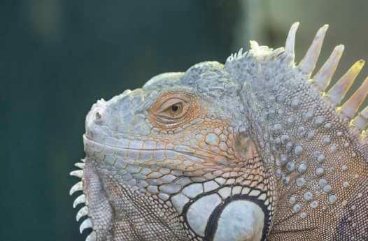
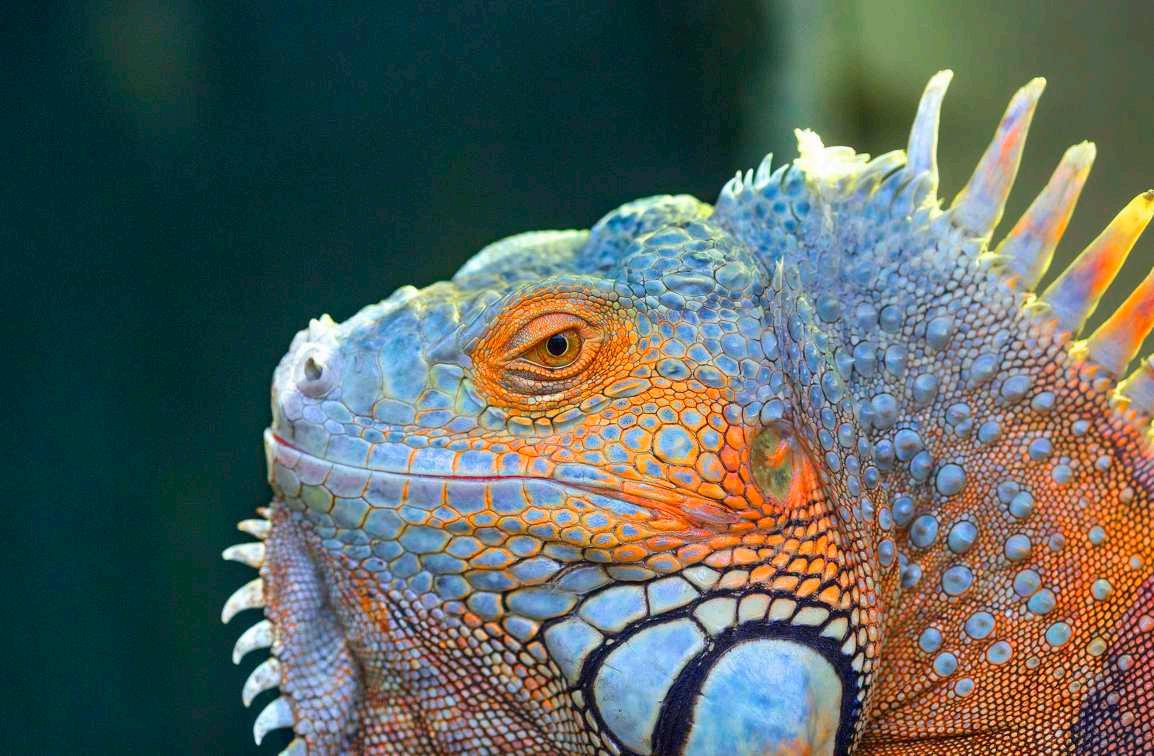
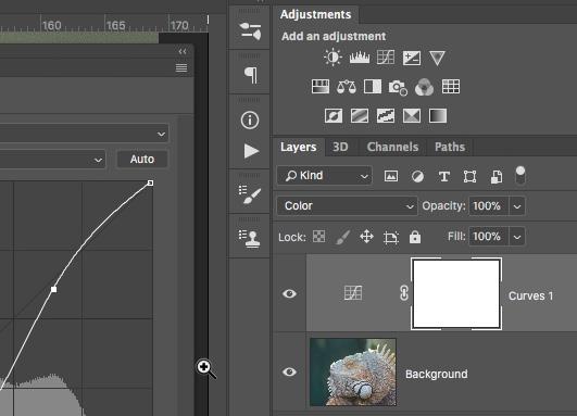
01 As an example we’ll use this snapshot of a lizard. In reality the colour of the scene is much more intense than it looks here, but the digital camera that was used to take the photo was set to a neutral and flat colour mode to capture as much dynamic range as possible. This mode generally leaves images looking a bit pale and lacking contrast and vibrant colour. This shouldn’t be a problem as the shot is well exposed and contains plenty of detail that will suit the increase in saturation. 02 The simplest way to improve the saturation is by adding a Hue/Saturation adjustment layer. Like many other parts of the program, Hue/ Saturation has been improved in Photoshop, producing a smoother result than previous versions. If you were to boost the saturation by about +50, you’d restore some of the missing colour, but it’s a scattergun approach and doesn’t offer much fine control. It can also increase noise in shadow areas in JPEG images. Let’s look at more options. 03 A much more controllable way to adjust both saturation and contrast is to use a Curves adjustment layer. We’ve already looked at Curves in the section on adjusting exposure, but by using Blend Modes we can also use Curves to enhance saturation. In Normal blend mode the curve will change both contrast and saturation. We’re using the same S-shaped curve, which boosts brightness at the upper end of the scale and darkens shadows at the lower end.

BEFORE AFTER
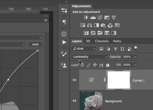
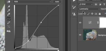
By changing the blend mode to Luminosity, the curve will only affect brightness, so an S-shaped enhancement curve will improve contrast, lightening highlights and darkening shadows without affecting colour saturation.
04 Conversely, by using a Color blend mode, an S-shaped curve will alter colour saturation without affecting brightness, so shadows and highlights are unaffected. This is great to keep noise under control.
05
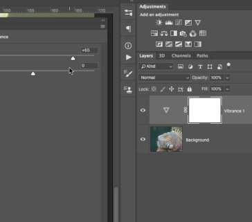
06 Another way to improve saturation is a Photoshop function called Vibrance, which can also be applied as an adjustment layer. Vibrance is a difficult thing to quantify. It is a saturation function, but it works on a graph, affecting the least saturated areas most, and the most saturated areas least. On a picture like this it can help, but it has to be used with contrast enhancement for best effect, which may again cause an increase in noise. This option is less intense than using Saturation. Vibrance is best used when processing a Raw image file.
Inside the Edit
Have you ever happened across photos or examples of digital art and wondered how it was done? The ability to be a great digital artist is within us all thanks to Photoshop and its host of tools and techniques. This section will unpick a number of artistic creations and give you a quick low-down on how they were created.
Contents
38 Work smart 40 Images that pop