March - April 2015 Issue of Design Matrix

Page 1

DESIGN MATRIX • MARCH-APRIL 2015

PEOPLE • LIFESTYLE • DESIGN • INTERIORS

March-April 2015 VOL. 5 • ISSUE 3 • `100

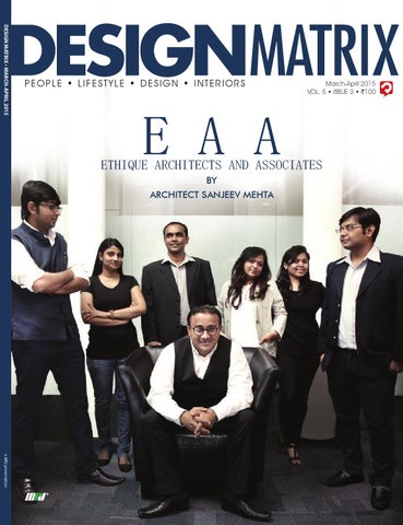
E A A

ETHIQUE ARCHITECTS AND ASSOCIATES BY ARCHITECT SANJEEV MEHTA

a MRJ presentation Mar-Apr 2015 Vol5 I 3.indb 1

26-02-2015 01:55:03

Mar-Apr 2015 Vol5 I 3.indb 2

26-02-2015 01:55:05


Mar-Apr 2015 Vol5 I 3.indb 1

26-02-2015 01:55:06


Mar-Apr 2015 Vol5 I 3.indb 2

26-02-2015 01:55:07


Mar-Apr 2015 Vol5 I 3.indb 3

26-02-2015 01:55:08


Mar-Apr 2015 Vol5 I 3.indb 4

26-02-2015 01:55:08


Mar-Apr 2015 Vol5 I 3.indb 5

26-02-2015 01:55:09


Mar-Apr 2015 Vol5 I 3.indb 6

26-02-2015 01:55:10


Mar-Apr 2015 Vol5 I 3.indb 7

26-02-2015 01:55:12


PEOPLE • LIFESTYLE • DESIGN • INTERIORS

January-February 2015 VOL. 5 • ISSUE 2 • `100

PEOPLE • LIFESTYLE • DESIGN • INTERIORS

November-December 2014 VOL. 5 • ISSUE 1 • `100

ANNIVERSARY 4TH

Anil & Amita Salian

Dipak Thaker Our mission is to ensure that our client gets an inspiring result with the best possible service.

Design Matrix Jan-Feb 2015 vol5 Issue 2.indb 1

27-12-2014 13:39:53

As designers we have to keep pace with the changing needs of the industry with respect to work environment and technology.

DM_Front Cover_Nov-Dec14 01.indd 1

28-10-2014 16:22:23

Cheques should be drawn in favor of ‘MRJ Trading Pvt. Ltd.’ payable at Mumbai (Add Rs.30 for cheques drawn outside Mumbai) Mailing Address: MRJ Trading Pvt. Ltd., 201, Shyam Kamal ‘C’ Bldg., Agarwal Market, Vile Parle (E) Mumbai – 400057 Tel: (022) 26187132 Email: subscription@designmatrix.co TERMS & CONDITIONS 1) Allow 3-4 weeks for processing of your subscription. 2)Rates are valid in India only. (Overseas Subscriptions are not accepted) 3)Please write your name and address on the reverse of the cheque/DD also. 4) MRJ Trading Pvt. Ltd will not be responsible for postal delays, transit losses or mutilation of the subscription form. 5) All disputes are subject to the exclusive jurisdiction of competent courts and forums in Mumbai itself. 6) This is a limited period offer & MRJ Trading Pvt. Ltd. reserves the rights to terminate or extend this offer or any part thereof at any time 7)MRJ Trading Pvt. Ltd. reserves the rights to accept or reject any or all forms received at their absolute discretion without assigning any reasons. 8) We may disclose your personal identifiable information to companies not owned by MRJ Trading Pvt. Ltd. who want to market products or services to you unless you specifically refuse to entertain any mail from companies not owned by us. 9) Terms & conditions are subject to change.

Mar-Apr 2015 Vol5 I 3.indb 8

26-02-2015 01:55:12


Mar-Apr 2015 Vol5 I 3.indb 9

26-02-2015 01:55:15


Mar-Apr 2015 Vol5 I 3.indb 10

26-02-2015 01:55:16


Mar-Apr 2015 Vol5 I 3.indb 11

26-02-2015 01:55:19


Publisher

:

Karan Jhunjhunwala karan@mrjgroup.in

Managing Director

:

Manohar Jhunjhunwala manohar@mrjgroup.in

EDITORIAL Editor

:

Marilyn Madathil editor@designmatrix.co

Finance Controller

:

Manjari Ved manjari@mrjgroup.in

Head-Administration

:

Maria Fernandes maria@mrjgroup.in

BUSINESS ENQUIRY WEST

:

mumbai@designmatrix.co

EAST

:

kolkata@designmatrix.co

NORTH

:

delhi@designmatrix.co

SOUTH

:

blr@designmatrix.co

USA

:

usa@designmatrix.co

UK

:

uk@designmatrix.co

Subscription

:

subscription@designmatrix.co

Art Director

:

Pramod Jadhav, R5 Design Hub

Designing

:

Mihir Amberkar

Digital Imaging

:

Bhavika Trivedi

OVERSEAS ENQUIRY

ART

Distributed by IBH Books and Magazines Distributors Private Limited

Owned, Printed and Published by Karan M. Jhunjhunwala. Printed at Taco Vision Pvt. Ltd., 38 -A & B, Govt. Indl. Estate, Charkop, Kandivali (W), Mumbai 400 067, India and Published at MRJ Trading Pvt. Ltd., F/ 201 Shyam Kamal ‘C’ Wing 1, Agarwal Market, Vile Parle(E), Mumbai 400 057, India.

A

venture

12 DESIGN MATRIX • MARCH-APRIL 2015

Mar-Apr 2015 Vol5 I 3.indb 12

26-02-2015 01:55:19


Mar-Apr 2015 Vol5 I 3.indb 13

26-02-2015 01:55:21


S ’ R O T EDI N O T E

T

he month of LOVE loaded my Inbox with adoring products and in honour of Cupid, I have put together a few in this edition. I can feel the fun and frolic that March will be bringing with the festival of colours and we make this issue bright with a design, postcard from Morocco and that is not all, we announce the Colour for 2015 that will add a lively touch to your decor. Celebrating the spirit of International Women’s Day, we have a few charming women designers around the world. Well, I am not biased and not breaking the heart of creative men’s fraternity, just kidding ! I opine, a good design is simply magical; no matter who creates it and with this ideology, I met Ar. Sanjeev Mehta, a simplistic person, who doesn’t believe in glamour and fashion statements. When I approached him for our Cover Story, he exclaimed, “It’s not me that I would like to see on the DM Cover and I am incomplete without my team.” I was totally impressed and convinced, so we have a Cover Story that is different; the dynamic Ethique Architects & Associates (E A A), share their design experiences and their journey is indeed inspiring… The luxurious Knightsbridge homes, a rejuvenating cafe at the North Parker and the dream of Istanbul will certainly take your breath away. The lively abodes, the best places to drink and dine within our country and other interesting spaces will grab your attention. Keep reading Design Matrix and do send in your comments and exclusive projects and we will certainly feature the best! Catch you soon!

Marilyn Madathil www.designmatrix.co

Now follow us on www.facebook.com/DesignMatrix.DM Now follow us on http://twitter.com/DesignMatrixMag

14 DESIGN MATRIX • MARCH-APRIL 2015

Mar-Apr 2015 Vol5 I 3.indb 14

26-02-2015 01:55:21


Mar-Apr 2015 Vol5 I 3.indb 15

26-02-2015 01:55:24


Mar-Apr 2015 Vol5 I 3.indb 16

26-02-2015 01:55:24


Mar-Apr 2015 Vol5 I 3.indb 17

26-02-2015 01:55:25


Mar-Apr 2015 Vol5 I 3.indb 18

26-02-2015 01:55:25


Mar-Apr 2015 Vol5 I 3.indb 19

26-02-2015 01:55:26


CONTENTS 24

66

COVER STORY

ARTY- TECHTURE

The dynamic Ethique Architects & Associates (E A A), share their design experiences. They create fresh and innovative design ideas, without compromising with the quality, respecting the client’s requirements and this is the ethic of Ethique. pg 24

We met Ar. Amarjeet Syali and he took us to his design world that adheres to a simple philosophy. pg 74

GLOBAL EYE On a trip to Morocco, Global Eye was looking for some design inspiration and found that in the old & new architecture and artefacts of Marrakech. pg 44

HOSPITALITY DESIGN The design language of “Suramaya Abode”, in Ahmedabad and “The Umrao”, a boutique hotel in Delhi; will allure you! pg 82

RESIDENTIAL DESIGN Luxurious apartments designed by Goldmine Consultants and P S Design will simply woo you! pg 57

DESIGN PEDAGOGY The “SPACE SANKARAS” make a learner realize that each form and space need to be given a meaning and a context, just as a space gives a context to the form and vice versa. pg 98

ZOOM IN With designer Ashish Andre from Pune, let’s fly to Egypt and land in GOA. pg 101

INTERNATIONAL A perfect place for coffee and high end luxurious homes at Knightsbridge will enchant you! pg 66

DIMENSION Welcome to SIlli Chilli and enjoy a creative palate. pg110

CREATIVE IDEAS Designer Rahul Gupta, shares the Pantone colour for 2015, for any opulent and regal home. pg 113

DESIGN PROMO Celebrating the Women’s day, we have Manjiri Desai, a designer who works with a unique style. pg 92

DESIGN CORNER Designer Bakir Baldiwala and his son Ali churn out interiors with a touch of elegance and comfort to reflect creatively on functionality. pg 49

multi-layered and sensitive to contextual conditions. pg 106

LEISURE DESIGN Opened in September 2014, Raffles Istanbul unveils a design inspired by ‘The Dream of Istanbul,” created by designers at HBA Atlanta and The Gallery HBA in London. It will take your breath away! pg 116

CASE STUDY American white oak dresses new elegant staircase in a former Flemish Renaissance palace. Read, to know more about AHEC ! pg 122

PRODUCT LAUNCH DESIGN N BUILD With Design Plus; we explore creating environments that are contemporary,

We have Fine furnishing, kitchens and appliances, LED and furniture for a complete home. pg 124

20 DESIGN MATRIX • MARCH-APRIL 2015

Mar-Apr 2015 Vol5 I 3.indb 20

26-02-2015 01:55:27


Mar-Apr 2015 Vol5 I 3.indb 21

26-02-2015 01:55:30


PEOPLE • LIFESTYLE • DESIGN • INTERIORS

January-February 2015 VOL. 5 • ISSUE 2 • `100

Dipak Thaker Our mission is to ensure that our client gets an inspiring result with the best possible service.

Design Matrix Jan-Feb 2015 vol5 Issue 2.indb 1

27-12-2014 13:39:53

We would love to have your views, comments and/or suggestions on what you would like to see or read in our pages. Please email to: editor@designmatrix.co or write to Design Matrix, MRJ Trading Pvt. Ltd., F/201, Shyam Kamal C Wing1, Agarwal Market, Vile Parle (E), Mumbai-400 057 or Call on 022-26187132.

22 DESIGN MATRIX • MARCH-APRIL 2015

Mar-Apr 2015 Vol5 I 3.indb 22

26-02-2015 01:55:30


INBOX

I am deeply impressed with the Design Matrix

the next issue with curiosity to know what is

style of presenting the cover stories, the

new in the future editions?

interview part is always interesting and the

Namita Narayan

projects featured are indeed mind blowing.

New Delhi

I must say, Design Matrix is one of the best

My favourite article was the Design Corner

design magazines and I simply love it.

and I was thrilled to see deeply interesting

Aishwarya Karnik Pune

international projects in the previous edition.

I feel, Design Matrix must also focus on articles The perfect blend of national and international

on the trends of design, prevailing in the

projects in the previous edition of the Design

industry. All the best!

Matrix mesmerised my senses. The hospitality

Ravindra Rathod

projects and the residential works were smart.

Jaipur

I also enjoyed the glamorous photo feature and the product launch section.

Dhanushree Naik Bengaluru

Design Matrix always surprises me with their selection of projects and coverage offered

to prominent designers across the country. I am a regular reader of the Design Matrix. The

The Zoom in was spectacular and I must

contents are rich with a great pictorial essence,

congratulate Design Matrix for bringing

the magazine creates a deep interest in the

in

readers. I was impressed by Design Pedagogy

imagination. I am deeply moved by the overall

and Roving Eye segments in the last edition.

presentation style and the editorial calendar

The office spaces were inviting too. I never

of this magazine.

projects that are unique and beyond

miss an edition of this publication as it is

Manisha Sharma

complete with different types of projects. I

Mumbai

wish your team, all the success and a bright future. Keep growing team DM!

Anish Nair Kochi

The restaurant spaces featured in your

magazine are just appetizing! I won’t be exaggerating, if I say the vivid projects by

The concept of Zen Design was interesting

SEAD was fabulous and sumptuous. Design

and informative. Design Matrix always brings

Matrix always has interesting projects in store.

in something new and I admire the style of

The product launch is always my favourite

each and every article featured with a well

and here I see a wide array of products. Good

explained matter and a great layout. It would

work!

be unfair, if I name only a few projects in the last edition, but the Hospitality projects in the

Parnunita Nandi

New year Edition was simply great. Awaiting

Chennai

SUBSCRIBE TODAY! Pay Now and get 2 FREE Issues! DESIGN MATRIX

STYL

DE E •

ary 2015 ebru • `100 ary-F 2 Janu • ISSUE 5 VOL.

BER-OCT OBER 2014

FE • LI

S

• SEPTEM

PLE

RIOR

DESIGN MATRIX • NOVEMBER-DECEMBER 2014

ARY EBRU ARY-F IX • JANU N MATR DESIG

PEO

TE • IN SIGN

PEOPLE • LIFESTYLE • DESIGN • INTERIORS

PEOPL

E • LIF ESTY

LE • D ESIG

November-December 2014 VOL. 5 • ISSUE 1 • `100

ANNIVERSARY 4TH

N • IN TERI

ORS

Septem ber-October VOL. 4 • 2014 ISSUE 6 • `100

er

2015

ak ak Th

Dip

ure to ensan n is s missio nt get the Our our clie ult with e. that ng res servic inspiripossible best

Anil & Amita Salian

As designers we have to keep pace with the changing needs of the industry with respect to work environment and technology.

A Paprika

13:39:53

Media presentatio n

a MRJ presentation

014

TO KNOW MORE GRAB NOW... • Celebrate with your favourite designers. • Enter different spaces- residential, luxury,leisure and lot more • Design centric projects across the globe. • Offering a design platform to students ( next -gen designers) Please subscribe to design matrix & receive the issue on a regular basis. Subscription form in the magazine on pg. 08 or call: (0) 98337 73376

Achal Kataria

27-12-2

PEOPLE • LIFESTYLE • DESIGN • INTERIORS

a MRJ

“AK A is syn with Health onymous Hospitali care, ty Embassy and buildings. ”

ation present

Design DM_Front Cover_Nov-Dec14 01.indd 1

Design

Matrix

2015 Jan-Feb J n Feb

vol5

Issue

2.indb

Matrix_Sep

t-Oct14.ind

b 1

16:22:23 28-10-2014 16:22:2

1

30-08-2014 13:07:04

Mar-Apr 2015 Vol5 I 3.indb 23

MARCH-APRIL 2015 • DESIGN MATRIX 23

26-02-2015 01:55:31


CREATIVE EVOLUTION

Cover story

E A A, Ethique Architects & Associates; headed by Ar.Sanjeev Mehta, believe in creating designs that are futuristic and in league with the changing times. The firm boasts of creating trends and not fashion statements. In conversation with Design Matrix, Ar. Sanjeev and his team, share their experiences and journey till date… Words: Marilyn Madathil

24 DESIGN MATRIX • MARCH-APRIL 2015

Mar-Apr 2015 Vol5 I 3.indb 24

26-02-2015 01:55:33


puts together the concepts of contemporary construction and art, which turns out to be a perfect blend of pure architecture. We create fresh and innovative design ideas and do complete justice with the project without compromising with the quality and also respect the clients requirements and this is the ethic of Ethique. All our designs stand the test of time and weather. We work seriously and with sincerity; I don’t believe in weak foundations, neither in our designs nor in our efforts.

DM: You have a great office space, so where is your cabin… SM: Honestly, I don’t believe in cabin work

DM: What is a DESIGN?

We believe in creativity and art and al-

and have not planned a separate cabin for

Sanjeev Mehta: Is it about modern sky-

ways surprise the clients with a new and

me in this office. I have a small cubicle in my

scrapers or funky architecture? Is it art or

fresh ideas, while experimenting with new

studio and I enjoy to be amongst my team.

science? We too have pondered over these

materials and technology. Any designer

questions and came to conclusion that

must build and design keeping in mind the

there is no single answer possible for all

future of our World and what environment

the questions. We believe that the design

and the next gen will inherit from them.

process can be visualized as an elliptical

DM: You work with different clients, how do you maintain a cordial relation with them… SM: Clients are clients, everyone has a

DM: How did you get interested in architecture and interiors?

unique requirement and my role as a de-

of architecture and two - the human consciousness. These two principles are com-

SM: It is an exciting story. My dream to be

cific needs and try to satisfy them. Some-

bined to establish an ordered intellectual

an architect thrived with in me, as a teen-

times explaining the concepts to them

context within which pursuit of the creative

ager; unfortunately, I did not get the admis-

becomes challenging, yet we put our heart

and synthetical design process occurs. The

sion at the first go. Not giving up the idea,

and soul and support what is functional and

successful culmination of this process will

I pursued Architecture from L.S Raheja Col-

aesthetically best.

result in a building with great variations of

lege of Architecture. The campus days were

space that allow the architectonic aspects

fabulous and the best part of my life.

DM: Have you participated in any design competitions…

DM: What are the different verticals ‘Ethique’ is into?

SM: My ideology is simple; it revolves

unparalleled quality and unmatched style of our design have given a new dimension to

SM: We have completed 15 successful

self- portrait of the firm and we let our

path around two paths: one - the science

of a design to be clearly understood at both the conscious and sub-conscious levels. The

the lifestyle today.

signer is to respect and attend to their spe-

around hard work. Every work is the

years and we are into mass housing proj-

work speak for us. We have our style of

The standardization and modularization

ects, skyscapers, commercial, residential

working and don’t think we need to en-

of homes across the country is a contempo-

apartments; bunglows, hospitality, health-

ter into competition to prove ourselves; if

rary indication that building designs must

care and all types of interiors. We have

something challenging comes, we might

be and remain cost efficient. This does not

even designed projects in Nairobi, Tanzania,

try our hands on that competition. Of

preclude the site specific design of buildings

Dubai and are approached by international

course, it is my point of view, but I stick to

in any way, but rather demands a greater re-

clients. My niche lies in creating a new look

my principles.

sponsibility of the designer for innovative

in my designs and create masterpieces ev-

and resource efficient solutions. Our design

ery time we design.

is based on ideas and not upon styles or

DM: Your definition of success… SM: For us, success means learning

put aside in our design process. Develop-

DM: The reason behind naming your firm as Ethique Architects…

reinventing and exploring our potential;

ing new ways of thinking about walls, floors,

SM: True to its name, Ethique expresses the

constantly expanding our limits and chal-

structure, and space is what we do the best!

importance of peaceful living; systems and

lenging our horizons of knowledge.

trends. The assumptions of architecture are

from the past and applying it in the future,

MARCH-APRIL 2015 • DESIGN MATRIX 25

Mar-Apr 2015 Vol5 I 3.indb 25

26-02-2015 01:55:33


RYTHMIC WINDCHIME Location: Mohammadwadi, Pune Area: 3.50 Lac sq. ft A combination of high end luxury and top class ambience with beauty and comforts spells E A A. “Windchime has a touch of Rythmic concept where waves expresses the pleasing combination of harmony and symmetry” says Ar. Rujuta Shah (Team E A A).

26 DESIGN MATRIX • MARCH-APRIL 2015

Mar-Apr 2015 Vol5 I 3.indb 26

26-02-2015 01:55:33


CLIENT REVIEW “Windchime is a signature project bearing all the impressions of excellent quality and innovation. We had a great experience working with E A A, a trustworthy firm that promises the highest human values of integrity, dedication and trust.” - NITIN NYATI, MD – NYATI GROUP

MARCH-APRIL 2015 • DESIGN MATRIX 27

Mar-Apr 2015 Vol5 I 3.indb 27

26-02-2015 01:55:39


Tathwade, Pune ; Area : 2 Lac sq.ft

Wadgao Sheri, Pune; Area : 8 Lac sq.ft

28 DESIGN MATRIX • MARCH-APRIL 2015

Mar-Apr 2015 Vol5 I 3.indb 28

26-02-2015 01:55:43


Office at Wagle Estate, Thane; Area : 4000 sq.ft

ENTICING FEEL! The gigantic skyscrappers designed by E A A are touching the sky line. It is awe-inspiring, elegant, eternal and geometrically perfect. With adequate space planning, technological advancement, E A A masters in creating flexible and ergonomic work spaces.

DYNAMIC Office at Vashi; Area : 1,20,000 sq.ft

B.T. Kawade, Pune ; Area : 3,60,000 sq.ft

MARCH-APRIL 2015 • DESIGN MATRIX 29

Mar-Apr 2015 Vol5 I 3.indb 29

26-02-2015 01:55:45


FUTURISTIC CLIENT REVIEW “Ar. Sanjeev Mehta has been creating strong aspirational value of Kundan Spaces projects over the years. E A A team understood our requirement and has been delivering to us what we think is perfect representation of our vision for all Kundan Spaces projects. We recommend E A A to anyone who seeks highest level of professionalism and on time delivery with industry’s best architectural skills.” ASHISH JAIN, MD KUNDAN SPACES, PUNE

30 DESIGN MATRIX • MARCH-APRIL 2015

Mar-Apr 2015 Vol5 I 3.indb 30

26-02-2015 01:55:48


EMIRUS Location: Baner, Pune. Area: 2,30,000 sq. ft. With such a futuristic and dynamic elevation, Emirus is a stunning blend of the curves and waves merging in with the fins and pergolas, which defines Emirus in a more classy way. “Form follows function, keeping this basic principle in mind, we designed Emirus with a combination of simplicity in planning and modernism in elevation” says Ar. Nimesh Ashar (Team E A A). With the basic functionality of light and ventilation, the architecture is enhanced with grand entrance lobby, floating gym and scenic landscape on the podium. The strong element like curved jaalis merge with oval pergola at the top to give a dynamic form.

MARCH-APRIL 2015 • DESIGN MATRIX 31

Mar-Apr 2015 Vol5 I 3.indb 31

26-02-2015 01:55:53


ASHIANA HALOL Location: Baroda Area: 7.5 Lac. sq. ft Ashiana Halol is the choice of those people who wants to live in close proximity with nature in their home, which are naturally lit and fresh air streams in with vast open green spaces and gardens. “ The idea behind designing Ashiana Halol around nature was to promote social interactivity among the residents,” says Ar.Sapna Mehta (Team E A A).

MASS HOUSING

ADITYA GARDEN CITY Location: Warje, Pune Area: 14 Lac sq. ft. 32 DESIGN MATRIX • MARCH-APRIL 2015

Mar-Apr 2015 Vol5 I 3.indb 32

26-02-2015 01:55:58


EVER GREEN CAFÉ ROYAL Location: Flora Fountain, Mumbai Area: 3000 sq. ft Cafe Royal is one of the Mumbai’s oldest restaurants. Spell casting the magic of the past , this cafe operates essentially as an all day cafe, specializing in Sizzlers and a variety of Continental delicacies. The team E A A blended in a western feel to the overall decor of this cafe, creating a cozy dining experience that one will remember for a lifetime.

MARCH-APRIL 2015 • DESIGN MATRIX 33

Mar-Apr 2015 Vol5 I 3.indb 33

26-02-2015 01:56:02


ENTHUSIASTIC E A A “We believe designing and execution is a team work. We don’t believe that more number of people in an organisation means better design and better product creation. We are very selective while choosing a professional for our team. E A A team is eager and curious for every new project and genre and look forward to large scale townships and low cost housing. Our each team itself works out like an office, where each member of the team is equally responsible and important for every kind of a project, which also welcomes new talent and everyone’s opinion is respected. Our team get involved in major brainstorming, right from evolving the concept and designing a desired form. “

34 DESIGN MATRIX • MARCH-APRIL 2015

Mar-Apr 2015 Vol5 I 3.indb 34

26-02-2015 01:56:03


“WE LET OUR WORK SPEAK

FOR US.”

MARCH-APRIL MAR RCH CH-APR APRIL APR IL 2015 • DESIGN MATRIX 35

Mar-Apr 2015 Vol5 I 3.indb 35

26-02-2015 01:56:07


SPECTACULAR

CLIENT REVIEW “E A A has always made us happy, satisfied right from concept, designing, to the overall aesthetics, till final execution. Chesterfield is another example of their excellence.” JAGDISH HOTE, DIRECTOR - NYATI GROUP

CHESTERFIELD Location: Mohammadwadi, Pune. Area: 3.50 Lac sq. ft. This space is designed such that every module has a spectacular natural view outside the house. Each and every space and corner of the site is well thought about and exemplifies a beautiful and elegant habitat. Every conceivable modern amenity is at hand, while a spectacular natural view outside is always on the house. A large terrace and an attached garden add to the grandeur of the place. It is a place that forever lives in the twilight of the city and countryside. You may simply call it the place with jet lag. You will be overpowered by the holiday thoughts!

36 DESIGN MATRIX • MARCH-APRIL 2015

Mar-Apr 2015 Vol5 I 3.indb 36

26-02-2015 01:56:11


SENIOR LIVING

ASHIANA UTSAV Location: Lavasa

CLIENT REVIEW

Area: 52 acres.

“Over the years that I have

Ashiana Utsav is an excellent space for senior living, where life after retirement is a bliss and

worked with Sanjeev, I

comfort living for the second innings of life. The twin houses and apartments are arranged in such a manner that each module gets unobstructed view. The soft contour is used so

have come to appreciate

effectively that every contour is “wheel chair friendly”. The team E A A has achieved to cre-

his friendly and down to

ate a space, where you get in touch with nature everyday with abundant greenery, clean

earth nature. He works

fresh air and a variety of active and passive social spaces that encourage and promote social interaction and intellectual stimulus.

with a lot of passion and commitment towards each project and has a strong sense of aesthetics. His designs are simple and functional from the inside and the exteriors are absolutely outstanding.” VISHAL GUPTA, MD ASHIANA HOUSING MARCH-APRIL 2015 • DESIGN MATRIX 37

Mar-Apr 2015 Vol5 I 3.indb 37

26-02-2015 01:56:16


Empire Square

INSPIRING EMPIRE SQUARE Location: Pimpri, Pune Area: 13 Lac sq.ft. E A A designed Empire Square’s residential

and

commercial

spaces with mivan technology to showcase how royalty can be everyday way of life and become a part of the beautiful green world, amidst a fresh space, shopping plaza, whilst enjoying all the benefits.

GANGA GO- SQUARE Location: Wakad, Pune Area: 3 Lac sq.ft. E A A does not restrict itself to just one style of construction and Ganga Go - Square exemplies it.

Ganga Go- Square

38 DESIGN MATRIX • MARCH-APRIL 2015

Mar-Apr 2015 Vol5 I 3.indb 38

26-02-2015 01:56:17


VNL INDIA LTD Location: Gurgaon Area: 56000 sq. ft. Welcome to an inviting office! This space would certainly make the clients feel that they are in a professional arena, distinct from the regular world. The splashes of colour blended by E A A in this space, makes this space more classic and attractive. The reception and the lobby area in this office, generates positive feelings in the clients as well as those who work here! The work stations are ergonomically designed with a mission to develop high performance. VNL India is synonymous of functionality and elegance. Creating a office space is just one step away with E A A!

MARCH-APRIL 2015 • DESIGN MATRIX 39

Mar-Apr 2015 Vol5 I 3.indb 39

26-02-2015 01:56:20


Bramha Suncity Club

BLISSFUL

Shangrila Club

BRAMHA SUNCITY CLUB Location: Kalyani Nagar, Pune; Area: 35000 sq.ft

SHANGRILA CLUB Location: Indore; Area : 15000 sq.ft

40 DESIGN MATRIX • MARCH-APRIL 2015

Mar-Apr 2015 Vol5 I 3.indb 40

26-02-2015 01:56:22


HALE AND HEARTY EUDORA Location: Talegaon, Pune. Area: 45 Lac sq.ft Eudora; as the name suggests is a generous gift. The site is close to nature, offering one a healthy lifestyle. “Rather than jumping into the design solution, we started developing concepts and spent more time in the research, which is the right way to approach any project,” says Ar. Suchit Patel (Team E A A).

MARCH-APRIL 2015 • DESIGN MATRIX 41

Mar-Apr 2015 Vol5 I 3.indb 41

26-02-2015 01:56:24


Amit Khandvilkar

Kunal Mehta

Our Vision •

We do not believe in a one size fits and we undertake every type of architectural projects and and our each solution is custom designed to suit.

Every design from the smallest balustrade detail to entire township

Suchit Patel

Sapna Mehta

Rujuta Shah

are uniquely treated and designed to preciesly serve their individual purpose. •

Major brain storming goes in evolving the concept, the seed of the design, to arrive at the desire design, which respects the site and clients requirements.

Our designs are futuristic and in league with the changing times.

Creating lively ambiences, which do not make the inhabitants feel, after that they are trapped in an Era bygone.

Even as we believe in architecture being the highest manifestation of art, it is an art to be experienced as well as enjoyed.

Buildings are the indelible signatures of a society, technology and time that herald the ages to come, and are expected to maintain their

Narendra Mathur

grandeur after witnessing many decades. •

OUR VISION

Nimesh Ashar

We will not allow our buildings to fail or fail ourselves.

“Each site has its own potential and beauty, we at E A A give complete justification to that through our design concept and ideas to give each architecture project a unique solution.” NIMESH ASHAR “We at E A A focus on form, logic and efficiency that allows us to design a well defined space.” RUJUTA SHAH “We at E A A provide functional and pratical design solution to meet all the needs of end user, taking care of aesthetics. We work on the project with same dedication from first pencil stroke on paper to final handover on site.” SUCHIT PATEL

“We at E A A design with a touch of uniqueness for every project. Our design bridges the gap between imagination and materialism.” SAPNA MEHTA

42 DESIGN MATRIX • MARCH-APRIL 2015

Mar-Apr 2015 Vol5 I 3.indb 42

26-02-2015 01:56:27


DELHI JAIPUR, JODHPUR BARODA INDORE

MUMBAI ALIBAUG GOA

PUNE

HYDERABAD

SOLAPUR

KERALA

BHUBANESHWAR

With passion and a bright vision in mind, a young mind had thought of E A A as a dream and have worked on it hard for more than 15 years with sheer dedication to make it a reality and we all can see in evidence; the success of Ar. Sanjeev Mehta who masters in all types of interiors. E A A is a team of creative designers working in over 10 cities with 6 creative teams under one roof; they are eager and curious for every new project and genres. This team enthusiastically look forward to large scale townships and low cost housing. Today, it is not only in Mumbai, where E A A has its office set up, they have expanded their wings to Pune as well as in Indore. For E A A, there is no age limit for gaining knowledge and that it can come from any one - be it a fresher or just a trainee. E A A always hunts and welcomes fresh and new talent with both arms wide open and with great passion train and support the budding minds with equal amount of interest and importance. With curiosity and energy E A A takes every project as a new challenge and gives the best shot to which you can see their success as evidence. E A A, today has grown in such a fashion and in terms of scale that it can very well cater to large scale mass housing and low cost housing projects with utter most creative and innovative ideas and planning and a masterpiece execution as well ! www.ethique.co.in info@ethique.in

MARCH-APRIL 2015 • DESIGN MATRIX 43

Mar-Apr 2015 Vol5 I 3.indb 43

26-02-2015 01:56:30


Global eye

A Design Postcard from

MOROCCO “Creativity is contagious, pass it on”- Albert Einstein

YSL’s Villa at Jardin Majorelle Gardens, Marrakech

44 DESIGN MATRIX • MARCH-APRIL 2015

Mar-Apr 2015 Vol5 I 3.indb 44

26-02-2015 01:56:32


n a trip to Morocco, Global Eye

O

The Berber architecture in Marrakech is

inspired by shapes found in nature, was in

was looking for some design

typically reddish or other earth tones, which

full swing. Majorelle harboured a lifelong

inspiration and found that in the

give the impression that the city and build-

love for flora and fauna. After three years of

old & new architecture and artefacts of

ings spring from the earth. Therefore Mar-

architectural studies, undertaken in accor-

Marrakech, which form the history and

rakech is called as the ‘Red city’ (it’s more

dance with his father’s wishes, Majorelle

culture of this beautiful city.

‘Ochre’ really) but I found a Blue gem in the

decided to dedicate his life to his primary

middle of this red city.

passion, painting.

An imperial city, Marrakech is an example of

The Jardin Majorelle

four acre land plot in Marrakech before

a city with a strong heritage and culture. It

The Jardin Majorelle gardens in Marrakech

expanding his domain by buying adjoin-

is situated in the centre of Morocco and lies

is one of the most visited sites in Morocco.

ing parcels of land, until it reached nearly

between the Grand Atlas Mountains and

It took French painter Jacques Majorelle

ten acres; here he constructed a house in

the Sahara desert. Through the rule of suc-

(1886-1962) forty years of passion and dedi-

a sober Moorish style. In 1931, he commis-

cessive dynasties, Marrakech has become

cation to create this enchanting garden in

sioned the architect, Paul Sinoir, to design

a cultural city where art takes a prominent

the heart of the ‘Ochre City’.

a Cubist villa for him, constructed near his

Marrakech is one of the most important

In 1923, Jacques Majorelle bought a

cities of the North African country Morocco.

place and attracts a number of celebrities from Hollywood as well as Bollywood.

Jacques Majorelle was born in 1886 in

first house. Balconies and an Arab-inspired

Nancy, France, the son of the famous furni-

pergola were added to the construction in 1933.

While there are a lot of splendour to

ture designer, Louis Majorelle. He grew up in

admire and share from this country, Global

an ideal artistic universe, among draftsmen,

Around his dwelling, Jacques Majorelle,

Eye was quite fascinated with one bold and

cabinetmakers and marquetry in layers

a passionate amateur botanist, created a

beautiful work of art – the house of the

from the workshops of his father, at a time

luxuriant garden which would become his

famous French designer Yves Saint Laurent.

when the Art Nouveau movement, largely

most dazzling work. For almost forty years,

YSL’s Villa at Jardin Majorelle Gardens, Marrakech ( images LHS & RHS )

MARCH-APRI 2015 • DESIGN MATRIX 45

Mar-Apr 2015 Vol5 I 3.indb 45

26-02-2015 01:56:36


I Intricate details in architectural elements

Hand-painted artwork on Ceiling

he continued to enrich it with new varieties of plants from all five continents, fashioning a ‘cathedral of shapes and colours’. After Jacques’s death in 1962, Yves Saint Laurent and Pierre Bergé discovered the Jardin Majorelle in 1966, during their first stay in Marrakech and bought it in 1980. They undertook the restoration of the garden in order to make the Jardin Majorelle become the most beautiful garden. The painter’s studio has been transformed into a museum open to the public, dedicated to Berber culture, and also housing the personal Berber collection of Yves Saint Laurent and Pierre Bergé. Yves Saint Laurent said that he was able to find an unlimited source of inspiration in the Jardin Majorelle, and that he dreamt many times about its unique colours.

The Captivating Gardens & Villa In the midst of trees and exotic plants of dreamy origin; one walks past refreshing, burbling streams and pools filled with water Clever use of bold Blue lines on Yellow background of the ceiling. 46 DESIGN MATRIX • MARCH-APRIL 2015

Mar-Apr 2015 Vol5 I 3.indb 46

lilies and lotus flowers. Amongst the beauS

26-02-2015 01:56:39


Bold Contrast of Colours

tiful garden stands a building with Moorish charm, with a hint of Art Deco, painted in astonishingly vibrant primary colours, glowing with an intense blue the artist perceived in the Atlas Mountains. It is a calming retreat near, and yet so far from the bustling city, sheltered from time by high earthen walls. The Bold use of colours like Blue & Yellow which stand out amongst the green of the garden is a striking stroke by the artist. But these colours do not take away from the details like the hand painted ceilings or the delicate Jali work on the windows. The Moroccan lamps which are famous dĂŠcor elements around the world find their perfect place Serene atmosphere in the garden

Mar-Apr 2015 Vol5 I 3.indb 47

MARCH-APRI 2015 • DESIGN MATRIX 47

26-02-2015 01:56:46


in this space. And the intricate Mosaic work in the indoor flooring and walls, reminds of the history and art of this country. I hope you all enjoy this postcard from Morocco and hoping that this creativity is contagious.

Designer YSL’s Art Gallery

Moroccan Artefacts

About the Author Harsha Kotak, an alumni of Savannah College of Art & Design, Georgia, graduated with an MFA in Commercial Interior Design, and for the last 17 years has practiced in the US, UK and India. She has worked on many prestigious projects for the White House and Pentagon in the US, as wells as for the US Embassy in New Delhi, India. Currently based in London, she handles projects across UK & Europe. Harsha’s hobby of writing took her to the prestigious Oxford University and that’s where the journey of Global Eye began. Her passion to explore the world of design and share her views gave birth to this regular column. She also regularly Impactful use of straight blue lines inside designer YSL’s store

writes about ‘Global Trends in Design’ for various American publications. harshakotak@designmatrix.co

48 DESIGN MATRIX • MARCH-APRIL 2015

Mar-Apr 2015 Vol5 I 3.indb 48

26-02-2015 01:56:49


Design corner

PLEASURE TO INNOVATE

Designing interiors have always been an enlightening journey for Bakir Baldiwala and his team. To mould a concept into reality, they get involved in the meticulous planning; understanding the client’s objectives and the result is an innovative space, quality design and a complete cost effective solution, delivered on time.

MARCH-APRIL 2015 • DESIGN MATRIX 49

Mar-Apr 2015 Vol5 I 3.indb 49

26-02-2015 01:56:55


B

akir Baldiwala and his son Ali churn out interiors with a touch of elegance and comfort to reflect creatively

on functionality. Baldiwala Associates are creatively involved in designing corporate offices, residences, villas, public places, healthcare facilities and several other spaces of working and living.

Heartwarming Environment Be it a necessity to earn our daily bread for survival, or climbing the professional ladder of success, our work is what is more important to us, isn’t it! Nevertheless to say, the maximum time of our day is spent in our work space and to boost our energy and give best results, one needs a vibrant office space. The client of this prime located office premises in Mumbai, desired to have a work area absolutely functional from a status oriented executive section, including an alcove for the meeting room. Describing the design parameters, the senior Baldiwala adds, “The rectangular nature of the premises in the right proportion inspired our line of thinking and we visualized to have physical segregation of both styles and want of décor – mirror image areas divided by an informal waiting area. Thus, one side was housed the functional open plan staff section with a more straightforward approach. The table for visitors has been placed towards the windows in a high unit, partitioning it from the rest of the staff. The tall unit has a niche and is mirrored on the other side for creating symmetry.” The elite decor of this welcoming office space include tables in veneer with timber strips and lamination, Travertino marble on walls, parquet flooring, black leather sofas, centre table in onyx, branded chairs and a specially designed mural running on the wall from one cabin to the other – made in veneer with black corian inlay and rough wood graphics. The segregation of two distinct areas of work linked by an unusual reception in between caters to serve the executive and general staff with minimum distraction. An oasis like discussion area is etched out from the rest of the work 50 DESIGN MATRIX • MARCH-APRIL 2015

Mar-Apr 2015 Vol5 I 3.indb 50

26-02-2015 01:56:56


areas. It has a touch of lime green laminate, offsetting the darker one around, providing freshness to the occupants therein. The laminated floor, white and lime green chairs and a matching table in glass with white base makes a perfect cozy discussion zone. Ceiling in this section is in Gypsum with tube lights running criss- cross to add more drama to it. The Executive section is on the right side of the entrance and is spacious enough to contain cabins for two executives with a seating lounge. “From the entrance we pass through a very informal seating – a glass top on a tree bark, a water body, formal chairs with a cubicle. A vestibule of this kind delights the visitor raising his eyebrow to an amusing welcome,” exclaims Ali.

A geometric office Now we enter another office in Mumbai. This office is rectangular with the length being much deeper. The requirement of several cabins, meeting room and storage areas commanded linear cabins on either side with a comfortable centre walkway. To make the place appear roomy, the staffs were placed at the entrance so that the open plan could offer a wider look. Although a lot of storage is provided, the same is on either side walls. In additional overhanging storage in beam-like structures hold a good quantum of files apart from concealing linear light fixtures underneath. The low height glass dividers enhance the aesthetics. The work stations are duly partitioned in low heights and being provided with the self supporting paraphernalias lent isolation at the same time, permits free movement to interact. The dark laminate with certain painted units along with bright lighting and white paint enliven the place. The cabins on either side of the passage have glazed partition – partly clear and partly etched to reflect spaciousness and style. The glass doors have specially designed with powder colour metal handles with perforations, which highlight the entry and function comfortably. Tapered ceiling with slant light fixtures with wall unit MARCH-APRIL 2015 • DESIGN MATRIX 51

Mar-Apr 2015 Vol5 I 3.indb 51

26-02-2015 01:56:58


and shelves in veneer further, provide func-

however camouflaged with the door at the

three bedroom apartment that is aestheti-

tionality and design. The executive table

end of the passage.

cally pleasing and elegant with cheerful but

with glass top and glass side supported by

The ceiling light fixtures are tailormade

veneered base is prominent. The white lam-

in powder coated M S Frames and per-

A good rectangular living room with

ination on top of the base further enhances

forated sheets. The tapered shape looks

a door leading to the kitchen and the pas-

the classiness.

dynamic and the flooring in Kota stone has

sage in the opposite direction leading to

sober colour scheme.

The conference room has a longish

inlay in brass to match the geometrics of

the bedrooms offered natural division to

table with the top in timber strips and sides

the ceiling light. These glamourize the pas-

set aside a dining enclave leaving rest of the

in veneer. The TV screen rests on partition

sage way. Commenting further, Baldiwala

area for seating and TV viewing. Apart from

in white lamination with frosted glasses on

adds, “Experience enables us to understand

sofas the balcony floor lies devoid of furni-

either side serving as white boards. The ceil-

these important aspects of the design pro-

ture to accommodate flexibility in seating.

ing in Barrisol (France) stretched fabric and

cess and demanding situations. Success

The pattern on the ceiling viz. wooden zig

the underneath carpet are other aspects

indeed lies in surpassing the defined needs

zigs is repeated on this part of the floor in

of décor, which complement the space. At

of the client.”

flamed and glossy granite.

for further storage requirement and the

Modern Home

with marble cladding on walls with fluted

rear of the offices houses the service area

After our busy day, we all are in hurry to

design combined with veneer and glass

including pantry and washrooms. These are

get inside our cocoon and here we have a

looks classy. The L shaped sofa seating on

Marble flooring in the rest of the area

one end of the passage is the compact unit

52 DESIGN MATRIX • MARCH-APRIL 2015

Mar-Apr 2015 Vol5 I 3.indb 52

26-02-2015 01:57:02


decorate the otherwise simple wardrobes and the other units. The ceiling has the triangular wooden members running diagonally to add a touch of warmth to the plain gypsum. The children bedroom in contrast is more straightforward with darker veneer and steel strips to add modernity and youthfulness. Indeed a serene home, one would certainly feel relieved after reaching this kind of a home after a days hard work, isn’t it?

Unique Health Care Good health and good sense are two of life’s greatest blessings and to be fit and fine one end provides coziness. The dining area

ware and fittings. This coupled with a com-

let’s walk into a specialized of Kamalnayan

in one corner relieves of congestion and

bination of pinkish grey laminate and white

Bajaj Hospital at Aurangabad.

is quite neatly positioned with a backdrop

lamination reflects sophistication and work

An ICU needs to be clinically functional,

of wooden paneling and side credenza.

friendly. With working areas parallel to each

easy on maintenance and aesthetically

The dining table with glass top resting on

other and the free centre space leading to

pleasing. With this goal the designers kept

thick glass panels with wooden base and all

balcony the kitchen is made absolutely

the flooring of the ICU on the first floor in

wooden chairs exudes sophistication. The

practical to function.

vitrified tiles with a combination of colours

marble floor adds not only richness to the

The master bedroom with full sized

and the patients’ cubicles with aluminium

décor but breathes openness to the space.

bed including back rest and the dressing

glazed sliding partitions. “This undoubtedly

The kitchen is though made conven-

unit around facilitate for comfort and con-

offers openness to the space at the same

tionally, but boasts of state of the art hard-

venience. Different colour wooden strips

time allows comfortable monitoring from MARCH-APRIL 2015 • DESIGN MATRIX 53

Mar-Apr 2015 Vol5 I 3.indb 53

26-02-2015 01:57:06


bird in a cage to its meeting the flock at various places showing its relief in a metaphorical presentation. The ceilings all over are in gypsum with different lights ranging from down lighters to linear light fittings to square fixtures – offering variety in appearance though in one colour. The facility on the third floor is dedicated to Super Deluxe and Deluxe rooms. Elaborating further, Baldiwala says, “We created a simple décor with maintainable materials like vitrified tiles and laminates for desired hygiene. The coloured laminates coupled with grained veneer and effective lighting provided a soothing ambience. The Vitrified tiles in larger size with reduced joints, further addsto better cleanliness.The lift lobby has the continuity of vitrified tiles flooring with the lift façade in granite having an inlay in laminate. The ceiling also has the recess in laminate to match the elevation and offer more warmth.” The Super Deluxe rooms – only 4 on the floor are larger in size and could be partly partitioned to make independent space for the attendant with the required paraphernalia like a wardrobe, sofa cum bed, separate TV and a small pantry. These rooms have the tiles in grid with white composite marble giving the dividing lines. Similar grid is reflected on the ceiling - which is in gypsum with the grid in teakwood. The rest of the floor has deluxe rooms. They are simpler with plain one colour flooring and a single room not having divider between the patient and the attendant. Of course the attendant is away on the other end wall and can maintain a bit of privacy. The nursing station is designed in a unique manner with corian apron and top and diagonally the Nurse Station,” says Baldiwala. The entry opens into a vast area with

ing look – a good contrast to the tiles and

patterned flooring to create vibrancy.

other solid mass around.

“We travel with passion to be loyal to

corridors and passages running through

One side of the passage walls has stain-

demands from clients offering environ-

waiting areas of each category - common

less steel rail guards with LED light running

ments that stimulate enjoyment, perfor-

waiting, deluxe waiting and VIP lounge. The

through inside. This one aids patient to hold

mance and productivity,” say the Baldiwa-

partitioning of the waiting areas is done in

support while taking the required stroll. The

las.

glass bricks with laminate. The glass bricks

same wall has graphics telling a story as you

do pour in light both ways and offer a pleas-

walk down the passage – starting from a

www.baldiwalaassociates.com

54 DESIGN MATRIX • MARCH-APRIL 2015

Mar-Apr 2015 Vol5 I 3.indb 54

26-02-2015 01:57:08


Mar-Apr 2015 Vol5 I 3.indb 55

26-02-2015 01:57:13


Mar-Apr 2015 Vol5 I 3.indb 56

26-02-2015 01:57:13


Residential design

SOBERNESS & SPIRITUALITY

Goldmine Project Consultant Pvt. Ltd; founded by versatile designer Ketan R Sheth provides aesthetically and immaculately planned projects with an eye for fine details that accentuate the particular qualities of a place. A sprawling 2500 sq ft residence located in Ghatkopar, Mumbai, is designed by this firm with the dream home come alive concept. MARCH-APRIL 2015 • DESIGN MATRIX 57

Mar-Apr 2015 Vol5 I 3.indb 57

26-02-2015 01:57:14


T

marble and there is no compromise on

functionality and aesthetics. White

The use of a mural at the entrance of

has the advantage of brightening up the

the living room adds to the warmth of the

room and fights gloominess and has been

home and the quotes of the spiritual guru

used extensively to cater to the client’s

Pramukh Swami brings in spirituality. The

taste. Minimum colours are used in the

use of Australian white flooring and the

entire house, with the colour scheme

polycoating of the walls, with the liberal

flowing through all the rooms in a series,

use of designer LED lights, brighten up the

right from the living, dining, kitchen,

living room. A customised wall clock cov-

bedroom and the bathrooms too.

ers a huge area on the wall, making it a

he client wanted a simple, no fuss decor with a balance of

safety, with the design of an attractive grill.

A niche name plate created at the

centre of attraction in the living room.

entrance adds a unique touch to this space.

The dining area is connected with the

The more effect is felt when indirect warm

living area and has a veneered ceiling with

light falls on it. The floor has silver Travitino

hanging lights, the either side of the side-

58 DESIGN MATRIX • MARCH-APRIL 2015

Mar-Apr 2015 Vol5 I 3.indb 58

26-02-2015 01:57:16


board has customised profile shutter with

lar stone breakfast table is provided in the

diffused light for storage of the finest and

kitchen that goes right up to the ceiling

precious crockery. The dining table is spe-

giving way to a look of openness in the

cially customised. It has the flexibility to

kitchen. The glass window provided near

host four to six persons.

the breakfast area faces the living area

The kitchen has an attractive com-

showcasing artificial flowers and leading

bination of charcoal grey and white with

to an enchanting view of the inner area like

gloss finish on the shoulders as well as on

master bedroom and entrance area.

the ceiling to make it maintenance free as

Keeping in mind the spiritual nature of

desired by the client. A cantilevered stel-

the family, the Puja room has a soft saffron

light on the ceiling, along with a wonderful lotus shape lamp. The wooden temple is white and gold, with engraved work. The ceiling and side panels are done in mother of pearl inlay work, with placements of multi-colour LED lights. Dark wine coloured glass, with white polycoating is provided as the backdrop of the master bedroom. The study area is done in classical type using designer wall paper in ivory with golden shimmer. The motorised blinds have a clear glass behind it leading to view of living area, which also gives the occupant the comforts to operate the blinds as desired. Entering the elder daughter’s room, one will be mesmerized by the hanging lights, with parallel running line of blue LED. The wardrobe of this room is designed in white back painted glass with hand engraved work in turquoise colour. Another centre of attraction of this space is a white polycoated wall at MARCH-APRIL 2015 • DESIGN MATRIX 59

Mar-Apr 2015 Vol5 I 3.indb 59

26-02-2015 01:57:20


the back of the bed done in ivory textured wallpaper. The second daughter’s room occupies a bed with the curved veneered paneling band in dark brown and white polycoating 60 DESIGN MATRIX • MARCH-APRIL 2015

Mar-Apr 2015 Vol5 I 3.indb 60

26-02-2015 01:57:24


leading to ceiling. This girl loves grooming

compelling and dynamic spaces by com-

and understanding her needs, each side

bining simplicity in planning and detailing

of the bed has dressing tables. The special

and a focus on space, light, structure and

element in this room is the wardrobe that

material with quite clarity and thought-

breaks the monotony of white; the dark

ful innovation. We conceive our project

veneered shutter is used and the same

with efficiency and with the highest level

veneer continues till the ceiling.

of professionalism and are able to adapt our creativity to meet the need, desires

About the firm

and expectation of our client. We continu-

Goldmine provides a unique combination

ously strive for excellence in design and

of services that handles Turnkey projects

create successful business in partnership

with the highest level of professionalism

with high profile operators and devel-

and efficiency by a core set of experts

opers. Our team is backed by qualified

from the industry under one roof. The firm

architects; interior designers and technical

undertakes residential, commercial, retail,

consultants with the joint efforts of skilled

pharmaceutical, hospitality, banking and

and semi-skilled labourers that assures

educational, institutional projects; Recre-

prompt response and absolute flexibility

ational and sample flat projects, common

to the customers needs and we complete

spaces like lift lobbies, entrance lobbies,

the assignment of large magnitude to the

community halls, banquet halls and other

extreme contentment of the clients.�

various types of projects. Elaborating further, Ketan says, “We aspire to create

www.goldmine99.com MARCH-APRIL 2015 • DESIGN MATRIX 61

Mar-Apr 2015 Vol5 I 3.indb 61

26-02-2015 01:57:28


Residential design

Lively

HOMES PS Design, established in 2009 is an architectural and interior design studio in Mumbai. They are currently involved in numerous architectural and interiors project across India. They are also credited for designing several celebrity homes and offices in Mumbai. The studio is spearheaded by Ar. Priyanka P Mehra and her partner, Ar. Piyush Mehra.

62 DESIGN MATRIX • MARCH-APRIL 2015

Mar-Apr 2015 Vol5 I 3.indb 62

26-02-2015 01:57:30


S “L

ess is more” has been the frontrunner principle for Priyanka and Piyush. With a team of seven,

they focus on creating designs, keeping pace with the client taste and making every work unique.

Beyond Luxury Located

in

Lokhandwala,

Andheri,

Mumbai; Manshani residence is lavish, 1500 sq ft, three bedroom apartment, with an impressive interiors for Mukesh Manshani, the owner of Hybec Lights. The Tree of Life and the Puja room cordially invite one to

MARCH-APRIL 2015 • DESIGN MATRIX 63

Mar-Apr 2015 Vol5 I 3.indb 63

26-02-2015 01:57:37


with Grey Salomi Marble on the floor and Beige-White mosaic tiles on the walls. The bathroom also features a round mirror with silver border, for the princess of this home. The son’s room is designed considering the sporty nature of this kid. The grayish theme with three hanging car models on the backdrop of the bed makes this space perfect for the little one.

Tinge of fun Welcome to a cozy home, sprawling over 1000 sq ft, with a hand-stuffed feature wall with Beige silk-wallpaper. This wall is a mixture of different coloured, textured, and shaped artifacts. Sharing the space together is the articles ranging from a this sweet home. The Beige colour palette

home has three bedrooms, the master

hand-made poster of a Kishore Kumar

in the living room creates a calm and

bedroom features a dramatic headboard

classic movie, a couple of vintage beer

relaxing ambience. Adding to the glamour

finished in Red velvet and stainless steel.

and cigarette advertisement, a rare pre-

is a high-back chair and a chandelier on

The master bath area is finished in Silver

independence map of ‘Hindustan’; a

top of the side table. This space is divided

Travertine marble on the floor and black

contemporary Lion sketch from Paris and a

into seating and dining area with an eight

mosaic tiles on the wall, further spreading

couple of odd-shaped frames. ‘Old is Gold,’

seater dining table, followed by leather

in the lavishness. Girls love pink and with

and one will feel like going back to the era

finished bar unit and a wooden dining

this ideology the daughter’s room is

of the 1950’s with an original Gramophone

cabinet. The kitchen is made on site and

finished in white DuCo and accents of

on a wrought iron table and a human chest

is finished in high-gloss PU finish. The

Pink color. Her powder room is special,

sculpture on the other side of a nine foot

64 DESIGN MATRIX • MARCH-APRIL 2015

Mar-Apr 2015 Vol5 I 3.indb 64

26-02-2015 01:57:47


long custom-made leather sofa loaded with a variety of cushions. The centre table has a three foot diameter vintage brass vessel, adding a rustic touch. The living room is simply inviting and connects to the dining area with a wooden dining table and silver-blue upholstered sleek chairs. A hand-shaped asymmetric mirror, a spray painted portrait, which was picked up from the Maison & Objet, Paris and a spider-shaped chandelier adds a delightful feel in the décor. The bar area is built on a six inch raised platform fetching fashion with a leather-cloaked mobile counter and a cove lighting at the bottom. The house has two bedrooms and the master bedroom has a simple box bed with a fabric back. The wallpaper in the room with human faces in different moods, add to a humor filled ambience. The tiger eye frame looks on with zeal. The shelf in this room has a variety of artifacts ranging from a vintage camera to a wooden truck and the limelight here, is an iron-ashtray. With a purple theme, another bedroom of this home brings in imagination and spirituality. “‘Retro’ is the first word that comes to my mind while describing Ruprell Residence, owned by Hemant Ruprell, the co-founder head of ‘FRAMES’, He wanted a film oriented theme, and we put everything in order,” exclaims Ar. Priyanka. www.psdesign.co.in MARCH-APRIL 2015 • DESIGN MATRIX 65

Mar-Apr 2015 Vol5 I 3.indb 65

26-02-2015 01:57:56


International

FUTURE OF COFFEE

Colkitt&Co; founded by Nathan Lee Colkitt, are a group of innovators, architects, designers, builders and thinkers who create meaningful experiences, inspired by the relationships and ideas that shape our everyday lives. The Colkitt&Co team was challenged with creating a modern and inviting eatery, Influx Cafe, over a 10-month renovation period. Photo courtesy: Sara Norris

66 DESIGN MATRIX • MARCH-APRIL 2015

Mar-Apr 2015 Vol5 I 3.indb 66

26-02-2015 01:58:06


I

nflux Cafe, a family-owned neighbourhood eatery best known for its coffee and locally sourced ingredients, tapped

architectural design firm Colkitt&Co to collaborate on the cafe’s third California location at the North Parker, a new mixeduse retail and residential development by Jonathan Segal. With the simultaneous construction of other notable restaurants on the ground level, including La Perla, under the belly and modern times, it was nevertheless being an easy task for this firm. Elaborating further, the founder and CEO, Nathan Lee adds, “The simultaneous construction of neighbouring restaurants at the North Parker development did pose a challenge in the sense that we were continually responding to change. For example, when the building dimensions were adjusted mid-process, we had to relocate doors which in turn changed our layout for furnishings and flow in and out of the space. There were also a number of technical requirements with the city to allow our desired number of patrons onto the outdoor patio area, so we had to scale back and eliminate large planter boxes and instead use thin plates of steel as the railing.” The Golden Hill and Little Italy locations are an important part of the fabric of the community as a coffee hangout with health-oriented breakfast and lunch menu items, owners Jason Twilla and Gina Bledsoe wanted the new space to incorporate

Photo courtesy: Adam Letch

Mar-Apr 2015 Vol5 I 3.indb 67

MARCH-APRIL 2015 • DESIGN MATRIX 67

26-02-2015 01:58:09


similar contemporary design with pops of colour. Taking cues from the previous two locations, Colkitt&Co worked closely with the owners to elevate the design concept and refine architectural details by adding symmetry and linearity throughout the cafe. The new space, housed in a glass exterior, boasts a modern, utilitarian and inviting interior. Featuring a white and grey colour palette accented by pops of red, succulents in glass terrariums, white architectural steel furniture frames, polished concrete floors, geometric patterned fabric draped over the seating and variegated strips of walnut wood that wrap around 68 DESIGN MATRIX • MARCH-APRIL 2015

Mar-Apr 2015 Vol5 I 3.indb 68

26-02-2015 01:58:14


the kitchen and front counter, the space

from the owners including a rebuilt vin-

tinue our commitment to sustainability, as

is brimming with Scandinavian-inspired

tage Italian espresso machine, hand-

sourcing from local businesses uses less

décor.

selected plates, silverware, and fabrics as

gas to transport and lends a sense of community to our projects.”

Colkitt&Co also collaborated with local

though they were personal items found

businesses and craftsman. Wood and Sil-

in his house. Sharing his experiences with

Enjoy kale salad, tofu sandwiches, glu-

ver were lavishly used on custom dining

them, Nathan Lee says, “They typically

ten free bowls for breakfast, cold brewed

tables and a long outdoor bench, made

are just as passionate about their projects

coffee, and sip your favourite juices at the

from varying strips of teak, placed adjacent

as we are about ours, which ultimately

raw juice bar at Influx Cafe in the North

to folded I-beam tables and chairs create al

manifests itself in the final space. It’s easy

Park.

fresco dining. The final result is a clean and

to spot when something is built with care

minimalistic space with personal touches

and passion and it’s a way for us to con-

www.colkitt.com MARCH-APRIL 2015 • DESIGN MATRIX 69

Mar-Apr 2015 Vol5 I 3.indb 69

26-02-2015 01:58:19


International

KNIGHTSBRIDGE

70 DESIGN MATRIX • MARCH-APRIL 2015

Mar-Apr 2015 Vol5 I 3.indb 70

26-02-2015 01:58:23


HOMES Designing for both private clients, developers and hoteliers, the international interior design firm Taylor Howes from London, headed by Karen Howes have built up an enviable reputation over more than two decades through creative excellence, engendering good relationships and caring service.

R

elaxed and welcoming Taylor Howes does not promote a signature look, but instead concentrates on giving

clients a home that is truly personal to them. The use of colour is bold and confident – bursts of vivid greens, red, blues, yellows and pinks enlivening an often neutral foundation – and great emphasis is placed on show-stopping artwork and unusual objects. It is the bridging of the gap between showstopping style and grounded practicality that has allowed this studio to continue to grow and thrive over the past twentyMARCH-APRIL 2015 • DESIGN MATRIX 71

Mar-Apr 2015 Vol5 I 3.indb 71

26-02-2015 01:58:24


four years. Explaining further, Karen adds, “It is important to the team to not only win a project, but to ensure that clients enjoy the whole design journey through to its successful conclusion. So appealing is this approach that they have a healthy return business, as people move house or add to their property portfolios.”

Trevor Square Trevor Square, a three-bedroom apartment in the heart of Knightsbridge was the 2nd project completed by Taylor Howes for a private developer. Entering this luxurious 3,000sqft apartment, one will be stunned by the elegant, but calming space specially created for a multicultural couple looking for a base in and amongst the hustle and bustle of this exclusive area. Each room’s scheme has its own character; they all connect well due to their serene and sophisticated colour palette and finishes. 72 DESIGN MATRIX • MARCH-APRIL 2015

Mar-Apr 2015 Vol5 I 3.indb 72

26-02-2015 01:58:28


Lowndes Square Taylor Howes was instructed to submit a complete furnishing package and dress the property fully of Lowndes Square, a 800sqft apartment in Knightsbridge to create a classic, contemporary style that would stand the test of time. This design firm carried out the build work on the property, completely reconfiguring the space, remodelling all the bathrooms and designing a number of bespoke built in joinery pieces. Some of the previous commissions by Taylor Howes

include the total

refurbishment of an 18,000 sqft property in Connecticut, a family villa in the South of France and refurbishments of premier addresses in London’s Mayfair and Knightsbridge. The team is currently working on a number of London’s most prestigious

developments,

designing

penthouses and showflats, as well as private projects such as a nine-story town house in London’s Kensington and a large villa in Abu Dhabi. www.taylorhowes.co.uk MARCH-APRIL 2015 • DESIGN MATRIX 73

Mar-Apr 2015 Vol5 I 3.indb 73

26-02-2015 01:58:36


Arty-Techture

SACRED

74 DESIGN MATRIX • MARCH-APRIL 2015

Mar-Apr 2015 Vol5 I 3.indb 74

26-02-2015 01:58:41


SPACES “Take a long view to maintain lasting client relationship.”- Team Locus

Amarjeet Syali

MARCH-APRIL 2015 • DESIGN MATRIX 75

Mar-Apr 2015 Vol5 I 3.indb 75

26-02-2015 01:58:42


76 DESIGN MATRIX • MARCH-APRIL 2015

Mar-Apr 2015 Vol5 I 3.indb 76

26-02-2015 01:58:44


L

ocus,

is a team of seasoned

professionals pooling in diverse design expertise and specialising in

interiors, architecture and

construction.

This firm has completed various projects with merit, over the past two decades. The Design Head Amarjeet Syali takes us to their design world that adheres to a simple business philosophy.

The Locus Studio Located in the heart of South Delhi, Defence colony; this studio boasts of being a ‘state of the art’ design studio. With a moderate 800 sq ft space, the design of this studio is a mix of contemporary and eclectic styles, split over two levels. The lower level houses

mined by the client objectives and not by

functional work stations with a turquoise

stylistic pre-conceptions. Our clients come

fabric clad soft board and an over-head

in all sizes ranging from small boutiques

storage along the walls. The use of wood

to big corporates and with varying design

on the ceiling, warm grey tiles on the floor

awareness levels and sensibilities. We

and earthy wall coverings exudes warmth.

encourage their active involvement in the

A metal staircase with light wooden steps

design process from conceptual phases to

connects the two levels.

final execution.” The Locus team does not

An MDF CNC cut divider screen sepa-

perceive a project as a one-time event; their

rates the rest room and the pantry area from

approach involves sound perception of cli-

the work zone. The upper level has a large

ent needs and a deep understanding of the

desk and scattered sitting arrangements for

specific challenges confronting the space

formal meetings and general discussions,

along with personal attention from the

respectively. The most beautiful feature is

beginning till the end. The final result hence

the two large windows overlooking a lush

is a perfect amalgamation of functionality

green public park, which is also reflected

and great design value.

on the leather clad wall with mirrors on the opposite side. Elaborating further Amarjeet

Spacious Dwelling

Syali adds, “Our design response is deter-

The owners of this private bungalow with MARCH-APRIL 2015 • DESIGN MATRIX 77

Mar-Apr 2015 Vol5 I 3.indb 77

26-02-2015 01:58:46


an area of 5,500 sq ft, located in the New Friends Colony, South Delhi; wanted large spaces to entertain their guests. Fulfilling their demands, Amarjeet Syali and his team smartly crafted a 650 sq ft drawing and dining room, overlooking the front lawn and another 1, 800 sq ft terrace garden, accompanying a patio and a glass room. The glass room allows the family to view the terrace garden even during adverse weather. The terrace has interesting features such as a small patch of vertical garden, a water feature, stone planters and sitting platforms with the walls as backrest, which are adorned with colourful fabric cushions. The bar is also made of stone and has interesting lighting that makes it glow at night

cony outside. “ The most challenging part of

et sophistication. In terms of design jargon,

like a firefly, against a dark sky.

this project was that on the existing ground

it is an eclectic mix, veering more towards

floor, the load bearing structure was to be

the contemporary than the traditional. The

by veneered wooden columns

largely retained, thus limiting the degree

best part of the apartment is the huge glass

between the main bed area and a sitting

of freedom available in designing the new

windows in each room, which not only let

space, specially planned

floor spaces to be constructed above it,”

in ample natural light, but also allow one to

remarks Amarjeet Syali.

peep into the scenic view of the garden

The master bedroom is a great space divided

for their close

guests. The penchant for large spaces continues into the master bath, which has

spaces. Each balcony is decked up with

a walk in closet, and a massage chair posi-

Fascinating Apartment

exotic plants and water features that take

tioned to overlook the fixed window that is

Let’ s enter in to an aesthetically designed

one closer to nature.

framed by some lush greenery in the bal-

functional city apartment that exudes qui-

The effective use of glass on the ceil-

78 DESIGN MATRIX • MARCH-APRIL 2015

Mar-Apr 2015 Vol5 I 3.indb 78

26-02-2015 01:58:49


ing and wall visually enhances spaces

high gloss lacquer finish bookshelf in white

along with great ambient lighting that is

with grey concealed cupboards. A part of

accomplished with multiple hanging lights

the ceiling is covered with denim wallpaper,

and lamps. Another interesting treatment

completely in sync with the two teenaged

is the customised floating bed design on a

occupants of the room. Another interesting

tapered wall in the kids bedroom, which is

feature is a long lobby that runs along the

an irregular pentagon. The bed is a trape-

major part of the length of the apartment.

zium. One wall is entirely covered with a

It has been very cleverly divided into three MARCH-APRIL 2015 • DESIGN MATRIX 79

Mar-Apr 2015 Vol5 I 3.indb 79

26-02-2015 01:58:51


separate functional areas one of them is the dining area. The unconventional dining space is an example of efficient space planning. The dining table is a single piece solid wood plank on a mirror finish stainless steel base with a sofa on one side and three leather upholstered chairs on the other. A customised painting covers the wall behind the dining sofa. The other two spaces are divided by veneered vertical rafters into an entrance foyer and a small entertainment 80 DESIGN MATRIX • MARCH-APRIL 2015

Mar-Apr 2015 Vol5 I 3.indb 80

26-02-2015 01:58:53


area with a shelf full of books and a TV, ideal

been designed without changing the basic

wives of the owners or their little ones. The

for the kids to chill, when they get back from

design elements, which were transitional

basement entertainment area houses two

school and enjoy their meal.

in style. Explaining the design, Amarjeet

sitting areas on either side of a bar, creat-

Syali adds, “The owners bought this villa,

ing a large space for a get together. The

Being Transitional

which was two years old and we were

furniture and other design elements of this

Amarjeet Syali always create a design that

confronted with the challenge of trans-

villa are simply flabbergasting”. The work

is opulent and recently, he revamped an

forming these spaces as per the needs

of Locus may be aptly summed up in one

independent villa built by a leading devel-

of the owners. This home was designed

word “elegance”….. that is both alluring and

oper on the Noida Expressway with three

for two young brothers and their fam-

persuading!

levels– a basement, ground and the first

ily and we took into consideration

floor. With 7000 sq ft, this city villa has

the needs of each family member, be it the

www. designarbeit.in MARCH-APRIL 2015 • DESIGN MATRIX 81

Mar-Apr 2015 Vol5 I 3.indb 81

26-02-2015 01:58:56


Hospitality Design

LUXURY OF KINGS “The Umrao” is a boutique hotel located in Delhi on NH-8 in close proximity to the IGI International Airport, designed to cater to the discerning business traveller. Sitting regally yet lightly on 10-acre manicured greens, the boutique hotel is a brand to reckon with.

Ar. Rajiv and Sabeena Khanna

Words: Ar. Himani Ahuja Photo courtesy: Studio KIA 82 DESIGN MATRIX • MARCH-APRIL 2015

Mar-Apr 2015 Vol5 I 3.indb 82

26-02-2015 01:58:57


T

he architectural character adopted by Studio KIA is in sync with its name yet contemporary in its offerings.

The word ‘UMRAO’ denotes the life and luxury of kings. “The Umrao” successfully captures the monumental scale and luxury of the past in a modern setup. Here, the Architect syncs heritage with the present.

Design and Structure Transforming

modern

geometry

into

an exotic creation, minimalism, straight line character, purity of form and subtle colours give this boutique hotel a unique charm.“The idea was to establish a hotel that combines the exclusivity expected by the guests in regards to luxury, which is visually pleasing and functional ly upscale”, says Ar. Sabeena Khanna, Principal ArchiMARCH-APRIL 2015 • DESIGN MATRIX 83

Mar-Apr 2015 Vol5 I 3.indb 83

26-02-2015 01:58:59


Fact File Project Name: The Umrao- Boutique Hotel, Delhi Architect: Studio KIA, Gurgaon Built Up Area: 66,000 sq.ft Cost of the Project: 45 Crores Project Status: Completed Client: Umrao Hotels Design Team: Ar. Rajiv Khanna & Ar. Sabeena Khanna

tect, Studio KIA. Ar. Khanna pays tribute to

the visitor to the transitional court hav-

Interiors

the resplendence of India’s culture with a

ing a focal obelisk from where the guest

An impressive entrance foyer depicting

project like “The Umrao” in the contrasting

experience begins to unfold. It combines

awe and grandeur is topped with a central

urban fabric of New Delhi.

classical architectural exterior design with

imposing dome creates an interesting play

The design elements were conceived

contemporary warm interiors. The stun-

of light and shade in the interiors. A grand

in such great detail and converted to actu-

ning exteriors with intricate décor envelop

welcoming reception and a Piano lounge

ality so that the reality bespeaks the vision

guests in a royal mystique.

pamper the guest on arrival. Multi-special-

envisaged. Blending contemporary design

An independent banquet hall approach

and timeless architecture, the hotel creates

separates the hotel guest from the ban-

an intimate welcoming feeling.

quet visitor. Manicured banquet lawns and

It accommodates venues, namely,

ity restaurant, Thyme, offers a sumptuous palate to the visitor.

Having a strong indoor-outdoor con-

state-of-the-art landscaping, swimming

Elroy, Courtis, Milap and Alameda. Elroy is

nect; this boutique hotel has an imposing

pool with deck and water features add the

the crown jewel of this hotel, with an area

entrance. Resting stately amidst lush green

nature element to the built mass.

of 1,20,000 sq.ft accommodating a gather-

lawns, an imposing palm lined vista takes

ing of 1000-5000 guests. Hosting an event

84 DESIGN MATRIX • MARCH-APRIL 2015

Mar-Apr 2015 Vol5 I 3.indb 84

26-02-2015 01:59:01


Key Areas Ground Floor : Grand lobby, restaurant, banquets , Piano lounge, breakfast lounge , gym and 28 well appointed guest rooms with outdoor Jacuzzis. First Floor : Grand double height atrium , lift lobby , terrace garden restaurant with lit up dome, 4 suites and 23 guest rooms, terrace top banquet facility.

modating a gathering of 500-1000 guests. A total of 60 well - appointed guest rooms have suites, double rooms, twin rooms and rooms with private outdoor Jacuzzis and are a treat for the business traveller. Offering uninterrupted views of the lush green outdoors, the guest rooms are of varying types depending upon the

requirement.

Warm

and

Plush

offerings bring in the desired comfort in Elroy challenges the creativity of event

luxury in the palm of nature.

and luxury.

decorator, each and everything starting

Milap is known in the wedding world

Fine dining restaurant, coffee shop,

from the entrance gate till the flooring of

to have hosted some of the best weddings

tea lounge, banquet hall with spillover

the venue is customizable.

in New Delhi with an area of 80,000 sq.ft

lawns and a beautifully landscaped pool

accommodating a gathering of a mini-

with deck and change rooms enhance the

mum of 1000 guests.

guest experience. The fine-dining restau-

Courtis is the sprawling lawn adjoining Swimming Pool with an area of 60,000 sq.ft accommodating a gathering of 500-2000

Alameda is the sprawling East facing

rant overlooks the pool and outdoor deck.

guests. Its huge expanse provides a hint of

lawn with an area of 70,000 sq.ft accom-

The large central Atrium serves as a MARCH-APRIL 2015 • DESIGN MATRIX 85

Mar-Apr 2015 Vol5 I 3.indb 85

26-02-2015 01:59:04


86 DESIGN MATRIX • MARCH-APRIL 2015

Mar-Apr 2015 Vol5 I 3.indb 86

26-02-2015 01:59:08


breakfast lounge and opens up onto the

Lighting, Ventilation & Sustainability

ning and urban design, residential develop-

poolside.

Weaving in with all modern facilities and

ments, mixed land use projects, hospitality

world class amenities in the hotel; its ven-

and retail environments; recreational and

Materials

tilation, air-conditioning, acoustics and

leisure projects, institutional and educa-

RCC post tensioned (PT) slab construction

illumination are taken care of. Rainwater

tional profiles as well as corporate interiors.

has been used to achieve large column free

Harvesting has been resorted to owing

“Each project designed is unique to its site

spans for public usage spaces in the hotel.

to the large green expanse to utilize

and setting, planning and purpose, having

Shear walls and conventional RCC with

and recharge ground water, ensuring

a strong sense of belonging. My designs

brick infill has been used for the stairwells

judicious and energy efficient function-

seek inspiration from real life.”, says Ar. Rajiv

and rooms.

ing of the hotel. Grass pavers have been

Khanna.

Patterns of flooring create a sensation

used in parking / landscaped areas. Large

Recipient of Le- Corbusier Gold Medal

of virtual space characterized by the super-

number of windows are aptly placed to

for best thesis, Sabeena topped the Uni-

position of light, transparency, texture and

maximize day lighting, reducing the need

versity with her creative intellect , being the

the luxurious colour blend of tan and gold.

for artificial.

creative head of the design studio, Sabeena leads and energetic and enthusiastic team

Italian flooring in public areas, wooden flooring in guest rooms, carpeting in guest

Know the designers

through inspiration, vision and leadership.

room corridors and banquet hall, Italian

Founder, Principal of the Design studio, Ar.

An architecture critic and designer, she is

marble cladding & flooring in toilets and

Rajiv Khanna has nearly 35 years of experi-

the master – mind behind each project

vestibules has been resorted to.

ence in the inter- disciplinary fields of archi-

undertaken. “I believe in Leonardo Da Vinci’s

The play of GRC Jaali creates an infor-

tecture, design management and real estate.

– “simplicity is the intimate sophistication,”

mal intricacy of shadows that are both

Rajiv’s works span across the length and

as also that “Life is short. Let’s build stuff that

dramatic and engaging. UPVC windows in

breadth of the country as well as engaging

matters”, says Ar. Sabeena.

the exteriors and teak wood joinery in the

with international concerns. The magnitude

interiors has been used.

and type of projects include master plan-

www.studiokia.com MARCH-APRIL 2015 • DESIGN MATRIX 87

Mar-Apr 2015 Vol5 I 3.indb 87

26-02-2015 01:59:10


Hospitality Design

88 DESIGN MATRIX • MARCH-APRIL 2015

Mar-Apr 2015 Vol5 I 3.indb 88

26-02-2015 01:59:11


SIMPLICITY WITH VARIATIONS Simplicity in the pattern language- attributed to sociocultural values, a prudent articulation of nature’s existence and playfulness of spaces; creates a masterpiece. Words: Apoorva Nandish

T

he rich and diverse cultural back-

Nature and Cultural Integrity is the design

the spaces built form for each use have

ground is a pint-sized idiosyncratic

language of Suramaya; perceived by HCP

similar volumes but are accentuated by the

to India’s modesty. It’s the celebra-

Interior Architecture Pvt. Ltd. (HCPIA) based

interiors to its function, aesthetics and psy-

in Ahmedabad.

chology of the user.

tion of myriad colours, multifarious nature, a warm hospitality and folksy comfort, and

The entertainment zone for the plotted

gracious tropical expressions to indulge in.

community of 2000 plots defined with indi-

Entrance

These design dialects are adorned in Sura-

vidual built forms for a clubhouse, guest-

The functional diversity and the aesthetic

maya Abode; far away from chaotic urban

rooms, a restaurant and a large recreational

charisma of the spaces are held together

life towards a serene nature, nestled in a

area for leisure and pleasure. These built

with earthy colours and local crafts, attrib-

Bird Sanctuary close to Nal Sarovar Lake,

forms characterized through site planning

uting to the nature and artistry of the bird

Ahmedabad. A Modern Inception through

and creating large courtyard in between

sanctuary. In the clubhouse-reception, office, a Card room and a Boutique Bar are unique in function but are gutted together with array of earthy colour tones and furnishings. The pattern of birds inlay in Kota stone flooring creates a gesture of a warm welcome to the visitors. The dramatic abstract graphical, the stacked logs forming the reception table immediately makes you break away from the shiny urban interiors.

Card Room and Beauty Bar This is a unique space depicting today’s equalitarian society; as Card room is for Men and Boutique Bar is for Women. A poker face and stringent rules creates sceptic and MARCH-APRIL 2015 • DESIGN MATRIX 89

Mar-Apr 2015 Vol5 I 3.indb 89

26-02-2015 01:59:16


pool provides loungers. This novelty serves both leisure (trying one’s hand at the game) and pleasure (enjoying the vast landscape). Besides, the verandah is dramatized with terracotta lamps, which along with their artistic features set an atmospheric tone.

Restaurant The subtle Contemporary Architecture of the Restaurant Block complements with the Indian contemporary outlook of the interiors. The rhythmic spectrum of furniture- a Diwan (modified version of 4-posted bed) to a casual reclined seating, the local art and accessories installed; lures one’s spatial experience for various age group. The laser-cut wooden panel as a backdrop to the buffet counter breaks the monotony of the space; embellishes the multi- functional hall. The fabric buntings from ceiling successfully provides for acoustic treatment.

Theatre The dynamic lines of acoustical fabric walls associate with the rhythmic seating of the auditorium. Further, the subtle hues of blue and grey create a complex simplicity of the dynamic space. This is a visual contrast with bare plywood in the ceiling and crafted fabric texture on the walls.

Guestroom Block The guest room provides the choice through colour palate, cut out pattern and graphical ceiling. The wall colours and graphics augment the human psychology to its space. A warm tone of pale yellow washed on the wall as a backdrop to the rustic bed set-up in the guest room, defines its coherence. A large can-vas on the ceiling- a black and white photograph of the trees personifies the ambience ‘sleeping under a tree’, as the designer states, “They are actual black and white photographs of India–trees.” The dusky colour of tiles, tense atmosphere in the Card room, the lat-

dah for overflow of varying activity. In the

granite counter slab, diffused lighting to

est cosmetics and spicy gossips over a mock

wide verandah, overlooking the landscape,

the circular mirror; crafts harmony with the

tail fill the bliss at the Boutique Bar.

the unique furniture setup is the living soul

nature. The monolithic wooden structure

of the space; one inscribed with Chess and

coalesced with void and solid imparts spa-

Verandah

Carom Board games, another with swing

tial segregation with a clear visual extent

Each building provides wide spacious veran-

and low seating, while one over looking

between the room and bathroom.

90 DESIGN MATRIX • MARCH-APRIL 2015

Mar-Apr 2015 Vol5 I 3.indb 90

26-02-2015 01:59:18


Library

sible for all the technical works of the proj-

assistants, Krupa Shah and Upasana Vora,

The library breaks through the general ter-

ect in an effort to bring the dream to reality.

who plays a major role in customizing the

minology to hold sophisticated spaces to

Priyanka Patel and Claire Reuter are Interior

artworks to the design specification.

an individual’s choice. The mere translucent

Designers. Sonal Patel is an Art and Acces-

partition demarcates the area from seclu-

sories Consultant accompanied by two

www.hcpia.co.in

sion to a mass yet visually persist-ed. While the local crafts- hand-woven baskets- act as a metaphor to the space and bird sanctuary.

Indoor Block In the indoor play area, the design team creates playful spaces as their signature concepts with life-size toys, dramatic play field, wall paintings; design elements that blend with the surroundings, seamlessly. The play area celebrates a child psychology more than accompanying adults. It is refreshing to see de-sign efforts put towards mere changing room. The Indian authenticity in terms of forms, colours, and traditional arts and crafts are rooted in moulding the interiors of Suramaya Adobe that lust for a tropical life. The pattern language of the interiors portrays this simplicity with design variables that blend with the surroundings in with the local context of a bird sanctuary.

Know the designers Ar. Canna Patel is the Chairperson of HCP Interior Architecture Pvt. Ltd (HCPIA) and an Interior Designer being a catalyst in leading the Interior Design Team on board. She completed her former architecture education in CEPT, Ahmedabad and later pursued Masters at U.C Berkeley. With 25years of professional experience, she has won many accolades from the Architecture and Interior Fraternity. There are multitudes of designers on board. Ar. Mili Amin, Associate Designer, with international experience in architecture and interiors handles residential, commercial and institutional projects right from its inception to the execution. Avdhesh Vishwakarma is an Associate Manager, responMARCH-APRIL 2015 • DESIGN MATRIX 91

Mar-Apr 2015 Vol5 I 3.indb 91

26-02-2015 01:59:24


Designn Promo

CREATIVE MINDS

Manjiri Desai and Associates is an architectural firm from Mumbai, specialising in planning and designing large interior projects. Ar. Manjiri incepted her firm in 1996 and strongly believes in team work Let’s walk into her design arena. Words: Bhagyashree Bandekar

F

irstly, we enter a sprawling 1800 sq

low level beams were obstructing but the

ft; four BHK apartment formed by

design of ceiling by the architect is done in

combining a two BHK and a one BHK

such a way that the bulkiness of the beams

apartment. The architect has given it a clean

is invisible.

look with white floors and walls and high

There is an extensive use of wallpapers

cross windows that let in natural light and

on TV panelling and ceiling. A square din-

make it airy.

ing table with six chairs and a bench veer

Formal seating is very well defined

away stereotype design. The crockery unit

with leather sofas and the family seating

besides the dining table is designed in a

area with green back painted glass pan-

unique way, having a niche to hold a vase

eling, muster coloured sofa and artificial

with flowers. The architect kept theme for

bamboo plants gives a relaxed feeling. The

the master bedroom as Aqua. Using aqua

Mazhar Nadkar Residence, Jogeshwari; Photo courtesy: Manjari Desai

92 DESIGN MATRIX • MARCH-APRIL 2015

Mar-Apr 2015 Vol5 I 3.indb 92

26-02-2015 01:59:30


blue and white, Manjiri seems to have stolen a handful of deep sea for this room. Leather upholstered headboard stretched till the ceiling gives the bedroom a grand look. The colour changing LEDs is used to create different moods. The full height windows give openness to the bedroom. The unique T.V. unit with glass cut-out for pebbles, texture paint done on the wall behind it and the matching curtains give an elegant look. With young girls spending much of their time within the four walls, it makes sense to make their bedrooms extra special. The bedroom is designed keeping in mind their three daughters so there

MARCH-APRIL 2015 • DESIGN MATRIX 93

Mar-Apr 2015 Vol5 I 3.indb 93

26-02-2015 01:59:33


Sangam Bungalow, Dombivli; Photo courtesy: Rahul Pawar

sonal areas of the home. Speaking the perfect design language, Ar. Manjiri has created a contemporary space, befitting the lifestyle of her clients.

A spacious bungalow Away from the noise on the streets and stress of work, Ar. Manjiri has fashioned a home that is devoid of clutter and brimming with sunny energy in Dombivli, Thane. The one thing that any home owner wants to experience upon returning from a hard day’s work is the feeling of being enveloped in a cocoon of serenity. Thus, are two beds with one single folding bed

one would feel, is the overriding emotion

hence the room does not look cluttered.

at this spacious bungalow .

The colour scheme chosen is white and

From the very beginning the clients

hues of pink. The pink and white study

yearned for a contemporary setting that

table, pencil theme on the wardrobe,

would comply with the family’s require-

colourful butterflies on the wall behind the

ments. They desired for an aesthetic house

beds and other colourful accessories give a

that utilized space efficiently and exhibit

fun and cheerful look to the room.

a sense of openness. As you enter the liv-

A small room, which was the kitchen

ing area, you notice that the space flaunts

of the 1BHK apartment, was designed into

clean lines and an open floor plan; the dou-

a small cosy grandparents’ bedroom. Ele-

ble height space and the large openings

gant use of white laminate and rust colour

on the ground level flood the space with

of the upholstery and curtains proves to be

ample natural light. This has further helped

motivating colours for the grandparents.

to enhance the space and make the house

The guest bedroom occupies one corner

look bigger and clutter-free.

of the apartment. It does not disturb per-

In the double height space, hanging

94 DESIGN MATRIX • MARCH-APRIL 2015

Mar-Apr 2015 Vol5 I 3.indb 94

26-02-2015 01:59:35


from the ceiling is a bronze chandelier,

graphs of the family create a feature wall in

four-piece single painting of a tree in four

which seems to be the focal point of this

this space.

different colours adorns the wall behind

void. The architect specified a modern art

The first floor is a private area that is

the bed. The guest bedroom is kept simple

painting on the wall above the main door,

demarcated with wooden flooring. The

with dramatic tints. The minimal colours

which gives a hint of colour to this other-

warmth of the dark, richly-toned wood

with thin LED strip light keep the decor

wise neutral space.

adds a sense of intimacy to the space.

simple and serene.

The Beige Italian marble flooring is in

The master bedroom is radically simple

The Puja room sets the tone for the

sync with the neutral colour scheme of

yet elegant with its leather laminated fur-

design of the bungalow with its clean, con-

the upholstery. A niche created by rafters

niture, wooden flooring and white walls. It

temporary lines.

from floor to ceiling with colour changing

has a walk-in closet that has a floor to ceil-

diffused lights beautifies and acts as a high-

ing wardrobe.

All in all, modern decor elements like sheers, wallpapers, laminates, back-painted

light of the seating area. Another highlight

The children’s bedroom is also on this

glass and soft furnishings exquisitely blend

in this area is the staircase; a combination

floor marked by clean lines and starkly

with simple yet stylish features which are

of wood and Italian marble, it is one of the

minimal forms. Dominated by a white

incorporated to bring peace and serenity

most dramatic elements of the house.

colour scheme, this room contrasts beau-

to the residence.

On the first floor, the staircase opens

tifully with the wooden flooring and red

“A very unique feature about Manjiri’s

out into a central space where photo-

back painted glass on the wardrobe. A

style of working is that she keeps in touch MARCH-APRIL 2015 • DESIGN MATRIX 95

Mar-Apr 2015 Vol5 I 3.indb 95

26-02-2015 01:59:38


Savor Restaurant & Bar, Ponda, Goa ; Photo courtesy: Prasad Pankar

96 DESIGN MATRIX • MARCH-APRIL 2015

Mar-Apr 2015 Vol5 I 3.indb 96

26-02-2015 01:59:41


experience. The restaurant is housed in a

The delicate backlit, laser-cut veneer

complete. She strongly believes in cus-

ground-plus-one-storey structure styled

work on walls and columns act as high-

tomer service for years after the project is

in contemporary charm. The stunning bar

lighters and add on to the beauty of the

complete. The service helps in maintaining

counter with its facia highlighted with half-

space. The restaurant is designed easy for

the house in an excellent state and it’s very

cut liquor bottles in fibre which are backlit

maintenance by having tile-clad walls up

convenient as her contractors know the

with LEDs is very eye-catching and ushers

to three feet.

detailing of the place.” say the clients, Mad-

guests on entering the restaurant.

with her clients even after the project is

A Goan is said to be born with music

The use of earthy colours throughout

in his blood and music literally follows him

the space - the warm light and dark brown

from the cradle to the grave. The pub area

Celebration of food

of the wood, white walls, the vibrant touch-

wall is dedicated to famous musicians by

Today eating out is often a high-drama

es of yellow, red, green creates a warm yet

having their ceramic plate portrait.

opportunity to immense yourself in not

contemporary spatial experience. The

At the time when the restaurant was

only good food and conversation, but in

circulation of the restaurant is made easy

coming up Sachin Tendulkar’s retirement

a vibe that makes the humdrum everyday

and swift by defining it into identifiable

was around the corner, so a wall of this

world feel far, far away.

sections - kitchen, the bar counter, the pub,

restaurant is dedicated to him by having a

family dining area, a banquet and an out-

painting of his done on the wall. This area

door patio dining area.

has a screen on which live screening of

hav Singh and his wife.

Savor Restaurant & Bar is a popular restaurant serving traditional Goan, Maha-

matches of various sports is played making

rashtrian and coastal cuisine, owned by

The design flows into the outdoors,

Ritesh and Akshaya Verenkar. The design

thereby maintaining a sense of continu-

had to quintessentially reflect their con-

ity. Several artworks - paintings and pho-

The kitchen is well planned keeping in

temporary-meets-traditional personalities

tographs by artists, also contemporary in

mind the equipments required and work-

so they reposed full faith in Ar. Manjiri to

nature, hang from the walls at the restau-

ing ways of the kitchen staff.

conceptualize and execute it.

rant. The mural above the main door is

The brand’s philosophy, which blends

made of actual spoons and forks.

it a perfect dining space for sports lovers.

On the first floor, the wall in front of the stairs, painted red with a gold leaf painted

global inspirations with local cuisine can be

Lighting in the restaurant harmonizes

tree acts as a feature wall for this space.

subtly noticed and extends to the décor.

with the furniture and creates contrast,

Family dining area on the first floor gives

What stands out in the design scheme is

highlights, sparkle and gives a general

warm, cosy feel and privacy to customers.

the different treatment given to each area,

warm glow adding exuberance to the

Banquet for small scale parties and corpo-

mindful of the varied clientele expected to

space.“I wanted to have hanging lights in

rate seminars occupy one corner of the res-

patronize the restaurant. Moreover, there is

the double height entrance porch so got

taurant on the first floor.

variety in seating and décor, which makes

them custom-made from coloured glass

each visit to the restaurant a different

bottles that glisten mutely,” says Manjiri.

manjiri.associates@gmail.com MARCH-APRIL 2015 • DESIGN MATRIX 97

Mar-Apr 2015 Vol5 I 3.indb 97

26-02-2015 01:59:49


Design Pedagogy

THE SPACE “SANSKARAS” Understanding of Space & Form is the essence of Design Space. Design is a matter of experience. A space designer conceives, designs spaces for effective functioning of human beings for his biological, physical and psychological needs.

U

nlike other visual arts, space

an appropriate sensitivity for cultivating

design can be described as an

the right kind of attitude, aptitude and

art of life itself to be expressed

aspirations towards space design. As this

and experienced in “life sized spaces”.

course module happens in the 1st semes-

Understanding of the concept of space to

ter in ISFD discipline, it is the basic “SANS-

a human being happens right through the

KARAS” through which one can develop

time of inception in a mother’s womb. The

the intellect to become a sensitive Space

perception of spaces is also governed by

& Furniture Designer. The module assign-

aesthetical laws of nature, understanding

ments vary from classical Bauhaus and Ulm

of “nothingness” and more importantly

exercises to the ones evolved into Archi-

the cultural background of a person. This is

tectural teaching systems. The course pro-

the human ability a space designer has to

vides opportunity to study and compose

understand, explore, tweak and exploit.As

spatial experiences using various elements

the performance of a dancer depends on

and by understanding visual techniques

sequencing of actions on stage, likewise

such as space division and space composition. The advantage at MITID though,

a sensitive space designer will sequence his spaces & elements to create a joyful experience for the user. With this basic philosophy, the course of Space & Form Studies at Interior Space & Furniture Design discipline at the MIT Institute of Design is conducted. A hands on approach to learning by doing, the course tests a learner’s versatility of hand and mind interrelationship and develops

Shripal Shah

The course of SPACE & FORM studies is conceptualized under the guidance of Prof. Dhimant Panchal & Prof. Vasudha Karhadkar . The course is conducted by Associate Prof. Amit Deshmukh at MIT Institute of Design. The brief note of the article is based on writings of Prof. Arun Ogle about Basic Design studies in Architecture .

remains that the learner has undergone the basic theory thoroughly in his Foundation studies. The methodology emphasizes on learning by doing and through discussions on all selected options. The objective also focuses on elimination of options and justifying the selected composition.The students of ISFD, who have undergone this course module share their

98 DESIGN MATRIX • MARCH-APRIL 2015

Mar-Apr 2015 Vol5 I 3.indb 98

26-02-2015 01:59:52


learning as: “This course gives us a platform to explore the relationship between forms and spaces. This relationship is central to a space designer as one has to acknowledge one’s influence on the other and how it contributes to the overall function, user interaction and experience of the space. The explorations are carried out on a two dimensional plane initially, before a third dimension: the volume, comes into picture. This helps us in understanding how the space can be manipulated to created desired visual effect, as well the human interaction with the space as one transcends from 2D to 3D. The principles of composition such as balance, harmony, contrast, rhythm, movement etc; are challenged and employed through the exercises. The course exposes us to certain major objectives of space and form studies such as space expansion, space division, space sequencing etc; the prerequisites for all efficient space planning,” says Shripal Shah The Space Elements In one of the assignments, the brief stressAddition of functional space elements like counters , displays in the composition to relate it to the context of a jewellery store : work by Aakanksha Gupta

es visualization of a composition of spaces with respect to perceived human scale. Marking hierarchy of spaces and compose a sequencing of spaces so that the user experiences a special feeling. The Student’s perception of this assignment says: “This assignment reflected all the prin-

Inverting the Space & form relationship and converting the composition into a dynamic Jewellery exhibition: work by Divya Tahlani ciples of space composition that we had learnt so far. We were given a composition to analyze the form and the space. It was up to us to give a meaning to the composition. Here space hierarchy was an important element that we had to acknowledge while defining the forms and spaces. We had to assume a human scale in proportion to the composition and device a sequence of spaces that the user would interact with and experience. We had to compose the existing space and the forms around it in relation to whatever context we gave to it,” adds Aakanksha. “I did not want to “contextualize” MARCH-APRIL 2015 • DESIGN MATRIX 99

Mar-Apr 2015 Vol5 I 3.indb 99

26-02-2015 01:59:54


Applying appropriate human scale to the given composition and understanding the formal semantics to develop the blocks into an institutional library: work by Shwetha Iyengar my space rigidly as it would restrict my spectrum of how I could treat the space. The objective of this assignment was to guide a user through this space and manipulate certain forms of the space to bestow desired perceptual experiences. I did not want to restrict my space

“Through the series of assignments

with height, thus I decided to have an out-

and exploration I became sensitive to

door space. I wanted to exploit the differ-

the importance of each space available

ent levels that the existing form had and

to the user. Thus, acknowledging pres-

create multi leveled spaces such as decks

ence of each space [including the cor-

and bridges. After a lot of brainstorming, I

ners] is extremely important to create

divided the space in three major sections:

a visual equilibrium, if not functionally.

a closed space leading to a semi open area

While exploring the behavior of forms on

which finally leads to a vast open space,”

2D spaces, I realized that I was limiting the

says Shwetha.

importance of the spaces in the center of the composition, thus the corners were left unattended visually,” opines Divya. “The assignment of space sequenc-

a space by visualizing the proportions -

ing gave us an insight as to how existing

scale and finally translates it contextual to

forms and spaces could be contextualized

the function of the space, sensitizes him

through efficient space planning and opti-

to aesthetical parameters of “SPACE and

mum definition of spaces. Here, the influ-

FORM”. These “SPACE SANKARAS” make a

ence of the form and space interaction

learner realize that each form and space

over human emotion was highlighted”,

needs to be given a meaning and a con-

adds Avisha Atly.

text, just as a space gives a context to the form and vice versa, without which

Avisha Atly

Conclusion

both are merely redundant arrangements

This entire process where, the student

with no relevance to human function,

analyses an abstract composition in 2D,

interaction or experiences.

explores its elements in 3D, relates it to

www.mitid.edu.in

100 DESIGN MATRIX • MARCH-APRIL 2015

Avisha Atly Mar-Apr 2015 Vol5 I 3.indb 100

26-02-2015 01:59:58


Zoom in

EGYPT TO GOA

Innovation is the most essential component in any design and this inspired young interior designer Ashish Andre to set up his design firm, Innovations in Pune. Ashish and his team focus on designing premium residences, studio apartments, bungalows, penthouses, hotels, restaurants and commercial spaces in Maharashtra. Photo courtesy: Anand Diwadkar (Aswan); Akul Gilche (Hide Out Lounge)

MARCH-APRIL 2015 • DESIGN MATRIX 101

Mar-Apr 2015 Vol5 I 3.indb 101

26-02-2015 01:59:59


A

swan, the Egyptian themed garden restaurant, spread over 7900 sq.ft, with an excellent ambience and

mouth watering variety of Mediterranean food, at Erandawne, Pune will certainly cheer you! The main focal point that will grab any visitor attraction is the date palms planted in a straight row and the seating arrangements created around them. These date palms are the main landscaping feature and create a dry and desert like look. Explaining in detail, Ashish adds, “We have tried to create an oasis effect at the bottom of these palms, lush green lawn is planted with sea sand around it. The other main attraction is the murals of Egyptian Gods’ with a relief and fresco effect.” The entrance lobby has a wide open passage to a waiting area on one side and compound partitioning with murals on the other. The kitchen is divided in two parts: the covered areas of this space include the cooking zone, washing and the storage. The

102 DESIGN MATRIX • MARCH-APRIL 2015

Mar-Apr 2015 Vol5 I 3.indb 102

26-02-2015 02:00:01


other part is an open space allocated for

crafted for them. The bar area is designed

did not permit it, yet Aswan has a wonderful

barbeque and tandoor, to spread the aroma

at the back side of the restaurant for the

ambience and an excellent dĂŠcor.

and stimulate the appetite of the visitors.

younger crowd with high tables, bar stools

The seating area is divided into three

and a tent in the corner. PMC rules and

Hide Out

distinct sections; a family space with a low

Vastu were the main constraints faced by

With Goan theme, the Hide Out lounge

level seating arrangement. The couples can

his designers, though a water body would

at Hotel Ashray in Pune is another great

enjoy privacy in the corner space, specially

have created a blissful feel, the vastu norms

attraction designed by Ashish and his team MARCH-APRIL 2015 • DESIGN MATRIX 103

Mar-Apr 2015 Vol5 I 3.indb 103

26-02-2015 02:00:04


within just 29 days. The major challenge

we made the best use of it by applying it

coloums; exposed white painted brickwork

was to demolish the existing bar, restaurant

to the bar counters and the serving tables

for seating, leather finished cuddappa, add-

and create a new look. The client wanted

and polished it in abstract colour such as

ed a rustic look,” exclaims Ashish.

the designers to finish the work during the

blue, red, yellow. All walls are painted white

The major crowd seen in this chilling

Shravan season and with a nominal budget.

with colourful Mario Miranda wall paintings.

lounge is the youngsters. Primarily located

“They wanted us to reuse maximum old fur-

The black matt ceiling brings in a classy feel.

near a bust stand and as conveyed by its

niture. They had logs of old pine wood and

The round mirror highlighters pasted on

name Hideout at Ashray is a one stop desti-

104 DESIGN MATRIX • MARCH-APRIL 2015

Mar-Apr 2015 Vol5 I 3.indb 104

26-02-2015 02:00:06


Ashish immediately started with profes-

on respecting the client’s tastes, require-

The client was satisfied, as these young

sional practice in 2007 in Pune. Innovations

ments and budget. “We look at every proj-

designers have put their best in changing

provide outstanding services like interior,

ect not just as a challenge, but as the true

the look of the space.

architecture, landscape designing and con-

embodiment of job satisfaction,” adds Ash-

sulting. In 2013, his wife Amruta an interior

ish.

nation for travellers to relish and refresh.

Know the designer After completing his

designer and an artist, joined the studio. design education,

Their design studio Innovations emphasise

ashish.andre@gmail.com MARCH-APRIL 2015 • DESIGN MATRIX 105

Mar-Apr 2015 Vol5 I 3.indb 105

26-02-2015 02:00:11


DESIGNED FOR IDENTITY

Design n Build

Design Plus; believes in creating environments that are contemporary, multi-layered and sensitive to contextual conditions. The firm boasts of being evolved from a post-modern idiom to current didactic and vibrant global needs with exchanges of varying information at the root; from a unitary client to an organized development sector. Photo courtesy: Mudassir Ahmed Khan( The NATCO + Odyssey), MD. Waseem Akram(Marketel)

A

modelling

architectural

Design

Explaining their design ideology, Ar. Arun

The NATCO + Odyssey Head Office; reflects

evolve

Bij, Principal, adds, “We believe influences

the trade of the company onto its inte-

technically, aesthetically, theoretically and

on design in this undefined era exist

rior detail, building skin and the immediate

technologically, with a team of architects,

from fields beyond the profession – be it

context. “The clients are one of the largest

interior designers and visualisers, who

construction industry, media, science or

exporters and designers of varied stone

demonstrate proficiency in novel designing,

any other.”

types in India. When the building was under

Plus

culture,

continues

to

and

research

techniques.

The NATCO + Odyssey

s an active part of the growing

106 DESIGN MATRIX • MARCH-APRIL 2015

Mar-Apr 2015 Vol5 I 3.indb 106

26-02-2015 02:00:16


and thickness. The stone by nature is brittle and stable only in small modules. Owing to these properties of small size and thin material, dry cladding was avoided. Although it was also discussed the possibility of using polymerized lining to make dry cladding possible, but that would have escalated cost in multi-folds. Secondly, slate has a property of scaling over time. As mentioned, areas were definitely marked for polished (nonscaling) surfaces and rough (scaling surfaces). Also, the varying sizes of cladding permitted us to avoid any wastage, since all oddly broken material was accommodated in the cladding system”.

Exploring Marketel It’s the endeavour at Design Plus that every office building they design should not only provide comfortable working environment to its inhabitants but also enhance the sense of belonging. The Marketels Head Office at Noida is the perfect example of such a space. The Marketels Head Office wear its trade on its skin, boasting of being a perfect example of collaboration between high and low tech

Fact File Project: NATCO + Odyssey Head Office

tions, possible with the material suggested,” explains Ar. Bij. Design Plus decided to break

Client: NATCO Exports Private Ltd. Type: Office Building

the façade of a rigid plan to create varying volumes for the exterior and resulting inter-

Built up : 1000 Sq m.

nal spaces. These volumes were treated with slate cut in as many sizes as possible

Architect: Arun K. Bij

for external cladding and varying polishes. The areas of the fascia that would permit

Firm: Design Plus

scaling of slate were identified. Each stone type was clearly defined in terms of dimen-

Structural Consultants : Nirman

sion and polish and was examined thor-

Engineering Consultants (P) Ltd.

oughly. The mirror polishes were executed with polymer compounds to fill naturally

Contractors: Space Constructions

occurring interstices on the slate surface. Ar.

(P) Ltd.

Bij says, “These would add a sense of dynaconstruction, a major material of export for

mism to the façade that would change over

Awards: December, 2011 | AISAA [All

them was slate. The building itself educates

time. The biggest constraint on offer was

India Stone Architecture Award]

the owner’s potential clients of the varia-

the size of the stone available for cladding MARCH-APRIL 2015 • DESIGN MATRIX 107

Mar-Apr 2015 Vol5 I 3.indb 107

26-02-2015 02:00:19


Indian construction industry.

SENSE OF BELONGING Marketels is a renowned travel and hospi-

WORK ENVIRONMENT

tality company. The office building would

Apart from building the complete available

be a chapter in their expanding endeavor.

FAR, the client’s brief included - ample natu-

Design Plus wanted to capture this endeav-

ral light in the working areas.The unidimen-

or and the dedication of its patrons towards

sional plot posted a threat to the both spa-

the travel industry. Various digital massing

tial comforts and percolation of any natural

models were generated, that were simulta-

light. The first constraint was dealt with by

neously draped with variations of a second

splitting an office floor to increase head

skin. The skin, in terms of a MS jaali, provid-

room for the reception, lobby and partners’

ed the much needed relief from the harsh

rooms. As for the issues pertaining to natu-

summer sun and also carried the world

ral light – both the narrow facades of the

map, which symbolizes marketels’ playing

building were proposed to be completely

field.

glazed and also a staggering light well was provided at the heart of the building for

HIGH WITH LOW TECH

shelf shading during summers.

Each module of the Jaali comprises of 4’x2’

Fact File Client: Marketels Hospitality Pvt. Ltd. Plot Area: 250 Sq.M. Built up: 600 Sq.M. Construction cost : 200 lacs Completion: March 2014 Architect: Arun K. Bij, Abhishek Bij Firm: Design Plus

108 DESIGN MATRIX • MARCH-APRIL 2015

Mar-Apr 2015 Vol5 I 3.indb 108

26-02-2015 02:00:30


less conversation of two worlds– a digital

cuted projects of varying scales, details and

design generation and physical methods of

regions, nationally as well as internationally.

MS panels, hand cut to conform to a precise

in-situ construction can proudly flaunt the

He is on the advisory board for Government

template generated by an algorithm. On

strengths and skills of Indian AEC industry.

of Dadra and Nagar Haveli, BVB, Northern

one hand a relatively mature digital algo-

Commenting further, Ar. Abhishek says,

Railways and many more. He is an active

rithm provides accurate 3-dimensional data

“We strive to develop environmentally and

academic and is on the panel of several

in terms of turn-lines, bracing locations,

morphologically responsible designs within

Architectural Schools in NCR.

mutations, perforation dimensions; on the

market and programmatic pressures and

Ar. Abhishek Bij is an Associate and

other hand this data was read by a very low

attempt to overlap our goals with our cli-

the Lead Designer at Design Plus. He is a

tech fabrication team. 216 Panels compris-

ents.”

keen academic having taught at various Architecture Schools. His views on Architec-

ing of 103 panel types were all cut, held, welded and bolted manually with hand

Know the designers

ture + Design have been widely expressed

held tools by a team, who was thus far only

Ar. Arun Bij has more than 30 years of

on public forums and Publications.

used to fabricating steel railings and gates

experience in Architecture, Planning and

for modest residences in NCR. This seam-

Construction. He has designed and exe-

www.designplus.org.in MARCH-APRIL 2015 • DESIGN MATRIX 109

Mar-Apr 2015 Vol5 I 3.indb 109

26-02-2015 02:00:35


Dimensions

Welcome Foodies Mumbai is known for its busy schedule and Mumbaikars always crave for variety of junk food, isn’t it? We take you to an attractive and affordable take away restaurant “Silli Chilli ” in the busy streets of Lokhandwala Complex.

Rohit Bhoite and Jannat Vasi

Photo courtesy: Sameer Chawda

“U

the Asian fast food cuisine.”

rban Street Take-Away” is the

adds, “We with the clients crafted a story,

motto of “Silli Chilli”. Breaking

which depicts the journey of two mascots,

Treating the space as a black canvas, art-

from

of

‘Silli’ and ‘Chilli’ from China to India, bringing

fully used dark and light materials justify the

the typical perception of interior design

the Wok Concept. The young entrepreneurs

balance of warmth and space. The highlight

associated

the

conundrum

restaurants,

of this restaurant were clear about adding

feature of the space is the geometric water

designers Rohit Bhoite and Jannat Vasi

a youthful exuberance into the space,

jet cut in custom Matt Grey and Glossy

approached this space with an urban twist.

which reflects the brand’s energy. In a cosy

White tile floor create different responses

Elaborating on the theme, designer Rohit

ambience the guests can certainly enjoy

via texture, colour, and light refraction.

with

Chinese

110 DESIGN MATRIX • MARCH-APRIL 2015

Mar-Apr 2015 Vol5 I 3.indb 110

26-02-2015 02:00:45


These elements add an innovative feel to the restaurant. The acoustic gypsum false ceiling is painted white to visually increase the sense of volume of the restaurant and merge the non-attention driven mandatory services, such as the AC, fans and light fixtures. The walls have hidden, concealed storage and are adorned with graphics showing the mascot’s journey. The high and low seating single benches promote community dining. The signature usage of red as seen in Asian restaurants has been limited to the furniture accents. Asian inspired furniture and interactive chalk walls, promote human social networking. Commenting further, designer Jannat adds, “It was imperative as designers that we fused the functionality of space planning and practicality with the overall sense of aesthetics and brand visibility, which we adapted in the form of wall graphics. The right blackboard wall acts as a base for the copper duct running across the restaurant.” With playful experimentation and indepth research, the colour white brings in a neutral feel in the decor and have coloured the space visually with static art accents of copper and use of wood, add warmth to the space. The stools are conceptualized MARCH-APRIL 2015 • DESIGN MATRIX 111

Mar-Apr 2015 Vol5 I 3.indb 111

26-02-2015 02:00:51


Fact File Project Name: Silli Chilli Area: 300 sq ft Client: Shehzaad and Huzaifa Lokhandwala Location: Lokhandwala, Andheri Interior Designer: Rohit Bhoite & Jannat Vasi Other Consultants: Rusi Namerian Commencement Date: June 2014 Completion Date: October 2014

from chopsticks. In contrast, the colours and

and styling the space.

materials on the counters and flooring cre-

With an expertise in design, develop-

ates a trendy clean-cut pattern. The Copper

ment, conceptualization and execution,

AC Duct emphasizes ‘Industrial Chic’ to the

Jannat Vasi is an Interior Designer with

urban settlement and with this, the young

an Advance Diploma from Raffles Design

designers Rohit and Jannat serve the guests

International, Mumbai. With experience in

with a creative palate.

various hospitality, retail, restaurant and residential projects, her visualization skills and

Know the designers

aptitude lies in the aesthetically detailed

Rohit Bhoite graduated from the Rachna

approach to interiors and functional designs,

Sansad School Of Interior Design, Mum-

which reflect the client’s personality or

bai, in 2009. Later he bagged the Master’s

brand. Her understanding and exposure

Degree from Domus Academy Spa, Italy

empower her to undertake new pursuits

in 2011. After working for a few years with

and broaden horizons as a designer and

some acclaimed studios in Italy and Mum-

therefore translate her vision into reality.

bai, he started his own studio in 2013. His forte is to create interiors of high end lux-

rohitbhoite@gmail.com

ury apartments, hospitality, furniture design

jannatvasi@gmail.com

112 DESIGN MATRIX • MARCH-APRIL 2015

Mar-Apr 2015 Vol5 I 3.indb 112

26-02-2015 02:00:56


Creative ideas

PANTONE COLOUR COLOUR OF 2015

Interior designers around the world breathed a sigh of relief when colour authority Pantone revealed its 2015 Colour of the Year, a rich yet relatable hue known as Marsala. Perhaps, it has something to do with the fact that it’s named after a wine (the second most universally appealing beverage after water). Opulent and regal but still warm and inviting, Marsala shade is easy to incorporate all over your home in both small doses and large. Words: Rahul Gupta, Interior Designer & Promoter of 9th Corner

M

arsala is a reddish-brown hue

the human eye. Marsala can be used to

Here, I reveal how to use this hue in different

(earthy wine red colour), a

paint an entire room, but it also plays well

spaces and I am sure you will be keen to add

cherry-chocolate that according

with other hues, so mixing and matching

a magical spell around you.

to Pantone’s Leatrice Eiseman, “has an

is encouraged pairing it with neutrals like

organic and a sophisticated air.” While

warmer taupes and grays, or amber, umber

black has perhaps become overused and

and golden yellows. For a more vibrant,

Usage of Marsala in spaces: Bathroom

expected, Marsala has a vintage but neutral

modern effect, juxtapose Marsala against

You can use it in bold-coloured bathrooms

feel, which evokes pleasant memories.

greens like turquoise and teal, or even blues.

and powder rooms, along with other rooms

Marsala shades work well in traditional

One can even use it in small amounts, for

that you pass through.

or transitional spaces when paired with

niches, nooks and built-in cabinetry. The less

Dining Room

other warm hues, such as reds, yellows,

you use of it, the more versatile the colour

Red hues are thought to stimulate the sens-

oranges and true browns.This space would

will be. By that it means, you can more easily

es and our appetites, so it’s a good choice

feel warm and cozy on a cold winter

work in other hues you love without going

for a dining area.

evening. Marsala echoes tones that are

overboard on colour. The combination

Furnishing

seen frequently in nature, it’s a soothing,

gives the room a crisp and clean look, and

Paint can be too big of a commitment for

comfortable colour that is not startling to

the beautiful wood details really stand out.

some, so there are plenty of other ways to MARCH - APRIL 2015 • DESIGN MATRIX 113

Mar-Apr 2015 Vol5 I 3.indb 113

26-02-2015 02:01:06


114 DESIGN MATRIX • MARCH-APRIL 2015

Mar-Apr 2015 Vol5 I 3.indb 114

26-02-2015 02:01:07


ing with varied shades of Marsala can create texture and interest that pairs easily with metallics too. When contrasted against white, Marsala’s ruddy tone can be as dramatic as shades of gray. White trim and ceilings contribute the perfect amount of contrast to balance a well-designed space. To tie in some of the other colors of the year, consider pairing Marsala with a washed denim or even a turquoise shade. The unique combination sounds intimidating, but actually creates an interesting approachability in a living room or bedroom.

About the Author Rahul Gupta is a qualified Interior designer incorporate Marsala into your home. Pil-

to pick from. Despite its new status as the

from Delhi. His Interior Design Firm 9th Cor-

lows, bedding and other fabrics allow you

2015 Color of the Year, Marsala is actually a

ner Inc provides valuable services at nation-

to fearlessly experiment with touches of

very timeless shade, so you don’t need to

al level. In a short span of time 9th Corner

Marsala, and create a new level of richness

worry as much about pieces in this colour

Inc. has more than 200 satisfied clients in

and texture that can’t be achieved with just

going out of style. However, as with any

its kitty and creating mesmerizing spaces

paint. Marsala may seem like an inherently

large investment for your home, be sure to

for residences, offices, showrooms and

earthy colour, but a change in texture can

make purchases that you can imagine your-

Salons too. The company work to bridge

change its feel completely. Pairing it with a

self loving five, ten or fifteen years down the

the gap between a projects’ full potential

glossy finish gives it a modern twist. With a

line. A splash of Marsala’s earthy hue may

and the boundaries imposed by the reali-

more neutral interior, Marsala can be used

be just the trick for freshening your interior

ties of life and believe that a great design

to anchor a space by incorporating an area

space. Marsala’s soft lipstick-like shade is

is the culmination of a tri-party relationship

rug or upholstered wall in a room. The rich,

effortlessly set off by gray, white and navy

between an interior designer, a client and

yet unpretentious shade can warm a space

blue backdrops.

the available space. 9th Corner Inc. believes

that may otherwise feel uninteresting.

Living Room

in translating the client’s requirement and

Furniture

With the popularity of wallcoverings and

lifestyle into their space with utmost per-

Furniture is another channel through which

graphic images on walls, Marsala can offer

fection.

you can infuse your room with a shot of

the ideal backdrop to a traditional, transi-

Marsala, and there are plenty of choices

tional or more modern room. A wallcover-

www.ninthcorner.com MARCH - APRIL 2015 • DESIGN MATRIX 115

Mar-Apr 2015 Vol5 I 3.indb 115

26-02-2015 02:01:35


Leisure Design

THE DREAM OF ISTANBUL Opened in September 2014, Raffles Istanbul unveils a design inspired by ‘The Dream of Istanbul.’ All the guest rooms, Lobby, Lounge, Long Bar, Writer’s Bar, and Ballroom was created by designers at HBA Atlanta and The Gallery HBA in London created the schemes for the hotel’s Arola Restaurant, the Champagne Room and Raffles Spa. 116 DESIGN MATRIX • MARCH-APRIL 2015

Mar-Apr 2015 Vol5 I 3.indb 116

26-02-2015 02:02:09


Sandra Cortner

he dramatic, rich interiors are the

T

tom lighting respectively, HBA’s designs

spa and a signature restaurant by Spanish

perfect fit for Istanbul’s most exciting

re-interpret Turkish history in a new and

Michelin-star chef, Sergi Arola. Elaborating

new hotel, the embodiment of

modern way. At the heart of the new Zorlu

further, Sandra Cortner, Raffles Istanbul

the new young face of an ancient city - a

Center – a next generation bazaar where

Lead Designer adds, “The first question

beacon above the Bosphorus and an oasis

fashion, fine food, performance and art

was, what would a guest coming into

of calm and cool.

converge - the 181 room hotel features

this landmark building expect? It would

Working with specialist partner com-

two swimming pools; one a magnificent

not be history, classic interiors, for sure.

panies Canvas and Illuminate to create the

rooftop pool on the 6th floor, with sweep-

Neither would the space be aggressively

hotel’s world class art collection and cus-

ing views of the city, a signature Raffles

contemporary. It was decided to make it MARCH-APRIL 2015 • DESIGN MATRIX 117

Mar-Apr 2015 Vol5 I 3.indb 117

26-02-2015 02:02:11


transitional and timeless. We needed to connect it to the destination to give the sense of place. Art is part of the fabric of every Raffles hotel - incorporated into the overall design, seamlessly, which is how we came to our concept, “The Dream of Istanbul”. Not everything has to be literal; you may have abstract sides to it, dreams, fantasies... You wake up in a room with a bed backdrop inspired by the chandeliers of the Hagia Sophia but they are not photographs; they are soft and volatile, painted on canvas.” The hotel will also feature Raffles’ legendary 24-hour butler service, catering to every need and bringing a new level of luxury and service to Istanbul.

THE INSPIRATION Istanbul itself was the main inspiration for HBA’s designs with the interiors reflecting the jewels of the Byzantine era, only worn by the Emperor and Empress of the time. These jewel tones are referenced throughout - in the palette and selected artworks. Mosaic tiles, a popular Byzantine decorative element, are found in nearly every space. This careful reference to Istanbul’s history aligns with the importance Raffles gives to maintaining its rich heritage and sense of place. Bringing the design into the present, much of the detail is inspired by the fashion-forward capital that is Istanbul now. This nod to haute couture is particularly fitting given the hotel’s setting in the Zorlu Center, Istanbul’s new fashion heart. Inge Moore, Principal and Creative Director of The Gallery HBA, elaborates further: “Our aim when designing a Raffles’ signature spa, the destination restaurant, Arola, and the Champagne Room was to reflect the energetic new vibe of Istanbul – avant-garde, cosmopolitan and full of optimism. Modern interpretations of ancient artistry and rituals create fresh and welcoming spaces that are in tune with today’s forward-looking guests.”

ARRIVAL Arriving at Raffles, guests pass through an 118 DESIGN MATRIX • MARCH-APRIL 2015

Mar-Apr 2015 Vol5 I 3.indb 118

26-02-2015 02:02:12


onyx vestibule with a stunning gold mosa-

what he hopes will be “a fascinating jour-

accents. Weathered timber has been

ic floor under foot and a sparkling crystal

ney.”

laid herringbone-style on the floors, and on the walls, as wide horizontal planks

chandelier overhead. The vestibule opens to a grand lobby with reflecting pools that

BARS AND RESTAURANT

flank the Lobby Lounge. The focal point

On the Mezzanine Level are The Long Bar,

Within the dining space is an oval

here is ‘Lavinia’, a monumental abstract

Arola Restaurant, the Champagne Room

column clad with stone mosaics in an

bronze sculpture by artist Martin Dawe

and The Writer’s Bar.

undulating pattern, while on the ceiling,

between narrow strips of brushed brass.

inspired by the famous Turkish poem of

The design concept for Arola, the sig-

stylised Turkish cut-outs inspired by kilim

the same name. Lavinia is a key work in

nature restaurant by the Spanish Michelin-

tapestries are backlit to cast layered shad-

the Raffles Istanbul art collection, which

starred chef Sergi Arola, has been imag-

ows across the tables. And as a nod to the

includes works by Turkish artists and works

ined as a “feast of discovery” by The Gallery

restaurant’s Spanish influence, the Ara-

inspired by Istanbul and Turkey.

HBA, whose studio in London specialises in

bic style diamond patterns of the curved

high-concept, original design for the hos-

upholstered feature walls in both the main

pitality and residential sectors.

and private dining rooms are reminiscent

Another physical manifestation of ‘The Dream of Istanbul’ is a magnificent

of those seen at the Alhambra.

specially-commissioned work by interna-

The finishes and furnishings in Arola

tionally acclaimed French hyper-photo

were selected to build an ambience of

The 44-seat alfresco terrace wrapping

realist, Jean-Francois Rauzier – whose work

anticipation and mystery. At the entrance,

around the restaurant has an elegant yet

has been exhibited at Raffles Istanbul’s sis-

walls are clad entirely in sparkling mirrors,

relaxed style. Fabrics in fresh pistachio

ter hotel, Le Royal Monceau – Raffles Paris.

a glamorous start to the culinary journey

tones are used on the dark reeded dining

Rauzier describes his work as a “long-for-

to come. The colour palette of the 74-seat

chairs and tables, while clusters of brass

gotten dream come to life” and here the

dining area combines the dark lustre of

lanterns create a romantic, candle-lit glow.

image of the Dolmabahçe Palace, an iconic

Turkish black salt with lighter colours and

Just off the main dining area is the

Istanbul landmark, takes Raffles guests on

deep lacquered navy blue, brass and red

Champagne Room, a glistening space MARCH-APRIL 2015 • DESIGN MATRIX 119

Mar-Apr 2015 Vol5 I 3.indb 119

26-02-2015 02:02:14


kitchen provides an interactive culinary adventure for gourmands. The famous Long Bar travels from Singapore, re-imagined for Istanbul. The 7.5 metre bar has mirrors at each end, so that it appears to extend into the adjacent Champagne Room. At the entry is a stunning sculpture by Oylum Oktem. Another allusion to the Raffles heritage here is The Writer’s Bar - a warm, cognac-coloured space with a ceramic book art installation by Ismail Oklugi lining the shelves. The back of the bar features a custom cast glass installation of fiery yellow and orange tiles that give the room its warm glow, inviting guests to relax.

BALLROOM encircled by glazed wine displays framed

of glass bubbles - or “tops” - adds to the

An elegant and gently winding staircase,

in brass and with a curved counter formed

celebratory atmosphere and calls to mind

adorned with a delicate tumbling of crys-

from polished stone slabs. Made from

Turkey’s legendary Whirling Dervishes.

tal stars, descends from the Lobby to the

black glass, an extended bar seats eight

This flexible space is also suitable for

Grand Ballroom. At the bottom of the

guests within the room and then contin-

private events. In addition, a separate,

stairs, the guest is greeted by a striking

ues through the wall into the neighbour-

exclusive dining room designed with a

artwork, a series of three cast glass and

ing Long Bar.

10-seat chef’s table in front of an open

woven metal Kaftans by Yasemin Aslan

Overhead, a chandelier

120 DESIGN MATRIX • MARCH-APRIL 2015

Mar-Apr 2015 Vol5 I 3.indb 120

26-02-2015 02:02:14


Bakiri. The Ballroom ceiling is designed to

a combination of iconic landmarks like

industry since 1965, HBA remains keenly

resemble the Istanbul night sky with 2,316

the Hagia Sophia and the Blue Mosque.

attuned to the pulse of changing industry

crystal stars strewn across it.

Ethereal blues and greens anchor the

trends governed by today’s sophisticated

dreamy palette, as do handwoven Turk-

traveller. The companys international pres-

THE SPA

ish carpets on elegant hardwood floors.

ence, depth of experience, and detailed

The spa’s design cleverly draws on Istan-

Every room has a huge balcony, for won-

industry knowledge enables them to iden-

bul’s richly layered history and the waters

derful panoramic views of the city and the

tify interior design trends at their source,

of the Bosphorus - the lifeblood and soul

Prince Islands. The General Manager, Tarek

make definitive predictions about new

of the city that weaves together the Occi-

Mourad concludes:“Whatever the journey,

directions and innovations, and influence

dental and Oriental worlds. Throughout

whatever the reason for their visit, at Raffles

design standards at a global level. The

the spa the concept of flowing water cre-

Istanbul, guests find a calm, modern luxury

HBA’s ultimate objective is to add value,

ates a harmonious ambiance: whether it’s

oasis - the perfect expression of the ‘new’

raise standards and enhance the brand of

a chandelier made from swirls of glass that

Istanbul: avant-garde, cosmopolitan and

a project’s owner and operator. With 1,566

emulate the currents of the Bosphorus;

full of energy and innovation, but utterly in

designers around the globe in 17 offices

pendant “bubble” lights hung from the

touch with the city in which it stands and

and a recent expansion in several locations

ceiling like droplets of water; or a water

its rich heritage.”

in Asia, HBA is a true global company with more than 85% of its employees now out-

sculpture featuring lotus plants as a link to the lotus flower, the Raffles Spa icon, each

ABOUT HBA

side the United States. HBA’s international

one is a symbol of calm in the serenity of

Honoured in 2013, by the Gold Key Awards,

presence, combined with its extensive

the spa.

Hospitality Design Awards, Perspective

knowledge of the interior design industry,

Awards, the Boutique Design Awards

has facilitated the ability to rewrite the lan-

GUESTROOMS

and the European Hotel Design Awards;

guage of design with each new project.

The vision of ‘The Dream of Istanbul’ cul-

HBA/Hirsch Bedner Associates, unveil the

minates in the guest rooms, in a custom

worlds most anticipated hotels, resorts,

Raffles Istanbul: www.raffles.com/istanbul

mural depicting the “dream” derived from

casinos and spas. Leading the hotel design

HBA: www.hba.com MARCH-APRIL 2015 • DESIGN MATRIX 121

Mar-Apr 2015 Vol5 I 3.indb 121

26-02-2015 02:02:16


Case Study

COLOSSAL STAIRWAY

American white oak dresses new elegant staircase in a former Flemish Renaissance palace. Photo courtesy : Frederik Vercruysse

H

of van Busleyden is one of the most

entering the museum, visitors walk through

white oak to make this monumental new

beautiful buildings in Mechelen,

a large room featuring the museum’s

staircase look delicate and elegant.

a Flemish city located between

reception desk. The room cleverly sets

The second flight of stairs that lead

Brussels and Antwerp. With a delicate

the tone of the project; plain white walls

visitors underground to the new extension

brickwork and sandstone facade, it was built

and door frames contrast with some of

is completely fitted in American white oak

for Hiëronymus van Busleyden, member

the building’s original features such as

including the floors and ceilings of the stair

of the Great Council of the Netherlands, a

the brickwork on selected walls, the old

landing (-1 floor level). The oak cladding

prominent humanist and friend of both

floor beams in the ceilings and a wooden

creates a peaceful and warm environment.

Erasmus and Thomas More. The building

herringbone floor.

The central white metal handrail is echoed

became a city museum in 1938 after being

As visitors move through to the next

by two further side white handrails, which

badly damaged during World War I. In 2009,

room, they get a first glimpse of the grand

have been cut out inside the wall panelling

designs for a renovation programme were

staircase leading down to the museum’s

to keep the wood surfaces flush and

approved with the intention to expand and

underground extension. The architects,

uncluttered. The oak woodwork around the

modernise the museum. The first phase

David Driesen from dmvA architects and

staircase, steps and landings is 22mm thick

of the programme comprised of building

Hans Le Compte from HLCr architects, have

strips of American white oak. The joinery

a new underground extension 9 meters

created an effective contrast between plain

work was constructed with the utmost

below the palace’s central courtyard. On

white walls and surfaces clad in American

precision using CAD drawings and CNC

122 DESIGN MATRIX • MARCH-APRIL 2015

Mar-Apr 2015 Vol5 I 3.indb 122

26-02-2015 02:02:17


American white oak (Quercus spp.)

Fact File

American white oak has a creamy coloured sapwood and a light to dark brown

Client: City of Mechelen

Heartwood. White oak is mostly straight grained with a medium to coarse texture, with longer rays than red oak, producing a distinctive and attractive grain pattern.

Architect practice: dmvA architects

American white oak is widely available and is a popular choice in export markets

and HLCr architects s

around the world for many furniture, flooring and joinery manufacturers due to its colour consistency and the high volume of square edged lumber production, and

Project Architects: David Driesen

veneer availability. The wood is hard and heavy, with medium bending and crushing

and Hans Le Compte

strength. It is low in stiffness, but very good in steam bending.

General Contractor: Willemen Interior joinery (staircase): Rudy

machinery so that the vertical strips of oak

panelled staircase. This vast exhibition area

and the joints run seamlessly from top to

hides a sophisticated HVAC and lighting

bottom at each level of the staircase. The oak

system, which rivals some of the most up

Project time span:

had to be vacuum impregnated first with a

to date museums. The air extraction system

•Initial contest and commission: 1999

fire resistant finish to meet fire regulation

has been hidden behind thick concrete

• Final design of the first phase: Dece-

requirements. The strips of quarter sawn

walls to cause the least noise disturbance

meber 2009

white oak have been very carefully fitted

whilst

• Construction period: September

to look smooth and seamless with a natural

regulation requirements. The ceiling lights

wax finish. On the stair landing (-1 floor

are cleverly integrated into the wave-shaped

level) a glazed lift shaft also provides access.

air extraction ducts, which are discreet and

(AHEC) is the leading international trade

The signposting on each floor level

seamless. White lines on the concrete floor

association for the US hardwood industry,

has been gouged in the wood panelling

are a reference to the Renaissance, when

representing committed exporting US

and painted in white. In addition, there

the notions of perspective drawing were

hardwood companies and all the major US

are no skirting boards making the surfaces

first discovered.

hardwood production trade associations.

complying

with

stringent

fire

de Keyser

2010 - August 2013

perfectly smooth and seamless. A small gap

The phase 2 is now underway and

AHEC runs a worldwide programme to

has been left between the edge of the oak

includes the renovation of the existing

promote American hardwoods in over 50

steps and the oak wall cladding to enhance

building and creating a new pedestrian

export markets, concentrating on providing

the volume of the staircase.

circulation route through the former

architects, specifiers, designers and end-

caretaker’s house and is due to be

users with technical information on the

completed in 2018.

range of species, products and sources of

At the bottom of the staircase the visitor discovers a spacious underground hall with tall 6 meter high ceilings and a total surface

supply.

area of 620m2. The hall’s plain concrete walls

About AHEC

and floors contrast starkly with the oak

The American Hardwood Export Council

www.americanhardwood.org MARCH-APRIL 2015 • DESIGN MATRIX 123

Mar-Apr 2015 Vol5 I 3.indb 123

26-02-2015 02:02:22


T C U D O R P

H C N LAU Anatolia Collection by Rumors

s; one of the largest RUMORS Fine Furnishing rics ers of rich furnishing fab ort manufacturers and exp atolia’. ‘An d latest collection title recently introduced their UK tile with Prestigious Tex s, Developed in collaboration tion lec y by RUMORS, this col and marketed exclusivel r idery design with all ove introduces striped embro y am dre embroideries and tex tured jacquards, simple tery collection of uphols sheers in sof t palettes. The cushion covers, crafted and and fabrics, cur tains, pillow es and polyester blends, com designed using polyester y, gre er silv gold, celestial blue, in a muted shades of old cinnamon and ivory. ww w.rumorsindia.in

124 DESIGN MATRIX • MARCH-APRIL 2015

Mar-Apr 2015 Vol5 I 3.indb 124

26-02-2015 02:02:26


H Franke Kitchen Appliances Now In India With the launch of Franke appliances, the Swiss brand marks its entry into the Indian market. Franke’s current offerings include kitchen sinks, taps and bio waste disposers. Apart from this, Franke has also launched a collection of luxurious products such as hobs, hoods, built in ovens, microwaves, deep fryers, barbeques, dishwashers, refrigerators and coffee machines. www.franke.com

Bleu Concepts launch the Iceberg Kitchen Bleu Concepts, one of the

global leaders in modular kitchens, wardro bes and storage solutions has rec ently launched their state-of-the-art kitc hen concept “Iceberg Kitchen,” a revolu tionary concept for kitchen storag e; available in more than 30 finishes. The rear wall is specially designed wit h customized fittings and shelving sys tem with accessories to address diff erent storage requirements. The entire back unit is aesthetically illuminated using LED’s, the overhead shutters are made of lacquered glass set in an Aluminum frame, and the base units are finished in a Hi Gloss paint import ed from Italy. The counter top is 12 mm Du Pont Corian, and the entire bac k wall is again lacquered glass. ww w.bleuconcepts.com MARCH-APRIL 2015 • DESIGN MATRIX 125

Mar-Apr 2015 Vol5 I 3.indb 125

26-02-2015 02:02:28


Anemos colourful decor of Holi, For special festive season colour Anemos adds a splash of lusive range of everywhere with an exc prises period products. The range com from cascading furniture to quirky lamps; ts and trendy chandeliers to rare artefac meeting of minds wall clocks. Anemos is a erienced, seen, and of ideas that have exp the profound felt, and continue to live From humble experience of evolution. of a PAN India beginnings to the scale is not just presence, Anemos, today, mood to a a lifestyle retail space but surrender oneself to. ww w.anemos.in

Valentine’s Day Wall Pap e

rs from Eleme

ntto

Elementto pres ents an array of visually appeali classy wall pape ng, opulent an rs, wall decor an d d wall accents, the ambience instantly enhanc and bringing in ing th e desired moo new range varie d for any room s in dynamic sh . Th e ad es of red, maroo whiskey creme, n, burgundy, ivory, fuchsia, an d many more. W creations compl ith inspirationa emented by de l light ful textures adds warmth to , each wallpape the bedroom or r living area. High accent wall and lighting one covering the re st of the area w will break the m ith contrasting onotony of the plains room. Tel: 022 - 491030 00

126 DESIGN MATRIX • MARCH-APRIL 2015

Mar-Apr 2015 Vol5 I 3.indb 126

26-02-2015 02:02:29


LED Large Ceiling Lights by Anchor Electricals The specialty product from Panasonic LED introduced by Anchor Electricals Pvt. Ltd; is equipped with built-in LED and built-in power supply unit, adorned with milky-white acrylic cover and silver frame with decorative crystal glass. With a 40,000 hrs operating life of the light-source at (LLMF: 70%), it offers dual operational controls: wall switch control for (MaxNormal-Night Light) and colour tunable from Cool Daylight –Warm White, along with dimming option via remote. It also offers the best-in-the-class lamp lumen efficacy of 71.2lm /W or 4700lm/66W. The remote with flashlight is included for operational ease. www.anchor-world.com

Consoles & Cabinets from Essentia Environments Essentia Environments has come up with a new line of designer multi utilit y cons oles and cabinets. From white, black and even brown, the collection seems to be a show steal er in all aspects of subtle style and contemp orary functionality. The use of different colo ur, pattern and size gives an element of versatility to the Consoles and Cabinets making them a perfect decor item for both office and personal space. www.essentiaenvironments.com

MARCH-APRIL 2015 • DESIGN MATRIX 127

Mar-Apr 2015 Vol5 I 3.indb 127

26-02-2015 02:02:30


GLOSSARY IFC: American Hardwood www.americanhardwood.org

Pg. 1: Ebco Pvt. Ltd. 402-3, Hyde Park, Saki Vihar Road, Mumbai 400 072. Tel: (022) 6783 7777 Email: info@ ebco.in, www.ebco.in

Pg. 2: LG Hi-Macs New Patel Sawmill Group 204/B, Vertex Vikas, Sir M V Road, Andheri (East), Mumbai – 400 069. Tel: (022) 2683 3377 / 0952 Email: decorexsol@gmail.com

Pg. 3: Jalaram Veneers • 935, Bhagwandas Wadi, Behind Kismat Talkies, off V.S. Marg, Prabhadevi, Mumbai 400 025 Tel: (022) 24318222 Email: jalaram_timber@yahoo.com • 9/B & 9/K, Laxmi Ind. Estate, New Link Road, Versova, Andheri (W), Mumbai – 400 053 Tel: (022) 2632 7733 / 34 Email: jalaramvnf@gmail.com

Pg. 4: Concept Dekor Surface Dekor (India) Pvt. Ltd. Gala No. 28/29, New Satguru Ind. Estate, Jay Coach, Goregaon (E), Mumbai 400063 Email: surfacedekor@gmail.com

Pg.5: Coomo Furniture Email: coomokiki@vip.126.com

Pg. 6: FINfloor Laminated flooring MRJ Trading Pvt. Ltd. F/201, Shyam Kamal ‘C’ Bldg., Wing 1, Agarwal Market, Vile Parle (E), Mumbai – 400 057. Tel: (022) 2618 7132 / 2613

1442 Email: flooring@mrjgroup.in

Pg. 7: Geeta Corporate Ad. Geeta Aluminium Company Pvt. Ltd. D/4, Ansa Industrial Estate, Saki Vihar Road, Saki Naka, Andheri (East), Mumbai – 400072. (M): 0 99 3080 6685 www.geetaaluminium. com

Bldg., Wing 1, Agarwal Market, Vile Parle (E), Mumbai – 400 057. Tel: (022) 2618 7132 / 2613 1442 Email: flooring@mrjgroup.in

Pg. 18 & 19: Uniply Doors Uniply Industries Ltd. #52, Harleys Road, Kilpauk, Chennai – 600 010. Tel: (044) 2660 5995 Email: info@uniply.in

Pg. 9: Sleek Kitchen Pvt. Ltd.

Pg. 21: Le Cdeor

Lotus Corporate Park, 301/302 D & G Wing, Graham Firth Steel Compund, Off Western Express Highway, Goregaon West, Mumbai – 400063. Tel: (022) 61075400 Email: enquiry@sleekworld.com www. sleekworld.com

MRJ Trading Pvt. Ltd. F/201, Shyam Kamal ‘C’ Bldg., Wing 1, Agarwal Market, Vile Parle (E), Mumbai – 400 057. Tel: (022) 2618 7132 / 2613 1442 Email: artifacts@mrjgroup.in

Pg. 10 & 11: Durian Chairs Durian Industries Ltd. 401, The Summit, Western Express Highway, Vile Parle (E), Mumbai 400 057. Tel: (022) 2626 9000 Email: info@durian.in, www.durian.in

Pg. 13: Uniply Elementz Decorative Veneers Uniply Industries Ltd. #52, Harleys Road, Kilpauk, Chennai – 600 010. Tel: (044) 2660 5995 Email: info@uniply.in

Pg. 15: Uniply Engineered Veneers Uniply Industries Ltd. #52, Harleys Road, Kilpauk, Chennai – 600 010. Tel: (044) 2660 5995 Email: info@uniply.in

Pg. 16 & 17: MRJ Laminated Wooden Flooring MRJ Trading Pvt. Ltd. F/201, Shyam Kamal ‘C’

Pg. 55: FlexStone MRJ Flex Stone 8/M, Laxmi Ind. Estate, New Link Road, Versova, Andheri (W), Mumbai – 400 053 Tel: (022) 26367471 Email: mrjflexstone@mrjgroup.in

Pg. 56: Travette Engineered Hardwood Flooring MRJ Trading Pvt. Ltd. F/201, Shyam Kamal ‘C’ Bldg., Wing 1, Agarwal Market, Vile Parle (E), Mumbai – 400 057. Tel: (022) 2618 7132 / 2613 1442 Email: flooring@mrjgroup.in

IBC: fensterbau frontale india 2015 info@nm-india.com

BC: Durian Corporate Durian Industries Ltd. 401, The Summit, Western Express Highway, Vile Parle (E), Mumbai 400 057 Tel: (022) 2626 9000 Email: info@durian.in www.durian.in

FORM IV Statement of Ownership and other particulars about magazine entitled –Design Matrix to be published in the first issue every year after the last day of February. 1. Place of Publicatiosn : MRJ Trading Pvt. Ltd., 201, Shyam Kamal ‘C’ Building, Agarwal Market, Vile Parle (E), Mumbai - 400057 2. Periodicity of its publication : Bi-Monthly 3. Printer’s Name : Mr. Karan Jhunjhunwala, Nationality : Indian, Address :MRJ Trading Pvt. Ltd., 201,Shyam Kamal ‘C’ Building Agarwal Market, Vile Parle (E), Mumbai -400057 4. Publisher’s Name : Mr. Karan Jhunjhunwala, Nationality : Indian, Address : MRJ Trading Pvt. Ltd., 201,Shyam Kamal ‘C’ Building Agarwal Market, Vile Parle (E),Mumbai -400057 5. Editor’s Name : Ms. Marilyn Madathil, Nationality : Indian, Address : MRJ Trading Pvt. Ltd., 201,Shyam Kamal ‘C’ Building Agarwal Market, Vile Parle (E),Mumbai -400057 6. Names and addresses of individuals who own the newspaper and partners or shareholders holding more than one per cent of the total capital. a) Karan Jhunjhunwala , MRJ Trading Pvt. Ltd. 201, Shyam Kamal ‘C’ Building, Agarwal Market, Vile Parle (E), Mumbai – 400057 b) Manohar Jhunjhunwala , MRJ Trading Pvt. Ltd. 201, Shyam Kamal ‘C’ Building, Agarwal Market, Vile Parle (E), Mumbai – 400057 I, Karan Jhunjhunwala – Publisher ( Design Matrix), herby declare that the particulars given above are true to the best of my knowledge and belief. Date: 1st March, 2015

Sd/Mr. Karan Jhunjhunwala Publisher

128 DESIGN MATRIX • MARCH-APRIL 2015

Mar-Apr 2015 Vol5 I 3.indb 128

26-02-2015 02:02:31


Mar-Apr 2015 Vol5 I 3.indb 129

26-02-2015 02:02:33


Mar-Apr 2015 Vol5 I 3.indb 130

26-02-2015 02:02:35


Turn static files into dynamic content formats.

Create a flipbook
Issuu converts static files into: digital portfolios, online yearbooks, online catalogs, digital photo albums and more. Sign up and create your flipbook.