1 minute read
REBRANDING PITCH


Advertisement
The concept of a ‘rebrand’ was pitched to all students in the first week by Tracey Hall. Ideally, she desired a shakeup of the current marketing and a more simplistic outlook for the consumer eye. To settle confusion and to make a fair decision of layout and font types, it was agreed that each team was to present their suggestions in the upcoming week of the 20th January 2023 to the class.
I strongly believe this introduced us into teamwork and negotiation skills from the outset. As a class, we are very much ambitious and slightly stubborn natured, therefore the contrasting ideas and differing opinions had to be controlled and viewed from a wider perspective! For me, this task opened my eyes to what the approaching few months may consist of. I learned that not everything will be smooth sailing when working as a team, but to remain understanding and considerate of other people’s thoughts and how circumstances can be governed to produce work effectively.
Below is my ‘rebranding’ concept which I pitched to the teams and CEO.

I selected the colours red, black, and white as alternative options to the branding we had presently. For me, black and white are dominant shades which show professionalism and strength, one of Studio 204’s core values. I identify a lot of luxury brands as having these fonts and believe the simplistic nature creates a stronger narrative too. The red I assimilated with passion, as well as cohesive to the University of Chester logo. To succeed on a course like ours, there must be an inner enthusiasm and fondness for what you’re doing. As students we have an embedded passion, and I was driven to implement this within the face value of our marketing.

To fortify my choice, I engaged in some research into colour theories and brand communication which can be discovered in the physical file handed in.
Final group negotiated colourways and why...

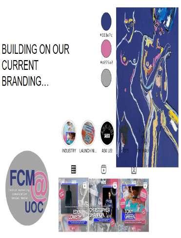
Incorporating our negotiation skills, we decided as a group to present multiple designs to the neighbouring teams and CEO. We loved the concept of using Industry Mentor Tony Green’s work as inspiration as he has worked alongside our course and supported us as students to evoke our creative and eccentric senses! The Multimedia Executive Milly took all our ideas on board and created some mock logos which reciprocated the digital nature and current branding of Studio 204 simultaneously, as shown above.