BRAND DESIGN


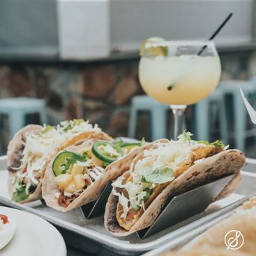
Spicy Street is a taco truck located in Los Angeles, California. They pride themselves in using only farm fresh food that is never frozen. They partner with local farms and wanted to include this throughout their branding. They were looking for fun, captivating designs that would make them really stand out on the streets.


Spicy Street needed a complete branding package including product designs, website, and social media content. While focusing on the freshness of their food, they were striving for a timeless design that had fun elements to make them seem welcoming and approachable. The final logo is simple, yet has a hint of texture to give it an aged and authentic feel.

 TACO TRUCK


Los Hermanos Borrachos is a golf apparel company located in Phoenix, Arizona. This company was started by two brothers who simply have a passion for golf. They also wanted to incorporate their heritage into some of these designs while still giving each of their designs a fun and playful feel to them.


LHB was searching for designs that could be easily adaptable for all different types of products they offer. Whiling staying true to their overall branding, they wanted illustrations that could be easily embroidered on anything from t-shirts and sweatshirts, all the way to duffel bags.


This infographic was designed to capture attention and educate on the decline of coral reefs. While designing this, it was important to focus on presenting the information in a meaningful way that would capture attention in order to spread awareness. Because of this, many icons and bright colors were used to capture interest.


This redesign for The New York Times website was heavily photography based, complimented by accents of typography. This layout brings interest into the site and is easily adaptable for each section that The Times features. Through this redesign I was also able to simplify their sections for easier navigation.


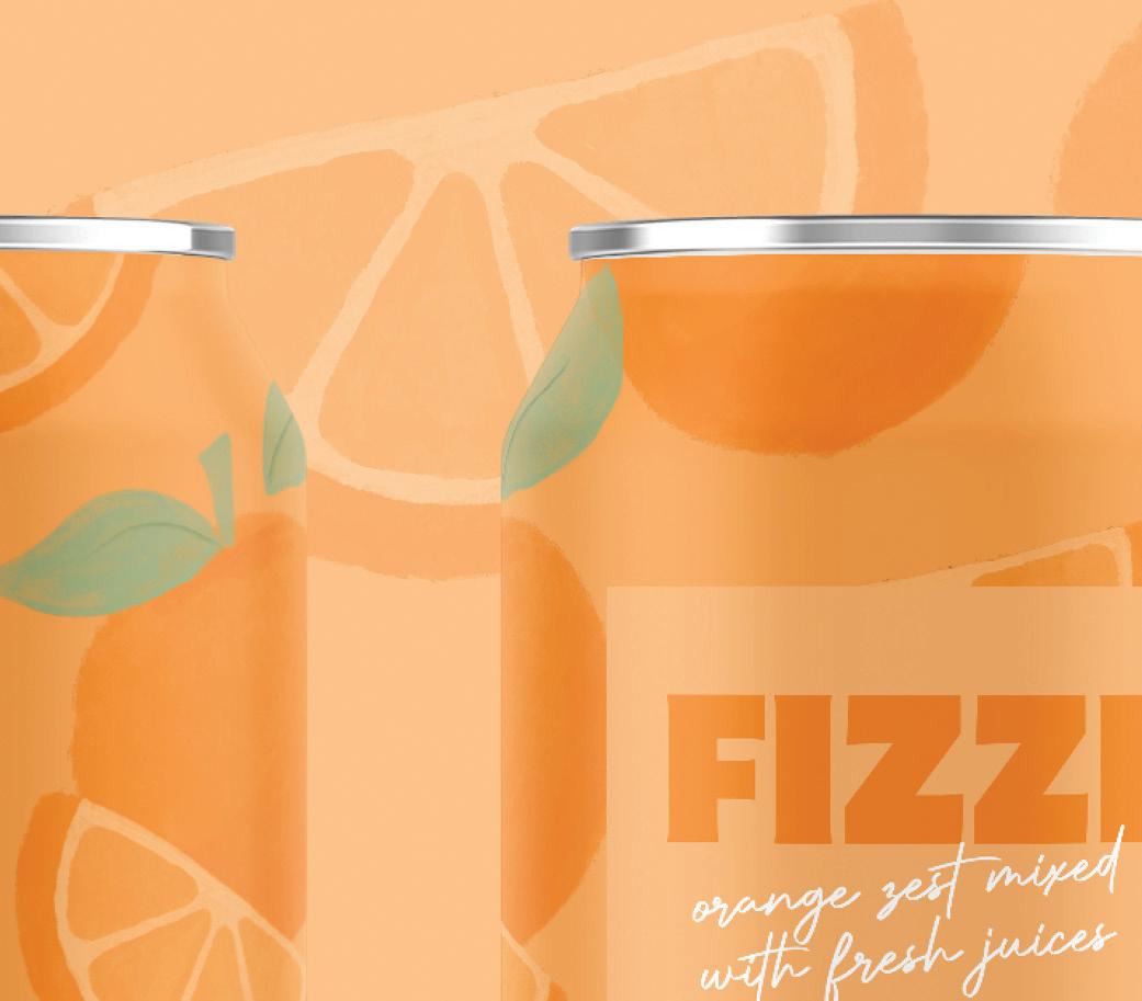
Fizzi is a sparkling water company that is passionate about giving back to the planet. They donate a portion of the proceeds from each can to environmental conservation organizations. Along with this, they wanted to really stand out against their competitors by using bright and vibrant colors all throughout their branding.


Fizzi was searching for designs that really captured attention. They wanted to use bright colors and completely unique illustrations of each of their flavored cans. These flavors include orange citrus, sweet lemon, and grapefruit. They also wanted to display their care for their consumers throughout this branding.


Elderwood is a winery located in Pleasant Hill, California. They were looking for a clean and modern design that felt sophisticated yet was able to stand out on the shelf. Because of this, I took an unique approach combining texture with simple typography to really make an overall captivating design.


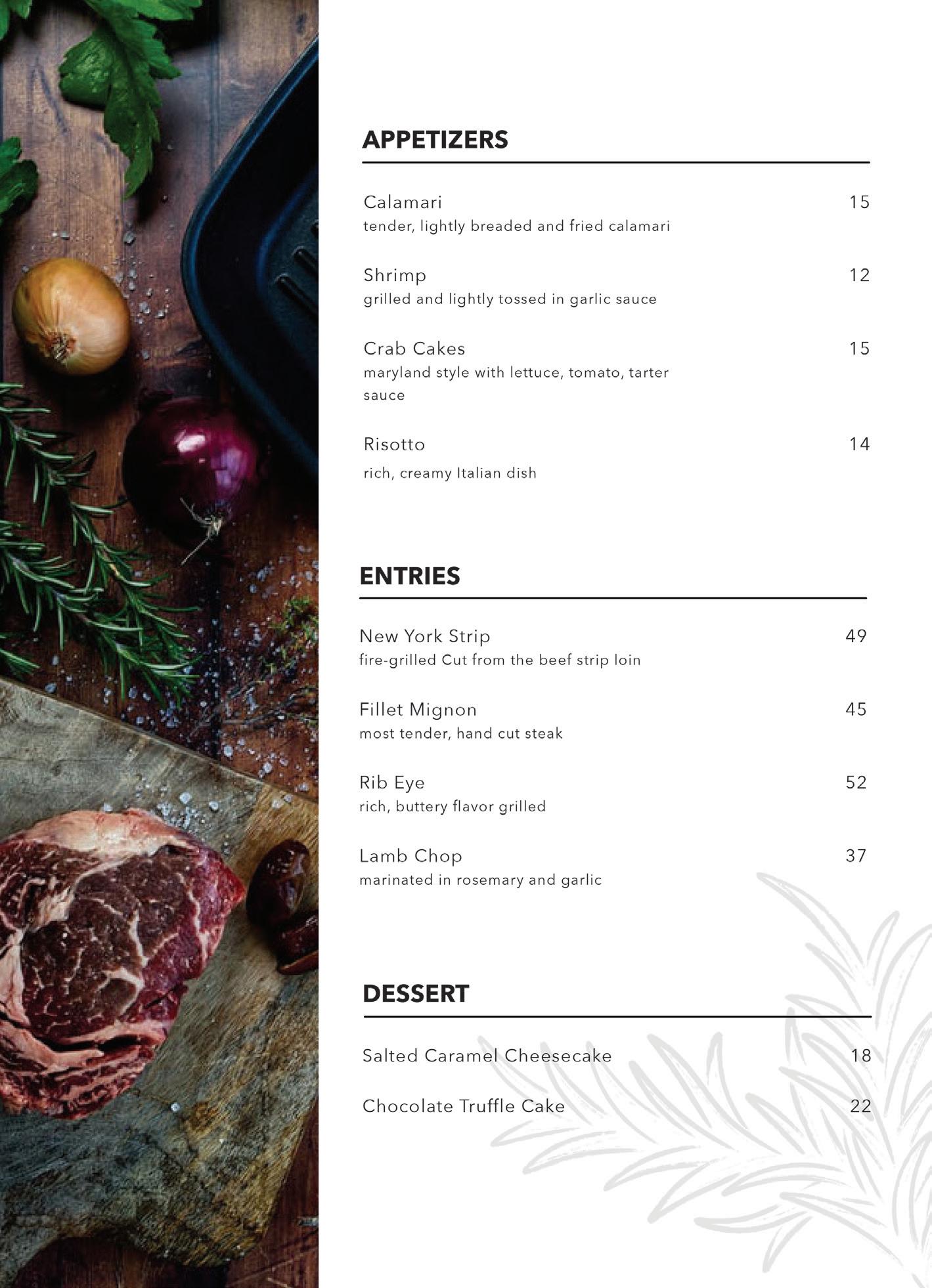
Louie’s Steakhouse is a high end restaurant located in Scottsdale, Arizona. They are a family owned business that takes pride in everything they make, carefully selecting each item on their menu. They wanted their branding to be based around this, keeping with a modern design that also connects with their customers.


Old Fashioned whiskey, bitters, and orange zest
Mint Mojito fresh mint, rum, and squeezed lime juice
Moscow Mule vodka, ginger beer, and squeezed lime juice
Manhattan whiskey, sweet vermouth, and bitters
Stone Delicious IPA
citrus-forward, lemon flavor and hop spice
Ballast Point Sculpin IPA
citrus twist, fresh squeeze of tangy bitterness

Rogue Hazelnut Brown Nectar rich nutty flavor, English Brown Ale style beer
Firestone 805 refreshing ale, malt sweetness with hops
Pegasus Bay Pinot Noir 2019


Louis Roederer Champagne 243


Foradori Teroldego 2020


Within this branding package, they were looking for menu designs as well as a website and social media content. Louie’s wants to stand out from their competitors through minimalistic, clean design that is then implemented all throughout their branding. Hand sketched icons are used consistently throughout their branding to give each design a personal touch.


