Issue 5

Page 1

Travel Close-up talk Avec les pieds dans l’eau Maurizio Lai

Food It rains grasshoppers

Fashion Botanical Silhouettes

Architectures Timeless architecture

Art Street art taking the stage

Music Playing something strange

Kabe 19003 Carlo Colombo


INDEX

05 07 11

#Primecollection

What’s New?

#Monography

Giuseppe Restano

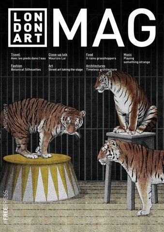
LONDONARTMAG On cover: Tigers 19004 | design Giuseppe Restano Art Director: Nicola Bottegal Editorial Director: Valentina Pepe Graphic design: Riccardo Zulato

headquarter

Via Migliadizzi 18, Noventa Vic. - Vi [IT] Tel +39 0444 760 565 LOGO FSC MISTOinfo@londonart.it E RICICLATO DA USARE PER GLI STAMPATI TRADIZIONALI E I CARTELLI VETRINA.

Showroom 12 mm

brera design district

Via Pontaccio 19, Milano [IT] Tel +39 328 62 59 868 milano@londonart.it 17 mm

www.londonartwallpaper.com www.londonart.it Printed by Grafiche Antiga spa

INGLESE

#Travel

Avec les pieds

17 22 24

dans l’eau #Fashion

Botanic Silhouettes

the stage

#Monography

Bellavista & Piccini

Maurizio Lai

#Architectures

Timeless architecture

#Close-up talk

#Food

It rains grasshoppers

#Monography

#Art

Street art taking

Maurizio Lai

Londonart Srl

INGLESE

29 36 41 47 54 57

#Monography

Antonio Colomboni

#Music

Playing

something strange


#EDITORIAL

In the beginning, there was the word, whereas now it is all image. We take

issue, we introduce our new designers, such Maurizio Lai (who you will

a fleeting look at the home page of Instagram and observe worlds that

get to know better in the interview on page 21) and our tried and trusted

are changing, snapshots of everyday life and trends that are born, driven

travel companions who will be with us for the next collection as well. We

by the urgent desire to be impressed. We travel through images, we eat,

talk about music with some weird and wonderful instruments which you

choose what we wear and who we follow through images, unaware of

will want to try out straight away, about the botanical trend and about

the mechanism which drives a market that, up until a few years ago, was

architecture through houses designed by undisputed experts (on page

unheard of. We are all photographers with front page-worthy lives, but

47). We will make you want to dine with your feet in the water in some of

we only take the good, weeding out the boring, sad parts. The advantage

the most sought-after locations around the world. And we had to include

is that it only takes an instant to figure out what is in the air. We have

food (on page41 ) to start getting used to the idea of eating insects which

drawn inspiration from this to create the #5 issue of Londonart MAG, to

appears to be what lies ahead for us, with panettone made from silk

talk not only about design and not just with words, but through images

worms and grasshopper flour, as in a magic recipe. But I will say no

too, of all that you can find by that routine gesture of scrolling through

more and leave you waiting in anticipation for the next issue in which we

images on social media. So, here it is, hot off the press, ranging from

will present the entire new Collection19, with the promise of amazing

Cologne to Paris with a sneak peek at the Londonart Collection 19. In this

you through visions, capable of transporting you to far away places.

In principio era la parola, ora tutto è immagine. Passiamo transitori a scrollare la

numero vi presentiamo nuovi designer come Maurizio Lai (che conoscerete meglio

home di Instagram e osservare mondi che cambiano, esibizioni del quotidiano e

nell’intervista a pag.24) e consolidati compagni di viaggio che ci accompagneranno

mode che nascono, guidati dal bisogno urgente di farci impressionare. Viaggiamo per

anche per la prossima collezione. Parliamo di musica con gli strumenti più strani

immagini, mangiamo per immagini, scegliamo cosa indossare e chi seguire, incuranti

che vi verrà subito voglia di provare, di moda botanica, di architettura attraverso le

del meccanismo che guida un mercato fino a pochi anni fa sconosciuto. Siamo tutti

case create dai grandi maestri (a pag.47) e vi faremo venir voglia di cenare con i piedi

fotografi con vite da prima pagina, ma prendiamo il bello, senza noiose malinconie, il

nell’acqua con le location più ambite in giro per il mondo. Non poteva mancare il food

vantaggio è che basta un attimo per capire cosa c’è nell’aria. Ci siamo ispirati a questo

(a pag.41) per iniziarci ad abituare all’idea di cibarci d’insetti, che sembra essere il

per creare il numero #5 del MAG Londonart non parlando solo di design, non parlando

futuro, con panettoni al baco da seta e farine di cavallette, un po’come in una formula

solo con parole, ma per immagini, di tutto quello che si può trovare proprio nel gesto

magica. Ma vi lascio In attesa del prossimo numero nel quale vi presenteremo la

quotidiano di scorrere immagini sui social. Ed eccolo fresco di stampa, tra Colonia e

nuova collection19 al completo, con la promessa di stupirvi, attraverso visioni capaci di

Parigi che vedranno in anteprima la preview della Collection 19 di Londonart. In questo

trasportarvi verso destinazioni lontane.

Buona visione

E D I T O R I A L

Valentina Pepe has worked as a journalist and interior designer after graduating in Modern Literature and Conservation of Cultural Heritage. A Masters in design and furnishing has led her to pursue interior architecture with great passion and sensitivity, like all those with crosscultural backgrounds. She has worked with the main Italian publications and

4

sector-based blogs, creating the design section for the fanpage.it website. She currently works as a regular contributor to the Panorama weekly magazine published by the Mondadori group and Artribune. She is also the writer and face behind the contemporary on-trend programme airing on Sky. She loves his three daughters, yellow and the scent of gardenias.

D I R E C T O R

Giornalista e interior designer dopo la laurea in Lettere Moderne e Conservazione dei Beni Culturali, un master in design e arredamento si avvicina ai temi dell’architettura d’interni con grande passione e sensibilità, come tutti coloro che vantano profili trasversali. Ha collaborato con le principali testate italiane e blog di settore ed ha creato la sezione design

per il portale fanpage.it. Attualmente lavora come regular contributor presso il settimanale Panorama edito dal gruppo Mondadori e Artribune, è inoltre autore e volto televisivo di un rotocalco di tendenze contemporanee in onda su Sky. Ama le sue tre figlie, il giallo e il profumo di gardenia.


50101LA BIANCO SABBIA p.20

50102LA BIANCO CREMA p.56

50103LA GRIGIO MADREPERLA p.08

50104LA NEBBIA MARINA p.52

50105LA AVORIO CHIARO p.52

50106LA CARAMELLO p.56

50107LA GIALLO DI MARTE p.34

50108LA ROSSO TERRACOTTA p.46

50109LA BLU BALTICO p.20/38

50110LA VERDE MALACHITE p.44/67

PRIMEWALLPAPER

50112LA

50111LA

NERO PROFONDO

p.52

TERRA D’OMBRA

50112LA NERO PROFONDO p.56

What’s new? Elena Paganelli / Filo Logico Prime Collection is the solid colour Londonart range that is intended to give a complete coordinated and tone-on-tone effect to the most decorative and spectacular wall paper. Prime is perfect as a stand-alone element as well, it creates tones and undertones which produce a well-balanced uniformity and plays on colour contrast by conjuring up Pantone palettes, adding highlights and depth while enhancing the surfaces. The sartorial texture of Londonart materials blends with the depth of the pigments creating dynamic, vibrant results, or ones that are pure, delicate and soft. Prime Collection è la gamma Londonart a tinta unita che nasce come

Pantone, creano uniformità armoniche e giochi di contrasto tonali per

elemento in grado di dare completezza coordinata e ton- sur-ton alle carte

dare risalto, profondità, preziosità alle superfici: la texture dei materiali

da parati più decorative e scenografiche. Perfetta anche come elemento a

sartoriali Londonart si fonde con la profondità dei pigmenti per risultanti

sé stante, Prime si compone di toni e sottotoni che, richiamando le palette

vitali, vibranti, o puri, morbidi e tenui.

5


#MONOGRAPHY

Drawing, the thing that more bores me least of all, the thing I do the most. G I U S E P P E

6

R E S T A N O


#MONOGRAPHY

GIUSEPPE RESTANO Giuseppe Restano is an artist, painter, illustrator and DJ from Apulia in Italy. In the 1990s, he set up his studio in Florence, working with major art galleries for two decades and emerging onto the contemporary scene of Italian painting. He is well-known for his vast number of personal and collective European exhibitions and the articles published about him in the main sector-based magazines, such as Flash art, Segno, Contemporary and Tema celeste. He currently lives and works in Milan where he has a home-studio in which he creates pictorial illustrations for some of the major fashion brands on the international scene.

Giuseppe Restano è un artista di origine pugliese, pittore, illustratore e dj. Negli anni novanta ha fondato il suo atelier a Firenze, relazionandosi per due decenni con note gallerie d’arte ed emergendo nella scena contemporanea della pittura italiana. Il suo nome è noto per aver esposto in un vasto numero di mostre personali e collettive europee e aver ricevuto pubblicazioni nelle principali riviste di settore, come ad esempio Flash art, Segno, Contemporary, Tema celeste. Attualmente vive e lavora a Milano, dove ha la sua casa-studio nella quale realizza illustrazioni pittoriche per alcuni dei più noti fashion brand del panorama internazionale.

Tigers 19004 Giuseppe Restano

7


PRIMEWALLPAPER

50106LA CARAMELLO

8


Coleotteri 19002 Cristina Celestino

9


Dune 19011 Francesca Besso

10


#TRAVEL

Avec les pieds dans l’eau Valentina Pepe

On a steep cliff overlooking the sea or in a cave, dining by candlelight cradled by the sea breeze, maybe with your feet in the water, is a real luxury. Here are the best restaurants around the world that enjoy a

THE GROTTO Krabi | Thailand

privileged position, able to turn food into a global experience. The Grotto restaurant is in Krabi, Thailand; it is called “The Cave” because indeed it stands under an ancient limestone cliff on the edge of Phra Nang Beach. In this extraordinary place you can have lunch in contact with nature and have dinner while watching the sunset.

Il ristorante The Grotto si trova a Krabi, in Thailandia, è stato chiamato appunto “La Grotta”, perché sorge sotto un’antica rupe calcarea ai margini di Phra Nang Beach. In questo posto straordinario si può pranzare a contatto con la natura e cenare guardando il tramonto.

A picco sul mare o in una grotta,

cenare

a

lume

di

candela cullati dalla brezza marina, magari con i piedi nell’acqua, rappresenta un vero lusso. Ecco i migliori ristoranti in giro per il mondo che godono di una posizione privilegiata, capaci di trasformare il cibo in esperienza globale.

EL FARALLÓN Cabo San Lucas | Mexico

El Farallón is in Mexico, in Cabo San Lucas, and is considered one of the most beautiful restaurants in the country, hidden among the cliffs of Capella Pedregal on the Pacific Ocean. In the evening it is the ideal place for a romantic dinner: you can savour great fish while watching the waves crash on the rocks. Here the executive Chef Gustavo Pinet offers only the best selection of the local catch and the menu changes according to availability.

El Farallón si trova in Messico, a Cabo San Lucas, ed è considerato uno dei ristoranti più belli del luogo; nascosto tra le scogliere della Capella Pedregal sull’Oceano Pacifico. Di sera è il luogo ideale per una cena romantica: si può assaporare un ottimo pesce guardando le onde infrangersi sugli scogli. Qui l’executive Chef Gustavo Pinet offre solo la migliore selezione del pescato locale ed il menù cambia in base alla disponibilità.

11


#TRAVEL

THE ROCK Zanzibar

The Rock already strikes you at first sight, and depending on the tide, the view on the ocean takes your breath away; the restaurant stands on a rock not far from the shore of the beautiful Michanwi Pingwe beach. This time you do not eat overlooking the sea, but directly in the middle of the sea, and beyond the enviable position, the menu, the excellent service, the relaxed environment, and the hospitality experience of the owners make this place unique. The flavours range from local spices to the products of the sea or the land, presented in an informal yet refined way. The Rock colpisce già al primo sguardo, e a seconda della marea, la vista sull’oceano muta; il ristorante sorge infatti, su una roccia non distante dalla riva della bellissima spiaggia Michanwi Pingwe. Questa volta non si mangia affacciati sul mare, ma direttamente in mezzo al mare e oltre all’invidiabile posizione, il menu, il servizio eccellente, l’ambiente rilassato e l’esperienza di ospitalità dei proprietari rendono questo posto unico. I sapori spaziano dalle spezie locali, ai prodotti del mare o della terra, presentati in modo informale ma ricercato.

LE BARACHOIS AL CONSTANCE LE PRINCE MAURICE Mauritius

In Mauritius at the floating restaurant Le Barachois you can dine while enjoying the incredible sight of the Indian Ocean and you can take romantic walks along a boardwalk lit by lanterns that mysteriously leads to a secluded area. Here you cannot miss the prawns, crabs, and extraordinary combinations of chef Scioli and sommelier Carlier.

Alle Mauritius al ristorante galleggiante Le Barachois si può cenare godendosi lo spettacolo delle acque dell’Oceano Indiano e si possono fare romantiche passeggiate lungo una passerella illuminata da lanterne che porta misteriosamente verso una zona appartata. Qui sono imperdibili i gamberi, i granchi e gli straordinari abbinamenti dello chef Scioli e del sommelier Carlier.

VILLA ESCUDERO Philippines In the Philippines we find the particular “Villa Escudero”, a tourist village that has positioned the restaurant at the foot of a waterfall, with the tables in the water. An idea so bizarre it attracts many tourists and curious people. Lunch and dinner are served on bamboo tables and you can taste typical Filipino dishes in total freshness. Nelle Filippine troviamo il particolare “Villa Escudero” un villaggio turistico che ha posizionato il ristorante ai piedi di una cascata, con i tavoli posti nell’acqua. Un’idea talmente bizzarra da attirare molti turisti e curiosi. Il pranzo e la cena sono serviti su tavoli di bambù e si possono gustare piatti tipici filippini decisamente al fresco.

12


#TRAVEL

ECO DEL MARE Fiascherino , Lerici | Liguria

Inside the Natural Park of Montemarcello Magra, at the Eco del Mare (Echo of the Sea) you can taste the authentic flavours of the Ligurian cuisine, revisited. At lunch a cool refreshment in front of the sea or directly under the umbrellas; at dinner a romantic evening with the moon kissing the sea. Here the local catch and the zero-km ingredients are a promise, to accompany with a careful selection of wines and champagnes, including an extremely rare assortment of wines from the Lunae cellars produced exclusively for the Tuscan vineyard of the property. All’interno del Parco Naturale di Montemarcello Magra, all’ Eco del mare, è possibile gustare i sapori autentici della cucina ligure, rivisitata. A pranzo un fresco ristoro di fronte al mare o direttamente sotto l’ombrellone; a cena una romantica serata con la luna che bacia il mare. Qui il pescato locale e gli ingredienti a km zero sono una promessa, da accompagnare con un’attenta selezione di vini e champagne, tra cui un introvabile assortimento di vini delle cantine Lunae prodotti in esclusiva per il vigneto toscano della proprietà.

SAFFRON RESTAURANT BANYAN TREE BINTAN Indonesia

Located on the splendid island of Banyan Tree Bintan, from which you can admire the South China Sea. The Saffron restaurant serves specialties of Thai and Indonesian cuisine with cocktails inspired by the Asian countries, and you can also choose to enjoy the meals in the privacy of an accommodation or on the beach. This paradise is just a 45-minute ferry ride away from Singapore.

Ubicato nella splendida isola di Banyan Tree Bintan, da cui si può ammirare il Mar Cinese Meridionale. Il ristorante Saffron propone specialità della cucina thailandese e indonesiana con cocktail ispirati ai paesi asiatici e si può anche scegliere di gustare i pasti nella privacy di un alloggio o sulla spiaggia. Questo paradiso dista appena 45 minuti di traghetto da Singapore.

13


#TRAVEL

GROTTA PALAZZESE Polignano a Mare | Puglia

The Grotta Palazzese restaurant was created in the fairy-tale setting of the Grotta Palazzese, the largest of the 80 natural caves that pierce the rocky coast near the town of Polignano a Mare, in the province of Bari. Renowned internationally, it has an outdoor hall set in a place known and used for parties and banquets since the 1700s. Famous, in this regard, is the 1783 watercolour by Jean Louis Desprez.

Il ristorante Grotta Palazzese è stato creato nello scenario da favola della Grotta Palazzese, la più grande delle 80 grotte naturali che squarciano la costa rocciosa nei pressi della città di Polignano a Mare, in provincia di Bari. Rinomato a livello internazionale, dispone di una sala all’aperto incastonata in un luogo conosciuto e utilizzato per feste e banchetti fin dal 1700. Famoso, a riguardo, è l’acquerello di Jean Louis Desprez del 1783.

IL RICCIO Anacapri | Campania

Starred restaurant, and an atmosphere of times past. Il Riccio, with its intense blue tables and pure white complements overlooking the Grotta Azzurra, brings you back to the Capri of the roaring 60s and its lively and debonair evenings. A restaurant pieds dans l’eau (on the waterfront) and a safe harbour both for those who decide to land by sea directly on the terrace that hosts it, and for those who are already on the Blue Island. A fairy-tale world balanced between the luxury of simplicity and a warm hospitality. At the direction of the Riccio there is Roberto Bonetti, who comes from Valtellina. The resident chef is Giovanni Bavuso from Potenza, and then there is Andrea Migliaccio from Ischia, but Caprese by adoption, the executive overseeing the kitchen.

14

Ristorante stellato in un’atmosfera d’altri tempi. Il Riccio, con i suoi tavoli azzurro intenso e i complementi bianco candido a picco sulla Grotta Azzurra, riporta alla Capri dei ruggenti anni ’60 e alle sue serate frizzanti e goderecce. Un ristorante “pieds dans l’eau” ed un approdo sicuro sia per chi decide di sbarcare via mare direttamente sulla terrazza che lo ospita, sia per chi è già sull’Isola Azzurra. Un mondo di fiaba in equilibrio tra il lusso della semplicità e la calorosa accoglienza. A dirigere il Riccio c’è Roberto Bonetti che arriva dalla Valtellina. Lo chef resident è Giovanni Bavuso da Potenza e a sovraintendere la cucina c’è l’executive Andrea Migliaccio ischitano di nascita, ma caprese di adozione.

IL CLANDESTINO Portonovo | Ancona

Il Clandestino sushi bar is the famous blue hut located in the bay of Portonovo, between the lavenders and brooms of the adjacent hills in the heart of the Conero park, a pristine oasis rich in Mediterranean scrub with intriguing aromas. The restaurant takes its name from a song by Manu Chao, but today for many people it brings to mind this restaurant in the province of Ancona, surrounded by sea water, sand, blue sky, and a night light that illuminates a small church. A spectacular setting that invites you to a romantic dinner for two under the moon.

Il Clandestino sushi bar è la celebre capanna blu che si trova nella baia di Portonovo, tra le lavande e ginestre delle colline adiacenti nel cuore del parco del Conero, oasi incontaminata e ricca di una macchia mediterranea dai profumi intriganti. Il locale prende il nome da una canzone, di Manu Chau, ma oggi ricorda a molti questo ristorante in provincia di Ancona, circondato dall’acqua di mare, dalla sabbia, dal cielo azzurro e da una luce notturna che illumina una chiesetta. Una scenografia spettacolare che invita a una cena a due, romantica, sotto la luna.


Farah Diba 19001 Ferruccio Laviani


Singularity 19015 Nicola Bottegal

16


#FASHION

Botanic Silhouettes Valentina Pepe

Petals and flowers bloom on clothes, shoes, handbags, and hairstyles. A poignant love that knows no end, the one between fashion and floral essences, that tries to always come up with new offers and proportions to renew itself.

Flowers have never really abandoned the fashion scene, and confirm themselves as an absolute trend even for the next season. Patterns, in fact, are the real protagonists of a clothing designed to instil joy and femininity. Flowers become irreplaceable allies capable of giving an extra touch of joy to clothes you can wear all day. But the love story between fashion and botany has distant roots; this is particularly true for flower prints, which sink their roots into really remote worlds. When we think of flowers on fabrics, in fact, our memory brings us back in a moment to the opulence of the decorations of Madame Pompidour’s dresses, to the sumptuousness of the Tudor period, to the velvets embroidered with corollas in the Italian Renaissance. But also the images that come to us from distant worlds, like the Iranian silks, the Japanese kimonos. All this was fully inherited by the masters of fashion, who have been making exclusive clothes

17


#FASHION with a romantic and refined allure since the 50s. A pioneer of the floral theme was Christian Dior, who in 1947 presented his first collection of haute couture and his Miss Dior, a fragrance with a floral essence and a delicate and fresh image like a flowery field. But he was certainly not the only one. Dresses decorated with impalpable flowers of tulle and organza became iconic. One cannot forget the dress scattered with embroidered roses created for Audrey Hepburn by the genius of Hubert de Givenchy, worn in Sabrina in 1954. Indelible images in the history of fashion, undoubtedly, which continue to influence the collections of today. Inspired by tapestry are the floral prints of the long kaftans at the ankle and the silk baggy suits by Gucci. From Roberto Cavalli instead, the floral motif seems to come out of biology books, with meticulous drawings made with nibs that faithfully reproduce every natural vein. For Michael Kors, the rose is the protagonist of macro jacquard fabrics and micro embroidery of petals and leaves, on trench and cocktail dresses. Shocking hues like turquoise and grass green colour Balenciaga’s vintage flower prints, while the shades chosen by Etro are decidedly more autumnal, with intertwined floral patterns on jackets and fluid silk trousers. Almost an abstraction are the motifs of Giorgio Armani – with stylized flowers reminiscent of a manga – or from Marni with rotating buds like brush strokes of sequins.

18


#FASHION

Petali e fiori sbocciano su abiti, scarpe, borse e acconciature. Un amore struggente che non conosce fine, quello tra la moda e le essenze floreali, che prova ad indagare sempre nuove proposte e proporzioni per rinnovarsi.

I fiori in realtà non hanno mai abbandonato la scena della moda e si confermano di tendenza assoluta anche per la prossima stagione. Le fantasie, infatti, sono le vere protagoniste di un abbigliamento pensato per infondere gioia e femminilità. I fiori, diventano complici insostituibili capaci di conferire un tocco di allegria in più agli abiti da indossare da mattina a sera. Ma la storia d’amore tra moda e botanica ha radici lontane, questo è particolarmente vero per le flower print, che affondano le loro radici in mondi davvero remoti. Quando pensiamo ai fiori sui tessuti infatti in un attimo torniamo con la memoria all’opulenza dei decori degli abiti di Madame Pompidour, alla sontuosità dell’epoca Tudor, ai velluti ricamati di corolle nel Rinascimento italiano. Ma anche le immagini che ci arrivano da mondi lontani, come le sete iraniane, i kimono giapponesi. Tutto questo è stato ereditato a piene mani dai maestri della moda, che ne hanno filato confezioni esclusive e dall’allure romantica e raffinata a partire già dagli anni ’50. Pioniere sul tema floreale fu Christian Dior, che nel 1947 presentò la sua prima collezione di haute couture e il suo Miss Dior, profumo dall’essenza floreale e l’immagine delicata e fresca come un campo fiorito. Ma non fu certo il solo. Gli abiti decorati da fiori impalpabili di tulle e organza divennero iconici. Impossibile dimenticare l’abito cosparso di rose ricamate creato per Audrey Hepburn dal genio di Hubert de Givenchy indossato in Sabrina nel 1954. Immagini indelebili nella storia della moda, non ci sono dubbi, che continuano ad influenzare le collezioni di oggi. Si ispirano alla tappezzeria le stampe floreali dei lunghi caftani alla caviglia e delle tute baggy di seta firmate Gucci. Da Roberto Cavalli invece, il motivo a fiori sembra uscire dai libri di biologia, con disegni minuziosi fatti a pennino che riproducono fedelmente ogni venatura naturale. Per Michael Kors la rosa è protagonista di macro tessuti jacquard e micro ricami di petali e foglie, su trench e abiti da cocktail. Tinte shocking come il turchese e il verde erba colorano le stampe a fiori dal sapore vintage di Balenciaga, mentre le tonalità scelta da Etro sono decisamente più autunnali, con ramage intrecciati su giacche e pantaloni fluidi in seta. Al limite dell’astratto i motivi di Giorgio Armani – con fiori stilizzati a mo’ di manga – o da Marni con boccioli rotanti come pennellate di paillettes.

19


PRIMEWALLPAPER

50108LA

ROSSO TERRACOTTA

PRIMEWALLPAPER

50109LA BLU BALTICO

PRIMEWALLPAPER

50101LA

BIANCO SABBIA

20


Cobra 19005 Elena Salmistraro

21


#MONOGRAPHY

My work is the result of an internal tension, a collision of logic and irrationality that pushes myself to leave some room for intuition M A U R I Z I O

L A I

MAURIZIO LAI Architect and designer Maurizio Lai was born in Padua in 1965 and studied Architecture in Venice and Milan. He started his career as set designer for the national TV broadcasters, while working on retail and display concepts for major luxury brands, such as Longines, Montblanc and Gucci, among others. Soon after he would begin his collaboration with Ventaglio Travels Group and The Club Med, to develop international hospitality and tourism related projects. In 1998 he founded LAISTUDIO in Milan. Consisting of a team of architects, engineers and designers the Studio promotes synergies of expression, approaching the design process in a distinguished original way, which determine the production of rather impacting concepts for the retail, commercial and hospitality industry, as well as for private residential projects and developments. An original interpreter of contemporary aesthetics, Maurizio Lai’s work is defined by an instinctive approach, which certainly reflects in the originality of his lighting creations. His style has been described as one of the most interesting in the Italian contemporary scene. Along with the creativity, the years-long experience with the high-end design manufacturing process and a strong network of trusted construction partners enables the Studio to deliver detailed, bespoke and beautifully crafted projects worldwide. Maurizio Lai’s work has been recognized with prestigious acknowledgments through time, his work is featured in the most authoritative architecture and design publications.

22

Architetto, scenografo e designer, Maurizio Lai nasce a Padova, studia Architettura a Venezia e al Politecnico di Milano, dove si laurea. Inizia la sua carriera progettando per la televisione, lo spettacolo e la moda, per estendere rapidamente l’attività al settore residenziale, commerciale e contract, sia in Italia che all’estero. Nel 1998 fonda e dirige LAI STUDIO, come organismo multidisciplinare che sviluppa costanti sinergie tra l’architettura e il design, avvalendosi nel corso degli anni della collaborazione di diversi professionisti e coltivando un ampio vivaio di giovani progettisti. Riconosciuto interprete di un’estetica contemporanea originale, il suo lavoro si fonda sull’istinto e si traduce in creazioni elaborate, nelle quali la luce gioca un ruolo fondamentale. Il suo stile è stato definito come uno dei più interessanti nel panorama contemporaneo italiano. I suoi lavori sono pubblicati internazionalmente sulla più autorevole stampa di Architettura e Design.


#MONOGRAPHY

Daydream 19008 Maurizio Lai

23


#CLOSEUPTALK

Maurizio Lai Valentina Pepe

What excites you in a project? I like designing, more than the specific content of the project. The project is not necessarily architecture or design, it can be a journey, an experience, a life project. The opportunity to conceive something is already exciting, realizing a project is a consequent aspect, inevitably more important, different in its dynamics and repercussions. How much does your work as a scenographer influences your architecture? My relationship with scenography began by chance, it was not a goal, it was an opportunity, experienced as an expressive research. I believe I have always been unknowingly influenced and involved by it. The scenographic approach is for me a fundamental aspect in the interpretation of space, it adds a narrative component to the architectural process, it tells a story, it communicates with the interlocutor.

creating a homogeneous condition or on the contrary strongly heterogeneous and contrasting. Can you tell us about your collaboration with Londonart? Was it stimulating to dress a white wall? Collaborating with Londonart gives me the opportunity to speak a new language. My approach to the wall itself is always about transforming the flat field, adding volume or subtracting it, fragmenting the surface into different levels of depth or negating the end of a space with a play of refractions. The challenge in this case is to apply this philosophy to a covering.. The recognition that has gratified you the most?

The material you love to use and why?

It may seem cliché, but the recognition that satisfies me the most is that of the people around me, when they consider a contribution, a point of view, or a teaching of mine valid. This passage gratifies me, I prefer to leave something rather than take.

I’m not attached to a particular material. I enjoy playing with the widest possible spectrum of materials, matching them randomly, each as an element that interacts with others,

Your works are recognizable and have a strong personality, how are they evolving over time and thanks to new technologies?

24

The evolution of my creative thinking is organic and has evolved in relation to the change of times, but I have always followed a single track, which is to work on the idea of an architecture that goes beyond the limits of the discipline, which works by realizing simple figurative boxes, to become part of a network of signs to be used as communication codes. In this case, technology is an offer that must be seized and used, because I think that the lack of curiosity towards innovative processes goes against the logic of design. Space, colour, concept, from where do you usually start to conceive a project? Personally, I always start from the space, from its perimeter and from the constraints within which I am asked to operate. Mine is a paradoxically classic approach, which studies the assigned space in its possibilities and its limits. Space and concept are two components that usually interact with each other in the first phase of a project, even in my works, in which the conceptual aspect is changeable and communicates with the interlocutor on an emotional level. Colour is the last part of this complex dress, probably the most playful component.

Wat are you working on right now? I am busy on several fronts, with several new projects in progress, both in the commercial and residential sectors, in Italy and abroad. I am also working with great interest in a special project dedicated to the professional training of young people with Asperger’s syndrome. The shape that you prefer and that you often find in your distinctive traits? I should talk about lines, rather than shapes. For me the shape is generated by an additive process, by segments that overlap and intersect, working in chorus like in a score. The result I want to achieve is a dynamic shape, not defined permanently and univocally. If you had not done this job, what would you have done? I’d have been a sculptor. And a flaw? Surely many, I would say that the first of them is a certain lack of synthesis!


#CLOSEUPTALK

Velasca 19041 Maurizio Lai

Cosa ti entusiasma in un progetto? Mi entusiasma progettare, non tanto il contenuto specifico del progetto. Il progetto non è necessariamente architettura o design, può essere un viaggio, un’esperienza, un progetto di vita. L’opportunità di ideare qualcosa è già emozionante, realizzare un progetto è un aspetto conseguente, inevitabilmente più importante, diverso nelle sue dinamiche e ripercussioni. Quanto il tuo lavoro di scenografo influisce sulle tue architetture? Il mio rapporto con la scenografia è cominciato in modo casuale, non era un obiettivo, è stata un’opportunità, vissuta come ricerca espressiva. Credo di esserne sempre stato inconsapevolmente influenzato e coinvolto. L’approccio scenografico è per me un aspetto fondamentale nell’interpretazione dello spazio, aggiunge una componente narrativa al processo architettonico, racconta una storia, comunica con l’interlocutore.

con la parete in sé è sempre di trasformazione del campo piatto, aggiungendo volume o negandolo, frammentando la superficie in livelli diversi di profondità o annullando la fine di uno spazio con un gioco di rifrazioni. La sfida in questo caso è quella di applicare questa mia filosofia ad un rivestimento. Il riconoscimento che ti ha gratificato di più? Può sembrare scontato, ma il riconoscimento che mi soddisfa di più è quello delle persone che mi stanno intorno, nel momento in cui ritengono valido un mio contributo, un punto di vista o un insegnamento. Mi gratifica questo passaggio, preferisco lasciare qualcosa piuttosto che prendere.

Il materiale che ami utilizzare e perché? Non sono legato a un materiale in particolare. Mi diverte giocare con il più ampio spettro possibile di materiali, accostarli uno all’altro in maniera casuale, ciascuno come un elemento che interagisce con altri, creando una condizione omogenea o al contrario fortemente disomogenea e contrastante.

I tuoi lavori sono riconoscibili ed hanno una forte personalità, come stanno evolvendo nel tempo e grazie alle nuove tecnologie? L’evoluzione del mio pensiero creativo è organica e si è evoluta in rapporto al cambiamento dei tempi, ma ho sempre seguito un’unica traccia che è quella di lavorare all’idea di un’architettura che superi i limiti della disciplina, che opera realizzando semplici scatole figurative, per diventare parte di una rete di segni da usare come codici comunicativi. In questo caso la tecnologia è una proposta che va colta e utilizzata, perché penso che la mancanza di curiosità nei confronti dei processi innovativi vada contro la logica del progetto.

Ci parli della tua collaborazione con Londonart? E’ stato stimolante vestire una parete bianca? Collaborare con Londonart mi dà la possibilità di parlare un nuovo linguaggio. Il mio approccio

Spazio, colore, concetto, da dove inizi di solito a concepire un progetto? Personalmente comincio sempre dallo spazio, dalla sua perimetrazione e dai vincoli entro i quali mi si chiede di operare. Il mio è un

approccio paradossalmente di tipo classico, che studia lo spazio assegnato nelle sue possibilità e nei suoi limiti. Spazio e concetto sono due componenti che dialogano abitualmente tra loro nella prima fase di un progetto, anche nei miei lavori, nei quali l’aspetto concettuale è mutevole e comunica con l’interlocutore su un piano emotivo. Il colore è l’ultima parte di questo complesso vestito, probabilmente la componente più giocosa. A cosa stai lavorando in questo momento? Sono impegnato su più fronti, con diversi nuovi progetti in corso, sia nel settore commerciale che residenziale, in Italia e all’estero. Sto lavorando con molto interesse anche ad un progetto speciale, dedicato alla formazione professionale dei giovani con sindrome di Asperger.

La forma che preferisci e che ritrovi spesso nei tuoi tratti distintivi? Dovrei parlare di linee, più che di forme. Per la me la forma è generata da un processo additivo, da segmenti che si sovrappongono e si intersecano, lavorando in coro come in uno spartito. Il risultato cui desidero arrivare è una forma dinamica, non definita in modo permanente e univoco. Se non avessi fatto questo lavoro, cosa avresti fatto? Avrei fatto lo scultore. E un tuo difetto? Sicuramente tanti, direi che il primo fra tutti è una certa mancanza di sintesi!

25


Stratze 19013 Elena Borghi


Elkann 19017 Riccardo Zulato


Utopia 19010 Jon Iubler

28


#ART

Street art taking the stage Valentina Pepe

Banksy Bethlehem

Os Gemeos Boston

From subways to abandoned buildings, from houses to bus shelters, street art has become part of our cities. Once opposed and seen as a mess to clean up, today it starts to be appreciated and even valued. But who are the street artists that travel around the world painting everything they find, ready to use the city like a giant canvas to represent their thoughts on?

The most famous among them is certainly Banksy, even more after his Girl with

Italians of the Bronx and the Lower East Side). It is no coincidence that the primary

Balloon was auctioned for a record amount of over a million pounds. The auctioneer

effect of their expression is the invention of a new graphic language, which did not

had just announced the winner when the artwork began to spontaneously shred,

exist before, an amalgamation of many styles, from Arabic to Western and Asian.

like any office document in a paper shredder. The author had hidden in the frame

In this scene,” says Mercurio, “Banksy amplifies and expands the multicultural

of the picture a device for self-destruction, in case it ever got auctioned. And what

character of the writers he initially drew inspiration from; like the street artists of

wanted to be a gesture of protest against the art market, turned into a bargain for

his generation, he emphasizes the content of political and social messages explicitly,

the buyer who in a few hours saw the value of the artwork double. Difficult not to

or rather, he radically shifts the message from the form to the content.” His message,

think of Banksy as a Zorro or imagine him as a rock star. The anonymous street

his art, manifest as an explicit and bitter provocation towards the arrogance of the

artist, originally from Bristol, has filled the world with his stencils full of political

establishment, of power, of conformism, of war, of consumerism.

significance, initially appearing in the United Kingdom. The first writers “came

As Shepard Fairey explained, “His artworks are full of metaphorical images that

from the different neighbourhoods of New York, which in turn were populated by

transcend language barriers. The images are fun and brilliant, yet so simple and

communities of different backgrounds (the blacks of Harlem, the Hispanics and the

accessible: even if 6-year-olds have no idea what a cultural conflict is, they will have

29


#ART

Blu Bologna

no problem recognizing that there is something afoot when they see Mona Lisa

murals are easily recognizable. JR defines himself as a “photograffeur” and has

holding a flamethrower.” Words in Banksy often go beyond an aesthetic assessment

indeed become famous for the giant photographs he shoots, prints, and attaches

(after all contrary to Banksy’s philosophy) or an agenda, but they highlight a firm

on the sides of buildings. Charged with a strong and precise meaning, the work of

stance against the contemporary art system. Contrary to what the artist probably

JR wants to tell the story of humanity and has been seen on walls all over the world,

would like, contrary as he is to the capitalistic standardization of art, the value of his

from Paris to Brazil. And then Maya Hayuk, an artist from Brooklyn famous because

artworks is constantly growing exponentially, creating what Mercurio defines as a

in her psychedelic visions she manages to create a fantastic union between street art

“further short circuit around Banksy, which is added to those already surrounding

and Ukrainian craftsmanship. “I had grandmothers who taught me ancient crafts,

his almost legendary character.” But Banksy is not the only one; among the artists

like embroidery,” she said in an interview, “this was the first true artistic influence of

stand out the Brazilian twins Os Gemeos who created their very personal style by

my life; they taught me how to have determination and a steady hand. That’s where

merging the traditional graffiti-hip-hop concept with Brazilian culture. Obtaining

my art was born.” As for Vhils, street artist originally from Lisbon, his artworks are

great success in Brazil and South America, Os Gemeos are a point of reference for

spread across all continents and tell stories and emotions of characters, more or less

street artists around the world. Their yellow-skinned characters and shimmering

famous, through their faces, opting preferably for white with darker shades.

30


#ART

Vhils Detroit

Dalle metropolitane agli edifici abbandonati, dalle case alle pensiline degli autobus, la street art è diventata parte delle nostre città. Un tempo osteggiata e vista come disordine da ripulire, oggi inizia a piacere e ad essere anche quotata. Ma chi sono gli street artists che girano per il mondo dipingendo tutto ciò che trovano, pronti ad usare la città come una gigantesca tela su cui rappresentare i propri pensieri?

Maya Hayuk Houston

JR Paris

Il più famoso di tutti è sicuramente

Lo street artist anonimo, originario di

Banksy ancora di più dopo che la sua

Bristol, ha riempito il mondo con i suoi

bambina col palloncino è stata battuta

stencil carichi di significati politici,

per la cifra record di oltre un milione

comparsi

di sterline. Il battitore aveva appena

Unito. I primi writers provenivano dai

aggiudicato l’opera quando la stessa

diversi quartieri di New York, che a

ha cominciato a distruggersi, come un

loro volta erano popolati da comunità

qualsiasi documento d’ufficio passato

di diversa provenienza (i neri di

al tritarifiuti. L’autore aveva nascosto

Harlem, gli ispanici e gli italiani del

nella cornice del quadro un dispositivo

Bronx e del Lower East Side). Non è

per autodistruggersi, qualora fosse

un caso che l’effetto primario della

stata sottoposta ad asta. E quello che

loro espressione è l’invenzione di

doveva essere un gesto di rifiuto verso

una grafia nuova, che non esisteva,

il mercato dell’arte, si è trasformato

amalgamando

in un affare per l’acquirente che in

quella araba, a quella occidentale

poche ore ha visto raddoppiare il

e asiatica. “In questo panorama”

valore dell’opera. Difficile non avere

afferma Mercurio, “Banksy amplifica

un’opinione su Banksy accomunato a

ed espande il carattere multiculturale

Zorro e immaginato come una rock star.

dei writers, ai quali si era agli inizi

inizialmente

molte

nel

Regno

grafie,

da

31


#ART

Banksy Cleveland

formalmente ispirato; come gli street

non

a

leggendaria.” Ma Bansky non è il

da Parigi al Brasile. E poi Maya Hayuk

artists della sua generazione accentua

riconoscere che c’è qualcosa che non

solo, tra gli artisti spiccano i gemelli

è un’artista di Brooklyn famosa perché

il contenuto dei messaggi politici e

quadra quando vedono Monna Lisa

brasiliani Os Gemeos che hanno creato

nelle sue visione psichedeliche, riesce

sociali in maniera esplicita, anzi sposta

che impugna un lanciafiamme.” Le

il loro personalissimo stile fondendo il

a creare un fantastico connubio tra arte

radicalmente il messaggio dalla forma

parole in Banksy spesso vanno oltre

concept graffiti-hip-hop tradizionale

di strada e artigianato ucraino. “Ho

al contenuto”. Il suo messaggio, la sua

una valutazione estetica (del resto

con la cultura brasiliana. Ottenendo

avuto nonne che mi hanno insegnato

arte si manifestano come un’esplicita

contraria al sentire di Banksy) o un

un grande successo in Brasile e

antichi mestieri, come il ricamo” – ha

e aspra provocazione nei confronti

programma d’intenti, ma evidenziano

Sudamerica, Os Gemeos sono un

dichiarato in una intervista – “questa è

dell’arroganza, dell’establishment del

una presa di posizione decisa contro

punto di riferimento nella street art

stata la prima vera influenza artistica

potere, del conformismo, della guerra,

il sistema dell’arte contemporanea.

mondiale. I loro personaggi dalla

della mia vita, loro mi hanno insegnato

del consumismo. Come ha spiegato

Contrariamente a quanto l’artista

pelle gialla ed i murales luccicanti

la determinazione e ad avere le mani

Shepard Fairey “le sue opere sono

probabilmente

sono

JR

ferme. Da qui nasce la mia arte”. Per

piene di immagini metaforiche che

com’è

capitalista

si definisce un “fotograffista” ed è

quanto riguarda Vhils, street artist

trascendono le barriere linguistiche.

dell’arte, il valore delle sue opere è

appunto diventato famoso per le

originario di Lisbona, le sue opere

Le

e

in crescita esponenziale costante,

fotografie giganti che scatta, stampa

sono sparse per tutti i continenti e

brillanti, eppure talmente semplici

creando quello che Mercurio definisce

ed attacca sui lati dei palazzi. Dotato di

raccontano storie ed emozioni di

e accessibili: anche se i bambini di

un “corto circuito ulteriore intorno

un significato forte e preciso, il lavoro

personaggi, più o meno famosi, tramite

sei anni non hanno la minima idea

a Banksy, che si aggiunge a quelli

di JR vuole raccontare l’umanità ed è

i loro volti, optando preferibilmente

di che cosa sia un conflitto culturale,

che già avvolgono la sua figura quasi

stato visto su muri di tutto il mondo,

per il bianco con sfumature più scure.

32

immagini

sono

divertenti

avranno

alcun

problema

vorrebbe,

all’omologazione

contrario

facilmente

riconoscibili.


Ghostmother 19023 Francesca Giordano

33


PRIMEWALLPAPER

50107LA

GIALLO DI MARTE


New Wave 19018 Riccardo Zulato

35


#MONOGRAPHY

BELLAVISTA & PICCINI This avant-garde Italian young firm works in architecture, interior and product design. It’s the expression of the fortunate working relationship between the two founders, Giancarlo Bellavista

and

Matteo

Piccini,

who graduated respectively at the University Federico II of Naples and the Politecnico of Milan, and were mentored by Riccardo Dalisi and Pierluigi Cerri. Their work is based on a mix of rigor and eclecticism, and design is conceived as the result of several subjects, from art to literature, brought together.

Giovane e avanguardista studio italiano, si occupa di architettura, interni e design del prodotto. Espressione della fortunata sinergia creata dai suoi fondatori, Giancarlo Bellavista, formatosi alla Federico II di Napoli con Riccardo Dalisi, e Matteo Piccini al Politecnico di Milano con Pierluigi Cerri. Un mix eterogeneo di rigore ed eclettismo oggi alla base della filosofia dello studio, che interpreta il design come confluenza di molteplici discipline che vanno dall’arte alla letteratura.

Trees 19036 Bellavista & Piccini

36

Art and life. Constant inspiration sources. Careful observers of behaviors, followers of iconic forms. Milanese and Neapolitan. B E L L A V I S T A

&

P I C C I N I


#MONOGRAPHY

Portici 19006 Bellavista & Piccini

37


The Lights 19057 Nicola Bottegal


Maysa 19022 Benedetta Simone


Simply 19019 Valeria Zaltron

40


#FOOD

It rains grasshoppers Valentina Pepe

The future tells us that at the cinema we will snack on bugs instead of popcorn, we just need to start getting used to it and understand that it is nothing new.

By now we are aware of the negative consequences that

attempt to introduce insects into the animal diet,

the production of proteins from animal sources could

which proceeds gradually starting from the principles

have on the environment if they were to feed the 9 billion

of biodynamic cultivation, i.e. the sharing of the same

people who will inhabit the planet in 2050. But have

ecosystem. This does not mean they could not gain a

no fear, it seems that the solution is out there – which

foothold in the next few years. Starting from this year,

one? Insects. Sure, we must have the courage to change

edible insects or products that have them as ingredients

tastes and habits, overcoming an initial scepticism from

can be traded freely in all European countries, after

disgust. New or unusual food is not at home on the tables

receiving a general authorization from the EU and not,

of Europeans. But in reality, history teaches us that in

like before, a green light from each EU country. So, in Italy

the past it was not uncommon for us to taste dishes

too, crickets, ants, and grasshoppers will no longer be

prepared with flours or derivatives of insects. In the Italy

taboo. And how will we taste them? They can be breaded,

of the early twentieth century, the paddy fields women

fried, boiled, grilled, added to soups and broths. They

(or mondine in Italian) of the Lodigiano area, returning

can be crumbled and used to bread vegetables, or turn

from the fields prepared rice soups and tasty fried

into muesli. And their flours are used for revolutionary

dragonflies. With the introduction of frogs in the rice

confectionery preparations inspired by tradition. Like

fields, the proteins of the amphibians and the insects

the Panseta, the silkworm flour pandoro, patented by

that fed them were added to the harvest, and the local

Marco Ceriani, journalist and writer expert of well-being

population soon recognized the benefits of a new food

and sports nutrition. Everyone ready? Meanwhile, they

at zero cost and zero kilometres. Without considering

rain on bags and clothes of the biggest fashion houses,

the fact that that of the mondine was the first pioneering

perhaps to get us used to the idea.

41


#FOOD

Il futuro ci dice che al cinema sgranocchieremo insetti invece che popcorn, basta iniziare a farci l’abitudine e capire che infondo non è una novità.

un

derivati di insetti. Nell’Italia dei primi

biodinamica, ovvero la condivisione

minestre. Possono essere sbriciolati

allarme sulle conseguenze che la

del ‘900 le mondine del lodigiano,

dello stesso ecosistema, ma non per

e utilizzati per panare verdure, oppure

produzione di proteine da fonti animali

tornando

preparavano

questo non potrebbero prendere piede

trasformarsi in muesli. E le loro farine

potrebbe

se

zuppe di riso e gustose fritture di

nei prossimi anni. Da quest’anno, gli

si utilizzano per preparazioni dolciarie

dovesse sfamare i 9 miliardi di persone

libellula. Con l’introduzione delle rane

insetti commestibili o prodotti che

rivoluzionarie ispirate alla tradizione.

che abiteranno il pianeta nel 2050. Ma

nelle risaie, al raccolto si aggiunsero

li hanno tra gli ingredienti potranno

Come il Panseta, il pandoro di farina

niente paura pare che la soluzione ci

le proteine dell’anfibio e dell’insetto

essere commerciati liberamente in

di bachi da seta, brevettato da Marco

sia, quale? Gli insetti. Certo bisogna

che lo nutriva e la popolazione locale

tutti gli Stati europei, dopo aver ricevuto

Ceriani, giornalista e scrittore esperto

avere il coraggio di cambiare gusti

non tardò a riconoscere i vantaggi

un’autorizzazione generale da parte

di benessere e nutrizione sportiva.

ed abitudini, superando una prima

di un nuovo alimento a costo e

della Ue e non, come prima, un via

Tutti pronti? Intanto piovono su borse

diffidenza

gli

chilometri zero. Senza considerare

libera da ciascun paese comunitario.

e abiti delle più grandi maison, forse

alimenti nuovi o insoliti, che non sono

il fatto che quello delle mondine fu

Anche in Italia, quindi, grilli, formiche

per abituarci un po’all’idea.

di casa sulle tavole degli europei. Ma

il primo pionieristico tentativo di

e cavallette non saranno più un

in realtà la storia ci insegna che nel

introduzione degli insetti nella dieta

tabù. E come li gusteremo? Possono

passato anche da noi non era difficile

animale, che procede per gradi anche

essere impanati, fritti, bolliti, cotti

gustare piatti preparati con farine o

a partire dai principi della coltivazione

alla piastra, aggiunti a zuppe e

Ormai

42

è

cosa

avere

da

nota

esiste

sull’ambiente,

disgusto.

Sono

dai

campi,


“Flowerin” 19021 Federico Gregolo

43


PRIMEWALLPAPER

50110LA

VERDE MALACHITE

44


Sci-Fi 19068 Riccardo Zulato

45


Swing 19071 Valeria Zaltron

46


#ARCHITECTURES

Timeless architecture Valentina Pepe

Timeless icons of the craft, there are many “architectural totems” that have remained over the years a point of reference for designers. True monuments of modern architecture, with a common bond with the surrounding space. After all, as Frederick Kiesler said, “Architecture must not be like sculpture. It must be sculpture.” Simboli atemporali del progetto, sono molti i “totem dell’architettura” rimasti negli anni punto di riferimento per progettisti e designer. Veri monumenti dell’architettura moderna, con un comune legame con lo spazio circostante. Infondo come affermava Frederick Kiesler l’architettura non deve essere come la scultura. Deve essere scultura.

FALLINGWATER

MAISON DE VERRE

Pennsylvania | United States

Paris | France Verre

Fallingwater, also known as Kaufmann House after the owners, is the villa designed by Frank Lloyd Wright in Pennsylvania, one of the masterpieces of modern architecture. Built between 1936 and 1939, the house is immersed in the greenery of a forest and thanks to the elegance of the proportions it integrates with the surrounding environment. Wright himself called it “organic architecture” for the perfect harmony between natural and artificial elements. “The house marks the poetic apex of the organic method and the highest peak reached by creative freedom”, said Bruno Zevi in one of the many praises for Wright’s architecture.

Fallingwater nota anche col nome di Casa sulla cascata o Casa Kaufmann dal nome dei committenti è la villa progettata da Frank Lloyd Wright in Pennsylvania, uno dei capolavori dell’architettura moderna. Costruita tra il 1936 e il 1939, la casa è immersa nel verde di una foresta e grazie all’eleganza delle proporzioni risulta integrata con l’ambiente circostante. Wright stesso la definì “architettura organica” per l’accordo perfetto tra elementi naturali e artificiali. La casa segna l’apice poetico del metodo organico e la massima vetta raggiunta dalla libertà creativa, dice Bruno Zevi in uno dei molteplici elogi all’architettura di Wright.

The “Maison de Verre”, the most complete work by Chareau, was built in Paris at 31 Rue Saint-Guillaume for Dr. Jean Dalsace, together with architect Bernard Bijvoet and the smith Louis Dalbet, from 1928 to 1932. A two-story building obtained from the demolition of an old house that left intact the last floor inhabited by an old lady who did not want to leave. A light metal structure covered in glass supports the old third floor in masonry. The “Maison de Verre” is perhaps the work that more than any other combines the classical tradition of highbourgeois furniture with the revolutionary and innovative one of the rationalist avant-gardes of the early twentieth century.

La “Maison de Verre”, l’opera più completa di Chareau, fu realizzata a Parigi al 31 di via Saint Guillaume per il dottor Jean Dalsace, insieme all’architetto Bernard Bijvoet e il fabbro Louis Dalbet, negli anni 1928-32. Una costruzione di due piani, ricavata dalla demolizione di una vecchia casa, che ha lasciato intatto l’ultimo piano abitato da una vecchia signora che non voleva andarsene. Una leggera struttura metallica completamente vetrata sostiene il vecchio terzo piano in muratura. La “Maison de Verre” è forse l’opera che più di ogni altra unisce la tradizione classica dell’arredo alto borghese con quella rivoluzionaria e innovativa delle avanguardie razionaliste del primo novecento.

47


#ARCHITECTURES

MELNIKOV Moscow | Russia

The strangest house in Moscow, now a museum, is Melnikov House, one of the very rare examples of a private building built during the Stalin era. A masterpiece of design. The house, designed by the architect Melnikov, was built in 1929. The concession was a reward from Stalin for the success achieved by Melnikov at the Paris Expo. Forced to work in a confined space and with waste materials, Melnikov created an innovative work with techniques never seen before. The building was later inherited by two cousins, nephews of Melnikov, causing a conflict that lasted many years, until the house was seized by the City.

48

La casa più strana di Mosca, oggi museo, è Casa Melnikov, uno dei rarissimi esempi di edificio privato costruito durante l’epoca di Stalin. Un capolavoro di design. L’abitazione, opera dell’architetto Melnikov, fu costruita nel 1929. La concessione fu un premio di Stalin per il successo ottenuto da Melnikov all’Expo di Parigi. Costretto a lavorare in uno spazio ristretto e con materiali di risulta, Melnikov realizzò un’opera innovativa con tecniche mai usate prima. L’edificio fu poi ereditato da due cugine, nipoti di Melnikov, innescando un conflitto durato anni. Finché la casa non è stata sequestrata dal comune.


#ARCHITECTURES

GLASS HOUSE New Canaan | United States The Glass House is a 1949 project by Philippe Johnson, one hour by train from New York. This house is a glass case designed as an observatory overlooking the surrounding landscape, a five-acre land. The plan is free, with the exception of the cylindrical volume that contains the bathroom and the fireplace, completed by furnishings from Johnson’s New York apartment, many of which designed by Mies van der Rohe for his architect friend.

FINLANDIA-TALO Helsinki | Finland

La Glass House è un progetto del 1949 di Philippe Johnson, a un’ora di treno da New York, questa abitazione è una teca di vetro pensata come un osservatorio con vista sul paesaggio circostante, un terreno di cinque acri. La pianta è libera, ad eccezione del volume cilindrico che contiene il bagno e il camino, completata dagli arredi provenienti dall’appartamento a New York di Johnson, molti dei quali disegnati da Mies van der Rohe per l’amico architetto.

Finlandia-talo is one of the masterpieces of Alvar Aalto, architect, designer, Finnish academic known all over the world for his works. Finlandia-talo is in Helsinki, on Töölö Bay. Alvar Aalto had presented a project that covered the whole area of the bay even with canal and buildings, which in his mind, during the summer, would reflect on the water of the Baltic Sea, a bit like the buildings on the Grand Canal in Venice. Finlandia-talo is a source of pride for all of Helsinki since its construction completed in 1971. The role of this building is to host events, conferences, and international meetings, as well as concerts and exhibitions. Following his signature style, Alvar Aalto wanted to give space to nature by modifying the shapes of the project to avoid cutting down trees. This is a detail that has always distinguished him. Already as a child he learned that “Forests can live without mankind, but mankind cannot live without forests”.

Finlandia-talo è uno dei capolavori di Alvar Aalto, architetto, designer, accademico finlandese conosciuto in tutto il mondo per le sue opere. Finlandia-talo è situata a Helsinki su baia di Töölö. Alvar Aalto aveva presentato un progetto che copriva tutta l’area della baia con tanto di canale e di edifici, che nella sua mente, durante la bella stagione rispecchiavano sull’acqua del Mar Baltico, un po’ come i palazzi sul Canal Grande a Venezia. Finlandia-talo, da quando esiste (dal 1971) è un motivo di orgoglio per tutta Helsinki. Il ruolo di questo edificio è di ospitare eventi, congressi e riunioni internazionali, ma anche concerti e mostre. Come è lo stile del maestro, anche in questo caso, Alvar Aalto ha voluto dare spazio alla natura modificando le forme del progetto pur di non abbattere alberi. Questo è un particolare che lo distingue da sempre. Già da piccolo imparò che “la foresta può vivere senza l’uomo ma l’uomo non può vivere senza la foresta”.

FARNSWORTH HOUSE Plano | United States

Farnsworth House is one of the most famous projects of the architect Ludwig Mies van der Rohe. Designed and built between 1945 and 1951 as a weekend home, with the block of services at the centre. It is located in a setting that was once rural, 80 kilometres west-southwest of Chicago, near the Fox River, south of the town of Plano. The glass and steel house was commissioned by Dr. Edith Farnsworth, who wanted a place where she could enjoy nature and devote herself to her hobbies. Mies created a 140 m² house considered the manifesto of the creative genius of Mies van der Rohe.

Casa Farnsworth è uno dei più celebri progetti dell’architetto Ludwig Mies van der Rohe. Progettata e costruita, tra il 1945 e il 1951, come casa per i weekend, con al centro il blocco dei servizi. È collocata in un contesto un tempo rurale, a 80 chilometri a ovest-sud-ovest di Chicago, nei pressi del fiume Fox, a sud della cittadina di Plano. La casa in vetro e acciaio fu commissionata dalla dr.ssa Edith Farnsworth, che desiderava un luogo dove poter godere della natura e dedicarsi ai suoi hobby. Mies creò una casa di 140 m² considerata il manifesto del genio creativo di Mies van der Rohe.

49


#ARCHITECTURES

VILLA SAVOYE Île-de-France | France

Villa Savoye, designed by Le Corbusier and Pierre Janneret, was built between 1928 and 1931 at twenty kilometres from Paris and is one of the monuments of modern architecture. The fame of this project is also due to the presence of the four canons of international style: the free plan, the pillars, the free façade, the long horizontal windows. Due to the presence of all these factors, it continues to amaze despite its age.

CASA CURZIO MALAPARTE Capri | Italy

Villa Malaparte, also known as Casa Malaparte, is a private house in the island of Capri set on a steep and narrow rocky promontory. Designed by Curzio Malaparte, the house is a marvellous example of integration between rationalist modernity and natural environment. The fondness of Curzio Malaparte for the island of Capri began in 1936 when, while visiting his friend Axel Munthe, he fell in love with it. The villa, named by the writer “Casa come me” (House Like Me), has a large living room with four large windows built to offer a different view in each one. While it is reminiscent of the local dwellings with its simple structure, it has clearly rationalist features such as the roof terrace with curving white wall and its “cinematic” staircase, which increases in width and height as it climbs toward the sunny rooftop.

CASA VICENS

VILLA PLANCHART

Barcelona | Spain

Caracas | Venezuela

Not only Casa Batlló, Park Güell, or the Sagrada Família. The cultural offer of Barcelona is enriched with a new jewel with the recent opening to the public of Casa Vicens; it is the first house completed by the Catalan architect Antoni Gaudí, and for over a century it remained a private home. It was in fact commissioned to Gaudí by Manuel Vicens i Montaner, a rich tile manufacturer (as is evident from the façade) who owned the land in the Gràcia district, at the Carrer de les Carolines. The building is inspired by the Mudéjar architecture. However, it is inside that you can truly appreciate Gaudí’s style.

50

La Villa Savoye progettata da Le Corbusier e Pierre Janneret venne realizzata tra il 1928 e il 1931 a venti km da Parigi e rappresenta uno dei monumenti dell’architettura moderna. La fama di questo progetto è anche dovuta alla presenza dei cinque canoni dell’international style: la pianta libera, i pilastri, la facciata libera, la finestra in lunghezza. Per la presenza di tutti questi fattori continua a stupire nonostante l’anno di progettazione.

Non solo Casa Batlló, Park Güell o la Sagrada Família. L’offerta culturale di Barcellona si arricchisce di un nuovo gioiello con la recente apertura al pubblico di Casa Vicens; si tratta della prima casa completata dall’architetto catalano Antoni Gaudí che per oltre un secolo, abitazione privata. Venne infatti commissionata a Gaudí da Manuel Vicens i Montaner, un ricco produttore di piastrelle (come appare evidente dalla facciata) che possedeva il terreno nel quartiere Gràcia, al Carrer de les Carolines. L’edificio si ispira all’architettura mudéjar. Tuttavia, è all’interno che si apprezza veramente lo stile di Gaudí.

Built between 1953 and 1957, Villa Planchart was commissioned to Gio Ponti (1891-1979) by Armando and Anala Planchart, great fans of his work. Elegant and innovative in its lines, this house that rises on the hills around Caracas, in Venezuela, shows many of the distinctive features of the Italian architect. For years it has been the headquarters of a Foundation that protects its conservation, manages the visits (by appointment), and promotes cultural activities in the memory of the great Milanese designer.

Villa Malaparte, anche nota come Casa Malaparte, è un’abitazione privata situata nell’isola di Capri su un irto e stretto promontorio roccioso. Ideata dallo stesso Curzio Malaparte, la casa rappresenta un meraviglioso esempio di integrazione tra modernità razionalista e ambiente naturale. L’amore di Curzio Malaparte per l’isola di Capri iniziò nel 1936 quando, recatosi a far visita all’amico Axel Munthe, ne rimase entusiasta. La villa, battezzata dallo scrittore Casa come me, è costituita da un grande salone sulle cui pareti si aprono quattro grandi finestroni, costruiti in modo da offrire in ognuno un panorama diverso. Mentre ricorda per la sua semplice struttura le abitazioni locali, possiede note chiaramente razionaliste come il tetto a terrazza con un paravento ondeggiante e la sua scala “cinematografica”, che sale ampliandosi sulla terrazza solare della copertura.

Costruita tra il 1953 e 1957, Villa Planchart fu commissionata a Gio Ponti (1891-1979) da Armando e Anala Planchart, grandi appassionati della sua opera. Signorile e innovativa nelle linee, questa abitazione che sorge sulle colline intorno a Caracas, in Venezuela, porta con sè molti dei tratti distintivi dell’architetto italiano. Da anni è sede di una Fondazione che ne tutela la conservazione, gestisce le visite (su appuntamento) e promuove attività culturali nel ricordo del grande progettista e designer milanese.


Ipanema 19012 Francesca Besso

51


PRIMEWALLPAPER

PRIMEWALLPAPER

AVORIO CHIARO

NEBBIA MARINA

PRIMEWALLPAPER

PRIMEWALLPAPER

50102LA

50103LA

BIANCO CREMA

GRIGIO MADREPERLA

50105LA

50104LA


Top View 19020 Valeria Zaltron

53


#MONOGRAPHY

ANTONIO COLOMBONI

Antonio Colomboni is an artistic director in the field of visual communication.

development, reinterpreting it from a pop perspective. To date, his illustrations have

He is Milanese by adoption, but has constantly developed his style by also living

been published in ADV, books, magazines and catalogues. In addition to these

in Holland, Spain, Africa and America. His passion for free-hand drawing led him

editorial contributions, he has championed the “Ritratti Modulari” project (Modular

to express himself through projects which deal with the contemporary world. He

Portraits) for many years. He creates abstract portraits of people using graphic

constantly draws on daily routine to shed light on the real dynamics of life and social

modules consisting of hand-crafted stamps as his starting point.

Antonio Colomboni è direttore artistico nel campo della comunicazione visiva. Milanese d’adozione, non ha mai rinunciato a formare il suo stile vivendo in Olanda, Spagna, Africa e America. La passione per il disegno a mano libera lo porta ad esprimersi attraverso progetti che parlano di contemporaneità. Attinge costantemente dal quotidiano per interpretare le dinamiche reali di vita e di sviluppo sociale interpretandole in chiave pop. Le sue illustrazioni sono ad oggi pubblicate su ADV, libri, magazine e cataloghi. Oltre alle collaborazioni porta avanti da anni il progetto di “Ritratti Modulari”: partendo da dei moduli grafici costituiti da timbri fatti a mano crea i ritratti astratti delle persone.

54


#MONOGRAPHY

Modern Eclipse 19007 Antonio Colomboni

“Creativity is a beautiful place beyond the confines of knowledge. When you reach it and let it envelop you, you feel motivated, projected into the future.� A N T O N I O

C O L O M B O N I

55


PRIMEWALLPAPER

50111LA

TERRA D’OMBRA


#MUSIC

Playing something strange Valentina Pepe There are water organs, instruments that play lightning, and even a 42-string guitar. After seeing them we are sure that the desire to try them all will be unstoppable! Ci sono organi ad acqua, strumenti che suonano fulmini e perfino una chitarra a 42 corde. Dopo averli visti siamo certi che la voglia di provarli tutti sarà irrefrenabile e non sarà più la “solita musica”.

Wheelharp The wheelharp is an instrument with 61 bowed strings (similar to the viola organista by Leonardo da Vinci) controlled by a keyboard and foot-controlled motor that allows a musician to reproduce the sound of a chamber orchestra. Designed by Mitchell Manger and Jon Jones of Antiquity Music in Los Angeles, it was made in 2013 thanks to Kickstarter. La wheelharp è uno strumento a 61 corde arcuate (simile alla viola organista di Leonardo da Vinci) comandato da una tastiera e un motore a pedale che consente a un musicista di riprodurre il suono dell’orchestra da camera. Progettato da Mitchell Manger e Jon Jones della Antiquity Music di Los Angeles è stato realizzato nel 2013 grazie a Kickstarter.

Stylophone The stylophone was created in 1967 by Brian Jarvis. About three million copies were sold under the Dubreq brand, mostly as a toy musical instrument. But it has also been used by several bands or musicians in their recordings: among them are for example David Bowie, for the songs Space Oddity, After All, Slip Away, the Kraftwerk, who used it in the first version of Pocket Calculator to get the bass. Lo stilofono è stato creato nel 1967 da Brian Jarvis. È stato venduto in circa tre milioni di esemplari sotto il marchio Dubreq, soprattutto come strumento musicale giocattolo. Ma è anche stato utilizzato da diversi gruppi musicali o da musicisti nelle loro incisioni: tra questi vi sono per esempio David Bowie, per i brani Space Oddity, After All, Slip Away, i Kraftwerk, che lo hanno utilizzato nella prima versione di Pocket Calculator per ottenere i bassi.

Crwth The Crwth is a medieval stringed musical instrument, initially plucked, then bowed, born in Wales around the seventh century, but widespread throughout northern Europe, and used in Celtic music. The traditional English name, not common today, is crowd or crouth. The instrument has the shape of a lyre and almost always mounts six strings of which one or two parallel to the fingerboard, but not over it. The instrument, which was made of sycamore wood, emitted a faint and melodious sound. Il Crwth è uno strumento musicale medioevale a corde, inizialmente a pizzico, quindi ad arco, nato nel Galles intorno al VII secolo, ma diffuso in tutta l’Europa settentrionale, e usato nella musica celtica. Il nome tradizionale inglese, poco usato oggi, è crowd o crouth. Lo strumento ha la forma di lira e monta quasi sempre sei corde di cui una o due non sono tastate perché corrono al di fuori della tastiera stessa, trasversalmente alla cassa. Lo strumento, che era costruito in legno di sicomoro, emetteva suono flebile e melodioso.

57


#MUSIC

Sharpsichord It took a British sound sculptor, a musician, Henry Dagg, five years, and 90,000 dollars to create this instrument that can only play 90 seconds of music at a time. The Sharpsichord is powered by solar energy and is a huge harp with adjustable keys that while spinning strike 46 internal strings. It has the peculiarity of always remaining in tune, it emits a marvellous sound, and it is very, very easy to play. Björk used it for the Biophilia reveal. Ci sono voluti uno scultore del suono britannico, un musicista, Henry Dagg, cinque anni e 90.000 dollari per creare questo strumento che può suonare solo 90 secondi di musica alla volta. Lo sharpsichord, è alimentato a energia solare ed è un enorme arpa con tasti regolabili che mentre girano colpiscono 46 corde interne. Ha la peculiarità di rimane sempre intonato, emette un suono meraviglioso, ed è molto, molto facile da suonare. Björk l’ha usato durante lo showcase di Biophilia.

American Fotoplayer Born in 1912 from the American Fotoplayer Company, it is a special piano used for the soundtracks of silent films. An automatic piano equipped with percussions, trumpets, chains, bells, sirens, horns, whistles, and many other effects, all playable thanks to the intervention of a single, very busy musician. About 9000 units were built between 1910 and 1928, mainly used for sound effects. About 50 of them survived, a dozen of which actually playable. One of these belongs to Joe Rinaudo, a rare instrument collector, who also learned to play it very well. Nato nel 1912 dall’American Fotoplayer Company, è un pianoforte speciale usato per le colonne sonore dei film muti. Un pianoforte automatico fornito di percussioni, trombette, catene, campane, sirene, clacson, fischi e tantissimi altri effetti, suonabili tutti grazie all’intervento di un unico, affannatissimo musicista. Ne furono costruiti circa 9000 esemplari tra gli anni ‘10 e ‘20, utilizzati soprattutto per gli effetti sonori. Ne sono sopravvissuti circa 50 di cui una dozzina suonabili. Uno di questi appartiene a Joe Rinaudo, un collezionista di strumenti rari, che ha anche imparato a suonarlo benissimo.

Hydrolauphone As the name suggest, this instrument produces sounds hydraulically. The term actually classifies an entire category of instruments like strings, woodwinds, or percussions. It provides a sensory experience as music is played by covering different water jets to produce different pitches. You can think of the Hydrolauphone as a hybrid: an underwater flute that meets a pipe organ. Come suggerisce il nome, questo strumento produce suoni idraulicamente. Il termine classifica effettivamente un’intera categoria di strumenti come stringhe, strumenti a fiato o percussioni. Fornisce un’esperienza sensoriale dato che la musica è suonata coprendo getti d’acqua differenti per produrre toni diversi. Si può pensare all’idrolofono come ad un ibrido: un flauto subacqueo che incontra un organo a canne.

58


#MUSIC

Singing Ringing Tree

More than an instrument, the Singing Ringing Tree is a work of art, designed by architects Mike Tonkin and Anna Liu of Tonkin Liu. The structure, similar to a tree, is 3 meters high and has galvanized steel pipes of different heights, which use the energy of the wind to produce a choral, penetrating, and supernatural sound. The original towers are in the landscape of the Pennine mountain range that overlooks Burnley, in Lancashire, England, but in March 2017 the brother of the Singing Ringing Tree was built, in Texas.

Più che uno strumento il Singing Ringing Tree è un’opera d’arte, progettata dagli architetti Mike Tonkin e Anna Liu di Tonkin Liu. La struttura, simile ad un albero, è alta 3 metri e comprende tubi di acciaio galvanizzato di altezze diverse, che sfruttano l’energia del vento per produrre un suono corale, penetrante e soprannaturale. Le torri originali si trovano nel paesaggio della catena montuosa Pennine che sovrasta Burnley, nel Lancashire, in Inghilterra, ma nel marzo 2017 è stato costruito, il fratello del Singing Ringing Tree, in Texas.

59


#MUSIC

The Glass Harmonica This instrument uses the same principle of playing glasses of wine by rubbing their rims. In this case, a series of glass bowls rotate while the player simply touches them with wet fingers producing the desired notes. It was very popular in the past, in fact, some of the great composers like Mozart and Beethoven arranged some pieces to include the glass harmonica, but unfortunately its popularity has diminished over time. Questo strumento utilizza lo stesso principio del suonare bicchieri di vino sfiorandoli sul bordo. In questo caso, una serie di ciotole in vetro ruotano mentre il suonatore le tocca semplicemente con le dita bagnate producendo le note desiderate. Era molto popolare in passato, infatti, alcuni dei grandi compositori come Mozart e Beethoven arrangiarono alcuni pezzi per includere l’armonica di vetro, ma purtroppo la sua popolarità è diminuita nel corso del tempo.

Zeusaphone a.k.a. the Thoramin The Zeusaphone or Thoramin plays music with lightning. It is essentially a plasma speaker that works by modulating the spark output of a Tesla coil, creating a shocking effect. This instrument easily wins over everything else for the most terrifying listening experience. Lo Zeusofono o Thoramin suona musica con i fulmini. È essenzialmente un altoparlante al plasma che funziona modulando l’uscita della scintilla di una bobina di Tesla, creando un effetto shock. Questo strumento vince facilmente su tutti per la più terrificante esperienza di ascolto.

Pikasso Guitar Built under the request of Pat Metheny by the Canadian master luthier Linda Manzer, the Pikasso guitar is an acoustic instrument that contains three guitars and a harp. With four headstocks, for a total of 42 pegs and as many strings, Pikasso is a rather bizarre instrument that required two years of work for its realization. The instrument owes its name to its resemblance with Cubist artworks by the legendary artist Pablo Picasso. Costruita su un progetto di Pat Metheny dalla liutaia canadese Linda Manzer, la chitarra Pikasso è uno strumento acustico che racchiude tre chitarre e un’arpa. Con quattro palette, per un totale di 42 bischeri e altrettante corde, la Pikasso è uno strumento alquanto bizzarro che ha necessitato di due anni di lavoro per la sua realizzazione. Lo strumento deve il suo nome alla somiglianza con l’aspetto delle opere cubiste del leggendario artista Pablo Picasso.

60


Settantacinque 19014 Laura Pozzi

61


Lost Paradise 19009 Jon Iubler

62


63


NICOLA BOTTEGAL

was concentrated on design and interior, extends progressively

Bellavista and Matteo Piccini, who graduated respectively at

barefoot through tobacco fields, is proud she still is one. As a

Art director

also in the field of constructions in Italy and abroad.In n2004

the University Federico II of Naples and the Politecnico of Milan,

child she fondly exercise the use of the words and spends hours

Born in 1965, he lives between Vicenza and Ibiza. In the mid-

the architect is awarded as designer of the year; in 2009

and were mentored by Riccardo Dalisi and Pierluigi Cerri. Their

making up stories and adventures, perched on a tree branch in

80s he began working as an advertising agent and went on to

wins an international competition for the design of the two

work is based on a mix of rigor and eclecticism, and design is

her grandmother’s garden. At the age of nine, believing she had

open his own agency later. In 2011 he approached the themes

multifunctional towers in Abu Dhabi and from 2011 teaches

conceived as the result of several subjects, from art to literature,

enough material, she begins to compose a collection of short

of design and furnishing, and founded, together with a team

design at the De Tao Masters Academy of Beijing in China. He

brought together.

stories with an old typewriter. Thanks to theater and opera,

of young and valuable collaborators, Londonart: a laboratory

receives a lot more awards all over the world, amongst them the

of ideas that creates exclusive wallpapers. Today he is the art

Elle Decor International Design Award in 2005, 2008, 2010, 2011,

ANTONIO COLOMBONI

At present she is a freelancer scenographer, she designs and

director and designer of the company that boasts multiple

the Good Design Award of the European Centre for Architecture

Designer

manufactures fittings for shop windows, exhibitions, events,

collections and which collaborates with the most important

Art Design and the Chicago Ath enaeumin in 2009, in 2012 e

Antonio Colomboni is an artistic director in the field of visual

interior design, advertising, photo shoots and any space which

national and international designers. Thanks to the tenacity

2014 e 2016 he wins the Red Dot Design Award, the Interior

communication.

is hungry of ethereal presences. She draws on walls, on paper

and creative vision of Londonart, which involves art, fashion and

Innovation Award e and the iF design award with Teuco. In 2017

He is Milanese by adoption, but has constantly developed

and on any possible surface where her black stroke can flow.

music, today it is considered a reference brand in the sector.

in Switzerland he was awarded by the Italian Console with title

his style by also living in Holland, Spain, Africa and America.

From February till December 2012 she has been writing for

of Knight of Order of Merit for Labour. Also in 2017, he won the

His passion for free-hand drawing led him to express himself

Blogosfere, implementing her knowledge about the web. In

FERRUCCIO LAVIANI

International Design Award in Los Angeles with the sculpture

through projects which deal with the contemporary world.

January 2015, Logos edizioni decided to publish a monograph

Architect

armchair “784”, and he was also included in the volume “100

He constantly draws on daily routine to shed light on the real

on her most significant papercraft works:“PAPER VISIONS”, for

Born in Cremona in 1960 Laviani attends the Istituto

Italian excellences”. Today the studio deals with projects in

dynamics of life and social development, reinterpreting it from

which Elena also provides the text.

Professionale Internazionale per l’Artigianato Liutario e del

large scale all over the world, from design to interior as well

a pop perspective. To date, his illustrations have been published

Legno di Cremona, receiving his degree in 1978. He later attends

as architecture.

in ADV, books, magazines and catalogues.

the Faculty of Architecture, at the Politecnico di Milano where he

turning fifteen, she twigs she wants to become a scenographer.

In addition to

LAURA POZZI

these editorial contributions, he has championed the “Ritratti

Stylist

graduates in 1986, while attending at the same time the Scuola

GIUSEPPE RESTANO

Modulari” project (Modular Portraits) for many years. He creates

Laura Pozzi is stylist, a visual story decorator, actively working

Politecnica di Design in Milan from 1982 to 1984. In 1983 he

Artist

abstract portraits of people using graphic modules consisting of

across different forms of advertising and media. She has been

starts working for Michele De Lucchi; he becomes a partner in

Giuseppe Restano is an artist, painter, illustrator and DJ

hand-crafted stamps as his starting point.

working for design companies, art directors, magazines, hotels,

1986 and works there until 1991, when he decides to open his

from Apulia in Italy. In the 1990s, he set up his studio in

own studio in Milan. Laviani’s work mainly focuses on product

Florence, working with major art galleries for two decades and

MAURIZIO LAI

She enjoys the possibility to create a taylor- made style for all

design, interior design, art direction and graphic. Since 1991,

emerging onto the contemporary scene of Italian painting. He

Architect

projects. Based in Milan and Treviso, Venice, Italy she works in

he is the Art Director for Kartell; same role he has played for

is well-known for his vast number of personal and collective

Architect and designer Maurizio Lai was born in Padua in 1965

the world without time’s limits.

other companies such as Flos, De Padova, Foscarini, Moroso,

European exhibitions and the articles published about him in

and studied Architecture in Venice and Milan. He started his

Society (Limonta), Emmemobili. He has designed retail spaces

the main sector-based magazines, such as Flash art, Segno,

career as set designer for the national TV broadcasters, while

RICCARDO ZULATO

and set-ups, offices and houses for private clients, as well as

Contemporary and Tema celeste. He currently lives and works

working on retail and display concepts for major luxury brands,

Designer

for furniture and fashion brands like Cassina, Dolce e Gabbana,

in Milan where he has a home-studio in which he creates

such as Longines, Montblanc and Gucci, among others. Soon

Born in Noventa Vicentina in July 1985, he attended the Technical

Dada – Molteni & C., Barovier & Toso, Piper- Heidsieck, Missoni,

pictorial illustrations for some of the major fashion brands on

after he would begin his collaboration with Ventaglio Travels

Institute of Aeronautics in Vicenza. Multi-instrumentalist, with

Citroen, Hansgrohe, Martini e Rossi , Swarovsky, Veuve Cliquot,

the international scene.

Group and The Club Med, to develop international hospitality

a punk nature, plays guitar, bass and saxophone. The eclectic

and tourism related projects. In 1998 he founded LAISTUDIO

and never predictable character makes him approach the world

Hennessy, Marazzi Group, La Rinascente, Piombo, Ermenegildo

specializing in interiors, still-life, food, lifestyle and events.

Zegna, Renault, Haworth, Emilio Pucci, Zara, Habitat. His

ELENA SALMISTRARO

in Milan. Consisting of a team of architects, engineers and

of illustrated art and design: in 2009 he obtains the diploma in

products are included in the collection of several brands: Kartell,

Product designer

designers the Studio promotes synergies of expression,

Advertising Graphics with the highest marks. Subsequently he

Foscarini, Dada – Molteni, Emmemobili, Moroso, UnoPiù, Lema,

Product designer and artist, Elena Salmistraro lives and works

approaching the design process in a distinguished original way,

deepens his passion for fonts, printing press and screen printing

Poltrona Frau, Fontana Arte, F.lli Boffi, Richard Ginori, Laufen,

in Milan. Graduated from Polytechnic University of Milan in 2008,

which determine the production of rather impacting concepts

at Marco Campedelli’s Studio in Sommacampagna, immediately

Citco, Ragno-Marazzi Group, Memphis, Driade, Panasonic,

she founded her own studio together with architect Angelo Stoli

for the retail, commercial and hospitality industry, as well as

immersed in the most practical area of work. In 2011 he crosses

Pelikan. In 2008 an exhibition was dedicated to the lamps he

in 2009, where she has been working on architectural and design

for private residential projects and developments. An original

the road of Nicola Bottegal, founder of Londonart: the love for the

designed for Kartell, being set up at Teatro Metropol in Milan.

projects ever since. She works as a product designer and artist/

interpreter of contemporary aesthetics, Maurizio Lai’s work is

figurative, the lettering, the illustration, the tattoo, his expertise

Bourgie and Take lamps for Kartell are part of the permanent

illustrator for various creative industry’s leading companies,

defined by an instinctive approach, which certainly reflects in the

in graphic advertising mixed with the world of home decor brings

Collection of IMA, Indianapolis Museum of Art (USA); also

including Alessi, Bosa, Seletti, De Castelli, B-Line, Bitossi

originality of his lighting creations. His style has been described

Zulato to print the first wallpaper and in 2012 the first catalogue

other products have been featured in museums and shows all

Home, LuisaViaRoma, Yoox, NasonMoretti, Massimo Lunardon,

as one of the most interesting in the Italian contemporary scene.

of the newborn brand. Today, Riccardo Zulato takes care of the

over the world. In 2015, Laviani develops the new concept for

Okinawa, Texturae, Stone Italiana, Effecte, MyHomeCollection,

Along with the creativity, the years-long experience with the

graphic design, the most peculiar projects, the press releases

Kartell Museum in Noviglio, updating the interior design he

Durame. Besides, she collaborates with prestigious Art and

high-end design manufacturing process and a strong network

in newspapers and TV programmes, as well as the models for

had conceived in 1999, when he received the award Premio

Design Galleries, such as Dilmos, Rossana Orlandi, Camp

of trusted construction partners enables the Studio to deliver

the brand’s new collections. The distinctly organized nature also

Guggenheim Impresa & Cultura 2000, as the best museum of

Design Gallery and Secondome. Her creations are the result of

detailed, bespoke and beautifully crafted projects worldwide.

leads him to interact with a team of external designer such as

a company.

an art – design mix; utmost care for details, painstaking search

Maurizio Lai’s work has been recognized with prestigious

Laviani, Salmistraro, Castrignano, Gallizia, Colombo and others,

for shapes’ harmony and poetic style characterize her projects.

acknowledgments through time, his work is featured in the most

up to the complete processing of the wallpapers and, last but

CRISTINA CELESTINO

One of her work’s priorities is the search for objects’ expressive

authoritative architecture and design publications.

not least,dealing with problem solving in the production phase.

Interior designer

language, which may fascinate people by evoking emotions. Her

Cristina Celestino was born in Pordenone in 1980. In 2005 she

projects have been selected for some of the most important

JON IUBLER

VALERIA ZALTRON

graduated from Iuav in Venice with fullmarks in Architecture and

art exhibitions including: “The New Italian Design”, a traveling

Designer

Designer

started working with a number of architecture studios, before

exhibition organized by the Triennale Design Museum of Milan,

Born in Livorno in 1882 from a Jewish family. In 1902 he enrolled

Graduated at “Scuola internazionale di Design” in Venice, She

shifting her attention to Interior architecture and design. In 2009

curated by Silvana Annicchiarico and Andrea Branzi, with stops

in the “Free School of Nude” of Florence and a year later he

lives and works in Schio, specializing in graphic design and

she moved to Milan where she founded her own design brand

in San Francisco, Santiago de Chile, Cape Town; the “The New

moved to Venice where he attended the Institute of Fine Arts

business communication.

under the name “Attico”, which produces lamps and furniture

Aesthetic Design” at 2013 Shanghai Biennale for Triennale

in Venice. In the 1906 he moved to Paris, the focal point of the

characterized by a deep research on materials and shapes. In

Design Museum and at 2015 Gwangju Biennale, South Korea.

Avant-Garde. Jon brings in his work an ancient ideal of Art, but

BENEDETTA SIMONE

2012 she was selected to take part in the Salone Satellite and

In 2016, during the XXI edition of the International Exhibition of

his subjects are subjected to a process of depersonalization. The

Designer

after this experience Attico products have been exhibited in

Triennale of Milan, she took part in W-Women in Italian Design,

“real” model loses detail and consistency, stripped of his identity,

Graphic Designer born in Vicenza (Italy) in 1992. She attended the

several international galleries and showrooms. The product

Triennale Design Museum’s ninth edition. In the same year,

in favor of a synthetic entity far from the time.

three-years course of Graphic Design at Istituto Design Palladio

Atomizers, produced by Seletti, becomes part of the Permanent

during the art event “Normali meraviglie La Mano “ curated by

collection of Italian Design by Triennale Museum of Milan. Her

Alessandro Guerriero and Alessandra Zucchi, she painted a hand

FRANCESCA BESSO

illustration, graphic design, logos, paper, colours, photography,

work currently spans from limited editions for design galleries

designed by the artist Mimmo Paladino, which was exhibited at

Designer & illustrator

painting and drawing. Every project is a new challenge.

and museums, to special commissions for outstanding brands

the Triennale of Milan. In 2017 was appointed Ambassador of

His artistic education began in her family: the father was

as: Alpi, Atipico, Botteganove, Durame, Fendi, Flexform, Fujifilm,

Italian Design in the world, on the World Day dedicated to italian

a painter and a graphic and the mother a decorator; they

FRANCESCA GIORDANO

Antonio Frattini, Ichendorf Milano, Mogg, Seletti, Tonelli Design e

design - “Italian Design Day” - an initiative promoted by the

transmitted her since her childhood the passion about drawing

Interior designer

Torremato. She works as a creative director for exclusive brands

Triennale di Milano in collaboration with Ministero degli Affari

and knowledge of many artistic techniques. Very young she

Graduated at IED in Milan, with a thesis about Interior Design,

and as an architect she is engaged in challenging interior and

Esteri and Ministero dei Beni e delle Attività Culturali. On the

worked with his father and with Piero Fornasetti, for about a

she has always be in love also with Scenography, Lighting and

exhibition projects. She works and lives in Milan.

occasion of the “White in the City” event, promoted by Oikos and

year: she did a series of drawings for him. Later, he attended

Graphic Design. The idea of being able to customize a space and

curated by Giulio Cappellini, she contributed with Alessi to the

for five years the Faculty of Architecture at the Polytechnic of

make it an active part of our lives, has always been her main

CARLO COLOMBO

project/installation “L’esercito delle spazzole”. In 2017 won the

Milan without receiving a degree, because she chose to work

source of inspiration.

Architect

“Best Emerging Designer Award” at Salone del Mobile- “Salone

as an illustrator in several advertising agencies. Over the years,

Carlo Colombo is considered one of the most important

del Mobile Milano Award”. Elena Salmistraro’s works have been

she expanded her experiences as an author for Fabbri, Giunti

FEDERICO GREGOLO

international Architect and designer. He started his career right

displayed at major Italian and international design industry fairs,

and other publishing houses, manuals on artistic techniques.

Interior designer

away with designing for top level brands. From this moment he

including Salone Internazionale del Mobile (Cosmit-Milan), Step

Recently she is designing of fabrics and wallpapers for foreign

Born in 1994, graduated at the European Institute of Design

collects hundreds of collaborations with the most important

09 (Milano), Maison&Objet-Paris, Homi, Stockholm furniture

producers.

in Milan with a thesis on Interior Design, he faces the graphic

brands of design made in Italy like Antonio Lupi, Artemide,

and light fair (Stockholm, Sweden).

Bentley Home, Bugatti Home, Flou, Flexform, Franke, Giorgetti,

in Verona. Benedetta is deeply passionate about tipography,

world; take into consideration his architecture studies to model

ELENA BORGHI

various settings in the decorative field, from 2018 he works for LondonArt, combining his passions for art and architecture.

iGuzzini, Penta, Poliform, Trussardi Casa, Varenna, just to

BELLAVISTA & PICCINI

Designer

mention some. Beyond the design of products and furniture,

Designers

Designs visions, grows words. Born in the midst of a summer

Colombo also takes care of strategy and marketing for the

This avant-garde Italian young firm works in architecture,

storm immediately leaving her parents baffled; her father, a

companies, develops graphic projects and curates exhibitions,

interior and product design. It’s the expression of the fortunate

psychic and an inventor, when he first sees her, cries: “She looks

works as a consultant and Art Director. The work that initially

working relationship between the two founders, Giancarlo

like an asshole”. Her mother, Australian and grown up running

64


NICOLA BOTTEGAL

si estende progressivamente anche al settore delle costruzioni,

alla Federico II di Napoli con Riccardo Dalisi, e Matteo Piccini al

qualunque spazio affamato di eteriche presenze. Disegna su

Art director

in Italia e all’estero. Nel 2004 l’architetto vince il titolo di

Politecnico di Milano con Pierluigi Cerri. Un mix eterogeneo di

muri, su carta e su ogni superficie dove possa scorrere il suo

Nato nel 1965, vive tra Vicenza ed Ibiza. A metà degli anni 80

Designer dell’anno; nel 2009 vince un concorso internazionale

rigore ed eclettismo oggi alla base della filosofia dello studio,

tratto nero. Da febbraio a dicembre 2012 è stata blogger presso

inizia a lavorare come pubblicitario per aprire succesivamente

per la progettazione di due torri polifunzionali ad Abu Dhabi e dal

che interpreta il design come confluenza di molteplici discipline

Blogosfere approfondendo la conoscenza del web e della parola

una sua agenzia. Nel 2009 si avvicina ai temi del design e

2011 insegna progettazione presso la De Tao Masters Academy

che vanno dall’arte alla letteratura.

come mezzo espressivo. Nel Gennaio 2015 la casa editrice

dell’arredamento fondando, insieme ad un team di giovani

di Beijing, in Cina. Tra i molti riconoscimenti, basti ricordare

e validi collaboratori, Londonart: un laboratorio di idee che

nel 2005, 2008, 2010, 2011 l’Elle Decor International Design

ANTONIO COLOMBONI

più significativi: “PAPER VISIONS”, della quale Elena cura anche

crea wallpaper esclusivi. Oggi e art director e designer

Award, nel 2009 il Good Design Award dell’European Centre for

Designer

i testi.

dell’azienda che vanta molteplici collezioni e collaborazioni

Architecture Art Design e The Chicago Athenaeum, nel 2012

Antonio Colomboni è direttore artistico nel campo della

con i più importanti designer nazionali ed internazionali. Grazie

vince il Red Dot Design Award e nel 2014 il “Best of the Best”

comunicazione visiva.

alla sua tenacia e alla sua visione della creatività che coinvolge

del Red Dot Design Award, l’Interior Innovation Award, il premio

rinunciato a formare il suo stile vivendo in Olanda, Spagna, Africa

Stylist

musica arte e moda, Londonart oggi è considerata un brand di

Design London e l’iF design award. Nel 2015 per la seconda

e America. La passione per il disegno a mano libera lo porta ad

Laura Pozzi è stylist, executive producer e creative director. Vive

riferimento nel settore.

volta vince il “Best of the Best” del Red Dot Design Award e l’iF

esprimersi attraverso progetti che parlano di contemporaneità.

e lavora fra Milano e Follina, Treviso, ed è specializzata in Visual

design award. Nel 2016, in occasione della 25° edizione del l’Elle

Attinge costantemente dal quotidiano per interpretare le

Interior Communication. Lavora dal 1998 in differenti media,

FERRUCCIO LAVIANI

Decor International Design Award, vince con Flou il premio per il

dinamiche reali di vita e di sviluppo sociale interpretandole in

portando, in ogni progetto, la propria passione per il design e

Architect

miglior letto. Nel 2017 vince l’International Design Award a Los

chiave pop. Le sue illustrazioni sono ad oggi pubblicate su ADV,

i suoi 18 anni di esperienza nel settore. Sebbene non collabori

Nato a Cremona nel 1960, si diploma nel 1978 presso l’ Istituto

Angeles con la poltrona scultura “784”; Sempre nel 2017, viene

libri, magazine e cataloghi. Oltre alle collaborazioni porta avanti

direttamente, oggi, con testate di interior e lifestyle, Laura ha da

Professionale Internazionale per l’Artigianato Liutario e del Legno

insignito del Titolo di Cavaliere dal Console Italiano a Lugano.

da anni il progetto di “Ritratti Modulari”: partendo da dei moduli

sempre un approccio innovativo ed editoriale al lavoro. Onorata

di Cremona. Frequenta la Facoltà di Architettura del Politecnico

Oggi lo studio si occupa di progettazione su grande scala in tutto

grafici costituiti da timbri fatti a mano crea i ritratti astratti delle

e orgogliosa di collaborare, e aver collaborato, alla creazione

di Milano dove segue i corsi di Achille Castiglioni e Marco

il mondo, dal design all’interior e all’architettura.

persone.

di importanti progetti per alcune notissime multinazionali, è

scuola privata Politecnico di Design di Milano dove consegue il

GIUSEPPE RESTANO

MAURIZIO LAI

diploma nel 1984. Nel 1983, inizia a lavorare presso lo Studio

Artist

Architect

De Lucchi divenendone socio nel 1986 fino al 1991, anno in cui

Giuseppe Restano è un artista di origine pugliese, pittore,

Architetto, scenografo e designer, Maurizio Lai nasce a Padova,

RICCARDO ZULATO

decide di aprire il proprio Studio a Milano. Si occupa di design,

illustratore e dj. Negli anni novanta ha fondato il suo atelier a

studia Architettura a Venezia e al Politecnico di Milano, dove

Designer

interior design, art direction e grafica. Dal 1991 è Art Director

Firenze, relazionandosi per due decenni con note gallerie d’arte

si laurea. Inizia la sua carriera progettando per la televisione,

Nato nel luglio del 1985 a Noventa Vicentina, frequenta

di Kartell, ruolo che negli anni, ha ricoperto per altre aziende

ed emergendo nella scena contemporanea della pittura italiana.

lo spettacolo e la moda, per estendere rapidamente l’attività

l’Istituto Tecnico Aeronautico di Vicenza. Polistrumentista

come Flos, De Padova, Foscarini, Moroso, Society (Limonta),

Il suo nome è noto per aver esposto in un vasto numero di mostre

al settore residenziale, commerciale e contract, sia in Italia

dall’indole punk, suona sassofono chitarra e basso. Un’indole

Emmemobili. Ha progettato spazi commerciali e allestimenti

personali e collettive europee e aver ricevuto pubblicazioni nelle

che all’estero.

Nel 1998 fonda e dirige LAI STUDIO, come

eterogenea e mai scontata lo fa avvicinare al mondo del disegno

ma anche uffici e residenze, per clienti privati e marchi

principali riviste di settore, come ad esempio Flash art, Segno,

organismo multidisciplinare che sviluppa costanti sinergie tra

e dell’arte illustrata: nel 2009 consegue con il massimo dei

dell’arredamento e della moda come Cassina, Dolce e Gabbana,

Contemporary, Tema celeste. Attualmente vive e lavora a Milano,

l’architettura e il design, avvalendosi nel corso degli anni della

voti il diploma in Grafica Pubblicitaria e, successivamente,

Dada – Molteni & C., Barovier & Toso, Piper- Heidsieck, Missoni,

dove ha la sua casa-studio nella quale realizza illustrazioni

collaborazione di diversi professionisti e coltivando un ampio

approfondisce la passione per font, stampa a torchio e serigrafia

Citroen, Hansgrohe, Martini e Rossi , Swarovsky, Veuve Cliquot,

pittoriche per alcuni dei più noti fashion brand del panorama

vivaio di giovani progettisti. Riconosciuto interprete di un’estetica

al Marco Campedelli Studio di Sommacampagna, immergendosi

Hennessy, Marazzi Group, La Rinascente, Piombo, Ermenegildo

internazionale.

contemporanea originale, il suo lavoro si fonda sull’istinto e si

immediatamente nell’ambito più pratico del lavoro. Un mix

traduce in creazioni elaborate, nelle quali la luce gioca un ruolo

non convenzionale di competenze, tutte legate con un fil rouge

Logos decide di pubblicare una monografia dei suoi papercraft

Milanese d’adozione, non ha mai

Zanuso, laureandosi nel 1986. Parallelamente è allievo della

LAURA POZZI

autrice di due libri di decorazione finlandese, entrambi in quarta

Zegna, Renault, Haworth, Emilio Pucci, Zara, Habitat. I suoi

edizione.

prodotti sono nelle collezioni di aziende di design come Kartell,

ELENA SALMISTRARO

fondamentale. Il suo stile è stato definito come uno dei più

all’amore per il figurativo, il lettering, l’illustrazione e il tattoo

Foscarini, Dada – Molteni, Emmemobili, Moroso, UnoPiù, Lema,

Product designer

interessanti nel panorama contemporaneo italiano. I suoi lavori

lo porta, nel 2011, a incrociare la strada di Nicola Bottegal,

Poltrona Frau, Fontana Arte, F.lli Boffi, Richard Ginori, Laufen,

Product designer e artista, vive e lavora a Milano.

sono pubblicati internazionalmente sulla più autorevole stampa

fondatore di Londonart. Nel 2011 stampa la prima carta da parati

Citco, Ragno-Marazzi Group, Memphis, Driade, Panasonic,

Si laurea in Industrial Design al Politecnico di Milano nel 2008

di Architettura e Design.

e, nel 2012, il primo catalogo di prodotto del neonato brand,

Pelikan. Una mostra dedicata alle lampade disegnate per Kartell

e nel Settembre 2009 fonda un proprio studio che si occupa

è stata allestita nel 2008, presso il teatro Metropol di Milano.

di architettura e design, nel quale lavora tutt’oggi. Lavora

JON IUBLER

dell’home decor. Oggi, Riccardo Zulato cura la veste grafica

Due di queste lampade, Bourgie e Take, sono nella collezione

come designer ed artista per diverse aziende del settore,

Designer

del brand, i progetti più peculiari, le uscite stampa su giornali

permanente dell’ IMA, Indianapolis Museum of Art (USA); altri

tra le quali Alessi, Bosa, Seletti, De Castelli, B-Line, Bitossi

Nasce a Livorno nel 1882 da una famiglia ebraica. Nel 1902

e programmi tv, oltre all’art delle nuove collezioni. L’indole

prodotti sono stati esposti in musei e mostre nel mondo. Nel

Home, LuisaViaRoma, Yoox, NasonMoretti, Massimo Lunardon,

si iscrive alla “Scuola libera di nudo” di Firenze e un anno più

spiccatamente organizzativa lo porta anche a interfacciarsi

2015 sviluppa il nuovo concept per il museo Kartell di Noviglio,

Okinawa, Texturae, Stone Italiana, Effecte, MyHomeCollection,

tardi si trasferisce a Venezia dove frequenta l’Istituto di Belle

con il team di designer di grido esterni - Laviani, Salmistraro,

aggiornando il progetto d’interni che aveva ideato nel1999 e che

Durame e collabora con Gallerie d’Arte e di Design quali

Arti di Venezia. Durante il 1906 si trasferisce a Parigi, punto

Castrignano, Gallizia, Colombo e gli altri - fino all’elaborazione

ha vinto il Premio Guggenheim Impresa & Cultura 2000, come

Dilmos, Rossana Orlandi, Camp Design Gallery e Secondome.

focale dell’ Avanguardia. Jon riporta nel suo lavoro un ideale

in toto delle carte da parati, occupandosi anche del problem

miglior museo d’impresa.

Le sue creazioni sono frutto di una commistione tra arte e

antico di Arte, ma i soggetti vengono sottoposti ad un processo

solving nella fase produttiva.

design, l’attenzione al dettaglio, la ricerca dell’armonia di

di spersonalizzazione. Il modello “vero” perde di dettaglio e

CRISTINA CELESTINO

forme, lo stile poetico caratterizzano i suoi progetti. La ricerca

coerenza, si spoglia della sua identità, in favore di un’ entità

VALERIA ZALTRON

Interior designer

del linguaggio espressivo dell’oggetto, che può fascinare le

sintetica lontana dal tempo.

designer

Cristina Celestino è nata a Pordenone nel 1980. Nel 2005 si è

persone evocando emozioni, è una priorità del suo lavoro. I suoi

laureata a Iuav a Venezia con i suoi punti di forza in Architettura

progetti sono stati selezionati per alcune tra le più importanti

FRANCESCA BESSO

vive e lavora a Schio dove si occupa di progettazione grafica e

e ha iniziato a lavorare con diversi studi di architettura, prima

esposizioni tra cui: “The New Italian Design”, mostra itinerante

Designer & illustrator

comunicazione aziendale.

di spostare l’attenzione su architettura e design d’interni. Nel

organizzata da La Triennale Design Museum di Milano a cura

La sua formazione artistica comincia in famiglia dove, il padre

2009 si trasferisce a Milano dove ha fondato il suo marchio di

di Silvana Annicchiarico e Andrea Branzi, con tappe a San

pittore e grafico e la madre decoratrice, le trasmettono fin da

BENEDETTA SIMONE

design sotto il nome di “Attico”, che produce lampade e mobili

Francisco, Santiago del Chile, Cape Town; alla mostra “The New

bambina la passione per il disegno e la conoscenza di numerose

Designer

caratterizzati da una profonda ricerca sui materiali e sulle

Aesthetic Design” presso la Biennale di Shanghai 2013 per La

tecniche artistiche. Giovanissima, collabora con il padre e per

Ha frequentato il corso triennale di Grafica all’Istituto Design

forme. Nel 2012 è stata selezionata per partecipare al Salone

Triennale Design Museum, ed alla Biennale Koreana, Gwangju,

circa un anno con Piero Fornasetti, per cui esegue una serie

Palladio di Verona. É appassionata di tipografia, illustrazione,

Satellite e dopo questa esperienza i prodotti Attico sono stati

South Korea 2015. Nel 2016, in occasione della XXI Esposizione

di disegni al tratto. In seguito, frequenta per cinque anni la

grafica, loghi, carta, colori, fotografia, pittura e disegno. Ogni

esposti in numerose gallerie internazionali e showroom. Il

Internazionale della Triennale Di Milano/“Design After Design”,

Facoltà di Architettura presso il Politecnico di Milano senza però

progetto è una nuova sfida.

prodotto Atomizers, prodotto da Seletti, fa parte della collezione

partecipa alla Mostra “W.Women in Italian Design”, nona edizione

conseguire la laurea, poiché sceglie di lavorare come illustratore

permanente del design italiano del Triennale Museum di Milano.

del Triennale Design Museum. Nello stesso anno dipinge su una

presso diverse agenzie di pubblicità. Nel corso degli anni,

FRANCESCA GIORDANO

Il suo lavoro attualmente comprende edizioni limitate per

mano disegnata dall’artista Mimmo Paladino, per l’iniziativa

amplia le sue esperienze pubblicando come autore per Fabbri,

Interior designer

gallerie di design e musei, a commissioni speciali per marche

“Normali Meraviglie La Mano “ a cura di Alessandro Guerriero

Giunti e altre case editrici, manuali sulle tecniche artistiche.

Diplomata all’Istituto Europeo di Design di Milano, con una

eccezionali. Lavora come direttore creativo e come architetto

e Alessandra Zucchi, esposta alla Triennale di Milano. Nel 2017

Recentemente si è dedicata con passione al disegno di tessuti e

tesi sull’Interior Design, coltiva da sempre anche una grande

si impegna in progetti impegnativi e interni. Nel 2016 Cristina

viene nominata Ambasciatore del Design Italiano nel Mondo, in

carte da parati per produttori esteri.

passione per la Scenografia, il Lighting e la Grafica. L’idea di

viene assegnato con il premio speciale della giuria a Salone

occasione della giornata mondiale dedicata al design italiano

del Mobile. Nello stesso anno, in occasione di DesignMiami /,

“Italian Design Day”, un’ iniziativa promossa dalla Triennale

ELENA BORGHI

Cristina disegna la collezione “The Happy Room” per FENDI.

di Milano in collaborazione con il Ministero Degli Affari Esteri

Designer

Lavora e vive a Milano.

e il Ministero Dei Beni e Delle Attività Culturali. In occasione

Creatrice di visioni, coltivatrice di parole dimenticate, braccia

FEDERICO GREGOLO

dell’evento “White in the City” promosso da Oikos e curato da

rubate all’agricoltura.

Interior designer

CARLO COLOMBO

Giulio Cappellini collabora con Alessi al progetto/installazione

Nasce nel pieno di una tempesta estiva incutendo da subito

Classe 1994, diplomato all’Istituto Europeo di Design di Milano

Architect

“L’esercito di spazzole”. Nel 2017 vince il premio “Salone del

perplessità nei genitori; il padre, sensitivo e inventore, quando la

con una tesi sull’Interior Design, si affaccia inizialmente

Carlo Colombo è ritenuto tra i più importanti architetti e

Mobile Milano Award” come “Miglior designer esordiente”. E’

vede la prima volta esclama: “Sembra una stronza”. La madre,

al mondo grafico; tenendo in considerazione i suoi studi di

designer italiani. Fin da subito disegna per brand top level.

presente alle più importanti fi ere nazionali ed internazionali del

australiana e cresciuta correndo scalza tra i campi di tabacco,

architettura d’interni per modellare varie ambientazioni in

Da quel momento colleziona centinaia di collaborazioni con

settore, tra le quali: Homi, Step 09 (Milano), Maison&Objet-Paris,

tuttora è orgogliosa che lo sia. Sin da piccola coltiva l’uso

ambito decorativo, dal 2018 lavora per LondonArt, combinando

i più importanti marchi del design Made in Italy: Antonio Lupi,

Salone Internazionale del Mobile (Cosmit-Milano), Stockholm

della parola e, appollaiata sul ramo di un albero nel giardino

le sue passioni per l’arte e l’architettura.

Artemide, Bentley Home, Bugatti Home, Flou, Flexform, Franke,

furniture and light fair_(Stockholm, Sweden).

della nonna, passa le ore inventando storie e avventure. All’età

Giorgetti, iGuzzini, Penta, Poliform, Trussardi Casa, Varenna,

fondendo così la sua competenza in grafica advertising al mondo

Diplomata alla Scuola Internazionale di Grafica a Venezia,

poter personalizzare uno spazio e renderlo parte attiva della nostra vita, è sempre stata una sua grande fonte d’ispirazione.

di nove anni ritiene di avere materiale a sufficienza per una

solo per citarne alcuni. Oltre al disegno di prodotti di arredo e

BELLAVISTA & PICCINI

raccolta di novelle e ne comincia la stesura attraverso l’utilizzo

al design, Colombo si occupa per le aziende di strategia e di

Designers

di una vecchia macchina da scrivere. Grazie al teatro e all’opera

marketing, elabora progetti grafici e cura mostre, lavora come

Giovane e avanguardista studio italiano, si occupa di architettura,

lirica, a quindici anni comprende che da grande vuole fare la

consulente e come direttore artistico. L’attività progettuale,

interni e design del prodotto. Espressione della fortunata

scenografa. Da allora progetta e realizza allestimenti per vetrine,

inizialmente concentrata sul design e la progettazione di interni,

sinergia creata dai suoi fondatori, Giancarlo Bellavista, formatosi

fiere, eventi, interior design, pubblicità, shooting fotografici e

65


Broken 19016 Riccardo Zulato


PRIMEWALLPAPER

50110LA

VERDE MALACHITE


19004 | TIGERS Giuseppe Restano

londonart.it | londonartwallpaper.com


Turn static files into dynamic content formats.

Create a flipbook
Issuu converts static files into: digital portfolios, online yearbooks, online catalogs, digital photo albums and more. Sign up and create your flipbook.