

From collaborative hubs to sustainable solutions, delve into pioneering designs that enhance productivity and well-being.


From collaborative hubs to sustainable solutions, delve into pioneering designs that enhance productivity and well-being.
In this edition, we are thrilled to showcase a vibrant compilation of projects by Paperspace Asia, where workplace design transcends mere functionality to foster creativity, collaboration, and a profound sense of community. From Allen & Overy’s innovative embrace of new workstyles to Norton Rose Fulbright’s thoughtful modernisation fostering productivity and WISE’s commitment to creating a destination workplace for collaboration and well-being – each project reflects Paperspace’s dedication to humancentric design.
We also explore the role of furniture and furnishings in creating functional and trendy workspaces. Highlighted is the Kross collection, which seamlessly blends comfort with contemporary design, offering customisation options and sustainable materials. Additionally, the ACTA.PRO shelf system revolutionises storage with its modular flexibility, adapting effortlessly to changing needs. A versatile workstation for open workspaces, Buddyhub Desk is the perfect solution for focused work and privacy. Featuring integrated sound-absorbing panels and a robust laminate top, it provides a tranquil workspace within open settings, complemented by its sleek, adaptable frame.
Join us as we delve into these innovations that elevate work environments, combining strategic thinking with innovative design to empower businesses and enrich the lives of their people.
Kenneth Khu k.k@kenneth-media.com

012 014 016
044
052
PUBLISHER’S NOTE NEXT-GEN WORKSPACES
WORKPLACE DESIGN
CONNECTING EMPLOYEES OF ALL LEVELS EXTENDING SIGHT LINES & CONNECTIONS
WELCOMING CLIENTS & EMPLOYEES ALIKE
BUILT FOR EVER-GROWING EXPANSION
TRADITIONAL NO MORE
TRANSFORMING DIGITALLY, GROWING GLOBALLY FROM YOUTUBE TO RETAIL
CULTIVATING THE TALENT OF TOMORROW A PROUD PRESENTATION OF CULTURE
060
TRANSFORMING CORPORATE EDUCATION FOR THE FUTURE ART AND VISIONARY MINDS UNITE PUSHING TOWARDS INNOVATION
128

134
140
FITTING INTERIORS
CABIN COMFORT ZONES
PRIVACY & PRODUCTIVITY IN HARMONY REVITALISING WORKSPACE DYNAMICS
HOUSE OF WISDOM
Editorial
MANAGING EDITOR Kenneth Khu
DEPUTY EDITOR Pang Yin Ying
EDITOR Christine Lee
Design
ART DIRECTOR Eric Phoon
SENIOR DESIGNER Sandy Liew
Contributors
WRITERS Adele Chong, Lily Wong, Dorothy Lung
WORKPLACE DESIGN Paperspace Asia
Sales & Marketing
SENIOR SALES MANAGER Edmond Lee
SALES EXECUTIVE Kelvin Ong
Publication
PUBLISHER Kenneth Khu
Enquiries
ADVERTISING advertising@officeconceptdesign.com
EDITORIAL submit@officeconceptdesign.com
SUBSCRIPTION subscribe@officeconceptdesign.com
Website officeconceptdesign.com
Contact KENNETH MEDIA SDN BHD
4, Jalan Hopea U15/28B Elmina West, Seksyen U15 40170 Shah Alam, Selangor, Malaysia. T: +603 5038 3022
Photo Credits
COVER: PAPERSPACE ASIA
SECTION OPENER:
WORKPLACE DESIGN PAPERSPACE ASIA FITTING INTERIORS HAWORTH
Printer
PERCETAKAN IMPRINT (M) SDN BHD No.538, Jalan 20
Taman Perindustrian Ehsan Jaya, Kepong 52100 Kuala Lumpur, Malaysia
Permit number
KDN PP18848/09/2015(034306)
MCI(P) 084/03/2024
Magazine
OC | Office Concept Design magazine is published three times a year and is circulated throughout the Asia-Pacific region. Opinions expressed are those of the contributors and not necessarily endorsed by the publisher.
Copyright Notice
All rights, including copyright, in the content of this publication are owned by Kenneth Media Sdn Bhd, Malaysia. You are not permitted to copy, broadcast, download, store in any medium, transmit, show or play in public, adapt or change any in any way the content of this publication for any other purpose whatsoever without the prior written permission of Kenneth Media Sdn Bhd, Malaysia.

VISION OF HARMONY
THE V PAVILION – WHERE FORM, FUNCTION, AND SUSTAINABILITY ARE IN PERFECT HARMONY, MEETS THE AESTHETIC AND FUNCTIONAL DEMANDS OF CONTEMPORARY LIVING WHILE SETTING A NEW STANDARD FOR ENVIRONMENTALLY FRIENDLY ARCHITECTURE.
CELEBRATING HISTORY AND LUXURY
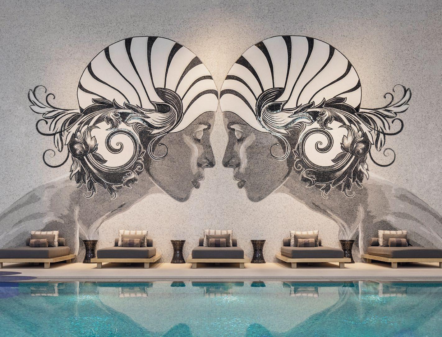
THE RENOVATION DRAWS INSPIRATION FROM THE ROYAL VISIT OF 1939, HIGHLIGHTING THE HOTEL’S RICH HERITAGE WHILE INTEGRATING CONTEMPORARY ELEGANCE.
PIXEL-PERFECT BRILLIANCE
PCRYSTAL PIXELS REIMAGINES LIGHTING WITH METICULOUS CRAFTSMANSHIP, BLENDING CRYSTAL ELEGANCE, DIGITAL NOSTALGIA, AND ARTISTIC TECHNOLOGY INTO A HARMONIOUS DISPLAY.
TAKE A TOUR > HOTELRESORTDESIGN.COM
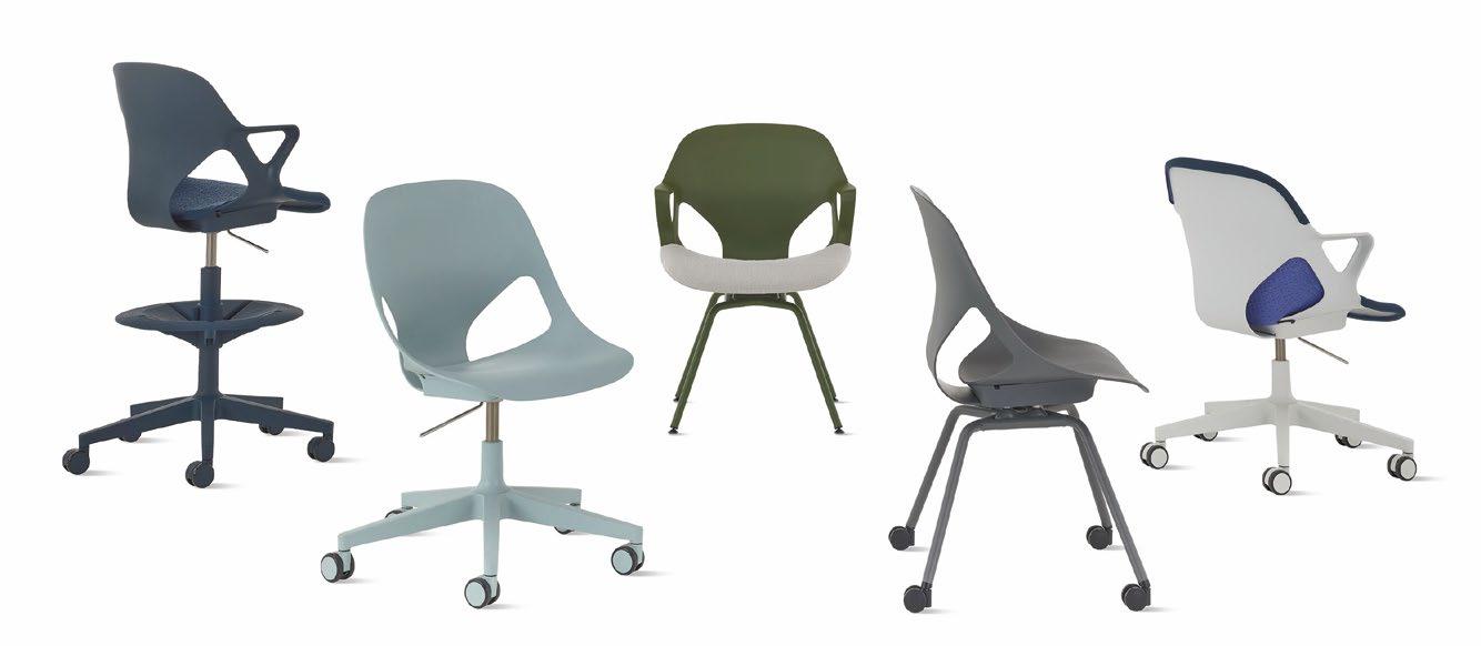
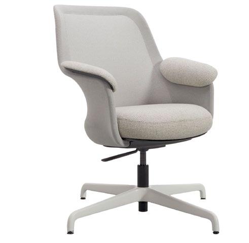
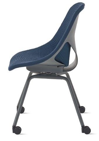
The Zeph Side Chair redefines comfort and functionality in side chairs by integrating the research-backed ergonomics of a task chair into its contemporary design. This versatile seating piece excels in dynamic workspaces – thanks to its advanced yet minimalist structure that maximises comfort with streamlined components. A standout feature is Studio 7.5’s use of 3D printing to refine the monoshell, resulting in a uniquely natural recline that adapts to your body.
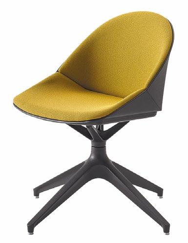
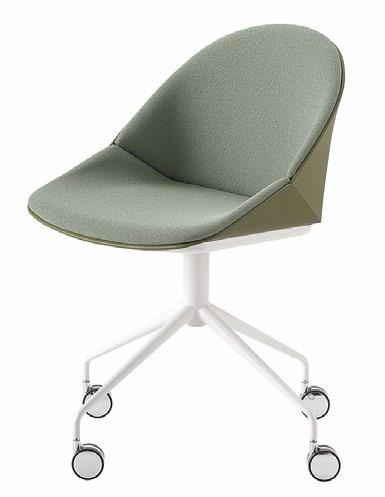
Aarea by PearsonLloyd embodies a harmonious balance of comfort, style, and eco-conscious innovation. Its aesthetic is warm and inviting; its functionality intuitive and ergonomic, all achieved using minimal components and materials that bring out the best of the chair’s ingenious design. Sleek yet cosy, Aarea’s distinctive mélange knit back is fashioned from upcycled marine plastics, moulding elegantly to the body and offering continuous support while minimising excess material waste.
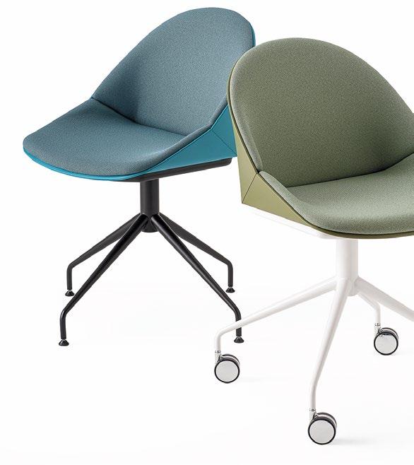
Modern and spirited, the Kross collection of chairs seamlessly blends into both work and social settings, evoking effortless comfort with its dynamic and transversal design. Featuring a polypropylene seat with extensive customisation possibilities, it comes in fixed, swivel, stool, and beam configurations. Available in six vibrant colour options, with diverse backrest and seat upholstery choices, its shell and frame are also crafted from recycled technopolymer compliant with CAM (Minimum Environmental Criteria).

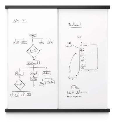
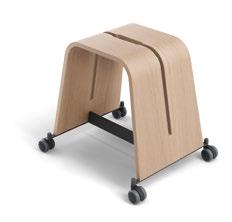

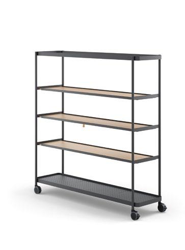
Designed by Osko + Deichmann, the Brunner’s boards collection enhances creativity in brainstorming and strategy meetings while offering unparalleled flexibility. Featuring lightweight whiteboards, rolling stools with integrated cut-outs, as well as versatile work and standing tables with multiple mounting options, this collection paves the way for innovative ideas effortlessly. From shelving to media trolley or wardrobe configurations, every element is designed for ease of use and adaptability, ensuring agile and productive workspaces.
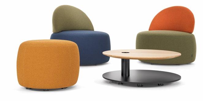
When smart seating is required, Mathias Seiler’s Incycle pouf program hits all the right notes. With its rounded and circular design, Incycle is perfect for informal teamwork and collaboration, dynamic and communicative central zones, as well as lounge areas that can be spontaneously rearranged. Most importantly, Incycle’s components are composed of 90 to 95% postconsumer recycled materials, significantly contributing to the circular economy in response to the amount of upholstered furniture produced.
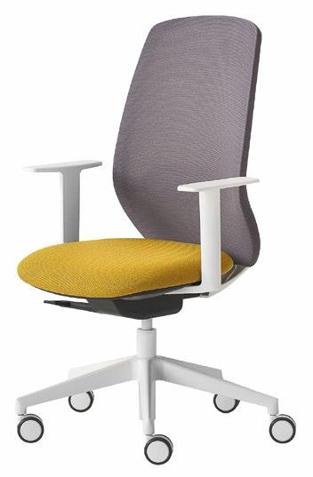
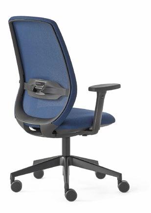
Marrying beauty and practicality, functionality and style, the Key Bold task chair by Alegre Design is not just a chair – it’s a statement piece designed to elevate any modern workspace with flair and finesse. Perfect as the ultimate task chair for smart working and co-working within the modern work environment, its mesh backrest with lumbar support ensures comfort and cosiness, while the Advanced version boasts a sleek synchronised mechanism.
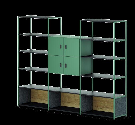
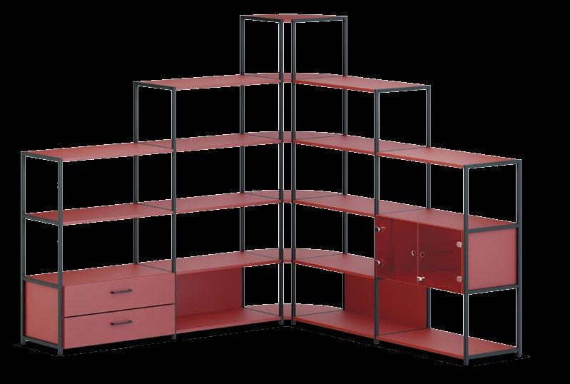
What happens when innovation meets intuitive design? With its modular and adaptable configuration, the ACTA.PRO shelf system is designed to challenge the perception of conventional storage entirely. Featuring a unique, patent-pending click mechanism, a plethora of design options along with a variety of supplementary elements, and extensive installation versatility, it continuously redefines spatial organisation and storage solutions. Its effortless adaptability ensures you can swiftly respond to evolving needs and preferences
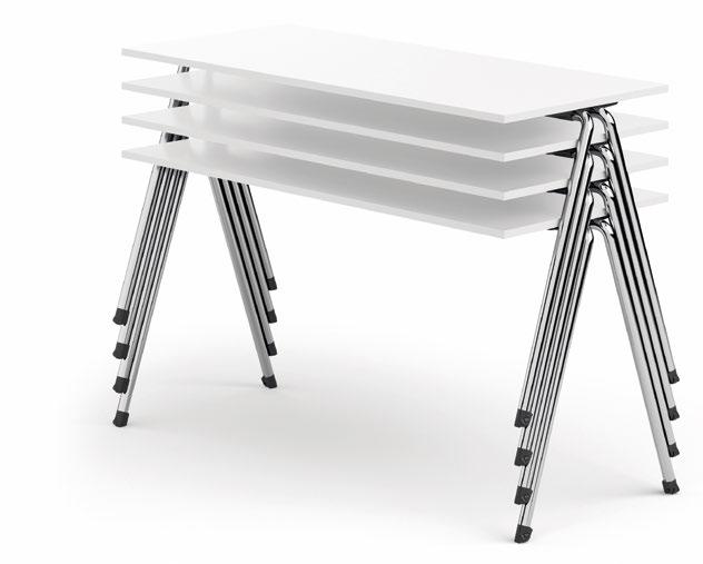
basic row is the perfect accoutrement for events and seminars demanding flexibility and efficiency. This streamlined table swiftly transitions from setup to reconfiguration. It can be effortlessly tilted off the dedicated transportation trolley and manoeuvred into position by a single person – thanks to integrated casters within its sleek steel tube frame. Smart stacking bumpers beneath the elegant tabletop enable easy linking and detachment of tables with a simple push-and-pull motion.
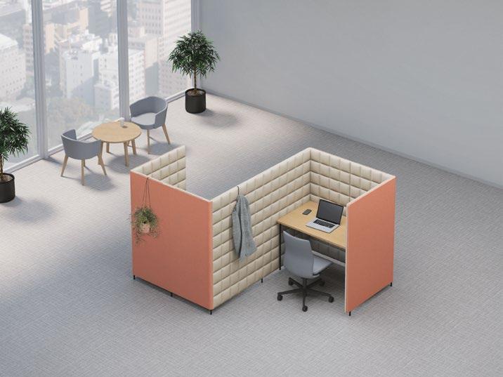
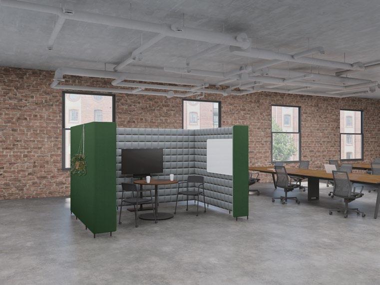
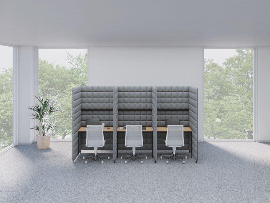
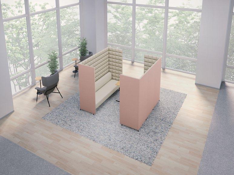
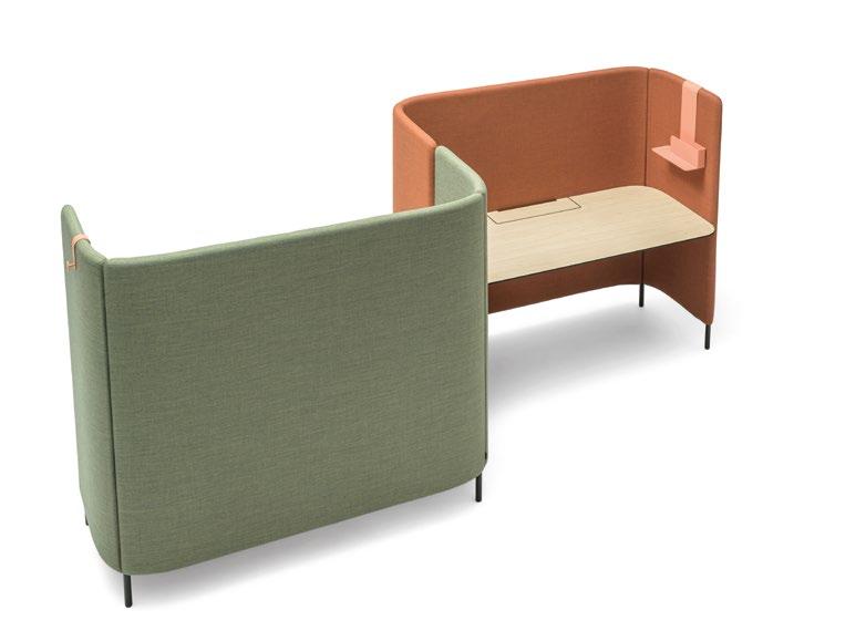
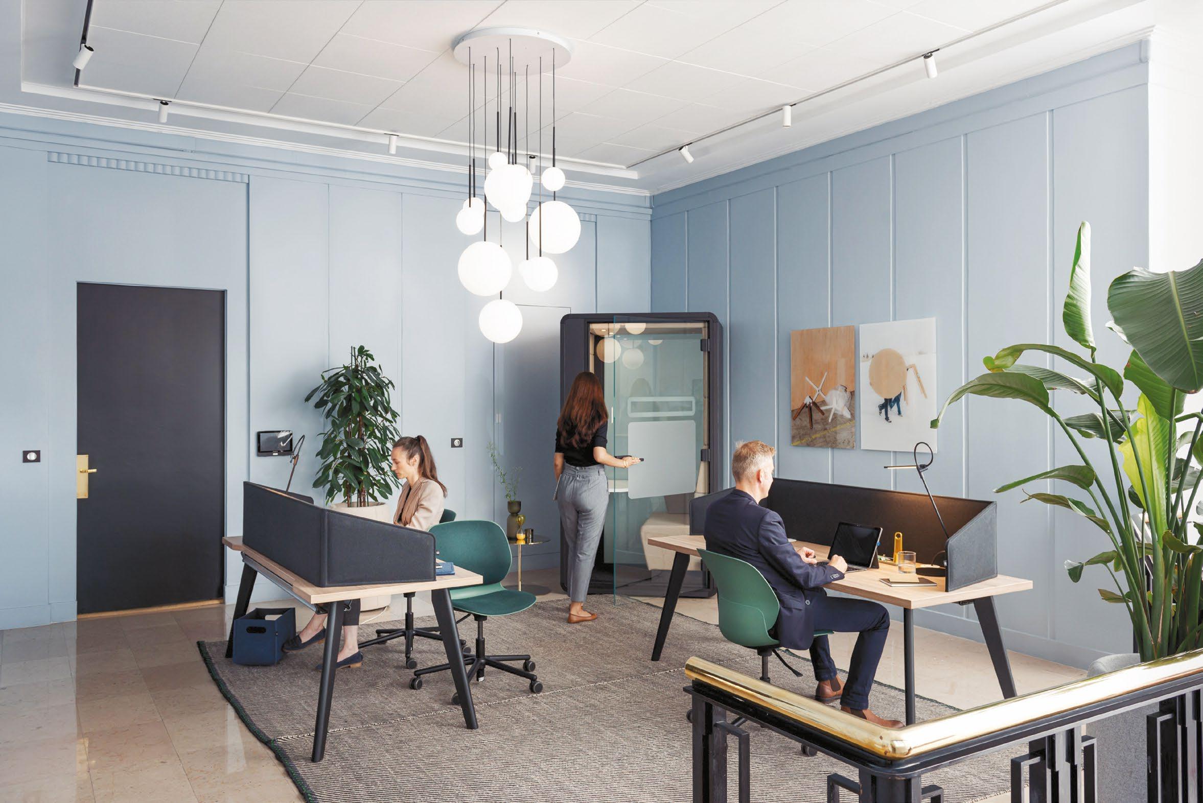
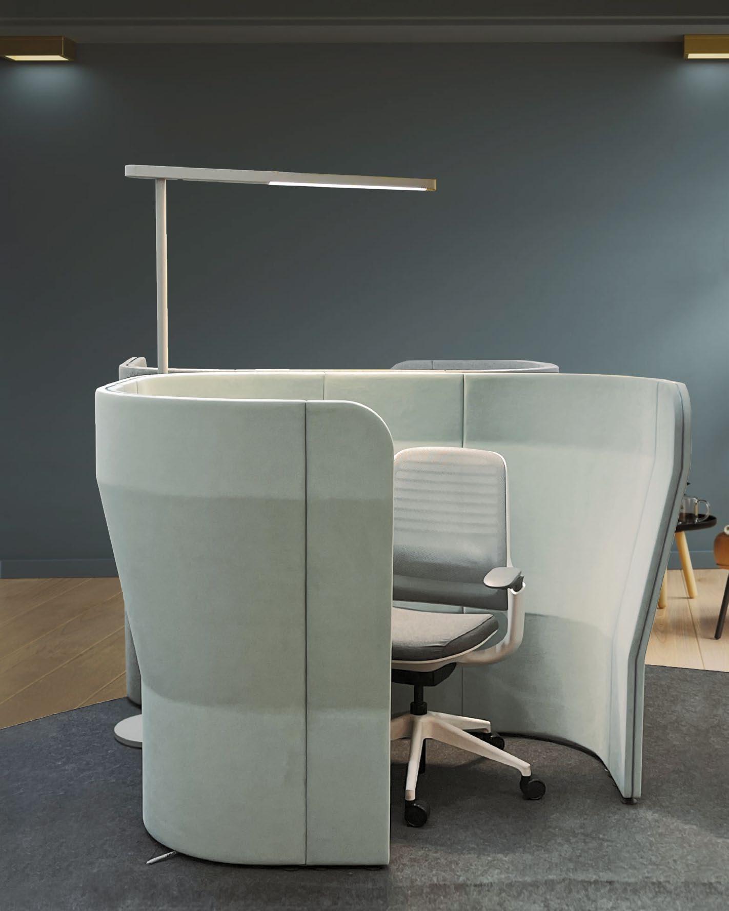
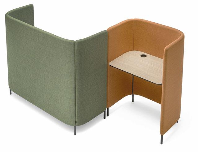
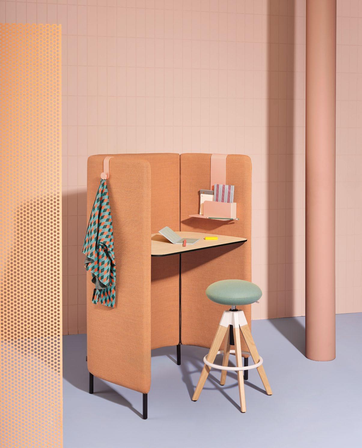
Introducing Buddyhub Desk: a versatile workstation designed for focused work and privacy. With its integrated perimeter sound-absorbing panel and robust laminate top, it forms a cosy work hub for acoustic and visual privacy. Its modular design allows seamless integration with other Buddyhub Desks or lounge seats from the collection – ideal for collaborative zones within open spaces. Supported by a sleek, lightweight frame, this executive workstation also offers convenient cable access.




THROUGH
Imagine stepping into a workspace that isn’t just a collection of desks, but a vibrant ecosystem alive with creativity, collaboration, and a deep sense of belonging. In today’s ever-evolving work landscape, such human-centric design isn’t a luxury—it’s a necessity. Paperspace Asia, a pioneering design collective, brings this vision to life by blending strategic thinking with innovative design to create workplaces that truly empower businesses and their people.
Paperspace Asia believes that the key to effective workplaces lies in going beyond mere aesthetics and functionality. Their journey begins with an in-depth exploration of a company’s unique culture and workforce needs. They shun cookie-cutter solutions, instead weaving a design tapestry where people, space, and systems seamlessly intertwine. Their unique methodology integrates ‘workplace strategy’ with ‘workplace design’ knowledge, delivering bespoke solutions tailored to their clients’ specific needs.
By thoroughly understanding a company’s operational goals and employee needs, Paperspace Asia crafts environments that align with business objectives and elevate the user experience. This holistic approach ensures that every design decision is informed by strategic insights, resulting in workplaces that are not only visually appealing but also highly functional and supportive of the company’s mission.
Their collaborative spirit extends far beyond their internal network. They actively foster knowledge sharing within the design industry through insightful events and exhibitions. By acting as facilitators and collaborators, they empower smaller independent design practices, particularly in the workplace design sector. This commitment to the broader design community reflects their dedication to excellence and their desire to push boundaries within the industry.
Narita Cheah, CEO of Paperspace Asia, expressed, “I think what’s next for us is to take this knowledge of designing workplaces strategically to all
markets and show the value of what we can do when we start the design process with a strategic approach.”
Their reputation for excellence is well-earned. Their recent win of the ‘Best Office Design Award’ at the prestigious Asia Pacific Property Awards 2024-2025 and an Honorary Mention at the Asia-Pacific Space Designers Association Awards 2023 is a testament to their innovative approach. As a trusted partner for large enterprises across Asia, they offer workplace strategy, design consultancy, design & build, and change management services.
Sombat Ng, CXO of Paperspace Asia, stated, “Design excellence is more than just creating visually stunning spaces; it’s about understanding the unique needs of our clients and translating those into functional, inspiring environments that drive productivity and innovation.”
Paperspace Asia is at the forefront of shaping the future of workplaces. Their commitment to human-centric design and collaborative spirit ensures that they create spaces that not only look good but also unlock the full potential of the individuals within them. As the world continues to change, they remain dedicated to pushing the boundaries of workplace design. Their visionary approach and unwavering commitment to excellence position themselves as leaders in the industry, setting new standards for what a workplace can and should be.
Whether through their award-winning designs, collaborative initiatives, or strategic insights, Paperspace Asia is redefining the future of work, one innovative project at a time. Founded in 2017 with headquarters in Singapore and regional offices in Manila and Bangkok, they leverage their network of 165 diverse collectives. Each collective brings its unique background and expertise to the table, fostering a culture of innovation and collaboration. This unique structure allows them to assemble project-specific design teams perfectly tailored to each client’s needs.
ALLEN & OVERY’S SINGAPORE OFFICE EMBRACES
NEW WORKSTYLES WITH A BALANCED APPROACH TO FLEXIBILITY AND SOCIAL INTERACTION, TRANSFORMING THEIR WORKSPACE TO ENHANCE COLLABORATION AND CLIENT EXPERIENCE ACROSS TWO DYNAMIC LEVELS.

31,000 SQFT | SINGAPORE | WORKPLACE STRATEGY + CHANGE COMMUNICATIONS + DESIGN CONSULTANCY

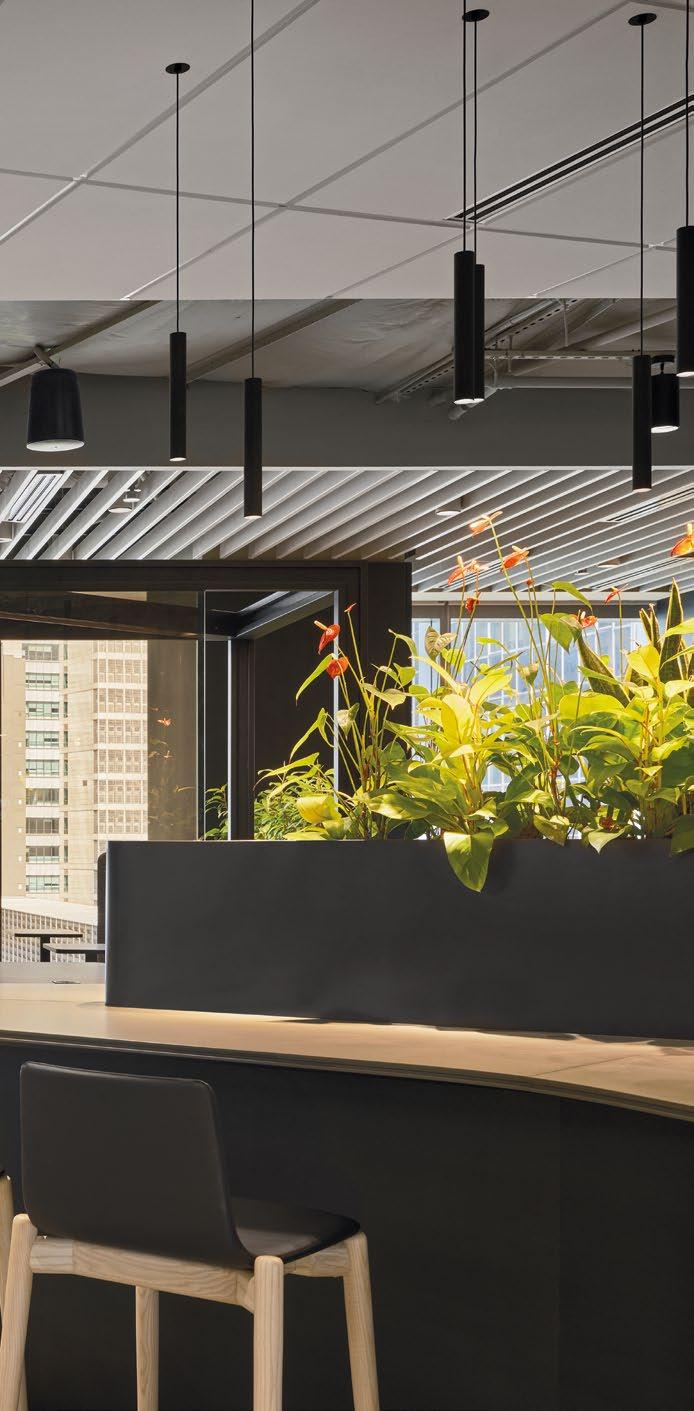

Allen & Overy, a prestigious global law firm, is steadfast in its mission to support the world’s leading businesses as they grow, innovate, and excel. By offering innovative solutions to complex legal and commercial challenges, the firm has established itself as a crucial partner for its clients. The Singapore office, a key hub for Southeast Asia, plays a vital role in the firm’s extensive Asia Pacific network.
In the wake of the pandemic, Allen & Overy recognised the growing need to balance employees’ work and personal lives. This insight led to the creation of a new office environment, designed to foster social interaction and learning while continuing to deliver the high-quality client service for which the firm is renowned. Collaborating with Paperspace, they developed a workspace that made optimal use of the available real estate, featuring ample spaces for social and collaborative activities across two levels, all while establishing a client-friendly atmosphere that appeals to all visitors.
Prior to the pandemic, employees were adept at working individually at their desks. However, the shift to remote work and the subsequent return to the office revealed new workstyles that Allen & Overy sought to incorporate. The firm recognised the importance of adding flexibility to the workspace and promoting social activities to accommodate these evolving work habits.
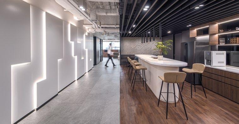
With the office spanning two different levels, it was essential to facilitate seamless movement across floors. Paperspace’s strategic workplace solutions identified the need for high-traffic areas where employees could gather. As a result, new pantries were installed on both levels: Level 9, designed for client reception, offers a comfortable and convenient space with various seating areas for meeting and a well-equipped pantry for refreshments. Level 10, intended for internal use, features more comprehensive facilities to encourage employees to take breaks or catch up with colleagues, regardless of their office level.
Due to their mobile and client-facing workforce, Paperspace introduced shared offices for employees with high-travel routines. This strategy allowed for the reallocation of space to create collaborative areas that support a variety of work activities away from the desk. This shift maximised the workspace’s efficiency and promoted a dynamic and engaging work environment.


WITH THE OFFICE SPANNING TWO DIFFERENT LEVELS, IT WAS ESSENTIAL TO FACILITATE SEAMLESS MOVEMENT ACROSS FLOORS, ENSURING AN INTEGRATED EXPERIENCE FOR BOTH THE FEE EARNERS AND BUSINESS SERVICES DIVISIONS. PAPERSPACE’S STRATEGIC WORKPLACE SOLUTIONS IDENTIFIED THE NEED FOR HIGH-TRAFFIC AREAS WHERE EMPLOYEES COULD GATHER.
DUE TO THEIR MOBILE AND CLIENT-FACING WORKFORCE, PAPERSPACE INTRODUCED SHARED OFFICES FOR EMPLOYEES WITH HIGH-TRAVEL ROUTINES. THIS STRATEGY ALLOWED FOR THE REALLOCATION OF SPACE TO CREATE COLLABORATIVE AREAS THAT SUPPORT A VARIETY OF WORK ACTIVITIES AWAY FROM THE DESK. THIS SHIFT MAXIMISED THE WORKSPACE’S EFFICIENCY AND PROMOTED A DYNAMIC AND ENGAGING WORK ENVIRONMENT.


Allen & Overy’s redesign of their Singapore office exemplifies their commitment to creating a balanced and innovative work environment that caters to the evolving needs of a modern law firm while maintaining exceptional client service. Their forward-thinking initiative integrates flexibility, promotes social interaction, and optimises space utilisation. It underscores Allen & Overy’s dedication to fostering a supportive and productive work culture, ensuring their employees and clients thrive in a collaborative and efficient setting.
Allen & Overy’s strategic adjustments have not only enhanced their office space but also reinforced their core values of innovation, collaboration, and excellence in client service.


NORTON ROSE FULBRIGHT MODERNISED ITS OFFICE, ENHANCING FUNCTIONALITY AND AESTHETICS TO IMPROVE WORK CULTURE, FOSTER COLLABORATION, AND ADAPT TO CHANGING NEEDS, PROMOTING PRODUCTIVITY AND INCLUSIVITY.
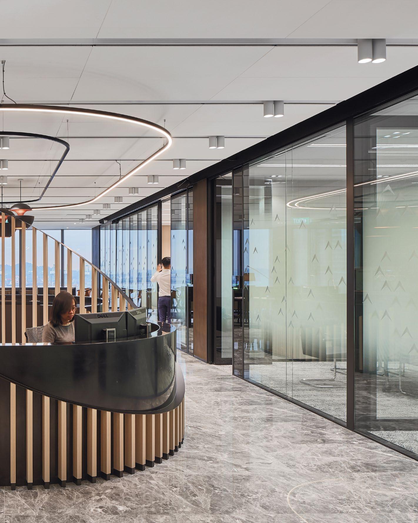
NORTON ROSE FULBRIGHT
18,000 SQFT | SINGAPORE | DESIGN CONSULTANCY
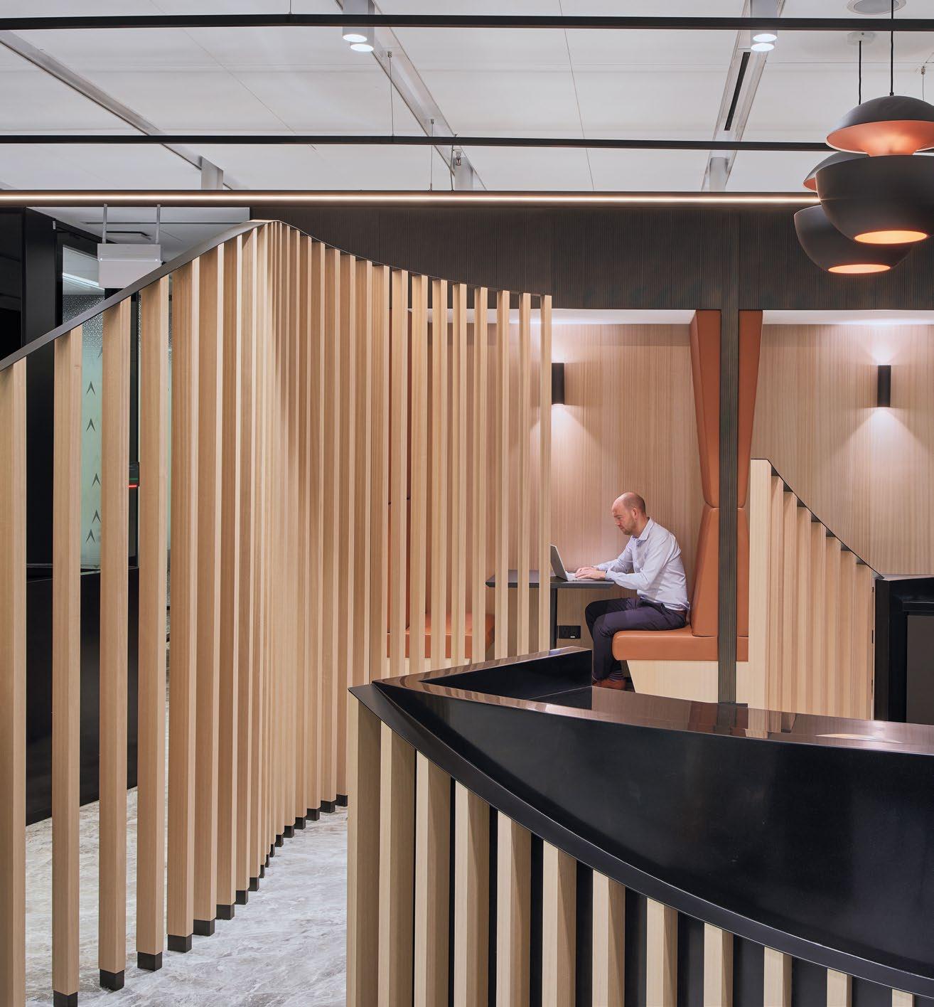
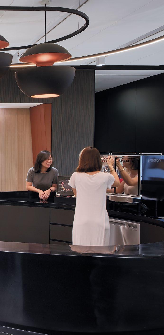
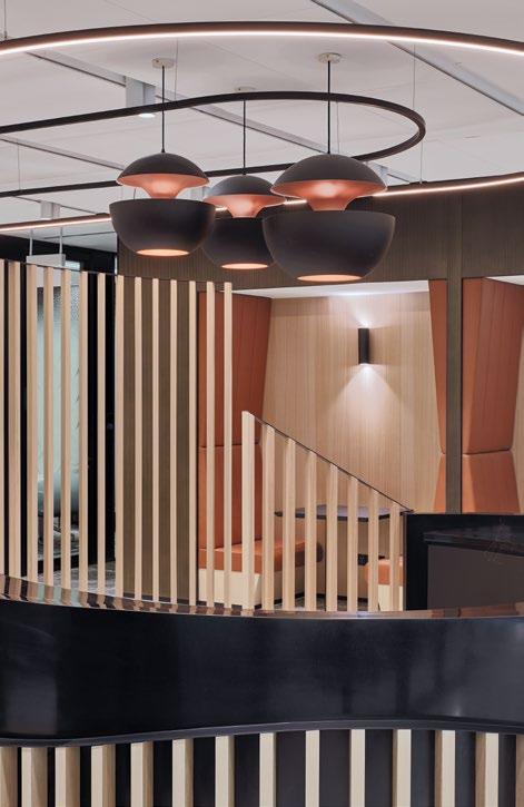
Norton Rose Fulbright, a prestigious global law firm, provides comprehensive business law services to the world’s leading corporations and financial institutions. With a formidable team of over 3,700 dedicated lawyers and legal staff spread across Europe, the United States, Canada, Latin America, Asia, Australia, the Middle East, and Africa, the firm ensures a robust and diversified legal presence worldwide.
In collaboration with Paperspace, Norton Rose Fulbright embarked on a transformative office modernisation project. This ambitious initiative aimed to enhance both the aesthetic and functional aspects of their expansive workspace. Paperspace played a pivotal role by utilising spacious layouts and meticulously balancing privacy with openness. This modernisation was a strategic overhaul intended to improve the overall work culture. The redesign created avenues for employees to maximise their potential as individual contributors and thrive both personally and professionally.

In order to separate themselves from traditional office layouts, the firm looked to establish a new way of work post-pandemic. The primary challenge was to create a space that maintained the professionalism expected of a world-class global law firm while also providing a comfortable, inclusive, and dynamic environment where employees could fully engage and bring their whole selves to work.
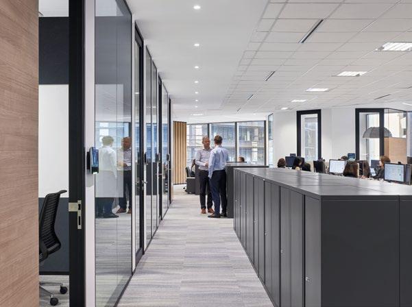
To address these challenges, a semi-open workspace design was implemented. Traditional, restrictive full-height walls were replaced with acoustically treated partitions, which provide the necessary privacy for staff while also allowing for increased visibility and a more open, airy feel
to the workspace. Smaller, strategically placed collaborative spaces were introduced to facilitate casual meetings and spontaneous interactions. Furthermore, the reception area was designed to be convertible, serving as a sizable open space for events, social gatherings, and staff activities. This multifunctional area enhanced the office’s flexibility and provided a venue for fostering community and team spirit.
Through these thoughtful and meticulously planned design changes, Norton Rose Fulbright successfully created a workspace that supports both individual productivity and collaborative efforts. The new design not only improved the physical environment but also

BY UTILISING SPACIOUS LAYOUTS, PAPERSPACE WAS ABLE TO BALANCE PRIVACY WITH OPENESS. THIS MODERNISATION WAS NOT MERELY A SUPERFICIAL UPGRADE BUT A STRATEGIC OVERHAUL INTENDED TO IMPROVE THE OVERALL WORK CULTURE. THE REDESIGN CREATED AVENUES FOR EMPLOYEES TO MAXIMISE THEIR POTENTIAL AS INDIVIDUAL CONTRIBUTORS AND THRIVE BOTH PERSONALLY AND PROFESSIONALLY.

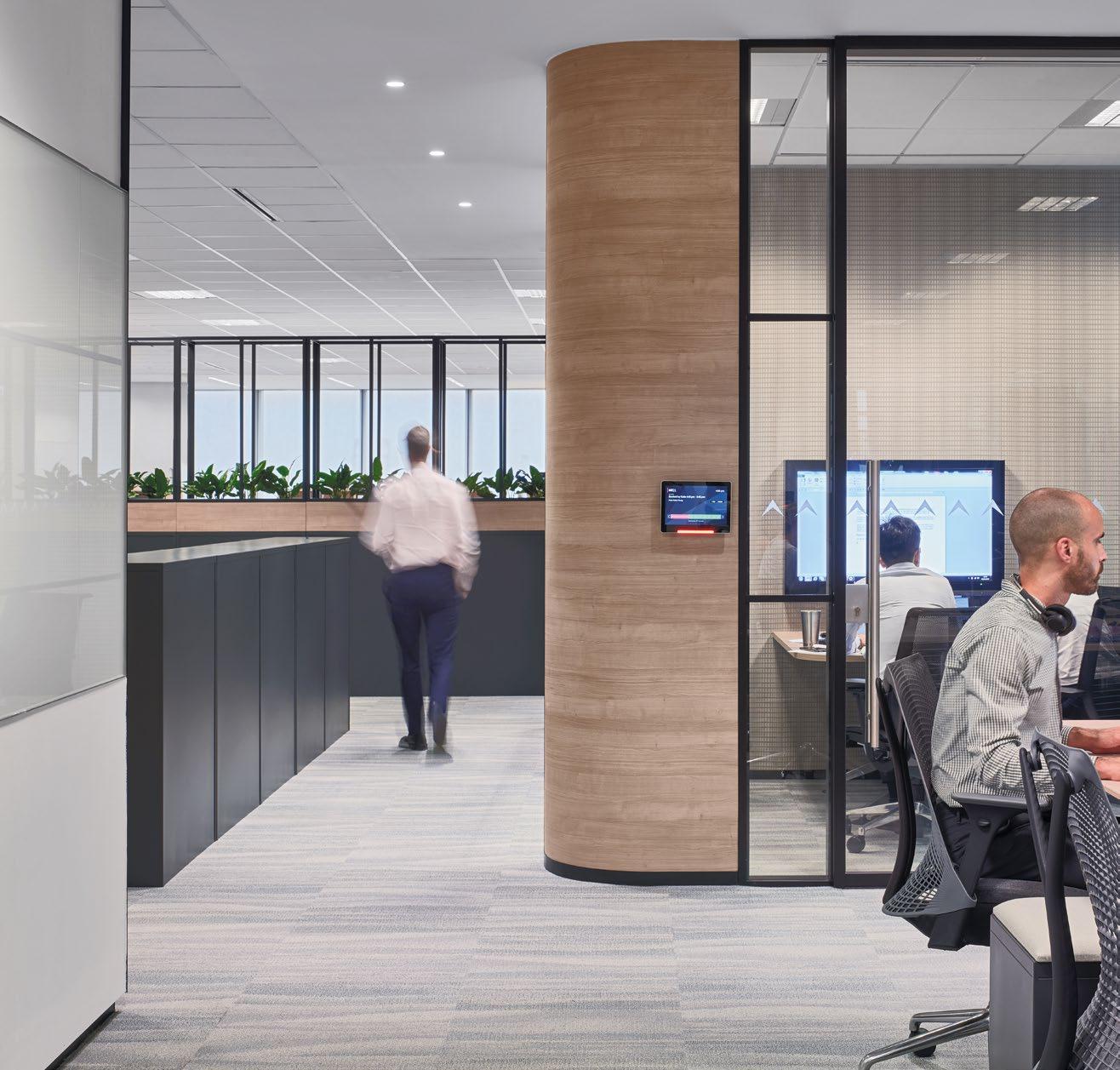
THE NEW DESIGN NOT ONLY IMPROVED THE PHYSICAL ENVIRONMENT BUT ALSO POSITIVELY IMPACTED THE FIRM’S WORK CULTURE, PROMOTING A SENSE OF BELONGING AND COMFORT. THIS DELICATE BALANCE BETWEEN MAINTAINING PROFESSIONALISM AND FOSTERING A WELCOMING ATMOSPHERE ALIGNS SEAMLESSLY WITH THE COMPANY’S VISION OF A WORKPLACE WHERE EMPLOYEES CAN BE THEIR AUTHENTIC SELVES WHILE DELIVERING WORLD-CLASS LEGAL SERVICES.
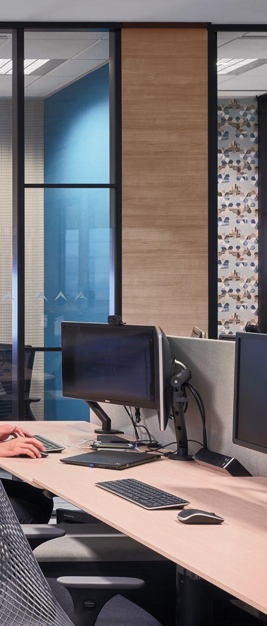
positively impacted the firm’s work culture, promoting a sense of belonging and comfort. This delicate balance between maintaining professionalism and fostering a welcoming atmosphere aligns seamlessly with the company’s vision of a workplace where employees can be their authentic selves while delivering world-class legal services.
Incorporating flexible furniture and modular layouts, the redesigned spaces can be easily reconfigured to meet the evolving needs of the firm. This adaptability is crucial in a dynamic legal environment where the demands on space and resources can vary significantly from day to day.
Overall, the new design not only meets the functional needs of a global law firm but also fosters a positive, inclusive, and vibrant work culture.

PALO ALTO NETWORKS’ SINGAPORE HEADQUARTERS PRIORITISES EMPLOYEE
WELL-BEING, COLLABORATION, AND INNOVATION THROUGH STRATEGIC DESIGN, FEATURING NATURAL LIGHT, FLEXIBLE WORKSPACES, AND MODULAR MEETING ROOMS, FOSTERING A SUPPORTIVE POST-PANDEMIC WORK ENVIRONMENT.

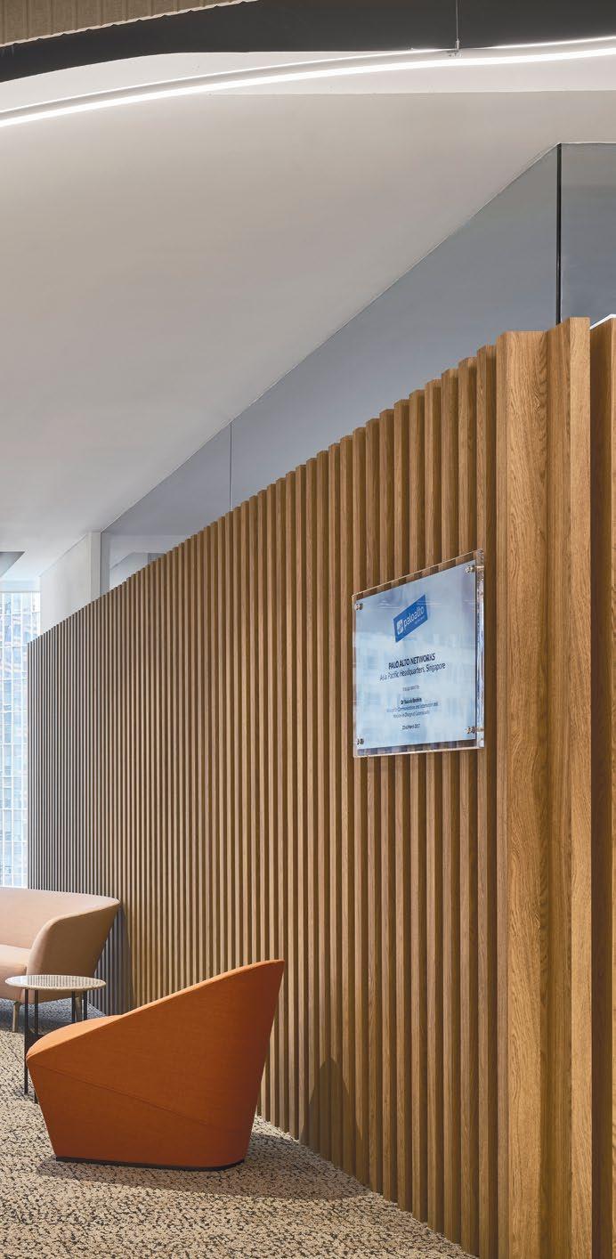

Palo Alto Networks, a global cybersecurity leader, has strategically designed its Singapore headquarters to prioritise employee well-being, foster collaboration, and enhance business performance. In the post-pandemic era, creating a workplace that inspires employees to return to the office has become paramount, acknowledging the irreplaceable value of in-person interactions for creativity, collaboration, and innovation. This approach underscores the importance of designing an office environment that not only meets functional needs but also enriches the overall experience for employees, customers, and partners.
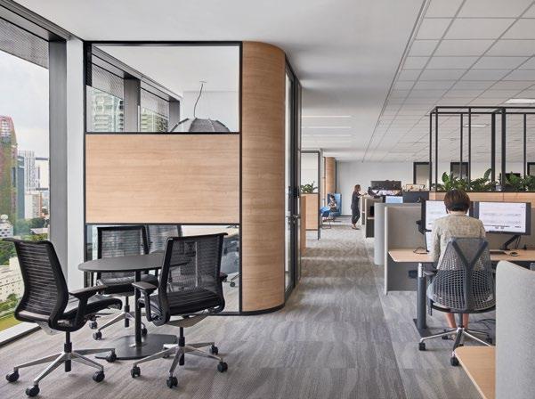
The design of the office space places a significant emphasis on employee well-being, recognising that a supportive environment is crucial for fostering productivity and satisfaction. A key aspect of this design strategy is the incorporation of abundant natural light, with the office layout meticulously planned to offer easy access to daylight. Floor-to-ceiling windows frame unobstructed views of the surrounding marina, contributing to a visually appealing and open atmosphere that enhances the workspace’s overall ambiance. This infusion of natural elements not only boosts aesthetic appeal but also promotes mental well-being and reduces stress among employees.

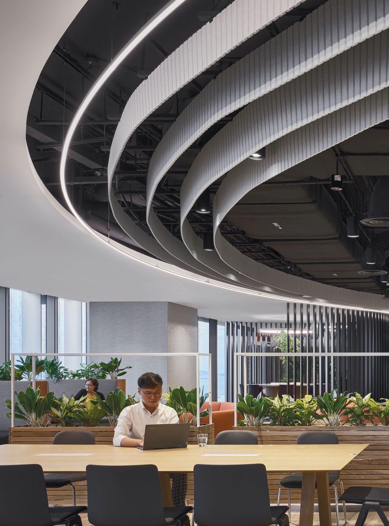
As employees and customers enter the office, they are greeted with expansive sightlines of the Work Cafe and extended workspaces, promoting a sense of connectivity and openness. This thoughtfully designed layout encourages spontaneous conversations and interactions, which are essential for driving creativity and collaboration. The design incorporates a diverse range of work settings, including quiet zones, collaborative hubs, and flexible seating arrangements, providing employees with various options to suit their preferences and needs. This variety helps foster a dynamic and adaptable work environment that caters to different tasks and workstyles, ensuring maximum comfort and productivity.
To further enhance collaboration, state-of-the-art modular training and meeting rooms were installed. These spaces are designed for collaborative efforts with partners and can be opened to expand the front-of-house office for town halls or celebrations. The modular nature


A KEY ASPECT OF THIS DESIGN STRATEGY IS THE INCORPORATION OF ABUNDANT NATURAL LIGHT, WITH THE OFFICE LAYOUT METICULOUSLY PLANNED TO OFFER EASY ACCESS TO DAYLIGHT. FLOOR-TO-CEILING WINDOWS FRAME UNOBSTRUCTED VIEWS OF THE SURROUNDING MARINA, CONTRIBUTING TO A VISUALLY APPEALING AND OPEN ATMOSPHERE THAT ENHANCES THE WORKSPACE’S OVERALL AMBIANCE.
PHOTO: Multipurpose rooms with modular walls that allow the 2 meeting rooms to be opened up completely for smaller and bigger events.
TO FURTHER ENHANCE COLLABORATION, STATE-OF-THE-ART MODULAR TRAINING AND MEETING ROOMS WERE INSTALLED. THESE SPACES ARE DESIGNED FOR COLLABORATIVE EFFORTS WITH PARTNERS AND CAN BE OPENED TO EXPAND THE FRONT-OF-HOUSE OFFICE FOR TOWN HALLS OR CELEBRATIONS. THE MODULAR NATURE OF THESE ROOMS LEVERAGES THE EXPANSIVENESS OF THE FLOOR, ALLOWING FOR MORE NATURAL LIGHT TO PERMEATE THE SPACE WHEN THEY ARE MOVED OR RECONFIGURED.


of these rooms leverages the expansiveness of the floor, allowing for more natural light to permeate the space when they are moved or reconfigured. This flexibility ensures that the office can easily adapt to different events and functions, making it a versatile and efficient workspace. The integration of advanced audio-visual technology in these rooms further supports seamless communication and collaboration, both in-person and virtually.
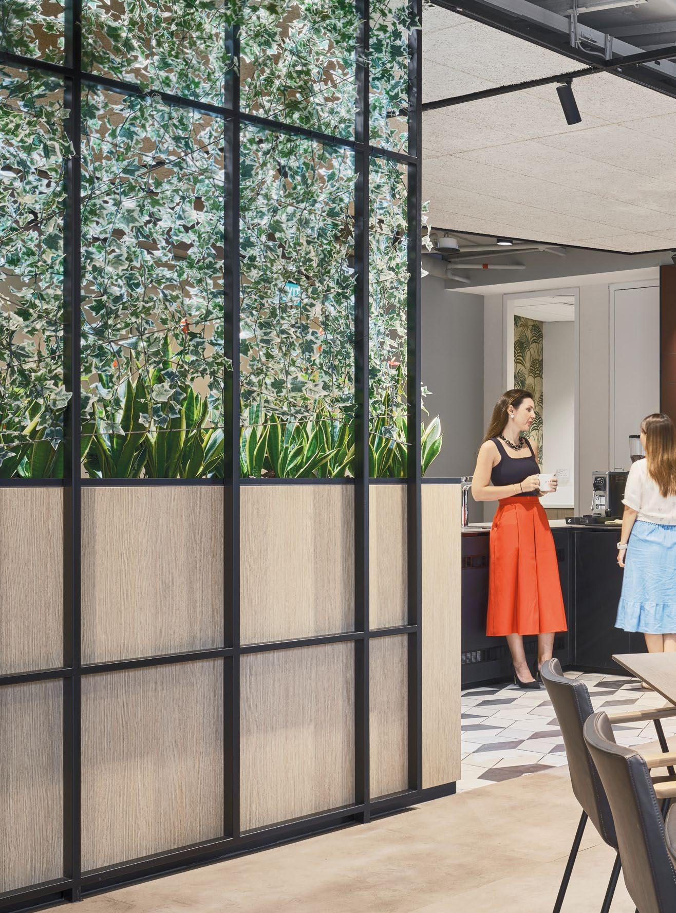
In addition to these features, ergonomic furniture and biophilic design elements have been incorporated throughout the office. Ergonomic chairs and adjustable desks support physical well-being, reducing the risk of discomfort or injury from prolonged sitting. Biophilic design elements, such as indoor plants and natural materials, create a soothing environment that connects
employees with nature, enhancing their overall wellbeing and productivity.
Through thoughtful design choices such as easy access to daylight, flexible workspaces, and modular meeting rooms, the office serves as a prime destination for employees to return to post-pandemic. This strategic design not only enhances the physical environment but also supports the company’s broader goals of driving business performance and fostering a collaborative culture.
The Singapore headquarters exemplifies how a well-designed office space can play a crucial role in attracting and retaining top talent, driving business success, and maintaining a competitive edge in the fastpaced cybersecurity industry.
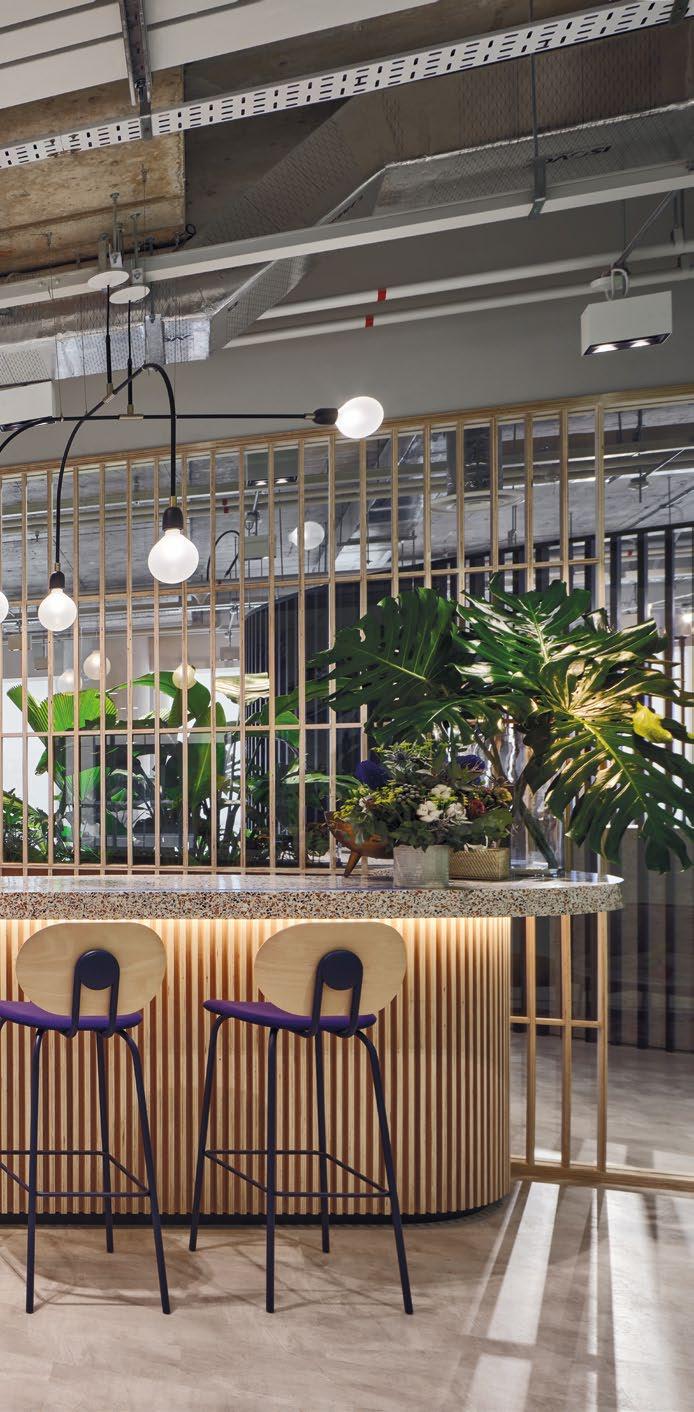
TOP: Pantry consists of a massive island used for company-wide events, and also serves as a functional space for dining.

WISE HAS EXPANDED ITS SINGAPORE OFFICE, TRANSFORMING IT INTO A DESTINATION WORKPLACE THAT FOSTERS COLLABORATION, INNOVATION, AND WELL-BEING, REFLECTING ITS RAPID GROWTH AND COMMITMENT TO EMPLOYEE SATISFACTION AND SUSTAINABILITY.

26,000 SQFT | SINGAPORE | DESIGN & BUILD


UK-based digital payments firm Wise has set its sights on the Asia-Pacific (APAC) region, recognising it as its fastest-growing market. To better serve its burgeoning customer base, partners, and businesses, Wise has significantly expanded its Singapore office.
In pursuit of ambitious business goals, the Singapore office has been thoughtfully crafted as a Destination Workplace. This concept is designed to foster a sense of collaboration, creativity, and innovation. The new office design balances a nostalgic nod to Wise’s start-up roots with the realities of its significant growth and the evolving methodologies in the digital payments sector. The redesign had to accommodate a growing headcount, multi-purpose functions, and essential public safety features to reassure employees returning to the office, who now bring new expectations, habits, and ways of working.
Promoting flexibility, versatility, and wellness was a top priority in the office’s design and space planning. Modular furniture allows for adaptable workspaces, while interconnected neighbourhoods within the office break down barriers between teams, fostering cross-functional collaboration in technology-integrated spaces. This


dynamic environment enables different teams to interact and work together seamlessly, promoting a culture of innovation and efficiency.
To further enhance the employee experience, a wellness zone was incorporated into the office design. Equipped with various facilities, this area provides a place for relaxation and respite from the busy office environment. These features are crucial for promoting employee well-being, ensuring a balanced and healthy work atmosphere. This holistic approach to workplace design underscores Wise’s commitment to its employees’ physical and mental health.
The success of this project is reflected in the positive return-to-office rates since 2021. The revamped office environment not only meets the current needs of Wise’s employees but also aligns with the company’s global workplace strategy. It reflects a deep understanding of the organisation’s needs, goals, and culture, ensuring that the workplace remains conducive to productivity and innovation.
Additionally, the design of the Singapore office takes into account the need for multi-purpose functions and activities, planning for public safety features essential in the current climate. By incorporating these elements,

PROMOTING FLEXIBILITY, VERSATILITY, AND WELLNESS WAS A TOP PRIORITY IN THE OFFICE’S DESIGN AND SPACE PLANNING. MODULAR FURNITURE ALLOWS FOR ADAPTABLE WORKSPACES, WHILE INTERCONNECTED NEIGHBOURHOODS WITHIN THE OFFICE BREAK DOWN BARRIERS BETWEEN TEAMS, FOSTERING CROSS-FUNCTIONAL COLLABORATION IN TECHNOLOGY-INTEGRATED SPACES.


THE EXPANDED AND REDESIGNED SINGAPORE OFFICE STANDS AS A TESTAMENT TO WISE’S DEDICATION TO CREATING A WORKSPACE THAT SUPPORTS ITS RAPID GROWTH IN THE APAC REGION. THIS PROJECT HIGHLIGHTS WISE’S ABILITY TO ADAPT TO CHANGING BUSINESS LANDSCAPES WHILE MAINTAINING A FOCUS ON FOSTERING A COLLABORATIVE AND SUPPORTIVE WORK ENVIRONMENT.
Wise has created a space that is both safe and conducive to the new ways of working that have emerged in the digital payments industry.
The expanded and redesigned Singapore office stands as a testament to Wise’s dedication to creating a workspace that supports its rapid growth in the APAC region. This project highlights Wise’s ability to adapt to changing business landscapes while maintaining a focus on fostering a collaborative and supportive work environment. It embodies Wise’s innovative spirit and commitment to employee well-being, ensuring the company is well-equipped to thrive in the dynamic digital payments market.
Moreover, the new office design emphasises sustainability, incorporating eco-friendly materials and energy-efficient systems. This commitment to environmental responsibility not only reduces the company’s carbon footprint but also creates a healthier work environment. This strategic blend of innovation, wellness, and sustainability positions Wise at the forefront of modern workplace design, showcasing its dedication to both its employees and the broader community.


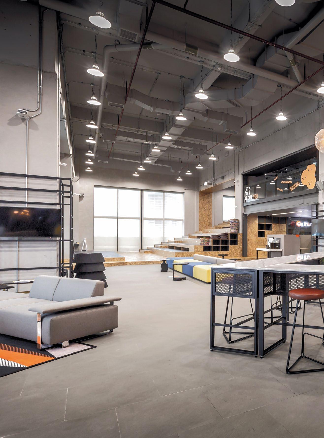
SC ASSET CREATED A PROGRESSIVE, INCLUSIVE CO-WORKING SPACE THAT FOSTERS CREATIVITY, COLLABORATION, AND PRODUCTIVITY, REFLECTING THE COMPANY’S MODERN SPIRIT AND COMMITMENT TO ENHANCING LIFESTYLES.

18,998 SQFT | THAILAND | DESIGN CONSULTANCY

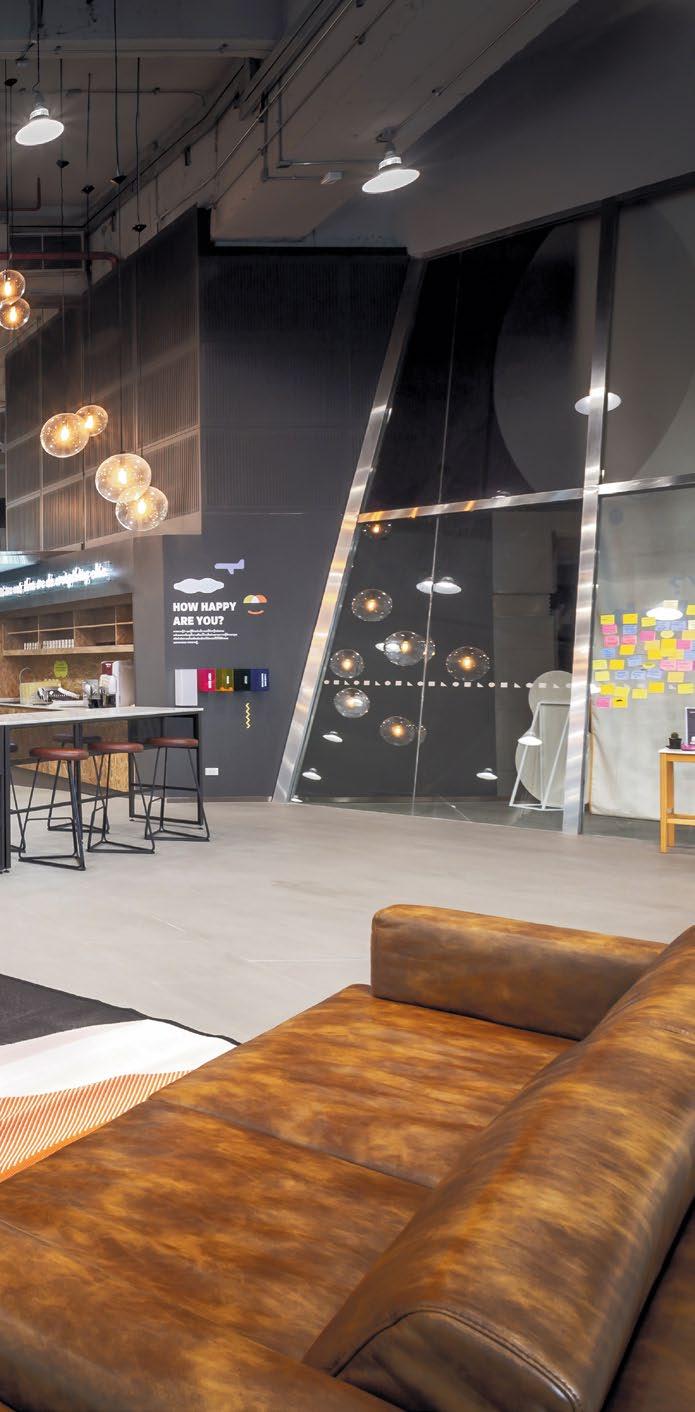

SC Asset, a trailblazer in the living solutions industry, is redefining what it means to provide homes by enhancing overall lifestyles. Based in Bangkok, Thailand, SC Asset envisioned a progressive co-working space within their headquarters to reflect this commitment.
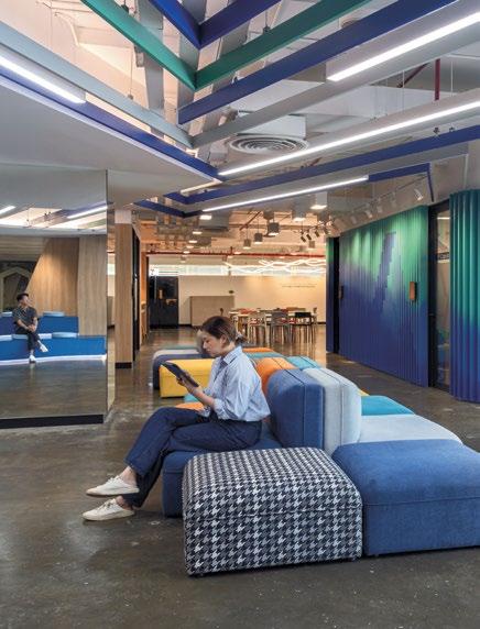
Partnering with Paperspace, SC Asset embarked on a journey to liberate their employees from traditional work constraints. They designed a dynamic environment that encourages creativity and collaboration, fostering a space where innovative ideas can thrive. This newly established area also serves as an engaging meeting space for business partners, suppliers, and other industry collaborators. The SC Co. Lab, a dedicated co-working area, epitomises the company’s collaborative ethos, promoting productivity, creativity, and idea-sharing.
The Co. Lab was meticulously crafted to be inclusive, welcoming employees from diverse backgrounds. SC Asset aimed to create a space that mirrors their modern and vibrant spirit, making a lasting impression on business partners. To achieve this, Paperspace embraced the essence of collaboration from the initial design phase through to project completion.
Paperspace facilitated a design thinking workshop that included all employees, top executives, and stakeholders to deeply understand the client’s needs. Through key questions, such as what elements would make the space feel like a living room, valuable insights were gathered regarding the desired collaborative space.
Armed with this data, Paperspace developed design mock-ups and integrated virtual reality technology into the design process. The Co. Lab floor plans were rendered


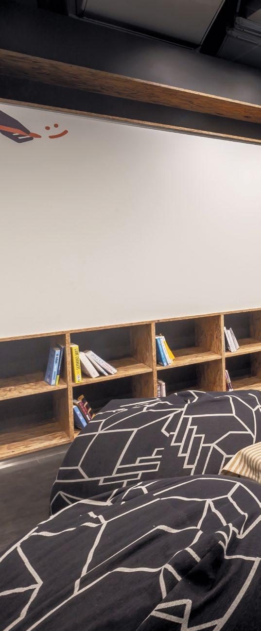

THE CO. LAB WAS METICULOUSLY CRAFTED TO BE INCLUSIVE, WELCOMING EMPLOYEES FROM DIVERSE BACKGROUNDS. SC ASSET AIMED TO CREATE A SPACE THAT MIRRORS THEIR MODERN AND VIBRANT SPIRIT, MAKING A LASTING IMPRESSION ON BUSINESS PARTNERS. TO ACHIEVE THIS, PAPERSPACE EMBRACED THE ESSENCE OF COLLABORATION FROM THE INITIAL DESIGN PHASE THROUGH TO PROJECT COMPLETION.
engaging brainstorming sessions.
PAPERSPACE FACILITATED A DESIGN THINKING WORKSHOP THAT INCLUDED ALL EMPLOYEES, TOP EXECUTIVES, AND STAKEHOLDERS TO DEEPLY UNDERSTAND THE CLIENT’S NEEDS. THROUGH KEY QUESTIONS, SUCH AS WHAT ELEMENTS WOULD MAKE THE SPACE FEEL LIKE A LIVING ROOM, VALUABLE INSIGHTS WERE GATHERED REGARDING THE DESIRED COLLABORATIVE SPACE.


in VR and presented on-site, allowing employees to experience the proposed space firsthand. Floors were marked to indicate the placement of various elements, helping decision-makers visualise the space plan effectively.
This comprehensive approach ensured that the final design met SC Asset’s expectations and needs. The result is a co-working space that not only boosts productivity and creativity but also embodies the company’s modern and vibrant spirit. This project is a testament to SC Asset’s dedication to creating innovative living solutions that transcend traditional boundaries, providing employees and partners with a dynamic and inspiring environment.
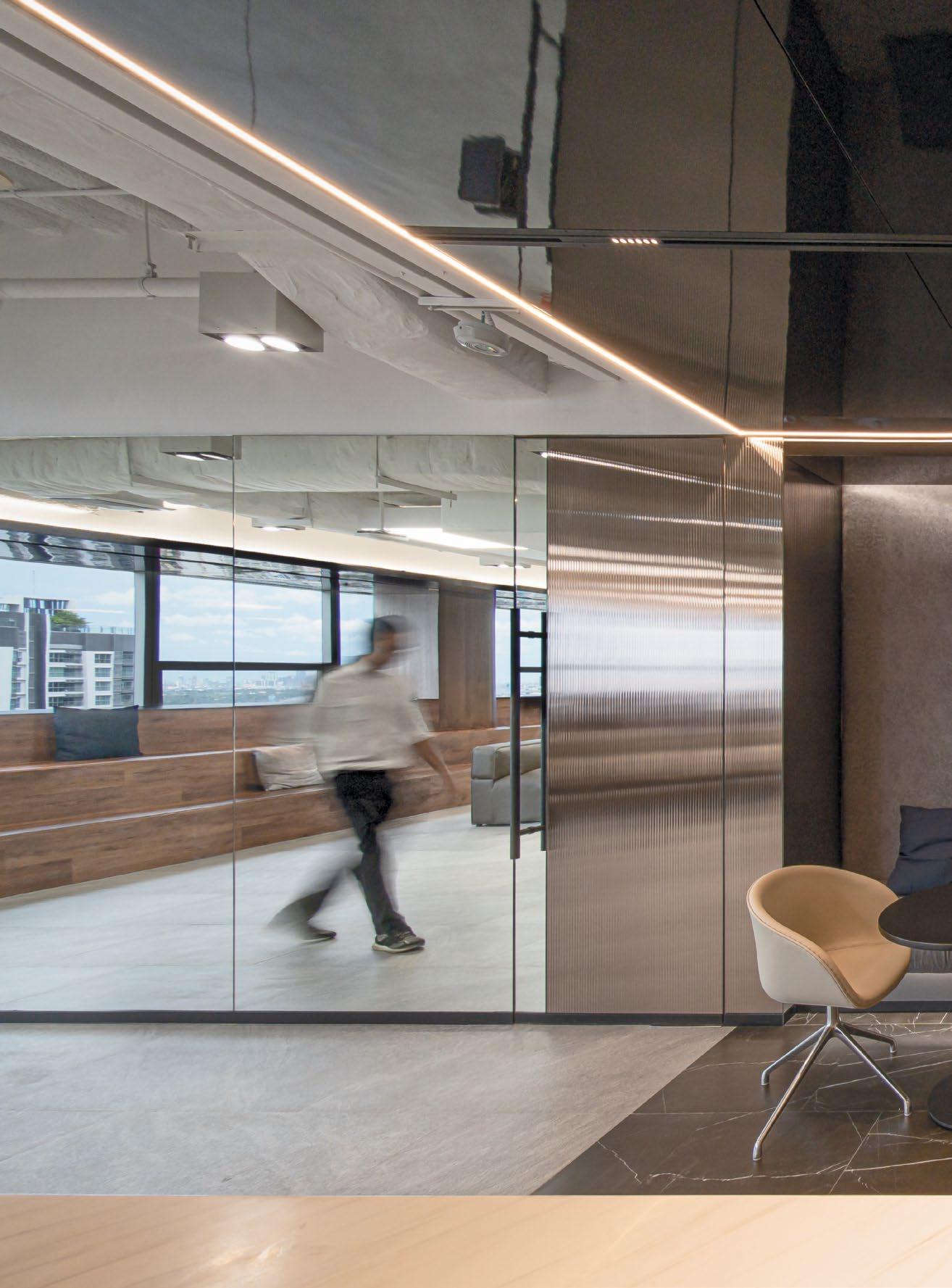
BLUEBIK GROUP’S OFFICE, DESIGNED WITH AN OPEN-SPACE CONCEPT, EMULATES A START-UP CULTURE DESPITE THEIR MASSIVE HEADCOUNT. A REMINDER OF THEIR HUMBLE BEGINNINGS WHILE PRIORITISING THEIR NEED FOR INNOVATION AND COLLABORATION.

BLUEBIK
12,350 SQFT | THAILAND | DESIGN & BUILD

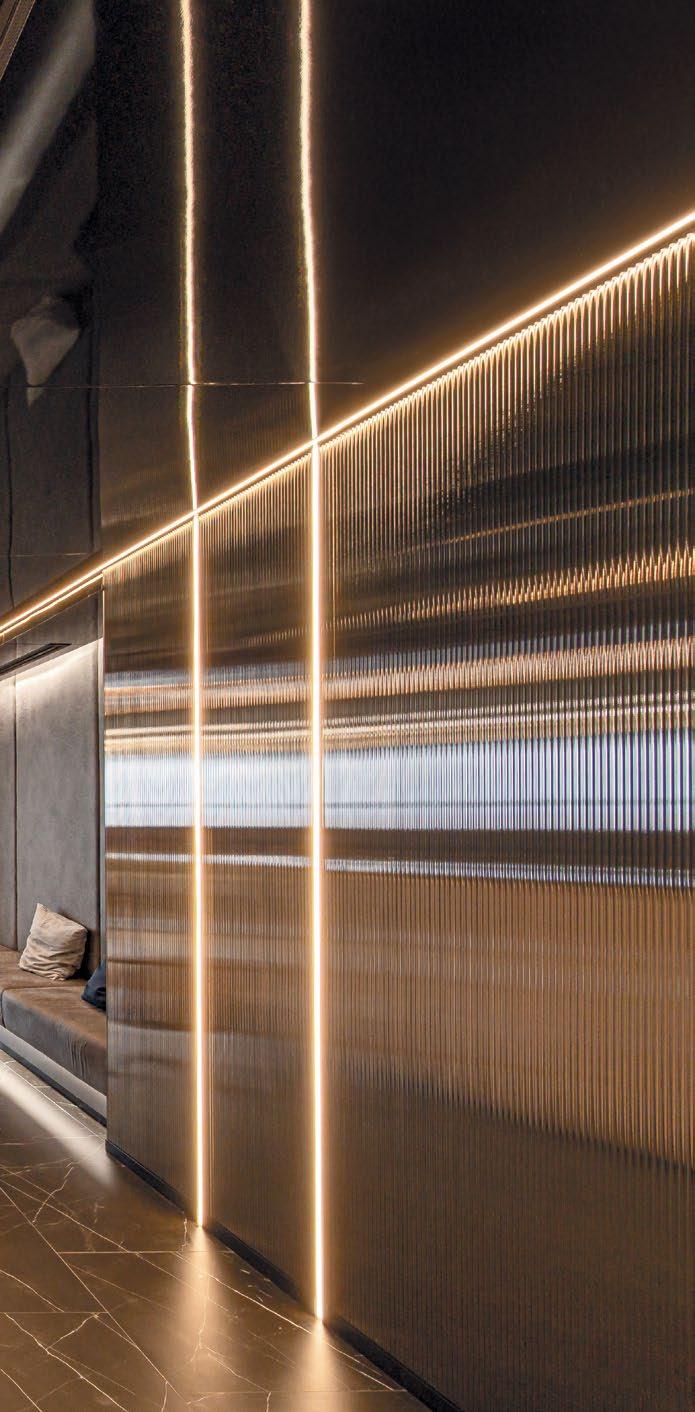

As a digital transformation consulting firm, Bluebik Group has set an ambitious goal to become a global player in its industry. To support this vision, the company’s office needed to reflect the top-of-the-line standard that its work exhibits. The design and layout of Bluebik’s headquarters are crucial in projecting the firm’s image and facilitating its operational needs. The office space was crafted with an open-space concept to accommodate the expanding headcount and promote a dynamic and collaborative work environment.
The workstations at Bluebik are designed to evoke the feeling of a start-up. This intentional design choice serves as a constant reminder to the employees of the company’s humble beginnings, instilling a sense of unity and shared purpose. By eliminating literal walls between different levels of hierarchy, Bluebik fosters an atmosphere of openness and collaboration. Everyone, regardless of their position, works in the same areas, encouraging spontaneous interactions and easy communication. This setup helps to break down barriers and promotes a culture where ideas can flow freely across all levels of the organisation.
TOP: The receiving area is meticulously designed to both welcome clients and leave a lasting, impressive first impression.
In addition to the open workspaces, Bluebik’s office includes a variety of settings to accommodate different workstyles and preferences. For employees who need a quiet space to concentrate or make private calls, private phone booths are available. These booths provide a quiet retreat from the bustling open office environment. As for those who seek a balance between health and wealth, the office is equipped with treadmills and standing desks, allowing employees to stay active while they work. These varied work environments ensure that all employees can find a space that suits their needs and helps them perform at their best.
Meanwhile, the front-of-house office is meticulously designed to leave a lasting impression on clients and visitors. This area is tailored for events and meetings, reflecting Bluebik’s forward-thinking approach and confidence in their expertise. The reception area emulates the professionalism of multinational corporations, creating a welcoming and impressive first impression. The expansive town hall area is versatile, serving as a space to hold guests for large gatherings or for casual discussions. This flexibility is key in showcasing Bluebik’s ability to adapt and innovate.

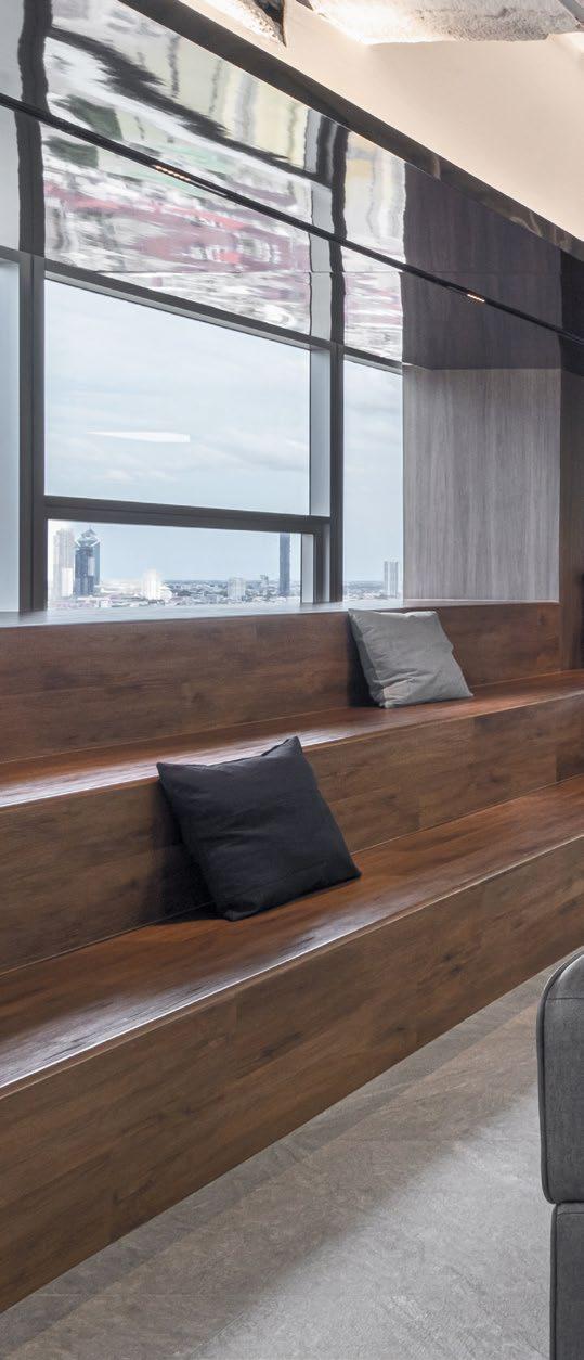

BY ELIMINATING LITERAL WALLS BETWEEN DIFFERENT LEVELS OF HIERARCHY, BLUEBIK FOSTERS AN ATMOSPHERE OF OPENNESS AND COLLABORATION. EVERYONE, REGARDLESS OF THEIR POSITION, WORKS IN THE SAME AREAS, ENCOURAGING SPONTANEOUS INTERACTIONS AND EASY COMMUNICATION. THIS SETUP HELPS TO BREAK DOWN BARRIERS AND PROMOTES A CULTURE WHERE IDEAS CAN FLOW FREELY ACROSS ALL LEVELS OF THE ORGANISATION.
A WELL-DESIGNED PANTRY IS ALSO INCLUDED IN THE FRONT-OF-HOUSE AREA. THIS SPACE SERVES AS A SOOTHING TOUCHPOINT FOR BOTH EMPLOYEES AND VISITORS TO WIND DOWN AND RELAX. THE PANTRY PROVIDES A COMFORTABLE SETTING WHERE PEOPLE CAN TAKE A BREAK, ENJOY REFRESHMENTS, AND ENGAGE IN INFORMAL CONVERSATIONS.


A well-designed pantry is also included in the frontof-house area. This space serves as a soothing touchpoint for both employees and visitors to wind down and relax. The pantry provides a comfortable setting where people can take a break, enjoy refreshments, and engage in informal conversations.

The design of Bluebik’s office goes beyond aesthetics; it is a strategic tool to support the company’s goals and values. The open-space concept promotes collaboration and innovation, essential elements for a company at the forefront of digital transformation. The variety of work settings caters to different preferences, ensuring all employees can work in a way that suits them best. The impressive front-of-house area underscores Bluebik’s professionalism and forward-thinking approach, crucial for making a strong impression on clients and visitors.
Bluebik’s attention to detail in the office design reflects its dedication to excellence in every aspect of its operations. The thoughtful layout and amenities are not only about creating a beautiful space but also about enhancing the work experience for employees and the overall experience for clients. This holistic approach to office design helps Bluebik attract and retain top talent, driving productivity and creativity.


Furthermore, the office serves as a physical manifestation of Bluebik’s brand and values. The start-up feel of the workstations keeps the company grounded and connected to its roots, while the modern amenities and professional front-of-house areas represent its aspirations and achievements. By creating an environment that balances these elements, Bluebik reinforces its identity as a leader in digital transformation.
Bluebik Group’s office is a testament to its ambitious goals and high standards. This carefully crafted environment not only reflects Bluebik’s brand but also plays a vital role in driving the company’s success and growth on a global scale.


THE OPEN-SPACE CONCEPT PROMOTES COLLABORATION AND INNOVATION, ESSENTIAL ELEMENTS FOR A COMPANY AT THE FOREFRONT OF DIGITAL TRANSFORMATION. THE VARIETY OF WORK SETTINGS CATERS TO DIFFERENT PREFERENCES, ENSURING ALL EMPLOYEES CAN WORK IN A WAY THAT SUITS THEM BEST. THE IMPRESSIVE FRONT-OF-HOUSE AREA UNDERSCORES BLUEBIK’S PROFESSIONALISM AND FORWARDTHINKING APPROACH, CRUCIAL FOR MAKING A STRONG IMPRESSION ON CLIENTS AND VISITORS.
Workstation designed to evoke the feeling of a start-up including a variety of settings to accommodate different workstyles.
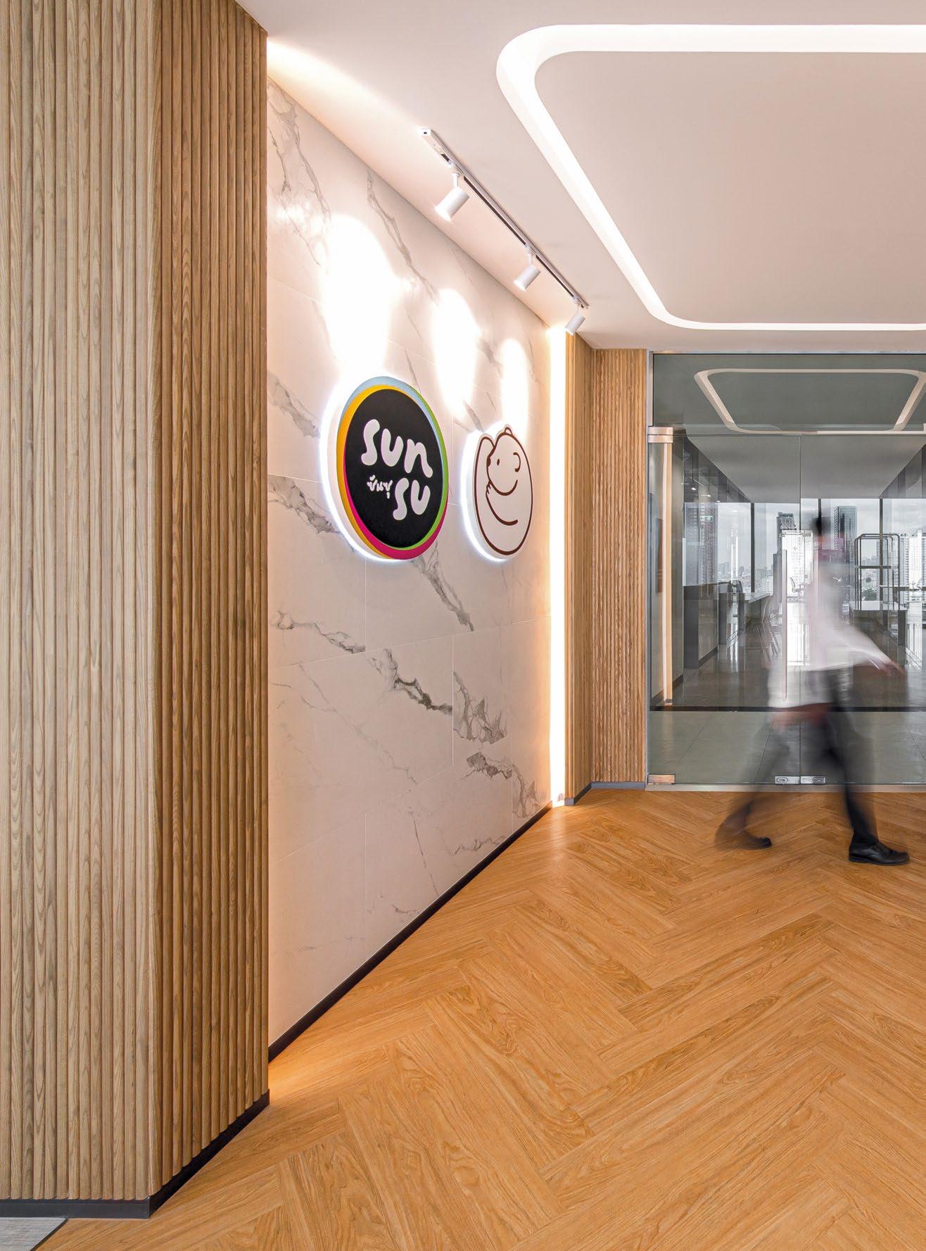
BEARHOUSE & SUNSU’S HEADQUARTERS, INSPIRED BY THEIR OWNER’S YOUTUBE PERSONAS, COMBINES A CAFÉ-LIKE ATMOSPHERE WITH COLLABORATIVE SPACES, FOSTERING INNOVATION AND CREATIVITY WHILE REFLECTING THE BRAND’S PLAYFUL AND AUTHENTIC IDENTITY.

BEARHOUSE & SUNSU
12,250 SQFT | THAILAND | DESIGN & BUILD

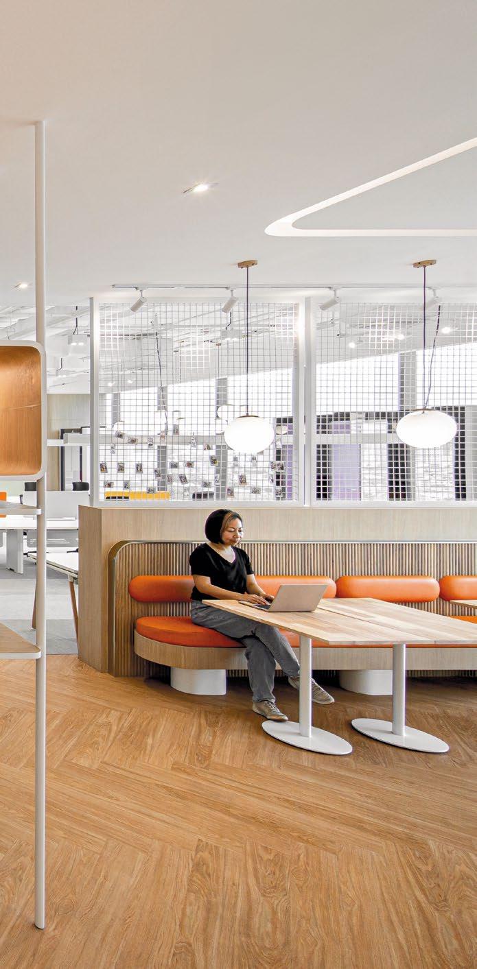

Bearhouse & Sunsu started as the brainchild of YouTubers. As a nationally recognised milk tea shop in Thailand, the brand channels the bubbly energy that fans have come to expect from their owners’ vlogs. This vibrant and engaging spirit extends beyond their online presence and permeates their headquarters, where they prioritise organic social interactions with employees and foster a culture of innovation throughout the company.
Fronted by two of Thailand’s most popular YouTubers, it was essential for Bearhouse & Sunsu’s office to not only represent their brand but also elevate it. The office needed to support collaborative work and ideation while serving as a suitable filming location for their videos. This dual requirement meant that the space had to be both aesthetically pleasing and functionally sound.
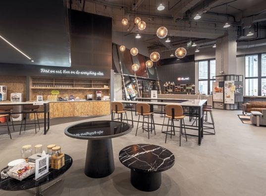
To create an environment that embodies the Bearhouse & Sunsu brand, the office lobby was designed to resemble a café, bringing the shop’s experience directly into the workplace. This design choice allows employees to immerse themselves in the customer experience, fostering a deeper understanding and connection to their work. The lobby
TOP: A quiet space for leaders to focus atstaring out at a view of the Bangkok CBD.

features earthy tones with colourful accents, reflecting the playfulness of their largely Gen Z workforce and setting the office apart from traditional corporate environments.

The design team focused on creating spaces that promote collaboration and creativity. Open work areas, cosy lounges, and communal tables encourage spontaneous interactions and idea-sharing among employees. The office layout facilitates fluid movement and communication, breaking down barriers between different departments and fostering a sense of unity and teamwork.
One of the office’s standout features is the food testing station in the back office. This area serves a dual purpose: it is a place to experiment with new drink recipes and a filming location for Kan and San’s YouTube videos. The food testing station is a constant reminder of the brand’s origins and a statement of their commitment to the legacy that Kan and San set for Bearhouse & Sunsu. It is a space where creativity can flourish, and new ideas can be tested and refined.
In addition to the food testing station, the office includes several other filming-friendly areas. These spaces

TO CREATE AN ENVIRONMENT THAT EMBODIES THE BEARHOUSE & SUNSU BRAND, THE OFFICE LOBBY WAS DESIGNED TO RESEMBLE A CAFÉ, BRINGING THE SHOP’S EXPERIENCE DIRECTLY INTO THE WORKPLACE. THIS DESIGN CHOICE ALLOWS EMPLOYEES TO IMMERSE THEMSELVES IN THE CUSTOMER EXPERIENCE, FOSTERING A DEEPER UNDERSTANDING AND CONNECTION TO THEIR WORK.


OPEN WORK AREAS, COSY LOUNGES, AND COMMUNAL TABLES ENCOURAGE SPONTANEOUS INTERACTIONS AND IDEA-SHARING AMONG EMPLOYEES. THE OFFICE LAYOUT FACILITATES FLUID MOVEMENT AND COMMUNICATION, BREAKING DOWN BARRIERS BETWEEN DIFFERENT DEPARTMENTS AND FOSTERING A SENSE OF UNITY AND TEAMWORK.


are designed with attention to lighting, acoustics, and aesthetics to ensure high-quality video production. The seamless integration of filming locations into the office design reflects the brand’s commitment to authenticity and transparency, allowing their audience to see behind the scenes of their business operations.
Bearhouse & Sunsu’s office also features a variety of amenities to support employee well-being and productivity. A dedicated relaxation area provides a space for employees to unwind and recharge, while a fully equipped kitchen and dining area encourage social interactions during mealtimes. The office is designed to be a place where employees feel valued and motivated, contributing to a positive and dynamic work environment.
The attention to detail in the office design extends to the selection of furniture and decor. Ergonomic chairs and desks ensure employee comfort, while vibrant artwork and plants create a lively and inspiring atmosphere. The design team carefully curated each element to align with the brand’s identity and values, creating a cohesive and immersive experience for employees and visitors alike.
Bearhouse & Sunsu’s commitment to sustainability is also reflected in their office design. Energy-efficient lighting, recycled materials, and eco-friendly practices are integrated throughout the space, demonstrating the brand’s dedication to environmental responsibility.

By emulating their brand identity, employees can better plan around the customer experience while they are at work.


The transformation of Bearhouse & Sunsu’s headquarters into a vibrant, collaborative, and aesthetically pleasing workspace is a testament to the founders’ vision and the brand’s identity. By creating an environment that mirrors the energy and creativity of their YouTube content, Kan and San have successfully translated their online persona into a physical space that inspires and motivates their employees.
Bearhouse & Sunsu’s office is more than just a workplace; it is a reflection of their brand’s journey and aspirations. It embodies the values of innovation, collaboration, and authenticity that have made them a beloved name in Thailand’s milk tea industry. As they continue to grow and evolve, their headquarters will remain a cornerstone of their success, nurturing the creativity and passion that define Bearhouse & Sunsu.

BEARHOUSE & SUNSU’S COMMITMENT TO SUSTAINABILITY IS ALSO REFLECTED IN THEIR OFFICE DESIGN. ENERGY-EFFICIENT LIGHTING, RECYCLED MATERIALS, AND ECO-FRIENDLY PRACTICES ARE INTEGRATED THROUGHOUT THE SPACE, DEMONSTRATING THE BRAND’S DEDICATION TO ENVIRONMENTAL RESPONSIBILITY.

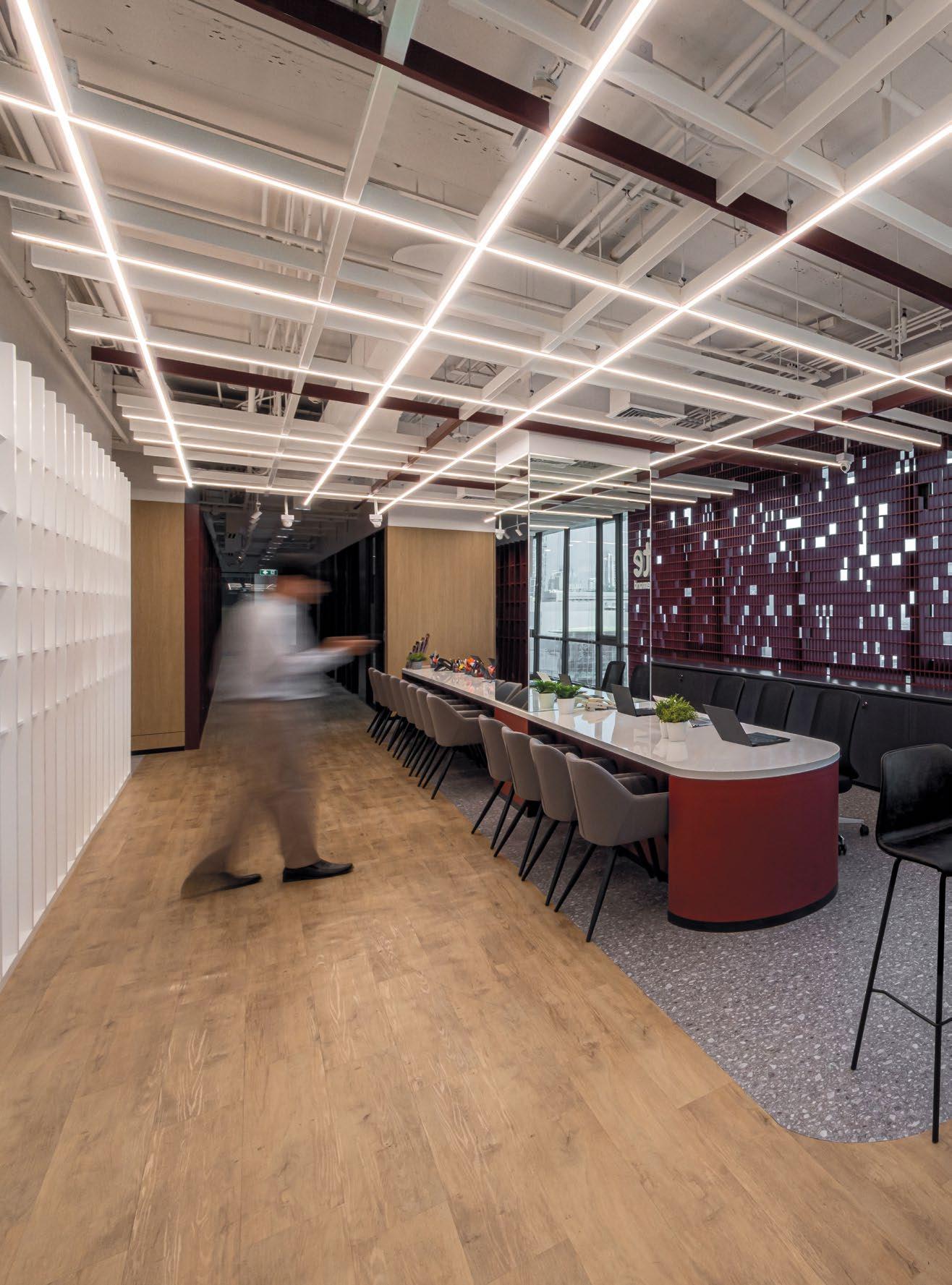
IGNITE BY ONDEMAND COMBINES PROFESSIONAL AMBIANCE AND VIBRANT PRODUCTIVITY, SERVING AS A DUAL-PURPOSE TRAINING AND CO-WORKING HUB, INSPIRING CREATIVITY AND GROWTH THROUGH FLEXIBLE, SOPHISTICATED DESIGN AND SUSTAINABLE PRACTICES.

IGNITE BY ONDEMAND
12,917 SQFT | THAILAND | DESIGN & BUILD

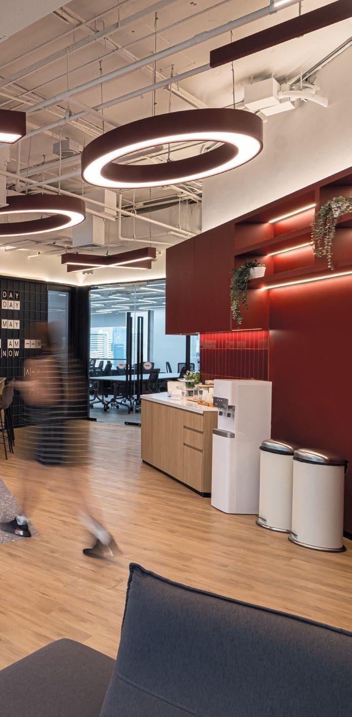

Ignite by OnDemand aspires to cultivate an innovative working and learning environment that seamlessly merges professional ambiance with the dynamic productivity of an educational institution. This space serves a dual purpose, functioning as a training centre for high school students and a co-working hub for Ignite and Learn Corporation, Ignite’s parent company.
Balancing vibrancy with professionalism in a working and learning environment, Ignite draws inspiration from the emotions and knowledge derived from playing board games. Beyond their entertaining and educational aspects, board games often provide a way to unwind and relax, stimulating endorphins. Similarly, Ignite is envisioned as a space where both students and employees can learn, find inspiration, be productive, and relax when needed.
Ignite’s design features a fusion of office space and training rooms. The reception area doubles as a waiting zone for students, while the versatile co-working space boasts multi-functional capabilities. Dedicated training rooms, breakout areas, one-on-one consultation rooms, and even bunk beds cater to diverse working and learning styles, creating a comprehensive environment for both productivity and education.
Upon entering Ignite, visitors are greeted by a striking logo on a backdrop inspired by the Chinese board game Go. The pristine white background enhances the gold
elements of the signage, making them stand out prominently. Inside the lobby, natural light permeates the space, illuminating the CNC metal backdrop. This backdrop introduces an intriguing illusion, remaining hidden from view when seen from an angle but revealing its unique pattern when viewed straight on.
The reception area also features a Hall of Fame showcasing alumni achievements, including acceptances into prestigious universities. This display serves to inspire current students with tangible examples of success.
The town hall is a versatile area featuring an interactive wall inspired by the Scrabble board game, allowing users to engage playfully. Visitors can create welcome messages or uplifting notes, enhancing the space’s dynamic and collaborative spirit. This adaptable area caters to individual work, small or large-scale collaborations, and events.


BALANCING VIBRANCY WITH PROFESSIONALISM IN A WORKING AND LEARNING ENVIRONMENT, IGNITE DRAWS INSPIRATION FROM THE EMOTIONS AND KNOWLEDGE DERIVED FROM PLAYING BOARD GAMES. BEYOND THEIR ENTERTAINING AND EDUCATIONAL ASPECTS, BOARD GAMES OFTEN PROVIDE A WAY TO UNWIND AND RELAX, STIMULATING ENDORPHINS. SIMILARLY, IGNITE IS ENVISIONED AS A SPACE WHERE BOTH STUDENTS AND EMPLOYEES CAN LEARN, FIND INSPIRATION, BE PRODUCTIVE, AND RELAX WHEN NEEDED.
THE NAP AREA DOUBLES AS A FOCUS LEARNING SPACE WITH EARTHY TONES AND COLOURFUL ACCENTS, PROVIDING A HOME-LIKE SETTING CONDUCIVE TO BOTH RELAXATION AND PRODUCTIVITY. IN THE BRAINSTORMING AREA, A STRATEGICALLY PLACED WHITEBOARD ALLOWS FOR JOTTING DOWN IDEAS AND FOSTERING CREATIVITY.


The nap area doubles as a focus learning space with earthy tones and colourful accents, providing a home-like setting conducive to both relaxation and productivity. In the brainstorming area, a strategically placed whiteboard allows for jotting down ideas and fostering creativity. Ignite’s office is designed with flexible learning spaces, featuring operable walls to accommodate both small and large events or meetings. Training rooms are equipped with acoustic panels, whiteboards, and LED TVs, enhancing their educational functionality. Consultation rooms offer private spaces for one-on-one student meetings or can serve as additional meeting rooms. Focus booths are designed for individual work, featuring vibrant colours to energise the space.
The emphasis on flexibility and multipurpose functionality allows Ignite to accommodate a diverse range of events and activities. Whether it’s hosting talks, workshops, knowledge-sharing sessions, or networking nights, the space is designed to inspire the next generation of leaders while maintaining a professional and sophisticated atmosphere.

Incorporating sustainable practices, Ignite’s design repurposes existing structures and utilises cradle-tocradle materials, minimising waste and environmental impact. The entrance, marked by minimalist stone cladding and programmable lighting, can be customised for different colours, setting the tone for a refined experience. Beyond being a conventional educational space, Ignite stands as a transformative learning hub that is fun, exciting, and unique. It is tailored to meet today’s needs and anticipate the challenges of tomorrow.

BALANCING VIBRANCY WITH PROFESSIONALISM IN A WORKING AND LEARNING ENVIRONMENT, IGNITE DRAWS INSPIRATION FROM THE EMOTIONS AND KNOWLEDGE DERIVED FROM PLAYING BOARD GAMES. BEYOND THEIR ENTERTAINING AND EDUCATIONAL ASPECTS, BOARD GAMES OFTEN PROVIDE A WAY TO UNWIND AND RELAX, STIMULATING ENDORPHINS. SIMILARLY, IGNITE IS ENVISIONED AS A SPACE WHERE BOTH STUDENTS AND EMPLOYEES CAN LEARN, FIND INSPIRATION, BE PRODUCTIVE, AND RELAX WHEN NEEDED.

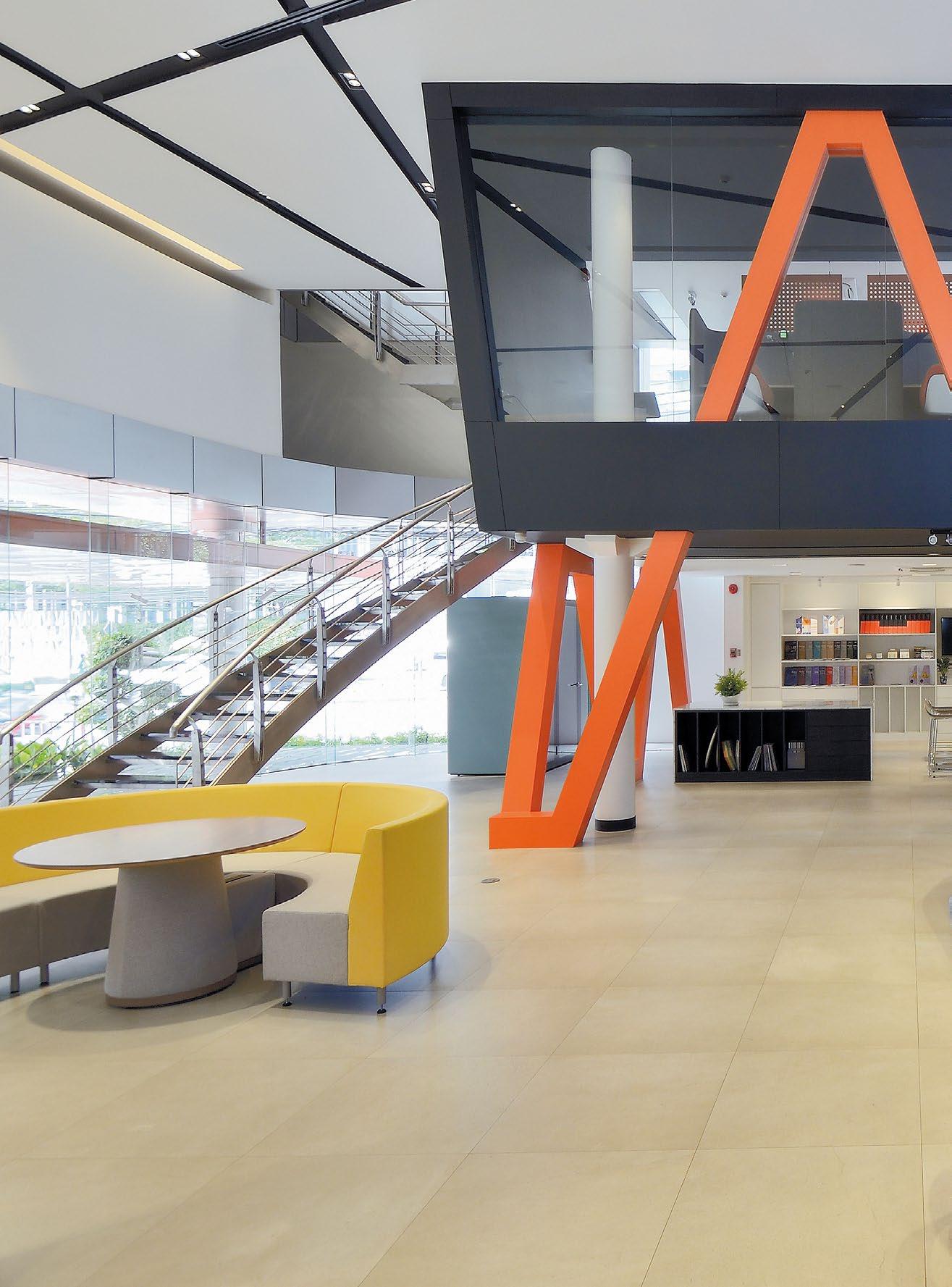
ROCKWORTH’S REDESIGNED OFFICE DOUBLES AS A SHOWROOM – IT APPEALS TO CUSTOMERS WHILE ALSO SHOWCASING THE STRONG CULTURE THAT CAN BE FOUND THROUGHOUT THE COMPANY.

13,050 SQFT | THAILAND | DESIGN CONSULTANCY

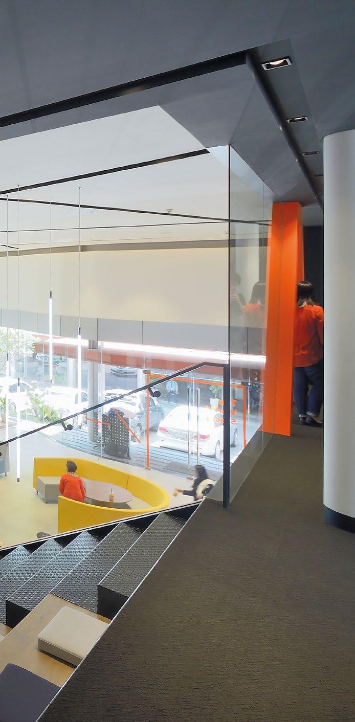

Rockworth is Thailand’s leading manufacturer, distributor, and marketer of quality office systems furniture. As part of a comprehensive rebranding effort, the company redesigned its office, which also serves as its showroom. This initiative aimed to refresh the company’s image while enhancing the functionality and appeal of the workspace.
The redesign has successfully attracted more clients and partners, thanks to its enhanced design and updated amenities. The new office and showroom now stand as a testament to Rockworth’s commitment to quality and innovation. By transitioning from a traditional workspace arrangement to a flexible office layout, Rockworth has fostered greater collaboration among staff. The updated design includes distinct zones: public space, co-working space, concentration space, and conference space. This strategic layout has minimised underutilised space, creating an environment conducive to dynamic interactions and increased productivity.
TOP: Multipurpose collaboration area for town hall, knowledge sharing sessions, and small and big events.
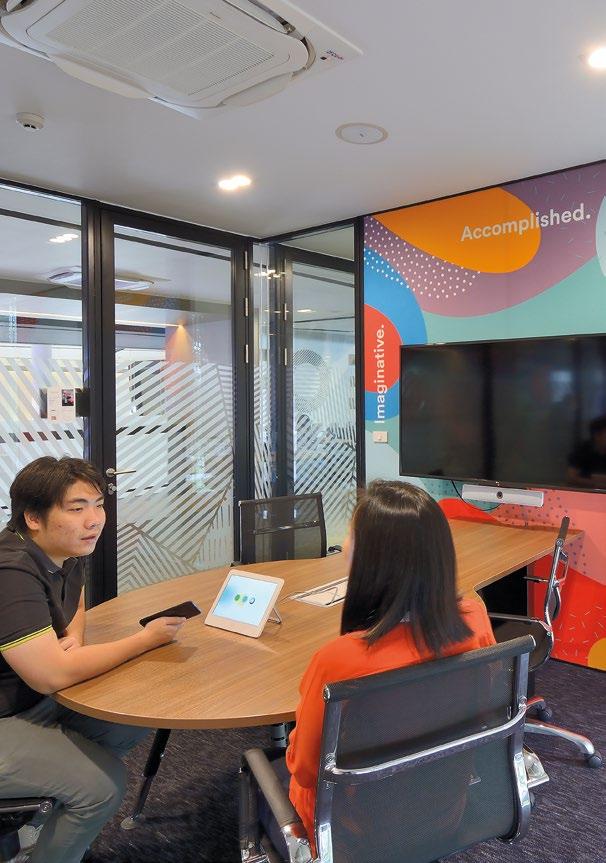

A key aspect of the redesign was to draw out different user journeys within Rockworth’s premises, from the showroom to the office areas. Ensuring smooth circulation and strong visual connections across the different working floors and the high-ceiling entrance hall, which also houses a mezzanine, was paramount. This was integral to improving the overall look, feel, mood, and tone of the office and showroom interiors as part of the rebranding effort.
The design process began with a deep understanding of Rockworth’s visual aesthetic, core values, and the elements that drive its reputation for quality services. The aim was twofold: to blend attractiveness with efficient functionality and to create a transformed workplace where people can build connections and contribute value within the community.
Orange, Rockworth’s brand colour, plays a significant role in the overall look and feel of the new office.
It is used throughout the workspace as a connection path, reinforcing the company’s wholesome image. The integration of this vibrant colour not only enhances the aesthetic appeal but also creates a cohesive visual identity that ties together the various zones within the office. Functionality was a crucial focus of the redesign. The traditional working space arrangement was elevated with the introduction of flexible workspaces. Four main operating zones were established: public space, designed to be welcoming and accessible, this area serves as the first point of contact for visitors and clients, setting a professional and inviting tone; co-working space, this zone promotes collaboration and interaction among employees and visitors. It is designed to be a dynamic area where ideas can flow freely and teamwork is encouraged; concentration space, recognising the need for focused work, this area provides a quiet and conducive environment for tasks that require high levels
ORANGE, ROCKWORTH’S BRAND COLOUR, PLAYS A SIGNIFICANT ROLE IN THE OVERALL LOOK AND FEEL OF THE NEW OFFICE. IT IS USED THROUGHOUT THE WORKSPACE AS A CONNECTION PATH, REINFORCING THE COMPANY’S WHOLESOME IMAGE. THE INTEGRATION OF THIS VIBRANT COLOUR NOT ONLY ENHANCES THE AESTHETIC APPEAL BUT ALSO CREATES A COHESIVE VISUAL IDENTITY THAT TIES TOGETHER THE VARIOUS ZONES WITHIN THE OFFICE.


BY TRANSITIONING FROM A TRADITIONAL WORKSPACE ARRANGEMENT TO A FLEXIBLE OFFICE LAYOUT, ROCKWORTH HAS FOSTERED GREATER COLLABORATION AMONG STAFF. THE UPDATED DESIGN INCLUDES DISTINCT ZONES: PUBLIC SPACE, CO-WORKING SPACE, CONCENTRATION SPACE, AND CONFERENCE SPACE. THIS STRATEGIC LAYOUT HAS MINIMISED UNDERUTILISED SPACE, CREATING AN ENVIRONMENT CONDUCIVE TO DYNAMIC INTERACTIONS AND INCREASED PRODUCTIVITY.

of concentration; and conference space, equipped with modern amenities, this zone is designed for meetings and presentations, facilitating effective communication and decision-making processes.
By creating these distinct zones, the new design helps users orientate their activities according to the nature of their tasks, thereby increasing efficiency and collaboration. The redesign has also significantly reduced the excess space previously occupied by permanent working desks, making the office more vibrant and interesting. Rockworth’s advantage in office furniture has been leveraged to complement this new way of working. The integration of their multifarious, purposebuilt furniture into the flexible workspaces enhances both functionality and aesthetics, making the office an engaging place to work.

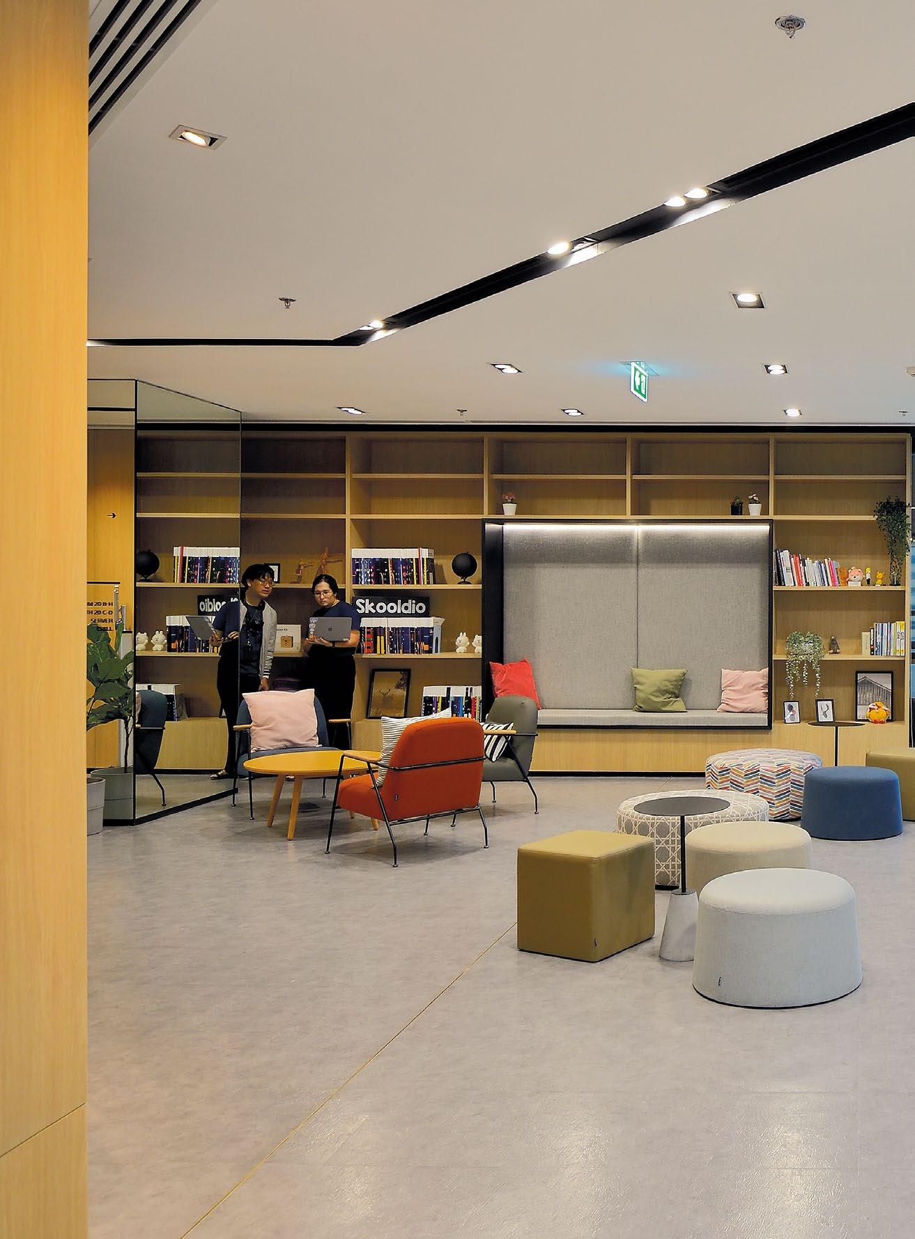
SKOOLDIO’S REDESIGNED OFFICE ENHANCES PRODUCTIVITY AND COLLABORATION THROUGH A FLEXIBLE, FUTURE-PROOF WORKSPACE, TAILORED TRAINING FACILITIES, AND ACTIVITY-BASED WORKING PRINCIPLES.

21,527.82 SQFT | THAILAND | DESIGN CONSULTANCY


Learn Corporation Co., Ltd. has carved a niche as a trailblazing learning organisation, harnessing the power of technology to create cutting-edge educational solutions for all age groups. With a steadfast commitment to continuous growth, Learn Corporation’s expansive network includes nine business groups and over 800 employees across the nation. This unwavering dedication to progress and excellence has solidified its standing as a leader in the education sector.
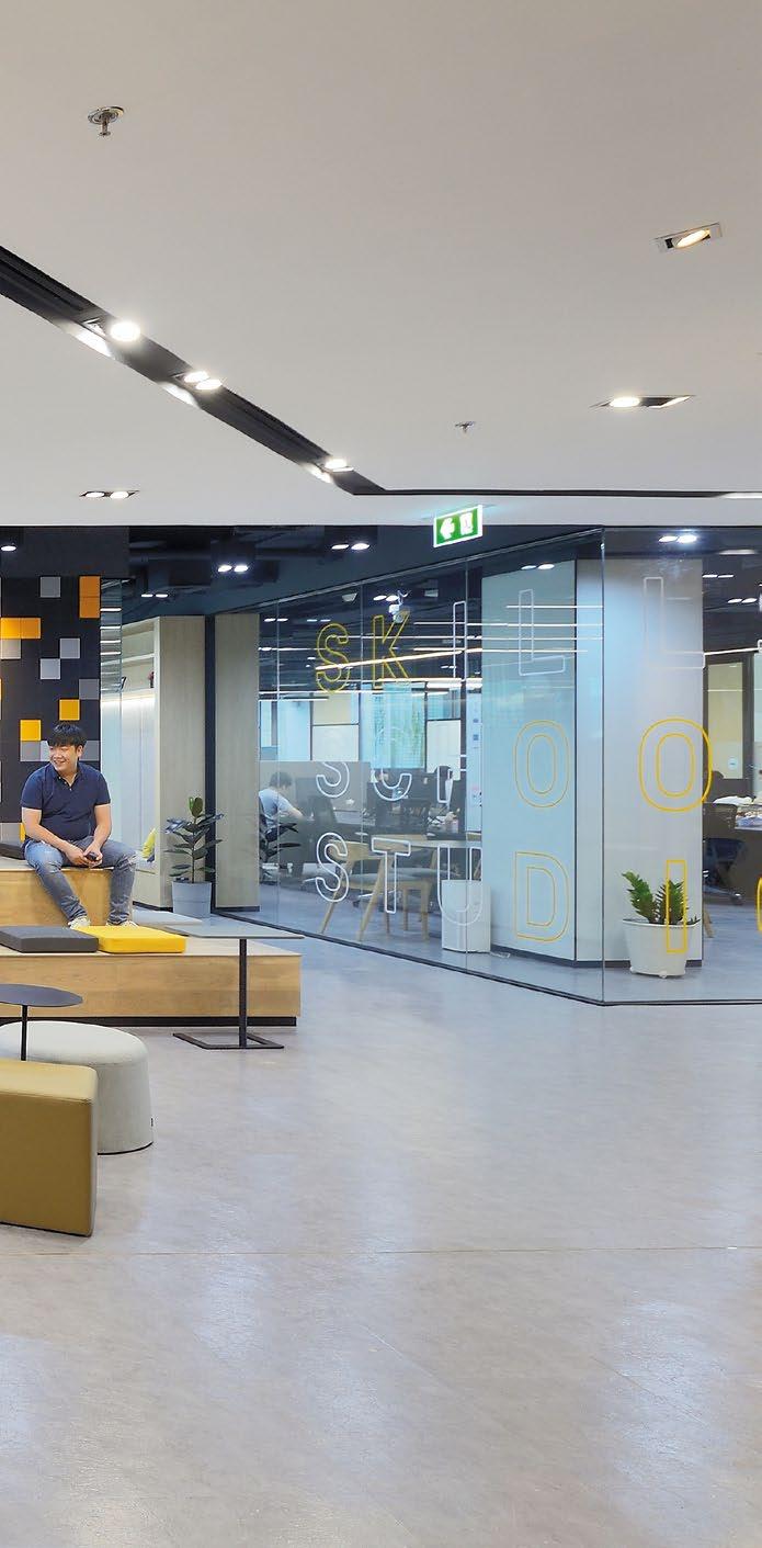
Skooldio, falling under Learn Corporation’s network, is one such unit that recognised its unique needs to embark on a transformative journey to redesign its office environment. This new, future-proof workspace, rooted in the principles of Activity-Based Working (ABW), significantly boosts employee productivity. The ABW approach allows employees to select their workspace based on their current tasks, fostering a dynamic and adaptable work culture.
The redesigned office is a marvel of flexibility, offering various zones for focused work and social interaction. This harmonious blend of private and collaborative spaces has been pivotal in nurturing a culture of teamwork while
respecting individual concentration needs. The forwardthinking design ensures the office remains relevant and contemporary for the next five years, truly embodying a future-proof workspace.
A highlight of the revamped office is its comfortable and versatile training facilities tailored for Skooldio clients. These spaces, designed to be inviting and empowering, adhere to ABW principles, promoting collaboration alongside private areas for focused work. Paperspace’s design meticulously defines each area’s function, strategically placing elements to encourage suitable behaviours for each specific space.
The town hall area features an interactive magnetic frame and collaborative spaces, providing a relaxed and social environment for employees from different business groups. In contrast, the workshop rooms and backend staff areas are equipped with tools and equipment specifically tailored to meet internal personnel’s needs.
Skooldio’s innovative approach to future-proofing its workspace is exemplified by its transformation into
a hybrid office setup. This model includes hot desking, where employees do not have fixed desks but are provided with designated lockers for their belongings. This setup offers unparalleled flexibility and comfort, allowing employees to work fluidly without the constraints of a traditional office environment. As Skooldio continues to grow, this hybrid setup has proven advantageous, accommodating an expanding workforce without necessitating a move to a larger office space.
To further enhance the working experience, Learn Corporation has incorporated state-of-the-art technology throughout the office. This includes advanced video conferencing systems, high-speed internet connectivity, and ergonomic furniture designed to reduce physical strain and increase comfort. These technological advancements not only improve efficiency but also contribute to a healthier and more enjoyable work environment.
Moreover, the office redesign has included sustainable practices, such as energy-efficient lighting and


THE REDESIGNED OFFICE IS A MARVEL OF FLEXIBILITY, OFFERING VARIOUS ZONES FOR FOCUSED WORK AND SOCIAL INTERACTION. THIS HARMONIOUS BLEND OF PRIVATE AND COLLABORATIVE SPACES HAS BEEN PIVOTAL IN NURTURING A CULTURE OF TEAMWORK WHILE RESPECTING INDIVIDUAL CONCENTRATION NEEDS. THE FORWARD-THINKING DESIGN ENSURES THE OFFICE REMAINS RELEVANT AND CONTEMPORARY FOR THE NEXT FIVE YEARS, TRULY EMBODYING A FUTURE-PROOF WORKSPACE.
SKOOLDIO’S INNOVATIVE APPROACH TO FUTURE-PROOFING ITS WORKSPACE IS EXEMPLIFIED BY ITS TRANSFORMATION INTO A HYBRID OFFICE SETUP. THIS MODEL INCLUDES HOT DESKING, WHERE EMPLOYEES DO NOT HAVE FIXED DESKS BUT ARE PROVIDED WITH DESIGNATED LOCKERS FOR THEIR BELONGINGS. THIS SETUP OFFERS UNPARALLELED FLEXIBILITY AND COMFORT, ALLOWING EMPLOYEES TO WORK FLUIDLY WITHOUT THE CONSTRAINTS OF A TRADITIONAL OFFICE ENVIRONMENT.


climate control systems, to minimise the environmental impact. By integrating these green initiatives, Learn Corporation demonstrates its commitment to sustainability and corporate social responsibility, reinforcing its reputation as an ethical and forward-thinking organisation.
In summary, the collaboration between Learn Corporation and Paperspace has culminated in a workspace that is both highly functional and aesthetically pleasing, catering to the diverse needs of its business groups. By prioritising flexibility, collaboration, and futureproofing, the redesigned office stands as a beacon of modern work environments, enhancing productivity and employee satisfaction. The seamless blend of innovative design, advanced technology, and sustainable practices ensures that Learn Corporation’s office remains a dynamic and vibrant place to work, supporting the company’s mission of fostering continuous growth and development.


HOUSE OF WISDOM (H.O.W) IS AN INVITE-ONLY SPACE IN SOUTHEAST ASIA, FOSTERING CONTINUOUS LEARNING AND GROWTH THROUGH FLEXIBLE, ART-INTEGRATED DESIGN AND SUSTAINABLE PRACTICES, INSPIRING EMERGING LEADERS ACROSS VARIOUS FIELDS.

HOUSE OF WISDOM
10,764 SQFT | THAILAND | DESIGN CONSULTANCY


House of Wisdom (H.O.W) is an exclusive space and platform dedicated to emerging leaders across Southeast Asia who are committed to continuous learning and personal growth in a rapidly evolving world. With a focus on fostering wisdom and creativity, H.O.W provides a nurturing environment where members find inspiration and opportunities for learning across diverse topics such as business, technology, AI, finance, arts, and music.
To accommodate H.O.W’s wide range of events and activities while inspiring the next generation of leaders, the design prioritises flexibility and multipurpose functionality, integrating evocative art pieces to enhance the space’s aesthetic appeal. The primary challenge in designing the space lay in seamlessly integrating areas intended for multiple activities while maintaining exclusivity and control over member-only and public areas. Ensuring flexibility and a clear sense of distinctiveness was crucial in making the space feel comfortable for all users.

The design approach focused on creating a flexible and multipurpose space capable of accommodating various events such as talks, workshops, knowledgesharing sessions, and networking nights, while also providing a productive environment for members to use for co-working or meeting with their clients and partners. Additionally, an emphasis was placed on delivering an elegant experience for members, ensuring that every aspect of the space exuded sophistication and refinement.
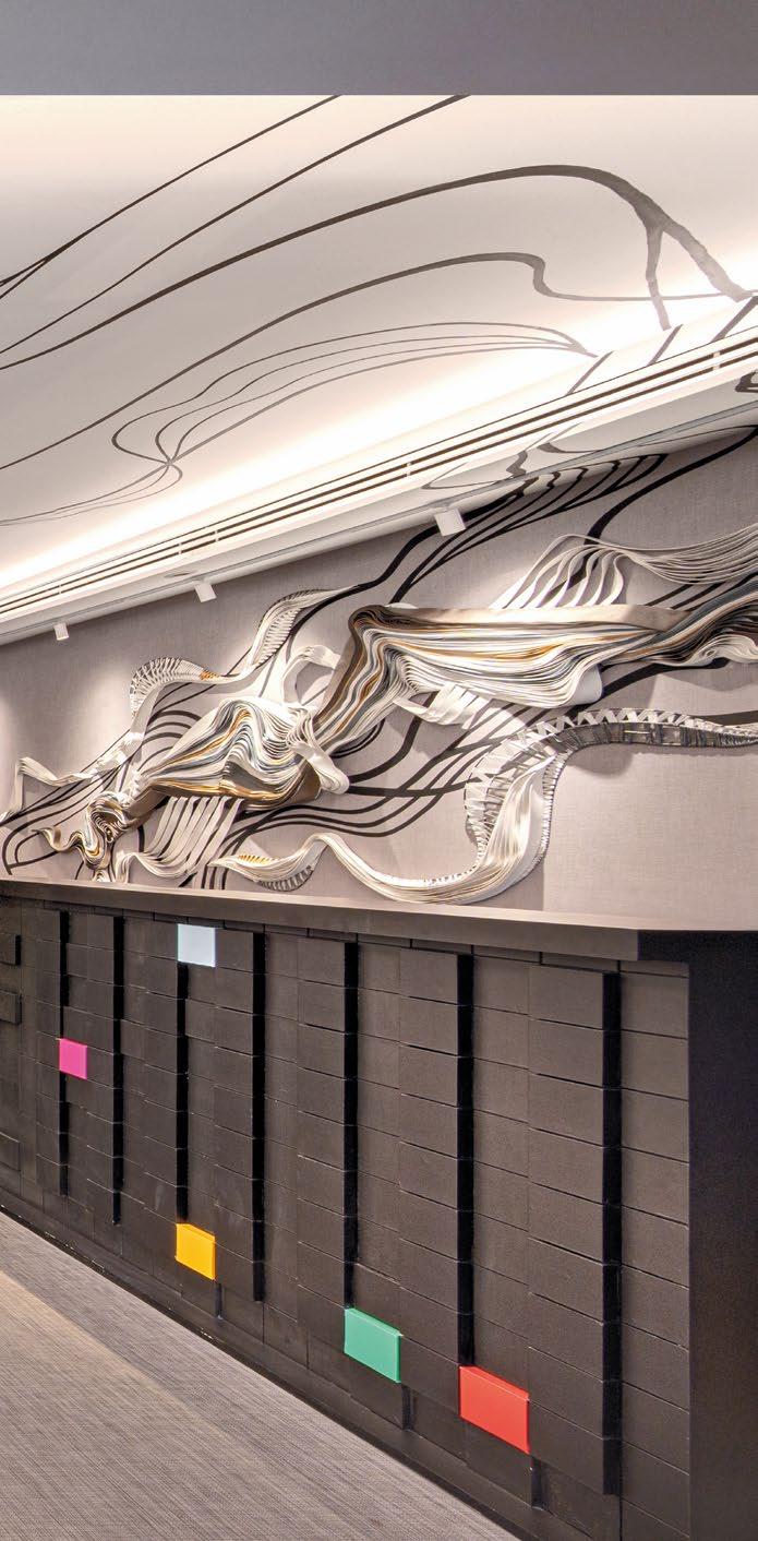
Inspired by the owners’ passion for art, carefully curated art collections throughout the space evoke the ambiance of an art gallery, enhancing its distinctive character and aesthetic appeal. The space showcases a masculine palette of greyish tones, timber, and dark metallic accents, infusing each area with sophistication. Art isn’t merely hung on the walls but is integrated into the ceilings and walls, creating a three-dimensional effect that adds depth and texture to the space.


THE HALL, A VERSATILE AREA THAT DOUBLES AS AN ART GALLERY AND EVENTS SPACE, FEATURES CUSTOM LIGHTING TO ENHANCE THE AMBIANCE AND HIGHLIGHT THE ARTWORKS, GIVING IT A THREE-DIMENSIONAL LOOK AND FEEL. THE LIVING ROOM, PRIMARILY USED FOR TALKS AND EVENTS, INCLUDES FLEXIBLE FURNITURE THAT CAN EASILY ADAPT TO ACCOMMODATE SMALL OR LARGE GROUP GATHERINGS.


INSPIRED BY THE OWNERS’ PASSION FOR ART, CAREFULLY CURATED ART COLLECTIONS THROUGHOUT THE SPACE EVOKE THE AMBIANCE OF AN ART GALLERY, ENHANCING ITS DISTINCTIVE CHARACTER AND AESTHETIC APPEAL. THE SPACE SHOWCASES A MASCULINE PALETTE OF GREYISH TONES, TIMBER, AND DARK METALLIC ACCENTS, INFUSING EACH AREA WITH SOPHISTICATION.


Incorporating sustainable practices, the existing structure was repurposed, and cradle-to-cradle materials were utilised, minimising waste and environmental impact. The entrance, marked by minimalist stone cladding and programmable lighting that can be customised for different colours, sets the tone for a refined experience.
The Front Room, or main reception area, seamlessly merges art with architecture, blurring the lines between decor and structure.
The Hall, a versatile area that doubles as an art gallery and events space, features custom lighting to enhance the ambiance and highlight the artworks, giving it a three-dimensional look and feel. The Living Room, primarily used for talks and events, includes flexible furniture that can easily adapt to accommodate small or large group gatherings. The Parlour serves a similar purpose but provides a more intimate setting for smaller groups.
DESIGN.COM


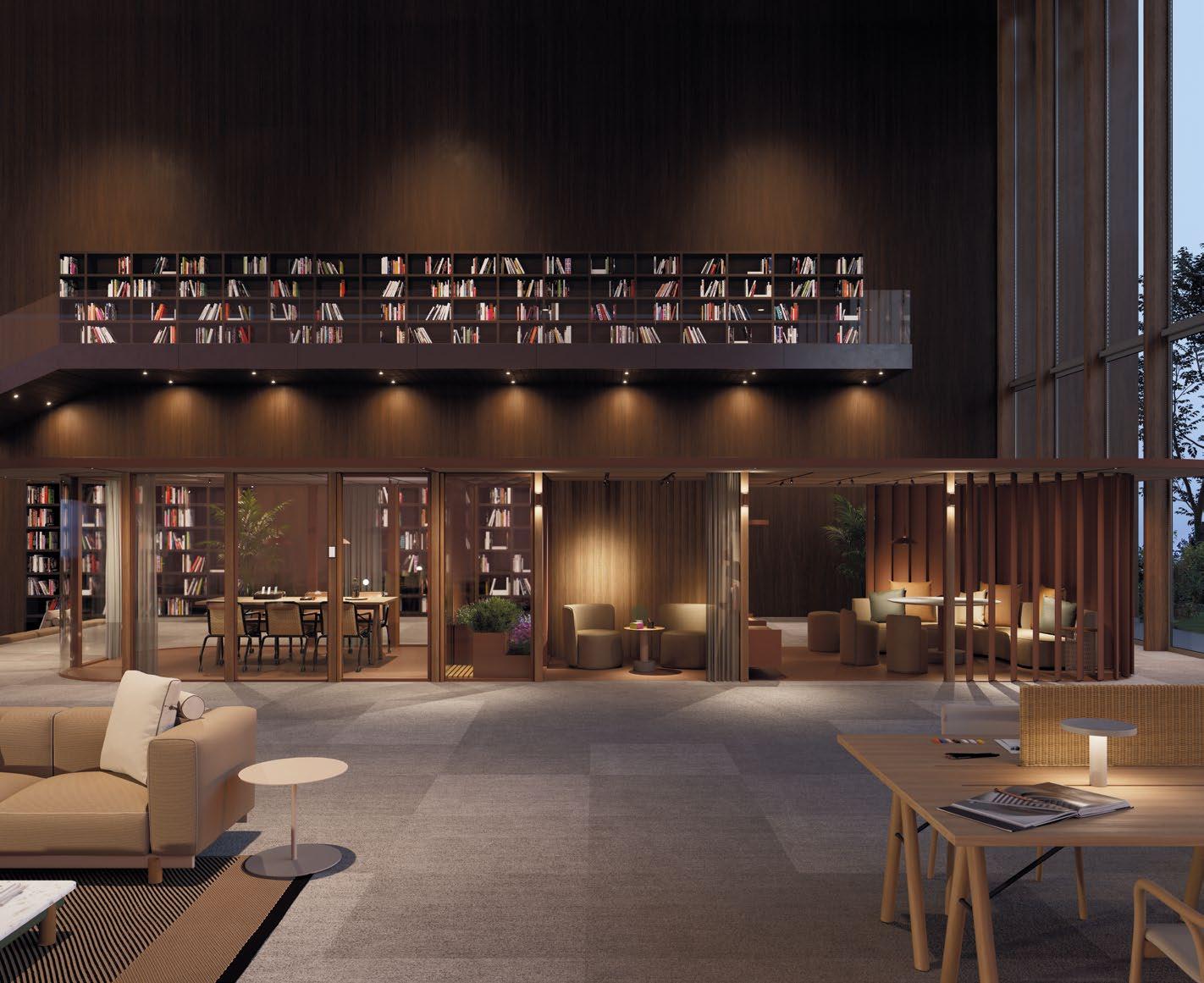
The Library, adorned with bookshelves showcasing member-contributed books, offers a cosy retreat for reading and networking, with a bar area aptly named the Library Bar. This space can easily transition into a clubbing area, showcasing the adaptability of the design to cater to diverse member needs.
H.O.W is more than just a physical space; it is a community and a platform for growth, creativity, and innovation. By creating a space that balances sophistication with functionality, H.O.W ensures that members have the resources and inspiration needed to thrive in their personal and professional endeavours. The careful design and thoughtful amenities reflect its commitment to nurturing the potential of its members, making it a beacon of wisdom and creativity in Southeast Asia.

THE DESIGN APPROACH FOCUSED ON CREATING A FLEXIBLE AND MULTIPURPOSE SPACE CAPABLE OF ACCOMMODATING VARIOUS EVENTS SUCH AS TALKS, WORKSHOPS, KNOWLEDGE-SHARING SESSIONS, AND NETWORKING NIGHTS, WHILE ALSO PROVIDING A PRODUCTIVE ENVIRONMENT FOR MEMBERS TO USE FOR CO-WORKING OR MEETING WITH THEIR CLIENTS AND PARTNERS.

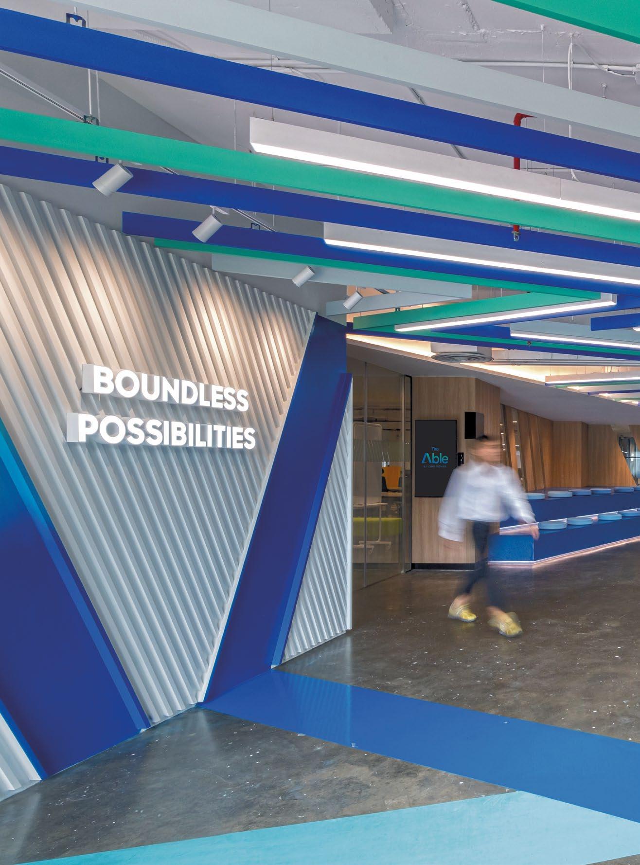
AMBITIOUS, BOLD, CREATIVE – THE DRIVING FORCE BEHIND THE ABLE BY KING POWER’S NEW WORKPLACE. DESIGNED TO EMBODY THE COMPANY’S INNOVATIVE SPIRIT AND SUPPORT ITS DIGITAL TRANSFORMATION TEAM IN BANGKOK.

THE ABLE BY KINGPOWER
17,222 SQFT | THAILAND | DESIGN CONSULTANCY

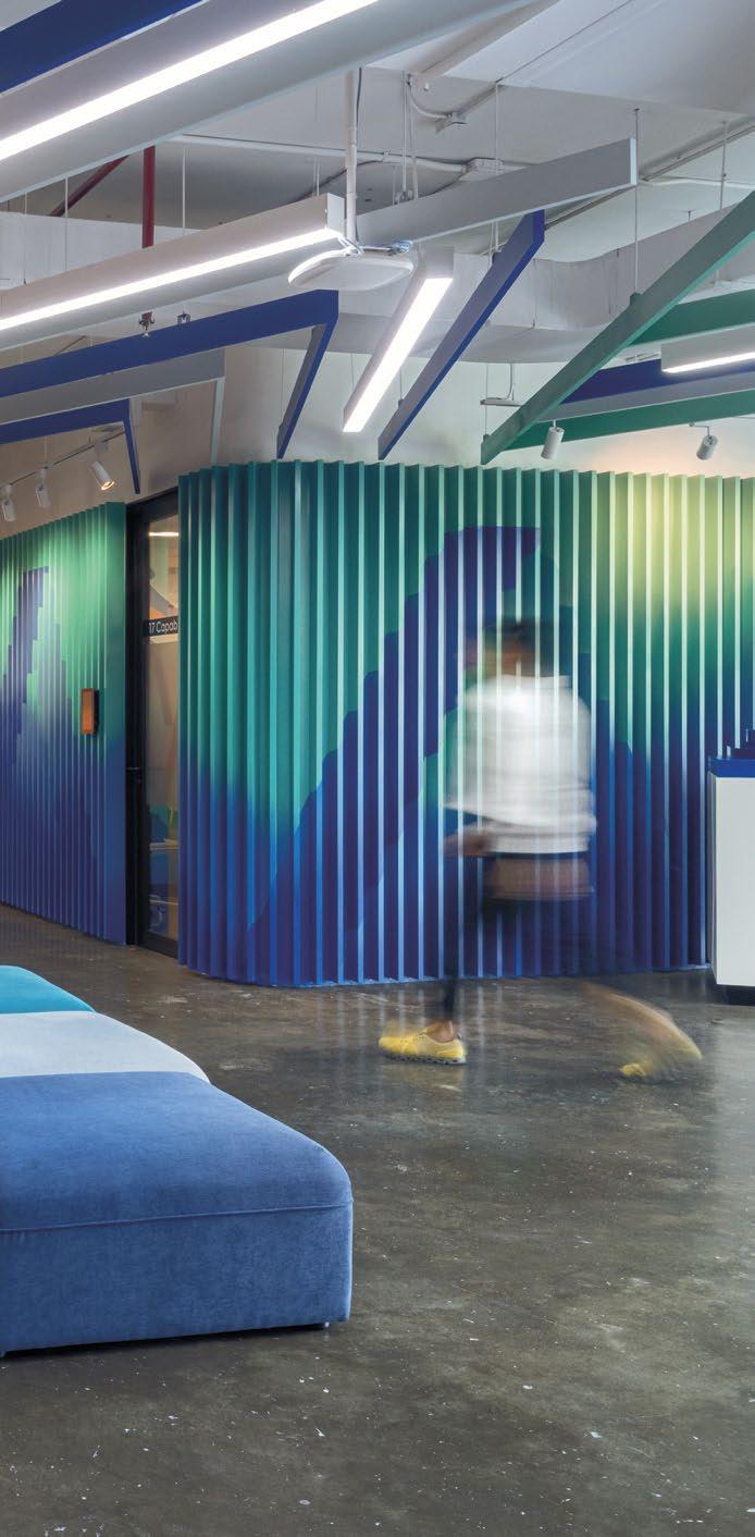

The Able by King Power is a visionary initiative spearheaded by the “Boundary Breakers” team at King Power Corporation Co., Ltd. Aiming to revolutionise how King Power operates and engages with stakeholders, this project focuses on creating an innovative and forward-thinking workspace.
To support this transformative vision, the workspace was crafted to be youthful, vibrant, and conducive to creativity, collaboration, and socialisation—perfect for King Power’s new digital transformation team. This team, charged with leading organisational change, required a dynamic environment that could keep pace with their innovative workflow.
The design meticulously embodied the company’s ambitious, bold, creative, determined, and energetic spirit. An agile workspace was implemented with hot desking and flexible configurations to promote adaptability and efficiency. The new brand was seamlessly woven into the physical space, making the design a tangible representation of King Power’s identity.
Leveraging insights from a previous workplace strategy project, decision-makers streamlined processes and made informed choices. The workspace included

specialised areas such as a versatile town hall for events, an art wall with a textured mural capturing the brand’s essence, and open co-working spaces encouraging spontaneous interactions and collaboration.

The reception area, featuring patterned ceilings and walls, created dynamic visual experiences, setting the tone for the rest of the workspace. This area combined aesthetic appeal with functional design, showcasing the brand’s identity.
The multifunctional town hall was designed for large meetings, presentations, and social events, fostering a sense of community. The art wall added creativity and inspiration, reinforcing the team’s innovative spirit.
Meeting rooms varied in design, from traditional layouts to relaxed, brainstorming-friendly environments, all enhanced with vibrant artistic murals to ignite creativity and inspire collaboration. The back-of-house was dedicated to marketing, business development, and engineering teams, with product test rooms equipped for application testing and user feedback, facilitating direct developer-user interaction.
The boardroom maintained a serious and professional tone for important meetings, utilising the firm’s corporate colours to reinforce brand identity and create a cohesive visual experience. Modern graphic elements were incorporated thoughtfully, adding a contemporary touch without detracting from professionalism.

THE DESIGN METICULOUSLY EMBODIED THE COMPANY’S AMBITIOUS, BOLD, CREATIVE, DETERMINED, AND ENERGETIC SPIRIT. AN AGILE WORKSPACE WAS IMPLEMENTED WITH HOT DESKING AND FLEXIBLE CONFIGURATIONS TO PROMOTE ADAPTABILITY AND EFFICIENCY. THE NEW BRAND WAS SEAMLESSLY WOVEN INTO THE PHYSICAL SPACE, MAKING THE DESIGN A TANGIBLE REPRESENTATION OF KING POWER’S IDENTITY.

PRIVATE PHONE BOOTHS IN THE CO-WORKING AREA CATERED TO THE NEED FOR CONFIDENTIAL CONVERSATIONS, OFFERING SECLUDED SPACES FOR IMPORTANT CALLS WITHOUT DISTRACTIONS. STRATEGICALLY PLACED CHARGING STATIONS ENSURED THAT THE WORKSPACE WAS NOT ONLY VISUALLY APPEALING BUT ALSO HIGHLY FUNCTIONAL, ADDRESSING POWER ACCESS NEEDS IN A HOT-DESKING ENVIRONMENT.


Private phone booths in the co-working area catered to the need for confidential conversations, offering secluded spaces for important calls without distractions. Strategically placed charging stations ensured that the workspace was not only visually appealing but also highly functional, addressing power access needs in a hot-desking environment.
The pantry was transformed into a vibrant, engaging space with painted illusions extending across the ceiling, walls, and floor. This artistic approach created a visually stimulating area, encouraging relaxation and social interaction among employees. The overall design is young, colourful, and vibrant, sparking creativity throughout the workspace and setting a new standard for modern, dynamic office environments.
This narrative-driven approach ensures that every element of the workspace at The Able by King Power is geared towards fostering an atmosphere of innovation, collaboration, and well-being, truly embodying the company’s forward-thinking ethos.

room equipped for application testing and user feedback, facilitating direct interaction between developers and end-users.
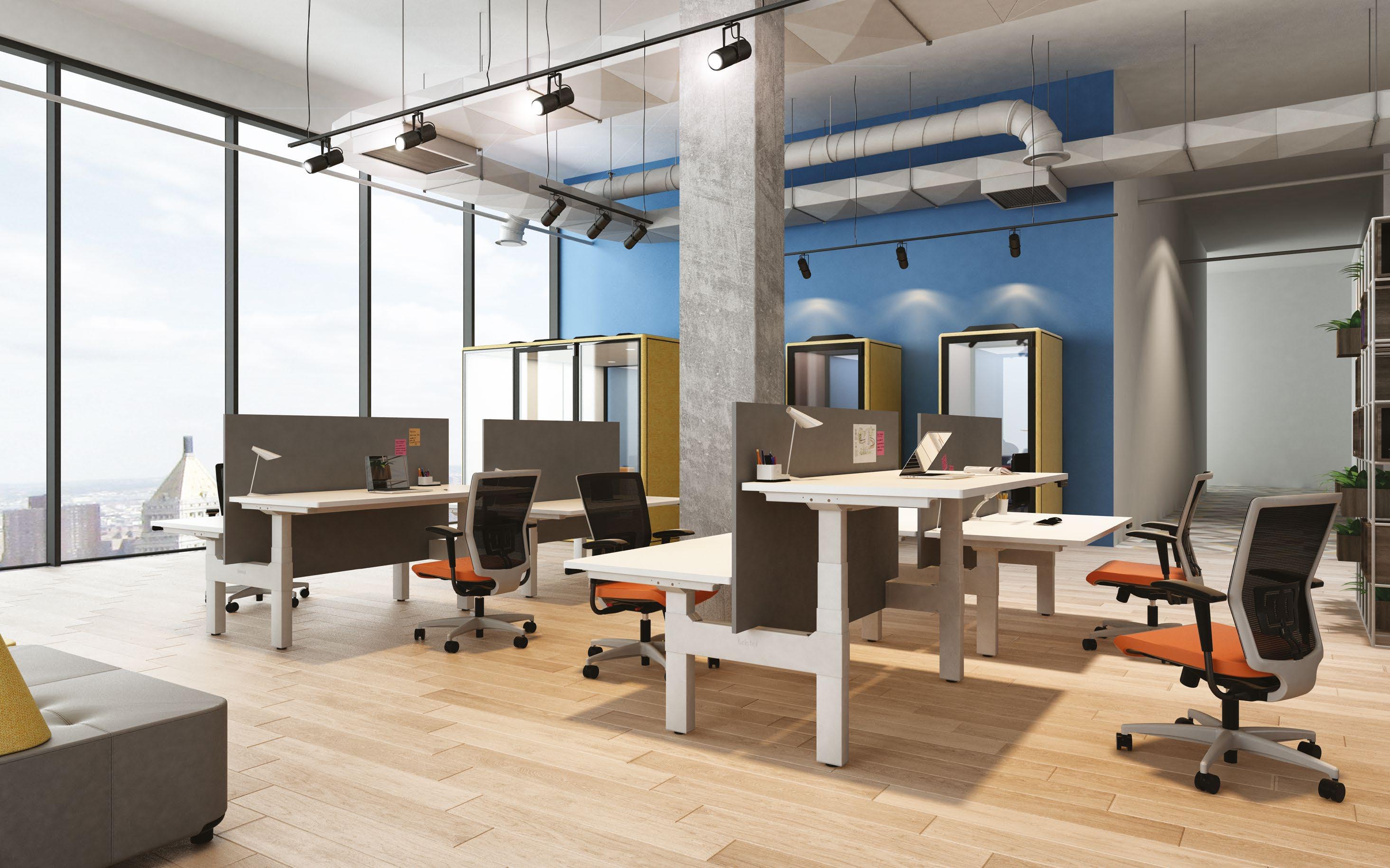


DISCOVER THE RIGHT FIT & BALANCE WITH CAREFUL MATERIAL SELECTION
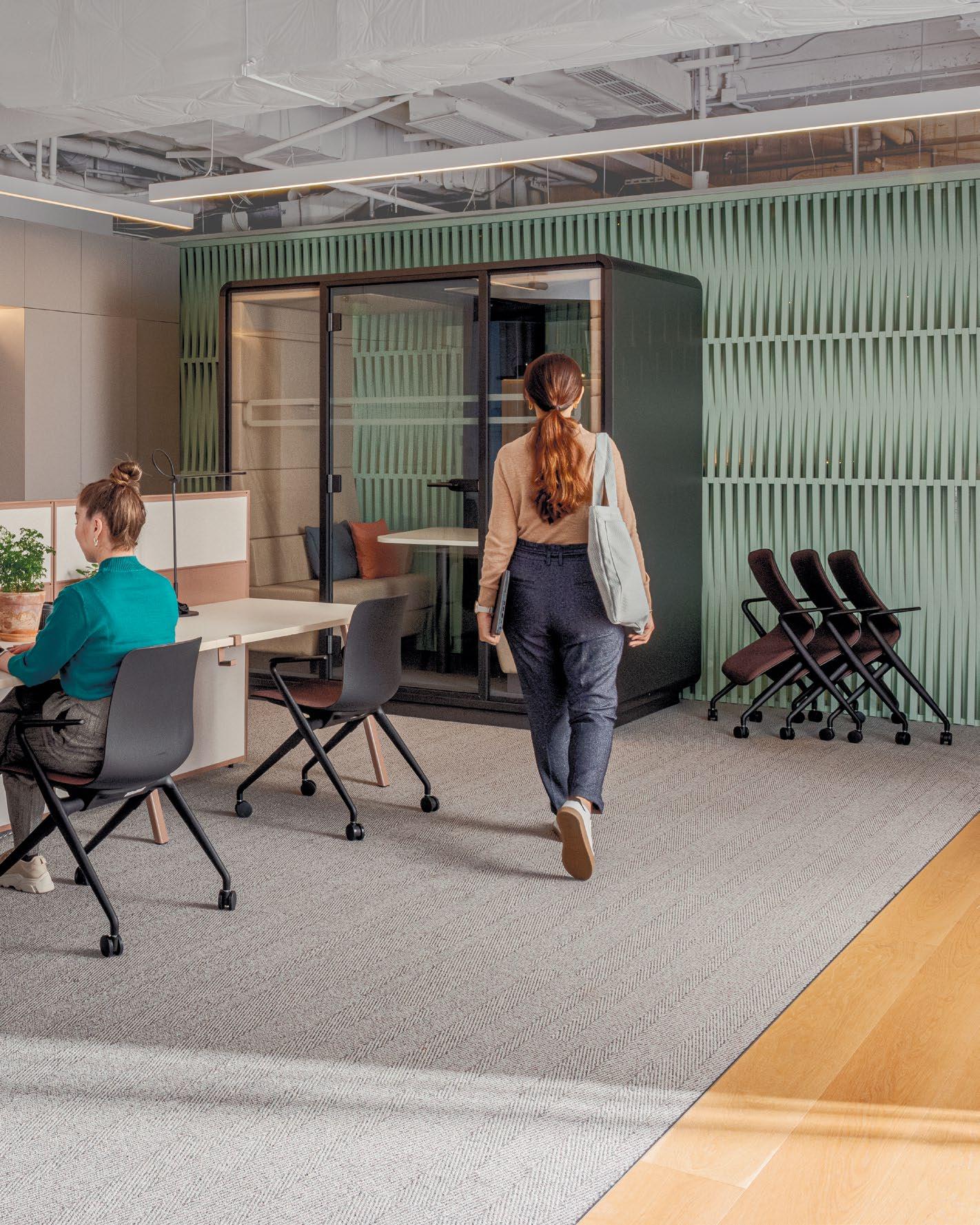
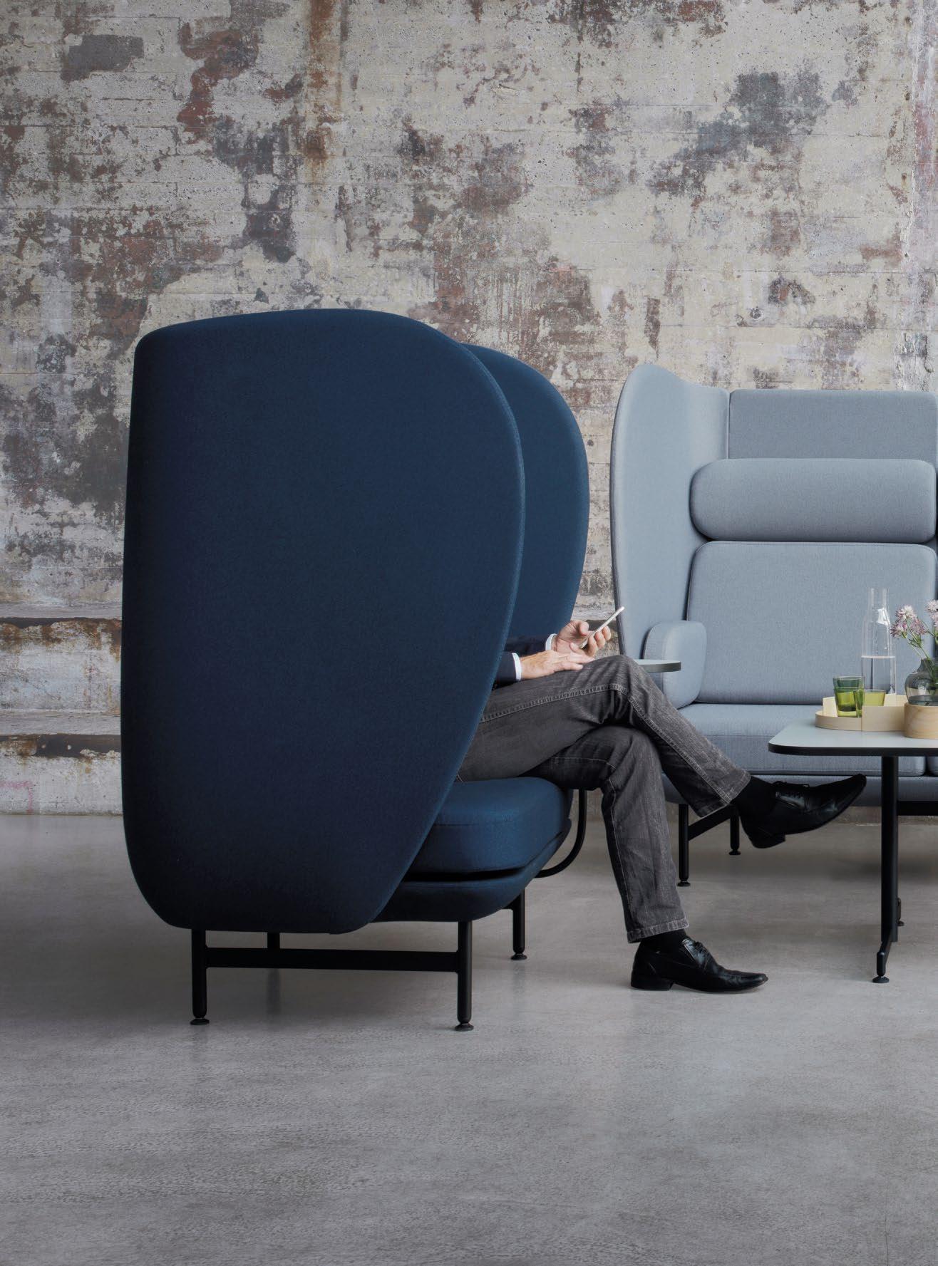
THE PLENUM™ CABIN COLLECTION IS POISED TO BECOME A STAPLE IN MODERN OFFICES, COMBINING COMFORT AND VERSATILITY TO CREATE AN ENGAGING WORK ENVIRONMENT.


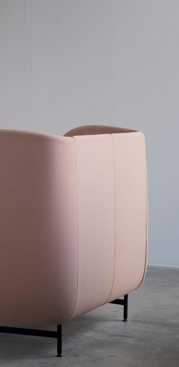

When comfort meets collaboration, creative possibilities abound. Here’s where the workplace can be redefined into a hub of creativity and teamwork with Plenum™ Cabin, the latest innovation from the renowned Plenum™ series designed by Jamie Hayon for Fritz Hansen.
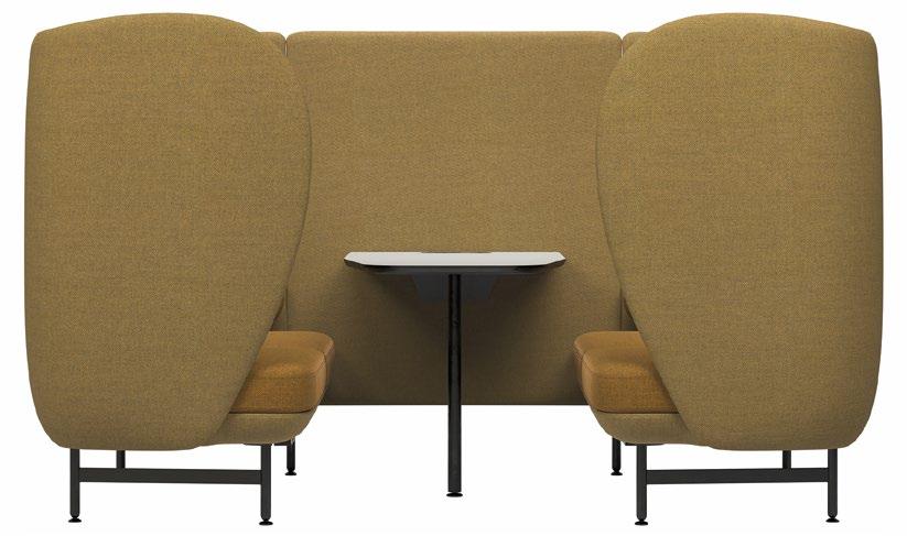
For those familiar with the Plenum™ series, the signature curved designs with high backs pair functionality and style to create aesthetically appealing and inviting spaces to work, meet and relax. Taking this concept further, the new Plenum™ Cabin collection offers a range of Cabin types that cater to various needs within the office environment. Whether you need a single or multipleseater, high or low table, the collection is available in 1-seater, 2-seater, or 3-seater configurations, making Plenum™ Cabin ideal for creating cosy work hubs.
From a quiet nook for focused work to a dynamic space for collaborative projects, Plenum™ Cabin is a highly adaptable element to elevate the office experience. With its high-back design, Plenum™ Cabin offers privacy without compromising versatility for conversations and informal meetings, even in the busiest open spaces. With various customisation options, including an integrated screen of up to 27” and clever internal cable management, the Plenum™ Cabin ensures a clean and professional look. The integrated table adds another layer of functionality to ensure productive meetings.
TOP: High or low tables pair seamlessly with Plenum™ Cabin to offer more possibilities for work meetings or solo work.


“WITH PLENUM™ CABIN, MY AIM WAS TO CRAFT A SPACE WITHIN A SPACE – A HAVEN FOR INTIMATE CONVERSATIONS AND INFORMAL GATHERINGS. IT’S NOT JUST A CABIN; IT’S AN INVITATION TO CONNECT, TO SHARE, AND TO EXPERIENCE THE BEST OF HUMAN INTERACTION IN THE WORKPLACE.”
Jamie Hayon, Designer
Additionally, the Cabin can be tailored to suit any office interior, with high-quality textiles available in a wide range of colours, including recycled textile options. This fully customisable aspect extends to the upholstery, where you can choose a single textile or a mix of two textiles for the shell and cushions, allowing you to create a truly unique piece that fits your space perfectly. The upholstery on the seat, back, and side cushions, which are subjected to the most wear and tear, can also easily be replaced, ensuring the longevity of the product.
“With Plenum™ Cabin, my aim was to craft a space within a space – a haven for intimate conversations and informal gatherings. It’s not just a Cabin; it’s an invitation to connect, to share, and to experience the best of human interaction in the workplace,” Jamie Hayon remarks.
FRITZHANSEN.COM
TOP LEFT & RIGHT: The series can adapt to any space and meet practical needs with optional power plugs, USB ports and table options.
BOTTOM: The high-back sofa Cabin can be customised with a screen of up to 27” and internal cable management for a clean look.


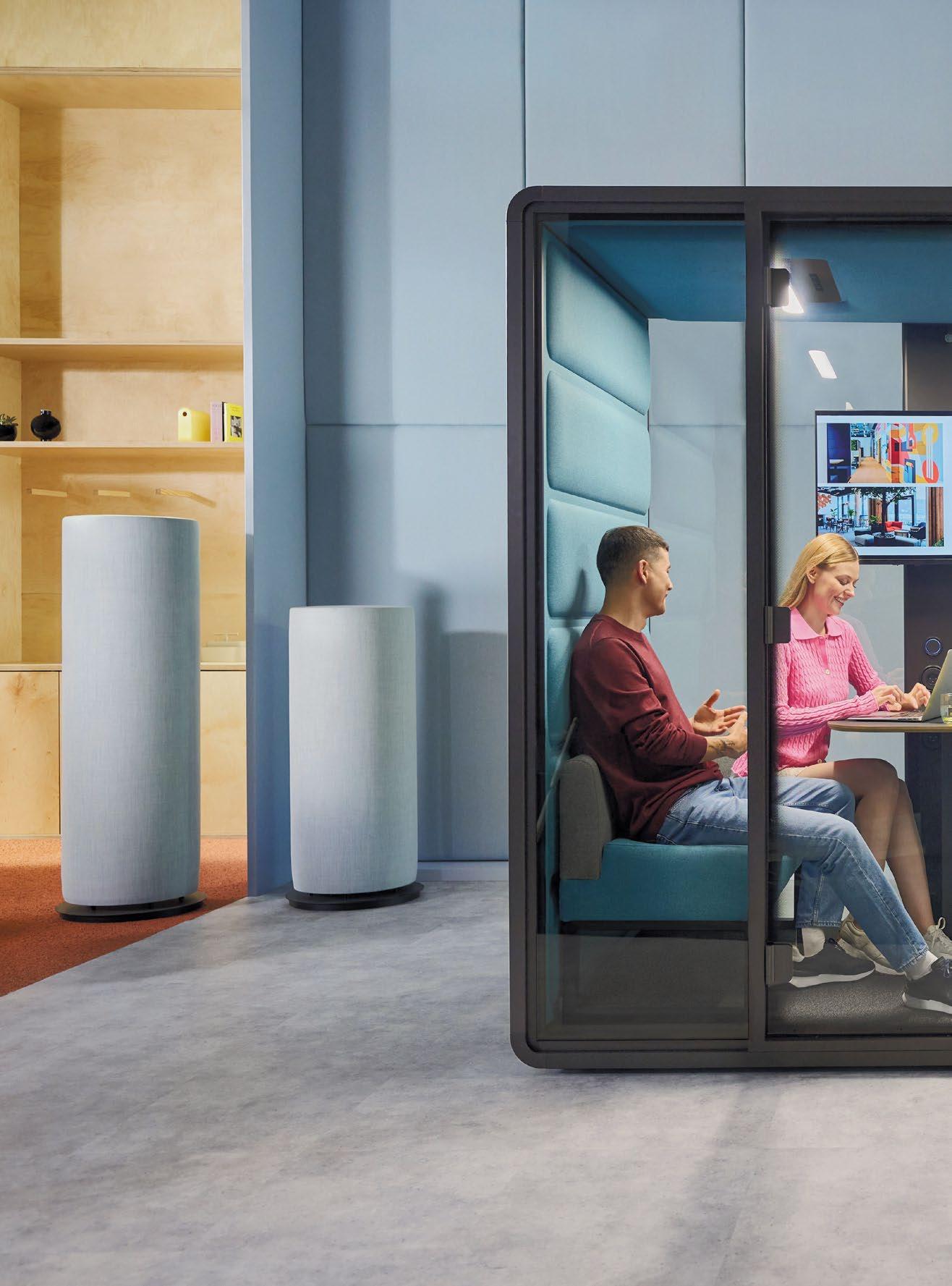
HAWORTH REDEFINES OFFICE ACOUSTICS WITH INNOVATIVE SOLUTIONS, HELPING ORGANISATIONS CREATE WORKSPACES THAT FOSTER PRIVACY, FOCUS, AND OVERALL WELL-BEING.

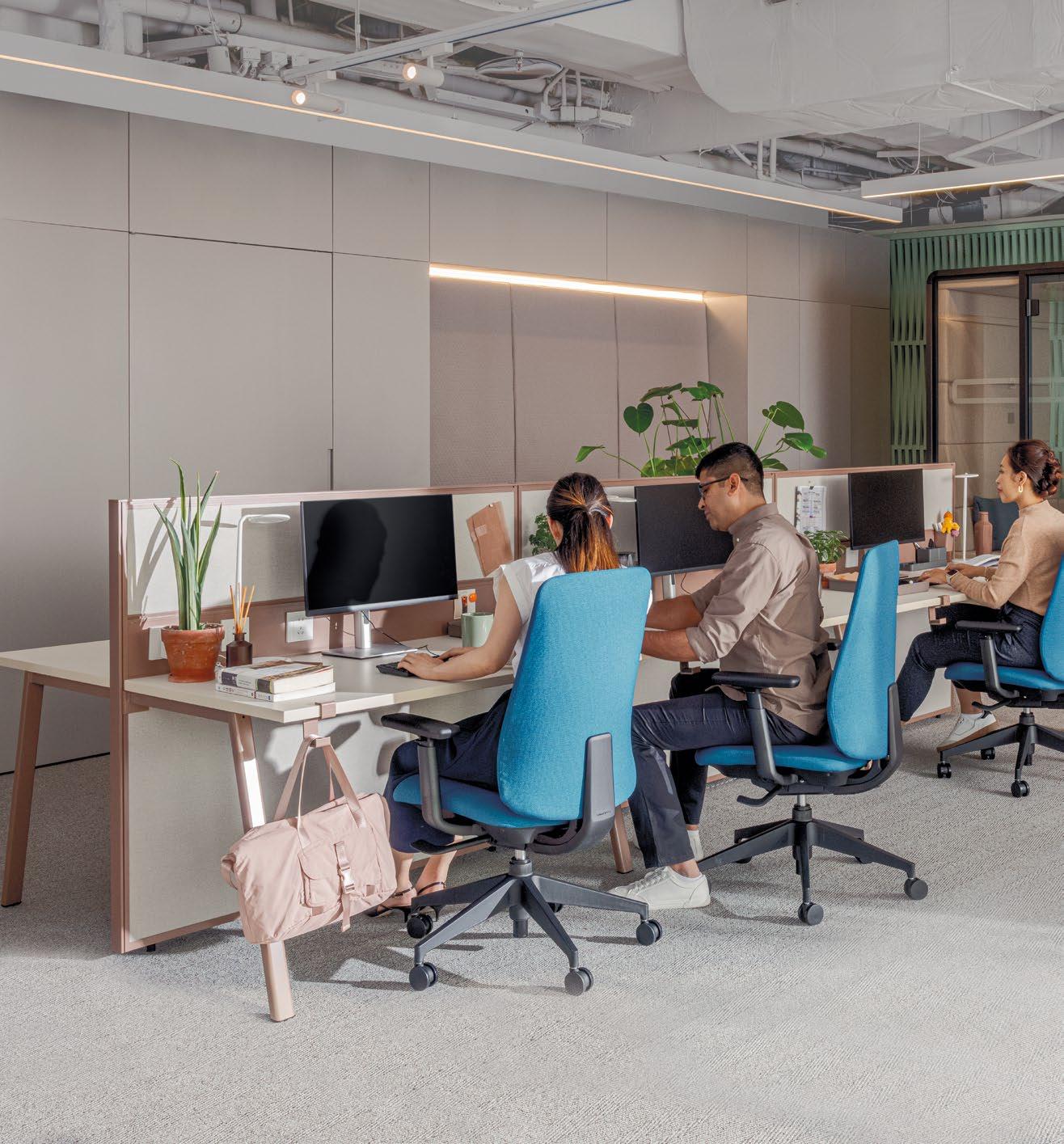
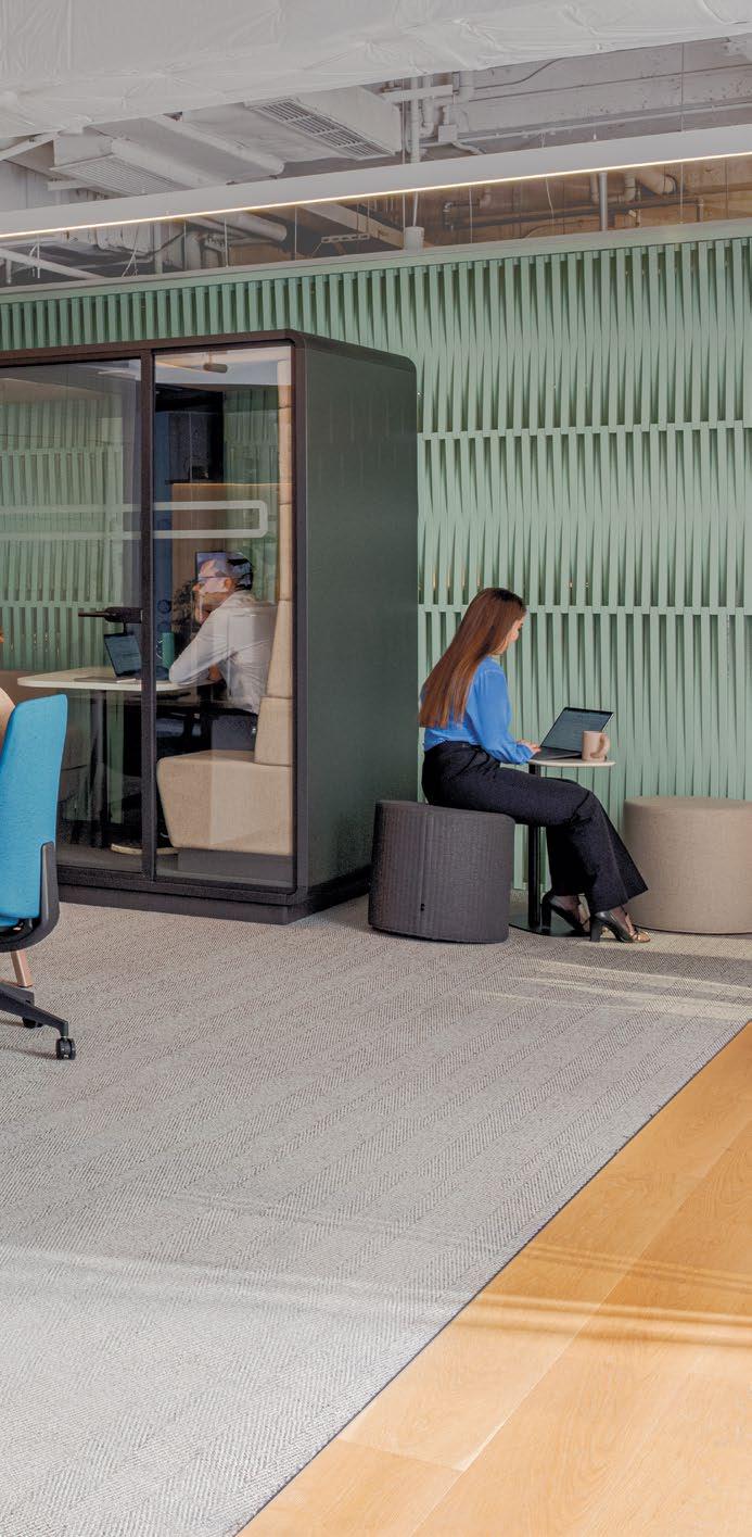

In today’s dynamic workplace, privacy and focus are paramount. Employees need an environment where they can concentrate on their tasks and hold confidential discussions without distractions. Haworth addresses these demands with a comprehensive approach to managing office acoustics, ensuring a harmonious balance that caters to diverse needs.
According to Haworth, well-designed office acoustics offer multiple benefits that contribute to a better workplace. Minimising distractions helps employees maintain focus, leading to higher productivity, enhanced communication, and more effective collaboration. Additionally, improved acoustics reduce stress and fatigue, promoting overall employee well-being.
Nevertheless, creating a soundproof office environment is complex due to our hearing sensitivity and the need for privacy. Here’s where solutions like dividers, specialised lighting, rugs, and phone booths can effectively control noise by altering how different surfaces interact with sound waves.
“An effective acoustic design takes a holistic approach by applying several solutions in various combinations to meet the needs of the space and the people in it. We refer to this as the ABCD of acoustical workspace design, or using elements that absorb, block, cover, and diffuse sound,” explains Haworth.

Haworth’s BuzziNest Pod and BuzziNest Booth are both designed to meet these stringent acoustic requirements. BuzziNest Pod reduces distracting noise and offers a spacious booth that accommodates up to four people, providing a private space for meetings and collaboration without disruption, even in open-plan offices. For individual users, the BuzziNest Booth offers a compact, private space for focused work and calls, ensuring minimal disturbance. These booths offer an appropriate level of acoustic comfort, avoiding the unnaturally complete silence that can often feel unsettling.
In addition to these solutions, customers are increasingly seeking cost-effective alternatives to traditional drywall construction commonly found in conference rooms. Haworth’s Hushoffice pods stand out in the market by offering unique, flexible advantages tailored to contemporary needs. With customisable features and cutting-edge technology, Hushoffice pods deliver unparalleled sound isolation and comfort, ensuring a productive and harmonious work environment.
HAWORTH.COM

AN EFFECTIVE ACOUSTIC DESIGN TAKES A HOLISTIC APPROACH BY APPLYING SEVERAL SOLUTIONS IN VARIOUS COMBINATIONS TO MEET THE NEEDS OF THE SPACE AND THE PEOPLE IN IT. WE REFER TO THIS AS THE ABCD OF ACOUSTICAL WORKSPACE DESIGN, OR USING ELEMENTS THAT ABSORB, BLOCK, COVER, AND DIFFUSE SOUND.

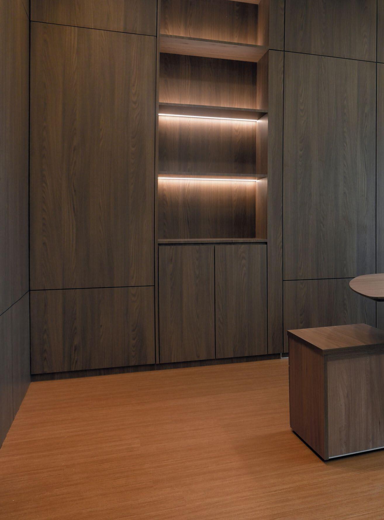
BRISTOL’S SIGNATURE OFFICE PIECES TAKE THE LEAD IN A DIGITAL BANK’S OFFICE INTERIOR, RESULTING IN A HIGHLY EFFICIENT WORKSPACE THAT PROMOTES INNOVATION AND COMFORT.


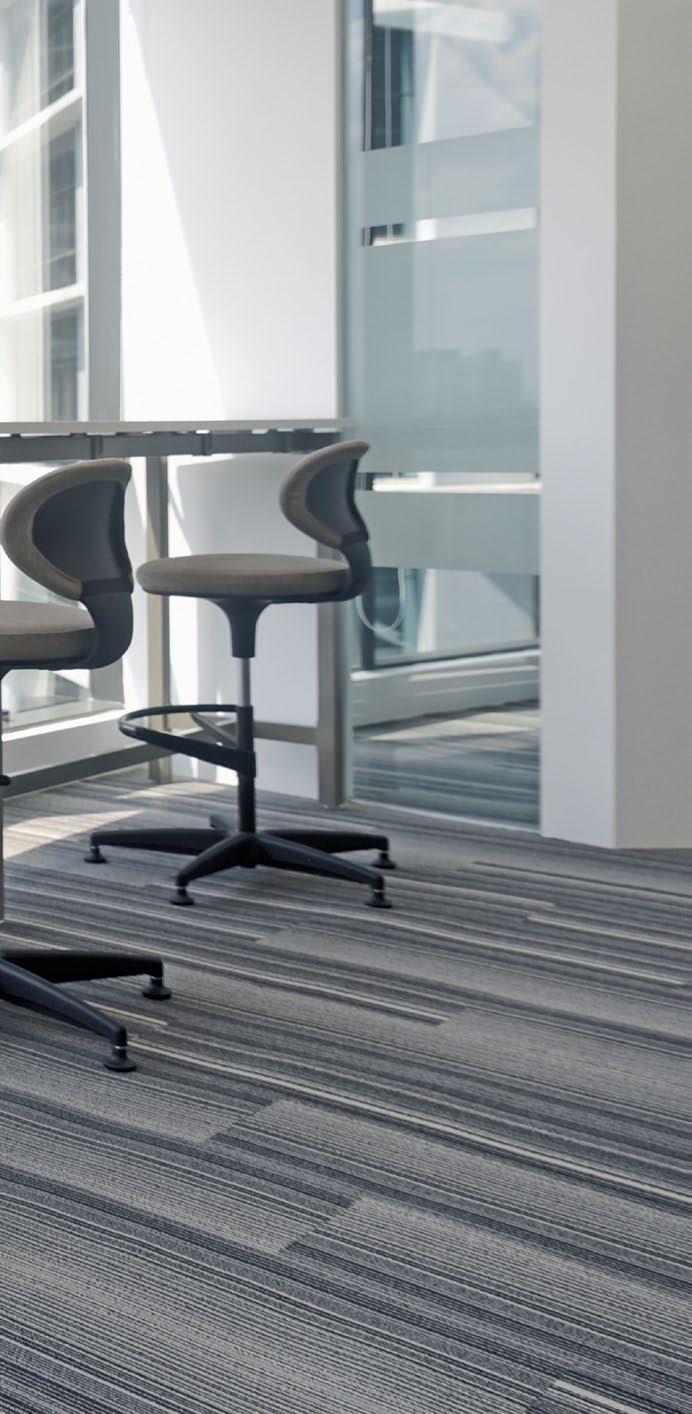

An environment that fosters efficiency, innovation, and employee well-being is paramount when it comes to modern workspaces. Embracing this trend, a leading digital bank teamed up with Bristol to design and furnish the key areas of their new office interior. By understanding the unique requirements of this digital bank, Bristol has successfully created a workspace that supports the bank’s operational goals while ensuring employee well-being.
A vital element of this office interior is Bristol’s Artiv system, which comprises desking solutions tailored to accommodate the dynamic nature of the bank’s modern workstyles and technologies. The Artiv desking system provides flexibility and enables seamless collaboration among employees. This adaptable system also allows easy transitions between different work modes, supporting both individual tasks and group discussions. Aesthetically, its sleek design contributes to a stylish environment.
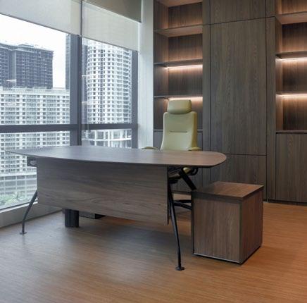
Other signature collections like Liven, Ginko, Presa V2, Como Office, and Como Desking were also strategically implemented throughout the office. In the executive room, a sophisticated wood-toned palette sets the stage for Bristol’s Como Desking and Liven chair. Liven, one of Bristol’s bestselling executive office chairs, combines modern elegance with ergonomic comfort.


A VITAL ELEMENT OF THIS OFFICE INTERIOR IS BRISTOL’S ARTIV SYSTEM, WHICH COMPRISES DESKING SOLUTIONS TAILORED TO ACCOMMODATE THE DYNAMIC NATURE OF THE BANK’S MODERN WORKSTYLES AND TECHNOLOGIES.

The open work area, which offers stunning city vistas, is enhanced by the Ginko chair and Artiv table. Inspired by the Ginkgo Biloba leaf, the Ginko chair features a lightweight and flexible form, making it suitable for various environments. Whether in offices or meeting and collaborative spaces, the Ginko chair’s versatile design adapts effortlessly to formal and casual settings.
In the main office, Presa V2 office chairs complement Artiv desks, enhancing the workstations with comfort and style. Presa’s spacious, cosy seat accommodates various body shapes, while its high-quality backrest netting promotes air circulation and supports any posture, ensuring a pleasant seating experience. In combination with the Artiv system, Presa chairs provide employees with a conducive space for tasks that require long hours.
To inject a touch of creativity into the bank’s meeting rooms, Bristol’s Artiv meeting table and Como chairs bring forth a vibrant appeal. These pieces are designed to foster a lively and engaging atmosphere, encouraging innovative thinking and effective communication during meetings.
BRISTOLFURNITURE.COM


