Table Of Contents
01. Pg 6
Round One
Three Keywords
R1 Rough Sketches
R1 Refinded Sketches
02. Pg 45
Round Two
R2 Rough Sketches
R2 Refinded Sketches
R2 Digital Sketches
03. Pg 58
Round Three
R3 Hand Sketches
R3 Digital Sketches
Further Refined The Final Logo
04. Pg 68
Visual Research
Standard Inspirations
Look-a-like Logos
Round One
Three Keywords Camp one Camp Two Camp Three
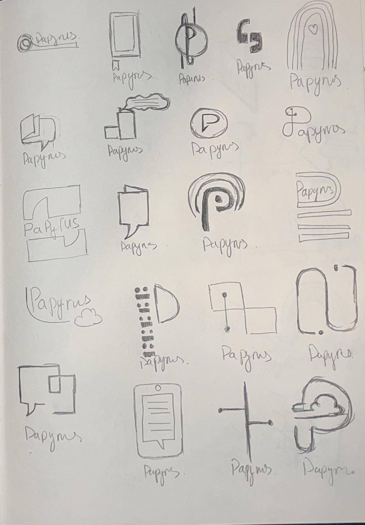
Based on the rebranding direction that I planned, to move forward, this week I am working to generate the logo ideas for the new Papyrus. In the first step, I picked 3 keywords for the project and explored 300 rough sketches based on the 3 categories. At this point, everything is drawn by hand.

Keywords
Connection – Showing your inner self.
We created a platform where customers can stay connected by expressing their inner thoughts to their loved ones, not only that, but we could also easily deliver your message to that person by click. With Papyrus products and services, we help you to speak and deliver better.
Celebration – Spark of joy
In those special moments, we are here to help you celebrate joy in many ways, both physically and digitally. Because we believe that in today’s world, celebration has no limitations and is accessible to anyone.
Inviting – Fun and Love
With the re-imaging of Papyrus, the company wants to bring a fun and inspirational platform to all customers. With our new products and services, we want to encourage people to express their message to their friends and family, with no hesitation, the interaction could spread more invitations to others.
We connect people so they can share meaningful and joyful interactions and help them express feelings, enrich their lives, and cherish memories.
Connection
Showing your inner self.
We created a platform where customers can stay connected by expressing their inner thoughts to their loved ones, not only that, but we could also easily deliver your message to that person by click. With Papyrus products and services, we help you to speak and deliver better.


Celebration
Spark of joy
In those special moments, we are here to help you celebrate joy in many ways, both physically and digitally. Because we believe that in today’s world, celebration has no limitations and is accessible to anyone.


Inviting
Fun and Love
With the re-imaging of Papyrus, the company wants to bring a fun and inspirational platform to all customers. With our new products and services, we want to encourage people to express their message to their friends and family, with no hesitation, the interaction could spread more invitations to others.


Sketch book


Round Two
Rought Sketches Digital Sketches
The process of narrowing the idea is based on both “connection” and “celebration”, which are very important to us. So, we want to find a new element in the between to balance the whole new logo idea, “upbeat” is the new approach for Papyrus, wants to show the fun, happiness from clients while gifting to their loved ones.
R2 Sketches


R2 Digital
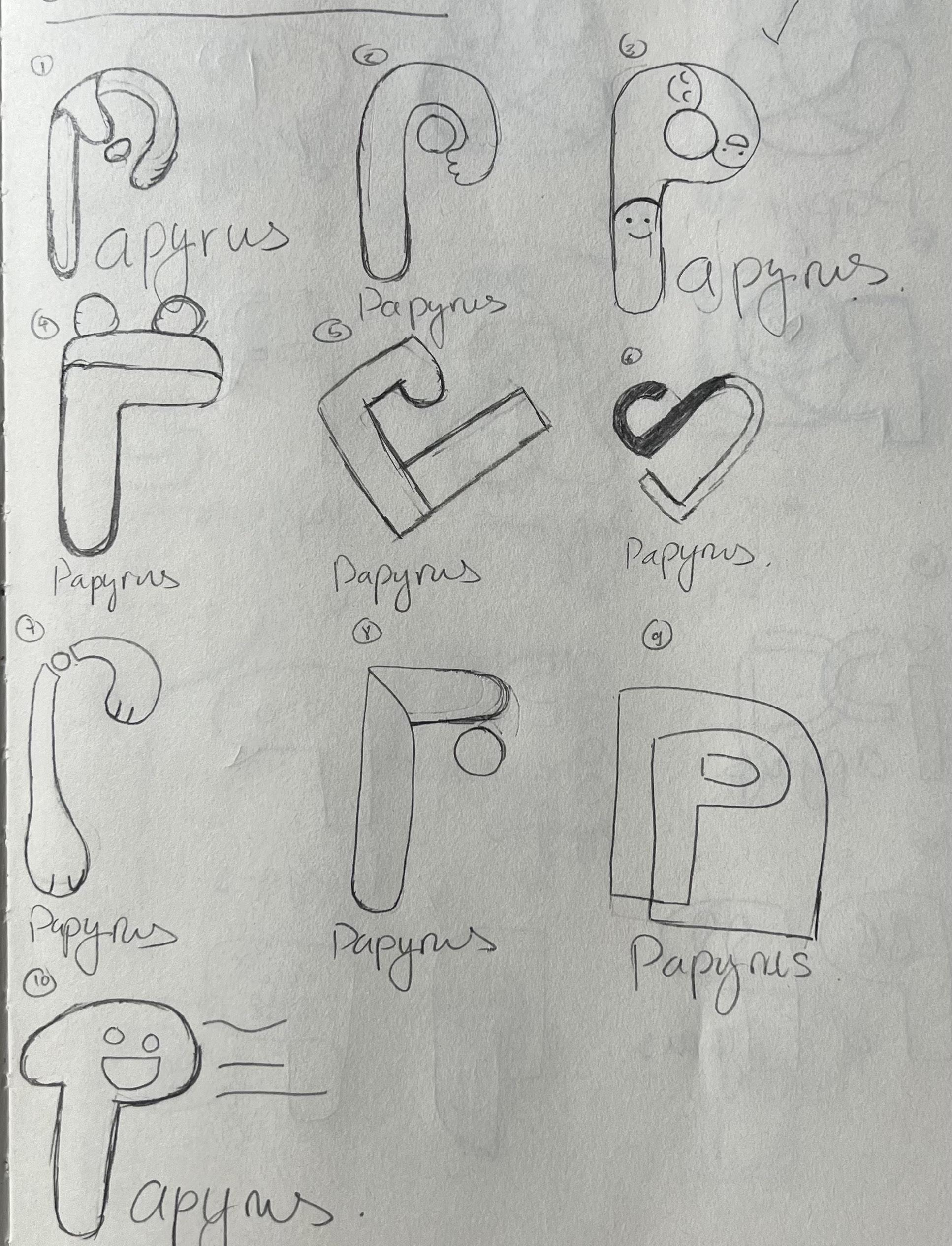
In round 2, I want to focus on the letter P to creating the logo along with the original ideas that we want to express.


The smiles are running into the letter P shade, it
This is a combination of the original paper shop
The letter P and the chat icon express a good
I combine the ideas of Joy, Gifting and Letter P together to create a happy face box, which

The idea of P in the gift box, it’s using the shape of the opened box and the letter P, creat -

With a big letter P and placed a shape of a gift box in there and create a shadow to highlight
This design expresses the idea of a gift box that was created by a unique shape of letters P, and


Create a letter P with a smiley face that creates
The letter P was created by the signature paper
The idea of the logo is when you looking down
Round Three
Rought Sketches
Digital Sketches
Final Logos
Continued the exploration in the 3rd round for new possibile ides of Papyrus new look, where it inspries from the happiness with pop of youthful colors. This is about new direction and path to tell viewers, Papyrus is just not a card store anymore.
Option 1
Using the original idea of letter P but in the shape of 3D, this could show case the brand, also what the new Papyrus offers to the consumers.


Option 2
Using the original idea of letter P but in the shape of 3D, this could show case the brand, also what the new Papyrus offers to the consumers.


Option 3
Using the original idea of letter P but in the shape of 3D, this could show case the brand, also what the new Papyrus offers to the consumers.

Final Logo
The new logo is inspired by the amalgamation of the letter P, which creates a gift box idea that we are looking down from above, the repetition of letters P are represented the connection of people, Papyrus also uses the 4 main colors celebration colors to bring customers closer together.
#FFC750 RGB: 255, 200, 80 CMYK: 0, 25, 80, 0
Visual Research
Visual Guideline
The process of research is always important while building/ rebranding a new image for the company. Because the Visual Standard Guideline from other brands could help us to define our own brand system. This section, I am doing the standard guideline system and get inspiration from them, to build up a strong foundation base for the new Papyrus.

New Indentity
Google:
Google used to know for their search engine, the company did not stop there, they introduced the new workspace that included Calendar, Cloud Storage, Mail and Password security. When they introduced these new services/products, Google was not just a search engine anymore.

Logo Anotomy
LG:
LG is a perfect example of Logo Anatomy by using the letter L and G, why is that? Because the logo presented the idea of Humanity and brand name very well. Viewers could notice easily the human face and letter L and G within the logo, the balance between those two factors are very well-balanced, the overall logo has a harmony connecting the brand soul and name.

Type Specs
Apple:
The best on the market right now is Apple, they created an interface system that could be on different products for developers and users, the system has a very clean and unique look to it, which connects with brand very well. Apple shows us how as a brand, we could use typography to connect all the products together.

Main Id Colors
PayPal:
The PayPal color charts have been separating the primary brand colors into RGB, CMYK and PMS. The colors not just showing the brand voice but also helping the whole brand to stay consistent throughout the visual system, that helps to bring a cohesive vibe for the whole company.

Logo Dont
Spotify:
There are many ways of Logo Donts on the market, here are some examples from Spotify that show us some bad ideas. These could help us to understand a better idea of what we should and shouldn’t do while designing and creating a better and higher quality logo.

Main Id Colors
Disney:
It’s very important for a brand to offer different versions of their logo, Disney is a good example for us to learn from. They go from full display of Disney with a castle, to Walt Disney, to Disney, and their signature handwritten letter D, all the versions of the logo have enough recognition to the viewers.


