
51 minute read
Creative Hero


Nata dalla collaborazione fra l’Istituto Salesiano San Marco di Mestre, Confartigianato Impresa Vicenza Sistema Comunicazione e TicTac Stampa di Thiene, con Epson e Cartes come sponsor tecnici, Creative Hero è la competizione aperta agli studenti delle scuole grafiche di tutta Italia che vogliono confrontarsi sulla realizzazione di un progetto creativo per brand che sottopongono ai partecipanti i loro obiettivi attraverso un brief. Un’occasione importante per imparare sul campo i trucchi del mestiere di designer, confrontandosi con le esigenze tecnico-produttive dei progetti e, soprattutto, lavorando in squadra e mettendo in campo un sano spirito di competizione come stimolo alla creatività.
Misurare il proprio valore, imparare divertendosi
Sono Benedetta De Rossi, Creative Hero 2020 con il progetto per il briefer Birrone, e Simone Piatto, Creative Hero 2019 con il progetto per la Birra Cimbra, a raccontarci la loro esperienza di concorrenti: «Tenendo da parte per un momento gli aspetti educativi, il concorso è un’occasione per divertirsi» dice Benedetta, che ha partecipato a tutte le edizioni, si è appena diplomata e sta per intraprendere gli studi all’ISIA di Urbino. «Quando si lavora su un progetto con degli amici – nel mio caso, Andrea e Riccardo – dei professori entusiasti e dei committenti reali ci si dimentica del fatto di essere a scuola». «La cosa fondamentale per me – dice Simone, che ha partecipato a due edizioni prima di diplomarsi – è stata lavorare in completa libertà fuori dal luogo scolastico. Io e il mio compagno di squadra, che è prima di tutto un amico, ci siamo divertiti oltre che aver lavorato sodo». Divertimento e libertà creativa prima di tutto, dunque, ma anche un’introduzione pratica alle dinamiche che sottendono il mondo del lavoro, dal rapporto col cliente agli aspetti legati alla produzione: «Cimentarsi con i briefer ti permette di mettere in atto un iter di progetto costruttivo e reale, molto diverso dal modo di eseguire un esercizio scolastico. Il ruolo dei professori è stato proprio questo: darci consigli su come affrontare una committenza reale piuttosto che correggerci ogni singolo errore di progettazione grafica» dice Benedetta. «Quando ti viene un’idea devi capire se è realizzabile» dice Simone. «Approfondire gli aspetti legati alla stampa e ai materiali mi ha aiutato a ritoccare e curare meglio l’idea per capire la strada da percorrere». Non da ultimo, poi, emerge l’aspetto della competizione, vissuta in maniera estremamente costruttiva: «La gara – dice Benedetta De Rossi – è un incentivo in più per impegnarsi. La competizione ti stimola ad approfondire il progetto e revisionare anche tutti quei piccoli errori che normalmente si considererebbero superflui». «Prima di tutto ci deve essere una competizione con se stessi: se non si cerca di superarsi ogni volta non si cresce come creativi e come grafici» conclude Simone Piatto.


L’importanza del rapporto coi briefer e con la stampa nella formazione dei giovani grafici
Un punto di vista sugli aspetti educativi del progetto ce lo forniscono Pierangelo Manenti, docente del laboratorio di Tecnologia Grafica del Patronato San Vincenzo di Bergamo, e Marco Capezzone, docente di Grafica all’Istituto dei Padri Somaschi di Ariccia (Roma). «In Creative Hero abbiamo riscontrato un alto grado di professionalità, uno stile particolare e molto innovativo rispetto ad altri eventi» dice Manenti. «È coinvolgente vivere con i ragazzi il periodo del contest, vedere come nascono le idee e come vengono sviluppate nel tempo». Per Marco Capezzone, che come docente ha scelto di partecipare alle ultime tre edizioni, «l’idea di confrontarci con altre realtà scolastiche e soprattutto realizzare delle grafiche commissionate da briefer importanti è stata determinante. Il format proposto dall’organizzazione – prosegue Capezzone – è uno dei motivi del successo delle edizioni. E anche io ho tratto beneficio dai Contest in quanto mi ha permesso di apportare dei correttivi riguardo le materie che insegno». Sul valore del coinvolgimento dei briefer dice ancora Manenti: «Partecipare al brief di un cliente porta gli studenti ad avere un alto tasso di attenzione e di conseguenza molta insicurezza nella fase iniziale del lavoro, ma proprio per questo permette loro di capire quanto è importante il rapporto che si costruisce con il cliente». Capezzone pone anche l’accento sulla collaborazione: «Alla base di tutto c’è il lavoro in team, dove ogni singolo studente mette a disposizione del gruppo le competenze acquisite. Il fatto di competere con altri grafici permette di alzare l’asticella e di conseguenza fornire prodotti di elevata qualità». Ma quanto è importante nel percorso degli studenti approfondire il rapporto con la stampa, dal design alla scelta dei materiali fino alla produzione? «Un buon grafico – prosegue Capezzone – deve essere il più possibile a conoscenza dei vari aspetti e strumenti della stampa, in particolar modo quelli di ultima generazione. Inoltre la conoscenza dei materiali è indispensabile per una buona riuscita di un prodotto, basti solo pensare all’evoluzione che ha avuto in questi ultimi anni tutto ciò che è legato al packaging». «Il nostro scopo – dice infine Manenti – è formare ragazzi con competenze che riguardino tutta la filiera grafica. Questo dà agli allievi prospettive importanti e molto apprezzate dalle aziende del settore».
Nel 2021 Creative Hero, giunto alla sua VI edizione, rinnova la sua formula e punta a un coinvolgimento ancora più esteso di almeno 500 studenti provenienti da tutta Italia. L’evento si svolgerà in più tappe nell’autunno 2021: si partirà l’8 ottobre con il brief iniziale, cui seguiranno 15 giorni di laboratorio con gli studenti che consegneranno i loro progetti, a livello locale, il 24 ottobre. I primi di novembre verranno selezionate le nove squadre finaliste (tre per ciascuna challenge) che parteciperanno poi a un bootcamp di due giorni (il 6 e il 7 novembre) in cui, grazie a un’attività di formazione e supporto da parte di esperti, dovranno perfezionare il progetto esecutivo dal punto di vista tecnico, in modo che vengano rispettati tutti i criteri di fattibilità in fase di produzione. Sempre il 7 i progetti verranno presentati ai briefer e l’8 novembre si terrà la premiazione: verranno proclamati i tre vincitori di ciascuna challenge e il vincitore assoluto. Tutte le informazioni su www.creativehero.it

PAGE 8
HOW PRINTLOVERS IS MADE
COVER The lovers inscription reproduces the predominant hot colour of the back cover, i.e. the holographic SB Liquid Select effect of the LIGHT LINE® line.
BACK COVER The diamond in liquid state is hot stamped with the SB Liquid Select effect, already used on the cover. It is a hot-stamped holographic with reflections that recall the changeable fluidity of water. The NOT inscription is enhanced with LUMAFIN® Clear, a transparent satin effect that adds a glossy touch to the design; the same LUMAFIN® is printed in relief on the drop that seals the whole illustration. The clichés are hinderer + mühlich Italia.
CHANGE WATERPROOF PAPER Developed for high humidity resistance, CHANGE WATERPROOF is a paper substrate suitable for all indoor and outdoor applications. It is ideal for projects wrapping plants, outdoor signage, displays and much more. Available from stock in 74x104 cm format, with weights of 175, 275, 320, 360 and 480 g/m2. It can also be produced on request, either in sheets or in reels, in a variety of grammages from 120 to 480 g/m2, single-jet.
PRINTING The back cover was designed to emphasise a luxury that conforms to the beauty and well-being that fill our days while trying to show what is often taken for granted. The printing was entrusted to Komori Lithrone G40, which promotes environmentally sustainable printing by reducing the use of consumables and energy as well as the carbon footprint. The result is a “green” press that uses the H-UV Led system to produce an OffsetOnDemand with no waste and the highest performance level. The back cover is then further embellished by the hot stamping of the key elements of the entire layout through the use of two effects that enhance and at the same time report the message of the precious resource. The holographic LIGHT LINE® leaf imprints a fleeting diamond that is melting while the lightness of LUMAFIN® is completed by a drop placed as a closure, a warning against waste. However, visual attractiveness is not the only criterion, and as a final touch we find an embossing relief that gives the drop a 3D effect so that we can touch the uniqueness of the value of which it is the messenger.
THE CREATIVE PROJECT IS BY ARTEFICEGROUP Luxury: definition That which represents a reason for conspicuous excess, temporary or permanent, beyond the sphere of everyday comfort or satisfaction. Something that adds pleasure or comfort but is not absolutely necessary: one of life’s luxuries. But what if something we have always taken for granted, like drinking a glass of water, became a luxury? More than two billion people still do not have access to drinking water, and water will increasingly become a scarce resource. Let luxury continue to be associated with the beautiful, the dreamy and the unnecessary. Water cannot be a luxury. Working team: Tiziano Saitta Ketija Feldmane Valeria Di Girolamo
PAPER
GRUPPO CORDENONS On the back of a long tradition, Gruppo Cordenons has specialised in developing creative papers, using the most advanced technologies and maintaining intact its vocation for creating high-end products with refined attention to detail. A specificity that distinguishes the company on the world scene and thanks to which it has developed a unique portfolio that today has over 2,500 reference points. Papers that differ in terms of type and application target, characterised by pearlescent, metallic and iridescent effects; by coatings that reproduce the softness and brightness of silk; by the look and feel of genuine leather and cards with a rubberised effect. In addition to these, there are the natural, soft-to-the-touch products thanks to the presence of cotton fibres and the eco-friendly ones produced with recycled fibres. Through an increasingly flexible production, Gruppo Cordenons offers customers - in addition to the wide range in the catalogue - the possibility of requesting supplies of customised papers based on specific colouring, weight and finishing requirements. www.gruppocordenons.com
PRINTING AND BACK COVER ENHANCEMENTS
VARIGRAFICA Varigrafica has been in the printing business for over 50 years, and today it is a leading company in Italy. Thanks to its experience and knowhow, it is equally at home in international markets. Reliability and quality have increasingly become keywords, thanks to the passion present in the ownership and staff; passion that supports and is supported by an impressive fleet of machines from prepress to finishing. The product and the customer are placed at the centre of the production process to emphasise quality and cutting-edge technological features but above all the typical Made in Italy aspect: offering a tailor-made experience where the product is designed and created to measure, constantly looking for new solutions to meet changing market demands. www.varigrafica.com
CLICHÉS AND COLOURS
LUXORO Luxoro is the exclusive partner in Italy of the KURZ Group, a world player and international reference point in producing equipment and technology for hot and cold printing. Luxoro wants to spread a new way of thinking about packaging and brand image through its inspirations, new finishing solutions, and high-quality materials studied for unique designs. Whether it’s packaging, labels, publishing, security, cosmetics, automotive, white goods or fashion, Luxoro’s enhancements are always cutting edge and surprising. Luxoro’s decoration technologies and materials are among the best in the world, and expertise in advice and service is a cornerstone of the company’s philosophy. Luxoro is a supplier of decoration materials but it also develops with designers and creative people the best applications to bring their ideas to life. Thanks to strict corporate policies aimed at environmental sustainability, Luxoro has long been a 100% renewable energy and totally zero impact company. www.luxoro.it
ENGLISH VERSION
PAGE 14
CLARINS THE BEAUTIFUL, THE GOOD, THE ENVIRONMENT
Cosmetics created to combine beauty and wellbeing. Clarins also differentiates itself from its competitors in terms of environmental sustainability, attention to people and scientific research. Marie-Hélène Lair, Director of Innovation at Clarins, tells us about this.
BY MARILDE MOTTA
Clarins’ history in the world of cosmetics began in Paris in 1954 and has grown to an international dimension with a presence in 150 countries. Jacques Courtin-Clarins started this success story with his innovative idea of cosmetics based on beauty and wellbeing. An inseparable combination that would guide all subsequent choices of responsibility towards people and the environment, of love for natural and organic raw materials. Clarins is still led by the Courtin-Cla-
rins family, whose members are committed to giving concrete value to the héritage every day and to updating strategies in an increasingly challenging world that requires permanent innovation and sincere attention to the environment. The decision to revise the packaging, without changing the strongly identifying iconic elements, has necessarily opened up new ways of finding creative and efficient solutions, which Marie-Hélène Lair explains to us.
What social and environmental concerns convinced Clarins to change its cosmetics and perfume packaging?
The packaging modifications we plan to achieve are in line with our CSR vision: Making life more beautiful, Passing on a more beautiful planet”. Adjusting outer cartons, reducing packaging, choosing materials from renewable sources, incorporating recycled material and creating a new refill system in boutiques — Clarins packaging is the subject of ongoing research aimed at reducing its environmental footprint to a strict minimum. To go further still, Clarins commits to achieving plastic neutrality by 2025. This ambitious goal is founded on a principle similar to that of carbon neutrality. For the group, it means putting in place new recycling and offset programmes, together with a 30% reduction in plastic usage.
How is your supply chain organized to ensure that, at every level, the packaging complies with sustainability criteria?
Clarins reinforced its program to accompany its most important suppliers (above 5000 euros annually) using a ratings platform developed by Ecovadis. More than 90% of purchases made by the head office were concerned. The goal is not only to ensure that the company is working with partners who share the same values and vision, but also to help those who are looking to make progress and to share knowledge and good practices. Four subsidiaries were involved in this quest in 2019: Mexico, Switzerland Hub (agents and travel retail), China and Japan. The goal is to extend this system to all subsidiaries and adopt the Group’s purchasing policy to minimal thresholds around the four CSR areas: environment, business ethics, human rights and responsible purchasing.
What are the turning points?
For the last several years, Clarins has adopted the ideas of ‘eco-development’ into every new packaging development project. In 2019, the Group put in place an internal tool called the ‘Pack Score’ which, much like the ‘Green Score’ for ingredients and formulas, made it possible to evaluate and compare different packaging ideas for the same product. The goal is to continually improve 100% of new developments around 8 criteria of eco-development: material and its impact, the percentage of recycled material, lightness, bulk, decorative elements, simplicity of the packaging, end of life considerations and the level of restitution of the formula. This activity helps make the Group’s vision a reality: reduce resource use, increase the amount of recycled materials used and develop recyclable packaging. This approach is a global one. It favours responsible materials (all outer cartons and corrugated pieces are sourced from sustainably managed forests) and reducing weight and volume (suppression of product wedges and inserts), along with achieving lighter containers (use of recyclable and recycled material). New packaging ideas are constantly being studied with suppliers to use less resources but also to develop ways to refill products. Clarins’ teams are working to make steady progress in terms of incorporating recycled materials in packaging . Since 2012, all-glass packaging used by the Clarins brand has contained at least 25% recycled glass and since 2019, all new plastic packaging should incorporate some PCR (post-consumer recycled) plastic. The Group’s commitment is to reach 100% recyclable packaging by 2025 by favouring a certain approach to eco-development: the least number of different materials possible, materials that are easy to recycle and can
be easily separated by the customer to facilitate sorting when the product is finished.
Do you think a call for rationality is necessary when addressing customers to explain the changes in your packaging?
At Clarins, we are fond of consumer listening, from our creation in 1954. We know that our faithful consumers want to know more details about our formulas and packagings. We are optimizing our digital communication, by fueling Clarins.com with more data on our ingredients and packagings (raw materials, refill programmes, recyclabililty assets).
What do you think is the optimal container size for the different categories of cosmetics and perfumes?
All our products are already available in several sizes for sampling or travelling. At Clarins our vision is less dealing between scarcity or perception of preciousness than offering to consumers the product size adapted to their daily usage.
It’s easy to benefit from online solutions via smartphone; what plans does Clarins have?
At Clarins, we had already developed, before the Covid crisis, many gaming, tutos, or applications methods, available on smartphones via QR code. We are developing more and more assets to spread our holistic approach online, such as many application gestures to boost the efficacy of our skincare formulas.
The perfume channel and the environmental challenges of packaging
Research is finding intelligent solutions: packaging made from high percentages of recycled materials, refillable packaging that has a long life, containers that express a rational size in relation to the actual possibility of consumption and avoiding waste. With the research centres, we experiment with sustainable, fully recyclable materials. Packaging design is careful to assemble a reduced number of components so that it is easier to separate and recover individual materials. With Luca Catalano, President of Cosmetica Italia in Perfumery, we have discovered how sustainability is an essential requirement for the entire sector. The cosmetics sector is committed to the sustainability of the whole supply chain: ingredients, formulations, logistics, production processes, transport and, of course, packaging, which is the central link in the chain.
Recycle, reuse, reduce are terms that recur in packaging redefinition policies. How are they applied?
Sustainability is the watchword for all companies - every brand has its own programme; in my opinion, within 5 years all brands will boast sustainable products, formulas, transport and packaging. The real challenge for industry and distribution will be to be sustainable with people; you cannot say you are sustainable if people are not at the centre of all processes. I firmly believe that sustainability must start from the individual’s wellbeing: this is the first action that all companies that want to claim all-round sustainability must take.
The perfumery channel is still important; what are customers looking for in particular?
The consumer is looking for exclusive branded products, quality at the right price, which is not necessarily low - it has to be worth what it costs. The customer is also looking for all-round service, i.e. advice on the product, an appropriate range of products based on a price scale and additional services such as a nail bar, a cabin and in some cases a hairdresser.
What are the figures for the perfumery channel in Italy?
A distinction must be made between before the pandemic and today. There has been a significant contraction, and the axis that has suffered most is make-up. Not only because of the mask but also because of being at home so much due to remote working. However, it should be noted
that in the last five years, the market has been enriched by private labels launched by well-known perfumery chains and exclusive brands (i.e. those given over to a single brand) that did not exist in Italy: we are talking about 100 new brands every year. It must be said that the only channel that performed well in these two years of pandemic was the pharmacy, partly because it never closed and, therefore, the cosmetic brands distributed there were always available. The one channel that literally exploded with large numbers was the do-it-yourself sector for hair colouring and hair care.
PAGE 20
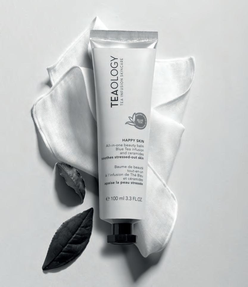
SUSTAINABILITY INFUSED WITH TEAOLOGY
Product innovation, green packaging. We talk to Cecilia Garofalo, founder of the young Italian brand Teaology, about the contemporary approach to high quality, ethical and environmentally friendly cosmetics.
BY ACHILLE PEREGO
Beauty is increasingly eco-friendly - not only in the content but also in the container. The path towards green and biodegradable packaging, saying goodbye to plastic - but also aiming for “zero waste” - has become almost obligatory for the cosmetics industry. From the big international brands to start-ups in the sector, both Italian and foreign, but at any rate present in Italy. A path taken with key partners such as printing companies and, in particular, paper converters because sustainability depends, on the one hand, on the development of new materials with renewed and renewable raw materials, and on the other on an innovative use of paper and cardboard. This is the case of Teaology, a new brand which, in addition to product innovation, has also chosen green packaging from the outset. Teaology was founded in 2016 by Cecilia Garofalo, whose love of tea led her to create a skincare line that would enhance all the extraordinary qualities of tea through an exclusive patent. Garofalo has invested her studies in economics and her professionalism, developed over many years in the marketing of major beauty multinationals, to make her dream come true. “With Teaology,” she says, “we have taken the use of tea to a new level to offer the benefits of effective, clean and sustainable skincare.” This sustainability couldn’t fail to apply to the packaging of this new cosmetics brand, whose product lines are now distributed in over 25 countries worldwide through selective perfumeries, department stores and e-commerce. The patent (Tea Infusion Skincare) that lies at the heart of Teaology’s success, adds the founder of the company, which has its headquarters in Monza, “is a unique technology that makes it possible to use real tea infusion in cosmetic formulas instead of water.” The focus on skin health and the general wellbeing of the body when using cosmetics translates into the choice of the most suitable organic teas (black, white, matcha, green, blue) to be included in each product on the basis of their active ingredients. It’s a range that now includes numerous lines from body creams to perfumes, from eye care to face care, from face and neck masks to the Yoga Line. And there are products that have already become icons in terms of both content and packaging: the Green Tea Detox Face Scrub, an exfoliating detoxifying cream-butter; the Matcha Tea ultra-firming face cream, toning, redensifying and moisturising; the Bancha Oil, an antioxidant, nourishing and brightening concentrate with 99% natural ingredients; Happy Skin multifunctional beauty balm, and Peach Tea Hydra cream - a face cream with infused Blue Tea, hyaluronic acid and prebiotics for smoothing and brightening. Sustainable products that require equally eco-friendly packaging. “We believe in the importance of recycling and separate waste collection,” explains Cecilia Garofalo, “so we are committed to using packaging that is as recyclable as possible and made of a single material to simplify disposal. So boxes and packaging are 100% recyclable and made of certified paper from responsibly managed forests, free of acids and heavy metals. The approach for plastic containers is also 100% recyclable, so we prefer containers made from raw materials of vegetable origin such as sugar cane processing waste and with reduced CO2 emissions. If the type of material is not yet recyclable, we highlight this in the how-to-recycle section of our website. In the context of environmental protection, the cosmetics sector is not only aiming to make packaging recyclable but also to reduce its presence as much as possible. “On the
overpackaging front,” Garofalo continues, “we have eliminated the leaflets in the packaging, thus saving over 500 kg of paper per year. But we have also eliminated superfluous and non-recyclable accessories such as plastic spatulas and brushes. In general, product packaging material is reduced to a minimum. This allows us to use fewer raw materials and to reduce the energy footprint needed for production, transport and therefore disposal.” For cosmetics, it has not always been possible, and still isn’t, to combine green packaging with the preservation of the contents over time, starting with the preservation of the active ingredients. “Natural resources are limited and must be preserved; science offers a safe alternative to avoid the uncontrolled exploitation of precious raw materials for the planet and the lives of its inhabitants,” says Cecilia Garofalo. “We are convinced that science is an indispensable resource for effective, sustainable and clean cosmetics. Sustainable packaging must meet several requirements: safe storage of the product, be made from sustainable materials and be able to be recycled when it has completed its task. This is why we continue to research with our partners and suppliers - Italian companies specialising in the cosmetics sector and active, also in terms of printing and converting, in the search for innovative solutions and sustainable materials - first and second level packaging that fully meets these requirements.”
Any successful examples of this combination of sustainable packaging and proper product preservation? “For example,” says Garofalo, “Matcha Pore cleansing stick. Its 3-in-1 formula requires special packaging with bottom filling and sealing. The stick is made of mono-material and is completely recyclable in plastic, facilitating separate collection and disposal. It is made of 100% recyclable polypropylene, an eco-responsible material because it limits the environmental impact and at the same time guarantees perfect safety in terms of hygiene and product preservation.” Another example of sustainable packaging that is good for the skin and the environment? “The Green Tea Mist has a recyclable aluminium canister featuring Bag on Valve aerosol technology. The BoV consists of a valve to which a bag is welded. The product is placed inside the bag, and only compressed air and no flammable gases are used as propellant. In this condition, the product remains intact and pure because it is always separated from the propellant. So we can talk about zero waste technology because it allows the optimal emptying of the product up to 99%. It improves storage and can be used in any position (360°). It does not require propellant gas, it is hygienic, sterilisable and recyclable.”
PAGE 26
THE GOLDEN AGE OF ILLUSTRATION
The relationship between illustration and printed communication is a story of ebbs and flows. Recently, it has come back into vogue, exiting the publishing field to occupy the spaces of packaging, advertising and visual communication. We talked about it with Ale Giorgini, Francesco Poroli, Riccardo Guasco and Emanuele Basso, who have directed and illustrated campaigns for important national and international brands.
BY ROBERTA RAGONA
Illustrated communication is a cyclical phenomenon in the history of image, coinciding with major changes in society and in printing technologies, in which the way we communicate, the media we use and the people we address change. The first large-scale example was in the 19th century, with the emergence of an advertising industry that required larger-scale printing processes with greater visual impact than publishing output. This was the time of the large colour chromolithographs of the advertising posters of Eugène Grasset, Alphonse Mucha and Toulouse-Lautrec. And of the Arts and Crafts Movement, which, in response to the changes of the Industrial Revolution, proposed a fusion of art and industry in which the useful was beautiful, and the beautiful was useful; an important role was also played by printed illustration, which we would now call surface design. In the early 20th century, the phenomenon reappeared: the popular illustrated press exploded, leading to an even greater permeability between the fine arts and the commercial arts in terms of authors and expressive language used, now familiar to the public’s eyes. This periodic return to illustration in brand communication responds to a need for synthesis and storytelling that few other media possess. In the last decade, we have found ourselves in what many consider to be the golden age of illustration. A combination of factors has contributed to this phenomenon: from a generation of authors and artists with a strong awareness of the potential of the medium and tools for critical reflection of their work to greater awareness on the part of communication professionals regarding the use of this language, especially when used in effective combination with graphics, stationery and motion design. Changing audiences, changing brands The return to the use of illustration also has to do with a change in the public, as Ale Giorgini, illustrator and creative director of the Grani D’Autore Barilla project, points out. “Illustration in the publishing sector has always had its own specific role that has never been questioned. Conversely, one of the reasons for this rediscovery in the packaging and communication sector is the need for brands to come into contact with an astute consumer, constantly immersed in a flow of information and content. They have all the tools to evaluate which product they think is best, so they need to be involved in a more narrative way. We are talking about a public that builds its own schedule of information and entertainment, which must therefore be met on that same terrain.” This is a communication method that has been built up over time, as Riccardo Guasco, who recently carried out projects for Esselunga and San Carlo, among others, says. “In the early years, companies experimented with web and social communication, the most immediate testing ground. The positive feedback opened up the field to increasingly bold projects with limited editions and targeted campaigns. If, on the one hand, there is Mondrian and, on the other, the famous L’Oréal packaging, illustration is somewhere between these two communicative extremes: it draws attention to the product by giving it an authorial voice. This ability to take stimuli from the most diverse fields - from art to pop culture - and rework them into a personal language is what makes illustration a remarkably flexible tool among those available to a creative agency, as Emanuele Basso, creative director of The6th, points out. “In the case of the Zedda Piras campaign, commissioned by Wunderman Thompson, we had references, but we also thought of the style of the Orgosolo murals with their figures broken up into geometric shapes, a somewhat Cubist style, with flat colour fields but material and rough. The illustrators who worked on the campaign were also inspired for some shots by sequences from Breaking Bad, an unexpected source given the serene tone of the animation, but one that suggested interesting solutions. Once the storyboard was approved, one of the illustrators took care of the characters and another the landscapes, in a continuous dialogue and exchange of brushes and palettes to harmonise the style and atmosphere. The animator then intervened on this illustration work because this is also an interesting aspect: the possibility of continuing the story with other means and methods.” The rediscovery of illustration has also led to a maturation on the part of brands, which have refined their ability to recognise and search for the right style for their tone of voice, working directly with the authors. Francesco Poroli, who curated the Eataly all’Aperto project for Illustri, notes, “Another big change in recent years is that it used to be agencies that proposed the inclusion of illustrations in their communication strategy, but now it is increasingly the brands themselves. I think this is a sign of maturity and confidence in the illustrator’s ability to communicate across the board. Illustration can visualise and tell stories in a democratic way, with a language that can be understood by any age group and type of audience without the need for translation.” Infinitely big, infinitely small But how does an illustrator fit into the variety of print applications of brand communication? If the same illustration goes from the infinitely small of packaging to the infinitely large of wide-format signage, all the way to wrapping for buses or, as in the case of Eataly, outdoor kiosks, and if everything is printed with different techniques on different media, how does one manage the workflow? For Giorgini, it’s definitely a team sport. “I find projects where you press down on the accelerator of creativity in terms of material and printing technique exciting. A few years ago, I designed a sleeve for the limited edition of a wine from the Banfi cellars that completely covered the bottle. For this year’s limited edition though, we are considering silk screen printing directly on the glass. During the design phase, I created the illustration with a deformation in perspective to follow the shape of the bottle so that once it was applied to the surface, the image could be read correctly. It’s a job that goes hand in hand with those who have expertise in the technical aspect of printing and materials; it’s difficult for an illustrator to be up to date on what the latest printing technologies are – it’s always a dialogue with other professionals. Some time ago, I was struggling with how to print personalised pizza boxes, and I discovered the existence of a digital printer for the direct marking of 3-D objects. Without a chance conversation with a person who deals

with printing, I’d never have discovered a technology that opened up a world of possible solutions for me”. As is often the case, when faced with such a wide variety of substrates and types, you have to think in strategic terms, as Poroli recalls. “Working mainly in vector graphics for digital printing, the workflow doesn’t change particularly on a technical level; it’s more a reflection on how the content will be used. Illustrating for a 3x4 cm Campari stamp or a 14 metre Eataly kiosk is different, especially in terms of its use. What level of detail can I allow myself? A stamp is a small space, but it’ll be closely observed, whereas the kiosk is a large space that has to provide interesting visual stimuli but will not be observed in detail like a work of art: it’s part of an overall experience of the space it’s in”. The solution may be to see the illustration as part of the ecosystem dialoguing with the rest and incorporate this thinking into the process. Says Guasco, “Lately, I like to work in a modular way, inserting the elements of illustration within an organic flow, which allows me to go from 6x3 metres to a postage stamp with an image that continues to function effectively. For a restaurant in Romagna, I created an illustration that recalls the iconic elements of the area, broken down into its construction elements to make coasters, images of the menu and other communication elements. To work in this way, you have to listen carefully and not limit yourself to when the brief takes place: it’s a conversation. The project for San Carlo, for example, came out of feedback from several focus groups and tests carried out on the international market, which showed that San Carlo’s packaging communication - with its elegant, clean and graphic approach - was not equally effective in all markets. So the brand decided to create a packaging series with a richer style but in line with its own communication and chose illustration. From there, an extremely detailed agency work started, with precise references. As they’re mainly addressed to the foreign market, each packaging tells the story of the product in its peculiarities and different cities to evoke the Italian lifestyle. This work also features the modular composition I mentioned earlier, which the brand and the agency had seen in a previous job for Campari and had found suitable for their own packaging too.”
Immersive experiences
The Grani D’Autore Barilla project also came out of the dialogue between the client, the agency and the illustrators. It has expanded into different media from an initial central nucleus, adapting to continuously changing circumstances, as Ale Giorgini tells us. “When Barilla started communicating its Manifesto del Grano Duro Italiano, Omnicom PR Group Italia contacted me to develop a project that would help spread a ‘policy document’ to a wider public. Ten points outlining the production approach and the decision to use only 100% durum wheat produced in ten specific zones of Italy, and what actions Barilla intended to take to enhance the area and the communities; for each of these points, ten illustrators from the different production areas were involved. The illustrations were also used on the packaging of some of Barilla’s most iconic formats, on a series of limited-edition dishes and on traditional merchandising media, such as shopping bags and diaries. The packaging also hides extra content in augmented reality: by framing the packaging with your smartphone, you can see the illustrations come to life. This was supposed to be followed by a series of local events, but the pandemic got in the way, and we re-imagined them in a different form. First a free exhibition, outdoors and open to everyone at BAM - Biblioteca degli Alberi in Milan - even when there was the red zone of the pandemic; then at the Triennale di Milano, as soon as the museums reopened, curated by myself and Maria Vittoria Baravelli in an installation created by Il Prisma with an immersive experience, in which the illustrations were surrounded by videos of the ‘making of’ described by the illustrators themselves and by animations in augmented reality.”
The live component is also at the heart of the Eataly all’Aperto events with Illustri: “The project derived from the request to tell the story of the moment when we open ourselves up to others, being together and re-appropriating an urban space to make it convivial,” says Poroli. “Starting with a
shortlist of names, we arrived at four different graphic styles and approaches: Elisa Macellari’s, Ilaria Faccioli’s, Luca Font’s and mine. The only requirement was that the proposals for the wrap-up of the kiosk and the paper placemats of the bistro be in harmony in terms of colour and content with the general graphics of the Eataly summer. I asked for a wider view: I wanted Milan to be in it, and in addition to the theme of conviviality and sustainability to convey the message that Milan is a city that includes you if you want to be included. I thought of Milton Glaser and proposed a typographic work that runs along the four sides of the kiosk: from I Love New York to Milano Loves You. Each change of the kiosk is accompanied by a live opening moment, which is the heart of the idea dialoguing with the space. In the case of Luca Font, the kiosk graphics are complete except for the windows, which were then painted live during the evening.”
Return to space - physical and digital Thinking about the near future of illustration for communication, there are not only new technologies: the dialogue with the area and the space inhabited by people is one of the most exciting variations, according to Guasco. “A signal that seems very interesting to me is that of urban art walls. It is a phenomenon that mixes many stimuli from different worlds, from graffiti art to public art to mural art, and even re-appropriating a mode of communication - that of large wall paintings - which was typical of advertising at the beginning of the 20th century. It was and is a use of the space of the city that stimulates more thoughtful communication. A huge limitation of digital is its speed, whereas the wall stays there for a long time, which makes people engage differently. I happened to reproduce a cover made for the Touring Club on the wall of their new headquarters, and in the week I spent working on the scaffolding, I saw the interest and curiosity of the people in the neighbourhood. They were interested and curious; they wanted to understand the reasons for the design and the choices because they would be seeing it much more often than me. It was going to be part of their days.” And it’s this possibility of dialogue between different media that is one of the most interesting aspects, according to Emanuele Basso. “At the moment, companies have a lot to say, and illustration allows us to continue a dialogue that starts with packaging and moves on to animations and micro-animations: not only commercials but also animated gifs and loops, up to augmented reality. The latter is still in an experimental phase, but the time will come when the friction will be less, and we will find a use that we’ll feel is a natural continuation. It is not something that is added but the continuation of a discourse. In this, digital devices are a fundamental means; they’ve encouraged dialogue and different places for communication, from the printing of the pack to use on social networks. It’s a way of not letting the story end.”
EMANUELE BASSO
Creative director, his career began at McCann Erickson. It continued with the foundation of Tita, an agency whose intelligent use of crafting, illustration and manual techniques immediately set it apart on the communication scene. This expressive research continued with the founding of The 6th Creative Studio. Their unmistakable campaigns have given voice to clients from all sectors, from Fernet Branca (commissioned by Yam112003) to Zedda Piras (Wunderman Thompson), Tonno Mare Aperto and even Fondazione Feltrinelli, Mondadori Libri e CTA – Centro Teatro Attivo.
ALE GIORGINI
Illustrator and art director, his work has appeared in innumerable national and international media, from the Boston Globe to Chicago Magazine, as well as Corriere della Sera, Il Sole 24 Ore and L’Espresso. He has worked for major international brands such as Disney and Armani, ESA (European Space Agency) and Barilla. His work has been included several times in the Annual of the Society of Illustrators. He has received awards such as the Good Design Award of the Chicago Museum of Design. He is one of the founders of Magnifico Illustrators Agency and teaches - among others - at IED, Idea Academy and Scuola Internazionale di Comics.
RICCARDO GUASCO
Internationally renowned illustrator, his work is appreciated across the board by the publishing industry (Mondadori, Topipittori and Carthusia, among others), by all the major media and audio-visual companies (from RAI to the New Yorker), by many international brands, such as Ferrari and Longines, and by Third Sector organisations such as Greenpeace, FAO and Emergency. His work has been included several times in the Annual of the AI, the Autori di Immagini Association, and the Society of Illustrators of New York.
FRANCESCO POROLI
Illustrator and art director, his work has appeared in all the major media - from the New York Times to the Daily Telegraph, Wired, Corriere della Sera and Il Sole 24 Ore - for major international brands, from Facebook to Campari, Apple and the NBA. His work has been included several times in the Annual of the Society of Illustrators and the Society of Publication Designers. He is one of the founders of Illustri and teaches - among others - at Domus Academy and IED Milan.
PAGE 35
SMART PACKAGING, SMART BRAND
Storytelling, sustainability and smartness are the three principles of smart packaging. Thanks to the combination of materials and integrated technologies, it becomes a communication platform rich in functionality and content.
BY LORENZO CAPITANI
“The entire malt supply chain minute by minute - from the sowing of the barley in the field to the bottle leaving the production line: all you need is a small QR code on the label and a smartphone to find out everything, and I mean everything, about the Peroni you’re going to drink, including the distance from the brewery.” These were the words of Federico Sannella, External Relations Director of Birra Peroni, at the presentation on 3 June of the project for blockchain traceability with digital certification on beer bottle labels. This is just one of the latest examples of what is now known as smart packaging, which goes beyond the primary functions of product protection and communication. This is a market worth almost $20 billion with an average annual growth rate of 9.4%. The packaging industry, according to a report by DS Smith, a London-based international packaging company, continues to grow and evolve to meet new market and consumer needs, and to drive purchasing, of course. Today, traditional forms are no longer enough, and the latest technological innovations are being explored, from QR to augmented reality and even the IoT (Internet of Things). “Consumers today are perfectly familiar with brands and their packaging,” writes Stefano Rossi, CEO of DS Smith Packaging Division Italy, in the report, “and associate them with trust and reliability, values that are now more necessary than ever. There has never been a more stimulating time to work in packaging. Simple packaging is also becoming a feature-rich communication platform.”
The three Ss
But let’s take a step back: this is a time of transition and change. We oscillate between uncertainty and the desire to restart, between caution and proactive impulses. Opposites which, however, have in common a strong desire for concreteness, authenticity and sustainability. Containment and attractiveness are now taken for granted in packaging. According to DS Smith’s research, there are now three drivers of packaging trends: the ability to tell a story, be sustainable and be smart. These three aspects are vector coordinates that are never disjointed but well integrated, each playing its part in communicating and selling a product.
Storytelling
Storytelling is a persuasive communication strategy that conveys the story of a company or the people who work for it, telling how their products come (or came) into being and are made. The trend today, especially in the food sector, is to convey the authenticity of the ingredients, that they are Zero km and the sustainability of the supply chain. Giving a face to a brand earns trust and transmits values, and this has weight: just think that 73% of people are willing to pay more for food and drink produced with recognisable and reliable ingredients and 50% of consumers buy sustainable products thanks to the information they read on the packaging. And all this is amplified by the so-called ‘Covid effect’ - the pandemic’s impact on people’s behaviour and habits. Breaking the restrictions encourages consumption, but a more conscious consumption, in which it is possible to get out of the everyday to try something unusual or exclusive, in a certain sense luxurious, made by the combination of careful design, careful selection of materials and perfect communication.
Sustainability
Consumers demand social responsibility from brands and want increasingly sustainable and environmentally friendly products - starting with packaging - rewarding brands that help them consume ethically. In addition, in the APAC countries, especially in China, Japan, India and Brazil, with the increase in per capita income, the population is increasing its demand for nutraceuticals (substances of natural origin that have a beneficial effect

on the body) and cosmeceuticals (natural body products). Recycling and reuse have become essential, and the Industry 4.0 plan pays a lot of attention to reducing the packaging itself, the wrapping and waste of materials, or the ‘polluting’ components. Even when the material does not appear to be environmentally friendly, its recyclability is enhanced. This is the case of Tetrapack, a combination of cardboard, polyethylene and aluminium, all of which are perfectly recyclable materials but together seem to be impossible to recover. And so the companies that use this material strive to break this belief, choosing graphics that enhance the raw look of the cardboard or communicate the green aspect. They are right to do so because today Tetrapack can easily be recycled, splitting paper to obtain cellulose and aluminium and plastic film to obtain ecoallene, a material used to recycle polycoupled materials to make plastic objects, including packaging. In a 2020 interview with Il Sole24 Ore, Maurizio Bassani, general manager of Parmalat, described how they have worked over time to reduce the amount of packaging. “The weight of a 1-litre bottle of fresh milk in PET has been reduced by 8% (1,931 tonnes of plastic less in 10 years) while the half-litre bottle by 20% (709 tonnes less). The weight of a 1-litre bottle of fresh milk in HDPE is 7% less compared to 2010, reducing the amount of plastic placed on the market by 2940 tonnes. A 125g PS yoghurt pot has been reduced by 6% (146 tonnes in 10 years). We work on our products to make them more sustainable, and where possible, we encourage their circularity by using recycled and recyclable materials.” Kraft Heinz, the international food giant with a global turnover of 25 billion dollars, has the same eco-systemic approach: their aim is to ensure that by 2025 all the components of ketchup bottles (which account for 60-70% of the total) and other top-down sauces are not only recyclable but can also be reused to produce other bottles of the same type and not other types of plastics and materials. An impact that in Europe alone is worth 300 million packs (of which about 10% in Italy) equivalent to 8-9000 tonnes of plastic. Likewise with Coca-Cola and Nestlé. But the real challenge is reuse, i.e. designing eco from the outset by thinking of packaging that can be reused, either by dismantling and recycling its components or by reusing it. This is what Clean Revolution has done, working with Amazon to develop a system of reusable sprays with cartridges containing concentrated product to be diluted in water for refilling. At the other end of the spectrum, we find edible packaging such as hamburger wrappers, instant noodle seasoning sachets and coffee bags from the Indonesian company Evoware, or water-soluble in hot water such as the Meal Bag. New York-based Loliware, on the other hand, will be producing flavoured straws derived from seaweed and red microalgae from 2020. Once wet, these straws are indistinguishable from plastic for 24 hours, can be eaten or, if discarded, will degrade in two months. The Marriott Hotel chain and Pernod Ricard at their events have replaced plastic straws with these.
Smartness
Certainly, the most obvious trend in packaging today is what is generically referred to as smart packaging. A phenomenon that in the five years 20162021 alone has recorded a growth rate of 9%. But what is meant by smart? As we shall see, the field goes right across the board, including the aspects mentioned above of product and brand storytelling and sustainability. The leitmotif is undoubtedly the technological aspect, in addition to the primary uses of containing, protecting, preserving and communicating. The use of QR and augmented reality is “smart”, as is being traceable, edible, water-soluble, self-cooling or self-heating, or being able to indicate the freshness of the product or its integrity, but also engaging the customer by taking them to a website, activating games, surveys or telling them stories, or even collecting data on their interaction with the packaging or the point of sale. These are just some of the forms of smart packaging that are becoming more widespread. Generally speaking, the tech aspect that reinforces the traditional marketing function operates in two directions: active packaging that can react with the content or the user and packaging with connected or connectable functionalities. In this sense, there is
one ultimate goal: inclusivity, i.e. to be a starting point for involving and engaging consumers. Design, connectivity and data-driven intelligence are used to offer added value to consumers. However, this effort is rarely an end in itself: smart packaging is rigorously designed to benefit people and enrich their shopping experience through ease of use and information. An example of the benefit of advanced container performance is self-cooling or self-heating packaging, which can cool or heat food to as much as 65 °C in a few moments, and which is already popular in many countries where there is a growing demand for ready-to-eat and ready-to-cook meals and snacks.
Packaging as a source of information
Smart packaging is just the gateway to a wealth of content, if not data, in other words, measurable information, that tells consumers what they want to know about their product, either passively or actively, i.e. requiring interaction with the consumer to engage them. Most passive content is for marketing purposes and goes little further than the product’s commercial shoutouts, but interesting smart use cases are emerging that exploit technologies that make the packaging react to the environment or state of the product to indicate its genuineness or integrity. Time-temperature indicators (or TTIs) change colour to indicate the thermal history of the packaged product, which is a technology also used to monitor the transport of Covid vaccines. The indicators indicate whether the cold chain has broken at a certain point in time, or whether the packaging has exceeded a certain ‘safety’ temperature, or even more if the temperature is just right. This is the case with all perishable products sold in Finland by the Lidl chain. One example is the Budweiser Climate Can, which tells you if the beer is cold enough. This information is obtained using a chemical reaction that starts when the packaging is applied: in the case of beer, thermochromic inks are used; in others, the migration of a dye through a porous material. A third approach is based on UV-activated colorimetric indicators: the packaging is initially coloured and lightens as it is exposed to light. But smart packaging can also generate data. Sensors can record a wide range of parameters such as temperature, external pressure, light levels, freshness and location to provide important information for consumers and brands alike. Or even when a product has been opened, as Cargo Cosmetics’ products do. Using this and other data, smart packaging lends itself to a multitude of uses, such as informing consumers, helping brands improve future packaging performance, supporting marketing promotions or enabling automated processes such as restocking items when they are out of stock. And last but not least, to capture data on consumption, browsing and purchasing habits, and the customer journey.
Active data for inclusive CX
Packaging technology really comes to life when it allows you to enter the world of the brand while also helping to improve the Customer eXperience by actively engaging customers. Studies have shown that packaging is the medium on which more than a third of scanning takes place. In this sense, the easiest solution for a connected pack is to use a QR code, with which we are all now familiar (thanks also to the Covid certificate, the Green Pass). They are easily generated, cost nothing and give access to a new dimension, such as websites, apps, social media, videos, games... In the 4,296 alphanumeric characters available, designers can communicate a much wider range of messages no longer limited to the pack’s surface and satisfy consumer demand for information while offering a new channel for storytelling. An example of this is the initiative of the Veronese winery Zai, which is not only testing out wine in a can but is doing so by depicting various characters in a comic strip set in 2150 with a QR code that links to the winery’s website, from which all the information can be accessed. On the other hand, Pepsi has printed a QR code on the cans that links to a site dedicated to exclusive media content produced for the 2021 Super Bowl.
Extending reality
But people have already gone further by using augmented reality activated by codes hidden in the graphics. Italian company AMA Bags commissioned Nava Press to create a luxury pack of three Sirio Black boxes with a printed QR code that enables the camera to take a video of the unboxing to be posted directly on Instagram and for the entire collection to be viewed. With the Italian platform Aryel, all you have to do is frame the packaging of a product or a special marker positioned on the packaging to view a series of additional informative content on your device’s screen. Lavazza, for example, has used it to give customers the chance to see their coffee machines set up at home. As DS Smith’s report points out, AR can be used to simplify practical aspects such as reading nutritional information by framing the product with the smartphone, or it can use the gaming approach to superimpose virtual games on the real world, as Corona Beer did with the summer graphics of the cans; when you frame the cans you have a virtual beach where you can find different games. AR is also used to provide access to videos (such as the animated Jim Beam whiskey bottle), social links or landing pages, interactive brochures, advertising and multimedia catalogues or interactive shop windows, and even certificates of guarantee and originality. The American Fruit Bliss uses Wikitude AR to activate video recipes, while Jack Daniel’s has created a virtual tour of the distillery - in 30 days, it has recorded more than 130,000 views with an average session time of 5:42, when the average impression time hardly exceeds a couple of minutes. Taking advantage of Konica Minolta’s GenARate technology, the Conversion E3 agency created for Mediterranea Saving Humans, as part of Brand Revolution LAB 2020, the packaging of a sponge which, when framed, activates a screen on the smartphone that allows you to be virtually in the middle of the sea waves. By clicking on two animated buttons, it is possible to land on special sections of the Mediterranea website to donate to the association or “jump on board” by signing up. AR breaks down spatial barriers and makes it possible to see how a product fits into a space or is worn. Gartner estimates that by 2022, 100 million consumers worldwide will buy clothes and items in shops using augmented reality applications.
Radio frequency
As low-end devices gain access to technologies such as RFID, which enables authentication via radio waves, and NFC, which relies on the contactless two-way transmission of data between two nearby devices, these sensors used for payments are also spreading to packaging. And the environment is thankful too: traditional tags made of metal antennas on paper are recyclable along with cardboard packaging, and RF codes using conductive inks that can be printed directly on the packaging for maximum security and tamper protection are becoming more widespread. But NFC technology is also transforming packaging from a passive marketing device into a genuine enabling platform for customer contact. The Vigneti Massa winery, for example, in collaboration with Guala Closures of Pavia and Compellio, a software company based in Luxembourg, has developed an intelligent cap that, thanks to NFC technology combined with blockchain, guarantees the unique identification of each individual bottle and the activation of exclusive digital content. So did Malibu Rum, which released more than 300,000 connected bottles into the market in 2020 alone, and Paco Rabanne, which created a refillable bottle with an NFC closure for its Phantom perfume line. According to analysts, the tech transition in packaging is only just beginning, accelerated by Covid. Just think of the strong push into e-commerce, even for simple food shopping, which is leading to rethinking final packaging to make it suitable for delivery-at-home and traceable.
PAGE 69
VODKA VOTIVA - WHEN PACKAGING BECOMES ART
The boundary between design and art really is thin, impalpable. The packaging of Vodka Votiva, created by Spazio Di Paolo, is a reminder of this, and it came from a work of art. Inspired by Hera Lacinia, protector of women and the family, Vodka Votiva celebrates the majestic Temple of Capo Colonna dedicated to her, of which only one column remains today out of the original 48. It’s an ambitious project, which will be officially presented at LuxePack 2021. It’s made entirely with materials from the Fedrigoni Group, which, thanks to its recent evolution and the synergy between the Paper and Self-Adhesives worlds, offers coordinated packaging that focuses on the same material as the lintel of the entire project. We are talking about Materica Gesso, a paper made with pure cotton fibres, which perfectly interprets the palpable peculiarities of stone, offering an immediate reference to the column that inspires the entire product. With these distinctive features, Materica Gesso has been combined with Sirio White for the box containing the bottle, made by Pozzoli and equipped with the innovative Twist2Open closing and opening system. Making the pack highly evocative is the choice of surprising enhancements, including hot foil embossing and an offset embossing that recalls the marble of the ancient Greek temple. But the sensory experience is further intensified by the label. We are well aware that the label is the first significant emotional encounter with the consumer and that it can therefore become a direct and effective communication tool. With this in mind, the


