BRAND BOOK



ARULA is her happy place.
ARULA is a world of inspiration where she creates the life she loves.
ARULA celebrates what makes her unique and reflects back her shining spirit. ARULA finds beauty in the details, and grace in the small moments of each day.
We believe that feeling beautiful has a halo effect.
We believe that real connections happen through lifting each other up.
We believe in the power of positivity and want to make smiles go viral.
We believe that a great outfit can change your mood and that great jeans make great days.
Fun-loving & Conversational
Spirited & Relevant
Inspiring & Uplifting
Personal & Approachable
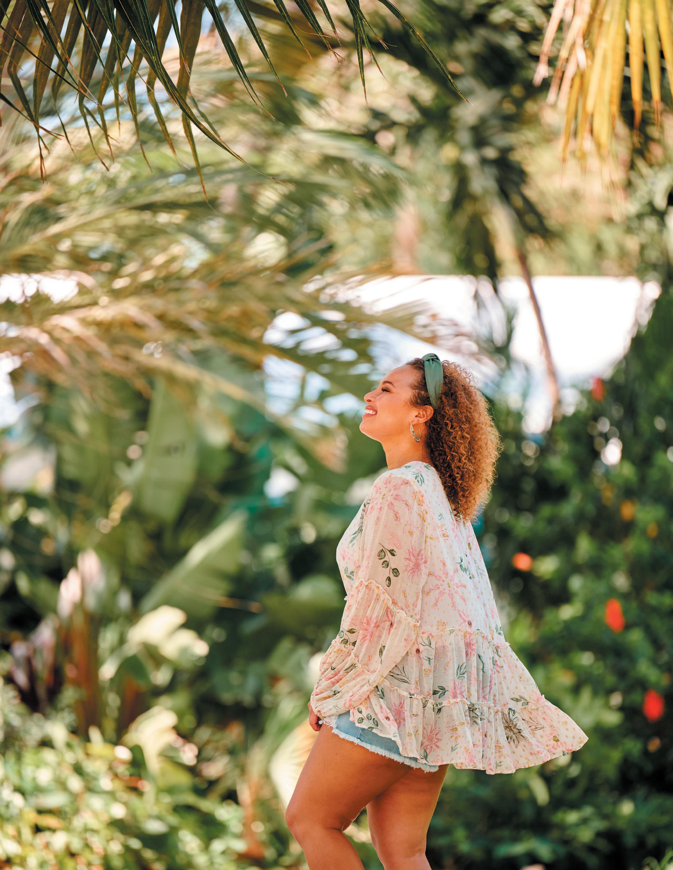
WE’RE HERE TO ERASE INDUSTRY STANDARDS AND RAISE THE BAR ON THE MID AND PLUS SIZE SHOPPING EXPERIENCE . WE PROVIDE A CURATED SHOPPING DESTINATION AT THE INTERSECTION OF FASHION AND COMMUNITY .
Passionate about giving back, wants to feel beautiful and be surrounded by positivity, loves to travel and is always looking for her next adventure (road trips are her new escape), believes her friends and family are everything, a dog mom, has a love of coffee that goes above and beyond her daily cup, loves a good photo opp, lives in the burbs but loves weekend trips to the city, drives a Jeep, a plant mom (but wishes for a greener thumb), and loves to make her space reflect her personality.
She
YOUTHFUL SUBURBAN
BODY POSITIVE ON TREND
SELF AWARE
FEMININE
APPROACHABLE AUTHENTIC ADVENTUROUS
JUVENILE URBAN
BODY FLAUNTING
HIGH FASHION
SELF PROMOTING
SEXY
AUSTERE PRETENTIOUS
PASSIVE
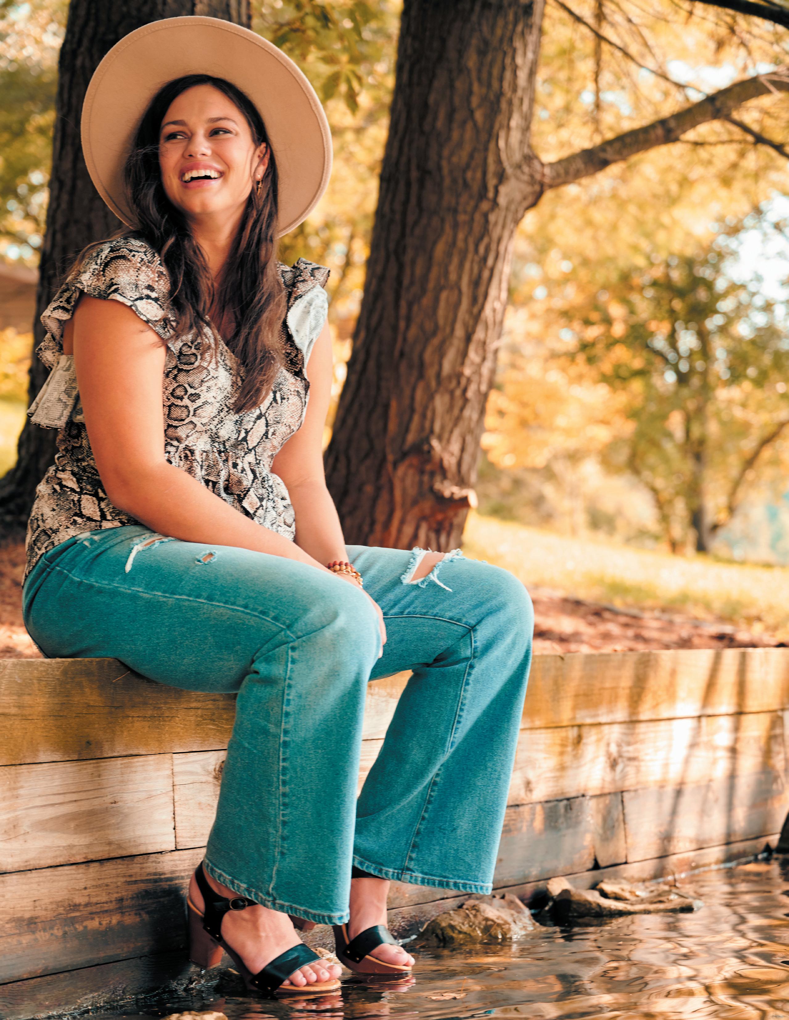
IS REFLECTED IN OUR VISUAL IDENTITY . WE � VE PROVIDED THE GUIDELINES IN THIS BOOK TO HELP YOU TELL OUR STORY IN THE BEST WAY POSSIBLE .
COMPLIMENTARY COLOR
BOLD MAIN COLOR
LIGHT NEUTRAL COLOR
DARK NEUTRAL COLOR
METALLIC ACCENT
POP ACCENT COLOR
ACCENT COLOR
ACCENT COLOR
This color will be used for grabbing attention, highlighting important information, and used for calls to action. This color is memorable this is the brand identity color.
This color is a pop shade that pairs well with the main and complimentary colors.
This color is a neutral shade that pairs well with the bold and complimentary color. This will help ground the colors and can be used as an accent color.
This color compliments the bold brand color.
This neutral shade pairs well with the bold and complimentary color. This will help ground the colors and can be used as an accent color.
This color aligns with the rest of the color scheme and is used mainly for paragraph text and dark backgrounds.
This color will be used for the background and supporting elements. This color will not take the limelight and will be used to add depth to the brand
CMYK will be the most accurate when printing offset. Color can vary significantly on desktop printers so we can’t guarantee a color match on all printers. If you will be doing a large amount of in house printing, we recommend printing a color test sheet to determine a specific color mix for your printer. Please contact Robin Easter Design to set one up.
* in order of prefered printing technique
PANTONE uncoated and coated inks may be different because color can appear very different on a coated versus uncoated surface. Coated colors should only be used for coated materials such as stickers, vinyl, or matching paint colors etc.
RGB & HEX numbers are for on screen use only. Ink colors do not look accurate on screen, we try our best to simulate web colors on our monitors, but color varies wildly from screen to screen.
Some of the brand colors cannot be typeset on top of each other for contrast and readability.
LOREM IPSUM DOLOR
LOREM IPSUM DOLOR
LOREM IPSUM DOLOR
LOREM IPSUM DOLOR
LOREM IPSUM DOLOR
LOREM IPSUM DOLOR
LOREM IPSUM DOLOR
LOREM IPSUM DOLOR
LOREM IPSUM DOLOR
LOREM IPSUM DOLOR
LOREM IPSUM DOLOR
LOREM IPSUM DOLOR
LOREM IPSUM DOLOR
LOREM IPSUM DOLOR
LOREM IPSUM DOLOR
LOREM IPSUM DOLOR
LOREM IPSUM DOLOR
LOREM IPSUM DOLOR
LOREM IPSUM DOLOR
LOREM IPSUM DOLOR
LOREM IPSUM DOLOR
LOREM IPSUM DOLOR
LOREM IPSUM DOLOR
LOREM IPSUM DOLOR
LOREM IPSUM DOLOR
LOREM IPSUM DOLOR
LOREM IPSUM DOLOR
LOREM IPSUM DOLOR
LOREM IPSUM DOLOR
LOREM IPSUM DOLOR
LOREM IPSUM DOLOR
LOREM IPSUM DOLOR
LOREM IPSUM DOLOR
LOREM IPSUM DOLOR
LOREM IPSUM DOLOR
LOREM IPSUM DOLOR
LOREM IPSUM DOLOR
LOREM IPSUM DOLOR
LOREM IPSUM DOLOR
LOREM IPSUM DOLOR
LOREM IPSUM DOLOR
LOREM IPSUM DOLOR
In most cases the colors should be used full strength, however there may be instances that call for screening of the colors.
To get a greater range of color in 1, 2 or 3 color printing, screening of the colors is recommended. The coral peach screened to 65%, 40% and 25% can replace the use of Light Peach in a 1 color print job. To acheive a very soft pink, the Light Peach may be screened.
These five papers are critical to the look and feel of the Arula brand. No other papers may be used.
Do not use coated paper for Arula materials, except for materials which need to withstand the elements such as a banner or bumper sticker, etc. Everything else should be printed on these uncoated papers.
NOTE For informal materials printed in house, white copy paper may be used. Never use white copy paper for materials marketed to the public.
VIVID PEACH
Cards & Pockets
Color · Coral
Weights · 91T · 100C
SOFT BLUE
Mohawk Keaykolour
Color · Pastel Blue
Weights · 80T · 100C
TERRACOTTA
French Paper Co. Construction
Color · Brick Red
Weights · 70T · 80C · 100C
DEEP TEAL
Mohawk Keaykolour
Color · Holly
Weights · 80T · 100C
WHITE
Domtar Cougar
Color · White
Weights · 70T · 80T · 100T
65C · 80C · 100C · 130C · 160C
The margin around the logo should always be at least equal to the height of the letters.
The logo must be resized proportionally. The logo should never be stretched in any way.
Do not change the proportion of elements in the logo
Do not alter the typography in any way
Do not alter the spacing or arrangement of elements in the logo
Do not use special effects such as beveling or drop shadows
Do not outline the logo
Do not skew or rotate the logo
The logo should primarily appear in vivid peach, but may appear in any of the brand colors. Some colors cannot be used on top of each other for contrast and readability.
In applications where color printing is not possible, the logo should appear in either solid black, 50% black, 30% black or reversed out.
Magnat is available in Poster, Head and Text faces. Characteristics of each face are optimized for specific uses. Text should be used for body copy and small type. Head for headers and larger type and Poster for very large type that you might find on a sign or poster.
The specimens to the right are enlarged to show the differences. The Text face appears clunky at larger sizes so should never be used for large type. The Display and Poster versions have thin places in the letterforms which would not print well at small sizes.
Within each face, Magnat is available in 18 weights (each with a matching italic). This provides a lot of flexibility for the future to give different marketing campaigns their own flavor or to evolve the brand to prevent it from getting stale. In 2021 for the launch, the brand primarily uses the weights called out in Peach.
The following are the most common uses of Magnat within the Arula brand.
HEADERS, CALL OUTS, SPECIAL TREATMENTS
Magnat Display Bold (or Poster Black for large scale)
SMALL HEADERS, CAPTIONS, SMALL CALLOUTS OR BITS OF TEXT
Magnat Text Medium
BRIDAL GOWNS
BODY COPY
Magnat Text Regular
Lorem ipsum dolor sit amet, consectetur adipiscing elit. Fusce suscipit, lorem sed grava dignissim, elit nunc lacinia elit, mattis con sequat dolor massa velit. Quisque male suada consequat est, in porta elit porttitor nec. Nam sus sit amet ante molestie facilisis vel eu eros.
Never use Magnat Display or Poster for small text .
LOREM IPSUM
Never use Magnat Text Bold, Display or Poster for body copy .
Lorem ipsum dolor sit amet, consectetur a dipiscing elit. Fusce suscipit, lorem sed grava dignissim, elit nunc lacinia elit, mattis con sequat dolor massa velit. Quisque male suada consequat est, in porta elit porttitor nec. Nam quis risus sit amet ante molestie facilisis vel eu eros. Duis nisl justo, imperdiet nec.
Trenda is available in 8 weights (each with a matching italic). As with Magnat, in 2021 for the launch, the brand primarily uses the weights called out in peach, the light, extra light and thin are not used.
The following are the most common uses of Trenda within the Arula brand.
HEADERS, CALL OUTS, SPECIAL TREATMENTS
Trenda Bold, Black or Heavy
SMALL HEADERS, CAPTIONS, SMALL CALLOUTS OR BITS OF TEXT
Trenda Bold, Black or Heavy
DENIM DREAMS SMALL AMOUNTS OF COPY
Trenda Regular, Semibold or Bold
Lorem ipsum dolor sit amet, consectetur adipiscing elit . Fusce suscipit, lorem sed grava dignissim, elit nunc lacinia elit, mattis con sequat dolor massa velit .
Never use bold, black or heavy for text longer than a sentence or two .
Lorem ipsum dolor sit amet, consectetur adipiscing elit. Fusce suscipit, lorem sed grava dignissim, elit nunc lacinia elit, mattis con sequat dolor massa velit. Quisque male suada consequat est, in porta elit porttitor nec. Nam quis risus sit amet ante molestie facilisis vel eu eros. Duis nisl justo, imperdiet nec. Lorem ipsum dolor sit amet, consectetur adipiscing elit. Fusce suscipit, lorem sed grava dignissim, elit nunc lacinia elit, mattis con sequat.
Funky Signature only come in one weight. The font was chosen for its handwritten nature.
Script should be used sparingly and only for a few words at a time.
CALL OUTS, SPECIAL TREATMENTS
EXAMPLES OF UNACCEPTABLE USE
Never use script for text longer than a few words .
Lorem ipsum dolor sit amet, consectetuer adipiscing elit, sed diam nonummy nibh euis mod tincidunt ut
Never track out Funky Signature
Lorem ipsum
dolor sit
Certain type treatments require additional space between letters.
MAGNAT in all caps should be tracked 100 to 200 .
Upper and lower case headers should be tracked 75 .
TRENDA in all caps should be tracked 100 to 200 .
Upper and lower case headers should be tracked 50 .
FUNKY SIGNATURE should never be tracked unless needed to connect disconnected letters .
The Arula brand should primarily use left aligned or centered type.
Lorem ipsum dolor sit amet, consectetur adipiscing elit. Fusce suscipit, lorem sed grava dignissim, elit nunc lacinia elit, mattis con sequat dolor massa velit. Quisque male suada consequat est, in porta elit porttitor nec. Nam quis risus sit amet ante molestie facilisis vel.
Centered text should only be used for smaller bits of copy . If you are typesetting more than a few paragraphs, left alignment should be used .
Lorem ipsum dolor sit amet, consectetur adipiscing elit. Fusce suscipit, lorem sed grava dignissim, elit nunc lacinia elit, mattis con sequat dolor massa velit. Quisque male suada consequat est, in porta elit porttitor nec. Nam quis risus sit amet ante mol estie.
The Arula brand should never use justified type . The effect is too rigid and feels uptight .
Lorem ipsum dolor sit amet, consectetur adipiscing elit. Fusce suscipit, lorem in sed gravas dignissim, elit nunc lacinia elit, mattis con sequat dolor massa velit. Quisque male suada consequat est, ind porta elit porttitor nec. Nam quis risus sit amet ante molestie facilisis.
Letters that curve to match photography or graphics may be used as a special treatment. It may be used in upper or lowercase. Trenda should be used primarily.
Y O U R DR E AM F I T
Y O U R DR E AM F I T
Y O U R DR E AM F I T
Several textures have been created for the Arula brand. These tiffs are made to mimic soft fabrics and shadows. They can used at various scales and overlaid as one color.
NOTE As the brand grows, additonal textures may be created to reflect trends and changing seasons.
SINGLE COLOR OVERLAID
An arch mirroring the curves of the Arula logo can be used as an graphic element or frame within the brand.
Full Arch
Haf Arch
Curve shapes have been created to use as an element within the Arula brand. These reference the curve of the human body while also bringing movement to photos and styling.
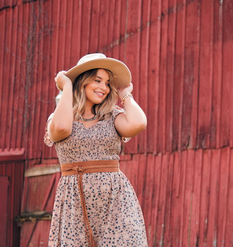
As a graphic element
Because the shape references the human body, do not use more than two and a half waves.
Examples of usable portions:
The same rules of proportion and resizing that apply to the logo apply to the graphics. The graphics must be resized proportionally.
Never compress the graphics .
Never stretch the graphics .
Never rotate the arch
Never use more than two humps of the wave
Lorem ipsum dolor sit amet, consectetuer adipiscing elit, sed diam nonummy nibh euismod tincidunt ut laoreet dolore magna aliquam erat volutpat. U\ Duis autem vel eum iriure dolor in hendrerit in vulputate velit esse molestie consequat,
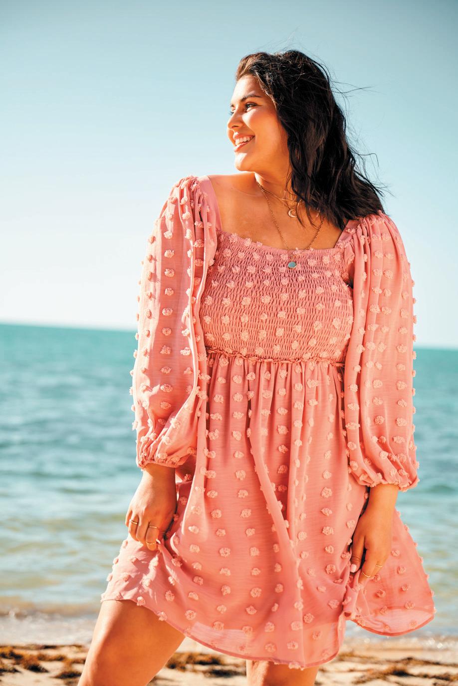
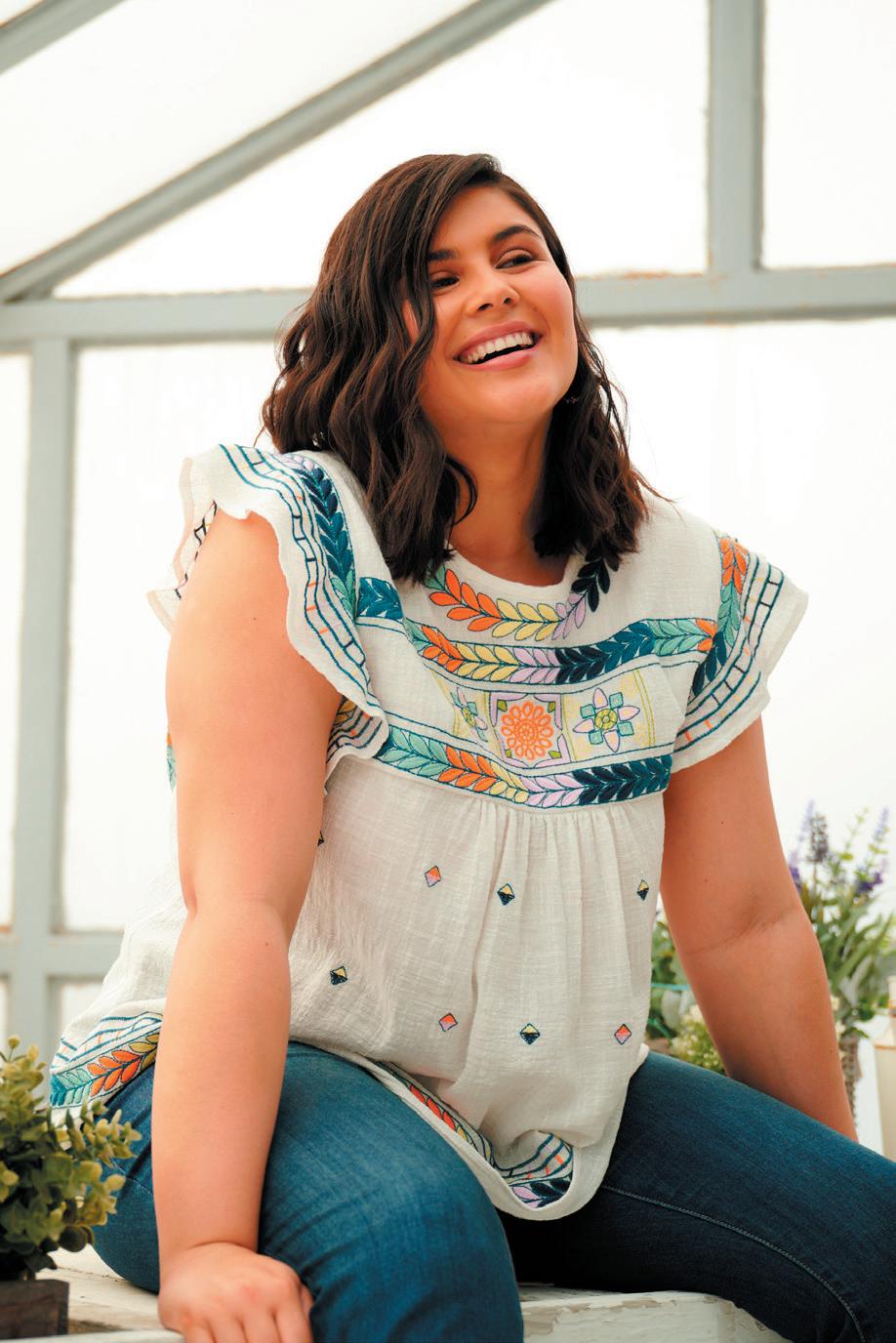
The arch can be used as graphic element layered with photography. Make sure the arch never eclipses product.
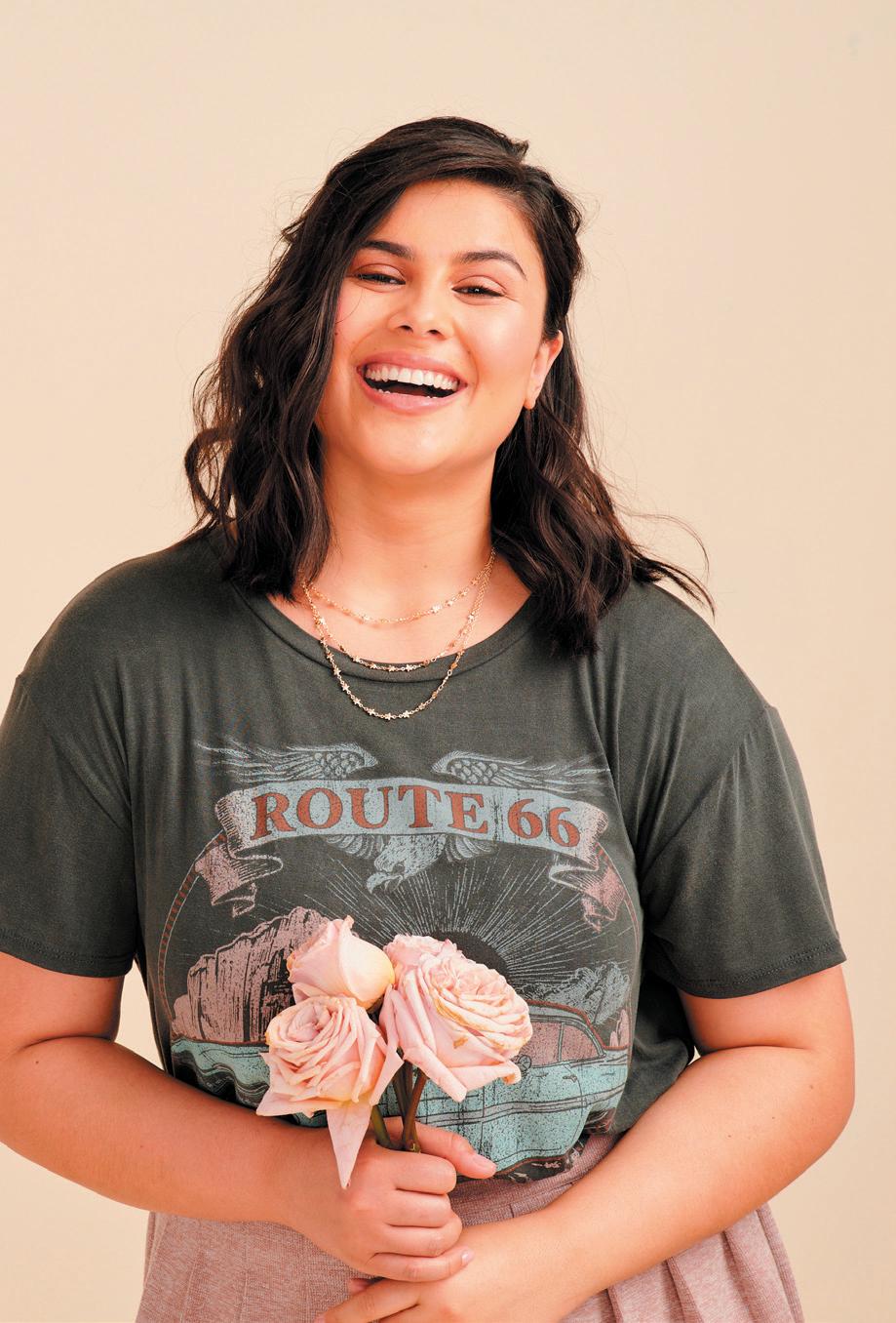
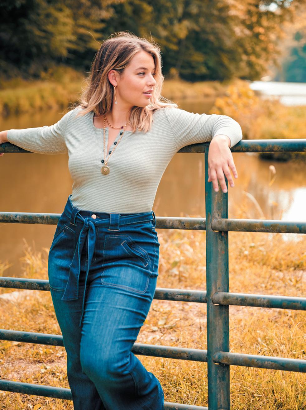
The arch can also be used as a frame to hold photography, text and texture.
The arch can be used to create negative space.
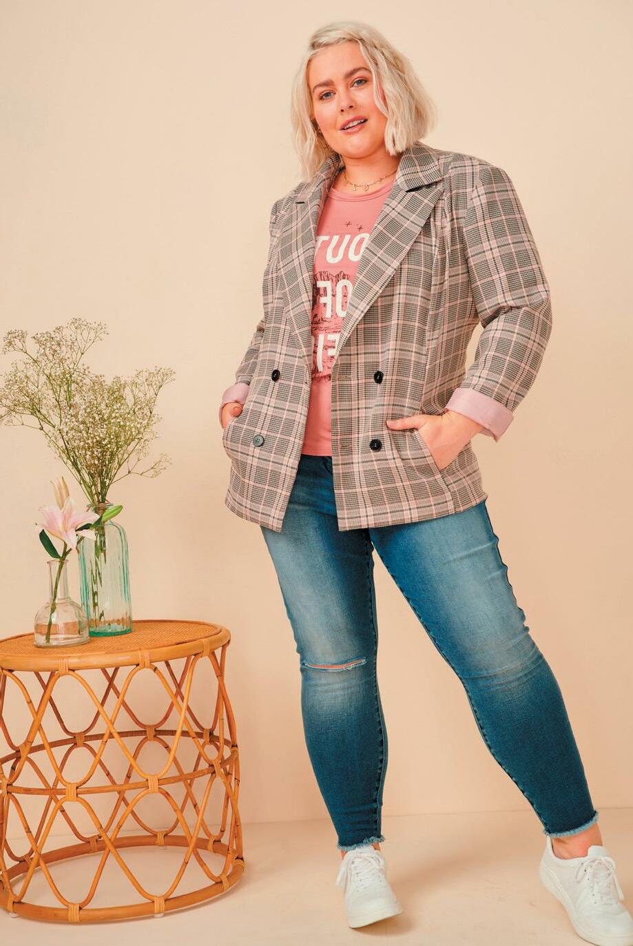
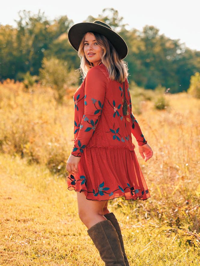
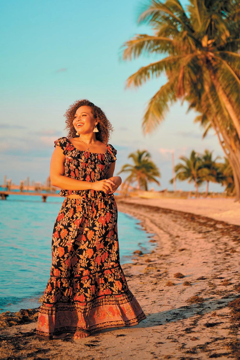
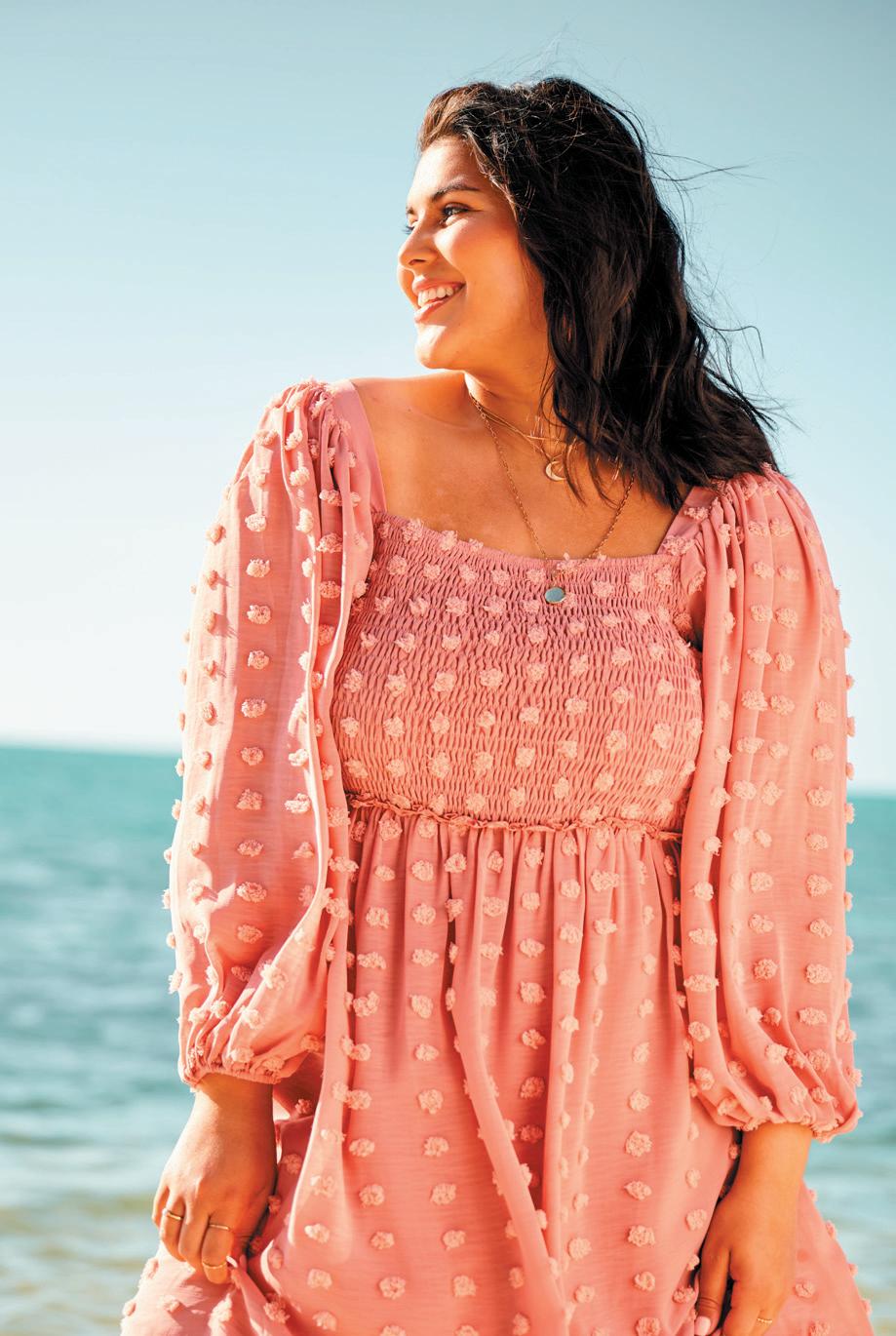
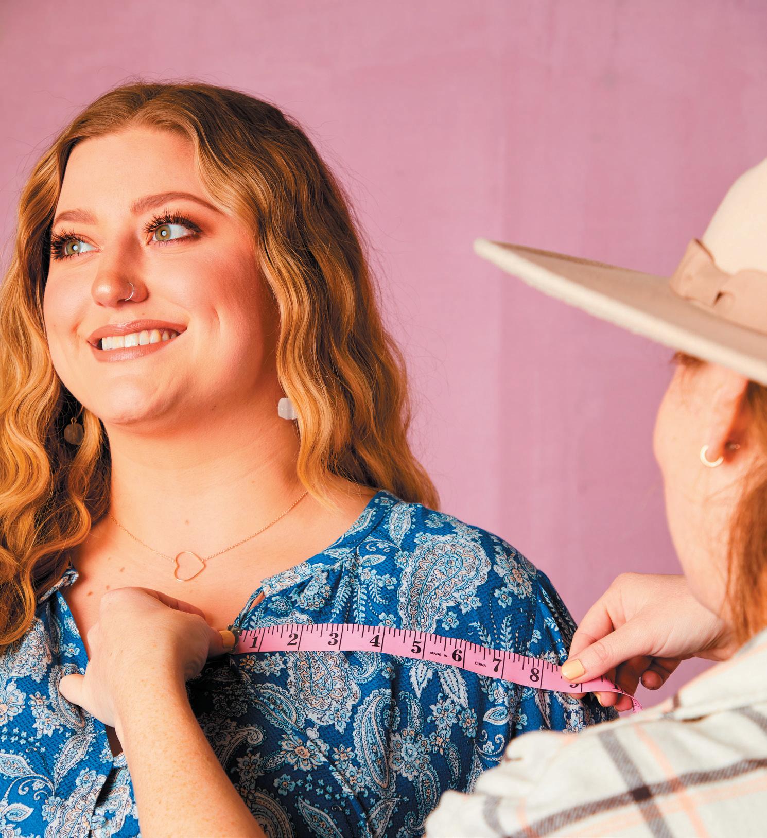
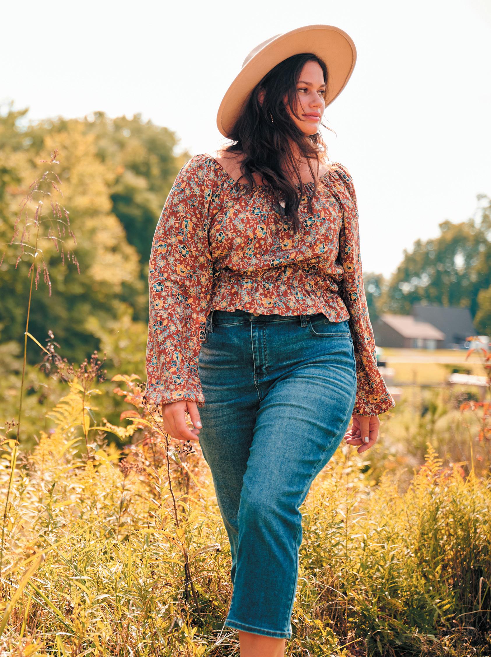
Denim is what we want to be known for it's the base of her look and fit is critical to Alivia. We want to be her fit expert.
PREPARED BY
865-524-0146
robineaster.com
