A sophisticated facelift for an iconic house


See pages 8-9


A sophisticated facelift for an iconic house


See pages 8-9


Bathroom renovations can be a daunting task, especially when it comes to choosing the right design and materials. However, for Whakamarama couple Robyn and Don Pickerill, the process was made easier with the help of Bay Bathroom Design & Build.

e expert team was able to provide solid advice and design solutions for the couple’s main bathroom and
ensuite renovations, to give them a very high-end nish with top quality products.


“We bought our house about four years ago,” says Robyn. “It’s a beautiful home but we just wanted to upgrade everything to a more modern look and colour schemes which suited us.”
e main bathroom was quite dark with not a lot of natural light and the ensuite just needed a real freshen up.
“We had collected a lot of ideas
online before we approached Bay Bathroom for a consultation,” say the couple. “It’s pretty overwhelming seeing so many possibilities so [Bay Bathrooms owner] Darryl Roach came out and looked around to discuss the project initially and then passed us onto designer Vicky Gillespie. ey were both incredibly helpful.”
ey toyed with the idea of changing the layout but eventually decided the existing oor plan worked best.


“I was stuck with what to do with a dead space in a corner of the main bathroom, but Vicky suggested using it for designer pendant lights and I just love it. at light sets the mood. It was an idea that I hadn’t considered but it was a great solution.”
Robyn is also thrilled she was convinced to use large mirrors.
“We decided on large, round back-lit mirrors. I never would’ve gone with mirrors that size, but Vicky

assured me it would work, and it really does. e mirrors are fabulous.”
e tiling was also di erent to what Robyn initially had in mind.
“I had imagined we’d have tiles on all the walls and oor. I just assumed it was what everyone did these days. Vicky suggested just using tiles on a feature wall and the oor.
“I saw brick-like tiles in the Bay Bathroom showroom laid vertically rather than horizontally in a striking black. ey looked incredible and I knew instantly that was for us! ere were three colour options and so I chose a mixture of cream for the main bathroom and dark greys for the ensuite. Each tile is either glossy, texture or matte – and so when the tilers did their random selection magic, they simply looked amazing.”
Robyn and Don were also frustrated by the marks that rural ‘hard’ water leaves on shower glass. “We just wanted to freshen it all up and the team

and close perfectly to checking defects in the painting.

“He did nd a few areas of paintwork to be retouched, which is quite normal, and the painter was there within a few days to make it perfect. It was only when we were all completely happy that the job was considered nished. It was very thorough.”

e use of large mirrors, special shower glass, well-planned lighting and a bespoke vanity cabinet has transformed the once dark and outdated bathrooms into modern and functional spaces. Robyn and Don say their expectations from Bay Bathroom were exceeded.


“From start to nish, it all went so smoothly. We couldn’t be happier.”

Debbie Gri ths


at Bay Bathroom Design & Build took that into account by suggesting we use the Atlantis shower box solution, which comes with glass that has a special coating on it to repel the water. We still need to clean it, but it should stay looking new for longer.”
Bespoke cabinet


e existing vanity in the ensuite was switched out for a bespoke cabinet that is longer than average, to t snugly in a speci c space wall-to-wall, providing plenty of bench space for two people to be in there at the same time.
“A real asset is the new shelving above the vanity where I can display my creams and perfumes rather than having them on the vanity or in a drawer,” says Robyn.
“I also wanted a shelf in the shower and an inset above the freestanding bath to store body wash and shampoo within handy reach, and ornaments if I choose.


“ e inset above the bath has lighting so looks


amazing at night. e designers at Bay Bathroom were able to help us with all our practical solutions – right down to having a little rubbish bin inside the cabinet.”
Robyn admits they were worried about having tradesmen in their home for 10 weeks but that was alleviated when they saw how diligently everyone stuck to the timetable.



“Bay Bathroom and all their associated suppliers and workers were really great to deal with. ey had a schedule, and they did everything on time.”

Thorough sign-o
Robyn and Don are also impressed by the endof-project service. “Something that Bay Bathroom does is they sign o on the job,” says Robyn. “ e project manager was in touch throughout the job and followed a thorough sign-o process, checking that all elements of the project were complete to our satisfaction – from whether the drawers open


When it comes to designing a new kitchen, renovation consultant Sharon Giblett likens it to solving a puzzle.
“Clients often have ideas but don’t realise the implications of moving things around,” she says. “ at’s why having someone like me to assist on the journey is useful because I can guide them.
“For example: ‘If you change the bench, you need to change the ooring and if we change the oor tiles it a ects the cabinetry’. I’m here to help homeowners make an informed decision about their project.”


For busy school teachers, Debbie Rice and Rob Maclaren, choosing Sharon from Refresh for their recent kitchen and living area overhaul was easy.
Precise

“Sharon was just what we needed,” says Debbie. “She walked us through the process and kept us informed along the way.”
“I managed the whole project right from the rst


meeting,” says Sharon. “From appointing the kitchen designers, to looking at how the space was used and what appliances they had – right down to the height of their soda stream and co ee machine. It’s not just giving them a cupboard space but working out precisely what was needed.”

Sharon says the old kitchen felt quite dated compared to the rest of their home.
“ e cabinetry was a dark chocolate brown, making the space feel dark as well,” she says. “ ey’d installed a skylight, but it didn’t help much. ere was also a wall between the living and kitchen areas that stopped natural light and ow.”

More inclusive

“Rob and I have a blended family of four older daughters,” says Debbie. “We wanted the kitchen to feel more inclusive. Sharon really listened to us. She o ered us professional yet personalised advice about what was available and what would suit our needs.” Sharon says getting to know the client is a really important part of the process. “A kitchen for a family

with younger children would’ve looked di erent. I take into account how they live in their home and their priorities, and go from there.”

Kitchen style

Debbie says their wishlist started small, grew large and was then honed back into the nal design. “I didn’t have any preconceived ideas of what it would look like – it just morphed as it went along. We wanted new ooring, appliances and lighting. I could give Sharon a call when I got stressed or if there were issues with suppliers or the schedule. I knew I could call her and we could chat about possibilities. She was great at coming up with practical
solutions like the issue of space.”

Sharon also o ered advice on the style of the kitchen. “Debbie and Rob wanted it to be light so had initially thought of lots of white but that wouldn’t have been as aesthetically pleasing.

“We used LED lighting and subtle black accents with wood nishes to add texture and dimension. We also added shelving that makes practical use of a dead space and echoes the curve of the bench,” says Sharon.
As with any major renovation, there were hiccups. e huge, curved stone benchtop needed special support.

“It’s four metres long and came in two pieces,” explains Sharon. “ e design called for


a large overhang and needed the cabinetry to support it. We didn’t want an unsightly post at one end – we wanted more of a oating look, so I went to the ooring company and the kitchen company and we came up with a solution to take to the client. e result is just gorgeous.”


“We are so pleased with the feeling of openness,” says Debbie. “It’s wonderful to nally see our plans move from paper printouts and 3D computer graphics to the nished product. We couldn’t be happier. It has made our house a bright, modern and well-functioning home, linking the inside and
outside areas seamlessly.”
Debbie and Rob have even hosted a gathering of all their work colleagues in their new kitchen.


“I really love this kitchen,” says Sharon. “When I look at the ‘before’ and ‘after’ pictures, I’m so proud of it. Every renovation is a partnership and a journey for the client. “We start with their vision and I bring my technical and design experience to help them achieve what they want.
“ e ow that they’ve ended up with feels modern, allows them to entertain easily and provided a family-friendly space where everyone feels included.”


Signature Homes Bay of Plenty & Coromandel pride themselves on providing clients with a bespoke experience, building homes that feel uniquely theirs.

Owners Debbie and Craig Williams know a thing or two about building beautiful Kiwi homes – they’ve been doing so in the region for more than 26 years.


One of the many bene ts of working with Signature Homes is that you get access to your own team of experts who will be with you every step of the way.
You’re almost guaranteed to enjoy your build experience with the Signature Homes Tauranga & Bay of Plenty team, who, since 2008, have won the National Client Survey award 13 times.


Signature Homes is proud to o er its clients Fixed Price Contracts as part of their independently bonded Building Guarantees programme, a market-leading o ering that ensures you can build your new home with con dence.


Signature Homes Bay of Plenty & Coromandel takes care of all the nuts and bolts – so you can relax and be con dent your build is in good hands from start to nish. On-time, on budget, with no nasty surprises.

Whether you have an idea of your dream home planned out or you’re just starting your building journey, Signature Homes team of experts will help you create a space that’s perfectly in tune with your lifestyle and budget.
When you choose to design and build your new home, you have full control of every stage of the process – from bedroom sizes, and extra storage spaces right through to colours, cladding, and ttings.


Whether you’re looking for a house and land package in the Bay of Plenty or you’re a landowner seeking a design and build solution, Signature Homes will take you through the new home building process step by step.
Contact Signature Homes Bay of Plenty & Coromandel on 0800 102 105 to start your new home journey today.


Resene’s white and neutral paints are dominating the Resene top 20 list across the board year after year, but you’re not here to keep up with the Joneses.


You just want to know which are right for you and how you could use them, so let’s get down to it.


e Resene Whites & Neutrals collection is your one-stop shop, a trusted compilation of palette cards that include colours in various strengths to help you play to yours when creating cohesive schemes that also provide visual interest. Soft, chalky, calcite-grey white Resene Black White is one of its top contenders, the hint of black in its makeup resulting in one of the ultimate white paints – one that’s ideal for you if you want something that gracefully walks the line between warm and cool.
Dreaming of using white for its calming qualities? In this bedroom, Resene Black White is used in two of its six available strengths to bring a soothing sense of restfulness to a bedroom, with a paler shade coating the walls and oor, and a heavier version creating a colour-blocked headboard e ect that frames the bed in minimalist style. Sleep easy by tying it all together with tonal accessories – we’ve used inexpensive Resene testpots to paint artwork and objects in complementary colours, and opted for natural materials and cosy textiles to o set the bleached backdrop.


Roll out the welcome mat for this chic circulation space, which shows how several strengths of a neutral hue – Resene Bison Hide, a warm green beige with white tones, can be used in an entryway to provide depth and interest, greeting you at the front door as Resene Half Bison Hide, then transitioning to Resene Triple Bison Hide. Another way with white is provided on the oorboards, which are stained with Resene Colorwood Whitewash, an Environmental Choiceapproved product that allows the grain of the timber to show through, inviting subtle visual texture into this relatively utilitarian space. Paler and darker accessories balance the palette and are enhanced by pieces that are both pleasingly tactile and practical, like the rug for wet feet and the bouclé armchair on which you can sit to take o your shoes. Round it out with greenery to usher a hint of the outside in.


In this scheme, a neutral paint is the basis of a look that’s pale and interesting – perfect for those who wonder if true white isn’t quite adventurous enough. Anchoring a living space, soft, muted beige Resene Quarter Tea on the wall forms a blank canvas for artwork and other items, yet is anything but boring when teamed with contrasting colours. Like whites, neutrals also have the bene t of being timeless, allowing you to easily alter your décor items as your tastes change, while your backdrop stays relevant.


See how Resene Quarter Tea appears lighter on the wall when set against the striped accent and charcoal sideboard? How a paint appears in your unique space is determined by the other hues in it, the light, the outlook, and the nish you choose, from gloss to matte. Take all of these factors into account when making your selection, using Resene testpots or Resene A4 drawdown paint swatches to trial possible paints at
your place, examining them in natural and arti cial light throughout the day. A word to the wise about ceilings: less light is re ected from these surfaces, so choose a half or quarter strength of your wall colour for overall balance in a at nish like Resene SpaceCote Flat.


An iconic Mexican-style house on Oceanbeach Rd has been totally transformed into a light, modern and sophisticated home while still giving respect to its exotic past.
e Auckland couple, who opted to make Mount Maunganui home after Covid-19 hit, sold their “holiday place” on the same street with the dream of buying a bigger place next to the golf course. “We wanted an already-renovated home on Oceanbeach Rd but couldn’t nd one. Houses came up for sale that needed renovation work. We approached three builders to give renovation advice and estimate



costs – we chose Jimmy Dow from Coast NZ Construction as he was the easiest to work with.” Jimmy helped the couple assess homes to purchase – the Mexican-style house was bought April 24, 2021. Coalesce Architecture’s Dylan Batenburg was engaged to develop plans and designs.
Construction began May 2021 with the couple bravely deciding to live in the home throughout the comprehensive renovation to modernise it. Orange and dark


“We wanted to lighten it up – and rightfully or wrongfully, we wanted to get rid of the Mexican look. It was orange outside and dark inside, with brown interior walls and bright patterned tiles etc,

and the upstairs deck had log trellises!”
Jimmy’s Coast NZ Construction team tackled the job in two stages. “Stage one was renovating downstairs while the clients lived upstairs. It was challenging but the couple made co ees for our team every single smoko, every day, for the whole job! It was something little, but meant a lot.”
Stage one renovated the kitchen, master bedroom and ensuite, and downstairs living quarters. An open re was removed, plus a number of windows and a slider due to leaks. e toilet moved to the laundry in the garage. A stunning cedar ceiling was added. e high ceilings dropped and ceiling lights added throughout.
A bad boy
“Stage 2 was a bad boy,” says Jimmy.
“We plastered the entire upstairs interior, renovated three bedrooms and ensuites, renovated an o ce to enable sea views by taking out a small deck; reclad the exterior in cedar, installed a new roof and added ve skylights to bring in sunlight.”


A 150mm nib-wall added around the interior to meet council rules meant all windows and sliders were swapped. “We put a bath in one of the rooms. Sitting in it, you have sea views,” says the wife.


Executed as the second Covid wave swamped NZ made sourcing materials incredibly di cult, material prices jump and Jimmy’s sta with Covid had to isolate. “It was a gnarly time but still the co ees kept coming!”
Jimmy thanks project manager
‘Stewy’, who was a major part of the job – onsite every day with total commitment from his building team and sub-contractors.


e conservatory roof was removed, and was rebuilt with a skylight. e garage was doubled in size to t the couple’s car. Two private decks were built out front – from the conservatory and pool room. e narrow cul-desac was changed with more concrete parking. Four tonnes of plaster “smoothed” all interior and exterior walls and ditched the “rough plaster” Mexican look.
Out back louvres added shade to outdoor furniture areas. An exterior steel staircase from bottom to top oors was added. Balustrades went on front and back decks. e cart shed was extended.
Nothing left untouched

“I don’t think there’s been a piece of the house that hasn’t been modernised and/or corrected,” say the couple. Building work nished July 2022, followed by six months of landscaping and nishing touches.


Jimmy’s team is “seriously proud” of the end result. “Transforming such an iconic house was an awesome job. e house did need a facelift – and the clients have given respect to its origins by keeping a few Mexican undertones.

“ ey’ve spent money wisely on features that give ‘wow’ factor but also futureproofed the home.”


e couple “love” their home. “We’re rapt with it. It’s a large house, but with


three adult children and their families it means we can accommodate them and entertain friends without hassle.”


“My husband’s dream was to build a house on a full section on a golf course – he got his dream.” And the home takes full advantage of its location. “We’ve opened it up, looking toward the golf course – and the louvres create more spaces outdoors where you can sit and watch golfers go by.”
Merle Cave

When Codri Luyk looked at a Pāpāmoa’s Coast Boulevard house back in 2020, with the intention of purchasing it, she knew exactly what it needed. “ e rst thing I said was:
‘ is house needs a pool’.”
Investment
Why? “ e house was very upmarket and had a great entertainment area. It was built in a U-shape with massive courtyard – and it just needed a pool to bring it all together.”

Eighteen months later Codri had sold the home and made a good pro t on her investment – which she puts down to installing the pool on the property with the help of Poolpac.


Codri purchased the home December 2020 and set about hiring a pool company. “I’m a person that always does lots of research before I approach a company to do work for me.
“ e Poolpac website was really easy and the fact they replied to me really quickly was an indication they were quite proactive.”


Size and type e project began with Poolpac’s Tauranga team having three consultations with Codri on-site. “First, they wanted to hear what I wanted and what I didn’t want. en Poolpac owner Kevin Horan made some really good suggestions and we decided on the pool size, type and heating mechanism.”

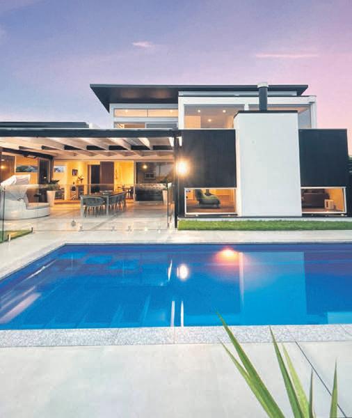
Codri chose a breglass 7m by 3.4m saltwater in-ground pool to be installed at the north-facing end of


the house, linking to the home’s entertainment area. “I had no idea about pools... e Poolpac team guided me through the whole process. I learnt that saltwater pools are much healthier than chemical pools.

“ ey also guided me through how to heat the pool. I wanted to use solar panels on the roof – but Kevin explained the cost of installing solar panels and that the pool would only be heated from them when the sun shines.
“He explained the bene ts of a heat pump as an alternative, and I went with this as you can use the pool nine-10 months of the year. I wanted to bene t as much as possible from the investment.”



Swimming 24/7
Once the pool installation was completed Codri says her family used the pool for eight months before she put the property on the market. “It was fabulous. We were swimming when it was raining, at night-time and friends enjoyed it too.

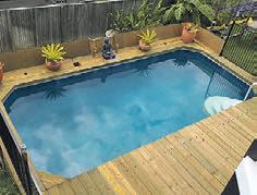
“It was a great entertainment for keeping the grandchildren away from screens and outside enjoying themselves. Installing that pool was the best thing I ever done. It’s amazing what a pool can do to uplift a house and also to add value to a property.
“It really added that extra amount of value to the house when I sold it. A family bought the home – and the pool was a big selling point for them because they have children.”
Codri now plans to install a pool at her Auckland home. “I’m going to approach Kevin to see if Poolpac can install another pool for me. I’m really keen to work with them again.” Merle Cave


Selling a home can be an exciting but also a stressful time for homeowners. While it’s tempting to undertake a full-scale renovation, the cost and time involved may not be possible for everyone. Fortunately, small, smart updates have a big impact on the perceived value of a home. Minor improvements can make it more attractive to potential buyers, increase its sale value, and help it sell faster. Here are ve budget-friendly updates to boost your home’s sale value:


Paint


Paint the interior and/or exterior of your home. A fresh coat of paint can transform the look of a home and make it feel more updated, fresh and clean. Consult your painter on what are currently the most popular neutral colours that will appeal to a wider range of potential buyers. If your budget doesn’t quite stretch to painting the outside, a good waterblast will have your house looking sparkly clean for open home.


Lighting
Update the lighting in your home. Switch out old light xtures for modern ones to give your home a fresh look and feel. Or – at the very least – ensure all your lights have lightbulbs and use bright, energy-e cient bulbs to literally show o your home in the best possible light. And make sure the light casing are dust-free and clean.


Floors


Freshen up your oors. If you have wooden oorboards that are in good condition, a simple re nishing can bring them back to life. is is a cost-e ective way to give your home a fresh, modern look. Also consider deep cleaning your carpets – especially if you have pets in the house.


Landscaping
A well-maintained property can increase the perceived value of your home and improve its curb appeal. Taking care of your lawn and garden can make a huge di erence in how potential buyers view your home.


Kitchen and bathroom
Updating your kitchen and bathroom can be a cost-e ective way to boost your home’s sale value so replace outdated appliances, upgrade the lighting, and either paint or switch out the cabinets for a


fresh look.With a little creativity and e ort, you can give your home a fresh, modern look that appeals to potential buyers without breaking the bank. In your mind, you’re already moving on – but if you show that your house was loved while you lived there, you’re more likely to convince buyers that it would make a lovely next home for them, too. Investing a little time and money into your home before you sell can pay o in the end.
Debbie Gri ths


