Cody Joe | Creative Portfolio

What’s up?


My name is Cody Joe Guerra. I’ve always had an interest in design ever since high-school. When I graduated, I went straight into the workforce and stayed there for 5 years. In 2017 I took the plunge and attended Coastal Bend Community College to earn an Associates of Arts. Immediately after, I got accepted at Texas A&M University-Corpus Christi with the goal of earning a Bachelors Degree in Graphic Design. Fast forward to present day , where I work as a design intern at the university’s marketing and communications department (MARCOM) and I could not be happier. I have come so far as a designer and only plan to continue developing my skills from here. This is a collection of works that I’ve accumulated over the years in both design courses and working at MARCOM.
Table of contents
Lead the WAVE

ROTC TRAILER WRAP
Dynamic trailer wrap designed for Texas A&M University-Corpus Christi’s
ROTC@TAMUCC.EDU 361.825.5841
mayhem festival rebrand
Multimedia campaign showcase for a rebranded heavy-music festival.
8.13.2021
ODD WORLD MAGAZINE
24-page original magazine concept with a showcase of the odd and fantastical.
VOLCOM CATALOG


12-page product catalog showcasing Volcom’s outerwear line for winter related extreme sports.

BLINK - CUSTOM TYPEFACE


Unique typeface designed using TypeCooker recipe and Glyphs with print and digital promotional material.
ARTIST BLOCK PACKAGING SERIES
Original packaging series for an artfocused wine company based in San Antonio, Texas.

2022 OUTERWEAR
in All Its Glory Vol. 1 May 2022
The American Circus
ROTC TRAILER WRAP
Deliverables: Large scale trailer wrap

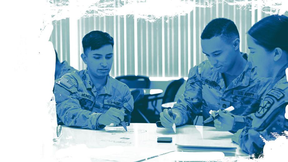
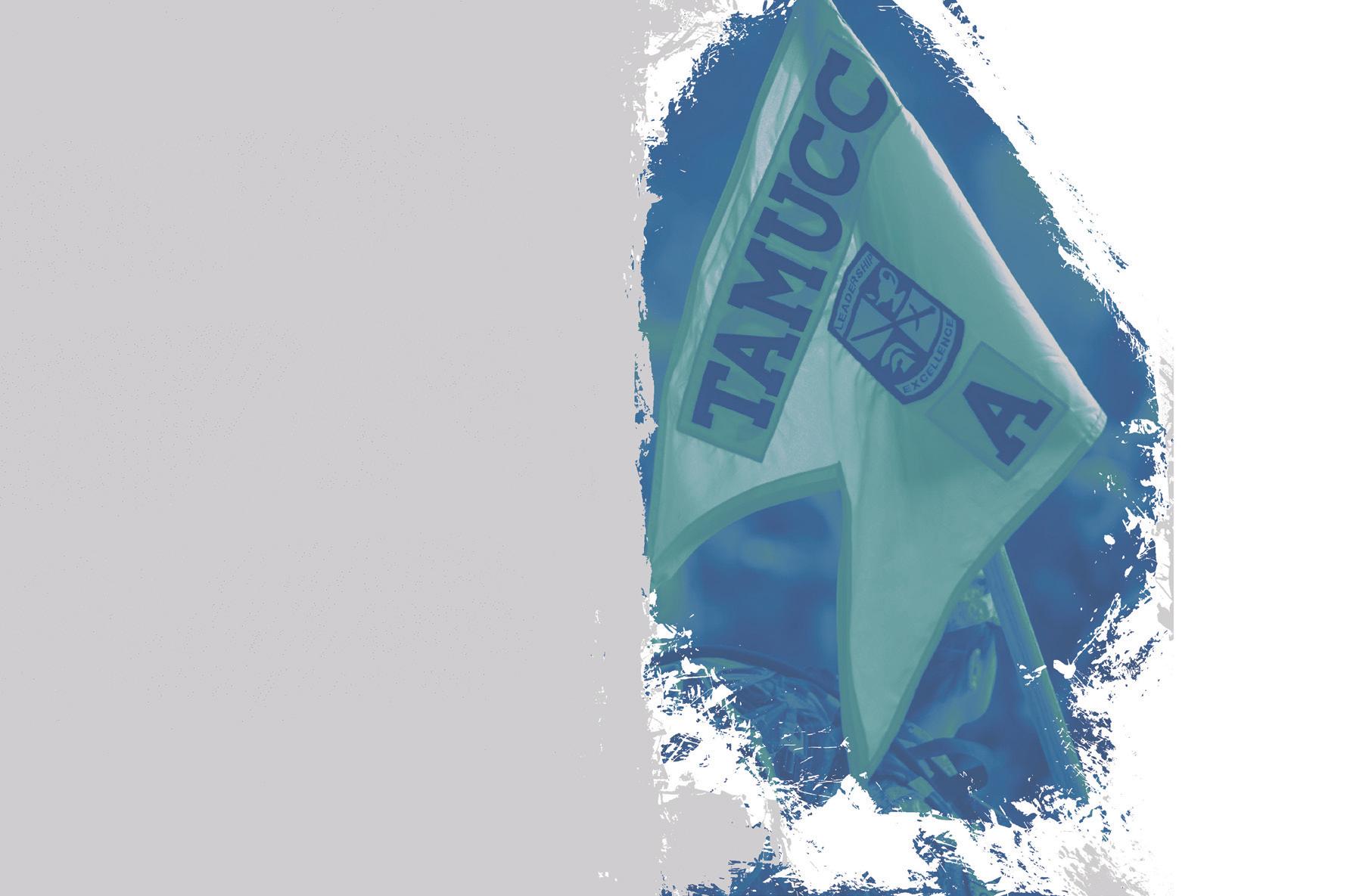
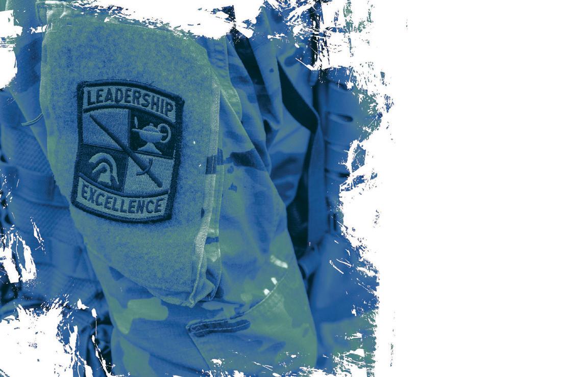
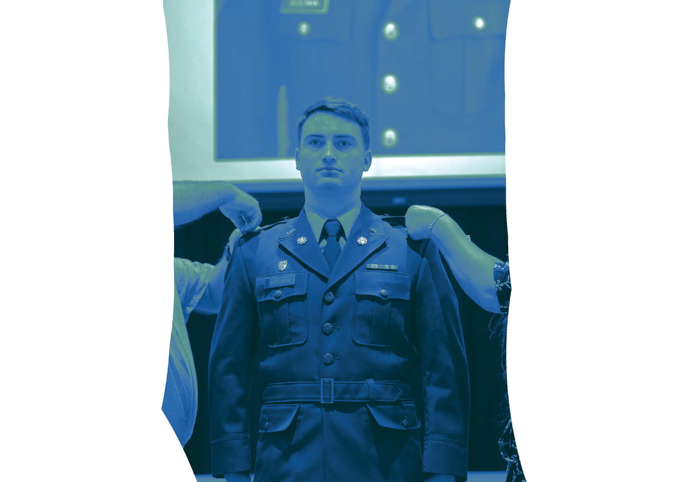
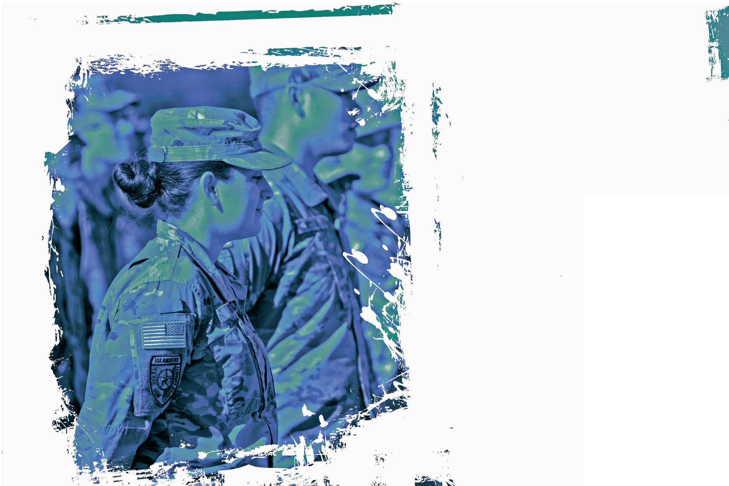
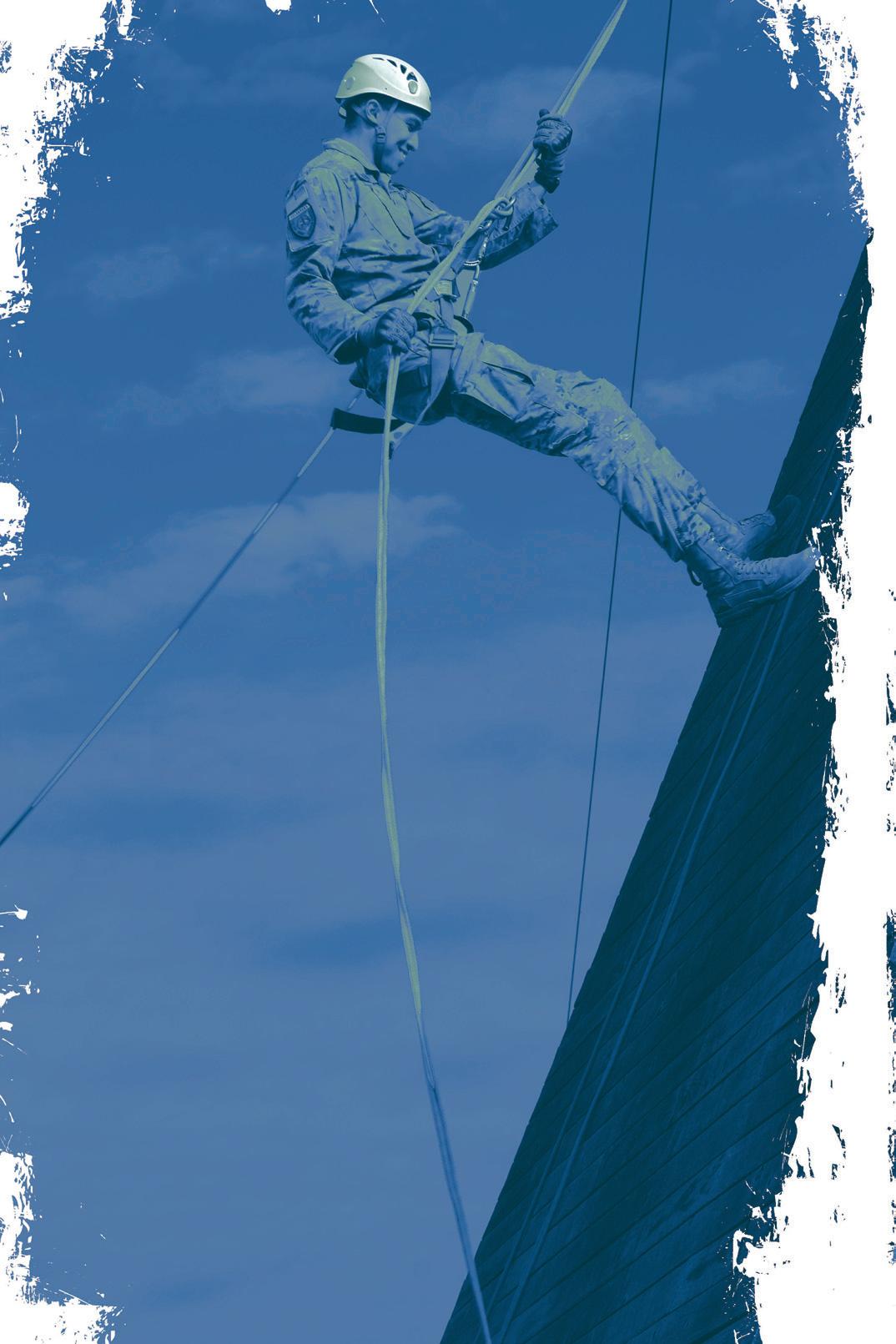
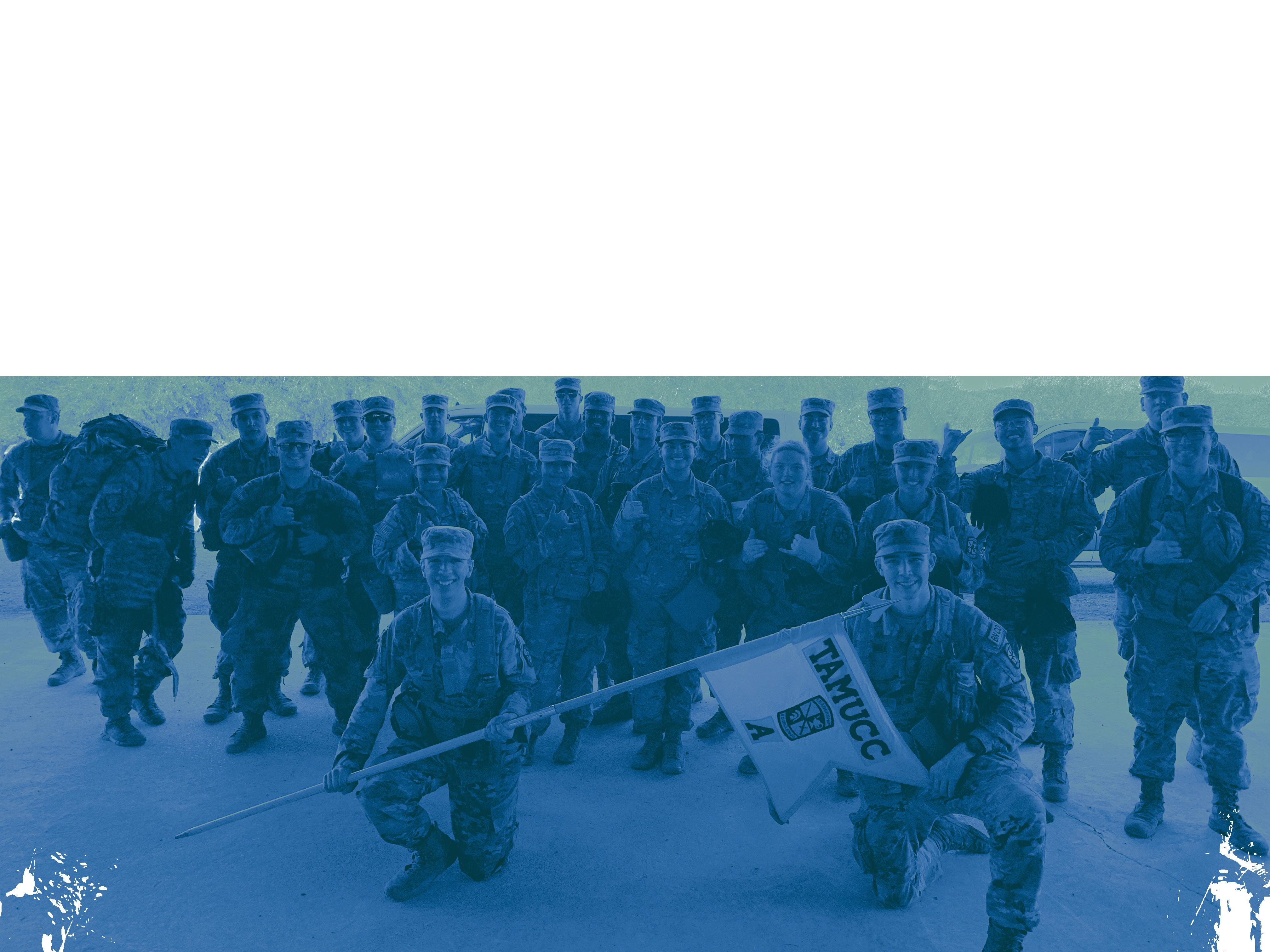
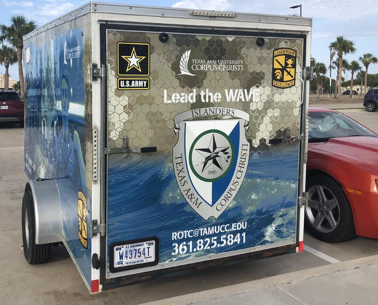
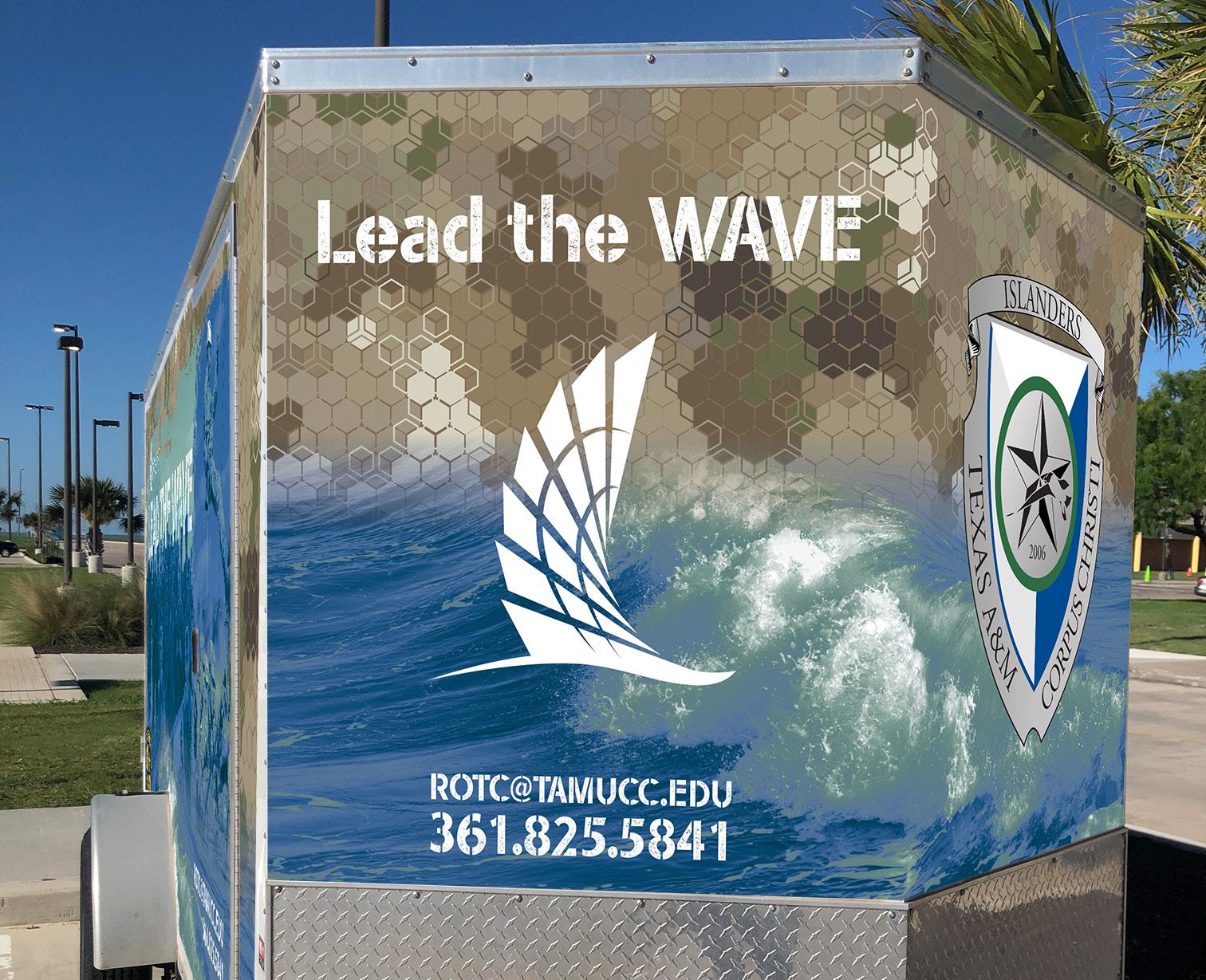
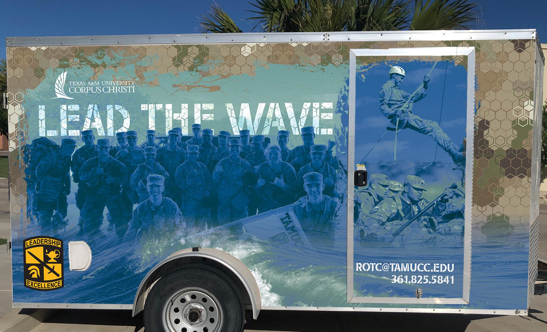
The ROTC program at Texas A&M University-Corpus Christi reached out with an inquiry about designing a trailer wrap for the small unit they tow to events. I had to consider design in both


ROTC@TAMUCC.EDU 361.825.5841
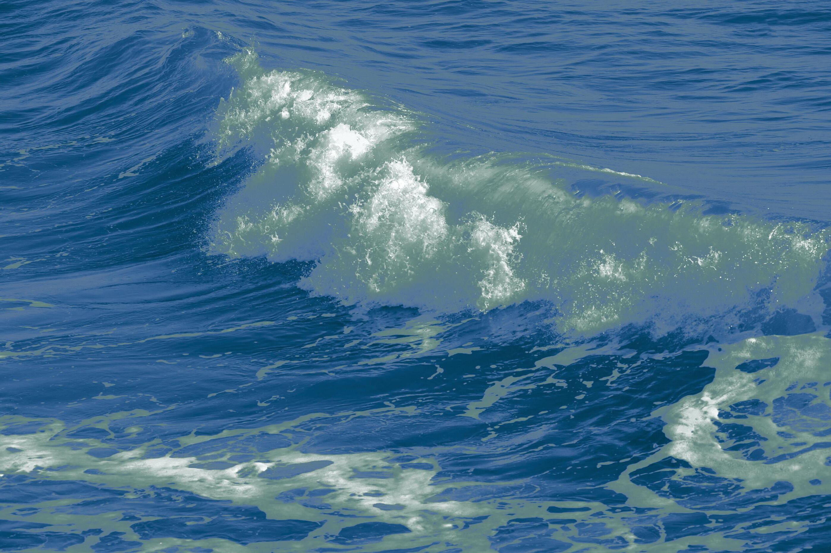
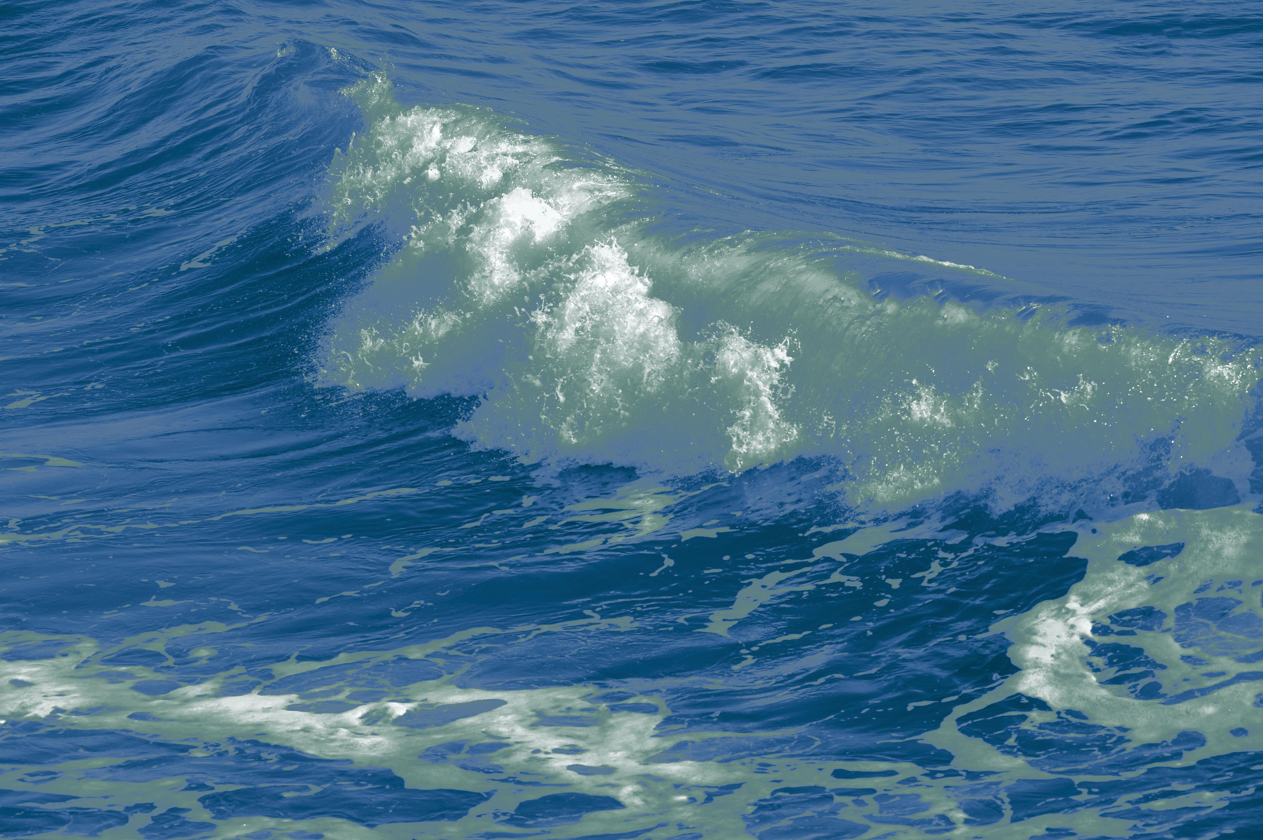
Distressed photo-collage and duo-tone treatment to the photography on the trailer wrap.


ROTC Trailer
MAYHEM FESTIVAL REBRAND


Deliverables: Logo redesign, promotional poster, brochure, social media post series, and promotional video

This project covered one of my favorite things in life, music. Mayhem Festival is an annual tour that travels across the United States while showcasing a long list of heavy-hitting names in the metal music industry. The goal of this solution was to bring back the metal scene and create a connection between contemporary bands and artists, and traditional heavy hitting all-stars. To create connections between old and new, I created a solution to modernize the edgy high school vibe into a universal language that more fans couldn enjoy.
These are examples of the current branding for the festival. There is a dated “heavy metal” aesthetic that does not feel inclusive to the younger fans of the genre. It also felt almost exclusive only to people who were familiar with the bands.

new brand standards
Heading - Industry (Blac k)
AaBbCcDdEeFfGgHhIiJjKkLlMmNnOoPp
QqRrSsTtUuVvWwXxYyZz 1234567890
Subhead - Industry (Medium)

AaBbCcDdEeFfGgHhIiJjKkLlMmNnOoPp
QqRrSsTtUuVvWwXxYyZz 1234567890
Body - Industry (Book)
AaBbCcDdEeFfGgHhIiJjKkLlMmNnOoPp
QqRrSsTtUuVvWwXxYyZz 1234567890
2-Color Full
Logo 1-Color Full Logo
Mayhem
I wanted the new brand standards to reflect a flexible color palette with bright and energy-driven hues. The new logo projects a sharp and edgy tone with a more approachable feel towards a more diverse audience. 2-Color Condensed 1-Color Condensed
Print Deliverables


 “11 x 17” Promo poster
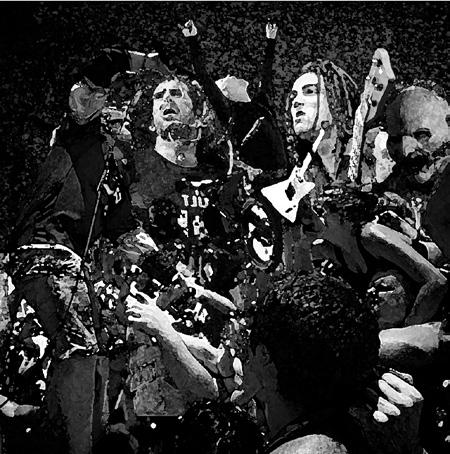
Photo-collage I created for the brochure’s festival summary page
Mayhem
Tri-fold promo & schedule brochure
Social media campaign




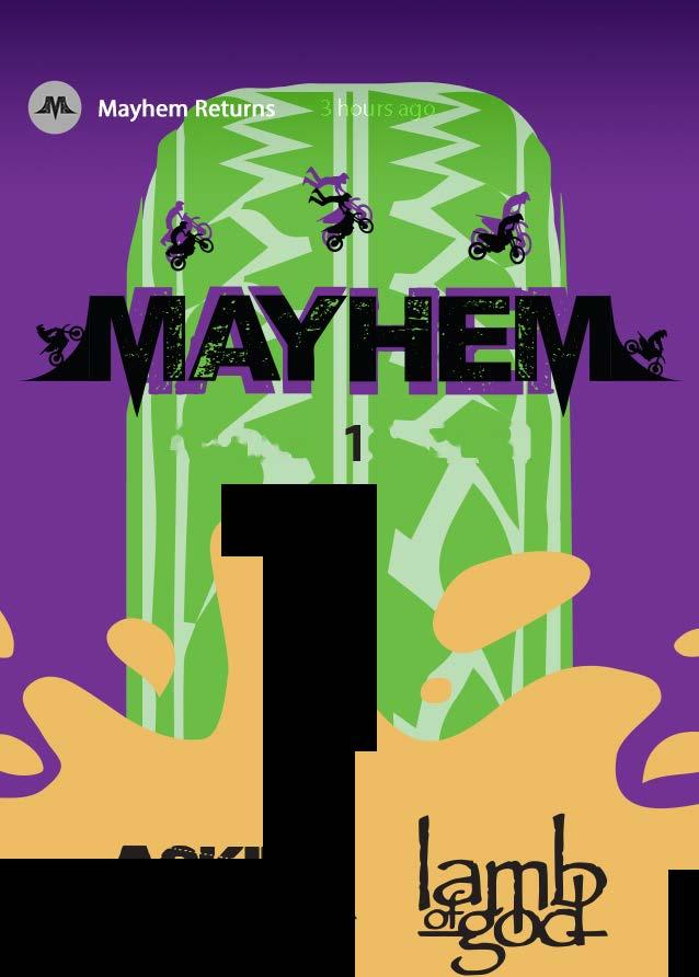
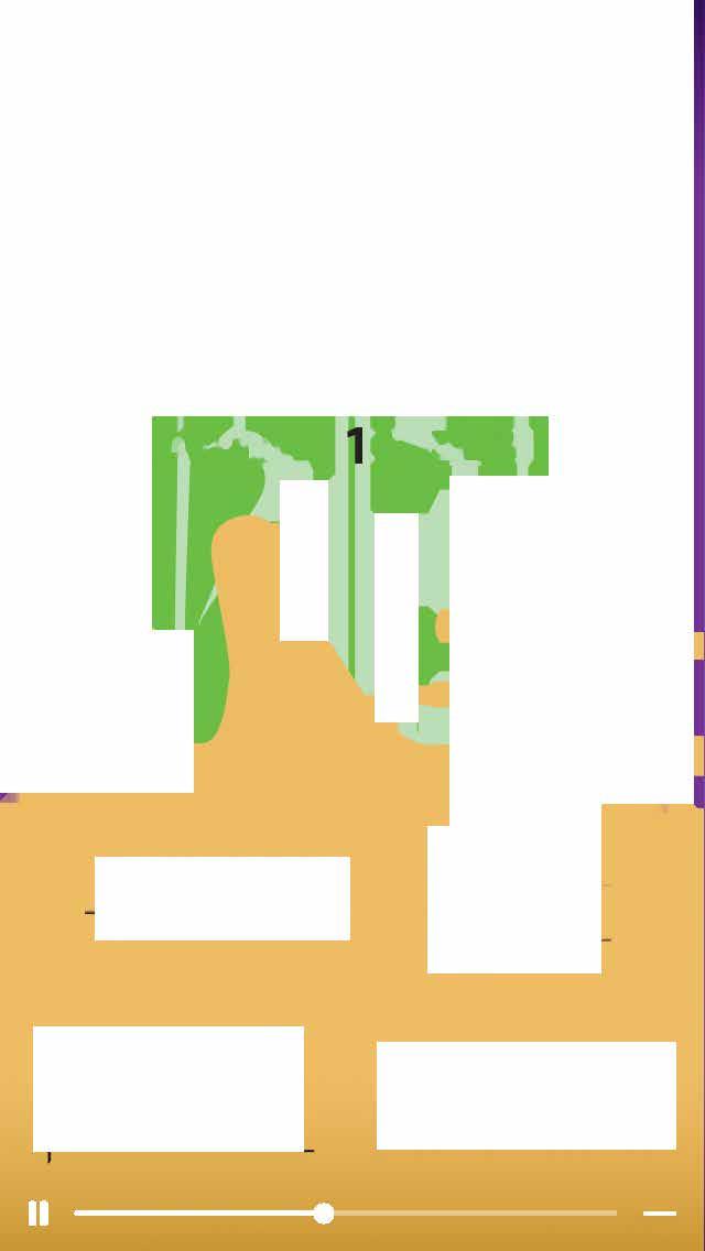


FaceBook promo post Instagram story promo freeze frame
August 3, 2021 Instagram promo posts Link to Instagram story promo on YouTube
Odd World – Original Magazine Concept
Deliverables: 24-page magazine

This project was one of my introductions to long-format design and my first time creating an original magazine. The overall goals included researching potential topics for the magazine, developing a brand persona, designing an appropriate logo, sourcing an ample number of articles with focus on 2 feature articles, and curating a 24-page magazine of content relevant to the chosen topic. The result was a unique culmination of oddities presented in a tasteful and inclusive tone.
research + considerations
Persona Development
Results from research turned out some beautiful examples of oddities. This created a unique visual standard across all branded elements in the magazine

Jayne is a real person and is a huge proponent to all things odd and curious. She was the perfect candidate to be the poster child for Odd World’s branding. A true oddity enthusiast.

LOGO DEVELOPMENT + REFINEMENT


COVER PROCESS
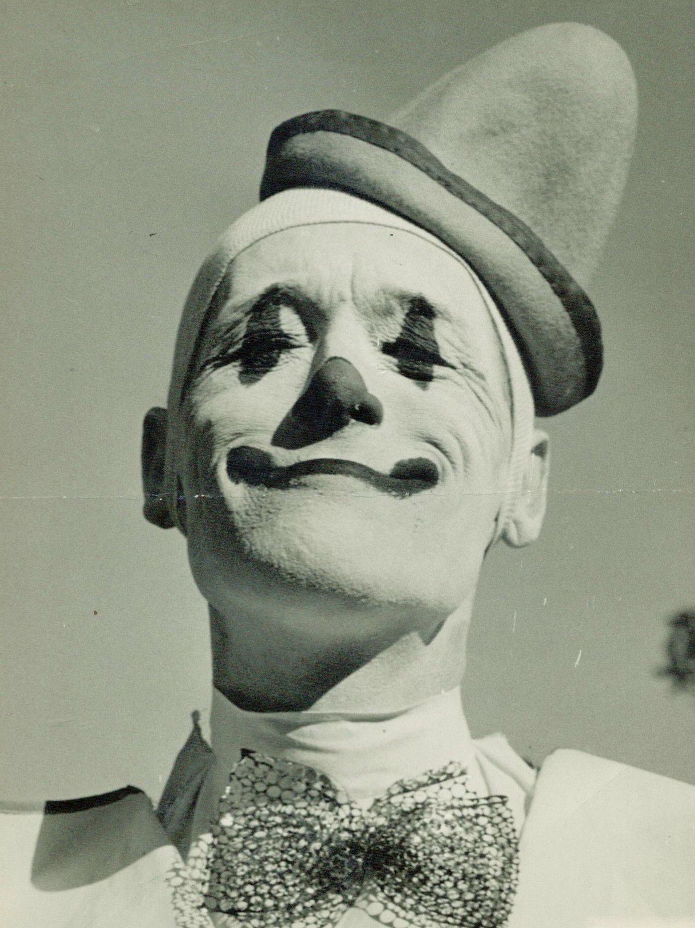
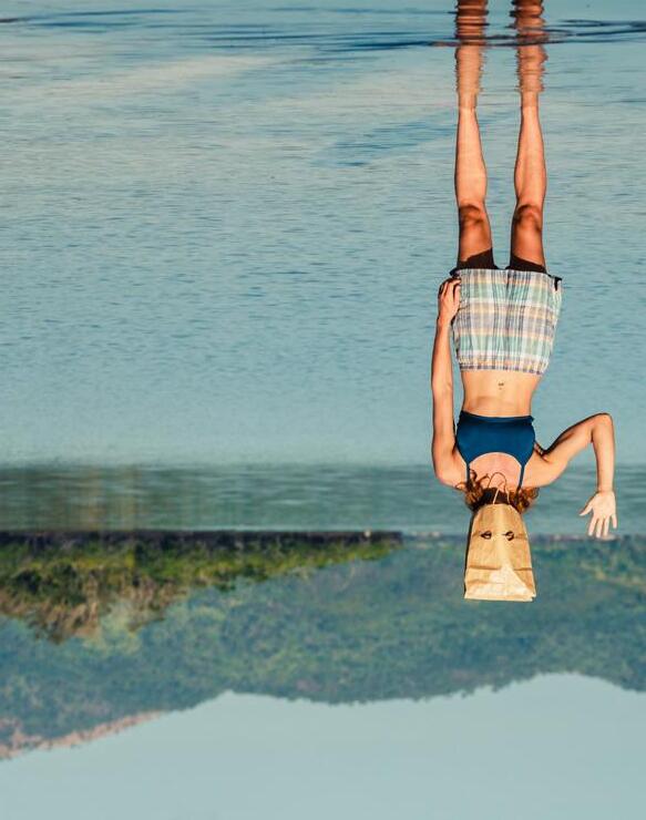
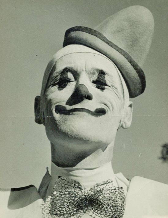
I wanted the cover to be unique to the brand but also communicate an inclusive voice. The goal was not to make a spectacle out of the oddities. That would defeat the purpose of this magazine. This was a showcase, and an educational one at that. The first iteration focused on a found article about a woman with a dissociative identity disorder, but felt too stigmatizing about her ailment. I found an article about circus life and it quickly became my first choice for the front cover visuals. The solution I went with felt compelling but also provoked interest in the circus without focusing on the stereotypical associations with the imagery.
 Logo progression for this brand shows how I dialed back the scale and kept some unique details that would help push the brand through a memorable visual voice.
TELLING MY STORY
1% OF THE POPULATION The American Circus in All It’s Glory Wonderfully Weird Collections “Real” Shrunken Head Used in Movie ‘The Midnight Gospel’ Review Do You Like Weird Art? Vol. 1 May 2022 The American Circus in All Its Glory Vol. 1 May 2022 Odd World First version of front cover Final front cover
MATTERS:
Brand style guide + Elements

Heading: Cocogoose Classic ExtraBold


AaBbCcDdEeFfGgHhIiJjKkLlMmNnOo
PpQqRrSsTtUuVvWwXxYyZz
Subhead: Cocogoose Classic Medium
AaBbCcDdEeFfGgHhIiJjKkLlMmNnOo
PpQqRrSsTtUuVvWwXxYyZz
Body copy: Big Caslon
AaBbCcDdEeFfGgHhIiJjKkLlMmNnOo
PpQqRrSsTtUuVvWwXxYyZz
Much of the brand’s style came from small elements that I noted during my moodboarding process. The visual standard were a combination of some repeating factors when thinking about oddities.
 #1C4257 #A42323 #328A81 #F1CA4E #BBD4B2
Solution + mockups


Link to full e-pub
Mockup


Odd World
BLINK - CUSTOM TYPEFACE

Deliverables: Full alphabet typeface with small set of glyphs and small social media campaign


This typeface is the result of a randomized recipe from TypeCooker. My goal is to create a typeface using the prompts given to me. I love technology so I took a more digital and modular approach to the letter forms. The result is a bold display style body of type that could be used in different digital applications to showcase a grunge take on blocky letter forms. This was my first time using Glyphs and it helped me understand the similarities across letter forms in a typeface.

Sketches + refinement
digitized typeface


Social media promotion

Blink
typeface in use


Type specimen graphic
A mock product using Blink as the display typeface on some packaging that I designed for an LED light strip
Mind Mapping & Word Listing
volcom - product catalog
Deliverables: 12-page product catalog

Brief:
Choose an existing e-commerce client and create a 12-page catalog showcasing this client’s style through appropriate graphics, photos, and content.
The goal for this project was to create a themed 12-page catalog using an established brand as the client while utilizing the grid and understanding how different elements fit together on the page. The primary focus of this project is to understand how brands can visually communicate through a catalog of products utilizing lifestyle photography, page layout, brand elements, relevant photography, and a memorable product showcase.
Workflow:
This project began with choosing a client that appealed to the designer. In the end I settled on Volcom because the brand always had a place in my childhood as an iconic skateboarding icon. From there I needed to decide what products I was going to be listing in the catalog and settle on some design standards for branding. Word mapping is a huge help when you need to break down a brand and really understand the possible design solutions.
Branding
research + conclusions
Brand Research VOLCOM TYPEFACE
Research Summary:
Research the brand and its current standards. Define appropriate color palette, visual elements, consistent voice, neutral yet definitive themes, typographic choices, and apply them accordingly.
Workflow:
Throughout my research I was able to narrow down my focus on which products I wanted to build the catalog around. I felt that it would be worth trying to focus on something different than the expected skateboarding route. Research about the brand helped me create consistent visual treatment to Volcom’s photography and color palette when it came to winter themed elements.

The mind map broke down Volcom to a simplistic level. I needed to gather research on current branding and prepare branding that matches it for the catalog. Much of the relevant data came directly from their website where their primary sales outlet lies. There, was able to quickly decide on visual branding choices.

Volcom consistently used their logo’s typeface in other areas outside of logotype. tried to stay away from this to avoid confusion of heirarchy between visual elements.


Cool, Neutral Colors
Striped textures with photo-collage elements
The mind mapping and word listing I conducted let me examine the brand as a whole and decide how I wanted to choose my products and branding. Volcom was consistently grunge themed and frequently used photocollage in much of their branding so those were two consistent elements I could use throughout the catalog. I liked the idea of choosing snowboarding because it felt like an unexpected choice for a south texas designer. This meant that I could use more blues and greys in my color palette, and incorporate snow texture into my treated photos. I wanted the overall design to feel inclusive so I needed the branding to be neutral but accurately representative of Volcom. A direct result of the mind mapping was the development of ideas for the cover of the catalog. I followed the mind mapping with branding so I could make use of the ideas I had for the cover.
for consistent call-backs to snowboarding and brand.

distressed textures. All defining visual elements used in Volcom’s branding.
“Torn” paper photo-collage to support lifestyle spreads and consistency of voice.
Snow powder texture for added grunge elements

cover + development


Digitized cover concept #2


I wanted the cover to follow Volcom’s visual standard when it came to catalogs while also tying back to the products themselves. Since it was a winter outerwear catalog, it felt appropriate to use mountain themed photography with emphasis on the snow visuals. My prior research had yielded a consistent use of “True To This” across all of Volcom’s current branding so it was appropriate to include this throughout this publication.


**************** ** VLCMTX CODE GRDS3304 CODY GUERRA 6300 Ocean Dr CORPUS CHRISTI TX 78412–5721 CC01 CC01
2022 OUTERWEAR
2022
OUTERWEAR
Finalized front cover Finalized back cover
Concept sketches
Digitized cover concept #1
Volcom
2022 OUTERWEAR


 female riders
This product showcase spread breaks down the key features in each of the signature series jackets
lifestyle spreads

The lifestyle spreads were by far my favorite part of this project. Volcom already had a wide variety of product photography but I was able to curate imagery while also photo-manipulating images to create snow texture, torn paper edges, and an overall winter focused theme.


COPYRIGHT DISCLAIMER: I am in no way affiliated or connected with Volcom in any way. I do not own any of the photography used, although the photo manipulation was done by me. Volcom owns all likeness of the Volcom Stone logo, Volcom logo, and product photography used in this publication.

Volcom
artist block - packaging series

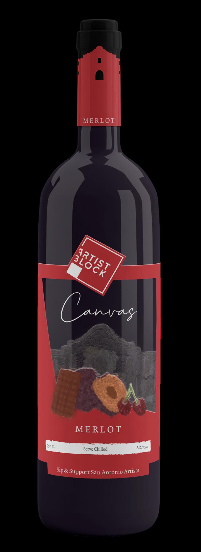
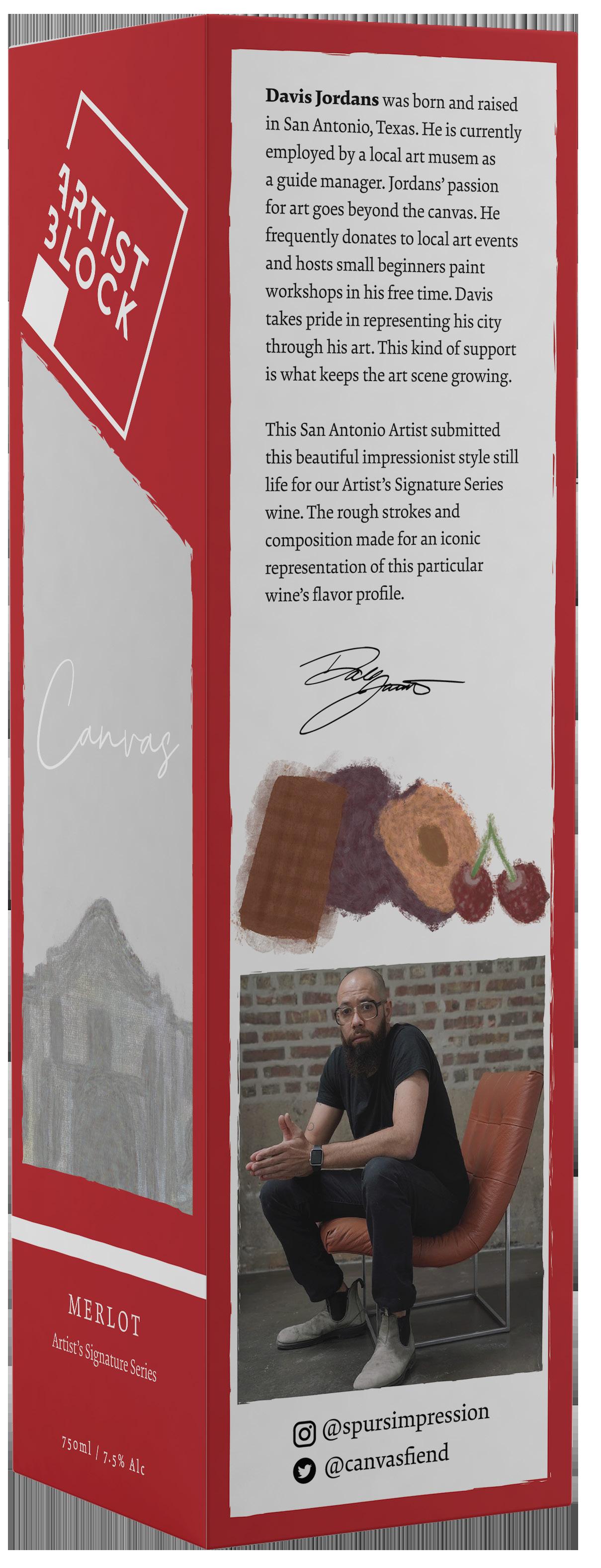
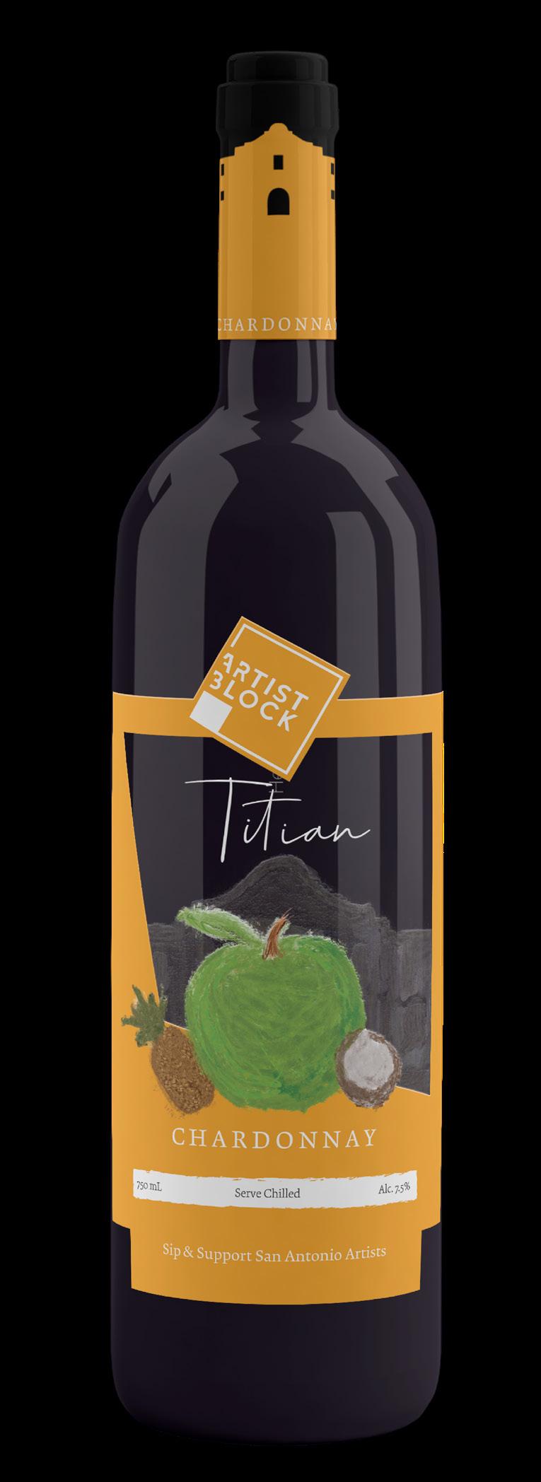
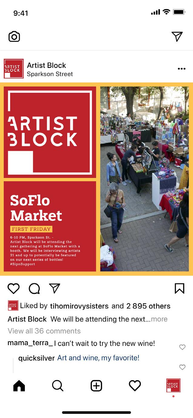
Deliverables: 3 wine labels, 1 wine box, social media campaign and print advertising series
This project was the result of creating an wine company that operates out of San Antonio, Texas. The hypothetical brand is unique because of its commitment to the local art scene and large financial contributions to art events. Goals for this project included creating a memorable logo, a cohesive set of wine labels, and a multi-media advertising campaign that include pushing the brand’s connection to the San Antonio art scene.

Logo

Design Standards
color palette
TITIAN RED
CMYK 00/98/98/00
RGB 236/38/38
IMPRESSION ORANGE
CMYK 02/71/99/00
RGB 236/108/36
Color Palette
RIVERWALK BLUE
CMYK 100/84/21/07
RGB 30/68/128
CHARTREUSE GREEN
CMYK 64/00/96/00
RGB 100/188/75
CANVAS YELLOW
CMYK 00/25/79/00
RGB 254/196/80
PTHALO GREEN
CMYK 72/36/99/25
RGB 74/108/51
Cody Guerra
mood board
Block Signature Wine Series
Artist
13
wine labels + box


Print series
social media campaign

This hypothetical brand had a unique call to action and acted as a strong proponent to the local San Antonio art scene. 50% of their earnings sounds steep but it makes all the difference keeping the culture of the arts alive. A brand where you can sip and support.


Block
Artist

cjcreativework@gmail.com cjcreative.net 361.227.1026 CORPUS CHRISTI, TEXAS


 Logo progression for this brand shows how I dialed back the scale and kept some unique details that would help push the brand through a memorable visual voice.


 #1C4257 #A42323 #328A81 #F1CA4E #BBD4B2


 female riders
This product showcase spread breaks down the key features in each of the signature series jackets


