It's so exciting to welcome you to the first issue of 2025, a year that promises to be full of inspiration and innovation in the Interior Design world. In this special January edition, I’m glad to inaugurate a journey through colors, materials and ideas that outline the Design Trends of the Winter season and celebrate creativity in all its forms. On page 20 a palette that combines warm tones, vibrant patterns and sensorial textures, offers endless possibilities to transform any space into a cosy refuge. Each shade has been carefully chosen to be a perfect match for what will be the protagonist throughout 2025: the Color of the Year Mocha Mousse (page 48). This soft and enveloping shade of brown is more than just a color - it is an invitation to slow down, to reconnect with ourselves and to create spaces that promote calm and presence.
Another unmissable topic is the Maison&Objet fair, which will be held in Paris in mid-January (page 59). The theme Sur/Reality, a bold exploration of the boundaries of creativity, is an invitation to joint the ordinary with the extraordinary, reimagining possibilities in every corner of the Design world. This issue will take you inside the main novelties of the show, anticipating the most surprising tendencies and protagonists.
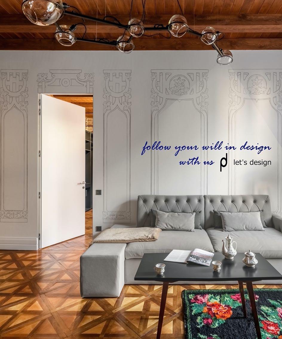
As you browse these pages, you will discover a proposal of Interior Design works by the best designers and architects on the international scene. Each of these projects represents a unique balance between tradition and modernity, soft and raw materials, neutral tones and bright accents. On page 82, the renovation of a Victorian building in London by Sara Leonor, who has masterfully integrated new pieces of furniture and art into a historical context, transforming it into her home and studio. The house designed by Greg Natale stands out with its marriage of brutalist architecture and bold, modernist-colored interiors, which captures the spirit of contrast (page 106). No less fascinating is the project by Hanna Pietras Architects (the subject of our cover): a tribute to the classics that warms the austerity of the Bauhaus (page 118).
Hope this issue inspires you, excites you, encourages you to explore new ideas.
With love,
G ANDG MAGAZINE.EU
INTERIORS
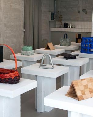
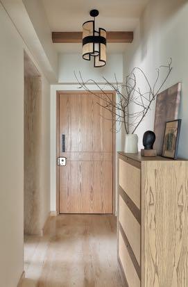
Casa Giolitti
The interior design firm based in Naples, IN-NOVA STUDIO renovated a 140 m² apartment in Aversa, Italy.
ARCHITECTURE
Richmond House
With the primary goal of crafting a home that accommodated a growing family, studio gram projected a residence in South Australia with a garden focused aesthetic to guarantee the indoor-outdoor experience.
SHOWROOM
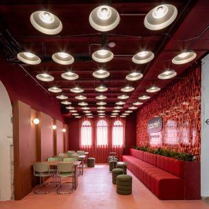
Opposing Emotions: Between the Walls studio presents One by One Flagship Showroom
The highly anticipated One by One Flagship Showroom has opened in the heart of Kyiv, offering a refreshing take on contemporary retail design.
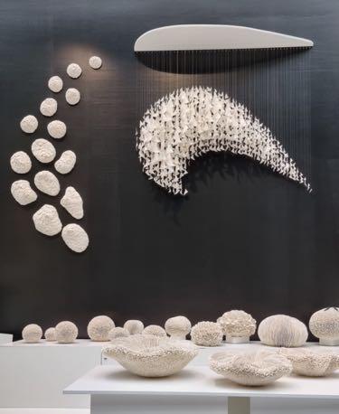
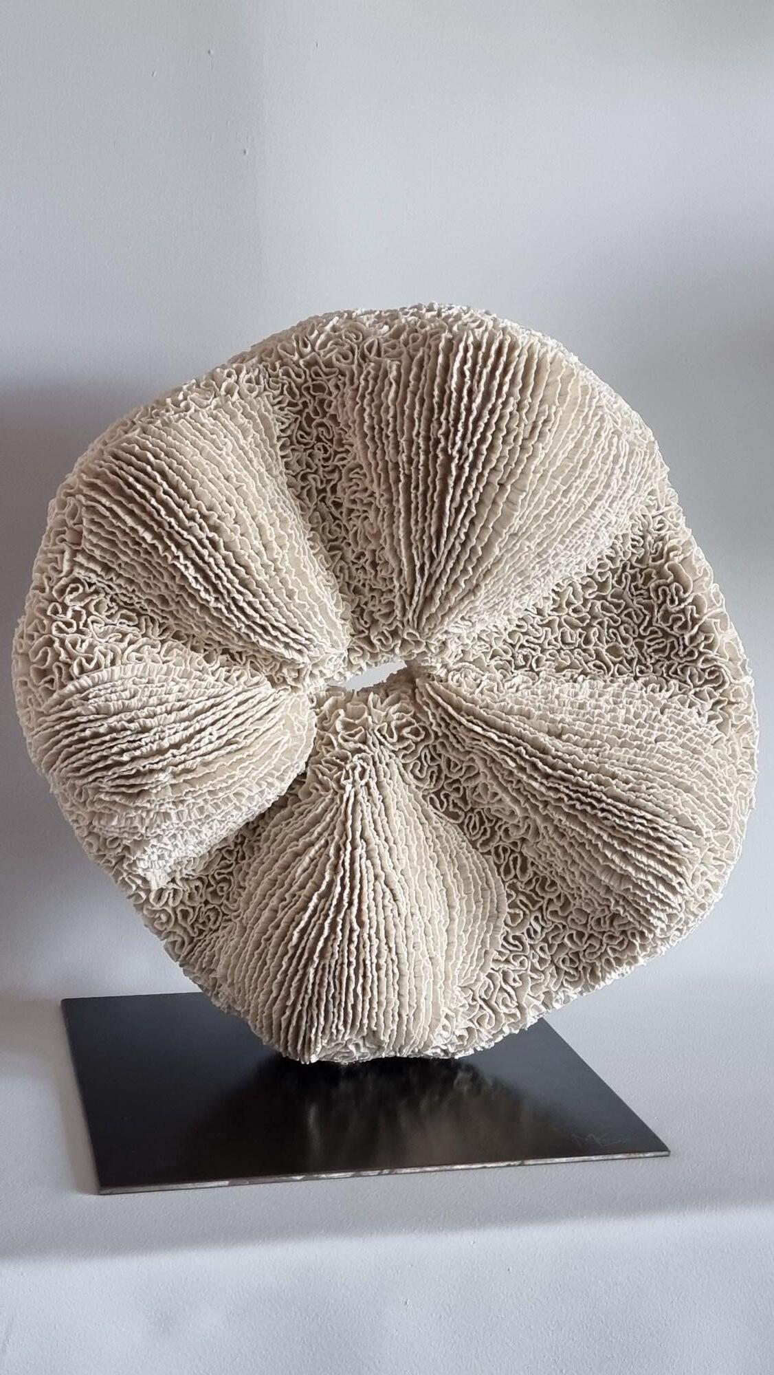
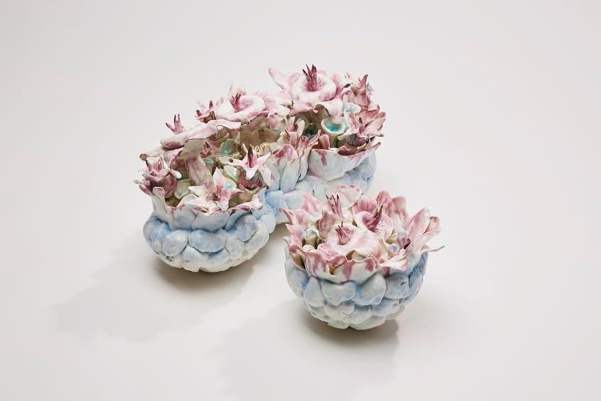
Marik KORUS Céramist
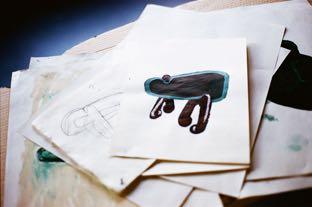
In her studio in Charente-Maritime, Marik Korus conducts constant research in order to always go further in terms of rigor, volume, richness of rendering or in risk-taking. The complexity of the artist's pieces makes each observation unique, the observer constantly discovers new facets, which modify the reading of the piece and question its creation. Marik Korus draws a large part of her inspiration from the world of the seabed. The long hours of work spent in her studio give birth to "incredible membranes, tubes, waves, rustling, almost breaths - a poetic wandering in the white purity of porcelain..." which draws the viewer into the Universe of the Artist. Visit www.marik-korus.fr to discover the full gallery!
Image courtesy LA REDOUTE INTERIEURS
DESIGN TRENDS
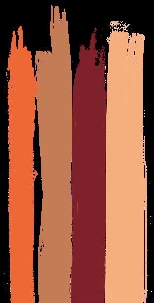
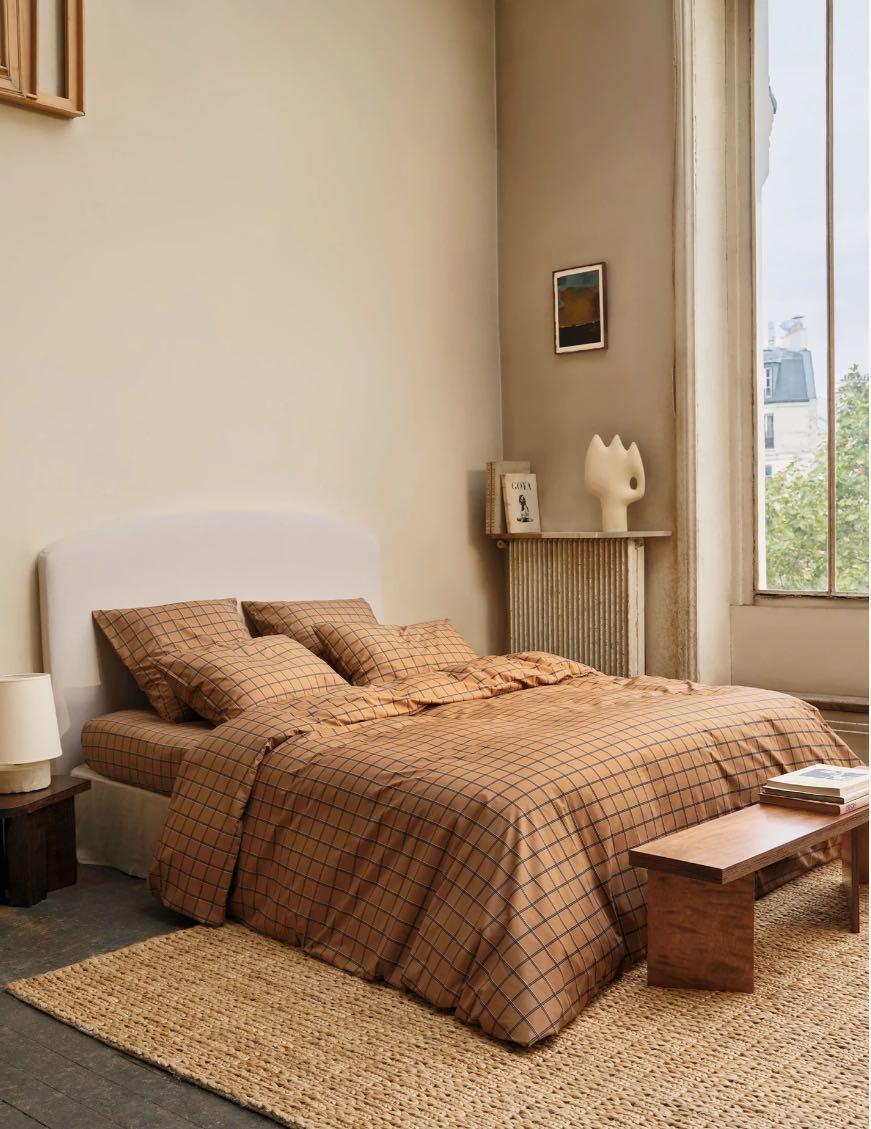
The protagonist of this Winter season is a slightly extravagant but delightful tint palette that revolves around the Color of the Year 2025 - Mocha Mousse. Each shade in the selection easily lends itself to pairing with the leading shade of the Year, and focuses on the innovative use of textures, patterns and blends to enhance chromatic depth and add personality to spaces.
Mandarin Orange
IT IS A BRIGHT ORANGE THAT INSTANTLY CHEERS ANY SPACE. USED WITH GEOMETRIC OR FLORAL PATTERNS, IT CAN OFFER SURPRISING COMBINATIONS TO MATCH DIFFERENT TASTES AND NEEDS.
Home accessory by
UNLIMITED IDEAS
Karl 1 Chair by MAMBO UNLIMITED IDEAS
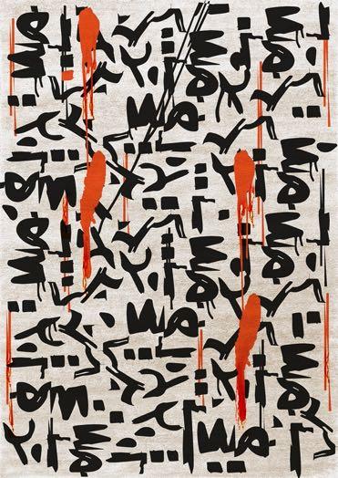
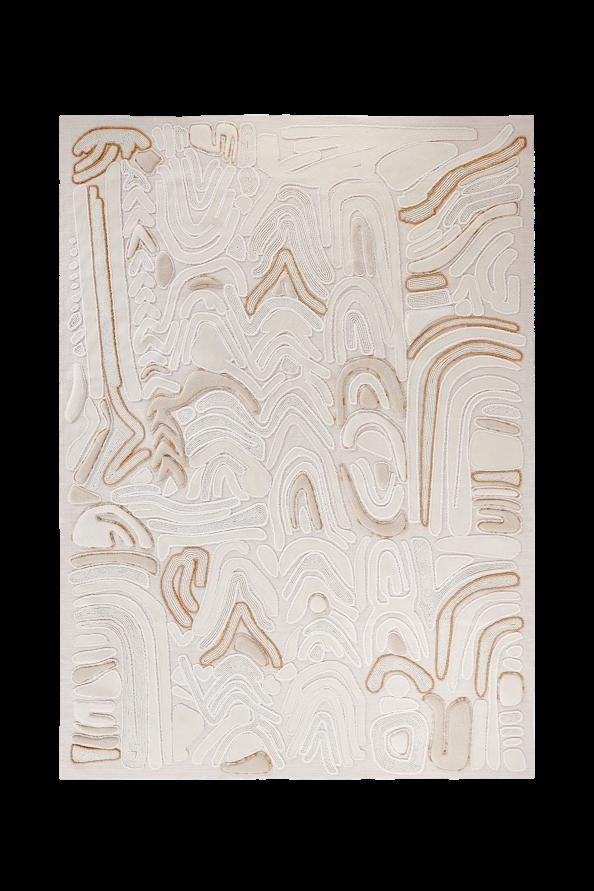
Inkaholic Rug by RUG’ SOCIETY
Elephant
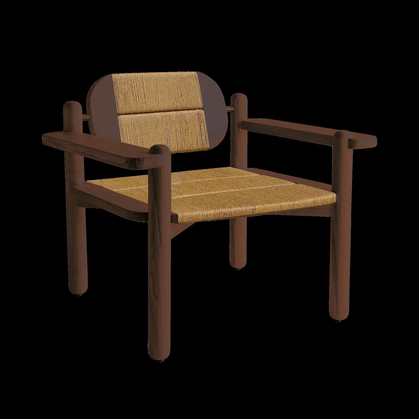
MAMBO
Lux Velvet Fabric by KOKET
Romero Sofa by BRABBU
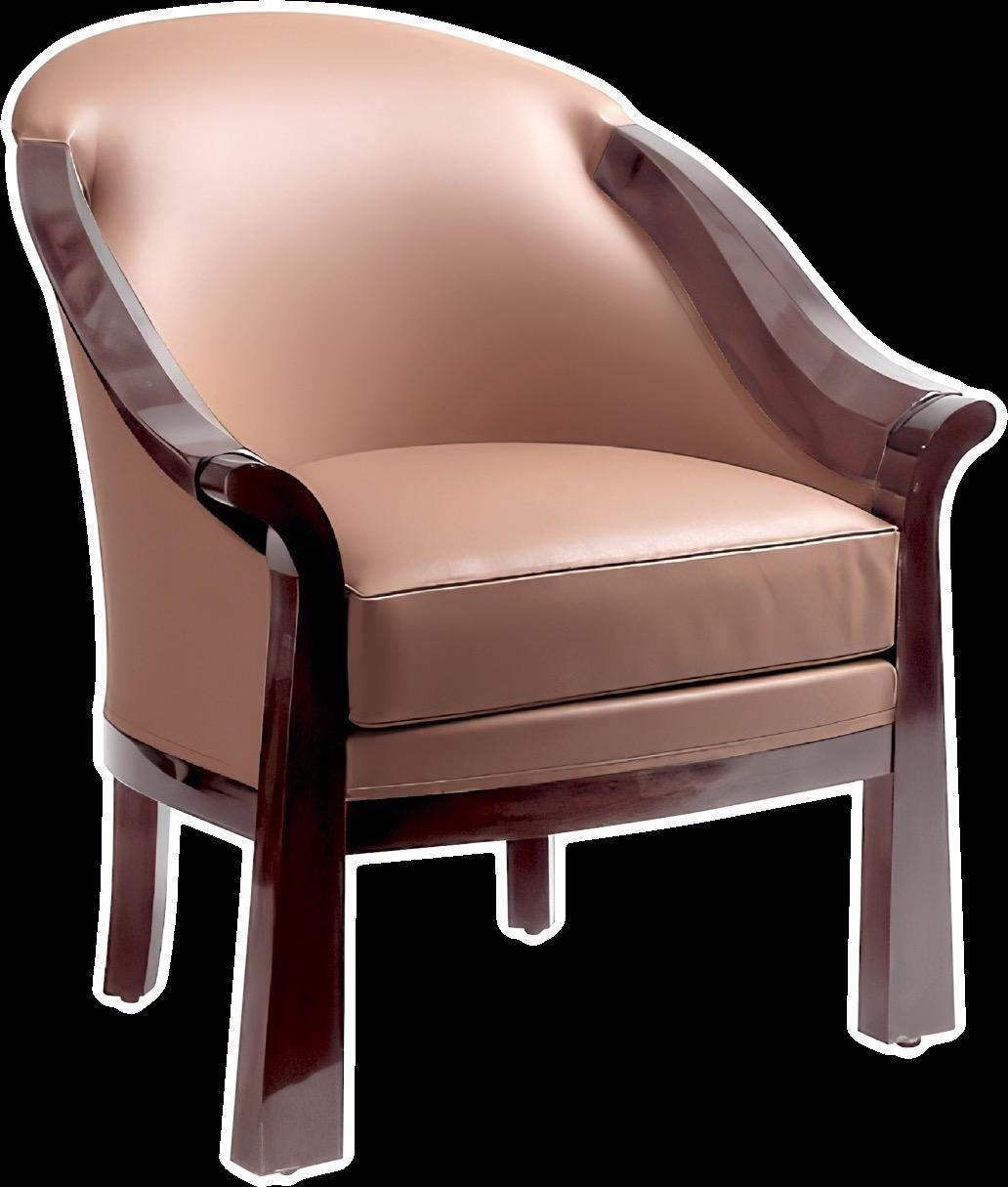
Evelyn Armchair by MEZZO COLLECTION
Fontainebleau Terraco=a Rug by ÉDITION 1.6.9
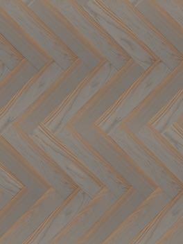
Quadro=e Kiev Parquet by BERTI
Ursule Suspension by ENAMOURA
Croix Armchair by MAMBO UNLIMITED IDEAS
Caramel
THE COMFORTING AND EARTHY SHADE OF CARMEL IS A GREAT MATCH FOR MOCHA MOUSSE WHEN YOU WANT TO STAY TONEON-TONE. THIS EXCITING MEETING OF TWO SIMILAR TONES OFFERS WARMTH AND COSINESS, INFUSING SPACES WITH A SENSE OF HOME INDULGENCE.
Carreau Caramel CoOon percale sheet set by BONSOIRS
#WINTER2025
Winery
THE RED SHADE INSPIRED BY THE RICH COLOR OF THE WINE IS A PERFECT MATCH WITH THE MOCHA MOUSSE: IT CREATES A PLEASANT BUT AT THE SAME TIME PROFOUND VISUAL CONTRAST. TO ENHANCE THE INTENSITY OF THE WINERY, IT IS SUFFICIENT TO ACCOMPANY IT WITH TOUCHES OF GOLD.
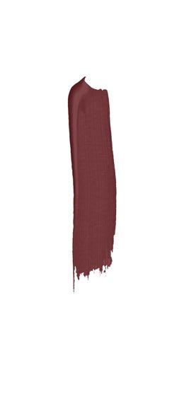
Uluru Paint by PURE & PAINT
Nº 11 Chair by BOCA DO LOBO
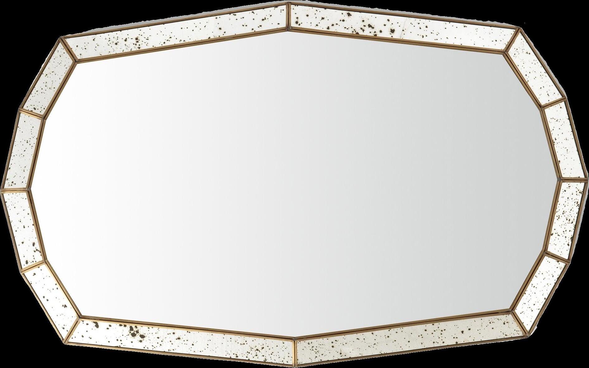
Belize Mirror by BRABBU
Malkiy Sofa by BRABBU
Rocaille Carpet by MARGAUX KELLER COLLECTIONS
#WINTER2025
Peach Cobbler
WARM AND INVITING, THIS SHADE CONJURES THE HOMELY SCENT OF CINNAMON-SPICED PEACHES! THE BOLD TOUCH OF CORAL BRINGS OUT THE PLAYFUL SIDE OF THIS VIBRANT ORANGE - BRINGING SPACES TO LIFE FOR THOSE LOOKING TO BRIGHTEN THEIR WORLD WITH PURE, STRIKING COLOR.
Tie Dye black Rug by REUBER HENNING
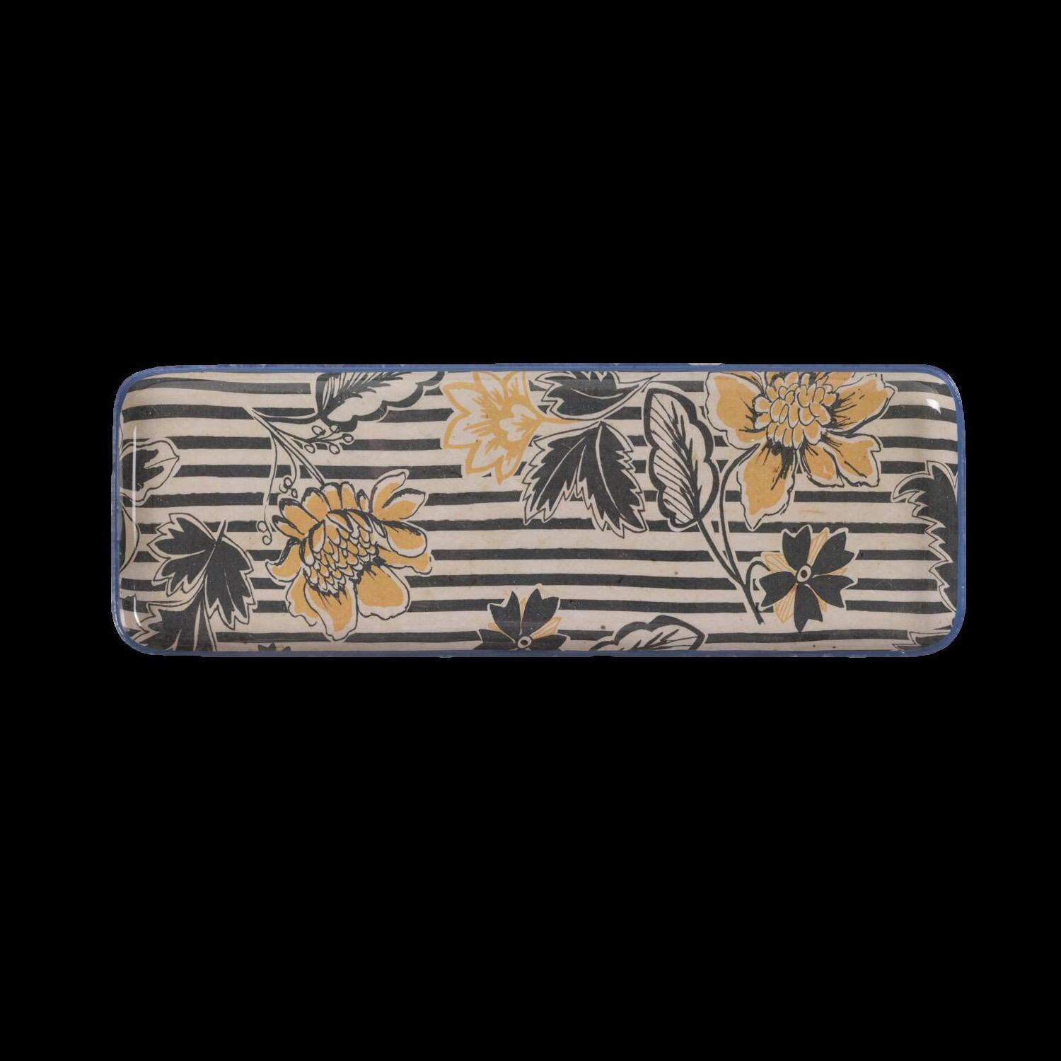
Atari Ritournelle Tray by LE MONDE SAUVAGE
Atari Madagascar Tray by LE MONDE SAUVAGE
Waters Carpet by BARTOLI DESIGN
Powel Sofa by BRABBU
LUXURY LIFESTYLE AWARDS PRESENTS
E-SHOP
Buy new design products for your home makeover: the best tips and latest arrivals that will make the transition to the new season easy.
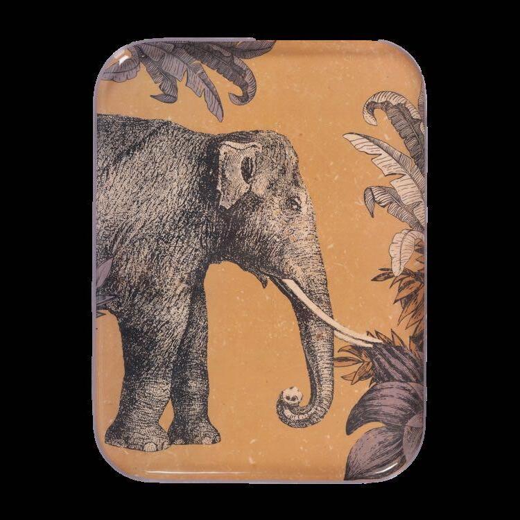
Atari Tokyo Tray by LE MONDE SAUVAGE €28,00
2
Reva Izamal Plaid by LE MONDE SAUVAGE €215,00 1 4
3 Henri Pencil pot by WARREN & LAETITIA €19,00
€180,00
€75,00 8
Fauvita Set of 6 amber glass tumblers by LA REDOUTE INTERIEURS
€49,99 Romy - Orient Candle by STUDIO GAÏA
Soggiorno Canvas by Serena Barbieri / WILO&GROVE
€2.300,00
Sheet set by BONSOIRS x MOISMONT
€270,00
Marron d’Inde / Marron Casse Noisette Velvet paint by PURE & PAINT
€22,90 Impro Tokyo Tablecloth by LE MONDE SAUVAGE
Mirèio Armchair by MARGAUX KELLER COLLECTIONS €1.570,00 12
by Camille Omerin
Marx
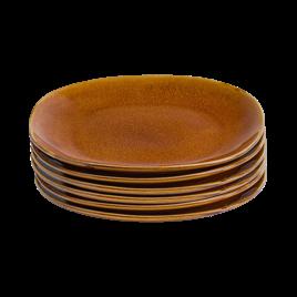
Set of 6 flat plates by LA REDOUTE INTERIURS
€59,99
x LA REDOUTE INTERIURS
€159,00
€17,99
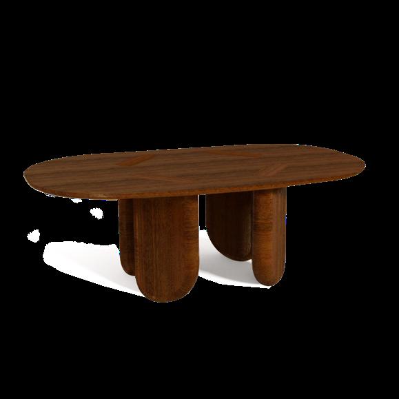
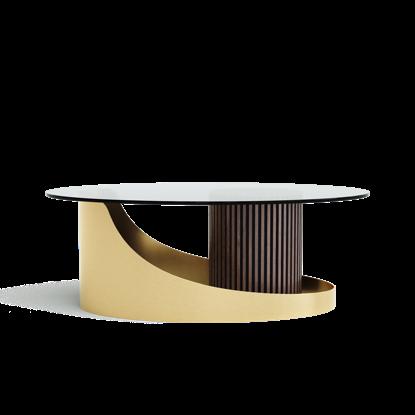
Coffee table by MARGAUX
Mirror
Valira
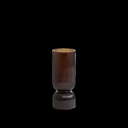
Ribbed glass vase by LA REDOUTE INTERIURS
Chandi
LATEST NEWS
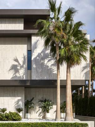
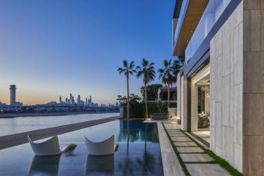
Kural Vista
In collaboration with Executive Architects CK Architecture Interiors, SAOTA designed Dubai villa on Frond G of the iconic Palm Jumeirah for developer Alpago Properties. The brief –to create a home that would maximise the allowable area and embody a sense of refined luxury – was open to interpretation from a design standpoint. This allowed the team freedom to interpret the notion of residential luxury freely in the context of this exclusive enclave. The team drew on the striking waterfront site – harnessing its considerable views – to design a villa that merges with the urban landscape and, in signature SAOTA fashion, seamlessly integrates indoors and out. www.saota.com
Rich materials
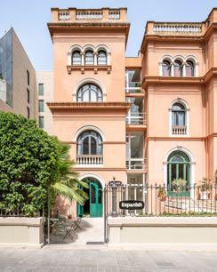
Led by Alberto Eltini and Marina Martín, El Departamento reimagined Barcelona's historic Casa Degli Italiani as a new home of the Expanish language school. The project respected the rich historical heritage of the Renaissance building, preserving characteristic elements such as the high ceilings with wooden beams, vaults and decorative details. The intervention followed a conservative approach, maintaining the original structure and enhancing the history of the place without introducing a new architectural style.
Paloma Bau designed the first Madrid space of Carmencita Film Lab, a leading company in the development and digitization of analog photography. Led by architect and interior designer Paloma Bau, the studio has materialized an innovative project inspired by Richter's camera obscura. This establishment serves as an ancestral device where exterior light merges with a perimeter interior skin.
Adress: Calle de Arganzuela 3, 28005 - Madrid, Spain www.palomabau.com
Artisan elegance
Alva Musa launched the Oasis center table: it harmoniously combines the warmth of wood with the fine curved metal, creating a refined and distinctive design. Perfect for exclusive furnishing projects, this table is a masterpiece of craftsmanship that adds style and sophistication to any room. www.alvamusa.com
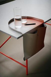
Innovative desk accessory
Ippolito Fleitz Group is glad to present the SALTO - a practical and sustainable saddlebag for the desk that keeps the workplace organised. Developed for Stuttgart-based furniture manufacturer Richard Lampert, the storage object and office accessory is made from washable vegan paper and balances on the edge of the table like a casual saddlebag. www.ifgroup.org
Open atmosphere
MUKU design transformed a 153㎡ century-old house in Imizu City, Japan, into Mokkado Café. Operated by a 75-year-old pharmaceutical company, the café honors its roots as the founder's birthplace and a former medicine factory. Specializing in Chinese herbal medicines and healthy foods, the company now offers chai and shaved ice inspired by traditional Chinese herbalism.
Address: 2643-1 Kurokawashin - Imizu-City, Japan www.mukudesign.jp
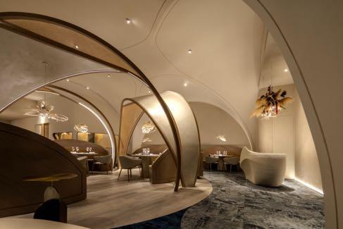
Culinary Haven
Space Copenhagen has completed the interiors for Chef Keita Kitamura’s new 40-seat restaurant, Apothéose, located in Toranomon Hills Tower
Tokyo. Blending the rich tapestry of Japanese culinary traditions with the refined influences of French culture, the interiors seamlessly weave together elements designed by Space Copenhagen to craft an environment that is not only inviting but also serves as the perfect backdrop for patrons to indulge in Chef Kitamura's extraordinary cuisine.
Address: 49F, Toranomon Hills, Station Tower, 2-6-2 Toranomon, Minato-ku, 1055549 - Tokyo, Japan www.spacecph.dk
Between past and future
Simple Architecture redesigned completely the Hotel Hello Plovdiv, characterised by solid facades and a dark inner courtyard. The facade was redesigned maintaining the original geometry, lightened by white and vertical aluminum profiles that give depth and dynamism. Perforated panels filter the light, enriching the composition. In the courtyard, the solid roof was replaced by a glass covering, creating a bright and airy environment. The interiors, inspired by the architecture of Plovdiv, use light tones and various textures, with traditional materials such as lime mortar and references to local stone, for a calm atmosphere. Address: 33 A, KarshiakaSeveren, ul. Ibar 33a, 4003 - Plovdiv, Bulgaria www.simple-architecture.com
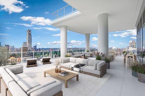
A look inside $42.5M
NYC Penthouse
The 200 East 59th Street building unveils the interiors with virtually staged images of the combination penthouse 33/34 that combines the top three floors. With panoramic view of Central Park and seamless indooroutdoor experience, the speculative triplex's modern interiors draw inspiration from 432 Park Avenue to attract buyers in search of elegant design. Wraparound terraces encircle each floor, with space wide enough to accommodate chaise lounges and dining tables, and there is a partially covered 212 m² rooftop deck. www.200east59.com
A wind of poetry
Designer and ceramist Alan Louis is pleased to present the Libra chandelier: a piece with a distinctive style, characterised by decorative ceramic elements that give it a natural and delicate look. The design emphasises a soft and organic texture, with an emphasis on artisanal materials and refined details. www.alanlouisparis.com
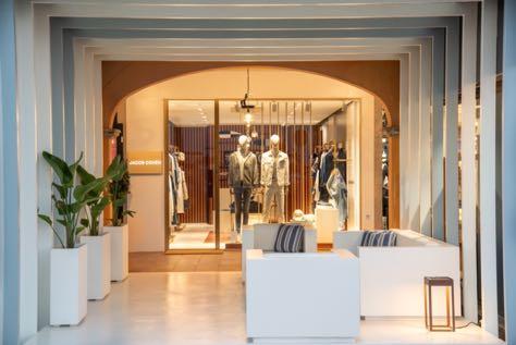
Inspired by the sea
Architect Stefano Cellerino, co-founder of FASEMODUS Architettura, signs the project for the opening of the new Jacob Cohën boutique in Palma de Mallorca. The concept reflects the image of the luxury denim brand that stands out for a combination of materials such as concrete, wood, brass and glass, creating a metropolitan, contemporary and sophisticated style. In line with this aesthetic, the new Mediterranean concept maintains the elegance of brass, with a reference to the naval sector. Address: Puerto Portals, Edificio B, Local 30, 07181Portals Nous, Balearic Islands, Spain www.fasemodus.com
Sea, Culture & Sustainable Design
Located near Kaohsiung Port, Taste Journey, designed by TaG Living, is a Michelin Green Star destination in Taiwan that celebrates French cuisine and local culture. Rooted in the city's maritime heritage, the restaurant creates seasonal menus inspired by Kaohsiung's customs and climate. The design is based on four main themes: sustainability, interdisciplinary collaboration, art and eco-friendliness. Influenced by the coastal location and seafood tradition, the design integrates elements of the port, ships and classic French style into six immersive zones - each tells a story, offers specific functions and reflects the essence of the sea, with a circular layout characterized by dynamic curved lines. www.tag-living.tw
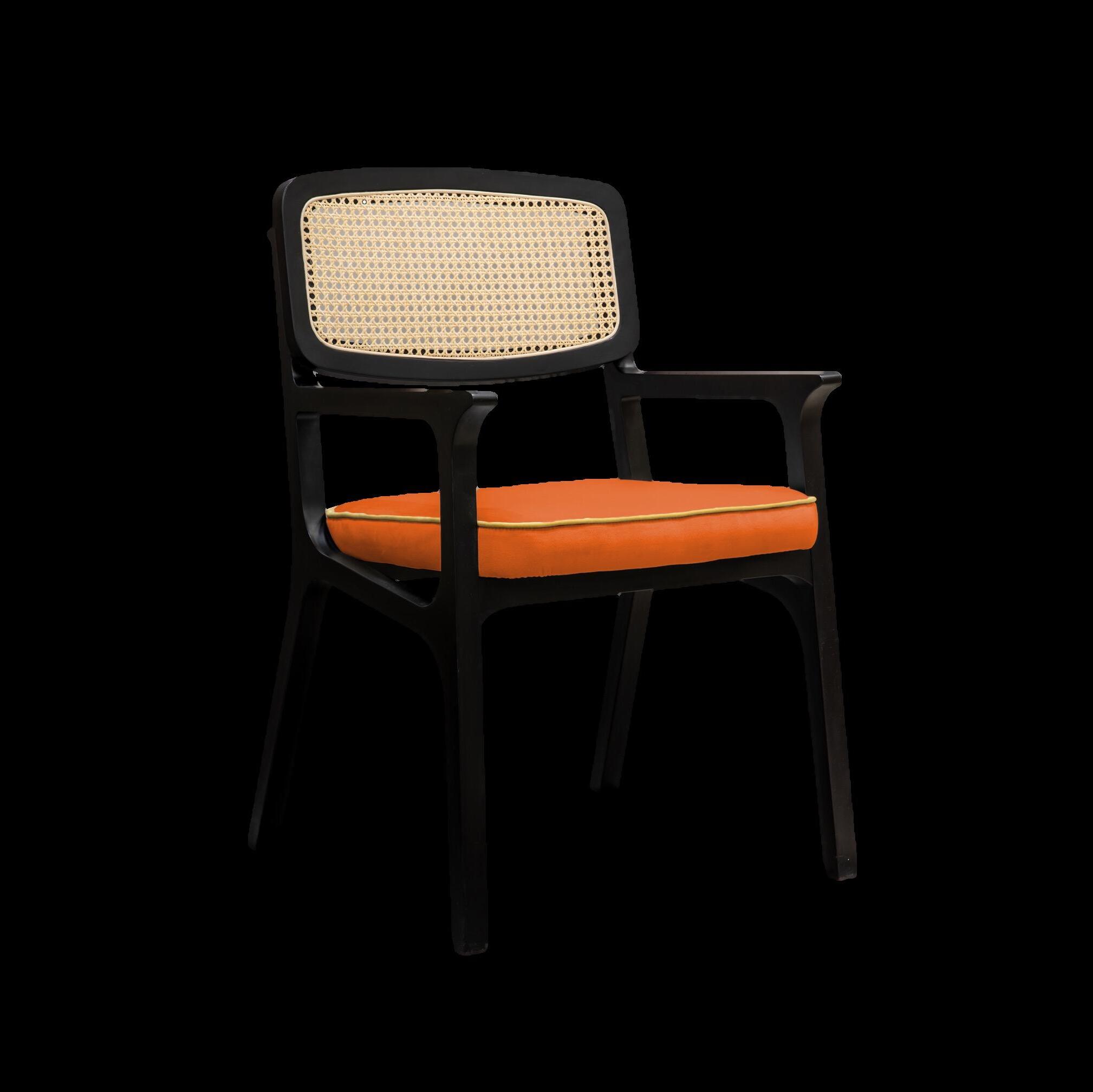
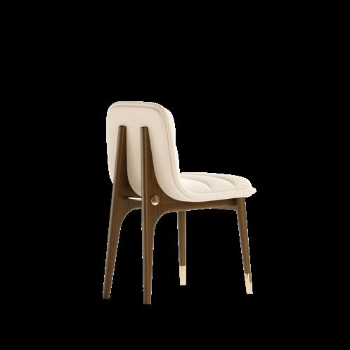
Retro charm
Crafted from rich, walnut wood, the new chair of Mezzo Collection exudes the classic elegance of mid-century design, with clean lines and gentle curves that provide both style and stability. The polished brass accents adorn the chair, subtly catching the light and adding a hint of glamour. www.mezzocollection.com
Strict but cosy
Anastasiia Lukashova, the founder of Luka Design, designed a 50 m² office in Kyiv, combining the opposites: the coldness and harshness of steel and the warmth of wood veneer, precise metal shapes and the lively cut of natural marble.
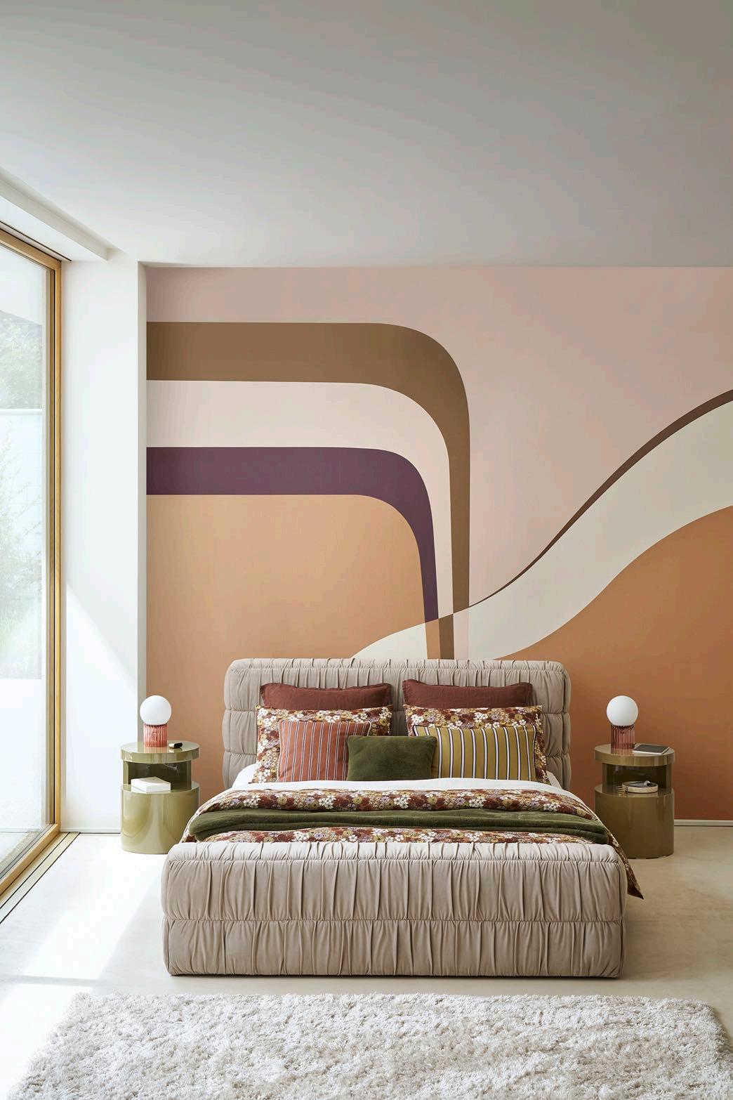
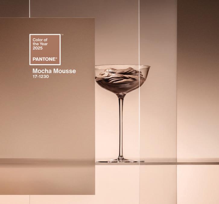
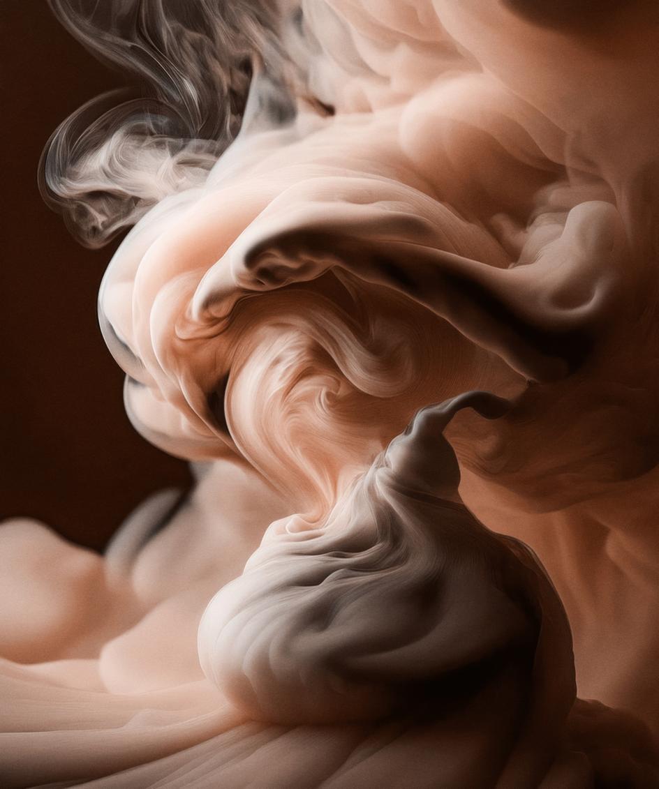
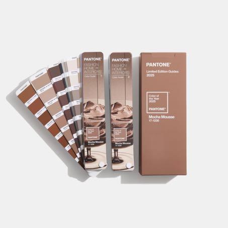
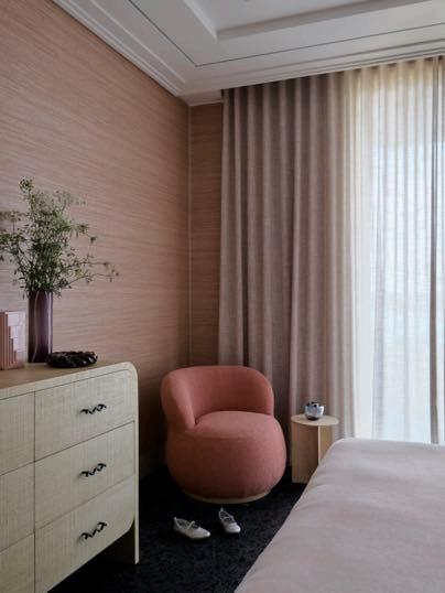
A warming rich brown hue - PANTONE 171230 Mocha Mousse nurtures with its suggestion of the delectable quality of cacao, chocolate and coffee, appealing to our desire for comfort every day. There is a growing movement to align ourselves more closely with the natural world. Characterized by its organic nature, PANTONE 17-1230 Mocha Mousse honors and embraces the sustenance of our physical environment. Imbued with authenticity, this brown shade finds harmony and balance between the demands of modernity and the timeless beauty of artful creation.
1 CD10 Chair by LA CHAISE FRANCAISE x GUILLAUME DELVIGNE 2. James Thessalie Cushion by LE MONDE SAUVAGE
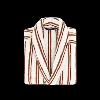
3. Madeleine Mug by REVOL 4. Club Caramel Bathrobe by BONSOIRS
5. Closerie Naturel Rug by ÉDITIONS 1.6.9
“
For Pantone Color of the Year 2025, we look to a color that reaches into our desire for comfort and wellness, and the indulgence of simple pleasures that we can gift and share with others.
Laurie Pressman, Vice President of the Pantone Color Institute
Being an extremely versatile shade, PANTONE 17-1230 Mocha Mousse creates a uniform color base that adapts to a variety of applications, from minimalist to decorative, within the design and color space. With its warm and enveloping tone, it lends itself to creating elegant and welcoming atmospheres. PANTONE 171230 Mocha Mousse can be used as a primary color for walls, giving depth and intimacy to spaces, especially in living rooms and bedrooms. Combined with neutral tones such as off-white or light gray, it creates harmonious and refined contrasts. For a bolder touch, it can be combined with jewel colors such as emerald green or petrol blue, enhancing their elegance. In textiles, such as curtains, rugs and upholstery, it adds texture and warmth, while in dark wood furniture or bronzed metal accessories it recalls a timeless aesthetic. It is the ideal color to transform environments into comfortable refuges, where design and functionality meet.
Coffee exfoliating soap by Fringe x CIMENT
Gravinis Naturel Rug by ÉDITIONS 1 6 9
Newton Wall lamp by BOCA DO LOBO
Marcia Marble box by LA REDOUTE
Flow
Suspension by CASTRO LIGHITNG
Tiffany Center table by CASTRO LIGHITNG
lush, yet at the same time an classic, PANTONE 17-1230 Mocha perceptions of the browns and grounded to embrace the luxe. Infused with subtle refinement, this brown shade presents a discrete and tasteful touch of glamour.
Leatrice
Eiseman, Executive Director Pantone Color Institute
SUR/REALITY
NEW CREATIVE HORIZONS
From 16 to 20 January 2025, Paris will once again be the protagonist with Maison&Objet, the international interior design and decoration fair, which this year presents itself with an inspiring and visionary theme: Sur/Reality. In collaboration with Peclers Paris, the event explores the rebirth of a new Surrealism, a creative movement that celebrates fantasy, the unexpected and originality.
The first two collections by Studio MoA&G each begin with seats because to feel good is first and foremost to sit as you wish
The MoGeo collection is rooted in a reinterpretation of the MullCa, France's iconic school chair. The first part of the collection is therefore a reflection of adult-child seating, complemented by seating for social areas The seats are wide and enveloping to suit everyone, young or old, small or large
The journey continues with the TLS collection, ‘Tous les sens’ in French ('In all directions'). Designed for the world of business and meetings, this collection focuses on how to feel good and be able to move without moving the furniture You can turn around and sit as you please. This seating range is complemented by a series of light fittings that allow us to direct the light as we need it
The brand of objects & furniture focused on use, comfort and colour, while questioning the sustainability of projects, for long-life product.
Opportunities for integration. Image of a potential space designed by Clara Jeantaud
Bergère MoGeo, available in 3 legs colors and 4 fabric colors.
Collection TLS Image of a potential space designed by Camille Lemaire
“We wanted to take a much more contemporary approach to Surrealism by interrogating its explosion into multiple modes of expression and looking far beyond the centenary celebrations. This capacity to reintroduce a fantastic element and shake up the established order is an extremely rich and fertile starting point for imagining new forms of reality, and Sur/Reality reveals new readings of this universe ” Charlotte Cazals & Brune Ouakrat of Peclers Paris
In an era marked by complexity and chaos, Sur/Reality feeds on distortions, chance and poetry to propose alternative realities that, with their eccentric charm, know how to amaze and enchant.
Between unexpected objects and dreamlike scenography, the fair promises to satisfy the increasingly marked desire of consumers to be surprised, offering innovative ideas that redefine the concept of creativity.
Maison&Objet is not just a showcase for the latest trends, but a real journey into imaginative landscapes where design and dream meet, giving life to productions that are as extraordinary as they are desirable. It is an invitation to suspend everyday reality and immerse yourself in a world of wonders that promise to leave their mark. Surrealism, born exactly a century ago, continues to be one of the most influential and stimulating forces in the creative landscape. The Sur/Reality theme of this edition of Maison&Objet is not only a tribute to masters such as Magritte and Dalí, but also a contemporary reinterpretation of their aesthetic processes and languages.
The characteristic elements of the surrealist movement – the dream, the absurd and the play of unexpected associations – are
updated to meet the needs of a world that seeks new forms of expression and connection. Today, like a century ago, Surrealism invites us to explore parallel dimensions, where conventional rules give way to imagination and intuition. With Sur/Reality, these principles come to life through installations and objects capable of transforming spaces into dreamlike scenography. More than a simple aesthetic, it is an emotional and almost instinctive approach, in which design does not speak to rationality, but to the heart and the unconscious. The combination of unusual materials, fluid shapes and chromatic contrasts creates atmospheres that capture and involve, offering an immersive and surprising experience. This celebration of the unreal also becomes a powerful tool for reflection: in a world increasingly governed by rules, data and certainties, the return to the absurd and the fantastic proves to be a liberating antidote. Surrealist design is an open window onto new perspectives, a break from everyday life to find a more authentic contact with our inner self.
Maison&Objet thus confirms itself not only as the showcase of the most current trends, but also as the stage for exploring new creative horizons, where imagination and design collaborate to give life to a future as surprising as it is desirable.
THE ABNORMAL AND THE STRANGE:
OPENING THE DOOR TO DISCOVERY
The allure of the abnormal and the strange lies in their power to expand the boundaries of creativity and spark new discoveries. This principle was masterfully illustrated by Philippe Starck, a selfdescribed paraphysicist, who explored the “science of imaginary solutions” cherished by the Surrealists. At an exhibition in Paris, Starck posed the thought-provoking question: What if the Seine were a lake? This unconventional perspective transformed an ordinary river into a source of boundless urban reinvention. By deliberately distorting reality, blending opposites, and bypassing the constraints of logic, Starck demonstrated how innovative formal languages can emerge. These languages are characterized by what he calls “delightful disorder,” a chaos that captivates and inspires.
Italian design brand Seletti embodies a similar ethos, pushing boundaries through provocation, poetic interpretation, and playful engagement with Surrealist codes. Among its iconic creations, the AtticWindow Lamp stands out a luminous sculpture resembling a window a serene blue sky. This unmistakable homage to
Surrealist master whose art blurred the line between dream and reality.
Both Starck’s explorations and Seletti’s creations remind us that the strange and unexpected are not merely curiosities; they are fertile ground for innovation. By embracing the unusual, designers craft challenge conventions, and transform the everyday extraordinary.
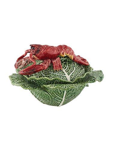
Poetic designs invite us to pause and daydream, while mischievous creations add joy and humor to everyday life This playful spirit represents a liberation in the design process, breaking free from rigid rationality and shifting away from technology’s utilitarian constraints. Instead, these creations cater to our innate desire for escapism, acting as bridges between the mundane and the extraordinary. For example, Bordallo Pinheiro’s containers as cabbages, walnuts, or papayas, they turn the familiar into something extraordinary, elevating everyday dining into a sensory experience. Similarly, the cocktail glasses from &Klevering feature twisted stems that distort reality even before the first sip, introducing a surreal touch to any gathering.
“Together with Peclers Paris, we are continuing our work both to decipher consumer expectations in an ever -changing context and to identify tangible stylistic trends that will generate new business. Inspiration, curation, and solutions remain the virtuous triad that shapes the interpretation of the theme at the show, through a carefully curated selection of products and innovative scenographies. ”
Mé lanie Leroy, Managing Director of Maison&Objet
MULTIDIMENSIONAL JOURNEY THROUGH MAISON&OBJET
The theme of Sur/Reality will unfold across multiple dimensions at Maison&Objet, offering a rich tapestry of interpretations tailored to inspire professionals in the design industry. Central to this exploration are the three exclusive What’s New? exhibitions: In Decor, In Retail, and In Hospitality. These curated spaces, designed as immersive experiences, will feature original stage designs and carefully selected new products. The goal? To equip brands, retailers, and specifiers with the creative tools needed to make retail ranges distinctive and elevate the success of interior design projects. Each of the three professions is supported by a dedicated programme, reflecting the unique challenges and opportunities they face. The topic Sur/Reality will serve as a unifying thread running through the entire show, thoughtfully staged by Maison&Objet’s curators and enriched by the Talks programme. This immersive approach extends beyond the event itself, infiltrating the broader Maison&Objet ecosystem. From curated selections on the MOM platform to the dynamic Paris In The City events, Sur/Reality will permeate every facet of the experience, offering endless variations and interpretations of this singular theme. These initiatives reflect Maison&Objet’s commitment to fostering creativity and supporting its partners. By weaving together inspiration, innovation, and commerce, the event empowers businesses to stay ahead of trends and harness the power of design as a driver for success. This multifaceted approach ensures that every participant whether a brand, retailer, or designer can find fresh perspectives and valuable insights to inform their work.
THE COUTURIER OF THE GAME
SINCE 1978
ART IS AT THE HEART OF OUR KNOWHOW. THE BACKGAMMON DESIGNS ARE CREATED ACCORDING TO THE THEME REQUESTED BY THE CUSTOMER. THE DETAILS AND COLORS ADD A UNIQUE ARTISTIC DIMENSION TO OUR GAMES, TRANSFORMING THEM INTO VERITABLE WORKS OF ART.
FAYE TOOGOOD
DESIGNER OF THE YEAR
Maison&Objet is proud to present Faye Toogood as the Designer of the Year 2025, celebrating her remarkable contributions to the design world. Renowned as an iconic figure in British design, Toogood’s polymorphic approach transcends disciplines, blending art, interior design, furniture, and fashion with a unique creative language.
Faye Toogood refuses to limit herself to a single form of creative expression - design, fashion, sculpture, drawing, and interior decoration all serve as outlets for her boundless imagination Raised in the tranquil English countryside, free from the distractions of television and immersed in the beauty of the natural world, Toogood has always been captivated by the power of the mind. Her debut collection, Assemblage 1, was a tribute to simplicity, focusing on raw materials and English craftsmanship. This collection embodied Toogood's ethos of sculpting shapes that speak to the tactile quality of materials, celebrating the inherent beauty of the natural world. The Roly-Poly chair, a curved seat on four sturdy legs, brought Toogood worldwide recognition in 2014. Its success marked a pivotal moment in her career, solidifying her place in the global design scene.
For Toogood, designing limited-edition collections is a chance to explore and experiment Her collaborations reflect this experimental spirit, with her works gracing the collections of prestigious museums and galleries, including the Friedman Benda gallery in New York. She has worked with a range of respected design brands, from Italian rug maker cc-tapis to furniture powerhouses Tacchini and Poltrona Frau, and even wallpaper designers Calico.
One of her signature pieces, the Roly-Poly chair, has been produced in a mass-market version by Driade, while the studio continues to craft limited handmade editions. Toogood’s most recent work, Assemblage 8, is a playful exploration of modular furniture, reminiscent of children’s construction sets, further demonstrating her ability to merge the worlds of art, design, and experimentation into striking, functional pieces
“Give them pieces of a puzzle and let them figure it out. Creativity is at the heart of who we all are, where we come from and who we could be one day. ” Faye Toogood
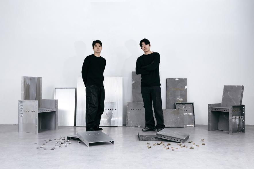
For the 2025 edition, Maison&Objet turns its spotlight to South Korea, a nation at the forefront of a cultural renaissance Riding the wave of ‘hallyu’ - Korea’s celebrated cultural ‘soft power’ - the peninsula has become a magnet for creative talent and a hub of global innovation. Renowned for its seamless blend of ancient tradition and cutting-edge modernity, Korea offers a uniquely dynamic environment that continues to inspire and shape the world of design. This vibrant creative landscape is fueled by a compelling interplay between heritage and futurism. International architects and designers flock to Korea to explore its rich cultural tapestry, while homegrown talents reinterpret traditional crafts with bold
originality. The new generation of Korean designers is reimagining ancestral techniques and materials, skillfully navigating the paradoxes of Western influence and their own deeply rooted cultural identity Their work pushes the boundaries between art and design, often erasing the lines entirely, resulting in creations that feel both timeless and avant-garde.
By choosing South Korea as the focal point for the 2025 Rising Talents Awards, Maison&Objet acknowledges the nation’s role as a powerhouse of cultural innovation. This year’s honorees exemplify the aesthetic and conceptual depth emerging from the region, making it clear that South Korea is not just a participant in the global design narrative it is shaping its future.
“The languages they weave are marked by an assertive futurism, refined originality and a reinvention of sculptural techniques. Moreover, our daily lives are fuelled by this giant of industrial and technological innovation Finally, even if the Korean creative scene is recognised today, we still have much to discover. ” Dereen O’Sullivan, head of the Rising Talents Awards
Dahye Jeong, 34, weaves horsehair on wooden moulds inspired by ancient anXques and tradiXonal Korean ceramics
Time dissolves in the hands of the weaver whose precious crad revives that of the Korean hat-makers who came half a millennium before her. With an emphasis on intricate paOern detail and transparent colour, she creates sculptural objects and relief wall pieces that are widely exhibited and have won mulXple awards.
In Yeonghye grew up in the 1990s in Yesan, in the ambiance of her parents’ furniture shop. It was a playground where her mother, who has a degree in fashion design, gave her a penchant for making things by hand. Following this path, she obtained a master’s degree in industrial design (at Chungnam National University) and began working with textiles in an intimately personal way. For the past two years, while in residence at the Korean Crafts Museum in Cheongju, she has been expanding her textile practice by producing sewn drawings, furniture and art objects. Using unique hand-sewing techniques, the artist moves away from the confines of functional structure to achieve a freedom of expression that is both liberating and comforting. Whether finely woven or roughly cut, velvet, cotton or terry, soft and thick, become a soothing, intimate comfort that invites you to touch, enfold and lean against, taking in its always positive vibrations.
Hwachan Lee and Yoomin Maeng, who founded Kuo Duo in 2021 in Seoul, incorporate experimental elements into each of their projects. They do so by using traditional wood treatment methods, for example, or more innovative recycled plastic methods. Striking a balance between the complexity of technical research and the simplicity of functionality, the studio designs and develops products, furniture and spaces under the direction of designers with international experience Their work ranges from industrial design (they collaborate with the Korean furniture brand Wekino), to limited editions and spatial installations, with the aim of expanding their own design typologies.
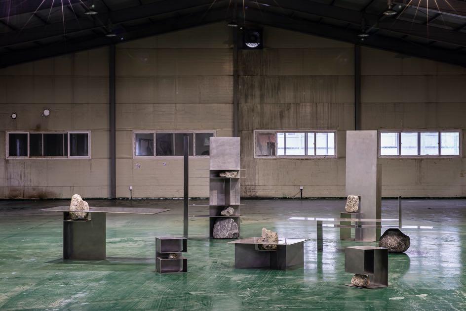
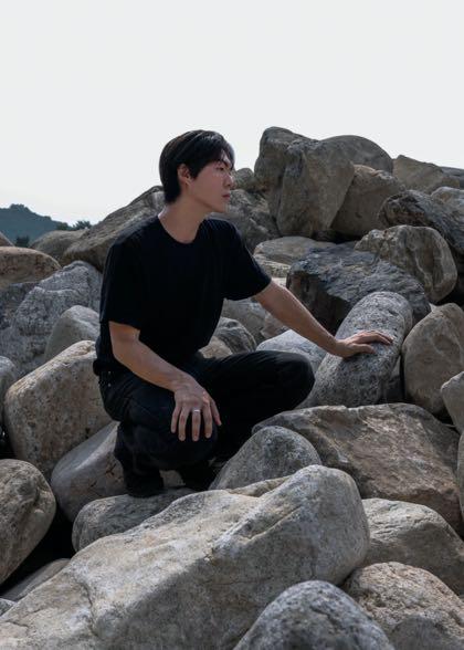
Profiled by the trade press in 2020, Sisan Lee, 29, based in Seoul, creates sculptural furniture and lighting worthy of museum installations. Fascinated by the shapes of the stones he collected, he decided to let the stones determine the dimensions of his chairs and shelves Combined with manufactured steel plates, the raw stones fulfil the desire for balance between nature and artefact Rimowa and Hyundai have adopted this highly aesthetic approach.
Minjae Kim, a 34-year-old Korean artist based in New York, designs furniture that acts as an antithesis to architectural practice (he has a degree in architecture) in terms of time, scale and accessibility. His creations in quilted fibreglass, bamboo and wood are like short sentences revolving around an idea. It might be a chair made of translucent leaves, or a lamp balanced by wooden weights. One of these lights up when two brass rods touch.
Woojai Lee draws inspiraXon from the small, even ignored, details of our everyday environment (old paper, damaged walls) to make solid benches, pedestals, bricks and parXXons. A Korean-New Zealander, he is a graduate of Dutch and Australian universiXes. Belonging to a foreign minority in the West makes him feel the beauty of silent presences, of what we don’t see. His work has been exhibited at the Stedelijk Museum in Amsterdam and the Saatchi Gallery in London, and is part of the permanent collecXon at the Schaudepot Lab, Vitra Museum in Germany.
Based in Seoul, Niceworkshop explores the physical properties of industrial materials. Hyunseog Oh, 30, and Sangmyeong Yoo, 27, who trained in interior architecture at Soongsil University, are transmitting a new design language, overheard on building sites and translated for art galleries Their first series of furniture, which forms an alphabet of this language, was inspired by fully threaded bolts. Their subsequent research led them to interaction and then to crafts inspired by nature, which they described as ‘neonaturalism’. Through their commitment to the reuse of industrial materials, new interpretations emerge.
MODERN
TWIST
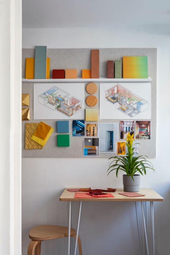
Spanish interior designer Sara Leonor transformed a three-storey Victorian building located on Upper Street, Islington’s main throughfare, London, into her home and studio.
Photography by Anna Batchelor
Sara Leonor has completely renovated this 150 m² property that was in a very poor state of repair and substantial changes to the layout and finishings were required.
The house’s original façade was restored, which had been painted light blue by the previous owners. Sara helped return it to a more natural, traditional tone, aligning it with the classic architecture of London’s urban landscape.
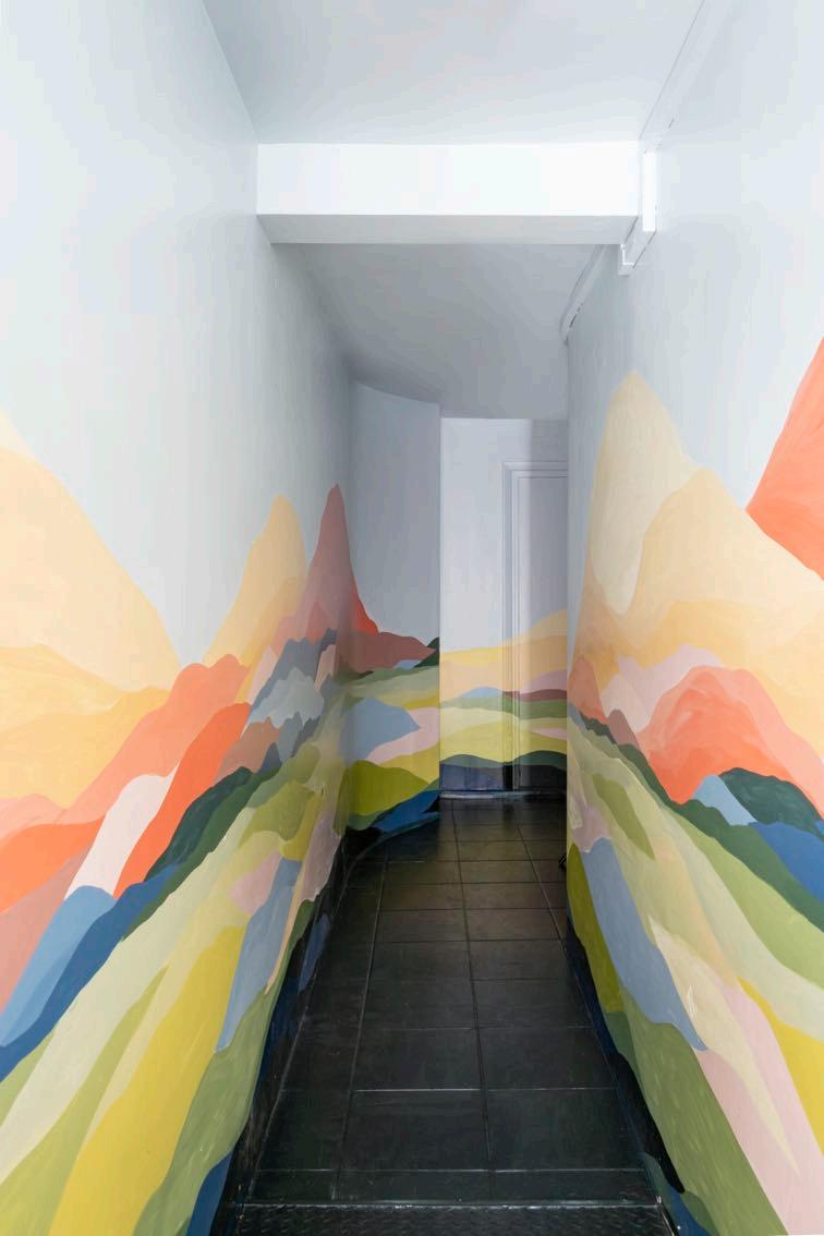
The corridor leading to both the studio on the ground floor and the stairs to the house is a vibrant explosion of color, thanks to artist and muralist Victoria Poveda, creating the illusion of a larger space.
The compact, ten-square-metre studio provides a dedicated workspace, allowing Sara to maintain a balance between work and family life, while also serving as a
welcoming spot for neighbours, students, and potential clients. Rachel Thomas, a window dresser, adapted the studio’s graphic image using acrylic and 3D materials, bringing light into the space while maintaining privacy. Inside, the designer has a broad array of materials, project designs, plans, and moodboards, adding bursts of colour to the otherwise neutral surroundings. Sound-absorbing felt panels line the walls, providing an easy way for Sara to attach and remove work materials as needed. A table near the
“We had been living in this area for 17 years when this house came up for sale. But inside, it was a complete wreck, with sloping floors. We had to redo everything, even between the second and third floors, leaving only the beams.”
Sara Leonor
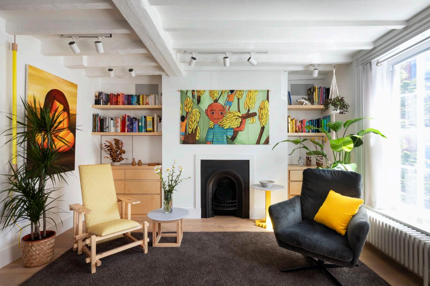
The renovation makes full use of the space. As you enter the first floor from the staircase, one of Leonor's designs, the Gogo chair, is prominently displayed alongside a discreet coat storage area. The first level features a spacious living room, with smart storage built beneath panels and under a five-metre-long sofa. The design had to work around both the fireplace and a beam that were protected by heritage regulations. One striking decorative element is a colorful fabricprinted drawing that enlivens the wall where the family projects audiovisual content. Behind the sofa, an adaptation of a Joan Miró piece adds an artistic touch. Much of the furniture, including coffee tables, chairs, and stools are designed by Sara and handcrafted locally. Beyond the sofa sits the family piano and a bookcase.
“The house had a 30-centimetre slope from one side to the other. Victorian homes move, and rigid surfaces would crack. That’s why we used wood, which absorbs the movement of older buildings.”
The former terrace was partially enclosed to create a kitchen and unify the day area on one level.
The kitchen features an extendable aluminum table designed by Sander Nevejans and produced in Belgium which, when opened, can seat up to 15 people. Other elements of the kitchen include paintings by Virginia Frieyro, handmade ceramics by Nathalie Loubert and a lamp by Norman Copenhagen. The entire kitchen is bespoke; with grey cork flooring chosen to mimic concrete - an alternative that wasn’t technically feasible for this Victorian building.
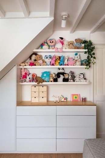
The first floor houses the children’s bedroom, once the location of the kitchen, along with a playroom and shared bathroom. Custom-designed shelves provide hidden storage spaces. The chairs, also designed by Sara Leonor, are made of iron with colorful acrylics that can be swapped out for different aesthetics.
“In my design work, I use a lot of colour, but for my own home, I prefer a neutral palette of wood, iron, cement, and white tones. We add colour through decorative details like textiles.”
The top floor contains the master bedroom, a guest room, and a third bathroom. The original flooring was removed during renovations and later reinstalled to maintain the historic charm. At the foot of the bed is a bench, an evolution of one Rietveld’s Red Blue Chair. The room is completed by a large double bed, a three-metre-long wardrobe, and one of Sara Leonor’s HI chairs.
CELEBRATING
eclecticism
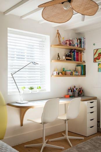
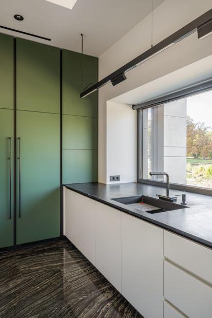
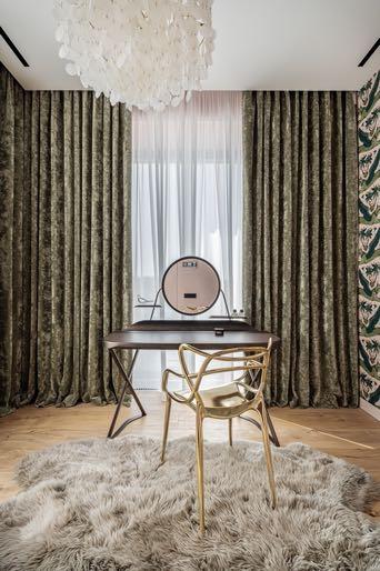
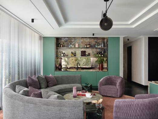
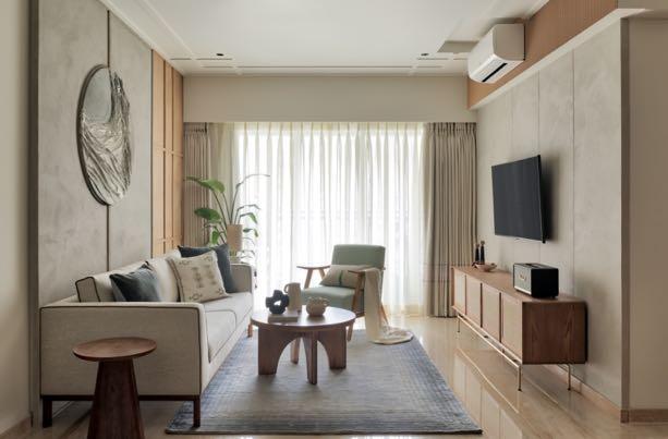
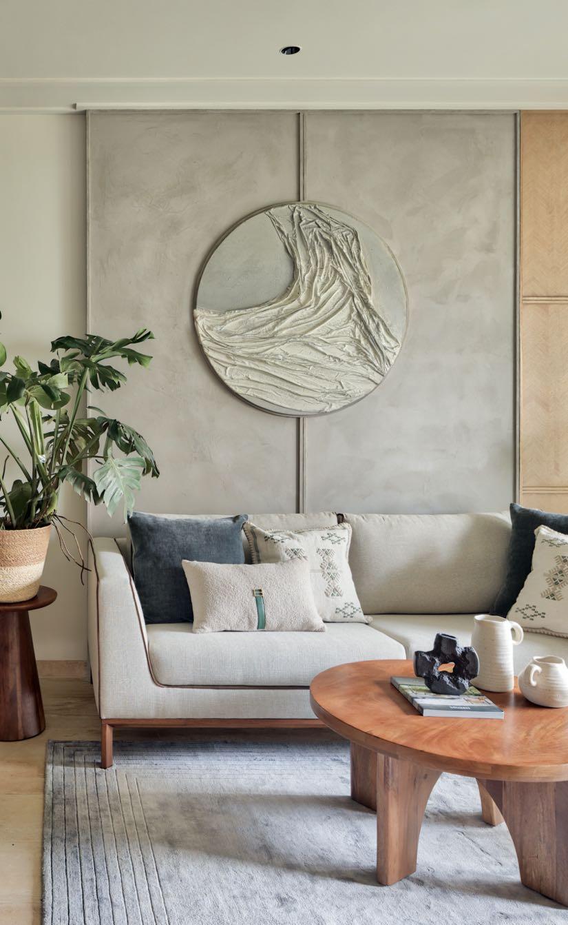
The interior architect Anastasiia Lukashova of Luka Design projected a private house with juicy accents for a family located on the slopes of the historic city of Kyiv.
Photography by Andrew Shurpenkov
After living in an apartment for a long time, the clients - a family with two children of school and preschool age and two cats -
dreamed of a spacious, light-filled house with many open spaces and large windows. They wanted to celebrate life: brightly and luxuriously in this 400 m² house. So, Anastasiia Lukashova faced the task of embodying in the interior the charismatic character of the customer, who likes things that sometimes seem incompatible at first glance. The project became the embodiment of eclecticism where a place is for bright colors, artistic solutions, glossy classic elements, golden surfaces, animalistic motifs, marble and modern design. Privacy and cosiness was essential, as well as a place for a creative flight of fantasy.
The first floor of the building is divided into left public and right private parts. The meeting place
of these parts is a large festive hall with access to the terrace and descent to the basement floor. The owner travels a lot and is interested in fashion, so the architect was inspired by the world of fashion designer Roberto Cavalli and bright colors reminiscent of trips to exotic countries.
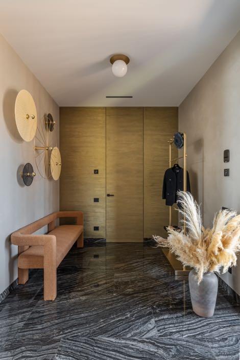
The entrance hall is illuminated by artistic sconces from Aromas del campo and ceiling lights from Nuura. A little table from Poltrona Frau adds color. A floor-standing coat hanger with a marble shelf, a trio of round-shaped pivoting mirrors and a banquette were custom- made from the designer's drawings.
The glass doors with handmade brass handles lead to the festive hall, where a hanging handmade glass installation by the Expolight team takes main place. The programmed light scenarios allow you to change the atmosphere depending on your mood and needs. Metal handrails are made according to the designer's drawings from steel with titanium nitride coating. Yellow metal continues its story with inserts brass in the mirrors and on the floor. Portals and windowsills are decorated with gold accents.
“At first it seemed like an unrealistic task - to combine several different worlds in the interior. On the other hand, it was an interesting challenge, because it was possible to let go the imagination, go beyond the usual and be creative.”
Anastasia Lukashova
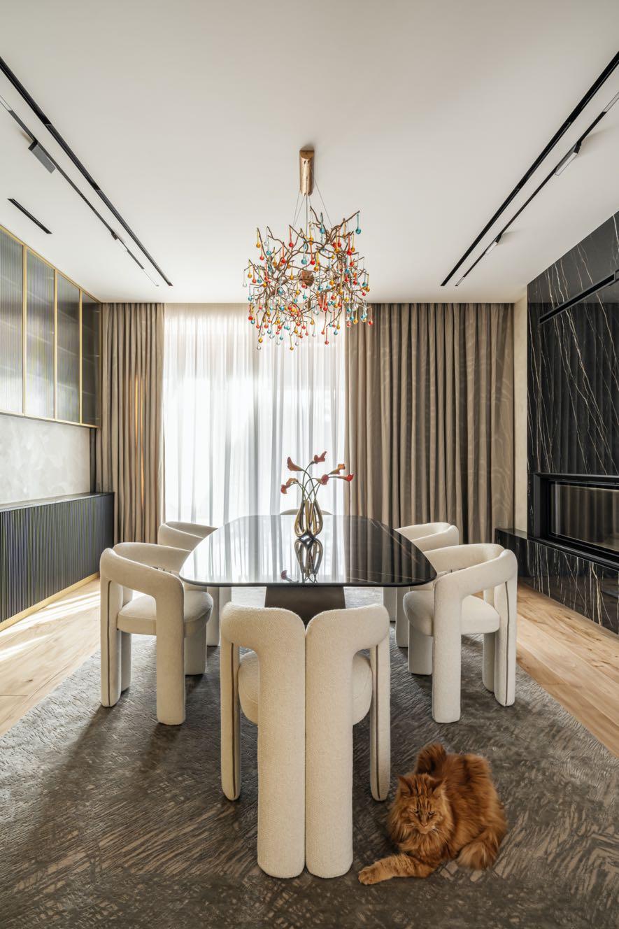
The dining room with a fireplace serves as a continuation of the festive story in the house. The family gathers around a large table from Cattelan Italia, surrounded by soft chairs from Cassina. The highlight of the dining room is a decadent Serip chandelier with metal branches and frosted glass droplets made of multi-colored glass. The customer likes color, so
the architect chose a colored version of the chandelier. One of the walls was decorated with milled panels with metallic painting. Its animalistic pattern is a reference to the aesthetics of Roberto Cavalli, one of the client's favorite fashion designers. Wall panels hide the entrances to utility rooms.
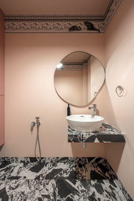
A window connects the dining room and the kitchen; it is a part of the lifting facades made of metal that covers a hidden functional apron on the kitchen side. The minimalistic and functional design dominates in the kitchen. There are no cabinets above the worktop, made of textured marble. One of the requests was to provide an area for the owner’s cats. So, the guest bathroom also became as a space for four-legged friends. There are no windows here, so the atmosphere is intimate; for the walls
Anastasiia opted for a pale pink while the floor was covered with 41zero42 tiles. Fragments suspended in the material and irregular geometries in black and white create a fluid visual rhythm. The same covering was also chosen for the washbasin support. An interesting touch is on the wallpaper borders by Cole & Son where cats chasing mice.
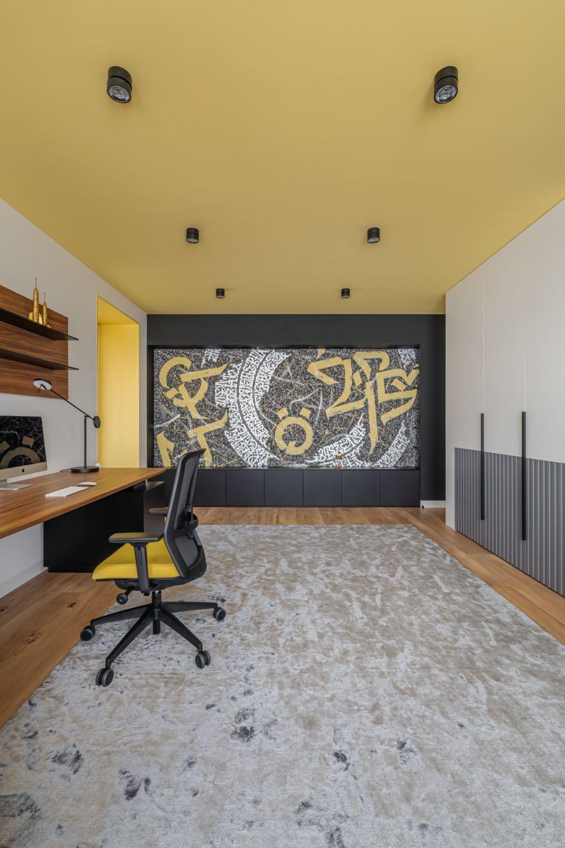
“Looking at the font, you can compose words yourself, as in a rebus or a puzzle. This is the essence of abstract calligraphy - the text is not thrown directly into the viewer's eyes. Here, first of all, forms and compositions that evoke emotion should be perceived.”
Oleksandr Stia
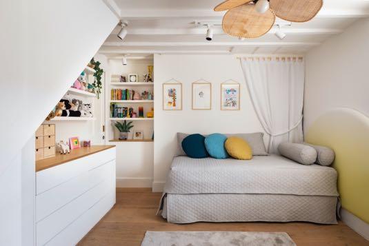
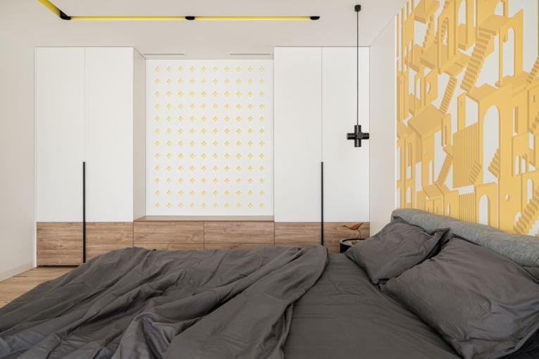
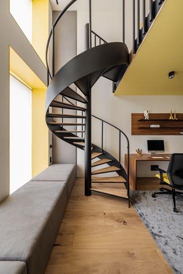
To the right of the entrance is the sleeping area. Graffiti and a gray-yellow color scheme - was the client's wish for the design of her eldest son's room. The room has two floors divided into zones: the lower level is for studying, the upper level is for rest. The floors are connected by metal spiral stairs, which were made according to the sketches of the designer. The wall calligraphy of the Ukrainian artist Oleksandr Stia became the accent of the space. From the artist's side, the condition was creative freedom, because calligraphy is a meditation for him, in the process of which thoughts are transferred to paper or to the wall, as in this case.
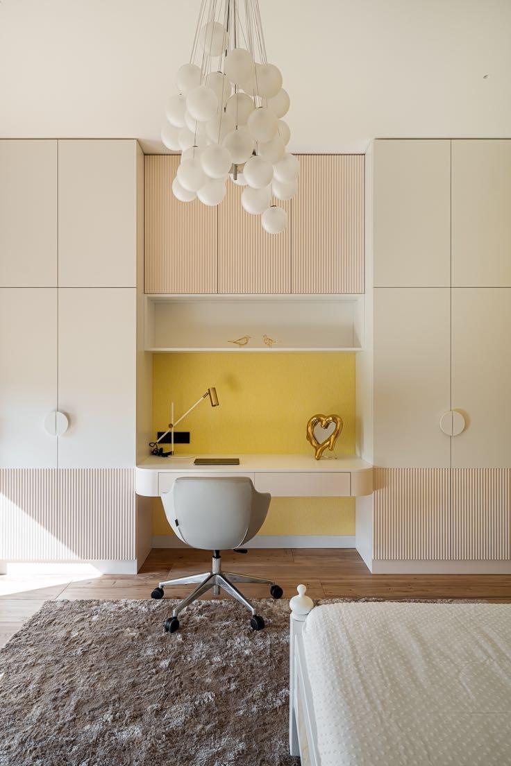
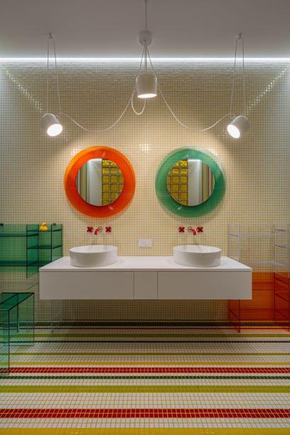
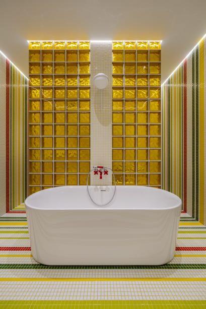
The other bedroom, reserved to the daughter, instead has a 'cleaner' design with white tones even if some yellow accents have been maintained. The real 'colorful and bright' jewel is the children's bathroom where the architect had the greatest freedom of creativity. The walls and floor of the room are decorated
with ceramic mosaics with a continuous pattern. The space between the bath and shower and toilet was made of yellow glass blocks. Fantini’s accent red plumbing fixtures and Laufen by Kartell furniture; mirrors complete the room. A variety of light scenarios are provided by Flos pendants, Vibia sconce and spotlights.
“Children don’t like to wake up in the morning and go to the bathroom. I wanted to change this by creating a bright bathroom that will make you smile every time you go to the bathroom and full fill you with energy.”
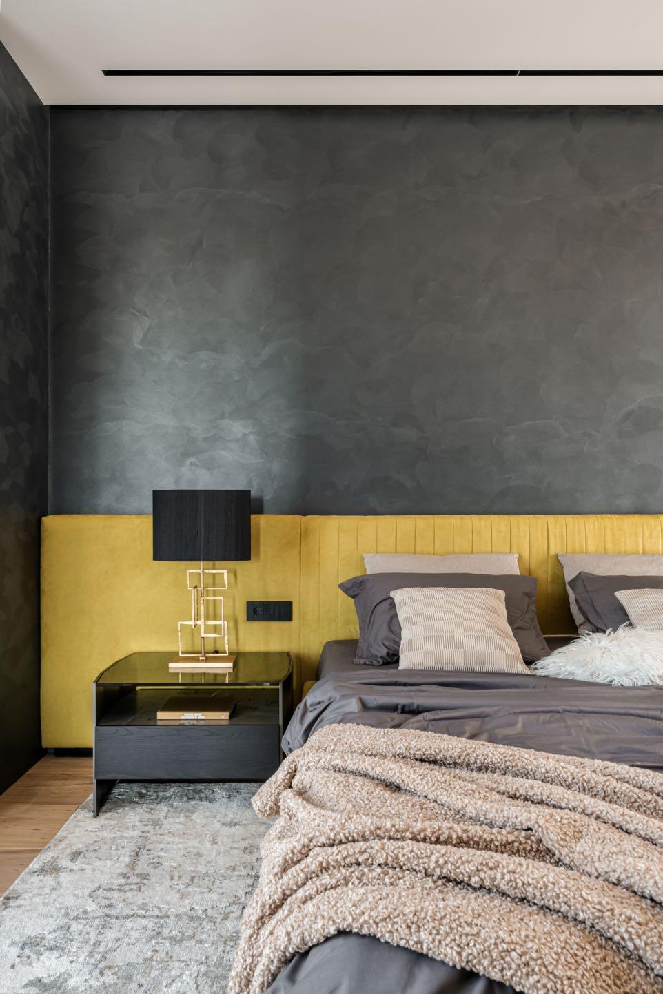
At the end of the wing, we find the area reserved for the parents consisting of bedroom, walk-in closet, majestic bathroom and cabinet. In the master suite the walls in a dark gray color contrast the yellow headboard of the bed that runs the entire length of the wall, giving character to the ambiance.
In the owner's cabinet we find a minimalist design composed of unique pieces such as Verpan chandelier, the Masters chair by Kartell in gold whose unmistakable silhouette intertwines with Cattelan Italia table. Clarke & Clarke wallpaper by Emma J
Shipley with animal prints brings the exotic touch to the room while the deep green velvet curtains give refinement. The bathroom is a special place for the customer, because it is an important ritual and place of relaxation. The Relax Design bathtub itself was placed near the window with a view of the green slopes. The overall mood of the bathroom is languid and relaxing, which is facilitated by several lighting scenarios, from festive with a chandelier from Aromas del campo to nuanced lights and chromotherapy in the shower from Gessi.
“I
believe that a home should reflect its owners’ characters, which is why this one turned out to be so unexpected and interesting.”
BRINGING SPACES TOLIFE
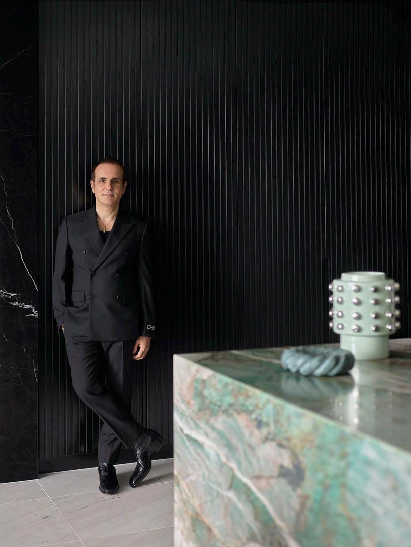
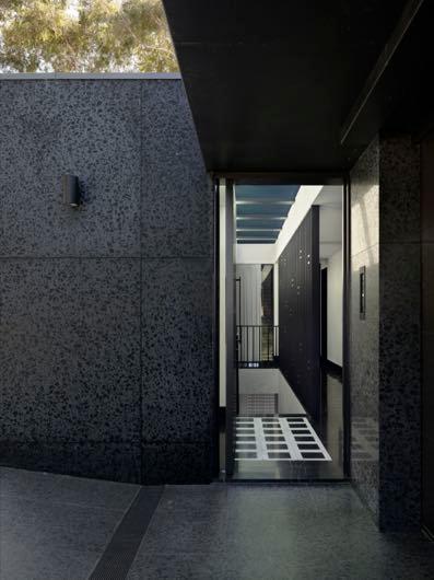
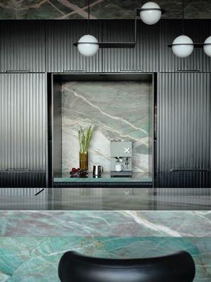
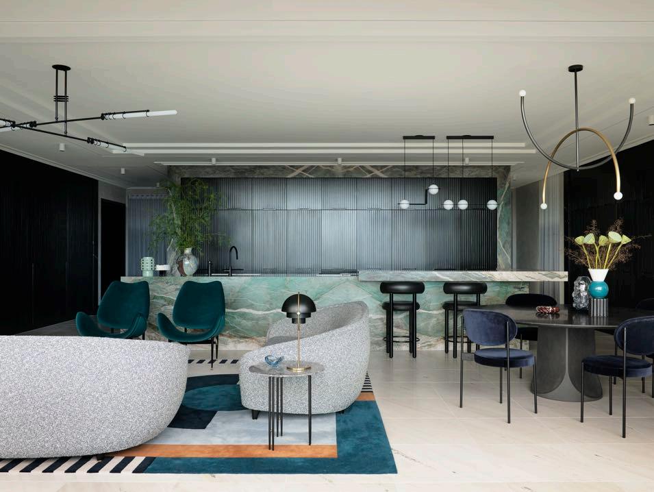
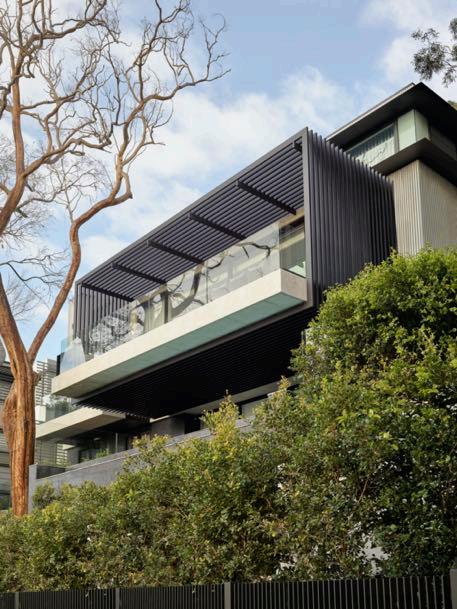
Greg Natale, founder and director of the eponymous design firm, projected a modern family home with bold colors and natural materials in the luxurious harbourside suburb of Mosman in Sydney.
Photography by Anson Smart
The exterior of the house is a bold marriage of stark brutalist architecture and rich contemporary design. The design team decided to
go with a striking concrete and black exterior for the property, enhanced with details for depth as grooved precast concrete panels and all the terrazzo walls. The off-form architecture is intentionally softened by surrounding verdure, creating a powerful contrast and rich design dialogue. Greg was inspired by Italian rationalist architecture and the use of marble in those buildings - Milan’s Villa Necchi Campiglio became a key reference for the project with its blend of pared-back classicism and modernity. Therefore, the project features elements of Italian rationalism and brutalism combined with Art Deco touches and 1970s design. Since the client likes color, the interior explodes with meaningful shades, creating a perfect contrast to the home’s black and gray base. In the entrance foyer the walls are finished in stucco, while the floor features signature Palladio marble tiles from the designer’s own collection for Teranova adding warmth and drama. This bold first impression is immediately
“The house was a white box, and our client didn’t want white, but the spirit of the exterior was still there from the original form, so we worked to change all the materiality.”
Greg Natale
softened by floating stairs and large skylights that bestow an ethereal airiness to the home. In various living areas, slabs of marble and quartzite stripe surfaces with vibrant flashes of color.
Oriented to overlook Sydney’s sparkling blue waters, the three levels of the house cater to integrated indoor-outdoor living: vast living spaces extend towards sprawling outdoor lawns, terraced gardens, and an infinity pool that disappears into the harbour view over Balmoral Beach.
The upper level of the home includes the huge open plan living, sitting, dining area
and the main bedroom. In generous strips that run along the floorboards and up the walls, in substantial beams that wrap around white lacquered ceilings, its grey, ivory, and black veins provide a beautifully decorative frame.
The kitchen with its huge Moldavite crystal quartzite island has become the wow factor. This shade breaks up the neutrals creating a statement but also tying everything together. In addition, Greg included the hidden pantry in the kitchen with black fluted panels and a coffee bar, finished in the same green stone.
The client requested blonde wood floors and neutral sandy tones. The design team decided on lots of natural stone for the natural feel and warm bronze to lean into the home’s villa-like aspect, which brought in lots of warmth and opulence, reinforced through a palette of beachy, golden-hour sunset colors and collectable vintage furnishings. The materials palette is a defining feature of the entire project, bringing together a bold mix of marble and granite with expressive patterning and rich shades of grey, emerald and pink, coupled with blonde timber and warm metallics. At the clients' request, Greg selected many vintage pieces from antique markets in Europe to give an interesting and original touch to the spaces.
To encourage a connection between inside and out, Greg has brought the essence of the outdoors inwards via blue water and blue-sky colors. The client’s existing Banto rug from Greg Natale’s collection for Designer Rugs helped trigger the meaningful introduction of color becoming the starting point of the room. To amplify the silhouette of a Japanese maple tree in the courtyard, Greg designed a sculpture on the wall behind, using fluted travertine panels overlaid with a form in green marble that suggests the tree’s shadow. The delicate old tree and the bold new sculpture make a powerful pairing. Extending from the formal lounge area, the balcony is designed to protrude from the side of the building over the pool below, cantilevered to appear suspended in midair; it proved to be one of the most challenging design features in this project. Thanks to this extension the level has additional outdoor seating without taking space from the living areas inside, creating a prominent feeling of openness and flow.
“Modern builds can be blank canvases and all-white spaces can overwhelm, especially in large rooms. To me, the unique colours and patterns of stone not only help to break up those spaces and add detail and warmth, but they also bring their own sense of history.”
Another key element of the interiors were the ceilings to create a spacious and refined atmosphere. The design team opted for step ceilings to get as much height as we can and to also hide services such as air conditioning. The impact of this design tactic is especially clear in the lower level where the pool, children’s bedrooms and second living room are situated. In homage to the coastal location, a palette of sky blues and forest green color each ambiance to soften all the concrete, with hints of pink and purple for a final feminine touch. These curated layers of color and texture balance two distinct styles, resulting in a cutting-edge home that is warm and welcoming.
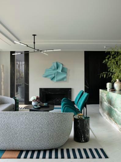
Inspired by the lush harbourside location, the living space includes a majestic circular
sofa, a pair of textured armchairs form the perfect seats, and a round peach rose rug to make the room cosy. On one wall, the mobile bar has been incorporated, which stands out for its aqua green color. In place of the backsplash, a mirror has been placed, reflecting the green surroundings that can be glimpsed through the French windows on the opposite side.
The sky-blue-on-sky-blue media room with punchy black details gives a bit of edge to the whole house. While the powder room is chic and sophisticated, framed by the stylish geometric tiles from Greg Natale’s collection with Teranova in custom colorways for a bespoke touch. The clever play of square and triangular shapes offers a strong directional feel that is both warm and crisp.
For the main bedroom and bathroom, the design team implemented more of a feminine feel with shades of purple and pink, while sleek furniture was selected to tie into the home’s overall architectural aesthetic. The ensuite bathroom presents a dynamic graphic language thanks to the marble tile design on the along the walls of the shower and freestanding bath. With their repeated arches and distinctive silhouette, Greg Natale's Avalon bathroom accessories in blush enriches the space.
“I think it’s very important, the introduction of colour because the exterior of the house is quite brutalist, so the interior needed to be softened.”
Among the different bedrooms we find the peach pink bedroom and its matching bathroom. Within that, the palette is made up of soft shades of warm pink that cover the walls and harmonious pieces of furniture. The curves of the headboard marry with the bedside tables with rounded corners. From the same collection, a dresser has been placed in front of the bed, accompanied by a graceful armchair.
The private bathroom is all in natural stone, specifically it is a medley of intricately realised Norwegian Rose and Jurassic marble mosaic tiles from Greg Natale. The result is a space full of lively and playful energy.
The bathroom featuring the forest-green Verde marble connects to the home's natural surroundings. Greg Natale's Onda sink in classic Carrara marble makes a sweet statement against the green color. Beautifully detailed, its curves create a delicate shadow play day and night. A skylight above the shower adds extra light to the space.
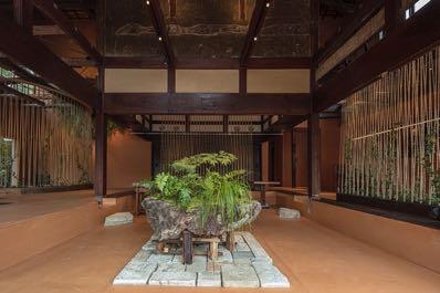
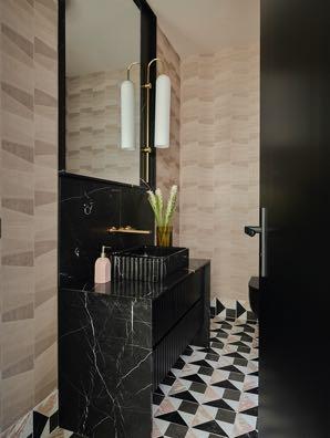
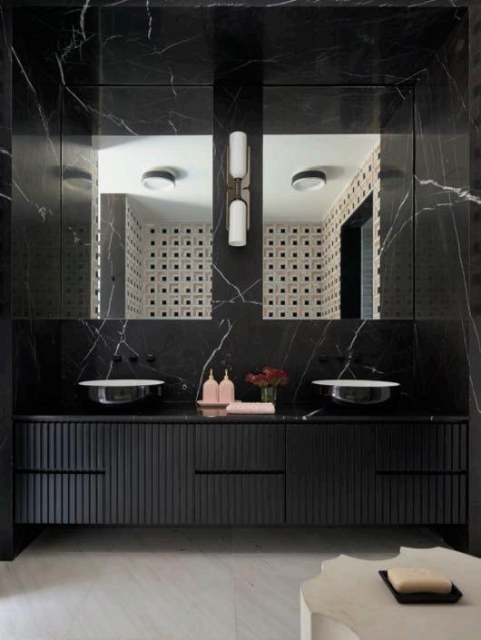
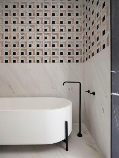
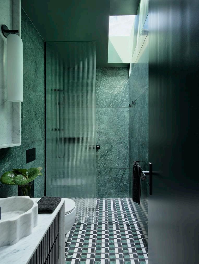
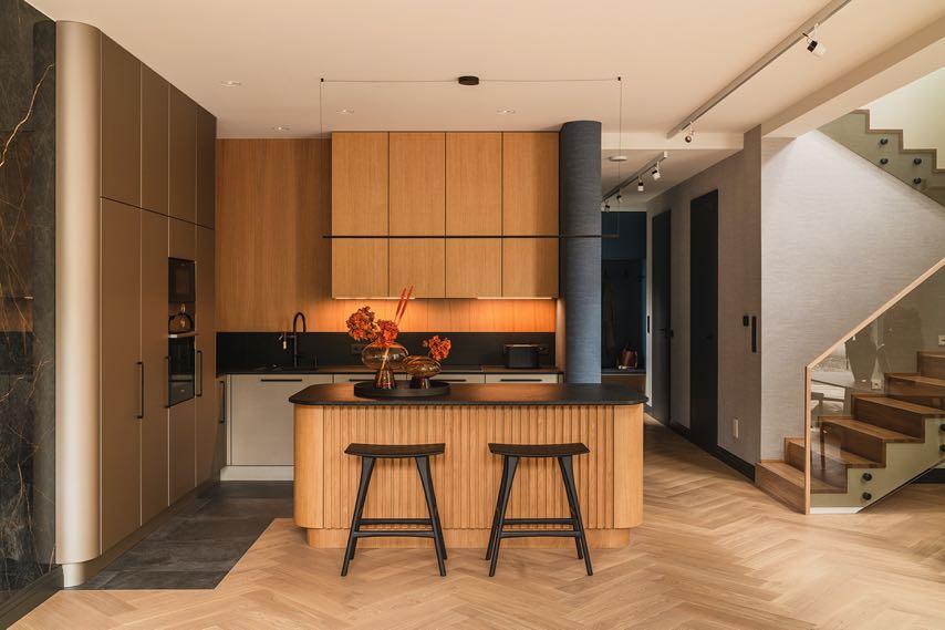
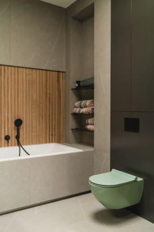
MINIMALIST BAUHAUS
Hanna Pietras Architects completed a unique interior design of a family house in Denmark, combining vintage aesthetics and modern contemporary spirit with cosy colors inspired by nature.
Photography by Mood Authors
“The biggest challenge was to balance elements of the old style with modern solutions to create a space that impresses with its originality. The inspiration came from both the minimalist Bauhaus tradition and a warm palette of earthy tones.”
Hanna Pietras, the founder of Hanna Pietras Architects
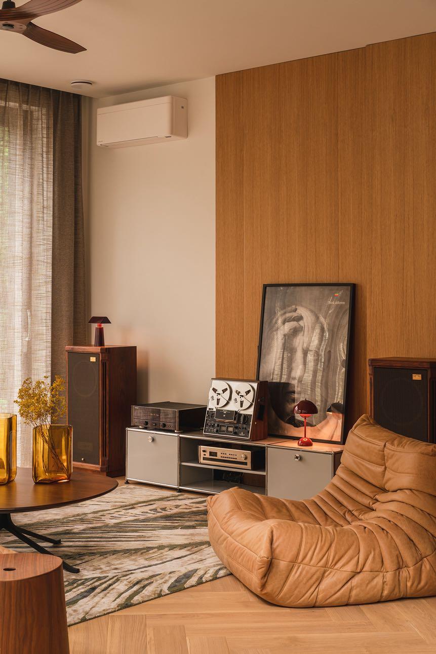
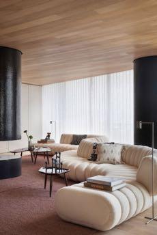
Made with the design lover, collector and audiophile in mind, the interior design of this approximately 250 m² house is destinated for a family of four. In particular the owner - an enthusiast of Danish design - wanted to create an interior that pays homage to the classics, but at the same time warms up the austerity of the Bauhaus. The designers' aim was to neatly combine simplicity of form with functionality, and to introduce warm tones such as beiges and browns to create a homely and welcoming atmosphere. Natural materials such as wood, stone and leather added authenticity and harmony to the interior.
The homeowner was very involved in the design and realisation process, which translated into an exceptional end result. His passion for design and music is reflected in every corner of this home, creating a space that is not only aesthetically stunning, but also the perfect place for the whole family to live and relax.
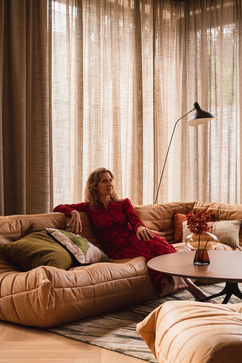
The living room, the heart of the house, features a unique space dedicated the music, including a 70s vibe and equipped with high-end audio equipment. The herringbone parquet and the large translucent linen curtains enhance the natural light, amplifying the feeling of space and serenity. While the Togo sofa from Ligne Roset by a contemporary design classic offers comfort and a sculptural touch. To complete the
space, the USM Haller modular furniture, a symbol of elegance and versatility, integrates harmoniously with the other elements. Decorative details, such as the iconic posters from the Apple 'Think Different' campaign, add a touch of personality and celebrate the link between innovation and creativity.
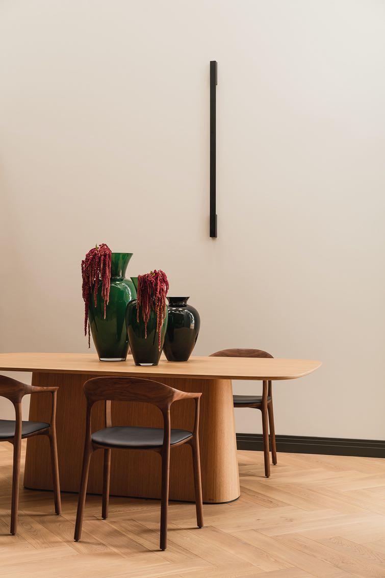
Next to the living room, the kitchen strikes the perfect balance between functionality and sophistication. Natural wood surfaces, combined with black metal details and the dark stone of the worktop, create a refined atmosphere. The kitchen island is a key design element, attracting attention with its modern shape and millwork. The rounded lines give it a lightness while emphasising the innovative nature of the interior. The black wooden seats add an elegant contrast, while the decorative elements introduce a vibrant touch to the environment. In this way, the studio created a house that combines the past with the present, tradition with modernity, creating an interior full of character.
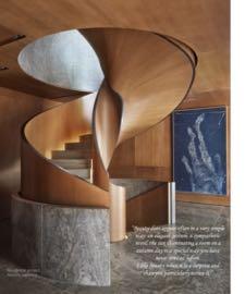
On the other side, the dining area and the stairs that lead to the upper floor. For the latter, the studio opted to put transparent glass parapets to give visual continuity to the space.
The dining zone is marked by a minimalist elegance formed by chairs with dark-toned padded seats and a light-wood dining table. Its sculptural base adds a modern note. Here too, home accessories have been included, such as generously proportioned green glass vases that house floral compositions, thus recalling the dialogue between nature and design. No flashy chandeliers have been placed to keep the background clean; minimalist linear lighting has been hung on the wall.
“Oak in a warm shade, dark blue accents contrasting with white and beige and the wooden parquet floor add to the cosiness of the space.”
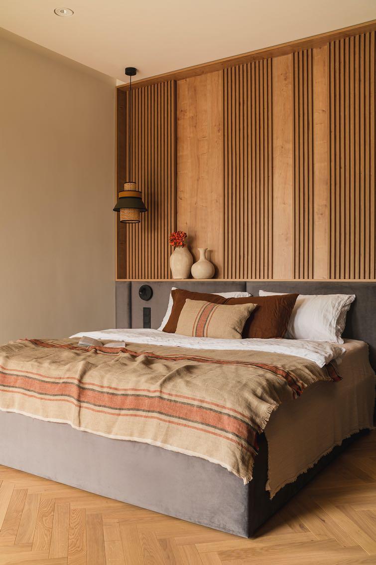
The herringbone parquet, with its warm tones, was also installed on the upper floor - dedicated to the sleeping area. To give an even calmer touch, the studio introduced gray tones and some touches of light green. In the master bedroom, a bed with gray padding was inserted with a keyboard that expands along the entire length of the wall. For the rest of it, wooden wall panels were chosen to add dynamism.
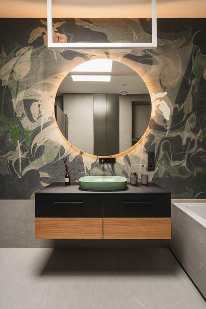
The same design concept accompanies the bathrooms, marked by soft lighting inserted just behind the mirrors. The suspended sinks instill a sense of ultramodern.
SERENITYLIVING
Soft colors, textures and wood: Rohini Bagla Studio has incorporated Nordic-Scandinavian elements into the design of a 102 m² apartment in the residential area of Powai, Mumbai.
Guided by a mood board, the design process, with a particular emphasis on
sustainable materials like natural cane and wood. Each element and detail was thoughtfully chosen to reflect the client’s personality and preferences, culminating in a home that is both stylish and deeply personal.
The entrance exudes a rustic charm, highlighted by a cane hanging lamp that creates intricate patterns when lit, setting a warm and inviting tone right from the doorstep.
In the living room, the real design journey begins with Nordic-Scandinavian with a perfect balance of contemporary style and natural warmth, offering a cozy and sophisticated space. Wooden and green elements have been added to create a
lively and rustic atmosphere. The clean and minimalist furniture harmonises with the glossy floor, enhancing the feeling of spaciousness. The sofa in neutral tones is enriched with decorative pillows that add texture and comfort. Opposite, a solid wood coffee table with a sculptural design captures the attention, serving as both a functional and artistic element. The main wall is embellished with a circular artwork, adding visual depth and a touch of originality. The media area is optimized with a sleek sideboard and a wall-mounted TV, ensuring organization and practicality without compromising on aesthetics. Strategically placed green plants complete the picture, bringing freshness and vitality to the space. The space is flooded with natural light that filters through the semitransparent curtains creating a serene feel.
The relaxation area opposite side where a been placed - a dining area gathering spot for family shaped bench with striped dining table embody welcoming space and for relaxation and conviviality has also been inserted reflect the shape of the for books and niches. Everything light wood. A pair of wall framed in black frames design. The kitchen has traditional brings a splash of color pastel shade - very light chosen for the wall furniture underneath is splash backs are off-white also used for the worktop sense of continuity. The some appliances (the hood, black - creating a contrast touch of personality.
"My personal favourite feature to design was the dining nook, a perfect blend of functionality and aesthetic, where natural cane and wood were incorporated as sustainable alternatives."
Rohini Bagla, the founder of Studio Rohini Bagla
interesting elements. The walls in the room has a rustic wash, giving it an earthy touch. The headboard of the bed proposes beautiful Indian motifs while the wardrobe has an interesting cane pattern on the doors. The colors are muted with earthy tones.
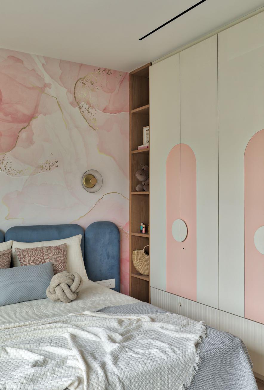
The daughter’s room is vibrant, combining white, beige, pink, and blue shades which itself blooms like Sakura in the entire apartment. It includes a unique rotating shelf, ample play space, and large pink board where she can pin her ideas and
"We thrive on creating diverse and unique spaces. For this apartment we embraced the client’s desire for a distinctive theme in every room, ensuring each space has its own character and charm."
Rohini Bagla
creations. The room is vibrant and colorful in comparison to other rooms in the house with the combination of colors such as white, beige, and pink. The exclusive piece is the pink wallpaper with Sakura prints and gold details.
shelter FAMILY
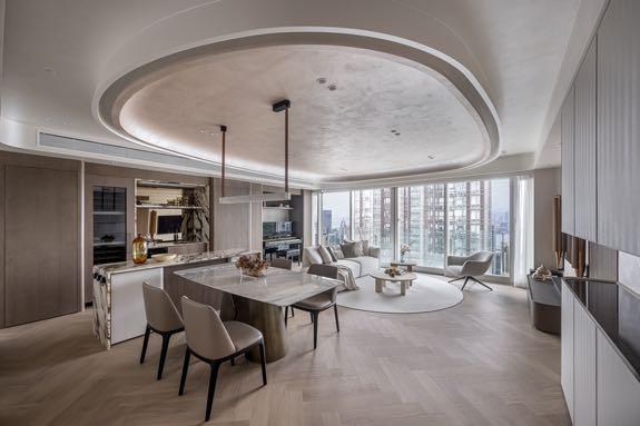
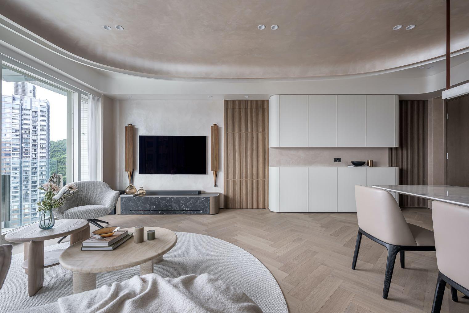
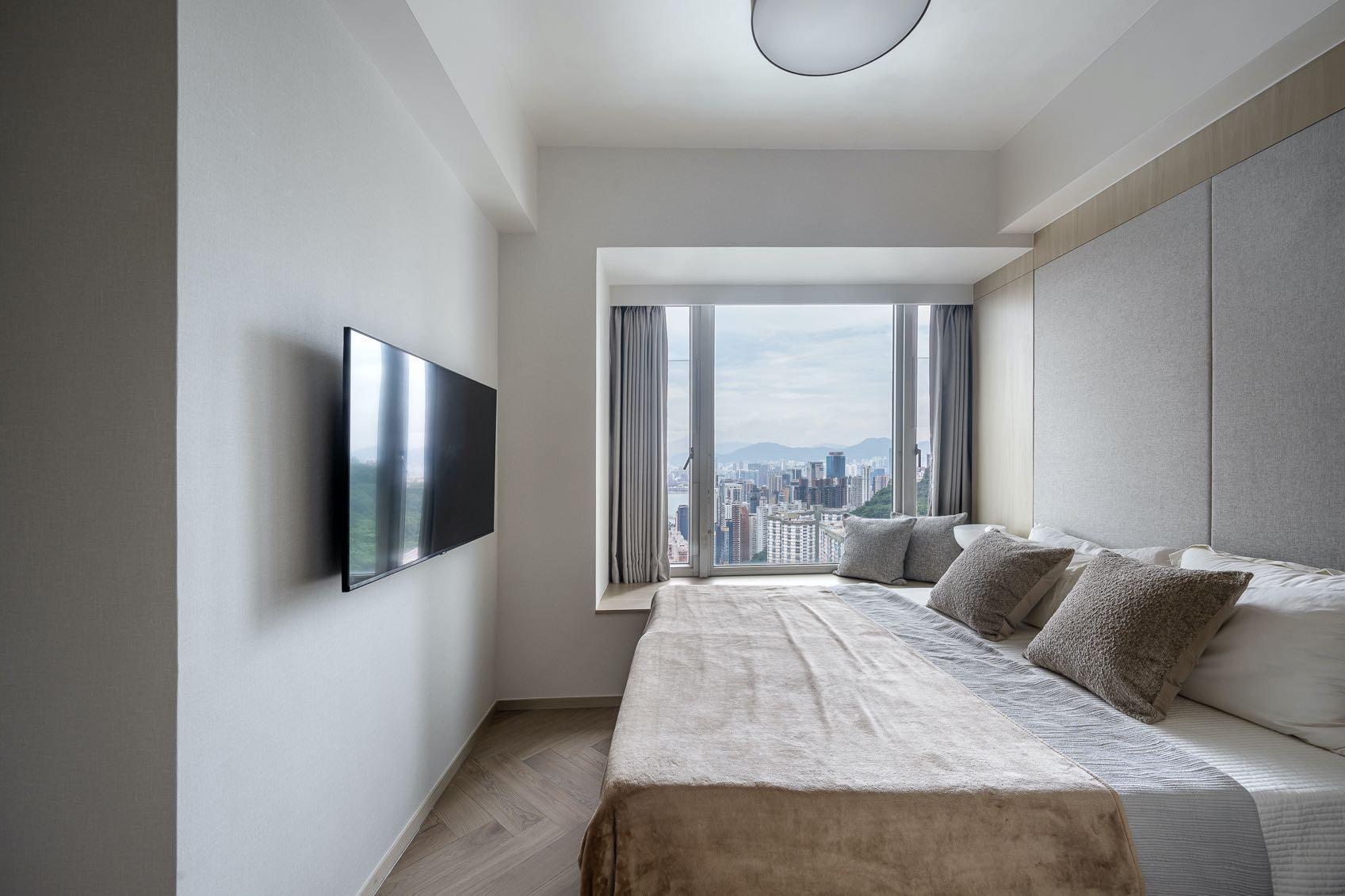
Projected as a warm and tranquil dream home for a multigenerational family, Grande Interior Design presents a 162 m² apartment sea-view high-rise in Tai Hang, Hong Kong.
Photography by Dick Leung
“THE LIVING AREA NEEDED TO MEET THE NEEDS AND PREFERENCES OF FAMILY MEMBERS OF DIFFERENT AGE GROUPS WHILE MAINTAINING OVERALL STYLE CONSISTENCY.”
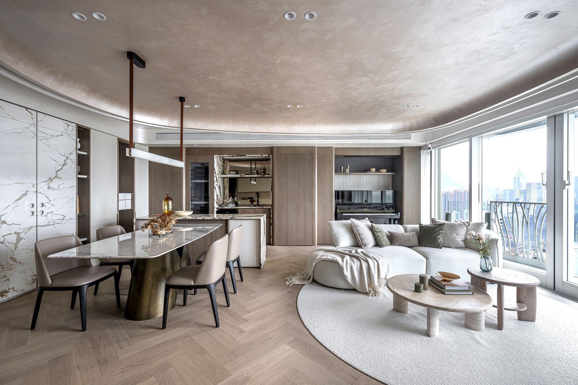
Led by Matthew Li Kai-lung, cofounder and creative director of Grande Interior Design, the design studio redesigned this 5-bedroom apartment, balancing open spaces with privacy to a harmonious living experience. The primarily divides the space into and private areas. The shared zones family members are situated in the of the home, while the private bedroom areas are positioned on either ensuring a degree of privacy.
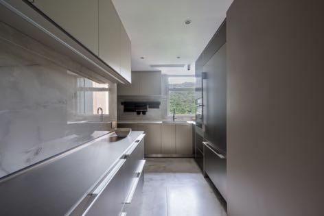
huge open space unit follows the of 'Shelter' incorporating a prominent arched ceiling in the center of a modern living area rich in light luxury. This feature infuses the space with a sense of warmth and security that resonates with family aspirations. To the left, the dining room leans towards a more rectilinear layout, considering the family's daily routines as the primary design criterion. The designer employs an open concept within the dining room, delineating areas for dining, a bar area, a piano corner, and a sofa area to minimise wasted space in the corridors while preserving each area’s functionality in a user-friendly manner. The actual kitchen is located immediately the right of the entrance. With its Lshape, it has a very simple, clean but functional design. A window floods the entire room with natural light.
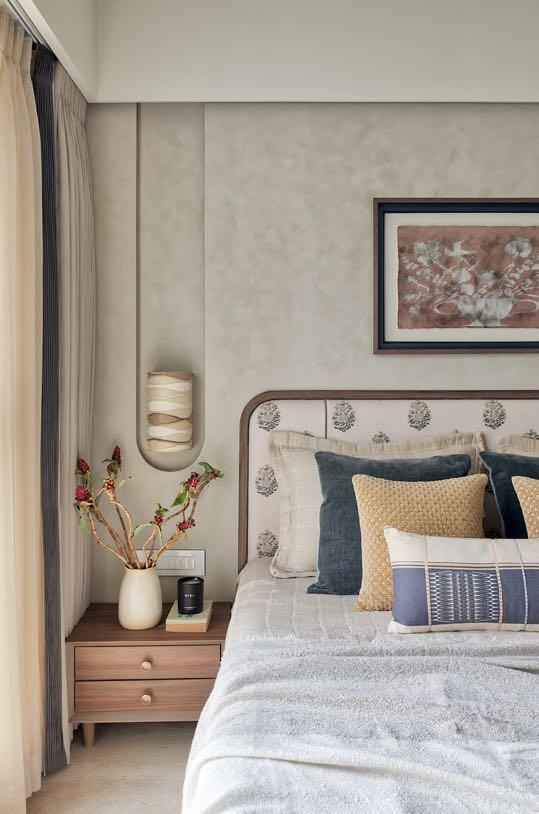
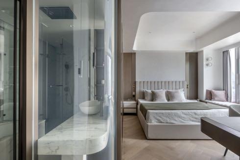
One wing of the house contains the master ensuite and the eldest daughter's bedroom, while the opposite side contains the parents' bedroom and that of the youngest daughter.
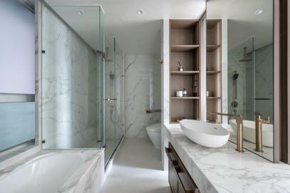
To create a visual extension effect in the master bedroom, the design team repositioned the walk-in closet to the corner. The original bathroom space has been reconfigured, transforming it into a semi-open master ensuite. Frosted glass partitions were used to enhance the sense of space while maintaining privacy, resulting in a hotel-style living experience. The master suite features a combination of wood, fabric, and steel accents to evoke a light luxury aesthetic.
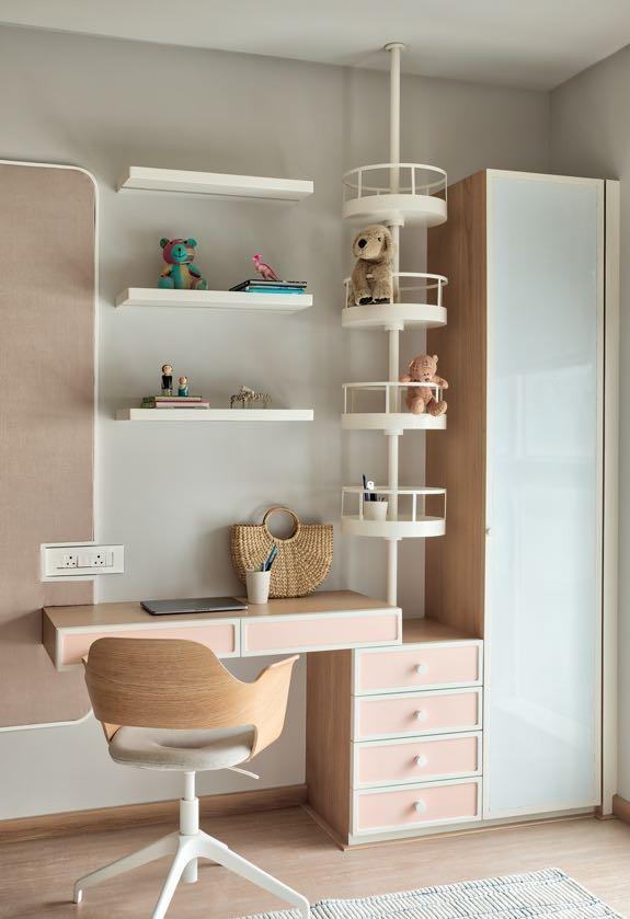
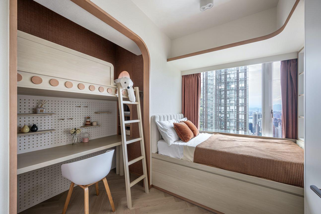
The eldest daughter's bedroom had limited space, so a storage bed design was incorporated, which not only increases storage capacity but also saves space. Given the high ceiling of the room, we drew inspiration from the "room within a room" concept to create a small study area for the daughter to use daily, with the upper level reserved as a playful entertainment nook.
“WE APPLIED VARIOUS MATERIALS SUCH AS WOODEN VENEER, SPECIAL PAINTING, WALLPAPER, MARBLES AND SO ON, ADDING WARMTH AND CHARACTER TO THE HOME.”
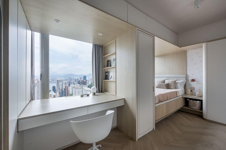
Originally a nursery, the homeowner found the space too small and not particularly functional. They asked the design team to open up the room, expanding it into a bedroom for the younger daughter. A desk was added to facilitate both daughters' studying, and the spacious area provides them with a shared space for mutual growth. The design features a minimalist light pink theme, combined with wood to create a softer ambiance. Full-height storage cabinets and wall surfaces have been integrated into the space to maintain visual consistency.
In the design of the parents' bedroom, decorative fabric was used to wrap around the existing walls, effectively concealing the entrance and wardrobe while adding warmth to the room. The bedroom is equipped with an adjoining bathroom
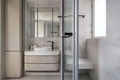
designed to maintain consistency with the bedroom's aesthetic, creating a fully equipped private retreat for the parents.
Africa
donatoengineeringsystem.com saota.com
America 200east59.com luxurylifestyleawards.com pantone.com