Brand Guidelines


sgurrenergy.com
INDEX 09 How to use the right background with the logo. BRAND MARK BACKGROUNDS 21 Defining the brand’s fonts and how to use them. TYPOGRAPHY SYSTEM 03 A brief look at our history. BRAND HISTORY 10 Things to remember about the logo’s placement. BRAND MARK PLACEMENT 23 Rules to use the right images and photos for brand use. PHOTOGRAPHY/ IMAGE GUIDELINES 05 Describing our logo formation and thought in detail. LOGO MARK 13 Defining the brand colors and how to use them. PRIMARY COLORS 27 Complimenting the brand’s visuals with the right patterns and designs. VISUALS IDENTITY GUIDELINES 06 The science and story of the SgurrEnergy logo. BRAND IDENTITY USAGE 14 Defining the brand colors and how to use them. PRIMARY COLOR GRADIENTS 29 How to select the right icons for use in brand visuals. ICONOGRAPHY STYLE 07 How to use the Emblem in the right way. EMBLEM 15 Defining the brand colors and how to use them. SECONDARY COLORS 30 Points to remember when designing charts and graphs for SgurrEnergy. CHARTS AND GRAPH STYLE 08 Logo usage, Brand Nomenclature, Brand Mark Usage (Black & White) BRAND MARK ORIENTATIONS AND USAGE 17 Defining the brand’s fonts and how to use them. TYPOGRAPHY 36 List of elements that make up for SgurrEnergy’s corporate identity. CORPORATE IDENTITY GUIDELINES 40 How to represent the brand,
and
SOCIAL PROFILE GUIDELINES
online as well as offline,
things to remember.
BRAND HISTORY
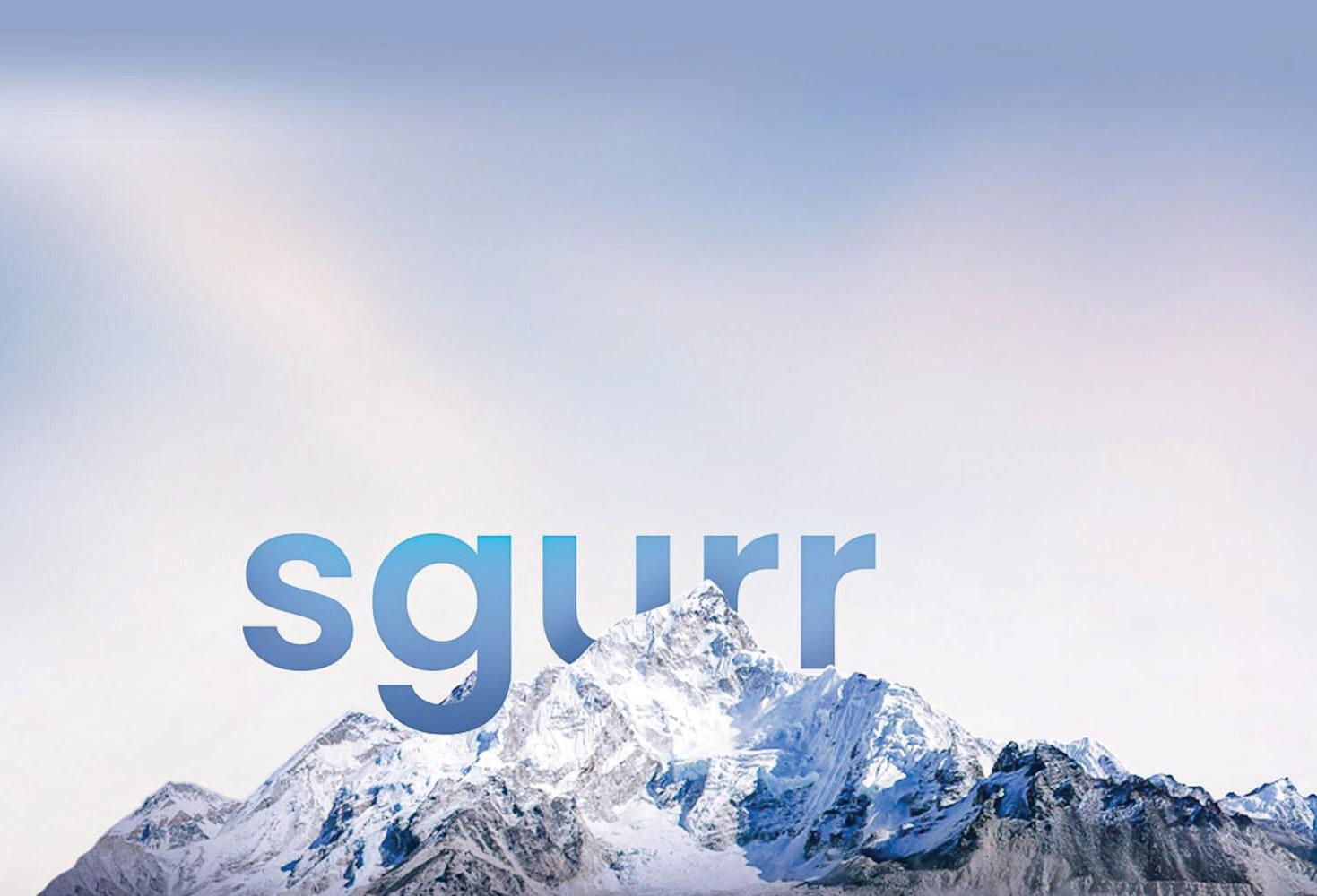
Sgurr /Sgùrr / Noun, (pl. skurr)

1. High sharp-pointed hill or a large conical hill that points us in the direction of sgôr.
2. A sharp steep hill rising by itself or a little steep precipitous height on another hill or mountain.
SgurrEnergy was founded in 2002 in Glasgow, United Kingdom, with the goal of excelling in renewable energy consulting. With an impressive portfolio of delivering solutions for over 60GW of renewable energy since inception, we have a proven track-record of providing the most profound, comprehensive, end-to-end solutions for renewable energy projects.
SgurrEnergy differentiates itself as an engineering consultant with a strong technical background; a 360° service-provider capable of successfully delivering projects introduced at any stage of the project life-cycle.
ADDING VALUE TO THE WORLD’S ENERGY TRANSITION
Vision : Adding value to the world’s energy transition, by providing multi-disciplinary 360 renewable energy consulting services
Mission : To be among the top five global renewable energy consulting companies by 2027
SgurrEnergy_brandmanual | 3
How We Look
SgurrEnergy_brandmanual | 4
Logo
01
LOGO MARK
The Sgurr Energy logo mark is an ‘icon + typography’ styled logo, with three triangles forming the image of a ‘sgurr’, and name text written besides it.
Design Elements
Icon: Three triangles in the company’s brand color, one behind the other and diminishing in size, depicting a mountain range.
Typography: ‘sgurr’ written besides the icon in small letters and ‘energy’ written below it as right-aligned. Font used is ‘Poppins’.
Tagline: The tagline ‘Sustainable Engineering Worldwide’ is written exactly below the icon and word mark in grey.


The position of the icon, text and tagline is never to be changed and needs to be kept constant.
Overall Tone
The overall logo signifies strength, dependability and sustainability. It is versatile so that it can be used in digital designs and traditional print, and timeless to withstand evolving trends.
SgurrEnergy_brandmanual | 5
BRAND IDENTITY USAGE
Anytime the logo is used, it should always be surrounded by a minimum uncluttered area called as ‘Safe-Space’.
For SgurrEnergy logo, this is defined by using the height and width of the ‘s’ in sgurr. The safe-space ensures that headlines, text or other visual elements do not hinder the logo’s legibility and visibility.


As a general rule of thumb, the more safe-space around the logo, the better.

SgurrEnergy_brandmanual | 6
EMBLEM
The emblem can be used in places where the full logo cannot be used, for example, as a favicon or app icon.


The Sgurr Energy emblem consists of three 60O right-angled equilateral triangles, of which all sides are equal.


• Do not increase or decrease the number of triangles
• Do not use outline or alter colors
• Do not change the gradient of the triangles


• Do not use white adaptation of the emblem
• Do not change the size ratio / angle / placement of the triangles with respect to each other
• Do not add or remove any elements
SgurrEnergy_brandmanual | 7
X X= 60O X X
BRAND MARK ORIENTATIONS & NAME USAGE
The logo’s appearance must remain consistent throughout all communications. It must never be redrawn, adjusted or modified in any way. Please use the provided artwork for any logo application.
BRAND NOMENCLATURE
In all communications, while writing or typing the name of the company, one has to maintain the way in which the name is written. The name must not be written in any other way than how it is given.
BRAND MARK USAGE (Black & White)
The brand mark can be used in black & white reversibly, at times when the original logo cannot be used. While doing so, it must be remembered that there has to be enough contrast in the background and the logo. The white logo variant must not be used on a light background and black logo variant must not be used on a dark background.
Minimum Print Height 0.5 in
Minimum Digital Height 32 px


Do not use incomplete, cut, blurred or altered logo
Do not change the dimension of the logo elements
Do not change the position of the logo elements

SgurrEnergy_brandmanual | 8
SgurrEnergy sgurrenergy Sgurr energy Sgurr Energy
BRAND MARK BACKGROUNDS


The logo should always be used inside a clear white or black background, to ensure that visibility of logo is not hindered.
• Do not use logo on complex backgrounds


• Do not use logo on background with same or similar colors as logo


• Do not use white adaptation of logo

SgurrEnergy_brandmanual | 9
BRAND MARK PLACEMENT
At a high level, the following diagrams illustrate the preferred placement areas for the SgurrEnergy logo, regardless of communication size or ratio. Keep only on right.


SgurrEnergy_brandmanual | 10
SgurrEnergy_brandmanual | 11
Colors
Brand Colors
SgurrEnergy_brandmanual | 12
02
PRIMARY COLORS
Solid Color Palette
The primary brand colors are the main vehicle for brand recognition. With SgurrEnergy being inspired by nature, we project this with the most abundant color visible in nature.
Green: Depicts growth, stability, sustainability, harmony, optimism Grey: Depicts honesty, transparency, integrity, elegance
SgurrEnergy_brandmanual | 13
78 / 30 / 96 / 16 62 / 122 / 62 3e7a3e CMYK RGB HEX Forest Green 01. 30 / 0 / 100 / 0 191 / 215 / 48 c1d82f CMYK RGB HEX Lime Green 02. 26 / 20 / 20 / 0 189 / 190 / 191 bdbebf CMYK RGB HEX Slate Grey 03.
PRIMARY COLOR GRADIENTS
The primary colors of the company are Forest Green and Lime Green, and are used as a gradient. Gradient should always be from Forest Green at the extreme left, to Lime Green on the extreme right.
Two-colored Gradient
Three-colored Gradient
It should be used in communication when creating strong brand awareness is needed (e.g. cover page, digital ad...) or to highlight important information. When using the brand gradient, please be mindful of the color balance and respect the given guidance as closely as possible.
Do not invert or interchange color position, or add any third color
Do not change direction of the gradient
SgurrEnergy_brandmanual | 14
SECONDARY COLORS
The secondary color palette consists of four additional colors to be used for communication, infographics or charts when the primary color palette doesn’t provide enough differentiation.
However, the balance should always be maintained and the secondary colors should never be used in a higher percentage than the primary colors. The look and visibility of all communication should always be in accordance with the core colors.
SgurrEnergy_brandmanual | 15
97 / 84 / 0 / 0 14 / 66 / 171 0e42ab CMYK RGB HEX 77 / 49 / 0 / 0 33 / 127 / 235 217feb CMYK RGB HEX 97 / 84 / 0 / 0 14 / 66 / 171 0e42ab CMYK RGB HEX 8 / 0 / 63 / 0 16 / 94 / 54 f3f57a CMYK RGB HEX
Deep Blue Ocean Blue
Tangerine Orange Marigold Yellow
Typo
Type Style
SgurrEnergy_brandmanual | 16
03
TYPOGRAPHY
Poppins Font Family is a Sans Serif typeface Font style, allowing for a simple, modern and cohesive look across communications. The font feels friendly and charismatic in lowercase, while equally seeming sophisticated and authoritative in uppercase.
SgurrEnergy_brandmanual | 17 AaBbCc AaBbCcDdEeFfGgHhIiJj KkLlMmNnOoPpQqRrSsTt UuVvWwXxYyZz 1234567890 :;?!@#$%^&*()_+ PRIMARY FONT 01 POPPINS
TYPOGRAPHY
Visby Font Family is a Sans Serif typeface Font style, allowing for a simple, modern and cohesive look across communications. The font feels friendly and charismatic in lowercase, while equally seeming sophisticated and authoritative in uppercase.
SgurrEnergy_brandmanual | 18 AaBbCc AaBbCcDdEeFfGgHhIiJj KkLlMmNnOoPpQqRrSsTt UuVvWwXxYyZz 1234567890 :;?!@#$%^&*()_+ PRIMARY FONT 02 VISBY CF
TYPOGRAPHY
Arial Font Family is a Sans Serif typeface Font style, allowing for a simple, modern and cohesive look across communications. The font feels friendly and charismatic in lowercase, while equally seeming sophisticated and authoritative in uppercase.
SgurrEnergy_brandmanual | 19 AaBbCc AaBbCcDdEeFfGgHhIiJj KkLlMmNnOoPpQqRrSsTt UuVvWwXxYyZz 1234567890 :;?!@#$%^&*()_+ SECONDARY FONT 01 ARIAL
TYPOGRAPHY
Gotham Font Family is a Sans Serif typeface Font style, allowing for a simple, modern and cohesive look across communications. The font feels friendly and charismatic in lowercase, while equally seeming sophisticated and authoritative in uppercase.
SgurrEnergy_brandmanual | 20 AaBbCc AaBbCcDdEeFfGgHhIiJj KkLlMmNnOoPpQqRrSsTt UuVvWwXxYyZz 1234567890 :;?!@#$%^&*()_+ SECONDARY FONT 02 GOTHAM
TYPOGRAPHY SYSTEM
Please respect the following specifications when creating typographic layouts.
Given alongside is the visual representation of standard guidelines to be followed.
The following specifications need to be followed when creating typography layouts for SgurrEnergy.
• The color to be used for headings and titles in reports is defined by Forest Green (RGB: 62/122/62)
• For Bullet Points, it is preferred yo use a simple round circle filled with black.
• Do not highlight information by using different fonts or different colors or underline words. Avoid using bold text.
As a general rule, SgurrEnergy prefers the use of shades of colors that align with the theme color of the report.
Living security for complete protection.
Apita conseque rem estotaepro imi, eum quide doloribusci omnihit aut molorate earcita spiscie nditasperum etur aute por reicte sunda coreprorum in et, undae lautem. Oviducimi, tectibusci sae volupta temquas con ea venimag natem.
Aliquam ipsam nihit ius, sita voluptae eum etur re dolorporem eum nist plique elest, sum arumque simpora teniant.
HIGHLIGHT
• Uppercase
• Weight: Bold
• Color: Green
HEADLINES
• Sentence case
• Weight: Regular
BODY COPY
• Sentence case
• Weight: Regular
BUTTON TEXT
• Uppercase
• Button Color: Green
• Weight: Bold
SMALL COPY
• Sentence case
• Weight: Medium
LOREM IPSUM SIT DOLOR
Note: Apita conseque rem estotaepro imi, eum quide doloribusci omnihit aut molorate earcita spiscie nditasperum etur aute por reicte sunda coreproru.
SgurrEnergy_brandmanual | 21
LEARN MORE
Photography Style
SgurrEnergy_brandmanual | 22 04
Image
PHOTOGRAPHY
The brand photography can be categorized into 2 categories:

Assets
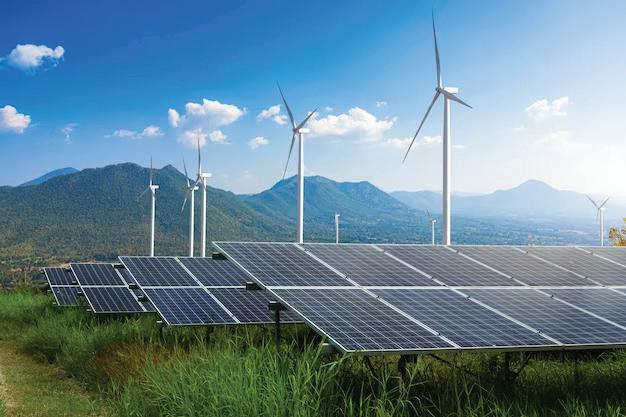
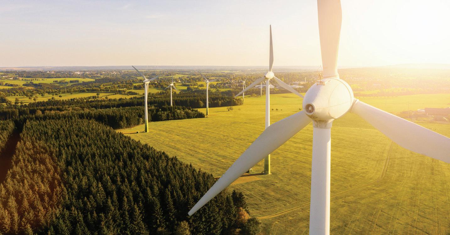
Visuals representing the different industries and assets that SgurrEnergy is related to, as well as our own in-house photographs.

People
Visuals portraying the people benefitting from SgurrEnergy services. Those visuals can represent people from the ‘consumer’ or ‘employee’ point of view.


SgurrEnergy_brandmanual | 23
PHOTOGRAPHY
When selecting photography, please make sure to draw inspiration from the following principles.
• Highlight a clear point of focus


• Keep a clean composition
• Use images that are related to the message/communication intended


SgurrEnergy_brandmanual | 24
PHOTOGRAPHY
Things to remember
• Do not use unclear, blurred, distorted images.

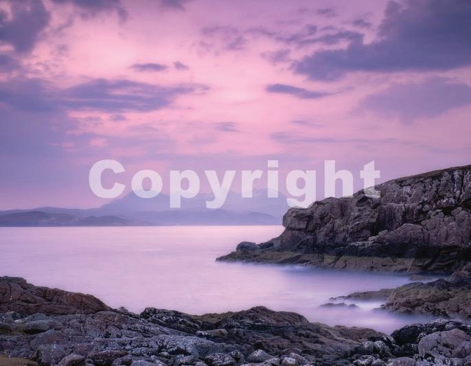
• Do not use images with watermark, or images that do not have legal license of use.

• Do not use images showing negative emotions or sensitive content.

• Do not use casual, unrelated images, with no relevance to the message.

SgurrEnergy_brandmanual | 25
Visual Identity / Visual Style Usage
SgurrEnergy_brandmanual | 26 05
Style
VISUAL IDENTITY
The brand pattern for SgurrEnergy is represented with a Mesh, as presented in the images alongside.
The Mesh pattern is a symbolic representation of a nuclear fission chain reaction, where atoms are shown following an inter-twined path.
As one of the most prominent by-products of a nuclear fission is the release of energy, the idea is to represent this generated energy.
Pattern Placement Guidelines:
• Mesh should always be placed on the left side
• Pattern should be aligned properly, so as not to overpower other elements on the page
• Using the pattern must not make the overall design look too crowded
• Do not use multiple patterns in a single background
• Pattern should not be used at full opacity
• Pattern should be lighter than other elements of the visual
• Pattern should not be used individually, or be enclosed in a borderzzzzz
Mesh 1
Mesh 2
SgurrEnergy_brandmanual | 27
Icons
Iconography / Charts and Graph Style
SgurrEnergy_brandmanual | 28
06
ICON STYLE
Iconography is helpful when needing to highlight a concept or feature in a digital product while remaining a minimal asset in layouts.
When using or creating icons, the following points need to be kept in mind:
• Always use strokes to design new icons. Never use solid color shapes.
• Always use flat-stroke caps and angular corners. Never use rounded caps & corners.
Please refer to the following examples to understand how to use icon color appropriately in communications.
1. WHITE/LIGHT BACKGROUND
Icon Colors: Forest Green, Lime Green, Black
2. GREEN BACKGROUND
Icon Colors: White
3. BLACK/DARK BACKGROUND
Icon Colors: Lime Green, Slate Grey, White
SgurrEnergy_brandmanual | 29
1.
2. 3.
CHART & GRAPH STYLE
The core color palette of 3 colours (forest green, lime green and slate grey) is to be used for representation in infographics and charts. These can be used in flat colours or the brand’s color gradient.


Additional colors that should only be used for infographics or charts when the core color palette doesn’t provide enough differentiation.
For single-colored graphs, gradient and transparency can be used. However, it needs to be ensured that visibility is not be hindered.
Visibility needs to be maintained at all times and brand colors should be preferred. In case brand colors cannot be used, gradients of colors can be used.
SgurrEnergy_brandmanual | 30
73% Lorem Ipsum 45% Lorem Ipsum 98% Lorem Ipsum 2023 2022 2023 2022 2023 2022
80 60 40 20 100 200 300 400 500 600
Lorem ipsum dolor sit amet, consectetuer adipiscing elit, sed diam nonummy
Lorem ipsum dolor sit amet, consectetuer adipiscing elit, sed diam nonummy
Lorem ipsum dolor sit amet, consectetuer adipiscing elit, sed diam nonummy
3457
2305
2890
SgurrEnergy_brandmanual | 31
38% Lorem ipsum
46% Lorem ipsum
27% Lorem ipsum
While creating pie-charts of singlecolor, it needs to be ensured that Forest Green remains the most dominant color, followed by the lighter shade in the gradient, as you proceed.
When multiple colors are used in a graph, Forest Green must be used for the most dominant/visible part. Second is Lime green and least dominant/visible parts should be coloured in slate grey or secondary colors, as required.
SgurrEnergy_brandmanual | 32
Series
Series 4 73 74 72 6 5 4 3 2 Jan Feb March April May June July August Sept Oct Nov Dec
Thernal Hydro Nuclear RES Series 1 Column 1
3
When using clustered column charts of single color, The first two prominent colors should be Forest Green and Lime Green, followed by lighter shades as you proceed.
When multiple colors are used in a graph, Forest Green must be used for the most dominant/visible part. Second is Lime green and least dominant/visible parts should be colored in slate grey or secondary colors, as required.
SgurrEnergy_brandmanual | 33 6 K J 5 4 H 3 7 2 7 3 H 4 5 J 6 K 72 77 73 7 3 H 4 5 J 6 K 6 K J 5 4 H 3 7 2 2 Category 1 Category 2 Category 3 Category 4 Series 1 Series 2 Column 1
When multiple colours are used in a Histogram, Forest Green must be used for the most dominant/visible part. Second is Lime green and least dominant/visible parts should be coloured in slate grey or secondary colours, as required.
When multiple colours are used in a Box & Whisker graph, Forest Green must be used for the most dominant/ visible part. Second is Lime green and least dominant/visible parts should be coloured in slate grey or secondary
SgurrEnergy_brandmanual | 34 73 74 72 6 5 4 3 2 Category 1 Category 2 Categaory 3 Category 4 I 5 J 6 K 72 77 73 Series 1 Series 1 Column 2 73 74 72 6 5 4 2 4 6 10 8 12
When all three brand colors are used in a graph or chart, Forest Green must be used for the most dominant/visible part of the chart. Second is Lime green and least dominant/visible parts should be colored in slate grey.
SgurrEnergy_brandmanual | 35
Lorem ipsum Lorem ipsum Lorem ipsum 10% 18%
Lorem ipsum Lorem ipsum Lorem ipsum 20%
5% 12% 8%
Corporate Identity Guidelines
SgurrEnergy_brandmanual | 36
Corporate
07
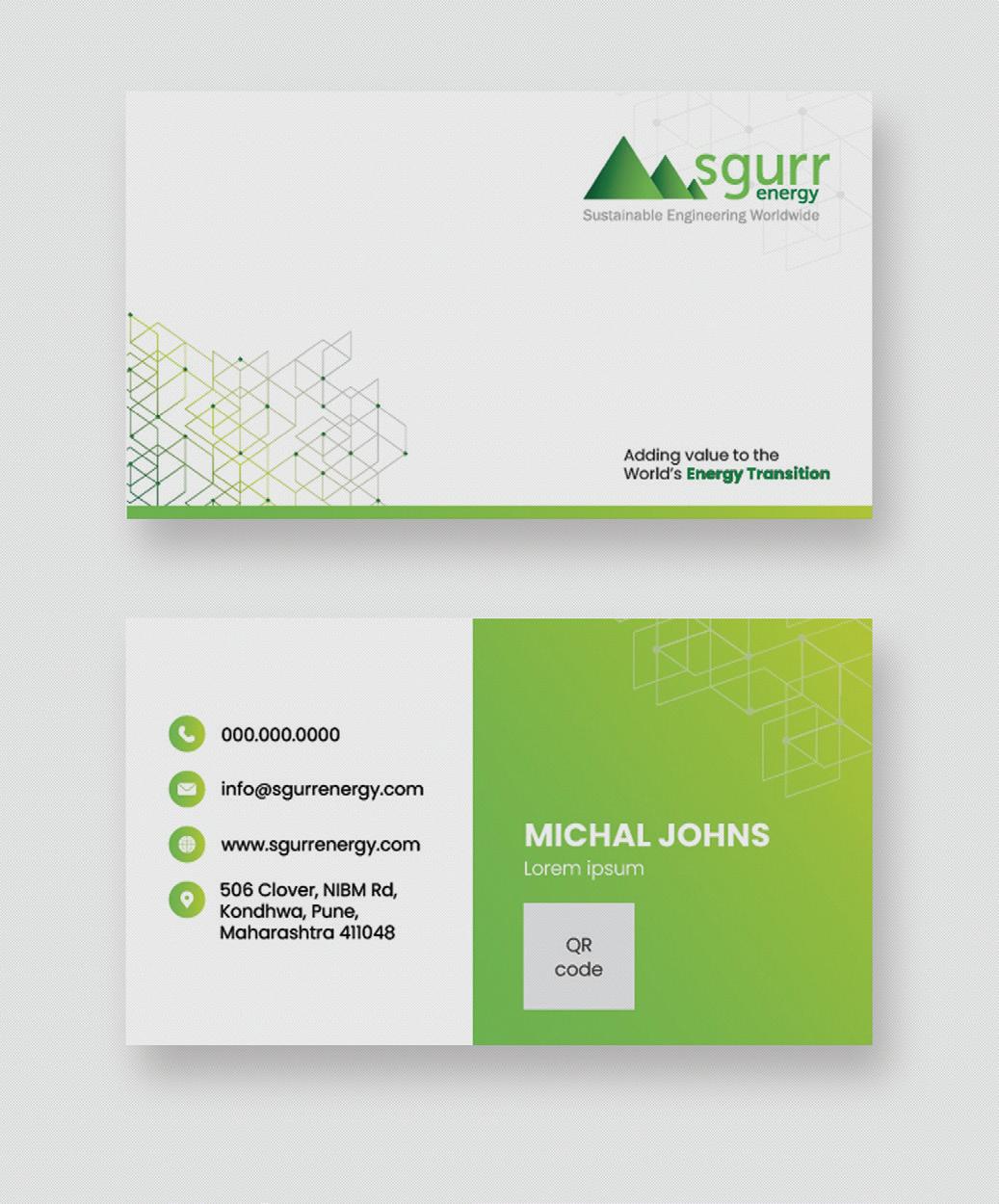
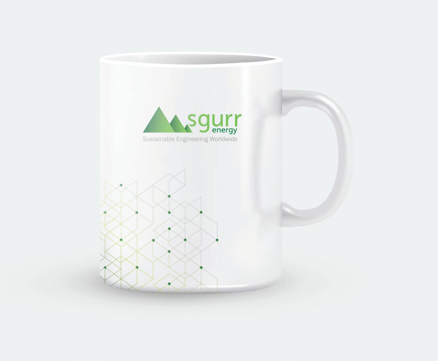
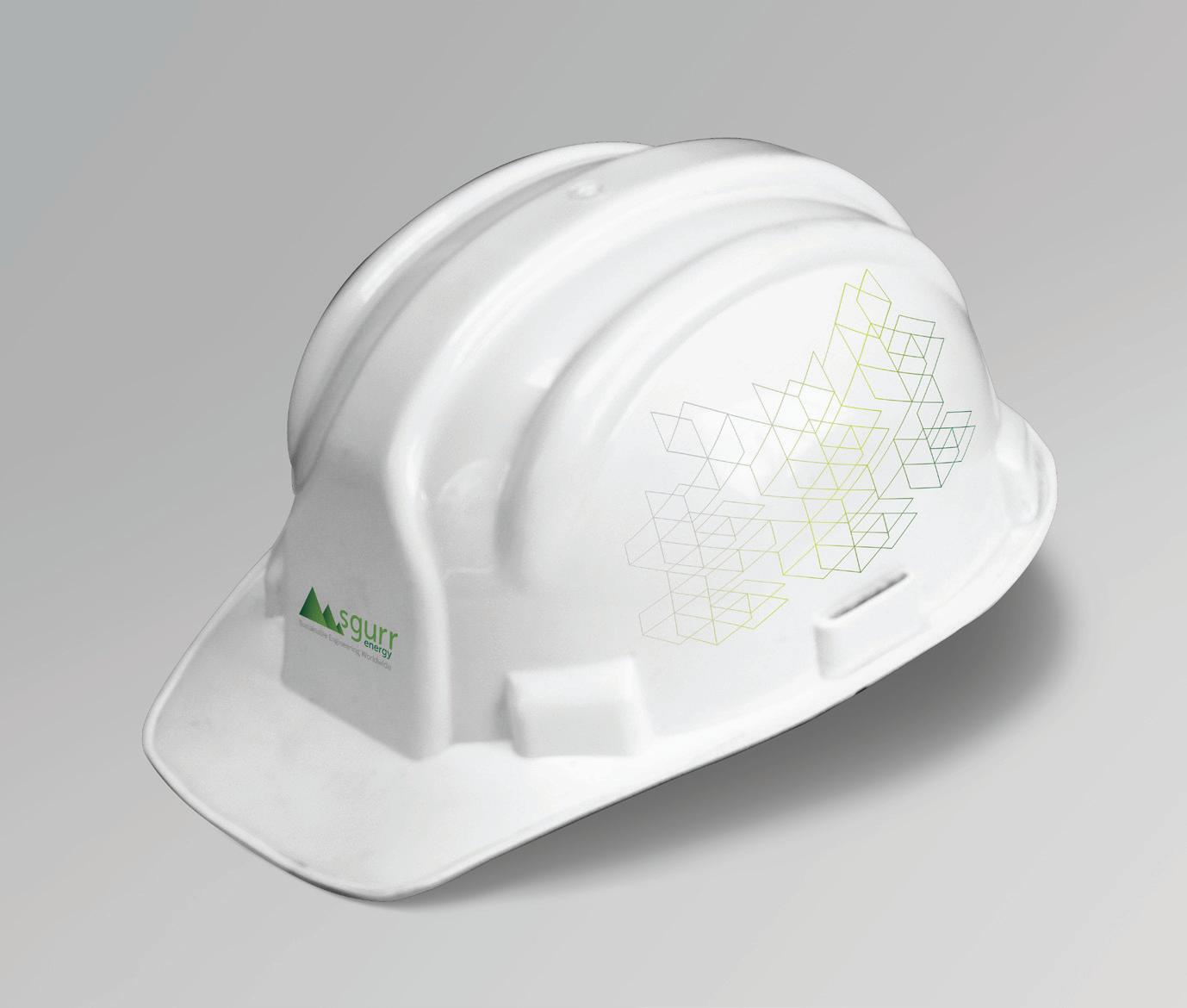
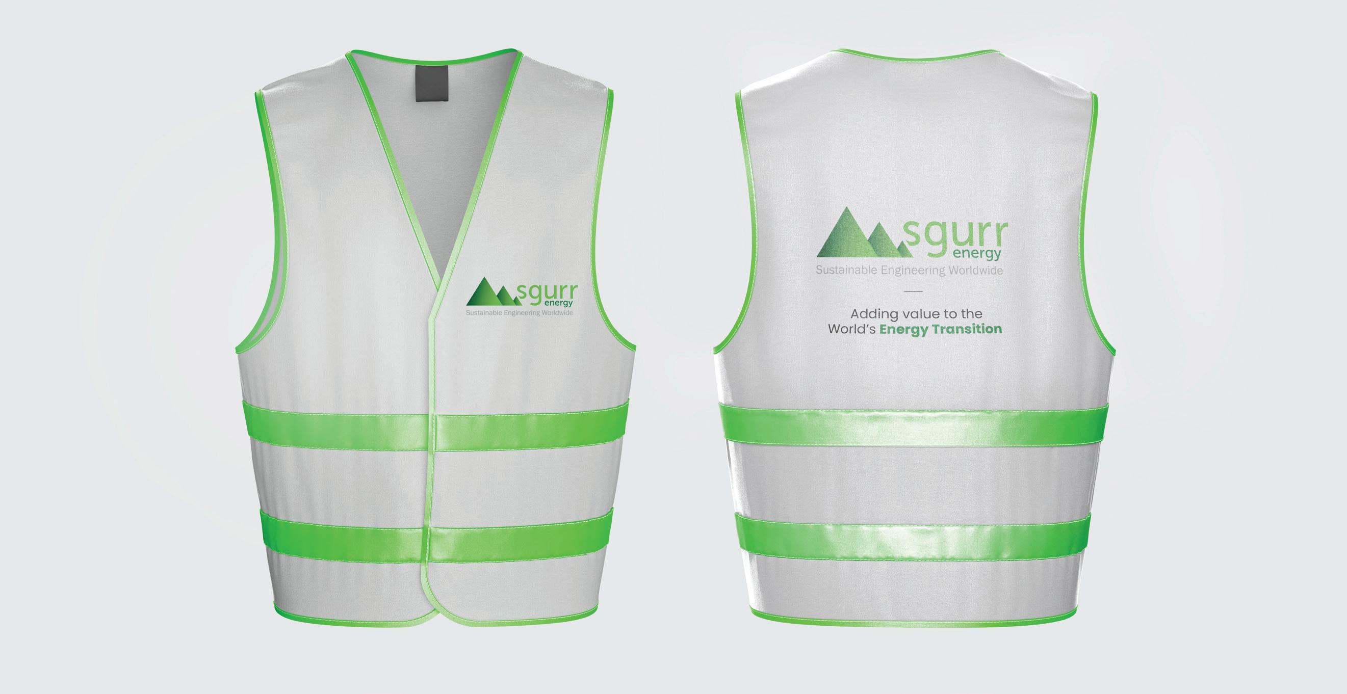
CORPORATE KIT
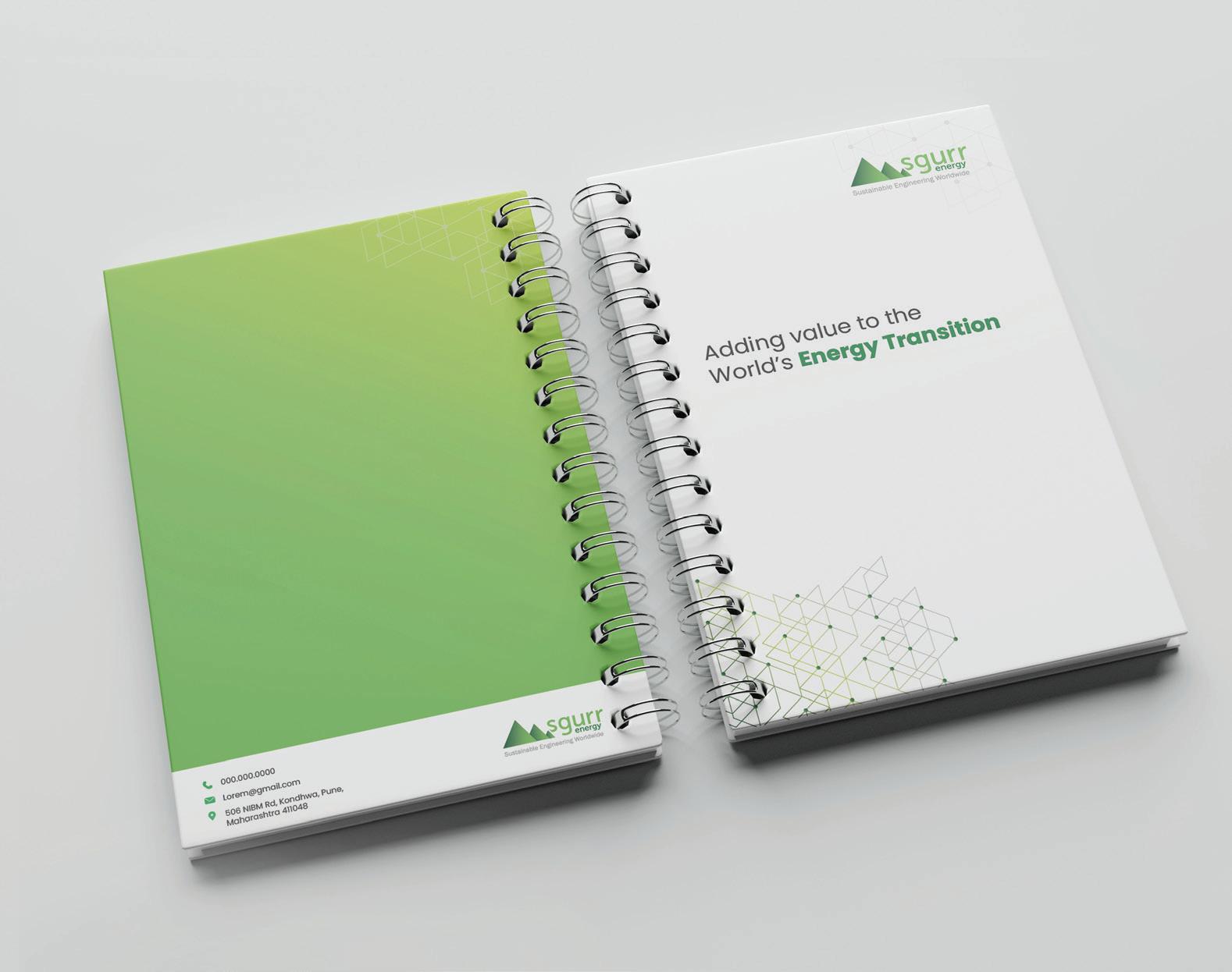
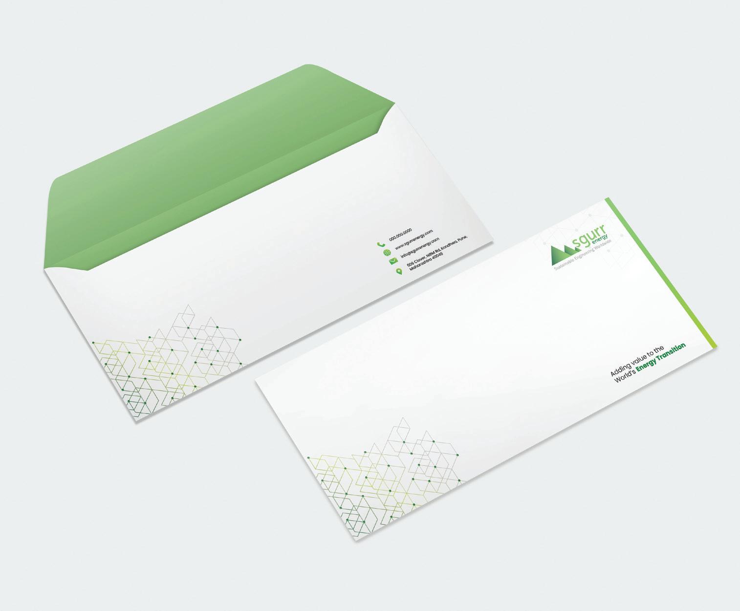
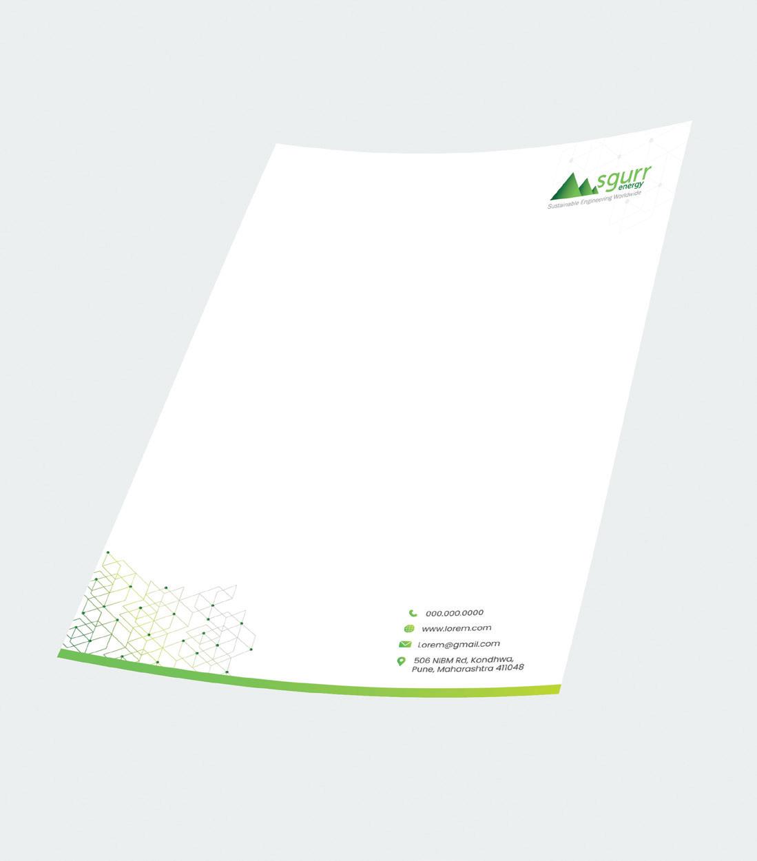
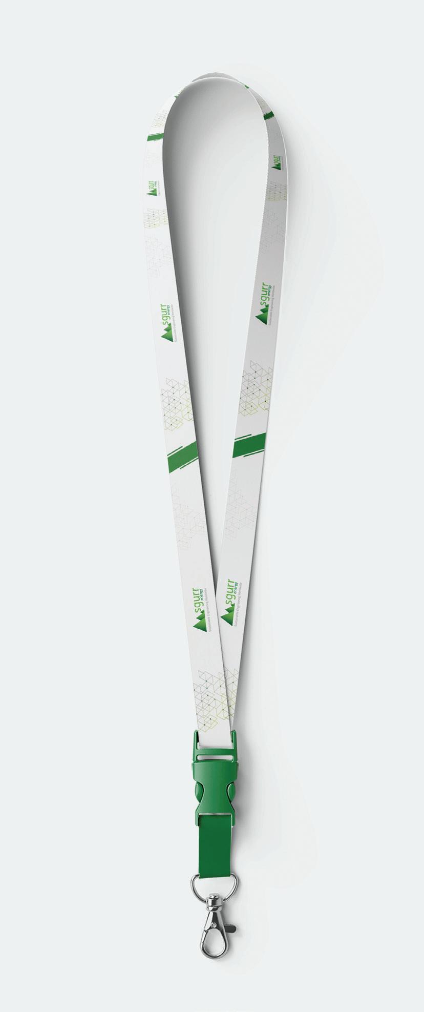
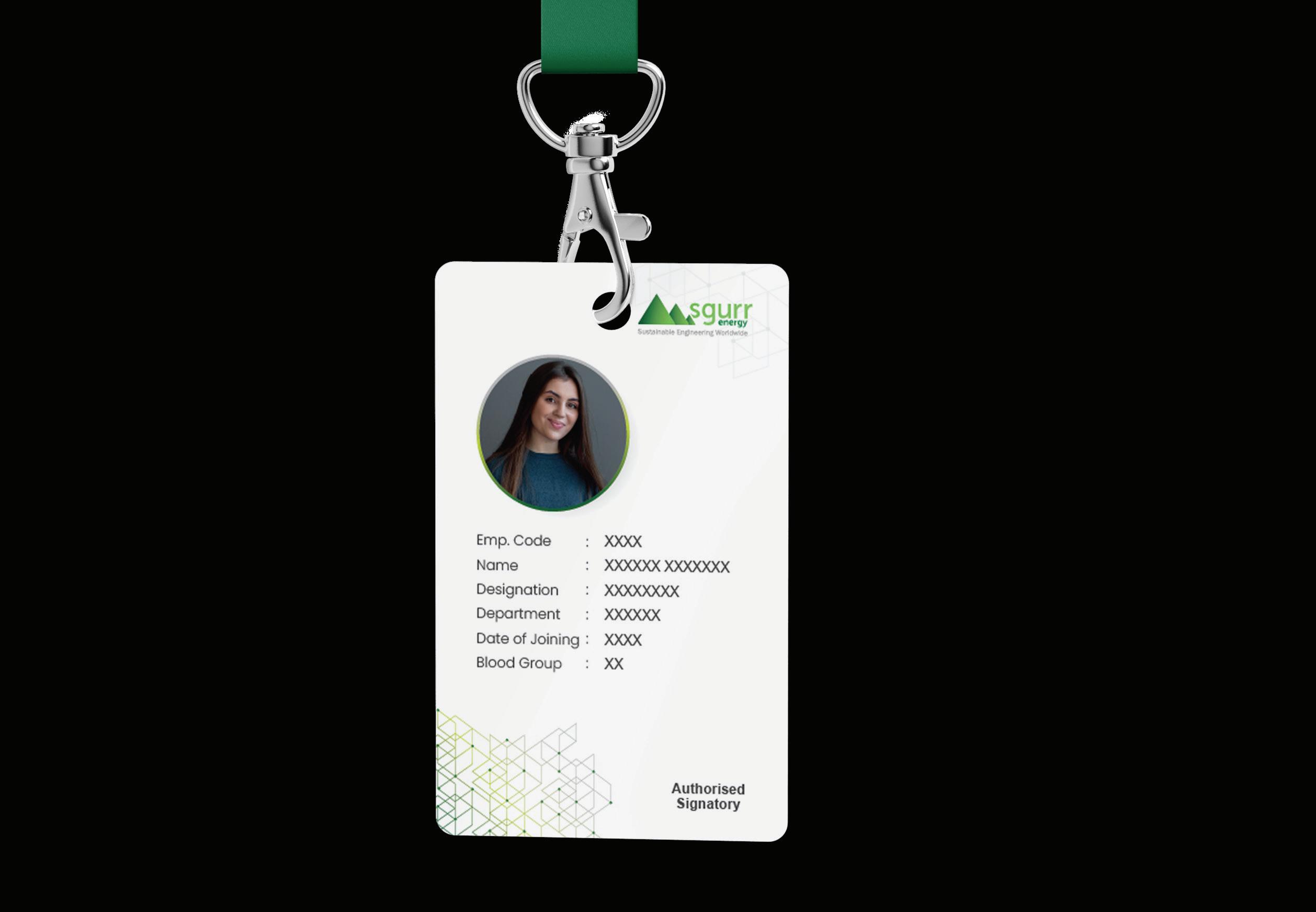
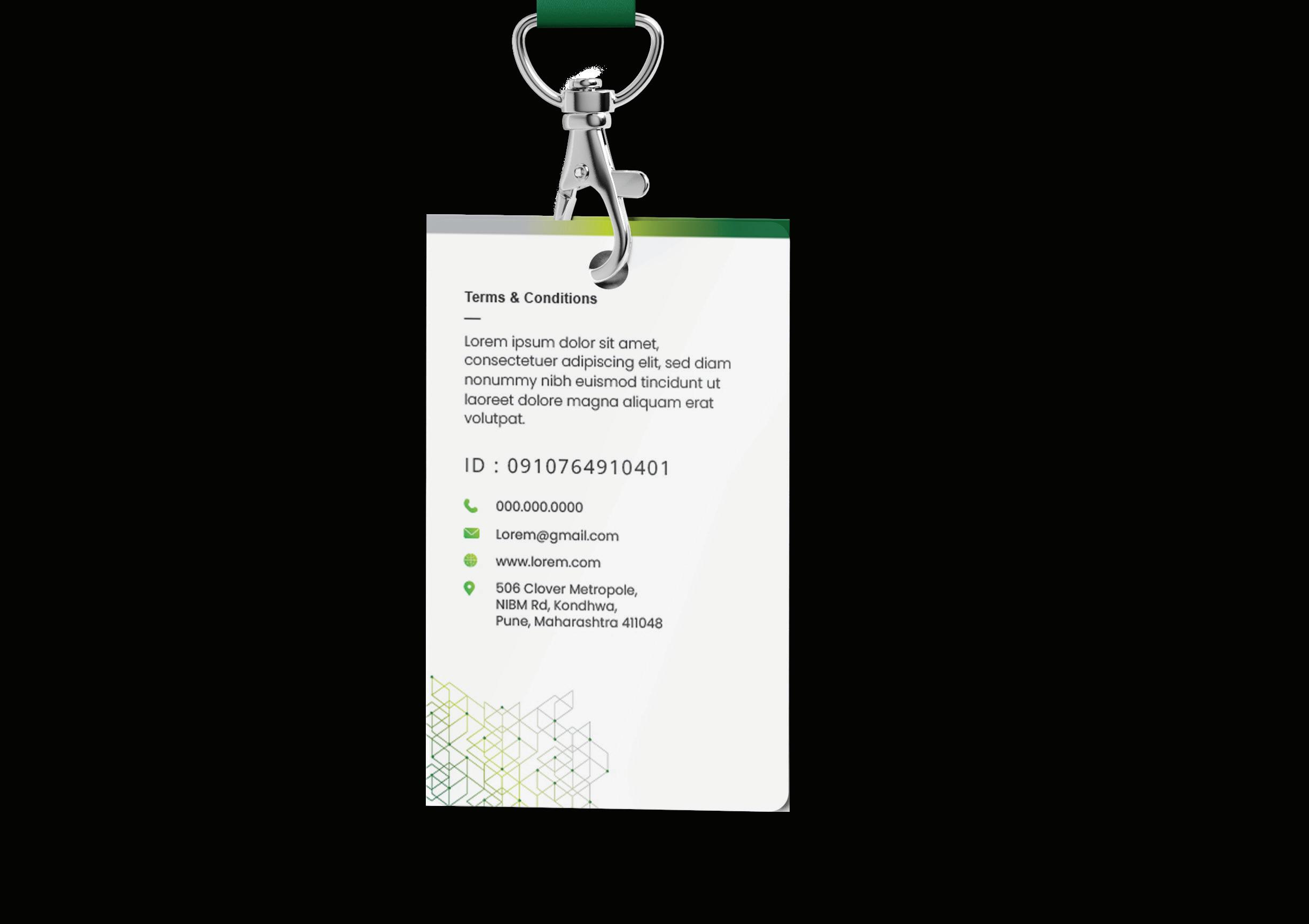
The corporate kit is the recognition of brand’s official documentation/ paperwork, as well as the presentation of the company’s branding in different tangible assets like merchandise, etc. All assets of the corporate identity must be uniformly followed and should carry the distinct identity that makes the brand easily recognizable.


SgurrEnergy_brandmanual | 37 01 Business Card 02 Notepad 03 Letterhead 04 Envelope
01 03 02 04


SgurrEnergy_brandmanual | 38 05 Lanyard & Identity Card 05


SgurrEnergy_brandmanual | 39 06 Safety Jacket 07 Coffee Mug 08 Helmet 06 07 08
Social Profile
Social Profile Guidelines
SgurrEnergy_brandmanual | 40
08
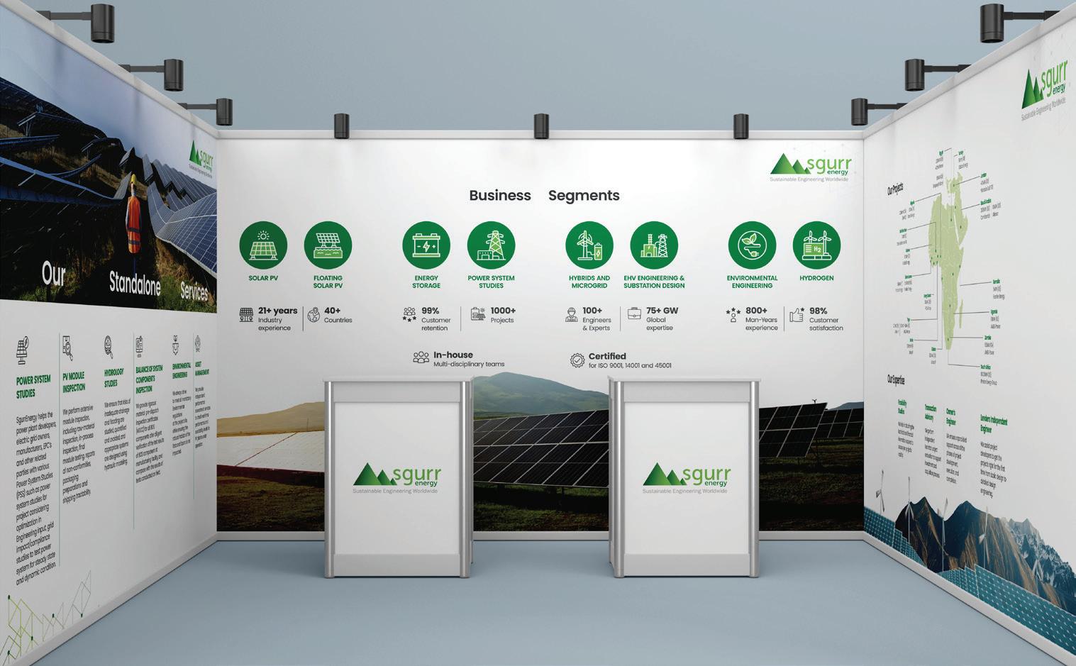
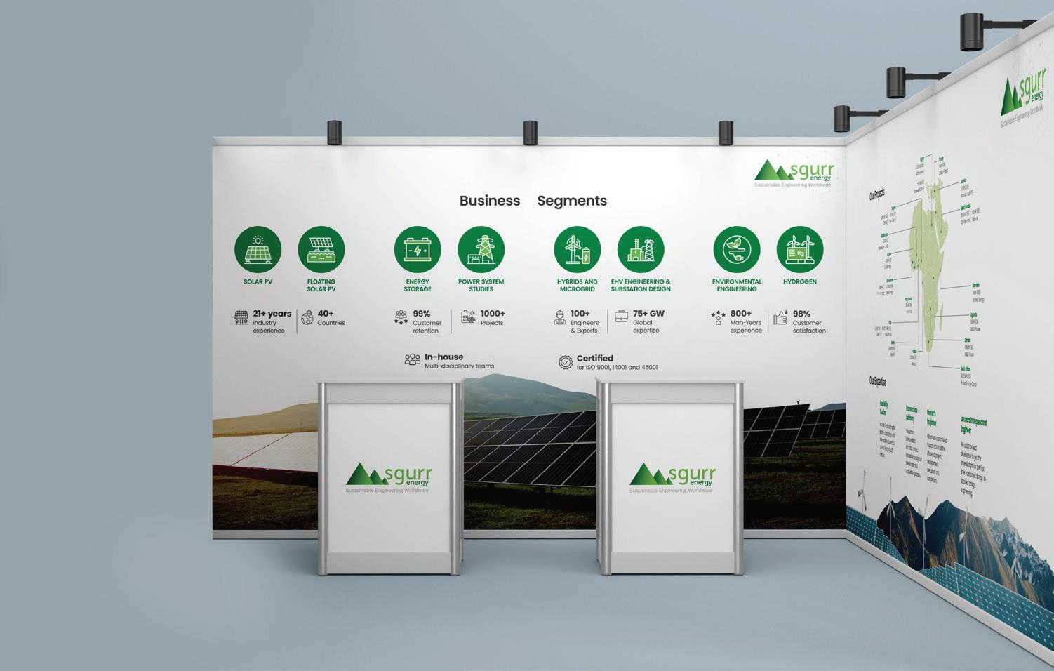
EXHIBITION BOOTH DESIGN

While creating printed designs for assets like exhibition booths, all brand elements used must be clearly visible. The company logo must be clearly visible and should not get cut in any way or be printed backward.
The color scheme and fonts, icons that are issued within the guidelines must be strictly used for designing of booth walls.

SgurrEnergy_brandmanual | 41

SgurrEnergy_brandmanual | 42
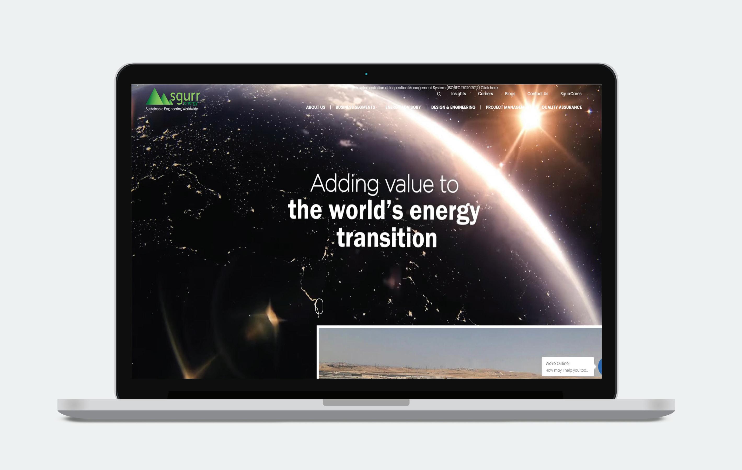
WEBSITE
BRAND COMPLIANCE AND MISUSE
While creating printed designs for assets like exhibition booths, all brand elements used must be clearly visible. The company logo must be clearly visible and should not get cut in any way or be printed backward.
The color scheme and fonts, icons that are issued within the guidelines must be strictly used for designing of booth walls. To report misuse or violations. Mail id: info@sgurrenergy.com
Terms of use of the Brand Guidelines:
• Brand guidelines are used to ensure that all brand assets are respected and distinct for the brand’s recognition.
• Additions can be made to this book from time-to-time and new set of rules may be added to it, as deemed fit.
• Brand guidelines help employees and internal stakeholders of the company to ensure that the brand is not disrespected in any way, style or manner.
• The brand book is the intellectual property of SgurrEnergy and can be modified only under the direct management of the company.


VelocitaBrand.com


