BRAND

November 2022

Other Acadia Marks Other Acadia Marks Sizing and Spacing Primary Colours and Tints & Shades Fonts Typography Imagery Templates & Resources Email Signature Business Cards Letterhead Powerpoint Resources and Support Glossary of Terms SECTION 3 Contents Brand Guidelines APPENDIX A APPENDIX B SECTION 1 SECTION 2
Introduction
About this Document
The Brand Guidelines document serves as a reference for the essential visual and verbal elements that make up the Acadia University brand and outlines how they should be used.
By following the recommendations in this guide, we are able to maintain a consistent look and feel across all communications, which works to create a clear, strong brand character.
These Guidelines are intended to serve both internal faculty, staff and external resources. Designed as a user-friendly and concise reference guide, it’s filled with tools and direction to guide the implementation of branded communication materials.
It has been organized into three primary sections:
1. Brand Identity
Delivers content about who Acadia is and how we use that in our communications.
2. Visual and Verbal Identity
Delivers guidelines for consistent use of the Acadia University brand visual and verbal identities.
3. Templates & Resources
Includes visual identity templates for internal implementation.
Acadia Brand and Communications Toolkit

Located on the Acadia University Sharepoint is the Acadia Brand and Communications Toolkit.
Brand and visual identity templates referenced throughout this document can be found here along with additional guides for writing and editing, media relations, social media, photo and video usage, protocols and etiquette.
If you are unclear on how to proceed with representing Acadia University in an academic or promotional capacity, Contact Us the Acadia Brand Council brandcouncil@acadiau.ca
5 Brand Guidelines
About this Document
Brand Identity


SECTION 1
Defining Who We Are
When you ask someone to describe Acadia, they don’t just talk about the classes, they talk about the people, the Wolfville community and the experiences that they have had while studying at the university.

This is to say, at the core of the Acadia identity is an unmistakably human element.


We recognize that the future is in our people. We are committed to ensuring our students have the support they need to become the best versions of themselves, not just as students but as human beings. Because, when we show up for students, students are empowered to show up for themselves.
Key Brand Pillars

 W Small School, Small Classes Personal Connections olfville Community
Brand Essence
“Like Nowhere Else”
Personality
Welcoming, Accepting, Unpretentious, Inspiring, Supportive and Kind
Emotional Benefits
We inspire students to become the best version of themselves. We fuel discovery and ambition. We educate the whole person – academically, emotionally and spiritually. We produce people who are grounded in their emotions, and confident in their abilities.
Functional Benefits
We offer a personalized and rigorous liberal education. We inspire students to become critical thinkers, lifelong learners and engaged citizens.
Attributes and Features
Small classes, a spectacular campus, and faculty who care about students on an individual level. Leading mental health supports. Socially conscious administration. Situated on the world-renowned Bay of Fundy. Nestled in the beautiful Annapolis Valley. Neighbouring the friendly, welcoming town of Wolfville.
Visual and Verbal Identity
SECTION 2
Short
Acadia University is a place like nowhere else. Founded in 1838, it is one of the most respected liberal education universities in Canada. At the core of school’s identity is an unrivaled commitment to its students, and shared mission to provide a personalized education while promoting a robust and respectful scholarly community.
Long
Acadia University is a place like nowhere else. Founded in 1838, it is one of the most respected liberal education universities in Canada. At the core of the school’s identity is an unrivaled commitment to its students, and a shared mission to provide a personalized education while promoting a robust and respectful scholarly community. Acadia’s staff, faculty, and administration come together to deliver a truly unique learning experience for students. Acadia’s four faculties –Arts, Pure and Applied Sciences, Professional Studies, and Theology – offer more than 200 degree combinations in its undergraduate and graduate programs. Acadia is widely regarded for its biology, business, kinesiology, environmental studies, psychology, computer science and English programs. Part of that success is owed to the beautiful campus that acts as the foundation for everything Acadia does. Overlooking the Bay of Fundy, nestled in the Annapolis Valley and surrounded by two hundred kilometres of trails – every corner of Acadia is truly and uniquely beautiful.
'About Us' Statements
10 Brand Guidelines Visual and Verbal Identity
Language
Tone of Voice
Acadia University is unlike anywhere else. This unique tone of voice should be reflected in the copy as well. Headlines should feature a unique aspect of the university. Scripts should convey a sense of wonder. Body copy should also try to weave in this sensibility. The rest of the copy should be positive, honest, and straightforward.
Headline examples:
Where else can you find a university only 500 meters from the ocean
Where else can you find a university with over 200 kilometres of trails
Where else can you find a university with its own private research island
Welcome to a commute like nowhere else
Where else can you find a dining hall with this view
A change in scenery can change your future
Tagline
“Acadia University. Like nowhere else.”
The tagline should be used in all brand communication materials. If incorporating as audio in video or radio, the tagline should be used at the end.
11 Brand Visual Guide & Resource Toolkit Visual and Verbal Identity
Logo Variations
The Acadia University visual identity is anchored by a core logo. This logo comes in various formats and its integrity is protected by the guidelines outlined in this document.
Primary Logo
The primary version of the logo is the colour, horizontal version. It is the strongest expression of the Acadia brand and is therefore the go-to logo for all public displays of the brand. It should be the only one used on document covers, posters, and other formal pieces of this nature. If width is an issue, the stacked version of the logo should be used instead.

Other colour variations are available for specific applications. See following pages for further direction.
Not sure if you’re using the visual identity correctly? Contact Us the Acadia Brand Council brandcouncil@acadiau.ca
12
Brand Guidelines Visual and Verbal Identity
Primary Logo with Tagline
In cases where the brand tagline “Like Nowhere Else” is to be included in the marketing material, the primary logo with tagline lockup should be used.
13 Brand Guidelines Visual and Verbal Identity
Logo and URL
Primary Logo with URL
In cases where the primary Acadia URL “acadiau.ca” is to be included in the marketing material, the logo with URL lockup should be used.
URL placement and typography
Font: Helvetica Neue Bold, all in lowercase, never with www. preceding it
Kerning: 50pt optical kerning
Colour: Black
Horizontal logo: URL should be 3/4 x height of the logo’s University x height and centered underneath the wordmark
Stacked logo: URL should be 3/4 the length of the logo and centered underneath the wordmark
14
Brand Guidelines Visual and Verbal Identity
Incorporating Faculties into the Primary Logo
In cases when a specific faculty of Acadia University is being represented, the primary logo + faculty lockup should be used (with or without tagline).
Faculty logo lockups follow the following rules:
• “Faculty of” should be typed in all caps in Helvetica Neue Light with 100pt kerning, sharing the ‘x’ height of the word ‘University’ in the logo.
• The name of the faculty should be represented by Helvetica Neue Medium, again in all caps, with 40pt kerning.
• Both parts of the acknowledgment should be coloured in the primary red.
• Adding the faculty can be done in either a horizontal or vertical manner. The primary version of the logo is the horizontal version. If width is an s hould her a horizontal be t yped in 100pt kerning, versit y’ in the be represented all caps, with hould be horizontal ced one shield’s ult y of’ on the me of the facult y A 0 5pt black s then added s apply, except shield’s height
issue, the stacked version of the logo should be used instead.
• For the horizontal version, the copy should then be placed one shield’s width to the right of “Acadia,” with “faculty of” on the same baseline as “Acadia” and the name of the faculty on the same baseline as “University.” A 0.5pt black keyline, the same height as the logo, is then added 1/2 a shield’s width from “Acadia.”
I n c o r po r a t i n g F a c u l ti e s i n t o t h e P r im a r y L o g o
• For the vertical version the same rules apply, except the faculty name is justified left with the logo. The baseline of “faculty of” should be one shield’s height from the bottom of the logo. The keyline is the width of the logo, and ½ a shield’s height from the bottom of the logo. The width of the copy should not exceed the width of the logo.
acknowledged, the following rules should be applied
The primary version of the logo is the horizontal version. If width is an issue, the stacked version of the logo should be used instead.
Adding the facult y can be done in either a horizontal or ver tical manner ‘Facult y of’ should be t yped in all caps in Helvetica Neue Light with 100pt kerning, sharing the ‘x’ height of the word ‘Universit y’ in the logo. The name of the facult y should be represented by Helvetica Neue Medium, again in all caps, with 40pt kerning
Both par ts of the acknowledgment should be coloured in the primar y red. For the horizontal version, the copy should then be placed one shield’s width to the right of ‘Acadia’, with ‘facult y of’ on the same baseline as ‘Acadia’ and the name of the facult y on the same baseline as ‘Universit y’. A 0 5pt black keyline, the same height as the logo, is then added 1/2 a shield’s width from ‘Acadia’
When incorporating with the tagline with the primary logo and faculty lockup, the horizontal version should be used with the tagline placed centered below the lockup.
For the ver tical version the same rules apply, except baseline of ‘facult y of’ should be one shield’s height from the bot tom of the logo. The keyline is the width of the logo, and 1/2 a shield’s height from the bot tom of the logo The width of the copy should not exceed the width of the logo
Facult y recognition can also be incorporated into the clock tower graphic as shown below, which is the preferred option When
If you need a faculty logo created, please contact the Acadia Brand Council
brandcouncil@acadiau.ca
15
recognizing a facult y the
Brand Guidelines Visual and Verbal Identity
Logo File Formats
There are a variety of logo file formats available to use for different applications:
The below outlines which file format would be most appropriate based on where and how it will be used:
.png
- Application: Web where a transparent background is required
.jpg
- Application: Web or print where a transparent background is not required
• A JPG can’t have a transparent background so they are always in the shape of a rectangle or square with a solid background (flat image)
• JPGS will lose resolution or image quality as the size increases.
Always check to ensure resolution is crisp at the required size.
If any image quality is lost, an EPS file should be used instead.
.eps
- Application: Print
• Requires access to design software such as Adobe Creative Suite
Still not sure if you’re using the correct format?
Contact Us the Acadia Brand Council brandcouncil@acadiau.ca
16
Brand Guidelines Visual and Verbal Identity
Logo Sizing and Spacing
A safety area should be maintained at all times around the borders of the logo to protect its integrity. These rules apply to every version of the logo. The exclusion area is based on the height of the shield graphic in the logo.The horizontal version has a safety area of one shield around it, and the stacked version has a safety area of 1/2 of one shield.
A minimum width of 1.25” is permitted for the horizontal logo, and a minimum width of 1” for the stacked version. The logo should never appear smaller than this. For the primary logo + faculty lockup variations, the primary logo component should be used as the point of reference for sizing. A minimum width of 1.25" is permitted for both the horizontal and stacked versions. The logo should never appear smaller than this.
1 25” 1”
17
Brand Guidelines Visual and Verbal Identity 1
25” 1 25”
Horizontal distor tion Keyline Angled White box around the logo Font substitution Too close to another element Resizing of elements Lack of contrast Colour change Ver tical distor tion A C A D I A u n i v e r si t y 18
Integrity The following adjustments to the logo are not permitted under any circumstances. Not sure if you’re using the visual identity correctly? Contact Us the Acadia Brand Council brandcouncil@acadiau.ca Brand Guidelines Visual and Verbal Identity
Logo
CMYK for standard pr inting c0 m0 y0 k100 c0 m100 y 90 k 20 c100 m60 y0 k40 Black for one colour positive use c0 m0 y0 k100 White for one colour ne gative use c0 m0 y0 k0 Pantone for re str ictive pr int use Pantone for re str ictive pr int use with black 295C 1807C 295C 1807C Black 6C Reve rsed CMYK ne gative use Reve rsed Pantone ne gative use, re str ictive pr int c0 m0 y0 k0 c0 m100 y 90 k 20 c100 m60 y0 k40 295C 1807C 19 Logo Colours The logo has various colour versions that allow it to be printed
formats. The examples below apply
each logo type and are the only permitted colour applications.
tagline. Brand Guidelines Visual and Verbal Identity
in many
to
With or without
The Acadia logo is t Univer sit y brand. It all communications
Other Acadia Marks
The Acadia logo is the signature mark of the university’s visual identity. It should appear in full on communications and marketing pieces. There are, however, other visual signifiers that can be used in addition to the logo.
Each of these Acadia marks expresses a subtle or explicit aspect of the overall identity, and as such represents a subsidiary entity of the University. If used in conjunction with the primary logo, they should be positioned so as not to “fight” with it visually, ideally in the opposite corner of a design or even on a separate page or side of a page.
are, however, other use d in addition to Each of these brand explicit aspe ct of th The Acadia A This is a secondar y emphasizing the sp more formal aspect on Acadia’s Athletic a more active, youth school’s brand.
T h e U n i v e r s i t y S e a l
Ot her Brand Marks
The seal is used only on the most official communications, such as diplomas or citations Permission is required to use this seal on any communication. To request permission, contact the Acadia Brand Council : brandcouncil@acadiau.ca
T h e Acadia Shield
The Acadia logo is the main identifier of the Univer sit y brand. It should appear in full on almost all communications and marketing pie ces There are, however, other visual signifier s that can be use d in addition to the shield and wordmark Each of these brand marks expresses a subtle or explicit aspe ct of the overall brand, and as such
represents a sub brand of the Univer sit y If use d in conjunction with the principal logo, they should be positione d so as not to “fight ” visually with it, ideally in the opposite corner of a design or even on a separate page or side of a page
The At hlet ics A This ver sion of the “ communications. It general “A” and has bet we en the re d fill also ver sions with t team mascots leani
The Univer sit y S eal The seal represents is use d only on the such as diplomas o
The Acadia A
Because the full university logo is not suitably shaped for certain uses, Acadia uses the shield on its own as an identifier. Examples of this are favicons and social media identifiers.
This is a secondar y identifier of the Universit y, emphasizing the spirit and tradition of Acadia over more formal aspects of the institution It is based on Acadia’s Athletics logo, and as such represents a more active, youthful, and informal take on the school’s brand
T h e Athletics A
The At hlet ics A
The Acadia Avat ar Be cause the full Un shape d for many of the shield on its ow developing theme d Acadia over time P Communications an
This version of the “A” is used strictly on Athletics communications There are also versions with the “A xemen” and “A xewomen” team mascots leaning on it
This ver sion of the “A” is use d strictly on Athletics communications. It is shor ter and wider than the general “A” and has white a xes and a white space bet we en the re d fill and the blue outline. There are also ver sions with the “A xemen” and “A xewomen” team mascots leaning on it
The Univer sit y S eal
The seal represents the O f fice of the President. It is use d only on the most of ficial communications, such as diplomas or citations
The Acadia Avat ar Be cause the full Univer sit y logo is not suitably
Us e of the Ac a
e ld a s a s ing le 8 O t her Brand M
d i a s hi
20
Brand Guidelines Visual and Verbal Identity
O t her Brand
O t her Brand Marks
represents a sub brand of the Univer sit y. If use d in conjunction with the principal logo, they should be positione d so as not to “fight ” visually with it, ideally in the opposite corner of a design or even on a separate page or side of a page
represents a sub brand of the Univer sit y. If use d in conjunction with the principal logo, they should be positione d so as not to “fight ” visually with it, ideally in the opposite corner of a design or even on a separate page or side of a page
Ot her Brand Marks
The Acadia logo is the main identifier of the Univer sit y brand. It should appear in full on almost all communications and marketing pieces There are, however, other visual signifier s that can be used in addition to the shield and wordmark Each of these brand marks expresses a subtle or explicit aspect of the overall brand, and as such
The exclusion areas are based on the shield from the primary logo.
The Acadia A
The Acadia A
T he Acadia logo is the main identifie r of the Unive r sit y brand. It should appear in full on almost all communications and marketing pie ce s. T he re are, howeve r, othe r visual signifie r s that can be use d in addition to the shield and wordmark. Each of the se brand marks expre s se s a subtle or explicit aspe c t of the ove rall brand, and as such
represents a sub brand of the Univer sit y. If used in conjunction with the principal logo, they should be positioned so as not to “fight ” visually with it, ideally in the opposite corner of a design or even on a separate page or side of a page.
This is a secondar y identifier of the Univer sit y, emphasizing the spirit and tradition of Acadia over more formal aspects of the institution. It is based on Acadia’s Athletics logo, and as such represents a more active, youthful, and informal take on the school’s brand.
This is a secondar y identifier of the Universit y, emphasizing the spirit and tradition of Acadia over more formal aspects of the institution. It is based on Acadia’s Athletics logo, and as such represents a more active, youthful, and informal take on the chool’s brand.
The Acad a ogo s the ma n dentifie of he Un versity brand It shou d appea n ull on a mos ll t d k g p Th are however othe visua signifiers tha can be u ed n add t on to he sh eld and wordmark Each o these brand marks expresse a subt e or exp ici aspect of he ove all b and and as such
The Acad a A Th s s a secondary identifie o the Universi y emphas z ng the sp t and rad tion of Acad a ove more forma aspects of he ns tu ion s based on Acad a s Athle c logo and as such epresents t y h d k the schoo s brand
repre sents a sub brand of the Unive use d in conjunc tion with the princip they should be positione d so as not visually with it, ideally in the opposi a de sign or even on a separate page a page.
The Acadia logo is the main identifier of the Univer sit y brand. It should appear in full on almost all communications and marketing pie ces. There are, however, other visual signifier s that can be use d in addition to the shield and wordmark. Each of these brand marks expresses a subtle or explicit aspe ct of the overall brand, and as such
The Ath et cs A Th s ve s on of he A s used st c y on Ath e cs commun ca ons It i sho er and wide than he g A” d h h t d a h pa between he red fill and he b ue ou l ne There a e a so ve s ons w th he Axemen” and Axewomen” eam ma cots eaning on
The At hlet ics A
The Acadia A
This ver sion of the “A” is used strictly on Athletics communications. It is shor ter and wider than the general “A” and has white a xes and a white space bet ween the red fill and the blue outline There are also ver sions with the “A xemen” and “A xewomen” eam mascots leaning on it
The Univer sit y S eal
The Un vers y Sea Th p ts h O fi f h P sid nt It s u ed on y on he most offic a commun cat ons such as dip omas o ci a ons
represents a sub brand of the Univer sit y If use d in conjunction with the principal logo, they should be positione d so as not to “fight ” visually with it, ideally in the opposite corner of a design or even on a separate page or side of a page
The At hlet ics A This ver sion of the “A” is use d strictly on Athletics communications. It is shor ter and wider than the general “A” and has white a xes and a white space bet we en the re d fill and the blue outline. There are also ver sions with the “A xemen” and “A xewomen” team mascots leaning on it.
The Acadia A
This is a secondar y identifier of the Univer sit y, emphasizing the spirit and tradition of Acadia over more formal aspects of the institution. It is based on Acadia’s Athletics logo, and as such represents a more active, youthful, and informal take on the school’s brand.
The Acad a Ava a Because the full Un versity ogo s not su tably shaped o many of he avatar bo es Acad a ses he h e d o its o as a de ifie We ill be deve op ng hemed avatars to prope y epresent Acad a ove t me P ease con act he O fice o
This is a secondar y identifier of the Universit y, emphasizing the spirit and tradition of Acadia over more formal aspects of the institution. It is based on Acadia’s Athletics logo, and as such represents a more active, youthful, and informal take on the school’s brand.
The Univer sit y S eal The seal represents the O f fice of the President. It is use d only on the most of ficial communications, such as diplomas or citations
The At hlet ic s A
The seal represents the O f fice of the President. It s used only on the most of ficial communications, uch as diplomas or citations.
The At hlet ics A
The Acadia Avat ar
ntifier of the ear in full on almost ing pie ces. There er s that can be nd wordmark. es ses a subtle or nd, and as such he Univer sit y, tion of Acadia over tution. It is based s such represents rmal take on the rictly on Athletics nd wider than the and a white space e outline There are ” and “A xewomen” f the President. It communications, is not suitably oxes, Acadia uses tifier We will be roperly represent t the O f fice of g for as sistance.
Because the full Univer sit y logo is not suitably haped for many of the avatar boxes, Acadia uses he shield on its own as an identifier We will be developing themed avatar s to properly represent Acadia over time. Please contact the O f fice of Communications and Marketing for assistance
The Acadia Avat ar Be cause the full Univer sit y logo is not suitably shape d for many of the avatar boxes, Acadia uses the shield on its own as an identifier We will be developing theme d avatar s to properly represent Acadia over time Please contact the O f fice of Communications and Marketing for as sistance.
0.75”
T his ve r sion of the “A” is use d stric tly on Athletic s communications. It is shor te r and wide r than the gene ral “A” and has white a xe s and a white space bet we en the re d fill and the blue outline. T he re are also ve r sions with the “A xemen” and “A xewomen” team mascots leaning on it.
Us e of th e Ac a d i a s h i e ld a s a s i ng l
This ver sion of the “A” is use d strictly on Athletics communications. It is shor ter and wider than the general “A” and has white a xes and a white space bet we en the re d fill and the blue outline There are also ver sions with the “A xemen” and “A xewomen” team mascots leaning on it.
The Univer sit y S eal The seal represents the O f fice of the President. It is use d only on the most of ficial communications, such as diplomas or citations.
The Acadia Avat ar
Us e of th e Ac a d i a s h i e ld a s a s i ng l e e ntit y is p e r m is s a bl e onl y wh e n us e d a s a n on li n e ico n/avata r fo r of fic i a l u n ive r s it y so ci a l m e d i a id e ntit y p ur p o s e s .
0.25”
The U niver s it y S eal T he seal repre sents the O f fice of the Pre sident. It is use d only on the most of ficial communications, such as diplomas or citations.
A l l of t h e s e b r a n d m a r ks ar e ava il a b l e i n m u l t i pl e ve r s i o n s fo r di e r e n t ap p l i c a t i o n s .
Be cause the full Univer sit y logo is not suitably shape d for many of the avatar boxes, Acadia uses the shield on its own as an identifier We will be developing theme d avatar s to properly represent Acadia over time. Please contact the O f fice of Communications and Marketing for assistance
Acadia University Identity Guidelines: Visual identity.
0
75”
U s e of th e Ac a d i a s h i e ld a e ntit y i s p e r m i s s a bl e o n a n o n li n e ico n/avat a r fo r o so ci a l m e d i a id e ntit y p u r p
Brand Guidelines Visual and Verbal Identity
The Acadia Avat ar Be cause the full Unive r sit y logo is not suitably shape d for many of the avatar boxe s, Acadia use s the shield on its own as an identifie r. We will be developing theme d avatar s to prope rly repre sent Acadia ove r time. Please contac t the O f fice of Communications and Marketing for as sistance.
21
e
s
e r
e n u
A l l of t h e s e b r a n d m a r ks ar e ava il a bl e i n m u l t ip l e ve r s i on s fo r di e r e n t ap p l i c a t i o n s . 8 Acadia University Identity Guidelines: Visual identity
Brand Marks
e ntit y i
p
m is s a bl e onl y wh
s e d a s a n on li n e ico n/avata r fo r of fic i a l un ive r s it y so ci a l m e d i a id e ntit y p u r p o s e s
Other
ep e en s a b brand of he Un ersity used n con unc on w th he pr nc pa ogo hey shou d be posit oned so as not to fight visua y w th dea y n the opposite co ne o a design or even on a sepa
e page
page U h A d h d g p bl y h d an online con ava a or o fic a un v ty ci d d t y p p A of hese brand ma ks are ava ab e n mu t p e ver ons o d e en app i a ons 0 25”
Commun cat ons and Marke ng o assis ance
a
o side o a
8 Acadia University Identity Guidelines: Visual identity
Us e of the Ac ad i a s hie ld a s a s ing le e ntit y is p e r mis s a ble onl y whe n us e d a s a n online icon/avata r for of fic ia l unive r s it y soci a l m e d i a id e ntit y pur pos e s A ll of t h es e b r a n d m a rks ar e ava il a bl e i n m u l t i pl e ve r s ion s fo r d i e r e nt a p p l ic a t io n s . 8
Acadia University Identity Guidelines: Visual identity.
Marks
The Acadia logo is the main identifier of the Univer sit y brand. It should appear in full on almost all communications and marketing pie ces There are, however, other visual signifier s that can be use d in addition to the shield and wordmark Each of these brand marks expres ses a subtle or explicit aspe ct of the overall brand, and as such
O t her Brand Marks
Us e of th e Ac a d i a s h ie ld a s a s ing le e ntit y is p e r m is s a ble onl y wh e n us e d a s a n o n lin e ico n/avata r fo r of fic i a l un ive r s it y so ci a l m e d i a id e ntit y p ur po s e s
Like the logo, other marks come with exclusion areas and minimum sizes.
The shield height is taken from the height of the mark itself.
Other Acadia Marks Sizing and Spacing
Primary Colours
Acadia University’s visual identity is represented by core colours –black, blue, red and white. These colours can and should be used throughout materials.
The primary red, Pantone 1807C, is the red found in the Acadia University logo. The primary red is the standard red to be used on Acadia communication materials. The only exception to using the primary red is for select recruitment materials. Not sure if you’re using the primary colours correctly? Contact the Acadia Brand Council (brandcouncil@acadiau.ca)
Please note that the blue and red should never overlap.
c100 m60 y0 k40 r0 g64 b119 #004077 Pantone 295C c0 m100 y90 k20 r196 g20 b36 #c41424 Pantone 1807C c0 m0 y0 k0 r255 g255 b255 #ffffff
Shades and tints of the primary red and blue also may be used as secondary colours. These provide a wider range of values that can be used for extra variety and depth, or flexibility for certain applications. Tints use white to lighten the colour while shades use black to darken the color.
The below shades and tints can be used in combination with or to compliment the primary colours. They should never be used on their own or in place of the primary brand colours. Exception will only be made for situations where colour options for promotional applications are limited (ie. t-shirts, tents, etc.); the approved red or blue colour options may be used. If none of the approved red or blue colours are available, the default option should be the primary white or black. If you are unsure about a particular application, please contact the Acadia Brand Council (brandcouncil@acadiau.ca) for additional guidance.
Red shades: 25% darker
Blue Tints & Shades: 25% lighter
c100 m60 y0 k15,
50% darker For printed materials, Pantone or CMYK versions of the colours are required for optimum and accurate colour. When using Acadia’s visual identity on the web, the RGB colour format is required. Using correct colour formats will ensure consistency on all materials.
25% darker
22
Usage c0 m100 y90 k45, r148 g5 b19, #940513 c0 m100 y90 k70, r103 g0 b0, #670000
r0
Tints & Shades Brand Guidelines Visual and Verbal Identity
g89 b157, #00599d c100 m60 y0 k65, r0 g89 b157, #002957 c0 m0 y0 k100 r29 g29 b27 #1d1d1b Pantone
Black 6C
23 Helvetica Neue
Helvetica Neue Medium ABCDEFGHIJKLMNOPQRSTUVWXYZ abcdefghijklmnopqrstuvwxyz
Helvetica Neue Bold ABCDEFGHIJKLMNOPQRSTUVWXYZ abcdefghijklmnopqrstuvwxyz 1234567890!@#$%^&*() Avenir Next Regular ABCDEFGHIJKLMNOPQRSTUVWXYZ abcdefghijklmnopqrstuvwxyz 1234567890!@#$%^&*() Avenir Next Bold ABCDEFGHIJKLMNOPQRSTUVWXYZ abcdefghijklmnopqrstuvwxyz 1234567890!@#$%^&*() Design Fonts Fonts Font is another important element of Acadia University's brand identity. Systematic use is vital for creating a consistent visual presentation across different communications materials. All communications on campus (email, letters, signage, etc.) should use Arial. Visit NS Government Standards Website accessible.novascotia.ca for additional information on post-secondary accessibility requirements. Supporting design fonts are Avenir and Helvetica. User Template Fonts
Arial Italic
Bold
Bold
Brand Guidelines Visual and Verbal Identity
ABCDEFGHIJKLMNOPQRSTUVWXYZ abcdefghijklmnopqrstuvwxyz 1234567890!@#$%^&*()
1234567890!@#$%^&*()
Arial ABCDEFGHIJKLMNOPQRSTUVWXYZ abcdefghijklmnopqrstuvwxyz 1234567890!@#$%^&*()
ABCDEFGHIJKLMNOPQRSTUVWXYZ abcdefghijklmnopqrstuvwxyz 1234567890!@#$%^&*() Arial
ABCDEFGHIJKLMNOPQRSTUVWXYZ abcdefghijklmnopqrstuvwxyz 1234567890!@#$%^&*() Arial
Italic ABCDEFGHIJKLMNOPQRSTUVWXYZ abcdefghijklmnopqrstuvwxyz 1234567890!@#$%^&*()
Typography
There are various typographic styles that should be applied to Acadia University copy. Proportions can be adjusted as needed but ratios should be maintained between typographic styles.
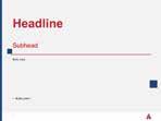
Lead Headlines
Display headlines for Acadia University can be expressed typographically in various weights of Avenir Next. The kerning of each line can also vary, as long as the length of the overall header stays the same. For emphasis, isolate one word or a sentence in an outline of the font. Add thin lines on the top and the bottom of the headline lockup to complete the look.
Colour: Primary brand colours blue, red or white (or combination of) may be used for the lead headline. The final design should always be tested for legibility and to ensure accessibility standards are met.
BRAND VISUAL & RESOURCES TOOLKIT
Header
Helvetica Neue Bold left justified. Colour: Primary red, blue or white.
Subheads
Helvetica Neue Bold left justified. Smaller font size from the header.
Colour: Primary red, blue or white.
Body Copy
Helvetica Neue Light left justified in the primary black. 9.4pt font size and 14pt leading, and 10pt optically kerned. There should be no hyphenation or widows at any point. Paragraph spacing of 0.25” should be applied.
Cutlines
Cutlines, captions to photographs or other illustrations, should be Helvetica Neue Thin left justified in the primary black.
Signature Visual Identity Components
Body Copy
Because we specialize in providing a premium undergraduate experience. It is the foundation of what we do. We care about our students. And we understand that means making a connection
Biology students and Teaching Assistant collecting samples on the beautiful Acadian Dykelands and tidal flats.
24
Brand Guidelines Visual and Verbal Identity
Imagery
Whether choosing from existing photography or shooting new photography, it is important to consider and reflect the experience Acadia offers its students.


When possible, use Acadia University’s approved photography for background images. If other images are required, ensure the images are bright and colourful and include an inclusive, human element. Avoid stylized filters or effects. Which summarizes in two rules:
High Quality
On a very basic but important level, you must consider whether the photograph itself is of professional qualityworthy of representing Acadia.? Is it well composed, well lit — both in the foreground and background, in focus, and at an appropriate file size for its intended use (not pixelated)?
On a more subjective level, you must consider whether it frames a high-quality experience or attribute that Acadia offers? If it is a photo of a building, does it present the
High Engagement
Being engaged means doing. It means active participation. Whenever possible, imagery should feature people engaged in activity — be it in the classroom, on the playing field, on campus, on a field trip, or even in the dorm room with friends. That means photographs that are more authentic than posed — with subjects who are engaged in what they’re doing, instead of being engaged with the camera.
25 Brand Visual Guide & Resource Toolkit Visual and Verbal Identity
Technical Guidelines for Photography
Any printed image should be at least 300 dpi at the finished size and set to a CMYK colour profile. Any image that is to be used online should not be enlarged when displayed online to avoid pixelation and should be set to an RGB colour profile. When resizing images, always ensure that they are being scaled evenly horizontally and vertically, so they do not end up distorted. Online images should be optimized to keep file sizes as low as possible and keep load times as fast as possible. This should be a setting of 60% quality for jpegs online.
Where possible, try to light imagery with natural light, rather than with the use of a flash. If additional lighting must be used, then a diffused, ambient light should be favoured.
Get Started
The very best photographic representations of Acadia are those that not only exhibit high-quality, high-engagement attributes — but also go a step further to frame an experi ence that can only be found at Acadia.

To obtain imagery or request new photography, Contact Us the Acadia Brand Council brandcouncil@acadiau.ca

26 Brand Visual Guide & Resource Toolkit Visual and Verbal Identity
Templates & Resources

SECTION 3


28 Email Signatures Co-branded Email Signatures Option 1: Longform Option 2: Condensed Option 1: Longform Option 2: Condensed Do you need help incorporating your sub-brand logo into your e-signature? Contact Us the Acadia Brand Council brandcouncil@acadiau.ca Brand Guidelines Templates & Resources
There are two e-signature options that can be used: Longform & Condensed. Departments or associated organizations that have thier own logo should use the sub-branded e-signature variations. Detailed instructions on how to update your e-signature are available in the Brand and Communications Toolkit accessible via the Acadia University Sharepoint.
Business Cards
These business card templates have been developed to convey an individual’s relevant information in a clean and easy-to-read manner. The following guidelines for individual's information should always be followed:
If the individual’s name is too long to fit on one line, the surname can be moved down to the next line.
Including pronouns is a personal choice and is optional. Pronouns are words used to refer to people when not using their name. Including pronouns on your business card shows others that you care about pronouns, and that you are open to people sharing their pronouns with you.
Designations should be included only for Acadia Alumni (degree and year of graduation: BBA '21), OR individuals whose designation directly pertains to their position.


If an individual needs to include a secondary phone number, it should be listed on the same line as the primary phone number, separated by a vertical line.
The address listed may either be the generic Acadia address or the individual's physical location on campus.
Note: Business cards can be ordered from the campus print shop (printshop@acadiau.ca)


29
Brand Guidelines Templates & Resources
Business Cards (Co-branded)
For departments or organizations that have a separate visual identity/logo, co-branded business cards should be used.

The samples below showcase the co-branded templates featuring Acadia Athletics as an example. Please contact the Acadia Brand Council (brandcouncil@acadiau.ca) if your department/organization requires co-branded business cards.


CO-BRANDED / SINGLE SIDED
CO-BRANDED / DOUBLE SIDED
30
Brand Guidelines Templates & Resources
Letterhead (Regular Use)
A generic letterhead template is available in Sharepoint within the Brand and Visual Identity Templates folder.
To use, download the Word document template and edit in Word on your desktop. Do NOT edit the file directly in Sharepoint as this will result in permanent changes to the template file.
In the downloaded Word file, you may update the contact information in the footer as required.
Copy should be typed in Arial Regular font or Arial Bold font. Margins for the body copy are as follows:
luptatum zzril delenit augue duis dolore te feugait nulla facilisi.
Lorem ipsum dolor sit amet, cons ectetuer adipiscing elit, sed diam nonummy nibh euismod tinci dunt ut laoreet dolore magna aliquam erat volutpat. Ut wisi enim ad minim veniam, quis nostrud exerci tation ullamcorper suscipit lobortis nisl ut aliquip ex ea commodo consequat.
512 Main Street Wolfville, Nova Scotia Canada B4P 2R6
t: 1 902 585 1218 f: 1 902 585 1077 acadiau.ca
31
CORPORATE
pages
Date Name Ttile Organization Address Location Dear Name, Lorem ipsum dolor sit amet, consectetuer adipiscing elit, sed diam nonummy nibh euismod tinci dunt ut laoreet dolore magna aliquam erat volutpat. Ut wisi enim ad minim veniam, quis nostrud exerci tation ullamcorper suscipit lobortis nisl ut aliquip ex ea commodo consequat. Duis autem vel eum iriure dolor in hendrerit in vulputate velit esse molestie consequat, vel illum dolore eu feugiat nulla facilisis at vero eros et accumsan et iusto odio dignissim qui blandit praesent
/ 2
Top: 1” Bottom: 0.75” Left: 1.25” Right: 1.25”
Regards, Name Title Phone Email
Lorem ipsum dolor sit amet, consectetuer adipiscing elit, sed diam nonummy nibh euismod tincid unt ut laoreet dolore magna aliquam erat volutpat. Ut wisi enim ad. Ut wisi enim ad minim veniam, quis nostrud exerci tation ullamcorper suscipit lobortis nisl ut aliquip ex ea commodo luptatum zzril delenit augue duis dolore te feugait nulla facilisi. Lorem ipsum dolor sit amet, cons ectetuer adipiscing elit, sed diam nonummy nibh euismod tincidunt ut laoreet dolore magna aliquam erat volutpat. Brand Guidelines Templates & Resources
Letterhead (Regular Use)

Department specific letterhead templates are available on Sharepoint within the Brand and Visual Identity Templates folder.
If a template does not yet exist for your department and you need one created, contact the Acadia Brand Council (brandcouncil@acadiau.ca) for assistance.
To use, download the applicable Word document template and edit in Word on your desktop. Do NOT edit the file directly in Sharepoint as this will result in permanent changes to the template file.
In the downloaded Word file, you may update the contact information in the footer as required.
Copy should be typed in Arial Regular font or Arial Bold font. Margins for the body copy are as follows:
Top: 1” Bottom: 0.75” Left: 1.25” Right: 1.25”
CORPORATE WITH FACULTY / 2 pages

32
Brand Guidelines Templates & Resources
Letterhead (Co-Branded)


For departments or organizations that have a separate visual identity/logo, co-branded letterhead templates should be used. Co-branded templates are available in Sharepoint within the Brand and Visual Identity Templates folder.
The samples below showcase the co-branded templates featuring Acadia Athletics as an example. If you need assistance creating your department or organization Letterhead, please contact the Acadia Brand Council (brandcouncil@acadiau.ca).
To use, download the Word document template and edit in Word on your desktop. Do NOT edit the file
directly in Sharepoint as this will result in permanent changes to the template file.
In the downloaded Word file, you may insert your department or organization logo where the co-brand logo is featured in the header and footer. Department/organization contact info in the footer may also be updated. All other elements should remain as is.
Copy should be typed in Arial Regular font or Arial Bold font. Margins for the body copy are as follows:
Top: 1” Bottom: 0.75” Left: 1.25” Right: 1.25”
CO-BRANDED / 2 pages
33 Brand Guidelines Templates & Resources
Letterhead (Enrolment

A pre-printed, full bleed letterhead template is available.
use, download the letterhead template available on Sharepoint within the Brand and Visual Identity Templates folder and edit in Word on your desktop. Do NOT edit the file directly in Sharepoint as this will result in permanent changes to the template file.
34
Advisor)
Copy
Date Name Ttile Organization Address Location Dear Name, Lorem ipsum dolor sit amet, consectetuer adipiscing elit, sed diam nonummy nibh euismod tincidunt ut laoreet dolore magna aliquam erat volutpat. Ut wisi enim ad minim veniam, quis nostrud exerci tation ullamcorper suscipit lobortis nisl ut aliquip ex ea commodo consequat. Duis autem vel eum iriure dolor in hendrerit in vulputate velit esse molestie consequat, vel illum dolore eu feugiat nulla facilisis at vero eros et accumsan et iusto odio dignis sim qui blandit praesent luptatum zzril delenit augue duis dolore te feugait nulla facilisi. Lorem ipsum dolor sit amet, cons ectetuer adipiscing elit, sed diam nonummy nibh euismod tincidunt ut laoreet dolore magna aliquam erat volutpat. Ut wisi enim ad minim veniam, quis nostrud exerci tation ullamcorper suscipit lobortis nisl ut aliquip ex ea commodo consequat. Regards, Name Title Phone Email t: 1 902 585 1218 f: 1 902 585 1077 acadiau.ca 512 Main Street Wolfville, Nova Scotia Canada B4P 2R6 Brand Guidelines Templates & Resources Top: 1” Bottom: 0.75” Left: 1.25” Right: 1.25”
ENROLMENT ADVISOR / 3 pages
To
should be typed in Arial Regular font or Arial Bold font. Margins for the body copy are as follows:
PowerPoint
Branded PowerPoint Templates are available on Sharepoint within the Brand and Visual Identity Templates folder. They are available in Standard (4:3) and Widescreen (16:9).
To use, download the PowerPoint template and edit in PowerPoint on your desktop. Do NOT edit the file directly in Sharepoint as this will result in permanent changes to the template file.


In the downloaded PowerPoint file, you may replace the Acadia University logo on Slide 1 with a Department specific logo if applicable. Department/faculty logos are available on in the Brand and Communications Toolkit on Sharepoint. If a logo does not yet exist for your department and you need one created, contact the Acadia Brand Council (brandcouncil@acadiau.ca) for assistance.

Brand Guidelines Templates & Resources


Page Slides - Primary 35
Copy should be typed in Arial Regular or Arial Bold font.
Page Slides - Co-branded

For departments or organizations that have a separate visual identity/logo, the co-branded Powerpoint template should be used. Co-branded PowerPoint Templates are available on Sharepoint within the Brand and Visual Identity Templates folder. They are available in Standard (4:3) and Widescreen (16:9).

The sample below showcases the co-branded template featuring Acadia Athletics as an example. If you need assistance creating your department or organization PowerPoint, please contact the Acadia Brand Council (brandcouncil@acadiau.ca).


In the downloaded co-branded PowerPoint template file, you may insert your department or organization logo where the sub-brand logo is featured on the title page and in the footer. You will need to use a .png version of your logo for this (ie. transparent background). Photography should also be updated to showcase relevant imagery. All other elements should remain as is.

Copy should be typed in Arial Regular font or Arial Bold font.

36 PowerPoint
Brand Guidelines Templates & Resources
Resources and Support

APPENDIX A
Resources and Support
Stewardship of Acadia’s brand is the responsibility of Acadia’s Brand Council, which is comprised of Acadia’s Vice-President of Advancement, Vice-Provost Students, Recruitment and Enrolment Management, and the Executive Director of the Office of the President.

The Council is tasked with the oversight, interpretation, and enforcement of Acadia’s Brand Guideline in order to protect the university’s brand position and advance Acadia’s standing among wide-ranging audiences. When necessary, the Brand Council will provide advice to colleagues regarding the use of the Brand Guidelines and ensure tools and templates are available to the university community. Partnerships are the cornerstone of our work – we collaborate with all colleagues across all sectors of campus to ensure we reach all audiences in the most effective manner possible.
To contact Acadia’s Brand Council, please email brandcouncil@acadiau.ca.
Online Resources
If you are unclear on how to proceed with representing Acadia University in an academic or promotional capacity, Contact Us the Acadia Brand Council brandcouncil@acadiau.ca
Editorial Style Guide Media Relations Writing Guide Social Media Photo & Video Gallery Photo Release Forms Templates Brand Guidelines
Glossary
APPENDIX B
Alignment
The arrangement of elements that form a line.
Asymmetrical
Design elements do not balance over a central line.
Baseline
The line upon which letters sit.
Bleed
When a design extends beyond the media size. This is so when the design is printed, it can be trimmed to the desired size with no risk of white borders.
Body Type
The typeface used in the main text.
Branding
The personality of a brand that portrays itself in both visual and verbal manners.
CMYK
Cyan, magenta, yellow, and black. The colour model used for printing. Also known as four-colour or process colour.
Gutter
The space formed between two columns of text. Can also be the space in the spine of two opposite pages.
The text which appears at the top of a printed page.
Headline
Header A large text illustrating the opening statement used in a layout.
JPEG
(Joint Photographic Electronic Group) A common process for compressing digital images.
Kerning
The horizontal space between letters.
Any frame in which a specific aspect of an item (its size, location, colour, etc.) is specifically defined.
The difference in colour found between the light and dark parts of an image.
Copy
Contrast Copy refers to editorial text supplied for incorporation into a design or website.
CSS Dots Per Inch. This is the number of dots within a square inch of printed material. The DPI for a clear, printed photograph should be 300 dpi.
Cascading Style Sheets is a style sheet language used for describing the presentation of elements online.
DPI Any individual part of a design. Can be an image or type.
EPS
Element Stands for Encapsulated Post Script. This is a graphics file format used to transfer PostScript documents that contain an image within another PostScript document.
Focal Point
Where the viewer’s eye is drawn to within a design or image.
Font
A stylization of an alphabet and numeric set, often with special characters.
Four-Colour Process
A stylization of an alphabet and numeric set, often with special characters.
Grid
Is a two-dimensional format made up of a set of horizontal and vertical axes used to structure content.
Keyline
Keyframe A single line that defines a shape. The line should be kept thin.
Leading
The amount of added vertical spacing between lines of text.
Lower Case
The smaller form of letter used in type.
Margins
Guidelines in a layout that defines where content should appear.
Matte Finish
Non-glossy printed finish.
Negative Space
Also known as white space. The area of a page that does not contain images or words.
Noice
Randomly coloured pixels within an image.
Offset Printing
A printing method that transfers ink from a plate to a blanket to paper as opposed to directly inking from plate to paper.
Open Type
A font format created by Adobe and Microsoft. Open Type font can include a set of glyphs defined as True Type or Type 1 curves.
Orphan Line
The first line of a paragraph appearing on its own at the bottom of a page with the remaining part of the paragraph appearing on the next page or column.
40 Glossary
Brand Guidelines
Outline
The outside edge of a font or the outer edge of a vector graphic.
The setup and style of content on a page.
Page Size
The size of a page the design has to occupy.
Text Wrap
An image with text wrap applied forces any copy to flow around it.
TIFF
Tagged Image File Format. A graphic file format used for storing images. TIFF is a commonly used file format for high colour depth images.
Tint
A colour made lighter by adding white is called a tint.
Trim Size
The Pantone matching system is used for defining specific colours based on a universal ink colour.
PDF
Pantone Portable Document Format. A universal document format that allows documents to be opened by any user with Adobe Acrobat, and edited with Adobe Acrobrat Pro.
The size of the printed material in its finished stage.
Typeface
A typeface consists of a series of fonts and a full range of characters such as numbers, letters, marks, and punctuation.
Typography
A minute area of illumination on a display screen, one of many from which an image is composed.
PNG
Pixel Portable Network Graphics format used for lossless compression. The PNG format displays images without jagged edges while keeping file sizes rather small, making them popular on the web. Also allows for transparent backgrounds.
Raster
An image made from individual pixels.
The art of arranging type—which includes letters, numbers, and symbols—so that it is pleasing to the eye. This includes not only the font that is used but how it is arranged on the page: letter by letter, size, line spacing, etc.
Uncoated Paper
This is paper that does not have a coating applied to it for smooth ness.
Uppercase
Also known as capital letters, they are the larger characters in a typeface.
Vector Graphic
The number of pixels contained in an raster image. 300 dpi is suitable for print, while 72 dpi is appropriate for screen.
RGB
Resolution Red, Green, Blue is the colour model used to project colour on a computer monitor. By combining these three colours, a large percentage of the visible colour spectrum can be represented.
A graphic element that is defined through mathematical equations. It allows the graphic to be scaled without loss of quality.
Weight
The different weights of a font such as light, regular, bold that define the thickness of the font.
Widow
A single word of the last sentence of a paragraph that appears on a line on its own.
A style of typeface that means “without feet.” Usual sans serif typefaces include Arial, Helvetica, AvantGarde, and Verdana.
Screen Printing
Sans Serif Technique of printing that uses a squeegee to force ink through an assembly of mesh fabric and a stencil.
Small Caps
Capital letters that are about the same height as the typeface’s x-height. Some software programs automatically create their own small caps, but true small caps are often only found in expert typefaces.
Widow Line
A single line of a paragraph at the bottom of a page or column.
Width
Refers to whether the basic typeface has been lengthened or compressed horizontally. The typical variations are Condensed, Normal, or Extended.
X-Height
This is the height of the lowercase letters that do not have ascenders or decenders, such as a, c, e and m.
Two pages that face each other and are created as one visual or production unit.
Template
Spread A design layout that is created to be used to hold non-specific content which has certain design elements already set up.
If you are unclear on how to proceed with representing Acadia University in an academic or promotional capacity, Contact Us the Acadia Brand Council brandcouncil@acadiau.ca
41 Glossary
Page Layout
Brand Guidelines
November 2022

