Recipes & Typography
Fall 2021 & Winter 2022 318 GrC
Welcome
The recipes in this book are a collection from the students enrolled in Digital Typography (GrC 318) in the Graphic Communication Department at Cal Poly, San Luis Obispo.
Students were asked to choose one of their favorite recipes to design a four-page layout using Adobe InDesign and their own photography. The last page of each recipe includes a note about the fonts they used and a bit of history about the typeface.
Choosing a typeface for a cookbook is an important decision. Is the typeface easy to read? Does the font have the appropriate special typographic features such as fractions and alternate characters? Does the font have different weights such as italic, semi-bold, bold, etc?
This recipe book was published using Issuu.com
 Professor Lorraine Donegan
Photography: Micheile Henderson (cover), this page, Joanna Kosinska Courtesy of Unsplash
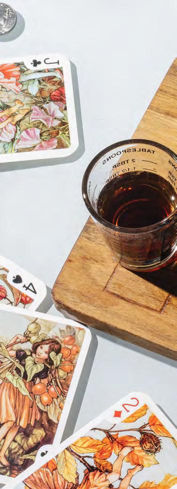
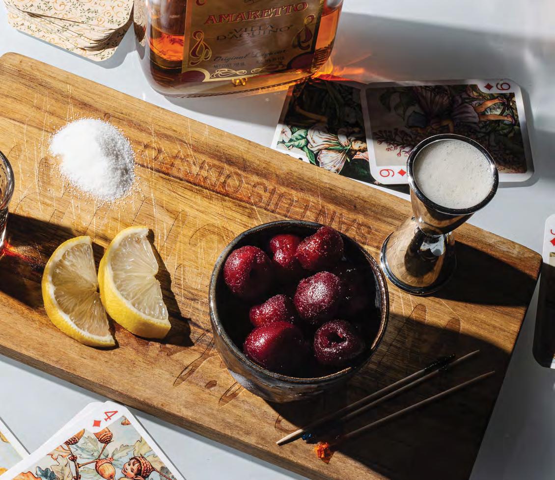
Amaretto Sour

This recipe uses aquafaba (water from a can of chickpeas) as a vegan egg white substitution, along with fresh lemon, and a bit of cask-strength bourbon. This creates a much improved version of the Amaretto Sour made popular in the 70’s. It’s frothy and fruity, and bourbon cuts the sweetness just enough.
Ingredients
1 ½ ounce amaretto
¾ ounce cask strength bourbon

1 ounce lemon juice
1 teaspoon simple syrup (2 to 1 ratio of sugar to water)
1 ounce aquafaba (chickpea liquid, strained)
brandied cherries (for garnish)
lemon slice or twist (for garnish)
Instructions
Add amaretto, bourbon, lemon juice, simple syrup, and aquafaba into a shaker. Dry shake (once without ice), for 10 seconds.
Open shaker and fill with ice, and shake vigorously for 30 seconds.
Strain into an old fashioned glass over new ice.
Garnish with a brandied cherry and a twist or slice of lemon.
1 cock t a i l
Makes
Notes
For this recipe, you may use chickpea liquid strained from the can. Other types of aquafaba will also work, such as other canned beans, and even the leftover liquid from cooking legumes. Note that different types of aquafaba will alter the taste and possibly thickness of the foam.

About the Type
Le Murmure
Le Murmure is an open-source typeface designed by Jérémy Landes. Landes is a founder of Velvetyne, an open-source type foundry where Le Murmure and other fonts of his are available as free downloads. The typeface was first created for the French design agency Murmure in 2017. It is a psychadelic, condensed sans-serif with dramatic contrast, created with editorial use in mind. This typeface won a “Grand Prix” at the Red Dot Design Awards in 2018.
and blogfonts.com
Typefaces sourced from Velvetyne.fr
Recipe sourced from HonestlyYum.com
ITC Serif Gothic
ITC Serif Gothic is a hybrid serif gothic typeface designed by Herb Lubalin and Tony DeSpigna in 1972. The typeface is loosely based on another design by Lubalin, the geometric sans-serif Avant Garde, but with subtle serifs added. This quintessential 1970s typeface was used to complement the Amaretto Sour recipe, a cocktail made popular in the United States during this era. A staple in graphic design for science fiction, ITC Serif Gothic was used in the original Star Wars and Star Trek posters. This typeface comes in six weights–Light, Roman, Bold, ExtraBold, Heavy, and Black.
A B C D E F G H I J K L M N O P Q R S T U V W X Y Z a b c d e f g h i j k l m n o p r s t u v w x y z A B C D E F G H I J K L M N O P Q R S T U V W X Y Z a b c d e f g h i j k l m n o p r s t u v w x y z
Design and layout by Hailey Honegger
Photography and staging by Hailey Honegger
Fall Cocktail The Must-Make

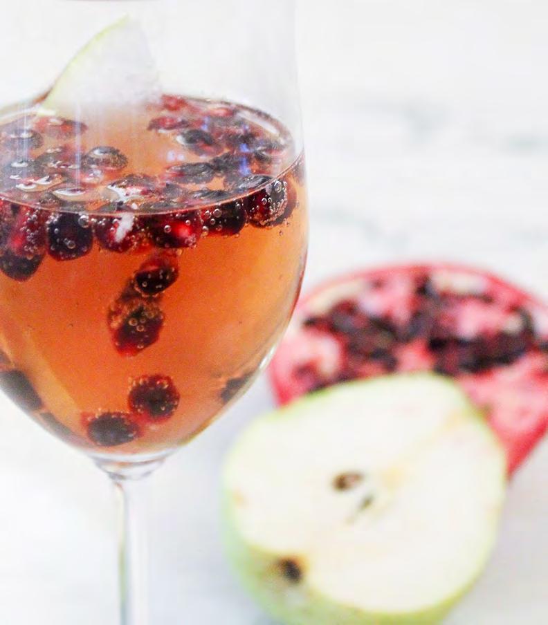
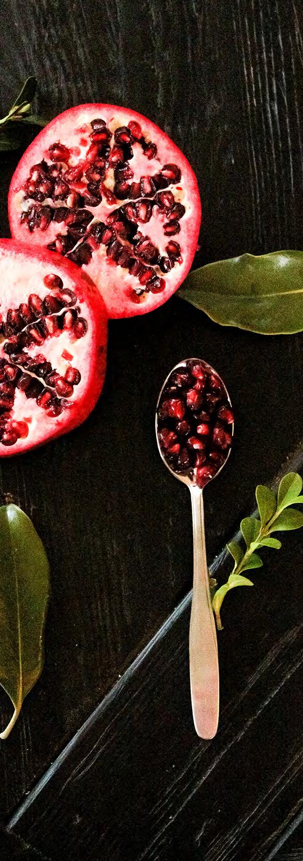
Pomegranate & Pear Bellini
This festive and beautiful Bellini is made with the sweet and tart flavor combination of pear and pomegranate. It’s gorgeous color makes it perfect for a romantic night in.
Servings: 8 Prep Time: 5 min Calories: 145 per serving
Ingredients
5 ounces of pear brandy
3 ounces of pomegranate juice
1 bottle of Prosecco chilled
1 cup pomegranate arils extra for serving

1 Anjou pear, thinly sliced extra for garnish
Directions
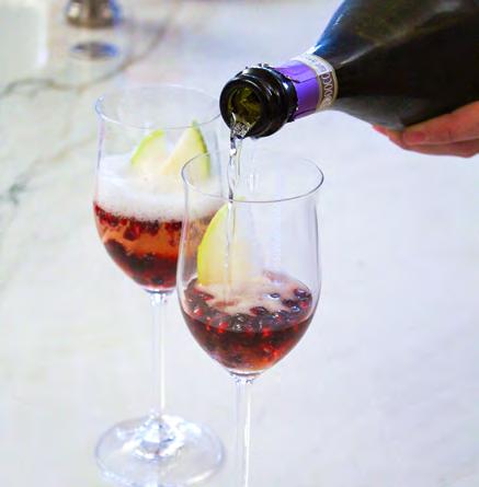
• To a glass pitcher, add pear brandy and pomegranate juice. Stir.
• Pour in prosecco, arils and pear slices and gently stir.
• To serve, add a sprinkle of pomegranate arils to bottom of a champagne flute, top with a few cubes of ice, pour in Bellini, garnish with a few slices of pear if desired.
prep pour serve


About the Type
Orpheus Pro
The original Orpheus design by Walter Tiemann, done for Klingspor between 1926 and 1928, was certainly a masterpiece. Unfortunately, like so many typefaces of that inter war era, it was overlooked when type technology changed over to film, and again when digital type came around. But during the decade or so when it was available on the metal type market, it was quite popular in Germany.
La Bohemienne
La Bohemienne is a graceful modern calligraphy script. It’s Open Type features replicate the personality of handcrafted penmanship. With clean elegant lines, it’s a natural choice for weddings and sophisticated events. This script is designed to mimic handcrafted writing with natural idiosyncrasies. Beautiful, sophisticated, unpredictable and free spirited, her Open Type magic automatically selects the ideal glyph through standard ligatures creating an organic feel. Bonus swashes and botanical flourishes included to elevate your words and are perfect
The surprising genius of Orpheus at the time was how it managed to seamlessly combine an expert vision of the traditional empire caps with a lowercase that precisely injects the efficient rhythm of modern minimalism that was all the rage in Germany at the time, which of course lives on to this very day. Since then, it has been revived with added variations of letters, ligatures, and over 1,000 glyphs.
Recipe by Amanda Batcher Design & Photography by Taylor Allred
for logos and stationery. This font was designed by Crystal Kluge, a hand-lettering artist from the United States. An expanding collection of digital fonts based on her work are used by designers around the globe. She has created custom fonts for Google, Nestle and Neapolitan. Her personal foundry Tart Workshop has received acclaim as Top Fonts of the Year.

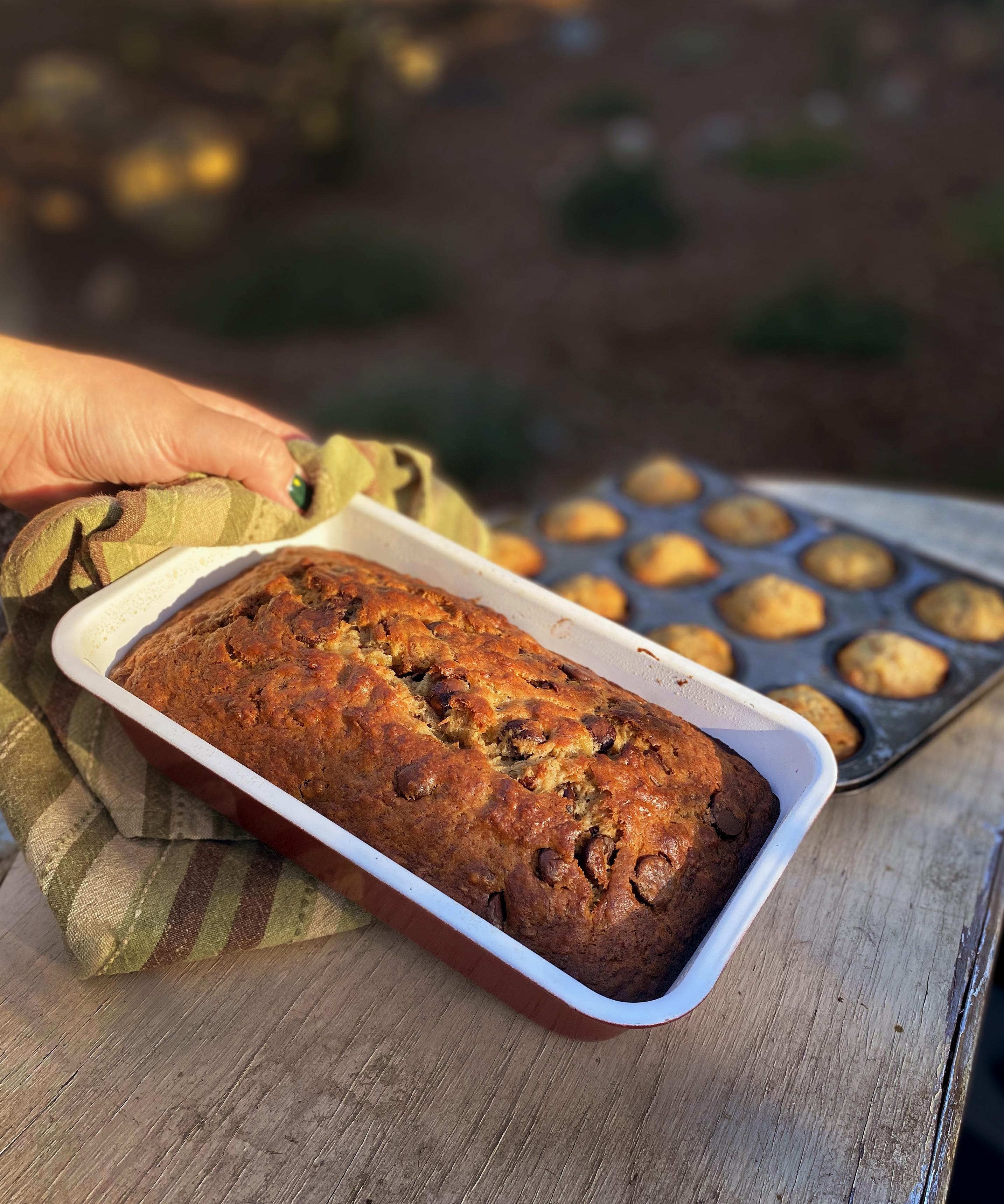
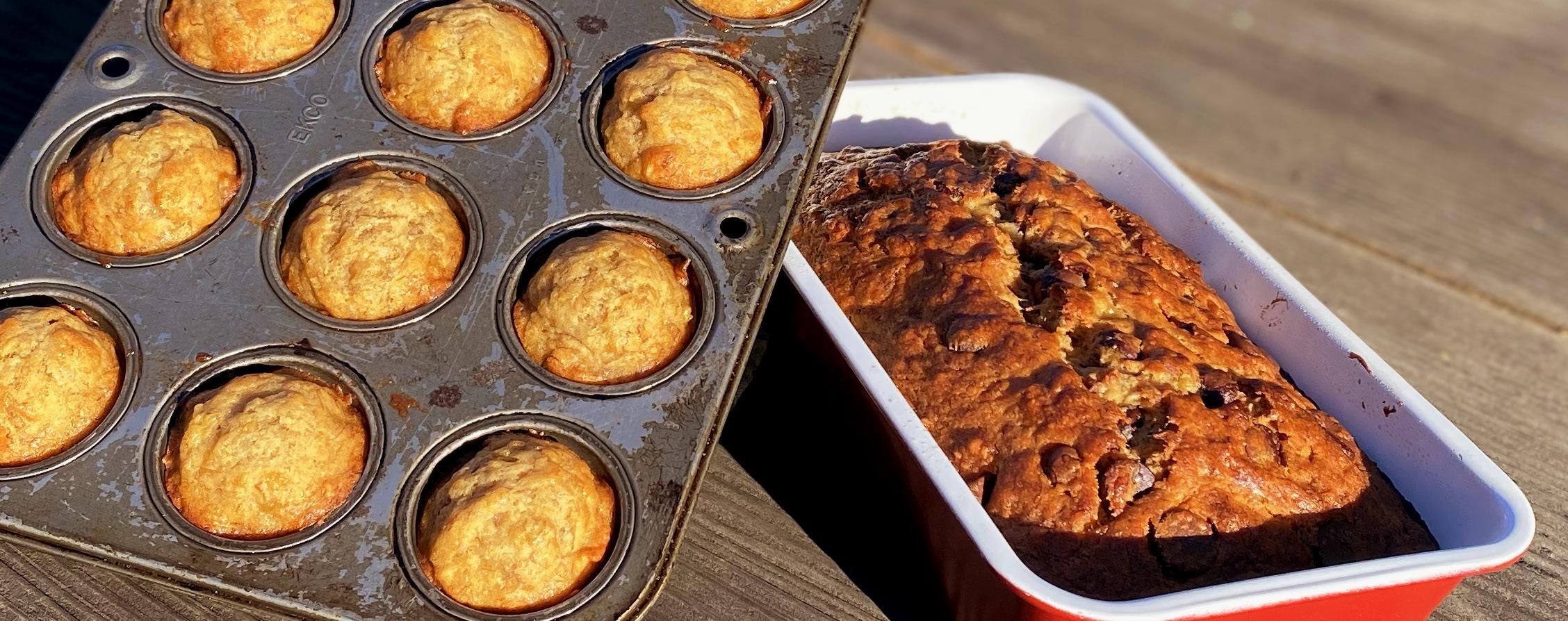
Yields: Makes about 2 loaves or 48 mini muffins
Ingredients
6 large overly ripe bananas
1 cup butter, softened
2⁄₃ cup granulated sugar
1⁄₃ cup brown sugar

1 tablespoon vanilla extract
3 large eggs
2 ¼ cup all purpose flour
1 teaspoon baking soda
¼ teaspoon salt
Optional toppings of your choice
Instructions
Preheat the oven to 350 ° F. Grease an 8½ x 4½ inch loaf pan or muffin pan with your choice of cooking spray, butter, or margarine.
Optional: Browning Bananas
I find the best banana bread uses overly ripe bananas and I like ones that don’t have any yellow visible on the peel. If your bananas aren’t ripe enough for your preference, here are some tricks to speed up the process.
Ñ Place your bananas on a baking sheet lined with parchment paper. With peels still on, use a fork to puncture the peels.

Ñ Place the sheet of bananas in your oven until you’re satisfied with the consistency and color. This could be anywhere from 10–20 minutes depending on the ripeness of your bananas and your preference.
Tip: You can also place the bananas on a plate in the microwave for 1 minute on high to ripen them. For both methods, make sure to let the bananas sit for a few minutes until they’re cool enough to handle.
Browning Butter
Place your softened butter into a medium-sized saucepan. I suggest using a saucepan with a light-colored bottom to see the color of the butter easier.
Place the saucepan on the stove on medium heat and stir constantly. Once the butter completely melts, it will start to foam. Monitor the heat and pan to make sure the bubbles don’t overflow the pan.
After 5-8 minutes, the color of the butter will change from a light yellow to a deeper caramel color and there will be a rich aromatic smell. Once you’re satisfied with the color, take it off the heat to prevent the butter from burning.
Make sure to let this sit to the side for a bit to cool.
Batter
Ñ Place your 6 large ripened bananas in a large bowl and mash them with a fork or potato masher.
Ñ Once the bananas are fully mashed, pour your browned butter into the banana mixture and combine with a whisk. Use a rubber spatula to scrape the brown bits at the bottom of the saucepan into the batter.
Ñ Next, add your granulated sugar, brown sugar, and vanilla into the banana batter and fully combine. Then, add your three eggs in, one at a time, combining after each one.
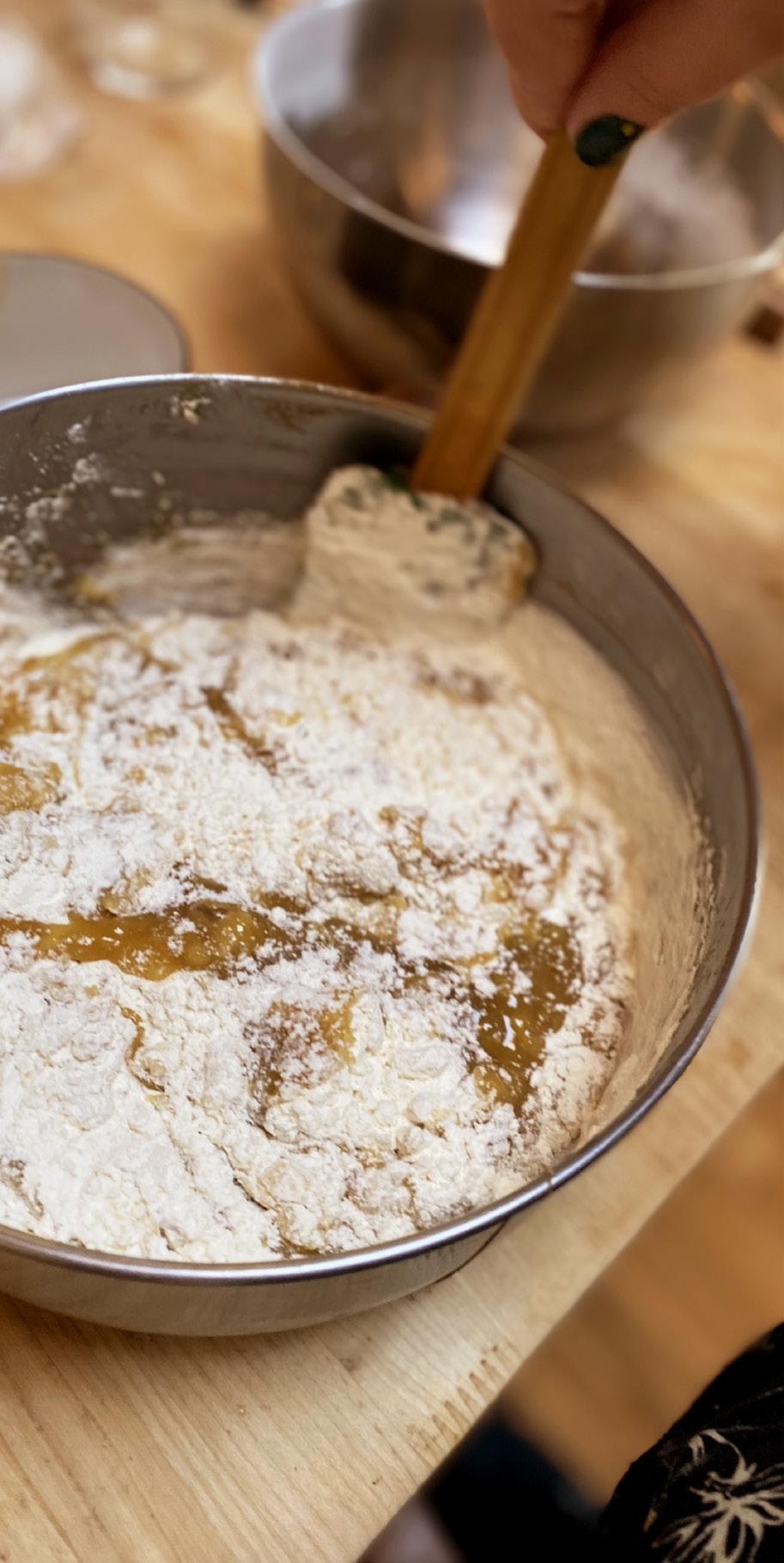
Ñ In a separate medium-sized bowl, sift your flour, salt, and baking soda together. Use a fork to quickly distribute the ingredients.
Ñ Pour the flour mixture into the banana batter and use a rubber spatula to fold the flour into the batter. Keep folding until you’re left with uniform consistency.

Ñ Pour the batter into the greased loaf pan and/or muffin pans. If you would like, you can add chocolate chips, nuts, or other add-ins into your batter before placing it into the oven.
Baking
Ñ Place your pans into the oven at 350 ° F.
Ñ If you are using a mini muffin pan, flip the pan at 10 minutes and bake for a total of about 15 minutes or until golden brown.

Ñ If you are using a loaf pan, make sure to flip the pan about every 15 minutes to ensure a consistent bake. The loaf takes a bit longer, so let it bake for about 50 minutes or until a deep golden brown color.
Ñ To ensure your banana bread is fully cooked, place a knife in the center of your muffin or loaf and if it comes up clean, its ready!
About the type
Mrs Eaves XL
Since Mrs Eaves is one of Emigre’s most popular typefaces, it’s not surprising that over the years we’ve received many suggestions for additions to the family. The predominant top three wishes are: greater space economy; the addition of a bold italic style; and the desire to pair it with a sans design. The XL series answers these requests with a comprehensive set of new fonts including a narrow.
The main distinguishing features of Mrs Eaves XL are its larger x-height with shorter ascenders and descenders and overall tighter spacing. These additional fonts expand the Mrs Eaves family for a larger variety of uses, specifically those requiring space economy. The larger x-height also allows a smaller point size to be used while maintaining readability.
Mrs Eaves XL also has a narrow counterpart to the regular, with a set width of about 92 percent which fulfills even more compact uses. At first, this may not seem particularly narrow, but the goal was to provide an alternative to the regular that would work well as a compact text face while maintaining the full characteristics of the regular, rather than an extreme narrow which would be more suitable for headline use.
Trochera

This typeface was designed by Sardiez, an independent type foundry run by Sergio Ramirez. Ramirez is based in Melbourne, Australia and has bee developing typefaces since 2008.
Ramirez believes that typographic design plays an essential role in communication design. We must use shapes to convey message and meaning, along with the words with choose. In the case of his typeface, Trochera, the aggressive moves, the lateral spurs and the heavy leaf endings resemble the silvan plants behavior giving it a very expressive and festive personality.
It is a very fun decorative font, with hint of a western feel. The blockiness of the letter forms give a sense of hardy and sturdiness, and yet with the heaviness this font carries, there is also an elegance with the use of curves and adapted serifs.
Its features make Trochera very useful for flamboyant and colorful purposes, but it is also attractive in black and white, the saturation of the ornaments will give an appealing texture to headings.
Recipe adapted from The Los Angeles Times California Cookbook.
Food styling and photography by Geneva Lindsley.
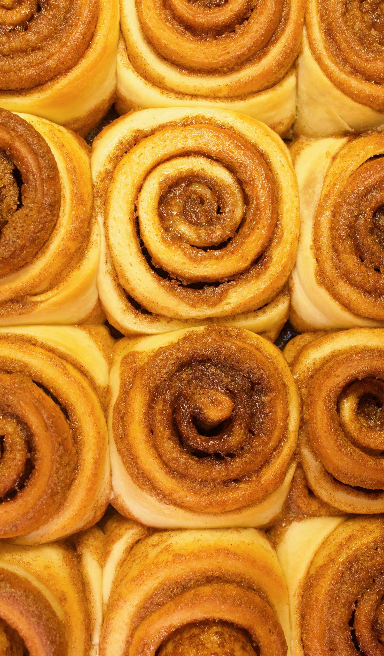
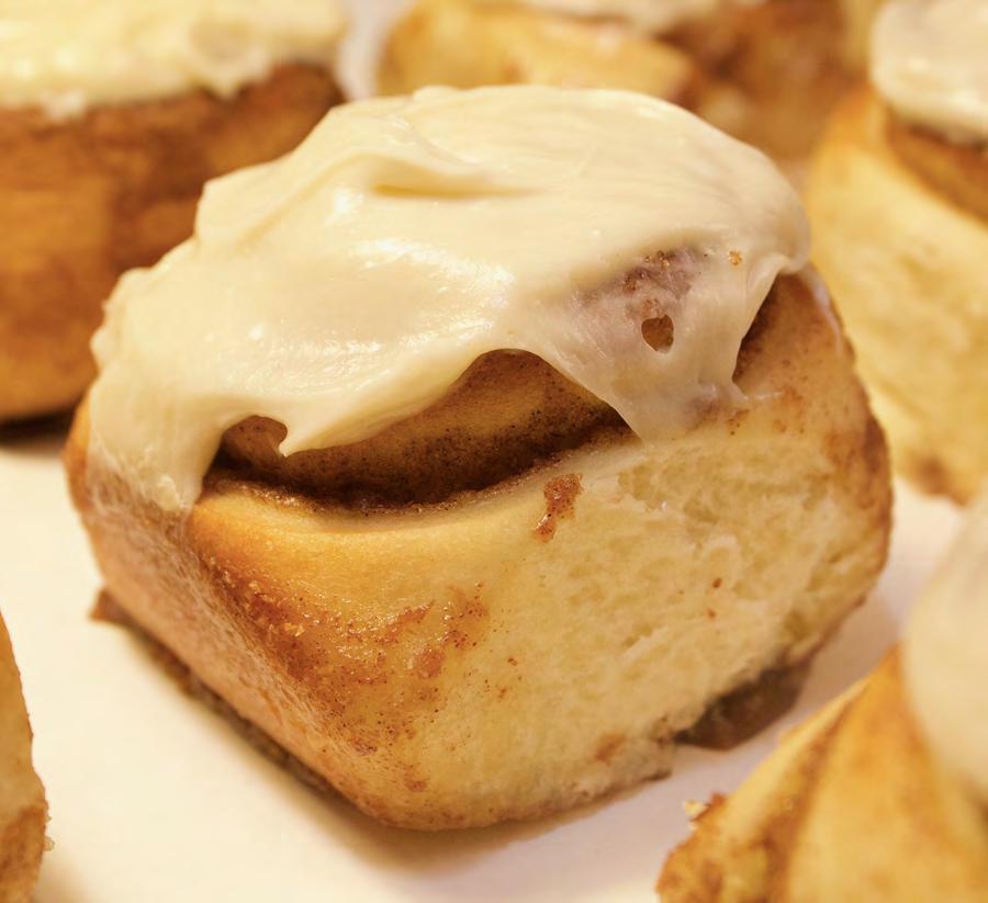
Cinnamon Rolls

Cinnamon Rolls
Ingredients
Dough:
1 cup warm milk
2½ teaspoons instant dry yeast
2 large eggs
1/3 cup salted butter
½ cup granulated sugar
1 teaspoon salt
4½ cups all-purpose flour
Filling:
½ cup salted butter, softened
1 cup packed brown sugar
2 tablespoons cinnamon
½ cup heavy cream
Frosting:
8 ounces cream cheese
1/3 cup salted butter
2 cups powdered sugar
1/2 tablespoon vanilla extract
Directions
Make the Cinnamon Filling:
1. Soften the butter to room temperature.
2. In a medium mixing bowl, mix the soft butter, brown sugar and cinnamon until well combined.
Make the Cream Cheese Frosting:
1. In a large bowl, combine the softened cream cheese and butter using a hand mixer. Blend well.
2. Add in the vanilla extract and powdered sugar. Beat until combined.
Make the Dough:
1. Pour the warm milk in the bowl of a stand mixer and sprinkled the yeast over top. Add the eggs, butter and sugar. Mix until combined.
2. Add the salt and 4 cups of flour and mix using a rubber scraper until the ingredients are barely combined. Allow the mixture to rest for 5 minutes so the flour has time to soak up the liquids.
3. Knead the dough, adding in up to ½ cup more flour if needed to form the dough. Knead for 5–7 minutes or until the dough is elastic and smooth. Spray a large bowl with cooking spray and place the dough in, covering the bowl with a towel or wax paper. Set the bowl in a warm place and allow the dough to rise until double.
4. Turn out the dough onto a floured surface, and sprinkle the top of the dough with additional flour. Flour a rolling pin and roll the dough to about a 24x15 inch rectangle. Use a rubber spatula to smooth the cinnamon filling over the whole dough rectangle.
Handmade
12 servings 618kcal 2 hours dairy wheat
5. Start on the long end, roll the dough up tightly jelly roll style. Cut into 12 slices and place into a greased baking pan. Cover the pan and allow the rolls to rise for 20 minutes or until nearly double.
6. Warm the heavy cream until it is warm to the touch. Once the rolls have risen, pour the heavy cream over the top of the rolls, allowing it to soak down and around the rolls.
7. Bake at 375 degrees for 20–22 minutes or until the rolls are lightly golden brown and the center rolls are cooked through. Spread the frosting over the rolls.

About the Type:

Dolly Pro Lust
Lust is a display, serif typeface created by Neil Summerour, a type designer who has published over 60 typeface families and produces custom typefaces for his consumer base. This specific typeface was released in 2012 through his brand Positype.
Lust's conception was inspired by the traditional look of Scotches and Didones, but has come to life through its full complement list of glyphs, substitutions, and ligatures. The typeface is popular due to its high levels of contrast that creates a dynamic and dramatic visual within a graphic design. However, because of its modern typeface, it is more impactful and easier to read when used for headings and titles.
Dolly Pro is a book typeface released as an OpenType font in 2001 consisting of four fonts: regular, bold, italic, and small caps. It was designed by the Dutch/ Finnish design company, Underware, who specializes in designing typefaces. This typeface was intended to be a book typeface that include flourishes through ligatures, alternate glyphs and figures, in addition to having multilingual Latin-script support.
Dolly stands out from other traditional serifs through its unique angles and curves in the details of the letters, such as asymmetrical serifs and angled lines. Despite this, Dolly has a relatively low contrast which allows it to be used in small sizes while being perfectly legible. It can also be used in a larger, display size which can show more details of the font that are normally invisible in a smaller font size.
Dolly Pro Regular 10pt Dolly Pro Regular Small Caps 10pt Dolly Pro Regular Italic 10pt Dolly Pro Bold 10pt
Didone
Neil
Lust Lust
Didone
Neil
Recipe from Homemade Cinnamon Rolls {Cinnabon Copycat} by Julie Clark Recipe Design and Photography by Sage Speich
APRICOT HAND PIES

Ingredients
6 ounces dried apricot
⅓ cup granulated sugar
2 packages uncooked pie shells
3 cups water
APRICOT HAND PIES
Directions
Step 1: Preheat oven to 375 °F
Step 2: Place apricots into a medium saucepan and add water to cover
Step 3: Cover pan and cook over low heat for 15 minutes or until tender
Step 4: Drain water the water and mash the apricots. Add sugar to the mashed apricots and set aside
Step 5: Roll out prepared pie shell and cut into circles using a cup
Step 6: Spoon about 1 teaspoon of apricot filling into half of each circle
Step 7: Moisten edges with water and fold the circles in half, pressing the edges together with a fork. Repeat with the remaining pastry
Step 8: Place hand pies on cookie sheet in the oven for about 15 to 20 minutes or until golden brown

ABOUT THE TYPE
History and Information
Tuppence
Tuppence is a typeface created by the award-winning designer and author Roberto de Vicq de Cumptich. This typeface is inspired by the design of the London foundry Stephenson Blake typeface Blackfriars. de Vicq’s version of the design has a more graceful, geometric and contemporary appearance. Tuppence includes various weights as well as a selection of catch words, swash capital letters, ligatures, ornaments, symbols, and arrows. Overall, Tuppence retains the warmth and craftsmanship of the Victorian era and is perfect for posters or beverage labels.
Bilo
Bilo is a grotesque typeface designed by Pieter van Rosmalen. In 2014, Rosmalen started exploring different shapes in attempt to design a low-contrast sans-serif version of Bodoni. Bilo includes various weights like hairline, extra light, light, regular, and medium. This typeface also has smooth curves and harmoniously progressing rounds.
Recipe by Lawsie Vidler Design and
photography by Alex Messner
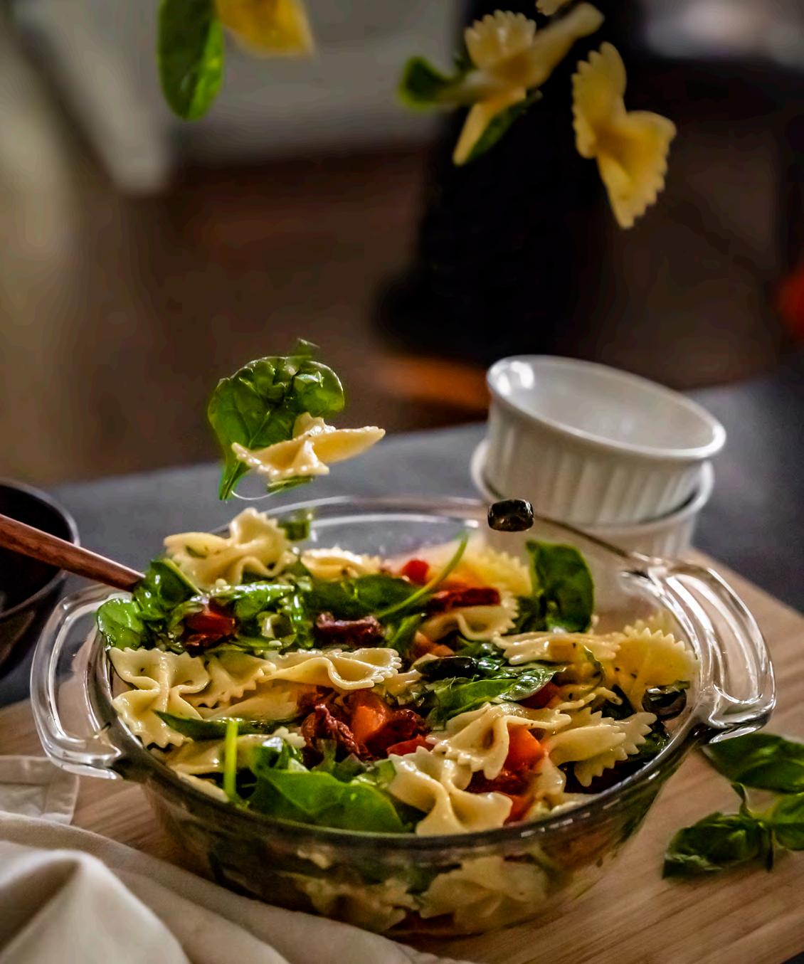
Tuscan Pasta Salad


SERVES 6
Tuscan Pasta Salad
Ingredients
16 ounces bow tie pasta, cooked
7 ounces sun-dried tomatoes, oil-drained
1 red bell pepper, diced
6 ½ ounces sliced olives
1 cup spinach
¼ cup basil, chopped
Dressing
¾ cup olive oil
2 tablespoons white vinegar
2 tablespoons water
1 teaspoon salt
1 teaspoon sugar
1 teaspoon dry oregano
1 teaspoon dry basil
1 garlic clove
Black pepper to taste
Step One
Directions
In a large bowl, add pasta, sun-dried tomatoes, red bell pepper, olives, spinach, and basil. Toss until combined.
Step Two
For the dressing, in a small bowl, whisk olive oil, vinegar, water, salt, sugar, oregano, basil, garlic, and salt and pepper.
Step Three
Drizzle the dressing over the pasta salad and serve.
A Note on The Type
Neuzeit Grotesk
A German type designer named Wilhelm Pischner designed the geometric sans-serif typeface, Neuzeit, for the Stempel Type Foundry. Released in 1928, Neuzeit provides a timeless design with multiple variations with Neuzeit Grotesk being one of them.
Mrs Eaves
Mrs Eaves was inspired by the popular typeface, Baskerville, which was named after John Baskerville’s wife, Sarah Eaves. Designed by Zuzana Licko, Mrs Eaves combines a low x-height with wide proportions to produce a serif typeface favorable for print applications. It was released in 1996.
Original recipe written by Alyssa Rivers. Design & Photography by Samantha Kim.
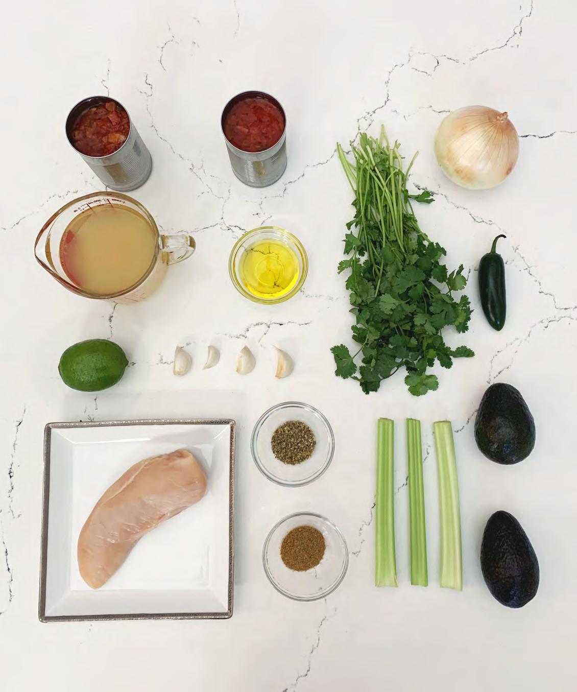
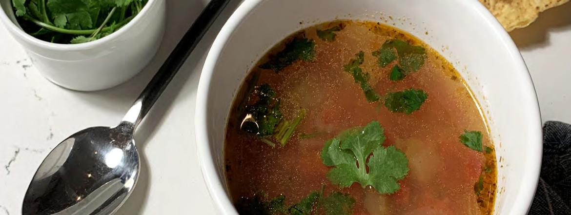
Chicken and Lime Soup
The perfect mix of salty, sour, and spicy


Chicken and Lime Soup
Serves 6
Ingredients
1 yellow onion
3 ribs celery
1 jalapeño with seeds removed
4 cloves garlic
2 tablespoons olive oil
1 chicken breast boneless and skinless
6 cups chicken broth
Instructions
20 ounces diced tomatoes with green chiles
1 teaspoon oregano
½ tablespoons cumin
1 lime for juicing
½ bunch cilantro
1 avocado for topping
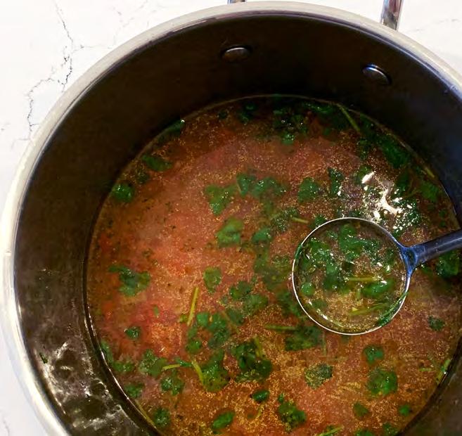
Dice the onion, celery, and jalapeño. Mince the garlic. Add the onion, celery, jalapeño, garlic, and olive oil to a large soup pot and cook over medium heat for about 5 minutes, or until the onions are soft and translucent.
Add the chicken breast, chicken broth, diced tomatoes with chiles (with juices), oregano, and cumin to the pot. Place a lid on the pot, turn the heat up to high, and bring the broth up to a boil. Once boiling, turn the heat down to low and let the pot simmer for 45 minutes.

After simmering for 45 minutes, carefully remove the chicken breast from the pot and use two forks to shred the meat. Return the shredded meat to the pot. Squeeze the juice of one lime into the soup.
Rinse the cilantro and then roughly chop the leaves. Add the chopped cilantro to the soup, give it a quick stir, then serve. Slice the avocado and add a few slices to each bowl.
Colophon
Mrs Eaves XL Serif OT
Mrs Eaves XL was designed by Zuzana Licko at Emigre Fonts in Berkeley, California. The original Mrs Eaves typeface was designed in 1996 by Licko. It was modeled after Baskerville, which was created in 1757 by John Baskerville. The inspiration for the Mrs Eaves typeface was the way Baskerville appeared when printed on paper. To differentiate Mrs Eaves from other revivals of Baskerville, Licko made Mrs. Eaves thicker and with a wider x-height. This worked beautifully for titles and heading, but, unfortunately, Mrs Eaves often looked too wide when in long sections of body text. This lead to Licko adding Mrs Eaves XL to the typeface family in 2009. Mrs Eaves XL has a larger x-height, shorter ascenders and descenders, and overall tighter spacing, making it much more suitable for body text. This redesign fixed many of the issues designers had been complaining about, and made Mrs. Eaves an even more versatile typeface.
Roc Grotesk
Roc Grotesk was designed by father and son duo Zoran and Nikola Kostic from Kostic Type Foundry located in Belgrade, Serbia. Roc Grotesk was released in 2012 and features an impressive 45 different styles to choose from. The Kostics drew their inspiration from American wood type created in the late 1800s when designing Roc Grotesk. It features large stroke contrast, which is more apparent in heavier weights. The family includes characters for English, Central European languages, and Turkish.

Butternut Squashsoup

Butternut Squash Soup
Cook Time 25 minutes | Gluten-Free | Serves 4
Creamy Curried Butternut Squash Soup infused with coconut milk and yellow curry powder. A savory, simple soup that’s perfect for the fall and winter months.
Ingredients
1 tablespoon coconut or avocado oil
2 medium shallots, thinly sliced
2 cloves garlic, minced
6 cups peeled & chopped butternut squash (1 small butternut squash yields 6 cups)
1 14-ounce can light coconut milk
2 cups vegetable broth

1-3 tablespoon maple syrup
1-2 teaspoon chili garlic paste
1 pinch of sea salt
1 pinch of black pepper
1 1/2 tablespoon curry powder
1/4 teaspoon ground cinnamon
1 2
Heat a large pot over medium heat. Once hot, add oil, shallots, and garlic. Sauté for 2 minutes, stirring frequently.
Add butternut squash and season with salt, pepper, curry powder, and ground cinnamon. Stir to coat. Cover and cook for 4 minutes, stirring occasionally.

Add coconut milk, vegetable broth, maple syrup or coconut sugar, and chili garlic paste (optional – for heat).
3 4
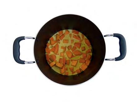
Bring to a low boil over medium heat and then reduce heat to low, cover, and simmer for 15 minutes or until butternut squash is fork tender.

15 min
Use an immersion blender, or transfer soup to a blender, and purée on high until creamy and smooth. If using a blender, return soup back to pot.

6
Taste and adjust seasonings, adding more curry powder, salt, or sweetener as needed. Continue cooking for a few more minutes over medium heat.
About the type
Source Sans Pro
The body text of this recipe utilizes Source Sans Pro, a soft and approachable Sans-Serif type face designed by Paul D. Hunt. Source Sans Pro is one of Adobe's first open source families uploaded in 2012. Drawing inspiration from 20th Century American Gothic Typefaces, Hunt designed Source Sans Pro with a more generous width to make the typeface more palatable for longer text passages.
Paul joined the Adobe type team in January 2009 as a typeface designer and font developer and continues to hone their skills in letter drawing and non-Latin type development.
An orange butternut squash jumps over a lazy shallot
An orange butternut squash jumps over a lazy shallot
An orange butternut squash jumps over a lazy shallot
An orange butternut squash jumps over a lazy shallot
Chauncy Pro Bold
This fun typeface family, Chauncy Pro, was designed by Chank Diesel. Chauncy Pro was made to resemble left-handed penmanship of an artist. This typeface has a bouncy and playful feel that is has invokes childhood nostalgia.
Diesel established Chank Co, in 1996 which he operates from his home office in Minneapolis, Minnesota. He creates primarily display typefaces full of humor, strength and personality.
A butternut squash jumps over a lazy shallot
A butternut squash jumps over a lazy shallot
A butternut squash jumps over a lazy shallot
Recipe compliments of Minimalist Baker Blog
Recipe designed by Maci Lee
Zebra Cake

Zebra Cake
Ingredients
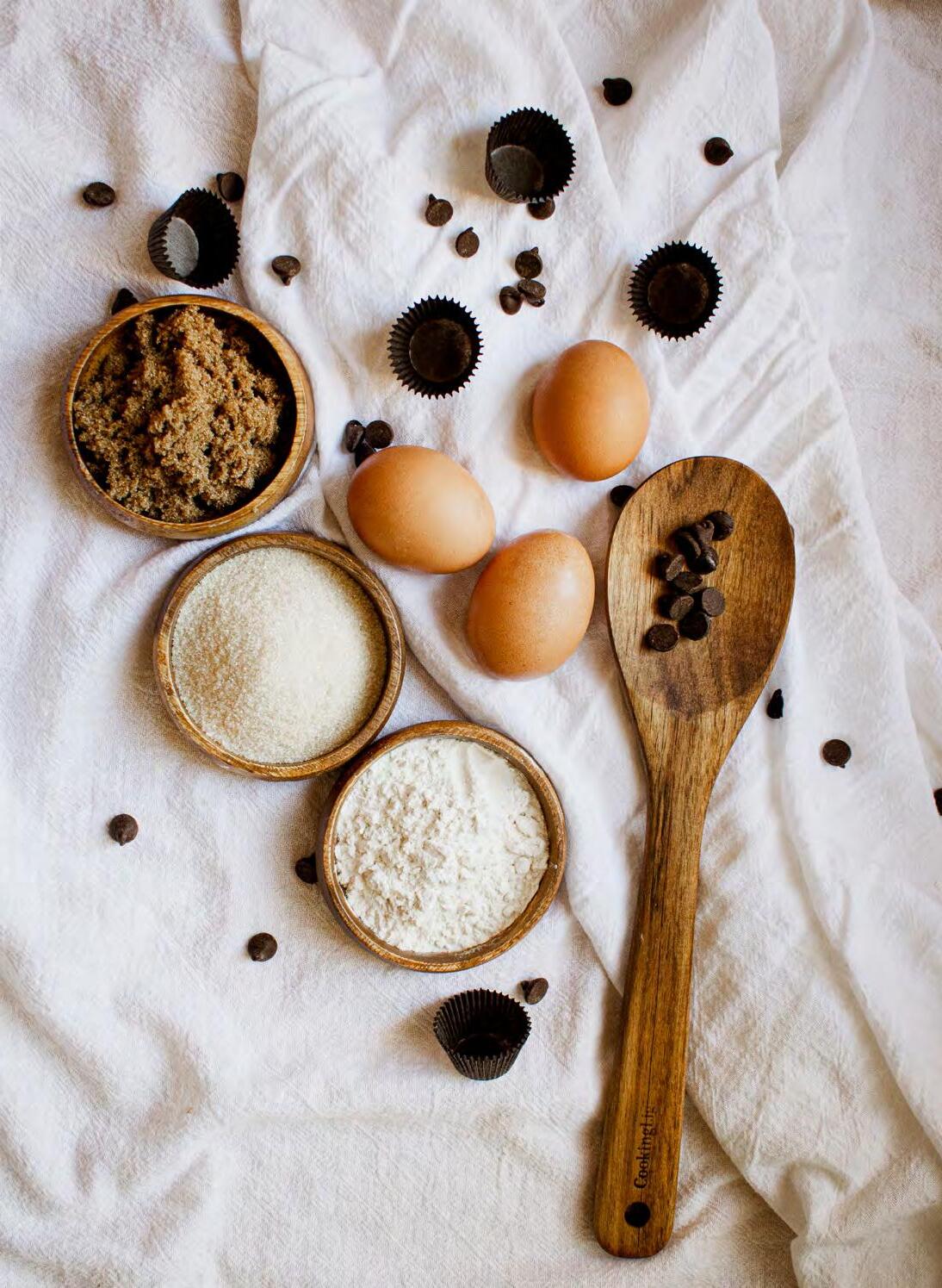
5 large eggs

1 ⅓ cups sugar
3 teaspoons vanilla extract
4 ounces warm water
9 ounces neutral baking oil
3 ⅛ cups flour
2 teaspoons baking powder

2 tablespoons cocoa powder
Instructions
Preheat the oven to 350ºF. Grease an 8-inch spring-form pan.
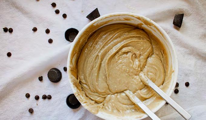
First, mix the eggs with the sugar and vanilla extract until a foamy mixture is formed.
Then add the warm water with the oil and stir in.
Next, mix the flour with the baking powder and gently fold into the mixture.
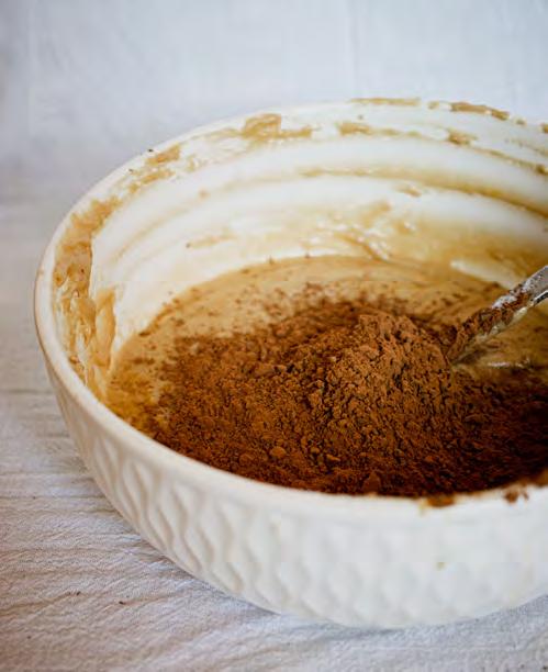
Then divide the dough in half and add the cocoa to one half of the dough and stir again.
Finally, grease the baking pan and spoon the light and dark dough alternately into the center of the pan, forming a circular pattern.
Place the baking pan in the oven and bake for about 45-60 minutes at 350°F. Remove the pan from the oven and allow the cake to cool slightly, then remove from the pan.
Finally, pour a chocolate glaze over the finished cake and refrigerate.


ABOUT THE TYPE
Quiche Sans
Was designed by Adam Ladd and is a part of the display sans font family. The typeface Quiche Sans has fourteen styles that have a high-contrast, moonlike stroke endings, angled stems and geometric proportions. The design was influenced by the serif divine genre which is characterized by its elegance and extreme thicks and thins.
Gravesend Sans
The display sans belongs to the dingbat font family and was designed by Ryan Hughes. This typeface exists in seven styles which can appear smart, legible or elegant.
Recipe written by Christine Rueb
Photography and recipe designed by Julia Rueb


A B C D E F G H I J K L M N O P Q R S T U V W X Y Z a b c d e f g h i j k l m n o p q r s t u v w x y z A B C D E F G H I J K L M N O P q r s t u v w x y z
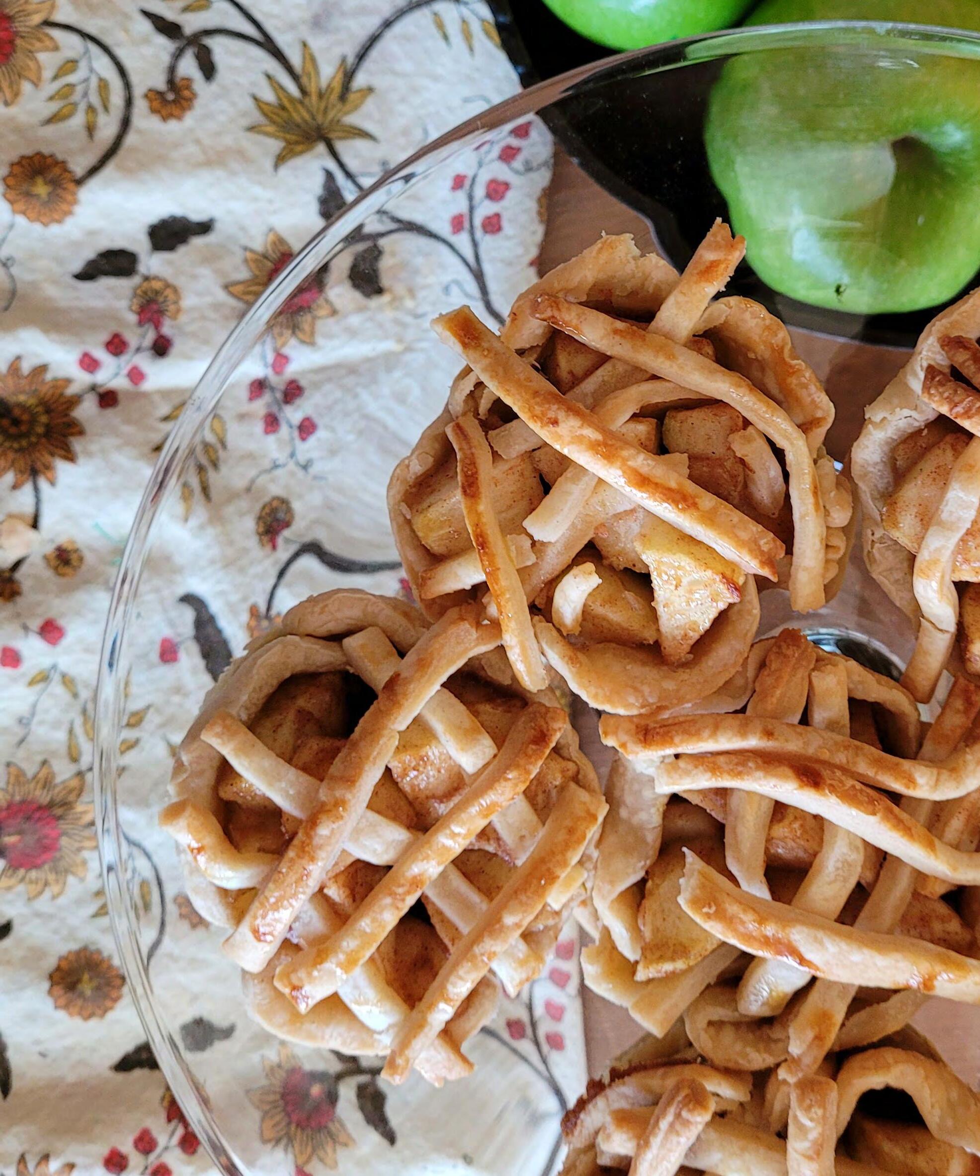
Muffin Tin Mini Apple Pies

Muffin Tin Mini Apple Pies

Makes 12 mini pies
Ingredients:
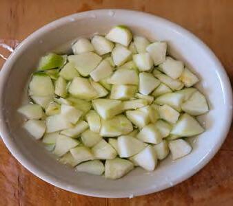
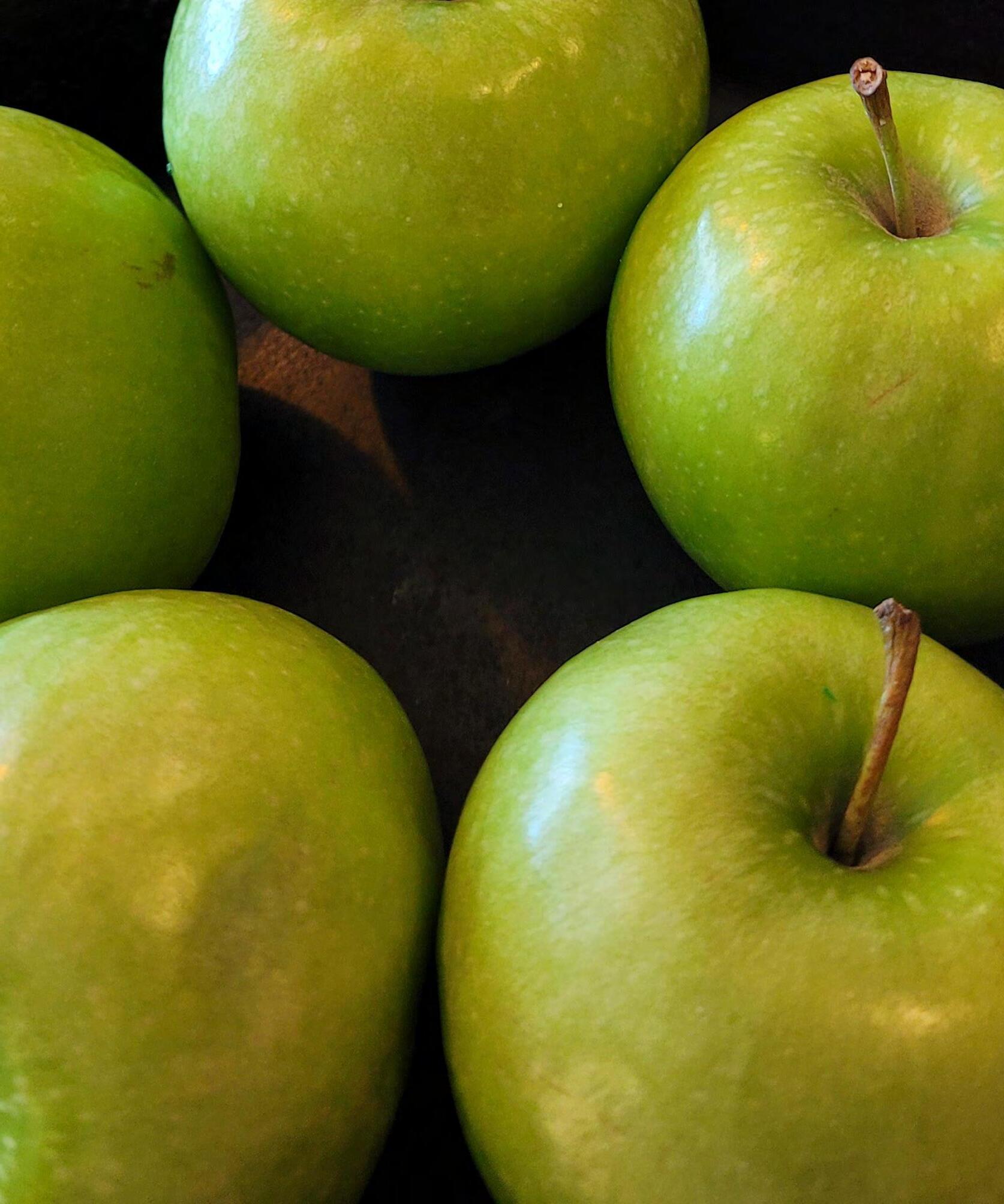
4 Medium apples Peeled and diced small (3 cups)


¼ Cup White sugar
¼ Cup Packed light brown sugar
1 Teaspoon Ground cinnamon
2 Tablespoons All-purpose flour
1 Large egg Whisked with 1 Tablespoon water
1 Package Pillsbur y premade pie crust
Sanding sugar (optional)
Instructions: Preheat the oven to 425°F.
1. Using a 4-inch cookie cutter (or a glass), cut out 12 circles from the dough.
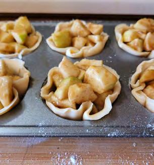
2. Arrange each circle in a muffin tin cup, pressing it down and up the edges. Keep dough scraps for the top lattice.
3. In a large bowl, stir together the diced apples, white sugar, brown sugar, cinnamon and flour.
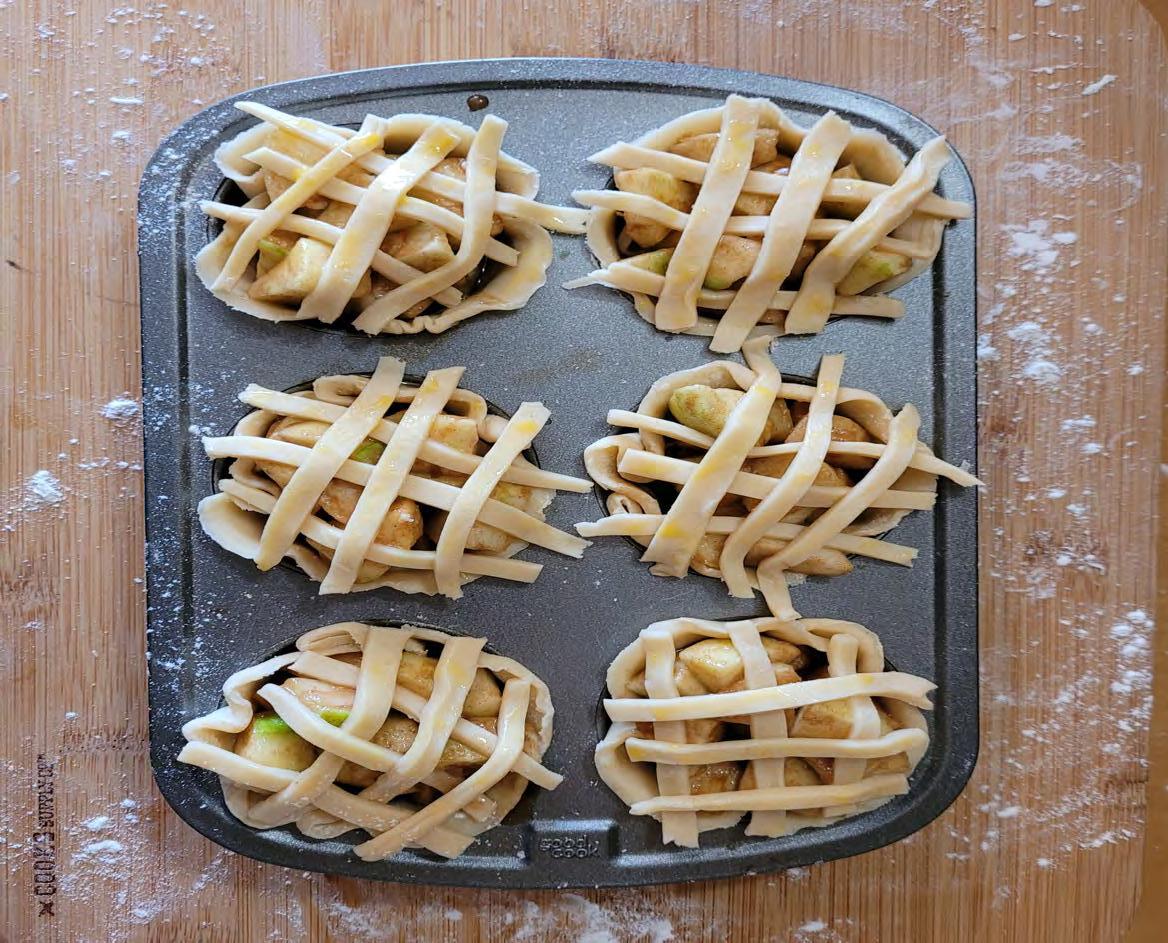
4. Divide the mixture among the muffin tins. Top each pie with a woven lattice or cut-out shapes.
5. Brush the tops of the pies with the egg wash then sprinkle them with sanding sugar (optional).
6. Bake the pies until they are golden brown, 16 to 18 minutes.
7. Remove the pies from the oven and let them cool completely in the muffin tin.
8. Using a knife, run around the edges of each pie to help release them then ser ve.
Recipe courtesy of justataste.com

Type History
Monarcha
Monarcha was designed by Isac Correa Rodrigues in 2009. It is a serif font that incorporates calligraphic strokes. This font has a high x-height that helps to balance out the different characters. Monarcha includes seven different variations which include combinations of weights that include semibold, italic, regular, book and bold.
a b c d e

f g h i j k l
m n o p q
r s t u v w x y z
a b c d e f g h i j k l m n o p q r s t u v w x y z
Soleil
Soleil was designer by Wolfgang Homola in 2011. The font was published through TypeTogether, a foundry that focuses on typography for editorial use in both digital and print. The font includes a large list of weights that include; light, book, italic, semibold, bold and extrabold.
Photography and Layout by Lauren Wagner La Grille
key lime tart recipe

key lime tarts
Prep Time: 15 minutes | Cook time: 17 minutes | Yields 12
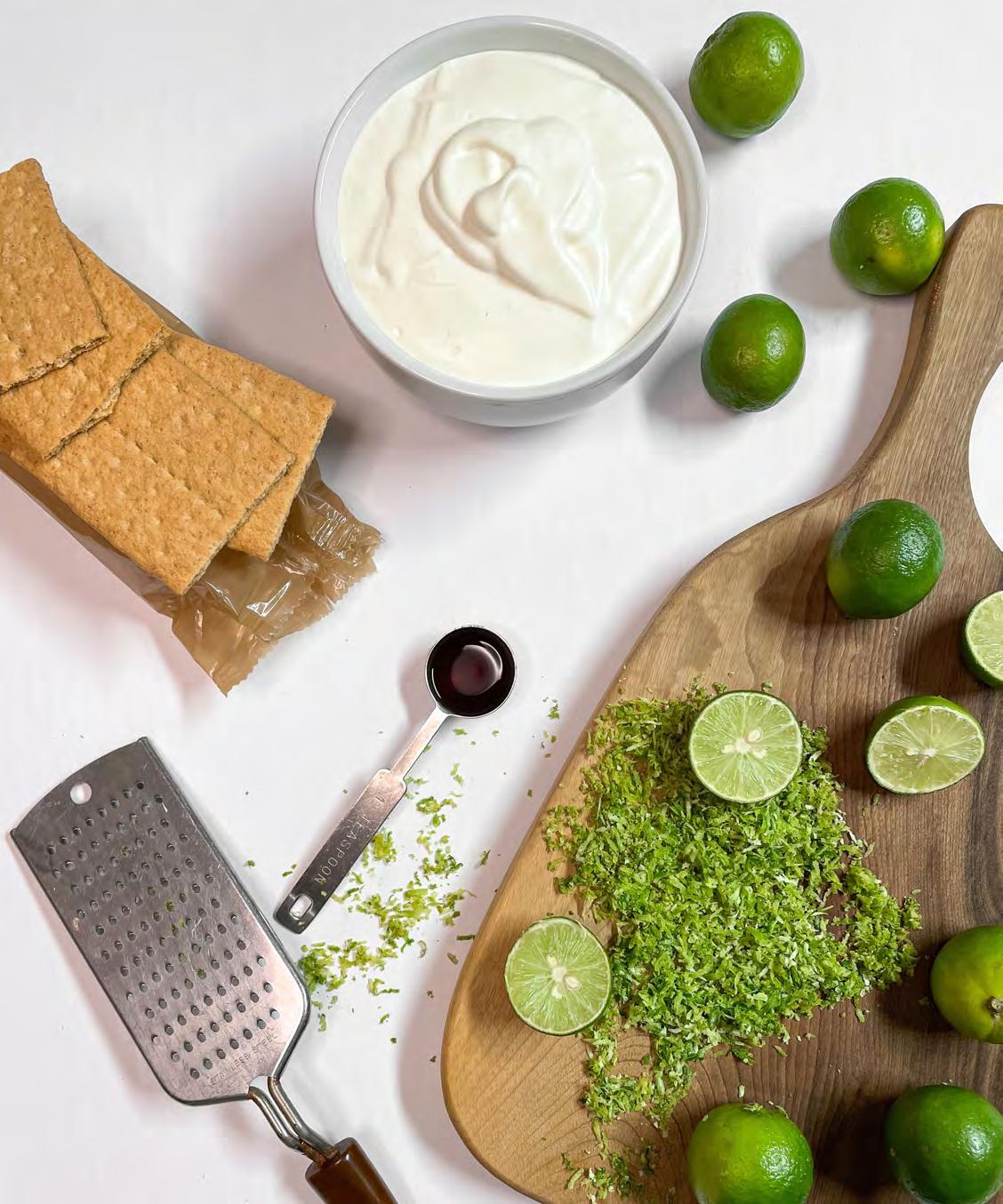
ingredients
9 whole graham crackers
¼ cup unsalted butter, melted
3 eggs at room temperature
14 ounces fat-free sweetened condensed milk
1 teaspoon vanilla
⅓ cup heavy whipping cream, whipped
¾ cup freshly squeezed key lime juice plus grated zest from all limes (roughly 16–20 key limes)


instructions
Preheat the oven to 325° F. Line 12 muffin cups with paper liners spray each paper liner with nonstick spray coating.
Crush graham crackers into fine crumbs and mix them together with melted butter. Add approximately 1 tablespoon of crumb mixture to each paper liner and tamp down firmly with a spoon. Whisk together eggs, milk, lime juice, lime zest and vanilla until well blended. Pour a scant
¼ cup lime mixture into each cup. Bake 16–19 minutes or until firm; do not over-bake. Allow hot tarts to set in the pan for about 10 minutes. Carefully lift each tart from the pan and place it on a tray. Cool completely, then refrigerate for several hours or overnight. Dollop with 1 tablespoon whipped cream.


about the type


Proxima Nova Regular | Bold Italic
Mark Simonson can be thanked for the renowned typeface Proxima Nova. The typeface was designed with the intention of combining modern proportions with a geometric appearance. The first version of this typeface was known as Proxima Sans. Proxima Sans had its first public debut in a Star Wars packaging project Simonson worked on in 1994. This typeface was incomplete in its first debut — lacking ligatures, finalized kerning — but Simonson went to print with the typeface anyway. Proxima Sans turned into Proxima Nova in 2005. Since its debut, this typeface has been used commercially all across the web and all across the world.
New Kansas Bold
The New Kansas typeface was created by Miles Newlyn in 2004. Newlyn drew inspiration from the typeface Copper Black. This font was designed as a display font and intended to be used for decorative purposes. Coined New Kansas to pay homage to Copper Black's designer Oz Copper, the typeface name plays off of the beloved film setting in The Wonderful Wizard of Oz. New Kansas serves as a revival typeface for Copper Black as the typeface is more fleshed out, equipped with more weights, and overall more modern than Copper Black.
Recipe Design and Photography by Elianna Oliver
Recipe by Kathryn Moor and Rozanne Wyss


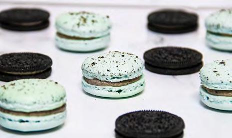
OREO MACARONS

OREO MACARONS


Yield: 30 macarons | Category: Desserts | Cuisine: French | Adapted from teakandthyme.com by Gail Ng
Prep Time: 1 hour | Cook Time: 15 minutes | Resting Time: 1 hour | Total Time: 2 hrs 15 minutes
TOOLS
Two baking sheets, parchment paper, mesh sieve, stand mixer or large bowl and electric mixer, rubber spatula, piping bag, and a scale.
OREO BUTTERCREAM INGREDIENTS

60 grams unsalted butter softened
200 grams powdered sugar
100 grams
cream cheese softened
5 Oreo cookies, finely crushed
1. In a stand mixer or large bowl, beat the softened butter and sugar together with a whisk attachment until it’s light and fluffy.
2. Add in the cream cheese and beat until smooth.
3. Pour in the crushed Oreos and whisk a few times until just combined.
4. Transfer buttercream to a piping bag fitted with an open star tip. Pipe Oreo buttercream onto a macaron shell and sandwich with another similarly sized shell.
5. Let macarons sit in the fridge overnight and bring them back to room temperature before eating.
MACARON INGREDIENTS
85 grams superfine almond flour
150 grams powdered sugar
80 grams granulated sugar
90 grams egg whites, room temperature & aged for 24 hours
1 Oreo cookie, finely crushed blue gel food coloring
INSTRUCTIONS
1. Line two baking sheets with parchment paper, cut to size so that it lies completely flat. Set aside.
2. With a mesh sieve, sift almond flour and powdered sugar together onto a sheet of parchment paper. Discard any large pieces remaining in the sieve.
3. In a stand mixer or large bowl & electric mixer, whisk the egg whites on medium speed until it becomes frothy like cappuccino foam.
4. Add in the granulated sugar, ⅓ at a time, while whisking on medium-high speed until all incorporated.
5. While the egg whites are at soft peaks, add in the food coloring. Keep whisking until meringue reaches stiff peaks.

6. Add in half of the sifted almond flour mixture and gently fold with a rubber spatula until just incorporated.
7. Add the rest of the almond flour mixture and continue folding. Smear the batter up around the sides of the bowl and scrape it back together in a folding motion to deflate some air out of the meringue. Stop folding when you can lift up the batter and drip it off the spatula in a figure 8 motion without the batter breaking.
8. Transfer batter to a piping bag fitted with a round piping tip. Pipe small 1 inch circles onto the prepared baking sheets by holding the piping bag in the same perpendicular position close to the parchment paper and letting the batter move outwards from the tip. Leave about ½ inch to 1 inch space between each macaron.
9. Firmly bang the baking sheet on the counter top a few times to bring air bubbles to the surface. Sprinkle a bit of crushed Oreo over the shells to create a speckled look.
10. Leave the baking sheets in a cool, dry area to rest macarons for 30 minutes to 1 hour or until you can brush the surface of a macaron with your finger and it doesn’t feel sticky. Preheat oven to 300°F while the macarons are resting.
11. Bake macarons one tray at a time, in the middle rack for about 15 minutes. Remove macarons from oven when the feet have set and the macarons peel cleanly off the parchment paper. Let cool completely before filling.
About The Type
Source Sans Pro
This well known font was designed by Paul D. Hunter with guidance from Robert Slimbach. Source Sans Pro was Adobe’s first open source typeface family and its intended use is for user interfaces. The designers drew inspiration from twentieth-century American gothic typeface designs due to their clear legibility. Paul worked diligently to simplify the glyph shapes to their essential forms. He added unique details to letters such as the uppercase I and lowercase L to differentiate the similar letter shapes. Another goal of his was to create a legible typeface for extended settings. To create a more pleasant reading experience he increased the width and created longer extenders. Source Sans Pro has six different weights within its font family. Overall, this font family is loved for its versatility and compatibility when designing.
Source Sans Pro Regular
Source Sans Pro Italic
Source Sans Pro Semibold
Source Sans Pro Semibold Italic
Source Sans Pro Bold
Source Sans Pro Bold Italic
Source Sans Pro Black
BodoniFLF
This beautiful font was created by Robin Casady and Greene in 2004. BodoniFLF is a modern style font with prominent thick and thin strokes as well as horizontal serifs. There are three weight variations within this font family. Other popular Bodoni font families include Bodoni, Bodoni 72, Bodoni 72 Oldstyle, and Bodoni 72 Smallcaps. BodoniFLF is great for headings and other large display texts.
BodoniFLF Regular
BodoniFLF Medium Italic
BodoniFLF Bold
Recipe Courtesy of teakandthyme.com by Gail Ng
Design and Photography by Elyse Bucheli


 Professor Lorraine Donegan


