Fecha///// pro_d________u_________cci_______ón}}}}}Oper____a ci ón ((( E n c a r g o ))) avd. <<<i- -de -a -c -í - ón>>> ///(((***In_____Ves______ti______ga_______ci_____ón***)))
"Im__pulso >>> [[[Proooxe _ cci ón // doo _ ii _ m _ a _ xi _ na< ri o))]] // . )-) . .
lin_gu__a_xe da com_prenn si ón = L i n gu a x e d a fa la . )) < < Ex.. pe.ri..en.ciaa c_omo f ó r m u l a . 1 / ´´´´´ . 0 ) {{{f e rrA___men_Ta___ de c. a . m . b . i . o }}}(]]] //// Ten dennn ciii a }}} d is r u p cii ón/// ^ ; c__ons_t-r_u--___ci_ón n [Co n t e x t o]] c P . ac t o `` l
<<paso_atráss<< ---- ((((((((((sinal)))))))))) ) ) Press_IÓN__ a
Dirección.Ç_¶¶ (( . )) == V percorrido.. e ,++ v e Orixe** e n n . contorno c lc Soporte
77 Tic. s o
Técnico() c disss_ruptivo
. e n c l a v e v C a t á l o g o A nu a R io E a s d ' An TO ni O F a il de
art: ístiico
ttanll e s p a z o
oreree p u r e za
2 0 2 2
xtfee)( O R I X E a a
Dess_a_prennder e c --lineal-- E N D E R E Z O >>> l >>
//peza . S i n gu la r=))))) . a > eeee signo [/// C A M B I O ) ‡ ‡ ‡ ‡ vozzz_ c.con tac to *** r_i...tmo(((( meccc a no .grafff___ FFFíA> ''' Communidadde coo pe ra ción ---- /// () ¨ : . . .... )) )) ()) ( p ) obxeto t ime))_^ ~ <<<
Magnetismo ** * ** STU D D DENTS= L. O . V. E / Sentido 0 : , i** // e enclllla een claa veee EE EE E . ,, . . preciso--- - - - - - ---cert-eiro i)]] 0, i > eowns (+++) ? desglose(( ****c ons , c i e n ci a **** } p a tlee F_ O C U S ) { I ddd ee a_ c i ó n ---- /// () + - -[sinal**** b l o q_ue (]]] )-) 0 ¨¨ /// () . , R__e__i_n_v_e_n_t_a_ A sim_bolo // x ía __)) . / ressultadoo=========== c/o/r/t/e
TeññoCertteza=TeññoDeseño_Teñño{Imp___ULso} h ´´ }}}
Faíldee_thats_great/ a natural__ place with__ fantastic_ people//] (]]] )-) 0 ¨¨ /// ()
RreetooooOOOrnooo//eNTREPalabRRRRRASeImaaaxeess// imags . 1 / ··· ** : ´´´´´Ç . 0 ) . a > eeee signo [/// "Enclave" é_o_catá_logo anuario seleccionado da Easd Antonio Failde 2022)) // )-)
A_entonación_e_o_ritmo_son_os_piares_máis_importantes_a_hora_de_compoñer_esta_portada} , t som_ospartícipes_das_nosaspalabras_e_cada_unha_delas_xera_o_seu-propio_percorrido 0 Ç 8 ``^ "" DDddddd (O_deseñ_o_é_unha_lingua_xe_híbrida_fruto_dunhasumade_coñecemen_tos+técnicas+expre_siónsquepermite_o_mov_emento
E n c l A v E c A t Á l o g o A nu A r io E A s d An to ni o f A il dE 2 0 2 2
Anuario 2022 da EASD ANTONIO FAÍLDE
DIRECCIÓN EDITORIAL//
Xosé Manoel González
DIRECCIÓN DE REDACCIÓN// Tonho Ferreiro e Cosme Fernández
DIRECCIÓN DE ARTE//
Josetxu F. Cárcamo
DESEÑO GRÁFICO E MAQUETACIÓN// Fernando Guimeráns, Tomás Lillo e Yago López
CONSELLO DE REDACCIÓN// Álvaro Blanco
Armando García
Lucía Rodríguez
Jacobo Fernández
Tonho Ferreiro
CONTIDOS// ALUMNADO
Ada González, Andrea Gil, Mikel Rúa Rodriguez, Robin Hannon, Victoria Feijoo Quintas,Stephanie López Anchisi, Jessica Nimo Ribao, Teresa Rodríguez Veiga, Elena Andrés Rodríguez, Alba Carreira Gómez, Cristina Castro Romero, Carla Domínguez Méndez, Luismi Ramos Silva, Itziar Couce Rodríguez, Pablo Lamothe Costas, Manuel González Meijide, Miguel Mosquera Conde, Maider Pumariño Riguera, Isabel Santos Martínez, Nerea Fiuza Mosquera, Tamar Fernández Pereira, Roi Cruz, Manuel Doval, Sofía Estévez, Uxía Fernández, Érika Gómez, Natalia Artunduaga, Miriam Matos, Alba Peña, Alba Chan, Lucía Sánchez, Paula Virulegio, Fernando García González, Antonio López, Carmen Muñiz, Jaime Vázquez Carnero e o colectivo Mala Tinta.
PROFESORADO
Miguel Álvarez Fernández, Xosé Manoel González e Laura Martínez López.
COLABORACIÓNS EXTERNAS// Luis Gil Pita, Cristina Nieto Peñamaría, Vania Lopez Arias e Pablo Otero.
TRADUCIÓNS AO INGLÉS// Opentrad-Imaxin
EDICIÓN//
EASD Antonio Faílde
Avda. Universidade 18. 32005 Ourense www.escolarte.com
IMPRESIÓN// Rodi Artes Gráficas
As cubertas imprimironse en papel CREATOR VOL de 350 gr e a tripa en papel mate de 140 gr. O apartado de traducións é papel POPSET de 120 gr.
As tipografías utilizadas son League Mono, Roboto Mono e Space Grotesk Mono baixo licenza OFL.
ISBN// 978-84-09-48931-2
DEPÓSITO LEGAL// OU 34-2023
Copyright das/os autoras/es
Os textos asinados son responsabilidade das/os autoras/es, non se identificando, necesariamente, a revista cos distintos puntos de vista. Prohibida a reprodución total ou parcial dos contidos da revista por calquera medio sen autorización expresa e por escrito das/os autoras/es.
Publicación subvencionada pola Dirección Xeral de Política Lingüística. Consellería de Cultura, Educación e Universidade. Xunta de Galicia.
EN CLAVE
"LIMIAR"
Por: MANUEL SEOANE
CANDO NO ANO 2009 VIU A LUZ “FAN”, O PRIMEIRO E ILUSIONANTE Anuario da Faílde, os correctores automáticos de textos non tiñan aínda a mala fe coa que agora nos amolan, permitindo sen sobresaltos que a pequena brincadeira pedagóxica de ligar cada ano o deseño a un nome diferente se revelase ao cabo imaxinativa, creativa e tamén eficaz. Os nomes elixidos ao longo destes anteriores trece números acertaron coa sonoridade que se agradece para a cabeceira dunha publicación, pero xogaron tamén case sempre con esa ambigüidade ou esa polisemia que permite simultanear e personalizar evocacións diferentes.
MANTER AO LONGO DE CATORCE ANOS UNHA PUBLICACIÓN RELACIONADA CO deseño non deixa de ser neste país unha pequena anomalía, unha rareza como a que significou implantar hai xa máis de trinta e seis, un centro de ensinanzas artísticas nunha cidade coma Ourense. “EN CLAVE” é pois, termo acaído para poder entender o fío condutor que parece agocharse cada ano, e que coma sempre recolle os mellores froitos do ano académico do alumnado, pero sen ensimismamento. Un “ENCLAVE” non necesariamente ten que illarse da contorna, e o anuario como ven sendo habitual recolle tamén aquelas colaboracións externas que enriquecen o contido. Algo semellante ao que fan ás interesantes palestras que se veñen organizando na escola, conectando co mundo profesional e poñendo o til sobre o labor docente máis rutineiro.
A ESCOLA ATINOU NON SEN DIFICULTADES NA SOLUCIÓN DOS PROBLEMAS derivados da pandemia, e loce agora o optimismo de retomar o ritmo cotián. Mudaron neste paréntese algúns hábitos, e tamén faces habituais entre o profesorado, o que permitiu anovar ideas e afrontar novos retos con ilusión. Retos coma a definitiva implantación dos estudos de mestrado en deseño conxuntamente coas outras escolas galegas, que por diferentes motivos non chegou a concretarse aínda pese a terse iniciado o proceso anos atrás. Completar o ciclo dunhas ensinanzas que como se ven comprobando suscitan tanto interese é fundamental para o alumnado que remata aquí as aulas e ten que desprazarse a outras comunidades para realizar o máster.
UN “ENCLAVE” COMA O LUGAR FÍSICO DA ESCOLA PRECISA TAMÉN dunha contorna apracible que convide unha aprendizaxe agradable e confortable, que por diferentes razóns nos anos pasados viuse alterada coa desaparición de parte do arborado. Preténdese agora recuperalo coa plantación de novas especies, que melloren un recinto de magníficas potencialidades ecolóxicas.
DAQUELA IMPORTA POUCO SE O CORRECTOR AUTOMÁTICO NOS XOGA A VOLTA xuntando ou separando palabras, porque “EN CLAVE” garda un significado que calquera con inquedanzas artísticas saberá descodificar, ao cabo son todos termos que no latín tiñan que ver coa chave. Oxalá sexa esta a que abra un prometedor futuro profesional para o alumnado que remata as súas ensinanzas na Faílde; precisámolo todos.
"EN CLAVE"
O ANUARIO PRESÉNTASE COMA UN MANUAL MOI TÉCNICO E RÍTMICO DOS MELLORES TRABALLOS DA ESCOLA. AO LONGO DESTA COMPILACIÓN DE DATOS VEMOS DE FORMA MINIMALISTA AS DIFERENTES ENSINANZAS DO CENTRO FORMANDO DIFERENTES RITMOS COMPOSITIVOS XUSTIFICADOS EN BANDEIRA RESALTANDO CORTES E BARRIGAS. EN DEFINITIVA, APARENTE MALA PRAXIS. COMO PARTE DA EXPERIENCIA PROPOÑEMOS MANEXAR O CATÁLOGO ANUARIO ACOMPAÑANDO DE FORMA AUDIOVISUAL ESTAS BANDEIRAS:
/ / HIMNO 1 / / HIMNO 2 / / HIMNO 3 / / HIMNO 4 / / HIMNO 5 / / HIMNO 6 / /
ENSINANZAS PROFESIONAIS DE ARTES PLÁSTICAS E DE DESEÑO ----------------------------------------------------------------------------------------------------------------------------------------------06 UN OLLAR FRÁXIL Conxunta fOTttttt 08 TREBOADA NO MAR Isabel Santos fOTttttt 10 ANNA Tamar Fernández fOTttttt 12 RECONHECÉNDOME Nerea Fiuza fOTttttt 14 DIGNIDADE Maider Pumariño fOTttttt 18 O SALTO Á NATUREZA Miguel Mosquera fOTttttt ENSINANZAS SUPERIORES DE DESEÑO ----------------------------------------------------------------------------------------------------------------------------------------------22 LA PECERA Stephanie López DES INTTT 24 ESPACIO CULTURAL FOTOGRÁFICO Jessica Nimo DES INTTT 26 CENTRO DA FESTA DO PULPO Teresa Rodríguez DES INTTT ENSINANZAS PROFESIONAIS DE ARTES PLÁSTICAS E DE DESEÑO ----------------------------------------------------------------------------------------------------------------------------------------------28 ODESSA Jaime Vázquez EBA 30 OLEA Fernando García EBA 32 TAEUBER Antonio López EBA 34 ALBATROS Antonio López EBA 38 OVAL Carmen Muñiz EBA 40 PÓLA Fernando García EBA 42 PUNK Antonio López EBA ENSINANZAS PROFESIONAIS DE ARTES PLÁSTICAS E DE DESEÑO ----------------------------------------------------------------------------------------------------------------------------------------------44 SOS MASSÓ Cristina Castro ILUS 46 SOÑOS Carla Domínguez ILUS 48 NINO SATURNINO Luismi Ramos ILUS 50 AP 6, 1-8 Manuel González ILUS 52 LUBLO Y EL BOTE DE PEPINILLOS Pablo Lamothe ILUS 54 EN BUSCA DOS MEUS Elena Andrés ILUS 56 CARMILLA Itziar Couce ILUS 58 AS FILLAS DA NOITE ALba Carreira ILUS ENSINANZAS SUPERIORES DE DESEÑO ----------------------------------------------------------------------------------------------------------------------------------------------60 FUENTE Andrea Gil DES GRAFF 62 TERRA Mikel Rúa DES GRAFF 64 KEYFRAME Ada González DES GRAFF 66 NEURA Victoria Feijoo DES GRAFF 70 MENTES GARABATEADORAS Robin Hannon DES GRAFF ARTIGOS ----------------------------------------------------------------------------------------------------------------------------------------------72 MALA TINTA Colectivo Mala Tinta AarRt 74 SOBRE A MESA E A ARQUITECTURA Undoredo AarRt 76 POLICROMÍA DO PÓRTICO DO PARAÍSO Vania López AarRt 80 TUTILIMUNDI Fernando García AarRt 84 HISTORIA DUNHA CADEIRA Laura Martínez AarRt TRADUCIÓNS ----------------------------------------------------------------------------------------------------------------------------------------------85 TRADUCIÓNS Opentrad-Imaxin traducións PX DESCR AUTORÍA ESTUDOS
UN OLLAR FRÁXIL.
A FOTOGRAFÍA ESTENOPEICA


ROI CRUZ, MANUEL DOVAL, SOFÍA ESTÉVEZ, UXÍA FERNÁNDEZ, ÉRIKA GÓMEZ, NATALIA ARTUNDUAGA, MIRIAM MATOS, ALBA PEÑA, ALBA CHAN, LUCÍA SÁNCHEZ E PAULA VIRULEGIO, COORDINADOS POR MIGUEL ÁLVAREZ FERNÁNDEZ
FOTOGRAFÍA ESTENOPÉICA
TÉCNICA ANALÓXICA SOBRE
PAPEL FOTOSENSIBLE
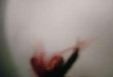
PERFORAMOS PAPEL DE ALUMINIO CUN ALFINETE e, ao ollar ao través do burato, atopamos un mundo de soños: o primeiro proxecto do alumnado de fotografía mergullounos no onírico, e así foi como viaxamos polas súas fantasías, medos e recordos.
ACHEGÁMONOS AOS INICIOS DA FOTOGRAFÍA, Á “cámara escura”, onde a ausencia de lente obriga a movernos nun mundo fora de foco. Collemos unha limitación técnica e xogamos a convertela nunha vantaxe estética. Agora podedes ver unha mostra do que atopamos.
//IMAXES
/01-/04
Paula Virulejo
/05
Natalia González
/06
Alba Chan
/07
Roi Cruz
/08
Erika Gómez
06
/01 /02 /03 /04
/05


f O Tttttt OTOOO FOTOGRAFÍA g r a fía del fottt FOTTTO /08 /07 /06
maixam@gmail.com
ISABEL SANTOS MARTÍNEZ
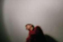
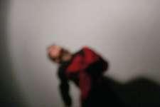
VIVIR ONDE NON HAI MAR FAI QUE O BOTE en falta. Espertar, abrir a ventá e non velo, o seu olor... É como se o necesitase, sen el afógome, fáltame o aire, e non podo estar moito sen velo, sen ulilo, sen sentilo, saber que está ahí.
ENTRAR NUN ESTADO DE ANSIEDADE QUE FAI QUE cando fotografo vexa o mar en calquera lugar, en cada árbore, no ceo, nunha botella ou nas luces dunha farola.


DENDE QUE NACÍN A RELACIÓN QUE TEÑO CO MAR É moi estreita. Son dun pobo pesqueiro, cun pai mariñeiro ao igual co meu avó, tíos ou veciños. As mareas, longos meses onde a espera sempre estaba presente.
O MAR ERA O NOSO PUNTO DE CONTACTO AÍNDA QUE estivese na outra punta do mundo. Co subir e baixar das ondas parece que podía escoitalo, como cando achegamos unha buguina á orella: pechas os ollos e escoitas o mar.

PROXECTO PERSOAL
/01 /02 /03 /04
08
TREBOADA NO MAR


f O Tttttt OTOOO FOTOGRAFÍA g r a fía del fottt FOTTTO //IMAXES /01-/08 Serie Treboada no mar /05 /06 /07 /08
tamarfdezp@gmail.com
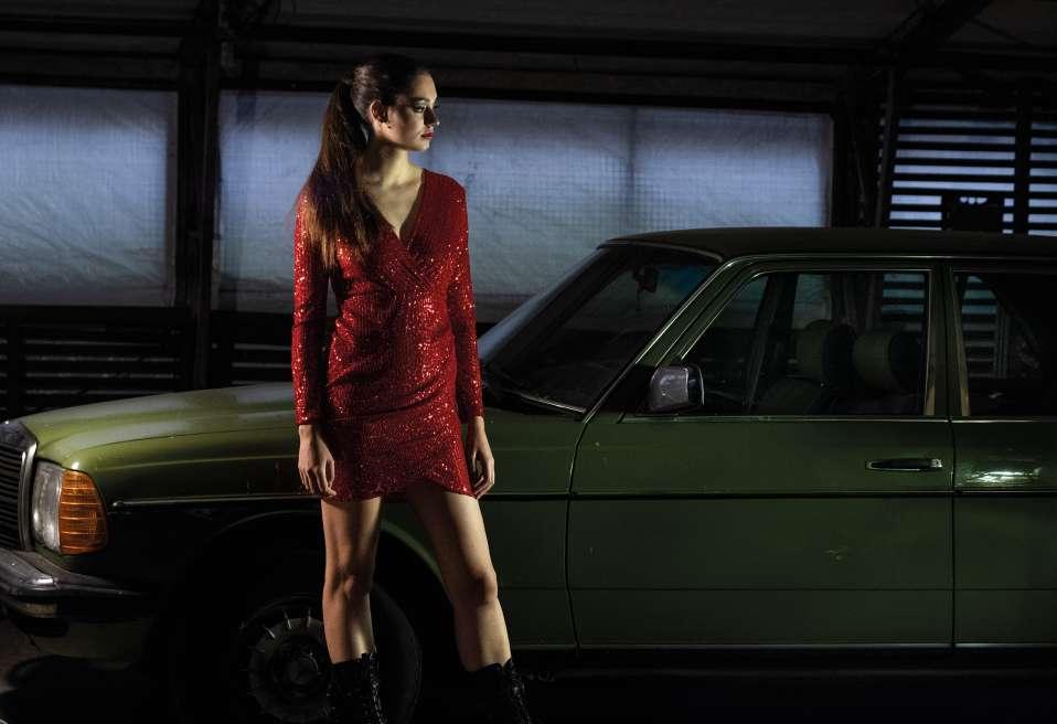
ANNA XORDE A PARTIR DA COLABORACIÓN COMERCIAL coa empresa Ana Mosquera S.L., que conta cunha tenda na zona vella da cidade de Ourense. Traballan con produtos de moda multimarca, e tamén coa súa propia marca: Anna Milittia. Este proxecto ten que ver coa campaña de roupa de festa para o Nadal.
O CLIENTE MOSTRABA GRAN INTERESE POR POTENCIAR as vendas e-commerce. Centrámonos pois en perfilar a imaxe que proxectaban na súa web, xa que non representaba adecuadamente os seus valores de marca. Para iso, buscaríamos un conxunto de fotografías que resultasen evocadoras, en lugar de meramente descritivas, resaltando o produto a través do contraste co escenario. Así,comezamos a dar forma ao que sería un primeiro paso cara á renovacióndo seu concepto de marca, achegándoo á exclusividade e calidade e distanciándoo de termos como cantidade e volatilidade.
PROXECTO COMERCIAL
10 ANNA
/01
TAMAR FERNÁNDEZ PEREIRA


f O Tttttt OTOOO FOTOGRAFÍA g r a fía del fottt FOTTTO /02 /03-/04 //IMAXES /01-/04 Fotografía comercial para a marca de moda Anna Militia
“ARROMBAR O CUARTO”
NEREA FIUZA MOSQUERA RECOÑECÉNDOME. ”ARROMBAR O CUARTO” é un proxecto persoal que nace a partir da necesidade de rachar co silencio, co escurantismo que hai ao redor da saúde mental, para falar da evidente herdanza dos estados depresivos. O proxecto parte da depresión da miña nai, desde a miña perspectiva, e acaba por converterse nun bucle de revelacións que me fan ser consciente de como o seu día a día afecta ao meu, da realidade do meu estado mental, das miñas propias obsesións e das miñas posibilidades de existir na resistencia.
AS FOTOGRAFÍAS, O TEXTO, OS SONS, AS IMAXES en movemento únense para elaborar unha mensaxe, unha chamada de atención, unha alerta; para dar unha explicación do que está a acontecer no meu interior.

ESA MENSAXE VAI DIRIXIDA AO PÚBLICO EN XERAL, co gallo de intentar expresar a experiencia dunha persoa cuxa vida xira en torno a unha herdanza dunha saúde mental descoidada polo sistema. Aos seres queridos, a quen unha non se atreve a desvelarlle o seu segredo. A unha mesma, para alertala do que

PROXECTO PERSOAL nereafiuza@gmail.com 12 RECONHECÉNDOME
/01 /02
está a acontecer no seu interior e procurar as ferramentas necesarias para superar, sobrevivir, resistir. Vai dirixida á miña nai, para facela aínda máis consciente e para dicirlle que estamos xuntas combatendo o monstro.


É UNHA MENSAXE PARA PODER SER //IMAXES
/01-/04
Serie Reconhecéndome "Arrombar o cuarto"
f O Tttttt OTOOO FOTOGRAFÍA g r a fía del fottt FOTTTO
/03 /04
maider77@yahoo.es
MAIDER PUMARIÑO RIGUERA
O PROXECTO DIGNIDADE NACE COMA UNHA homenaxe aos meus avós, finados, e á mestura de sentimentos que me transmitían ao compartir tempo con eles: o meu respecto, certo fondo de angustia e dor, o sacrificio, a dureza, a resignación, o silencio...
ASÍ, O PROXECTO CONVÍRTESE NUNHA HOMENAXE que se extende a toda unha xeración pola que sinto gran admiración e que considero que merece ser honrada.
SON AQUELES QUE MEDRARON NA ESCASEZA E AS dificultades, viviron a época da guerra e a posguerra desde os ollos dun neno ou nena, perderon a pais e irmáns, e criáronse entre a fame, a dor e o medo. Como adultos trataron de adaptarse ao sistema, mantendo a cabeza baixa e traballando duro, exemplo de resignación e sacrificio, e cadaquén saíndo adiante como puido. E agora, na recta final da súa vida sinto que son os máis olvidados, igual de silenciosos e igual de resignados, resistindo no seo dunha sociedade cada vez máis superficial. E por todo iso, para min é unha xeración esquecida e admirable.
DIGNIDADE É UNHA SERIE DE 10 RETRATOS DE anciáns da vila na que vivo. As circunstancias sanitarias provocadas pola aparición da COVID-19, e eles, como un dos sectores da poboación máis castigados durante a pandemia, fan que me decidira por elixir a usuarios da Residencia e Centro de Día “O teu Fogar” de Foz como os modelos para fotografar nesta homenaxe.
O PROXECTO ERGUEUSE EN TORNO A TRES EIXES, comúns para os retratados e retratadas, aspectos que simbolizan o que para min representa esta xeración e o que quero transmitir deles: o coñecemento do que importa de verdade, a aceptación da realidade e a súa pel como o mapa dun percorrido vital.
DIGNIDADE TEN UNHA FINALIDADE ARTÍSTICA E un único propósito: unha actuación en e para a comunidade. O obxectivo é darlle visibilidade e recoñecemento a 12 persoas concretas que simbolizan a unha xeración completa. Para levar a cabo este fin plantexo dúas fases sucesivas e complementarias, a través de dúas ferramentas.
A PRIMEIRA FERRAMENTA, MÁIS TRADICIONAL, É unha exposición conxunta das imaxes nunha sala de exposicións. Á carón de cada imaxe vai colocada unha cartela na que unhas liñas de texto dan conta de quen é esa persoa que aparece no retrato.
A SEGUNDA FERRAMENTA, PENSO QUE MÁIS conceptual e innovadora, é unha acción que consiste na mostra das mesmas imaxes en lugares de relevancia, os lugares que se gardan para os retratos oficiais en case calquera institución. Así, o lugar destinado noutrora á fotografía do Rei será agora ocupado durante un tempo polo retrato dunha persoa maior do pobo. O importante aquí é onde se coloca a imaxe e por qué, para convidar á reflexión.
RETRATO
14 DIGNIDADE
//IMAXES /01 Mariano /02 Concha /03 Miguel /04 Nana /05 Merlín /06 Feli /07 Casas /08 Angelita /09 Armando /10 Toñita /11 Manuel /12 María José


f O Tttttt OTOOO FOTOGRAFÍA g r a fía del fottt FOTTTO /01 /03 /02 /04


/05 /07 /06 /08


f O Tttttt OTOOO FOTOGRAFÍA g r a fía del fottt FOTTTO /09 /11 /10 /12
MIGUEL MOSQUERA CONDE
O PROXECTO FINAL DE MIGUEL MOSQUERA CONDE; O salto á natureza, para o Ciclo Formativo de Grao Superior de Fotografía, liga dun xeito fermoso o seu discurso coa necesidade xenuína, tal e como explica na memoria do proxecto, de cuestionar e sandar certas actitudes ou procesos laborais herdados do seu facer profesional, vital. Encrucilladas.

ADOITA ENTÓN FACER LONGAS CAMIÑADAS POLO bosque que promoven a reflexión. Un novo xeito de relacionarse co traballo que, co paso do tempo, deriva nun modus operandi no que atopa un sentido e realización máis preto de seu.
FROITO DESTE NOVO PENSAR É A PROPOSTA O SALTO á natureza, onde Mosquera aproveita a desculpa dun proxecto de fin de grao para razoar o taboleiro do xogo. Incorpora así
mosqueracondemiguel@gmail.com

EN OCASIÓNS, OS PROCESOS ARTÍSTICOS nacen baixo a éxida, ou derivan cara o exercicio íntimo de poñer orde e facer limpeza. Demasiado ruído, demasiado concepto, marea, vida. Cousa adquirida, que enturba a comprensión dun mesmo.
Shitao. (Pintor de paisaxes chinés, s.XVIII)
a ficción, na forma dunha nova editora de literatura (Glifo), que lle fai a encarga profesional de varias fotografías para as capas de cinco títulos que pretenden sacar ao mercado, en tradución ao galego e achegados ao xénero Nature Writing.
É PARTINDO DESTA MAGNÍFICA PREMISA LÚDICA, onde o proxecto acada unha dimensión de fondura pouco común. Comezando polas lecturas e conversas cos libros elixidos, as visitas frecuentes ao lugar de Tronceda, onde xorde quizais, a idea dos retratos fotográficos para daren nova vida ós títulos ou, nesa xunta que en todo momento fai con algúns artistas polos que sente unha querenza especial e, que Mosquera sitúa na esfera das “inspiracións / débedas visuais e conceptuais” e que son: Pierre Gonnord, Daniel Spoerri, Miguel Mosquera (seu pai), Hamish Fulton e, Gilbert Garcín.
PROXECTO PARA SERIE EDITORIAL
18 O SALTO Á NATUREZA
"O PINCEL SERVE PARA SALVAR AS COUSAS DO CAOS."
/01 /05
//IMAXES
/01-/04
Fotografías para "O Libro da Madeira" /05


Código QR para acceder ao proxecto completo
A DIMENSIÓN DE FONDURA QUE COMENTARA ANTES, fornécese ao comprobar as trazas de riqueza de pensamento conceptual e formal que vai acadando o proxecto. As liñas de significados e implicacións do propio artista aparecen, nun palimpsesto onde o relato acolle, para min, o seu valor máis verdadeiro. Falo da meticulosidade e gusto á hora de soster o predio todo da ficción; a invención da editora, do nome e deseño da marca. A multiplicidade de funcións, sendo ao tempo fotógrafo, deseñador, editor, artista contratado, impresor ou, artesán da madeira, cando ofrece cara ao final do produto, ese estoxo magnífico de colección e pensado até o último detalle para conter os libros editados. O proxecto ven acompañado dunha deliciosa documentación que de novo, fuxe do marco da esixencia académica: ademais dos planos convencionais de estudo para cada

fotografía, aparecen bosquexos e mapas conceptuais, itinerarios (con relación de quilómetros e custes), e unha sorte de detalles técnicos que Mosquera vai anoando xunto a relación que mantén cos modelos das fotografías, o feito de encargarlle a outro estas liñas ou, o acerto do detalle conceptual e fotografado que pecha os libros e, que a xeito de espello, crea unha relación de proximidade onde se dan o xogo, a ironía, o pensamento crítico e, abrindo de novo a partida para un outro relato dentro do relato.
E TODO XIRA!
f O Tttttt OTOOO FOTOGRAFÍA g r a fía del fottt FOTTTO
Texto: PABLO OTERO
/02 /03 /04


/07-/08 /09 /10 /12-/13 /14
//IMAXES
/07-/10
Fotografías para "A Sabiduría das Árbores"

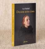
/11-/14
Fotografías para "Dende esta Cima"

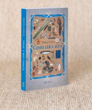
/15-/18
Fotografías para "Como ler a Auga"
f O Tttttt OTOOO FOTOGRAFÍA g r a fía del fottt FOTTTO
/15-/16 /17 /18
22 LA PECERA STEPHANIE LÓPEZ ANCHISI
LA PECERA representa a convivencia dos plásticos e dos seres vivos que habitan nos océanos. A través das súas instalacións educativas e de lecer mergullámonos no universo da reutilización do plástico.
NA PECERA
desenvólvese un xogo de rol en equipo ou equipos, no que os xogadores terán que resolver, mediante o enxeño e a lóxica, diversos enigmas que lles permitirán escapar do recinto. A súa historia transcorre en escenarios inspirados no océano e nalgúns temas dos Beatles coma "Help" ou "All you need is love"; con salas que amosan a problemática que provocan os residuos plásticos no planeta e pequenas accións que se poden axudar a minimizala. Segundo o tipo de xogo proposto, as salas permiten o seu uso independente ou cambios no circuíto. Nelas a atmosfera pode transformarse grazas aos teitos elevados e á iluminación, creándose ambientes diversos.
COMUNICANDO CO exterior, unha pasarela permite acceder ao primeiro nivel, onde se sitúa o principal atractivo, a sala de escape. As comunicacións verticais permiten acceder aos niveis superior e inferior, onde se desenvolven o resto de actividades. As de uso privado como aseos, almacéns ou salas de traballo agrúpanse en dous bloques, mentres que as actividades dirixidas ao público desenvólvense en espazos libres que interactúan co resto do edificio do mesmo xeito que a sala de escape. A través de dobres alturas, miradoiros, chans translúcidos ou acristalamentos, os xogadores poden interactuar co exterior e co resto dos espazos.
NA PLANTA INFERIOR sitúase a cafetería, a terraza e a sala de exposicións. Neste andar, aludindo á reciclaxe de plásticos e no marco da exposición, deséñase un “muro de clasificación”, dispoñible tamén na planta superior, que promove a recollida de envases de plástico para darlles un novo uso. Para os máis curiosos e con ganas de aprender, hai un obradoiro de reciclaxe na planta superior con instalacións que permiten experimentar cos residuos que achegan os usuarios e crear novos obxectos.
COMO NON PODÍA SER doutro xeito, o plástico reciclado forma parte da proposta, tanto no uso de acabados como no mobiliario, mostrándose as posibilidades estéticas e funcionais que pode aportar este material.
ESTE PROXECTO BUSCA transmitir a importancia de reducir os plásticos dun só uso e a súa correcta reciclaxe para darlles unha vida máis longa dun xeito lúdico e didáctico.
stephanie.anchisi6@gmail.com
//IMAXES
/01-/02
Renders
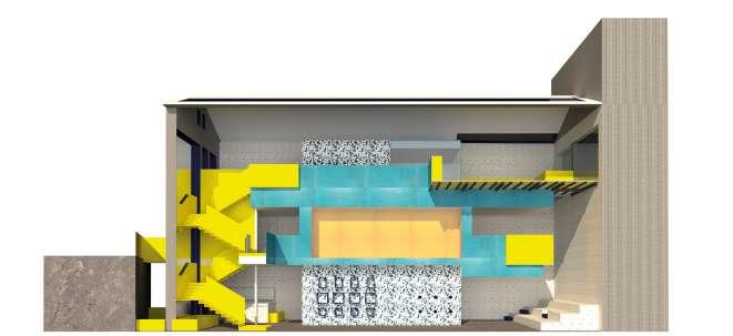
/02-/05
Niveis 0,inferior e superior
DESEÑO
SUITE
AUTOCAD
DE ESPAZO PARA ESCAPE ROOM
ADOBE
AUTODESK + SKETCHUP
/01 /02
DE S INT IN TE RIO RESS DESS EEEÑOO IN TER NOOOO E N T E R IN N TRO /03 /04 /05
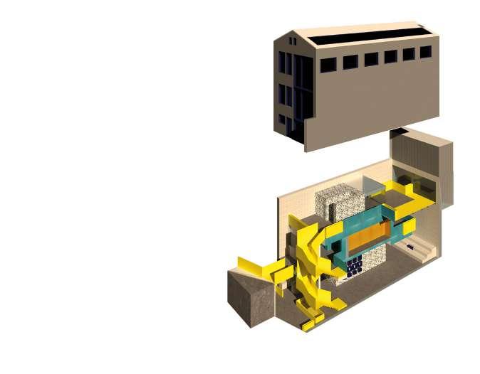
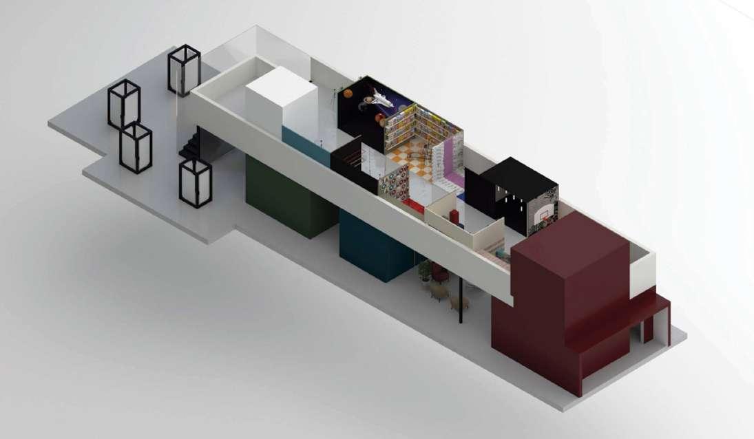
24 ESPACIO CULTURAL FOTOGRÁFICO
JESSICA NIMO RIBAO
O ESPAZO CULTURAL fotográfco é un centro para a realización de fotografías e exposición destas, destinado ao público xeral, instagramers, autónomos ou fotógrafos profesionais. Un espazo onde atoparán diferentes platós e ambientacións onde realizar fotografías de promoción, fotografías de venta ou fotografías para as súas redes sociais ou os seus books personais. Ademais, o centro inclúe espazos de exposición para dar visibilidade a traballos de fotógrafos ou artistas locais, e espazos formativos para diversos obradoiros.
O PROXECTO
lévase a cabo na capela desacralizada dos Franciscanos, unha capela construída en 1704 para acoller a Venerable Orde Terceira dos franciscanos, mercada polo concello de Ourense en 1999 e convertida en albergue municipal.
ESPAZO CULTURAL FOTOGRÁFICA SUITE ADOBE AUTOCAD AUTODESK + SKETCHUP
jessicanimoribao@gmail.com
A INTERVENCIÓN desenvólvese mantendo coma premisa un respecto constante ao edificio, permitindo que todo o proxecto fora reversible practicamente na súa totalidade. Créase unha estrutura totalmente independente da capela, que fai posible conservar unha visión global da edificación envolvente.
AS INTENCIÓNS de partida céntranse en resolver as necesidades da actividade coa funcionalidade do espazo. Para isto, búscase a configuración de espazos flexibles, dinámicos e adaptables ao uso fotográfico co contraste de espazos delimitados ou máis ríxidos para o resto de actividades.
//IMAXES
/01 - /03
Planta e sección do espazo
/04 e /05
Renders,interior e planta
+4.70m
/02
/03 /01
DE S INT IN TE RIO RESS DESS EEEÑOO IN TER NOOOO E N T E R IN N TRO /04 /05
CENTRO DE INTERPRETACIÓN DA FESTA DO PULPO
TERESA RODRÍGUEZ VEIGA
A IDEA XORDE de darlle a unha construción industrial obsoleta, banal e fría a priori un motivo para seguir existindo. Como combinar a súa existencia cun uso real que lle dea vida de novo e impida a súa desaparición. Con esta premisa xurdiu a idea dedarlle o uso de “Centro de Interpretación da Festa do Pulpo”, festa de Interese Turístico Internacional que se celebra anualmente na vila do Carballiño.
DESTE XEITO, ademais de poñer en valor un ben inmaterial como é este evento, amosarase o conxunto de bens físicos relacionados con ela (dispersos pero homoxéneos) ao tempo que terá a función de preparar, dende o punto de vista organizativo, as visitas turísticas.
O OBXECTIVO É CREAR un espazo onde os asistentes poidan informarse en profundidade sobre a festa; pero non só iso, o futuro “Centro de Interpretación da Festa do Pulpo” concíbese como algo máis dinámico, algo que, como a propia festa, inclúan ese movemento continuo de persoas e casa de reunións.
ASÍ, NO SEU interior, grazas a un uso racional do espazo dispoñible e do seu mobiliario, crearase unha zona polivalente na que o uso expositivo se converta nun centro de encontro da asociación de pulpeiros/as, nunha sala de charlas, proxeccións ou eventos análogos.


O EDIFICIO NON SE entende coma un elemento pechado e simplemente expositivo, senón que, un espazo de relación coa súa contorna, participando na pequena carballeira situada na parcela ao tempo que ofrece o servizo de cafetería.
EN TODO CASO, o deseño proposto permite disociar este último para poder utilizarse en horarios diferentes á zona expositiva, o que permite organizar outros eventos como concertos nocturnos.
TRÁTASE DE CREAR unha experiencia completa, unha pequena festa popular sen data prefixada, aproveitando todo o que ofrece a trama, dende a edificación ata as árbores, eses elementos naturais milenarios sosegados que a acompañan durante tantos anos.
26
CENTRO DE INTERPRETACIÓN
SUITE ADOBE AUTOCAD AUTODESK + SKETCHUP tereveiga@yahoo.es
//IMAXES /01 Render do exterior do Centro /02 Render do interior da Exposición /03 - /04 Planta e sección do Centro /01 /02


DE S INT IN TE RIO RESS DESS EEEÑOO IN TER NOOOO E N T E R IN N TRO 04 pte 8% pte. 8% /03 /04
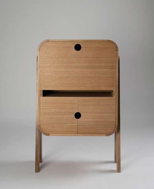
JAIME VÁZQUEZ CARNERO
A CONSTRUCIÓN DA MESA "ODESSA" PARTE DA PREMISA DE elaborar unha mesa auxiliar de gran tamaño, na que predomine a polivalencia de usos. O seu nome fai referencia á cidade de nacemento de Vasili Kandinsky, pintor abstracto cuxa obra inspira a composición figurativa do mesado. Figuras xeométricas básicas, desordeadas anárquicamente, achegando dinamismo e sinxeleza ao deseño.

AS PATAS INCLINADAS EN ESTÍPITE, ASÍ COMO O SUAVE biselado do taboleiro, dan lixeireza á peza a pesar do seu tamaño.
CONCIBIDA PARA SER USADA DE FORMA ACTIVA, A SÚA forma sinxela permite ser empregada como mesa de escritura, ou mesmo para comer.
A COMBINACIÓN DE MADEIRAS DE FREIXO E CERDEIRA, CON tonalidades contrastadas, axústase a remarcar o seu estilo moderno e á vez atemporal.
escola.arte.antonio.failde@edu.xunta.gal
//IMAXES
/01
Composición xeométrica
/02 e /04
Detalles da Mesa Odessa
/03
Vista xeral da mesa
Fotografías de Belén Guitian e Miguel Bello
28 ODESSA
/01
MESA DE ESCRITURA/COMEDOR FREIXO E CERDEIRA


EBA EB EBANISTERÍA E B A EBBA RÍA E A B /04 /02 /03
FERNANDO GARCÍA GONZÁLEZ
OLEA É UNHA MESA DE CENTRO CONCIBIDA DESDE A cultura do deseño e construída mediante técnicas artesanais.

INFLUENCIADA POLO MOVEMENTO MODERNO, PRESENTA lixeireza na súa estrutura, e xeometrías simples nas súas formas. Éstas, contrastan perfectamente con elementos tan tradicionais como os seus ensambles, que están realizados manualmente e a taracea, que se estende por todo o taboleiro, chegando tamén aos seus cantos. O traveseiro da parte baixa da mesa, funciona como un reflexo da liña que cruza o taboleiro, con este detalle créase un xogo visual que achega valor ao seu deseño.
A SIMBIOSE ENTRE DESEÑO E ARTESANÍA NON É A ÚNICA que existe en Olea. Os seus materiais combinan de forma natural, creando un contraste suave e harmónico. A súa estrutura está construída integramente con cerdeira, mentres que para o taboleiro a madeira seleccionada foi o freixo.
OLEA É UNHA PEZA QUE CONXUGA VERSATILIDADE E deseño, o que a converte nunha mesa que tería cabida en calquera espazo.
//IMAXES
/01
Detalle da ensamblaxe
-Fotografías de Patricia Pérez
/02-/03
Vistas de estructura e motivo
-Fotografías de Ofelia Cardo
/04
Vista xeral
-Fotografías de Monserrat Martínez /01
30 OLEA
escola.arte.antonio.failde@edu.xunta.gal
MESA DE CENTRO FREIXO E CERDEIRA


EBA EB EBANISTERÍA E B A EBBA RÍA E A B /02 /04 /03
32 TAEUBER
ANTONIO LÓPEZ
SOPHIE TAEUBER FOI UNHA DAS MÁIS IMPORTANTES FIGURAS dos movementos artísticos de vangarda da primeira metade do século XX. Como deseñadora polifacética, o seu traballo ofrécenos unha linguaxe visual moi forte.
TAEUBER É UNHA MESA AUXILIAR COMPOSTA POR UNHA estrutura de cedro de Brasil. Elixido pola súa cor e lixeireza, acompaña a sinxeleza visual da súa forma. O mesado ou sobre, realizouse mediante unha combinación xeométrica a base de 7 tipos de madeira diferentes, aproveitando así a gama cromática que esta nos ofrece. A mesa foi deseñada inspirándose nas composicións xeométricas de Sophie que, xunto coa súa expresiva utilización da cor, deunos pé a experimentar cos tons da madeira, dando como resultado un interesante catálogo visual.
DOUTRA BANDA, COMBINANDO O TRABALLO ARTESÁN REALIZADO en madeira e a nosa fonte de arte moderna, achegamos unha peza dunha sinxeleza estética que non esconde a complexidade técnica do conxunto.
 MESA AUXILIAR
CEDRO BRASILEIRO, NOCEIRA, FREIXO, SAPELLY, CARBALLO, CASTIÑEIRO E FAIA
MESA AUXILIAR
CEDRO BRASILEIRO, NOCEIRA, FREIXO, SAPELLY, CARBALLO, CASTIÑEIRO E FAIA
//IMAXES
/01-/02
Vistas do motivo xeométrico
/03
Vista frontal da peza
/04
Vista xeral Fotografías de Raúl
/01
Iglesias
escola.arte.antonio.failde@edu.xunta.gal


EBA EB EBANISTERÍA E B A EBBA RÍA E A B /02 /03 /04
QUEDARNOS MIRANDO AO MAR FOI UNHA COSTUME HUMANO dende o principio dos tempos. Pode ser porque a nosa orixe atópase nel ou simplemente pola relaxación que nos ofrece esa superficie cambiante e ondulante.
ALBATROS É UN COLGADOIRO DE PAREDE QUE NOS PRESTA as súas ondas para colgar as nosas pezas de vestir. Nos colgadoiros, realizados en madeira de arce contrachapada, podemos apreciar as siluetas dos albatros colocados sobre unha superficie ondulante, esta vez en madeira de freixo. Coa flexión exercida sobre as láminas desta resistente madeira, conseguimos as súas suaves curvas. Esta banda fluctuante pode ser empregada realizando composicións de varias pezas, creando unha sensación de dinamismo e adaptándose ao espazo no que se atopen con diferentes lonxitudes dispoñibles.

//IMAXES /01 e /03 Vistas xerais Colgadoiro Albatros /02 e /04 Detalles Fotografías de Ofelia Cardo /01 COLGADOIRO DE PAREDE FREIXO E ARCE escola.arte.antonio.failde@edu.xunta.gal
34 ALBATROS ANTONIO LÓPEZ

EBA EB EBANISTERÍA E B A EBBA RÍA E A B /02

/03

EBA EB EBANISTERÍA E B A EBBA RÍA E A B /04
TRÁTASE DUN ESCRITORIO PARA TRABALLAR E ALMACENAR, que pode encaixar en distintas estancias. O deseño deste moble mestura calidez e funcionalidade. A prevalencia das liñas curvas e formas redondeadas enlaza co auxe do deseño orgánico e ergonómico. As formas curvas resultan moito máis amables tanto ao ollo como ao tacto e achegan delicadeza e elegancia, creando un ambiente acolledor. As pezas curvas realízanse no torno nunha peza única que logo dividimos en 4 pezas iguais.


O EMPREGO DE DISTINTAS MADEIRAS, CARBALLO E nogueira, achéganos unha mestura de cores. O moble elévase a través das súas patas inclinadas creando un espazo aberto. A potencia das súas patas, á súa vez, outorga un certo aire de sofisticación e elegancia atemporal.
ESCRITORIO CARBALLO, NOCEIRA E TABLERO CONTRACHAPADO DE CARBALLO
escola.arte.antonio.failde@edu.xunta.gal
38
/01 /03 /02
OVAL CARMEN MUÑIZ


EBA EB EBANISTERÍA E B A EBBA RÍA E A B //IMAXES /01-/02 Detalles do escritorio /03 Escritorio pechado /04-/05 Escritorio aberto Fotografías de Fernando García /04 /05
PÓLA, "RAMA" EN GALEGO, É UN COLGADOIRO DE parede cunha clara inspiración na natureza. É unha peza que conxuga un carácter escultórico e funcional.
INFLUENCIADA POLO MOVEMENTO ORGANICISTA, AS súas curvas suavizadas e as súas formas irregulares tentan imitar o crecemento dunha árbore, dunha das súas ramas. O resultado é unha forma cargada de dinamismo e continuidade que vén dada polo predominio da liña curva.
O COLGADOIRO CONSTRÚESE A PARTIR DE CINCO LÁMINAS dechapa de okume, que son moldeadas con axuda dunhas cuñas fabricadas con madeira maciza. Grazas a estas pezas e ao estudo da curvatura conseguimos definir a súa forma. Dividido en dúas partes: o encabezado con forma de folla é un elemento que imprime carácter ao deseño e por outra banda, está o corpo, onde aparecen os colgadoiros.
PÓLA É UNHA PEZA VISUAL, CUN MARCADO CARÁCTER escultórico que pretende achegar un pedazo da natureza ao noso fogar.
“EN CADA PASEO POLA NATUREZA, UN RECIBE MOITO MÁIS DO QUE ESTÁ A BUSCAR”
John Muir
COLGADOIRO DE PAREDE CHAPA DE OKUME E NOCEIRA

escola.arte.antonio.failde@edu.xunta.gal
//IMAXES
/01 e /03
Detalles do colgadorio
/02
Vista xeral da peza
Fotografías de Ofelia Cardo
40 PÓLA FERNANDO
GARCÍA GONZÁLEZ
/01


EBA EB EBANISTERÍA E B A EBBA RÍA E A B /03 /02
NA NOSA PARTICULAR COCTELEIRA INTRODUCIMOS FORMAS xeométricas e angulosas, algo de Punk, un chisco de iconicidade, humor e o toque art-decó ofrecido polos seus espellos e luces…
CON TODO ISO CONCIBIMOS PUNK, UN MOBLE BAR QUE non pasa desapercibido. PUNK é un moble bar diferente, rechamante e co seu punto rebelde. Está formado por dous corpos tronco piramidais, invertido un respecto ao outro e lacados en branco.
O SEU CORPO INFERIOR ACHEGA UN ESPAZO PARA botellas e no corpo superior bríndanos un aloxamento para copas e vasos.

AS SÚAS DÚAS PORTAS SUPERIORES PODEN ESTAR APOIADAS sobre guías para crear un pequeno mostrador que xera o ambiente óptimo para pousar a nosa copa.
AS GUÍAS ESTÁN REALIZADAS EN CARBALLO E CANDO NON son usadas intégranse na parte central, entre os dous corpos.
TODO O CONXUNTO APÓIASE SOBRE CATRO ROBUSTAS patas de carballo en estípite invertida, dando contraste sobre o lacado branco.
OS PINCHOS DE CARBALLO, NA PARTE SUPERIOR, SON OS que lle dan o carácter Punk ao moble
DESAFÍAN A QUE OS TOQUEDES…
//IMAXES /01
Vista frontal /02
Detalle dos Pinchos /03-/04
Vistas xerais da peza aberta
Fotografías de Fernando García
42 PUNK
MOBLE BAR ROBLE E MDF
ANTONIO LÓPEZ
escola.arte.antonio.failde@edu.xunta.gal
/01


EBA EB EBANISTERÍA E B A EBBA RÍA E A B /02 /03 /04
CRISTINA CASTRO ROMERO
UN DÍA UNHA AMIGA REFERIUSE NUNHA conversa a este proxecto como "ese da lata de sardiñas con cousas de Massó dentro" e o que a ela, que o dixo sen pensar, lle pareceu que fora unha maneira un tanto pobre de referise a el, a min pareceume marabilloso. Pois, en esencia, iso foi o que quixen facer; gardar en conserva certos aspectos da historia do complexo arquitectónico de Massó, sito en Cangas do Morrazo. Os edificios abandonados sempre espertaron a miña curiosidade, facendo que me pregunte en que momento deixou de usarse e o porqué, quen son os propietarios ou os responsables do seu abandono, a maneira na que podería recuperarse, etc... E non foi diferente despois de visitar por primeira vez a conserveira de Massó. Neste caso, tras investigar sobre o tema, foi precisamente a historia posterior ao cese do seu uso e abandono a que me interesou contar. Especialmente a historia de loita social que aí descubrín, merecedora de todo o meu respecto e admiración.

A TRAVÉS DA ILUSTRACIÓN, QUIXEN contar sobre o pasado do edificio, sobre o seu estado, e sobre a loita que a veciñanza librou contra a especulación inmobiliaria que, dende que quedou en desuso, ameazou o futuro deste complexo e da vila de Cangas en xeral. As ilustracións que fixen mesturan cousas tal e como as podemos ver hoxe en día con outras que toman como referencia información e fotografías antigas para representar como poderían atoparse agora os edificios de non ser abandonados, ou mesmo se foran rehabilitados. Centreime en representar elementos como cubertas, portas ou fiestras, que poden ser determinantes na conservación dun edificio. Tamén algunhas das frases que lembran á protesta veciñal e están aínda presentes no complexo en forma de pintadas. Ademais, quixen representar como contrasta coa ruína a vida que a veciñanza lle dá ao lugar, incluíndo algunhas escenas clave.
O QUE FIXEN FOI UNHA SORTE DE fanzine ou proxecto de autoedición esperimental enteiramente de ilustración. Principalmente combinei debuxo a liña con partes que quixen destacar a través da cor, con máis detalle, para as que empreguei acrílicos. A orde das ilustracións que seleccionei responde ás distintas paradas que na realidade se poden facer nun paseo circular polo complexo. Para os primeiros prototipos impresos deste proxecto empreguei cartulina, papel canson de esbozo e papel vexetal. O fanzine vai dentro dunha especie de funda que leva impresa, mediante un selo, unha lata de coserva. Dentro, unha faixa de sardiñas envolve o fanzine cosido á man. Á fin, como acertou a dicir a miña amiga, non é máis unha lata de sardiñas con cousas de Massó dentro.
FANZINE + PACKAGING ACRÍLICOS + CARTULINA + PAPEL CANSON DE BOSQUEXO + PAPEL VEXETAL escola.arte.antonio.failde@edu.xunta.gal 44
SOS MASSÓ
//IMAXES /01 Packaging /02 Fanzine aberto /03-/06 Ilustracións /01


I ILUS ILUSTRACIÓN TRA IÓN TR ÓN T ÓN /05 /06 /03 /04 /02
dominguezmendezcarla@gmail.com
SOÑOS NACE DO MEU RETO PERSOAL DE facer unha animación e ao mesmo tempo o desexo ou necesidade de abandonar o convencional. Isto deu lugar a que o meu proxecto final de ilustración fora unha animación experimental.

PARA REALIZALA MESTUREI TÉCNICAS tradicionais e dixitais, usei gouache, lápices de cor e recortes de papel para os primeiros bocetos, storyboard e as ilustracións finais e, por outro lado, as probas de movemento, montaxe e animación final realiceinas usando Photoshop e Openshot.

AO SER A MIÑA PRIMEIRA ANIMACIÓN tiven moitos momentos de desesperación e ,ao final, o traballo consistíu en ir probando e fallando ata acadar algo satisfactorio. Este proceso xa de por si é bastante experimental pero a maiores engadín algunhas esceas que fixen coa técnica cut-out, un método coñecido no mundo da animación deste estilo.
A HISTORIA, POR OUTRO LADO, PARTE dun soño que tiven no cal estiven cavilando máis dun ano e este proxecto serviume para sacarmo da cabeza. Aínda así non quería plasmar a miña historia directamente, preferín manterme na liña experimental e facer que a ambigüedade da narrativa dera lugar a interpretacións variadas e únicas.
46 SOÑOS CARLA DOMÍNGUEZ MÉNDEZ ANIMACIÓN EXPERIMENTAL PHOTOSHOP + OPENSHOT
/01
/02


I ILUS ILUSTRACIÓN TRA IÓN TR ÓN T ÓN /03 /04 //IMAXES /01-/06 Frames da curta /05 /06
EN COMMODORE
NINO SATURNINO, É UN HÍBRIDO ENTRE novela e cómic. Isto funciona cunha lectura acompañada de texto e viñetas que acompañan a historia. Deste modo, necesitas ler tanto o texto como as viñetas para entender o 100% do contido, posto que se complementan. Está dirixido a un público de 8 ou 9 anos en diante, mais é disfrutable por todas as idades. Presenta acción, intriga, traxedia e sobre todo comedia. A nivel técnico, foi un proxecto moi complicado de levar a cabo, posto que escribín a novela en pouco máis de dúas semanas e media, reescribín todo e fixen o storyboard e bocetos nun mes e case toda a parte de cómic noutro mes. En total foron 136 páxinas, dentro das cales, arredor de 30 son de cómic. Sinopse:

NINO, UN TAXISTA INTERDIMESIONAL, sufre un altercado cun malvado alieníxena misterioso. A causa disto, caen os dous nun planeta, Commodore, o cal está habitado por robots. Nino descubre que o antagonista lle roubou a peza do taxi a cal lle permite viaxar entre dimensións. Unindo forzas con outros 3 cidadáns de Commodore,intentarán recuperala e parar os misteriosos e malvados plans do antagonista, mais unha serie de problemas e traxedias farán da vida de Nino unha tortura.

48 NINO SATURNINO.
NOVELA/CÓMIC DEBUXO E COR DIXITAL luismiramossilva@gmail.com
AVENTURA
LUISMI RAMOS SILVA
/01 /02 //IMAXES /01 Portada /02-/04 Viñetas


I ILUS ILUSTRACIÓN TRA IÓN TR ÓN T ÓN /04 /03
MANUEL GONZÁLEZ MEIJIDE
AP 6, 1-8 É UN PROXECTO NO QUE SE representa ós catro xinetes do Apocalipsis cá intención de referenciar aos Beatos, así como de recuperar un tema bíblico pouco tratado ao largo de toda a historia da arte.
O PROXECTO TAMÉN NACE DA FASCINACIÓN pola simboloxía cristiá,sendo o libro do Apocalipsis o que máis cargado está de imaxes simbólicas.
HOUBO DUÁS ETAPAS CLARAS DENTRO DO proceso, unha de investigación e outra de execución da idea. Na primeira etapa se fixo unha lectura e análise do capítulo e versículos aos que fai referencia, o que máis tarde convertiriase no título do proxecto. Nesta etapa analizáronse tanto as cores como os atributos de cada xinete, sendo os elementos narrativos clave da obra. Tamén se fixeron bocetos dos xinetes e máis tarde a disposición deles como conxunto.
A SEGUNDA ETAPA DEDICOUSE Á PINTURA exclusivamente, nela os catro lenzos foron pintados a un mesmo tempo para que non houbera unha desconexión estética entre eles. A técnica utilizada foi o óleo porque é versátil e ten unha marxe de erro maior que outras, tamén porque é na que podía desenvolver mellor o resultado da idea. O resultado final consta de catro lenzos de 120x80cm en formato vertical aínda que a obra é concevida como conxunto, unha obra única.
AP 6, 1-8 AÍNDA QUE NON É UN PROXECTO de ilustración como tal, foi un bo remate para o ciclo e un bo comezo para o grao en Belas Artes, asi como unha reafirmación na pintura que é ao que realmente me quero adicar.

PINTURA ÓLEO + LENZO de 120x80cm @mgm_arte_ 50
AP 6, 1-8.
/01


I ILUS ILUSTRACIÓN TRA IÓN TR ÓN T ÓN //IMAXES /01 Obra final /02-/06 Bosquexos /02 /03 /04 /05
Y EL BOTE DE PEPINILLOS
PABLO LAMOTHE COSTAS
LUBLO Y EL BOTE DE PEPINILLOS É UN cómic que trata de Lublo, un personaxe de anatomía triangular, que trata de abrir un bote de pepinillos.

NO SEU INTENTO, O BOTE DE PEPINILLOS revelase e comenza unha fuxida. Durante esta persecución, Lublo, vivirá unha serie de aventuras tratando de saciar o seu estómago con deliciosos pepinillos.
LUBLO NACE A PARTIR DUN PROXECTO DE álbum ilustrado basado no humor absurdo. A forza do personaxe fai que o decida recuperar para realizar un novo proxecto de cómic un tanto underground a par que xuvenil, onde se utiliza o humor absurdo para dar orixe a unha aventura sin sentido, facendo así unha crítica divertida hacia a complicación exaxerada das solucións de situación simples. O cómic dividese en distintas situación problemáticas parao personaxe ,no intento de recuperar o seu aperitivo do día, que se volven cómicas polas rebuscadas resolucións as que chega o personaxe.
TRÁTASE DUNHA DIVERTIDA AVENTURA DA que podemos disfrutar sen profundizar na crítica da estupidez que se propon ao largo do cómic. Estéticamente tamén trata de ser gracioso utilizando así un debuxo simple pero recargado de tramas e texturas diferentes que lle den vida a imaxe. O personaxe principal, Lublo, trata de ser un personaxe torpe, creativo e estúpido que de lugar as ideas máis extravagantes posibles a partir de problemáticas simples. O argumento do cómic en si é unha excusa para que o protagonista poida ter momentos graciosos e os "sketches" dos que xa falamos. Así pois en canto a estructura falaríamos de que está dividido en escenas que a única relación que gardan entre si é a excusa da búsqueda dos pepinillos.

PINTURA DEBUXO E
DIXITAL @lamo_drawss 52 LUBLO
COR
/01 /02 //IMAXES /01 Viñeta con texto /02 Páxina Completa /03 Portada

I ILUS ILUSTRACIÓN TRA IÓN TR ÓN T ÓN /03
EN BUSCA DOS MEUS

ELENA ANDRÉS RODRÍGUEZ.
MAE ESPERTA NA CIDADE DOS ROBOTS, mais non lembra como chegou ata alí. Atópaa Aroth, un arrogante buscavidas, que a leva xunto a súa compañeira Vreti, unha desconfiada robot que detesta saír da rutina na súa monótona vida. Mae deberá gañarse a confianza deste peculiar par se quere que a axuden. Xuntos vivirán numerosas aventuras onde coñecerán personaxes a cada un máis estrafalario. Conseguirán saír da cidade e atopar á nai de Mae sen ser descubertos polos gardas e Mamá Roxanne? Un momento... non era que os humanos estaban extinguidos?

DISTO TRATA EN BUSCA DOS MEUS, o primeiro libro desta serie homónima de banda deseñada. Para este proxecto creouse a historia do primeiro libro e as primeiras páxinas deste no transcurso de tres meses, combinando a técnica tradicional de tinta china para a liña e a técnica dixital en Photoshop para a cor.

54
BANDA
DESEÑADA TRADCIONAL + COR DIXITAL elenaandres97@gmail.com
/01 /02 /03

I ILUS ILUSTRACIÓN TRA IÓN TR ÓN T ÓN //IMAXES /01 Páxina Completa a liña /02 Viñetas a cor /03 e /04 Deseño de persoaxes
ITZIAR COUCE RODRÍGUEZ
"CARMILLA. LA CONDESA DE KARNSTEIN" é unha adaptación libre e ilustrada do clásico conto de terror “Carmilla” escrito polo autor Joseph Sheridan Lefanu no ano 1872.

CARMILLA É COÑECIDO NO IMAXINARIO literario por ser o primeiro relato de vampiros que se escribiu na historia. Foi un conto tanto controvertido como innovador xa que máis aló de ser un conto con tódalas características típicas da novela gótica, tamén é unha historia sobre dúas mozas que se namoran no medio dunha morea de sucesos estraños.

O FORMATO FINAL ESCOLLIDO PARA o proxecto foi o de álbum ilustrado, dando como resultado un libro de 20x30 cm (aberto) composto por 14 pliegos máis as cubertas.
PARA AS ILUSTRACIÓNS BUSCÓUSE un estilo realista e figurativo, inspirado no traballo de ilustradores como Santiago Caruso e Ana Juan, dando como resultado composicións oscuras, sinistras e cheas de detalles.
EN CANTO Á TÉCNICA, TÓDALAS ilustracións fixéronse de forma tradicional a tinta china negra nun papel especial para grabado 100% algodón, cun proceso posterior de postproducción e retoque dixital para corrixir luces e sombras,engadir o texto e algún detalles e facer todo o deseño gráfico e a maquetación.
ÁLBUM ILUSTRADO TINTA CHINESA + DIXITAL itziarcouce@gmail.com 56 CARMILLA
/01 /02


I ILUS ILUSTRACIÓN TRA IÓN TR ÓN T ÓN /05 /06 //IMAXES /01 Portada do álbum ilustrado /02-/06 Ilustracións interiores /04 /03
AS FILLAS DA NOITE
ALBA CARREIRA GÓMEZ
ESTE PROXECTO CONSISTE NA CREACIÓN dun libro ilustrado que simula un caderno de campo antigo, onde se conta a historia dun home galego, de nome descoñecido (John doe), que decide saír a percorrer Galicia en busca das famosas meigas, e recoller así,en forma de notas e bosquexos, todolos datos que vai recopilando.

AO DECIDIR CREAR ESTE PROXECTO OPTEI por mostrar unha parte de Galicia que me fascinou dende pequena e que sempre estivo moi presente,xa sexa en historias que nos contaban na escola, en contos que os meus avós repetían cando era pequena ou integradas no noso día a día de maneira sutil en forma de figuritas, beberaxes e mesmo castañas.
PARA ISO DECIDÍN ESCOLLER O SER DO noso folclore máis emblemático, a meiga galega, pois por todos é sabido que Galicia foi, é e será, terra meiga repleta de maxia.
58
CADERNO DE CAMPO ENCADERNACIÓN ARTESANAL + TRADICIONAL + DIXITAL bluespectrumx@gmail.com
/01


I ILUS ILUSTRACIÓN TRA IÓN TR ÓN T ÓN //IMAXES /01 Bosquexos /02-/03 Apuntes das Meigas /02 /03
NO MUNDO DO DESEÑO GRÁFICO, ter un percorrido cultural e de información fai que os teus deseños adquiran tanto significado como estética. O deseñador gráfico ten que estar en constante formación, ben con cursos en liña de melloras en ferramentas e software ou con libros.
A pesar de ser unha actuación obrigada para o actual deseñador, a gran maioría da información relativa á tipografía non está adaptada ás novas tecnoloxías; información técnica de fontes en textos sinxelos e seguidos ou, se hai algunha visualización de datos técnicos, é de determinadas fontes.


POR ISO É FUNDAMENTAL O USO de aplicacións e o coñecemento das tendencias para non quedar obsoletos no mercado. Así xurdiu o proxecto [fuente(s)], que é a creación dun deseño de interface para unha aplicación de organización, identificación e coñecemento de fontes que conte coa información que lle resulte útil ao deseñador actual no seu día a día. Complementado cunha proposta visual de identidade de marca, prototipado e publicidade en RRSS.

PROTOTIPO APP + IDENTIFICACIÓN SUITE ADOBE & SERIGRAFÍA
60 FUENTE ANDREA GIL DA CONCEPCIÓN
andreagilda@gmail.com
/01 /02 /03
//IMAXES
/01-/02
Acreditacións
/03-/04
Imaxe Corporativa
/05
Layout prototipado App

/06
Prototipo App para móbil

DE
G R A F I C D E S E Ñ O /04 /05
DES GRAFFFF GRAFÍC
S GRAFF
TERRA É UN PROXECTO DUNHA serie de viños de autor de edición limitada. Esta pretende mostrar a calidade e exclusividade dos viños experimentais que elabora José Luis Mateo na bodega Quinta da Muradella.
O OBXETIVO FOI REALIZAR un deseño en consonancia co traballo artesanal e o entorno onde se realiza. Mediante o uso de recursos naturais, elaborouse papel artesanal mezclado coa terra da propia parcela dos viñedos.


O RESULTADO DO PROXECTO é unha síntese entre o producto e o entorno.
O PROXECTO INCLÚE UNHA tipografía personalizada, fotografías de producto e do entorno da bodega, un vídeo presentación e o redeseño de dúas series de etiquetas de viño.
mikelruarodriguez@hotmail.com
PACKAGING + TIPO + VÍDEO SUITE ADOBE
PAPEL ARTESANAL
62 TERRA
MIKEL RÚA RODRÍGUEZ
/01 /02


DES GRAFFFF GRAFÍC DE S GRAFF G R A F I C D E S E Ñ O /03 /04 //IMAXES /01 e /04 Quinta da Muradella /02 e /05 Detalle das etiquetas /03 Conxunto /05
KEYFRAME É UN XOGO DE MESA de cinema español que busca por en valor e visibilizar o lugar e a importancia do sector audiovisual, e a protección e movemento que este merece e necesita dentro e fóra do país.
COMPOSTO POR CINCO MAZOS de cincuenta cartas cada un, dous taboleiros, dous dados, e diferentes bonificacións busca mergullar ao xogador dentro da sétima arte guiándose por un percorrido dentro da historia do cinema, as producións máis relevantes, eventos históricos, etc., do mesmo xeito que dar a coñecer oficios invisibles e pequenos realizadores dentro do sector, dunha forma relaxada e lúdica, para deste xeito ampliar e afianzar os coñecementos do xogador dentro do sector audiovisual español, e fomentar o consumo do mesmo.

O PROXECTO BUSCA ADEMAIS achegar certo valor estético e diferenciador entre os demais xogos que se poden atopar no mercado, cunha liña e un packaging moi diferente ao convencional, e tendo moi presente o uso da cor e as constantes referencias ao cinema e os seus formatos.

64 KEYFRAME
adagonrod95@gmail.com
ADA GONZÁLEZ XOGO DE MESA SUITE ADOBE + PACKAGING
/01 /02

DES GRAFFFF GRAFÍC DE S GRAFF G R A F I C D E S E Ñ O /03 //IMAXES /01 Packaging pechado /02 Tarxetas /03 Conxunto do xogo
66 NEURA VICTORIA FEIJOO QUINTAS
POEMARIO EXPERIMENTAL SUITE ADOBE + PACKAGING +SELLO + OUTRAS APLICACIÓNS
@petite_toria
NEURA É UN PROXECTO DE poemario experimental que se pretende elaborar a través dunha linguaxe gráfica. Sendo construído a través da tipografía experimental, fotografía e diversos elementos gráficos.
A LITERATURA PODE SER PARTE do concepto xerador no desenvolvemento dos proxectos de deseño gráfico que transcenden o ámbito editorial. E da mesma forma, pór ao deseño a servizo da poética e salientar o sentido das palabras. Neura aspira a ser un libro de poesía visual en galego que abra un campo novo na poética galega.
A IDEA PRINCIPAL É CREAR UN libro obxecto que implique ao seu público. Un cóctel de estímulos visuais que lle active os sentidos e así enfatizar as sensacións que producen os poemas.
AO SER UN XÉNERO INTERMEDIO entre as artes gráficas e literatura ademais de contar historias, incorpora a imaxinación ao proceso de percepción, invitando ao público a viaxar un pouco máis alá do “evidente”, a volver a vista. Un factor clave para interpretar un poema visual é a capacidade expresiva e representativa da imaxe en sí. Non son os ollos os que ven, senón o cerebro que interpreta.
//IMAXES
/01
Detalle da guarda
/02-/03
Detalles do Packaging


/04
Portada do poemario
/05
Detalle dunha lámina
/06
Detalle do poemario
/01 /02


DES GRAFFFF GRAFÍC DE S GRAFF G R A F I C D E S E Ñ O /04 /03


/06 /05


DES GRAFFFF GRAFÍC DE S GRAFF G R A F I C D E S E Ñ O /08 /07
MENTES GARABATEADORAS, CADERNOS RUBIO DO DESEÑO
ROBIN HANNON
ESTE PROXECTO BASEOUSE en crear un conxunto de cadernos Rubio sobre estilos visuais do deseño gráfico, educando, a través de distintas actividades, sobre o deseño e todos os ámbitos que engloba, como a tipografía, a fotografía, as ilustracións...
CADA CADERNO SEGUE UN ESTILO visual e para este proxecto leváronse a cabo dous: un caderno que se basea no deseño de estilo punk e outro de estilo Bauhaus, coa idea de que posteriormente se desenvolvería unha colección que abarque máis estilos.
AS ACTIVIDADES QUE COMPOÑEN os cadernos céntranse na estética principal, por exemplo, incluíronse actividades de como facer unha tipografía de estilo punk, ou como facer unha correcta composición de elementos nun póster Bauhaus...
O CONCEPTO XIRA AO REDOR dos produtos de Rubio xa existentes. Con este proxecto buscamos combinar valores e características das publicacións da editorial co deseño gráfico, e ampliar a sección de iniciación ao deseño (de lettering, tipografía e ilustración) que recentemente desenvolveron.
O CONXUNTO DE CADERNOS QUE se fixeron, que comporía a nova colección da editorial chámase “Cuadernos para mentes Garabateadoras”.
CADERNOS RUBIO SUITE ADOBE CADERNOS GRAMPADOS
//IMAXES
/01
Caderno Rubio Bauhaus

/02
Caderno Rubio Punk
/03-/05
Conxunto Rubio Bauhaus
/06
Interior Caderno Rubio Punk

70
robin.hnlg@gmail.com
/01 /02


DES GRAFFFF GRAFÍC DE S GRAFF G R A F I C D E S E Ñ O /03 /06 /04-/05
72 MALA TINTA (MERCADILLO DE ARTE E DESEÑO)
POR: COLECTIVO MALA TINTA
MALA TINTA NACE ENTRE CONVERSAS E CAFÉS DUN GRUPO DE COMPAÑEIRAS de 2ºde Deseño Gráfico (Sara G, Génesis, Sara T, Uxía, Marta, Antía, Cristina e David) que, cansas do baleiro artístico que había na cidade, decidimos poñernos a traballar e comezar o cambio por onde máis preto nos toca, a nosa Escola.
CUN AFÁN DE ACHEGAR A ARTE Á XENTE DA CIDADE E DE IMPLICARNOS de primeira man nos movementos culturais locais, creamos un mercadillo no que o resto dos nosos compañeiros da escola tiveran a oportunidade de mostrar a súa obra ou vender os seus produtos relacionados ca arte, o deseño ou a artesanía e así darse a coñecer. Este mercadillo tivo lugar o 21 e 22 de maio de 2022 en Ourense, no Café Cultural El Pueblo e tivo unha enorme acollida para ser tan só a súa 1ª edición.
ADEMÁIS, COMO RESULTADO DO TRABALLO DE DESEÑO PARA A IDENTIDADE do mercadillo, atopamos en Mala Tinta unha marca cos seus propios produtos (totebags, camisetas, pegatinas...)
DENDE A ORGANIZACIÓN QUEREMOS AGRADECER A PARTICIPACIÓN DE TODOS os alumnos, ao Café Cultural El Pueblo polas facilidades que ofreceron para traballar con eles e especialmente aos profesores Cosme Fdz e Yellice Rdgz pola súa gran axuda durante todo o proceso.

//IMAXES
/01
Mala,mascota do mercadillo
/02
Logotipo do Mala Tinta


/03
Mercadillo no Café Cultural El Pueblo
/04 - /05
Merchandising "Mala Tinta"
/01 /03 /02


aarRt aAARTt tt TT A r T i g o S a R T I G O s A r T i g o S /04 /05 /06
74 SOBRE A MESA E A ARQUITECTURA
POR: UNDOREDO / LUIS GIL PITA E CRISTINA NIETO PEÑAMARÍA
MESA ARQUITECTURA? NON, PERO DOUTROS XEITOS TAL VEZ SÍ. Non é arquitectura, porque aínda que se entenda como un lugar non se trata de ningún recinto ou dominio pechado e cuberto, iso pareceranos claro. Pero quizais, si sexa arquitectura se pensamos nela como un obxecto construído suxeito a unhas leis da estática e tamén do uso-función práctico, polo tanto, susceptible de ser pensado como un obxecto arquitectónico que tamén haberá de seguir as pautas clásicas da firmitas, utilitas e venustas...
PARA NÓS, PORÉN, AS MESAS SEMPRE FORON MOITO MÁIS ADMIRADAS por motivos antropolóxicos e sociais que polos estritamente construtivos-arquitectónicos, porque ese espazo no que se desenvolven tantas funcións habituais e cotiás, non deixa de ser máis que un anaco de chan elevado, unha artificialidade sinxela pero revolucionaria, que nos permite ser nós mesmos fronte aos demais e o noso contorno.
UN LUGAR, A TERRA REPENSADA, SANEADA E ELEVADA ATA A CINTURA QUE se acompaña do asento para producir cultura e sociedade. Cultura da discusión, do encontro da fala e da relación social entre varios, do xogo, da comida e do traballo. O lugar artificial onde se debaten e pactan armisticios verbais ao abeiro de determinadas medidas de dominio que evitan chegar aos golpes... Qué acontecería en certas reunións familiares ou laborais se non existise a distancia que marcan os bordos do perímetro deste invento?
VISTA ASÍ, A MESA É UNHA REPRESENTACIÓN, UN PEQUENO TEATRO ONDE só aparecen os actores de cintura para a cima,ocultando as nosas carencias como animal erguido para representar o que
somos, ou quizais o que non somos a corpo enteiro diante dos demais. Como a mesa é escenario e case sempre ampla -moble para varias persoas-, tamén é máis torpe, menos lixeira e máis cainita ou arquitectónica neste sentido da súa mobilidade, ca o seu curmán a cadeira. Non podemos levar a mesa a dar unha volta no coche, non resiste as mudanzas tanto como os asentos, e moitas veces permanece agarrado ao seu dominio espacial, cando hai cambios urxentes de residencia ou de local.
PERO TAMÉN NOS GUSTAN AS MESAS POLO QUE GARDAN DENTRO, É DICIR, debaixo do sobre co seu mantel, onde se cobren as patas do animal, ese mundo onírico e oculto que é onde xogan os nenos fóra das conversas dos adultos. Xogos agochados tamén para os maiores, a fricción cómplice e a sexualidade que non se pode amosar, o espazo a cuberto para as trampas e paso de información que non se quere ou debe facer visible.
HOXE A MESA, ESE PLANO NO QUE TRABALLAMOS OU DISCUTIMOS, XA NON é soamentes físico, senón que como tantas cousas converteuse no escritorio do computador ou na pequena pantalla do smartphone onde nos atopamos cos nosos comensais ou interlocutores, presentes nun taboleiro con outros bordos ou vértices moito máis afastados que os do moble tradicional que era a mesa con patas...
AÍNDA ASÍ, SEGUIMOS ABRAIADOS POLA CAPACIDADE DE ATOPARNOS CON nós mesmos e cos demais, na acción de compartir e debater que xera esa non arquitectura que é este moble: A MESA.
“SANT SOPAR”, Jaume Ferrer I, Gótico Catalán S.XV.

Eve Babitz y Marcel Duchamp, Pasadenan Art Museum, 1963.
Fotografía Julian Wasse
Fotografía de Olaf Martens
É A
/01
//IMAXES
/02
/03
/01


aarRt aAARTt tt TT A r T i g o S a R T I G O s A r T i g o S /03 /02
POLICROMÍA DO PÓRTICO DO PARAISO
POR: VANIA LOPEZ ARIAS / DIRECTORA DO CENTRO DE CONSERVACIÓN E RESTAURACIÓN
SAN MARTÍN / CATEDRAL DE OURENSE
SOBRE A POLICROMÍA DO PÓRTICO DO PARAÍSO PODEMOS FALAR, POR UNHA banda, de cores lisas realizadas en óleo nas carnacións, vestimentas e fondos e por outra, da aplicación de ouro e prata en diferentes relevos, adornos e tallas co fin de resaltar ditos elementos.
AS ZONAS DE COR SIMPLEMENTE SE COMPÓN DUN SÓ ESTRATO, É DICIR, non existe aparello ningún que pula ou alise esa superficie rugosa da pedra que actúa de soporte. Pola contra, as zonas acabadas en ouro e prata posúen unha pintura por baixo que farán de cama para que non rompan as láminas metálicas no momento da súa aplicación. Esa capa será un ton pardo-avermellado que tamén se atopou como base nalgunhas columnas e nas carnacións dos capiteis historiados da arcada esquerda.

AS ZONAS DE OURO PODEN DIFERENCIARSE FACILMENTE POLO SEU BRILLO e luminosidade: ornamentos vexetais que coroan a arcada central, molduras, broches das túnicas, cenefas das vestimentas. Así, non será tan fácil distinguir as zonas acabadas en prata, xa que a súa conservación non foi tan boa e oxidáronse na súa maioría, adquirindo unha cor parda con certo brillo. Nestas zonas podemos ver algunhas pinceladas claras, as máis rechamantes no organistrum, estas son froito de ocultar as unións entre as diferentes láminas, que para que non se visen zonas do soporte igualábanse con óleo dunha cor similar ao metal. Este tratamento repítese en todo o conxunto.
ZONAS ONDE PODEMOS ATOPAR ESTAS APLICACIÓNS SON: algúns instrumentos dos anciáns, no tímpano; tanto nos nervos dos calados como no nicho que alberga a San Martín, capitel central das tentacións, nimbos dos profetas e evanxelistas, así como nalgúns elementos que forman parte da súa iconografía.
POSIBLEMENTE ESTÁ REALIZADO POR DIFERENTES MANS XA QUE SE aprecia diferenzas entre as distintas arcadas e grupos de figuras que compoñen o conxunto pétreo.
TÉCNICAMENTE NON SE TRATA DUNHA PRÁCTICA DEPURADA NIN MOI minuciosa, xa que podemos ver que se usaron pinturas demasiado líquidas o que provocou grandes chorretóns mesmo en zonas visibles: Exemplos delo son os grupos de anxos, onde arrincan os arcos, nas almas e mesmo nas figuras e capiteis máis próximos. As carnacións de moitas das figuras carecen de expresividade, con algunhas pincelas bastas creando os diferentes trazos.
/01 76 A


aarRt aAARTt tt TT A r T i g o S a R T I G O s A r T i g o S /02 /03
//IMAXES
/01
Proceso de restauración dos Apóstolos

/02
Restauración da Virxe no parteluz
/03
Detalle da faciana de San Martiño
/04
Profetas do Antigo Testamento /05
Anciáns do Apocalipse
/06
Capitel coas Tentacióna de Cristo
AS ROUPAXES ESTÁN ELABORADOS CON CORES LISAS E NALGÚNS CASOS diferenciando as luces e sombras. As zonas máis lisas que funcionan como fondo resólvense cunha especie de marmoreado, nalgunhas zonas as vetas mellor pintadas que noutras.
CHAMAN A ATENCIÓN AS ZONAS DOURADAS, QUE SE REMATARON DE FORMA pouco coidada xa que poden verse as unións das láminas, en sitios a modo de pequenos cadrados o que provoca certas interrupcións á hora de ler os volumes.
COMO CAPA DE PROTECCIÓN SÓ SE ATOPOU UNHA ESPECIE DE LACA amarela sobre os dourados e unha especie de verniz verde encima das vestimentas de cor verde que se tería botado nalgún momento para refrescar esas zonas. Esas capas escurecían e volvían opacas a capa pictórica orixinal.
/04


aarRt aAARTt tt TT A r T i g o S a R T I G O s A r T i g o S /05 /06
80 TUTILIMUNDI
POR: FERNANDO GARCÍA GONZÁLEZ
SEMPRE ME ADIQUEI AO AUDIOVISUAL. A MIÑA VIDA LABORAL, ATA QUE comecei na Escola Antonio Faílde transcorrera cunha cámara na man. Un dos encargos máis recorrentes que tiñamos na produtora, era gravar as representacións de marionetas que facían Viravolta Títeres, unha compañía de teatro con máis de 40 anos ás súas costas.Tanto tempo xuntos, achegoume aos monicreques dunha forma máis persoal e tamén aos titiriteros. O que me atrapou deste oficio é a capacidade destas compañías de fabricar as súas propias marionetas, decorados e textos, un traballo moi artesanal, que garda moita relación co da ebanistería.


O TEATRO DE TÍTERES É UNHA ARTE UNIVERSAL, E TENTAR ATOPAR A SÚA orixe é tarefa imposible. Desde as primeiras civilizacións, da India a Exipto, e de Grecia a Roma, pasando polas culturas amerindias, monicreques e bonecos animados están presentes nos ritos relixiosos.No territorio galego a expresión da cultura popular que nos conecta con outras tradicións europeas de monicreques, vén da man de Barriga Verde, “monifate” co que a familia Silvent moveuse polas feiras e festas do século pasado.
DURANTE MOITOS ANOS A BARRACA DE BARRIGA VERDE FOI A ATRACCIÓN principal das numerosas feiras e romarías ao longo da xeografía galega. Estes espazos efémeros funcionaban como centro de intercambio e relación, sendo unha xanela ao mundo para a poboación rural. Nelas Silvent e Barriga Verde representaban o seu espectáculo, cheo de humor e entretemento, e tamén funcionaba como crítica e desafogo fronte aos poderes establecidos.O teatro de marionetas nunca puido ligarse a un espazo concreto, a súa natureza está unida á itinerancia. Por iso a importancia de crear un soporte versátil e cómodo, que permita viaxar e tamén aposentarse.

//IMAXES
/01
Cómicos na Rúa /02
Imaxe de Arquivo:
Espectáculo da compañía
Viravolta Títeres /03
Teatrillo de Barriga Verde /04 - /05
Imaxes de Arquivo:
Diferentes espectáculos de Monicreques
/01 /02 /03


aarRt aAARTt tt TT A r T i g o S a R T I G O s A r T i g o S /05 /06
TUTILIMUNDI (DO ITALIANO TUTTI LI MONDO – TODOS OS mundos-) Espectáculo ambulante de orixe italiana que consistía nun artefacto onde se albergaban unhas pequenas figuras, e mediante un efecto óptico estas figuras parecían entrar en movemento.Esta peza propón algo similar a estes antigos espectáculos ambulantes, crear un espazo onde un artista poida representar “tutti li mondo”, calquera espectáculo de monicreques que teña no seu repertorio e que conte con ferramentas para que poida darlle vida a todo tipo de mundos.


TUTILIMUNDI PARTE DUNHA “CAIXA”, QUE UNHA VEZ MONTADA transfórmase nun teatro en miniatura, co seu fondo e o seu escenario, con espazos e ferramentas de maneira que a obra para representar conte coa súa escenografía, o público teña un escenario para concentrar a atención, e o artista ese espazo físico para a localización da súa historia, en definitiva, un teatrillo que se pode colgar do ombreiro. Un teatro con todas as súas virtudes e funcións, en escala. O deseño afástase da estética “titiritesca” tradicional, barroca e cargada mostrando unha peza que respira simpleza e ebanistería. As xeometrías simples como o círculo e o rectángulo son as protagonistas e a propia madeira é a encargada de achegar personalidade ao moble. Ao tratarse dunha peza portátil, o seu volume está pensado para que sexa ergonómico á hora de moverse con ela. Unha correa de coiro situada nos laterais do moble facilita o transporte, dando a opción de levala cruzada ou sobre un ombreiro. A tapa dispón de dúas perforacións que dan acceso a un lateral do caixón, este alberga uns “vermes”para que podamos colgar a correa. Deste xeito será o caixón quen soporte o peso.
O MOVEMENTO E A MONTAXE DO TEATRILLO DEPENDEN ÚNICAMENTE DUN par de guías en cola de milano, realizadas en madeira. Ao retirar a tapa en forma de “U”, un simple xiro desta permítenos montar o teatrillo. Deste xeito eliminamos bisagras e elementos metálicos do noso deseño.
A NOGUEIRA E O FREIXO ELIXIDOS PARA A SÚA CONSTRUCIÓN ERAN madeiras con moita personalidade, traballalas e situalas dentro do moble, foi unha das partes máis importantes da construción de TUTILIMUNDI e un proceso que gocei moito.

COA CREACIÓN DE TUTILIMUNDI PRETENDÍN RECOLLER O ESPÍRITO DOS Titiriteiros, poñendo en valor, unha tradición artística milenaria, que sobreviviu a censuras e precariedades, e que tamén levou noticias dun lado a outro, cando o xeito de facelo era andando os camiños que separaban.
ACTUALMENTE O TEATRO DE MONICREQUES É UN EXERCICIO DE resistencia, un exercicio de resistencia como o que se realiza dende a escola, que pon en valor a artesanía, o deseño e unha profesión, apostando por unha forma de ensinar que se afasta das masificacións ou do consumo inmediato, pero que segue sendo capaz de manter a súa vixencia. E iso ten que ser garantía para a súa permanencia.
//IMAXES
/01-/07
Vistas de TUTILIMUNDI, peza en Nogueira e Freixo
ASÍ NACEU
/01 /02
Fotografías de Fernando García
/03


aarRt aAARTt tt TT A r T i g o S a R T I G O s A r T i g o S /04 /05 /06 /07
84 HISTORIA DUNHA CADEIRA
UN DÍA ATOPEI UNHA CADEIRA.
Era unha cadeira vella, de madeira, que fora lanzada nun contenedor á beira dunha casa que estaban a desaloxar. Enterradas xunto a ela xacían os corpos demolidos doutras tres cadeiras idénticas, que moi probablemente atoparían o seu final alí entre os entullos da casa á que sempre pertenceran. Do xogo de catro cadeiras, aquela estaba mutilada á altura do respaldo de modo que só lle restaba o asento. Polo seu aspecto, pensei que podería tratarse dun modelo reproducido en serie dos anos 50 que quizais pertencería ao comedor dunha familia de clase media nunha época en que a disposición das casas viraba ao redor dunha gran mesa central rodeada de catro ou seis cadeiras.
COA FAMILIA COMO NÚCLEO DA VIDA EN SOCIEDADE, Á HORA PARA COMER, a cada membro da familia asignábaselle unha cadeira. O aspecto relevante non era a cadeira en si, senón a posición que esta ocupaba ao redor da mesa. Con frecuencia, a cadeira rexentada polo pai atopábase nunha posición privilexiada para ver a televisión, mentres que a nai sentaba no lugar máis próximo á cociña. Pola súa banda os nenos, que ostentaban un status familaiar semellante, ocupaban indistintamente calquera das outras cadeiras.
NO PATRÓN SOCIAL DESTA ÉPOCA CONCRETA, AS CADEIRAS MARCABAN xeográficamente o correcto funcionamento dunha familia; aínda cando algún dos seus membros non estaba sentado, aquel seguía sendo o seu sitio. Así, “O sitio do pai”, representábao e, en certo xeito, substituíao. Quen usurpaba aquel asento apoderábase do seu rango e privilexios. Sentar na cadeira de alguén ou vestirse coa súa roupa era o máis parecido a sentirse como el. As nosas posesións represéntannos. Proxectamos consciente ou inconscientemente, pero sempre deliberadamente, certos trazos da nosa identidade sobre os obxectos.

NAS SÚAS DIVERSAS MANIFESTACIÓNS AO LONGO DA HISTORIA, A evolución da cadeira foi amplamente documentada por diversas disciplinas como a Historia do moble, o deseño industrial e de interiores ou a ergonomía. O ser humano ten a capacidade non só de manexar senón de crear obxectos materiais cos que mantén relacións emocionais. A comunicación entre suxeito e obxecto xera un intercambio de significados cun forte compoñente social.
AS CADEIRAS, POLA SÚA FUNCIÓN, DEMOSTRARON SER ESPECIALMENTE vulnerables a este proceso de significación; deseñadas para mimetizarse en contornas específicas, absorben as modas e empregan a tecnoloxía, os procesos de produción e materiais da súa época. Adáptanse ao status económico e reproducen como un molde as características psicofisiolóxicas do seu comprador. Representan situacións sociais diferentes segundo o seu estilo, número, ou xeito no que se agrupan ou a súa orientación. A configuración semántica de catro cadeiras enfrontadas na terraza dunha cafetería difire moito da súa posición nunha sala de espera ou nunha aula.
//IMAXES
A NOSA RELACIÓN COS OBXECTOS REPRESENTA UNHA ELECCIÓN DE identidade e foi e continúa sendo nos últimos tempos, obxecto de estudo por parte de teóricos do deseño e a comunicación como Klaus Krippendorf, Donald Norman ou da chamada ciencia proxémica que estuda o espazo físico entre as persoas. As súas teorías no campo do deseño emocional lanzan algo de luz sobre o que significan en realidade os obxectos para nós e poden resultar de aplicación en miras a un estudo antropolóxico e social da cadeira.
/01
POR: LAURA MARTÍNEZ LÓPEZ /01
Cadeira intervenida e modelo
PG DESCR
PROFESSIONAL TEACHING OF PLASTIC ARTS AND DESIGN
06 A FRAGILE LOOK. THE PINHOLE PHOTOGRAPHY
Roi Cruz, Manuel Doval, Sofía Estévez, Uxía Fernández, Érika Gómez, Natalia Artunduaga, Miriam Matos, Alba Peña, Alba Chan, Lucía Sánchez and Paula Virulegio. Coordinated by:
Miguel Álvarez Fernández
WE PERFORATED ALUMINIUM FOIL WITH A PIN AND, AS WE LOOKED through it, we discovered a world of dreams: the first project of the photography students to merge into the dream world, and that is how we travelled through its fantasies, fears and memories.
LET US GO BACK TO THE PHOTOGRAPHY’S EARLY DAYS, TO THE “camera obscura”, where the absence of a lens forces us to move in a world out of focus. We take a technical limitation and turn it into an aesthetic advantage. Now you can see a sample of what we discovered.
PG DESCR
08 STORM AT SEA
Isabel Santos Martínez
SINCE I WAS BORN, I HAVE ALWAYS HAD A VERY CLOSE RELATIONSHIP with the sea. I am from a fishing village, with a sailor father as well as my grandfather, my uncles and my neighbours. The fishing trips, long months where the wait was always present.
THE SEA WAS OUR POINT OF CONTACT EVEN IF WE WERE ON THE OTHER side of the world. It seemed that I could hear him as the waves went up and down, like when we bring a seashell close to our ear: you close your eyes and you hear the sea.
LIVING WHERE THERE IS NO SEA MAKES ME MISS IT. WAKING UP, opening the window and not seeing it, its smell... It's as if I needed it, without it I feel suffocated, I lack air, and I can't stay long without seeing it, without hearing it, without feeling it, knowing that it's there.
I ENTER INTO A STATE OF ANXIETY THAT WHEN I TAKE PHOTOGRAPHS
I see the sea everywhere, in every tree, in the sky, in a bottle or in the lights of a street lamp.
PG DESCR 10 ANNA
Tamar Fernández Pereira
ANNA ARISES FROM THE COMMERCIAL COLLABORATION WITH THE COMPANY Ana Mosquera S.L., which has a shop in the old town of Ourense. They work with multi-brand fashion products, and also with their own Brand: Anna Milittia. This project is related to the festive clothing campaign for Christmas.
THE CLIENT SHOWED GREAT INTEREST IN BOOSTING E-COMMERCE. We focused on the image they were projecting on their website, as it did not adequately represent their brand values. For this, we looked for a set of photographs that would be evocative, rather than merely descriptive, highlighting the product through contrast with the setting. Thus, we began to give shape to what would be a first step towards the renewal of its brand concept, by embracing exclusivity and quality and distancing it from terms such as quantity and volatility.
PG DESCR
12 ACKNOWLEDGING MYSELF. TIDYING UP THE ROOM
Nerea Fiuza
ACKNOWLEDGING MYSELF. TIDYING UP THE ROOM IS A PERSONAL PROJECT born from the need to break with the silence, with the obscurantism that surrounds mental health, to talk about the evident inheritance of depressive states. The project begins with my mother's depression from my perspective, and ends up becoming a loop of revelations that make me aware of how her daily life affects mine, of the reality of my mental state, of my own obsessions and of my possibilities of existing in resistance.
THE PHOTOS, THE TEXT, THE SOUNDS, THE MOVING IMAGES COME together to elaborate a message, a call for attention, an alert; to give an explanation of what is happening inside me.
THIS MESSAGE IS ADDRESSED TO THE GENERAL PUBLIC, WITH THE AIM of trying to express the experience of a person whose life revolves around the inheritance of a mental health rejected by the system. To loved ones, to whom one does not dare to reveal her secret. To oneself, to alert her of what is about to happen inside her and to look for the necessary tools to overcome, survive and resist. It is addressed to my mother, to make her even more aware and to tell her that we are fighting the monster together.
IT IS A MESSAGE TO BE ABLE TO BE.
PG DESCR
14 DIGNITY
Maider Pumariño Riguera
THE DIGNITY PROJECT WAS BORN AS A TRIBUTE TO MY DECEASED grandparents, and to the mixture of feelings that they conveyed to me when I shared time with them: my respect, a certain depth of anguish and pain, the sacrifice, the hardness, the resignation, the silence...
THUS, THE PROJECT BECOMES A TRIBUTE THAT EXTENDS TO A whole generation for whom I feel great admiration
PHOTOGRAPHY
85
TRADUCIÓNS OPENTRAD - IMAXIN
and which I think deserves to be honoured.
THEY ARE THOSE WHO GREW UP IN POVERTY AND DIFFICULTIES, LIVED through the war and the post-war period from the eyes of a boy or a girl, lost their parents and their siblings, and grew up amidst fame, pain and fear. As adults they tried to adapt to the system, keeping their heads down and working hard, an example of resignation and sacrifice, and each one making the best of what they could. And now, in the final stretch of their lives, I feel that they are the most forgotten, just as silent and just as resigned, resisting in the middle of an increasingly superficial society. And for all these reasons, for me it is a distinguished and admirable generation.
DIGNITY IS A SERIES OF 10 PORTRAITS OF ELDERLY PEOPLE FROM the town where I live. The health circumstances caused by the appearance of Covid-19, and them, as one of the sectors of the population most affected during the pandemic, made me decide to choose the users of the O teu Fogar nursing home and day centre in Foz as the models to be photographed in this tribute.
THE PROJECT REVOLVES AROUND THREE MAIN IDEAS, COMMON TO those portrayed. These are aspects that symbolise what this generation represents for me and what I want to transmit about them: the knowledge of what really matters, the acceptance of reality and its skin as the map of a life journey.
DIGNITY HAS AN ARTISTIC PURPOSE AND A SINGLE PURPOSE: a performance in and for the community. The aim is to give visibility and recognition to 12 specific people who symbolise a whole generation. In order to achieve this goal, I propose two successive and complementary phases, through two tools.
THE FIRST, A MORE TRADITIONAL TOOL, IS A JOINT EXHIBITION of the images in an exhibition hall. On the face of each image there is a card with lines of text telling who the person in the portrait is.
THE SECOND TOOL, WHICH I THINK IS MORE CONCEPTUAL AND innovative, is an action that consists in showing the same images in places of relevance, places that are kept for official portraits in almost any institution. Thus, the place formerly destined to the photograph of the King will now be occupied for a time by the portrait of an elderly person of the town. The important thing here is where the image is placed and why, to invite reflection.
PG DESCR
18
THE LEAP INTO NATURE
Miguel Mosquera Conde
OCCASIONALLY, THE ARTISTIC PROCESS IS BORN UNDER THE AEGIS OR derives towards the intimate exercise of putting things in order and cleaning up. Too much noise, too much concept, tide, life. Acquired thing, which clouds self-understanding.
“THE BRUSH SERVES TO SAVE THINGS FROM CHAOS.” - SHITAO. Chinese landscape painter, century: XVIII
MIGUEL MOSQUERA CONDE'S FINAL PROJECT, THE LEAP INTO NATURE, for the Higher Level Training Course in Photography, strongly links his discourse with the need, as he explains in the project report, to question and cure certain attitudes or working practices inherited from his professional, vital work. Crossroads.
HE OFTEN GOES FOR LONG WALKS IN THE FOREST THAT STIMULATE reflection. This is a new way of relating to his work which, with the passage of time, leads to a modus operandi in which he finds a sense of meaning and fulfilment that is closer to his own.
AS A RESULT OF THIS NEW WAY OF THINKING COMES THE PROPOSAL THE Leap into Nature, in which Mosquera uses the excuse of a final degree project to reason out the game board. He thus incorporates fiction, in the form of a new literary publishing house (Glifo), which professionally commissions him to take several photographs for the covers of five titles that they intend to launch on the market, translated into Galician and added to the nature-writing genre.
IT IS FROM THIS MAGNIFICENT PLAYFUL PREMISE THAT THE PROJECT takes on a dimension of uncommon depth. Beginning with the readings and conversations with the chosen books, the frequent visits to Tronceda's place, where perhaps the idea of photographic portraits to give new life to the titles comes from or, in that meeting that he always has with some artists for whom he feels a special affection and that Mosquera places in the sphere of “inspiration” / “visual and conceptual debts” and that are: Pierre Gonnord, Daniel Spoerri, Miguel Mosquera (his father), Hamish Fulton and Gilbert Garcín.
THE DIMENSION OF DEPTH THAT I MENTIONED EARLIER IS PROVIDED BY the traces of richness of conceptual and formal thought that the project gradually acquires. The artist's own lines of meaning and implications appear in a palimpsest where, for me, the story collects its truest value. I am talking about the meticulousness and taste when it comes to sustaining the whole fiction field; the editor's invention, the name and design of the brand. The multiplicity of functions, being at the same time photographer, designer, editor, hired artist, printer or, woodwork artisan, when it offers towards the end of the product, that magnificent case of collection and thought to the last detail to contain the edited books. The project is accompanied by a delightful documentation that, once again, goes beyond the framework of the academic essence. In addition to the conventional study plans for each photograph, there are sketches and conceptual maps, itineraries (with a list of kilometres and costs), and a series of technical details, that Mosquera records together with the relationship he maintains with the models of the photographs.
IT IS ALSO REMARKABLE THE FACT THAT HE COMMISSIONED SOMEONE else to write these lines, or, the conceptual and photographic detail that closes the books and, like a mirror, creates a relationship of proximity where play, irony and critical thought take place, opening the way for another story within the story.
AND EVERYTHING SPINS!
(TEXT BY: PABLO OTERO)
PG DESCR
22 THE FISH BOWL
Stephanie López Anchisi
HIGHER EDUCATION IN DESIGN
THE FISH BOWL REPRESENTS THE COEXISTENCE OF PLASTICS AND LIVING beings that inhabit the oceans. Through its educational and leisure facilities we dive into the world of plastic reuse.
THE FISH BOWL IS A ROLE-PLAYING GAME IN ONE OR VARIOUS TEAMS, in which the players will have to solve, through ingenuity and logic, several enigmas that will allow them to escape from the enclosure. The story takes place in settings inspired by the ocean and by some Beatles' songs such as “Help” or “All you need is love”; with rooms that show the problems caused by plastic waste on the planet and small actions that can help to minimise them. Depending on the type of game proposed, the rooms allow their independent use or changes to the circuit. The atmosphere in them can be transformed thanks to the high ceilings and the lighting, creating different environments.
A WALKWAY COMMUNICATING WITH THE OUTSIDE ALLOWS ACCESS TO THE first level, where the main attraction, the escape room, is located. The vertical communications allow access to the upper and lower levels, where the rest of the activities take place. Those for private use such as toilets, storerooms or workrooms are grouped in two blocks, while the activities aimed at the public are carried out in open spaces that interact with the rest of the building in the same way as the escape room. Through double heights, balconies, translucent floors and glazing, players can interact with the outside and with the rest of the spaces.
THE GROUND FLOOR HOUSES THE CAFETERIA, THE TERRACE AND THE exhibition hall. In this floor, referring to the recycling of plastics and within the framework of the exhibition, a “sorting wall” is designed, also available on the upper level, which promotes the collection of plastic containers to give them a new use. For the more curious and eager to learn, there is a recycling workshop on the upper floor with facilities that allow users to experiment with the residues they bring in and create new objects.
AS IT COULD NOT BE OTHERWISE, RECYCLED PLASTIC IS PART OF the proposal, both in the use of finishing elements and furniture, showing the aesthetic and functional possibilities that this material can provide.
THIS PROJECT AIMS TO TRANSMIT THE IMPORTANCE OF REDUCING SINGLEuse plastics and their correct recycling in order to give them a longer life in a playful and educational way.
PG DESCR
24 PHOTOGRAPHIC CULTURAL SPACE
Jessica
Nimo Riba
THE PHOTOGRAPHIC CULTURAL SPACE IS A PLACE TO TAKE photographs and exhibit them, aimed at the general public, Instagrammers, freelancers and professional photographers. A space where they will find different sets and settings where they can take promotional
photographs, photographs for sale or photographs for their social networks or their personal books.
IN ADDITION, THE CENTRE INCLUDES EXHIBITION SPACES TO GIVE visibility to the work of local photographers and artists, and training spaces for various workshops.
THE PROJECT IS CARRIED OUT IN THE DECONSECRATED FRANCISCAN chapel, a chapel built in 1704 to house the Venerable Third Order of the Franciscans, bought by the municipality of Ourense in 1999 and turned into a local hostel.
THE INTERVENTION WAS DEVELOPED ON THE PREMISE OF MAINTAINING a constant respect for the building, allowing the whole project to be reversible almost in its entirety. It creates a structure that is totally independent from the chapel, which makes it possible to preserve a global vision of the surrounding building.
THE INITIAL INTENTIONS ARE FOCUSED ON SOLVING THE NEEDS of the activity with the functionality of the space. To this end, we seek the configuration of flexible, dynamic and adaptable spaces for photographic use, in contrast to delimited or more rigid spaces for the rest of the activities.
PG DESCR
26 INTERPRETATION CENTRE FOR THE OCTOPUS FESTIVAL
Teresa Rodríguez Veiga
THE IDEA IS TO GIVE AN OBSOLETE, BANAL AND COLD INDUSTRIAL construction at first sight a reason to continue to exist. How to combine its existence with a real use that gives it new life and prevents its disappearance. With this premise, the idea of using it as an Interpretation Centre for the Octopus Festival (festival of International Tourist Interest that is held annually in the town of Carballiño) was born. In this way, as well as giving value to an immaterial good such as this event, it will show the set of physical goods related to it (scattered but homogeneous) at the same time that it will organise the tourist visits.
THE PURPOSE IS TO CREATE A SPACE WHERE THE ASSISTANTS CAN be informed in depth about the festival; but not only that, the future Interpretation Centre for the Octopus Festival is conceived as something more dynamic, something that, like the festival itself, includes that continuous movement of people and meeting places.
IN THIS WAY, THANKS TO A RATIONAL USE OF THE AVAILABLE SPACE and its furniture, a multi-purpose area will be created inside, in which the exhibition use will be converted into a meeting centre for the pulpeiros/as (octopus fanatics) association, a room for talks, screenings or similar events.
THE BUILDING IS NOT UNDERSTOOD AS A CLOSED AND SIMPLY exhibiting element, but as a space that interacts with its surroundings, taking part in the small oakwood located in the plot at the same time that it offers the service of cafeteria. In any case, the proposed design allows the latter to be dissociated so that it can be used at different times than the exhibition area, making it possible to organise other events such as evening concerts.
THE AIM IS TO CREATE A COMPLETE EXPERIENCE, A SMALL POPULAR festival without a fixed date, taking advantage of all that the plot has to offer, from the buildings to the trees, those peaceful millenary natural elements that have stood by its side for so many years.
INTERIOR DESIGN
PG DESCR
28 ODESSA
ARTISTIC CABINETMAKING
PROFESSIONAL TEACHING OF PLASTIC ARTS AND DESIGN
Jaime Vázquez Carnero
THE CONSTRUCTION OF THE ODESSA TABLE IS BASED ON THE PREMISE of creating a large side table, where a multifunctional character predominates. Its name refers to the birthplace of Vasili Kandinsky, the abstract painter whose work inspired the figurative composition of the table top. Basic geometric figures, anarchically disarranged, adding dynamism and simplicity to the design.
THE LEGS INCLINED IN PILASTER, AS WELL AS THE smooth bevelled edge of the table top, give the piece lightness in spite of its size.
DESIGNED FOR ACTIVE USE, ITS SIMPLE SHAPE ALLOWS IT TO BE used as a writing table, or even as a dining table.
THE COMBINATION OF ASH AND CHERRY WOOD, WITH CONTRASTING TONES, is suitable to emphasise its modern yet timeless style.
PG DESCR
30 OLEA
Fernando García González
OLEA IS A COFFEE TABLE CONCEIVED FROM THE CULTURE OF design and built using artisan techniques.
INFLUENCED BY THE MODERN MOVEMENT, IT HAS A LIGHTNESS IN its structure and simple geometries in its forms. These contrast perfectly with traditional elements such as its joints, which are made by hand, and the marquetry, which is spread throughout the whole of the table, also reaching its edges. The crosspiece at the bottom of the table acts as a reflection of the line that crosses the table, creating a visual play that adds value to its design.
THE SYMBIOSIS BETWEEN DESIGN AND CRAFTSMANSHIP IS NOT THE only one that exists in Olea. Its materials combine in a natural way, creating a soft and harmonious contrast. Its structure is built entirely of cherry wood, while the one selected for the tabletop is ash.
OLEA IS A PIECE THAT COMBINES VERSATILITY AND DESIGN, making it a table that would fit in any space.
PG DESCR
32 TAEUBER
Antonio López
SOPHIE TAEUBER WAS ONE OF THE MOST IMPORTANT FIGURES OF the avant-garde artistic movements of the first half of the twentieth century. As a versatile designer, her work offers us a very strong visual language.
TAEUBER IS A SIDE TABLE WITH A BRAZILIAN CEDAR STRUCTURE. Chosen because of its colour and lightness, it accompanies the visual simplicity of its shape. The table top was made using a geometric combination of 7 different types of wood, thus taking advantage of the chromatic range it offers.
THE TABLE WAS DESIGNED INSPIRED BY SOPHIE'S GEOMETRIC
compositions which, together with her expressive use of colour, allow us to experiment with wood tones, resulting in an interesting visual catalogue.
ON THE OTHER HAND, BY COMBINING THE MANUAL WORK DONE IN wood and our modern art source, we have achieved a piece of aesthetic simplicity that does not hide the technical complexity of the whole.
PG DESCR
34 ALBATROSS
Antonio López
STARING AT THE SEA HAS BEEN A HUMAN HABIT SINCE THE BEGINNING OF time. It could be because our origins lie in it or simply because of the relaxation that this changing and undulating surface offers us.
ALBATROSS IS A COAT RACK THAT LENDS US ITS waves to hang our clothes.
IN THE HANGERS, MADE OF MAPLE PLYWOOD, WE CAN SEE THE silhouettes of the albatrosses placed on an UNDULATING SURFACE MADE OUT OF ASH WOOD.WITH THE bending exerted on the sheets of this resistant wood, we achieve its smooth curves.
THIS FLUCTUATING BAND CAN BE USED IN COMPOSITIONS of several pieces, creating a sense of dynamism and adapting to the space in which they are placed with different lengths available.
PG DESCR
38 OVAL
Carmen Muñiz
IT IS A DESK FOR WORK AND STORAGE, WHICH CAN be placed in different rooms.
THE DESIGN OF THIS PIECE OF FURNITURE SHOWS warmth and functionality.
THE PREVALENCE OF CURVED LINES AND ROUNDED SHAPES IS linked to the rise of organic and ergonomic design.
CURVED SHAPES ARE MUCH MORE PLEASANT TO THE EYE AND TO THE TOUCH and bring delicacy and elegance, creating a cosy atmosphere.
THE CURVED PIECES ARE MADE ON A LATHE IN A SINGLE PIECE that we then divide into 4 equal pieces.
THE USE OF DIFFERENT TYPES OF WOOD, OAK AND walnut, provides a mixture of colours.
THE PIECE OF FURNITURE RISES THROUGH ITS INCLINED legs creating an open space. The power of its legs, at the same time, gives it a certain air of sophistication and timeless elegance.
PG DESCR
40 PÓLA
Fernando García González
PÓLA, BRANCH IN GALICIAN, IS A WALL COAT RACK WITH A clear inspiration in nature. It is a piece WITH A SCULPTURAL AND FUNCTIONAL CHARACTER.INFLUENCED BY THE organicist movement, its smooth curves and irregular shapes try to imitate the growth of a tree, of one of its branches. The result is a form full of dynamism and continuity given by the predominance of the curved line.
THE HANGING IS MADE FROM FIVE SHEETS OF OKOUME VENEER, WHICH are moulded with the help of wedges made from solid wood. Thanks to these pieces and the study of the curvature we were able to define its shape. Divided into two parts: the head with the shape of a leaf is an element that gives character to the design and on the other side, there is the body, where the hangers appear.
PÓLA IS A VISUAL PIECE, WITH A STRONG SCULPTURAL CHARACTER that aims to bring a piece of nature into our home.
“IN EVERY WALK WITH NATURE ONE RECEIVES FAR more than he seeks.” - John
Muir.
PG DESCR
42 PUNK
Antonio López
IN OUR PARTICULAR COCKTAIL BAR, WE INTRODUCE GEOMETRIC and angular shapes, a bit of Punk, a TOUCH OF ICONICITY, HUMOUR AND THE ART DECO TOUCH offered by its mirrors and lights.
WITH ALL THIS WE CONCEIVED PUNK, A DRINKS cabinet that doesn’t go unnoticed.
PUNK IS A DIFFERENT, REMARKABLE AND REBELLIOUS DRINKS CABINET. It is made up of two pyramid- shaped trunk bodies, one inverted with respect to the other and lacquered in white. The lower body has a space for bottles and the upper body has a space for glasses and cups.
ITS TWO UPPER DOORS CAN BE SUPPORTED ON GUIDES TO CREATE A small counter that is ideal to place our glass. The guides are made of oak and when they are not used, they are integrated in the central part, between the two bodies.
THE WHOLE UNIT RESTS ON FOUR STURDY OAK LEGS IN INVERTED pilaster, giving contrast to the white lacquer.
THE OAK SPIKES AT THE TOP GIVE THE FURNITURE ITS PUNK character. They dare you to touch them...
PG DESCR 44 SOS MASSÓ
PROFESSIONAL TEACHING OF PLASTIC ARTS AND DESIGN
Cristina Castro Romero
ONE DAY A FRIEND OF MINE REFERRED TO THIS PROJECT IN A conversation as “the one with the can of sardines with Massó stuff inside” and what seemed to her, who said it without thinking, to be a rather poor way of referring to it, I found it marvellous. Because, in essence, that is what I wanted to do; to preserve certain aspects of the history of the architectural complex of Massó, located in Cangas do Morrazo. Abandoned buildings have always aroused my curiosity, making me wonder when it stopped being used and why, who are the owners or those responsible for its abandonment, the way in which it could be recovered, etc. And that did not change after visiting the Massó cannery for the first time. In this case, after doing some research on the subject, it was precisely the story that followed the cease of its use and abandonment that interested me. Specially, the story of the social struggle that I discovered there, which deserves all my respect and admiration.
THROUGH THE ILLUSTRATION, I WANTED TO SHOW THE PAST OF the building, its condition, and the fight that the neighbourhood waged against the real estate speculation that, since it fell into disuse, has threatened the future of this complex and of the town of Cangas in general. The illustrations I made mix things as we can see them nowadays with others that take as a reference information and old photographs to represent how the buildings could be now if they were not abandoned, or even if they were rehabilitated. I focused on representing elements such as roofs, doors or windows, which can be decisive in the conservation of a building and also some of the phrases that remind me of the neighbourhood protest and are still present in the complex in the form of graffiti. In addition, I wanted to represent how the life that the neighbourhood gives to the place contrasts with the ruin, including some key scenes.
WHAT I MADE WAS A KIND OF FANZINE OR EXPERIMENTAL SELFpublishing project, entirely about illustration. I mainly combined line painting with parts that I wanted to highlight through the colour, with more detail, for which I used acrylics. The order of the illustrations that I selected corresponds to the different stops that can actually be made on a circular walk around the complex. For the first printed prototypes of this project, I used cardboard, sketch Canson paper and parchment paper. The fanzine is enclosed in a kind of sleeve with a stamp printed on it, a tin can. Inside, a pile of sardines wraps the hand-sewn fanzine. In the end, as my friend rightly said, it's nothing more than a can of sardines with Massó stuff inside.
ILLUSTRATION
Carla Domínguez Méndez
DREAMS WAS BORN OUT OF MY PERSONAL CHALLENGE TO MAKE AN animation and at the same time the desire or need to abandon the conventional. This resulted in my final illustration project being an experimental animation.
TO MAKE IT, I USED TRADITIONAL AND DIGITAL TECHNIQUES: I used gouache, colour pencils and paper cuttings for the first sketches, storyboard and the final illustrations. On the other hand, the tests of movement, editing and final animation were made using Photoshop and Openshot.
AS IT WAS MY FIRST ANIMATION, I HAD MANY MOMENTS OF DESPERATION and, in the end, the work was about trying and failing until I achieved something satisfactory. This process is already quite experimental but additionally I added some scenes that I made with the cut-out technique, a wellknown method in the world of animation of this style.
THE STORY, ON THE OTHER HAND, IS BASED ON A DREAM I HAD THAT I had been thinking about for more than a year and this project helped me get it out of my head. Even so, I didn't want to capture my story directly, I preferred to stay in the experimental line and let the ambiguity of the narrative give rise to varied and unique interpretations.
PG DESCR
48
SATURNINO.
NINO SATURNINO IS A HYBRID BETWEEN NOVEL AND COMIC. THIS works with a reading along with text and vignettes that follow the story. Thus, you need to read both the text and the vignettes to fully understand the content, as they complement each other. It is aimed at an audience of 8 or 9 years old and upwards, but can be enjoyed by all ages. It features action, intrigue, tragedy and above all comedy. On a technical level, it was a very complicated project to carry out, as I wrote the novel in just over two and a half weeks, rewrote everything and made the storyboard and sketches in a month and then the whole comic part in another month. In total there were 136 pages, of which around 30 are comics.
SYNOPSIS:
NINO, AN INTERDIMENSIONAL TAXI DRIVER, SUFFERS AN ALTERCATION with a mysterious evil alien. Because of this, they both fall on a planet, Commodore, which is inhabited by robots. Nino discovers that the antagonist has stolen a piece of the taxi that allows him to travel between dimensions. Joining forces with 3 other citizens of Commodore, they will try to recover it and stop the mysterious and evil plans of the antagonist, but a series of problems and tragedies will make Nino's life a torture.
PG DESCR
50 REV 6, 1-8
Manuel González Meijide
REV 6, 1-8 IS A PROJECT IN WHICH THE FOUR HORSEMEN OF the Apocalypse are represented with the intention of referencing the Blessed, as well as recovering a biblical theme that has been barely treated throughout the history of art. The project also stems from a fascination with Christian symbolism, with the Book of Revelation being the one most loaded with symbolic images.
THERE WERE TWO CLEAR STAGES IN THE PROCESS, ONE FOR RESEARCH AND the other for the execution of the idea. The first stage involved a reading and analysis of the chapter and verses referred to, which would later become the title of the project. At this stage, both the colours and the attributes of each horseman were analysed, being the key narrative elements of the work. Some sketches of the horsemen were also made and later they were arranged as a whole.
THE SECOND STAGE WAS DEVOTED EXCLUSIVELY TO PAINTING, IN which the four canvases were painted at the same time so that there would not be an aesthetic disconnection between them. The technique used was oil painting because it is versatile and has a greater margin of error than others, and also because it is the one in which I could best develop the result of the idea. The final result consists of four 120x80 cm canvases in vertical format, although the work is conceived as a whole, a single work.
ALTHOUGH REV 6, 1-8 IS NOT AN ILLUSTRATION PROJECT AS such, it was a good ending for the course and a good beginning for the Bachelor’s degree in Fine Arts, as well as a reaffirmation in painting, which is what I really want to dedicate myself to.
PG DESCR
52 LUBLO AND THE PICKLE JAR
Pablo
Lamothe Costas
LUBLO AND THE PICKLE JAR IS A COMIC ABOUT LUBLO, A character with a triangular anatomy, who tries to open a pickle jar. In his attempt, the jar of pickles rebels and starts running away. During this chase, Lublo will live a series of adventures trying to satisfy his stomach with delicious pickles.
LUBLO WAS BORN FROM AN ILLUSTRATED ALBUM PROJECT BASED ON ABSURD humour. The strength of the character makes me decide to recover it to carry out a new comic project that is both underground and youthful, in which absurd humour is used to give rise to a nonsensical adventure, thus making an amusing criticism of the exaggerated complication of simple solutions to situations. The comic is divided into different problematic situations for the character in an attempt to get his daily snack back, which become comical due to the complicated resolutions that the character reaches.
IT IS AN AMUSING ADVENTURE THAT WE CAN ENJOY WITHOUT DELVING into the criticism of stupidity that is proposed throughout the comic. Aesthetically it also tries to be funny, using a simple design but full of different plots and textures that give life to the image. The protagonist, Lublo, tries to be a clumsy, creative and stupid character who comes up with the most extravagant ideas possible from simple
PG DESCR 46
DREAMS
NINO
ADVENTURE IN COMMODORE Luismi Ramos Silva
problems. The plot of the comic itself is an excuse for the protagonist to have funny moments and the sketches that have been mentioned before. So, in terms of structure, we could say that it is divided into scenes that are only related to each other by the excuse of the search for pickles.
PG DESCR
54 IN SEARCH OF MY PEOPLE
Elena Andrés Rodríguez
MAE WAKES UP IN THE CITY OF ROBOTS, BUT SHE DOESN'T REMEMBER how she got there. She is found by Aroth, an arrogant scandalmonger, who leads her to his companion Vreti, a distrustful robot who hates to get out of the routine of her monotonous life. Mae will have to win the trust of this peculiar pair if she wants them to help her. Together they will live numerous adventures where they will meet more and more bizarre characters. Will they manage to get out of the city and find Mae's mother without being discovered by the guards and Mum Roxanne? Wait a minute... weren't humans extinct?
THIS IS WHAT IN SEARCH OF MY PEOPLE, THE FIRST BOOK OF THE series of the same name, is about. For this project, the story of the first book and the first pages of this one were created in the course of three months, combining the traditional technique of India ink for the line and the digital technique in Photoshop for the colour.
PG DESCR
56 ICARMILLA. THE COUNTESS OF KARNSTEIN
Itziar Couce Rodríguez
CARMILLA. THE COUNTESS OF KARNSTEIN IS A FREE AND illustrated adaptation of the classic horror story Carmilla written by the author Joseph Sheridan Lefanu in 1872.
CARMILLA IS KNOWN IN THE LITERARY WORLD FOR BEING THE FIRST vampire story to be written in history. It was both a controversial and innovative story, since apart from being a story with all the typical characteristics of the Gothic novel, it is also a story about two girls who fall in love in the midst of a series of strange events.
THE FINAL FORMAT CHOSEN FOR THE PROJECT WAS THAT OF AN illustrated album, resulting in a 20x30 cm book (open) made up of 14 pages plus the covers.
FOR THE ILLUSTRATIONS, A REALISTIC AND FIGURATIVE STYLE WAS sought, inspired by the work of illustrators such as Santiago Caruso and Ana Juan, resulting in dark, sinister compositions full of details. Regarding the technique, all the illustrations were made in a traditional way with black India ink on a special paper for engraving 100% cotton, with a later process of post- production and digital retouching to correct lights and shadows, add text and some details and do all the graphic design and layout.
PG DESCR
58 THE DAUGHTERS OF THE NIGHT
Alba Carreira Gómez
THIS PROJECT CONSISTS IN THE CREATION OF AN ILLUSTRATED BOOK that simulates an old log book, which tells the story of a Galician man, whose name is unknown (John Doe), who decides to go out and travel around Galicia in search of the famous meigas (witches), and thus collect, in the form of notes and sketches, all the data he gathers.
WHEN I DECIDED TO CREATE THIS PROJECT, I CHOSE TO SHOW A PART of Galicia that has fascinated me since I was a child and that has always been very present, either in stories that we were told at school, in stories that my parents repeated when I was a child or subtly integrated into our daily lives in the form of figurines, brews and even chestnuts.
FOR THIS REASON, I DECIDED TO CHOOSE THE MOST EMBLEMATIC creature of our folklore, the Galician meiga, because it is well known that Galicia was, is and will be a land full of witch magic.
PG DESCR
60 [FONT(S)]
Andrea Gil Da Concepción
HIGHER EDUCATION IN DESIGN
IN THE WORLD OF GRAPHIC DESIGN, HAVING A CULTURAL AND informational background makes your designs acquire both meaning and aesthetics. The graphic designer has to be in constant training, either with online courses about tools and software improvements or with books. In spite of being an obligatory action for the current designer, most of the information related to typography is not adapted to new technologies. Technical information of fonts in simple and continuous texts or, if there is any visualisation of technical data, is from certain fonts.
FOR THIS REASON, KNOWLEDGE OF TRENDS AND THE USE OF applications is essential to avoid becoming obsolete in the market. This is how the [fuente(s)] project came about, which is the creation of an interface design for an application involving the organisation, identification and knowledge of fonts that contains information that is useful to the current designer in their day-to-day work. This is complemented with a visual proposal for brand identity, prototyping and advertising in social media.
PG DESCR
62 LAND
Mikel Rúa
Rodríguez
TERRA IS A PROJECT FOR A SERIES OF LIMITED EDITION signature wines. It aims to show the quality and exclusivity of the experimental wines produced by José Luis Mateo at the Quinta da Muradella winery.
THE OBJECTIVE WAS TO CREATE A DESIGN IN HARMONY WITH THE traditional work and the environment in which it is carried out. Through the use of natural resources, handmade paper was made, mixed with soil from the vineyards' own plot.
THE RESULT OF THE PROJECT IS A SYNTHESIS BETWEEN the product and the environment.
THE PROJECT INCLUDES A CUSTOM-MADE TYPOGRAPHY, PHOTOGRAPHS of the product and the winery environment, a video presentation and the redesign of two series of wine labels.
PG DESCR
64 KEYFRAME
Ada González
KEYFRAME IS A SPANISH CINEMA BOARD GAME THAT SEEKS TO highlight and draw attention to the place and importance of the audiovisual sector and the protection and movement that it deserves and needs at home and abroad.
COMPOSED OF FIVE PACKS OF FIFTY CARDS EACH, TWO BOARDS, TWO dice, and different bonuses, it seeks to immerse the player in the seventh art by guiding him or her through a journey across the history of cinema, the most outstanding productions, historical events, etc. It also intends to give him or her the chance to discover invisible trades and small directors inside the sector in a relaxed and playful way, in order to extend and to secure the knowledge of the player inside the Spanish audiovisual sector as well as to encourage its consumption.
THE PROJECT ALSO ATTEMPTS TO PROVIDE A CERTAIN AESTHETIC AND distinctive value among the other games that can be found on the market, with a very different style and packaging to the conventional one, and with the use of colour and constant references to cinema and its formats.
PG DESCR
66 NEURA
Victoria Feijoo Quintas
NEURA IS A PROJECT OF AN EXPERIMENTAL POETRY BOOK intended to be elaborated through graphic language. It is developed through experimental typography, photography and various graphic elements.
LITERATURE CAN BE PART OF THE GENERATING CONCEPT in the development of graphic design projects that transcend the editorial sphere.
AND IN THE SAME WAY, IT PLACES DESIGN AT THE SERVICE OF poetics and highlights the meaning of words. Neura aspires to be a book of visual poetry in Galician that opens up a new field in Galician poetry.
THE MAIN IDEA IS TO CREATE AN ARTIST’S BOOK THAT INVOLVES ITS public. A cocktail of visual stimuli to activate the senses and thus emphasise the sensations produced by the poems.
AS AN INTERMEDIATE GENRE BETWEEN GRAPHIC ARTS AND LITERATURE, as well as telling stories, it incorporates imagination into the process of perception, inviting the public to travel a little further than the “obvious”, to look back. A key factor in the interpretation of a visual poem is the expressive and representative capacity of the image itself. It is not the eyes that see, but the brain that interprets.
GRAPHIC DESIGN
ARTICLES
70 DOODLING MINDS
Robin Hannon
THIS PROJECT IS BASED ON THE CREATION OF A SET OF WORKBOOKS inspired by those of the Spanish learning support brand Rubio. These workbooks follow the theme of visual styles of graphic design, educating, through different activities, about design and all the areas it encompasses, such as typography, photography, illustrations...
FOR THIS PROJECT TWO WORKBOOKS WERE PRODUCED, EACH OF THEM following a different visual style: a workbook based on punk style design and another in Bauhaus style, with the idea that a collection covering more styles would be developed later.
THE ACTIVITIES THAT MAKE UP THE WORKBOOKS ARE FOCUSED on the main aesthetic. For example, there are activities on how to make a punk style typography, on how to make a correct composition of elements in a Bauhaus poster...
THE CONCEPT REVOLVES AROUND RUBIO'S EXISTING PRODUCTS. With this project we seek to combine the values and characteristics of the publishing house's publications with graphic design, and to expand the section of initiation to design (lettering, typography and illustration) that has recently been developed.
THE SET OF WORKBOOKS MADE UP THE NEW COLLECTION OF THE PUBLISHING house, which was called "Workbooks for Doodling Minds".
PG DESCR
72 MALA TINTA, ART AND DESIGN FLEA MARKET
Mala Tinta Collective
MALA TINTA WAS BORN BETWEEN CONVERSATIONS AND COFFEES OF A group of classmates of 2nd year of Graphic Design (Sara G, Génesis, Sara T, Uxía, Marta, Antía, Cristina and David) who, tired of the artistic void that existed in the city, decided to get to work to start the change where it is closest to us, in our school.
WITH A DESIRE TO BRING ART CLOSER TO THE PEOPLE OF THE city and to get involved first-hand in local cultural movements, we created a market where the rest of our classmates had the opportunity to show their work or sell their products related to art, design or craftsmanship and thus make themselves known.
THIS FLEA MARKET TOOK PLACE ON MAY 21 AND MAY 22 OF THE YEAR 2022 in Ourense, at the El Pueblo Cultural Café and was very well received for only being its 1st edition.
IN ADDITION, AS A RESULT OF THE DESIGN WORK FOR THE IDENTITY of the flea market, Mala Tinta has created a brand with its own products (tote bags, T-shirts, stickers...).
FROM THE ORGANISATION WE WOULD LIKE TO THANK ALL THE STUDENTS for their participation, El Pueblo Cultural Café for the facilities they offered to work with them and especially the teachers Cosme Fernández and Yellice Rodríguez for their great help throughout the whole process.
PG DESCR
74 ABOUT THE TABLE AND ARCHITECTURE
Undoredo
IS THE TABLE ARCHITECTURE? NO, BUT IN OTHER WAYS IT MIGHT BE. It is not architecture, because even if it is understood as a place, it is not a closed and covered enclosure or domain, that seems clear to us. But perhaps it is architecture if we think of it as an object built according to the laws of statics and also of practical use-function, therefore, susceptible of being thought of as an architectural object that will also have to follow the classical guidelines of firmitas (firmness), utilitas (utility) and venustas (beauty)... For us, however, tables have always been much more admired for anthropological and social reasons than for strictly constructive-architectural ones, because this space in which so many habitual and everyday functions take place is nothing more than a piece of raised ground, a simple but revolutionary artificiality that allows us to be ourselves in front of others and our surroundings. A place, the reflected land, restructured and elevated to the waist that is accompanied by the seat to produce culture and society. A culture of discussion, of the meeting of speech and of social relations between several people, of games, of food and of work. The artificial place where verbal armistices are debated and agreed under certain measures of control that avoid coming to blows... what would happen in certain family or work meetings if the distance marked by the edges of the perimeter of this invention did not exist?
PG DESCR
SEEN LIKE THIS, THE TABLE IS A REPRESENTATION, A SMALL THEATRE where the actors only appear from the waist up, hiding our shortcomings as an upright animal to represent what we are, or perhaps what we are not, as a whole body in front of others. As the table is a stage and almost always wide -a piece of furniture for several people- it is also clumsier, less light and more architectural in terms of mobility than its cousin the chair. We cannot take the table for a ride in the car, it does not resist moving as much as the seats, and often remains clinging to its spatial domain when there are urgent changes of residence or premises.
BUT WE ALSO LIKE THE TABLES FOR WHAT THEY KEEP INSIDE, THAT IS, under the tablecloth, where the animal's legs are covered, that dreamy and hidden world where children play away from adult conversations. Hidden games also for adults, complicit friction and sexuality that cannot be shown, the covered space for traps and the passing of information that is not wanted or should not be made visible.
TODAY, THE TABLE, THAT SURFACE ON WHICH WE WORK OR DISCUSS, is no longer just physical, but like so many things has become desk for the computer or for the small smartphone screen where we meet our friends or interlocutors, present on a table with other edges or vertices much more distant than those of the traditional piece of furniture that was the table with legs... Even so, we continue to be amazed by the ability to find ourselves and others in the action of sharing and debating that generates this nonarchitecture that is this piece of furniture, the table.
PG DESCR
76 THE POLYCHROMY OF THE PÓRTICO DO PARAÍSO, CATHEDRAL OF OURENSE
Vania López Arias Bachelor of Fine Arts, specialising in restoration. Director of the San Martín Conservation and Restoration Centre.
REGARDING THE THE PÓRTICO DO PARAÍSO, WE CAN TALK, ON THE ONE hand, of plain colours made in oil on the , clothing and backgrounds and, on the other hand, of the application of gold and silver in different reliefs, ornaments and carvings in order to highlight these elements.
THE AREAS OF COLOUR ARE SIMPLY COMPOSED OF A SINGLE LAYER, THAT is to say, there is no device that polishes or smooths the rough surface of the stone that acts as a support. On the other hand, the areas finished in gold and silver have a paint underneath that will act as a bed so that the metal sheets don’t break when they are applied. This layer will be a tone that was also used as a base on some columns and in the carnations of the capitals of the left arcade.
THE AREAS OF GOLD CAN BE EASILY DIFFERENTIATED BY THEIR brightness and luminosity: the vegetable ornaments that crown the central arcade, mouldings, brooches of the tunics, borders of the vestments... Thus, it won't be so easy to distinguish the areas finished in silver, as their preservation was not so good and most of them oxidised, acquiring a brownish colour with a certain shine. In these areas we can see some light brush-strokes, the most striking ones in the organistrum, these are used to hide the joints between the different sheets, which were evened with oil of a colour similar to that of metal in order to not show areas of the support.
This treatment is repeated throughout the whole set.
SOME AREAS WHERE WE CAN FIND THESE APPLICATIONS ARE: SOME instruments of the elders, in the tympanum; both in the ribs of the fretwork and in the niche that houses Saint Martin, the central capital of the temptations, the halos of the prophets and evangelists, as well as in some elements that form part of its iconography.
IT IS POSSIBLY MADE BY DIFFERENT HANDS, AS DIFFERENCES can be seen between the different arcades and groups of figures that make up the stonework.
TECHNICALLY, IT IS NOT A REFINED OR METICULOUS PRACTICE, AS WE can see that paints that were too liquid were used, which caused large drips even in visible areas: examples of this are the groups of angels, where they tear off the arches, in the souls and even in the figures and nearest capitals. The carnations of many of the figures lack expressiveness, with a few rough brush-strokes creating the different features.
THE CLOTHING IS MADE WITH PLAIN COLOURS AND IN SOME cases differentiating the lights and shadows. The smoother areas that act as a background are solved with a kind of marbling, and in some areas the veins are better painted than in others.
THE GOLDEN AREAS STAND OUT. THEY WERE FINISHED OFF IN A rather careless manner, as the joints between the sheets can be seen, in places like small squares, which causes certain interruptions when reading the volumes.
AS A PROTECTIVE LAYER, ONLY A KIND OF YELLOW LACQUER WAS found on the golden ones and a kind of green varnish on top of the green clothes, which would have been thrown away at some point to refresh those areas. Those layers darkened and made the original pictorial layer opaque.
Fernando García González
I HAVE ALWAYS BEEN INVOLVED IN AUDIOVISUALS. MY WORKING LIFE, until I started at the Antonio Faílde School, was spent with a camera in my hand. One of the most frequent commissions we had in the production company was to record the puppet shows performed by Viravolta Títeres, a Galician theatre company with more than 40 years of experience. So much time together brought me closer to the puppets in a more personal way and also to the puppeteers. What attracted me to this profession is the ability of these companies to make their own puppets, sets and texts, a very artisanal work, which is closely related to cabinetmaking.
PUPPET THEATRE IS A UNIVERSAL ART, AND TRYING TO FIND ITS ORIGIN is an impossible task. From the first civilizations, from India to Egypt, and from Greece to Rome, passing through Native American cultures, puppets and animated dolls are present in religious rites. In Galicia, the expression of popular culture that connects us with other European puppet traditions comes from the hand of Barriga Verde (green belly), puppet with which the Silvent family moved around the fairs and festivals of the last century.
FOR MANY YEARS, BARRIGA VERDE’S BARRACA (FAIR STALL) WAS THE main attraction of numerous fairs and romerías (religious festivity) throughout Galicia. These ephemeral spaces functioned as a centre of exchange and relationship, being a gateway to the world for the rural population. In them, Silvent and Barriga Verde performed their show, full of humour and entertainment, and also functioned as a critique and outlet against the established powers. The puppet theatre has never been tied to a specific space, its nature is linked to itinerancy. That is why it is important to create a versatile and comfortable support, which allows you to travel and also to sit.
THIS IS HOW TUTILIMUNDI (FROM THE ITALIAN TUTTI LI MONDO –all the worlds) was born, a travelling show of Italian origin that consisted of a device where small figures were housed, and by means of an optical effect these figures seemed to move. This piece proposes something similar to these old travelling shows, to create a space where an artist can represent tutti li mondo, any puppet show that he has in his repertoire and that has the tools to bring all kinds of worlds to life.
TUTILIMUNDI COMES FROM A “BOX”, WHICH ONCE ASSEMBLED BECOMES a miniature theatre, with its backdrop and stage, with spaces and tools so that the play to be performed has its scenery, the audience has a stage to focus their attention, and the artist has that physical space to locate his story, in short, a little theatre that can be hung from the ceiling. A theatre with all its virtues and functions, in scale. The design is different from the traditional “puppetry” aesthetics, baroque and loaded, showing a piece that breathes simplicity and woodwork. Simple geometries such as the circle and the rectangle are the protagonists and the wood itself is in charge of adding personality to the furniture. As it is a portable piece, its volume is designed to be ergonomic when moving around with it. A leather strap located on the side of the furniture makes it easy to carry, giving the option
of carrying it crossed or on a shoulder strap. The lid has two perforations that give access to one side of the box, which houses some "wormholes" so that we can hang the strap. This way it will be the box that supports the weight.
THE MOVEMENT AND ASSEMBLY OF THE LITTLE THEATRE DEPEND solely on a pair of dovetailed guides, made of wood. When removing the U-shaped lid, a simple twist allow us to set up the theatre. This way we eliminate hinges and metallic elements from our design.
THE WALNUT AND ASH CHOSEN FOR ITS CONSTRUCTION WERE woods with a lot of personality, working them and placing them inside the furniture was one of the most important parts of the construction of Tutilimundi and a process that I enjoyed very much.
THE CREATION OF TUTILIMUNDI AIMS TO RECAPTURE THE SPIRIT OF THE puppeteers, giving value to a millenary artistic tradition, which survived censorship and precariousness, and which also brought news from one side to the other, when the way to do it was to walk the roads that separated them.
NOWADAYS, PUPPET THEATRE IS AN EXERCISE OF RESISTANCE, AN exercise of resistance like the one that is carried out at school, that puts in value the craftsmanship, the design and a profession, betting on a way of teaching that is far from massification or immediate consumption, but that is still capable of maintaining its validity. And that has to be a guarantee for their permanence.
PG DESCR
84 HISTORY OF A CHAIR
Laura Martínez López
ONE DAY I FOUND A CHAIR.
IT WAS AN OLD WOODEN CHAIR THAT WAS THROWN INTO A CONTAINER next to a house that was being evicted. Buried next to it were the demolished bodies of three other identical chairs, which would probably meet their end there in the rubble of the house they had always belonged to. Of the set of four chairs, that one was mutilated at the height of the back so that only the seat remained. Because of its appearance, I thought that it could be a model mass-produced in the 1950s that might have belonged to the dining room of a middle-class family at a time when the layout of the houses revolved around a large central table surrounded by four or six chairs.
WITH THE FAMILY AS THE NUCLEUS OF LIFE IN SOCIETY, AT MEALTIMES, each member of the family was assigned a chair. The relevant aspect was not the chair itself, but the position it occupied around the table. Often, the chair occupied by the father was in a privileged position to watch television, while the mother sat in the place closest to the kitchen. On the other hand, the children, who had a similar family status, indistinctly occupied any of the other chairs.
IN THE SOCIAL PATTERN OF THIS PARTICULAR PERIOD, CHAIRS geographically marked the correct functioning of a family; even when one of its members was not seated, that was still his or her place. Thus, o sitio do pai (the father’s seat) represented him and, in a way, replaced him. Whoever usurped that seat took over his rank and privileges. Sitting in someone's chair or wearing their clothes was the closest thing to feeling like them. Our possessions represent us. We consciously or unconsciously, but always deliberately,
PG DESCR 80 TUTILIMUNDI
project certain traces of our identity onto objects.
IN ITS VARIOUS MANIFESTATIONS THROUGHOUT HISTORY, THE EVOLUTION of the chair has been extensively documented by various disciplines such as furniture history, industrial and interior design and ergonomics. Human beings have the capacity not only to handle but also to create material objects with which they maintain emotional relationships. The communication between subject and object is an exchange of meanings with a strong social component.
CHAIRS, BECAUSE OF THEIR FUNCTION, PROVED TO BE SPECIALLY vulnerable to this process of signification. Designed to mimic specific surroundings, they absorb the trends and use the technology, production processes and materials of their time. They adapt to the economic status and reproduce like a mould the psychophysiological characteristics of their buyer. They represent different social situations according to their style, number or the way they are grouped or their orientation. The semantic configuration of four chairs facing each other on the terrace of a cafeteria differs greatly from their position in a waiting room or a classroom.
OUR RELATIONSHIP WITH OBJECTS REPRESENTS A CHOICE OF IDENTITY and has been, and continues to be in recent times, the subject of study by design and communication theorists such as Klaus Krippendorf, Donald Norman or the so-called proxemic science that studies the physical space between people. Their theories in the field of emotional design shed some light on what objects really mean to us and can be applied to an anthropological and social study of the chair.
e n c l a v e C a t á l o g o A nu a R io E a s d An TO ni O F a il de 2 0 2 2 9 788409 489312

