Workplace Design Qualifications


We are a custom art and experiential graphic design studio within HOK.
We bring decades of experience working in the built environment to craft moments that are unique and memorable.
Together with our clients and project partners, we map out the journey and leverage brand strategy, so everyone can visualize your unique personality.
And we recommend a variety of artwork and messaging intentionally selected for the most effective engagement, flow and impact.
1
About Experience Design
2
Select Projects
We are designers, wayfinders, makers, gardeners, visualizers, artists & so much more.


LOCATION
Wichita, KS
BUDGET
$200,000
COMPLETION DATE
September 2019
SERVICES
Brand Experience, Signage & Wayfinding

Cargill Protein’s new headquarters celebrates “families feeding families” and ties visitors to the protein process including the farmers, ranchers, chefs, scientists and engineers working together to nourish the world.
EXD helped to develop a tour path through the space with a corresponding story that would be told. Content is sourced locally and reference the landscape, animals, textures and details that are found in the supply chain.
Hand-drawn sketches married with corporate brand guidelines create a regional expression that is both authentic and humble. In all, the experiential graphics create a holistic picture and authentic expression that is uniquely Cargill Protein.


As the design team was beginning work on a new headquarters for Cargill Protein, the subsidiary was going through a rebrand from Cargill Meat Solutions. The signage and experiential graphics had to support this rebrand, and the group’s own unique personality, within the Cargill family.
Working collaboratively with interiors, architecture and landscape, the branded graphics and signage become inseparable from experience. The design theme “families feeding families” drove the approach and ties employees to others in the protein process, such as the farmers, ranchers, chefs, scientists and engineers. A 28-foot wide custom art display of ceramic plates symbolizes where Cargill Protein’s work meets the consumer–on the plate.
These plates, like other design elements, are sourced locally and reference the landscape, animals, textures, materials and details that are found in the supply chain. Working with local artists and materials further enhance the sense of place and connection with the Cargill Protein brand, like the rancher’s rope that is used to create an abstracted three-dimensional landscape mural or the custom triptych of the rolling Flint Hills.


Atlanta, GA
Brand Design, Experiential Graphics, Wayfinding, Digital integration

Norfolk Southern (NS) is one of the nation’s premier transportation companies and its history spans nearly two centuries to the earliest days of American railroading.
The experiential design emphasizes the concept of “thoughtful movement” and reinforces design pillars of stability, timelessness, energy and seamlessness. Graphic elements create a sense of speed, agility and speak to the evolution of NS from a railway company into a tech company. The use of repetition and rhythm gave a subtle nod to trains and railways without being too overt.
Notable to the headquarters is the creation of 14 unique names and identities for amenities that live throughout the space, including a food hall, childcare center, fitness center, coffee shop and on-the-go marketplace. The naming was filtered through the same design lens—technology and energy—and all have their own brand guidelines to be expanded across various collateral. The team also created a series of custom icons that correspond with NS’s rich history that are talking points to tell the NS story.


Toronto
Toronto, Ontario
Naming & Identity Creation, Brand Guidelines, Experiential Graphics, Wayfinding Signage


The new BCG office in Toronto contributes to the company’s mission to make Canada a better place to live, work and run a business. With the post-pandemic workforce in mind, the design team focused on enhancing the space into a truly transformational workplace that promotes well-being, purpose and equity and reflects their strong company culture through supportive and beautiful amenities and meaningful installations that celebrate the people at BCG Canada.
Spaces like the Signature Hall showcase the names of alumni through dimensional signatures that can easily be added to over time, conference room names that reflect local train stations and founding leadership, a custom graphic Land Acknowledgment, and a history wall showcasing watershed moments in the company’s history are all meant to encourage a sense of belonging and aspiration among BCG local and visiting staff inspired by the company expression, “Once a BCGer, always a BCGer.”


Boston Consulting Group (BCG) partners with leaders in business and society to tackle important challenges and capture great opportunities. BCG’s new Toronto office was designed to be a place where staff wanted to be and to remind them that they belong to something special. Integrating digital media into the reception space, the team designed a celebration of the BCG legacy that captures their history of strategy and innovation and is flexible enough to grow with them into the future.
This Legacy Wall spans over 60 feet and was purposefully designed to showcase nine digital screens that are carefully integrated into the wood and brass materiality of the wall so that the installation would appear elegant with or without anything shown on screen. Each of the 27 static wood veneer panels woven into the wall are removable and can easily be shifted and added to over time as BCG advances into the future.
Working closely alongside BCG’s social impact manager, the team developed a written timeline that pinpoints milestones and divided them into unique eras of BCG history. The design team sifted through hundreds of hours of footage and thousands of photographs from BCG history to develop nine unique video reels that are intertwined with the written history. Each of the video panel content is connected to the static written panels beside them. As a visitor walks from 1963 to today, the video content becomes more and more modern and crisp just as the video technology has advanced through time.

Graphic Packaging, a packaging manufacturing company located in Atlanta, desired a headquarters which celebrates their manufacturing past while promoting workplace innovation. Important from the project kickoff, brand presence was at the center of the design. HOK’s Experience Design group was engaged from the beginning to create a thoughtful journey in the space.
On the first floor, a Client Innovation Center was created to multi-purpose as a meeting space, small “museum display,” and innovation display to showcase the history of packaging as well as the future.
This was done through materiality (inspiration of “raw” materials, cardboard inspiration, and folded/faceted shapes) and true branding opportunities throughout the space. There is also a patent display that celebrates thousands of existing patents and gives space to celebrate new ones. Graphic Packaging brings in about 30 new patents yearly.


LOCATION
WPP’s new vertical campus in Chicago’s historic Fulton Market district brings together employees from 31 marketing, advertising and creative solutions agencies into one landmark location. With access to more amenities, workplace options and customizable, branded space, the agencies fuel innovation and collaboration.


The designers used the concept of “convergence and progression” to create a definitive sense of place separate from any one brand. The design represents the physical convergence of these collocated operating companies and allows for variation of design elements for each organization while still that sharing the same language. A graphic kit of parts was developed alongside the interior design elements that bring both consistency and variety to the design of each of the floors.


With more than 100 advertising, PR and media services firms under its wing, WPP is one of the world’s largest communications services groups. To better adapt to the changing landscape of acquisitions and mergers, WPP often co-locates these agencies into shared locations. Each one must be rich in amenities and flexible enough for the world’s top creatives to collaborate and innovate.
Through our relationship with WPP, HOK has delivered inspiring spaces that support a range of workstyles and brand hierarchies. The designers have expertly navigated the complex environment of competing brands to create powerful expressions with a high level of detail and design integration.


As the focus for the power plant company is shifting to sustainable power delivery, they wanted a way to tell this story. The designs, including a History Wall, are located at the client facing areas and offer timeless solutions with little maintenance.


Powerful leadership quotes atop diagrammatic wall coverings depict company vision and capabilities, which have become part of new graphics and signage standards rolling out to other locations. The palette, tone on tone with highlights of yellow, uses materials plant workers would find on site, and linear elements emphasize energy usage.


The new headquarters for Shiseido Americas is designed to support the company’s value of “One Shiseido.” Each of the nine brands are part of the family but have their independence. The new space offers a place for the exchange of ideas, organic connection and to come together for a common goal. At the heart of the Shiseido brand and culture are the principles of Omotenashi, which is a Japanese phrase loosely meaning hospitality, treatment, reception and service.
The design brings a luxury retail experience to the workplace. The graphics support this with the clean lines of magnetic artwork, which offers quick changeability for new campaigns and products. Large-scale wallcoverings invoke the layered effect of the brushstroke—a nod to Japanese calligraphy and brushpainting—and reference the connection of human hand in make-up.
HOK has designed over 20 offices for the Polsinelli Law Firm. Each office balances Polsinelli’s design standards with the city’s unique culture, featuring signature staircases, carefully curated collections of original artwork, expanses of glass, clean walls punctuated by colorful furniture, and rich, memorable textures and materials. Reception desk design standards create both variety and consistency with an updateable logo and feature material.
By visually communicating Polsinelli’s brand and culture, these workplace environments have become powerful tools for recruiting, marketing and community engagement.


As part of a renovation of law firm Allen & Overy’s San Francisco office, the experience design team is creating an arrival moment designed to welcome visitors into the space and tie the office to the surrounding region.


The reception wall in Allen & Overy’s lobby will feature a dimensional installation depicting an aerial map of the city of San Francisco in a combination of paint, steel, and lasercut acrylic line work. The piece, designed in concert with the client, gives a subtle nod to the office’s northern California home while serving as a moment of surprise and delight for visitors to the space.


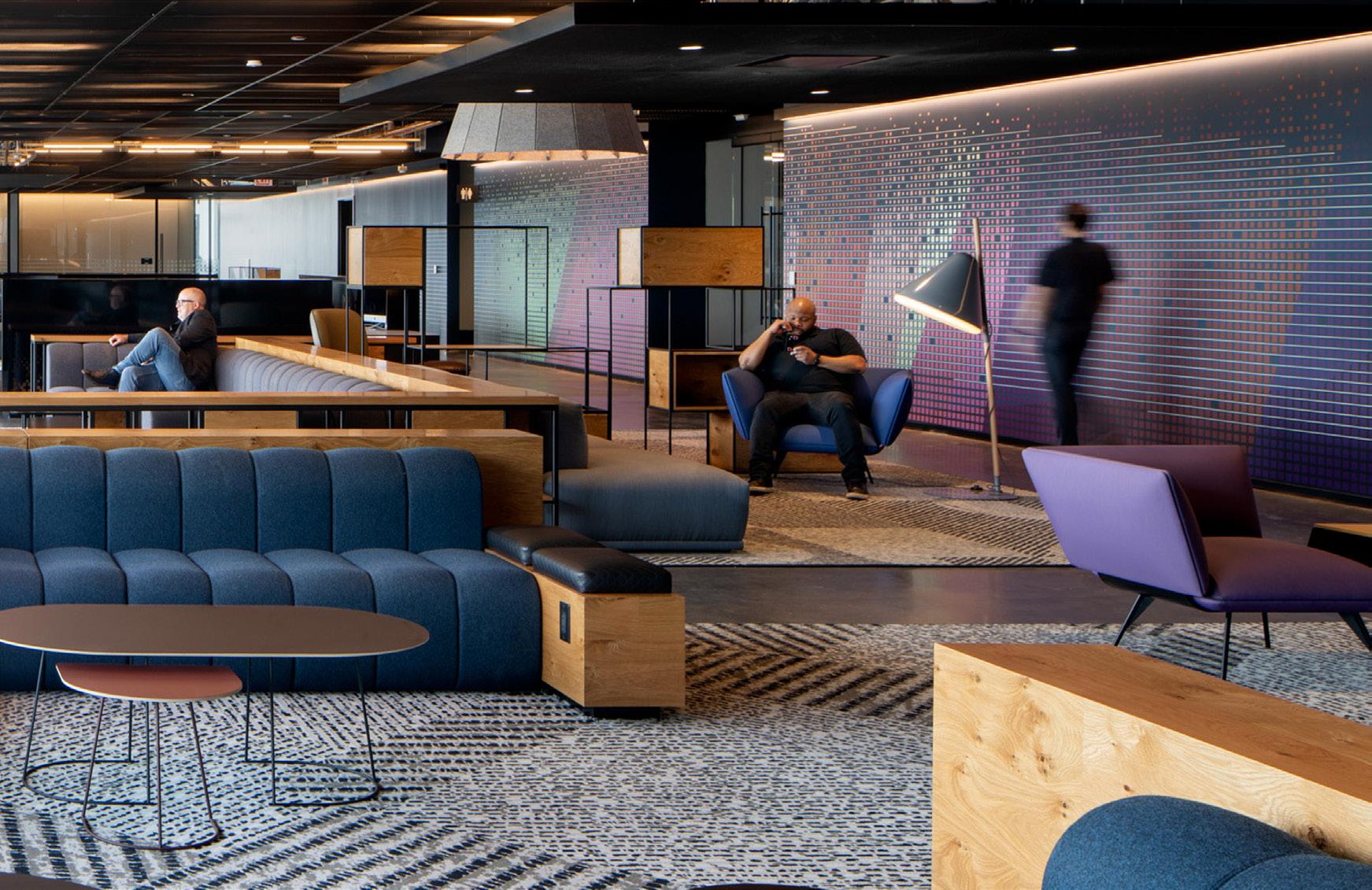
McGraw Hill Education (MHE) wanted the journey through their workspace to reflect the company’s transition to a technology company. The new dynamic office environment is 100% open plan with a uniform workstation module throughout. The office features a central Hub designed to promote casual collisions and interaction between employees of the office.
The project also served as a pilot program for a new set of global workplace guidelines; the standards are aimed to reflect MHE’s culture and mission, and to support Agile workstyles. The experiential graphics are data driven yet artistic, dynamic and transformative. At the elevator lobby, the square MHE logo is positioned next to a pixelated wallcovering that wraps the ceiling to create a wow moment upon arrival and signals MHE’s transition to tech.


Graphics, Recognition Displays, Storytelling Displays, Digital Experiences, Dimensional Installations, Wayfinding Signage, Film on Glass
Halas Hall, which serves as the Chicago Bears’ headquarters and training facility, is all about winning games. From the way the team trains, recovers and educates players, each step of the journey connects them to the Bears legacy and the goal of every season: the Superbowl trophy.
At the players’ entrance, retired numbers are incorporated with motion sensors, light, sound and video to invigorate players as they enter. A large-scale installation commemorates 100 years of Bears football with suspended acrylic rods that represent different seasons—regular, post or Superbowl. And we worked closely with the team’s archivists to carefully display and reinterpret historic memorabilia.
As part of a new 41,500 sq ft headquarters for Breakthrough, a transportation management and technology provider, EXD created branding and environmental graphics reflecting the company values, history, and culture. A custom wall made up of shipping containers reflects company culture in employees’ own words, while a green wall creates a healthy, inspring environment. Finally, a custom logo wall made up of glass bricks spotlights clients, and will be updated as Breakthrough adds clients to their pool. The new headquarters, termed the Breakthrough Collaboration Hub, will provide a flexible work environment for Breakthrough’s highly innovative and collaborative team, numbering more than 100.


Intuit engaged HOK to deliver an innovative and forward-thinking workplace in their new home in Downtown Toronto. The fourfloor project is the first integration of Intuit’s Workplace and Workforce of the Future standards, integrating leading-edge technology throughout the space.
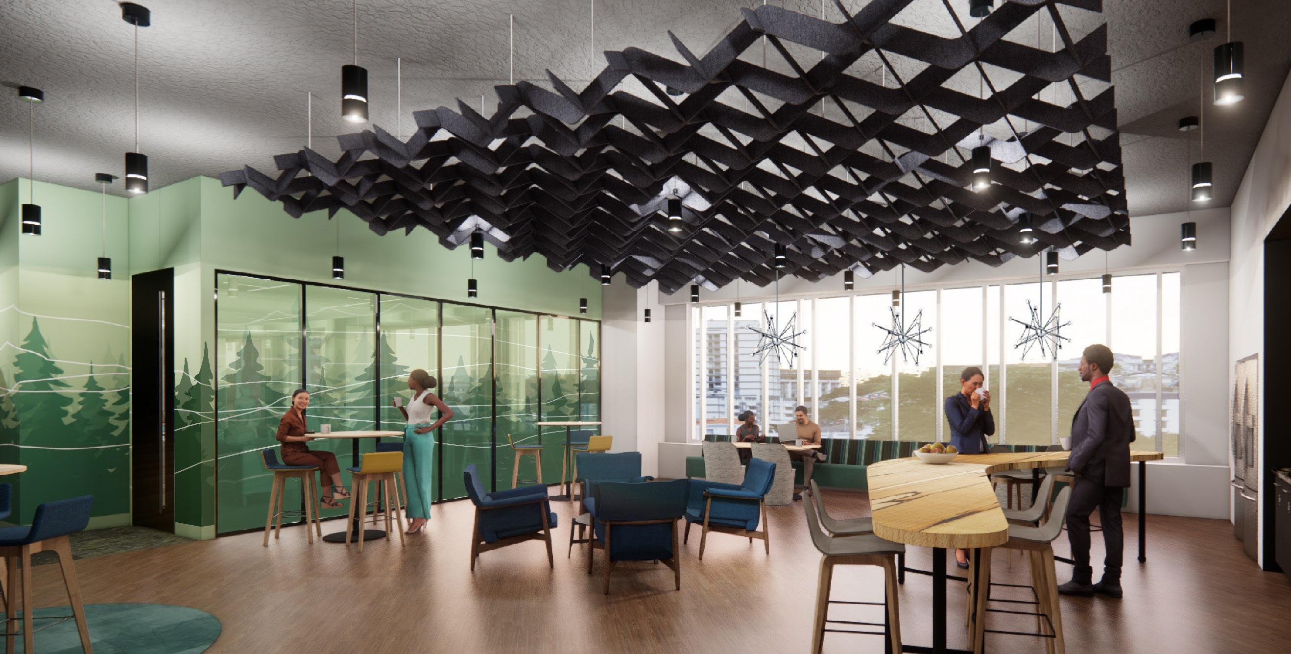
Experience Design was engaged for graphics, wayfinding, and naming on the project, inspired by Ontario’s rich cultural history and Intuit’s broad customer reach. A biophilic approach with a nod to Canada’s emblematic maple leaf was integrated throughout the project in café spaces, wellness areas, and heads down spaces. Designers collaborated with Intuit to create a ‘brand gallery’ of static and digital panels in the reception floor and throughout the workplace, telling the story of Intuit and their customers for both clients and visitors. Custom glass film draws from local Toronto landmarks and city parks, and indigenous stories are shared through custom walls and graphics at team gathering spaces.


For their brand new Global Workplace HQ, Honeywell aspired to go next level with brand implementation and immersive digital integration. The client focus on emphasizing a user experience meant to capture the breath of the entire Honeywell Global Brand and its impact on the modern world in a fully immersive space. Experience design leveraged the Honeywell brand standard to offer solutions for shared design elements throughout the space. Lobby graphics, wayfinding, logos, wallcoverings, film on glass, artwork, storytelling, object curation, custom illustration all helped define an optimal a client-facing experience that is authentically Honeywell.


HOK worked with a confidential technology company to design this development and testing facility outside of Seattle, Washington. The interior graphics and wayfinding speak to the work being done at the facility while maintaining confidentiality in spaces that might be seen by the public. Graphics incorporate sky and landscape photography from a local photographer, alluding to the work being done. A testing space is surrounded by glass film incorporating a pattern of QR codes used by the developers, maintaining privacy, and another glass film design separates public from private space.


HOK worked with Invesco, an investment management firm, on the build out of their Global Headquarters in Atlanta, Georgia. The midtown building spans six levels and combines reception, conferencing space, heads-down space, lounges and an employee cafe. Recognizing that Invesco’s brand identity is designed to be ‘digital first,’ Experience Design crafted solutions that kept the design resilient and flexible far into the future while artfully communicating the company’s core values.
Light instillations and a large custom blue glass wall grab attention as clients and customers enter the space, and connect back to the brand principles of being innovative, adaptable and fast-moving. And to embody another of Invesco’s core values of investment in the local community, the design team found an opportunity to create a biophilic wall installation in a main reception space on the top floor of the building to highlight that ethos for visitors, clients and Invesco employees. Invesco is a proud sponsor of the Atlanta Botanical Garden, and a moss wall depicting dimensional orchids pays homage to that support and the Botanical Garden’s signature orchid collection.
At Invesco’s new Atlanta Headquarters, the Experience Design team found opportunities for custom pieces that timelessly express Invesco’s vision and mission. The team crafted solutions that kept the design resilient and flexible far into the future while artfully communicating the company’s core values. At the outset of the project, Invesco expressed that one of their core values was their investment in the local community. In a main reception space on the top floor of the building, the design team found an opportunity to create a biophilic wall installation to highlight that ethos for visitors, clients and Invesco employees. Invesco is a proud sponsor of the Atlanta Botanical Garden, and a moss wall depicting dimensional orchids pays homage to that support and the Botanical Garden’s signature orchid collection.
Experience Design recognized that it was important to Invesco to not only honor the Botanical Garden and the local community through this installation, but also to invest in a fine artist to produce it. The team put together initial concepts and sketches, and then worked with Plant the Future and a local fabricator to bring the moss mural to life. The final piece honors Invesco’s
Conferencing Space - Concept 2 LEVEL 26


For their headquarters, Equinix aspired to create a productive and engaging environment that embodies their vision of “For Everyone”, “With Everything” and “Everywhere”. The concept of Interconnecting Threads represent Equinix’s belief in providing seamless connections for their customers through their business model as well as their employees in the workplace. The team created custom connection patterns and 3D graphics repeateable for each floor and used color statements to evoke this concept in the user experience, which doubles as a wayfinding device.
With the creation of a kit of parts, branding and signage for the HQ, HOK Experience Design added a valuable and missing piece to the client’s Corporate Real Estate Office Design Guidelines. The designs developed for the HQ offers solutions for shared elements such as wayfinding at the elevator lobbies, graphics for core walls and signage for their Tech Bars.

Portland, OR; New Orleans, LA; Cleveland, OH; Sacramento, CA; Las Vegas, NV; Nashville, TN; Omaha, NE
HOK worked with this confidential corporate client with offices across the US to create custom signage, wayfinding, experiential graphics, dimensional art and glass film capturing the spirit of the location and office while still reflecting the global brand.
Through an intensive and collaborative visioning process, the design team identified what employees felt was special and noteworthy about their office’s location and developed an experiential graphics program that called out those elements. In Omaha, employees called out the patchwork rolling fields of Nebraska and the city’s history as an important rail stop on the journey west; in Portland, glass film calls out the Rose City’s iconic bridges with a backdrop of the Cascades. Each office has the feel of a boutique space while still preserving a sense of brand unity.


LOCATION SERVICES
Pharmavite is a dietary supplements company best known for their Nature Made and Food State brands. The experience connects employees to Pharmavite’s line of vitamins and minerals and their “Nature Made” ethos and promotes healthy lifestyles through the incorporation of wellness and biophilia into the design.
Inspired by the pattern of mineral deposits found in the earth’s strata, the layered design motif is expressed on glass film and wallcoverings. In the atrium, the stratified design transforms into the recognizable Pharmavite bottle silhouette.
After the completion of their initial headquarters space, Pharmavite engaged Experience Design again to create a history wall celebrating the company’s story and important milestones. Designers worked closely with Pharmavite to parse through a wealth of materials in the company’s archive, editing and workshopping content to create the right narrative. The history wall consolidates several layers of information that are important to the company’s story - larger panels represent important company milestones, dimensional bottles mark important changes in the company’s brand and packaging design, and important external events that have affected the company over the years are noted throughout. The final wall, unveiled at a ceremony in the fall of 2023, was extremely well received and tells the story of Pharmavite to employees and clients.


HOK engaged in a brand master plan strategy for American Century Investments in Kansas City, Missouri. A kit of parts was developed with options ranging from universal to customizable. Themes of growth, global reach and data visualization fed into options for glass film and wall coverings throughout American Century Investments’ space.
Additionally, elevator lobby graphics were designed to activate the space using brand colors, subtle imagery and messaging that reinforces the ACI brand. Wayfinding in the form of a large number was incorporated into the wallcovering. The abstract wallcovering is inspired by the flow of data often seen in financial infographics.


HOK worked with this confidential corporate client to design their new office in Plano, Texas. The focus was on creating a design that expressed the company’s brand to clients and visitors from other offices while retaining a voice that was unique to the Plano location. The design expresses ideas of home and growth, speaking to the company’s mission and the office’s development, and the design team came up with experiential elements that were creative interpretations of the vocabulary of home. Natural wood elements and planters through the space allude to the office’s continued growth, and abstracted home elements like keys, blueprints and lumber are expressed in experiential moments, grounding visitors in the company mission.

JEFF LANCASTER
Creative Director | Experience Design
t +1 424 298 4633 jeff.lancaster@hok.com

EMILY PAYNE
Director | Experience Design
t +1 816 472 3219 emily.payne@hok.com

STEVE WILLIAMS
Director of Operations | Experience Design
+1 713 407 7879 jeff.lancaster@hok.com