

Acknowledgement of Country
The staff and students would like to show our respect and acknowledge the Bedegal People as the traditional custodians of the lands and waters of this place we now call Kensington.
We acknowledge all Aboriginal and Torres Strait Islander Elders, past and present, and emerging, and we thank them, and their communities who have shared and practised their teachings.


ARCHEX 2022: IN REAL LIFE
After two years of digital exhibitions I was thrilled we could hold this year’s UNSW Architecture Graduation Exhibition ‘in real life’! The exhibition was aptly named ‘ARCHEX 2022 IRL’; to mark that once again we were able to come together in person to celebrate the fantastic work and achievements of our graduating students.
ARCHEX 2022 IRL was open to the public from the 2nd to the 11th of November 2022 in the awardwinning heritage conversion of the decommissioned Esme Cahill nurses’ quarters, previously part of the South Sydney Hospital. ‘107 Green Square’, as it is affectionately known, is the work of Peter Stutchbury Architecture and Design 5 – Architects and was completed and launched in 2018.
ARCHEX 2022 IRL showcases student design work from the graduation years of our Bachelor’s and Master’s degrees.
The Bachelor’s studio consists of Urban and Regional-based design projects, and this year students in both streams worked on a mixed-use library complex. Even with very different locations – Westmead in suburban Sydney and the town centre of Broken Hill – the shared program made for very stimulating and productive exchanges.
The Master’s studio continued the distinctive nature of UNSW Architecture in offering four design studio streams which provide students the opportunity to build design knowledge and skills in relation to one of the following areas: Housing,
vi
WELCOME


ARCHEX 2022: IN REAL LIFE
Urban Conditions, Social Agency and High Performance Technology. The strength of this approach is clearly shown in the work, where creative design solutions are carried through to a
to all the leaders of the graduation studios, tutors, guest lecturers and presentation jurors.

I would like to thank 107 Projects for all the amazing help in staging the 2022 ARCHEX exhibition. We were very fortunate to be able to use this inspiring venue. Thanks also to the exhibition sponsors for your generous support. It is very much appreciated. A big thanks to Dr Cristina Garduño Freeman and the student volunteers who pulled the exhibition together and created such a wonderful environment in which to view the work.
Congratulations to all the graduating students of 2022. You have reason to take great pride in your work and in all you have achieved – the exhibition is clearly testimony to that. I wish you all the best in your future endeavours.
Dr Paul Hogben Discipline Director Architecture Program
WELCOME viii

x
GOLD: THANK YOU!
SPONSORS
SILVER: THANK YOU!
xii
BRONZE: THANK YOU!
SPONSORS


ARCHEX 2022: IN REAL LIFE
XIAO
ISABELLE KIM
CARSON KWONG
CHELSEA LIU
RIVKA PARIJ
DAVID RAMOS
EAMON WHITE
GABRIELLE YUDHISTIRA
CONTENTS xiv WELCOME........................................................................................vi SPONSORS .......................................................................................x OPENING NIGHT ..............................................................................1 MIXED STUDIO ..............................................................................37 LILY CHEN TAILIN GAO VANESSA JANE REGIONAL STUDIO ........................................................................51 JENNA BENSON NICHOLAS CHEAH WEN JUN FRANCES DE ASIS DANIEL FISHER RACHEL HERTZ JASMIN LOKE-JEFFERY GIULIA MARZULLI BENJAMIN SELIG
VAN VOORTHUYSEN URBAN STUDIO .............................................................................89 SU THET HAY THI AUNG
CAMACHO
CHAN
MICHAELA
DANIEL
JENNY
XUAN CHOONG
HO
MAXWELL

TAREK ABOU DIB
LAURA CIMILIO NATALIE HO
ERICA LEONG
TSANG SHING LI
CHLOE ANDREWS
JESSICA BRAID
FLYNN FIELDING
NATHALIE TUN-BARRETO
TYLA VENISH
WATSON
CALEB BURKE
YAZHISAI EZHILMARAN
WEN LI
HNIN WINT KHINE
NICOLE SAMUDERA
JESSIE XI YANG
SOFIA YIN
LACON ZHANG
ZHONG GUAN URBAN
ASHRITH BHARADWAJ
UNJELIQUE HAJJAR
YEJIN KIM
ANASTHASIA KODHYAT
TIMOTHY LAU
TSANG SHING LI
CLAIRE OH
MILAN PANCHAL
CHRISTY TANG
WAYNE WANG EXHIBITION
CONTENTS
HIGH-PERFORMANCE TECHNOLOGY STUDIO...........................141
xvi
GRACE MCILROY HOUSING STUDIO ........................................................................167
HADEEL ALRAHMANI
AGENCY STUDIO ...........................................................201
JESSICA
HO HEI ALEX WONG SOCIAL
CONDITIONS STUDIO ....................................................239
......................................................................277
TEAM
ARCHEX 2022: IN REAL LIFE


CELEBRATING!
OPENING NIGHT
In the middle of 2022, the prospect of being able to meet up, connect, and celebrate our graduating students without the was very welcome.
Program Director Paul Hogben and I considered how to make the exhibition a reality as we scouted venues with availability (not many), planned installation logistics (transporting models from UNSW), organised fast turn-around print production (thank you to Cloud Print Group), and completed our COVID risk plans (thankyou Trish Danzey). Eventually, we met Jess Cook, CEO and founder of 107 Projects, and it all fell into place.
Jess was a long-term UNSW collaborator introduced to us by Professor David Sanderson. 107 Projects is an independent that manages and curates inclusive and inspiring places in inner Sydney for creative thinkers to thrive. Jess offered to host the exhibition at the Joynton Avenue Creative Centre aka ‘107 Green Square’ - the awardwinning 2018 heritage conversion of the decommissioned South Sydney Hospital Esme Cahill nurses’ quarters.
Our very own Dr John Gamble spent time there as a child while visiting his older sisters who were training to be nurses!
1

CELEBRATING!
OPENING NIGHT
Convening ARCHEX is always rewarding. I enjoy working with passionate and dedicated students from our architecture programmes. And organising the exhibition is also an chance to engage with our communities and profession.
‘107 Green Square’ is managed by Josie Stomann. We'd like to thank her for her help. She supported our tight deadlines and connected us with social catering company Plate it Forward and chef Shaun Christie-David (it was delicious!). We were also assisted by the UNSW Design Futures Lab maker team (Nichola Jephcott, Richard Blackwell and Gabriel Undery) who trimmed our panel system and provided advice on, and the rigging of our LED light and sketch installation in the stairwell.
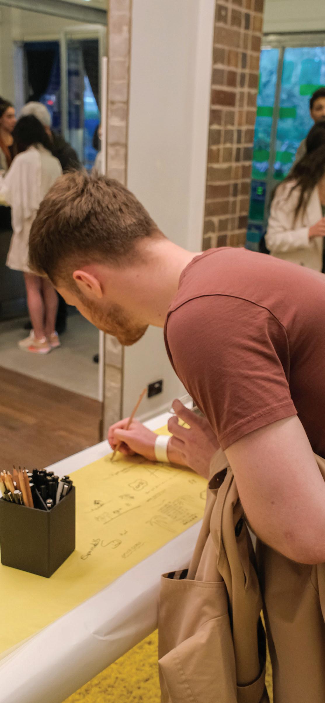
On the 3rd of November 2022 the exhibition team arrived early in the morning to transform 107 Green Square into ARCHEX 2022 IRL. 400 guests were due to arrive for the Opening Night at 5:30 pm. that same day
Kudos goes to our student team – yep that’s you, Unjelique, Tracey, Tailin, Peter, Jacob, Max, Ashrith, Chelsea, Ahine, Caleb, Jasmin,
Su Thet, Louyao, Yazhisai and Milan for the way you tackled a challenging single day installation and enjoyed worked together.
Thanks also to Alvin Zhu, who captured all the ups and downs of the installation and the experiences of our students for our documentary. And to my family (Nick and Izel), who pitched in to help me on the day.


CELEBRATING!
OPENING NIGHT
The adaptive reuse of the Esme Cahill building is the work of Peter Stutchbury Architecture and Design 5 – Architects. They created a three-storey community centre, to provide affordable work spaces for small creative enterprises as part of a commission by the City of Sydney. The heritage conversion of the nurses' quarters includes the addition of a new vaulted verandah structure that signals the courtyard as a welcoming public space, adjacent to a public green lawn, creating a human scale space that acts like a common for the surrounding medium-density residential development.
The exhibition would not have come together without such a fantastic venue and without everyone’s cooperation and enthusiasm on the day.
The energy encapsulated the in-person collaboration our student body had missed over the previous years, and by dusk the crowd was celebrating! With the ideas of the next generation of architects on display in a beautifully restored heritage building, accompanied by music, drinks and grazing tables, all were reminded of the joy such events bring.
5

OPENING NIGHT
The speeches kicked off with an Acknowledgement of Country by Jess Cook: “Warrama…warrama means welcome in Gadigal tongue”
107 Projects have an ongoing commitment to First Nations peoples and to recognising our interconnectedness with Country. As the profession explores new ways to integrate indigenous knowledge, it was a critical reminder about respectful practise. Jess also noted that “buildings without people are just empty spaces” and thanked the crowd and installation team for “activating every nook and cranny” and “giving this building its heartbeat”.
Our keynote was Alan Croker from Design 5 – Architects. A UNSW graduate, Alan began his studies in 1969 and is now an esteemed professional, both in architecture
combination of “the extraordinary teachers” and his “own passion for what was being taught” that shaped the direction and focus of his career. He described the
sturdy brick nurses’ quarters, with its cellular structure, into an open and friendly creative community centre and events space.
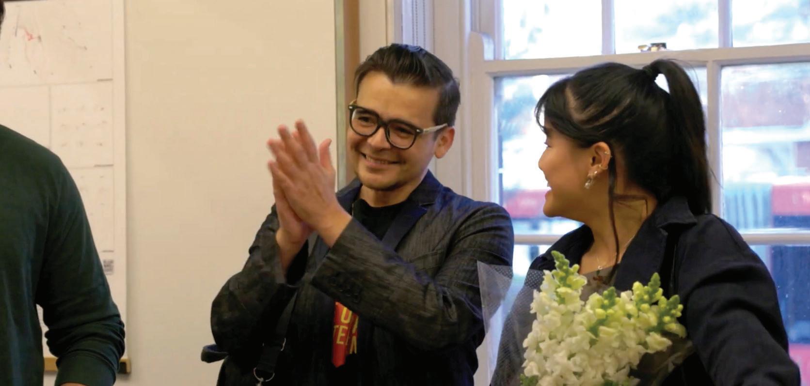
It was the role of Program Director Paul Hogben to warmly congratulate our graduands (both present and overseas) for reaching the end of a long and intense period of study under
acknowledged the support from the parents, partners, families and friends who were part of their journey.
7
CELEBRATING!


OPENING NIGHT
We then heard from each of our graduating cohorts, beginning with John Gamble, the convenor of the Bachelor of Architectural Studies who introduced our esteemed Professors of Practice, Philip Thalis, of Hill Thalis Architecture + Urban Projects and Rachel Neeson of Neeson Murcutt + Neille
Philip is a well-known advocate for the importance of public domain design, social housing and contextually-responsive architecture. He was, in fact, one of my own teachers – and although at the time I did not fully appreciate the extent of what we were learning, I now recognise that sourcing maps and plans from the NSW State Library taught me the value of urban history and its entanglement with politics, culture and progress.
Speaking of Barangaroo, Philip discussed the breadth of knowledge embedded in the practice of architecture: “soil mechanics, engineering, philosophy, anthropology, [architecture] addresses the needs of the population by selecting the forms and the spatial relationships of all future construction in ways that can be public ... we need to speak to connect with society, with the public, to show them through our work and through our advocacy the value of architecture.”
Then Rachel Neeson, a highly regarded architect, addressed the crowd. She spoke of the happiness and relief our cohort was feeling after completing the foundation of their architectural education. Rachel understands the importance of experience, having recently led the award-
9
CELEBRATING!


CELEBRATING!
OPENING NIGHT
winning transformation of the Australian Museum in collaboration with Cox Architecture. She offered advice as graduands enter a transition: “a time to build upon these foundations through the unmediated experience of places, buildings and landscapes, connecting through real life felt experience like we have tonight in this fantastic building.”
UNSW is fortunate to have senior practitioners work with our projects, and each stream creates connections between senior practitioners and the future of the profession around a mutual area of interest. Teaching at UNSW is a relational activity where knowledge is not just shared but exchanged, and Shaowen Wang, convenor of the Master of Architecture Graduation Studios,
along with each of the studio stream leaders and tutors, offered their thoughts about the year just passed.
The High Performance Technology studio was led this year by two notable practitioners; Jonathan Evans, a registered architect, and principal and founder of Arbor.tect, and Dijana Tasevska, Associate Director, of CHROFI. Both Jonathan and Dijana bring knowledge and experience in the design and construction of large-scale commercial buildings utilising pre-fabricated mass timber technology.
11


OPENING NIGHT
This year’s Housing studio was run by a formidable team of practitioners from COX, one of Australia’s leading architectural practices. Led by Joe Agius and Ramin Jahromi, the studio was supported by Felipe Miranda, Vicente Castro, Helen Kuo and Cristian Rojas. Joe is a UNSW graduate and past President of the NSW Chapter of the AIA. Like Joe, Ramin plays an active role in connecting COX’s Sydney studio with NSW tertiary institutions through the organisation of scholarships, tutoring and guest critic roles.
The Social Agency studio was again led by UNSW Professor David Sanderson, the inaugural Judith Neilson Chair in Architecture. Working with Mark Szczerbicki, a registered architect and founder of boutique practice MSDS, David brings
a wealth of expertise from decades of work within the nongovernment organisation sector across policy, development and emergency programs. A key feature of the Social Agency Studio is the opportunity to work sector, including 107 Projects, to encourage students to develop skills in community engagement and participatory practice.
The Urban Conditions studio was run by UNSW staff members Shaowen Wang and Rafaelle Pernice. Both Shaowen and Rafaelle are experienced architectural design educators who share a passion for urbanism and architecture with a focus on the impact of climate change on waterfront cities in Japan and the
13
CELEBRATING!


OPENING NIGHT
the studio leaders “infused their briefs and teaching to encourage students to do their best … and broaden their minds” and that the synergy of the graduating cohort is the outcome of many contributions and investments; from staff, students, from studio leaders, from our guests and collaborating organisations and from our sponsors.

I couldn’t agree more.
Dr Cristina Garduño Freeman Convenor ARCHEX 2022 IRL
15
CELEBRATING!







UNDERGRADUATE
BACHELOR OF ARCHITECTURAL STUDIES
35

37
BACHELOR OF ARCHITECTURAL STUDIES COURSE CONVENOR
DR JOHN GAMBLE
STUDIO TUTORS
PETER CHIVERS • CHRISTOPHER COLE
JOHN DIMOPOULOS • CATHERINE LOVE
SARA PEARSON • LACHLAN SEEGERS • JANE THRELFALL
MIXED STUDIO
The studio project required the design of three small dwellings and a kiosk on a lot in Georgina Street, Newtown, adjacent to Hollis Park. The main design task was to develop an architectural proposal that provided the inhabitants with high levels of environmental control by making available a wide range of options across three kinds of human situations – social interactions and separations, activities, and thermal experiences – and that was a positive contribution to the life and built fabric of the site. Three characteristics of the site were studied: topography, the urban fabric and climate. Precedent studies of multi-unit housing projects were a major part of the design investigation.
Seven sets of spatial relationships critical in providing multi-unit housing inhabitants with control over their environments provided
a framework for the investigation of the human situations, the site and the precedents, and for the students’ design developments: the distribution of the major types of spaces of social control – public, communal, household, individual; the distribution of these space types in relation to the larger urban fabric; the distribution of these space types in relation to the topography of the site; the distribution of the space types, the urban fabric and the topography in relation to the sun and prevailing winds; the location of pedestrian and vehicular movements within and between the space types and the site; the opening and closing of the boundaries within and between the space types and the site; the open and closed relationships between shared and individually controlled spaces with each dwelling, and their relationships with the other space types.
NEWTOWN: A MULTI-UNIT HOUSING PROJECT


LILY CHEN 4 0



DESIGN PRINCIPLES & SITE SKETCHES KEY IDEAS PLANS MIXED-USE
We Depend on Connection

Human beings have an innate instinct to seek connections with the natural world, and Hollis Park in Newtown is a space that greatly enables opportunities for such interactions. With the whimsical urban sanctuary serving as a backdrop to the collection of dwellings, moments of respite were strewn throughout, in the form of natural spaces. These provide outlook, guide circulation, and enliven social activities in a manner that mimics the experience of the park itself.
Each dwelling sits at a different level to ensure privacy. These slope to meet at the centre of the site, where a kiosk and public space are further integrated through a community garden and seating area. In weaving both private and public open spaces throughout the dwellings, nature becomes a constant experience. The sight of fallen leaves gliding through the water, the sound of birds calling from above – these are scenes that recall the ‘essence’ of Hollis Park.
42
Essence LILY C HEN EMAIL: mail.comlily.chen12321@g INSTAGRAM: @arch lc LINKEDIN: 7451a2www.linkedin.com/in/lily-chen-aa1


IMAGE CAPTION


TAILIN GAO 4 4


SITE ANALYSIS LEVEL 1 PLAN GROUND PLAN MIXED-USE
Hills to the Horizon
A View Towards the Horizon.
The concept is premised on Hollis Park as a ‘valley’, with all the surrounding buildings turning inwards to create a strong sense of community. The project lots are designed as ‘hills’ to offer a place with a focus towards the horizon and the vast exterior space of the sky.
The brief required the design of three small dwellings and a kiosk on the lot located at 53 and 55 Georgina Street, Newtown. The main design task is to develop an architectural proposal that will support as fully as possible the inhabitants in living well in their interactions with one another and with the physical environment of this particular place.

46
G A O EMAIL: mail.comgaotln7@g INSTAGRAM: @tln.gh
TAILIN


VANESSA JANE 4 8


TOP: SECTION AA BOTTOM: GROUND FLOOR PLAN PERSPECTIVE SKETCHES CONSTRUCTION SKETCHES MIXED-USE
Drawing on Japanese Culture


Shi Bui House, a Japanese word loosely translated to a particular aesthetic of simple, subtle and unobtrusive beauty, is a multiresidential plot that provides for three separate dwellings and a shared courtyard. Formed through a central perimeter pattern, Shi Bui House subtly encourages social interaction between neighbours that builds relationships and support systems, to decrease isolation and individuality.
Despite the abundance in social interaction, occupants inside the house will still maintain their privacy. This is provided through all the greenery (trees and plants) strategically placed in front of glazing that faces more public areas. This is done to allow sunlight to penetrate into the dwellings whilst still providing privacy. Greenery is also subtle, unobtrusive and will enhance the exterior and interior experience of occupants.
The timber structure of the dwellings further emphasises the lightness and unobtrusive aspect of the dwellings. It creates contrast against the ornamental terrace houses on the site. Timber also provides for better insulation allowing occupants to have more control over their spaces.
50
VANE SS A J ANE Shi
EMAIL: mail.comvanessajane.id@g INSTAGRAM: sa_jane@vanes
Bui House
51
BACHELOR OF ARCHITECTURAL STUDIES COURSE CONVENOR
DR JOHN GAMBLE
STUDIO LEADER (REGIONAL) PROFESSOR OF PRACTICE
RACHEL NEESON
STUDIO TUTORS
DAVID OSTINGA • BRENDAN RANDLES
REGIONAL STUDIO
Broken Hill has starred in the movies Mad Max and Adventures of Priscilla, Queen on the Desert This isolated place, set in the arid rural landscape of far western NSW, has a ‘perfect light’ that
photographers and artists.
This regional city thrived in its mining heyday. Now, Broken Hill is a little quieter; like many cities, large shopping centres on the periphery have pulled life from the city centre. It is a place of extreme heat and cold, frequent strong winds, dust storms, blinding rain and searing sunshine. With high lead levels because of its mining heritage, architecture’s role is conditions.
This studio asks: how can we sustain the urban communities in regional cities?
Students were tasked with designing a new library to be the cornerstone of Broken Hill’s rejuvenation. This typology is fundamentally collective. Libraries have evolved from archives of knowledge to urban living rooms catering to community diversity. Libraries are strategic urban assets that are powerful activators of the public realm. Students learnt to ‘read’ place through its layers, looking for enigmatic relationships between elements – topography and
levels, climate and wall thickness, dust, and landscape to produce architecture that is a response to the city of Broken Hill.
BROKEN HILL: LIBRARY


y JENNA BENSON 5 4


Ridge Fin Wood furring strips Gypsum board Cavity Plywood Kolumba Brick Cladding Horizontal wood furring strips Skylight MDF board Brick Wall painted with liquid Asphalt Hard wall Plaster Bottom Plate Levelling screed with backing Stone Frameless Glass Door Cavity Orientated Strand Board OSB Timber top plate Fabric Mesh Shell DETAILED SECTION REGIONAL
T he Civic Library J ENNA BEN SO N
Civic Engagement
The Civic Library encourages social engagement, activates spaces of refuge and encourages gestural and diffused light. The library’s spatial organisation is dictated through a structural grid, inheriting an existing internal skin and creating recreational opportunities for all demographics. Furthermore, the consistency in size and height maintains the urban civic importance.
EMAIL: mail.comjenna.benson.au@g
INSTAGRAM: son.arch@jenna.ben
LINKEDIN: 851211www.linkedin.com/in/jenna-benson-35b

56


CHEAH WEN JUN 5 8 c NICHOLAS


ARCHITECTURAL DRAWINGS REGIONAL
Centralizing Broken Hill

Centralising Broken Hill is designed as a central courtyard serving as a focal node within a library that serves as a connection point
celebration of the importance of ‘land’ from its context, including its indigenous and mining history. With the central courtyard as a main point of connection through a spine, the library breaks down into three main blocks.
of the library follows the existing typologies at Broken Hill, tying the three blocks together as a cohesive whole. Constructed out of rammed earth, a timber frame double skin and a corrugated iron roof, materiality grounds the library to its site, deep and connected.
60
HEAH WEN JU N
C
C HEAH WEN JU N c NICHOLAS EMAIL: mail.comcheah.nicholas97@g LINKEDIN: 312100/www.linkedin.com/in/nicholas-cheah-424


FRANCES DE ASIS 6 2






REGIONAL
Diversity from any Direction


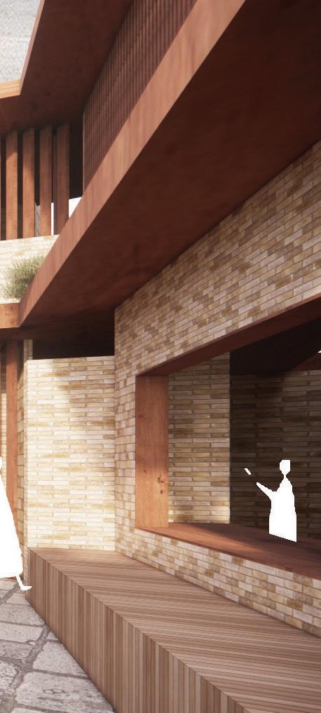
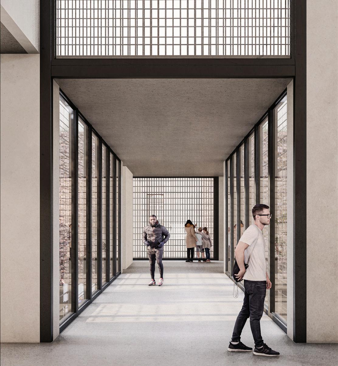
The Avenue invites diversity from any direction, via the central walkway connecting Blende Street and Argent Street. A smoothly paved connection ensures everyone, of all levels of mobility, feels welcomed.
The Wilyakali Keeping Place sits at the forefront of the design: acknowledging their importance to the community. The central walkway assists in granting this room its stature by guiding the eye of the visitor towards it’s bold red and rounded walls, which contrast the rest of the building. The walkway is also essential for leading people to the different experiences of the design, transitioning from wide open spaces that are exposed to the elements, to protected interior rooms, and to spaces which lay between interior and exterior, simultaneously providing shelter and connection to the natural environment.
Each of these is critical for providing users with the ability to choose and select spaces that accommodate their personal wants and needs.
64
T he Avenue FRAN C E S DE A S I S EMAIL: mail.comfrancesjd03@g


DANIEL FISHER 6 6


REGIONAL
Knowledge = Discovery
Few remember the late Town Hall, but the earth still attests to its presence. Once a place of governance, now it is reimagined as a public square, a symbol of the people.
Knowing requires ignorance and leads to the discovery of only more ignorance.
disoriented internal space, a grid inverted by 45 degrees. Windows hide the orientation to highlight clarity - apertures frame exterior reference points. It is a subterranean experience mirroring the context of Broken Hill.
A library is a place of community and knowledge – summarily a library is culture and should function to facilitate and embody shared knowledge and memory. The formal characteristics of the proposal identify it as a public building – a keep to retreat to when the elements are beating down.
68
KNOWING EMAIL: LINKEDIN: WEBSITE:
DANIEL FI S HER


7 0
RACHEL HERTZ


GROUND PLAN STORIES LONG SECTION REGIONAL
Songlines

This concept is inspired by the Indigenous technique of using songlines to remember and pass on knowledge and stories. Songlines are navigational tracks that link position and stories within the landscape. These tracks ground and embed memories and knowledge within the landscape.
Using the concept of songlines, I chose to have the central courtyard as the focal point of the design. The different elevations of the building all have windows that frame moments looking into the courtyard. The only exterior windows are ones that have been strategically positioned to frame the courtyard or to look out onto vistas that were chosen as focal points along the songline. The additional points I wanted to focus on are the load line and the Telstra tower.
As well as using vistas to emphasis focal points, I also have chosen to activate courtyards that have been created by the form. One of the courtyards in the northeast yard on the site is activated to become an art space where local indigenous artists can create exhibitions and installations as well as inviting an artist to redo the artwork painted along the west façade of the existing library.
72
RA C HEL HERTZ EMAIL: mail.comrachel.a.hertz@g INSTAGRAM: _design @rachel hertz LINKEDIN: a57135www.linkedin.com/in/rachel-hertz-659
SONGLINES


JASMIN LOKEJEFFERY 7 4


FIRST FLOOR SECOND FLOOR EXTERIOR GROUND FLOOR REGIONAL
Connect and Learn!

The proposal for the New Broken Hill Library focuses on the idea of connecting and learning. The new library is designed as a civic, communal and social hub for the local community. Located within the rich landscape of Broken Hill and situated within the centre of the site, the library is accessible, either by foot or vehicle, from the north-west, south-east and south-west.
The structure comprises of a series of stacked circular forms which have been divided between public and private. The forms
symbol of a meeting place has been reimagined as an organic form and spiral circulation path that travels through the building, inviting the user on a journey as they ascend higher into the library. The idea of the library as a physical meeting place is intrinsic to its function as a place to ‘connect and learn’. Connection is further represented through location and structure. The new form connects to the old Charles Rasp Library which houses the library archives and services, whilst the main circular form encircles an existing tree, creating a physical and visible connection to nature that can be seen throughout the library.

76
DIGITAL MODE L T he New Library J A S MIN EMAIL: ook.comjasminlj@outlo INSTAGRAM: 111111j@j11111111 LINKEDIN: ejeffery/www.linkedin.com/in/jasminloke LOKE
JEFFERY


GIULIA MARZULLI 7 8




DESIGN PRINCIPLES GROUND PLAN SITE PLAN UPPER PLAN DETAIL SECTION 01 DETAIL SECTION 02 LEFT: SECTION RIGHT: ELEVATION REGIONAL
Place, Identity, Form Material.

In drawing upon the rich mining history of Broken Hill, this library project aims to speak to the identity of the place and its people through form and materiality. The repetitive language of the bays create a repetition that runs along the site. This gabled, shed-like form evokes a sense of industry and production. Local steel used in the cladding and structure speaks to the identity of Broken Hill as a mining town and also results in local employment opportunities in the construction of this civic building. The portal frame structure is easy to assemble off-site and deliver, which suits the regional nature of the town.
Contrasting the regular, structured repetition of the exterior are the sweeping curves of the interior, which assist in diffusing light to create a comfortable atmosphere. Service spaces have been offset from the main volumes to allow for the organisation of interior spaces to be read from the outside, and also develops a hierarchy of spaces – with the more important ones at the forefront.
80
RHYTHM G I U LIA MARZ U LLI EMAIL: mail.comg.marzulli13@g INSTAGRAM: ulli.arch@g.marz LINKEDIN: 99a225www.linkedin.com/in/giulia-marzulli-337



BEN SELIG 8 2

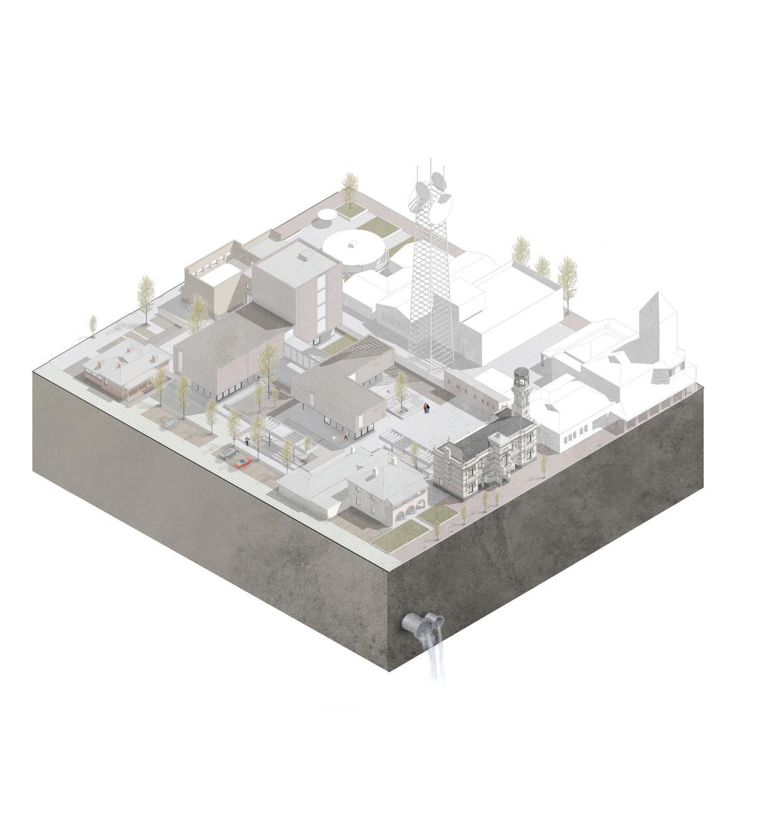


AXONOMETRIC DESIGN PRINCIPLES REGIONAL
Reference to Green Square...
This design proposal aims to diversify the site into more than just a library as outlined by the brief. The strategy developed to meet this criterion is derived from the Green Square Library which generated a public ‘precinct’ by pushing the library space below. However, to shield the ground plane from the harsh Broken Hill
The ground plane’s squares and courtyards are activated by the café, gallery, exhibition space, amphitheatre, stage and visitor
safety, while framing the major passages of circulation between Blende and Argent Streets. The library is located on the gabionvertical circulation core to shade a large portion of the site.
EMAIL: mail.com b d.selig@g
INSTAGRAM: itecture@selig_arch
LINKEDIN: 672193/www.linkedin.com/in/benjamin-selig-596
WEBSITE: io.com/benjaminselig.myportfol

84
T he
Precinct BEN S ELI G


MICHAELA VAN V OO RTH U Y S EN 8 6


LEVEL 1 PLAN GROUND PLAN DESIGN DIAGRAMS REGIONAL
Welcoming Architecture


The library is sited inside an enclosing perimeter. Access to the site is provided by intimate passages, as one has to pass through the surrounding civic buildings. Entry to the site can be provided from Blende Street, Argent Street and a smaller side street on the west. The building form is designed so that ‘arms’ greet all directions of the site.
The structural system of the building makes up the internal organisation. Structural columns are offset from the building perimeter, circulation runs between these elements. The central spine of the building acts as the main circulation pathway and gathering areas. The arms that connect to the spine house the designated room programs. Internal spaces are largely open plan,
inside the library are located at the northern and southern end to activate the civic space to invite passersby in.
88 V OO RTH U Y S EN
DIGITAL MODE L Shelter MI C HAELA VAN EMAIL: w.edu.auz5264710@ad.uns LINKEDIN: com/in/www.linkedin. 626207/michaela-van-voorthuysen-098
89
BACHELOR OF ARCHITECTURAL STUDIES COURSE CONVENOR DR JOHN GAMBLE
STUDIO LEADER (URBAN) PROFESSOR OF PRACTICE
PHILIP THALIS
STUDIO TUTORS
CALLUM COOMBE • PETER FARMAN • JONATHON KIBBLE VICTORIA KING • ANGELO KORSANOS • TARA SYDNEY
URBAN STUDIO
Libraries today are popular. Government of all levels and public institutions are building and expanding libraries as important social spaces and civic places. In particular, local libraries are experiencing a resurgence. Libraries are now conceived as more than just places of books and are grouped with other complementary uses to stimulate and serve the community.
This project aims to transform a typical suburban centre by the addition of a grouping of public facilities and new public open spaces. In so doing the project will enrich the architectural character, public domain and cultural life of Westmead, the wider Parramatta/ Cumberland council area and the city as a whole.
Located on Hawkesbury Road,
diagonally across from the Westmead Train Station, the new library complex would comprise a community library, a 250-seat theatrette, exhibition space and new public open space(s). A work of art also needed to be chosen and placed in the library complex.
Students were encouraged to attend a range of public libraries to observe their usage and inspire their thoughts.
WESTMEAD: A NEW LIBRARY COMPLEX AND PUBLIC SPACE


SU THET HAY THI AUNG 9 2


WIREFRAME VIEWS LEFT: KEY MOVES & PLANS RIGHT: MASSING MODEL URBAN U
Individual Ways of Learning
an exhibition space for giant animal sculptures. The large sunken public space is positioned at the corner of the two junctions, while public space.
A curved glazed façade maximises visual connectivity and allows to maximise shading as well as to act as a second skin wrapped around the internal fragile glazed skin. The consistent use of timber columns and beams is seen throughout to soften the internal spaces and match the external second skin façade.
The main idea of Choice is to give visitors control in allowing them to choose between three different settings of learning (auditory, visual and kinesthetics). This is done by zoning the requirements different bands of learning spaces.
EMAIL: mail.comsuthet.aung562@g
INSTAGRAM: uthet.sc@s
LINKEDIN: scarlett/www.linkedin.com/in/su-thet-hay-thi-aung-

94
CHOICE SU THET HAY THI
AUNG


DANIEL CAMACHO 9 6

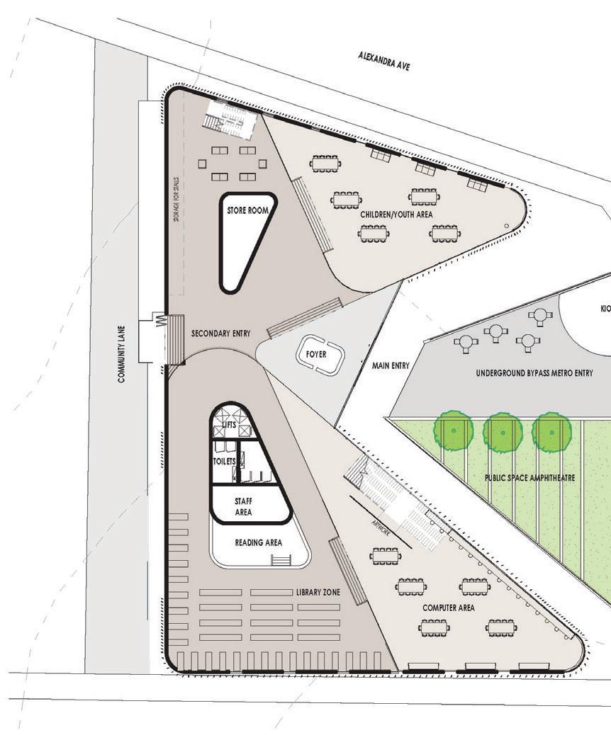


URBAN U
Interconnection for Connection

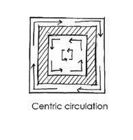
Two opposing building wings joined in the centre to create a nucleus core where people are focused and drawn to. The activity of this core allows for surrounding spaces of the building to become personal spaces and platforms to look out onto surrounding views.
EMAIL: mail.comdaniel.camacho11@hot
LINKEDIN: amachowww.linkedin.com/in/d-c
WEBSITE: /mysitedancamacho1197.wixsite.com

98
SLIDESHARE DANIEL C AMA C H O Platform
Nucleus


Ahhiblihdill JENNY CHAN 1 0 0


1exhibition hall 1 2exhibition foyer 3 ‘Colours are the country’ - Nike Savvas 4entry/control 5community 6computer lab/copy 7local history 8 cafe 9storage 10theatrette foyer ground floor b c 1 2 3 4 5 6 7 8 10 9 1:250 @ a1 east elevation 0 10m 1:250 @ a1 noise disturbances along transport nodes entrance sited via pedestrian circulation building levels respond to orientation URBAN U
In the heart of Westmead a hidden courtyard is nestled in a public library. Granite walls protect the contemplative space from urban noise. Passersby are beckoned into the internal courtyard by an overhanging roof that curves up through the library. The curved roof responds to the orientation of the site, as well as its topography, allowing solar access into the welcoming courtyard. The white ribbon roof appears weightless, seeming to hover above the building on glazed facades, curving through the levels and uniting the building. White steel columns slant outwards to provide shade whilst maintaining the character of a defensive and introverted building. A strong rhythm is established, particularly in the main east façade. Expansive views out to the surrounding streets are facilitated by a glazed cut through the façade which follows the ascension of circulation. As you make your way along the edges of the library, you eventually arrive at your destination: the grand reading room where you are surrounded by knowledge lit from above.


102
Haven Ahhiblihdillihi J ENNY C HAN EMAIL: mail.comjenny.h.chan@g LINKEDIN: a76246www.linkedin.com/in/jenny-chan-272

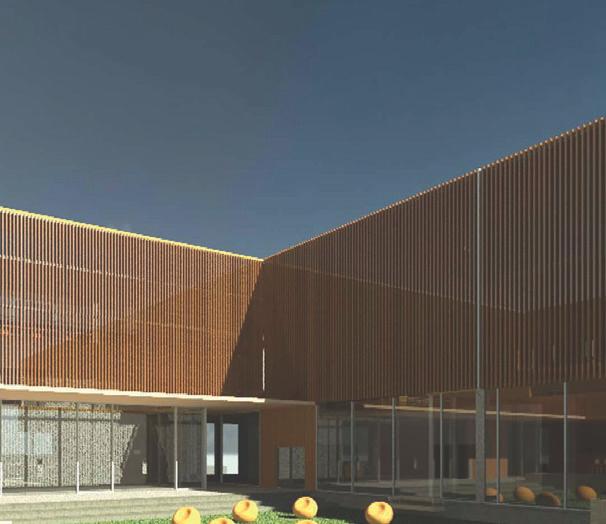


XIAO XUAN CHOONG 1 0 4


URBAN U
Centre-Perimeter
The building follows a centre-perimeter pattern with blocks and landscape as boundaries that surround a central courtyard and open to the main road (Alexandra Avenue), embracing the desirable northern wind to create a sense of arrival. The porosity of the building form is introduced by the large openings. Playing with the level of openness between inside and outside, it maximises natural daylighting and provides a comfortable place for the community to use.

106
XIA O X U AN C H OO N G COURTYARD EMAIL: mail.comxiaoxuan0899@g INSTAGRAM: 8____xx@i0


MAXWELL HO p 1 0 8

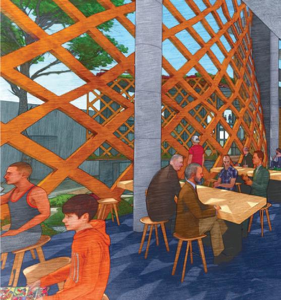


LEFT TOP: PLAN LEFT BOTTOM: SECTION RIGHT: EXPLODED AXONOMETRIC URBAN U
Optimisation


The design focused primarily on activating the north-east corner of this site in Westmead.
To achieve this, a large public space is located here, cornered by building masses. The organic form of the building masses, as well as the public space, encourage the public to enter the library,
buildings to the north of the site on the other side of the train station will be commercial. Meanwhile areas to the west and south will become dense residential areas. To the east is the development of the new transport hub. To facilitate this change, the design focused on highlighting a hallway between commercial up north and residential down south. The entrance to the theatre and library is combined. As a typical function of a library is to study and socialise, experiences are focused around a ground around this garden. The voids, combined with the roof, enhance the scale and size of the garden. The exhibition connects to the library on the upper levels, to allow for circulation.
110
MAXWELL H O Spaces between
EMAIL: mail.comarchimax2022@g INSTAGRAM: max2022@archi
Heartbeats


ISABELLE KIM Thlibilld 1 1 2


URBAN U
Imagined Worlds

In Between Stories, Walls and Dreams is about the amalgamation of erudition and community: through permeability and enclosure; asking what it is to belong to imagined worlds, the city and each other. The library becomes a place for people across diverse cultural and social expressions to gather, share, work and hope.
The programs are divided into two bodies, the larger main library with the smaller theatrette and exhibition, differentiated in appearance by their function. The library’s permeable, doubleskin facade, guides users to circulate around its perimeter and oscillate between books and the city. The theatre/exhibition building has an opaque, double-skin facade, focusing on internal spaces that enhance the arts within. Circulation spirals inwards, with air pockets that oversee the gardens.
The library is no longer an enclosed space as we oscillate and connect between imagined worlds to the real one we live in, characters in our own stories.
114
I S ABELLE KIM In Between Thlibilld EMAIL: mail.comisabellekimhome@g INSTAGRAM: llee.kim@isabe


CARSON KWONG g Thhblkiidbildih 1 1 6


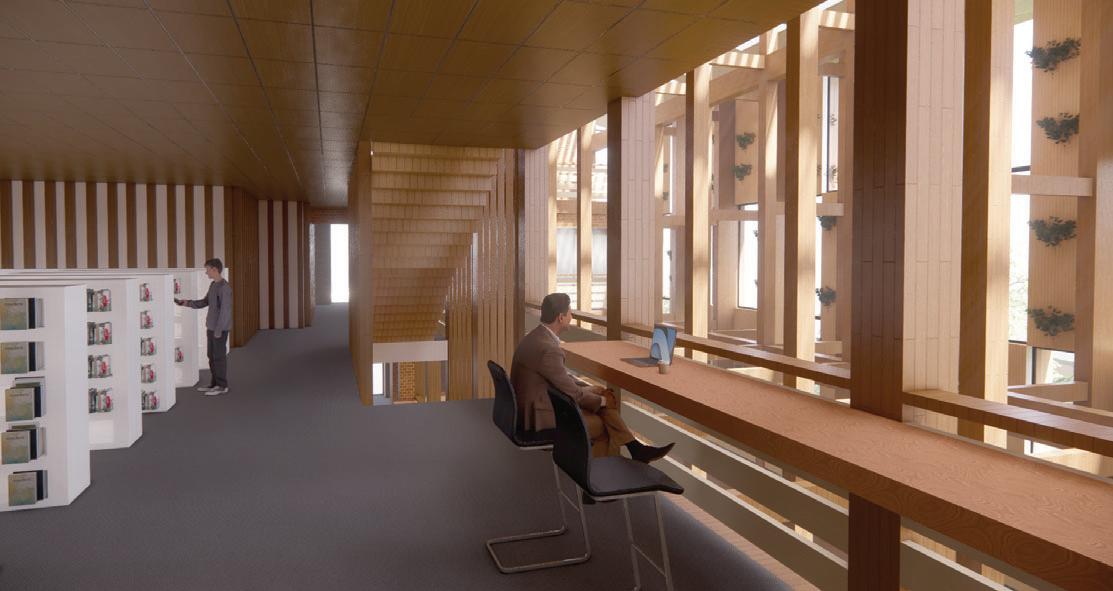

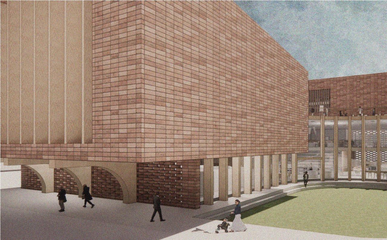
Timber Cloistered Facade Brick Library Stack Hybrid Lobby Hybrid Exhibition/ Theatre Block URBAN U
Green Growth

Verdant Visage is a response to the rapid development of Westmead and Parramatta by means of visual connection supplemented with natural elements that extend the green corridor between the two growing urban hubs.
by a lush courtyard. This orientation enables prospect refuge towards Westmead and Parramatta, whereas the central courtyard functions as a key public space for the community. The role of the central courtyard is further accentuated by a series of colonnades encapsulating the perimeter of the court.
sloped terrain of the site, while also engendering a sense of revelation as users gradually ascend the building to connect with Parramatta in the distance. The library block is four-stories with an atrium adjacent to the central courtyard which spatially connects the interior and exterior of the building.
118
C AR SO N KW O N G V erdant Visage Thhblkiidbildihl
: mail.comckwong.creation@g INSTAGRAM: _design@cask_ LINKEDIN: 56424a/www.linkedin.com/in/carson-kwong-764
EMAIL


CHELSEA LIU 1 2 0


LEFT: FLOOR PLANS RIGHT: EXPLODED AXONOMETRIC URBAN U
Change = Curiosity
The brief called for a library in the heart of Westmead which would accommodate a range of activities: library space, theatrette and gallery. The multifunctional nature of the brief called for space alive, provoking curiosity for passersby and allowing free-
Smaller rectangular volumes are connected to an irregular central volume that serves as a place to meet. This is evident encourages social encounters and connections.
Library space usage is separated by the formation of furniture. Spaces that have large tables and lounges promote group work, while linear tables that surround parts of the building perimeter promote a quiet space for concentration and independent work. The theatrette takes over the eastern rectangular volume and acts as an offering to the public as outsiders can look into the space like a ‘performance’.
INSTAGRAM

122
Junction C HEL S EA LI U
EMAIL: mail.comchelsea.liu984@g
:
:
chlesae@arc LINKEDIN
612187/www.linkedin.com/in/chelsea-liu-0a2


RIVKA PARIJ 1 2 4


URBAN U
When considering the site for the new library, my instant pull was to create connections between the existing public buildings that comprise the hub of the new Westmead development. I chose to link the building to its site context in multiple ways by angling various spaces to ‘speak’ to each other. By creating these intentional views and openings to surrounding civic facilities, the overall energy of the Westmead development is strengthened through a powerful central core that creates a dynamic atmosphere. Passersby are drawn towards the building through an open northern courtyard that faces the train station, metro, university and hospital, creating an alluring access point as well as a desirable outdoor space. A quieter outdoor space on the southern facade connects to the local public school, creating a pleasant and safe environment to hang out with friends whilst waiting to be picked up by a parent.


126
RIVKA PARI J CONNECTIONS EMAIL: com.aurivka_parij@yahoo. INSTAGRAM: @riv.arch


DAVID
1 2 8
RAMOS


CONCEPT DIAGRAMS CONCEPT MODEL PROCESS MODELS SECTION URBAN U
Implicit Grid
At the heart of Westmead is the focus of an extraordinary pace of change for metropolitan Sydney. Arcadia is a proposal which establishes a library with an internal street that blurs the interior with the exterior public space and landscape. From this street, two circulation service towers frame the rest of the scheme and establish an implicit grid as the organising principle of the architecture. Three radial spokes wrap around the central
elements of the public space, circulation and tectonics begin to expand in a serial progression enabling different choices for inhabitation and to connect with or withdraw from others.
Aboriginal communities, serving as a symbol of transformation,
and the library proposal. Visitors are guided through a vertical experience around the radial planning of the architecture which spawns different opportunities to engage with the native

130
A rcadia DAVID RAM OS
:
davidpramosarch@g
: os_arch@ram
: lramos/www.linkedin.com/in/davidpau
EMAIL
mail.com
INSTAGRAM
LINKEDIN


EAMON WHITE Thhibjifhiji 1 3 2


URBAN U
Narrative

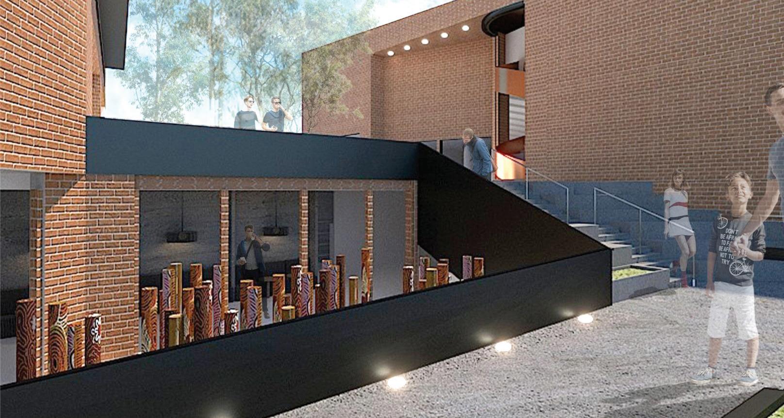
The aim of my project is to introduce and maintain a strong architectural narrative as a way of guiding audiences based on their needs. Using scale as a visual anchor for the prominent form, it gives the program a sense of belonging within the Westmead site – a harmonious permanence with the natural elevated topography, gazing over the surrounding dynamic urban environment. From this comes a place of sanctuary, designed to accommodate all visitors. With wide sloping paths and numerous allocations of entry to site, there is no set circulation one must undertake in order to ‘properly’ experience this library complex – yet there are strategically organised signals for certainty of
The overarching objective of this project is to, broadly, advocate a sense of community and togetherness, and, on a more intimate scale, to invite individual connection to place and to themselves via moments of pause, transition and thus exploration.

134
EAM O N WHITE embrace Thhibjifhijibdl EMAIL: mail.comeamonwhite31@g INSTAGRAM: on.white@eam




GABRIELLE Y U DHI S TIRA 1 3 6


URBAN U
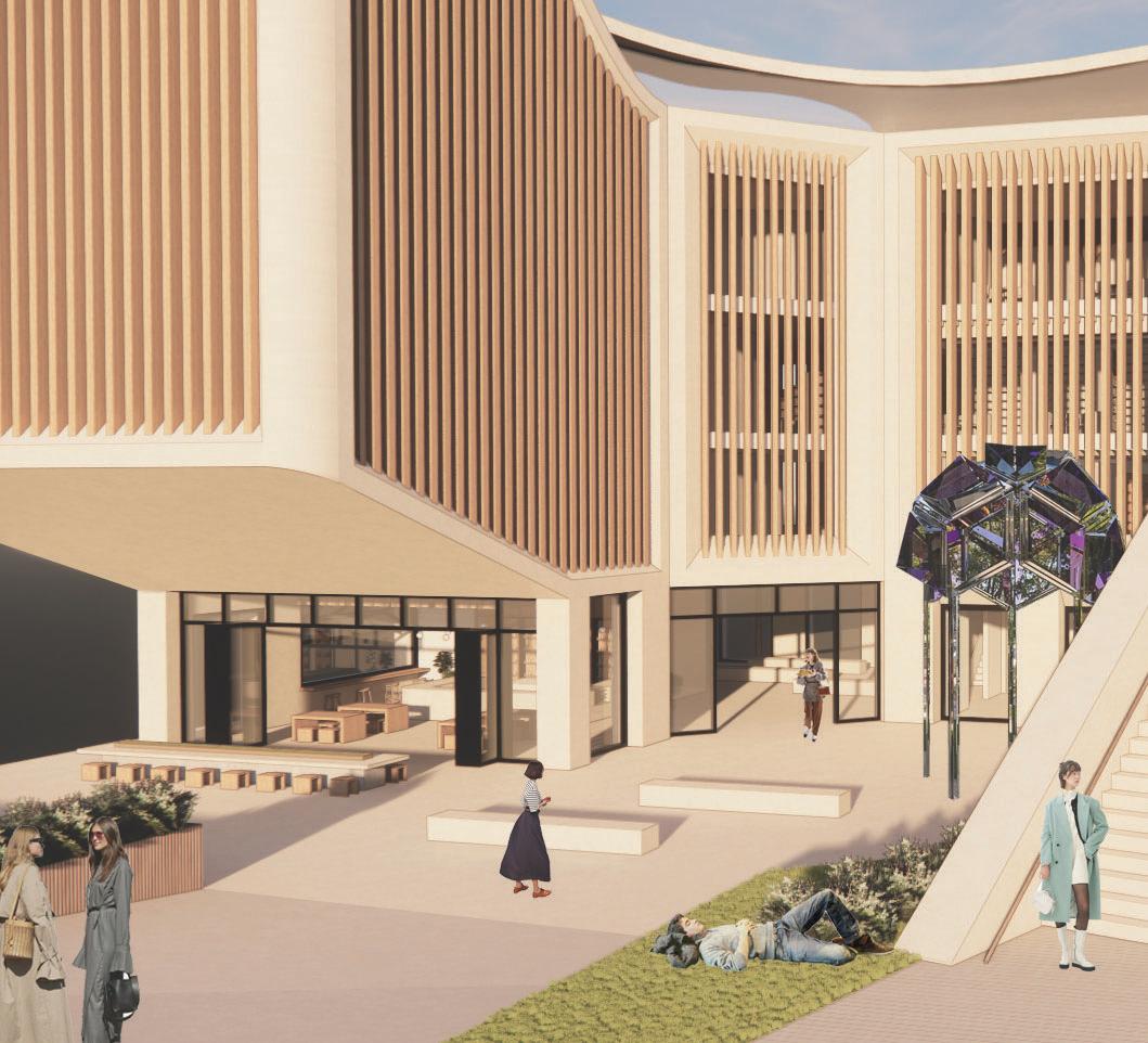
Symphony Library accommodates spaces for all ages and needs, from an indoor and outdoor library, café, exhibition space, theatrette and even a public courtyard. Located in the heart of Westmead, the orientation of this building was decided by the placement of the impending Sydney Metro West. The library’s U-shape and tiered form allows visual connection from the street, into the building and opens its ‘arms’ to the proposed Sydney Metro, whilst enabling an even spread of sunlight throughout each space.
The library’s name derived from the interpretation of classical orchestrated symphonies, whereby the musical composition is performed in parts, by a full orchestra. Like how a symphony is performed by all persons in an orchestra, the library is inclusive and accessible for everyone to enjoy. The domain accommodates a progressive and storytelling journey by which the placement of each facility was determined by the study of acoustics and foot


138
SYMPHONY jbhihhlfhfili EMAIL: mail.comgabrielleyud@g LINKEDIN: udhistirawww.linkedin.com/in/gabrielle-yu Y U DHI S TIRA
G ABRIELLE
MASTER OF ARCHITECTURE
POSTGRADUATE 139

HIGH PERFORMACE 141
MASTER OF ARCHITECTURE ARCHITECTURE AND HIGH PERFORMANCE TECHNOLOGY
STUDIO LEADERS
JONATHAN EVANS
DIJANA TASEVSKA
The earth’s atmosphere is warming at an increasingly rapid rate, with the construction and operation of our built environment accounting for around 38% of global carbon emissions. As other sectors, like personal transportation, adapt and transform in recognition of the clear and present danger of global warming, the construction industry will account for an even higher proportion of emissions without a radical and holistic change from the current ‘business-asusual’ methods of construction and operation. So what needs to change, and how?
The Architecture and High Performance Technology graduation studio this year provided an opportunity to challenge and rethink the way that we utilise and recycle resources and energy in our built environment, to not only eliminate the concept of waste, depletion
of non-renewable resources and release of sequestered carbon into the atmosphere. The studio sought to establish new relationships for the built environment, which are aesthetically beautiful, technically robust, and integrated with the natural environment to develop lasting solutions to the current global challenges. Can our buildings of the future be procured to make a positive contribution to the environment?
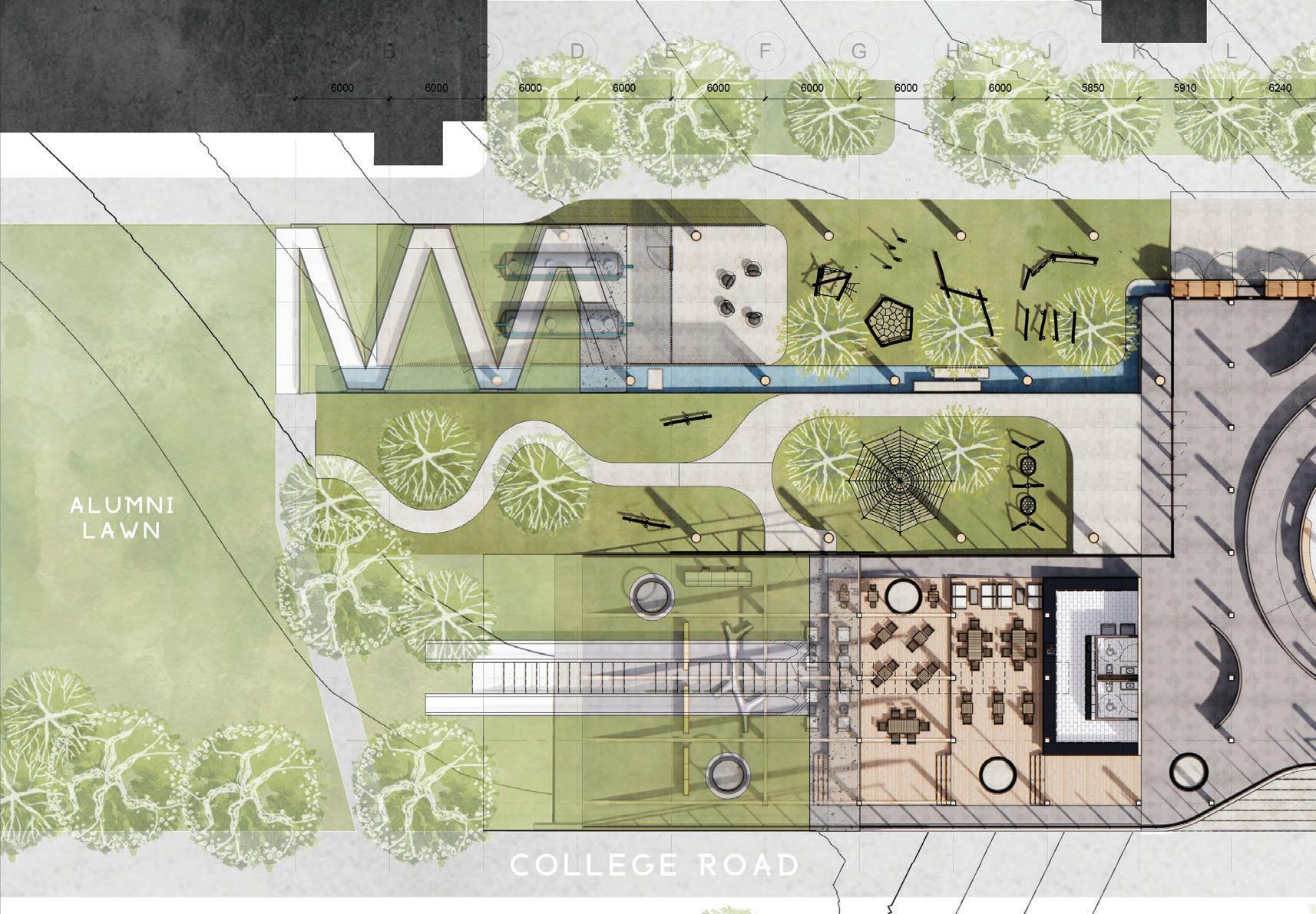
The studio explored a number of aspects of architectural design, construction, operation and ultimate demolition through the research and design of a UNSW education building of the future – to formulate integrated design principles which will better address our ongoing climate crisis. The site was an area within UNSW’s Kensington lower campus between Fig Tree Lane, Alumni Park and College Walk.
CARBON POSITIVE ARCHITECTURE


y TAREK ABOU DIB 1 4 4


QUADRANGLE BUILDING WHITE HOUSE COLLEGEWALK FIGTREE LANE WC 1.Thermal Storage Tubes (VHC) 2.Timber laced Structure 3.Internal void - Atrium 4.Brick Arches at ground plane 1 3 2 5 4 Environmentally Sustainable Design Renewable Energy Rooftop Pv Cells Providing Standby Power Thermal Comfort Thermal and Acoustic Comfort through materiality and system Low Energy Lighting Smart Bmu Control Rain Water Collection for irrigation, flushing and thermal water wall Timber Structure Offsets Embodied Carbon High Performance Facade Horizontal/ vertical sun shading & light shelf accordingly Low - Carbon Low Carbon Concrete And Carbon Cements For Podium Structure Landscape Filters & Retains Storm-water Ventilation Natural Ventilation Through Operable Windows & Doors Prefabrication construction and assembly reducing waste Integrated Planting Enhanced Biophilia & Outdoor spaces through hard/soft-scape Operable Roof Louvres Skylight with operable louvres, manages light and thermal gain Recycle/Reuse Post-industrial recycled content, & reuse of brick salvaged on-site Thermal storage tubes Act as thermal mass, four times as effective than concrete ELEVATE Opportunity to respond to White house typo ogy by creating a civic terrace, publicly accessible and adaptable for various activities. CONNECTION Opportunity to create an urban connection as the public amenity and civic gesture. This is also echoed by the secondary public amenity utilizing the terrace as public space TECTONIC VOIDS Transition through the building is based on a temporal activity, a definition of entry, threshold and active connection is designed with maximum visibility and safety in mind SUSTAINABILITY Prefabricated timber structure creates a system of components that are adaptable, sustainable and can be disassembled and reused. QUADRANGLE BUILDING WHITE HOUSE COLLEGEWALK FIGTREE LANE STORAGE N LOBBY IMMERSIVEPODS 350 700 600 600 700 350 Sketch 01 Sketch 02 Sketch 03 Skylight - Operable Louvres •Sun-Lite Glazing panel with god thermal transmittance •Operable Louvres, orientation subject to sun angle and climatic conditions, automatically controlled •Timber structure and Aluminium framed substructure for glazing/clerestory/flashings 1200mm GL Timber Soffit Structure Insulated and timber cladded •Soffit structural design to support 7m cantilever Foundation Structure •Concrete foundation and Footings Thermal Mass (Wall) •Thermal storage tubes, containing in harvested water in low cost, non-pressurized cylinder (Volumetric Heat capacity) 4186 KJ/m3/K > VHC Concrete > VHC Brick •Built for assembly/disassembly, light weight, low maintenance/replaceable Brick Arch •Reduced materiality through use of efficient PT •Self supporting middle recycled brick arch •Substructure supported cantilevered recycled brick arch •Air cavity layer, for mechanical systems and subfloor ventilation layout (thermal labyrinth) Prefabricated Timber Structure •Bolted Timber Structure designed for disassembly and modular construction •7mCLT Slab spanning one direction •600mmm GL Beams, 500mm x 500mm GL box Column Inverted Brick Arch •Light gauge steel substructure •Insulated and clad with mixture of recycled and salvaged brick from on-site demolition Timber/Aluminium framed Glazing •High performance glazing with operable top-hung awning windows •2.3m centre, full floor to ceiling height •600mm & 300mm fixed horizontal shades LEVEL 3 PLAN GROUND PLAN AXONOMETRIC DETAILED SECTION CONCEPTS SUSTAINABILITY DIAGRAM HIGH PERFORMANCE HIGHPERFORMANCE
Vision of Future Tertiary Education
The site can be viewed as a combination of multiple layers of history, future planning, materiality, shared spaces and social strengths that can be utilised to drive the architectural response.
One response to this context is to create a place where individuals can engage, learn and build meaningful relationships. But to facilitate tertiary education of the future we must consider the impact of the virtual world on our physical context and how that relates to the broader natural environment.
A vision of future tertiary education that does not have an interface problem and allows the architecture to be the medium through which communities connect. The proposal does not target creating an architectural typology of the future, rather it responds to its context and anticipates the capacity for change over time. Its fundamental program serves the purpose of researching, developing and showcasing technologies that can be integrated in education.
The design responds to the existing typology by creating a civic terrace, publicly accessible and adaptable for various activities. Transition through the building is based on a temporal activity, a connection and exchange of ideas.

146
Study.Research.Exhibit.TAREK AB OU DIB EMAIL: mail.comteaboudib@g INSTAGRAM PERSONAL: aboudib @tarek a INSTAGRAM: edesign@tarekaboudibarchitecture LINKEDIN: 493178www.linkedin.com/in/tarek-abou-dib-975


LAURA CIMILIO 1 4 8


CT AHU CT DETAIL SECTION FOURTH FLOOR PLAN CROSS SECTIONRESEARCH AND PRINCIPLES GROUND FLOOR PLAN HIGH PERFORMANCE HIGHPERFORMANCE
of the Future
An Opportunity...
“The best way to predict your future is to create it not from the known, but from the unknown. When you get uncomfortable in the place of the unknown – that’s where the magic happens.”
Joe Dispenza

The mind is a powerful tool in creating the future we want, but it seems as though this is not always tapped into. Our thoughts dictate our choices, interactions, experiences and, most importantly, our lives. Day-by-day we are creating our own reality without being fully conscious. We are stuck. But we are comfortable. So why do we submit to this? What if we saw each day as a new opportunity to grow? To learn? To be better? To experiment? To fail? To face setbacks, but to keep going? The only way we can expand our minds is to allow ourselves to be uncomfortable in the unknown.
“To truly change is to think greater than your environment.” Institutions need to be reconstructed, to encourage exploration, passion and the unknown.
What does this look like?
150
Education
LA U RA C IMILI O “T EMAIL: mail.comlauracimilioo@g INSTAGRAM: n_arch laura_art LINKEDIN: 009135/www.linkedin.com/in/laura-cimilio-b1b0


yNATALIE HO 1 5 2


TOWER PLAN LONG SECTION DETAILED SECTION CONCEPT GROUND PLAN HIGH PERFORMANCE HIGHPERFORMANCE
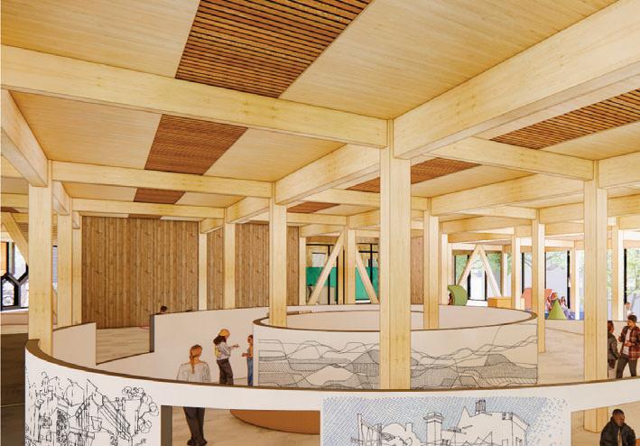
This project is about the students of UNSW, providing a comfortable, safe and lively place to spend time. This is a building that keeps students ‘alive’, a place where their voices are heard, passions are showcased, motivation is maintained, stress is relieved, relationships are made, lessons are learned, insights are broadened.

future needs, activities that might not have even existed now in 2022. It is a place where students are invited to amend and change through time sustainably, creating a carbon positive future for UNSW.
The massing of the building form comprises of three main components: the activated ground plane, the learning hub and the hobby tower. As a diagrammatic gesture, the hobby tower intersects into the learning hub and serves as the main service core and where the solar chimney system takes place throughout the whole building.
154
Stayin’ Alive NATALIE H O EMAIL: mail.comnataliews.ho@g INSTAGRAM: nw_arch@n



ERICA A . LEONG 1 5 6




HIGH PERFORMANCE HIGHPERFORMANCE
Living with Neurodiversity

BACoN - [Building for Awareness and Co-existence with Neurodiversity] is a body of research that seeks to explore the design of the built environment as a holistic support framework for autistic students in higher education by recommending and shedding light on holistic disability supports, pedagogical innovations and inclusive design solutions.
By employing high-performance strategies, the proposed student hub envisions a future university environment that considers both ASD-centric and universal design principles to support both autistic students as well as the broader student population.
The proposed student hub is organised around a series of natural environments based on hierarchies in scale and privacy, providing a variety of social mixing spaces to encourage social skill development across all levels. By blurring the distinction between ‘inside’ and ‘outside’, nature and greenery is interwoven throughout the building, which can lead to better educational outcomes for autistic students.
158
BACoN ERI C A A. LE O N G EMAIL: mail.comericaanne14159@g LINKEDIN: a01142/www.linkedin.com/in/erica-a-leong-111 WEBSITE: esplashericaleong99.wixsite.com/architectur


1 6 0
STEPH LI


PLAN FACADE SECTION COMPONENTS HIGH PERFORMANCE HIGHPERFORMANCE
Changing the Hierarchy


Landscape First, Building Second aims to discover the possibilities of vertical landscaping and the connections between people, landscape and architecture through studies of form, functionality and connectivity. The concept of stacking landscapes is also aimed at how architecture can mitigate and resolve the problems of climate change.
Moreover, the project direction is to maximise the land’s environmental potential, link and reconnect open space and the built form and achieve the goal of improving health and well-being.
162
Landscape
S TEPH LI EMAIL: mail.comltshingl@g INSTAGRAM: hing526@tsangs
First.


1 6 4
yGRACE MCILROY


GROUND PLAN SECTION CONCEPT AXONOMETRIC HIGH PERFORMANCE HIGHPERFORMANCE
Currently, we build and then demolish it 20 years later and build it again. This is an epidemic of building for the now. We aface a harsh reality that global warming is an extreme threat.
We have a choice: demolish a perfectly good building, to build a new one, in the process contributing tonnes of CO2 emissions; or transform this existing building with a thermally performative brick façade so it can give back to it’s users and the planet.
Hybrid Hub is has three parts: a place for hybrid and virtual learning, a place for play and creativity and a place that supports social relationships.
Hybrid Hub
EMAIL: mail.comgmcilroy.95@g LINKEDIN: 4b0148/www.linkedin.com/in/grace-mcilroy-3814

166
G RA C E M C ILR O Y
MASTER OF ARCHITECTURE HOUSING
STUDIO LEADERS
JOE AGIUS
VICENTE CASTRO
RAMIN JAHROMI
HELEN KUO
FELIPE MIRANDA
CRISTIAN ROJAS
Housing affordability is one of the the health of our nation as it progresses into its new urban future. Macro-economic factors concerning home ownership have resulted in the current housing affordability crisis. This presents built environment professionals with the unique opportunity to come up with alternative housing models that could challenge the status quo.
The Built-To-Rent (BTR) housing model has been touted as a housing tenure that could remedy the housing crisis by providing a viable alternative to the predominant Build-To-Sell (BTS) housing tenure. Unlike BTS housing, BTR housing is a housing tenure that is held in single ownership by a housing provider that has a commercial desire to keep its renters happy. This ensures that its residents
are able to reside in their housing development for longer which
to constantly search for new tenants.
The focus of the Housing graduation studio this year was to interrogate and question the tenure principles attached to BTR housing to come up with an architectural proposition. The site was Precinct 75, an area of approximately 1.5 hectares containing mostly industrial buildings with frontages along Mary and Edith Streets in St Peters, Sydney.
HOUSING 167
NOT JUST MASS HOUSING: LIVING
IN THE MACRO-MESO-MICRO

CONTINUUM


ihihdf HADEEL ALRAHMANI 1 7 0

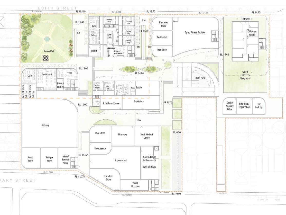


LEFT: GROUND PLAN RIGHT LEVEL 1 PLAN DETAILED SECTION
HOUSING
UNIT TYPES
The Central Hub is a mixed-used commercial, retail and residential site in Precinct 75, St Peters. Through a change of levels and stairs throughout the site, movement is encouraged towards the northern social spaces. The site was designed as a place where the whole community can gather, with permeable spaces for temporal events such as weekend markets and live music. A comfortable environment was created through greenery, places of respite, water features, and a separation of social spaces amongst different age groups and residents. A communal park was designed as a passive social space for use by adults; a skatepark with seating was created for teenagers; whilst a childcare centre with a large playground was designed for children and situated away from the apartments and the adults’ communal space to minimise noise. With the target demographic of young families, a separation of space was also designed within the apartments to accommodate for different users’ needs, with a retreat to. A healthy living environment was also maintained with morning or afternoon light reaching all habitable rooms, ample cross ventilation, and external views to the communal spaces.

172
ihihdfdiff Central
HADEEL ALRAHMANI EMAIL: mail.comhadeelalrahmani.98@g INSTAGRAM: yhadeelart.by
Hub


CHLOE ANDREWS 1 7 4


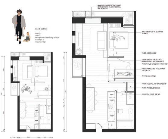
MASSING CONCEPTS INTERNAL RENDER LEFT: GROUND PLAN RIGHT TOP: CONCEPTS RIGHT BOTTOM: APARTMENT TYPES HOUSING
Co-Housing for Single Parent Families
Sydney has no housing type to help single parents and their children. My project is a study on the psychology and relationships of single parenthood seen through the lens of co-housing systems.
Financial and child rearing pressures also mean that for single parents there is very little room for self-care and meaningful connections with other adults. What my scheme attempts to do is reduce social isolation for both parents and children. Children will become active agents in single parenthood and grow up in a normalised environment rather than a ‘broken’ or ‘disfunctional’ family. This will be achieved by exploring the emotional needs of parents and children – communal kitchens, lounges, exercise spaces. Furthermore, exploring multifunctional uses –transforming bedrooms into studies through joinery and strategic architectural design.

176
P&CC C HL O E ANDREW S EMAIL: mail.comchloeandrews4@g INSTAGRAM: andrews @ chl0e LINKEDIN: rews16/www.linkedin.com/in/chloeandr


JESSICA BRAID 1 7 8


LONG SECTION DETAIL PLAN DETAIL SECTION ELEVATION GROUND PLAN HOUSING
FOR ONE
Housing For One addresses the rise of ‘sole-occupancy’ living, with more than 25% of Australians now living alone. It looks to provide an affordable, safe, desirable and community-orientated housing project that caters for the age group of 18-35. This demographic may be working professionals, or university students who live alone and want to be a part of a wider community of people in a similar situation. The residential sectors offer quiet one bedroom bedroom apartments. The project is based in St Peters at Precinct 75 and will offer a range of community spaces such as lively restaurants, cafes for ‘single’ people, rooftop amenities, a cinema, weekly games night and community events.
Housing For One tackles the issue of ‘sole-occupancy’ living by encouraging people to become a part of a resourceful and vibrant community.

180
HOUSING
J E SS I C A BRAID EMAIL: mail.comjessica.b65@hot INSTAGRAM: itecture@jbraid_arch LINKEDIN: 09b180/www.linkedin.com/in/jessica-braid-a33


FLYNN FIELDING 1 8 2


HOUSING
TOP: GROUND PLAN MIDDLE: INTERIOR MODULES BOTTOM: ELEVATIONS
In Australia today, loneliness and social isolation is a widespread issue. Co-hAUS is an Australian take on co-housing that is an initial step towards blurring the spheres of sharing and taking a step towards mending the broken social networks of Millennials whilst maintaining some of the strict Australian housing ideals.

Co-hAUS aims to address the growing need to re-kindle meaningful relationships and connections for the lonely generation. This is achieved by providing spaces and places that foster meaningful relationships between individuals within the amenity provided on-site and the interdependency created through the typical apartment arrangement. Four buildings form a
Within each cluster there is a differentiation between private, communal, and public spaces, providing a variety of options for contemporary living within the shared residential spaces.
space that does not have a curated use and is open to resident interpretation.
Co-housing works best on an intimate scale where the residents can build relationships and start to blend the spheres of sharing and attitudes towards ownership. Australia has a very distinct attitude to housing and privacy hence why this scheme offers varied degrees of social interaction and is heavily reliant on the
thought into how it would affect and assist the existing adaptable ‘hub’ between St Peters and Sydenham station.
184
Co-hAUS FLYNN FIELDIN G EMAIL: INSTAGRAM: LINKEDIN:


NATHALIE TUNBARRETO 1 8 6


TECTONICS AND PEOPLE
HOUSING
MASTERPLAN & UNIT LAYOUTS
Mixed-Use, Build-to-Rent, Co-Housing.
Dadirri draws on how we can target the loneliness endemic in both elderly and younger generations by experimenting with different housing models. This includes a mixed-use, build-to-rent and co-housing scheme which also includes a residential aged care unit to promote the concept of ageing in place.

The project is situated at 75 Mary Street, more commonly investigated and the opportunity to create a 15-minute walkable neighbourhood from St Peters and Sydenham train stations, and the upcoming metro line, was explored.
Precinct 75 is located in St Peters, a suburb in which 87% of the demographic is within the age range of 25 to 60. This means that the older members of this group will transition towards an elderly range. Hence came the inspiration to provide housing for the elderly. Next, younger people were chosen in order to consider ways of connecting generations and where wisdom could be passed down from one generation to the next. The program of spaces is created to promote use by both demographics, cater to the artistic precinct in nearby Newtown, and to become a central hub of rest and play for people of different walks of life.
188
Dadirri NATHALIE T U N-BARRET O EMAIL: mail.comnathalie.tun@g INSTAGRAM: nbarreto@nathalietun LINKEDIN: 9061abwww.linkedin.com/in/nathalie-tun-barreto-167


TYLA VENISH 1 9 0


RESEARCH SECTION MASTERPLAN & GROUND PLAN HOUSING
‘Turn a Blind Eye’
Facing up to Social and Environmental Challenges

It is easier to turn a blind eye to societal and environmental issues than to face them, particularly when they are hidden from view. Turn a Blind Eye aims to provide a pedestal for the issues of ‘waste’, contamination, and housing inaccessibility by parading them in an exposed nature.
St Peters has long been positioned as a backwater to more ‘desirable’ adjacent suburbs; a bypass on the railway line, rather than a destination. The multiple towering, shingled cones
the Brickworks chimneys. In this sense, the architecture itself serves as a mode of connection within the wider suburb; reframing the site as a destination rather than a bypass, and providing a cultural and educational icon within St Peters.
Designed for Key Workers requiring affordable housing close to the CBD, people are treated as key pieces of the ecology which is being restored in my proposal; aiming to address the neglect of renters in Australia and striving for security of tenure. In this sense, Key Workers are reconnected with an otherwise unreachable feat of living close to their place of work.
192
DidfKWkiiffdbl EMAIL: ook.comtyla.venish@outlo LINKEDIN: a41194www.linkedin.com/in/tyla-venish-42b
TYLA VENI S H


JESSICA WATSON 1 9 4 AXONOMETRIC


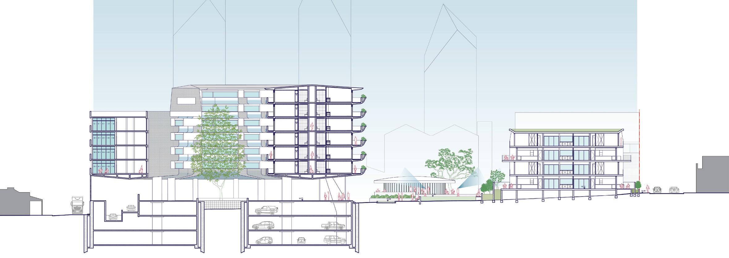
SECTION FLOOR PLANS & SITE SECTION FLOOR PLANS & LOCATION DIAGRAM HOUSING
Inclusive of All Families
to-Rent provides security of tenure through longer rental leases and the opportunity for tenants to integrate with their local community by staying in one place. The research behind the architecture within this project probed into the realities of what a family may be now, challenges they face and opportunities provided in an existing local community that embraces the arts.
196
CONFIGURATIONS J E SS I C A WAT SO N EMAIL: on.comjessica@jessicabwats INSTAGRAM: bwatson@jessica WEBSITE: on.comwww.jessicabwats


HO HEI ALEX
1 9 8
WONG


TETRIS CONCEPT DETAILED SECTION HOUSING
The purpose of the project is to research the Built-To-Rent (BTR) housing tenure for apartment design in order to address the issue of housing affordability, as well as to consider Precinct 75’s value for placemaking in order to design the best place to live there.
type, it could simply be a one-bedroom unit, two-bedroom unit, or up to three-bedroom unit. Residents can rent the number of bedrooms that best suit their needs.
200
Precinct 75 H O HEI ALEX W O N G EMAIL: w.edu.auz5347111@ad.uns
201
MASTER OF ARCHITECTURE SOCIAL AGENCY
STUDIO LEADERS
PROFESSOR DAVID SANDERSON MARK SZCZERBICKI
As with many other rapidly urbanising towns and cities, Sydney is witnessing a
SOCIAL AGENCY
While often bringing improved services and quality of life,
to displacement of the original residents, with those remaining often marginalised and socially isolated.
A counter to this is inclusive neighbourhoods, wherein isolated and marginalised groups feel they are equal co-owners and users of places and services. Underpinning inclusive neighbourhoods is the concept of social inclusion, which
of improving the terms on which individuals and groups take part in society – improving the ability, opportunity, and dignity of those disadvantaged on the basis of their identity.’1
This year’s Social Agency graduation studio was concerned with how architects and architecture can contribute to social inclusion. The studio took place in Redfern, currently
and was partnered with the vibrant Redfern-based arts collective 107 Projects. The site included 107 Projects’ venue on Redfern Street, Sydney Mental Health Service, housing and cafes. As well as focusing on the 107 Projects existing site, students were free to use some or all of the remaining site.
1. The World Bank, www.worldbank.org.
RESILIENT NEIGHBOURHOODS: INCLUSION


CALEB BURKE 2 0 4


SECTION STAGE 1 SECTION STAGE 2 TOP: PLAN BOTTOM: CONCEPTS SOCIAL AGENCY SOCIALAGENCY S
Architecture to Foster Community

Community Building - Building Community is a project that anticipates a hypothetical future for Redfern, where historic utilitarian buildings that have reached their natural end-of-life are repurposed as public facilities that will provide a framework for community-led construction. These are a community forum space adapted from an existing substation, and a trade school and building workshop adapted from the existing Redfern Telephone Exchange. Together, the facilities will serve as a springboard for future alterations and additions to buildings in the community.
or external agent would be required, thus placing the complete agency of the buildings within the hands of their users.

206
CommunityBuildingC ALEB B U RKE EMAIL: mail.com
INSTAGRAM:
calebjosephburke@g
@cvlebb


YAZHISAI EZHILMARAN 2 0 8


 TOP: ROOF, LEVEL 1 & GROUND PLANS
SOCIAL AGENCY SOCIALAGENCY S
BOTTOM: PROGRAMME & KEY MOVES
Inclusivity
This proposed community food centre aims to create an inclusive neighbourhood in Redfern drawing on ideas of social inclusion enabled by growing and selling food.
EMAIL: yazhisai97@gmail.com LINKEDIN: www.linkedin.com/in/ yazhisai-ezhilmaran-97b4b51b8/

210
T aste
Redfern YAZHISAI EZHILMARAN
of


IMAGE
CAPTION


WEN LI 2 1 2


PLAN SECTION SOCIAL AGENCY SOCIALAGENCY S
The Social Agency studio this year questioned what is a meaningful architectural response that builds inclusion. I found area. Through further research, I found an interesting relationship Street in Chongqing, China, became valuable references showing me how social inclusion has been created when the law and policy step back and so much emotional expression can let people draw on buildings.
I designed this building without concern for property protection paint and skateboard on the site and people can come to paint element to the part of the unowned architecture to emphasise visitors’ experience to act with greater freedom within the public space by painting, eating, talking or singing.
EMAIL: mail.comatlasliwen@hot

INSTAGRAM: asliwen@atl

YOUTUBE: @Atlas Li
FACEBOOK: @Atlas Li
214
UNOWNED WEN LI ANIMATION


HNIN WINT KHINE 2 1 6


RESEARCH AND KEY MOVES GROUND PLAN SOCIAL AGENCY SOCIALAGENCY S
Sensory Paths to Safety
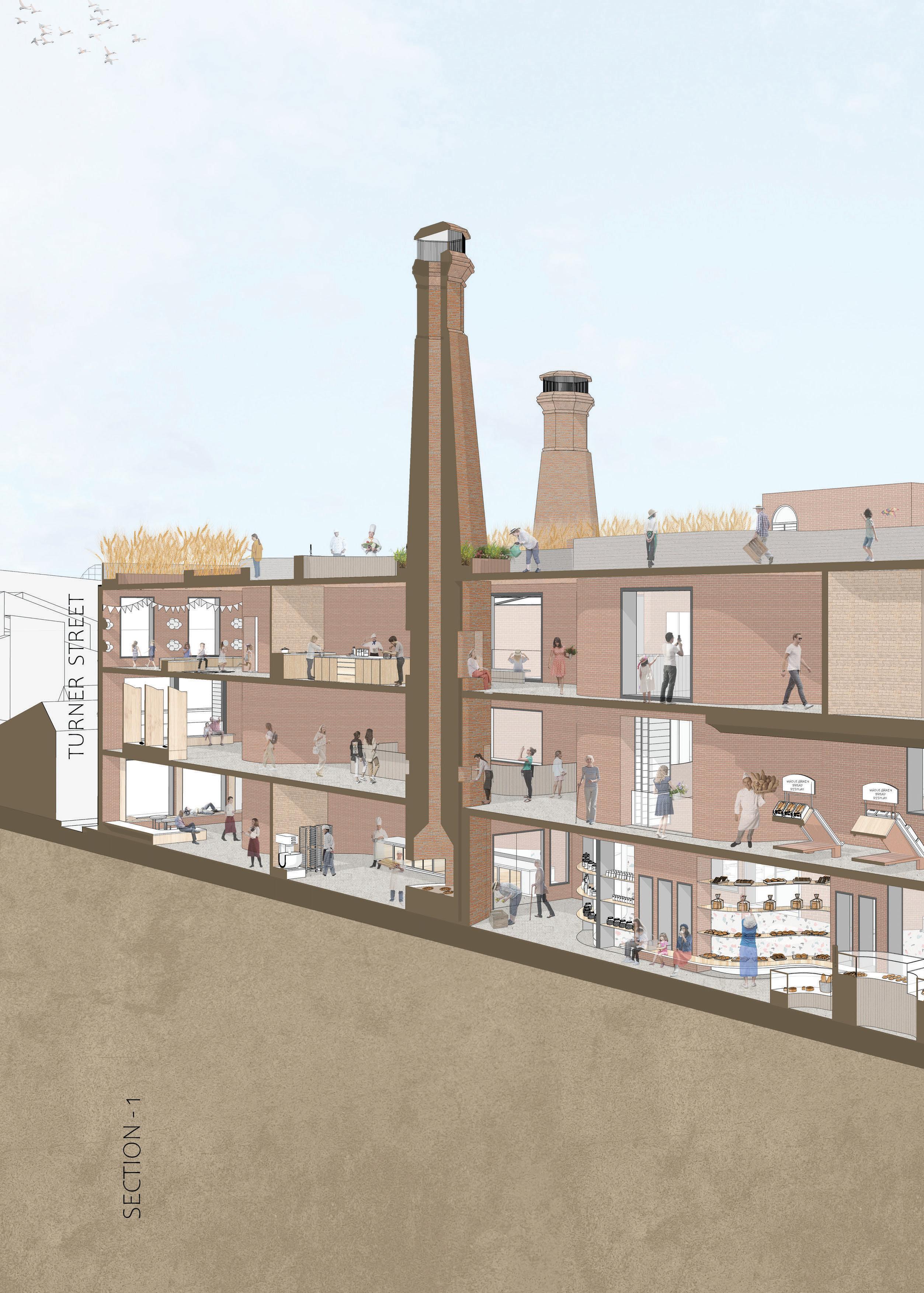
Multisensory environments, especially scents and tastes, can trigger nostalgia and contentment in people as they are associated with particular moments or places. According to research, the smell of bread is universally accepted as the most pleasant. Therefore, the project title is ‘3 Chimneys Bread Factory’, which serves the community.
Chimneys are used not only for producing bread smells and baking but can also be part of celebration spaces, bakery parks, landmarks, or gathering venues. Steel, bricks, concrete and metals are the primary materials used to convey a factory vibe. Different sizes and shapes of curves along the pathway also evoke a sense of enclosure where people can gather, investigate and explore different things from outside.
A combination of various programs such as community baking, bread exhibitions, celebrations, wheat gardens and bakery parks demonstrate how social inclusion can make society more cohesive.
EMAIL: ook.com K hninwint@outlo
INSTAGRAM: uehua_1@suex
LINKEDIN: b94250/www.linkedin.com/in/hnin-wint-khine-308
FACEBOOK: ene Sue @Ir

218
3
HNIN WINT KHINE
CHIMNEYS
IMAGE CAPTION


NICOLE ANN SAMUDERA T 2 2 0


BASICHUMANMOVEMENTS SQUATLUNGEPUSHPULL BENDTWISTWALK AUNTIE MARGARET AND RYC PLAN TOP: CONCEPTS MIDDLE: RESEARCH SKETCHES BOTTOM: AXONOMETRIC SECTION SOCIAL AGENCY SOCIALAGENCY S
wants to play
Community, Relationships, Movement, Play!
This project is located at The National Centre of Indigenous Excellence (NCIE) in Redfern.
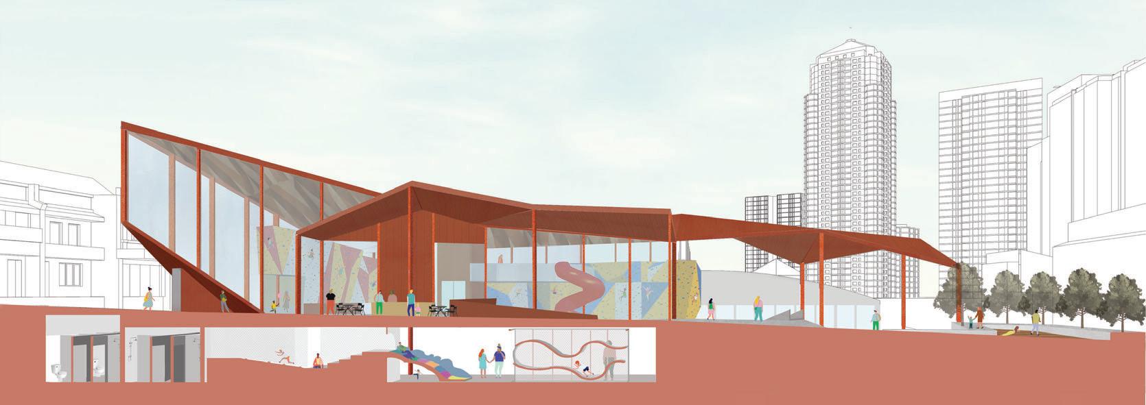
The concept of this project is inspired by NCIE and Redfern Youth Centre (RYC). Auntie Margaret, the co-founder of RYC, and the kids centre emerged through the idea of sports and play. Built as an extension of the NCIE, this climbing hub caters to everyone
athletes, children and adults. An outdoor landscaping water park seamlessly weaves into the building that brings parents and children into the space. The movement of the climbing walls is expressed in the internal circulation of the building and through the contours of the roof structure.
The architecture incorporates an inside-outside relationship to establish inclusivity, not only between passersby and climbers but for the entire Redfern community..

222
EVERYBODY
NI CO LE ANN Thhiiiidid EMAIL: mail.comsamuderanicole@g INSTAGRAM: @_nsmdr LINKEDIN: 3221b6linkedin.com/in/nicole-ann-samudera-559


JESSIEXIYANG 2 2 4


GROUND PLAN KEY MOVES SOCIAL AGENCY SOCIALAGENCY S
A Creative Youth Centre
This project started from a conversation with the Redfern community – Redfern Youth Centre (NCIE). The conversations with Aunty Margaret, the co-founder of Redfern Youth Centre, as well as the kids formed the driving inspiration. Interactions and observations with NCIE led to a design that placed people at the centre of the architecture. The proposal is a creative youth centre, functioning as an additional program to the original sport centre. The design aims to foster conversations through a community dining hall, a series of workshops and outdoor landscape activities. The open planning of this creative youth centre makes the building more porous and welcoming, reinforcing the idea of community architecture. The program creates a series of interactive and fun learning environments that encourage students to learn and grow whilst reinforcing community bonds.

226
A Conversation J E SS IE XI YAN G EMAIL: ook.comjessie_yangjy@outlo INSTAGRAM: carrot96@crazy FACEBOOK: Xi Yang Jessie


2 2 8
SOPHIA YIN


LONG SECTION TOP: LEVEL 1 PLAN MIDDLE: GROUND PLAN BOTTOM: BASEMENT PLAN SOCIAL AGENCY SOCIALAGENCY S
Role-Play Theatre is a creative hub where users freely express themselves; they can be whichever ‘role’ they desire to ‘play’ – a customer at the café, a learner in the lounge, a writer or a director, new ‘roles’ to ‘play’.

From observations gathered from the site, and by sketching human activities, I noticed Redfern Street is the setting for a kind of organised chaos. Everyone has a role at any one moment. We can be a passer-by, a parent, a kid, a judge, a contestant, etc. The human interaction.
Due to a lack of funding, the National Black Theatre in Redfern, struggles, was closed in 1977. I aim to revive the theatre by constructing a performance space within which people are free to play any role they like. The building is the theatre and acting is the medium that bridges the gap between individuals. Role-Play Theatre is created where users can freely express themselves. They can choose to be whichever ‘role’ they wish to ‘play’, or unlock new experiences.
230
SO PHIA YIN EMAIL: mail.comsophiayin0314@g INSTAGRAM: ophiayin@s. LINKEDIN: hia-yin1www.linkedin.com/in/sop
Role-Play Theatre

IMAGE CAPTION

LACON ZHANG Thdihlllhi 2 3 2


PLANS SECTION SOCIAL AGENCY SOCIALAGENCY S
The Common Sense design project includes multi-functional architecture, interior design, signage, natural lighting, art and landscaping to deliver a holistically integrated environment, to create and perceive an inclusive total environment suiting all. The humanitarian concept of this project refers to the social integration and encouragement of independence of disabled people throughout daily life.
The key concept is to create a building that would be inclusive and accessible for all, a place of ambition that would free the assistant and inspire the disabled themselves. Simple and clear straightforward design, multi-functional for all, and minimalism are the key features of the building.

The design approaches wall-less architecture, as one more wall means one more division, one more barrier. There is an everheightened commitment to remove all barriers, we seamlessly fused function, environmental considerations, and high aesthetics into a ‘total environment’ extending from the site to the buildings. All the walls are aligned to the grids, forming a simple, clear, and
the beauty of austere minimalism. There is a mission to promote a fully accessible world for all, to create a multi-sensory space: take enjoyment of the space through the senses.
234
Common Sense LA CO N ZHAN G Thdihlllhi EMAIL: mail.comlacon.zh@fox INSTAGRAM: @lacon_z LINKEDIN: n-zhangwww.linkedin.com/in/laco WECHAT: n forest @ laco


IMAGE CAPTION


ZHONG GUAN 2 3 6


SOCIAL AGENCY SOCIALAGENCY S
Connecting the Physical and the Virtual
The project is named ‘Wonderland’; it’s a virtual reality entertainment club located at 107 Projects in Redfern. I designed a virtual world that relies on physical form to enhance the contrast between dull reality and the wonderful virtual world. It is a place that would be open to all the community, allowing people to create their own world or join others, through which they could exchange their stories and emotions, and, in doing so, become a more inclusive community..
EMAIL: mail.comzhong.g.529529@g

INSTAGRAM: zhong_g @ z
LINKEDIN: a08251www.linkedin.com/in/zhong-guan-01a

238
W ONDERLAND ZH O N G GU AN VIRTUAL REALIT Y
MASTER OF ARCHITECTURE
URBAN CONDITIONS
URBAN CONDITIONS
STUDIO LEADERS
DR RAFFAELE PERNICE
SHAOWEN WANG
The focus of the Urban Conditions graduation studio was the design of a resilient multi-functional community on two selected sites along the waterfront of Sydney Harbour (Camellia and Lavender Bay) as models of an urban community suitable to withstand threats posed by high-sea level
caused by climate change in the
initially respond to the site with two possible design approaches: one was to engage the site with an urban intervention inspired by current urban regeneration strategies, implementing more conventional techniques in waterfront design; the other was to envision alternative (and radical) future scenarios with the
The studio asked students to resilience, adaptability and creative innovation in the urban design process and to rethink architecture and urbanism against
In formulating their hypotheses for their projects, students could
239
SYDNEY
WATERFRONTS: VISIONS AND SCENARIOS FOR RESILIENT AND INNOVATIVE WATERFRONT COMMUNITIES IN A TIME OF CLIMATE CHANGE


ASHRITH BHARADWAJ K . A . 2 4 2


PLANS FACADE DETAILS FACADE DETAILS URBAN CONDITIONS NS URBANCONDITIONS U
Knowledge/Healing
A. BHARADWAJ K. BHARADWAJK.

Centre of Knowledge, Center of Healing
The demographics of Lavender Bay indicate that there is a need for a community centre which would provide a place for recreation along with a learning centre to serve the growing population and the existing population of students and middle-aged people.
The promenade binds the Centre of Knowledge and Centre of Healing and is a place to enjoy the view of the
Sydney Opera House
A S HRITH
EMAIL: mail.com ashrith bharadwaj27@g

INSTAGRAM: mname@insagra
LINKEDIN: 959121/www.linkedin.com/in/ashrith-bharadwaj-049
FACEBOOK: shrith 9 @ angada.a
244
ANIMATION


UNJELIQUE HAJJAR 2 4 6


URBAN PRINCIPLES AND ELEVATIONS ELEVATION ELEVATION SITE AXONOMETRIC URBAN CONDITIONS NS URBANCONDITIONS U
Camellia River School
Camelia River School
This project was forged to respond to the Camellia area, both Parramatta River. By reimagining the area, the site shifted from being a highly contaminated redundant industrial land into an educational institution that is fully accessible and adaptive to
In order to meet the needs of the growing population of the Camellia precinct the project provides the provision of a school featuring an early learning centre, primary school and secondary school (ELC-YEAR 12). The masterplan for the educational area is to include a variety of facilities with a strong emphasis on bringing spaces. The precinct is to cater for approximately 1200 students with a co-educational school structure.
EMAIL: mail.comunjeliquehajjar@g

INSTAGRAM: uehajjar@unjeliq
LINKEDIN: 880165www.linkedin.com/in/unjelique-hajjar-579
WEBSITE: olio.comunjeliquehajjar.myportfo
248
U N J ELI QU E HA JJ AR


YEJIN KIM 2 5 0


TOP RIGHT: RISING SEA LEVEL ANALYSIS BOTTOM RIGHT: STEM STRUCTURE LEFT: KEY MOVES URBAN CONDITIONS NS URBANCONDITIONS U
Residency for Artists

The studio premise lies within the issue of how water cities can manage current and future challenges related with climate change and sea level threats. The artist retreat and exhibition space consider how a new relationship between the North Sydney community and the water can be facilitated through vertically rising architectural form that also weaves along the planted railway, which has been renewed through our urban masterplan.
The urban connections are formed from street networks that slope down from Milsons Point leading to an elevated podium which overlooks the courtyard and beyond to the bay. Rising above this level are the two residency towers which are connected by a sky bridge and shared public space. The towers consist of several typologies of integrated living and offer a temporary retreat for the artists – designed with light, ventilation and structure in mind.
252
T he Well YE J IN KIM EMAIL: mail.comyejiinkim95@g INSTAGRAM: @yej.kim


ANASTHASIA KODHYAT 2 5 4


GROUND FLOOR PLAN MASTERPLAN TOP: CROSS SECTION BOTTOM: DETAIL SECTIONS
MOVES URBAN CONDITIONS NS URBANCONDITIONS U
KEY
[re]centre, [re]lax, [re]set


[re]centre explores the typology of a mixed-use building, with programs that cater to the physical and social recreation of the individual looking to [re]centre/lax/set themselves as they navigate through the changing conditions of the city, climate, and everyday routines.
programs and physical health amenities, with considered design of form, facilities, and circulation in conjunction with the overarching strategies for Lavender Bay in the ‘from meet here to meet there’ master planning scheme. This proposal considers how the building can interact with the Lavender Bay waterfront to enhance the site conditions and establish a fun, recreational, health and social destination for the Lavender Bay community and its greater surrounds.
256
ANASTHASIA [ re ] centre EMAIL: mail.comanasthasiakodhyat7@g AT KODHY A


TIMOTHY LAU 2 5 8


SECTION SKETCH MASTERPLAN SKETCH SECTIONAL RELATIONSHIPS DESIGN PREMISE URBAN CONDITIONS NS URBANCONDITIONS U
An Introverted Encounter with Extraversion


Within space there exists a non-binary delineation of architecture through the scope of introversion and extraversion. When an individual enters a space they experience excitation and inhibition, one ‘resonating’ and the other ‘consonating’.
In his 1921 paper on psychological types, C.G. Jung dissects the introversion-extraversion complex under four primary categories: thinking, feeling, intuition and sensation, functions that will be explored to inform program and movement through the proposal. In particular, an artist initially begins creating their work within an introverted space. Once complete, it is exhibited in a traditionally extraverted space. Therefore, the program of the proposal seeks to use the conversation between introversion and extraversion as a medium by which the built environment encounters the waterfront of Lavender Bay.
260
ANIMATION Introverted/Extraversion TIM O THY LA U EMAIL: mail.comtimlau4@g INSTAGRAM: ypattern@poly LINKEDIN: 3b9200www.linkedin.com/in/timothy-lau-15b


CLAIRE OH 2 6 2


SECTION GROUND FLOOR PLAN FIRST FLOOR PLAN URBAN CONDITIONS NS URBANCONDITIONS U
The project is located in Lavender Bay in close proximity to the foreshore, high-rise residential areas as well as North Sydney CBD. As the site is close to the entertainment district as well as having a visual connection with the Sydney Opera House, the project that was chosen is a music centre that would draw activity and life to the foreshore and create a social spot for artists and performers. It supports a wide range of activities from private studio spaces to large public theatres, the main aim being to merge both architecture and music to create a sensory experience for the coastline of Lavender Bay.


264
C LAIRE O H A TEMPO EMAIL: mail.comclairesjoung@g


MILAN PANCHAL
2 6 6
y


TOP: SECTIONS BOTTOM LEFT: PROGRAMME BOTTOM RIGHT: CONCEPT KEY MOVES URBAN CONDITIONS NS URBANCONDITIONS U
Bay Wharf
Can there be a link between the water and the land to create architecture? To begin with, the basic concept is to make a place within which the commons can enhance the use of the waterfront. How could the project align with the proposed Lavender Bay masterplan with elements such as a promenade, residents’ community, entertainment and leisure, and green open space? This was the primary thought that directed my design
EMAIL: mail.companchalmilan676@g
INSTAGRAM: panchal@milan__
LINKEDIN: 6b213a/www.linkedin.com/in/milan-panchal-4016


268
ANIMATION MILAN PAN C HALLavender


CHRISTY TANG 2 7 0
SPA PHYSICAL ENJOY COURTYARD EXPLORE CREATION GATHER MAKING DIGITAL TOUCH INTERACTIVE EMOTIONAL RECONNECT IMMERSIVE EXHIBITION EMOTIONAL VIEW TOGETHER FRAME HEARING FUN FUN PAINTING PROJECTION OUTPUT MINDLESS PHYSICAL EXPERIENCE EXPLORE GARDEN ROOF N O A FTOP RELAX LEISURE QUIET RELAX SELF EXHIBITION SOCIAL MEET REFRESHMENTS WELCOME KID BOOKS CAFE SOCIAL COLLABORATIVE DISCUSSING DIFFERENT MINDS SOCIAL PUBLIC GATHER CAFE SOCIAL POINT BAR TIONSINTERACT DESTRESS BEAUTY PARLOUR INTELLECTUAL EVERYBODY BRAINSTORM A OR INTELLECTUAL INTELLECTUAL COMMUNITY INTELLECTUAL LEARNING TECHNOLOGY THINKING EXHIBITION UNIVERSAL LIBRARY ART BOOKS RECENTRE MIND THERAPEUTIC RELAX RE A ELLAX LAAX WALK KWAL AL WATER AEROBICS WA W I A OBIC CATERAEROBBI SURE URE RE LEIS E EIS S SU POOL OL SOCIAL S SECTION 1 SECTION 2 PROGRAMME URBAN CONDITIONS NS URBANCONDITIONS U
Boundless Boundaries...
Between the land, global warming sea level rise and architecture, which one serves as a boundary? Rather than building away from the water, we will use this as an opportunity in strengthening the connections between water, architecture and people, using it as an instrument of therapy rather than a threat.
By blurring the lines between humans, architecture and water, we can focus on creating a natural and relaxing environment for the community of not only Lavender Bay but also wider Sydney, designing a destination away from the stresses of work, school and daily life and providing a space of leisure.
EMAIL: ook.comtang-christy@outlo INSTAGRAM: archives@tangy LINKEDIN: stytangywww.linkedin.com/in/chri

272
C HRI S TY TAN G
boundless boundaries


WAYNE WANG 2 7 4


TOP: CONCEPTS BOTTOM: DETAILED SECTION A C D 1 8 10 11 B C D 1 2 6 7 8 9 10 11 A C D 1 2 6 7 8 9 10 11 LONG SECTION CROSS SECTION LEVEL 1 PLAN GROUND PLAN LEVEL 4 PLAN URBAN CONDITIONS NS URBANCONDITIONS U
[creative hub]
Ocean Tides: Rise and Fall..
Located along the Sydney Harbour shoreline in North Sydney, Undulate Creative Hub includes two multifunctional theatres and one gallery. These programs enhance the identity of Sydney Harbour: amusement, leisure and creativity. The Hub expects to welcome two thousand visitors daily. The remaining train track has been reused as a new shuttle tram service connected to the nearby train station. Meanwhile, a ferry station has been opened on the harbour side, allowing public and private boat access.
and truss are modular and can be lifted by the hydraulic system. As the storm season comes, the building could be lifted and
EMAIL: ook.comwangjiawen1998@outlo
INSTAGRAM: chitects@wjw_arc
LINKEDIN: 06b176www.linkedin.com/in/wayne-wang-77a
WEBSITE: bly.comwangjiawen.weeb


276
VIDEO
UNDULATE
WAYNE WAN G
Exhibition Team
Ahine The Su
Ashrith Bharadwaj
Caleb Burke
Chelsea Lu
David Ramos
Jasmin Loke-Jeffrey
Louyao Zhang
Lily Chen
Max Ho
Milan Panchal
Peter Geng Huang
Su Thet Hay Ti Aung
Tailin Gao
Tracey Lau
Tsang Shing Li
Unjelique Hajjar
Wayne Wang

Yazhisai Ezhilmaran
Lily Chen
Opening Night Photos - Wayne Wang
For further information email Dr Cristina Garduno Freeman c.garduno_freeman@unsw.edu.au
Dr Paul Hogben
p.hogben@unsw.edu.au


 TOP: ROOF, LEVEL 1 & GROUND PLANS


