


imageLayer-basededitingMasterclass NEW PHOTOSHOP • LIGHTROOM • TIPS • TECHNIQUES Create professional images that are simply out of this world! Tricks & Techniques help you improve your photoshop skills Photoshop Issue Three 2022September 100% Independent 258+Includes Photoshop Lightroom & Elements Give Your Portraits a Dramatic Makeover Turn your friends into striking Dragan effect portraits Cool Underwater Scenes (without getting wet!) Expert guides show you how to create stunning effects Photoshop Mega Tips Build Your Skills Tools, techniques & features to improve your workflow


Want to take great photos? Then don’t miss our NEW Photography magazine on digital platforms now!
The complexities of Photoshop will eventually seem less daunting as you become more familiar and confident with the large array of tools available. There is also no doubt that over time, you will default to a certain number of core tools and techniques

that matches your workflow. It is always good form to step out of your comfort zone now and again and try something new. Let’s continue the learning process in this issue. While you’re at it, say hello to Photoshop Elements too.

Do more than you thought possible
Photoshop 3


20 Modifying selections 22 Gradient fill and paint bucket 24 The clone stamp tool Exploring PhotoshopComplex Compostions 28 Panorama stitching 30 Soft focus technique 32 The pen tool and paths 34 Contrast and saturation Tools and Techniques 3430 8 How to work with many layers and how the order of the various components work as well 2622 Contents 8 4


44 Create an underwater scene 52 Liquid effects 58 The dragan effect 64 Add your own lens flare Photoshop Creative Zone 82 Introducing the develop module 84 Using the crop and straighten tool 86 Removing spots and red eye 88 Adjustments using the basic panel Lightroom Develop Module 70 Bananas, monkeys, coffee and toast 72 Front image cropping 74 Improve your spot healing 76 One image, two windows 78 Transparency from blend More Mega Tips 92 What is Photoshop Elements? 94 The Elements home screen 96 The quick mode workspace Photoshop Elements 72 44 9682 38 Work smart 40 Images that pop Inside the Edit 46 5
CompositionsComplex


One of the many benefits of layer-based editing is how you can manage and organise more complicated projects that consist of many layers and adjustments. This means you can work nondestructively by duplicating image elements in order to retain the original source materials and stacking adjustment layers rather than destroying the original pixel data, colour and size of each element. Take a look at our example over the page. It ends up with nine layers to create the final sci-fi image.

6


7 COMPLEX COMPOSITIONS
ArtSci-fi
Turn friends and loved ones into mechanical beings
It is often the case that as a digital graphic artist, you sometimes have to work with a number of image components and bring them together to make one final image. This means working with your multiple images over many layers with adjustments and masks; it is a good exercise in being able to manage a larger than usual document. Our example uses a collection of foreground and background images as well as
some assets to be used to create a human/cyborg hybrid. This tutorial aims to help you understand a little more about working with many layers and how the order of the various components work as well as masking and adjusting colour, exposure, saturation and layer styles. At the end, you will have a neat little sci-fi image and hopefully learn a few interesting creative tricks along the way.


AFTER BEFORE 8 SCI-FI ARTCOMPLEX COMPOSITIONS
We have four main components that will be assembled to create the final piece of art. There is our main character base, a secondary character element, a backdrop and a human portrait. For your attempt, you can find many similar images like these for free on sites like Pixabay.com.


 We’re using Adobe Bridge to navigate to the folder where the four images are kept. Highlight all four and then go to Tools > Photoshop > Load Files Into Photoshop Layers. They will be put into a new Photoshop document in alphabetical order.
At the moment of course, the order of elements is incorrect. In the layers palette, click and drag the layers to reorder them with ‘face’ at the top and ‘simulant’ below that, then ‘cyborg’ and finally ‘station’ at the bottom of the stack.
For the moment, you don’t need to see the ‘face’ layer yet. Click on the visibility icon to the left of the thumbnail image to turn it off. Now you should see the other three components in their correct order.
We’re using Adobe Bridge to navigate to the folder where the four images are kept. Highlight all four and then go to Tools > Photoshop > Load Files Into Photoshop Layers. They will be put into a new Photoshop document in alphabetical order.
At the moment of course, the order of elements is incorrect. In the layers palette, click and drag the layers to reorder them with ‘face’ at the top and ‘simulant’ below that, then ‘cyborg’ and finally ‘station’ at the bottom of the stack.
For the moment, you don’t need to see the ‘face’ layer yet. Click on the visibility icon to the left of the thumbnail image to turn it off. Now you should see the other three components in their correct order.
01 02 03 04 9 SCI-FI ART COMPLEX COMPOSITIONS


 First, click on the ‘station’ layer and then go to the bottom of the layers palette and click on the Create A New Layer button. The new layer will be added above the ‘station’ layer you just clicked. Name it ‘mist 1’ and make sure it is active.
Go to the toolbar and select the Brush Tool (B). Use a large soft brush of about 1800 pixels and make sure the foreground colour is white and Opacity is about 50%. Paint white around the cyborg character to create a little mist that separates him from the background.
Add a second new layer called ‘mist 2’ and place this one between the ‘simulant’ and ‘cyborg’ layers. Using the same large white brush, paint around the main character to create some additional separation between the simulant and cyborg characters.
Next you need to create our human/simulant and add a human face to the character on the ’simulant’ layer. Go back to the ‘face’ layer and click its visibility icon once more to make it visible again.
First, click on the ‘station’ layer and then go to the bottom of the layers palette and click on the Create A New Layer button. The new layer will be added above the ‘station’ layer you just clicked. Name it ‘mist 1’ and make sure it is active.
Go to the toolbar and select the Brush Tool (B). Use a large soft brush of about 1800 pixels and make sure the foreground colour is white and Opacity is about 50%. Paint white around the cyborg character to create a little mist that separates him from the background.
Add a second new layer called ‘mist 2’ and place this one between the ‘simulant’ and ‘cyborg’ layers. Using the same large white brush, paint around the main character to create some additional separation between the simulant and cyborg characters.
Next you need to create our human/simulant and add a human face to the character on the ’simulant’ layer. Go back to the ‘face’ layer and click its visibility icon once more to make it visible again.
05 06 07 08 10 SCI-FI ARTCOMPLEX COMPOSITIONS


 In order to be able to match the size and positioning of the human face to the simulant character image, reduce the Opacity of the ‘face’ layer to 50%. You will now be able to see the rest of the image below it.
Press Cmd + T to use the Free Transform Tool and move and scale the ‘face’ layer image so the main features such as eyes, nose and mouth roughly match the existing features of the simulant character beneath it. Press Enter to commit the changes you’ve made.
Now you need to make a mask to conceal areas of the human face so it appears to fit exactly over the face of the character on the ’simulant’ layer. Since the facial aperture has some interesting curves, you need to use the Pen Tool and make a path that can then be turned into a selection.
Keep the ‘face’ layer active and go to the Toolbar and choose the Pen Tool (P). Click once on the edge of the simulant suit face area to add an anchor point and then click and drag further along the edge to add another anchor point.
In order to be able to match the size and positioning of the human face to the simulant character image, reduce the Opacity of the ‘face’ layer to 50%. You will now be able to see the rest of the image below it.
Press Cmd + T to use the Free Transform Tool and move and scale the ‘face’ layer image so the main features such as eyes, nose and mouth roughly match the existing features of the simulant character beneath it. Press Enter to commit the changes you’ve made.
Now you need to make a mask to conceal areas of the human face so it appears to fit exactly over the face of the character on the ’simulant’ layer. Since the facial aperture has some interesting curves, you need to use the Pen Tool and make a path that can then be turned into a selection.
Keep the ‘face’ layer active and go to the Toolbar and choose the Pen Tool (P). Click once on the edge of the simulant suit face area to add an anchor point and then click and drag further along the edge to add another anchor point.
09 10 11 12 11 SCI-FI ART COMPLEX COMPOSITIONS
You drag your mouse around and will be able to create a curved line between the two anchor points that you added, that matches the curve of the suit. When you have the curve as you want it, you can release the Mouse button.


You can then move along and add a new anchor point and click and drag that one to continue creating curved areas along the suit face mask. If you don’t want any curves, you can simply click once to add a point and move on and click again to add another.


 Using the Pen Tool you can work your way around the face mask until you’ve gone all the way around and come back to where you started. You can click on your starting point to join up the path you’ve created.
Go to the Paths tab above your layer stack and click on it. You will see the path you’ve just drawn as a Work Path. Below are a number of icons. Click on the Load Path As Selection to convert the path to a selection. You will see marching ants appear to confirm this.
Using the Pen Tool you can work your way around the face mask until you’ve gone all the way around and come back to where you started. You can click on your starting point to join up the path you’ve created.
Go to the Paths tab above your layer stack and click on it. You will see the path you’ve just drawn as a Work Path. Below are a number of icons. Click on the Load Path As Selection to convert the path to a selection. You will see marching ants appear to confirm this.
13 14 15 16 12 SCI-FI ARTCOMPLEX COMPOSITIONS


 Go back to your Layers tab and make sure the ‘face’ layer is still active, go to the bottom of the layers palette and click on the Add Layer Mask button. A mask will be added in the shape of the selection.
You can now return the Opacity of the ‘face’ layer to 100% and only the area inside the face mask can now be seen. Everything else outside the selection is hidden by the mask you just added. You may notice that the human face isn’t quite wide enough to fit the face mask.
Between the ‘face’ layer thumbnail and the mask thumbnail is a small chain link icon. When visible, it means that any move, scale or adjustment to the image will also affect the mask. Click the chain link icon so the image and the layer mask are independent of each other.
Make sure the ‘face’ thumbnail is active and go to Filter > Liquify (Shift + Cmd + X). The Liquify panel will open and you can use the Forward Warp Tool (W) to stretch out the edge of the girl’s face.
Go back to your Layers tab and make sure the ‘face’ layer is still active, go to the bottom of the layers palette and click on the Add Layer Mask button. A mask will be added in the shape of the selection.
You can now return the Opacity of the ‘face’ layer to 100% and only the area inside the face mask can now be seen. Everything else outside the selection is hidden by the mask you just added. You may notice that the human face isn’t quite wide enough to fit the face mask.
Between the ‘face’ layer thumbnail and the mask thumbnail is a small chain link icon. When visible, it means that any move, scale or adjustment to the image will also affect the mask. Click the chain link icon so the image and the layer mask are independent of each other.
Make sure the ‘face’ thumbnail is active and go to Filter > Liquify (Shift + Cmd + X). The Liquify panel will open and you can use the Forward Warp Tool (W) to stretch out the edge of the girl’s face.
17 18 19 20 13 SCI-FI ART COMPLEX COMPOSITIONS
Work around the edges of the face by the cheeks and chin. You won’t need to stretch it out too far. Make sure the lips, eyes and nose are unaffected by the stretching. When you’re happy, you can click OK to apply the Liquify effect.
When you return to the document, her face will have been warped so now there is no gap along the side of the face mask. Now you need to better blend her face into the face mask give her flesh the appearance of being less human and more synthetic.


 Keep the Layer Style panel open and go down to the Blend If section and the white furthest right slider on This Layer. Alt + left-click on the left-hand side of the stop and it will separate into two pieces. Click and drag the left-hand part of the slider to the left.
When you do, you will see how the ‘face’ layer blends much better with the brightest areas of the white face on the layer below. Do the same with the furthest left slider on Underlying Layer and slide it a little to the right to blend the darker areas.
Double-click the ‘face’ layer and you will call up the Layer Style panel. Start by checking the Inner Shadow button and use the settings shown to add a small shadow that makes the human face look more a part of the mask.
You can also check the Bevel & Emboss button and use the settings shown to add a small bevel to the edge of the face mask to give it a more solid feel. Next, you need to blend the human face into the white simulant face below.
Keep the Layer Style panel open and go down to the Blend If section and the white furthest right slider on This Layer. Alt + left-click on the left-hand side of the stop and it will separate into two pieces. Click and drag the left-hand part of the slider to the left.
When you do, you will see how the ‘face’ layer blends much better with the brightest areas of the white face on the layer below. Do the same with the furthest left slider on Underlying Layer and slide it a little to the right to blend the darker areas.
Double-click the ‘face’ layer and you will call up the Layer Style panel. Start by checking the Inner Shadow button and use the settings shown to add a small shadow that makes the human face look more a part of the mask.
You can also check the Bevel & Emboss button and use the settings shown to add a small bevel to the edge of the face mask to give it a more solid feel. Next, you need to blend the human face into the white simulant face below.
21 22 23 24 25 26 14 SCI-FI ARTCOMPLEX COMPOSITIONS
In the options menu above, click the Add To Selection button. Click and hold on the centre of one eye and then press the Alt key, you can now draw an ellipse outwards from the point you clicked. Encircle the iris. Then do the same for the other eye.


The lips and both eyes are now selected. You need the mask to only let the Hue/Saturation layer affect them so you need to invert the selection by going to Select > Inverse (Shift + Cmd + I). The selection will invert, so everything except the eyes and lips are selected.


 Next, click the Create New Fill or Adjustment Layer button and choose Hue/Saturation from the dropdown list. This will add a Hue/Saturation adjustment layer to the top of the layer stack. You can use this to colour her eyes and lips to match her suit.
Go to the toolbar and choose the Lasso Tool (L) and draw around her lips; when you join back up to the start point, you’ll have a selection of the lips. Next, go to the toolbar again and this time choose the Elliptical Marquee Tool (M).
Set your background colour to black and then simply hit the delete key. The inverted selection will be replaced with black. The mask should now display the lips and both eyes as white on the black mask. the selection by pressing Cmd + D.
Click on the Hue/Saturation layer icon and in its Properties panel make sure Colorize is checked and make Hue 40, Saturation 60 and Lightness about -5. Both eyes and her lips should now be a golden yellow to match the highlights on her suit.
Next, click the Create New Fill or Adjustment Layer button and choose Hue/Saturation from the dropdown list. This will add a Hue/Saturation adjustment layer to the top of the layer stack. You can use this to colour her eyes and lips to match her suit.
Go to the toolbar and choose the Lasso Tool (L) and draw around her lips; when you join back up to the start point, you’ll have a selection of the lips. Next, go to the toolbar again and this time choose the Elliptical Marquee Tool (M).
Set your background colour to black and then simply hit the delete key. The inverted selection will be replaced with black. The mask should now display the lips and both eyes as white on the black mask. the selection by pressing Cmd + D.
Click on the Hue/Saturation layer icon and in its Properties panel make sure Colorize is checked and make Hue 40, Saturation 60 and Lightness about -5. Both eyes and her lips should now be a golden yellow to match the highlights on her suit.
Clear
27 28 29 30 31 32 15 SCI-FI ART COMPLEX COMPOSITIONS


If you want, you can click on the layer mask thumbnail and under its Properties, set the Feather value to about 3 pixels. This will blur the mask very slightly to soften the hard edge around her lips and eyes. Now we can experiment with some colour. Click on the Create New Fill or Adjustment Layer button again and choose Colour Lookup from the menu. Colour Lookup Tables (LUTs) are colour schemes you can add to a photo. You can choose from the options available in the menu. This just reclaims some of the areas of the image lost to shadows after the application of the Colour Lookup filter. You can make the image a little more bleak and futuristic looking by adding a Photo Filter. Under the Photo Filter 1 properties, set Filter to Deep Emerald, Density to 100% and uncheck the Preserve Luminosity button. The image will go a bright green colour but you can blend it in the next step. We’ve chosen Crisp_Warm.look to create a warm and contrasty look to the image. Next, press Shift + Alt + Cmd + E to create a new layer that is a merged version of all that is currently visible. You can name this new layer ‘merged’. Go to Image > Adjustments > Shadows/Highlights and under Shadows make the Amount 40%, Tone 15% and Radius 15%. Under Highlights, make Amount 20%, Tone 50% and Radius 102%. The other values can be kept at zero. 33 34 35 36 37 38 16 SCI-FI ARTCOMPLEX COMPOSITIONS
Combine, create, and enjoy


 Photoshop is there to help you make amazing art.
Click the Photo Filter 1 layer to make it active, set its Blend Mode to Darken and drop the layer Opacity to 50%. This blends the green in a more subtle way giving the image a more Matrix-style colour palette.
Your image is complete. By taking a group of elements and assembling them into a great science fiction image. You’ve also used masks, selection tools and adjustment layers to combine and colour grade the various parts.
Photoshop is there to help you make amazing art.
Click the Photo Filter 1 layer to make it active, set its Blend Mode to Darken and drop the layer Opacity to 50%. This blends the green in a more subtle way giving the image a more Matrix-style colour palette.
Your image is complete. By taking a group of elements and assembling them into a great science fiction image. You’ve also used masks, selection tools and adjustment layers to combine and colour grade the various parts.
39 40 17 SCI-FI ART COMPLEX COMPOSITIONS
PhotoshopExploring


To learn every toolbox item, technique or adjustment in Photoshop may seem like an insurmountable task. It’s part of the reason we’ve split up the tutorials in order to keep them manageable. Don’t worry though, you’ll be surprised that how quickly they become second nature with a little practice.
Contents 20 Modifying selections 22 Gradient fill and paint bucket 24 The clone stamp tool 18

19 EXPLORING PHOTOSHOP
ModifyingSelections
Photoshop has sophisticated tools to refine selections

Photoshop’s standard selection tools: the Marquee, Lasso and Magic Wand, are fine for making basic selections of regular, well defined shapes, but they’re not so good at picking out soft-edged or very fine shapes. One thing in particular, that has always been a problem, is the edge of fine or untidy hair. Take this photo for example:
This model has been photographed in a typical studio setting, with good lighting and against a plain background. Photos like this are used all the time for catalogues, advertising posters and the like.

However, in order to fit these needs the model will have to be separated from the background. With a plain background like this, it would be tempting to use a normal selection tool such as the Magic Wand. However if we try it, what we end up with is something like this:
Modify Selection Border Smooth
Photoshop has other tools to modify a selection which you’ll find, appropriately enough, in the Select menu, under Modify. The options include: Border, Smooth, Expand, Contract and Feather. They’re all relatively simple, but useful nonetheless. We have some examples to show you.
Border converts the single-line selection into a border of the specified width. You can use this selection to create a border around your original selection by using the Paint Bucket tool. Be aware that the border extends an equal amount from either side of your original selection.

Smooth removes the kinks and wrinkles from the line of your selection. It’s useful when you’re selecting smooth-edged objects, but it will round off the corners of any irregular shapes. The larger the value of Smooth Selection, the smoother and less detailed the selection becomes.

20 MODIFYING SELECTIONSEXPLORING PHOTOSHOP
MODIFYING SELECTIONS
Select and Mask is very easy to use. Starting with a Magic Wand or Polygonal Lasso selection as close as possible to the edge of the hair, or any other soft edge, click on the Refine Edge button on the tool options bar. In the dialog window that opens, in Edge Definition, check the box marked Smart Radius and use the square brackets keys to set the brush size so that it’s large enough to cover the hazy edge area around the hair. Then simply paint around the edge, overlapping both the model and the background.


When you’ve been around all the edge area that you want to refine, click OK and then wait a few seconds while the program recalculates the edge. As you can see here, the result is a good improvement over the first attempt.
As you can see, the edge around the model’s hair looks terrible. The automatic Magic Wand selection has produced a very jagged edge, because it can’t distinguish between the fine edge of the hair and the background. Fortunately the latest version of Photoshop has a feature called Select and Mask, which is capable of making much finer distinctions.


Expand Contract Feather
Expand, as the name suggests, expands the size of the selection by the specified number of pixels. The larger the value you expand the selection by, the more the detail and shape of your original selection will begin to decrease as it enlarges outwards.
Contract is the opposite of Expand. It shrinks the size of the selection by the specified number of pixels. As with the Expand option, the more you Contract the selection, the more the original selection shape’s detail will become less well defined.
We’ve looked at Feather before. It softens the edge of the selection by the radius set in the dialog box. It’s perhaps the most useful option here, particularly if you’re trying to copy and paste the selection into a background. Unlike Smooth, this creates a soft vignette effect.
21
EXPLORING PHOTOSHOP
Gradient Fill & Paint Bucket
Fill layers and selections with colours, textures and gradients

One very useful facility that Photoshop provides is the Gradient tool. It can fill an area of a layer with a gradual blend between multiple colours. You can choose from a selection of pre-set gradient fills or create your own. It’s a great way to add gradient filters for enhancing photographs, or to create effects
such as vignettes and centre-spot soft-focus. Let’s take a closer look at how it works.
You’ll find the Gradient tool about halfway down the Tool Palette. It has its own unique set of options in the Tool Options bar, the main one being the Gradient Picker, which lets you choose from a list of pre-set gradients.

22 GRADIENT FILL AND PAINT BUCKETEXPLORING PHOTOSHOP
Like the Brush tools the Gradient has blend modes that let you mix the gradient colour fill with the layer below it in various ways. This is a great way to enhance landscape shots, by using an orangeto-transparent gradient fill in Color mode, as in the example seen here.


Paint Bucket Tool
Photoshop comes with a selection of default pre-set gradients loaded, but there are other packs of gradients available. You can load in these other packs via the Gradient menu. If you open the Gradient Picker you’ll see a list of standard gradient packs beneath the standard presets available to use displayed at the bottom. You can expand each pack to see what is available
Other Gradient tool options include the overall layer opacity, reversing the direction of the gradient colour mix, changing the “dither” of the colour mixing and toggling the transparency.

Below are the main gradient types that you can choose from the tool options bar at the top left of your screen.


If you click and hold on the Gradient tool you’ll find that one of its options is the Paint Bucket tool, which is used to fill an area, a layer, or a selection with a solid colour. In combination with layer transparency and blend modes it’s a great way to add a colour tint or filter to a whole image.
If you use the Paint Bucket on the background layer of your image it will fill in an area of contiguous colour in much the same

way as the Magic Wand tool. To add a tint to a whole image, create a new layer then fill it with the colour. It will fill the whole layer and you can then use layer transparency and blend modes to achieve the effect you’re looking for.

To get this vintage photo effect, we used a sand brown colour, at 100% opacity and a Colour blend mode, which combines the fill colour with the tones and colours of the background image.


USEFUL TIP
Remember that the Paint Bucket uses the same edge detection as the Magic Wand tool. If you want to fill the whole screen, use a new layer.
 Next to this is a row of buttons that create different gradient shapes. The default setting is a straight Linear Gradient, but other options include Radial, Angle, Reflected and Diamond shapes. AFTER
Linear Radial Angle Reflected Diamond BEFORE
23 GRADIENT FILL AND PAINT BUCKET EXPLORING PHOTOSHOP
The StampCloneTool
USEFUL TIP
Vary brush size by using the open and close square brackets keys and vary brush hardness with the curly brackets.
Remove unwanted elements from your photos

The Clone Stamp tool (also known as the Clone Brush in some programs) is one of the most useful items in your image editing tool kit. Despite recent developments such as Photoshop’s Spot Healing tool and Content-aware fill, it is still the most precise and reliable way to retouch photographs, allowing you to remove unwanted
elements such as dust spots, skin blemishes, lens flare, telephone lines and other intrusive objects from your pictures. Because the process is entirely manual it can be somewhat time-consuming, but the results are often superior to the output of the more modern automatic tools.
BEFORE AFTER
The Clone Stamp works by copying (“cloning”) pixels from a selected target area and placing them over the unwanted objects. Using the Clone Stamp, it is relatively straightforward to remove even quite large unwanted objects from a photo. Our example, taken on a sunny day, is a photo on a beach, deserted except for a lone figure wandering away from camera.
We decided it would be a good demonstration of the power of the Clone Stamp tool to remove the lone figure from the image leaving a pure landscape photograph uncluttered by any sign of human life. This means not only removing the figure, but also her shadow and the footprints that lead out of the bottom of the shot.

24 THE CLONE STAMP TOOLEXPLORING PHOTOSHOP
Go to your toolbar and select the Clone Stamp Tool (S). For the image we’re working on, a brush Size of about 75 - 100 pixels will be fine. You can make the brush Hardness anywhere between 0% - 20%. We’re going to start with the flag in the lower right corner.

Now move your cursor over the top of the figure, level with your target area from the last step. It is shown as an overlay so you can see what you are about to clone on top of your figure. If you click and drag your mouse across her legs, the sand and sea adjacent to it will be cloned over the top, removing her legs.


Now you can continue to remove her body by sampling an area of the cliff to the left of her and cloning that over the top of the figure’s midriff. Finally, we can remove her shadow and the footprints in the sand using the same techniques we’ve just learned.
Make sure that you have the Aligned option ticked. This means that the sampling area of your brush moves as your brush does, otherwise you will clone the same sampled area repeatedly until you alter it.


You can now choose another target sample to the left of her legs and clone sand from that side over the remaining area of her legs and feet. If you notice any repeated areas that stand out as being cloned, you can choose a new target area and clone in some new sand to keep the pattern random.
The random fractal nature of the sand texture is actually quite useful. Sample an area directly below the long shadow and then clone the sand texture sample on top of it. You can also click on the sand either side of each footprint and use that sampled pixel data to clone out the footprints leading up the beach.
Find an area of sand or sea next to the figure and then press your Alt key. A small target icon will appear. Anything under this target will be your sample to be used as the starting point of the cloning. Left-click your mouse to confirm this as your sample area.

You can now move to her head and body and create a new sample from the cliff and sky to clone over her, as you did with her legs. Again, watch out for obvious repeat patterns as you clone clean areas on top of her body.
Once complete, you can assess the result and if you see any obvious repeating patterns that give the game away, you can simply clone new areas over the offending repeated parts using random sea, sand and sky as needed.
This is your clean target pixel sample.
Sampledpixels Sampled pixels are copied here
030201 040506 090807
25 THE CLONE STAMP TOOL EXPLORING PHOTOSHOP
Tools Techniquesand


Let’s keep the pace going with a few more techniques that will stand you in good stead as you progress your knowledge of Photoshop. Control the look of your photos by understanding how the use of contrast and saturation affects them. Want to learn how to make super-wide panoramas? Well, Photoshop has handy tool for that very thing. Contents 28 Panorama stitching 30 Soft focus technique 32 The pen tool and paths 34 Contrast and saturation 26

27 TOOLS AND TECHNIQUES
StitchingPanorama
Get the whole of the landscape into one ultra-wide picture


Many digital cameras have a feature known as “Panorama Stitching” or “Panorama Assist” mode. It’s there to help with a particular type of photograph, or rather series of photographs, in which successive shots are taken as the camera is panned across a scene. After you take the first shot, the camera shows the edge of that shot superimposed on the monitor so you can match up the position of features in successive shots, producing a long continuous photo showing an entire panoramic scene. You can also shoot your pan sequence manually, especially if you have a tripod handy to keep the camera level. When it’s done well the results can be breathtaking, but getting a satisfactory result isn’t as easy as it looks.
We’ll use this example of a five-shot sequence taken at a sweeping beach location.
Having downloaded our panorama pictures from the camera into a folder on the PC, it’s time to fire up Photoshop and stitch them together into a panorama. Locate the files on your hard drive and open all of them in Photoshop. If you go to the Window > Arrange menu you can view them all at once in various arrangements. Not essential, but it gives you a chance to make a lastminute exposure check.
In Photoshop you’ll find Photomerge in the File menu under Automate, along with several other automatic processes.


The Photomerge window offers a number of options for how to arrange your panoramic shots. For a simple landscape panorama like this the Auto option should work fine. Click on the Add Open Files button to add the five shots to the Photomerge list and check the top two options and the bottom option to attempt to fill blank areas with the Content Aware tool.

BEFORE 01 02 03 28 PANORAMA STITCHINGTOOLS AND TECHNIQUES
Once you click OK the merging process starts and it is completely automatic. It will take a while to complete, possibly quite a long while if you have a slow computer and/or very large image files.

Once the Panorama has been rendered, you’ll see that there are areas where the program has had to warp the pictures to correct for perspective. This is where the Content Aware Fill tool will have attempted to add something that looks a bit like sky and sea. Depending on how well the fill works, you can always crop out these areas.
USEFUL TIP
If shooting a panoramic sequence manually, always make sure that you have a large enough overlap between each shot you take. For best results, it is advisable to have about 25% of the previous frame visible each time.


 You can also use the Crop tool to straighten out any slight tilt in your horizon, but hopefully you won’t need it. The finished result should look something like this.
AFTER 04 05 06
29 PANORAMA STITCHING TOOLS AND TECHNIQUES
Soft TechniqueFocus
Adding a soft focus effect gives your portraits a romantic feel

Soft focus is an effect used widely in television and in the movies, as well as in many commercial and advertising photographs, for producing a dreamy romantic look. It’s also a big favourite with wedding photographers. In traditional photography the effect is achieved with a special filter fitted over the camera lens. Many digital cameras now include soft focus as a digital effect, but we can produce the same results in Photoshop with ease, using blur and layer transparency.

BEFORE AFTER 30 SOFT FOCUS TECHNIQUETOOLS AND TECHNIQUES
The first step is to turn the picture into two identical layers. To do this, go to the Layer menu, and select Duplicate Layer. Don’t worry about naming this layer, it’s the only one we’re going to make.

SOFT
In the Layers palette, set the transparency of the blurred layer to around 60 percent. This lets the still-sharp lower layer to show through, mitigating the effects of the Gaussian blur. If you feel it is too blurred, you can drop the Opacity down to about 70% if you like.
Next, go to the Filter menu, move down to Blur, and select Lens Blur. This is a special type of blurring that can be adjusted to produce certain effects which look more like true photographic lens blur.

YOu may need to experiment with the amount of blurring to produce the soft-focus effect. A radius of 75 pixels is used here. You may need a smaller radius for smaller images, but keep it subtle.

Next, select Inverse from the Select menu to change the selection so that everything outside the ellipse is selected.

We can further enhance the look of the picture by adding an elliptical vignette of further blurring around the subject. This is a technique that portrait photographers have been using almost since the invention of photography. First, select the Elliptical Marquee tool.

Drag an elliptical marquee selection around the portrait subject. This may take a few tries to get right, so use Cmd+D to deselect if you get it wrong. When you’re happy with it, go to the Select menu and click on Feather. Set a radius of about 50-60 pixels.


Now add a Lens blur filter to the selection, giving it a much bigger radius than before; around 100 pixels should do the job.
One final option is to use a soft eraser and erase areas of the blurred layer around your subject’s face to keep it sharp if you prefer.
01 02 03 04 05 06 07 08
09 31
FOCUS TECHNIQUE TOOLS AND TECHNIQUES
The Pen Tool and Paths
Draw smooth curved paths with the versatile Pen Tool

The quickest and most common way to make selections is to use the Polygonal Lasso Tool but since that only draws straight lines from point to point it isn’t ideal for making accurate selections around curved edges. Photoshop does have a tool for making smooth curves though, and it’s called the Pen Tool (keyboard shortcutRatherP).than
creating a selection directly like the Lasso Tool, the Pen Tool is used to create a Work Path. A Work Path in Photoshop is a vector graphic outline which can be used for several functions, including shaped text, outline strokes and of course selections. A path consists of straight and curved lines segments connected with points. You can leave a path open to form a straight or curved line, or close a path to form a shape.
Curved path
Bezier control Tangent lineAnchor point
Paths are independent of any particular layer, so you can use the same path to create shapes on more than one layer of an image, and you can copy a path from one image to another.
Using the Pen Tool and Paths effectively is a complicated process that takes a lot of practice to master, but it’s worth the effort, because once you crack it you’ll be able to make smooth curves and selections around almost any shape. If you want to use Photoshop in a professional capacity it’s an essential skill to learn.
USEFUL TIP
If you need to repeat the same selection on multiple layers, save your selection as part of the image. You can then load it in again to save repeating work.

Pen Tool P Freeform Pen Tool P AddAnchor Point Tool DeleteAnchor Point Tool Convert Point Tool 32 THE PEN TOOL AND PATHSTOOLS AND TECHNIQUES
THE PEN TOOL AND PATHS TOOLS AND TECHNIQUES


Using the Pen Tool
 01 The Pen Tool works by using anchor points which are connected by lines. To draw a curved line, first select the Pen Tool from the Tool Palette.
02 Click with the Pen Tool at three or four points on the line you wish to draw; these are called anchor points, and you’ll see that there are straight lines connecting them.
03 Next, click and hold on the Pen Tool icon, and select the Convert Point Tool. You use this to manipulate the anchor points and control the curvature of the line.
04 Click and hold on any of your anchor points, and drag away from the point. You should see two lines with handles on the ends extrude from the anchor point. This is called a tangent line.
05 If you move the cursor around you’ll see the line linking your anchor points flex and bend. You can use this to bend the line to match the curvature of the edge you’re trying to follow.
06 With practice and patience you can bend a curved line around even quite complex shapes. If you open the Paths palette you’ll see the work path you’ve created appear in the list.
Using the Pen Tool effectively takes some practice and a lot of patience. Here’s the low-down on how it works.
01 The Pen Tool works by using anchor points which are connected by lines. To draw a curved line, first select the Pen Tool from the Tool Palette.
02 Click with the Pen Tool at three or four points on the line you wish to draw; these are called anchor points, and you’ll see that there are straight lines connecting them.
03 Next, click and hold on the Pen Tool icon, and select the Convert Point Tool. You use this to manipulate the anchor points and control the curvature of the line.
04 Click and hold on any of your anchor points, and drag away from the point. You should see two lines with handles on the ends extrude from the anchor point. This is called a tangent line.
05 If you move the cursor around you’ll see the line linking your anchor points flex and bend. You can use this to bend the line to match the curvature of the edge you’re trying to follow.
06 With practice and patience you can bend a curved line around even quite complex shapes. If you open the Paths palette you’ll see the work path you’ve created appear in the list.
Using the Pen Tool effectively takes some practice and a lot of patience. Here’s the low-down on how it works.
33
andContrastSaturation
Using curves and blend modes to improve colour saturation and contrast in your digital photos


When you take a digital photo of a scene, you are relying on your camera to be able to capture all the colours and tones that you see. Unfortunately most digital cameras simply aren’t capable of recording the full range of colours and shades that the human eye can see, so your photo of what was a bright and colourful scene may prove to be a bit of a disappointment when you see it on your monitor. Fortunately there are many different ways to improve both contrast and colour saturation, which might help to restore some of the sparkle to your photos. Let’s take a look at some of the alternatives.
As an example we’ll use this snapshot of a lizard. In reality the colour of the scene is much more intense than it looks here, but the digital camera that was used to take the photo was set to a neutral and flat colour mode to capture as much dynamic range as possible. This mode generally leaves images looking a bit pale and lacking contrast and vibrant colour. This shouldn’t be a problem as the shot is well exposed and contains plenty of detail that will suit the increase in saturation.

The simplest way to improve the saturation is by adding a Hue/Saturation adjustment layer. Like many other parts of the program, Hue/ Saturation has been improved in Photoshop, producing a smoother result than previous versions. If you were to boost the saturation by about +50, you’d restore some of the missing colour, but it’s a scattergun approach and doesn’t offer much fine control. It can also increase noise in shadow areas in JPEG images. Let’s look at more options.
A much more controllable way to adjust both saturation and contrast is to use a Curves adjustment layer. We’ve already looked at Curves in the section on adjusting exposure, but by using Blend Modes we can also use Curves to enhance saturation. In Normal blend mode the curve will change both contrast and saturation. We’re using the same S-shaped curve, which boosts brightness at the upper end of the scale and darkens shadows at the lower end.
01 02 03 34 CONTRAST AND SATURATIONTOOLS AND TECHNIQUES
By changing the blend mode to Luminosity, the curve will only affect brightness, so an S-shaped enhancement curve will improve contrast, lightening highlights and darkening shadows without affecting colour saturation.


Conversely, by using a Color blend mode, an S-shaped curve will alter colour saturation without affecting brightness, so shadows and highlights are unaffected. This is great to keep noise under control.

Another way to improve saturation is a Photoshop function called Vibrance, which can also be applied as an adjustment layer. Vibrance is a difficult thing to quantify. It is a saturation function, but it works on a graph, affecting the least saturated areas most, and the most saturated areas least. On a picture like this it can help, but it has to be used with contrast enhancement for best effect, which may again cause an increase in noise. This option is less intense than using Saturation. Vibrance is best used when processing a Raw image file.

BEFORE AFTER 04 05 06 35 CONTRAST AND SATURATION TOOLS AND TECHNIQUES
theInsideEdit you ever happened across photos digital art wondered how it was done? ability to be a great digital artist is within us all thanks to Photoshop and its host of tools techniques. This section will unpick a number of artistic creations and give you a quick low-down on how they were created.


Contents
Have
or examples of
and
The
and
38 Work smart 40 Images that pop 36


37 INSIDE THE EDIT
The subtle texture used around the edges has been blended in using the ‘blend if’ function in Photoshop.

SmartWork
Part of what can set you apart as an artist or image manipulator is creating images that are simple yet effective. Take this example. It only uses a couple of elements but is surreal and spooky and can be put together in 30 minutes.

A photographer has made this moody image available on Pixabay and has much promise for an edit.

01 38 INSIDE THE EDIT
This image asset has been subtly altered to make it look more alien. The glowing eyes finish it off.


39 INSIDE THE EDIT


The ink blot images are merged together and mirrored. Since they are black and white, it is easy to select their outline and use it to create a mask that can reveal the face through the abstract background. shownthecreatedtoappear,ofthethroughcreationanimagebackgroundTheisabstractwhichportraitthegirlcanthanksthemaskfrominkblotsabove. A few simple photographic and illustrative components from image sharing sites like Pixabay or Deviant Art and a little imagination can lead to eye-opening art. Let us show you how Photoshop can unlock your creative power. thatImagesPop 02 40 INSIDE THE EDIT

 This mono portrait has been coloured quite subtley and a starburst brush used on her forehead.
41 INSIDE THE EDIT
CreativePhotoshopZone

We start this issue’s creative zone with a couple of water-based projects. Create an underwater scene that you can populate with denizens of the deep and learn how to make some serious liquid droplet effects. We also show you how to add drama to portrait photos and a neat little tip on how to make non-destructive lens flares.

Contents 44 Create an underwater scene 52 Liquid effects 58 The dragan effect 64 Add your own lens flare
42

43 PHOTOSHOP CREATIVE ZONE
Some lucky people are able to take a camera underwater and capture the beauty of the seabed with all its life and colour. Most of us however, are not able to grab a wetsuit, camera and pressure housing, before diving into crystal clear, blue seas to photograph what’s around us, we can only dream of what it must be like. Fortunately, Photoshop give us the tools to create an underwater scene
from scratch and you don’t even have to get your feet wet. This fun little tutorial will show you how to set up the basic environment into which you can add your favourite marine life. There are a number of websites that offer free images for personal and commercial work so you’ll have plenty of choice. Let’s dive in. BEFORE


How to construct an underwater scene from scratch with Photoshop Create SceneUnderwateran
AFTER
44 CREATE AN UNDERWATER SCENEPHOTOSHOP CREATIVE ZONE
First, open Photoshop and go to File > New (Cmd + N) to create a new document. In our example, the scene will be 3000 pixels wide by 4000 pixels high, but you can work with whatever size suits you. Next, you are going to need some ocean.
Next, choose the Gradient Tool from the toolbar and click the Gradient Editor in the top left of your screen to open it. Confirm that you have the Foreground to Background option selected as your gradient colour type and then click OK to continue.


Left-click and hold your cursor at the top of the document then drag downwards to the bottom of the page, a vertical line indicates the direction of the gradient. If you hold Shift, you can constrain the cursor to 45-degree increments, if you wish.
 Click on your foreground colour in the toolbar and it will open the Colour Picker. Select a nice light blue for your foreground, then click on the background colour in the toolbar and choose a strong, deep blue that contrasts well with the lighter colour.
01 02 03 04 45 CREATE AN UNDERWATER SCENE PHOTOSHOP CREATIVE ZONE


 When you have the start and end point of the gradient ready, let go of the Mouse button to create a gradient that runs from the foreground colour to the background colour. This is your basic ocean and it should be light blue at the top and dark blue at the bottom.
Hit the D key before you proceed to the next step. This will reset your foreground and background colours to the defaults of black for the foreground and white for the background. You will need this for the next step in the process.
Keep the selection you just made active and go to Filter > Render > Clouds. This will fill the selection with a random mottled cloud pattern in black and white. This pattern can be used to mimic the texture of the water’s surface.
In the top File menu, go to Filter > Filter Gallery then choose Plastic Wrap from the Artistic range of filter pre-sets displayed in the righthand panel. From here, make Highlight Strength 20, Detail 1 and Smoothness 15, then click OK to apply the effect to the mottled texture.
Click on the Create New Layer button at the bottom of the layer palette. The new layer will appear in the layer stack where you can name it ‘surface’. We are going to use this layer to create the illusion of the water’s surface as seen from below.
Make sure the ‘surface’ layer is active before you go to the next step. Go to your toolbar and select the Rectangular Marquee Tool (M), then click and drag to create a selection on the ‘surface’ layer that roughly covers the entire top half.
When you have the start and end point of the gradient ready, let go of the Mouse button to create a gradient that runs from the foreground colour to the background colour. This is your basic ocean and it should be light blue at the top and dark blue at the bottom.
Hit the D key before you proceed to the next step. This will reset your foreground and background colours to the defaults of black for the foreground and white for the background. You will need this for the next step in the process.
Keep the selection you just made active and go to Filter > Render > Clouds. This will fill the selection with a random mottled cloud pattern in black and white. This pattern can be used to mimic the texture of the water’s surface.
In the top File menu, go to Filter > Filter Gallery then choose Plastic Wrap from the Artistic range of filter pre-sets displayed in the righthand panel. From here, make Highlight Strength 20, Detail 1 and Smoothness 15, then click OK to apply the effect to the mottled texture.
Click on the Create New Layer button at the bottom of the layer palette. The new layer will appear in the layer stack where you can name it ‘surface’. We are going to use this layer to create the illusion of the water’s surface as seen from below.
Make sure the ‘surface’ layer is active before you go to the next step. Go to your toolbar and select the Rectangular Marquee Tool (M), then click and drag to create a selection on the ‘surface’ layer that roughly covers the entire top half.
05 06 07 08 09 10 46 CREATE AN UNDERWATER SCENEPHOTOSHOP CREATIVE ZONE


 Your mottled cloud pattern should now have a rippled highlight effect that can be used to emulate the water’s surface. Go to Edit > Free Transform (Cmd + T) and scale the texture so that it occupies approximately one quarter at the top of the document.
If you right-click on the texture whilst the Free Transform tool is still active, you can access a set of additional tools that allow you to shape, alter, rotate and scale the texture. For this tutorial, choose Distort from the Context menu.
Press Cmd + D to clear any active selections then click on the Add Layer Mask button, at the bottom of the layers palette, to add a layer mask to the ‘surface’ layer. We can use this mask to blend out the hard edge of the surface texture.
Go to the toolbar and select the Brush Tool (B), choose a large, soft black brush. Make sure the ‘surface’ layer mask is active (not the image) and paint with your black brush on the mask along the hard bottom edge of the surface texture to blend it out. sure that the ‘surface’ layer is active and then go to the Blend Mode at the top of the layer palette. on it and Dodge (Add) as your blend from the menu. Then the about per
Your mottled cloud pattern should now have a rippled highlight effect that can be used to emulate the water’s surface. Go to Edit > Free Transform (Cmd + T) and scale the texture so that it occupies approximately one quarter at the top of the document.
If you right-click on the texture whilst the Free Transform tool is still active, you can access a set of additional tools that allow you to shape, alter, rotate and scale the texture. For this tutorial, choose Distort from the Context menu.
Press Cmd + D to clear any active selections then click on the Add Layer Mask button, at the bottom of the layers palette, to add a layer mask to the ‘surface’ layer. We can use this mask to blend out the hard edge of the surface texture.
Go to the toolbar and select the Brush Tool (B), choose a large, soft black brush. Make sure the ‘surface’ layer mask is active (not the image) and paint with your black brush on the mask along the hard bottom edge of the surface texture to blend it out. sure that the ‘surface’ layer is active and then go to the Blend Mode at the top of the layer palette. on it and Dodge (Add) as your blend from the menu. Then the about per
Take each of the top, corner control points in turn and drag them outwards to add a perspective effect that will make the ripples look like they are receding into the distance. When you are happy with how it looks, hit Enter to apply the distortion. Make
still
menu
Click
choose Linear
make
layer’s Fill value
35
cent. 11 12 13 14 15 16 47 CREATE AN UNDERWATER SCENE PHOTOSHOP CREATIVE ZONE


 The ’surface’ layer texture you’ve made can also be used to create the seabed. Press Cmd + J to duplicate the ‘surface’ layer and name the resulting copy ‘seabed’. Make sure this is at the top of the layer stack and that it is the active layer.
Go to Edit > Transform > Flip Vertical, to flip the layer upside down. Press V to activate your Move Tool or select it from the toolbar and then drag the ‘seabed’ layer down to the bottom of the image. Feel free to scale and stretch it until you’re happy with it.
Go to Filter > Render > Clouds, then fill the selection with the random black and white cloud texture, as done previously in step 9. Next, we can use a quick, simple little trick to create some convincing atmospheric light rays.
Go to the File menu and choose Image > Adjustments > Threshold, the texture will be reduced to black or white with no grey tones, now adjust the Threshold Level slider until you have a roughly equal amount of black and white areas.
Now, for the addition of some lighting: Create a new layer called ‘sun’ and make sure it is the top layer. Set your foreground colour to white, press B to activate your Brush Tool and then use a large, soft white brush to paint a bright glow on the water’s surface.
Next, create another layer called ‘rays’. From the toolbar, select the Rectangular Marquee Tool (M) and use it to click and drag a selection area that covers the entire top half of the ‘rays’ layer, this is where we’re going to add some more light effects.
The ’surface’ layer texture you’ve made can also be used to create the seabed. Press Cmd + J to duplicate the ‘surface’ layer and name the resulting copy ‘seabed’. Make sure this is at the top of the layer stack and that it is the active layer.
Go to Edit > Transform > Flip Vertical, to flip the layer upside down. Press V to activate your Move Tool or select it from the toolbar and then drag the ‘seabed’ layer down to the bottom of the image. Feel free to scale and stretch it until you’re happy with it.
Go to Filter > Render > Clouds, then fill the selection with the random black and white cloud texture, as done previously in step 9. Next, we can use a quick, simple little trick to create some convincing atmospheric light rays.
Go to the File menu and choose Image > Adjustments > Threshold, the texture will be reduced to black or white with no grey tones, now adjust the Threshold Level slider until you have a roughly equal amount of black and white areas.
Now, for the addition of some lighting: Create a new layer called ‘sun’ and make sure it is the top layer. Set your foreground colour to white, press B to activate your Brush Tool and then use a large, soft white brush to paint a bright glow on the water’s surface.
Next, create another layer called ‘rays’. From the toolbar, select the Rectangular Marquee Tool (M) and use it to click and drag a selection area that covers the entire top half of the ‘rays’ layer, this is where we’re going to add some more light effects.
17 18 19 20 21 22 48 CREATE AN UNDERWATER SCENEPHOTOSHOP CREATIVE ZONE


Press Cmd + D to clear any active selections, then go to the File menu and choose Filter > Blur > Radial Blur. Set the Amount to 100, the Blur Method to Zoom and Quality to Best, now click and drag the Blur Centre to the top, central position. When you hit OK, the black and white mottled texture will be blurred. It will need to be blurred a number of times for the best effect, so press Ctrl + Cmd + F (Cmd + F on older versions of Photoshop) to repeat the last action, now we have the basis of our light rays. In the case of our own example, go to ‘turtle 1.png’, press Cmd + A to select all, then press Cmd + C to copy it. Go back to your underwater scene and press Cmd + V to paste the copied creature into your document. Name this new layer ‘turtle 1’. Repeat the process with your other creatures, then arrange and scale them until you are happy with them. At the moment, they look too obviously pasted on top of the image, so we need to make them look a more convincing part of the world that has been created. Set the ‘rays’ layer Blend Mode to Soft Light. Set the Fill value of your ‘rays’ layer to about 50 per cent to create the effect of sunlight filtering down through the water. If you want, you can alter the scale and position of the rays to suit. So far so good, but it’s looking a bit empty down here, we need some aquatic life to make it look more convincing, so now go to File > Open and navigate to where you’ve stored any images for your scene. Select them and click Open. 23 24 25 26 27 28 49 CREATE AN UNDERWATER SCENE PHOTOSHOP CREATIVE ZONE
First, click and drag the ‘rays’ to the top of the layer stack it the sea creatures. that they are everything in the document, the rays with aquatic friends as they slant the surface of their bodies.


Another little trick to a feeling of on a simple blue as this, to the ’whale’ layer its Opacity 30 per cent. the ‘dolphin’ layer Opacity about 50 per cent. out for the creature’s outlines overlapping.
Next, create a new layer called at the top of the layer bubble You can some brushes to at Just search for ‘bubbles Photoshop’ and install them by clicking their ABR file.


 Go to your toolbar foreground colour your Brush Tool and your bubble. set the brush to bubbles for convincing, effect.
From the Brush Settings fly-out palette, click on the Shape Dynamics option and make the Size Jitter value about 70 per cent. Click on Scattering next, then check the Both Axes button and make the Scatter 1000 per cent. foreground have layer Opacity cent. This simple trick creates the feeling that the dolphins are receding into the murky depths of the water and helps blend their colours into the watery scene around them.
Go to your toolbar foreground colour your Brush Tool and your bubble. set the brush to bubbles for convincing, effect.
From the Brush Settings fly-out palette, click on the Shape Dynamics option and make the Size Jitter value about 70 per cent. Click on Scattering next, then check the Both Axes button and make the Scatter 1000 per cent. foreground have layer Opacity cent. This simple trick creates the feeling that the dolphins are receding into the murky depths of the water and helps blend their colours into the watery scene around them.
layer
so
is above
Now
above
light
interact better
our
across
create
depth
background such
is
click on
and make
about
Make
Watch
and make sure your
is set to white then go to
choose
Now, we need to
randomly scatter
a more
less uniform
value
Our
‘dolphin 1’ can
a
of about 70 per
‘bubbles’
stack; here we will add some
effects.
obtain
great free
use
www.deviantart.com.
brushes
29 30 31 32 33 34 50 CREATE AN UNDERWATER SCENEPHOTOSHOP CREATIVE ZONE
Now click on Brush Tip Shape and make Size about 30px and Spacing about 100 per cent. You will see a preview window that shows how your bubbles will be spaced when you use the brush in your scene. You can obviously tweak these settings to your own taste.


Finally, you can now add a scattering of bubbles to the ‘bubbles’ layer, simply set the ‘bubbles’ Blend Mode to Overlay and blend them in. If you add too many bubbles, you can always press Cmd + Z to undo your brush strokes and with that, your scene is complete.
Photoshop


Your aquaticownworld
gives you your very own deep blue sea.
35 36 51 CREATE AN UNDERWATER SCENE PHOTOSHOP CREATIVE ZONE
W

hether it’s droplets of water on a bathroom mirror, rain spattered windows or even just condensation on the side of a cold glass of beer, there’s something appealing about those little drops of liquid and the way they catch the light. Recreating water effects can be a bit of a challenge to get right. Water catches the light in
various ways and then there is the
issue of opacity and making the drops appear to have depth and substance to them. We have a tutorial for you that can create a lovely water droplet effect and you can use it on surfaces to create a condensation look.

Add a drop of liquid realism to your images EffectsLiquid
AFTER BEFORE 52 LIQUID EFFECTSPHOTOSHOP CREATIVE ZONE


 The tutorial image
To begin, we have our image of a woman holding out her hand to the camera. We are going to put a window in front of her and add water drops on top of that to create a moody, rainy day kind of image. Websites like Pixabay have free images you can use for your own project.
is 2000 pixels wide x 3000 pixels high. The effects we are adding are based on using an image this size. If your image is a different size, then you’ll need to adjust your settings appropriately to keep the effects at the right scale. Double-click the ‘glass’ layer to call up the Layer Style panel. In the Styles menu, click on Colour Overlay to activate it. In the Colour Overlay panel, choose a blue colour and make its Blend Mode Normal and Opacity about 10 per cent. Next, click on Pattern Overlay. Click on the Pattern thumbnail and if you don’t have it installed already, choose Erodible Textures and append it to your pattern swatches. Go to the bottom of your layer palette and click on the Create New Layer icon or press Shift + Cmd + N. This will add a new layer above your background image. Name this new layer ‘glass’. This is the first element in the water drop creation process. Now go to Edit > Fill (Shift + F5) and select 50 per cent Grey as your fill option and click OK. The new ‘glass’ layer will be filled with grey and covers your background image for the moment. 01 02 03 04 05 06 53 LIQUID EFFECTS PHOTOSHOP CREATIVE ZONE


 Use the Rough erodible texture and make the Blend Mode Normal, Opacity about 30 per cent and the Scale about 200. You should now have a grey/blue mottled texture. This is our interpretation of frosted glass. Click OK to continue.
With your ‘glass’ layer still active, go the top of your layer palette and choose ‘Overlay’ as your blend mode. The ‘glass’ layer will blend into the image below, creating a mottled surface.
Keep ‘drops’ active and go to Filter > Noise > Add Noise and make the Amount 400 per Set Distribution to Gaussian and make sure that the Monochromatic button is checked. Click OK and a heavy noise pattern will be created.
Next, go to Filter > Blur > Gaussian Blur and make the Radius value about 5-10 pixels. This slight blur turns the sharp noise pattern into a soft, mottled pattern that will the basis of our water droplets. the ‘drops’ layer active and go to Edit > (Shift + F5) and choose Black as your colour. Click OK and you’ll the layer with solid black, once again obscuring your background image for the moment.
Use the Rough erodible texture and make the Blend Mode Normal, Opacity about 30 per cent and the Scale about 200. You should now have a grey/blue mottled texture. This is our interpretation of frosted glass. Click OK to continue.
With your ‘glass’ layer still active, go the top of your layer palette and choose ‘Overlay’ as your blend mode. The ‘glass’ layer will blend into the image below, creating a mottled surface.
Keep ‘drops’ active and go to Filter > Noise > Add Noise and make the Amount 400 per Set Distribution to Gaussian and make sure that the Monochromatic button is checked. Click OK and a heavy noise pattern will be created.
Next, go to Filter > Blur > Gaussian Blur and make the Radius value about 5-10 pixels. This slight blur turns the sharp noise pattern into a soft, mottled pattern that will the basis of our water droplets. the ‘drops’ layer active and go to Edit > (Shift + F5) and choose Black as your colour. Click OK and you’ll the layer with solid black, once again obscuring your background image for the moment.
cent.
Click on the Create New Layer icon again to add a new blank layer that sits above your ‘glass’ layer and call this one ‘drops’. You will start to create the basic shapes of water droplets on this layer. Keep
Fill
fill
fill
07 08 09 10 11 12 54 CREATE AN UNDERWATER SCENEPHOTOSHOP CREATIVE ZONE


 The tutorial image is 2000 pixels wide x 3000 pixels high. The effects based image this If image is different adjust settings appropriately to keep the effects at the right scale.
To begin, we have our image of a woman holding out her hand to the camera. We are going to put a window in front of her and add water drops on top of that to create a moody, rainy day kind of image. Websites like Pixabay have free images you can use for your own project.
we are adding are
on using an
size.
your
a
size, then you’ll need to
your
Double-click the ‘glass’ layer to call up the Layer Style panel. In the Styles menu, click on Colour Overlay to activate it. In the Colour Overlay panel, choose a blue colour and make its Blend Mode Normal and Opacity about 10 per cent. Next, click on Pattern Overlay. Click on the Pattern thumbnail and if you don’t have it installed already, choose Erodible Textures and append it to your pattern swatches. Go to the bottom of your layer palette and click on the Create New Layer icon or press Shift + Cmd + N. This will add a new layer above your background image. Name this new layer ‘glass’. This is the first element in the water drop creation process. Now go to Edit > Fill (Shift + F5) and select 50 per cent Grey as your fill option and click OK. The new ‘glass’ layer will be filled with grey and covers your background image for the moment. 13 14 15 16 17 18 55 CREATE AN UNDERWATER SCENE PHOTOSHOP CREATIVE ZONE


 Colour Overlay next. the Blend Burn the click Glow
With the ‘condensation’ layer active, set its Fill value to 0 per cent but make sure Opacity is kept at 100 per cent. This is important, as it will be part of creating the water effect in the next steps. Double-click the ‘condensation’ layer and you will call up the Layer Style panel. In the Styles menu, click on Bevel & Emboss and use the settings shown. Then click on Contour keeping the defaults but set Range to 70 per cent. Click on Satin next and again use the settings shown. Make the Contour shape Gaussian. This adds a little shadow to one side to make it feel like there’s a little more directional light hitting the drops.
is
Make
Mode Colour
and set Opacity to about 5 per cent. This adds a darker sheen to offset the white in order to make
drops feel as three dimensional as possible. Next click on Inner Shadow and use the settings we’ve provided. This adds a little more density to the water drops. Feel free to alter the settings as you wish to get a look that you like. Now
on Inner
and use our settings to add a little sheen to round out the droplets. As above, you can alter the settings to suit your own taste. 19 20 21 22 23 24 56 CREATE AN UNDERWATER SCENEPHOTOSHOP CREATIVE ZONE


Your solution for liquid effects A great water effect on tap whenever you need it. Finally, click on Drop Shadow and alter the the settings shown. This simply makes the drops look like they are sitting on a surface and casting a small shadow. Click OK to continue. 25 If you look at your ‘condensation’ layer now, you will see all the effects you’ve just added listed beneath the thumbnail. You can click each of 26 Your water effect is complete. You’ve now got a nifty condensation effect at your disposal whenever you need it. 27 57 CREATE AN UNDERWATER SCENE PHOTOSHOP CREATIVE ZONE
EffectDraganThe
The Dragan effect is named after Andrzej Dragan. He is actually a Polish physics teacher in Warsaw, but he does also have a widely praised reputation for producing surreal and compelling portraits. He employs high contrast and saturation in his images, along with rich detail that gives his subjects a highly
emphasised look. Some would say it’s an almost pseudo HDR appearance. It is a technique that is used to great effect on male portraits in particular, where the extra detail is not considered detrimental to the subject. Our tutorial will take you through some easy steps that can give your images a dramatic twist.


Give the people in your shots a dramatic makeover AFTER BEFORE 58 THE DRAGAN EFFECTPHOTOSHOP CREATIVE ZONE
01 Choose a relevant image and open it in Photoshop. We have an image of a chap called Dom, who is a musician. For your reference, the image size we are working at is 2667px wide x 4000px high.


02 Any effects we add are based on this size. If you have a different size image, just be aware that your values may need to change to suit the dimensions you are working with.

03 To start, we need to create a duplicate of our original image, just so we have an original to go back to if needed. Press Cmd + J and rename this layer ‘dom’.

04 Next, we need to boost contrast. Press Cmd + L to bring up the Levels dialog box. Move the leftmost slider to the right to deepen the shadows and the rightmost slider to the left to brighten the highlight areas.


05 Additional adjustments will be made afterwards, so try not to be too heavyhanded. Click OK to apply the Levels adjustment.
06 With your ‘tim’ layer still active, go to the top menu and select Image > Adjustments > Hue/Saturation (Cmd + U). This will bring up the Hue/Saturation panel.
07 Move the Saturation slider to the left to desaturate the image slightly. A value in our example of -40 is enough to take the edge off the vibrance of the original.
08 Now move the Hue slider a small amount to the right (+10 in or example). This will shift the image colours to make it slightly more yellow. Click OK when you are happy with your choice.


09 Now we are going to add more contrast by using a basic ’S’ curve. With the ‘tim’ layer still active, go to the top menu and select Image > Adjustments > Curves (Cmd + M) to bring up the Curves panel.

59 THE DRAGAN EFFECT PHOTOSHOP CREATIVE ZONE
10 Click on the curve line 3 times to add anchor points, one in the middle and one equidistant on each side in the shadow and highlight areas. Drag the anchor points and adjust the contrast and brightness.


11 What you are looking for is what resembles a flattened ’S’ shape. This classic curve boosts overall contrast. Don’t make the shadow areas too black. Click OK when you are happy with the result.
12 Next, press Cmd + J to create a duplicate of the newly adjusted ‘dom’ layer. Name this copy ‘high pass’. Make it the topmost active layer. We are going to use this layer to bring out much greater detail.
13 From the top menu, select Filter > Other > High Pass. The High Pass panel will appear and you can set the amount of filtering applied to that layer by changing the Radius value.


14 Smaller values produce less sharpness, but keep the image clean, whereas higher values create sharper images at the expense of halo artefacts.
15 In this example, a value of about 3 pixels produces a clean, sharp image. When you hit OK, the ‘high pass’ layer will now look similar to a greyscale image.

16 With the ‘high pass’ layer active, go to the Blend Mode button at the top of your Layers Palette and select Overlay. The layer is blended into the ‘tim’ layer below and the sharpness is boosted.

17 Press Shift + left-click on both the ‘high pass’ and ‘tim’ layers. Select them both and then right-click on them to call up the context menu and select Merge Layers and combine the two layers into one.


18 Now to add drama to this portrait by using the Dodge and Burn Tool to enhance detail still further. This means changing the colour mode of the image while these enhancements are being made.

60 THE DRAGAN EFFECTPHOTOSHOP CREATIVE ZONE
19 Firstly, go to the top menu and select Image > Mode > Lab Color. You will be asked at this point if you want the image flattened. Be sure to click Don’t Flatten.
20 Lab Color is used because we want to work solely on light and dark parts of the image, but we don’t want to damage the colour values. Lab Color lets us do this.


21 It creates a channel that is dedicated only to the lightness values of the image. It is a much more controlled and subtle way of Dodging (lightening) and Burning (darkening) parts of the image.


25 Because we’ve selected the affected range as Highlights, none of the other darker tones will be modified by this action.
23 Click and hold on the Dodge and Burn icon where you can choose either Dodge or Burn. Click on the Dodge Tool icon. In the top menu area, a context menu lets you choose the Range you will affect when using the Dodge Tool.


24 We are going to lighten just the Highlights. Set the exposure to about 30% and choose a medium sized, soft-edged brush and begin ‘painting’ where you want to amplify areas of white (or near-white) tones.
26 Brushing over the hands, eyes, hair and facial features will bring up the brightness of just the areas closest to white. Take your time and try not to be too heavy-handed and destroy any detail.

27 If you overdo it, you can always press Alt + Cmd + Z to step back through your actions. When you are happy with the Highlight areas, go back and click on the Range button in the top context menu and select Midtones.

 22 In your Layers Palette, click on the Channels tab. Make sure all channels are on and select the Lightness channel to activate it. This is the channel we will work on.
61 THE DRAGAN EFFECT PHOTOSHOP CREATIVE ZONE


 28 We will now affect the Midtones and gradually begin working on the facial areas and hands once more as we emphasise the tone and detail of our subject.
29 The next step is to select the Burn Tool, set the range to Midtones and, using the same soft medium-sized brush, paint over mid-tone and darker areas of the face and hands to emphasise those areas.
30 The wrinkles around the eyes, facial stubble and the pores of the skin become quite strongly defined. When you are happy with the work you’ve done, you need to convert your image back to standard RGB mode.
31 From the top menu, select Image > Mode > RGB Color. If you are asked if you want to flatten the image, make sure you click Don’t Flatten.
32 There is an additional step we’ve added that is not necessarily part of the standard Dragan Effect procedure, but we feel it is useful for further enhancement of the look we’ve established.
33 With your ‘high pass’ layer active, go to Image > Adjustments > Shadows/Highlights. Here you can fine-tune the effect of shadow and highlight areas on your image.
28 We will now affect the Midtones and gradually begin working on the facial areas and hands once more as we emphasise the tone and detail of our subject.
29 The next step is to select the Burn Tool, set the range to Midtones and, using the same soft medium-sized brush, paint over mid-tone and darker areas of the face and hands to emphasise those areas.
30 The wrinkles around the eyes, facial stubble and the pores of the skin become quite strongly defined. When you are happy with the work you’ve done, you need to convert your image back to standard RGB mode.
31 From the top menu, select Image > Mode > RGB Color. If you are asked if you want to flatten the image, make sure you click Don’t Flatten.
32 There is an additional step we’ve added that is not necessarily part of the standard Dragan Effect procedure, but we feel it is useful for further enhancement of the look we’ve established.
33 With your ‘high pass’ layer active, go to Image > Adjustments > Shadows/Highlights. Here you can fine-tune the effect of shadow and highlight areas on your image.
62 THE DRAGAN EFFECTPHOTOSHOP CREATIVE ZONE
34


35
In the Shadows panel, a small 5% Amount value will lift shadows, making sure they are not solid black and lacking in detail. Tonal Width is 20% and Radius is 25 px.
An Amount of 15% in the Highlights panel will try to pull any highlights down from bright white, bringing detail back into the brightest areas, providing the highlights aren’t completely blown out. Tonal Width is 40% and Radius is 20 px. 36 There is always room for a few more tweaks. Go to Filter > Sharpen > Unsharp Mask, where you can add extra sharpness to the image and also boost the Dodge and Burn effect you started in step 18. 37 An Amount of 25% and Radius of 25 pixels and Threshold of 0% will suffice. Once done go to Image > Adjustments > Vibrance and set the Vibrance to -35 and Saturation at 0% to bring the overall vibrancy of the more muted colours down still further. Your Dragan effect is complete. portraitsCompelling Dramatic portraits effects to add to your repertoire. 63 THE DRAGAN EFFECT PHOTOSHOP CREATIVE ZONE
Add FlareOwnYourLens

Lens flare is one of those peculiar lighting effects that people either love or loathe. It is quite ironic that photographers will do whatever they can to avoid getting lens flare in their shots, whereas it is now very common to see it added back in for dramatic effect. If you’ve ever watched any television show or movie by J. J. Abrams, you’ll be aware that you can’t go 30 seconds without some form of post-worked lens flare punctuating a scene. So, let’s have a quick look at how to add lens flare, but more importantly, how to do it non-destructively.
AFTER BEFORE

A quick guide to creating a non-destructive lighting effect
64 ADD YOUR OWN LENS FLAREPHOTOSHOP CREATIVE ZONE
We’ll begin with an appropriate image. It will, of course, need to have the sun in it or at least a very bright light source that will appear to create the lens flare we are seeking to add to the image. We’re using a sunset photo with the sun peeking out from behind a tree.
Normally, to add the lens flare effect you need to go up to the File menu and choose Filter > Render > Lens Flare. This will open up the Lens Flare dialog box from where you can choose the various settings you prefer to create your lens flare effect on your photo.

Here, you can choose precisely where the flare appears in your image by clicking with your cursor on a thumbnail of your photo and selecting where to place the centre of the effect. You can also choose the brightness and lens type from the options below.


We’ve used the 50-300mm Zoom type as it gives a particular flare effect that we like, however you can experiment with the other options as you wish. We’ve also set the brightness to 125% and placed the centre of our flare over the sun as it appears in the sunset image.

01 02 03 04 65 ADD YOUR OWN LENS FLARE PHOTOSHOP CREATIVE ZONE


 When
Press Cmd flare effect. the a button to above the scene. this
Click can image as by the button at the of the palette and the below.
When
Press Cmd flare effect. the a button to above the scene. this
Click can image as by the button at the of the palette and the below.
you click OK, the flare effect is added to the lake image using the settings you chose and the centre of the flare is positioned on the spot you clicked with your cursor. All well and good, except that now you’ve just merged the flare into the original image.
+ Z and you will be able to undo the application of that particular lens
Now, instead of applying flare to the photo directly, click on
Create
new layer
add a new layer
lake
Name
layer ‘flare’.
on Filter > Lens Flare (Ctrl + Cmd + F) and the flare you previously added directly to the image will now be applied to the black ‘flare’ layer. It will also utilise the settings you chose previously, including the placement of the flare. Now our ‘flare’ layer
be blended into the main
on the layer below. Choose Screen
your blend mode
clicking
Blend Mode options
top
layers
flare you created is blended into the scene
Make sure that the ‘flare’ layer is currently active, then go to the file menu and choose Edit > Fill (Shift + F5) and choose 100% Black as your fill colour from the Fill dialog box that appears. Click OK when you are ready to proceed. The ‘flare’ layer is now filled black. Photoshop has a handy habit of remembering the last effect that was applied and this is something we can use to our advantage. If you go to the top menu and click Filter, you will see Lens Flare listed directly below. 05 06 07 08 09 10 66 ADD YOUR OWN LENS FLAREPHOTOSHOP CREATIVE ZONE
The benefit of doing it this way is that you can move the layer around and rotate it if you want, you can also apply adjustments to the ‘flare’ layer, such as levels to control the brightness and contrast of the lens flare effect, to suit your preferences.


A bright idea for dramatic lighting

Another

useful, non-destructive effect for your toolbox. Although the flare looks like it is part of the image it is in fact safely on the layer above. Because the effect has been applied to the layer above our beach scene, it is completely non-destructive and does not compromise your original image.
There you have it. In no time at all, you have made an image using simple, but effective techniques that make use of layers and blend modes, giving you a little more control of your images and effects. 11 12 13 67 ADD YOUR OWN LENS FLARE PHOTOSHOP CREATIVE ZONE
MegaMore Tips section offers up a few more mega tips to help you and your image editing workflow step up a gear. Get to grips with some advanced cropping techniques and upgrade your skin retouching skills with some simple, yet useful, tips to make your spot healing even more effective. There’s even a fun easter egg tip to play with.


68 Contents 70 Bananas, monkeys, coffee and toast 72 Front image cropping 74 Improve your spot healing 76 One image, two windows 78 Transparency from blend
This

69 MORE MEGA TIPS
Bananas, Monkeys, Coffee and Toast

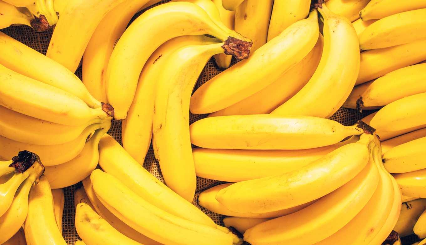
Yes, you did read that title correctly. This is not going to revolutionise your workflow, but with a little luck, these Easter eggs, hidden in Photoshop, might make you and your work colleagues smile.
70 BANANAS, MONKEYS, COFFEE AND TOASTMORE MEGA TIPS
If you go to Photoshop CC > Preferences > Interface, you can change the Color Theme under the Appearance section by clicking on one of the four colour chips, ranging from dark grey to light grey, to alter the workspace appearance. Not terribly exciting, but you can inject a little humour.


If you hold the Shift + Alt keys and then click on one of the colour chips, you won’t change the Color Theme effects, but the colour chips are replaced by pieces of toast, ranging from very dark toast up to white toast. Choose your preferred toast to alter your workspace brightness.
While the toast is visible, press Shift + Cmd and then click on a piece of toast, it will change to cups of coffee of varying strengths to represent the colour theme choices. You can hold Shift + Alt again and click on the colour chips to change it back to the original grey.

Next, on the toolbar are three small dots representing the Edit Toolbar function. Click and hold over this icon and the small fly-out menu will appear. Click on it to open the edit panel. Hold the Shift key and click Done and where the three dots were before, a banana will appear.


The banana will stay there until you use Edit Toolbar again, press Shift and click Restore Defaults. Now we just need the monkey to go with the banana. Open or create a Photoshop document with layers in it and then go to Window > Layer Comps. This opens a small Layer Comps panel.
 Click the Menu icon and choose New Layer Comp. Name the new layer ‘Layer Monkey 0’ and click OK to add a new layer comp. It might require a click to activate, but when you do, the icon on the left of the panel will turn into a cheeky monkey! Rename it anything else to return to normal.
themselves
01 02 03 04 05 06 71 BANANAS, MONKEYS, COFFEE AND TOAST MORE MEGA TIPS
Front CroppingImage

There is a Crop Tool option that has a very useful function, but you might not have seen it. If you need to match a series of images with the same, cropped sizes and dimensions, then Front Image cropping is for you.
AFTER

BEFORE 72 FRONT IMAGE CROPPINGMORE MEGA TIPS


 The peacock photo photo.
We have our example target image cropped and sized, to our preference, in the shape of a peacock. This is the first image document opened and we want all subsequent images cropped to the same proportions and the same pixel dimensions, to match this one.
is 2000 pixels wide by 1125 pixels high. By comparison, the next image of a barn owl is 3544 pixels wide by 3132 pixels high and the third image of a parrot is 2019 pixels wide by 2694 pixels high. The last two need to match the peacock and there is a smart way to do it. The crop box will match the same ratio as your peacock image. You can move and scale the crop box and even though it indicates it is still 3299 x 1855 px, as soon as you commit the crop, it will be resized automatically to match the peacock image of 2000 x 1125 px. Open the next
It too will have a crop box ready for you in the correct aspect ratio. Move and scale the box to suit and then, when you commit the changes, that image will also be cropped and scaled to match the target image. Any subsequent images that you open can be altered in this way. Go back to your target image (the peacock in our case), go to the toolbar and click on the Crop Tool (C). Then go up to the Crop Tool options bar and click on the Aspect Ratio box to view the various pre-set options available. Click on Front Image. Initially, nothing will appear to change. A crop box will encompass the entire image and the width and height boxes in the options bar will show the image is 2000 x 1125 px. If you click on the next document tab, to view your other images, they will now have a crop box placed on them. 01 02 03 04 05 06 73 FRONT IMAGE CROPPING MORE MEGA TIPS
Improve Your Spot Healing
Retouching skin effectively can be a challenge. Photoshop’s Spot Healing Tool is very effective at removing blemishes, but it can still introduce more issues than it eradicates. Here is a way of ensuring better results.
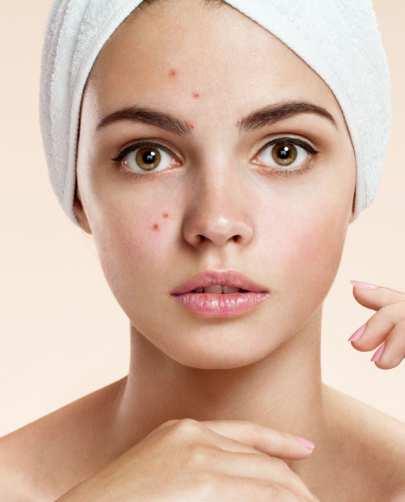
AFTER BEFORE

74 IMPROVE YOUR SPOT HEALINGMORE MEGA TIPS
We have an example image of a teenager with some acne on her face. We want to be able to remove the blemishes without having too many obvious indications that retouching has been used. Because there are many areas of clean, natural-looking skin, the Spot Healing Tool is a good choice here.


For non-destructive retouching, create a new layer above the main image and name it ‘retouch’. Any work done will appear on this layer. Choose the Spot Healing Tool from the toolbar and use a medium hardness brush of about 70 pixels. Make sure the Sample All Layers box is checked.


Make sure the new ‘retouch’ layer is active. This way, any cloned pixels will be added to the ‘retouch’ layer only, preserving the original image underneath. Since you have checked Sample All Layers, pixel data from the main image will still be incorporated on the new layer.

As you start brushing over the blemishes by her eyebrow, the results may very well look mottled and the healing process may remove parts of the brow. Alternatively, if you go to the options menu in the top left of the screen and choose Lighten, from the Mode panel, you can be more precise with your healing.


If you undo what you’ve done and try the tool, with the Lighten Mode now active, you should see that the darker blemishes are removed, but more of the hair detail is left intact. In this case, the Lighten Mode targets the darker pixels of the blemish, not the lighter pixels of the hair.
You can now continue to target the darker blemish pixels around the face. If you view the ‘retouch’ layer on its own, you can see that you have cloned new pixel data on this layer, preserving the original image underneath with a non-destructive edit.

01 02 03 04 05 06 75 IMPROVE YOUR SPOT HEALING MORE MEGA TIPS
One Image, Two Windows


Here’s another very handy hint for you in the shape of a two-screen window. Sometimes, it is useful to be able to view a part of your photo in extreme closeup, while still being able to see the effect you’re having on the overall image.
AFTER BEFORE
76 ONE IMAGE, TWO WINDOWSMORE MEGA TIPS


 This detail the entire image
With photo. the handy technique. Selection small balloon the of duplicated layer the new layer the Move Tool to the copied balloon to part of the sky. the balloon in the 300% window the wider view on the left also performs the same move. You can even between windows if you like. You can close one window when you are done. the photo vertically, in the workspace. magnification window the other. this window Shift spacebar, image and the other at the same time.
This detail the entire image
With photo. the handy technique. Selection small balloon the of duplicated layer the new layer the Move Tool to the copied balloon to part of the sky. the balloon in the 300% window the wider view on the left also performs the same move. You can even between windows if you like. You can close one window when you are done. the photo vertically, in the workspace. magnification window the other. this window Shift spacebar, image and the other at the same time.
tip uses a colourful image of hot air balloons taking off en-masse into a beautiful blue sky. We want to be able to edit one of the smaller balloons in close-up
while still being able to see
and what effect we’re having on it, as we work.
your main image open, go to Window > Arrange > New Window For One Image. A second document tab will appear with the same name as your current document. It is a duplicate of your
Now, you need to be able to see both windows side-by-side to get
most out of this
We stayed with the 300% window, went to the toolbar and used the Quick
Tool to select one
in
middle
the throng. We then
it onto a new
using
Layer Via Copy command. This
was named ‘balloon’. Use
drag
another
As you do, you will see that not only does
move, but
switch
Go to Window > Arrange > 2-Up Vertical. You can choose from the other arrangements depending on the shape and orientation of
on which you are working. This will arrange both documents
so they are side-by-side
Photoshop
The
of one
can be different to
In
example, the left
is at 50% while the other is at 300%. If you hold the spacebar and drag, you can move each image around individually. Hold
+
drag one
will move
01 02 03 04 05 06 77 ONE IMAGE, TWO WINDOWS MORE MEGA TIPS
FromTransparencyBlend

Blend modes can help you achieve a number of effects by controlling how one layer’s colours interact with another. Take Blend Modes even further with handy tips on adding transparency to the blend you’ve created.

AFTER BEFORE 78 TRANSPARENCY FROM BLENDMORE MEGA TIPS
In this example, we have a grungy, peeling paint texture that we would like to blend into some text. However, we only want to use the darker cracks in the paint and add that to our text so it takes on a more weathered feel. Fortunately, Blend Modes can help us here.
We’ve added some large bold text, which is currently on a layer above the background texture. We need to start by clicking on the Background layer’s lock icon to convert it to a layer as well. This allows us to click and drag the Background layer so it is above the text layer.

If you make the texture layer invisible for a moment, you can doubleclick the text thumbnail, change its colour to something appropriate and then make the texture visible again so it covers your text. If you double-click the texture layer, you can open the Layer Style panel.
If you look down at the Blend If section, you can use the sliders to hide light pixels or dark pixels. Slide the white tab to the left and you will see the lightest parts of the image start to disappear, leaving the dark cracks and the text layer underneath.


Examine the texture thumbnail and you will see the entire image. Rightclick the layer and select Convert To Smart Object. If you now right-click the thumbnail and choose Select Pixels, you can actually make a selection of the dark cracks and not the entire peeling paint texture.


You can scale the transparent cracks to better fit your text. Now add a Clipping Mask, so it only covers the text and then double-click the texture layer again to bring up the Layer Style menu once more and perhaps add some Bevel And Emboss to really make those cracks stand out on your text.

01 02 03 04 05 06 79 TRANSPARENCY FROM BLEND MORE MEGA TIPS


80 Contents 82 Introducing the develop module 84 Using the crop and straighten tool 86 Removing spots and red eye 88 Adjustments using the basic panel ModuleDevelopLightroom Now it’s time to start revealing what Adobe Lightroom is really all about: using the powerful tools in the Develop module to enhance and improve your photos.


81 LIGHTROOM DEVELOP MODULE
Introducing the Develop Module
The Develop module is where the tools that let you fully realise the potential of your photographs lie. Enhancing and improving them, removing blemishes, noise and distortion and applying a range of impressive effects and filters.
Like the Library module, the Develop module window is divided into three main areas, the left sidebar, the main viewing area and the right sidebar. The filmstrip view is also available at the bottom of the screen. The filmstrip and both sidebars can be permanently in view or set to auto-hide by clicking on the arrow symbols on the edge of the screen.
The left sidebar holds the Navigator thumbnail, a list of available Presets, the Snapshot and History views and the Collections. The right-hand sidebar holds all the actual editing and enhancement tools, as well as the Histogram.

1 Navigator
This shows you a view of the whole image, useful if you zoom in when using the spot correction tool and need to navigate around the frame.
2 Presets
This list shows the preset adjustments that can be applied with just one click. Lightroom comes with dozens built-in and you can add and edit your own user presets.

3 Snapshots
If you’re experimenting and making adjustments to an image as you go, you can save a snapshot of your progress at any point. It’s like a save point in a video game; you can go back to that point by clicking on the snapshot in the list.
1 2 3 4 5 6 7
82 INTRODUCING THE DEVELOP MODULELIGHTROOM DEVELOP MODULE
4 History
This shows each alteration that you’ve made to your image in chronological order.
If you decide that you don’t like the last few changes that you made, you can revert to an earlier point by clicking the step in the history list.
5 Collections
We covered these in the Library module section. You can also access your collections from the Develop module by opening up this tab.
6 Copy and Paste
Rather than copying the active image, as you might expect, the Copy button copies certain adjustments that you’ve made to the image. You can open another image and instantly apply the same corrections by clicking the Paste button. You can choose which parameters are copied.
7 View Window
As with the Library module, there are a number of viewing options available, including split-screen and the beforeand-after view.
8 Histogram
The histogram shows you a graph of the number of pixels of a given tone in three colour channels, vital for setting the best optimum exposure.
9 Tools
Here’s where you’ll find the Crop Overlay tool, Spot Removal and Red Eye Correction tools. Linear filters, Radial filters, the Adjustment Brush and new tools to automatically select subject and sky are all under the Masking tool. Masking is the latest additional to the editing arsenal after the 2022 update and amalgamates a few key tools under one heading.
10 Developing AdjustmentandTools
In each of these panels you’ll find more tools to improve your images, such as lens distortion correction, noise reduction, grain and filter effects and more.

11 Previous and Reset Buttons
As the names imply, the Previous button takes you back one editing step, while the Reset button removes all effects and restores the image to its original state. Since Lightroom edits nondestructively this involves no loss of original image quality.
12 Done Button
The Done button applies any adjustments you’ve made in Lightroom. Clicking it will close the current adjustment window and make the alterations to the image. If you clicked it too soon, you need to start again and re-apply any adjustments.
The Adjustment Panel
The Adjustment Panel offers a range of tools tailored to the Module you’re currently on, in this case the Develop Module. Here you can find a wealth of features to help tweak your photo to perfection.
Basic
The Basic panel holds the essential adjustments for white balance, exposure, contrast and tone, as well as clarity, vibrancy and saturation. This is probably where you’ll spend most of your time when using the Develop module.


Calibration
Some cameras have unique colour balance profiles that are embedded in the metadata along with the image file. You can use these profiles to ensure absolutely accurate colour reproduction in your photo if you require it.
Lens Corrections
Lightroom can automatically apply preset corrections that compensate for known distortions in many popular lenses from most manufacturers. You can also choose to make manual adjustments yourself.

Detail
The Detail panel is where you can find the controls for adjusting sharpening and noise reduction. It includes a small preview window for judging the effects of your image adjustments.

8 9 10 1211
83 LIGHTROOM DEVELOP MODULEINTRODUCING THE DEVELOP MODULE
Using the Crop & Straighten Tool
Even the most careful photographer will sometimes rush a shot and take a photo that’s not quite level, with either a sloping horizon or a leaning building. Fortunately, Lightroom offers several effortless ways to correct those faults.


1 The main tools that you’ll need to straighten your shots are found in the Crop & Straighten tool, located on the editing tools panel that we looked at before. Click on the tool and you can see a grid with corner handles appear over your image, as well as a panel of other tools and options appear below the panel. Note the icon change in the 2022 update.

3 A quicker and more precise way to straighten a tilted horizon or leaning vertical is to use the Straighten Tool. You’ll find this on the left-hand side of the options panel below the edit tool bar when you click on the Crop & Straighten tool. It’s the circular icon with a picture of a spirit level in it. Click on this icon to activate the tool.


2 If you place your mouse cursor anywhere on the grey border of the workspace outside the image, you can see that it changes to a double-ended curved arrow, indicating rotation. Click anywhere in this area and you’ll see a grid appear over your image. You can simply drag the image around until your horizon lines up with the grid.
4 To use the Straighten Tool on a tilted horizon, simply click on one end of the horizon line and drag a line along it. As soon as you release the Mouse button Lightroom will automatically rotate the image to make the line horizontal. Note that it also constrains the rotated image within the original size of the frame.
84 USING THE CROP AND STRAIGHTEN TOOLLIGHTROOM DEVELOP MODULE
5 The Straighten Tool also works on leaning verticals. To save a toppling building, activate the tool by clicking on the icon and then click and drag a line up or down a line on the image that should be vertical, such as the side of a structure. Again, as soon as you release the Mouse button the image will automatically be straightened.


8 Cropping your image to improve composition is very simple. When you open the Crop & Straighten tool it defaults to the crop tool straight away; but if you’ve previously been using the Straighten tool you’ll need to click on the round icon with a picture of a darkroom crop-frame tool to switch the tool back into cropping mode. TOOL


6 The Crop & Straighten tool offers a third option for rotating your image. Next to the Straighten Tool you’ll see a slider. If you drag this slider right and left, you’ll see that it rotates the image clockwise and anticlockwise. This is useful if you want to tilt an otherwise level shot. You can also enter the degree of tilt numerically.
9 You’ll see a crop frame grid overlay your image, with drag points in each corner and in the middle of each side. When you click on and drag one of these points in any direction you’ll see the cropping frame move, with the areas outside it slightly greyed out. It also includes a “rule of thirds” grid to help with classical composition.
7 There is yet another option for levelling your shots. If you open the Transform tools you’ll see a panel of buttons in the options panel, including one marked Level. If you click on this button, Lightroom will attempt to automatically straighten your image. Note that this is based on pattern recognition and is therefore not 100 per cent reliable.
10 You can crop to a specific aspect ratio or image size by clicking to the right of where it says Aspect to open the context menu. You can select a preset ratio or size or enter your own manually. Note that the padlock icon next to the menu changes, to indicate that the aspect ratio is now locked to the dimensions that you’ve set.

85 LIGHTROOM DEVELOP MODULEUSING THE CROP AND STRAIGHTEN
Removing Spots and Red Eye
Even the latest digital cameras can sometimes get dust inside and contaminate the sensor, leaving black spots on your images; and there’s also the problem of flash Red Eye and indoor photography. Luckily Lightroom offers tools for dealing with these problems.


1 If you scan film photos or use an older DSLR, you may have problems with dust and blemishes on your images. Fortunately, Lightroom includes a handy tool to get rid of them. It’s the Spot Removal tool and you use it by clicking on the icon in the editing tools panel or by using the keyboard shortcut Q. Note the icon change in the 2022 update.
3 As you click on dust spots you’ll see the position from which the replacement sample is being taken displayed on the image and you can adjust the position and size of the sample location by dragging on the visible circle. You can turn this feature off from a pop-up menu on the lower tool bar; this can help if your image is heavily spotted.

2 The Lightroom Spot Removal tool operates in the same way as the matching tool in Photoshop. You can adjust the brush size by using the slider in the control panel or by using the square brackets keys [ and ]. Simply click on a spot and it will be replaced by a matching background colour sampled from elsewhere on the image.

4 If you make a mistake or if you simply don’t like the result of one of your spot removal operations, you can undo any of them by holding down the left Alt button and clicking on the offending circle. As well as the heal function, the Spot Removal tool also offers a Clone option. If you hold the CTRL key you can move the sampling point to wherever you want.
 Removing Spots
86 REMOVING SPOTS AND RED EYELIGHTROOM DEVELOP MODULE
1 Red Eye is caused when light from your camera flash reflects off the blood vessels at the back of the eye and is most visible in low light when the pupils are widely dilated. Even if your flash has anti-Red Eye pre-flash it can still be a problem. You can remove Red Eye from your shots using the Red Eye Removal tool.


4 Repeat the same procedure with the other eye. If you’re not happy with the result, reset the image and try again; the automatic process isn’t perfect and a second try may do better. You can also manually adjust the size and darkness of the fake pupil that it superimposes by adjusting the two sliders in the tool options panel.
2 The Red Eye Removal tool is very simple to use. When you activate the tool you’ll see a cross-shaped mouse cursor. Simply place this over the centre of an affected eye and drag an elliptical shape outwards until it covers the entire eye. Release the Mouse button and the tool will automatically detect and correct the redness.
5 The Red Eye Removal tool also works with pet’s eyes, although due to the nature of cat and dog eyes, they’re usually green or yellow rather than red. Click on the Pet Eye button on the tool option panel and then use the same procedure that you did for a human eye; click and drag outwards from the centre of the eye.


3 As noted above, make sure the elliptical shape covers the entire eye, not just the pupil. You may think you just need to cover the red area of the eye, but the tool works by using the shape of the iris and the pupil. If you drag the ellipse over the pupil alone, you will see that the redness reduction is confined to a very small area. Adjust the ellipse accordingly.
6 As with human eyes you do have the option to manually increase or decrease the pupil size but there is no option to darken, since it will set to maximum darkness automatically. There is an option to add catchlights in the eyes though, which is strangely missing from the tool options for human eyes. The results are usually excellent.
Removing Red Eye
87 LIGHTROOM DEVELOP MODULEREMOVING SPOTS AND RED EYE
Adjustments Using the Basic Panel
After cropping and straightening, the most common adjustments made are white balance, exposure, tonal balance and colour saturation. Lightroom’s Basic panel is where you can find these features, with an easy-to-use slider interface.


1 You’ll find the Basic panel in the right-hand sidebar of the Develop module. Click on the title bar to open the panel and you’ll see an array of sliders for things like colour temperature, tint, exposure and contrast; also a panel of Tone controls and another one for Presence controls that adjust Clarity, Vibrance and Saturation.
3 To the left of the White Balance selector you’ll see another tool with an icon shaped like an eyedropper. If you click on this the eyedropper will become the mouse cursor and you can use it to select a white-point to manually set the white balance. If you’ve ever used Adobe Camera Raw you’ll be familiar with this operation.
2 Near the top of the Basic panel you’ll find the White Balance controls. This will usually show As Shot by default, indicating that Lightroom is using the white balance setting determined by your camera. If you click on this, you’ll see a context menu with more options. We’ll look more closely at correcting white balance elsewhere.
4 Immediately below the White Balance selector you’ll see a pair of sliders for Temp, or colour temperature, and Tint. These controls allow you to make manual adjustments to the white balance and colour cast, which is useful if you’re shooting under unusual artificial lighting conditions that are not covered by any of the white balance presets.
88 ADJUSTMENTS USING THE BASIC PANELLIGHTROOM DEVELOP MODULE
5 Moving further down the panel, we come to the Tone controls, which are divided into two sections; Exposure and Contrast, and Highlights, Shadows, Whites and Blacks. Exposure and Contrast work in exactly the same way that they have done in Adobe Photoshop and most other editing suites for years.
8 If you just want to quickly optimise a photo but aren’t sure in which direction to take it, the Basic panel offers an auto-tone option that will instantly analyse your image and attempt to adjust the tone to bring it closer to an idealised average by equalising the histogram. It’s not likely to be perfect but can be a good starting point.
6 The Highlights, Shadows, Whites and Blacks section of the Tone panel is a more recent addition for Lightroom and not found in previous versions of Photoshop. It offers more precise manual control over the relative density of light and dark tones and lets you take advantage of the greater tonal range of raw files.
9 The Basic panel can also be used to turn your colour image into monochrome. At the top of the panel you’ll see Colour and Black & White. If you click on the latter you’ll see that the Vibrance and Saturation slider will be greyed out and the image will turn monochrome. You still have full control over the other sliders.


7 The Presence controls are another new Lightroom feature and replace the old Hue, Saturation and Lightness controls that feature in Photoshop. Clarity improves the contrast in the mid-tones of the image by sharpening the edge detail, while Vibrance increases the saturation of only the least saturated colours.
10 Auto-tone also still works in Black & White mode and just like in colour mode it will attempt to equalise the exposure, contrast and distribution of tones to produce an idealised histogram with no clipping. You may find that the results look a little flat though, so use it as a starting point rather than relying on it to finish your images.
89 LIGHTROOM DEVELOP MODULEADJUSTMENTS USING THE BASIC PANEL
ElementsPhotoshop
Welcome to our introduction to Photoshop Elements, you have an easy and affordable means to find all those elusive images, organise them and manipulate your favourite ones to make them even better. Let’s begin with a few basics. This will gradually build into a comprehensive guide to this very capable image editing package.


Contents 92 What is Photoshop Elements? 94 The Elements home screen 96 The quick mode workspace
90


91 PHOTOSHOP ELEMENTS
What is Elements?Photoshop
Adobe Photoshop Elements is a great option for those who want an extensive toolset that can take on most of their image editing needs, without the requirement of highly advanced features such as you would find in Photoshop CC. It is also a great choice for those who only need oneclick solutions to their image editing needs, or perhaps want to start to learn how to take on the more involved techniques and tools that Elements has to offer. Another big plus point in its favour is that it is one of the very few remaining Adobe products that can be purchased outright, without the need for subscription.
A Worthy Alternative
There was a time when, in certain quarters, Elements was considered a dumbed-down version of Photoshop with a limited toolset, that was only meant for beginners with no aspirations to advance to the more technically advanced techniques seen in Photoshop. However, recent versions of Elements have shown that it is a worthy standalone alternative to using Photoshop. It is a focused image editor and cataloging application that is more than capable of taking on any image editing task you care to send its way.
In its current form, Adobe Photoshop Elements is comprised of two main components. One is the image editing module of the software where you can touch up your photos or even manipulate and transform them beyond recognition. The Edit section is broken down into three sections. The first is the Quick Edit mode, then comes the Guided Mode section and finally there is the Expert mode.

Make the Most of Modules
Each module has its own set of tools and preset options that can quickly get the job done. Quick Edit, as the name suggests, contains the basic editing
Let's take a moment to get to know a little more about the software and how it can help you with your day to day image editing.
92 PHOTOSHOP ELEMENTS WHAT IS PHOTOSHOP ELEMENTS
The Adobe Photoshop Elements and Organiser interfaces are designed to be as intuitive as possible with plenty of options for beginners and experienced users alike.
WHAT IS PHOTOSHOP ELEMENTS

tools such as colour correction, cropping, quick selection, spot healing, sharpening and lighting fixes. You can also apply some oneclick presets such as Smart Fix, Exposure and Lighting.
Helping Hand
The Guided module is also fairly selfexplanatory. Here you can make any number of popular image adjustments to your photos, with guided step-by-step tutorials, such as altering brightness and contrast, resizing photos, rotating and straightening your images and adding vignettes. It also has a number of specialised and fun options for restoring old photos, creating your own frames and replacing backgrounds.
More Advanced Options
Finally comes the Expert mode. This has more of the feel of its big brother, Photoshop to it. It has a toolbar ranged down the left hand side of the workspace and on the right is the layers panel that behaves much in the same way as Photoshop's layers palette. Here you also have access to a number of photo colour presets such as Faded Photo, Glow and Monotone Color. There are also a number of filters for more artistic effects such as coloured pencils, watercolours, distortion effects and sketch filters. You can also add Bevels, Patterns, Strokes, Photographic Effects and much more by accessing the icons in the lower right of the taskbar at the bottom of your workspace. Expert mode is the most hands-on of the three modes you can employ and gives you access to all the tools, so you can apply all your own advanced edits to your photos.
Getting Organised
The second main component of the latest Adobe Photoshop Elements is the Elements 2019 Organiser. At its heart, this is a cataloguing and photo organising program that lets you import, sort, tag and rate your photos. If you wish, you can create albums and use names, locations, date, time and GPS data to sort them. The program can even employ face recognition to find and sort photos of people and tag them much as you would in Facebook. Indeed, you can actually import your list of Facebook friends as an aid to tagging the people in your photos. If


it detects a similar name being entered as a tag, it will display those existing names similar enough as a match to be an option for tagging.
The two components of Photoshop Elements and Elements Organiser are separate programs, which can be a bit of nuisance if you need to keep switching between them but you have at your disposal a set of powerful
editing tools that will keep beginner and expertOverhappy.thepage we'll begin to delve deeper into the workspaces offered by the Editor and Elements Organiser. It is best to consider the Editor module as your digital darkroom and design studio and to think of Elements Organiser as your library, where you keep all your media items such as photos and videos.
93 PHOTOSHOP ELEMENTS
The HomeElementsScreen
We start the journey by becoming more familiar with all the module environments you will be working with.
Welcome Home
When you open Adobe Photoshop Elements 2019, you are presented with a Home screen. This simple screen is your gateway to the Photo Editor program or the Organiser. The third option available is to activate the Adobe Premiere Elements Video Editor, if you have purchased that as well. If not, it will ask if you want to download a trial version.

You also have the option at the top of the Home screen to search for help on things you want to achieve in the programs or to click on any of the featured Try This guides and What's New items and Inspiration articles ranged across the screen.
On the extreme top right of the page are buttons for Facebook and Twitter and a Help button that takes you to Adobe Customer Support.
Search Option
From the home page you can can search for things you need to learn more about. If you want to learn how to make a calendar for instance, type that in the search bar and it will show you links to help files that can tell you more.
Featured Guides
Ranged along the top of the home page are a number of clickable guides and inspirational media that gets you into the heart of what Photoshop Elements 2019 is all about. There are several themes you can access. Try This are guided tutorials that help you create exciting media and art. What's New highlights all the step-by-step features that are new to this version. Inspiration is a collection of stories and articles to get you in a creative mood.

1 2 3
1
2 4 94 PHOTOSHOP ELEMENTS THE ELEMENTS HOME SCREEN
Auto Creations
When you open the home page for the first time, you will be prompted to add media for Auto Creations to make a series of personalised creations, such as slide shows that use your own photos and videos.

Add Media
Auto Creations are created with media (photos or videos) that you've imported. If you haven't imported any media yet, click Add media under Auto Creations on the Home screen and relaunch the app. You can open and edit any Auto Creation and instantly share it with your family and friends.
Program Chooser
To the right of the home page are the icons for Organiser, Photo Editor and Video Editor. You can click on these to activate the relevant program. If you do not have the Adobe Premiere Elements video editor program for instance, it will ask you if you want to try if for free with the option to purchase later if you wish.
Recent Files
Any images you have been working on recently will be displayed here for quick access. Click on the image you want to continue working on and it will be opened within the relevant program.
Facebook Button
Click this button to go to the Adobe Photoshop Elements Facebook page.
Twitter Button
When you click this button, it will take you to the Photoshop Elements Twitter feed where you can view, reply to, retweet and like tweets.
Help Button
If you need further assistance, you can click this button to be directed to the Adobe Customer Support webpage.
Explore the Guides
For those who are in need of more guidance, or just some creative inspiration, go ahead and click on any of the featured guides and articles to explore more of the online world of features Adobe Photoshop Elements has to offer.

5 6 7 8 9
3 4 5 6 7 8 9 95 PHOTOSHOP ELEMENTSTHE ELEMENTS HOME SCREEN
The ModeQuickWorkspace
One-click Power
Although this mode is designed to be quick and simple to use, it is still a powerful method to rapidly improve your photos with easy one-click presets that give you instant feedback on how your image will look with the new adjustments applied. There are many filters to choose from and many ways you can adjust your image to make it perfect, so you can share it with the world.
The File Menu
Although a number of file menu option will not be accessible, the main ones that you need will be available. All the Enhance options are there as well as the Filter Gallery presets.


Mode Selector
Here can you can exit the current mode and choose to enter the Guided or Expert modes.
3
The Open Button
This is a simple button to specify a new project to work on. Click it to create a new document at the size you want. When you click OK, the document will be created and can be worked on in either Quick mode or Expert mode.
The Toolbar
The Quick mode toolbar has a core set of tools to get your image looking great with minimal effort. You can make quick selections to specific areas of the photo, crop it, straighten the horizon, whiten teeth and fix eyes as well as adding text and a number of varied filters, textures and adjustments.
1 2 4 6 7 8
For fast and simple edits, this is the mode to get you editing quickly, with one-click results for better photos.
4 2 1 3 5 96 PHOTOSHOP ELEMENTS THE QUICK MODE WORKSPACE
The Tool Options Bar
For every tool you activate in the toolbar, you have another panel called the Tool Options bar that gives you many more choices as to how that tool can be modified and controlled. There are also additional tools that can be accessed in the Tool Options bar.
The Taskbar
The taskbar is situated at the bottom of the workspace and contains all the most frequently used actions, which are displayed as buttons. Click each one and you can see all the images you are working on at that time, display or hide the Toolbar Options bar and Undo or
redo any steps you have performed on your image. You also have the option to rotate the image and activate the Elements Organiser if you need to.

View Options
Clicking on this button reveals the View options. This is useful if you want to compare a before and after view of your currently active image, to see how much the image has changed from its original untouched state.
Active Image Area
The image you are working on is displayed in this area. It will either be as a single image or, if you have chosen a
different view option, as two images that represent the before and after state of the photo.
Zoom Slider
This slider lets you quickly zoom your image from 1% all the way up to 3200%.
Create and Share
These two dropdown menus display options for creating slide shows, photo books, greetings cards, calendars, Facebook Covers and much more. You can also share your works of art on Facebook, Flickr and Twitter.

The Panel Bar
This panel changes content depending on what adjustment or effect you are using. If you are using the Adjustment tools, then they will be displayed in the right hand panel bar. Items such as Smart Fix, Exposure, Lighting and Colour will be available here and each can be clicked to reveal its available options. The Effects menu, Textures and Frames are also available to be accessed here.
Create and Share
Don't forget to check out the Create and Share options. Whether you want to share your creation online and on social media or make prints of your photos or even calendars, click the buttons to explore further.
5 6 7 8 9 10 11 9 10 11 97 PHOTOSHOP ELEMENTSTHE QUICK MODE WORKSPACE

Photoshop Get Inspired! Next issue, get more hands-on with Photoshop’s many tools and techniques, as well as a deeper look at Lightroom’s Develop Module. We also begin to uncover some essential knowledge about using Photoshop Elements too. All this and more Photoshop mega tips to sink your teeth into. On DecemberSale2022 via digital platforms
Don’t miss out on more magazinesgreat on digital platforms now!

Publishedby:Papercut
ManagingEditor:James Gale
ProductionDirector:Mark Ayshford
Editor:Mark Frost
ProductionManager:Mark Ayshford
Design:Mark Frost, Mark Ayshford
Editorial,Artwork&ImageEditing:Mark Frost
Digitaldistributionby:Zinio, Pocketmags & Readly


2022 © Copyright Papercut Limited. All rights reserved. Notice: Before purchasing this publication please read and ensure that you fully understand the following guidelines, if you are in any doubt please don’t buy. No part of this publication may be reproduced in any form, stored in a retrieval system or integrated into any other publication, database or commercial programs without the express written permission of the publisher. Under no circumstances should this publication and its contents be resold, lent, loaned out or used in any form by way of trade without the publisher’s written permission. While we pride ourselves on the quality of the information we provide, Papercut Limited reserves the right not to be held responsible for any mistakes or inaccuracies found within the text of this publication. Due to the nature of the software industry, the publisher cannot guarantee that all software and/or tutorials, tips,
guides will work on every version of the required hardware. It remains the purchaser’s sole responsibility to determine the suitability of this magazine and its content for whatever purpose. Any images reproduced on the front and back cover are solely for design purposes and are not representative of content. We advise all potential buyers to check listing prior to purchase for confirmation of actual content. All editorial opinion herein is that of the writer as an individual and is not representative of the publisher or any of its affiliates. Therefore the publisher holds no responsibility in regard to editorial opinion and content. Papercut Limited reserves the right not to be held responsible for any mistakes or inaccuracies found within the text of this publication. The publisher, editor and their respective employees or affiliates will not accept responsibility for loss, damage, injury occasioned to any persons acting or refraining from action as a result of the content with this publication whether or not any such action is due to any error, negligent omission or act on the part of the publisher, editor and their respective employees or affiliates. Our articles are intended as a guide only. We are not advising you to change your device, and would actually advise against it if you have even the slightest doubts. There are potential risks to the hardware/software involved, and you must be aware of these before you decide to alter anything on your device. Read all of the nformation here carefully and then make up your own mind whether you want to follow our guides. We take no responsibility for damage to your computer or any other device used in the process. If you are unsure, please do not buy this publication. This Papercut Limited publication is fully independent and as such does not necessarily reflect the views or opinions of the manufacturers or hardware and

software, applications or products contained within. This publication is not endorsed or associated in any way with Adobe, Photoshop, Lightroom or any associate or affiliate company. All copyrights, trademarks and registered trademarks for the respective companies and developers are acknowledged.
Guides in this title are based on Photoshop, Camera Raw, Elements, Lightroom and Lightroom Classic. Adobe is a registered trademark of Adobe Systems, registered in the US and other countries. Adobe ©2022 Adobe Systems.
Additional images contained within this publication are reproduced under license from shutterstock.com and Pixabay. Cover images are used for illustrative purposes only.


All information was correct at time of print. Some content may have been previously published in other volumes or titles. We advise potential buyers to check the suitability of contents prior to purchase
Papercut Limited Registered in England & Wales No: 04308513
ADVERTISING - For our latest media packs please contact: Richard Rowe - richard@tandemmedia.co.uk
Will Smith - will@tandemmedia.co.uk
INTERNATIONAL LICENSING - Papercut Limited publishes many high quality publications and all are available for licensing worldwide. For more information email: jgale@pclpublications.com
Photoshop User Issue Three |September 2022 |ISSN: 2752-4701
Limited
